ULTRA
An exhibition of painting and installation
by
Gregory Blunt
A thesis exhibition
presented to the University of Waterloo
in fulfillment of the
thesis requirement for the degree of
Master of Fine Arts
in
Studio Art
East Campus Hall, April 25-May 2
Waterloo, Ontario, Canada, 2006
© Gregory Blunt 2006

AUTHOR’S DECLARATION FOR ELECTRONIC SUBMISSION OF A THESIS
I hereby declare that I am the sole author of this thesis. This is a true
copy of the thesis, including any required final revisions, as accepted by
my examiners.
I understand that my thesis may be made electronically available to the
public.
ii

Abstract
This thesis paper is meant to serve as a supporting document for a
thesis exhibition that was held the University of Waterloo Art Gallery.
The show consisted of paintings on Plexiglas and sculptural installations
with fluorescent lights.
The aesthetic style of my paintings makes a strong reference to the
visual vocabulary of computer software. More specifically, it mimics
architectural computer vector graphics from the 1980s. There is a visual
metaphor created in my paintings where it blueprint drawing has
'evolved' into computer vector graphics, ultimately though, nothing has
changed. The images are still hand drafted with pencils and then hand
painted. The lexicon of digital software is appropriated, but by
transferring the images from the virtual space of the screen to a literal
three-dimensional space, the meaning is discarded. They become
generalized abstract signs that retain their connotations, but not their
meaning and function. The work thus makes a simple point in its refusal
to 'get digital.' There is a fetishization of technology, yet simultaneously a
refusal of it.
Other concerns that I deal with in my work and thesis paper, include
notions of good and bad taste, kitsch and the Camp aesthetic, science-
fiction, nostalgia, representations of the ‘future,’ Suprematist painting,
Minimalism, Design, and the utopian ideals of Modernism.
iii

Acknowledgements
I would like to gratefully acknowledge the Fine Arts Faculty at the
University of Waterloo. I am also indebted to Michele White and Ron
Shuebrook from the Ontario College of Art and Design for their
assistance in making this MFA happen and providing the scholarship to
do so. Lastly, I am grateful to Emmy Skensved for her support.
iv

Table of Contents
Pages 1 - 7 Taste and Aesthetics
Pages 7 – 17 Aesthetic References
Page 17-18 Simulacra and Simulation
Pages 18 - 24 Influential Artists
Page 24 - 25 Conclusion
Page 26 Bibliography
Pages 27 - 34 ULTRA: Studio Work for Thesis Exhibition
v

List of Illustrations
1. Album cover of Musique’s ‘Keep on Jump In’
2. Image of ‘Pacman’ computer game circa 1984
3. Still from the movie ‘TRON’ (1982) 4. Album and film covers for the movie ‘TRON’ (1982) 5. Album cover of Kraftwerk’s 'Computerwelt’ (computer world) 6. Habitat ‘67 in Montreal (Moshe Safdie, 1967) 7. Images of Star Trek computer console props (1967-1969) 8. Benjamin Edwards, ‘Historical Zone #0053,’ 2005.
9. Julie Mehretu, Empirical Construction, 2003.
10. Sarah Sze, Proportioned into the Groove, 2005.
11. Brian Alfred, Lobby, 2004.
12. Sarah Morris, Metro Center (Capital), 2001.
13. ‘You Are in a Car’ (1996) by Julian Opie
ULTRA: Studio Work for Thesis Exhibition
1. Fade to Grey, 24” x 48”, Plexiglas, acrylic, frosted mylar, and fluorescent lights, 2006
2. ULTRA installation view
3. ‘ULTRA MARINA,’ three sculptural pieces in Plexiglas and fluorescent lights on
painted floor, 2006.
4. ULTRA installation view
5. ULTRA installation view
6. detail of ‘ULTRA MARINA’
7. ‘Console,’ Plexiglas and acrylic with flashing mini lights on black fun fur, 2006.
8. ‘Snow White,’ 18” x 18”, Acrylic on Plexiglas with Fluorescent light, 2006.
9. Convention Center, 2 panels at 36” x 48” each, Gesso and Acrylic on Board, 2006
10 ’Epsilon,’ 36” x 72”, Acrylic, sparkles and epoxy resin on Plexiglas, 2006.
11. detail of ‘Epsilon’
12. ‘Shorne Neue Computerwelt,’ 98” x 98”, Acrylic on clear Plexiglas mounted on the
wall, 2006.
13. Installation of four 10” x 10” pieces, Acrylic, sparkles, and epoxy resin on Plexiglas,
2006.
vi

Taste and Aesthetics
My current body of work represents a combination of various stylistic and
aesthetic references. I have been particularly concerned with
understanding what constitutes good or bad taste and what informs my
own sense of aesthetics. This inevitably has a great deal to do with my
personal sense nostalgia and sentimentality. It has led me to investigate
a graphic sensibility that is reminiscent of the computer games from the
1980s that I grew up with. Other influences on my work include
Suprematist painting, International-Style architecture, Minimalism, quasi-
futuristic design, and science fiction set designs from television and film.
My work has always had a great deal to do with aesthetics and my own
personal taste. Taste is essentially one's own perception of what is
aesthetically ideal or pleasing. It is important to consider that taste is
highly informed by one's class and socio-political situation, and thus
provides categories of social division and cultural hierarchie. When
considering the so-called low, middle and upper classes, certain
generalized distinctions of taste can be observed. Since these
discrepancies of taste are strongly associated with one's financial
situation and level of education, it is inevitable that hierarchies of
aesthetics have developed which favour the upper class. The language
used in relation to aesthetics inexorably reaffirms these hierarchies. The
taste of the 'low' class is often described with derogatory intent, perhaps
as being kitsch, garish, uneducated, cheap, and distasteful. In contrast,
the upper class is said to have 'good' taste, however bourgeois and
conservative it tends to be.
As I became increasingly aware of the hierarchies of taste and the codes
of meaning that certain aesthetics carry, I gradually realised that my
taste was associated with lower classes; A sensibility which is often
1

branded as 'bad' taste. The so-called 'trashy' aesthetic of disco, arcades,
and mobile homes, was in fact what I grew up with and which greatly
informs my current taste. The images that my paintings make reference
to, namely those of 1980s video games and sci-fi TV shows, inevitably
reference a sensibility that has been branded 'pop' or 'low' culture. The
uses of materials such as sparkles, Plexiglas, and fluorescent colours,
have a similar reading. Not only are these materials associated with the
low class, they also have an equally pertinent significance as part of kid
culture. This may banish sparkles and fluorescent colours even further
into the realm of bad taste, seeming perhaps to be 'unsophisticated' and
'immature.'
The ironic sensibility of 'camp' has played a crucial role in my work for
the past number of years. I have used irony in order to explore and
reinterpret my notions of what constitutes bad taste, especially as they
relate to my own feelings of nostalgia. Camp became a device that
enabled me to seriously fetishize and indulge in the most garish aspects
of my childhood influences, namely the glittering candy-coloured
aesthetic of disco.
1. Album cover of Musique’s ‘Keep on Jump In’
2
The work of author Susan Sontag has been especially relevant in my
understanding of how the camp sensibility functions in my work. Sontag
famously defined the term in her 1964 short essay entitled 'Notes on
Camp.' She wrote that Camp is a mode of aestheticism that sees the
world not through beauty, but rather its degree and artifice and
stylization. Many examples of Camp are things that, from a 'serious'
point of view, are either bad art or kitsch. The Camp sensibility falls
towards that which is strongly exaggerated, such as particularly
flamboyant sexual characteristics and personality mannerisms; it’s a
metaphor of life as theatre. The most obvious example are Drag Queens
who have fashioned entire identities around the Camp sensibility. In
order to grasp their identities, or any Camp aesthetic, a double
interpretation is needed as gestures are full of duplicity.
The common approach in appreciating a work of art is by assessing its
truthfulness, seriousness, dignity, and beauty. Such readings however,
inherently set-up hierarchies of high and low culture. Camp is an
alternative to the good-bad axis of ordinary aesthetic judgment. It doesn't
argue that the good is bad, or the bad is good. It offers a different way of
evaluating, other then the tragic or comic seriousness that is typical of
high culture. Camp is "the sensibility of failed seriousness, of the
theatricalization of experience. Camp refuses both the harmonies of
traditional seriousness, and the risks of fully identifying with extreme
states of feeling" writes Sontag. Ultimately, something is good not
because it is achieved, but because it reveals another, equality valid,
reality of the human condition and experience. Sontag offers an
interpretation of three overall sensibilities. "The first sensibility, that of
high culture, is basically moralistic. The second sensibility, that of
extreme states of feeling, represented in much 'avant-garde' art, gains
power by a tension between moral and aesthetic passion. The third,
Camp, is wholly aesthetic... It incarnates a victory of 'style' over 'content,'
3
'aesthetics' over 'morality,' of irony over tragedy." writes Sontag. Camp
dethrones the serious and is playful. It feels that 'sincerity' is often not
enough, and can often just be simple Philistinism and intellectual
narrowness. It "involves a new, more complex relation to 'the serious.'
One can be serious about the frivolous, frivolous about the serious"
(Sontag). Ultimately, Camp is a mode of enjoyment. It "doesn't propose
that it is in bad taste to be serious; it doesn't sneer at someone who
succeeds in being seriously dramatic. What it does is to find the success
in certain passionate failures" (Sontag).
2. Image of ‘Pacman’ computer game circa 1984
The relation of Camp taste to the past is extremely sentimental. The
passage of time has a great deal to do with the development of
something as Camp. "Time may enhance what seems simply dogged or
lacking in fantasy now because we are too close to it, because it
resembles too closely our own everyday fantasies, the fantastic nature of
which we don't perceive. We are better able to enjoy a fantasy as
fantasy when it is not our own" writes Sontag. This is why so many
4

Camp objects are old-fashioned and out-of-date. It's not so much about
nostalgia, but rather the sense of detachment that happens over time,
which ultimately allows the Camp interpretation. With regards to my own
work, though I do believe that sentimentality and nostalgia are deciding
factors in my taste, my attraction to Camp and the distancing effect that
occurs with time is also quite relevant.
A dominant theme in twentieth century art has been to subvert and
deconstruct notions of high and low culture. With my work, I have been
interested in blurring the distinctions between what I consider to be good
or bad taste. An example of what I consider good taste is the cool
reductive aesthetic of Minimalism and Modern design. At the same time
that I have been attracted to the garish side of popular consumer culture,
I have also admired the minimalist sensibility of Modernism. High-
Modernism was a movement that catered almost exclusively to elite
circles of bourgeois intellectuals. At its outset, the ideas of Modernism
tended to alienate middle and lower classes. This was curious since the
original intentions of Modernism were in fact to create a puritan machine-
made aesthetic that would debunk the ornate and decadent tastes of the
old bourgeois. Instead Modernism simply became a new upper-class
convention that reiterated the same fundamental hierarchies of high and
low culture. In the end, Modernism has become a contemporary
archetype of good taste and high culture. For this reason, I have
introduced several approaches of Modernism into my new work,
simultaneously with disruptive pop references. My aspiration is that the
work will not fit neatly into any category of taste.
Colour has always been a major concern of mine, and an important
element in my work. Relating to themes of good versus bad taste, I have
been attempting to combine my ideas of what are tasteful and distasteful
colours. This may be indicative in my decision to reduce the amount of
5
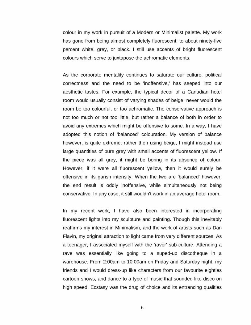
colour in my work in pursuit of a Modern or Minimalist palette. My work
has gone from being almost completely fluorescent, to about ninety-five
percent white, grey, or black. I still use accents of bright fluorescent
colours which serve to juxtapose the achromatic elements.
As the corporate mentality continues to saturate our culture, political
correctness and the need to be 'inoffensive,' has seeped into our
aesthetic tastes. For example, the typical decor of a Canadian hotel
room would usually consist of varying shades of beige; never would the
room be too colourful, or too achromatic. The conservative approach is
not too much or not too little, but rather a balance of both in order to
avoid any extremes which might be offensive to some. In a way, I have
adopted this notion of 'balanced' colouration. My version of balance
however, is quite extreme; rather then using beige, I might instead use
large quantities of pure grey with small accents of fluorescent yellow. If
the piece was all grey, it might be boring in its absence of colour.
However, if it were all fluorescent yellow, then it would surely be
offensive in its garish intensity. When the two are 'balanced' however,
the end result is oddly inoffensive, while simultaneously not being
conservative. In any case, it still wouldn't work in an average hotel room.
In my recent work, I have also been interested in incorporating
fluorescent lights into my sculpture and painting. Though this inevitably
reaffirms my interest in Minimalism, and the work of artists such as Dan
Flavin, my original attraction to light came from very different sources. As
a teenager, I associated myself with the 'raver' sub-culture. Attending a
rave was essentially like going to a suped-up discotheque in a
warehouse. From 2:00am to 10:00am on Friday and Saturday night, my
friends and I would dress-up like characters from our favourite eighties
cartoon shows, and dance to a type of music that sounded like disco on
high speed. Ecstasy was the drug of choice and its entrancing qualities
6

made one especially perceptive to the disco lights. I believe that the
ultimate inspiration for using light in my work comes from going to raves
and experiencing the entire Saturday Night Fever aesthetic. Inevitably
this also might relate to my tendencies towards 'bad' taste and so-called
kitsch.
Aesthetic References
My thesis work has taken the form of both painting and installation. With
regard to the technical processes of my paintings, I have recently begun
to work on the back of Plexiglas. I begin by covering the surface with
masking tape and then I map out a basic grid. Using a pencil and ruler, I
then draft simple geometric forms within the grid. When the final image is
complete, the various shapes and lines are cut out of the masking tape
with a utility knife, and painted with acrylic in flat colours. Once all the
shapes have been painted, the remainder of the masking tape is
removed. In some pieces, I then add a layer of sparkles mixed into
epoxy resin, before finally painting a solid background colour. Since the
Plexiglas is the top layer, these paintings are created in a subtractive
manner working from foreground to background.
The Plexiglas, flat paint handling, and sparkles, ultimately place a great
emphasis on the surface. This flattens the illusionistic space that is
created by the geometric shapes that appear in perspective. At first, the
slick graphic image might seem as if it had been created in a computer
program and printed onto the Plexiglas like a commercial advertising.
Upon closer inspection however, it becomes obvious that the work is
hand painted. In order to narrow that gap between the initial
misconception and subsequent realization that the work is hand-painted,
it is important to mimic the slick technical perfection of an industrially
manufactured product. Though I try to reduce 'the hand of the artist,' it is
7
important to me that the work remains a 'false' representation of
something industrially or digitally produced, in order to emphasize the
differences and discrepancies between the two. I am attracted to this
sense of false perception, things that are deceiving, not what they seem,
and can have double meanings; a painting for example that resembles a
digital graphic, or a representation of the future that is based on the past.
This may ultimately reveal how notions or perceptions of the future are
socially constructed.
In some works I have drafted the space using one or two point
perspective drawing. This means that shapes recede in space towards a
vanishing point. Recently however, I have been working with an
isometric perspective in which there is no vanishing point. The sides of a
cube for example, are represented with parallel lines. With this
approach, the back of a shape ends up with the same dimensions as the
front. When describing a shape as transparent or without solid planes, it
becomes confusing to distinguish between the front and back planes of
the form. There is a sort of optical illusion created where the space can
be inverted, and the front and back planes of a shape become
interchangeable.
Drafting with isometric perspective makes a strong reference to blueprint
drawing; it creates a flatter and less convincing representation of space.
I couple this effect with a golden mean method of composing space. My
simplistic use of golden mean sections results in stiff and contrived
shape designs in which forms ‘coincidentally’ line-up with one another.
This creates confusion as to where one shape may start and another
ends. The effect increases a sense of improbability, making the space
less believable and more difficult to enter.
8

3. Still from the movie ‘TRON’ (1982)
The flat geometric style that I have pursued in my paintings makes a
strong reference to the visual vocabulary of computer software. More
specifically, the combination of a flatly painted geometric stylization with
planes and grids in perspective makes reference to early computer
vector graphics and video games from the 1980s. I am interested in this
transitional period when traditional blueprint drawing in pencil on
isometric grid paper, began to be computerized into vector graphic
software. My paintings create a visual metaphor of traditional blueprint
drawing ‘evolving’ into computer vector graphics; ultimately though,
nothing has changed. The images are still hand drafted with pencils and
then hand painted. However feasible it may be to produce actual
computer graphics and exhibit digital prints, I feel that it is important that
the work remain hand-painted. This allows 'painting' to remain a
conceptual component of the work. In a sense, I am making traditional
paintings, however digital the end result may seem. In some recent
9

pieces, I have been leaving the vector lines clear and installing
fluorescent lights in the stretchers in order to have the line work glow.
For a split second, the viewer may actually have the impression that they
are looking at a digital image on a computer screen. However digital the
images may seem, they remain a false representation of computer
vector graphics. I appropriate the lexicon of digital software, but by
transferring them from the virtual space of the screen to a literal three-
dimensional space, the meaning is discarded. They become generalized
abstract signs that retain their connotations, but not their meaning and
function. The work thus makes a simple point in its refusal to 'get digital.'
There is a fetishization of technology, yet simultaneously a refusal of it.
On an aesthetic level, early vector graphics were much more ambiguous
in delineating or defining space in comparison to today's capabilities.
Such graphics would often appear as coloured contour lines that
denoted sharply defined geometric shapes floating on a solid black
background. The emphasis on geometry and contour had the effect of
an architectural or blueprint drawing. As computers evolved, digital
imaging became increasingly concerned with a more naturalistic
representation of space. I am interested in how the earlier period of
digital imaging, by providing a reduced level of information, was much
more open-ended and ambiguous in the way it described form and
space. There in fact seems to be a coincidental aesthetic alignment in
1980s computer graphics with the work of Suprematist painters such as
Kasimir Malevich. If a great goal of twentieth-century art was the
reduction in form and content, then it is interesting to consider how
earlier computer graphics were perhaps more in tune with ideas or
approaches in contemporary art making. As digital imaging moves closer
towards a naturalistic mode of representation, it seems to be
increasingly concerned with illustrative matters.
10

4. Album and film covers for the movie ‘TRON’ (1982)
The movie ‘TRON’ (1982), which is supposed to take place in an actual
computer, is a good example of early 1980’s computer graphics. The film
has been especially influencial in my new work. It also evidences a
sense of optimism regarding the advent of personal computers. The
early electronic music of Kraftwerk, with track titles like Computer Liebe
(computer love) and It’s More Fun to Compute, also evidences a similar
sentiment of enthusiasm and curiosity regarding computers (and
synthesizers).
5. Album cover of Kraftwerk’s 'Computerwelt’ (computer world)
11

While focusing on the stylistic premise of computer graphics, I have
inevitably aligned my work with issues that relate to design and
technology. Within these topics I am particularly concerned with the
ways in which images of the 'futuristic' are constructed. I have been
interested in constructing a visual metaphor of utopia in my work. More
specifically, the brand of utopian thinking that was developed in high
Modernism with the work of designers such as Le Corbusier and Mies
Van der Rohe. Their visions of the future reveled in the reduction of form
and content, and placed faith in the potential of technological progress. I
am interested in understanding how ideas or notions of the future and
utopia are constructed and manifest themselves in our built environment.
Deeply rooted in Modernist ideology was the idea of progress. There
was a great sense of optimism and hope towards technological
advancement, and a belief that society was evolving to something
greater. In the fine arts there was the sincere belief that International
Style architecture and reductive abstract painting were improvements on
their predecessors. The denial of decoration and nostalgia was
understood as a progressive move forward. It was thought that through
reduction and objectivity, it was possible to communicate truth on a
fundamental and universal level. A Mies van der Rohe office tower for
example, could communicate a sense of logic and control over its
environment had utopian overtones; that by reducing form to its essential
elements, a primary and universal truth could be communicated.
Representations of the future have also come to be communicated
through a specific lexicon of signs; aesthetic signifiers that communicate
the idea of the future. These signs change from period to period, and
ultimately just reflect their own contemporary concerns or aspirations. In
the twentieth century, it seems as though the ideas that emanated from
12

Modern avant-garde design set up the basis for how the future would be
envisaged. From Das Werkbund (DWB), the Bauhaus and Burg
Gielbichenstein, to the International Style, the future was constructed to
be rational, objective, minimal; to reject the past, to be made of
'industrial' materials, and to be concerned above all else with
technological advancement.
This quasi-futuristic sensibility was emphasized in modular design from
the 1960s and 1970s. Architect Moshe Safdie best exemplified modular
design in his Habitat ‘67 housing complex that was featured at Expo ’67
in Montreal. In his thesis put forward to McGill University in 1960, Safdie
wrote of a “system of spatial urbanization with unlimited growth potential,
based on the three-dimensional networking of elements that are
standardized and can fit together harmoniously to fulfill all the urban
functions in variable, complex, and evolving patterns” (Elder, 65). Pre-
fabricated modular systems held great promise in the 1960s, and Habitat
was designed to be a type of housing complex for the future. Today it
stands as an icon of the optimistic thinking that prevailed in the 1960s
regarding technology, design, and the future. Although large-scale
projects like Habitat ’67 were not widely adopted, modular design had a
great impact in industrial design. Automotive manufacturers for example
have become increasingly conscious of design, and particularly
receptive to the slick, efficient, and plastic sensibility of 1960s modular
design. Cars have become a kind of traveling utopian module where one
can travel through an environment while maintaining the illusion of
comfort, stability, and control. The interior designs of most trailer homes
also implement modular systems in order for maximal efficiency. Having
spent my summers in a trailer home as a child, this modular plastic
environment and its futuristic design sensibility have been a great
influence on my practice. I have become especially concerned with how
utopian ideals can be manifested through functional design.
13

6. Habitat ‘67 in Montreal (Moshe Safdie, 1967)
In the 1960s, design also shifted its attention away from modernist
applications of steel and glass towards an exuberant pop aesthetic that
made use of the new possibilities that plastics presented. Author Brent
Cordner wrote that “plastic was the counterpart of utopia. It
complemented the expression of an ideal future because the vessel-like
forms that emerged from its properties found agreement in how an
abstract concept such as utopia was formalized. The hermetic capacity
of plastic married well with the insular requirements of sixties
utopianism- material, form, and idea coalesced into ideal
representations” (Elder, 92). In my recent work, I have been using
Plexiglas in both sculptural pieces and as a painting surface. I am
interested in the inherent meanings and associations that arise with the
use of plastics.
The other components of my thesis work are installations comprised
mostly of quasi-futuristic computer consoles. The influences for these
pieces come from science-fiction images from pop culture, including
television shows like Dr. Who, Space 1999, and the original Star Trek.
14

These three television series were from the 1960s and 1970s, and
shared a similar aesthetic in set design; namely that of ambitious yet
low-budget sets that were flashy, cheap, and often very unconvincing.
They were extremely theatrical in the sense that everything was made to
look hyper-futuristic, despite the logistics of what might actually be
probable. In the end, it was all very cliché and contrived: aerodynamic
furniture, one-piece bodysuits, pentagon shaped hallways, and big
important-looking computers with flashing jewel-like rainbow coloured
lights that did seemingly important things. One might wonder what was
going on with all those blinking lights; perhaps the computer was thinking
up some grand scheme to take over the world. Or maybe it was just a
cardboard box with flashing Christmas lights in it. This uncertainty in
reading the object is what interests me. Science fiction nowadays seems
very slick and convincing; it sets up a more believable fantasy (similar
perhaps to the evolution in digital imaging). With early science fiction
however there is a distancing that occurs as the contemporary viewer is
usually aware of the theatricality of the situation. It is obvious for
example that the alien landscapes in Star Trek are made of papier-
maché rocks with overhead fuchsia-coloured spotlights. It is as though
the signs become confused and reveal that they are empty or not what
they seem. The papier-maché rocks on Star Trek are not convincing and
as such their primary reading become that of low-budget 1960s set
design, instead of actual rocks. The super-computers that appeared on
Star Trek have also revealed themselves with time as theatrical signs.
Now they primarily signify an idea of what people once thought
computers would look like. They are the representation of an unrealized
and obsolete future; it is highly doubtful that a spaceship of the future
would ever look like one from Star Trek.
15
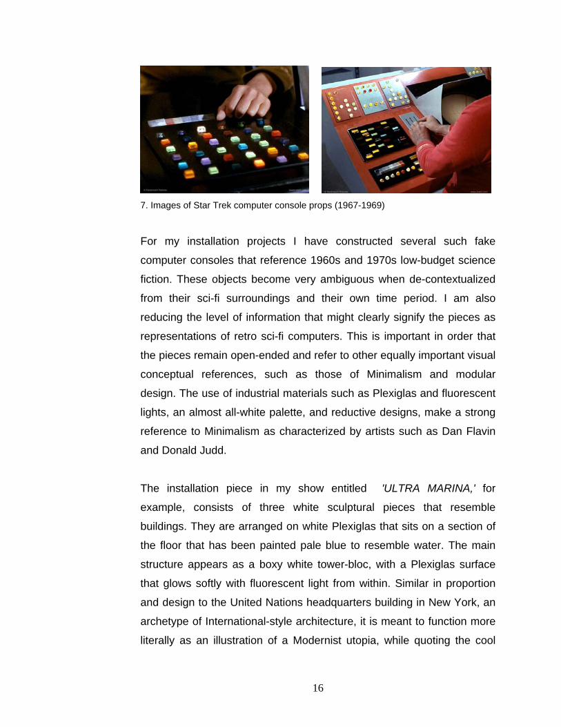
7. Images of Star Trek computer console props (1967-1969)
For my installation projects I have constructed several such fake
computer consoles that reference 1960s and 1970s low-budget science
fiction. These objects become very ambiguous when de-contextualized
from their sci-fi surroundings and their own time period. I am also
reducing the level of information that might clearly signify the pieces as
representations of retro sci-fi computers. This is important in order that
the pieces remain open-ended and refer to other equally important visual
conceptual references, such as those of Minimalism and modular
design. The use of industrial materials such as Plexiglas and fluorescent
lights, an almost all-white palette, and reductive designs, make a strong
reference to Minimalism as characterized by artists such as Dan Flavin
and Donald Judd.
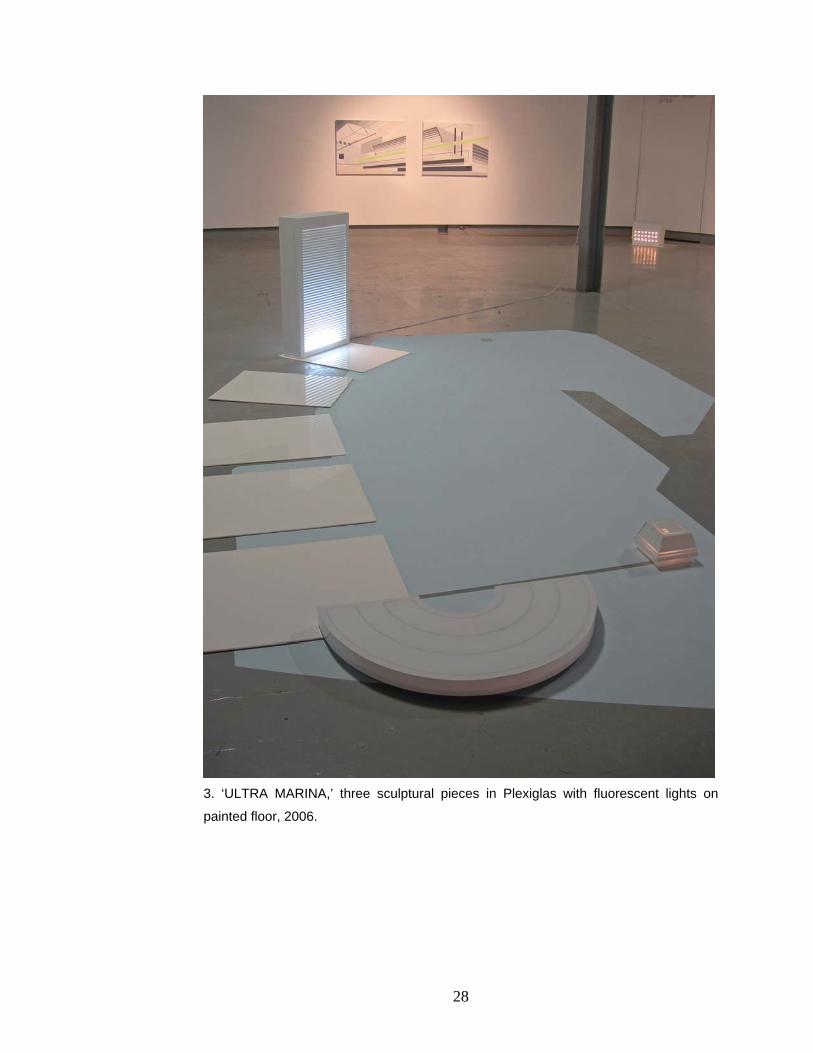
The installation piece in my show entitled 'ULTRA MARINA,' for
example, consists of three white sculptural pieces that resemble
buildings. They are arranged on white Plexiglas that sits on a section of
the floor that has been painted pale blue to resemble water. The main
structure appears as a boxy white tower-bloc, with a Plexiglas surface
that glows softly with fluorescent light from within. Similar in proportion
and design to the United Nations headquarters building in New York, an
archetype of International-style architecture, it is meant to function more
literally as an illustration of a Modernist utopia, while quoting the cool
16
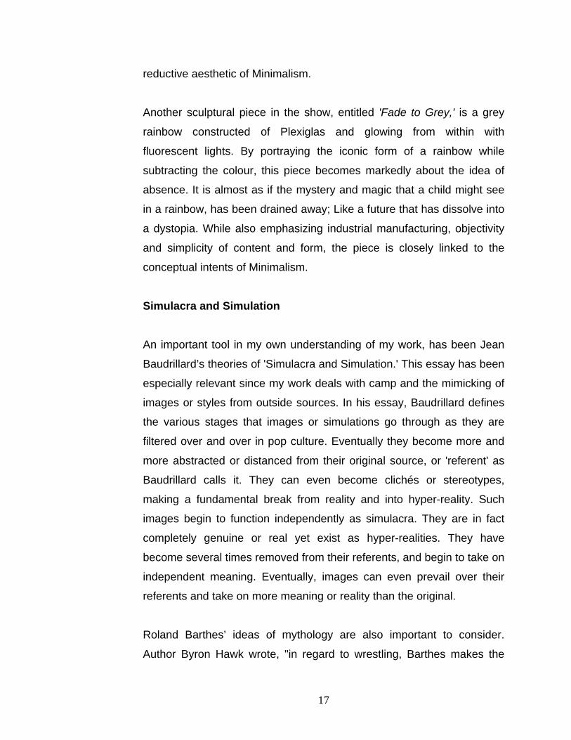
reductive aesthetic of Minimalism.
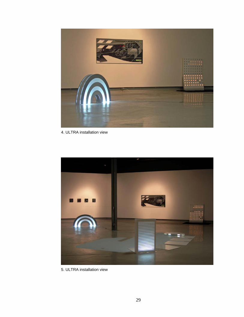
Another sculptural piece in the show, entitled 'Fade to Grey,' is a grey
rainbow constructed of Plexiglas and glowing from within with
fluorescent lights. By portraying the iconic form of a rainbow while
subtracting the colour, this piece becomes markedly about the idea of
absence. It is almost as if the mystery and magic that a child might see
in a rainbow, has been drained away; Like a future that has dissolve into
a dystopia. While also emphasizing industrial manufacturing, objectivity
and simplicity of content and form, the piece is closely linked to the
conceptual intents of Minimalism.
Simulacra and Simulation
An important tool in my own understanding of my work, has been Jean
Baudrillard’s theories of 'Simulacra and Simulation.' This essay has been
especially relevant since my work deals with camp and the mimicking of
images or styles from outside sources. In his essay, Baudrillard defines
the various stages that images or simulations go through as they are
filtered over and over in pop culture. Eventually they become more and
more abstracted or distanced from their original source, or 'referent' as
Baudrillard calls it. They can even become clichés or stereotypes,
making a fundamental break from reality and into hyper-reality. Such
images begin to function independently as simulacra. They are in fact
completely genuine or real yet exist as hyper-realities. They have
become several times removed from their referents, and begin to take on
independent meaning. Eventually, images can even prevail over their
referents and take on more meaning or reality than the original.
Roland Barthes’ ideas of mythology are also important to consider.
Author Byron Hawk wrote, "in regard to wrestling, Barthes makes the
17

important observation that what the public wants is the image of passion,
not passion itself. The desire for the spectacle, for the image, for the
archetype, pervades the mentality of the viewing public. We want the
image of violence in movies but not violence itself... [T]he spectator
does not wish for the actual suffering of the contestant; he only enjoys
the perfection of the iconography" (Hawk). Essentially, we want
imaginary passion, without the real thing (which might lead to pain and
suffering).
As our culture becomes increasingly absorbed with images, namely
advertising and television, it has begun to take the form of a massive
hyper-realty. Simulations evolve from simulations, distancing any notion
of a primary referent. Our culture becomes exaggerated or a caricature
of itself that is basking in artifice, stereotype, and camp. It is at this point
that the world can be clearly seen as a series of stage sets; that the
status-quo perception of reality is constructed, theatrical, and in itself a
myth. Influential Artists
There are several artists who have been influential in the direction that
my practice is taking. Many of these contemporary artists build from the
ideas of early Suprematist thinking, namely the work of Russian painter
Kasimir Malevich, who was a pioneer of geometric abstraction. He
began working in an unexceptional Post-Impressionist manner, but by
1912 was painting in a style closer to that of Cubism and Futurism.
Malevich desired however `to free art from the burden of the object' and
launched the Suprematist movement, which brought abstract art to a
style of geometric simplicity more radical than anything previously seen.
As early as 1913, he made a painting that consisted of nothing more
than a black square on a white field. Some of his other works from the
18

1910s introduced colours contained in simple and flatly painted
geometric forms in perspective that suggested a deeper spatial relation.
Almost a century later, artists such as Julie Mehretu and Benjamin
Edwards incorporate many motifs that were common in Suprematism. It
is interesting to consider however that the contemporary work that
follows in the footsteps of Suprematism tends to simultaneously
reference early computer graphics. In the early stages of digital imaging,
the technology was not capable of producing very naturalistic effects.
This era of digital imaging was characterized by a flat stylization with
simply articulated planes that seemed to evoke the aesthetic of
Suprematist painting. Another reference is that of Modern architecture,
which was in its early stages during the actual time of Suprematism.
8. Benjamin Edwards, ‘Historical Zone #0053,’ 2005.
Benjamin Edwards is a painter who explores what he calls 'the
architecture of suburbia,' found in strip malls, fast-food restaurants, gas
stations, motels and other familiar places of consumerism.
Accompanying the architecture is what Edwards refers to as 'the
19

iconography of the roadway,' including commercial signage, symbols,
colours and artificial elements juxtaposed against the natural
environment. Edwards takes these images and digitally reduces them to
flatly coloured graphics. He then carefully layers them one over the other
in acrylic paintings. The result is a conflated composition that becomes
emblematic of what he refers to as the 'American consumerist utopia.'
His paintings end up looking misleadingly futuristic, but by sourcing
imagery that actually exists, he claims that the future is now. His work
has been especially influencial to me in the linking of utopian themes
with the evolution of computers. It is almost as though he is saying that
the future is not in our actual built environment, but rather our virtual
environment; that the new site of utopia is in fact the internet.
9. Julie Mehretu, Empirical Construction, 2003.
Julie Mehretu’s often large-scale paintings are built up with layers of
delicate ink drawings and coloured shapes in acrylic, between a thick
20

layer of silica. Drawings of explosions and abstract forms that reference
elements of architecture, early digital imaging, and Suprematism, are
juxtaposed in complex bursting compositions. Her work feels like a
cataclysmic explosion of images. Perhaps it alludes to how our daily
lives have become overwhelmed by a barrage of images; a society that
is moving so fast that it is bound to explode. Her work has been
influential to me in regard to its simultaneous referencing of
Suprematism and early computer graphics.
10. Sarah Sze, Proportioned into the Groove, 2005.
Sarah Sze is an artist who works in 2-D and 3-D. I had the opportunity to
see one of her elaborate installation projects in New York. In her
whimsical constructions, Sze organizes small found objects such as
toothpicks, candy, plastic cups, clothespins, and pencils into complex
arrangements dependent upon their wall, floor, or shelf supports. Her
21

constructions seem to defy gravity and come together to form entire
micro-cities, complete with lights and waterfalls. They have futuristic and
utopian qualities that are ultimately undermined by their inherent fragility.
Her work inspired me too focus more specifically on the theme of
unlikely utopian cities that are on the brink of disaster.
11. Brian Alfred, Lobby, 2004.
Brian Alfred works with video animation, painting and collage. His digital
animations use images he has painted or collaged, and are
accompanied by electronic music. He works with themes of a passively
aggressive hi-tech society that seems to be nearing both disaster and
utopia simultaneously. Endless high-rises, various mass-transit vehicles,
nuclear reactors, high-voltage electric wires, piles of computers and
cables, and fenced landscapes are some of his landscape and still-life
subjects. I am particularly interested in how his style of flat paint
22

handling references digital imaging reminiscent of the 1990’s, and how it
is linked to the cool environment of corporate places.
12. Sarah Morris, Metro Center (Capital), 2001.
Sarah Morris is a New York based artist, for whom I worked as an intern
in 2005. Her work strongly references geometric abstraction, but it is
interesting how a contemporary reading of her work brings in references
to early digital imaging. She works from the realm situated between the
two, emphasizing the digital references by painting spaces with grids in
perspective, which was a common motif in 1980s digital imaging (as
seen in the movie TRON for example). Though I have always been
attracted to a graphic style of painting with flat colours, working with
Sarah Morris made me seriously consider it for my own work.
23
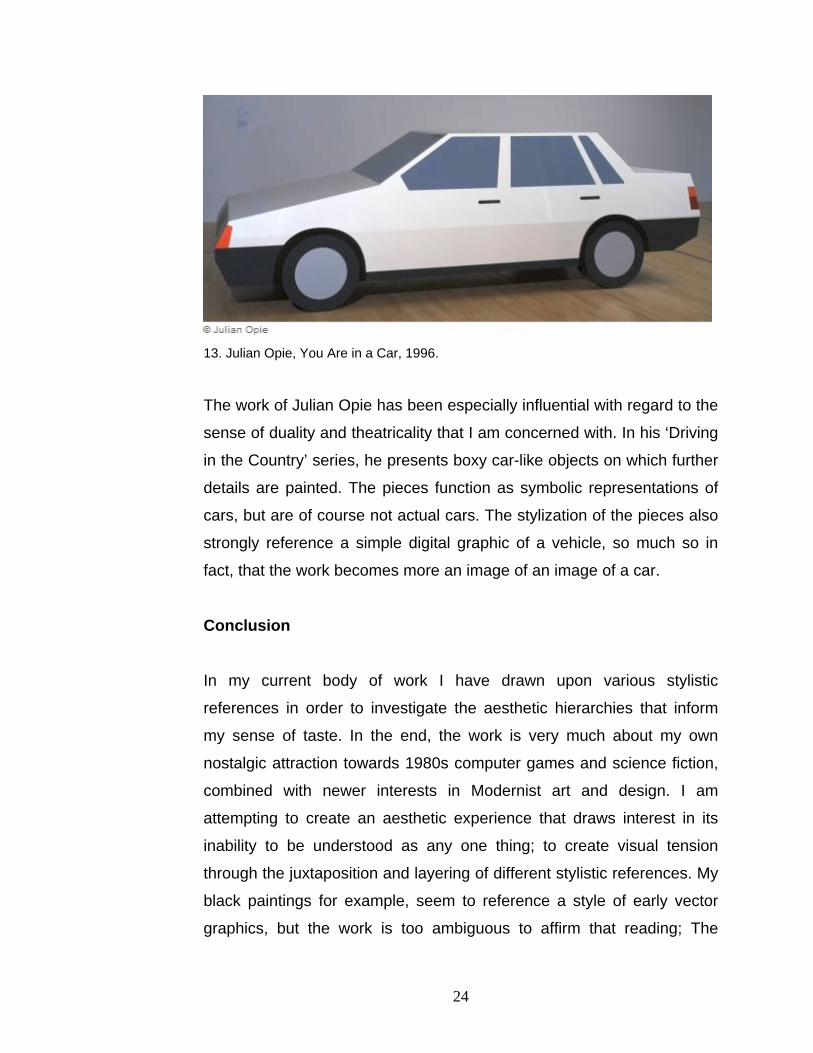
13. Julian Opie, You Are in a Car, 1996.
The work of Julian Opie has been especially influential with regard to the
sense of duality and theatricality that I am concerned with. In his ‘Driving
in the Country’ series, he presents boxy car-like objects on which further
details are painted. The pieces function as symbolic representations of
cars, but are of course not actual cars. The stylization of the pieces also
strongly reference a simple digital graphic of a vehicle, so much so in
fact, that the work becomes more an image of an image of a car.
Conclusion
In my current body of work I have drawn upon various stylistic
references in order to investigate the aesthetic hierarchies that inform
my sense of taste. In the end, the work is very much about my own
nostalgic attraction towards 1980s computer games and science fiction,
combined with newer interests in Modernist art and design. I am
attempting to create an aesthetic experience that draws interest in its
inability to be understood as any one thing; to create visual tension
through the juxtaposition and layering of different stylistic references. My
black paintings for example, seem to reference a style of early vector
graphics, but the work is too ambiguous to affirm that reading; The
24
image could be anything from a computer graphic on a monitor screen,
to a lunar colony in space, or perhaps a Suprematist-like graphic design.
The layerings of visual references confuse one another and create a
sense of ambiguity and open-endedness. There is also a subversive
quality in the visually mimesis of computer vector graphics which
stubbornly remain in the traditions of hand drafting and painting instead
of being digitally printed. By transferring the graphics from the computer
monitor into the physical space of a painting, the images lose their
meaning and become empty or false signifiers that are superficial and
purely aesthetic. This sense of falseness and theatricality reaffirms my
interest in the sensibility of camp. With a sense of irony, I have been
attempting to blur certain distinctions between high and low culture, the
future and past, and notions of good versus bad taste
25

Bibliography Crone, R., D. Moos (1991). Kazimir Malevich: The Climax of Discourse. London:
Reaktion Books Ltd.
Elder, A. C. (2005). Made in Canada: Craft and Design in the Sixties. Montreal,
Quebec: McGill-Queen’s University Press.
Grosenick, U. (2005). ART NOW 2. Cologne: Tashen.
Hawk, B. Mythologies. http://www.uta.edu/english/hawk/semiotics/barthes.htm
(accessed March 2, 2006).
Horlock, M. (2004). Julian Opie. London: Tate Publishing.
Kant, I. (1790). The Critic of Judgement.
http://etext.library.adelaide.edu.au/k/kant/immanuel/k16j/ (accessed May 8, 2006).
Nymphius, F. (2002). Sammlung Daimler Chrysler: Minimalism and After. Berlin: Dr.
Cantz'sche Druckerei.
Nymphius, F., R. Wiehager (2003). Sammlung Daimler Chrysler: Minimalism and After
II. Berlin: Dr. Cantz'sche Druckerei.
Schwabsky, B. (2002). Vitamin P: New Perspectives in Painting. London: Phaidon
Press Limited.
Sontag, S. (1964). Notes on Camp.
http://interglacial.com/~sburke/pub/Susan_Sontag_-_Notes_on_Camp.html (accessed
May 8, 2006).
Woodman, J. M. (1997). Twentieth-Century Design. Honk Kong: Oxford University
Press.
26

ULTRA: Studio Work for Thesis Exhibition
1. Fade to Grey, 24” x 48”, Plexiglas, acrylic, frosted mylar, and fluorescent lights, 2006
2. ULTRA installation view
27
3. ‘ULTRA MARINA,’ three sculptural pieces in Plexiglas with fluorescent lights on
painted floor, 2006.
28
4. ULTRA installation view
5. ULTRA installation view
29

6. detail of ‘ULTRA MARINA’
30
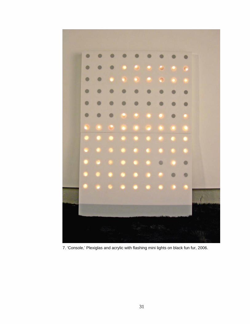
7. ‘Console,’ Plexiglas and acrylic with flashing mini lights on black fun fur, 2006.
31

8. ‘Snow White,’ 18” x 18”, Acrylic on Plexiglas with Fluorescent light, 2006.
9. Convention Center, 2 panels at 36” x 48” each, Gesso and Acrylic on Board, 2006
32

10 ’Epsilon,’ 36” x 72”, Acrylic, sparkles and epoxy resin on Plexiglas, 2006.
11. detail of ‘Epsilon’
33
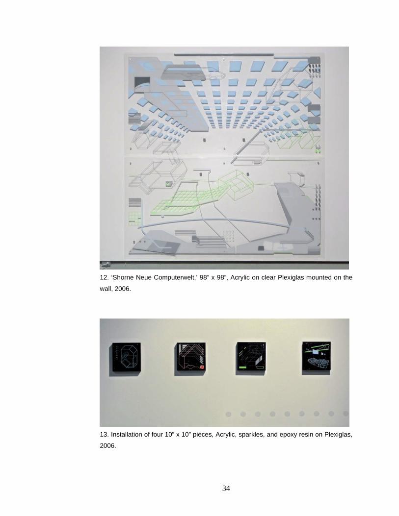
12. ‘Shorne Neue Computerwelt,’ 98” x 98”, Acrylic on clear Plexiglas mounted on the
wall, 2006.
13. Installation of four 10” x 10” pieces, Acrylic, sparkles, and epoxy resin on Plexiglas,
2006.
34