@gita_m @EuroTestConf
About myself
Industries Countries
SyncHerts
Entrepreneur QA Champion
@gita_m @EuroTestConf
What this talk will be about?
First Project
Quick Tips
Useful Tools
@gita_m @EuroTestConf
What is responsive website?
Responsive Web design is the approach that suggests that design and development should respond to the user’s behaviour and environment based on screen size, platform and orientation.
~ Wikipedia

@gita_m @EuroTestConf
@gita_m @EuroTestConf
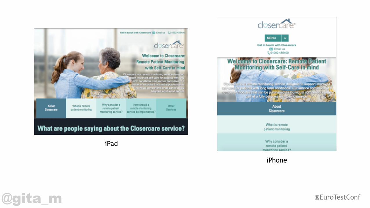
iPhone
iPad
@gita_m @EuroTestConf
Problems on initial project• Which devices to test? • Android vs iPhone • Devices missing • Personal phones • Not charged • Not connected to Wifi • How to make screenshots and get them out?

@gita_m @EuroTestConf
Clarify & Research & Plan
@gita_m @EuroTestConf
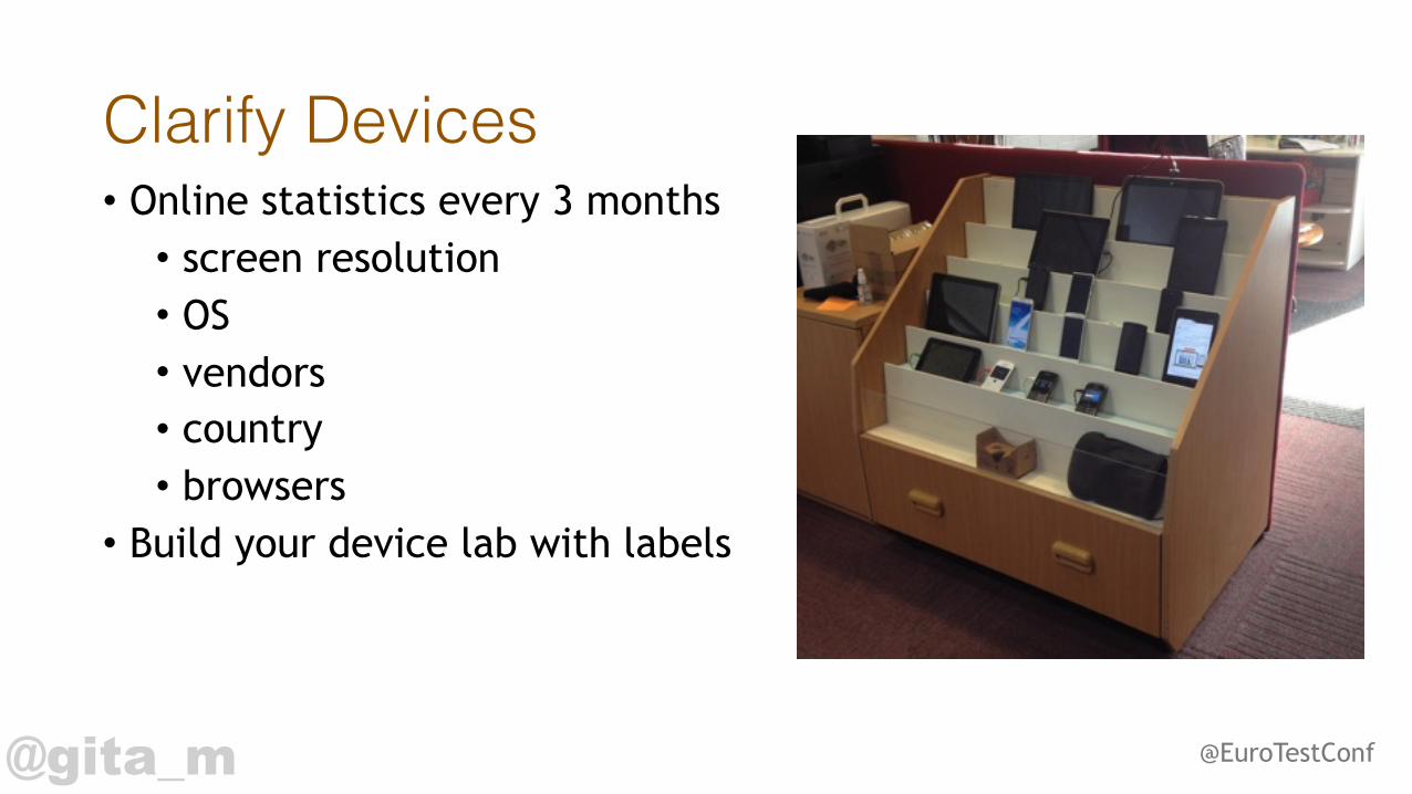
Clarify Devices• Online statistics every 3 months • screen resolution • OS • vendors • country • browsers
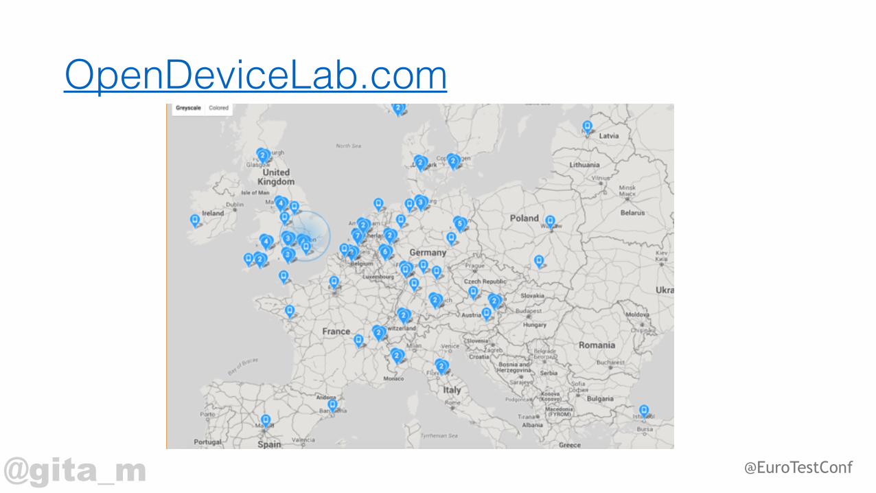
• Build your device lab with labels
@gita_m @EuroTestConf
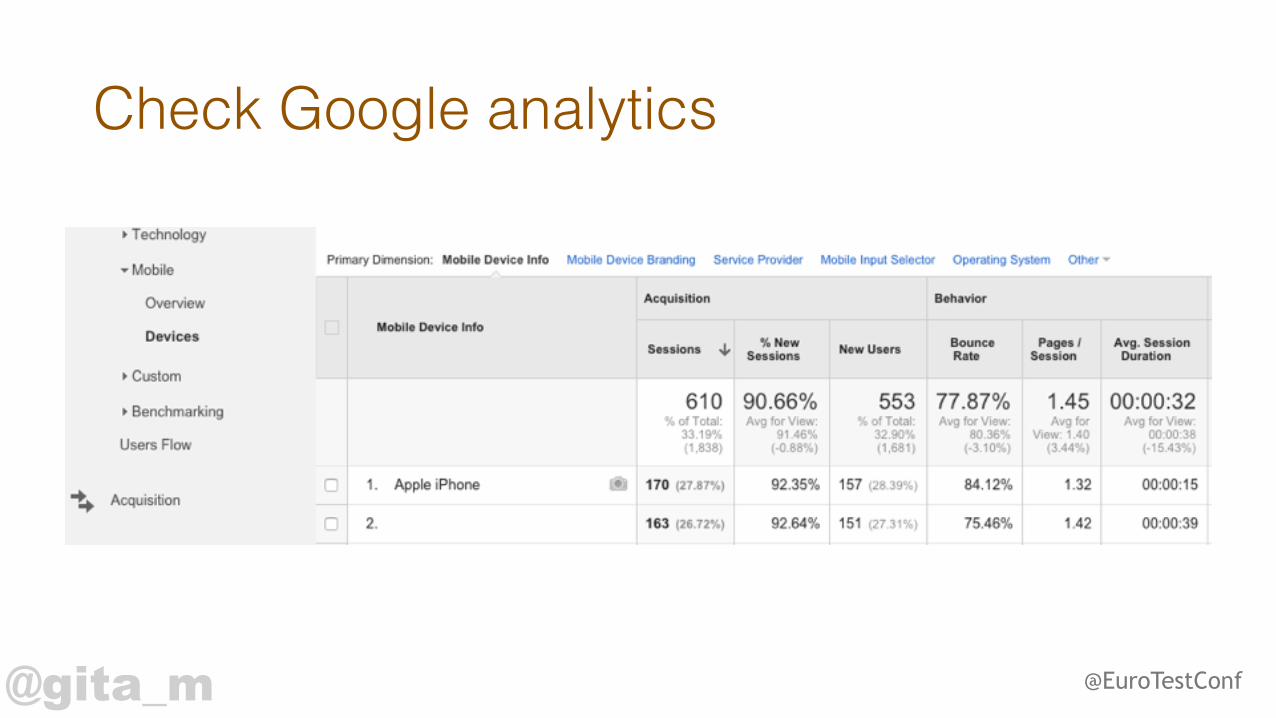
Check Google analytics

@gita_m @EuroTestConf
Google mobile-friendly test
@gita_m @EuroTestConf
Client involvement• Limited devices • Little knowledge • Inaccurate expectations of responsive design • Understand time constraints • Clarify browsers
@gita_m @EuroTestConf
Design• Never on time • Rarely responsive • Mobile first / Website first • Testers = business analysts • Developers = designers
@gita_m @EuroTestConf
Testing
@gita_m @EuroTestConf
Load time is important

@gita_m @EuroTestConf
Usual problems with load1. Unoptimised images 2. Icons fonts 3. Large videos 4. Bulky Code 5. Data in production
@gita_m @EuroTestConf
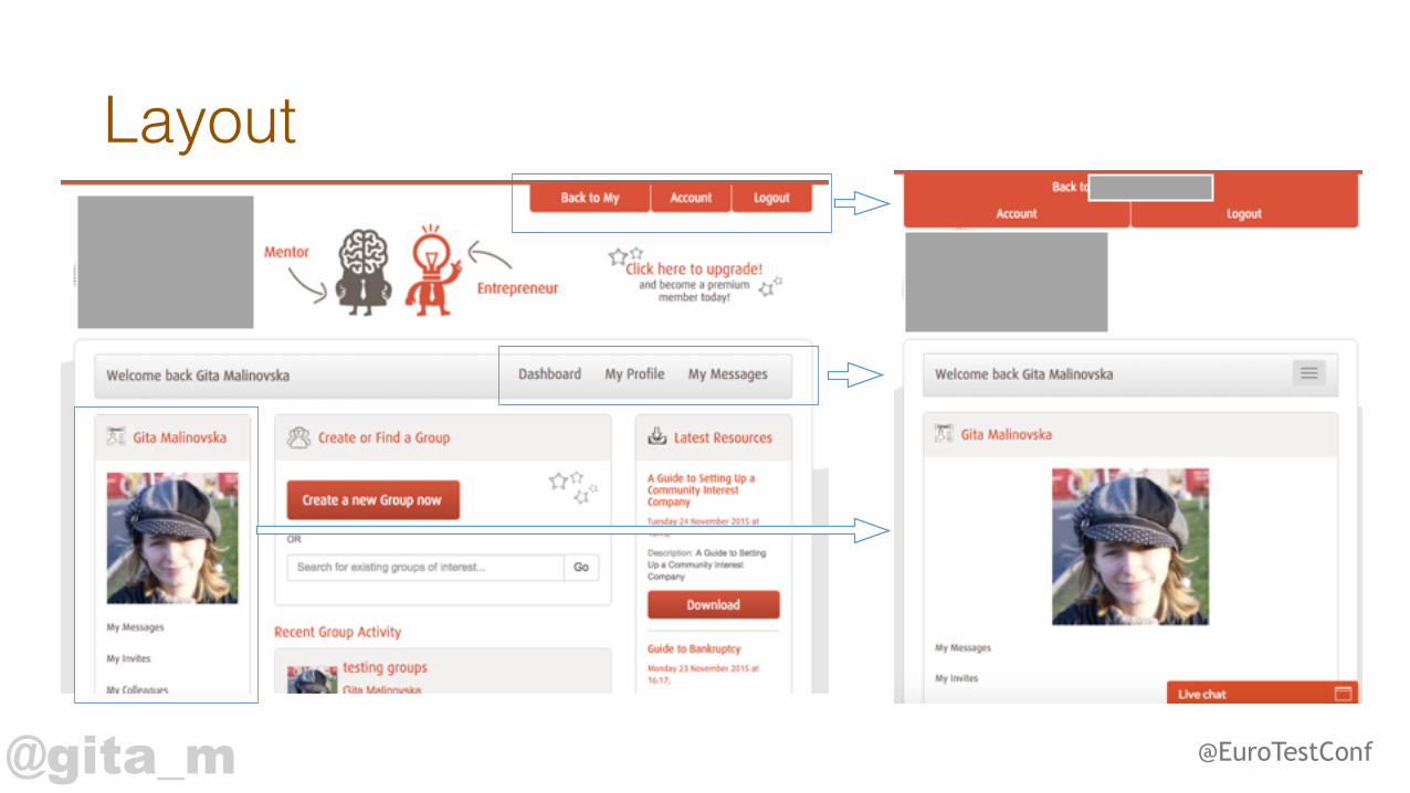
Layout

@gita_m @EuroTestConf
Pay extra attention to• Long text • Tables / Graphs • Auto complete fields • Date pickers • Dialog boxes • Headers / footers
@gita_m @EuroTestConf
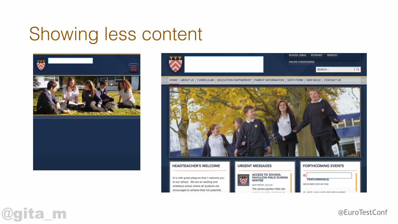
Showing less content
@gita_m @EuroTestConf
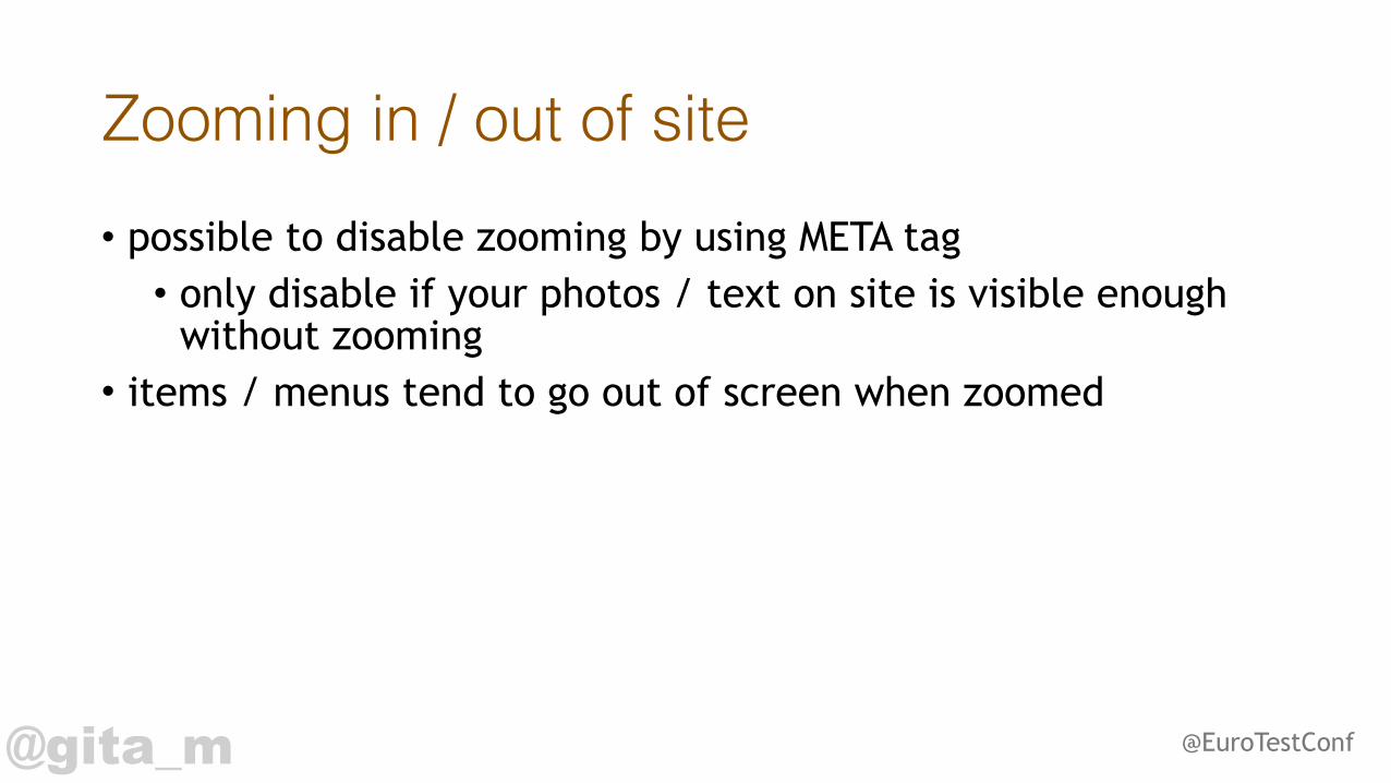
Zooming in / out of site• possible to disable zooming by using META tag • only disable if your photos / text on site is visible enough
without zooming • items / menus tend to go out of screen when zoomed
@gita_m @EuroTestConf
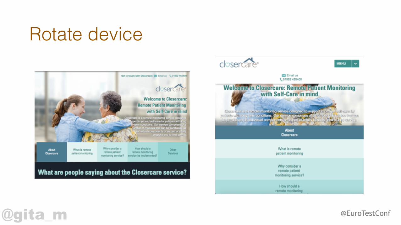
Rotate device

@gita_m @EuroTestConf
Browser vs Responsive
@gita_m @EuroTestConf
Use tools
@gita_m @EuroTestConf
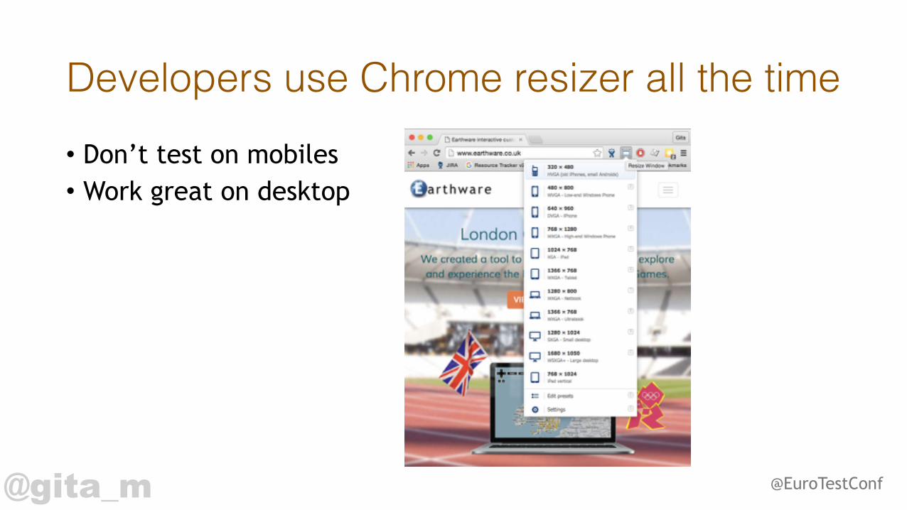
Developers use Chrome resizer all the time• Don’t test on mobiles • Work great on desktop

@gita_m @EuroTestConf
BrowserStack

@gita_m @EuroTestConf
Emulators can’t emulate everything• Gestures (tap, pinch, zoom) • Interruptions (calls, battery running low, internet disappearing) • Performance and load • Look and feel • Orientation change • Display brightness, saturation and similar
@gita_m @EuroTestConf
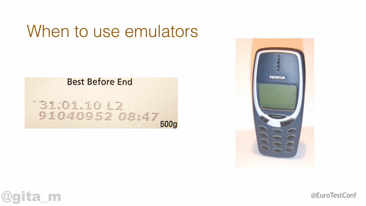
When to use emulators
@gita_m @EuroTestConf
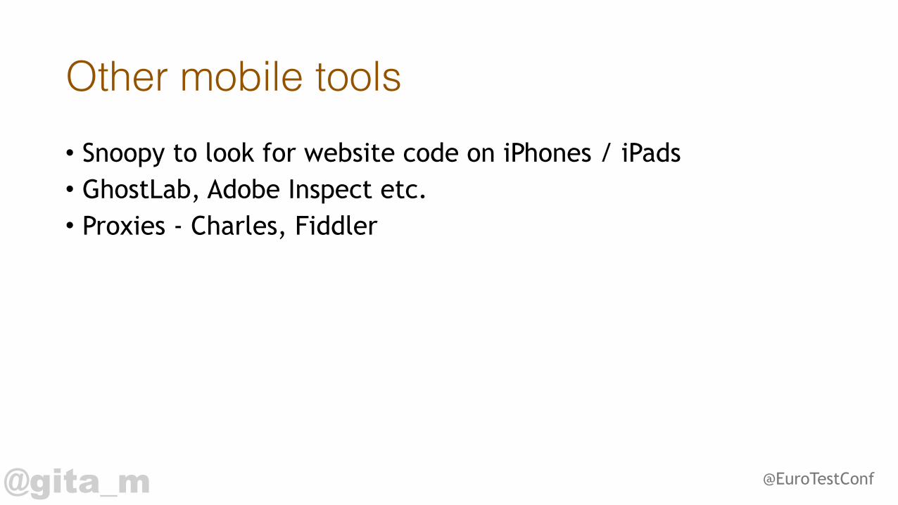
Other mobile tools• Snoopy to look for website code on iPhones / iPads • GhostLab, Adobe Inspect etc. • Proxies - Charles, Fiddler
@gita_m
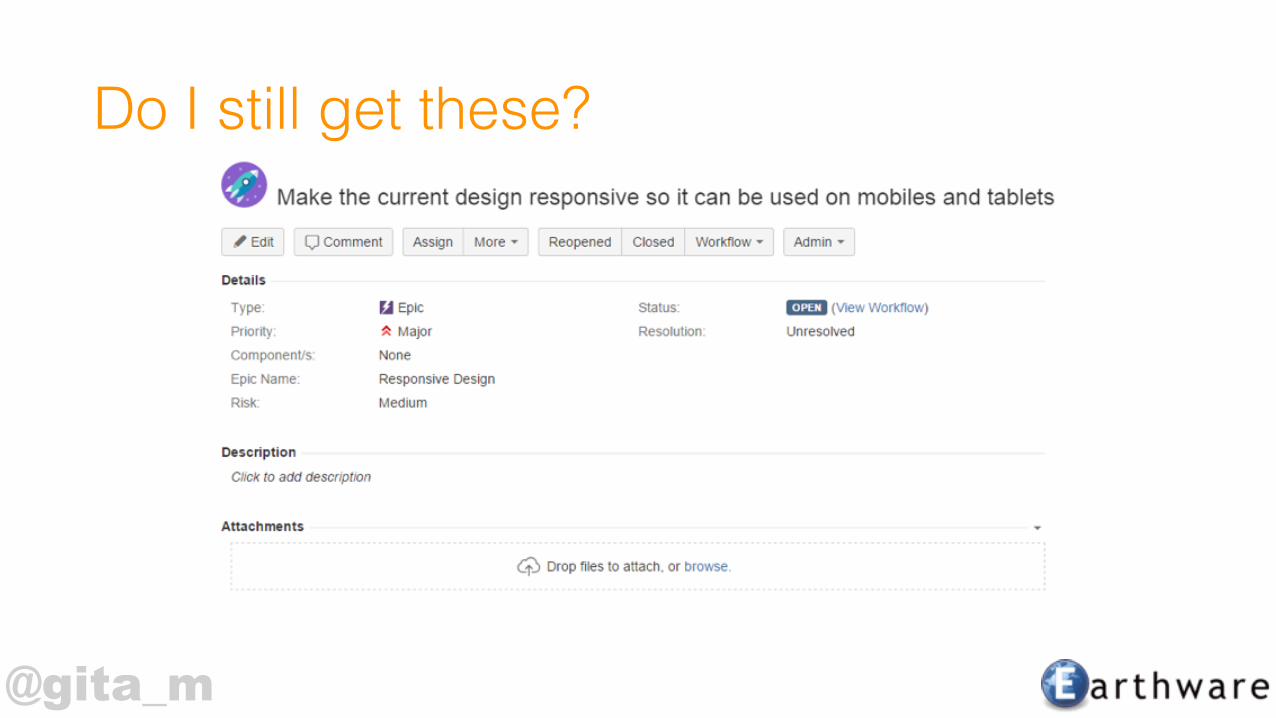
Do I still get these?

@gita_m @EuroTestConf
Three challenges for you1. Clarify your devices 2. Understand user behaviour 3. Find tools that works for you


![Benchmarking of Responsive Websites - UEM Sunrise Websites - [ February 2016 ]](https://static.cupdf.com/doc/110x72/587369bd1a28abe7648b76df/benchmarking-of-responsive-websites-uem-sunrise-websites-february-2016.jpg)