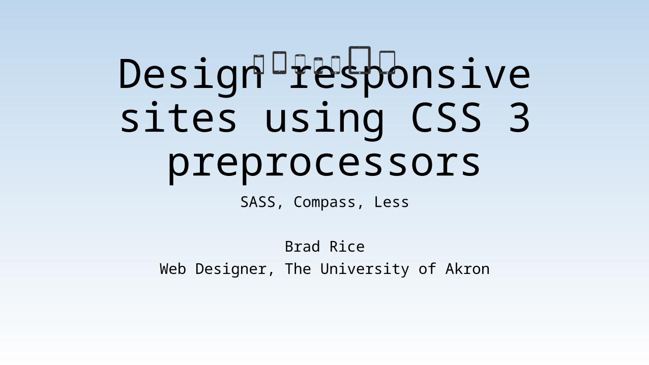
Design responsive sites using CSS 3 preprocessors SASS, Compass, Less Brad Rice Web Designer, The University of Akron

Welcome message from author
This document is posted to help you gain knowledge. Please leave a comment to let me know what you think about it! Share it to your friends and learn new things together.
Transcript
Design responsive sites using CSS 3 preprocessors
SASS, Compass, Less
Brad RiceWeb Designer, The University of Akron


Default viewport is 960px
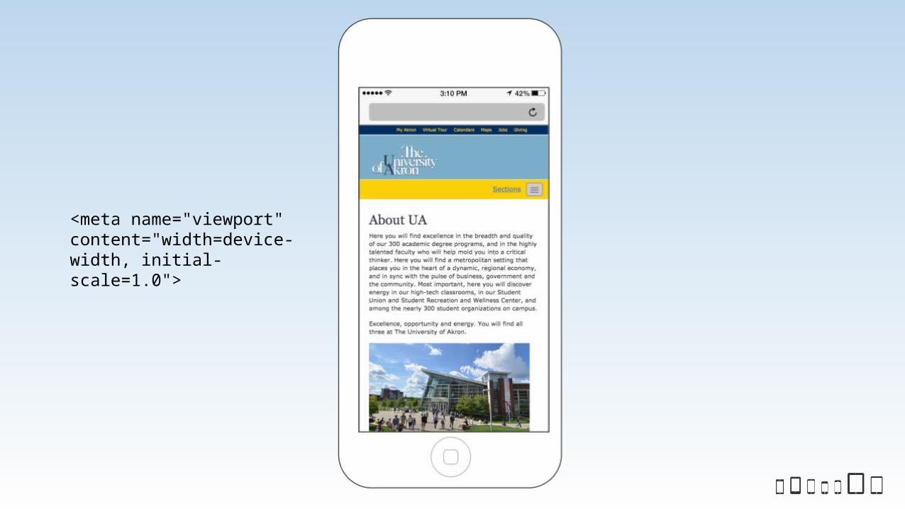
<meta name="viewport" content="width=device-width, initial-scale=1.0">
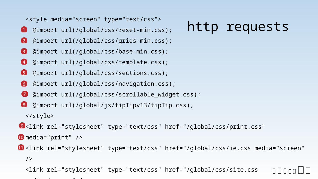
<style media="screen" type="text/css">
@import url(/global/css/reset-min.css);
@import url(/global/css/grids-min.css);
@import url(/global/css/base-min.css);
@import url(/global/css/template.css);
@import url(/global/css/sections.css);
@import url(/global/css/navigation.css);
@import url(/global/css/scrollable_widget.css);
@import url(/global/js/tipTipv13/tipTip.css);
</style>
<link rel="stylesheet" type="text/css" href="/global/css/print.css"
media="print" />
<link rel="stylesheet" type="text/css" href="/global/css/ie.css media="screen"
/>
<link rel="stylesheet" type="text/css" href="/global/css/site.css
media="screen" />
http requests
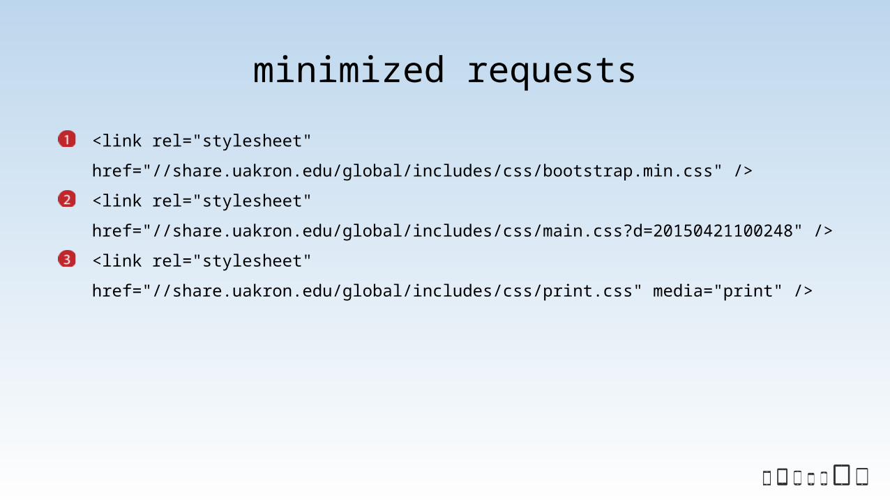
<link rel="stylesheet"
href="//share.uakron.edu/global/includes/css/bootstrap.min.css" />
<link rel="stylesheet"
href="//share.uakron.edu/global/includes/css/main.css?d=20150421100248" />
<link rel="stylesheet"
href="//share.uakron.edu/global/includes/css/print.css" media="print" />
minimized requests
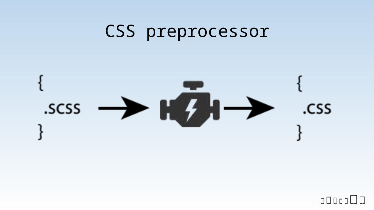
CSS preprocessor
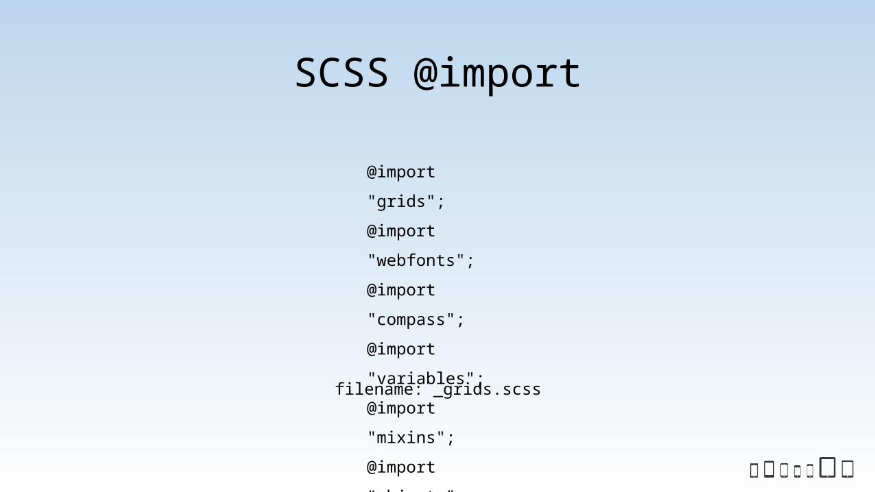
SCSS @import
@import "grids";
@import "webfonts";
@import "compass";
@import "variables";
@import "mixins";
@import "objects";
filename: _grids.scss

SCSS @import
@import "tablet";
@import "desktop";
@import "large";
@import "huge";
Use media queries at the bottom of main the sass file

Compiling SASS
From command line:
sass style.scss - prints to screen
sass style.scss ../css/style.css – prints to file
sass –-watch style.scss ../css/style.css – watches file for
changes
with compass: compass watch – watches entire scss directory
uses a config.rb file for configuration of where to save file changes

Compiling SASS using Compass
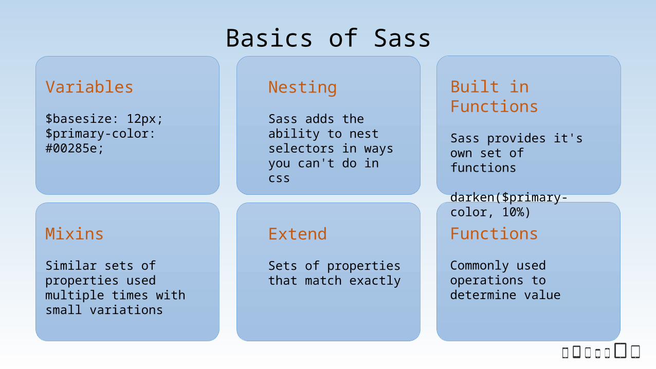
Basics of Sass
Mixins
Similar sets of properties used multiple times with small variations
Extend
Sets of properties that match exactly
Functions
Commonly used operations to determine value
Variables
$basesize: 12px;$primary-color: #00285e;
Nesting
Sass adds the ability to nest selectors in ways you can't do in css
Built in Functions
Sass provides it's own set of functions
darken($primary-color, 10%)
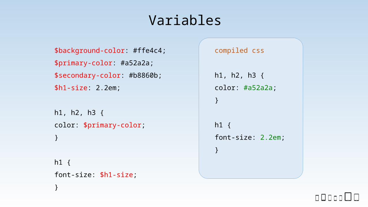
$background-color: #ffe4c4;
$primary-color: #a52a2a;
$secondary-color: #b8860b;
$h1-size: 2.2em;
h1, h2, h3 {
color: $primary-color;
}
h1 {
font-size: $h1-size;
}
compiled css
h1, h2, h3 {
color: #a52a2a;
}
h1 {
font-size: 2.2em;
}
Variables

a {
color: #6495ed;
&:hover {
color: darken(#6495ed, 10%);
}
&:visited {
color: darken(#6495ed, 50%);
}
}
compiled css
a {
color: #6495ed;
}
a:hover {
color: #3676e8;
}
a:visited {
color: #092049;
}
Nesting & selector
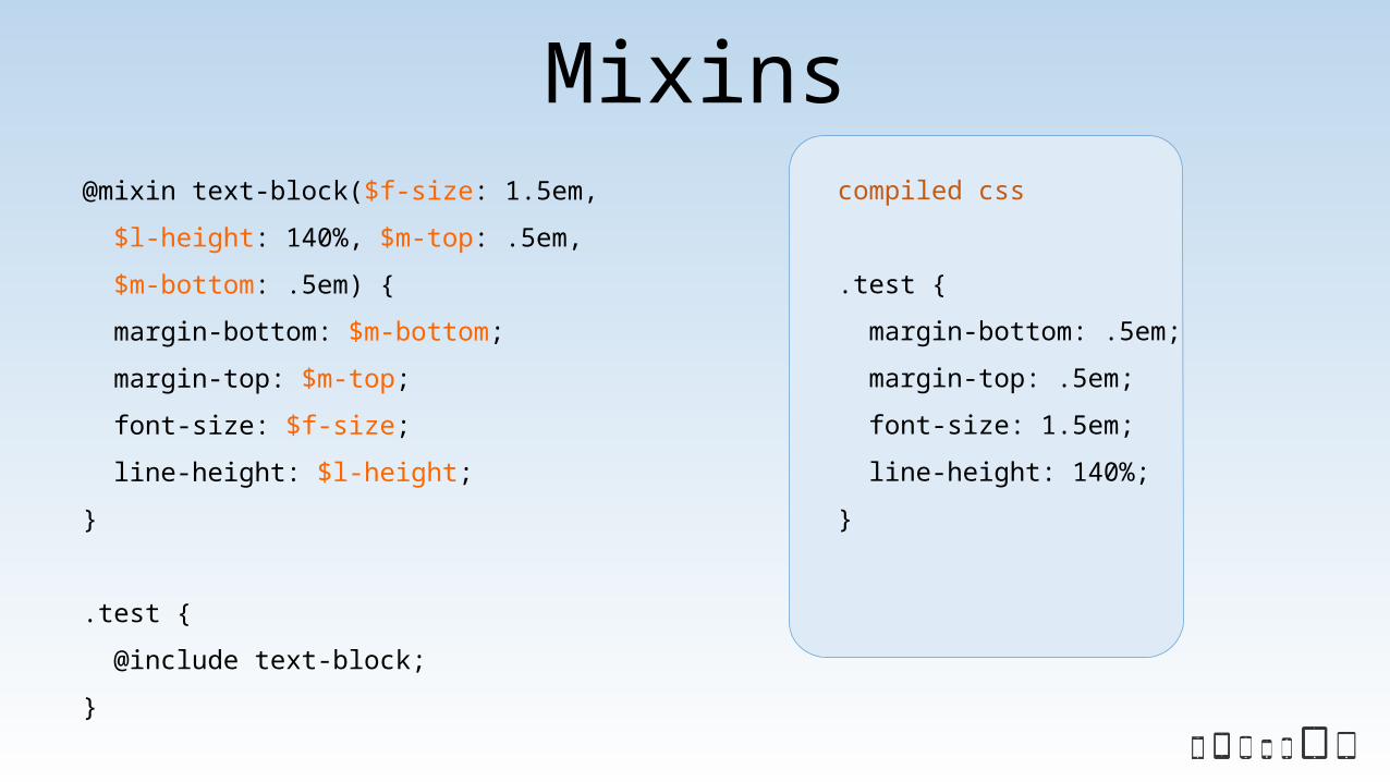
@mixin text-block($f-size: 1.5em,
$l-height: 140%, $m-top: .5em,
$m-bottom: .5em) {
margin-bottom: $m-bottom;
margin-top: $m-top;
font-size: $f-size;
line-height: $l-height;
}
.test {
@include text-block;
}
compiled css
.test {
margin-bottom: .5em;
margin-top: .5em;
font-size: 1.5em;
line-height: 140%;
}
Mixins

body.test a {
color: #6495ed;
&:hover {
color: darken(#6495ed, 10%);
}
&:visited {
color: darken(#6495ed, 50%);
}
}
compiled css
body.test a {
color: #6495ed;
}
body.test a:hover {
color: #3676e8;
}
body.test a:visited
{
color: #092049;
}
Use nesting to namespace
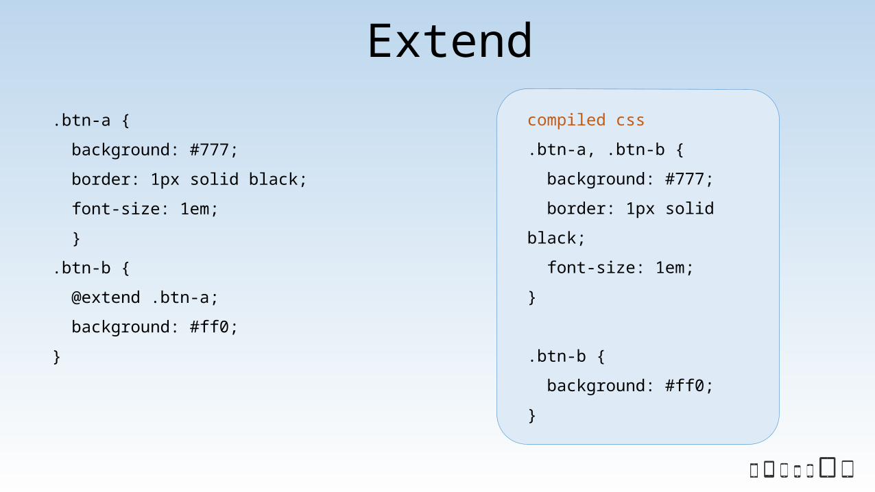
.btn-a {
background: #777;
border: 1px solid black;
font-size: 1em;
}
.btn-b {
@extend .btn-a;
background: #ff0;
}
compiled css
.btn-a, .btn-b {
background: #777;
border: 1px solid
black;
font-size: 1em;
}
.btn-b {
background: #ff0;
}
Extend
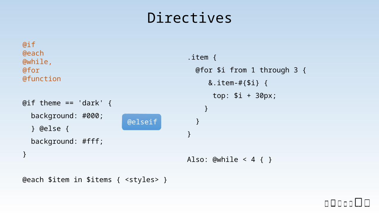
@if theme == 'dark' {
background: #000;
} @else {
background: #fff;
}
@each $item in $items { <styles> }
.item {
@for $i from 1 through 3 {
&.item-#{$i} {
top: $i + 30px;
}
}
}
Also: @while < 4 { }
Directives
@elseif
@if@each@while,@for@function

When to use
Mixins
Similar sets of properties used multiple times with small variations
Extend
Sets of properties that match exactly
Functions
Commonly used operations to determine value
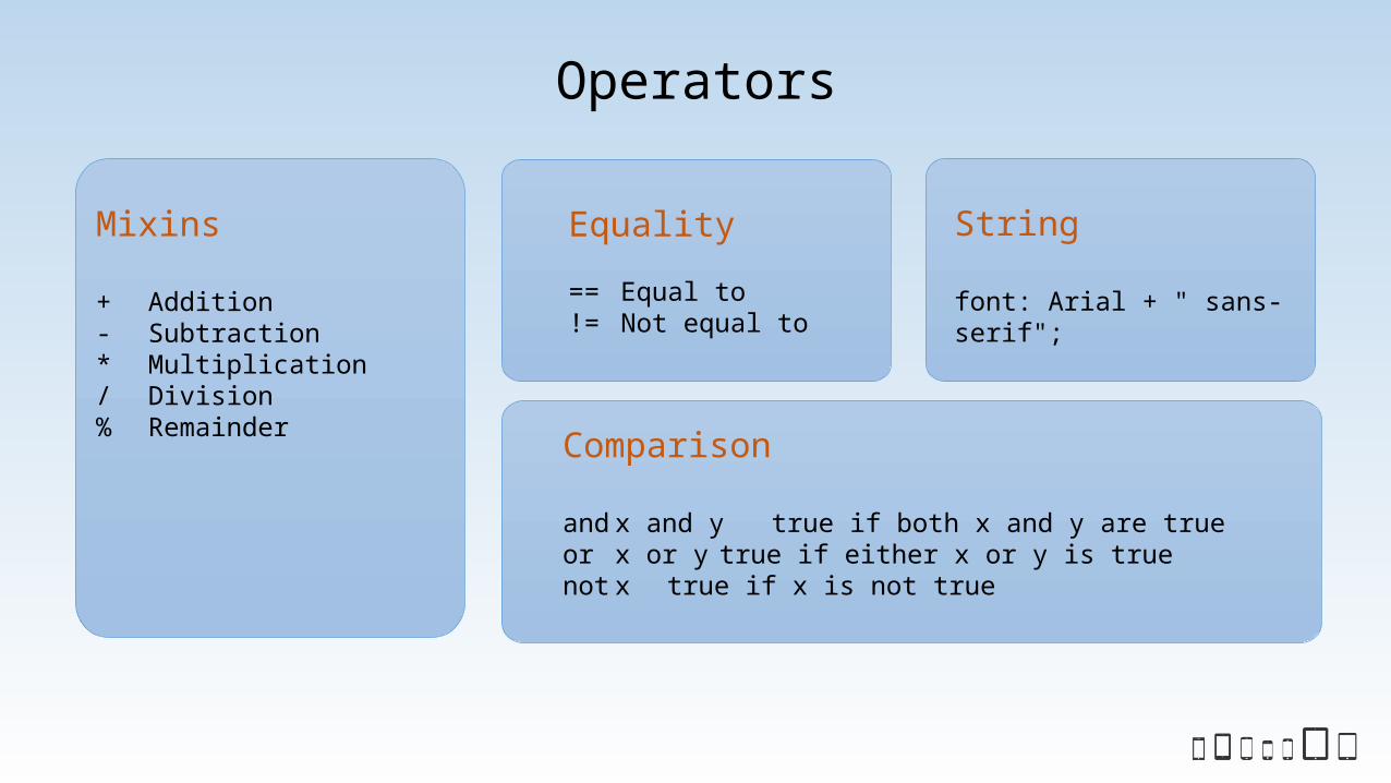
Operators
Mixins
+ Addition- Subtraction* Multiplication/ Division% Remainder
Equality
== Equal to!= Not equal to
String
font: Arial + " sans-serif";
Comparison
and x and y true if both x and y are trueor x or y true if either x or y is truenot x true if x is not true

Compass http://compass-style.org/
@import 'compass';
@import 'compass/reset';
html {
@include box-sizing;
}
body {
font-size: 100%;
}
compiled css
.. reset stuff
html {
-moz-box-sizing: border-box;
-webkit-box-sizing: border-box;
box-sizing: border-box;
}
body {
font-size: 100%;
}

Media Queries@mixin respond-to($width){
@media (min-width: $width){
@content;
}
}
div.main {
border: 1px solid #000;
@include respond-to(750px){
float: left;
width: 75%;
}
}
compiled css
div.main {
border: 1px solid #000;
}
@media (min-width: 750px) {
div.main {
float: left;
width: 75%;
}
}

Breakpointhttp://breakpoint-sass.com/
$high-tide: 500px;
.johnny-utah {
@include breakpoint($high-tide) {
content: 'Whoa.';
}
}
compiled css
@media (min-width: 500px) {
.johnny-utah {
content: 'Whoa.';
}
}
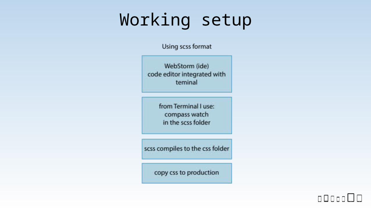
Working setup

Let's code – Vinyl vintage website

Sass/Compass productivity
• Sass and Compass team up for maximum productivity and help you accomplish browser compatibility
• Susy allows you to create your own grid layouts• Bootstrap or Foundation are more complete css frameworks that help you style large sites
with lots of configurations• SassMeister.com allows you to play with sass and evaluate frameworks that will best suit your
application
Foundation sass: http://foundation.zurb.com/docs/sass.htmlBootstrap sass: http://getbootstrap.com/getting-started/#download

Less
• Less is javascript based, so requires node.js and npm to install and run• Less.js can be a client side processor for times you want runtime generation of css• Less syntax is not very different from Sass. The main issue is using @ for variables instead of $
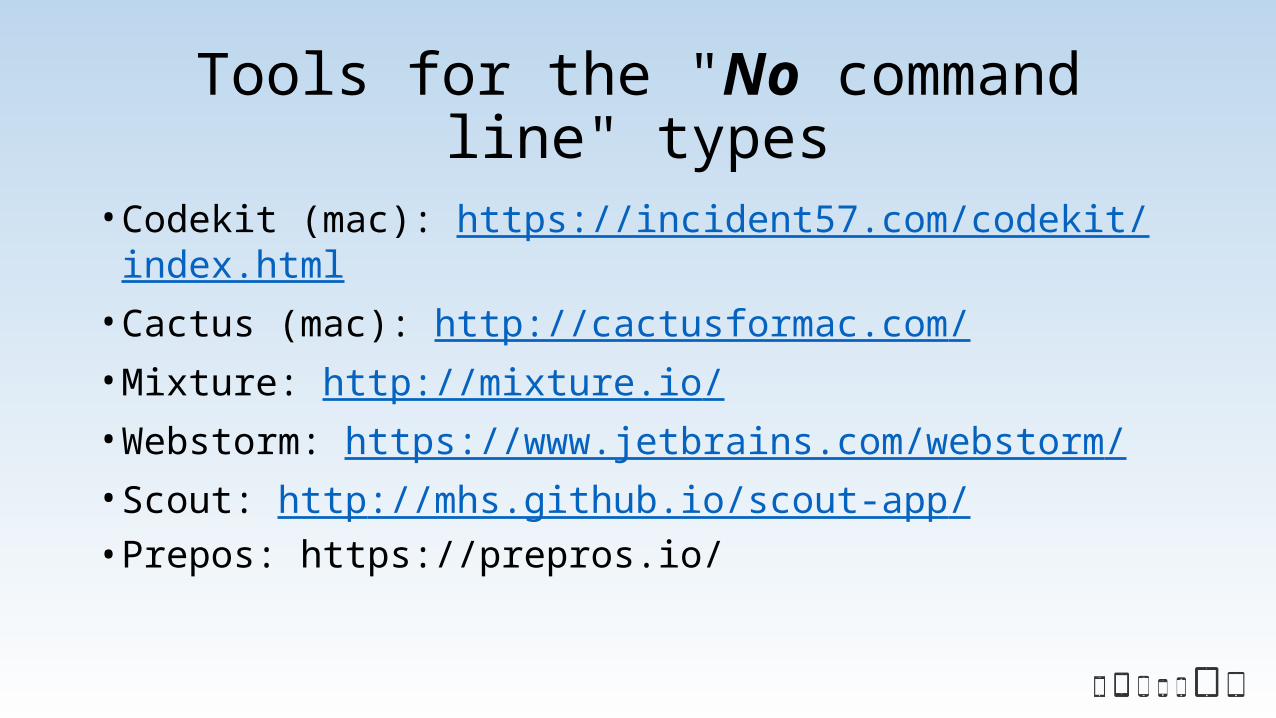
Tools for the "No command line" types
• Codekit (mac): https://incident57.com/codekit/index.html• Cactus (mac): http://cactusformac.com/• Mixture: http://mixture.io/• Webstorm: https://www.jetbrains.com/webstorm/• Scout: http://mhs.github.io/scout-app/• Prepos: https://prepros.io/
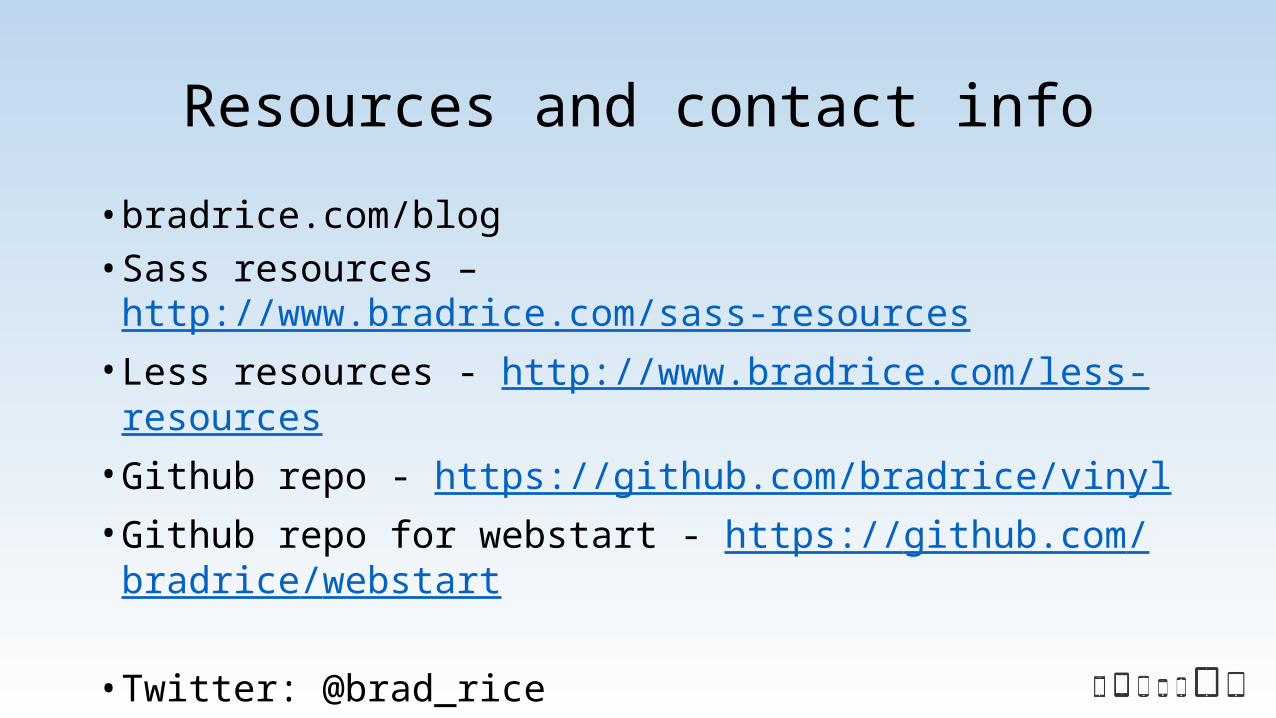
Resources and contact info
• bradrice.com/blog• Sass resources – http://www.bradrice.com/sass-resources• Less resources - http://www.bradrice.com/less-resources• Github repo - https://github.com/bradrice/vinyl• Github repo for webstart - https://github.com/bradrice/webstart
• Twitter: @brad_rice• Email: [email protected]
Related Documents