Adobe Experience Manager Adobe Experience Manager Adobe Experience Manager 6.1: Responsive Websites & Grid-Based Layouts Damien Antipa, Senior UX Engineer Twi er: @visiongeist Gabriel Walt, Product Manager Twi er: @gabrielwalt hps://www.slideshare.net/GabrielWalt/aem-responsive

CIRCUIT 2015 - Responsive Websites & Grid-Based Layouts
Aug 19, 2015
Welcome message from author
This document is posted to help you gain knowledge. Please leave a comment to let me know what you think about it! Share it to your friends and learn new things together.
Transcript

Adobe Experience ManagerAdobe Experience Manager
Adobe Experience Manager 6.1: Responsive Websites & Grid-Based LayoutsDamien Antipa, Senior UX Engineer Twitter: @visiongeist
Gabriel Walt, Product Manager Twitter: @gabrielwalt
https://www.slideshare.net/GabrielWalt/aem-responsive

Adobe Experience Manager https://www.slideshare.net/GabrielWalt/aem-responsive
Agenda
Responsive Websites & Grid-Based Layouts:
1. Overview 2. Edit Responsive Layouts 3. Setup Responsive Editing 4. Develop for the Grid

Adobe Experience Manager https://www.slideshare.net/GabrielWalt/aem-responsive
Overview

Adobe Experience Manager https://www.slideshare.net/GabrielWalt/aem-responsive
Adaptive vs ResponsiveAdaptive The server response will change to adapt to a defined set of screen size. ➔ Server-side device detection through a database of user-agents ➔ Consequence: Different URLs for different devices
Responsive The design will fluidly change and respond to fit any screen size. ➔ Client-side feature detection through media queries ➔ Consequence: Same content delivered to all visitors

Adobe Experience Manager https://www.slideshare.net/GabrielWalt/aem-responsive
Making Content ResponsiveTraditional workflow • A designer mocks the different breakpoints • A developer implements the mocks
for a specific template • The author picks that template
and fills the content
Responsive layout editing • The author fills the content • The author can adapt the layout

Adobe Experience Manager https://www.slideshare.net/GabrielWalt/aem-responsive
Edit Responsive Layouts
Adobe Experience Manager https://www.slideshare.net/GabrielWalt/aem-responsive
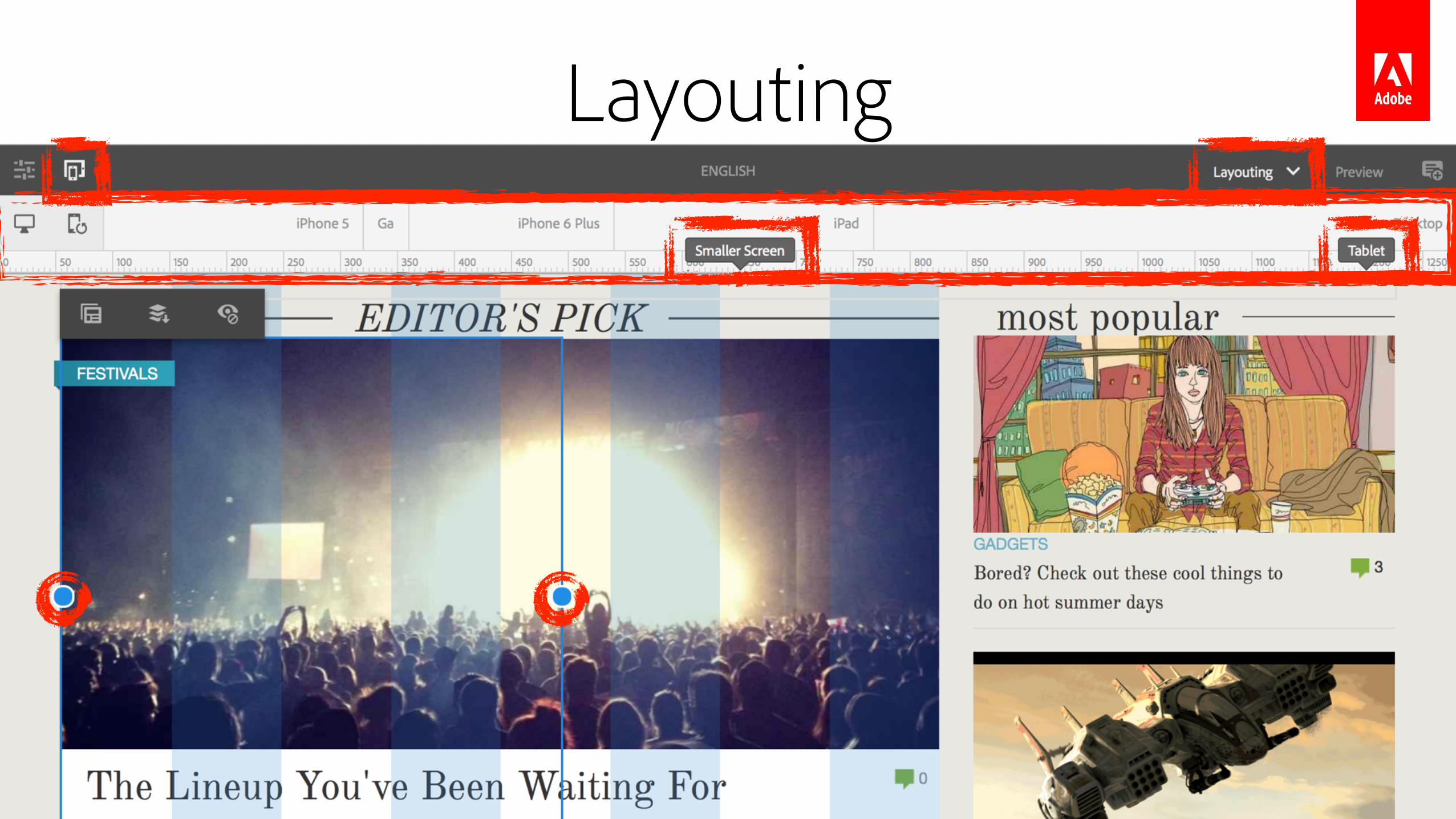
Layouting

Adobe Experience Manager https://www.slideshare.net/GabrielWalt/aem-responsive
Floating
1 2 3 4
5 6 7 8
1 2
3 4
3 4
1
2
2

Adobe Experience Manager https://www.slideshare.net/GabrielWalt/aem-responsive
Floating
1 2 3 4
5
6 7 8
1
2
3
1 2
3
4 5
6

Adobe Experience Manager https://www.slideshare.net/GabrielWalt/aem-responsive
Breaking
1
2
3
1 2 3 4
5 6 7 8
1 2
3 4
5 6

Adobe Experience Manager https://www.slideshare.net/GabrielWalt/aem-responsive
Nesting
1
2
3
4
5
6
1 2 3
5
4
1
2
3
4

Adobe Experience Manager https://www.slideshare.net/GabrielWalt/aem-responsive
Hiding
1
2
3
4
5
6
1 3
5
4
4
5
6

Adobe Experience Manager https://www.slideshare.net/GabrielWalt/aem-responsive
Setup Responsive Editing

Adobe Experience Manager https://www.slideshare.net/GabrielWalt/aem-responsive
0. Enable the Responsive Emulator
Register page components for simulation ➔ List the sling:resourceType of your pages in an OSGi config for com.day.cq.wcm.mobile.core.impl.MobileEmulatorProvider
Specify the device groups ➔ On jcr:content node of the site root, add the following property:jcr:content[nt:unstructured] @cq:deviceGroups=["/etc/mobile/groups/responsive"]

Adobe Experience Manager https://www.slideshare.net/GabrielWalt/aem-responsive
1. Enable the Layouting ModeSpecify the breakpoints ➔ On jcr:content node of the site root, add following node structure:jcr:content[nt:unstructured] cq:responsive[nt:unstructured] breakpoints[nt:unstructured] phone[nt:unstructured] @title="Smaller Screen" @width=650 tablet[nt:unstructured] @title="Tablet" @width=1200

Adobe Experience Manager https://www.slideshare.net/GabrielWalt/aem-responsive
2. Enable the Responsive Grid
Use the responsive paragraph system ➔ Replace the parsys with the responsive one:@resourceType="wcm/foundation/components/responsivegrid"
Include the responsive stylesheet ➔ Copy the following file into your client library:/etc/designs/geometrixx-media/clientlibs/css/grid.less
➔ Adapt the breakpoints and the number of columns to your needs

Adobe Experience Manager https://www.slideshare.net/GabrielWalt/aem-responsive
3. Configure the Parsys Design Mode
Enable Layout Nesting ➔ In the General group of allowed components:
Authorize the Layout Container component
Define the number of columns ➔ If your parsys doesn’t exactly take 12 columns:
Set a value for the Columns input field

Adobe Experience Manager https://www.slideshare.net/GabrielWalt/aem-responsive
Develop for the Grid

Adobe Experience Manager https://www.slideshare.net/GabrielWalt/aem-responsive
A Project’s Grid Configuration@import (once) "/etc/clientlibs/wcm/foundation/grid/grid_base.less";
/* maximum amount of grid cells to be provided */ @max_col: 12;
.aem-Grid { .generate-grid(default, @max_col); }
/* smaller screen (phone) breakpoint */ @media (max-width: 650px) { .aem-Grid { .generate-grid(phone, @max_col); } }
/* tablet breakpoint */ @media (min-width: 651px) and (max-width: 1200px) { .aem-Grid { .generate-grid(tablet, @max_col); } }

Adobe Experience Manager https://www.slideshare.net/GabrielWalt/aem-responsive
Persistence in JCR Content
The component size is saved on the resource node jcr:content[nt:unstructured] parsys[nt:unstructured] image[cq:Component] @sling:resourceType="wcm/foundation/components/image" cq:responsive[nt:unstructured] default[nt:unstructured] @width=4 phone[nt:unstructured] @width=12

Adobe Experience Manager https://www.slideshare.net/GabrielWalt/aem-responsive
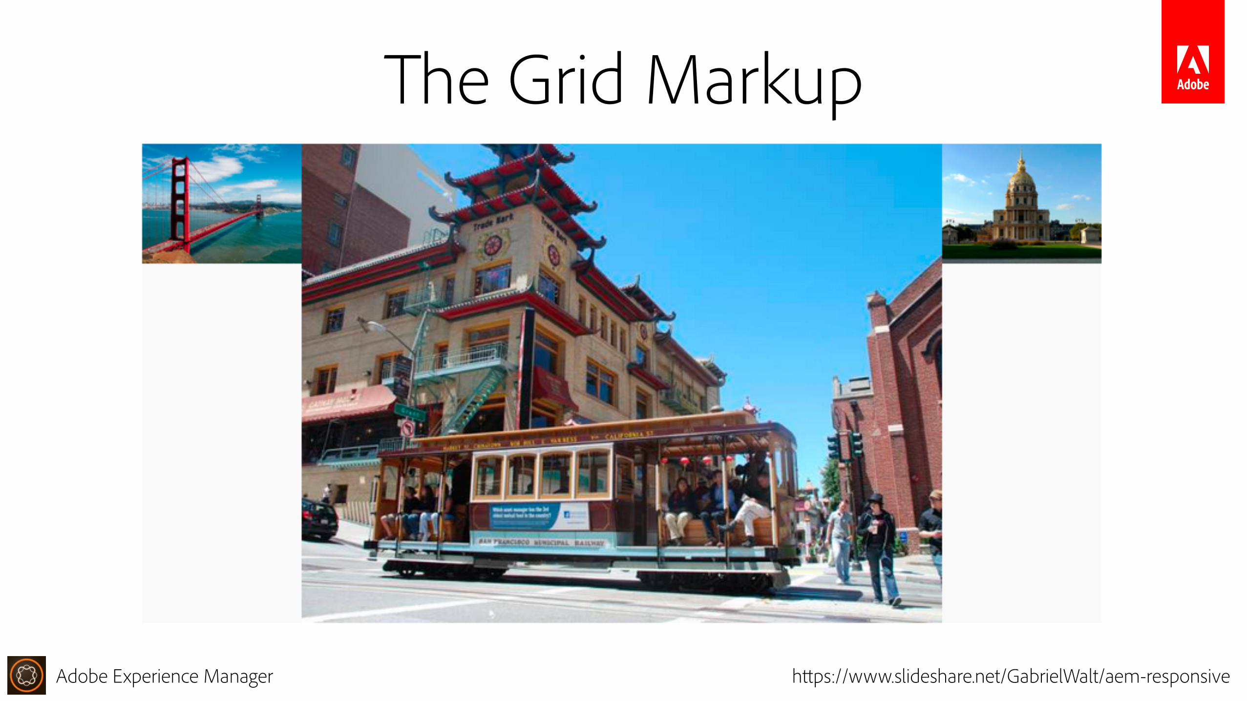
The Grid Markup<div class="aem-Grid aem-Grid--12"> <div class="aem-GridColumn aem-GridColumn—default--2"> Col 1 </div> <div class="aem-GridColumn aem-GridColumn—default--8"> Col 2 </div> <div class="aem-GridColumn aem-GridColumn—default--2"> Col 3 </div> </div>
Adobe Experience Manager https://www.slideshare.net/GabrielWalt/aem-responsive
The Grid Markup

Adobe Experience Manager https://www.slideshare.net/GabrielWalt/aem-responsive
Floating Rendering<div class="aem-Grid aem-Grid--12"> <div class="aem-GridColumn aem-GridColumn—default--2"> Col 1 </div> <div class="aem-GridColumn aem-GridColumn—default--8"> Col 2 </div> <div class="aem-GridColumn aem-GridColumn—default--2"> Col 3 </div> <div class="aem-GridColumn aem-GridColumn—default--6"> Col 4 </div> </div>

Adobe Experience Manager https://www.slideshare.net/GabrielWalt/aem-responsive
Floating Rendering

Adobe Experience Manager https://www.slideshare.net/GabrielWalt/aem-responsive
Leverage Breakpoints<div class="aem-Grid aem-Grid--12"> <div class="aem-GridColumn aem-GridColumn—default--2 aem-GridColumn—phone--12"> Col 1 </div> <div class="aem-GridColumn aem-GridColumn—default--8 aem-GridColumn—phone--6"> Col 2 </div> <div class="aem-GridColumn aem-GridColumn—default--2 aem-GridColumn—phone--6"> Col 3 </div> </div>
/* grid.less smaller screen breakpoint */ @media (max-width: 650px) { .aem-Grid { .generate-grid(phone, @max_col); } }

Adobe Experience Manager https://www.slideshare.net/GabrielWalt/aem-responsive
Leverage Breakpoints

Adobe Experience Manager https://www.slideshare.net/GabrielWalt/aem-responsive
<div class="aem-Grid aem-Grid--12"> <div class="aem-GridColumn aem-GridColumn—default--4 aem-GridColumn—phone--hide"> Col 1 </div> <div class="aem-GridColumn aem-GridColumn—default--4"> Col 2 </div> <div class="aem-GridColumn aem-GridColumn—default--4 aem-GridColumn—phone--newline"> Col 3 </div> </div>
➔ hide item
➔ force new line
Custom Behaviour

Adobe Experience Manager https://www.slideshare.net/GabrielWalt/aem-responsive
Custom Behaviour
Adobe Experience Manager https://www.slideshare.net/GabrielWalt/aem-responsive
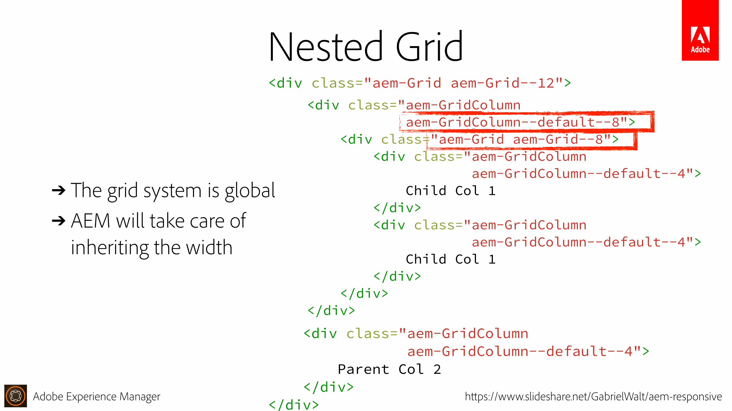
<div class="aem-Grid aem-Grid--12">
<div class="aem-GridColumn aem-GridColumn--default--4"> Parent Col 2 </div> </div>
<div class="aem-GridColumn aem-GridColumn--default--8"> <div class="aem-Grid aem-Grid--8"> <div class="aem-GridColumn aem-GridColumn--default--4"> Child Col 1 </div> <div class="aem-GridColumn aem-GridColumn--default--4"> Child Col 1 </div> </div> </div>
Nested Grid
➔ The grid system is global ➔ AEM will take care of
inheriting the width

Adobe Experience Manager
Thanks!Damien Antipa, Senior UX Engineer Twitter: @visiongeist
Gabriel Walt, Product Manager Twitter: @gabrielwalt
Markup example for front-end developers: http://adobe-marketing-cloud.github.io/aem-responsivegrid/
Documentation Links http://docs.adobe.com/docs/en/aem/6-1/administer/operations/page-authoring/configuring-responsive-layouting.html http://docs.adobe.com/docs/en/aem/6-1/author/page-authoring/responsive-layout.html
https://www.slideshare.net/GabrielWalt/aem-responsive

Related Documents