Using to Design
Academic Poster HANIFFA BEEVI BT ABD JALEEL

Objective
At the end of the workshop, you should be able to:
• design academic posters using PowerPoint;
• apply poster designing tips to make visually attractive academic posters.

Who is your audience?
Novice
Intermediate
Experts
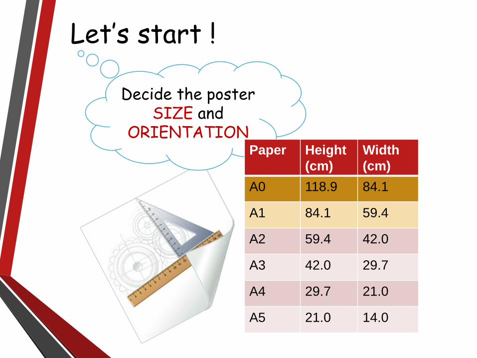
Let’s start !
Decide the poster SIZE and
ORIENTATION Paper Height
(cm)
Width
(cm)
A0 118.9 84.1
A1 84.1 59.4
A2 59.4 42.0
A3 42.0 29.7
A4 29.7 21.0
A5 21.0 14.0
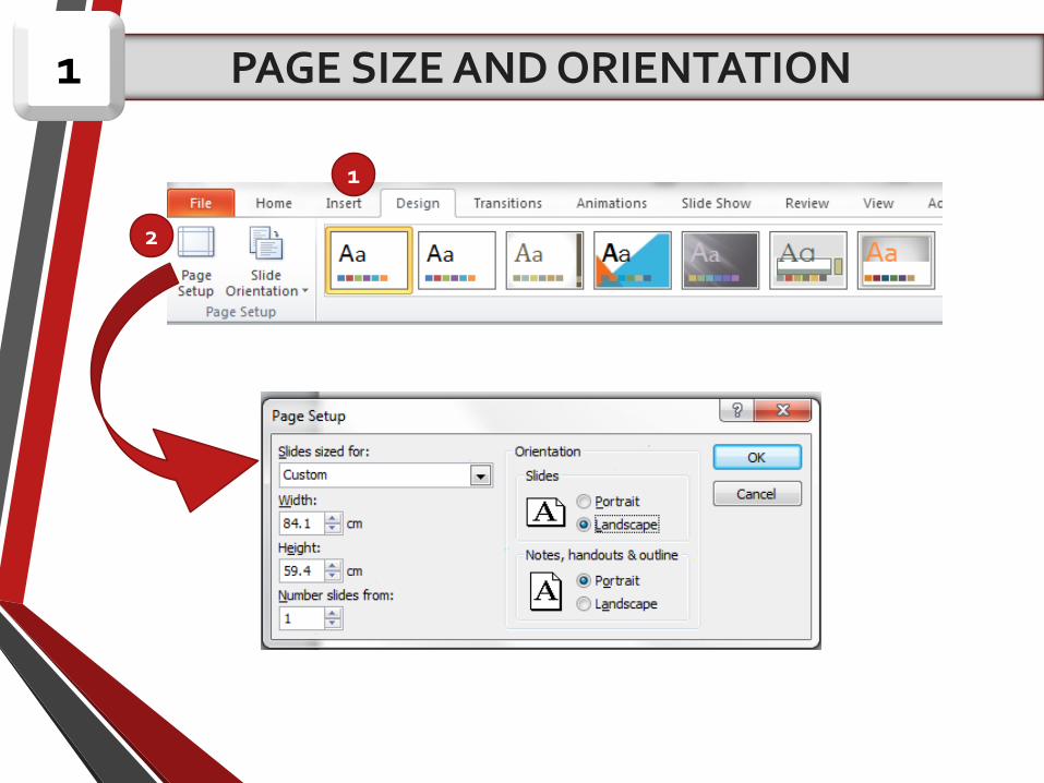
PAGE SIZE AND ORIENTATION 1
1
2

Design layout & content

1
2
LAYOUT AND CONTENT2

Leaving breathing
space between column.
4 cm around inside edge
3 cm in between column

Your poster title : 85 pt
Author: 56ptSub-headings: 36ptBody text: 24ptCaption: 18pt
Title need to be
BIG GRAB
ATTENTION
FONT SELECTION3

Don’t put conclusion on
the floor.
In 30 second, the viewers decide whether your content is worthy for further exploration or not.

Conclusion first!
• Put the most important part first.
• Short and to the point.
• Highlight it !

High Contrast
BADExample
GOODExample

Use sans serif fonts: these fonts are more legible than serif fonts from a distance.
Example:
ArialCalibri Impact
Verdana
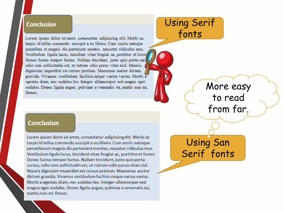
Using Serif fonts
Using San Serif fonts
More easy to read
from far.

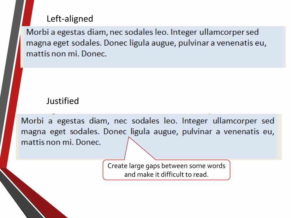
Left-aligned your text. Reason;
vs.
Left-aligned Justified
Create large gaps between some words and make it difficult to read.
Left-aligned
Justified
Create large gaps between some words and make it difficult to read.

Your poster should have roughly:
CONTENT
GRAPHICS
TEXT
SPACE

Use PNG image instead of JPEG
REASON

PNG
JPEG

JPEG
PNG
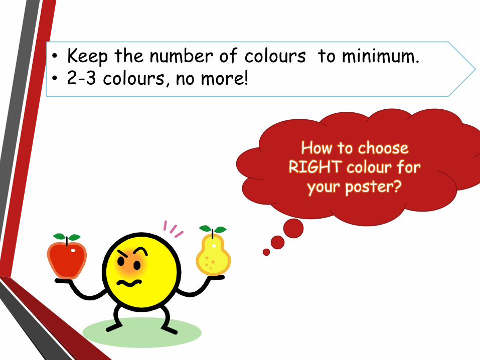
• Keep the number of colours to minimum.• 2-3 colours, no more!
How to choose RIGHT colour for
your poster?

Guidelines to choose colours:
1. Use colours from your school or organizations logo.
2. Choose an image or graph from your poster.
3. Use an online resource likehttp://www.colourlovers.com/palettes/

http://www.colourlovers.com/palettes/
Million of colourpalettes
available here

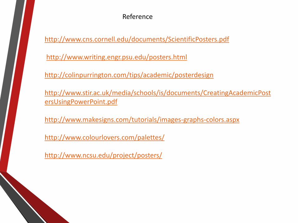
Let’s judge some designs
Finally !!
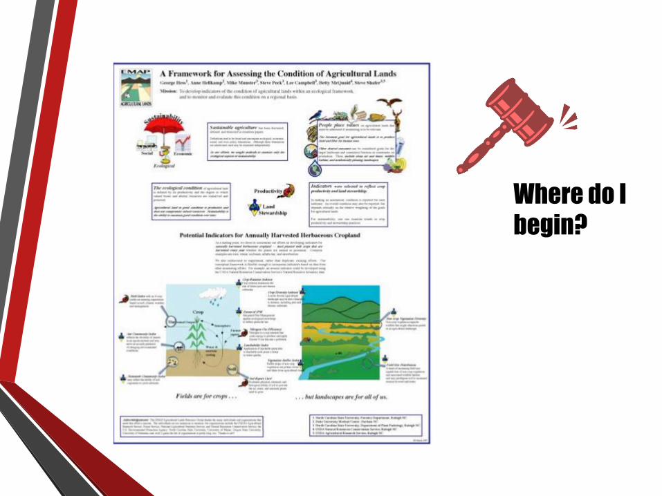
Where do I
begin?
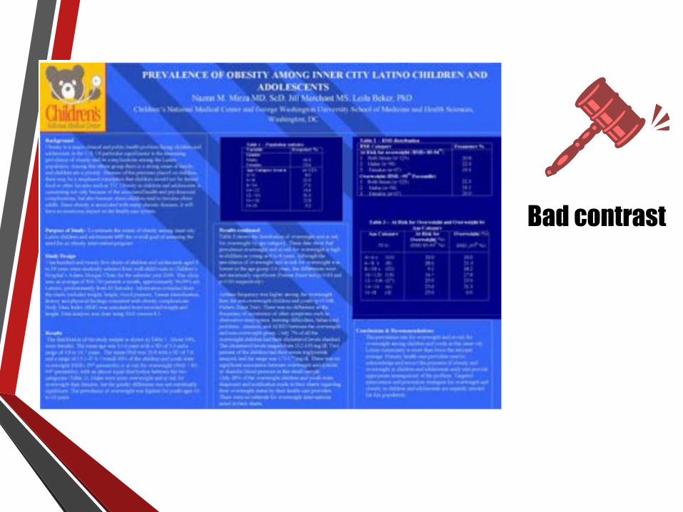
Bad contrast

Good Design

Perfect
Reference
http://www.cns.cornell.edu/documents/ScientificPosters.pdf
http://www.writing.engr.psu.edu/posters.html
http://colinpurrington.com/tips/academic/posterdesign
http://www.stir.ac.uk/media/schools/is/documents/CreatingAcademicPostersUsingPowerPoint.pdf
http://www.makesigns.com/tutorials/images-graphs-colors.aspx
http://www.colourlovers.com/palettes/
http://www.ncsu.edu/project/posters/


![Poster Presentations Poster Presentations - [email protected]](https://static.cupdf.com/doc/110x72/62038863da24ad121e4a8405/poster-presentations-poster-presentations-emailprotected.jpg)