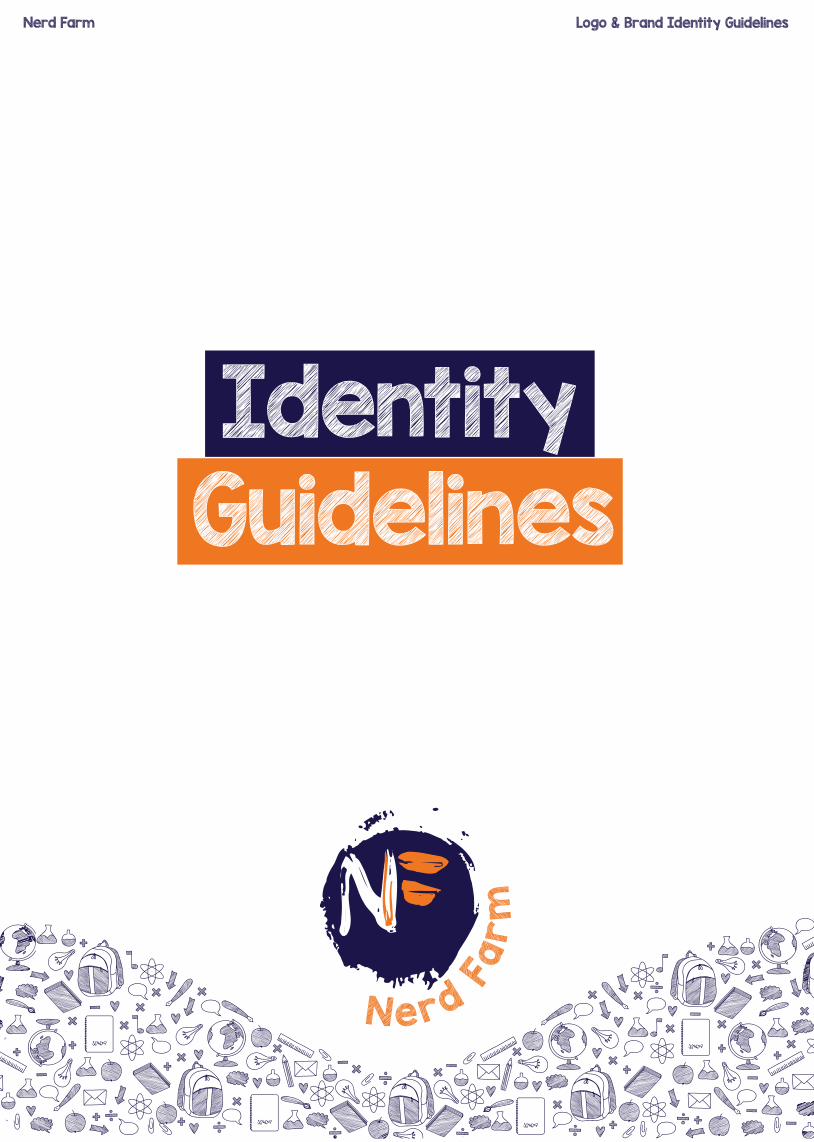
N e r d F a r m Identity Guidelines Nerd Farm Logo & Brand Identity Guidelines

Welcome message from author
This document is posted to help you gain knowledge. Please leave a comment to let me know what you think about it! Share it to your friends and learn new things together.
Transcript
Nerd Fa
rm
IdentityGuidelines
Nerd Farm Logo & Brand Identity Guidelines
Nerd Farm Logo & Brand Identity Guidelines
N e rd Fa
rm
CONTENT
Intro
Logo Specifics
Typeography
Colour
Styles
Don’t Dos
Thank you
03
04
05
06
07
08
09

03
04
05
06
07
08
09
Nerd Farm Logo & Brand Identity Guidelines
N e rd Fa
rm
FOLLOW THESE GUIDELINES AS YOU CREATE MARKETING MATERIALS, INTERNAL AND
EXTERNAL COMMUNICATIONS.
Our brand is more than our logo. It is a design scheme made up of a number of core
elements and guiding principles that combine to create a distinctive look and feel that is
immediately recognisable as Nerd Farm.
This guide will help to familiarize you with the core brand elements to assist you in designing
and producing dynamic and powerful communications with a degree of flexibility.
Nerd Farm Logo & Brand Identity Guidelines
Logo
Specifics
NN
NNNNNNNN
NN
NN
N
NNNNNNNNNN
NN
NN
N
N erd Fa
rm
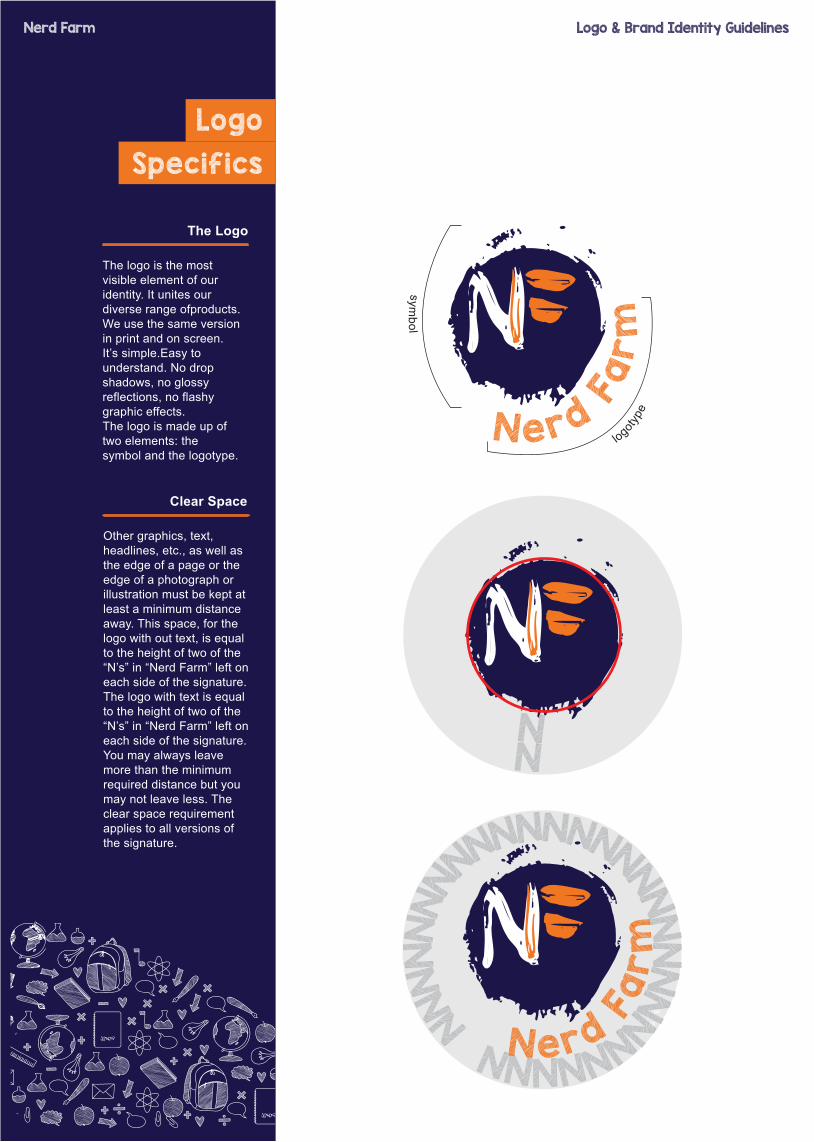
Other graphics, text, headlines, etc., as well as the edge of a page or the edge of a photograph or illustration must be kept at least a minimum distance away. This space, for the logo with out text, is equal to the height of two of the “N’s” in “Nerd Farm” left on each side of the signature. The logo with text is equal to the height of two of the “N’s” in “Nerd Farm” left on each side of the signature. You may always leave more than the minimum required distance but you may not leave less. The clear space requirement applies to all versions of the signature.
Clear Space
N erd Fa
rm
The logo is the most visible element of our identity. It unites our diverse range ofproducts.We use the same version in print and on screen. It’s simple.Easy to understand. No drop shadows, no glossy reflections, no flashy graphic effects.The logo is made up of two elements: thesymbol and the logotype.
The Logo
logotyp
e
symbol

Nerd Farm Logo & Brand Identity Guidelines
Typeography
KG Blank Space Sketch (Reg)
AaABCDEFGHIJKLMNOPQRSTUVWXYZ
abcdefghijklmnopqrstuwxyz
123456789
Typography is an important aspect of our brand identity. Our typographic stylecontributes to our distinctive aesthetic.KB Blank Space Sketch is our main typeface. KB Blank Space Sketch is used for all headlines and titles.KB Blank Space Sketch is used for the Nerd Farm logotype.
Primary Typeface
Centuray Gothic (Reg)
AaABCDEFGHIJKLMNOPQRSTUVWXYZ
abcdefghijklmnopqrstuwxyz
123456789
Centuray Gothic (Bold)
AaABCDEFGHIJKLMNOPQRSTUVWXYZ
abcdefghijklmnopqrstuwxyz
123456789
Centuray Gothic Regular and Bold is to be used for the main body of text.In cases where a standard system font is required, in place of the prefered KB Blank Space Sketch font (such as sales presentations, Powerpoint documents, etc.) Centuray Gothic Regularand Bold should be used.
Secondary Typeface

Nerd Farm Logo & Brand Identity Guidelines
Colour
PRINT C 100 M 100 Y 35 K41SCREEN R 28 G 22 B73WEB HTML #1C1649
Pantone 539 U
PRINT C 2 M 65 Y 100 K 0SCREEN R 238 G 119 B 34WEB HTML #EE7722
PRINT C 0 M 0 Y 0 K60
PRINT C 0 M 0 Y 0 K 100
533 C
Pantone 150 U 1495 C
Pantone 403 U 403 C
Pantone Black U Black C
Orange and Dark Blue are our distinguishing features. It is an essential part of our brand identity.Combined with white, black and dark grey a distinct style is createdwhich is both simple to use and powerful through it’s simplicity.
Primary Colours
Black and Dark Grey colours should be used for black/white print such as fax, and some forms of commercial printing applications, such as local newspapers etc.
Primary Colours
Nerd Farm Logo & Brand Identity Guidelines
Styles
N e rd Fa
rm
N e r d Fa
rm
N e r d Fa
rm
N e rd Fa
rm
N e r d Fa
rm
N e r d Fa
rm
N e rd Fa
rm
N e r d Fa
rm
N e r d Fa
rm
N e rd Fa
rm
N e r d Fa
rm
N e r d Fa
rm
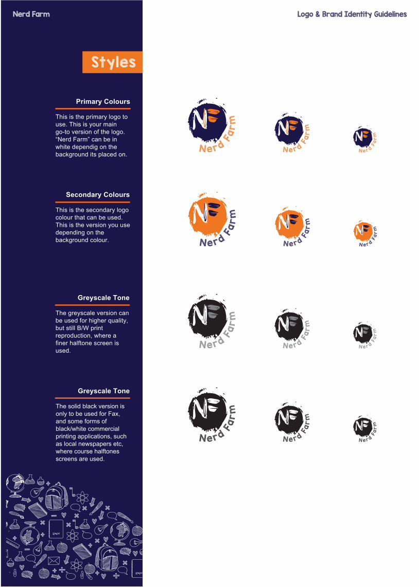
Primary Colours
This is the primary logo to use. This is your main go-to version of the logo. “Nerd Farm” can be in white dependig on the background its placed on.
Secondary Colours
This is the secondary logo colour that can be used. This is the version you use depending on the background colour.
Greyscale Tone
The greyscale version can be used for higher quality, but still B/W print reproduction, where a finer halftone screen is used.
Greyscale Tone
The solid black version is only to be used for Fax, and some forms of black/white commercial printing applications, such as local newspapers etc, where course halftones screens are used.
Nerd Farm Logo & Brand Identity Guidelines
Don’t Do
Misuse of Logo
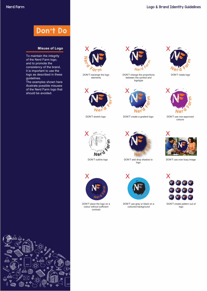
To maintain the integrity of the Nerd Farm logo, and to promote theconsistency of the brand, it is important to use the logo as described in theseguidelines.The examples shown here illustrate possible misuses of the Nerd Farm logo that should be avoided.
Ne
rd Fa r m N e r d F
a rm
N e r d Fa rm
DON’T rearange the logo elements
X X X
DON’T change the proportions between the symbol and
logotype
DON’T rotate logo
DON’T stretch logo
X X X
DON’T create a gradent logo DON’T use non-approved colours
N e rd Fa
rm
N e rd Fa
rm
N e rd Fa
rm
DON’T outline logo
X X X
DON’T add drop shadow to logo
DON’T use over busy image
N e rd Fa
rm
N e r d Fa
rm
DON’T place the logo on a colour without sufficient
contrast
X X X
DON’T use gray or black on acoloured background
DON’T create pattern out of logo
N e r d Fa
rm
N e r d Fa
rm
Nerd Farm Logo & Brand Identity Guidelines
N e rd Fa
rm
If you’ve just read these guidelines,you have our
appreciation. It means you share our belief in details and quality. We
know applying these principles takes time and effort, but it will
help tell the Nerd Farm story.
If you ever have additional questions about our visual identity
and its application in design, contact [email protected]

Nerd Fa
rm
Nerd Farm Logo & Brand Identity Guidelines
Related Documents