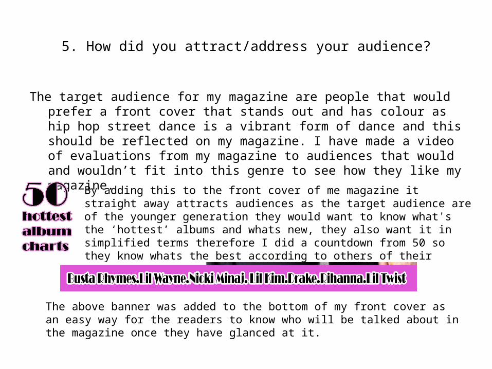
5. How did you attract/address your audience? The target audience for my magazine are people that would prefer a front cover that stands out and has colour as hip hop street dance is a vibrant form of dance and this should be reflected on my magazine. I have made a video of evaluations from my magazine to audiences that would and wouldn’t fit into this genre to see how they like my magazine. By adding this to the front cover of me magazine it straight away attracts audiences as the target audience are of the younger generation they would want to know what's the ‘hottest’ albums and whats new, they also want it in simplified terms therefore I did a countdown from 50 so they know whats the best according to others of their social group. The above banner was added to the bottom of my front cover as an easy way for the readers to know who will be talked about in the magazine once they have glanced at it.

Music magazine evaluation11 15
Aug 09, 2015
Welcome message from author
This document is posted to help you gain knowledge. Please leave a comment to let me know what you think about it! Share it to your friends and learn new things together.
Transcript
5. How did you attract/address your audience?
The target audience for my magazine are people that would prefer a front cover that stands out and has colour as hip hop street dance is a vibrant form of dance and this should be reflected on my magazine. I have made a video of evaluations from my magazine to audiences that would and wouldn’t fit into this genre to see how they like my magazine.
By adding this to the front cover of me magazine it straight away attracts audiences as the target audience are of the younger generation they would want to know what's the ‘hottest’ albums and whats new, they also want it in simplified terms therefore I did a countdown from 50 so they know whats the best according to others of their social group.
The above banner was added to the bottom of my front cover as an easy way for the readers to know who will be talked about in the magazine once they have glanced at it.

5. How did you attract/address your audience?
By using a grabquote next to an image in my double page article, this drew attention to my text so the reader will be intrigued about what the article is saying.
I played around with the layout of the contents and used different shades of blue to make it more appealing and give it a funky look. The text is toppling around almost dancing which is a good theme for my magazine as it is aimed at dancers. I can tell my target audience liked this because they said this in the Focus Task video on my blog.
By adding this offer in the magazine the reader will want to buy it because the target audience are fashion conscience girls who would love to be involved in seeing a fashion show for free.
6. What have you learnt about technologies from the process of constructing this product?
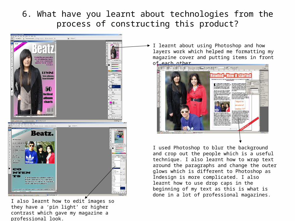
I learnt about using Photoshop and how layers work which helped me formatting my magazine cover and putting items in front of each other.
I also learnt how to edit images so they have a ‘pin light’ or higher contrast which gave my magazine a professional look.
I used Photoshop to blur the background and crop out the people which is a useful technique. I also learnt how to wrap text around the paragraphs and change the outer glows which is different to Photoshop as Indesign is more complicated. I also learnt how to use drop caps in the beginning of my text as this is what is done in a lot of professional magazines.
7. Looking back at your preliminary task, what do you feel you have learnt in the progression from it to the full product
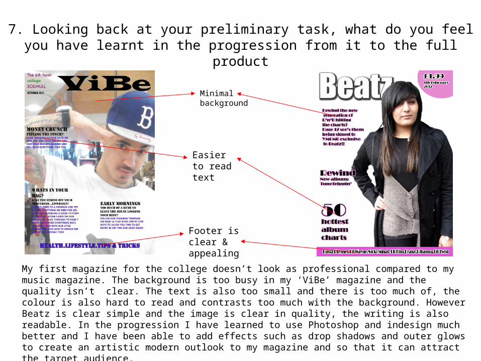
My first magazine for the college doesn’t look as professional compared to my music magazine. The background is too busy in my ‘ViBe’ magazine and the quality isn’t clear. The text is also too small and there is too much of, the colour is also hard to read and contrasts too much with the background. However Beatz is clear simple and the image is clear in quality, the writing is also readable. In the progression I have learned to use Photoshop and indesign much better and I have been able to add effects such as drop shadows and outer glows to create an artistic modern outlook to my magazine and so that it can attract the target audience.
Minimal background
Footer is clear & appealing
Easier to read text

7. Looking back at your preliminary task, what do you feel you have learnt in the progression from it to the full product
There is a big difference between my contents page for the college magazine and the contents for my music magazine, for example the word contents is written out with no style to it in my ViBe magazine however for the music magazine the contents it has a more professional touch to it because I have added a drop shadow to it and used a vary of fonts.
The background is more appealing and not as boring looking.
The contents has a more engaging layout as it looks like its tumbling and not as symmetrical.
The text is easier to read and has a better appeal because of the outer glow, whereas my contents before was just a Comic Sans font with no real effects and theme
Related Documents