Research for my music magazine

Research for my music magazine
Aug 08, 2015
Welcome message from author
This document is posted to help you gain knowledge. Please leave a comment to let me know what you think about it! Share it to your friends and learn new things together.
Transcript

Research for my music magazine

I have looked at a wide variety of magazines for my research. I have looked at ‘Rolling Stone’, ‘Top of the Pops’ and ‘Q’. I have noticed that women are usually objectified. I also have noticed that the content is a lot more celebrity gossip rather than about musicians. The magazines are generally targeted at a young audience as the majority of artists featured are quite young with a large teenage fan bases. The colour schemes of the magazines aimed at middle to upper class individuals tended to stick to around 2-3 colours to look sophisticated. The magazine aimed at a lower class, younger audience had a variety of very bright colours with an extremely crowded front cover. Observing and evaluating a variety of magazines has helped me have a greater understanding of how I will set out my magazine according to my target audience.

Analysing ‘Q’ MagazineThe cover image is of popular R&B singer, Amy Winehouse. The image is not objectifying to women, which is unusual for a magazine. This shoot shows mainly Amy’s full face, showing that the magazine is mainly focusing on her as a person rather than an underdressed woman used to sell the product. I think the reason that this particular shoot was chosen was to reflect and remember her as the ‘voice of our time’. Most shots of Amy published before her death by the media were portraying her in a negative light. It is sad that only after her death that the media decided to publicize her for her talent and personality. This is an example of how bias the media can be portraying someone to be a bad person by only focusing on the negative aspects of them.
The text creates a sympathetic approach towards Amy’s death. It says how ‘we lost her’, implying that we all loved and cared for her. All of the text is spread out around the cover image and the image even covers part of the masthead. This implies that Amy is the main focus of the magazine and demonstrates that she is the most important aspect of it.
The magazine is thick and glossy. By being a good quality magazine, it aims for a target audience who are willing to pay extra for it. This shows the social classes that ‘Q’ aims for are upper-middle or middle class, as these people would be most likely to have money to spare (as they would have higher incomes), therefore wanting good quality products to get their money’s worth; this is further demonstrated by it's high retail price of £4.50.
The text which is used to draw in the reader is in re. This is to make it stand out and be eye-catching so that the potential reader will be intrigued and want to buy the magazine. The exclusive is in a bold red box to also stand out and advertise the ‘Amy Winehouse tribute CD’. These features will encourage people to buy the magazine as it stands out. It grabs the attention and interests the customer. ‘Q’ magazine manage to do this well as the magazine is not too colourful and tacky, yet the text still bold and appealing to the customer, who would be looking for a classy and sophisticated magazine – not a cheap, trashy and colourful magazine.
The iconic ‘Q’ masthead appeals to customers. Although it is slightly overtaken by the cover image of Amy Winehouse, it still is a main feature of the magazine and takes up a large amount of space. The letter ‘Q’ is enigmatic, bold and upper case, implying it is iconic and important. This masthead departs from the conventions of normal magazines that have their masthead among the top of their cover.
This quite simplistic front cover suggests the sophistication that Q magazine are looking to achieve. It is in contrast many lower production value magazines which usually have cluttered front covers that have limited design considerations.
Analysing ‘Top of the Pops’ magazine
The front cover of this magazine is very clustered and colourful. This suggests that it is aimed a fun, unsophisticated reader. The bright, loud colours also reflect that this magazine would be aimed at a younger audience, who would tend to go for a colourful magazine rather than one with a more classy or mature colour scheme (like ‘Q’).
The masthead is crowded and with bold colours. This gives it a immature look. It reflects what the target audience will be for this magazine, which would be young girls. The fact that it is bright pink also suggests that it would be targeted at stereotypical young, female audience.
This feature suggests that this magazine is targeted at a stereotypical heterosexual, young female audience. This is quite objectifying to men as they are used to advertise the magazine in a provocative way.
This article reflects the fact that this magazine is aimed at a lower to middle class audience. This is because the prices of the items advertised are low. This is further implied by the subtitle ‘All the trends, none of the spend’ which suggests that readers usually look for cheap items. This would be common amongst working class to middle class individuals, as they have the least disposable income and therefore would generally purchase low priced items. For this reason, the magazine is aiming at a lower to middle class demographic audience.
Audience Demographics
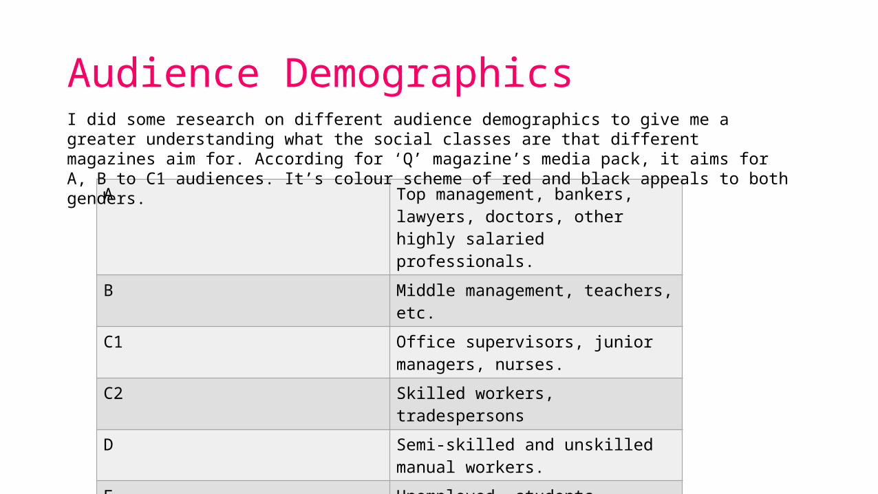
A Top management, bankers, lawyers, doctors, other highly salaried professionals.
B Middle management, teachers, etc.
C1 Office supervisors, junior managers, nurses.
C2 Skilled workers, tradespersons
D Semi-skilled and unskilled manual workers.
E Unemployed, students, pensioners, casual workers.
I did some research on different audience demographics to give me a greater understanding what the social classes are that different magazines aim for. According for ‘Q’ magazine’s media pack, it aims for A, B to C1 audiences. It’s colour scheme of red and black appeals to both genders.

Target Audience research The target audience for Q magazine is teenagers, both male and female. This is because each magazine varies genders of artists. Also, the musicians featured in ‘Q’ vary from R&B to rock to pop. This would encourage a wider audience of readers who like listening to different genres of music. The majority of readers will fall into the age category of teenagers as the magazine focuses on the latest music.
A Feature from ‘Q’I analysed an article from ‘Q’ to see how they address their readers and observe the language that they use. I noticed that the article was in quite formally written. The vocabulary used is quite advanced; the use of long, complex words are used every so often. However, there is not much of a variety in punctuation and the sentence structure is quite simplistic. I think this is done to enable the magazine to reach a larger audience as it is relatively easy to read, but still formal. Only a minority of people would want to read a really formal magazine which has complicated, harder to read articles. The article is formal and does not direct the reader, this is because the magazine is informative of information. This is because the articles are mainly informing people about musicians and does not relate or talk about things directly concerned with the readers themselves. The aim of the magazine is to educate the reader of issues within the music industry, therefore the magazine has no need to relate to the reader on a personal level by engaging with them.
Related Documents