Master thesis An Empirical Evaluation of the Story Focus Concept – The Example of a Map Telling the Story of “The Legend of Meng Jiangnu” ADEBAYO .Y. ISHOLA 2020

Welcome message from author
This document is posted to help you gain knowledge. Please leave a comment to let me know what you think about it! Share it to your friends and learn new things together.
Transcript
Master thesis
An Empirical Evaluation of the Story Focus Concept – The Example of a Map Telling the Story of “The Legend of Meng Jiangnu”
ADEBAYO .Y. ISHOLA
2020

Thesis submitted to the Faculty of Geo-Information Science and Earth
Observation of the University of Twente in partial fulfilment of the
requirements for the degree of Master of Science in Geo-information Science
and Earth Observation.
Specialization: Cartography
SUPERVISOR:
Dr F.-B. Mocnik
THESIS ASSESSMENT BOARD:
Prof. Dr M.-J. Kraak (Chair)
Dr F.-B. Mocnik (Advisor)
E.P. Bogucka (Reviewer, Technical University of Munich)
ADEBAYO YUSUF ISHOLA
Enschede, The Netherlands, September 2020
An Empirical Evaluation of the Story Focus Concept – The Example of a Map Telling the Story of “The Legend of Meng Jiangnu”

DISCLAIMER
This document describes work undertaken as part of a programme of study at the Faculty of Geo-Information Science and
Earth Observation of the University of Twente. All views and opinions expressed therein remain the sole responsibility of the
author, and do not necessarily represent those of the Faculty.
i
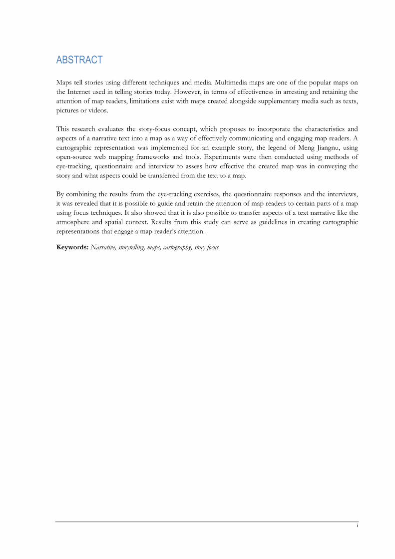
ABSTRACT
Maps tell stories using different techniques and media. Multimedia maps are one of the popular maps on
the Internet used in telling stories today. However, in terms of effectiveness in arresting and retaining the
attention of map readers, limitations exist with maps created alongside supplementary media such as texts,
pictures or videos.
This research evaluates the story-focus concept, which proposes to incorporate the characteristics and
aspects of a narrative text into a map as a way of effectively communicating and engaging map readers. A
cartographic representation was implemented for an example story, the legend of Meng Jiangnu, using
open-source web mapping frameworks and tools. Experiments were then conducted using methods of
eye-tracking, questionnaire and interview to assess how effective the created map was in conveying the
story and what aspects could be transferred from the text to a map.
By combining the results from the eye-tracking exercises, the questionnaire responses and the interviews,
it was revealed that it is possible to guide and retain the attention of map readers to certain parts of a map
using focus techniques. It also showed that it is also possible to transfer aspects of a text narrative like the
atmosphere and spatial context. Results from this study can serve as guidelines in creating cartographic
representations that engage a map reader’s attention.
Keywords: Narrative, storytelling, maps, cartography, story focus

ii
ACKNOWLEDGEMENTS
My supervisor, Dr F.-B Mocnik, thank you for your guidance, support and critical feedback throughout
this research. Your recommendations on what I should be doing, when and how made the completion
and quality of this research possible. Edyta Bogucka, your reviews helped fine-tune my thoughts for this
research, and I am grateful.
The MSc Cartography Erasmus+ consortium, especially the Coordinator, Juliane Cron, thank you for the
support throughout the degree and making the journey hassle-free. My sincere gratitude to all Local
Coordinators at all four (4) universities of the consortium: Edyta Bogucka (at Technical University of
Munich, Germany), Francisco Porras Bernardez (at Vienna University of Technology, Austria), Eva
Hauthal (at Technical University of Dresden, Germany) and Paulo Raposo (at ITC, University of Twente,
the Netherlands) for your tremendous support.
My profound gratitude to participants of this research’s experiments, you form an integral part of the
success of this work.
The completion of this research will not have been possible but for the support of my parents, siblings
and relatives. The tremendous support from my special friend, Tomiwa Owoeye and her family, Mowa,
Debby, Stephen, Tosin, JohnJay and many others ensured that I completed this research in a good
fashion.
I dedicate this thesis to God for His infinite mercy and wisdom which saw me through.
iii
TABLE OF CONTENTS
List of figures ................................................................................................................................................................. v
List of tables .................................................................................................................................................................vii
1. INTRODUCTION .............................................................................................................................................. 8
1.1. Research Context .........................................................................................................................................................8
1.2. Motivation and Problem Statement .........................................................................................................................9
1.3. Target Research Innovation ................................................................................................................................... 11
1.4. Research Objectives and Questions ...................................................................................................................... 11
1.5. Thesis Structure ........................................................................................................................................................ 12
1.6. Thesis Method .......................................................................................................................................................... 13
2. LITERATURE BACKGROUND ................................................................................................................. 14
2.1. Maps ............................................................................................................................................................................ 14
2.2. Storytelling ................................................................................................................................................................. 15
2.3. Narratives ................................................................................................................................................................... 18
2.4. Story Maps ................................................................................................................................................................. 20
2.5. Story focus Concept ................................................................................................................................................. 21
3. STORY VISUALIZATION ............................................................................................................................ 24
3.1. Story ............................................................................................................................................................................ 24
3.2. Implementation of story.......................................................................................................................................... 26
3.3. Conclusion ................................................................................................................................................................. 40
4. EXPERIMENTS ............................................................................................................................................... 41
4.1. Research methods .................................................................................................................................................... 41
4.2. Research ethics .......................................................................................................................................................... 45
4.3. Reader recruitment ................................................................................................................................................... 45
4.4. Equipment used in experiments ............................................................................................................................ 48
4.5. Pilot experiments ...................................................................................................................................................... 50
4.6. Execution of the research experiments ................................................................................................................ 51
4.7. Processing of eye movement data ......................................................................................................................... 52
4.8. Conclusion ................................................................................................................................................................. 54
5. RESULTS AND DISCUSSION .................................................................................................................... 55
5.1. Analysis of eye movement data .............................................................................................................................. 55
5.2. Analysis of questionnaire responses ...................................................................................................................... 67

iv
5.3. Analysis of post-experience interviews ................................................................................................................. 70
5.4. Discussion .................................................................................................................................................................. 71
6. CONCLUSION ................................................................................................................................................. 74
6.1. Overview .................................................................................................................................................................... 74
6.2. Answers to research questions ............................................................................................................................... 75
6.3. Recommendations and future research ................................................................................................................ 76
List of references ......................................................................................................................................................... 78
Appendix I: Reader Information Sheet ................................................................................................................... 88
Appendix II: Consent Form ...................................................................................................................................... 89
Appendix III: Experiment invitation ....................................................................................................................... 90
Appendix IV: Experiment checklist ......................................................................................................................... 91
Appendix V: Questionnaire & Interview ................................................................................................................ 93
Appendix VI: Icons and symbols ........................................................................................................................... 101
Appendix VII: Story Visualization ......................................................................................................................... 102
Appendix VIII: Selected Areas of Interest ............................................................................................................ 106
Appendix IX: Gaze plots ......................................................................................................................................... 110
Appendix X: Sample perceived story ..................................................................................................................... 114
Appendix XI: Eye-tracking Set-Up ........................................................................................................................ 115
Appendix XII: Eye movement processing ............................................................................................................ 116

v
LIST OF FIGURES
Figure 1-1. Teresa Carpenter’s NY diaries of mapping Manhattan. ................................................................... 10
Figure 1-2. Marvel Comics map of Manhattan ...................................................................................................... 10
Figure 1-3. Research method workflow. ................................................................................................................. 13
Figure 2-1. The process of storytelling from data (Lee et al., 2015). .................................................................. 16
Figure 2-2. Digital storytelling in education. (Robin, 2008) ................................................................................. 17
Figure 2-3. Story Map of China. ............................................................................................................................... 21
Figure 3-1. Background image design in Adobe Photoshop. .............................................................................. 29
Figure 3-2. Story characters designed in Adobe Illustrator. ................................................................................ 30
Figure 3-3. Design of start screen in Figma. .......................................................................................................... 31
Figure 3-4. Story scene design with CSS style equivalence of a highlighted component. ............................... 31
Figure 3-5. Structure of directory. ............................................................................................................................ 32
Figure 3-6. Before and after applying the defined base filter. ............................................................................. 36
Figure 3-7. “Story bubble” created using the leaflet-tilelayer-mask plugin. ...................................................... 37
Figure 3-8. MiniMap at the bottom right-hand corner of the screen. ................................................................ 37
Figure 3-9. Animation button to restart the movement of characters. .............................................................. 37
Figure 3-10. Before and after application of custom vanilla CSS filter. ............................................................. 38
Figure 3-11. CSS filter browser compatibility. (Source: MDN web docs) ........................................................ 38
Figure 3-12. Story timeline used for navigation and as a time metaphor. ......................................................... 40
Figure 4-1. Comparison table of quantitative and qualitative research methods ............................................. 41
Figure 4-2. Experiment readers’ age group (a) and their educational background (b). ................................... 46
Figure 4-3. A calibration result of the eye-tracker device set-up. ....................................................................... 49
Figure 4-4. Workflow of the research experiment. ............................................................................................... 51
Figure 4-5. Sample AOIs selected for a story scene. ............................................................................................ 54
Figure 5-1. All readers heat map of the start page, Scene 01, Scene 02 and Scene 03. ................................... 56
Figure 5-2. All readers heat map of Scene 04, Scene 05, Scene 06, and Scene 07. .......................................... 57
Figure 5-3. All readers heat map of Scene 08, Scene 09, Scene 10, and Scene 11. .......................................... 58
Figure 5-4. All readers heat map of Scene 12, Scene 13, Scene 14, and Scene 15. .......................................... 59
Figure 5-5. Sample gaze plot of a reader for a story scene. ................................................................................. 61
Figure 5-6. Distribution of visit duration by readers on each scene. ................................................................. 62
vi
Figure 5-7. Distribution of visit time by all readers on each scene. .................................................................... 63
Figure 5-8. Mean of the total duration of fixation on each story scene's legend. ............................................. 63
Figure 5-9. Mean of the total duration of fixation on each scene's mini-map. ................................................. 65
Figure 5-10. Percentage total duration of fixation in the story bubble of each scene. ..................................... 67
Figure 5-11. Readers story knowledge before the experiment ............................................................................. 68
Figure 5-12. Readers internet map usage ................................................................................................................. 68
Figure 5-13. Readers' evaluation on navigating the story visualization. ............................................................. 69
Figure 5-14. Readers' perception of story location. ............................................................................................... 69
Figure 5-15. Readers' medium preference for communicating the story. .......................................................... 71
vii
LIST OF TABLES
Table 1. An overview of similarities and dissimilarities between maps and text media. ................................. 22
Table 2: Mapping of techniques ............................................................................................................................... 27
Table 3. Selected basemap tiles. ............................................................................................................................... 33
Table 4. CSS filter options for Leaflet-TileLayer-colorFilter map tiles. ............................................................ 35
Table 5. Profile of readers, their internet map familiarity level and knowledge of the story. ........................ 47
Table 6. Percentage average duration readers fixated on the legends. ............................................................... 64
Table 7. Percentage average duration readers fixated on the mini-maps. ......................................................... 65
Table 8. Time from the first fixation to click of repeat animation button. ........................................................... 66
Table 9. Time to each scene’s first fixation: minimum average time, count, S.D and S.E.M. ....................... 66
Table 10. Atmosphere perceived in the story visualization and their identifiers.............................................. 70
Table 11. Summary of comparative findings.......................................................................................................... 73
8
1. INTRODUCTION
1.1. Research Context
In understanding our world, data is presented as information on devices like maps, paintings and
narratives (van der Valk, 2019). Moreover, historically, with the mention of place, maps are involved. This
is because maps are capable of revealing connections and trends (Kraak & Fabrikant, 2017) of a place.
Both tangible and intangible phenomena of a place can also be displayed on a map. A map can provide
answers to questions such as: Where is the Eiffel Tower? How many parks are there in Enschede? What is
the average temperature in Nigeria today? In communicating delicate information visually and in
storytelling, maps are an incredible means.
Storytelling has been used in many ways and several domains. Predominantly, cartographers use maps to
tell stories. Data journalists, historians and data visualization engineers also use maps to communicate facts,
fiction and issues.
Visualization researchers have mainly found maps as a powerful medium in communicating compelling
stories (Lee et al., 2015) from data. Researchers have been exploring the possibilities of telling historical,
cultural and fictional stories on maps while transferring the characteristics of the narratives. Their works
have highlighted the need to extend mapping stories beyond the space-time properties of places to
include other features such as the expression of emotions, context and atmosphere.
Segel and Heer (2010) investigated design space in narrative visualization, identified emerging patterns and
proposed techniques for narrative visualization. Design space analysis was conducted by analyzing 58
visualization examples collected from online journalism sources. The outcome of analyzing the data
stories was the design of unique genres defined by visual narrative tactics and narrative structure tactics.
They, after that, proceeded in designing a taxonomy of design elements that facilitates the reader’s
interpretation through well-layered meanings, and interaction between these design elements which would
serve as a guide in creating visualizations to convey stories engagingly.
The work of Caquard and Naud (2014) addressed fundamental concerns in mapping cinematographic
narratives. They were able to develop a methodological framework and designed a cybercartography
application to map movies narratives. A spatial topology was created based on three conditions: the place
of the action, the relationship between the locations and the multiplicity of the locations as the stories
unfold. Based on these three criteria, 46 Canadian films were mapped and analyzed, and four recurring
narrative forms were observed. The movies were either unipolar (story unfolds in just one location),
bipolar (story unfolds between only two locations – back and forth), multipolar node (story unfolds in
multiple locations but emanates from a central node) or multipolar circular (story moves between more
than two locations without returning to a central node) in form. They also held the opinion that narrative
places should have its spatial unit, and the confidence level associated with a location should be
represented.
Caquard and Cartwright (2014) explored a post-representational concept of mapping stories. Their
research took two cartographic perspectives: maps representing the spatial features of stories and the
narrative power of a map. Emphasis was made on the critical role of developing narratives that describe
9
the process in mapping stories as well as the context as they unfold. The identified fundamental issues for
mapmakers in narrative cartography such as sequence representation, visualizing stories unfold at multiple
scales, emotions conveyance and the inclusion of fantasy locations in the mapping (written, oral and
audio-visual) of stories to their referential places. They, however, neither implemented nor tested the
concept.
In a study by Mocnik and Fairbairn (2018), a novel cartographic concept called “story focus” was
proposed. Story focus entails incorporating the story told within the same map representation, unlike in
digital and multimedia maps where additional media like texts are transported alongside the map. The new
concept emphasizes some aspects of the text in modifying maps such as the temporal and non-spatial
context, local-scale variability with time, increased expressivity through open-world assumption, and the
atmosphere as the story unfolds. They demonstrated the possibility of employing cartographic creativity
and writing processes to develop maps that tell stories more effectively. The researchers postulate that
their approach will allow for effective communication and expose engaging narratives within maps to tell
stories.
Yuan (2020) discussed Geographical Information Science and Technology (GIST) approaches to
geographically enhance the communication and representation of historical landscapes by incorporating
the processes and transformations. A review into the possibilities of traversing phenomenological and
cartographic perspectives revealed the crucial role human experiences and the physical environment play
in comprehending landscapes. The author explored how geographic attributes, emotions and events can
be incorporated in GIST methods of spatial narratives, geo-narratives and deep mapping of landscapes.
Spatial and geo-narratives emphasize personal stories of landscapes leaving out the landscape experience
itself, while deep maps utilize multimedia elements and multiple layers of data to record both the physical
and human experience of a landscape.
The research community has identified the need to transfer personal experiences and accounts to maps to
enhance the quality of maps in storytelling. Clearly, much work has been put into developing methods and
conceptual frameworks to achieve richer cartographic representations of narratives.
1.2. Motivation and Problem Statement
Advancements in mobility mean that people can now travel to places of their choice and at the time they
desire. These locations vary from a few to hundreds and thousands of kilometres with lots of resources to
be invested. Travellers often need to plan to maximize their limited resources by getting a good
description of where they would be departing for and as realistic as possible in terms of experience and
expectations. Students who desire to start their education in another city are usually eager to know what it
is like living and studying there as well as how to navigate their way there. Tourists also tend to seek out
exposés of famous historical sights and landmarks they would be exploring. These individuals have a
shared need: “how do I get to the place?” and “what does the place feel like?”
In answering the question of “how do I get to the place?”, maps have been a reference medium while
“what does the place feel like?” has been conveyed via text-alike mediums – blog posts, individuals diaries
and guidebooks. Maps are generally known to use symbols which in contrast to text medium uses words in
understanding a place. Rather than have a map and read a lengthy blog post or several pages of a guide
book, will it be possible to capture both the location and the linguistics of the text in a single
communication device and give the reader a good perception of a place (Mocnik & Fairbairn, 2018)?
10
Very often, the terms “narrative” and “story” are used interchangeably. The relationship between these
two terms is that narratives give form to a story as events unfold (Bach et al., 2018). Narratives help in
informing readers about events and enable the comprehension of divergent facts (Tateosian et al., 2019).
Furthermore, in visualizing narratives selecting an appropriate sequence technique (Hullman &
Diakopoulos, 2011) to tell the story as it unfolds is crucial.
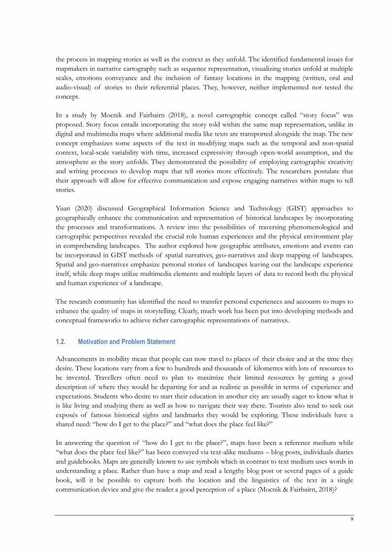
Figure 1-1. Teresa Carpenter’s NY diaries of mapping Manhattan. (Maria Popova, 2013)
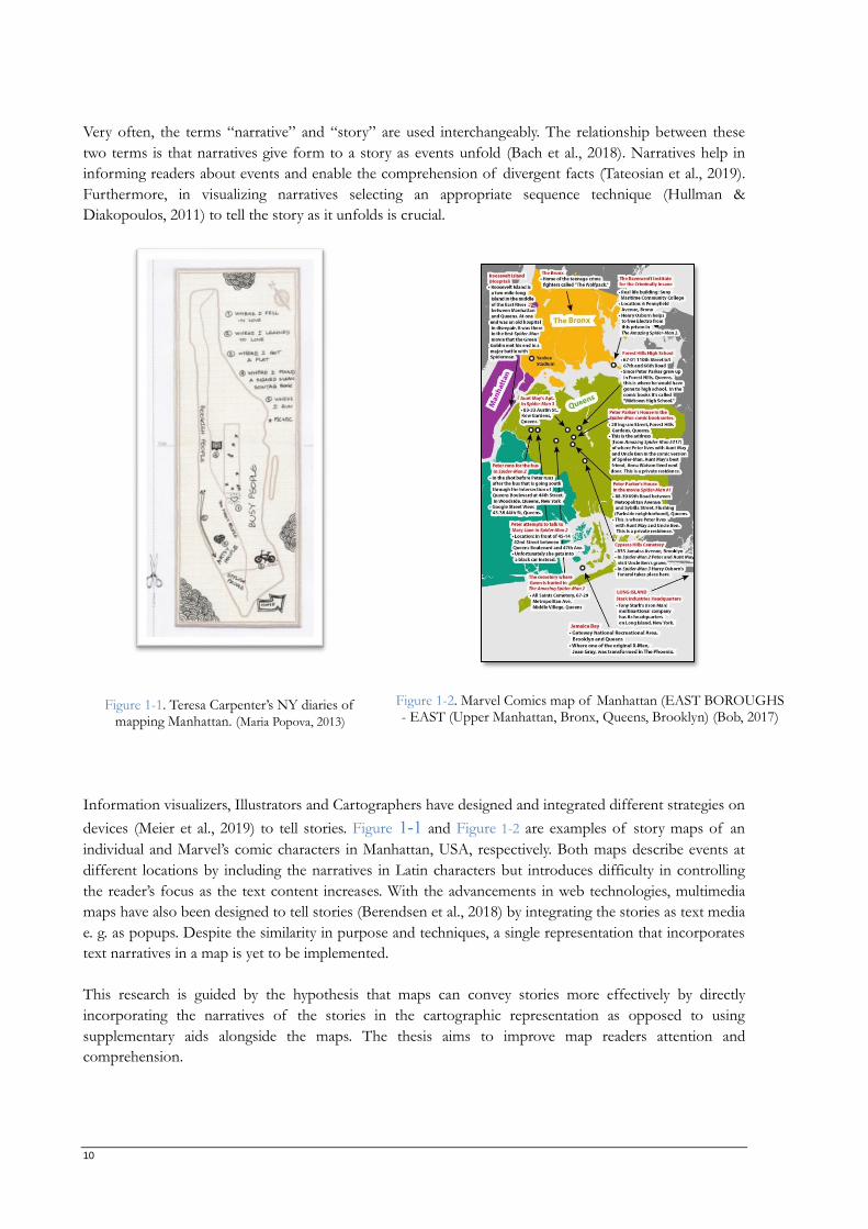
Figure 1-2. Marvel Comics map of Manhattan (EAST BOROUGHS - EAST (Upper Manhattan, Bronx, Queens, Brooklyn) (Bob, 2017)
Information visualizers, Illustrators and Cartographers have designed and integrated different strategies on
devices (Meier et al., 2019) to tell stories. Figure 1-1 and Figure 1-2 are examples of story maps of an
individual and Marvel’s comic characters in Manhattan, USA, respectively. Both maps describe events at
different locations by including the narratives in Latin characters but introduces difficulty in controlling
the reader’s focus as the text content increases. With the advancements in web technologies, multimedia
maps have also been designed to tell stories (Berendsen et al., 2018) by integrating the stories as text media
e. g. as popups. Despite the similarity in purpose and techniques, a single representation that incorporates
text narratives in a map is yet to be implemented.
This research is guided by the hypothesis that maps can convey stories more effectively by directly
incorporating the narratives of the stories in the cartographic representation as opposed to using
supplementary aids alongside the maps. The thesis aims to improve map readers attention and
comprehension.
11
This work is motivated by the concept of mapping stories designed by Mocnik and Fairbairn (2018) in
their publication which they termed “story focus” where maps are modified to incorporate the various
aspects and characteristics of a story in a map representation. The concept design proposed to modify
maps to tell stories of places beyond their spatial context but also emphasize structural aspects like
perception, atmosphere, scale and multiple scales as the stories unfold. This research will be implementing
story focus as a concept and gain empirical knowledge of its effectiveness in communicating a story
compared to its text version.
1.3. Target Research Innovation
Several interactive multimedia and conventional story maps exist on the Internet with most transporting
text media alongside the map instead of incorporating the different aspects of the story narrated in the
map. Until now, there has only been proposals, methodological frameworks, and conceptual designs on
transferring the characteristics of text into cartographic representations.
The innovation this research aims at is assessing the effectiveness of incorporating the characteristics of
text in creating a cartographic representation for narrative storytelling.
1.4. Research Objectives and Questions
1.4.1. Research Objectives
The main objective of this research is to implement and subsequently, test the adaptation of conventional
cartographic maps to incorporate narrative text in telling stories. The objective is divided into the
following sub-objectives:
RO1. Explore existing web mapping frameworks and implement a story in a single cartographic
representation by incorporating the structural aspects comparable to the ones often found in narrative
text.
RO2. Determine the effectiveness of modifying conventional maps to incorporate characteristics
often found in the narrative text by empirical experiments.
1.4.2. Research Questions
RQ1: Which technical means can practically be used to design a cartographic representation
that conveys the narratives of a story?
RQ1.1. What web visualization techniques can be used to tell stories of places of interest and at
different scales as the story unfolds?
RQ1.2. What web mapping frameworks exist that support representation of the narrative aspects and
characteristics (atmosphere, mood, scale, time and spatial context) of a story?
RQ2: What is the reader’s perception of the cartographic representation compared to the text
version?
RQ2.1. How effective is the implemented cartographic representation in communicating and engaging
the reader when compared with reading a text version of the story?
12
RQ2.2. In which ways do the readers need to adapt to these new techniques of mapping stories?
RQ2.3. Which reactions did the readers perceive while reading the cartographic representation of the
story?
1.5. Thesis Structure
The summary of each chapter of this thesis is outlined here. The research consists of 6 chapters.
Chapter 1: The research context, motivation, objectives and questions are described in the
current chapter – chapter one. The thesis method workflow is also summarized here.
Chapter 2: Chapter two reviews relevant literature by researchers and the current state of
storytelling using maps, the proposed story focus concept, as well as the definition of
terminologies. The concept, types and purpose of maps are highlighted. This section of the
research elaborates on the map-types using different media and approaches to communicate to its
readers.
Chapter 3: This section of the research outlines the techniques and tools for implementing the
narratives of a story using the story focus approach are explored. A story is then implemented.
Some of the thesis research questions are answered here.
Chapter 4: In the fourth chapter, the experimental design and procedure are elaborated.
Following the completion of the experiment layout, the next section, chapter five, presents the
results and findings.
Chapter 5: Here, readers perception of the cartographic representation is evaluated from the
experiment for effectiveness and focus retention in communicating the story compared to the
text version. In this section, the remaining research questions are answered.
Chapter 6: In the last chapter, conclusion, the most relevant findings of the research, as well as
the limitations and recommendations for future research, are outlined.
13
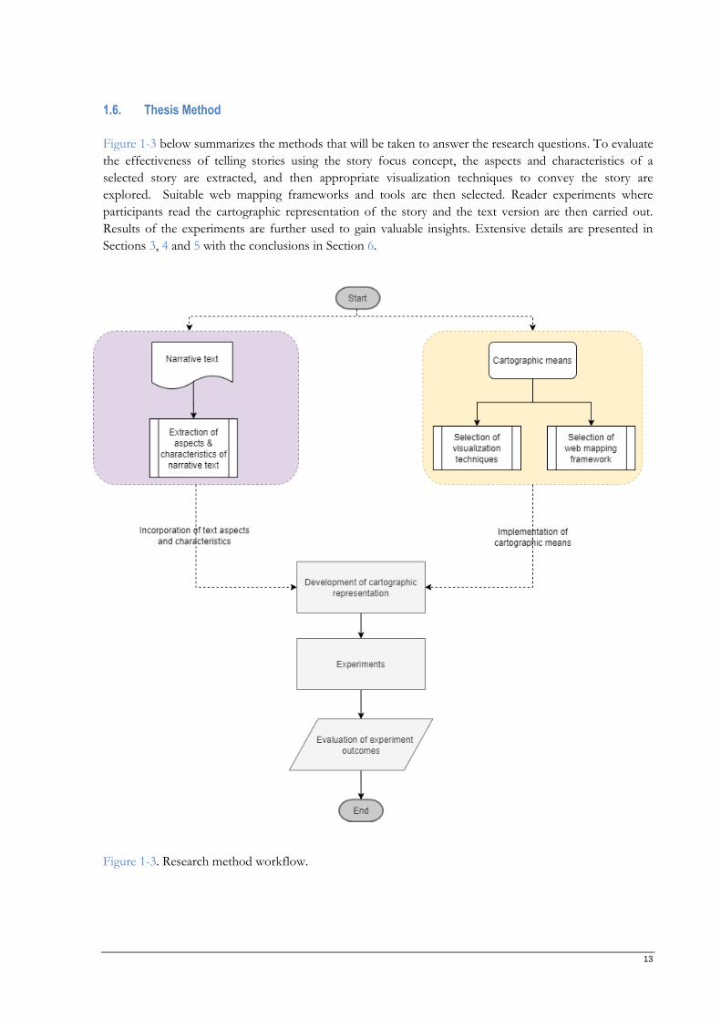
1.6. Thesis Method
Figure 1-3 below summarizes the methods that will be taken to answer the research questions. To evaluate
the effectiveness of telling stories using the story focus concept, the aspects and characteristics of a
selected story are extracted, and then appropriate visualization techniques to convey the story are
explored. Suitable web mapping frameworks and tools are then selected. Reader experiments where
participants read the cartographic representation of the story and the text version are then carried out.
Results of the experiments are further used to gain valuable insights. Extensive details are presented in
Sections 3, 4 and 5 with the conclusions in Section 6.
Figure 1-3. Research method workflow.
14
2. LITERATURE BACKGROUND
This chapter examines the scientific background on the role of maps in telling stories. Chapter
2.1 discusses maps and map types. The next, chapter 2.2 takes a dive into storytelling where the
two forms of storytelling, digital and non-digital storytelling is examined. Chapter 2.3 focuses on
narratives, narrative text and narrative cartography. While chapter 2.4 discusses story maps and
popular tools for creating them. Finally, chapter 2.5 summarizes the concept of story focus and
contrasts maps and text.
2.1. Maps
In this section, an overview of maps and map types is researched. The two common map types, paper and
digital maps are covered in terms of medium and relevance.
2.1.1. Overview of maps
Maps are used for varying purposes, including depicting geographical processes and human phenomena
(Kraak & Fabrikant, 2017). In terms of visualization, maps are considered landmarks of innovations that
convey events and processes of places. They present, graphically, the geospatial information that relates to
the Earth, its inhabitants and its environment, including metaphysical information (Fairbairn et al., 2001).
While map readers are saddled with the responsibility of decoding embedded information of a place in
maps, mapmakers must strive to design maps that effectively encode this information (Tateosian et al.,
2019).
In facilitating at-a-glance comprehension of spatial patterns and processes, maps should be well designed,
engaging and interesting (Kraak & Fabrikant, 2017). Maps should be engaging enough not only to reveal
trends but also make the world a better place, such as in achieving the United Nations SDGs objectives
(Kraak & Fabrikant, 2017). The data used, needs to be unambiguous, clear, complete and as accurate as
possible so that they are not incomprehensible (Stern et al., 2016).
2.1.2. Map Types
Maps are produced to be relevant to society. Therefore, the need to continually innovate how they are
made is crucial. The flexibility of Cartography as a discipline means that it will be able to adapt to societal
and technological changes in producing maps that are relevant to society. In ensuring that cartography
does not experience stagnation, while still maintaining the core cartographic values such as symbols, it
involves other cognate fields including artists (graphic designers), scientists (data scientists and visualizers)
and technologists (digital media). The volume of data today makes a demand on the modern-day
cartographer to acquire programming, and database management, processing and analysis skills to
correctly handle the heterogeneous nature of the data from different sources. (Kraak & Fabrikant, 2017)
2.1.2.1. Paper maps
Paper maps are sometimes referred to as traditional maps. They are simply maps for “printed
communication” (McKee, 2017). Paper maps are so easy to use, unlike digital maps, because they do not
require any special training to use the media. The graphical abstraction of the vast expanse of space is well
known to people because of paper maps.
15
Paper maps are still trendy today, for example, in the tourism world as they are usually incorporated in
guidebooks to help tourists and adventure seekers navigate their way and plan their schedule (Mocnik &
Fairbairn, 2018).
2.1.2.2. Digital maps
Technology has significantly improved how information is being shared around the world, and
Cartography has benefited from these developments. Numerous maps can be found on the Internet
including the Web, mobile devices and enterprise systems. These maps aid decision making, provide
location services and serve as a guide for tourists and logistics personnel and a myriad of ways.
One of the most popular digital maps is those with multimedia components. Multimedia has extended the
reach and products of cartographers (Cartwright, 1999; Cartwright & Peterson, 2007) by creating digital
maps that are supplemented by media such as videos, text, sound. Multimedia elements have also enriched
how geographical information is presented and interacted with (Mocnik & Fairbairn, 2018). Today,
multimedia maps abound over the Internet and are very popular in the journalistic world.
WebGIS, also known as Internet GIS, has provided governments and agencies to serve spatial
information via an interactive interface (Chang & Park, 2006; Zhao & Chen, 2017). End-users do not need
to install GIS software on their computers, nor do they need to have the data stored and can query for
information in near real-time. Many governments use WebGIS to communicate to its citizenry (Milson,
2006). Schools, restaurants and many other services use WebGIS too. This digital mapping technology is
so versatile that it allows for operations such as querying for location-based results.
The accessibility and user-friendliness of digital maps are such that even non-geographers can easily use it
to derive the information that they are intended to provide.
2.2. Storytelling
Generally, a story is a series of actions that reveal human traits; sometimes, stories are about objects but
yet contain qualities of humans (Levine, 2011) while storytelling is the narrating a tale (Dujmović, 2006) or
the series of events. Storytelling is as old as human history (Sam Slater, 2020; Yılmaz & Ciğerci, 2018) and
has been used for the preservation of cultures (Kocaman-Karoglu, 2015) and improving communication
skills (Mokhtar et al., 2011).
Storytelling is an age-long tradition of describing events in such a way that the audience is able to conjure
mental images, thus, entrapping them. It is recognized as one vital form of communication. However,
advancement in digital media presents new opportunities in telling stoies for the purpose of education,
entertainment, marketing, culture preservation, and much more (Levine, 2011).
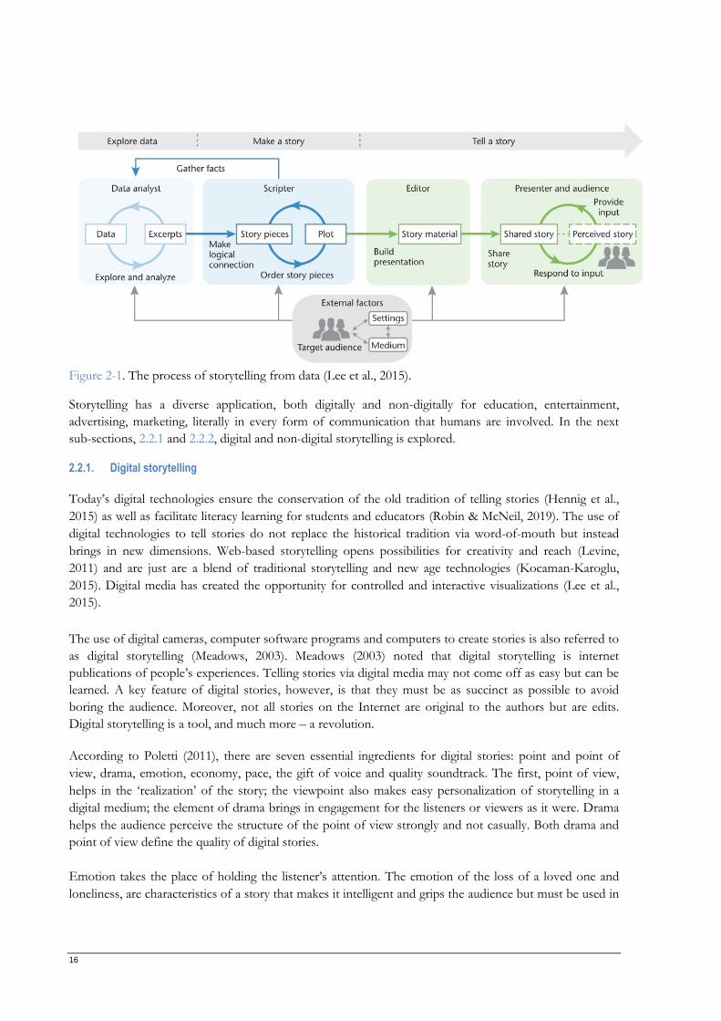
Lee et al., (2015) in their “Visual Data Storytelling Process (VDSP)” came up with three broad stages for
telling stories from data starting with data exploration, story formulation and then telling a story as shown
in Figure 2-1. The data exploration stage includes creating sketches to make excerpts. The data excerpts
collected are then used to form a rich and compelling plot from which a story is then delivered. Worthy of
note is that the storytelling process is rarely linear, that is, at the “make a story” stage, it might be
necessary to go back to the data exploration stage to gather more excerpts. The entire story visualization
process may or may not involve multiple individuals or roles.
16
Figure 2-1. The process of storytelling from data (Lee et al., 2015).
Storytelling has a diverse application, both digitally and non-digitally for education, entertainment,
advertising, marketing, literally in every form of communication that humans are involved. In the next
sub-sections, 2.2.1 and 2.2.2, digital and non-digital storytelling is explored.
2.2.1. Digital storytelling
Today’s digital technologies ensure the conservation of the old tradition of telling stories (Hennig et al.,
2015) as well as facilitate literacy learning for students and educators (Robin & McNeil, 2019). The use of
digital technologies to tell stories do not replace the historical tradition via word-of-mouth but instead
brings in new dimensions. Web-based storytelling opens possibilities for creativity and reach (Levine,
2011) and are just are a blend of traditional storytelling and new age technologies (Kocaman-Karoglu,
2015). Digital media has created the opportunity for controlled and interactive visualizations (Lee et al.,
2015).
The use of digital cameras, computer software programs and computers to create stories is also referred to
as digital storytelling (Meadows, 2003). Meadows (2003) noted that digital storytelling is internet
publications of people’s experiences. Telling stories via digital media may not come off as easy but can be
learned. A key feature of digital stories, however, is that they must be as succinct as possible to avoid
boring the audience. Moreover, not all stories on the Internet are original to the authors but are edits.
Digital storytelling is a tool, and much more – a revolution.
According to Poletti (2011), there are seven essential ingredients for digital stories: point and point of
view, drama, emotion, economy, pace, the gift of voice and quality soundtrack. The first, point of view,
helps in the ‘realization’ of the story; the viewpoint also makes easy personalization of storytelling in a
digital medium; the element of drama brings in engagement for the listeners or viewers as it were. Drama
helps the audience perceive the structure of the point of view strongly and not casually. Both drama and
point of view define the quality of digital stories.
Emotion takes the place of holding the listener’s attention. The emotion of the loss of a loved one and
loneliness, are characteristics of a story that makes it intelligent and grips the audience but must be used in
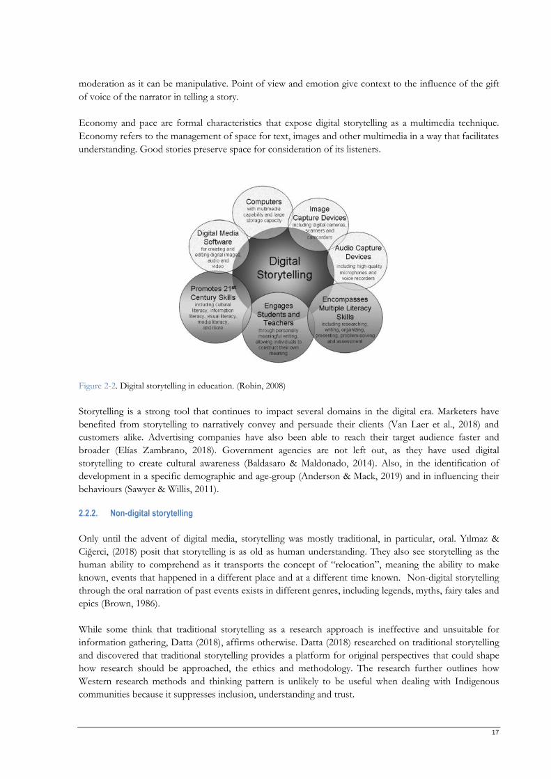
17
moderation as it can be manipulative. Point of view and emotion give context to the influence of the gift
of voice of the narrator in telling a story.
Economy and pace are formal characteristics that expose digital storytelling as a multimedia technique.
Economy refers to the management of space for text, images and other multimedia in a way that facilitates
understanding. Good stories preserve space for consideration of its listeners.
Figure 2-2. Digital storytelling in education. (Robin, 2008)
Storytelling is a strong tool that continues to impact several domains in the digital era. Marketers have
benefited from storytelling to narratively convey and persuade their clients (Van Laer et al., 2018) and
customers alike. Advertising companies have also been able to reach their target audience faster and
broader (Elías Zambrano, 2018). Government agencies are not left out, as they have used digital
storytelling to create cultural awareness (Baldasaro & Maldonado, 2014). Also, in the identification of
development in a specific demographic and age-group (Anderson & Mack, 2019) and in influencing their
behaviours (Sawyer & Willis, 2011).
2.2.2. Non-digital storytelling
Only until the advent of digital media, storytelling was mostly traditional, in particular, oral. Yılmaz &
Ciğerci, (2018) posit that storytelling is as old as human understanding. They also see storytelling as the
human ability to comprehend as it transports the concept of “relocation”, meaning the ability to make
known, events that happened in a different place and at a different time known. Non-digital storytelling
through the oral narration of past events exists in different genres, including legends, myths, fairy tales and
epics (Brown, 1986).
While some think that traditional storytelling as a research approach is ineffective and unsuitable for
information gathering, Datta (2018), affirms otherwise. Datta (2018) researched on traditional storytelling
and discovered that traditional storytelling provides a platform for original perspectives that could shape
how research should be approached, the ethics and methodology. The research further outlines how
Western research methods and thinking pattern is unlikely to be useful when dealing with Indigenous
communities because it suppresses inclusion, understanding and trust.
18
Telling stories orally is unlikely to go away anytime soon as it is a good source of information gathering
and cultural integration.
2.3. Narratives
Narratives are designed to entertain its audiences rather than cause arguments by minimizing
opportunities for counter-arguments (Zwarun & Hall, 2012). They are capable of sweeping readers to
different geographies and times (Green, 2014) and connecting cultures to physical spaces (Couling et al.,
2019). A compelling narrative is adept at holding the attention of its readers that they do not realize that
time has passed nor notice activities going on around them in their immediate environment (Green &
Brock, 2000; Green, 2014). Green (2014) called this phenomenon “transportation into a narrative world”.
One of the most common forms of digital storytelling is the narration of personal experiences – personal
narratives (Robin, 2008). Because these narratives are unique to an individual, they are acquired through
face-to-face interviews. Narratives that are personal can be useful in bringing the lives of pupils into the
classroom, thereby bridging the gap between schooling and literacy (Kahveci & Güneyli, 2020). As an
example, Kourti (2016) successfully explored the utilization of personal narratives in the identification of
multiple identities within the context of an organization.
Another type of digital storytelling are stories told to pass on information or instruct (Robin, 2008). This
type of narrative is used by teachers to instruct pupils on subject-areas like art, science and technology. An
example will be digital stories created to direct students on how to create and use a pendulum in a Physics
laboratory. In some instances, personal narratives may also contain historical information as a precursor.
Historical narratives are yet another type of storytelling approach. The most use of historical narratives is
in the definition of national identities and the establishment of shared goals for the future (Korostelina,
2019). In a classroom setting, photographs, newspapers and other materials serve as rich sources of events
that took place in the past (Robin, 2008). Korostelina (2019) posit that four mechanisms, recognition,
assessment, connotation and prescription, give historic narratives their normative function.
Narrative persuasion is a predominant technique used in marketing research. The marketing industry uses
narratives to tell stories that influence the mental state of their consumers, thereby, mitigating their
propensity for rebuttals by arousing their emotions (Van Laer et al., 2018). In an experiment conducted by
Appel & Richter, (2007) to test the “absolute sleeper effect”, they observed that information gotten from
narratives could easily find its way into the listener’s real-world knowledge. They also added that
transporting stories via narratives to target markets goes beyond the moment they encounter the
narratives, but even long after they do.
“Fictional narratives often exist to entertain” (Zwarun & Hall, 2012). Kids enjoy entertainment, especially
those show on television. Moyer-Gusé et al. (2010) explain how fictional narratives could be used to
entertain kids while still providing information that promotes healthy habits and good behaviours.
Beyond entertainment, fictional narratives substantially impact readers’ view of reality and beliefs,
especially when its content is fact-related (Appel & Richter, 2007; Green, 2014).
In summary, narratives are used in literally every aspect of life and the plot, emotions, locations, media and
other materials, when properly utilized, can influence the readers’ beliefs, motivation and decisions.
19
2.3.1. Narrative text
A narrative text is a written, meaningful series of events (Latifa & Manan, 2018). It is a story that tries to
resolve problematic events or amuse or entertain its readers (Aris Munand, 2013). Readers generally tend
to observe a text in five (5) unique dimensions which are place, cause, time, cause and effect, and
character(s) (Zwaan et al., 1998; Therriault & Raney, 2007).
Languages, like English, are characterized by a generic structure. The generic structure of a narrative is
divided into five broad categories: orientation, complication (events sequence), resolution, re-orientation and
evolution (Sulistyo, 2017). Orientation is the main contention of the text where the character is made known.
The complication is the middle of the story, which shows the story’s sequence. Resolution is where the
problem encountered by the character is resolved while re-orientation contains the moral values intended to
be passed on. Finally, the evolution, which can be merged with orientation, gives information about place and
time.
Below is an example of a narrative text titled “A Countryman and a Snake”.
The quality of narrative text will continually play an essential role in telling stories on how humans
perceive reality and understand the past. By quality, this means coherence, richness and structure (i.e. the
level of organization) (Chen & Liu, 2019).
2.3.2. Narrative Cartography
The geography of narratives is a subject that many studies have given attention to over the last few
decades because everything happens in a place. Location constructs, progression and movement, are
vocabularies that are associated with stories and lives. In narratives and works of literature, it is almost
ubiquitous to find critical vocabularies that stem from spatial models. In most cases, time is emphasized
while the location is marginalized and this is in part due to the nature of narratives which unfolds with
time (Linton, 2001; Ameel, 2017; Westerholt et al., 2020).
Places play a significant role in the plot of a story, just as stories are crucial in identifying places.
Furthermore, this gives narrative cartography a dual role of identifying the spatial structure of a story as
well as the impact of stories on places. Although placing narratives on a map might seem as easy as
inserting a point, but this is not all there is to narrative cartography. There is the need to include all
dimensions of a narrative: place (geography), geometry and time for compelling storytelling (Sebastien
Caquard & Fiset, 2014).
“A countryman's son stepped on a snake's tail accidentally. The tail suddenly turned and
hit him so that he died. The father was very angry so that he cut off part of the snake’s tail.
Then, the snake in revenge stung several of the farmer's cattle. It caused him great loss.
However, the farmer decided to stop the fight with the snake. He brought food and honey
to the mouth of its lair, and said to it, "Let's forget and forgive. Perhaps you were right to
punish my son, and take revenge on my cattle, but surely, I was right in trying to revenge
him. Now that we are both satisfied, why should not we be friends again?" "No, no," said
the snake. "Take away your gifts. You can never forget the death of your son, nor I the
loss of my tail. Injuries may be forgiven, but not forgotten.” ” – (Ophie Ovie, 2012)
20
Mapping narratives comes with its challenges. One of such is breaking the narratives into bits and pieces
of places to resolve the complexity in identifying their actual location (e.g. fictional narratives). Another
challenge in mapping narratives includes piecing of places and the relationship between those places from
the pieces in the data acquisition phase. In addition, mapping the temporal aspects of narratives can prove
challenging especially that both geometry and geography will also need to be linked (Sebastien Caquard &
Fiset, 2014).
Couling et al. (2019) observed that contributions by citizens in the development of cartographic
representations could help in the capture of esvents of the past while providing future visions. The author
noted that narrative cartography through alternative information gathering could equally aid the process of
innovative planning.
Expressive creativity is an essential ingredient in the writing process of a narrative text (Méndez-Negrete,
2013) and so also is creativity important for every map design process. Maps produced using narrative
cartography techniques, when done creatively, can help its users understand complex landscapes and
detect locations more intuitively.
2.4. Story Maps
Like most maps, story maps tell stories. The stories can be that of an event, a journey or a metamorphosis.
They help reveal, propagate and explain (ESRI, 2012) information that will be otherwise hidden.
A story map is a visual representation that enables readers to identify, organize and analyze the elements
of a story (Stetter & Hughes, 2010) and its grammar (Boulineau et al., 2004). The elements of the story
represented on a story map are prompts that support readers in locating and identifying important
information (Stetter & Hughes, 2010) while the story grammar refers to the characters, the context and
episodic events (Stein, 1975). A story map, besides improving the comprehension ability for its readers,
also contributes to how well and much the readers can recall the story content.
Students with or without reading disabilities have also found the comprehension of narrative text
enhanced via story mapping visual strategy (Boulineau et al., 2004; Stetter & Hughes, 2010) very helpful. A
sizeable number of students with Learning Disabilities (LD) experience reading comprehension problems
(Proctor et al., 2007) in studying their curriculum. In an experiment conducted by Narkon and Wells
(2013), they demonstrated how the story-mapping strategy improved the comprehension ability of
students with reading disability.
Virtually every story map contains the narrative aspect, the textual elements, location data, supplementary
media and cartography. These maps are created either to locate something, provide navigation, tell about a
place, highlight a topic with geography embedded in it, summarize a situation, compare themes or places,
display change with respect to time, model the future or even enable participatory tasks (ESRI, 2012).
An example story map created to tell about the history of China is captured in Figure 2-3. The
visualization incorporates several multimedia cartography techniques to communicate the development of
China from its early days. The timeline narrated on the history of china in five themes: Early China, Tang
Dynasty, Ming Dynasty, Qing Dynasty and Modern China. For each of these periods, a map with markers
is shown. A popup feature is attached to the styled markers to provide additional information. The
popups contain a picture and some text for a descriptive title. Clicking the image opens up more to be
read in a larger popup widow with more text. Videos are also used to provide additional aid to visitors of
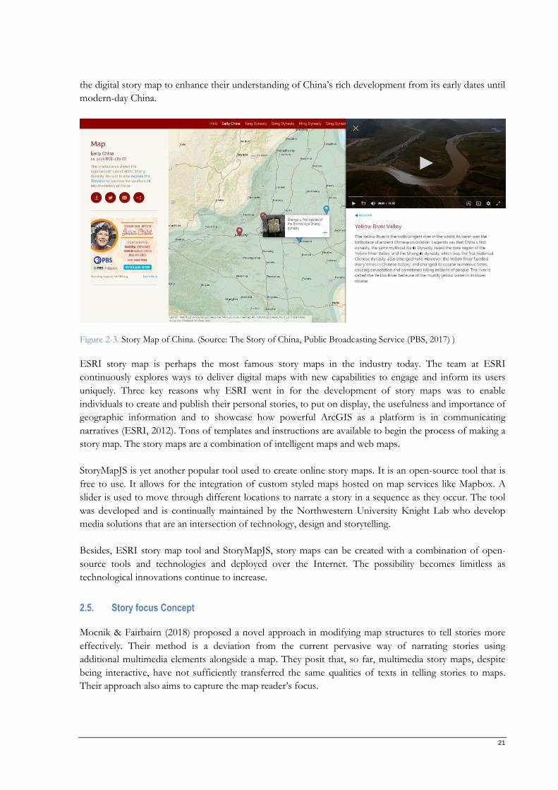
21
the digital story map to enhance their understanding of China’s rich development from its early dates until
modern-day China.
Figure 2-3. Story Map of China. (Source: The Story of China, Public Broadcasting Service (PBS, 2017) )
ESRI story map is perhaps the most famous story maps in the industry today. The team at ESRI
continuously explores ways to deliver digital maps with new capabilities to engage and inform its users
uniquely. Three key reasons why ESRI went in for the development of story maps was to enable
individuals to create and publish their personal stories, to put on display, the usefulness and importance of
geographic information and to showcase how powerful ArcGIS as a platform is in communicating
narratives (ESRI, 2012). Tons of templates and instructions are available to begin the process of making a
story map. The story maps are a combination of intelligent maps and web maps.
StoryMapJS is yet another popular tool used to create online story maps. It is an open-source tool that is
free to use. It allows for the integration of custom styled maps hosted on map services like Mapbox. A
slider is used to move through different locations to narrate a story in a sequence as they occur. The tool
was developed and is continually maintained by the Northwestern University Knight Lab who develop
media solutions that are an intersection of technology, design and storytelling.
Besides, ESRI story map tool and StoryMapJS, story maps can be created with a combination of open-
source tools and technologies and deployed over the Internet. The possibility becomes limitless as
technological innovations continue to increase.
2.5. Story focus Concept
Mocnik & Fairbairn (2018) proposed a novel approach in modifying map structures to tell stories more
effectively. Their method is a deviation from the current pervasive way of narrating stories using
additional multimedia elements alongside a map. They posit that, so far, multimedia story maps, despite
being interactive, have not sufficiently transferred the same qualities of texts in telling stories to maps.
Their approach also aims to capture the map reader’s focus.
22
The concept, story focus, which enhances the ability of maps to communicate the same information in
narrative text on a map was developed by Mocnik & Fairbairn (2018). It involves the incorporation of the
structural features of texts such as time, non-spatial relations, emotions, atmosphere. Unlike the popular
maps produced today, story focus makes provision for a more dynamic representation of important
elements in a story’s narrative by implementing the structural elements of text versions of a story. The
approach makes a shift from today’s paradigm of map use and feature interpretation by differently
interpreting existing concepts.
The heart of representations using the story focus concept means depicting what is relevant to the story
and eliminating redundancies. However, as the story unfolds, the map and its elements can change with
time. The authors of this concept likened this approach to a “variable generalization technique” where the
cartographic visualization is designed to be adaptable using varying layers of mood, emotion, component
features, scale and level-of-detail.
2.5.1. Map versus text representations
Mocnik & Fairbairn (2018) acknowledge that while conventional maps are being explored to incorporate
the characteristics of a narrative text, this may not be entirely feasible. Some of the affordances of text that
may be difficult to incorporate in a map accurately include the atmosphere of the location where the event
took place. Text can easily tell what the characters were doing, where they were, how they feel and relate
to one another, whereas a map is limited in conveying the same features of a place because they are non-
spatial. Zupan & Babbage (2017) research revealed how narrative text help readers understand emotions
easily. Table 1 summarizes a comparison of the properties of prototypical textual and cartographical
representations.
Table 1. An overview of similarities and dissimilarities between maps and text media. (Source: Mocnik & Fairbairn, 2018)
Map Text
Two dimensions One dimension
Parametrized by space Parametrized by time
Spatial relations implicitly contained Spatial relations need to be explicitly represented
Size of the representation of all binary spatial relations
is for n objects
Size of the representation of all binary spatial relations
is for n objects
Spatial incoherencies and contradictions impossible Spatial incoherencies and contradictions possible
Strong spatial context Strong temporal and thematic context
Limited flexibility of the scale The high flexibility of the scale
Closed-world assumption Open-world assumption
Possibly animated Static
Can be perceived in arbitrary order To be perceived in a contemplated order
Inflexible use of categories Flexible use of categories
More objective More subjective use possible

23
Implicit Spatial Index No implicit spatial index
Algorithmic generalization possible Algorithmic generalization hardly possible
24
3. STORY VISUALIZATION
In this chapter, I report how I implemented the story focus concept with the story, “Legend of
Meng Jiangnu”. The selection of the story is described in Section 3.1. The techniques and
technologies needed to implement the narratives of the story in a cartographic representation are
outlined in Section 3.2. A prototype of the story visualization is designed before the actual
development of the map.
3.1. Story
The story, “Legend of Meng Jiangnu”, is one of the popular folktales in the People’s Republic of China. The
story has variations in terms of content as well as the title. The multiplicity of versions and variations in
the Chinese tale is linked to retelling via the agelong tradition of oral storytelling and performance. In
addition to the subtle nuances in story retelling, translation from Chinese to English contributes to the
variation in folktale.. However, the plot and theme remain unchanged. The first translation was done by
George Carter Stent, who lived his adult life in China and had a predilection for Chinese tales. George’s
version is included in a compilation by Lu Gong as “Mêng Chêng’s Journey to the Great Wall.”. About fifty
years on from George’s version, in 1934, came another translation by Geoffrey Chen and Genevieve
Wimsatt translation which they titled “The Lady of the Long Wall” (Idema, 2018).
For this research, I created a minified version of the story. The minified version here refers to the part of
the narrative which starts from when the main characters, Fan and Meng, lived in different places to when
they meet, and then finally, Meng seeing Fan’s body remains as bones. The three online versions used to
create this short version are:
i. Meng Jiangnu Cries The Great Wall 1
“More than 2000 years ago, there is a couple, Fan Xiliang and Meng Jiangnu, get married. During
their wedding day, the government comes to their home and takes Fan away, for the labor force
of building the Great Wall.
Meng loves her husband so much, so she overcomes so much difficulty and finally finds part of
the Great Wall where her husband worked. At the same time, she hears a bad news that her
husband is dead because of exhausted to build the Great Wall. She is so desperate and cries three
days on the Wall. Suddenly, the Wall collapses 800 kilometers, and she can see her husband’s
bones.”
ii. Meng Jiangnu’s Bitter Weeping 2
1 Meng Jiangnu Cries The Great Wall. http://www.beijingwalking.com/top-5-most-famous-chinese-stories/
2 Meng Jiangnu’s Bitter Weeping.
https://www.travelchinaguide.com/china_great_wall/culture/mengjiangnu.htm#:~:text=The%20Great%20Wall%2
0story%20of,bottle%20gourd%20in%20his%20yard
25
“Meng and Jiang liked this good-looking, honest, and good-mannered young man. They decided
to wed their daughter to him. The two young people accepted happily and got married several
days later. However, three days after their marriage, officials suddenly broke in and took Fan
Qiliang away to build the wall in the north of China.
It was a hard time for Meng Jiangnu after her husband was taken away - she missed her husband
and cried nearly every day. She sewed warm clothes for her husband and decided to set off to
look for him. Saying farewell to her parents, she packed her luggage and started her long journey.
She climbed over mountains and went through the rivers. She walked day and night, slipping and
falling many times, but finally she reached the foot of the Great Wall at the present Shanhaiguan
Pass.
Upon her arrival, she was eager to ask about her husband. Bad news came to her, however, that
Fan Qiliang had already died of exhaustion and was buried into the Great Wall! Meng Jiangnu
could not help crying. She sat on the ground and cried and cried. Suddenly with a tremendous
noise, a 400 kilometer-long (248-mile-long) section of the wall collapsed over her bitter wail.”
iii. The Legend of Meng Jiangnu 3
“Once, when she was walking in the garden, she found a man hiding in the bushes, and
immediately called for her parents. When the man came out, it was a young, good looking man
named Fan Xiliang. Fan was hiding from officials that wanted to take him to build the great Wall.
Jiangnu and Xiliang fell in love and were married in short order. But their happiness was not
everlasting – three days after their wedding Xiliang was taken by officials to build the wall.
A year passed and Jiangnu did not hear any news from her husband. Once she had a dream that
he was freezing on the wall, after waking up she started knitting warm clothes for him. It was then
she decided she would find him, no matter the cost. Day and night she climbed over mountains
and went through the rivers, slipping and falling many times, and after many moons she finally
reached the foot of the Great Wall at the present Shanhaiguan Pass. And when she reached there,
it turned out that her husband had died from hard labor and was buried somewhere under the
Great Wall like thousands of other workers.
Upon hearing such news Meng Jiang could not help but cry with grief for her beloved husband,
she wept like this for three days and three nights.
Suddenly with a tremendous noise, that part of the wall just collapsed. Chinese believed in the
telepathy between heaven and man. They thought man’s cries could move God, and that’s why
she was able to “bring down the Great Wall with her tears”.”
Based on these three versions, I created the following minified version of the story, which is used
hereafter for the study conducted:
3 The Legend of Meng Jiangnu. https://www.theworldofchinese.com/2015/03/the-legend-of-meng-jiangnu/
26
“More than 2000 years ago, there lived Fan Xiliang and Meng Jiangnu, who later got married.
Three days after their wedding, the government comes to their home and takes Fan away for the
labour force of building the Great Wall.
Seeing that her husband was taken away, Meng experienced such a hard time, and she cried for
days as she missed him terribly. Meng loves her husband so much, so she takes some warm
clothing and departs for the Great Wall where her husband works after a year of not hearing from
him.
She finally gets to the Wall and hears the bad news that her husband is dead from exhaustion
while building the Great Wall. She is so desperate and cries three days at the Wall. Suddenly, the
Wall collapses 800 kilometres away, and she can see her husband’s bones.”.
Each of the online versions had similar plots and the same characters but differed in level-of-detail. For
instance, only the second online resource mentions how many days had passed before the government
forces took Fan after his wedding to Meng. Regarding Meng’s journey to the Wall to find Fan, both the
second and third online resource detailed her packing up warm clothing before setting off for the journey
while the first resource gives no such detail. The number of days she spent crying at the Wall was not
mentioned in the second but was detailed as three (3) days in the first and last online resources. Similarly,
there exist variations in the exact distance of the Wall that collapsed according to the legend.
The difference in versions can be traced to the old tradition of telling and retelling stories by word of
mouth. Bias tends to be introduced when a story is orally retold in an attempt to emphasize a detail or
pass on a specific lesson which then leaves the listeners transferring the same or less detailed version.
Besides, the versions are usually characterized by different wordings.
3.2. Implementation of story
In this section, the story is visualized. The process begins with breaking down the story and matching the
narratives with suitable cartographic visualization techniques in 3.2.1, followed by the design of the
cartographic representation in 3.2.2, and then the development of the map visualization in 3.2.3.
3.2.1. Cartographic representation techniques
Digital maps are advantageous compared to non-digital maps. Creating cartographic visualizations for the
Internet makes it possible to reach a broad audience. An online map could either be static or interactive.
Interactive maps are designed to let users change aspects of the map, and thus create a bidirectional
relationship between the user and the map, which is in contrast to static maps. Although the latter type of
maps are relatively straightforward to create, such maps do not allow users to explore the contents beyond
what is initially presented on their screens. Generally, interactive maps on the Internet provide hybrid
functionality of exploration and presentation (Smith, 2016).
The process of creating well-designed maps starts with the selection of appropriate visualization
techniques (Smith, 2016). A summary table of the techniques that I have chosen for visualizing the story is
presented in Table 2. The table shows the entire narrative split into pieces with matching appropriate
techniques to convey the story. The main goal of selecting the visualization techniques is to ensure that
the characteristics and aspects of the text are transferred to the visualization. The techniques selected were
also considered when selecting the tools and framework to be used.
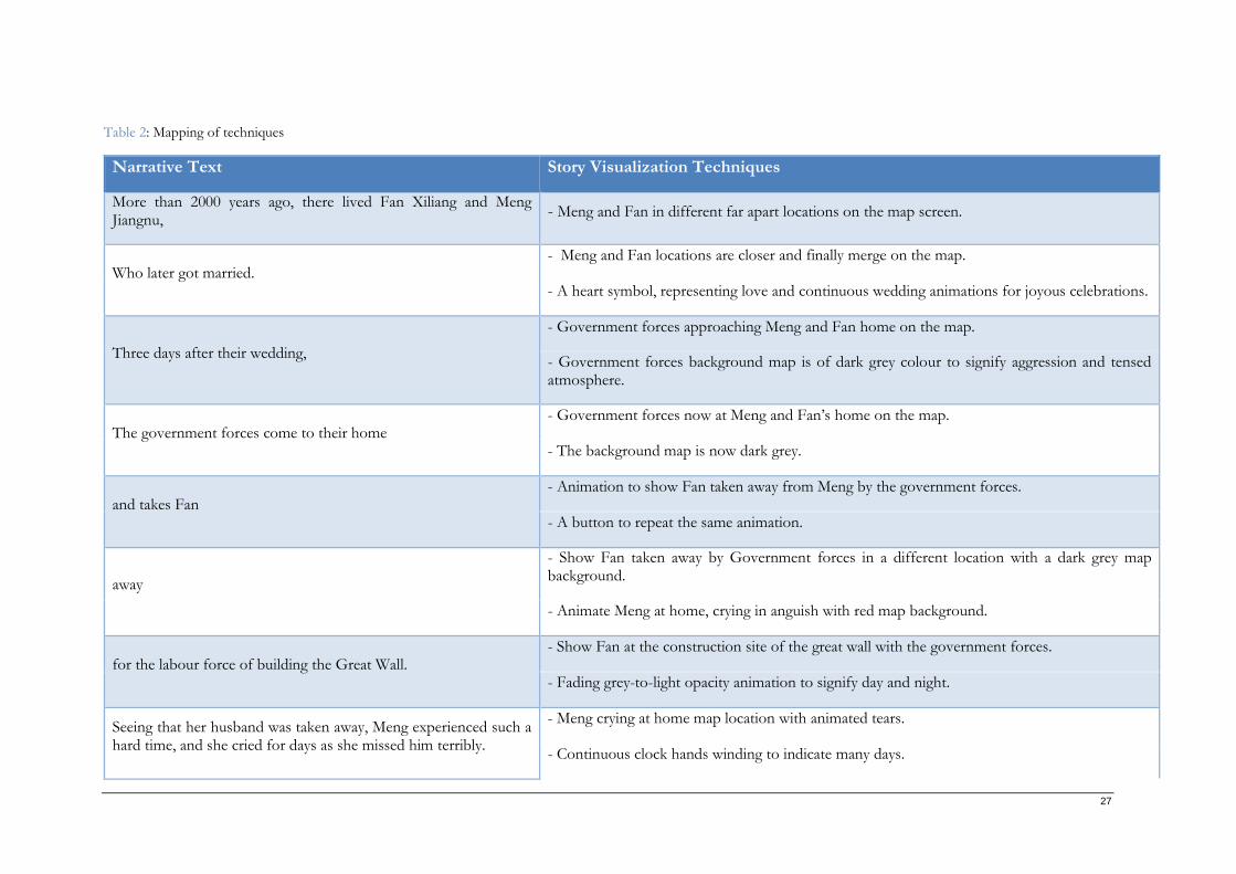
27
Table 2: Mapping of techniques
Narrative Text Story Visualization Techniques
More than 2000 years ago, there lived Fan Xiliang and Meng Jiangnu,
- Meng and Fan in different far apart locations on the map screen.
Who later got married. - Meng and Fan locations are closer and finally merge on the map.
- A heart symbol, representing love and continuous wedding animations for joyous celebrations.
Three days after their wedding,
- Government forces approaching Meng and Fan home on the map.
- Government forces background map is of dark grey colour to signify aggression and tensed atmosphere.
The government forces come to their home - Government forces now at Meng and Fan’s home on the map.
- The background map is now dark grey.
and takes Fan - Animation to show Fan taken away from Meng by the government forces.
- A button to repeat the same animation.
away
- Show Fan taken away by Government forces in a different location with a dark grey map background.
- Animate Meng at home, crying in anguish with red map background.
for the labour force of building the Great Wall. - Show Fan at the construction site of the great wall with the government forces.
- Fading grey-to-light opacity animation to signify day and night.
Seeing that her husband was taken away, Meng experienced such a hard time, and she cried for days as she missed him terribly.
- Meng crying at home map location with animated tears.
- Continuous clock hands winding to indicate many days.
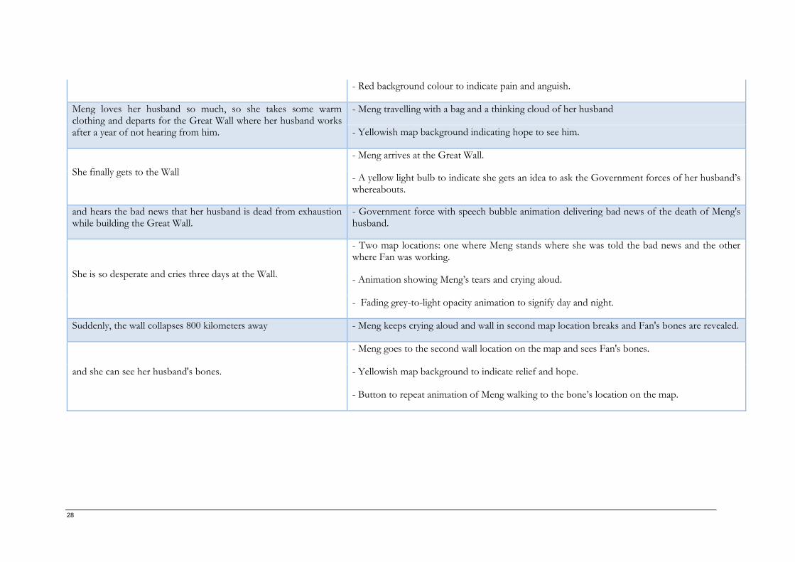
28
- Red background colour to indicate pain and anguish.
Meng loves her husband so much, so she takes some warm clothing and departs for the Great Wall where her husband works after a year of not hearing from him.
- Meng travelling with a bag and a thinking cloud of her husband
- Yellowish map background indicating hope to see him.
She finally gets to the Wall
- Meng arrives at the Great Wall.
- A yellow light bulb to indicate she gets an idea to ask the Government forces of her husband’s whereabouts.
and hears the bad news that her husband is dead from exhaustion while building the Great Wall.
- Government force with speech bubble animation delivering bad news of the death of Meng's husband.
She is so desperate and cries three days at the Wall.
- Two map locations: one where Meng stands where she was told the bad news and the other where Fan was working.
- Animation showing Meng’s tears and crying aloud.
- Fading grey-to-light opacity animation to signify day and night.
Suddenly, the wall collapses 800 kilometers away - Meng keeps crying aloud and wall in second map location breaks and Fan's bones are revealed.
and she can see her husband's bones.
- Meng goes to the second wall location on the map and sees Fan's bones.
- Yellowish map background to indicate relief and hope.
- Button to repeat animation of Meng walking to the bone’s location on the map.
29
3.2.2. Design of the cartographic representation
In this section, the process of creating a visualization to convey the narrative of a selected story is
presented. Specifically, Section 3.2.2.1 explains the design of the icons, while the layout of the visualization
is described in Section 3.2.2.2.
3.2.2.1. Icon design for the cartographic representation
Cartographic representations contain graphic elements such as icons which serve as metaphors of real
items they represent. Icons are visual language elements of a map. For computer icons, attention should
be given to contrast, identity (metaphor) and uniqueness (that is, should be easy to distinguish). Besides,
efficient icons should be able to stimulate the eyes of its users (Honeywill, 1999) while they view them.
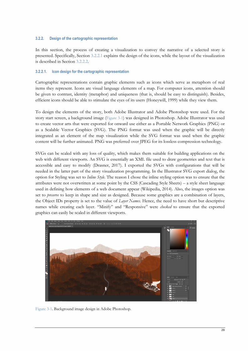
To design the elements of the story, both Adobe Illustrator and Adobe Photoshop were used. For the
story start screen, a background image (Figure 3-1) was designed in Photoshop. Adobe Illustrator was used
to create vector arts that were exported for onward use either as a Portable Network Graphics (PNG) or
as a Scalable Vector Graphics (SVG). The PNG format was used when the graphic will be directly
integrated as an element of the map visualization while the SVG format was used when the graphic
content will be further animated. PNG was preferred over JPEG for its lossless compression technology.
SVGs can be scaled with any loss of quality, which makes them suitable for building applications on the
web with different viewports. An SVG is essentially an XML file used to draw geometries and text that is
accessible and easy to modify (Drasner, 2017). I exported the SVGs with configurations that will be
needed in the latter part of the story visualization programming. In the Illustrator SVG export dialog, the
option for Styling was set to Inline Style. The reason I chose the inline styling option was to ensure that the
attributes were not overwritten at some point by the CSS (Cascading Style Sheets) – a style sheet language
used in defining how elements of a web document appear (Wikipedia, 2014). Also, the images option was
set to preserve to keep in shape and size as designed. Because some graphics are a combination of layers,
the Object IDs property is set to the value of Layer Names. Hence, the need to have short but descriptive
names while creating each layer. “Minify” and “Responsive” were checked to ensure that the exported
graphics can easily be scaled in different viewports.
Figure 3-1. Background image design in Adobe Photoshop.
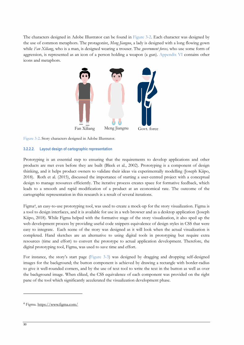
30
The characters designed in Adobe Illustrator can be found in Figure 3-2. Each character was designed by
the use of common metaphors. The protagonist, Meng Jiangnu, a lady is designed with a long flowing gown
while Fan Xiliang, who is a man, is designed wearing a trouser. The government forces, who use some form of
aggression, is represented as an icon of a person holding a weapon (a gun). Appendix VI contains other
icons and metaphors.
Fan Xiliang Meng Jiangnu Govt. force
Figure 3-2. Story characters designed in Adobe Illustrator.
3.2.2.2. Layout design of cartographic representation
Prototyping is an essential step to ensuring that the requirements to develop applications and other
products are met even before they are built (Bleek et al., 2002). Prototyping is a component of design
thinking, and it helps product owners to validate their ideas via experimentally modelling (Joseph Kiipo,
2018). Roth et al. (2015), discussed the importance of starting a user-centred project with a conceptual
design to manage resources efficiently. The iterative process creates space for formative feedback, which
leads to a smooth and rapid modification of a product at an economical rate. The outcome of the
cartographic representation in this research is a result of several iterations.
Figma4, an easy-to-use prototyping tool, was used to create a mock-up for the story visualization. Figma is
a tool to design interfaces, and it is available for use in a web browser and as a desktop application (Joseph
Kiipo, 2018). While Figma helped with the formative stage of the story visualization, it also sped up the
web development process by providing useful code snippets equivalence of design styles in CSS that were
easy to integrate. Each scene of the story was designed as it will look when the actual visualization is
completed. Hand sketches are an alternative to using digital tools in prototyping but require extra
resources (time and effort) to convert the prototype to actual application development. Therefore, the
digital prototyping tool, Figma, was used to save time and effort.
For instance, the story’s start page (Figure 3-3) was designed by dragging and dropping self-designed
images for the background; the button component is achieved by drawing a rectangle with border-radius
to give it well-rounded corners, and by the use of text tool to write the text in the button as well as over
the background image. When cliked, the CSS equivalence of each component was provided on the right
pane of the tool which significantly accelerated the visualization development phase.
4 Figma. https://www.figma.com/
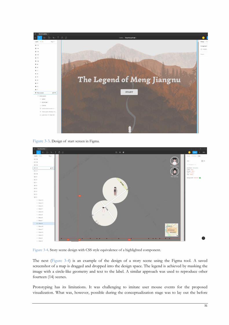
31
Figure 3-3. Design of start screen in Figma.
Figure 3-4. Story scene design with CSS style equivalence of a highlighted component.
The next (Figure 3-4) is an example of the design of a story scene using the Figma tool. A saved
screenshot of a map is dragged and dropped into the design space. The legend is achieved by masking the
image with a circle-like geometry and text to the label. A similar approach was used to reproduce other
fourteen (14) scenes.
Prototyping has its limitations. It was challenging to imitate user mouse events for the proposed
visualization. What was, however, possible during the conceptualization stage was to lay out the before
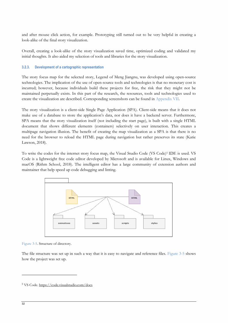
32
and after mouse click action, for example. Prototyping still turned out to be very helpful in creating a
look-alike of the final story visualization.
Overall, creating a look-alike of the story visualization saved time, optimized coding and validated my
initial thoughts. It also aided my selection of tools and libraries for the story visualization.
3.2.3. Development of a cartographic representation
The story focus map for the selected story, Legend of Meng Jiangnu, was developed using open-source
technologies. The implication of the use of open-source tools and technologies is that no monetary cost is
incurred; however, because individuals build these projects for free, the risk that they might not be
maintained perpetually exists. In this part of the research, the resources, tools and technologies used to
create the visualization are described. Corresponding screenshots can be found in Appendix VII.
The story visualization is a client-side Single Page Application (SPA). Client-side means that it does not
make use of a database to store the application’s data, nor does it have a backend server. Furthermore,
SPA means that the story visualization itself (not including the start page), is built with a single HTML
document that shows different elements (containers) selectively on user interaction. This creates a
multipage navigation illusion. The benefit of creating the map visualization as a SPA is that there is no
need for the browser to reload the HTML page during navigation but rather preserves its state (Katie
Lawson, 2018).
To write the codes for the internet story focus map, the Visual Studio Code (VS Code)5 IDE is used. VS
Code is a lightweight free code editor developed by Microsoft and is available for Linux, Windows and
macOS (Rithm School, 2018). The intelligent editor has a large community of extension authors and
maintainer that help speed up code debugging and linting.
Figure 3-5. Structure of directory.
The file structure was set up in such a way that it is easy to navigate and reference files. Figure 3-5 shows
how the project was set up.
5 VS Code. https://code.visualstudio.com/docs
33
i. Base directory: This directory houses the base files and resource folders. The two HTML
(Hypertext Markup Language) documents are where the structure of the web pages is defined.
ii. Animations directory: Animated SVGs are kept in this folder from where they are accessed by the
HTML document(s). The files in this folder have the extension svg.
iii. Assets directory: This directory stores all image resources. The files in this folder have the file
extension png.
iv. Scripts: DOM manipulation is executed via scripts – vanilla JavaScript in this instance. The files in
this directory have the extension js.
v. Styles: All custom styles to give aesthetics to the HTML document are defined in .css files which
are stored in this directory.
3.2.3.1. Basemaps
One common feature of most online cartographic representations is a basemap. Several free and hosting
maps services exist today on the Internet. However, selecting the right basemap depends on the context
and the mapping goal.
Basemaps are grouped into aerial (raster-based), rendered (vector-based) and hybrid (aerial imagery
overlaid with rendered data) map types. The two significant factors for choosing a basemap are style and
functionality (Michael Moore & Andy Walz, 2016). An aerial basemap shows details of the real world, like
a photograph, making it suitable for projects related to natural features. On the other hand, rendered
basemaps, a result of digitizing, simplifies the real world mostly contain roads and cities and are used in
navigational-related mapping projects.
Several free and paid basemaps exist. An exhaustive list of OSM map tiles from different contributors can
be found on Wikipedia Map Tiles page6 and on Leaflet providers web page7. Although most of these map
tiles are free-to-use, it is usually mandatory to attribute their source. The map created as part of my MSc
research uses the map tiles listed in Table 3.
Table 3. Selected basemap tiles.
Map Tile Provider URL
OpenStreetMap https://s.tile.openstreetmap.org/z/x/y.png
Stadia maps8 https://tiles.stadiamaps.com/tiles/osm_bright/z/x/yr.png
6 Tiles: https://wiki.openstreetmap.org/wiki/Tiles
7 Leaflet-providers. https://leaflet-extras.github.io/leaflet-providers/preview/
8 NOTE: This map tile is free only when served over a local network (127.0.0.1) but requires a license when deployed on the Internet. The experiments served the files locally and the need for paid license, before deployment on the internet, was only discovered after the completion of writing this thesis.
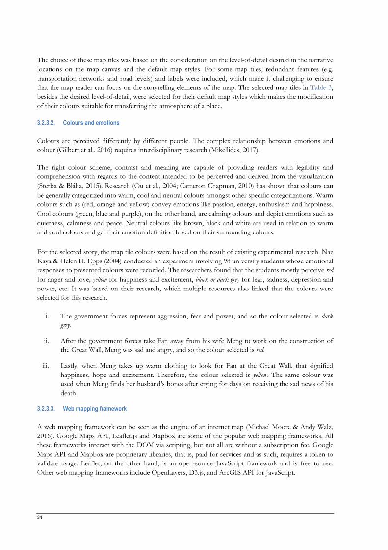
34
The choice of these map tiles was based on the consideration on the level-of-detail desired in the narrative
locations on the map canvas and the default map styles. For some map tiles, redundant features (e.g.
transportation networks and road levels) and labels were included, which made it challenging to ensure
that the map reader can focus on the storytelling elements of the map. The selected map tiles in Table 3,
besides the desired level-of-detail, were selected for their default map styles which makes the modification
of their colours suitable for transferring the atmosphere of a place.
3.2.3.2. Colours and emotions
Colours are perceived differently by different people. The complex relationship between emotions and
colour (Gilbert et al., 2016) requires interdisciplinary research (Mikellides, 2017).
The right colour scheme, contrast and meaning are capable of providing readers with legibility and
comprehension with regards to the content intended to be perceived and derived from the visualization
(Sterba & Bláha, 2015). Research (Ou et al., 2004; Cameron Chapman, 2010) has shown that colours can
be generally categorized into warm, cool and neutral colours amongst other specific categorizations. Warm
colours such as (red, orange and yellow) convey emotions like passion, energy, enthusiasm and happiness.
Cool colours (green, blue and purple), on the other hand, are calming colours and depict emotions such as
quietness, calmness and peace. Neutral colours like brown, black and white are used in relation to warm
and cool colours and get their emotion definition based on their surrounding colours.
For the selected story, the map tile colours were based on the result of existing experimental research. Naz
Kaya & Helen H. Epps (2004) conducted an experiment involving 98 university students whose emotional
responses to presented colours were recorded. The researchers found that the students mostly perceive red
for anger and love, yellow for happiness and excitement, black or dark grey for fear, sadness, depression and
power, etc. It was based on their research, which multiple resources also linked that the colours were
selected for this research.
i. The government forces represent aggression, fear and power, and so the colour selected is dark
grey.
ii. After the government forces take Fan away from his wife Meng to work on the construction of
the Great Wall, Meng was sad and angry, and so the colour selected is red.
iii. Lastly, when Meng takes up warm clothing to look for Fan at the Great Wall, that signified
happiness, hope and excitement. Therefore, the colour selected is yellow. The same colour was
used when Meng finds her husband’s bones after crying for days on receiving the sad news of his
death.
3.2.3.3. Web mapping framework
A web mapping framework can be seen as the engine of an internet map (Michael Moore & Andy Walz,
2016). Google Maps API, Leaflet.js and Mapbox are some of the popular web mapping frameworks. All
these frameworks interact with the DOM via scripting, but not all are without a subscription fee. Google
Maps API and Mapbox are proprietary libraries, that is, paid-for services and as such, requires a token to
validate usage. Leaflet, on the other hand, is an open-source JavaScript framework and is free to use.
Other web mapping frameworks include OpenLayers, D3.js, and ArcGIS API for JavaScript.
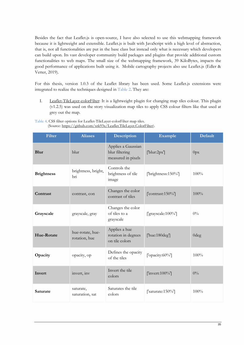
35
Besides the fact that Leaflet.js is open-source, I have also selected to use this webmapping framework
because it is lightweight and extensible. Leaflet.js is built with JavaScript with a high level of abstraction,
that is, not all functionalities are put in the base class but instead only what is necessary which developers
can build upon. Its vast developer community build packages and plugins that provide additional custom
functionalities to web maps. The small size of the webmapping framework, 39 KiloBytes, impacts the
good performance of applications built using it. Mobile cartography projects also use Leaflet.js (Edler &
Vetter, 2019).
For this thesis, version 1.0.3 of the Leaflet library has been used. Some Leaflet.js extensions were
integrated to realize the techniques designed in Table 2. They are:
I. Leaflet-TileLayer-colorFilter: It is a lightweight plugin for changing map tiles colour. This plugin
(v1.2.5) was used on the story visualization map tiles to apply CSS colour filters like that used at
grey out the map.
Table 4. CSS filter options for Leaflet-TileLayer-colorFilter map tiles. (Source: https://github.com/xtk93x/Leaflet.TileLayer.ColorFilter).
Filter Aliases Description Example Default
Blur blur
Applies a Gaussian
blur filtering
measured in pixels
['blur:2px'] 0px
Brightness brightness, bright,
bri
Controls the
brightness of tile
image
['brightness:150%'] 100%
Contrast contrast, con Changes the color
contrast of tiles ['contrast:150%'] 100%
Grayscale grayscale, gray
Changes the color
of tiles to a
grayscale
['grayscale:100%'] 0%
Hue-Rotate hue-rotate, hue-
rotation, hue
Applies a hue
rotation in degrees
on tile colors
['hue:180deg'] 0deg
Opacity opacity, op Defines the opacity
of the tiles ['opacity:60%'] 100%
Invert invert, inv Invert the tile
colors ['invert:100%'] 0%
Saturate saturate,
saturation, sat
Saturates the tile
colors ['saturate:150%'] 100%
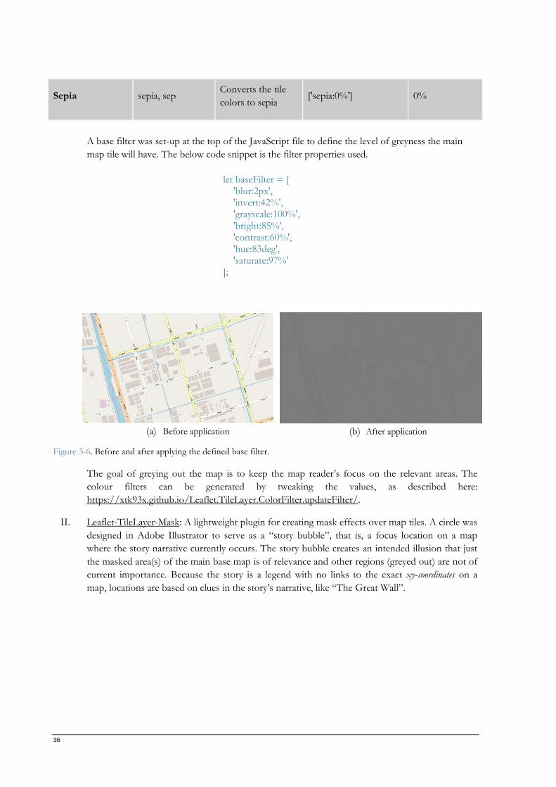
36
Sepia sepia, sep Converts the tile
colors to sepia ['sepia:0%'] 0%
A base filter was set-up at the top of the JavaScript file to define the level of greyness the main
map tile will have. The below code snippet is the filter properties used.
(a) Before application (b) After application
Figure 3-6. Before and after applying the defined base filter.
The goal of greying out the map is to keep the map reader’s focus on the relevant areas. The
colour filters can be generated by tweaking the values, as described here:
https://xtk93x.github.io/Leaflet.TileLayer.ColorFilter.updateFilter/.
II. Leaflet-TileLayer-Mask: A lightweight plugin for creating mask effects over map tiles. A circle was
designed in Adobe Illustrator to serve as a “story bubble”, that is, a focus location on a map
where the story narrative currently occurs. The story bubble creates an intended illusion that just
the masked area(s) of the main base map is of relevance and other regions (greyed out) are not of
current importance. Because the story is a legend with no links to the exact xy-coordinates on a
map, locations are based on clues in the story’s narrative, like “The Great Wall”.
let baseFilter = [ 'blur:2px', 'invert:42%', 'grayscale:100%', 'bright:85%', 'contrast:60%', 'hue:83deg', 'saturate:97%' ];
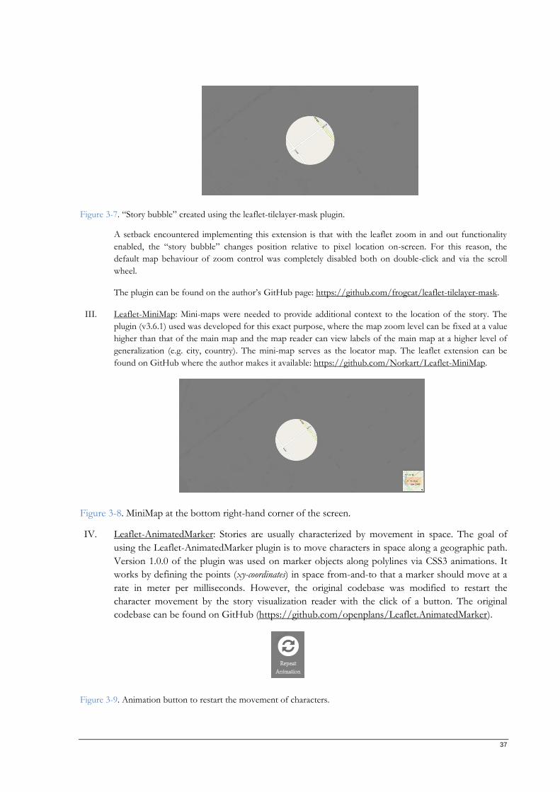
37
Figure 3-7. “Story bubble” created using the leaflet-tilelayer-mask plugin.
A setback encountered implementing this extension is that with the leaflet zoom in and out functionality
enabled, the “story bubble” changes position relative to pixel location on-screen. For this reason, the
default map behaviour of zoom control was completely disabled both on double-click and via the scroll
wheel.
The plugin can be found on the author’s GitHub page: https://github.com/frogcat/leaflet-tilelayer-mask.
III. Leaflet-MiniMap: Mini-maps were needed to provide additional context to the location of the story. The
plugin (v3.6.1) used was developed for this exact purpose, where the map zoom level can be fixed at a value
higher than that of the main map and the map reader can view labels of the main map at a higher level of
generalization (e.g. city, country). The mini-map serves as the locator map. The leaflet extension can be
found on GitHub where the author makes it available: https://github.com/Norkart/Leaflet-MiniMap.
Figure 3-8. MiniMap at the bottom right-hand corner of the screen.
IV. Leaflet-AnimatedMarker: Stories are usually characterized by movement in space. The goal of
using the Leaflet-AnimatedMarker plugin is to move characters in space along a geographic path.
Version 1.0.0 of the plugin was used on marker objects along polylines via CSS3 animations. It
works by defining the points (xy-coordinates) in space from-and-to that a marker should move at a
rate in meter per milliseconds. However, the original codebase was modified to restart the
character movement by the story visualization reader with the click of a button. The original
codebase can be found on GitHub (https://github.com/openplans/Leaflet.AnimatedMarker).
Figure 3-9. Animation button to restart the movement of characters.
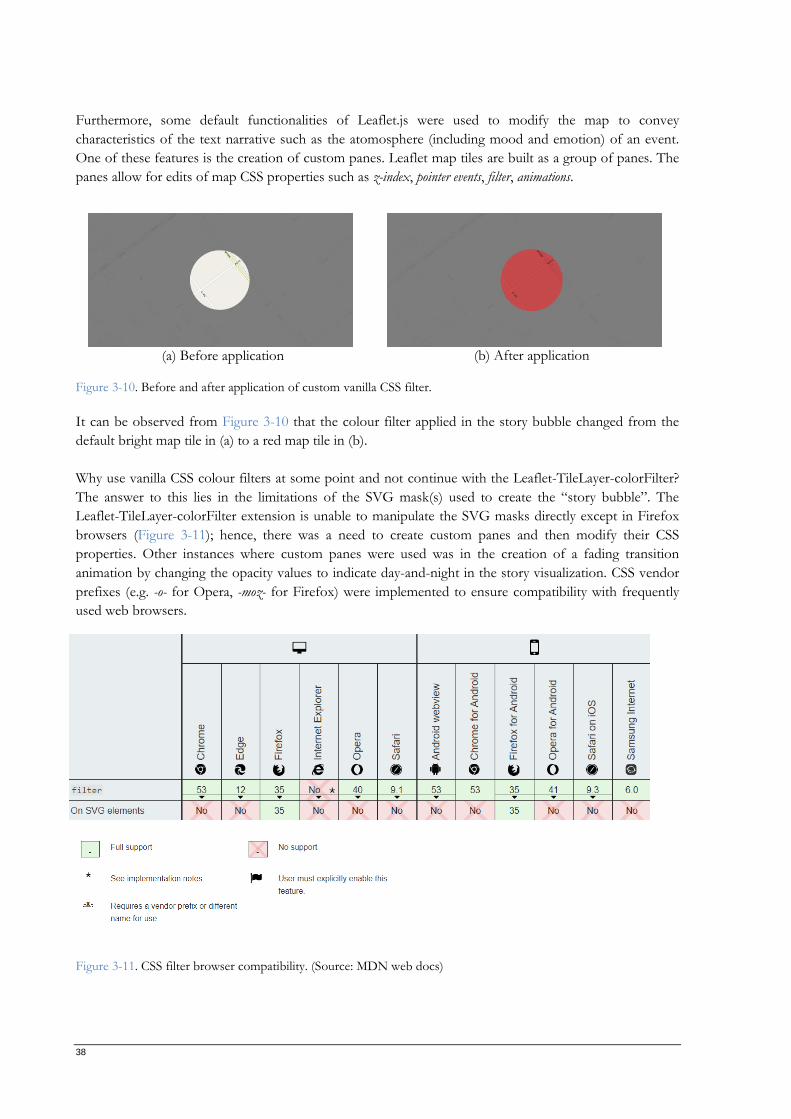
38
Furthermore, some default functionalities of Leaflet.js were used to modify the map to convey
characteristics of the text narrative such as the atomosphere (including mood and emotion) of an event.
One of these features is the creation of custom panes. Leaflet map tiles are built as a group of panes. The
panes allow for edits of map CSS properties such as z-index, pointer events, filter, animations.
(a) Before application (b) After application
Figure 3-10. Before and after application of custom vanilla CSS filter.
It can be observed from Figure 3-10 that the colour filter applied in the story bubble changed from the
default bright map tile in (a) to a red map tile in (b).
Why use vanilla CSS colour filters at some point and not continue with the Leaflet-TileLayer-colorFilter?
The answer to this lies in the limitations of the SVG mask(s) used to create the “story bubble”. The
Leaflet-TileLayer-colorFilter extension is unable to manipulate the SVG masks directly except in Firefox
browsers (Figure 3-11); hence, there was a need to create custom panes and then modify their CSS
properties. Other instances where custom panes were used was in the creation of a fading transition
animation by changing the opacity values to indicate day-and-night in the story visualization. CSS vendor
prefixes (e.g. -o- for Opera, -moz- for Firefox) were implemented to ensure compatibility with frequently
used web browsers.
Figure 3-11. CSS filter browser compatibility. (Source: MDN web docs)
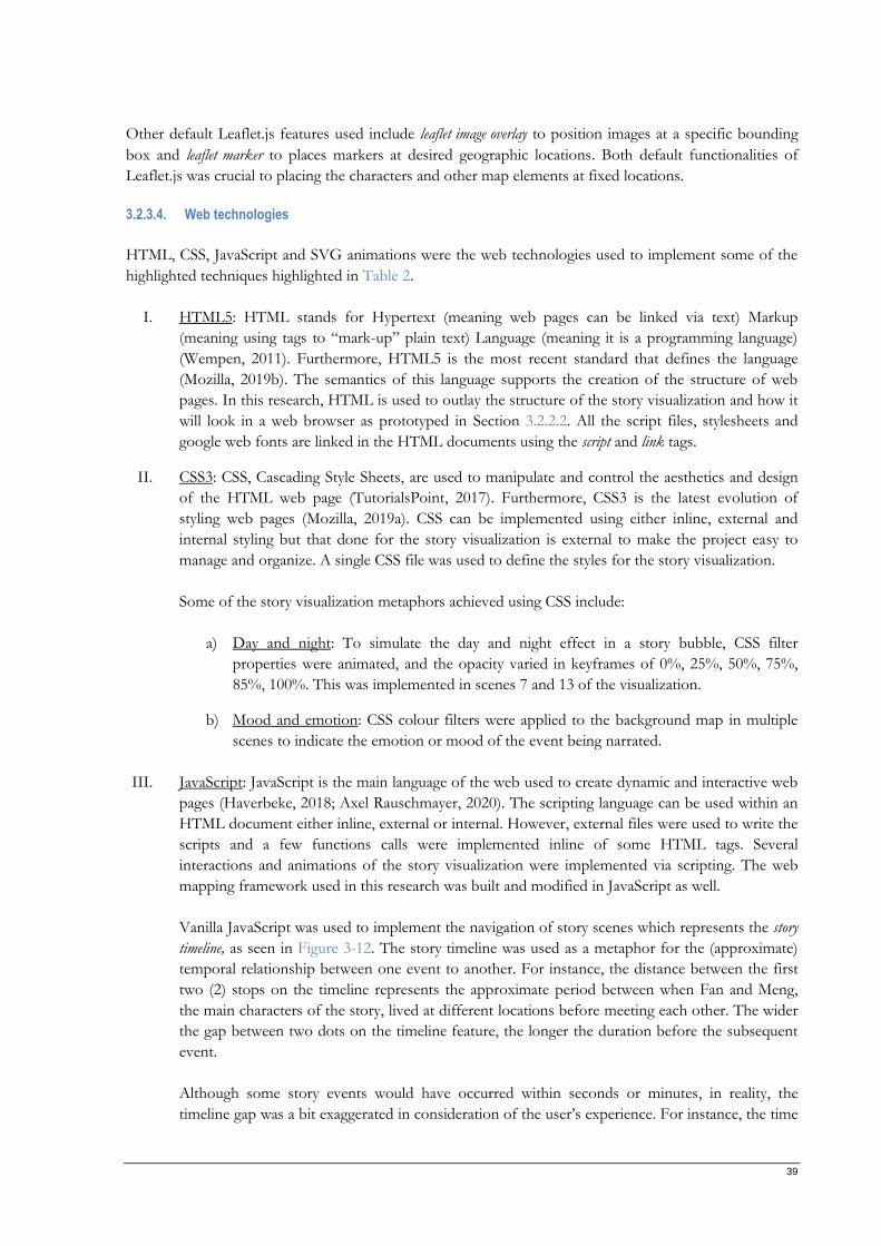
39
Other default Leaflet.js features used include leaflet image overlay to position images at a specific bounding
box and leaflet marker to places markers at desired geographic locations. Both default functionalities of
Leaflet.js was crucial to placing the characters and other map elements at fixed locations.
3.2.3.4. Web technologies
HTML, CSS, JavaScript and SVG animations were the web technologies used to implement some of the
highlighted techniques highlighted in Table 2.
I. HTML5: HTML stands for Hypertext (meaning web pages can be linked via text) Markup
(meaning using tags to “mark-up” plain text) Language (meaning it is a programming language)
(Wempen, 2011). Furthermore, HTML5 is the most recent standard that defines the language
(Mozilla, 2019b). The semantics of this language supports the creation of the structure of web
pages. In this research, HTML is used to outlay the structure of the story visualization and how it
will look in a web browser as prototyped in Section 3.2.2.2. All the script files, stylesheets and
google web fonts are linked in the HTML documents using the script and link tags.
II. CSS3: CSS, Cascading Style Sheets, are used to manipulate and control the aesthetics and design
of the HTML web page (TutorialsPoint, 2017). Furthermore, CSS3 is the latest evolution of
styling web pages (Mozilla, 2019a). CSS can be implemented using either inline, external and
internal styling but that done for the story visualization is external to make the project easy to
manage and organize. A single CSS file was used to define the styles for the story visualization.
Some of the story visualization metaphors achieved using CSS include:
a) Day and night: To simulate the day and night effect in a story bubble, CSS filter
properties were animated, and the opacity varied in keyframes of 0%, 25%, 50%, 75%,
85%, 100%. This was implemented in scenes 7 and 13 of the visualization.
b) Mood and emotion: CSS colour filters were applied to the background map in multiple
scenes to indicate the emotion or mood of the event being narrated.
III. JavaScript: JavaScript is the main language of the web used to create dynamic and interactive web
pages (Haverbeke, 2018; Axel Rauschmayer, 2020). The scripting language can be used within an
HTML document either inline, external or internal. However, external files were used to write the
scripts and a few functions calls were implemented inline of some HTML tags. Several
interactions and animations of the story visualization were implemented via scripting. The web
mapping framework used in this research was built and modified in JavaScript as well.
Vanilla JavaScript was used to implement the navigation of story scenes which represents the story
timeline, as seen in Figure 3-12. The story timeline was used as a metaphor for the (approximate)
temporal relationship between one event to another. For instance, the distance between the first
two (2) stops on the timeline represents the approximate period between when Fan and Meng,
the main characters of the story, lived at different locations before meeting each other. The wider
the gap between two dots on the timeline feature, the longer the duration before the subsequent
event.
Although some story events would have occurred within seconds or minutes, in reality, the
timeline gap was a bit exaggerated in consideration of the user’s experience. For instance, the time
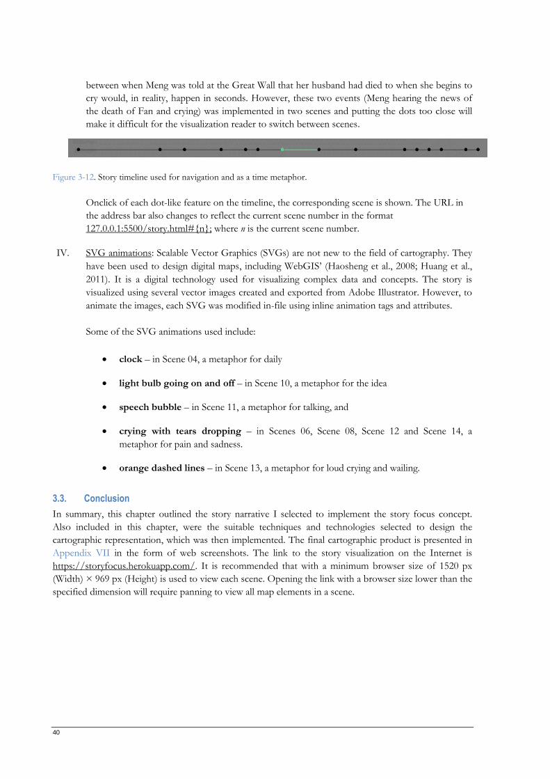
40
between when Meng was told at the Great Wall that her husband had died to when she begins to
cry would, in reality, happen in seconds. However, these two events (Meng hearing the news of
the death of Fan and crying) was implemented in two scenes and putting the dots too close will
make it difficult for the visualization reader to switch between scenes.
Figure 3-12. Story timeline used for navigation and as a time metaphor.
Onclick of each dot-like feature on the timeline, the corresponding scene is shown. The URL in
the address bar also changes to reflect the current scene number in the format
127.0.0.1:5500/story.html#n; where n is the current scene number.
IV. SVG animations: Scalable Vector Graphics (SVGs) are not new to the field of cartography. They
have been used to design digital maps, including WebGIS’ (Haosheng et al., 2008; Huang et al.,
2011). It is a digital technology used for visualizing complex data and concepts. The story is
visualized using several vector images created and exported from Adobe Illustrator. However, to
animate the images, each SVG was modified in-file using inline animation tags and attributes.
Some of the SVG animations used include:
• clock – in Scene 04, a metaphor for daily
• light bulb going on and off – in Scene 10, a metaphor for the idea
• speech bubble – in Scene 11, a metaphor for talking, and
• crying with tears dropping – in Scenes 06, Scene 08, Scene 12 and Scene 14, a
metaphor for pain and sadness.
• orange dashed lines – in Scene 13, a metaphor for loud crying and wailing.
3.3. Conclusion
In summary, this chapter outlined the story narrative I selected to implement the story focus concept.
Also included in this chapter, were the suitable techniques and technologies selected to design the
cartographic representation, which was then implemented. The final cartographic product is presented in
Appendix VII in the form of web screenshots. The link to the story visualization on the Internet is
https://storyfocus.herokuapp.com/. It is recommended that with a minimum browser size of 1520 px
(Width) × 969 px (Height) is used to view each scene. Opening the link with a browser size lower than the
specified dimension will require panning to view all map elements in a scene.
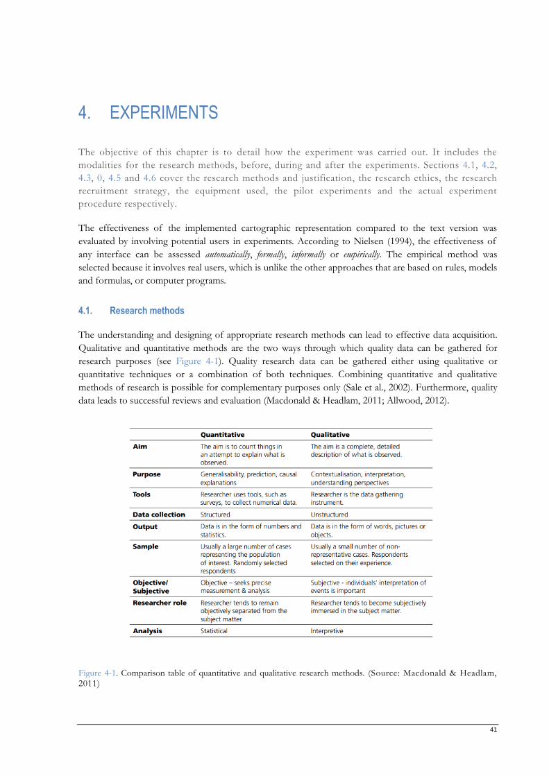
41
4. EXPERIMENTS
The objective of this chapter is to detail how the experiment was carried out. It includes the
modalities for the research methods, before, during and after the experiments. Sections 4.1, 4.2,
4.3, 0, 4.5 and 4.6 cover the research methods and justification, the research ethics, the research
recruitment strategy, the equipment used, the pilot experiments and the actual experiment
procedure respectively.
The effectiveness of the implemented cartographic representation compared to the text version was
evaluated by involving potential users in experiments. According to Nielsen (1994), the effectiveness of
any interface can be assessed automatically, formally, informally or empirically. The empirical method was
selected because it involves real users, which is unlike the other approaches that are based on rules, models
and formulas, or computer programs.
4.1. Research methods
The understanding and designing of appropriate research methods can lead to effective data acquisition.
Qualitative and quantitative methods are the two ways through which quality data can be gathered for
research purposes (see Figure 4-1). Quality research data can be gathered either using qualitative or
quantitative techniques or a combination of both techniques. Combining quantitative and qualitative
methods of research is possible for complementary purposes only (Sale et al., 2002). Furthermore, quality
data leads to successful reviews and evaluation (Macdonald & Headlam, 2011; Allwood, 2012).
Figure 4-1. Comparison table of quantitative and qualitative research methods. (Source: Macdonald & Headlam, 2011)
42
Quantitative research methods are mostly evaluated using statistics and mathematics such as quantitative
surveys, statistical analyses and secondary data collation and analyses (Macdonald & Headlam, 2011). They
expedite comparison using standard responses and deductive reasoning (Yilmaz, 2013; Han, 2018),
thereby saving time and resources (Daniel, 2016). However, qualitative research methods are exploratory
in nature such as questionnaires, interviews, observation, visual techniques, focus groups and workshops
(Macdonald & Headlam, 2011). Unlike quantitative methods, qualitative studies give room for the
participants to express themselves and their feelings in their own words through interviews and direct
observations (Smeyers, 2008; Yilmaz, 2013).
Suchan & Brewer (2000) and Elzakker (2004) identified qualitative methods such as questionnaire, think-
aloud, interviews and focus groups as techniques used in the evaluation of cartographic products. Due to
the exploratory and descriptive nature of this research, qualitative methods were selected to capture the
experience of the participants effectively. The techniques are eye-tracking, questionnaires and (audio-
recorded post-experience) interview. In the sections that follow, the chosen techniques are justified.
4.1.1. Method of eye-tracking and reader observation
Eye-tracking is a research method commonly used to derive evidence-based information on the
participant’s cognitive activities (Lai et al., 2013). Analyzing the data from eye-tracking exercises can reveal
how humans perceive and interact with visual targets (Mele & Federici, 2012). Eye-tracking is capable of
answering the usability questions of interfaces such as the order, location, time, duration, and frequency users
view elements on a map interface (Çöltekin et al., 2013). The technique has been used to study
programming comprehension in students (Bednarik & Tukiainen, 2006), for usability studies (Li et al.,
2010), advertising and marketing (Gidlöf et al., 2012), transportation (Andrew T. Duchowski, 2017), etc. A
combination of eye-tracking with appropriate research techniques is capable of revealing users’ thoughts
based on their visual interactions with the target (Tobiipro, 2015).
Applied cartography greatly benefits from using eye-tracking to evaluate the effectiveness of created
cartographic products (Alzbeta Brychtova et al., 2012; Dong et al., 2014). Therefore, eye-tracking was
selected to gather information on where users look, as well as the frequency and the strategy they
employed in reading the designed story visualization. The eye-tracking exercises were also used to reveal
the adaptation techniques and the needs of the users in terms of the design and functionality (Popelka et
al., 2012) of the representation.
Eye-tracking exercises provide a good number of metrics which can reveal users’ cognitive activities.
Providing answers to some of the research questions requires extracting Areas of Interest (AOIs) metrics
such as revisits, gaze duration (or dwell time), fixation duration and fixation count to understand user’s
behaviour while reading the story visualization. These metrics are derived from two main types of eye
movement behaviours recorded: fixations and saccades. Where fixations are long and steady focus on a
region or object of interest while saccades are quick and rapid movements of the eyes between points of
fixations (Salvucci & Goldberg, 2000; Andrychowicz-Trojanowska, 2018). The acquired metrics informed
me on the pattern, count and duration users focussed their attentions on the selected regions and
components of the visualization.
In a study to determine how Graphic User Interface (GUI) elements of internet maps impacts the
performance and experience of users, Cybulski & Horbiński (2020) highlighted the efficacy of the eye-
tracking method. The authors were able to draw insights on the decision of where to place buttons on a
map interface by analyzing the participants’ visual and interactive experience. Time and interaction
parameters from the eye-tracking exercises were used to arrive at their findings. Similarly, I am using eye-
43
tracking to investigate the ease with which users of the story visualization notice certain elements and if
they can discover its functionality by using them.
Eye-tracking has equally been used as a method to discover how students who have geography and non-
geography backgrounds read topographic maps (Dong et al., 2018). Parameters such as fixation frequency,
fixation count and saccade count were the metrics used to evaluate how quickly geographers process
spatial problems compared to their non-geography counterparts. The study combined eye-tracking
exercises and participants’ responses to the questions asked to evaluate how the two (2) categories of
students processed spatial information.
In addition, Çöltekin et al. (2013) used the method of analyzing eye movements to evaluate the
effectiveness of interface designs. They evaluated the usability of selected maps by employing the method
of eye-tracking in terms of the complexity and advancements of interactive digital maps. Likewise, I use
the method of eye-tracking to understand how users interact with the map interface and if the overall
design facilitated or interfered with their ability to perform certain tasks.
In summary, eye-trackers have been used in many cognitive research fields to understand what users
thoughts are like based on their visual interactions with the target stimulus (Chennamma & Yuan, 2013;
Majaranta & Bulling, 2014; Bogucka & Jahnke, 2018). This research also uses eye-trackers to understand
users’ perception of the story visualization alongside observation to note the participant’s reactions and
activities not captured with the eye-tracking device. The eye-tracking device used is screen-based because
the screen coordinates were needed to compute the exact places the users looked at on the story
visualization (stimulus).
4.1.2. Method of questionnaires
The method of questionnaires is an easy and efficient way of ollecting certain information from
participants. Easy to use in the sense that they do not require special skills by the participants and efficient
because they can be used to collect quantifiable and discrete data. Collecting information on the profile
(e.g. age, occupation and skill level) of the experiment’s participants is rapid and systematic (Codó, 2009)
using the questionnaire. Besides, questionnaire data are declarative in nature. Therefore, the risk of
induced sensitive bias by the researcher is reduced.
One goal of this research was to assess how users perceive stories told with maps compared to the text
version. To gather data on how the users perceive aspects of a story transferred from the text version to a
cartographic representation, a series of questions needed to be asked. Therefore, a questionnaire was used.
A questionnaire is a series of questions and prompts prepared by the researcher(s) to be answered by the
participants (Suchan & Brewer, 2000). The data collected through the questionnaire designed for this
research were both closed-ended or open-ended questions. Close-ended questions such as multiple-choice
questions are straightforward and were used to get definite responses from the participants of the
experiments. The closed-ended questions were also easy to encode. However, to acquire more detailed
responses from the experiment’s participants, open-ended questions were asked. The open-ended
questions required more effort to analyze (Reja et al., 2003).
Method of questionnaires has been utilized in several cartographic studies. Standardized questionnaires
have been used to collect information on user satisfaction on the use of internet maps (Çöltekin et al.,
2013). For instance, questionnaires were used by Halik & Medyńska-Gulij (2017) to evaluate the
experience of participants reading maps. However, Cybulski & Horbiński (2020) in their research,
concluded that combining methods of questionnaire and eye-tracking was a more effective method to
44
understand the efficiency of web map elements and the experience of its users. Hence, the method of
questionnaires was adopted to evaluate, in combination with eye-tracking exercises, the effectiveness of
the story visualization in telling stories. The outcome of analyzing users’ responses using questionnaires
delivered insights on how to effectively design cartographic representations for the story focus concept.
Specific considerations were made when designing this study’s research questions. Codó (2009)
recommended that the questionnaires be brief and straightforward. The questionnaire designed for this
research in Appendix V was tested for clarity, brevity and ease-of-understanding by test participants (who
did not participate in the actual experiment). During the pilot test, the individuals were asked about the
difficulty of understanding the instructions and the average time it will take them to answer the questions
was used for the main experiments.
4.1.3. Method of interviews
Interviews have been used by researchers to interact with participants. Likened to questionnaires,
interviews are used to transfer opinions, feelings, behaviours and experiences from participants to
researcher(s) (Suchan & Brewer, 2000; Easwaramoorthy & Zarinpoush, 2006) making it ideal for reaching
the goal of this research in evaluating interviewees perception of the story visualization compared to the
text version of the story. Furthermore, the method of interviews does require good listening, engaging and
asking skills of the interviewer (Gill et al., 2008); hence, I conducted pilot tests to acquaint myself with the
procedure.
Method of interviews is perhaps the most flexible, descriptive and in-depth technique used to get detailed
information in human research but must not be seen as an informal chat session (Ryan et al., 2009;
McGrath et al., 2019). To mitigate gathering redundant data or making the interview session informal, I
thoroughly evaluated the questions that I needed to ask concerning the goal of this research. Another
reason for this was to assess the relevance of my interview questions was to minimize the challenges that
comes with analyzing the non-discrete nature of the data (Codó, 2009).
Interviews could be structured, semi-structured or unstructured. In structured interviews, the researcher is limited
to ask only the questions that they have prepared down without further probing the response the
participants give. Unlike structured interviews, unstructured interviews have little or no organization
before the start of the session, and they are time-consuming. Semi-structured interviews, however, uses
predetermined questions but with room to get deeper into the response of the interviewee (Gill et al.,
2008; Jamshed, 2014). The popularity and effectiveness of semi-structured interviews in collecting rich
information (Macdonald & Headlam, 2011; Wilson 2013) by probing the choices of the interviewees
makes it ideal for this research. The semi-structured interviews for this research were conducted face-to-
face.
According to Macdonald & Headlam (2011) and McGrath et al., (2019), method of interviews is a proven
approach to get the subjective perceptions and opinions of interviewees on topical issues. Interviews have
been used to gain further insights on a subject after the completion of questionnaires (Codó, 2009;
Bullock, 2016; Quad, 2016). Therefore, the semi-structured interview approach was adopted to probe
further the cognitive perceptions of the story focus concept beyond the questionnaires. However, to
ensure the realization of the research goals, a back-up plan was prepared should participants decline to be
audio-recorded, and this was to have the same questions answered on an extra sheet at the end of the
questionnaire found in Appendix V.
45
4.2. Research ethics
Social and behavioural research requires that specific ethical standards be duly followed. These ethical
standards, in the form of informed consent, covers the confidentiality, anonymity, privacy and safety of
the research subjects. Ethical merits demand that subjects understand the research goal and procedure,
consent to participate and be free to request further clarifications (Benatar, 2002; D. Smith, 2003; Rhodes,
2005; Crow et al., 2006) especially when a vulnerable population is involved.
In conducting the experiments for this research, it was essential to inform the participants about what they
are about to do, how it will be carried out, and the possible consequences (Fouka & Mantzorou, 2011;
Tessier & Bonnemains, 2019). Prior to the commencement of each experiment, the information sheet and
consent forms created were presented to each participant. Where the information was not clear enough,
an explanation was given. The participants were also informed that they could decide to stop the
experiment at any time without stating their reason as well as request that their collected data be excluded
from the research. They were informed of how the data collected will be processed. Because interviews
are recorded and stored before they are transcribed, it was essential to get the consent of the interviewees.
A copy of the information sheet and consent forms used are found in Appendix I and Appendix II. The
participants, called readers, voluntarily participate in these experiments by signing the consent forms after
reading the information leaflet.
Data privacy and confidentiality are essential aspects of research ethics towards ensuring the quality of a
study (Petrova et al., 2016). The data collected via the eye-tracking device were labelled using identifiers
that were not affiliated with the readers and discarded after the final submission of this thesis. Likewise,
the questionnaire data were completely anonymized by using identifiers that are not directly linked to the
readers. For the audio-recorded interviews, these were transcribed within five (5) days post-experiment
exercise and discarded with no back-up wheresoever. Each reader was informed about the above privacy
and confidentiality measures and consented before proceeding.
Finally, this study’s research methods received the approval of the ITC’s Ethics Committee at the
University of Twente. This meant that the research was cleared as safe and that sufficient quality assurance
procedures were put in place.
4.3. Reader recruitment
To complete the research study, that is, provide answers to the research questions, human participation
was required. Readers, voluntary participants of the research experiment, were recruited through several
means. One of these means was via one-on-one contact where a breakdown of the experiment tasks and
goal of the research was delivered as an elevator pitch – An elevator pitch is a short and persuasive
description of a concept or idea which is easy to understand by any listener (Wikipedia, 2011). Another
was through referrals. People inform their connections or those within their circle about the research and
its benefits. Another recruitment approach was via email. In all cases, emails were still used to confirm the
reader’s voluntary participation, what they need to know before participating, the location of the
experiment and how to schedule a convenient appointment.
In order to efficiently manage readers schedule, a doodle premium account – with a 14-day free trial
period – was created where they select a convenient day and time. Potential readers were asked to insert
their valid email addresses after making a choice selection of day and time. Their emails (only visible to
me), was used to communicate additional details of the experiment. A maximum of 8 slots per day for
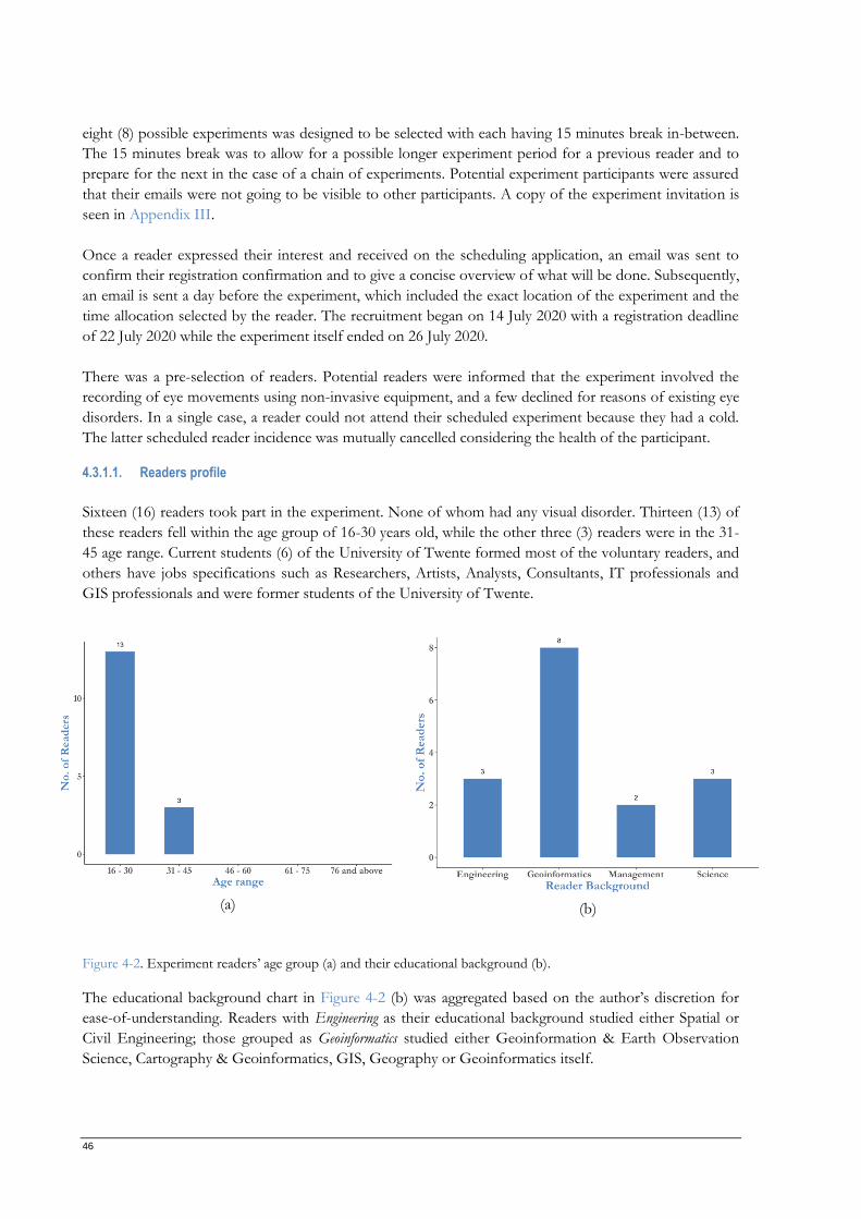
46
eight (8) possible experiments was designed to be selected with each having 15 minutes break in-between.
The 15 minutes break was to allow for a possible longer experiment period for a previous reader and to
prepare for the next in the case of a chain of experiments. Potential experiment participants were assured
that their emails were not going to be visible to other participants. A copy of the experiment invitation is
seen in Appendix III.
Once a reader expressed their interest and received on the scheduling application, an email was sent to
confirm their registration confirmation and to give a concise overview of what will be done. Subsequently,
an email is sent a day before the experiment, which included the exact location of the experiment and the
time allocation selected by the reader. The recruitment began on 14 July 2020 with a registration deadline
of 22 July 2020 while the experiment itself ended on 26 July 2020.
There was a pre-selection of readers. Potential readers were informed that the experiment involved the
recording of eye movements using non-invasive equipment, and a few declined for reasons of existing eye
disorders. In a single case, a reader could not attend their scheduled experiment because they had a cold.
The latter scheduled reader incidence was mutually cancelled considering the health of the participant.
4.3.1.1. Readers profile
Sixteen (16) readers took part in the experiment. None of whom had any visual disorder. Thirteen (13) of
these readers fell within the age group of 16-30 years old, while the other three (3) readers were in the 31-
45 age range. Current students (6) of the University of Twente formed most of the voluntary readers, and
others have jobs specifications such as Researchers, Artists, Analysts, Consultants, IT professionals and
GIS professionals and were former students of the University of Twente.
(a) (b)
Figure 4-2. Experiment readers’ age group (a) and their educational background (b).
The educational background chart in Figure 4-2 (b) was aggregated based on the author’s discretion for
ease-of-understanding. Readers with Engineering as their educational background studied either Spatial or
Civil Engineering; those grouped as Geoinformatics studied either Geoinformation & Earth Observation
Science, Cartography & Geoinformatics, GIS, Geography or Geoinformatics itself.
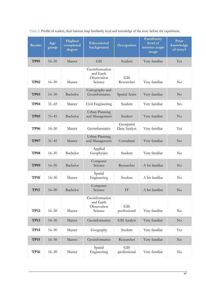
47
Table 5. Profile of readers, their internet map familiarity level and knowledge of the story before the experiment.
Reader Age
group
Highest completed
degree
Educational background
Occupation
Familiarity level of
internet maps usage
Prior knowledge
of story?
TP01 16–30 Master GIS Student Very familiar Yes
TP02 16–30 Master
Geoinformation and Earth
Observation Science
GIS Researcher Very familiar No
TP03 16–30 Bachelor Cartography and Geoinformatics Spatial Artist Very familiar No
TP04 31–45 Master Civil Engineering Student Very familiar No
TP05 31–45 Bachelor Urban Planning
and Management Student Very familiar No
TP06 16–30 Master Geoinformatics Geospatial
Data Analyst Very familiar Yes
TP07 31–45 Master Urban Planning
and Management Consultant Very familiar No
TP08 16–30 Bachelor Applied
Geophysics Student Very familiar No
TP09 16–30 Bachelor Computer
Science Researcher A bit familiar No
TP10 16–30 Master Spatial
Engineering Student A bit familiar No
TP11 16–30 Bachelor Computer
Science IT A bit familiar No
TP12 16–30 Master
Geoinformation and Earth
Observation Science
GIS professional Very familiar No
TP13 16–30 Master Geoinformatics GIS Analyst Very familiar No
TP14 16–30 Master Geography Student Very familiar Yes
TP15 16–30 Master Geoinformatics Researcher Very familiar No
TP16 16–30 Master Spatial
Engineering GIS
professional Very familiar No
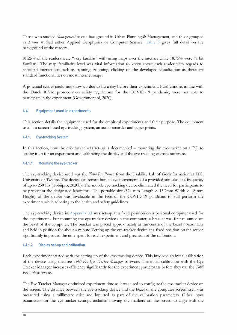
48
Those who studied Management have a background in Urban Planning & Management, and those grouped
as Science studied either Applied Geophysics or Computer Science. Table 5 gives full detail on the
background of the readers.
81.25% of the readers were “very familiar” with using maps over the internet while 18.75% were “a bit
familiar”. The map familiarity level was vital information to know about each reader with regards to
expected interactions such as panning, zooming, clicking on the developed visualization as these are
standard functionalities on most internet maps.
A potential reader could not show up due to flu a day before their experiment. Furthermore, in line with
the Dutch RIVM protocols on safety regulations for the COVID-19 pandemic, were not able to
participate in the experiment (Government.nl, 2020).
4.4. Equipment used in experiments
This section details the equipment used for the empirical experiments and their purpose. The equipment
used is a screen-based eye-tracking system, an audio recorder and paper prints.
4.4.1. Eye-tracking System
In this section, how the eye-tracker was set-up is documented – mounting the eye-tracker on a PC, to
setting it up for an experiment and calibrating the display and the eye-tracking exercise software.
4.4.1.1. Mounting the eye-tracker
The eye-tracking device used was the Tobii Pro Fusion from the Usability Lab of Geoinformation at ITC,
University of Twente. The device can record human eye movements of a provided stimulus at a frequency
of up to 250 Hz (Tobiipro, 2020b). The mobile eye-tracking device eliminated the need for participants to
be present at the designated laboratory. The portable size (374 mm Length × 13.7mm Width × 18 mm
Height) of the device was invaluable in the face of the COVID-19 pandemic to still perform the
experiments while adhering to the health and safety guidelines.
The eye-tracking device in Appendix XI was set-up at a fixed position on a personal computer used for
the experiments. For mounting the eye-tracker device on the computer, a bracket was first mounted on
the bezel of the computer. The bracket was placed approximately at the centre of the bezel horizontally
and held in position for about a minute. Setting up the eye-tracker device at a fixed position on the screen
significantly improved the time spent for each experiment and precision of the calibration.
4.4.1.2. Display set-up and calibration
Each experiment started with the setting up of the eye-tracking device. This involved an initial calibration
of the device using the free Tobii Pro Eye Tracker Manager software. The initial calibration with the Eye
Tracker Manager increases efficiency significantly for the experiment participants before they use the Tobii
Pro Lab software.
The Eye Tracker Manager optimized experiment time as it was used to configure the eye-tracker device on
the screen. The distance between the eye-tracking device and the bezel of the computer screen itself was
measured using a millimetre ruler and inputted as part of the calibration parameters. Other input
parameters for the eye-tracker settings included moving the markers on the screen to align with the
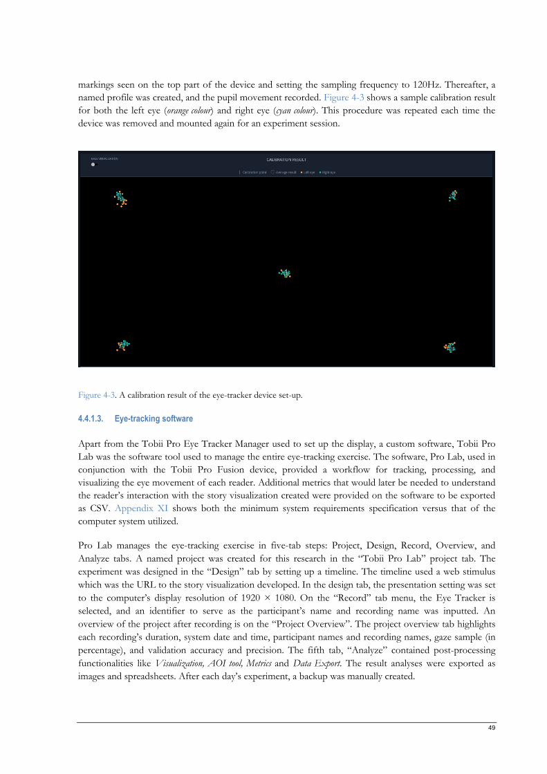
49
markings seen on the top part of the device and setting the sampling frequency to 120Hz. Thereafter, a
named profile was created, and the pupil movement recorded. Figure 4-3 shows a sample calibration result
for both the left eye (orange colour) and right eye (cyan colour). This procedure was repeated each time the
device was removed and mounted again for an experiment session.
Figure 4-3. A calibration result of the eye-tracker device set-up.
4.4.1.3. Eye-tracking software
Apart from the Tobii Pro Eye Tracker Manager used to set up the display, a custom software, Tobii Pro
Lab was the software tool used to manage the entire eye-tracking exercise. The software, Pro Lab, used in
conjunction with the Tobii Pro Fusion device, provided a workflow for tracking, processing, and
visualizing the eye movement of each reader. Additional metrics that would later be needed to understand
the reader’s interaction with the story visualization created were provided on the software to be exported
as CSV. Appendix XI shows both the minimum system requirements specification versus that of the
computer system utilized.
Pro Lab manages the eye-tracking exercise in five-tab steps: Project, Design, Record, Overview, and
Analyze tabs. A named project was created for this research in the “Tobii Pro Lab” project tab. The
experiment was designed in the “Design” tab by setting up a timeline. The timeline used a web stimulus
which was the URL to the story visualization developed. In the design tab, the presentation setting was set
to the computer’s display resolution of 1920 × 1080. On the “Record” tab menu, the Eye Tracker is
selected, and an identifier to serve as the participant’s name and recording name was inputted. An
overview of the project after recording is on the “Project Overview”. The project overview tab highlights
each recording’s duration, system date and time, participant names and recording names, gaze sample (in
percentage), and validation accuracy and precision. The fifth tab, “Analyze” contained post-processing
functionalities like Visualization, AOI tool, Metrics and Data Export. The result analyses were exported as
images and spreadsheets. After each day’s experiment, a backup was manually created.
50
Noteworthy, the computer used, had a lower CPU and RAM capability. The effect is the significant loss
of frames (about 8%) which caused gaps in the gaze video replay; however, the gaze and video data
synchronization was intact. Situations where there was a loss of frames (a single scenario), the reader
voluntarily agreed to repeat the exercise.
4.4.2. Audio recorder
The audio recorder used for the study was the default voice recorder on a person mobile phone –
Samsung Galaxy J4 2018. A dedicated memory card with a 32 Gigabyte capacity was used for the sole
purpose of the study. A real-time back up of each audio recording was set up to prevent data loss.
Prior to the start of each experiment, the readers were sufficiently informed that they would be recorded,
and they consented on the form in Appendix II. Consent, privacy and confidentiality were enforced as
elaborated in Section 4.2.
4.4.3. Questionnaire
Both open-ended and closed-ended questions were constructed to explore the profile of the reader, and
their experience reading both the story visualization and the text version. The questionnaire (Appendix V)
was printed in A4 sheets and administered to each participant. Then the questionnaire data were
transcribed into digital documents for further processing and analysis.
The closed questions required the readers to select only one option provided or, in some cases, as many as
they considered right while leaving room for other options that were not specified. The open-ended
questions were mostly used to get the readers to describe their feelings and experience of the completed
task.
4.5. Pilot experiments
Rothgeb (2008) referred to pilot tests as “dress rehearsals” because they help to identify potential
problems before the main exercise quickly. Two pilot experiments were conducted by random students of
the University of Twente as if it were the main experiment. The tests were successful in estimating how
much time each experiment schedule would take and in the optimization of the main experiment
workflow. The participants of the pilot tests did not take part in the experiment outcomes reported in this
research and had their data deleted before exiting the test location.
The pilot experiments optimized the workflow of two of the selected research methods the most: the eye-
tracking exercise and the interviews. For the eye-tracking exercise, the test session helped identify the need
to restart the computer used before each session for improved system performance. Also, during the pilot
test, it was observed that Tobii Pro Lab’s built-in browser, which served the web stimulus, rendered the
URL rather slowly causing a delay in reading the story visualization. The workaround was to run a sample
test prior before the time scheduled for an experiment. Furthermore, Tobii Pro Lab records interaction
with web stimulus and maps the gaze data to a snapshot per unique URL. However, the story
visualization, which was designed as a SPA, had no hooks to uniquely identify the navigation to another
scene with a URL in the browser’s address bar. The mapped gaze data was aggregated only on the last
story scene. Hence, the story visualization was modified, as shown in Section 3.2.3.4 to include a unique
URL for each scene. Some questions in the interviews were recognized to be redundant to the objectives
of the research and were removed.
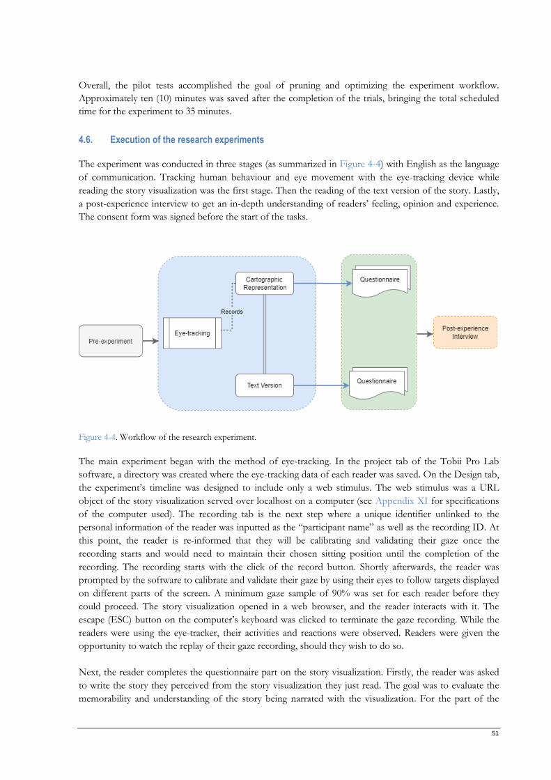
51
Overall, the pilot tests accomplished the goal of pruning and optimizing the experiment workflow.
Approximately ten (10) minutes was saved after the completion of the trials, bringing the total scheduled
time for the experiment to 35 minutes.
4.6. Execution of the research experiments
The experiment was conducted in three stages (as summarized in Figure 4-4) with English as the language
of communication. Tracking human behaviour and eye movement with the eye-tracking device while
reading the story visualization was the first stage. Then the reading of the text version of the story. Lastly,
a post-experience interview to get an in-depth understanding of readers’ feeling, opinion and experience.
The consent form was signed before the start of the tasks.
Figure 4-4. Workflow of the research experiment.
The main experiment began with the method of eye-tracking. In the project tab of the Tobii Pro Lab
software, a directory was created where the eye-tracking data of each reader was saved. On the Design tab,
the experiment’s timeline was designed to include only a web stimulus. The web stimulus was a URL
object of the story visualization served over localhost on a computer (see Appendix XI for specifications
of the computer used). The recording tab is the next step where a unique identifier unlinked to the
personal information of the reader was inputted as the “participant name” as well as the recording ID. At
this point, the reader is re-informed that they will be calibrating and validating their gaze once the
recording starts and would need to maintain their chosen sitting position until the completion of the
recording. The recording starts with the click of the record button. Shortly afterwards, the reader was
prompted by the software to calibrate and validate their gaze by using their eyes to follow targets displayed
on different parts of the screen. A minimum gaze sample of 90% was set for each reader before they
could proceed. The story visualization opened in a web browser, and the reader interacts with it. The
escape (ESC) button on the computer’s keyboard was clicked to terminate the gaze recording. While the
readers were using the eye-tracker, their activities and reactions were observed. Readers were given the
opportunity to watch the replay of their gaze recording, should they wish to do so.
Next, the reader completes the questionnaire part on the story visualization. Firstly, the reader was asked
to write the story they perceived from the story visualization they just read. The goal was to evaluate the
memorability and understanding of the story being narrated with the visualization. For the part of the
52
questionnaire where the readers needed to describe the emotions, they revisited the visualization.
Completing this part of the questionnaire required the reader to match each scene with its emotions, if
present, and their corresponding identifiers.
Upon completing the eye-tracking exercise and questionnaire of the story visualization were completed,
the text version of the story is presented to the participant to read. The reader reads the text version of the
story, and their reactions were observed. The reader then completed a corresponding questionnaire for
this stage of the experiment.
In the final stage – the post-experience interview, the readers were asked about their experience and
opinions. The first question was to identify what medium conveyed the story better and what aspects of
the story influenced their choice. The other question was to receive feedback on the story visualization.
Additional probes were used to understand the reader’s choice for each interview question. However,
during the pilot phase, one of the test readers declined to be audio-recorded, and this prompted the need
to include the verbal questions as a supplement to the questionnaire.
Daily backup of the entire project was done using the export project functionality to forestall the loss of
data. A checklist for the research experiment can be found in Appendix IV.
4.7. Processing of eye movement data
The data collected from recording the eye movement of the readers were processed as heat maps and gaze
plots for qualitative interpretation and Areas of Interest (AOI) metrics for quantitative analysis.
4.7.1. Heat maps
A heat map, also known as a fixation density map, is one of the visualization techniques this research uses to
assess where the readers’ gaze was the least or most fixated on the stimulus displayed on a screen. In
generating the heat maps, the Tobii I-VT (Velocity-Threshold Identification) Fixation filter was used. The
filter works by classifying the reader’s eye movements based on the eye directional shifts velocity (Olsen,
2012). Appendix XII gives a complete breakdown of the filter configuration used.
The basis upon which the heat maps was created is the “Absolute count”, computed from the number of
fixations by the software. The absolute count basis was selected to get an understanding of how many
times the readers had their gazes fixated on different portions of the stimulus. Additional calculation basis
included in the software includes absolute duration (which works by computing the period of fixations),
relative count (calculated for a Time of Interest (TOI), the number of fixations made by a reader relative
to the total number of fixations), and relative duration (which computes for a Time of Interest (TOI), the
number of fixations by a reader relative to the total number of fixations on the mapped screenshot)
(Tobiipro, 2020b). The calculation basis explained here is referred to as “Type” on the software dashboard
as a dropdown option.
Other custom settings made on the software to generate the heat maps for its appearance were:
i. Background image: The snapshots captured during the recording of each unique URL was used as
the background to give a visual understanding of where the readers had their gazes fixated.
ii. Colour: The colours to represent the levels of data, low, middle and high are Green – #00FF00,
Yellow – #FFFF00 and Red – #FF0000, respectively. The colour scheme used is original to
visual depictions of clusters (Wilkinson & Friendly, 2009).
53
iii. Opacity: The opacity level was set to 100% to ensure the best transparency of the heat map with
minimum distractions.
4.7.2. Gaze plots
A gaze plot, also referred to as scan paths (Olsen et al., 2010), shows the path of the readers' eyes over the
recording period on the stimulus. The gaze plots were used to gain hints on the readers’ thoughts and
intents (Majaranta & Bulling, 2014). The configuration for the gaze plot filter used is the same as that used
in the heat map filter, as seen in Appendix XII.
Similar to the custom settings for the heat map’s appearance, those of the gaze plot are:
i. Background image: The snapshots captured during the recording of each unique URL was used as
the background to give a visual understanding of where the readers had their gazes fixated.
ii. Scale: A coverage size of 20px was applied to ensure sufficient visibility of all fixation circles.
iii. Border colour: The colour white (#FFFFFF) was used to emphasize the circle boundaries.
iv. Fill colour: For this research, random colours were generated and assigned to the fixation circles
for each recording to give a visual clue of all the readers' cognitive activities.
v. Saccades: The connections between fixation circles as readers look at different parts of the stimuli
were equally applied to show the connections.
vi. Opacity: The opacity level was set to 80% to ensure the best transparency of the gaze plot with
minimum distractions while allowing for the visibility of overlapping fixation circles.
4.7.3. Areas of Interests extraction
Areas of Interest (AOI) is a technique used to acquire numerical and statistical analysis of features and
regions that are of interest in this study. The technique enabled quantitative analysis by calculating the
movement of the eyes, such as counts and durations of fixations. On the Tobii Pro Lab software, closed
geometries were created around elements and regions of interest for each unique URL of the web stimuli.
The AOIs drawn were of varying shapes, sizes and locations.
Selecting AOIs is a common problem in eye-tracking research (Hessels et al., 2016). In designing and
analysing the AOIs for this research, it was important to consider the size and placement of the AOIs as
well as negotiating selectivity and sensitivity. That is, the amount of gaze data to be utilized in the AOI
computation. The smaller the AOI, the higher the selectivity needed thereby eliminating irrelevant gaze
but with a chance of losing a valid gaze. However, larger AOIs mean higher sensitivity and a greater
potential of capturing the true gaze but the inclusion of irrelevant gaze (Tobiipro, 2020a).
In the case of selecting multiple AOIs, it was important to consider the proximity of AOIs to one another.
According to Tobiipro (2020), AOI placement influences the computational accuracy and relevance of the
gaze metrics. Similarly, the spacing between AOIs equally impacts the balance in selectivity and specificity.
Therefore, in processing the eye movement data, the AOIs proximity was carefully considered.
Figure 4-5. Sample AOIs selected for a story scene. shows a sample scene snapshot with its designed AOIs and those for all other scenes can be found in Appendix VIII.
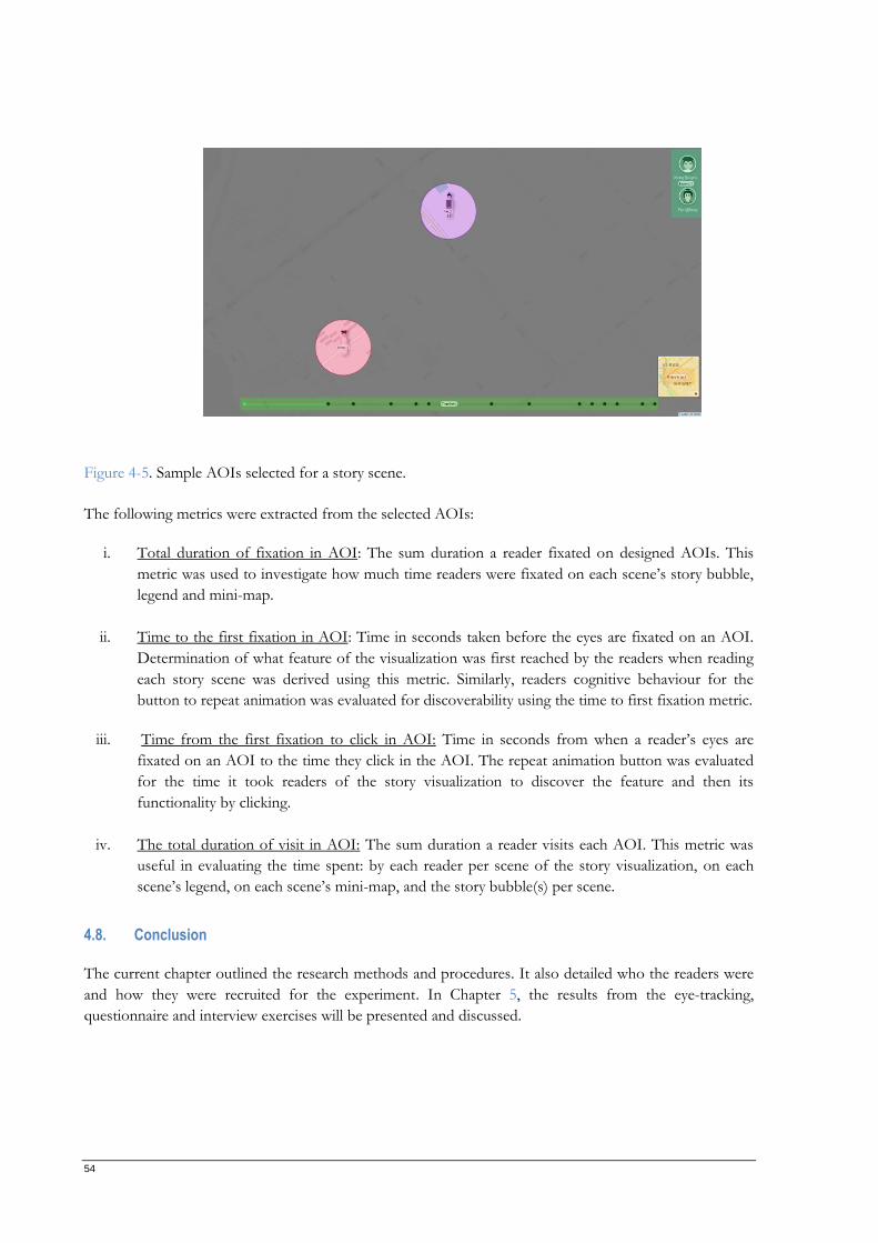
54
Figure 4-5. Sample AOIs selected for a story scene.
The following metrics were extracted from the selected AOIs:
i. Total duration of fixation in AOI: The sum duration a reader fixated on designed AOIs. This
metric was used to investigate how much time readers were fixated on each scene’s story bubble,
legend and mini-map.
ii. Time to the first fixation in AOI: Time in seconds taken before the eyes are fixated on an AOI.
Determination of what feature of the visualization was first reached by the readers when reading
each story scene was derived using this metric. Similarly, readers cognitive behaviour for the
button to repeat animation was evaluated for discoverability using the time to first fixation metric.
iii. Time from the first fixation to click in AOI: Time in seconds from when a reader’s eyes are
fixated on an AOI to the time they click in the AOI. The repeat animation button was evaluated
for the time it took readers of the story visualization to discover the feature and then its
functionality by clicking.
iv. The total duration of visit in AOI: The sum duration a reader visits each AOI. This metric was
useful in evaluating the time spent: by each reader per scene of the story visualization, on each
scene’s legend, on each scene’s mini-map, and the story bubble(s) per scene.
4.8. Conclusion
The current chapter outlined the research methods and procedures. It also detailed who the readers were
and how they were recruited for the experiment. In Chapter 5, the results from the eye-tracking,
questionnaire and interview exercises will be presented and discussed.
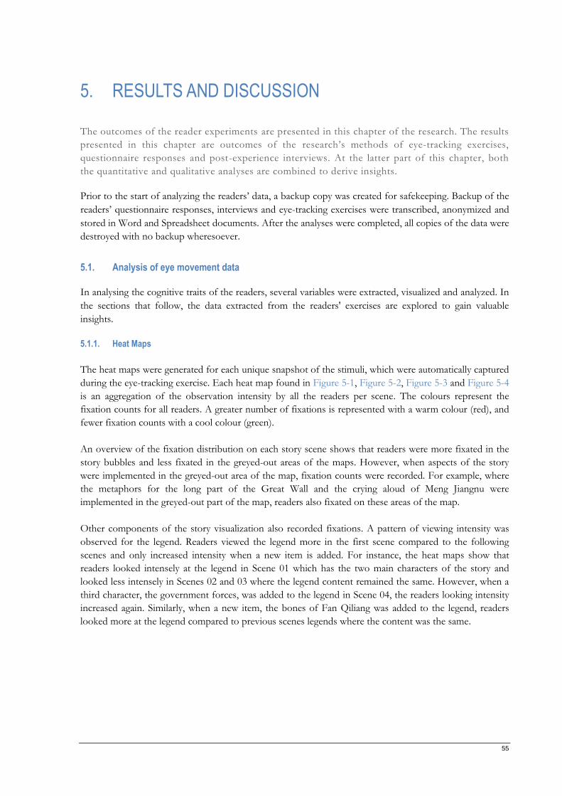
55
5. RESULTS AND DISCUSSION
The outcomes of the reader experiments are presented in this chapter of the research. The results
presented in this chapter are outcomes of the research’s methods of eye-tracking exercises,
questionnaire responses and post-experience interviews. At the latter part of this chapter, both
the quantitative and qualitative analyses are combined to derive insights.
Prior to the start of analyzing the readers’ data, a backup copy was created for safekeeping. Backup of the
readers’ questionnaire responses, interviews and eye-tracking exercises were transcribed, anonymized and
stored in Word and Spreadsheet documents. After the analyses were completed, all copies of the data were
destroyed with no backup wheresoever.
5.1. Analysis of eye movement data
In analysing the cognitive traits of the readers, several variables were extracted, visualized and analyzed. In
the sections that follow, the data extracted from the readers' exercises are explored to gain valuable
insights.
5.1.1. Heat Maps
The heat maps were generated for each unique snapshot of the stimuli, which were automatically captured
during the eye-tracking exercise. Each heat map found in Figure 5-1, Figure 5-2, Figure 5-3 and Figure 5-4
is an aggregation of the observation intensity by all the readers per scene. The colours represent the
fixation counts for all readers. A greater number of fixations is represented with a warm colour (red), and
fewer fixation counts with a cool colour (green).
An overview of the fixation distribution on each story scene shows that readers were more fixated in the
story bubbles and less fixated in the greyed-out areas of the maps. However, when aspects of the story
were implemented in the greyed-out area of the map, fixation counts were recorded. For example, where
the metaphors for the long part of the Great Wall and the crying aloud of Meng Jiangnu were
implemented in the greyed-out part of the map, readers also fixated on these areas of the map.
Other components of the story visualization also recorded fixations. A pattern of viewing intensity was
observed for the legend. Readers viewed the legend more in the first scene compared to the following
scenes and only increased intensity when a new item is added. For instance, the heat maps show that
readers looked intensely at the legend in Scene 01 which has the two main characters of the story and
looked less intensely in Scenes 02 and 03 where the legend content remained the same. However, when a
third character, the government forces, was added to the legend in Scene 04, the readers looking intensity
increased again. Similarly, when a new item, the bones of Fan Qiliang was added to the legend, readers
looked more at the legend compared to previous scenes legends where the content was the same.
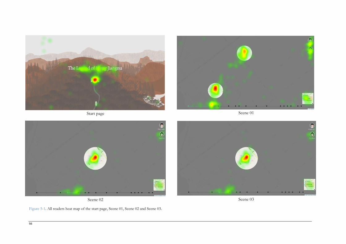
56
Start page Scene 01
Scene 02 Scene 03
Figure 5-1. All readers heat map of the start page, Scene 01, Scene 02 and Scene 03.
57
Scene 04 Scene 05
Scene 06 Scene 07
Figure 5-2. All readers heat map of Scene 04, Scene 05, Scene 06, and Scene 07.
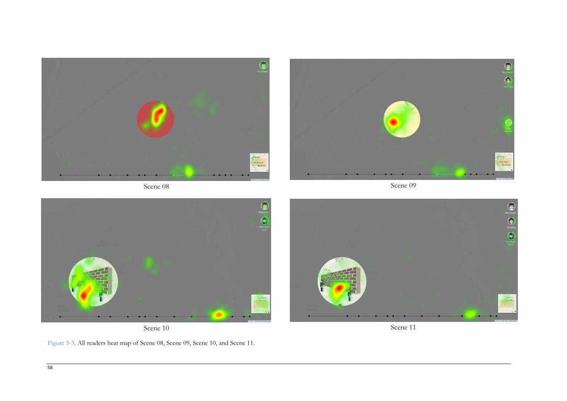
58
Scene 08 Scene 09
Scene 10 Scene 11
Figure 5-3. All readers heat map of Scene 08, Scene 09, Scene 10, and Scene 11.
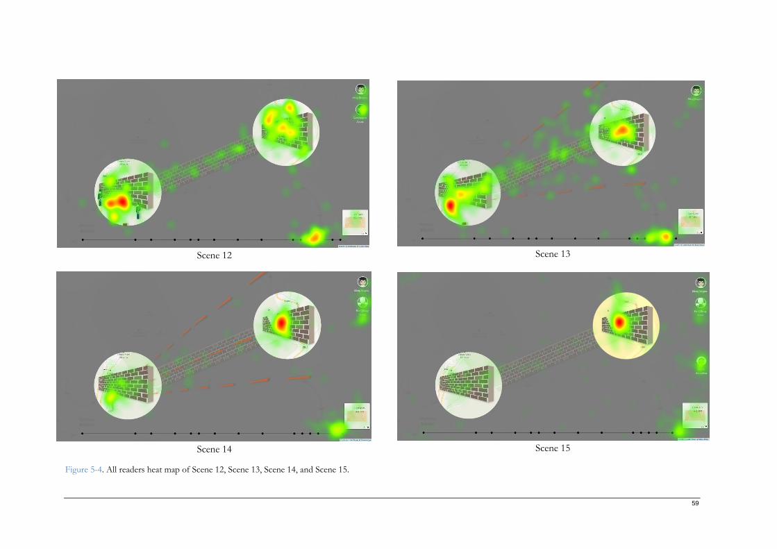
59
Scene 12 Scene 13
Scene 14 Scene 15
Figure 5-4. All readers heat map of Scene 12, Scene 13, Scene 14, and Scene 15.
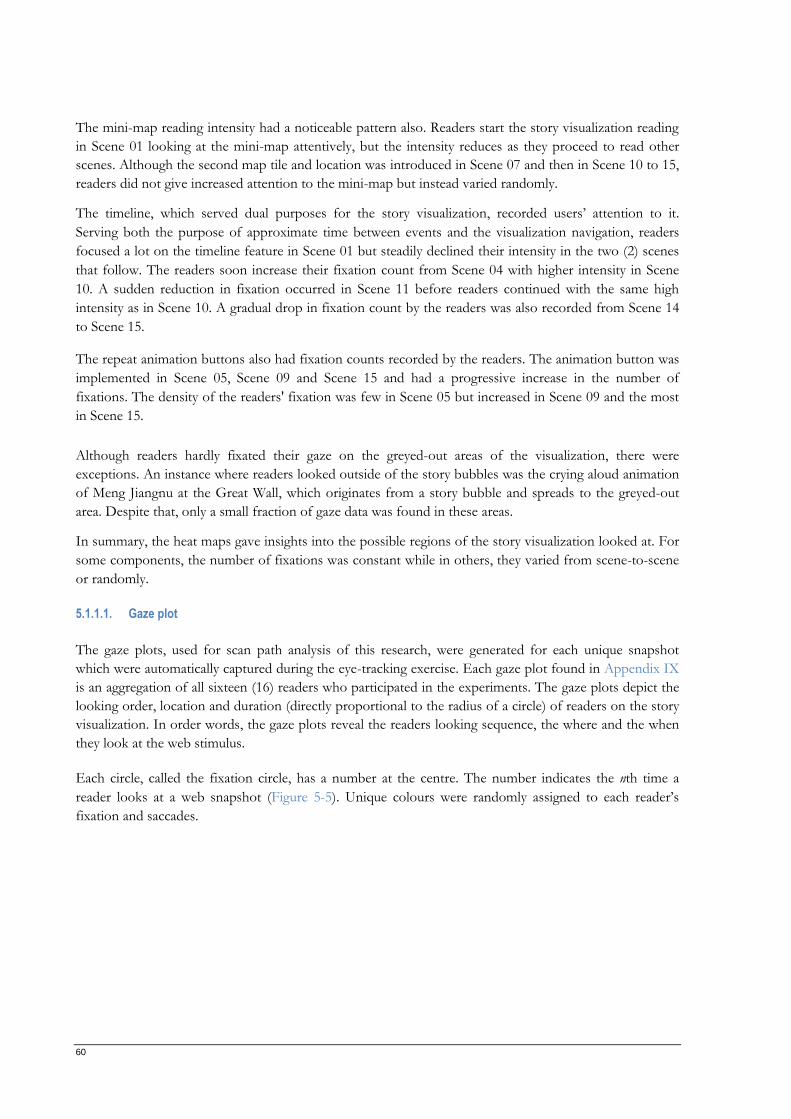
60
The mini-map reading intensity had a noticeable pattern also. Readers start the story visualization reading
in Scene 01 looking at the mini-map attentively, but the intensity reduces as they proceed to read other
scenes. Although the second map tile and location was introduced in Scene 07 and then in Scene 10 to 15,
readers did not give increased attention to the mini-map but instead varied randomly.
The timeline, which served dual purposes for the story visualization, recorded users’ attention to it.
Serving both the purpose of approximate time between events and the visualization navigation, readers
focused a lot on the timeline feature in Scene 01 but steadily declined their intensity in the two (2) scenes
that follow. The readers soon increase their fixation count from Scene 04 with higher intensity in Scene
10. A sudden reduction in fixation occurred in Scene 11 before readers continued with the same high
intensity as in Scene 10. A gradual drop in fixation count by the readers was also recorded from Scene 14
to Scene 15.
The repeat animation buttons also had fixation counts recorded by the readers. The animation button was
implemented in Scene 05, Scene 09 and Scene 15 and had a progressive increase in the number of
fixations. The density of the readers' fixation was few in Scene 05 but increased in Scene 09 and the most
in Scene 15.
Although readers hardly fixated their gaze on the greyed-out areas of the visualization, there were
exceptions. An instance where readers looked outside of the story bubbles was the crying aloud animation
of Meng Jiangnu at the Great Wall, which originates from a story bubble and spreads to the greyed-out
area. Despite that, only a small fraction of gaze data was found in these areas.
In summary, the heat maps gave insights into the possible regions of the story visualization looked at. For
some components, the number of fixations was constant while in others, they varied from scene-to-scene
or randomly.
5.1.1.1. Gaze plot
The gaze plots, used for scan path analysis of this research, were generated for each unique snapshot
which were automatically captured during the eye-tracking exercise. Each gaze plot found in Appendix IX
is an aggregation of all sixteen (16) readers who participated in the experiments. The gaze plots depict the
looking order, location and duration (directly proportional to the radius of a circle) of readers on the story
visualization. In order words, the gaze plots reveal the readers looking sequence, the where and the when
they look at the web stimulus.
Each circle, called the fixation circle, has a number at the centre. The number indicates the nth time a
reader looks at a web snapshot (Figure 5-5). Unique colours were randomly assigned to each reader’s
fixation and saccades.
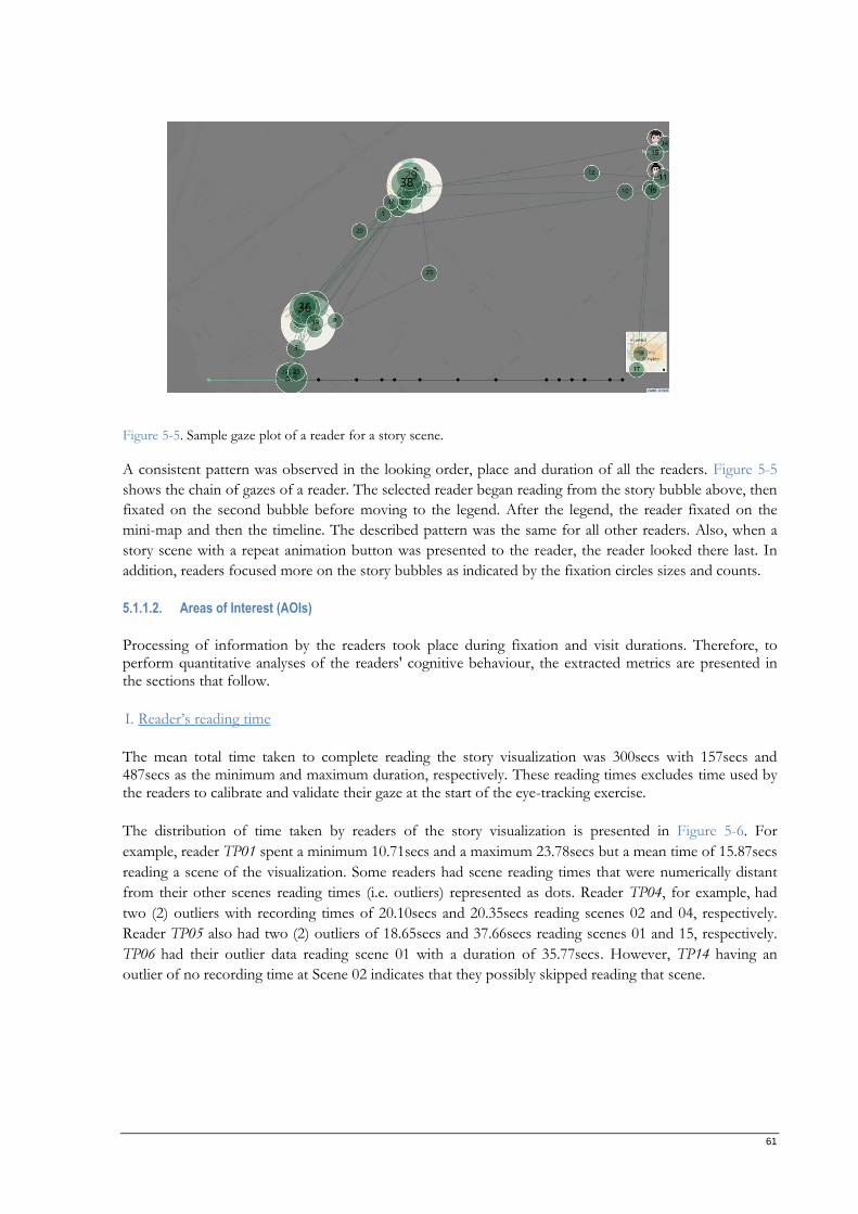
61
Figure 5-5. Sample gaze plot of a reader for a story scene.
A consistent pattern was observed in the looking order, place and duration of all the readers. Figure 5-5
shows the chain of gazes of a reader. The selected reader began reading from the story bubble above, then
fixated on the second bubble before moving to the legend. After the legend, the reader fixated on the
mini-map and then the timeline. The described pattern was the same for all other readers. Also, when a
story scene with a repeat animation button was presented to the reader, the reader looked there last. In
addition, readers focused more on the story bubbles as indicated by the fixation circles sizes and counts.
5.1.1.2. Areas of Interest (AOIs)
Processing of information by the readers took place during fixation and visit durations. Therefore, to perform quantitative analyses of the readers' cognitive behaviour, the extracted metrics are presented in the sections that follow.
I. Reader’s reading time
The mean total time taken to complete reading the story visualization was 300secs with 157secs and 487secs as the minimum and maximum duration, respectively. These reading times excludes time used by the readers to calibrate and validate their gaze at the start of the eye-tracking exercise.
The distribution of time taken by readers of the story visualization is presented in Figure 5-6. For
example, reader TP01 spent a minimum 10.71secs and a maximum 23.78secs but a mean time of 15.87secs
reading a scene of the visualization. Some readers had scene reading times that were numerically distant
from their other scenes reading times (i.e. outliers) represented as dots. Reader TP04, for example, had
two (2) outliers with recording times of 20.10secs and 20.35secs reading scenes 02 and 04, respectively.
Reader TP05 also had two (2) outliers of 18.65secs and 37.66secs reading scenes 01 and 15, respectively.
TP06 had their outlier data reading scene 01 with a duration of 35.77secs. However, TP14 having an
outlier of no recording time at Scene 02 indicates that they possibly skipped reading that scene.
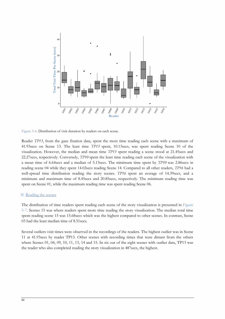
62
Figure 5-6. Distribution of visit duration by readers on each scene.
Reader TP13, from the gaze fixation data, spent the most time reading each scene with a maximum of
41.93secs on Scene 13. The least time TP13 spent, 10.13secs, was spent reading Scene 10 of the
visualization. However, the median and mean time TP13 spent reading a scene stood at 21.45secs and
22.27secs, respectively. Conversely, TP10 spent the least time reading each scene of the visualization with
a mean time of 6.64secs and a median of 5.13secs. The minimum time spent by TP10 was 2.86secs in
reading scene 04 while they spent 14.02secs reading Scene 14. Compared to all other readers, TP16 had a
well-spread time distribution reading the story scenes. TP16 spent an average of 14.39secs, and a
minimum and maximum time of 8.45secs and 20.85secs, respectively. The minimum reading time was
spent on Scene 01, while the maximum reading time was spent reading Scene 06.
II. Reading the scenes
The distribution of time readers spent reading each scene of the story visualization is presented in Figure
5-7. Scenes 15 was where readers spent more time reading the story visualization. The median total time
spent reading scene 15 was 15.68secs which was the highest compared to other scenes. In contrast, Scene
03 had the least median time of 8.51secs.
Several outliers visit times were observed in the recordings of the readers. The highest outlier was in Scene
11 at 41.93secs by reader TP13. Other scenes with recording times that were distant from the others
where Scenes 01, 04, 09, 10, 11, 13, 14 and 15. In six out of the eight scenes with outlier data, TP13 was
the reader who also completed reading the story visualization in 487secs, the highest.
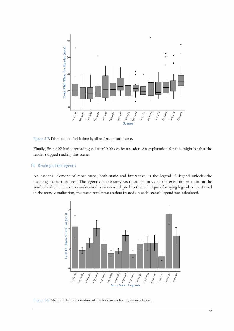
63
Figure 5-7. Distribution of visit time by all readers on each scene.
Finally, Scene 02 had a recording value of 0.00secs by a reader. An explanation for this might be that the
reader skipped reading this scene.
III. Reading of the legends
An essential element of most maps, both static and interactive, is the legend. A legend unlocks the
meaning to map features. The legends in the story visualization provided the extra information on the
symbolized characters. To understand how users adapted to the technique of varying legend content used
in the story visualization, the mean total time readers fixated on each scene’s legend was calculated.
Figure 5-8. Mean of the total duration of fixation on each story scene's legend.
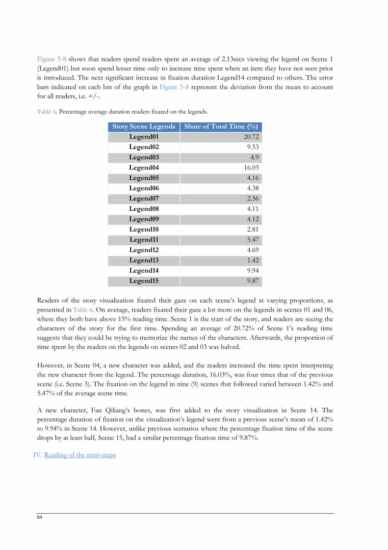
64
Figure 5-8 shows that readers spend readers spent an average of 2.13secs viewing the legend on Scene 1
(Legend01) but soon spend lesser time only to increase time spent when an item they have not seen prior
is introduced. The next significant increase in fixation duration Legend14 compared to others. The error
bars indicated on each bin of the graph in Figure 5-8 represent the deviation from the mean to account
for all readers, i.e. +/-.
Table 6. Percentage average duration readers fixated on the legends.
Story Scene Legends Share of Total Time (%)
Legend01 20.72
Legend02 9.53
Legend03 4.9
Legend04 16.03
Legend05 4.16
Legend06 4.38
Legend07 2.56
Legend08 4.11
Legend09 4.12
Legend10 2.81
Legend11 5.47
Legend12 4.69
Legend13 1.42
Legend14 9.94
Legend15 9.87
Readers of the story visualization fixated their gaze on each scene’s legend at varying proportions, as
presented in Table 6. On average, readers fixated their gaze a lot more on the legends in scenes 01 and 06,
where they both have above 15% reading time. Scene 1 is the start of the story, and readers are seeing the
characters of the story for the first time. Spending an average of 20.72% of Scene 1’s reading time
suggests that they could be trying to memorize the names of the characters. Afterwards, the proportion of
time spent by the readers on the legends on scenes 02 and 03 was halved.
However, in Scene 04, a new character was added, and the readers increased the time spent interpreting
the new character from the legend. The percentage duration, 16.03%, was four times that of the previous
scene (i.e. Scene 3). The fixation on the legend in nine (9) scenes that followed varied between 1.42% and
5.47% of the average scene time.
A new character, Fan Qiliang’s bones, was first added to the story visualization in Scene 14. The
percentage duration of fixation on the visualization’s legend went from a previous scene’s mean of 1.42%
to 9.94% in Scene 14. However, unlike previous scenarios where the percentage fixation time of the scene
drops by at least half, Scene 15, had a similar percentage fixation time of 9.87%.
IV. Reading of the mini-maps
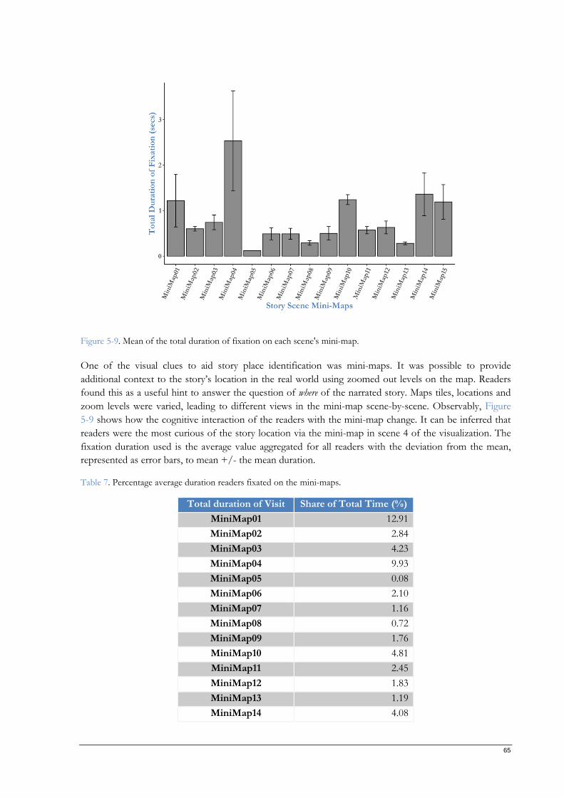
65
Figure 5-9. Mean of the total duration of fixation on each scene's mini-map.
One of the visual clues to aid story place identification was mini-maps. It was possible to provide
additional context to the story’s location in the real world using zoomed out levels on the map. Readers
found this as a useful hint to answer the question of where of the narrated story. Maps tiles, locations and
zoom levels were varied, leading to different views in the mini-map scene-by-scene. Observably, Figure
5-9 shows how the cognitive interaction of the readers with the mini-map change. It can be inferred that
readers were the most curious of the story location via the mini-map in scene 4 of the visualization. The
fixation duration used is the average value aggregated for all readers with the deviation from the mean,
represented as error bars, to mean +/- the mean duration.
Table 7. Percentage average duration readers fixated on the mini-maps.
Total duration of Visit Share of Total Time (%)
MiniMap01 12.91
MiniMap02 2.84
MiniMap03 4.23
MiniMap04 9.93
MiniMap05 0.08
MiniMap06 2.10
MiniMap07 1.16
MiniMap08 0.72
MiniMap09 1.76
MiniMap10 4.81
MiniMap11 2.45
MiniMap12 1.83
MiniMap13 1.19
MiniMap14 4.08
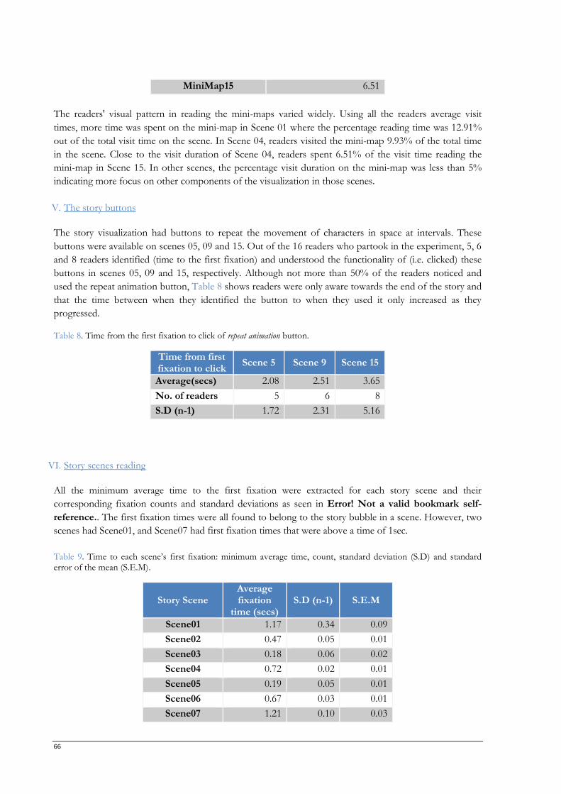
66
MiniMap15 6.51
The readers' visual pattern in reading the mini-maps varied widely. Using all the readers average visit
times, more time was spent on the mini-map in Scene 01 where the percentage reading time was 12.91%
out of the total visit time on the scene. In Scene 04, readers visited the mini-map 9.93% of the total time
in the scene. Close to the visit duration of Scene 04, readers spent 6.51% of the visit time reading the
mini-map in Scene 15. In other scenes, the percentage visit duration on the mini-map was less than 5%
indicating more focus on other components of the visualization in those scenes.
V. The story buttons
The story visualization had buttons to repeat the movement of characters in space at intervals. These
buttons were available on scenes 05, 09 and 15. Out of the 16 readers who partook in the experiment, 5, 6
and 8 readers identified (time to the first fixation) and understood the functionality of (i.e. clicked) these
buttons in scenes 05, 09 and 15, respectively. Although not more than 50% of the readers noticed and
used the repeat animation button, Table 8 shows readers were only aware towards the end of the story and
that the time between when they identified the button to when they used it only increased as they
progressed.
Table 8. Time from the first fixation to click of repeat animation button.
Time from first fixation to click
Scene 5 Scene 9 Scene 15
Average(secs) 2.08 2.51 3.65
No. of readers 5 6 8
S.D (n-1) 1.72 2.31 5.16
VI. Story scenes reading
All the minimum average time to the first fixation were extracted for each story scene and their
corresponding fixation counts and standard deviations as seen in Error! Not a valid bookmark self-
reference.. The first fixation times were all found to belong to the story bubble in a scene. However, two
scenes had Scene01, and Scene07 had first fixation times that were above a time of 1sec.
Table 9. Time to each scene’s first fixation: minimum average time, count, standard deviation (S.D) and standard error of the mean (S.E.M).
Story Scene Average fixation
time (secs) S.D (n-1) S.E.M
Scene01 1.17 0.34 0.09
Scene02 0.47 0.05 0.01
Scene03 0.18 0.06 0.02
Scene04 0.72 0.02 0.01
Scene05 0.19 0.05 0.01
Scene06 0.67 0.03 0.01
Scene07 1.21 0.10 0.03
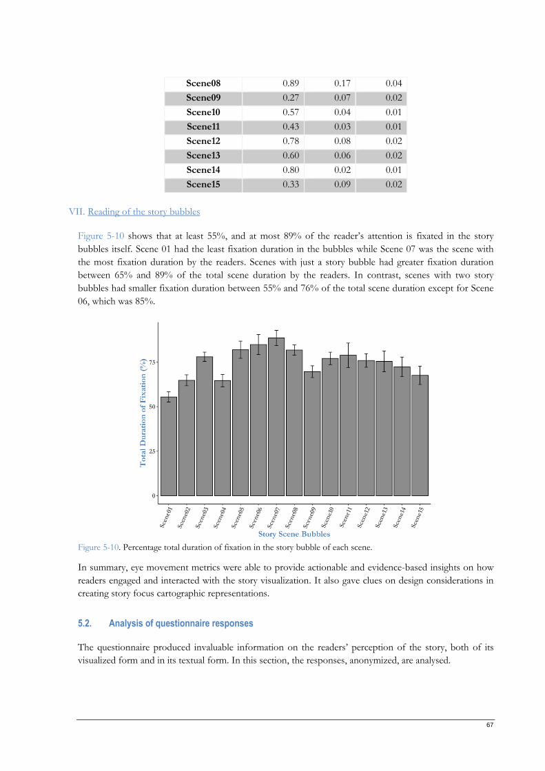
67
Scene08 0.89 0.17 0.04
Scene09 0.27 0.07 0.02
Scene10 0.57 0.04 0.01
Scene11 0.43 0.03 0.01
Scene12 0.78 0.08 0.02
Scene13 0.60 0.06 0.02
Scene14 0.80 0.02 0.01
Scene15 0.33 0.09 0.02
VII. Reading of the story bubbles
Figure 5-10 shows that at least 55%, and at most 89% of the reader’s attention is fixated in the story
bubbles itself. Scene 01 had the least fixation duration in the bubbles while Scene 07 was the scene with
the most fixation duration by the readers. Scenes with just a story bubble had greater fixation duration
between 65% and 89% of the total scene duration by the readers. In contrast, scenes with two story
bubbles had smaller fixation duration between 55% and 76% of the total scene duration except for Scene
06, which was 85%.
Figure 5-10. Percentage total duration of fixation in the story bubble of each scene.
In summary, eye movement metrics were able to provide actionable and evidence-based insights on how
readers engaged and interacted with the story visualization. It also gave clues on design considerations in
creating story focus cartographic representations.
5.2. Analysis of questionnaire responses
The questionnaire produced invaluable information on the readers’ perception of the story, both of its
visualized form and in its textual form. In this section, the responses, anonymized, are analysed.
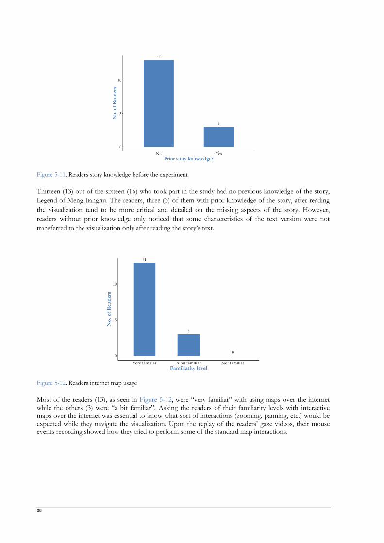
68
Figure 5-11. Readers story knowledge before the experiment
Thirteen (13) out of the sixteen (16) who took part in the study had no previous knowledge of the story,
Legend of Meng Jiangnu. The readers, three (3) of them with prior knowledge of the story, after reading
the visualization tend to be more critical and detailed on the missing aspects of the story. However,
readers without prior knowledge only noticed that some characteristics of the text version were not
transferred to the visualization only after reading the story’s text.
Figure 5-12. Readers internet map usage
Most of the readers (13), as seen in Figure 5-12, were “very familiar” with using maps over the internet while the others (3) were “a bit familiar”. Asking the readers of their familiarity levels with interactive maps over the internet was essential to know what sort of interactions (zooming, panning, etc.) would be expected while they navigate the visualization. Upon the replay of the readers’ gaze videos, their mouse events recording showed how they tried to perform some of the standard map interactions.
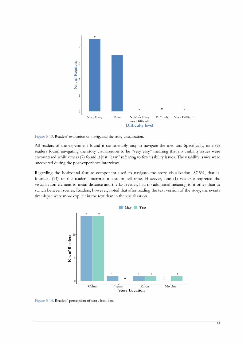
69
Figure 5-13. Readers' evaluation on navigating the story visualization.
All readers of the experiment found it considerably easy to navigate the medium. Specifically, nine (9)
readers found navigating the story visualization to be “very easy” meaning that no usability issues were
encountered while others (7) found it just “easy” referring to few usability issues. The usability issues were
uncovered during the post-experience interviews.
Regarding the horizontal feature component used to navigate the story visualization, 87.5%, that is,
fourteen (14) of the readers interpret it also to tell time. However, one (1) reader interpreted the
visualization element to mean distance and the last reader, had no additional meaning to it other than to
switch between scenes. Readers, however, noted that after reading the text version of the story, the events
time-lapse were more explicit in the text than in the visualization.
Figure 5-14. Readers' perception of story location.
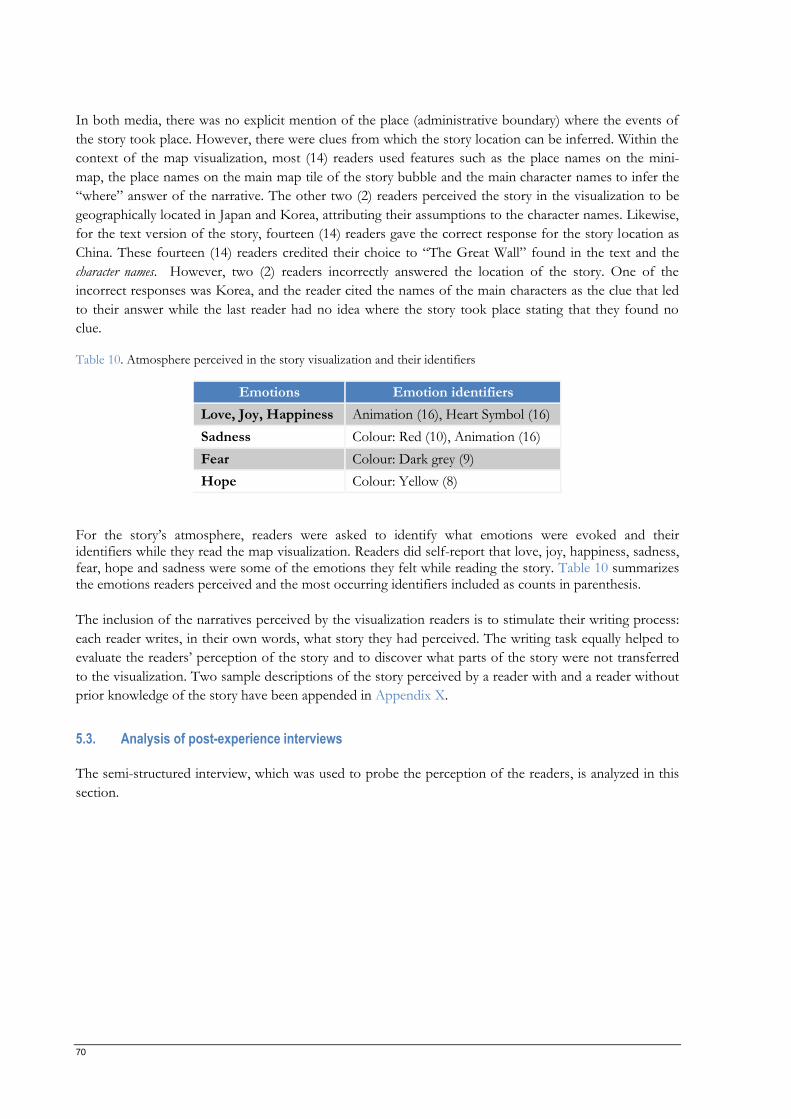
70
In both media, there was no explicit mention of the place (administrative boundary) where the events of
the story took place. However, there were clues from which the story location can be inferred. Within the
context of the map visualization, most (14) readers used features such as the place names on the mini-
map, the place names on the main map tile of the story bubble and the main character names to infer the
“where” answer of the narrative. The other two (2) readers perceived the story in the visualization to be
geographically located in Japan and Korea, attributing their assumptions to the character names. Likewise,
for the text version of the story, fourteen (14) readers gave the correct response for the story location as
China. These fourteen (14) readers credited their choice to “The Great Wall” found in the text and the
character names. However, two (2) readers incorrectly answered the location of the story. One of the
incorrect responses was Korea, and the reader cited the names of the main characters as the clue that led
to their answer while the last reader had no idea where the story took place stating that they found no
clue.
Table 10. Atmosphere perceived in the story visualization and their identifiers
Emotions Emotion identifiers
Love, Joy, Happiness Animation (16), Heart Symbol (16)
Sadness Colour: Red (10), Animation (16)
Fear Colour: Dark grey (9)
Hope Colour: Yellow (8)
For the story’s atmosphere, readers were asked to identify what emotions were evoked and their identifiers while they read the map visualization. Readers did self-report that love, joy, happiness, sadness, fear, hope and sadness were some of the emotions they felt while reading the story. Table 10 summarizes the emotions readers perceived and the most occurring identifiers included as counts in parenthesis.
The inclusion of the narratives perceived by the visualization readers is to stimulate their writing process:
each reader writes, in their own words, what story they had perceived. The writing task equally helped to
evaluate the readers’ perception of the story and to discover what parts of the story were not transferred
to the visualization. Two sample descriptions of the story perceived by a reader with and a reader without
prior knowledge of the story have been appended in Appendix X.
5.3. Analysis of post-experience interviews
The semi-structured interview, which was used to probe the perception of the readers, is analyzed in this
section.
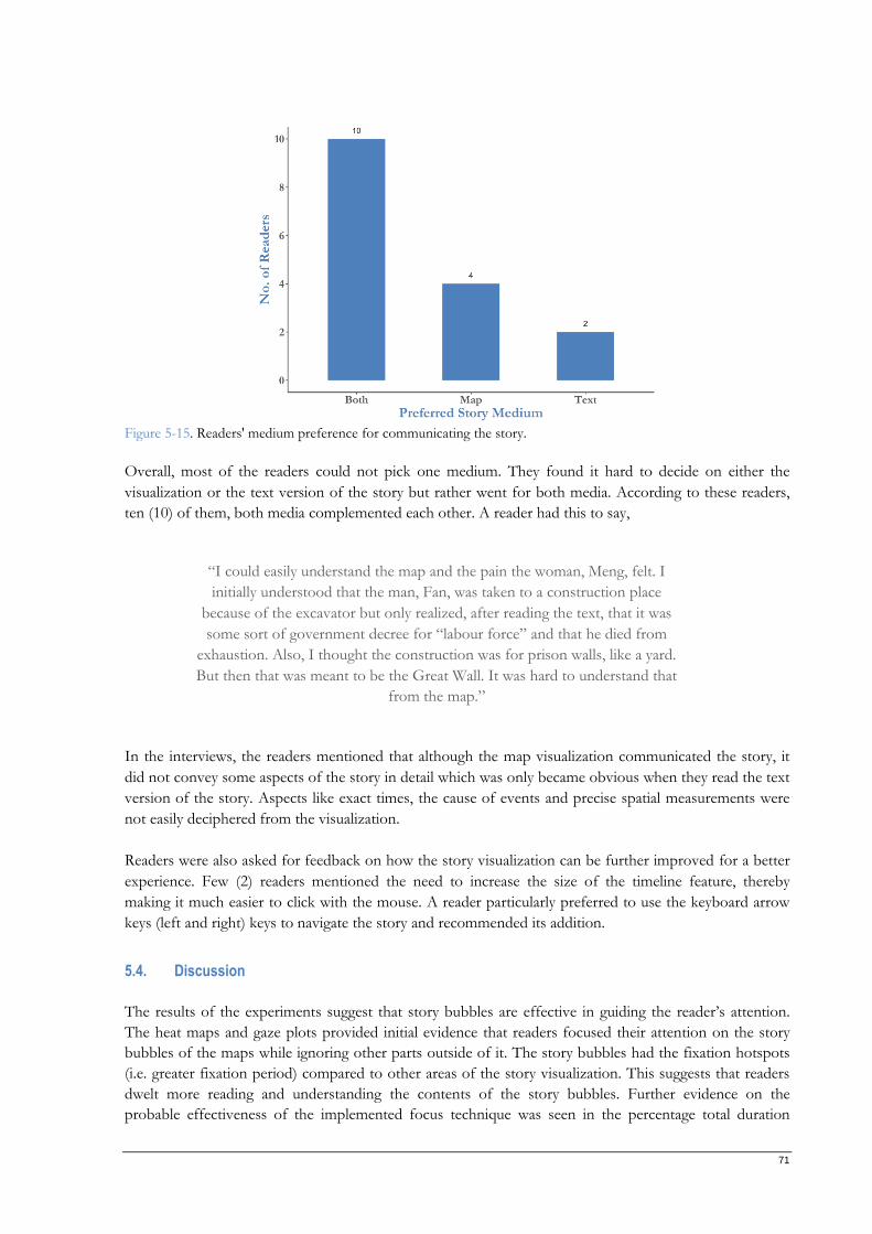
71
Figure 5-15. Readers' medium preference for communicating the story.
Overall, most of the readers could not pick one medium. They found it hard to decide on either the
visualization or the text version of the story but rather went for both media. According to these readers,
ten (10) of them, both media complemented each other. A reader had this to say,
In the interviews, the readers mentioned that although the map visualization communicated the story, it
did not convey some aspects of the story in detail which was only became obvious when they read the text
version of the story. Aspects like exact times, the cause of events and precise spatial measurements were
not easily deciphered from the visualization.
Readers were also asked for feedback on how the story visualization can be further improved for a better
experience. Few (2) readers mentioned the need to increase the size of the timeline feature, thereby
making it much easier to click with the mouse. A reader particularly preferred to use the keyboard arrow
keys (left and right) keys to navigate the story and recommended its addition.
5.4. Discussion
The results of the experiments suggest that story bubbles are effective in guiding the reader’s attention.
The heat maps and gaze plots provided initial evidence that readers focused their attention on the story
bubbles of the maps while ignoring other parts outside of it. The story bubbles had the fixation hotspots
(i.e. greater fixation period) compared to other areas of the story visualization. This suggests that readers
dwelt more reading and understanding the contents of the story bubbles. Further evidence on the
probable effectiveness of the implemented focus technique was seen in the percentage total duration
“I could easily understand the map and the pain the woman, Meng, felt. I
initially understood that the man, Fan, was taken to a construction place
because of the excavator but only realized, after reading the text, that it was
some sort of government decree for “labour force” and that he died from
exhaustion. Also, I thought the construction was for prison walls, like a yard.
But then that was meant to be the Great Wall. It was hard to understand that
from the map.”
72
recorded in each scene of the story visualization. Readers fixated between 55% to 89% of their reading
times on each scene, focusing on the story bubbles in proportion to other components. Additional proof
that suggested the effectiveness of the story bubble was seen in time to the first fixation in each scene.
The results showed that readers first visited the story bubbles meaning that their attention was first fixated
there.
The visual strategy used in reading the story visualization was identical across all readers. Each reader
started with the story bubble where they also had their gaze mostly fixated before moving to the legend,
then the mini-map and finally the timeline. In scenes where they were animation buttons, readers had their
gaze fixated last there. The evidence was consistent in the time to first fixation, gaze plots and replay of
gaze video recording.
The experiments revealed that readers needed to adapt to added functionalities like buttons in the story
visualization. Although few readers used the button at the beginning, more readers used the button as they
approached the end of the visualization. This could be a pointer that readers needed some time to adapt
to the implemented technique of visualizing movements in space. It could also mean that the instruction
to use the button was incomprehensible or inconspicuous enough. Hence, there might be a need to
include a salient hint feature telling the readers to use the button.
Asides the main map tile and character names, readers of the story visualization identified the mini-maps
as an element of the visualization that informed them of where the story took place. A reading pattern was
observed for the mini-maps. These mini-maps, provided in each scene, were to provide additional spatial
clues to where the story took place. Overall, readers had their fixation the most on the mini-map in Scene
01, and in other scenes only a few readers looked at them again, evidenced in the heat maps, gaze plots
and fixation duration. The drastic reduction in intensity by the readers on the heat maps, fewer readers
and fewer counts.
Readers also adapted to the varying contents of the legends. In the first scene of the story visualization,
readers were presented with the two (2) main characters and their meanings in the legend. As soon as a
new character was introduced as they read the story visualization, they fixated their gaze longer on the
legends compare to when they had previously encountered those characters and unlocked their meanings.
This afforded the reader to focus on other parts of the visualization and only look at the legend when it is
needed. The evidence of the readers’ adaption was seen in the heat maps, the gaze plots and the fixation
duration.
In terms of navigation, the story visualization used a timeline feature. Most readers reported the ease of
navigating the story visualization. However, the results of the experiment showed that a reader missed
reading a scene of the story’s visualization. Further investigation into the possible reason for the miss
could not be ascertained from the video replay of the reader’s gaze recording.
Large reading durations and time to the first fixation were observed in scenes 01, 07 and 15. For Scene 01
the reason for the large reading time and time to the first fixation was identified to be caused by the low
latency in loading cartographic elements to the DOM of the browser. That is, the story visualization being
a SPA, loaded all components on the first scene of the story visualization before the map, and the
elements of Scene 01 alone showed up. Scene 07 was due to the insertion of a new map tile. The map tile
server had a low latency. However, readers with scene reading times that were numerically far apart from
the other data for Scene 15, was because these readers forgot the instruction on how to end the eye-
tracking exercise and took a while before requesting assistance.
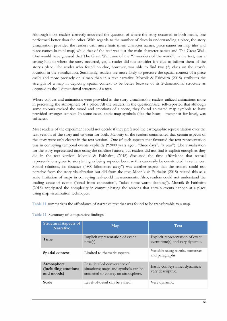
73
Although most readers correctly answered the question of where the story occurred in both media, one
performed better than the other. With regards to the number of clues in understanding a place, the story
visualization provided the readers with more hints (main character names, place names on map tiles and
place names in mini-map) while that of the text was just the main character names and The Great Wall.
One would have guessed that The Great Wall, one of the “7 wonders of the world”, in the text, was a
strong hint to where the story occurred, yet, a reader did not consider it a clue to inform them of the
story’s place. The reader who found no clue, however, was able to find two (2) clues on the story’s
location in the visualization. Summarily, readers are more likely to perceive the spatial context of a place
easily and more precisely on a map than in a text narrative. Mocnik & Fairbairn (2018) attributes the
strength of a map in depicting spatial context to be better because of its 2-dimensional structure as
opposed to the 1-dimensional structure of a text.
Where colours and animations were provided in the story visualization, readers utilized animations more in perceiving the atmosphere of a place. All the readers, in the questionnaire, self-reported that although some colours evoked the mood and emotions of a scene, they found animated map symbols to have provided stronger context. In some cases, static map symbols (like the heart – metaphor for love), was sufficient.
Most readers of the experiment could not decide if they preferred the cartographic representation over the
text version of the story and so went for both. Majority of the readers commented that certain aspects of
the story were only clearer in the text version. One of such aspects that favoured the text representation
was in conveying temporal events explicitly (“2000 years ago”, “three days”, “a year”). The visualization
for the story represented time using the timeline feature, but readers did not find it explicit enough as they
did in the text version. Mocnik & Fairbairn, (2018) discussed the time affordance that textual
representations gives to storytelling as being superior because this can easily be constructed in sentences.
Spatial relations, i.e. distance (“800 kilometres away”) was another aspect that the readers could not
perceive from the story visualization but did from the text. Mocnik & Fairbairn (2018) related this as a
scale limitation of maps in conveying real-world measurements. Also, readers could not understand the
leading cause of events (“dead from exhaustion”, “takes some warm clothing”). Mocnik & Fairbairn
(2018) anticipated the complexity in communicating the reasons that certain events happen at a place
using map visualization techniques.
Table 11 summarizes the affordance of narrative text that was found to be transferrable to a map.
Table 11. Summary of comparative findings
Structural Aspects of Narrative
Map Text
Time Implicit representation of event time(s).
Explicit representation of exact event time(s) and very dynamic.
Spatial context Limited to thematic aspects. Variable using words, sentences and paragraphs.
Atmosphere (including emotions and moods)
Less detailed conveyance of situations; maps and symbols can be animated to convey an atmosphere.
Easily conveys inner dynamics; very descriptive.
Scale Level-of-detail can be varied. Very dynamic.
74
6. CONCLUSION
Research overview, answers and recommendations are highlighted in Section 6.1, 6.2 and 6.3,
respectively. Future research possibilities are suggested.
6.1. Overview
Maps have been used to tell stories about places for a long time. Today, it is possible to tell stories using
interactive digital maps. Albeit, most of the maps on the internet are supplemented by multimedia aid. A
limitation with multimedia maps is the issue of effective communication as well as engagement of the
target audience. Users of such maps have to navigate the map to understand the spatial context and then
read, listen or watch the additional media. The idea that the characteristics of narrative text can be
incorporated directly into maps was proposed by Mocnik & Fairbairn (2018) as the “story focus concept”.
The story, “Legend of Meng Jiangnu” was implemented using story focus techniques and evaluated
through empirical experiments.
The second chapter starts by reviewing works of literature on maps and map types. It briefly discussed
how different map types are used, how they are disseminated, and their pros and cons. A section in
chapter 2 was dedicated to storytelling, the origin, the purpose it serves, and the advancements made in
recent years. Digital and non-digital storytelling were the two broad categories considered and how one
impacts the other. An overview of narratives and story maps was also covered. Lastly, the story focus
concept is summarized, and maps and text media were contrasted.
Chapter 3 is where the selected story implementation was reported. In the section of the research, a
breakdown of suitable techniques to convey the characteristics of the narrative text is tabularized. A
prototype design of the cartographic representation was created from the selected techniques to convey
the story. Based on the chosen techniques, the web mapping framework and tools to visualize the story
was explored. The story visualization was then created.
In chapter 4, the research methods were selected and justified. Because the research experiments involved
human participation, ethical procedures were followed, including getting approval from the ethics
committee and presenting each participant with a consent form. Qualitative methods of eye-tracking,
questionnaires and semi-structured interviews were adopted for the experiments. Participants, referred to
as readers, participated in the exercises voluntarily.
Analyzing the results of the research experiments were done in chapter 5. The data collected were
analysed for each research method in the form of charts and descriptive statistics. Evidence-based insights
were then derived from the results. The results were interpreted within the context of this research.
In the current chapter, chapter 6, the research questions are answered in summary. Limitations and
suggestion for further research are also included.
75
6.2. Answers to research questions
The research aimed to answer the research questions highlighted in Section 1.4.2. Section 6.2.1 covers the
first research questions (RQ1.1 and RQ1.2) while Section 6.2.2 covers the second research questions
(RQ2.1, RQ2.2 and RQ2.3)
6.2.1. Implementation of a cartographic representation
RQ1.1. What web visualization techniques can be used to tell stories of places of interest and at
different scales as the story unfolds?
In answering this question, the story text was broken into pieces, and suitable means to convey the aspects
of the story were identified. Techniques such as map styles, symbols, animation and scale were selected.
When selecting the techniques, priority was given to the characteristics and aspects of the text to ensure
that they are adequately transferred to the cartographic representation.
RQ1.2. What web mapping frameworks exist that support representation of the narrative aspects
and characteristics (atmosphere, mood, scale, time and spatial context) of a story?
Existing web mapping frameworks and tools were explored to incorporate the structural aspects of
narrative text. In creating the visualization, Leaflet.js was used as the base mapping framework because it
was simple, easy to modify and free to use (no payment required). The selected web mapping framework
was simple in terms of understanding and implementing the functionalities as well as its size – lightweight.
To transfer the characteristics of narrative text (atmosphere, mood, scale and spatial context) to a map,
there was the need to modify the map, and Leaflet.js was successful in achieving this goal. Some of the
modification implemented includes altering the scale to communicate a spatial context, interaction for
reader’s engagement and filter properties (opacity, blur, contrast, brightness, greyscale, hue and saturation)
to evoke emotions, mood and atmosphere. The open-source status of the web mapping library eliminated
the need for subscription fees and also provided the opportunity for developers to create plugins and
extensions. Some of these plugins and extensions (leaflet-TileLayer-ColorFilter and leaflet-TileLayer-
Mask) were useful in implementing the selected techniques.
6.2.2. Assessing the effectiveness of the cartographic representation
RQ2.1. How effective is the implemented cartographic representation in communicating and
engaging the reader when compared with reading a text version of the story?
Most of the readers (62.5%) self-reported that neither the cartographic representation not the text version
of the story alone was effective; rather, both media complemented each other in different aspects. For
instance, they could perceive the temporal aspects of the story from the cartographic representation but
not as explicit as it was in the text. Similarly, some inner dynamics of a place and the reason why an event
occurred wasn’t obvious in the cartographic representation but was glaring from the text. However, they
found, for example, the spatial aspects (such as where the story took place) to have been better conveyed
in the cartographic representation. The other 25% and 12.5% of the readers who participated in the
experiments reported that the cartographic representation and the text version, respectively,
communicated the story better.
RQ2.2. In which ways do the readers need to adapt to these new techniques of mapping stories?
76
Readers needed to adapt to the story mapping techniques in different ways. All the readers had their gaze
mostly fixated and first on the story bubbles, – a focus guiding technique – and hardly looked at the
greyed-out areas of the map. Readers used the map legend to understand the characters and fixated their
gaze more when a new character was added; else, they rarely looked at the legend – a variability technique.
Similarly, readers used the mini-maps to acquire additional hints on where the story took place
geographically in the first scene and afterwards sparsely refer to the mini-map. Also, readers progressively
identified and used additional button functionalities to understand spatial events – dynamics and
expressivity.
RQ2.3. Which reactions did the readers perceive while reading the cartographic representation of
the story?
The implemented cartographic representation was effective in transporting some of the aspects of the
narrative text. One of such aspects was the atmosphere (mood and emotions). Readers perceived positive
emotions of love, joy, happiness and hope via map colours, animations and graphic symbols. They also
perceived negative emotions of sadness, and fear via the colours on the map and animations.
6.3. Recommendations and future research
The implemented story visualization in this research combined several tools and frameworks. However,
having one framework that works out-of-the-box to create cartographic representations implementing the
story focus concept would be ideal. The framework should ideally provide a variety of techniques that
support telling stories using the story focus concept. It should be easy-to-use and, preferably, open-
sourced.
Guidelines for implementing the story focus concept in telling stories can be derived from the experiment
outcomes. For instance, by using story bubbles, a focus technique, the attention of the map readers will be
well guided to parts of the map where they will find the information they need faster and efficiently.
Similarly, by using (symbol) animation, emotions of a place can be easily understood by readers of the
story visualization. Replicating the evaluated techniques in creating cartographic representations that
implement the story focus concept could significantly improve the effectiveness of using maps to tell
stories.
The emotions from the narrative text depicted in the story visualization in this research were self-
interpreted, but it could be useful to consider other approaches. One such approach would be to carry out
a pre-study to determine the feelings readers get when reading the text narrative before implementing the
visualization. The pre-study could be by interviews or questionnaires.
The story focus concept for a story was implemented and evaluated in one story visualization in this
research. A comparative approach could be considered. That is, a story is selected and implemented
differently and then compared. Creating several representations of a story could better inform the
Cartographer on which techniques transferred the aspects of the narrative text better. It could become
clearer why some techniques performed poorly and why others were better.
Furthermore, it might be interesting to carry out a pre-selection of readers for the experiment. One pre-
selection would be based on their educational backgrounds. For example, cartographic and non-
cartographic students to evaluate how these two groups perceive spatial relations. Doing this might also
provide insights on techniques a Cartographer should consider for story focus maps to effectively convey

77
scale and temporal aspects of storytelling. Another pre-selection might be based on their prior knowledge
of the story. Two groups of experiment readers can be designed and then evaluated to see how readers
with versus those without prior knowledge of the story perceive the story.
Lastly, future research might consider adopting the visualization to be more inclusive. Potential readers of
maps created using story focus techniques might have eye colour disorders. They might also benefit by
including functionalities to enable readers to experience the story as readers without eye colour disorders.
Also, useful to consider is providing readers with the capability to switch between modes and themes –
like light to dark and vice-versa. Making the story visualization responsive across multiple devices should
also be considered to accommodate readers with different screen sizes.
78
LIST OF REFERENCES
Alzbeta Brychtova, Stanislav Popelka, & Zdena Dobesova. (2012). Eye-Tracking Methods For
Investigation Of Cartographic Principles. 12th International Multidisciplinary Scientific GeoConference
SGEM 2012. https://pdfs.semanticscholar.org/848b/ef61e7ef79022013a1c6426c6a63d969f807.pdf
Ameel, L. (2017). Narrating Space / Spatializing Narrative: where narrative theory and geography meet.
Social & Cultural Geography, 18(7), 1062–1064. https://doi.org/10.1080/14649365.2017.1337553
Anderson, K. M., & Mack, R. (2019). Digital Storytelling: A Narrative Method for Positive Identity
Development in Minority Youth. Social Work with Groups, 42(1), 43–55.
https://doi.org/10.1080/01609513.2017.1413616
Andrew T. Duchowski. (2017). Eye Tracking Methodology | Theory and Practice (Third Edition). Springer.
Andrychowicz-Trojanowska, A. (2018). Basic terminology of eye-tracking research. Applied Linguistics
Papers, 2/2018(25), 123–132. https://doi.org/10.32612/uw.25449354.2018.2.pp.123-132
Appel, M., & Richter, T. (2007). Persuasive effects of fictional narratives increase over time. Media
Psychology, 10(1), 113–134. https://doi.org/10.108/15213260701301194
Aris Munand. (2013). Narrative Text: Definition, Purposes, Generic Structures and Example of Narrative Text.
http://duoulala.blogspot.com/2013/07/narrative-text-definition-purposes.html
Axel Rauschmayer. (2020). JavaScript for Impatient Programmers. https://exploringjs.com/impatient-
js/downloads/impatient-js-preview-book.pdf
Bach, B., Stefaner, M., Boy, J., Drucker, S., Bartram, L., Wood, J., Ciuccarelli, P., Engelhardt, Y., Köppen,
U., & Tversky, B. (2018). Narrative Design Patterns for Data-Driven Storytelling. Data-Driven
Storytelling, 107–133. https://doi.org/10.1201/9781315281575-5
Baldasaro, M. M., & Maldonado, N. (2014). Storytelling to Teach Cultural Awareness: The Right Story at the Right
Time.
Bednarik, R., & Tukiainen, M. (2006). An eye-tracking methodology for characterizing program comprehension
processes. https://doi.org/10.1145/1117309.1117356
Berendsen, M. E., Hamerlinck, J. D., & Webster, G. R. (2018). Digital story mapping to advance
educational atlas design and enable student engagement. ISPRS International Journal of Geo-Information,
7(3). https://doi.org/10.3390/ijgi7030125
Bleek, W. G., Jeenicke, M., & Klischewski, R. (2002). Developing web-based applications through e-
prototyping. Proceedings - IEEE Computer Society’s International Computer Software and Applications
Conference, May, 609–614. https://doi.org/10.1109/CMPSAC.2002.1045071
Bob. (2017). The PopSpots Guide to Pop Culture in New York City - Sports.
https://www.popspotsnyc.com/comics_maps/index.html
Bogucka, E., & Jahnke, M. (2018). Feasibility of the Space–Time Cube in Temporal Cultural Landscape
Visualization. ISPRS International Journal of Geo-Information, 7(6), 209.
https://doi.org/10.3390/ijgi7060209
79
Boulineau, T., Iii, C. F., Hagan-burke, S., Burke, M. D., Boulineau, T., Hagan-burke, S., & Burke, M. D.
(2004). Use Story-Mapping To Increase The Story-Grammar Comprehension Of Elementary Students With
Learning Disabilities. 105–121.
Brown, L. M. (1986). Storytelling: Cultural Study Approach. June, 1–214.
Bullock, A. (2016). Conduct one-to-one qualitative interviews for research. Education for Primary Care, 27(4),
330–332. https://doi.org/10.1080/14739879.2016.1176874
Cameron Chapman. (2010, January 28). Color Theory for Designers, Part 1: The Meaning of Color — Smashing
Magazine. https://www.smashingmagazine.com/2010/01/color-theory-for-designers-part-1-the-
meaning-of-color/
Caquard, Sébastien, & Cartwright, W. (2014). Narrative cartography: From mapping stories to the
narrative of maps and mapping. Cartographic Journal, 51(2), 101–106.
https://doi.org/10.1179/0008704114Z.000000000130
Caquard, Sebastien, & Fiset, J. P. (2014). How can we map stories? A cybercartographic application for
narrative cartography. Journal of Maps, 10(1), 18–25. https://doi.org/10.1080/17445647.2013.847387
Caquard, Sébastien, & Naud, D. (2014). A Spatial Typology of Cinematographic Narratives. Modern
Cartography Series, Series 5, 161–174. https://doi.org/DOI: 10.1016/B978-0-444-62713-1.00011-8
Cartwright, W. (1999). Extending the map metaphor using web delivered multimedia Extending the map
metaphor using web delivered multimedia*. Int. j. Geographical Information Science, 13(4), 353.
https://doi.org/10.1080/136588199241238
Cartwright, W., & Peterson, M. P. (2007). Multimedia Cartography. Springer.
https://link.springer.com/content/pdf/10.1007/978-3-540-36651-5_1.pdf
Chang, Y. S., & Park, H. D. (2006). XML Web Service-based development model for Internet GIS
applications. International Journal of Geographical Information Science, 20(4), 371–399.
https://doi.org/10.1080/13658810600607857
Chen, Z.-H., & Liu, W.-Y. (2019). A six-stage story structure approach for elementary students’ story
production: quality, interest, and attitude. Computer Assisted Language Learning, 1–24.
https://doi.org/10.1080/09588221.2019.1688354
Chennamma, H. R., & Yuan, X. (2013). A Survey On Eye-Gaze Tracking Techniques. Indian Journal of
Computer Science and Engineering (IJCSE).
Codó, E. (2009). Interviews and Questionnaires. The Blackwell Guide to Research Methods in Bilingualism and
Multilingualism (pp. 158–176). John Wiley and Sons. https://doi.org/10.1002/9781444301120.ch9
Çöltekin, A., Heil, B., Garlandini, S., & Irina Fabrikant, S. (2013). Evaluating the Effectiveness of Interactive Map
Interface Designs: A Case Study Integrating Usability Metrics with Eye-Movement Analysis.
https://doi.org/10.1559/152304009787340197
Couling, N., d’Alençon, P. A., & Altiok, M. (2019). Narrative Cartography: Capturing a Holistic
Perspective on Waterscapes. European Journal of Creative Practices in Cities and Landscapes, 2(1), 11–36.
https://doi.org/10.6092/issn.2612-0496/8808
80
Cybulski, P., & Horbiński, T. (2020). User Experience in Using Graphical User Interfaces of Web Maps.
ISPRS International Journal of Geo-Information, 9(7), 412. https://doi.org/10.3390/ijgi9070412
Datta, R. (2018). Traditional storytelling: an effective Indigenous research methodology and its
implications for environmental research. AlterNative, 14(1), 35–44.
https://doi.org/10.1177/1177180117741351
Dong, W., Liao, H., Roth, R. E., & Wang, S. (2014). Eye Tracking to Explore the Potential of Enhanced
Imagery Basemaps in Web Mapping. The Cartographic Journal, 51(4), 313–329.
https://doi.org/10.1179/1743277413Y.0000000071
Dong, W., Zheng, L., Liu, B., & Meng, L. (2018). Using Eye Tracking to Explore Differences in Map-
Based Spatial Ability between Geographers and Non-Geographers. ISPRS International Journal of Geo-
Information, 7(9), 337. https://doi.org/10.3390/ijgi7090337
Drasner, S. (2017). SVG Animations - From Common Ux Implementations To Complex Responsive Animation (M.
Foley, S. Kalapurakkel, & M. I. Brower (eds.)). O’Reilly. http://englishonlineclub.com/pdf/SVG
Animations - From Common UX Implementations to Complex Responsive Animation
[EnglishOnlineClub.com].pdf
Dujmović, M. S. M. (2006). Storytelling As A Method Of Efl Teaching.
Easwaramoorthy, M., & Zarinpoush, F. (2006). Interviewing For Research.
http://sectorsource.ca/sites/default/files/resources/files/tipsheet6_interviewing_for_research_en_
0.pdf
Edler, D., & Vetter, M. (2019). The Simplicity of Modern Audiovisual Web Cartography: An Example
with the Open-Source JavaScript Library leaflet.js. KN - Journal of Cartography and Geographic
Information, 69(1), 51–62. https://doi.org/10.1007/s42489-019-00006-2
Elías Zambrano, R. (2018). Digital advertising storytelling: consumer educommunication. IROCAMM, 1,
32–42. https://doi.org/10.12795/IROCAMM.2018.i1.02
ESRI. (2012). Telling Stories with Maps: A White Paper Telling Stories with Maps.
Fairbairn, D., Fairbairn, D., Andrienko, G., Andrienko, N., Buziek, G., & Dykes, J. (2001). Representation
and Its Relationship with Cartographic Visualization: A Research Agenda. Cartography And Geographic
Information Science , 28, 13--28. http://citeseerx.ist.psu.edu/viewdoc/summary?doi=10.1.1.110.4440
Gidlöf, K., Holmberg, N., & Sandberg, H. (2012). The use of eye-tracking and retrospective interviews to
study teenagers’ exposure to online advertising. Visual Communication, 11(3), 329–345.
https://doi.org/10.1177/1470357212446412
Gilbert, A. N., Fridlund, A. J., & Lucchina, L. A. (2016). The color of emotion: A metric for implicit color
associations. https://doi.org/10.1016/j.foodqual.2016.04.007
Gill, P., Stewart, K., Treasure, E., & Chadwick, B. (2008). Methods of data collection in qualitative
research: Interviews and focus groups. British Dental Journal, 204(6), 291–295.
https://doi.org/10.1038/bdj.2008.192
Government.nl. (2020). Dutch measures against coronavirus | Coronavirus COVID-19 | Government.nl.
81
https://www.government.nl/topics/coronavirus-covid-19/tackling-new-coronavirus-in-the-
netherlands
Green, M. C. (2014). Transportation into narrative worlds: The role of prior knowledge and perceived
realism. In The Effects of Personal Involvement in Narrative Discourse: A Special Issue of Discourse Processes (pp.
247–266). Taylor and Francis. https://doi.org/10.1207/s15326950dp3802_5
Green, M. C., & Brock, T. C. (2000). The role of transportation in the persuasiveness of public narratives.
Journal of Personality and Social Psychology, 79(5), 701–721. https://doi.org/10.1037//0022-
3514.79.5.701
Halik, Ł., & Medyńska-Gulij, B. (2017). The Differentiation of Point Symbols using Selected Visual
Variables in the Mobile Augmented Reality System. The Cartographic Journal, 54(2), 147–156.
https://doi.org/10.1080/00087041.2016.1253144
Haosheng, H., Yan, L., & Georg, G. (2008). An SVG-based method to support spatial analysis in the web
environment. Proceedings - International Conference on Computer Science and Software Engineering, CSSE 2008,
4, 623–626. https://doi.org/10.1109/CSSE.2008.1288
Haverbeke, M. (2018). Eloquent JavaScript 3rd edition. https://eloquentjavascript.
Hennig, P., Berger, P., Dullweber, C., Finke, M., Maschler, F., Risch, J., & Meinel, C. (2015). Social media
story telling. Proceedings - 2015 IEEE International Conference on Smart City, SmartCity 2015, Held Jointly
with 8th IEEE International Conference on Social Computing and Networking, SocialCom 2015, 5th IEEE
International Conference on Sustainable Computing and Communic, 279–284.
https://doi.org/10.1109/SmartCity.2015.84
Hessels, R. S., Kemner, C., van den Boomen, C., & Hooge, I. T. C. (2016). The area-of-interest problem
in eyetracking research: A noise-robust solution for face and sparse stimuli. Behavior Research Methods,
48(4), 1694–1712. https://doi.org/10.3758/s13428-015-0676-y
Honeywill, P. (1999). Designing Icons for the Graphical User Interface. Digital Creativity, 10(2), 67–78.
https://doi.org/10.1076/digc.10.2.67.3254
Huang, H., Li, Y., Gartner, G., & Wang, Y. (2011). An SVG-based method to support spatial analysis in
XML/GML/SVG-based WebGIS. International Journal of Geographical Information Science, 25(10), 1561–
1574. https://doi.org/10.1080/13658816.2010.532133
Hullman, J., & Diakopoulos, N. (2011). Visualization rhetoric: Framing effects in narrative visualization.
IEEE Transactions on Visualization and Computer Graphics. https://doi.org/10.1109/TVCG.2011.255
Idema, W. L. (2018). Revisiting Meng Jiangnü. http://nrs.harvard.edu/urn-3:HUL.InstRepos:34903187
Jamshed, S. (2014). Qualitative research method-interviewing and observation. Journal of Basic and Clinical
Pharmacy, 5(4), 87. https://doi.org/10.4103/0976-0105.141942
Joseph Kiipo. (2018, September 5). Getting started in design with Figma. | by Joseph Kiipo | Figma-Africa |
Medium. https://medium.com/figma-africa/getting-started-in-design-with-figma-3530471ab564
Kahveci, G., & Güneyli, A. (2020). The effect of personal narrative intervention on late talkers’ personal
narrative generation skills. Cogent Education, 7(1). https://doi.org/10.1080/2331186X.2020.1758288
82
Katie Lawson. (2018, July). What is a Single Page Application | Bloomreach.
https://www.bloomreach.com/en/blog/2018/07/what-is-a-single-page-application.html
Kocaman-Karoglu, A. (2015). Telling stories digitally: an experiment with preschool children. Educational
Media International, 52(4), 340–352. https://doi.org/10.1080/09523987.2015.1100391
Korostelina, K. V. (2019). The normative function of national historical narratives: South Korean
perceptions of relations with Japan. National Identities, 21(2), 171–189.
https://doi.org/10.1080/14608944.2017.1401599
Kourti, I. (2016). Using personal narratives to explore multiple identities in organisational contexts.
Qualitative Research in Organizations and Management: An International Journal, 11(3), 169–188.
https://doi.org/10.1108/QROM-02-2015-1274
Kraak, M.-J., & Fabrikant, S. I. (2017). Of maps, cartography and the geography of the International
Cartographic Association. International Journal of Cartography, 3(sup1), 9–31.
https://doi.org/10.1080/23729333.2017.1288535
Lai, M. L., Tsai, M. J., Yang, F. Y., Hsu, C. Y., Liu, T. C., Lee, S. W. Y., Lee, M. H., Chiou, G. L., Liang, J.
C., & Tsai, C. C. (2013). A review of using eye-tracking technology in exploring learning from 2000
to 2012. In Educational Research Review (Vol. 10, pp. 90–115).
https://doi.org/10.1016/j.edurev.2013.10.001
Latifa, N., & Manan, A. (2018). Teaching Narrative Text By Using Preview, QUESTION, READ, STATE, And
Test (PQRST) Technique.
Lee, B., Riche, N. H., Isenberg, P., & Carpendale, S. (2015). More Than Telling a Story: Transforming
Data into Visually Shared Stories. IEEE Computer Graphics and Applications, 35(5), 84–90.
https://doi.org/10.1109/MCG.2015.99
Levine, A. (2011). Experiments in Web Storytelling. Journal of Museum Education, 36(3), 249–260.
https://doi.org/10.1179/jme.2011.36.3.249
Li, X., Çöltekin, A., & Kraak, M.-J. (2010). Visual Exploration of Eye Movement Data Using the Space-
Time-Cube. In LNCS (Vol. 6292).
Linton, P. (2001). Narrative Geography in Guy Vanderhaeghe’s The Englishman’s Boy. American Review of
Canadian Studies, 31(4), 611–621. https://doi.org/10.1080/02722010109481074
Macdonald, S., & Headlam, N. (2011). Research Methods Handbook | Introductory guide to research methods for
social research. www.cles.org.uk
Majaranta, P., & Bulling, A. (2014). Eye Tracking and Eye-Based Human-Computer Interaction.
https://doi.org/10.1007/978-1-4471-6392-3_3
Maria Popova. (2013, April 2). Mapping Manhattan: A Love Letter in Subjective Cartography by Neil deGrasse
Tyson, Malcolm Gladwell, Yoko Ono & 72 Other New Yorkers.
https://www.brainpickings.org/2013/04/02/mapping-manhattan-becky-cooper/
McGrath, C., Palmgren, P. J., & Liljedahl, M. (2019). Twelve tips for conducting qualitative research
interviews. Medical Teacher, 41(9), 1002–1006. https://doi.org/10.1080/0142159X.2018.1497149
83
McKee, L. (2017). Digital Maps : An Essential Part of Every Citizen’s Interface to the NII. OGC’s Position
Paper for the National Research Council Computer Science and Telecommunication Board’s “Toward an Every-
Citizen Interface to the NII” Workshop, 1. http://portal.opengeospatial.org/files/?artifact_id=6199
Meadows, D. (2003). Digital Storytelling: Research-Based Practice in New Media. Visual Communication,
2(2), 189–193. https://doi.org/10.1177/1470357203002002004
Meier, S., Tost, J., & Heidmann, F. (2019). On the relevance of cartography; An interaction design
perspective. Proceedings of the ICA, 2, 1–6. https://doi.org/10.5194/ica-proc-2-84-2019
Mele, M. L., & Federici, S. (2012). Gaze and eye-tracking solutions for psychological research. Cognitive
Processing, 13(1 SUPPL), 261–265. https://doi.org/10.1007/s10339-012-0499-z
Méndez-Negrete, J. (2013). Expressive creativity: Narrative text and creative cultural expressions as a
healing praxis. Journal of Creativity in Mental Health, 8(3), 314–325.
https://doi.org/10.1080/15401383.2013.821934
Michael Moore, & Andy Walz. (2016a, May 10). Choosing a Mapping Framework - LuminFire.
https://luminfire.com/2016/05/10/choosing-mapping-framework/
Michael Moore, & Andy Walz. (2016b, May 19). The Basics of Basemaps - LuminFire.
https://luminfire.com/2016/05/19/basics-of-basemaps/
Mikellides, B. (2017). Colour psychology: The emotional effects of colour perception. In Colour Design:
Theories and Applications: Second Edition (pp. 193–214). Elsevier Inc. https://doi.org/10.1016/B978-0-
08-101270-3.00008-4
Milson, A. J. (2006). Local Data, Global Concepts. The Geography Teacher, 3(1), 14–16.
https://doi.org/10.1080/19338341.2006.11089880
Mocnik, F. B., & Fairbairn, D. (2018). Maps Telling Stories? Cartographic Journal, 55(1), 36–57.
https://doi.org/10.1080/00087041.2017.1304498
Mokhtar, N. H., Farida, M., Halim, A., Zurina, S., & Kamarulzaman, S. (2011). The Effectiveness of
Storytelling in Enhancing Communicative Skills. Procedia Social and Behavioral Sciences, 18, 163–169.
https://doi.org/10.1016/j.sbspro.2011.05.024
Moyer-Gusé, E., Gusé, G., & Nabi, R. L. (2010). Explaining the Effects of Narrative in an Entertainment
Television Program: Overcoming Resistance to Persuasion. Human Communication Research, 36, 26–52.
https://doi.org/10.1111/j.1468-2958.2009.01367.x
Mozilla. (2019a, April 19). CSS3 - Archive of obsolete content | MDN. https://developer.mozilla.org/en-
US/docs/Archive/CSS3
Mozilla. (2019b, July 3). HTML5 - Developer guides | MDN. https://developer.mozilla.org/en-
US/docs/Web/Guide/HTML/HTML5
Narkon, D. E., & Wells, J. C. (2013). Improving Reading Comprehension for Elementary Students With
Learning Disabilities: UDL Enhanced Story Mapping. Preventing School Failure: Alternative Education for
Children and Youth, 57(4), 231–239. https://doi.org/10.1080/1045988x.2012.726286
Naz Kaya, & Helen H. Epps. (2004). Relationship between colour and emotion: a study of college students.
84
http://irtel.uni-mannheim.de/lehre/expra/artikel/Kaya_Epps_2004b.pdf
Olsen, A. (2012). The Tobii I-VT Fixation Filter: Algorithm description. Tobii Technology, 21.
https://www.tobiipro.com/siteassets/tobii-pro/learn-and-support/analyze/how-do-we-classify-eye-
movements/tobii-pro-i-vt-fixation-filter.pdf
Olsen, A., Smolentzov, L., & Strandvall, T. (2010). Comparing different eye tracking cues when using
theretrospective think aloud method in usability testing. Proceedings of the 2010 British Computer Society
Conference on Human-Computer Interaction, BCS-HCI 2010, July, 45–53.
https://doi.org/10.14236/ewic/hci2010.8
Ophie Ovie. (2012, April 17). English For Junior High School.
http://englishjuniorhighschool.blogspot.com/2012/04/countryman-and-snake-countrymans-
son.html
Ou, L. C., Luo, M. R., Woodcock, A., & Wright, A. (2004). A study of colour emotion and colour
preference. Part I: Colour emotions for single colours. Color Research and Application, 29(3), 232–240.
https://doi.org/10.1002/col.20010
PBS. (2017). Map | Story of China | PBS. http://www.pbs.org/story-china/map/#/map/early-china
Poletti, A. (2011). Coaxing an intimate public: Life narrative in digital storytelling. In Continuum (Vol. 25,
Issue 1, pp. 73–83). Taylor & Francis Group . https://doi.org/10.1080/10304312.2010.506672
Popelka, S., Brychtova, A., Brus, J., & Voženílek, V. (2012). Advanced Map Optimalization Based on Eye-
Tracking. In Cartography – A Tool for Spatial Analysis (pp. 99–118). https://doi.org/10.5772/46190
Proctor, C. P., Dalton, B., & Grisham, D. L. (2007). Scaffolding English Language Learners and Struggling
Readers in a Universal Literacy Environment With Embedded Strategy Instruction and Vocabulary Support. 39(1),
71–93.
Quad, A. (2016, March 7). Research Tools: Interviews & Questionnaires – Research Methodology in Education.
https://lled500.trubox.ca/2016/225
Reja, U., Manfreda, K. L., Hlebec, V., & Vehovar, V. (2003). Open-ended vs Close-ended Questions in Web
Questionnaires.
Rithm School. (2018, February 21). Intro to VS Code. The most important tool for developers… | by Rithm School |
Medium. https://medium.com/@rithmschool/intro-to-vs-code-7a4caadb7c70
Robin, B. R. (2008). Digital Storytelling: A Powerful Technology Tool for the 21st Century Classroom.
Theory Into Practice, 47, 220–228. https://doi.org/10.1080/00405840802153916
Robin, B. R., & McNeil, S. G. (2019). Digital Storytelling. In The International Encyclopedia of Media Literacy
(pp. 1–8). Wiley. https://doi.org/10.1002/9781118978238.ieml0056
Roth, R. E., Ross, K. S., & MacEachren, A. M. (2015). User-centered design for interactive maps: A case
study in crime analysis. ISPRS International Journal of Geo-Information, 4(1), 262–301.
https://doi.org/10.3390/ijgi4010262
Rothgeb, J. M. (2008). Pilot Test. In Paul J. Lavrakas (Ed.), Encyclopedia of Survey Research Methods (pp. 584–
585). Sage Publications, Inc. . https://doi.org/10.4135/9781412963947
85
Ryan, F., Coughlan, M., & Cronin, P. (2009). Interviewing in qualitative research: The one-to-one
interview. International Journal of Therapy and Rehabilitation, 16(6), 309–314.
https://doi.org/10.12968/ijtr.2009.16.6.42433
Salvucci, D. D., & Goldberg, J. H. (2000). Identifying fixations and saccades in eye-tracking protocols.
Proceedings of the Eye Tracking Research and Applications Symposium 2000, 71–78.
https://doi.org/10.1145/355017.355028
Sam Slater. (2020, March 10). From Data to Narrative: Leveraging Digital Maps as a Storytelling Medium.
https://www.concept3d.com/blog/digital-maps/from-data-to-narrative-leveraging-maps-as-a-
storytelling-medium
Sawyer, C. B., & Willis, J. M. (2011). Introducing Digital Storytelling to Influence the Behavior of Children
and Adolescents. Journal of Creativity in Mental Health, 6(4), 274–283.
https://doi.org/10.1080/15401383.2011.630308
Segel, E., & Heer, J. (2010). Narrative visualization: Telling stories with data. IEEE Transactions on
Visualization and Computer Graphics, 16(6), 1139–1148. https://doi.org/10.1109/TVCG.2010.179
Smith, D. A. (2016). Online interactive thematic mapping: Applications and techniques for socio-
economic research. In Computers, Environment and Urban Systems (Vol. 57, pp. 106–117). Elsevier Ltd.
https://doi.org/10.1016/j.compenvurbsys.2016.01.002
Stein, N. L. (1975). An Analysis of Story Comprehension in Elementary School Children [microform] : A Test of a
Schema / Nancy L. Stein and Christine G. Glenn (C. G. Glenn (ed.)). Distributed by ERIC
Clearinghouse. https://eric.ed.gov/?id=ED121474
Sterba, Z., & Bláha, J. D. (2015). The Influence of Colour on the Perception of Cartographic
Visualizations. AIC, 348(6299), 533–538. https://doi.org/10.1038/348328a0
Stern, B., Flitter, H., Hurni, L., Werner, M., & Wiesmann, S. (2016). Cartographic Data Representation.
http://www.gitta.info
Stetter, M. E., & Hughes, M. T. (2010). Using Story Grammar to Assist Students with Learning Disabilities and
Reading Difficulties Improve their Comprehension. 33(1), 115–151.
Suchan, T. A., & Brewer, C. A. (2000). Qualitative Methods for Research on Mapmaking and Map Use.
The Professional Geographer, 52(1), 145–154. https://doi.org/10.1111/0033-0124.00212
Sulistyo, I. (2017). An Analysis of Generic Structure Of Narrative Text Written By The Tenth Year
Students of Sma Yasiha Gu. ETERNAL (English Teaching Journal), 4(2).
https://doi.org/10.26877/eternal.v4i2.1956
Tateosian, L., Glatz, M., & Shukunobe, M. (2019). Story-telling maps generated from semantic
representations of events. Behaviour and Information Technology, 3001.
https://doi.org/10.1080/0144929X.2019.1569162
Therriault, D. J., & Raney, G. E. (2007). Processing and Representing Temporal Information in Narrative
Text. Discourse Processes, 43(2), 173–200. https://doi.org/10.1080/01638530709336897
Tobiipro. (2015). Combining think aloud methods and eye tracking in usability tests.
86
https://www.tobiipro.com/learn-and-support/learn/steps-in-an-eye-tracking-
study/design/combining-the-think-aloud-method-and-eye-tracking/
Tobiipro. (2020a). Digging Into Areas of Interest. https://www.tobiipro.com/learn-and-support/learn/steps-
in-an-eye-tracking-study/data/digging-into-areas-of-interest/
Tobiipro. (2020b). User’s manual Tobii Pro Lab (1.145). Tobii AB.
https://www.tobiipro.com/siteassets/tobii-pro/user-manuals/Tobii-Pro-Lab-User-
Manual/?v=1.142
TutorialsPoint. (2017). CSS | Cascading Style Sheets. https://www.tutorialspoint.com/css/css_tutorial.pdf
van der Valk, A. (2019). 1. Introduction: sharing knowledge - stories, maps and design. The Cultural
Landscape and Heritage Paradox, 365–386. https://doi.org/10.1515/9789048510962-024
Van Laer, T., Feiereisen, S., & Visconti, L. M. (2018). Storytelling in the digital era: A meta-analysis of relevant
moderators of the narrative transportation effect.
Wempen, F. (2011). Step by Step HTML5. http://my.safaribooksonline.com
Westerholt, R., Mocnik, F. B., & Comber, A. (2020). A place for place: Modeling and analyzing platial
representations. Transactions in GIS, 811–818. https://doi.org/10.1111/tgis.12647
Wikipedia. (n.d.). Cascading Style Sheets - Wikipedia. Retrieved August 16, 2020, from
https://en.wikipedia.org/wiki/Cascading_Style_Sheets
Wikipedia. (2011). Elevator pitch - Wikipedia. https://en.wikipedia.org/wiki/Elevator_pitch
Wilkinson, L., & Friendly, M. (2009). History corner the history of the cluster heat map. In American
Statistician (Vol. 63, Issue 2, pp. 179–184). https://doi.org/10.1198/tas.2009.0033
Wilson, C. (2013). Interview Techniques for UX Practitioners: A User-Centered Design Method. In
Interview Techniques for UX Practitioners: A User-Centered Design Method. Elsevier Inc.
https://doi.org/10.1016/C2012-0-06209-6
Yılmaz, R., & Ciğerci, F. M. (2018). A Brief History of Storytelling. July, 1–14. https://doi.org/10.4018/978-1-
5225-5357-1.ch001
Yuan, M. (2020). Geographical Enrichment of Historical Landscapes: Spatial Integration, Geo-Narrative,
Spatial Narrative, and Deep Mapping. In C. Travis, F. Ludlow, & F. Gyuris (Eds.), Historical
Geography, GIScience and Textual Analysis: Landscapes of Time and Place (pp. 259–272). Springer
International Publishing. https://doi.org/10.1007/978-3-030-37569-0_16
Zhao, S., & Chen, T. (2017). Design and development of national geographic condition monitoring
system based on WebGIS. Geology, Ecology, and Landscapes, 1(1), 12–18.
https://doi.org/10.1080/24749508.2017.1301054
Zupan, B., & Babbage, D. R. (2017). Film clips and narrative text as subjective emotion elicitation
techniques. The Journal of Social Psychology, 157(2), 194–210.
https://doi.org/10.1080/00224545.2016.1208138
Zwaan, R. A., Radvansky, G. A., Hilliard, A. E., & Curiel, J. M. (1998). Constructing Multidimensional
Situation Models During Reading. Scientific Studies of Reading, 2(3), 199–220.

87
https://doi.org/10.1207/s1532799xssr0203_2
Zwarun, L., & Hall, A. (2012). Narrative Persuasion, Transportation, and the Role of Need for Cognition
in Online Viewing of Fantastical Films. Media Psychology, 15(3), 327–355.
https://doi.org/10.1080/15213269.2012.700592

88
APPENDIX I: READER INFORMATION SHEET
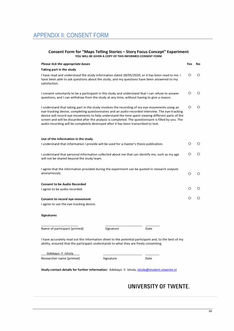
89
APPENDIX II: CONSENT FORM
90
APPENDIX III: EXPERIMENT INVITATION
91
APPENDIX IV: EXPERIMENT CHECKLIST
A day before experiment
For Researcher
Check experiment location availability.
Audio recorder storage space.
Printed and digital copies of questionnaire, consent form and information leaflet.
Print experiment procedure.
For Reader (via email)
Confirmation of availability to participate.
Experiment exact address.
Overview of what will be done.
Moments before experiment
For Researcher
Laptop computer.
Eye tracking device.
Audio recorder check.
Provision of hand sanitizer.
Seats are 1.5meter apart in accordance with Dutch government regulation on COVID-19.
Copies of questionnaire, consent form and information leaflet.
Writing pens.
Restart computer and run a trial with eye tracking device.
For Reader
Shows and has no signs of COVID-19 symptoms.
Understands purpose of experiment and signs consent form.

92
Just after experiment
For Researcher
Consent forms and questionnaire are properly stored.
Audio and eye tracking recordings saved properly and backed-up
93
APPENDIX V: QUESTIONNAIRE & INTERVIEW
READER’S PROFILE
This section requires information to understand the reader’s profile.
1. I belong to the age group of:
16 - 30
31 - 45
46 - 60
61 - 75
76 and above
2. What is your highest completed degree?
High School
Bachelor
Master
Doctorate
Other ___________________________________________________
3. What is your educational background? (the title of highest degree completed above) ___________________________________________________________
4. What is your occupation? (e.g. Cartographer, GIS professional, medical doctor) ____________________________________________________________
5. How familiar are you with using maps over the internet?
Very familiar
A bit familiar
Not familiar

94
6. Before now, did you know the story “The Legend of Meng Jiangnu”?
Yes
No
Write the story you perceived. _____________________________________________________________________
_____________________________________________________________________
_____________________________________________________________________
_____________________________________________________________________
_____________________________________________________________________
_____________________________________________________________________
_____________________________________________________________________
_____________________________________________________________________
_____________________________________________________________________
_____________________________________________________________________
_____________________________________________________________________
_____________________________________________________________________
_____________________________________________________________________
_____________________________________________________________________
_____________________________________________________________________
_____________________________________________________________________
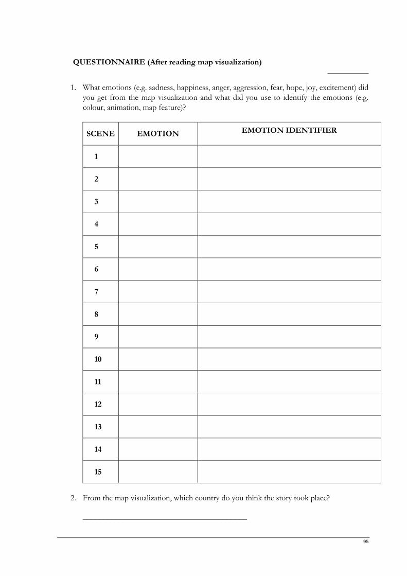
95
QUESTIONNAIRE (After reading map visualization) __________
1. What emotions (e.g. sadness, happiness, anger, aggression, fear, hope, joy, excitement) did
you get from the map visualization and what did you use to identify the emotions (e.g.
colour, animation, map feature)?
SCENE EMOTION EMOTION IDENTIFIER
1
2
3
4
5
6
7
8
9
10
11
12
13
14
15
2. From the map visualization, which country do you think the story took place?
________________________________________
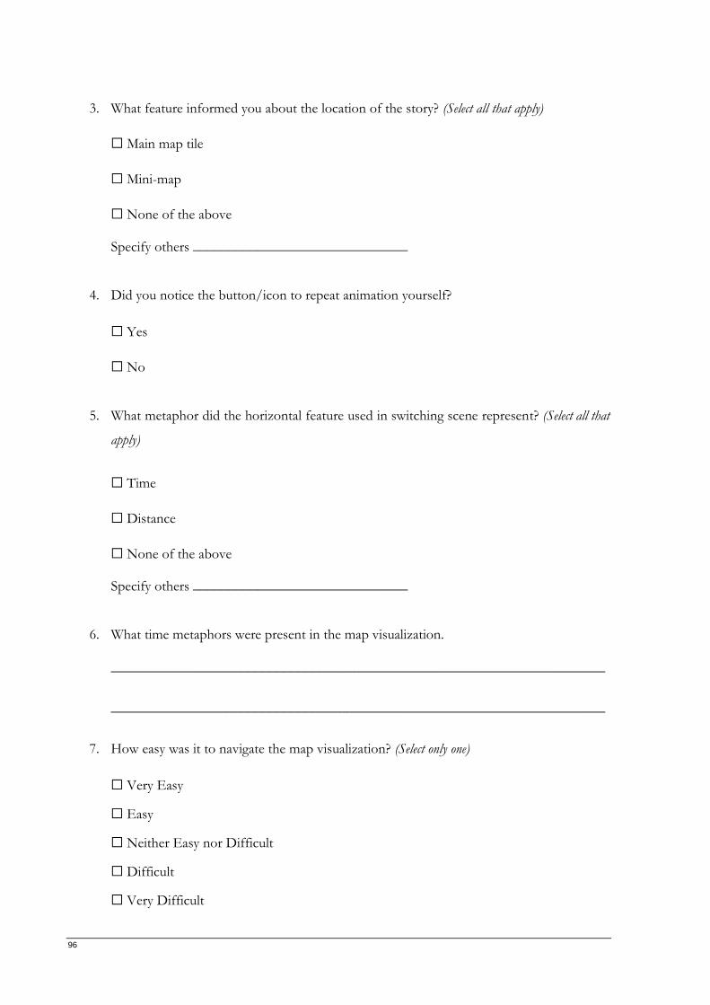
96
3. What feature informed you about the location of the story? (Select all that apply)
Main map tile
Mini-map
None of the above Specify others ______________________________
4. Did you notice the button/icon to repeat animation yourself?
Yes
No
5. What metaphor did the horizontal feature used in switching scene represent? (Select all that
apply)
Time
Distance
None of the above Specify others ______________________________
6. What time metaphors were present in the map visualization.
_____________________________________________________________________
_____________________________________________________________________
7. How easy was it to navigate the map visualization? (Select only one)
Very Easy
Easy
Neither Easy nor Difficult
Difficult
Very Difficult
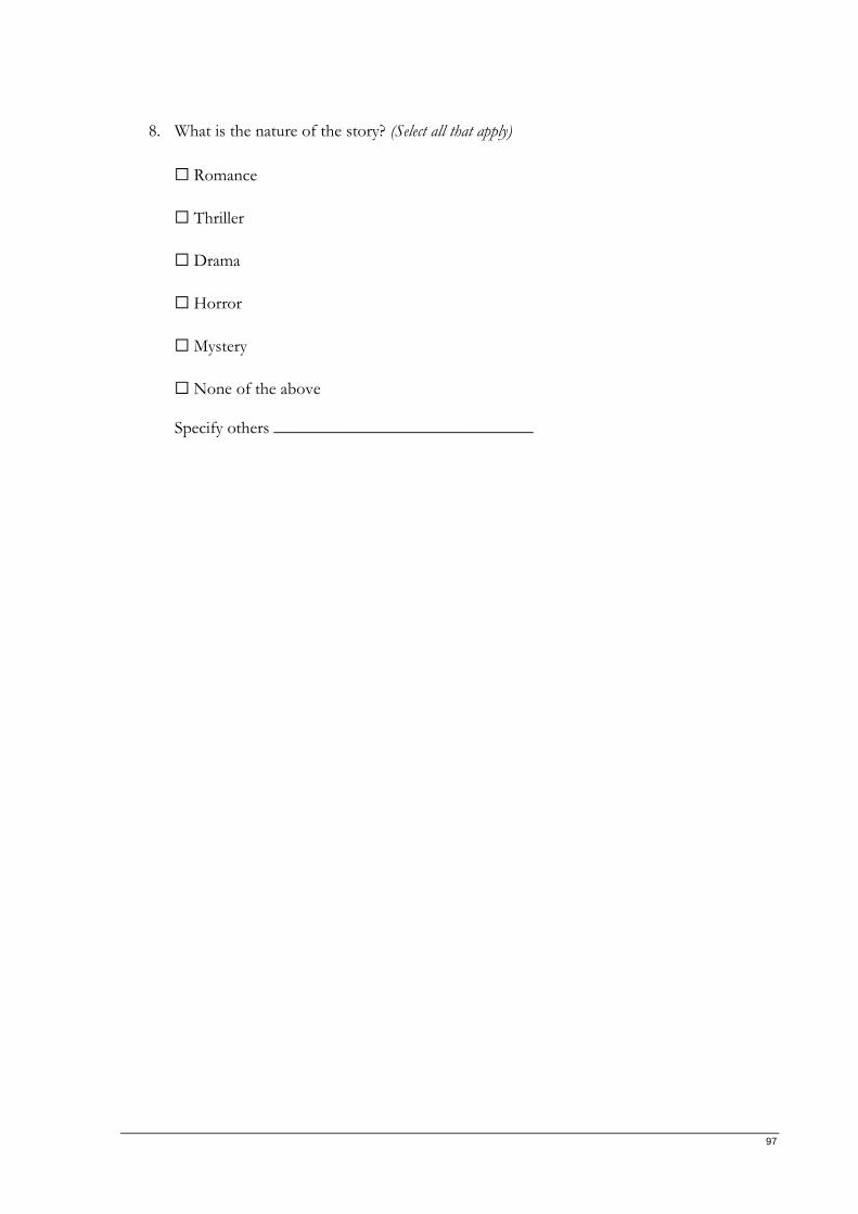
97
8. What is the nature of the story? (Select all that apply)
Romance
Thriller
Drama
Horror
Mystery
None of the above Specify others ______________________________
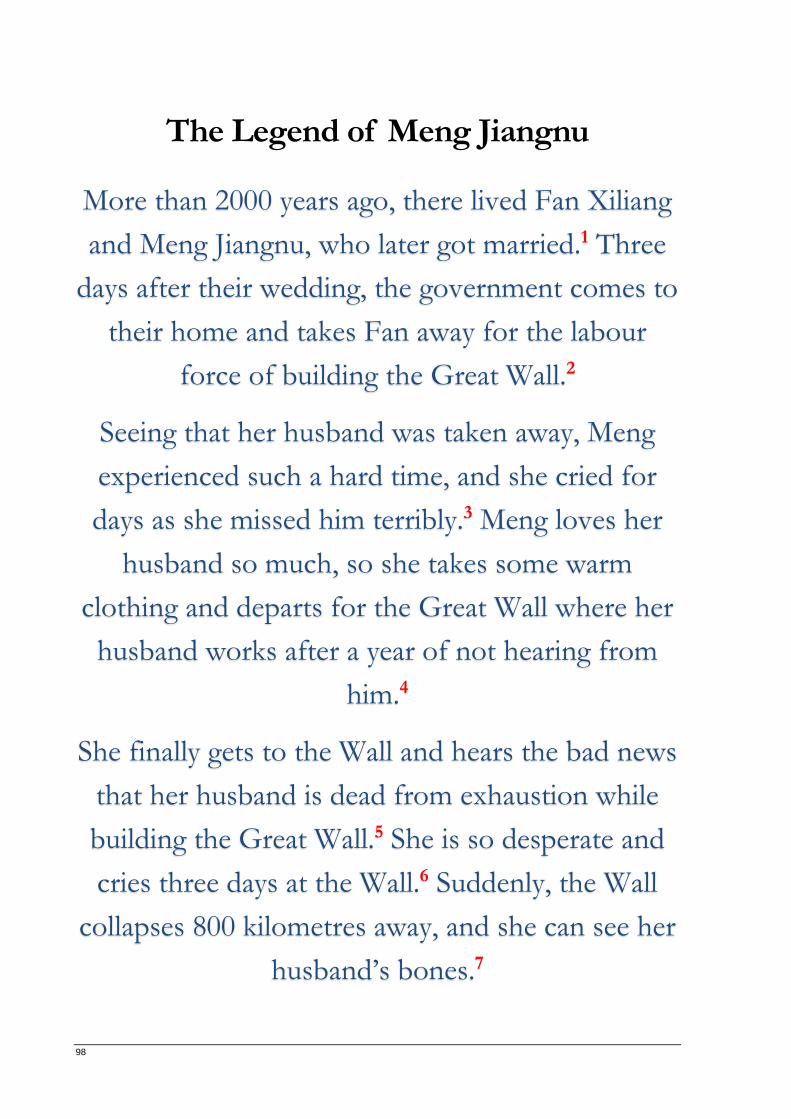
98
The Legend of Meng Jiangnu
More than 2000 years ago, there lived Fan Xiliang
and Meng Jiangnu, who later got married.1 Three
days after their wedding, the government comes to
their home and takes Fan away for the labour
force of building the Great Wall.2
Seeing that her husband was taken away, Meng
experienced such a hard time, and she cried for
days as she missed him terribly.3 Meng loves her
husband so much, so she takes some warm
clothing and departs for the Great Wall where her
husband works after a year of not hearing from
him.4
She finally gets to the Wall and hears the bad news
that her husband is dead from exhaustion while
building the Great Wall.5 She is so desperate and
cries three days at the Wall.6 Suddenly, the Wall
collapses 800 kilometres away, and she can see her
husband’s bones.7
99
QUESTIONNAIRE (After reading text) __________
1. What emotions (e.g. sadness, happiness, anger, aggression, fear, hope, joy, excitement) did
you get from the text and what did you use to identify the emotions (e.g. dancing
indicates happiness)?
SENTENCE EMOTION EMOTION IDENTIFIER
1
2
3
4
5
6
7
2. From the text, which country do you think the story took place?
_______________________________________
3. What word(s) informed you about the location of the story? _____________________________________________________________________
4. What aspects of the story in the text version were missing in the map visualization?
_____________________________________________________________________
_____________________________________________________________________
_____________________________________________________________________

100
INTERVIEW
1. Which medium conveyed the story better? (Select only one)
Map visualization
Text version
Both media (they complemented each other)
2. Any suggestions on the map visualization?
_____________________________________________________________________
_____________________________________________________________________
_____________________________________________________________________
_____________________________________________________________________
_____________________________________________________________________
_____________________________________________________________________
_____________________________________________________________________
_____________________________________________________________________
_____________________________________________________________________
_____________________________________________________________________
_____________________________________________________________________
_____________________________________________________________________
_____________________________________________________________________
_____________________________________________________________________
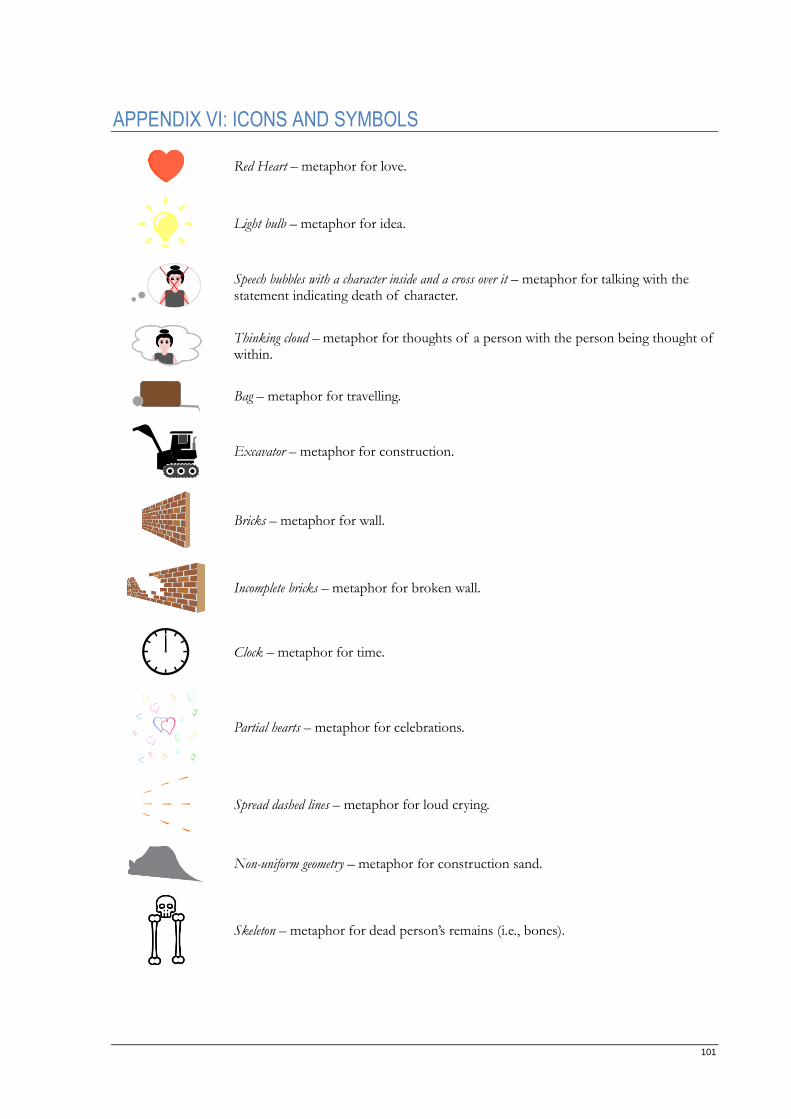
101
APPENDIX VI: ICONS AND SYMBOLS
Red Heart – metaphor for love.
Light bulb – metaphor for idea.
Speech bubbles with a character inside and a cross over it – metaphor for talking with the statement indicating death of character.
Thinking cloud – metaphor for thoughts of a person with the person being thought of within.
Bag – metaphor for travelling.
Excavator – metaphor for construction.
Bricks – metaphor for wall.
Incomplete bricks – metaphor for broken wall.
Clock – metaphor for time.
Partial hearts – metaphor for celebrations.
Spread dashed lines – metaphor for loud crying.
Non-uniform geometry – metaphor for construction sand.
Skeleton – metaphor for dead person’s remains (i.e., bones).
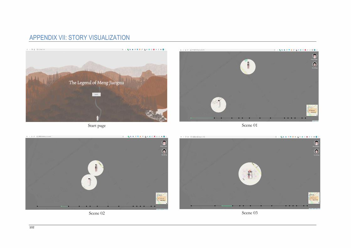
102
APPENDIX VII: STORY VISUALIZATION
Start page Scene 01
Scene 02 Scene 03
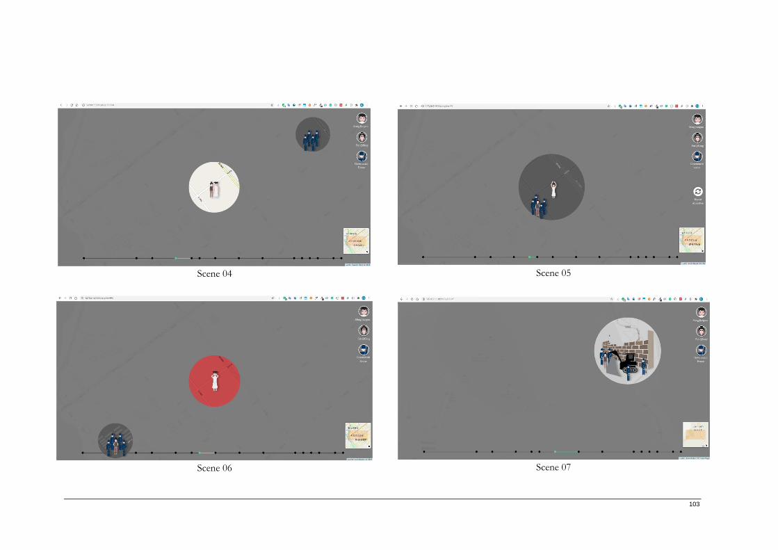
103
Scene 04 Scene 05
Scene 06 Scene 07
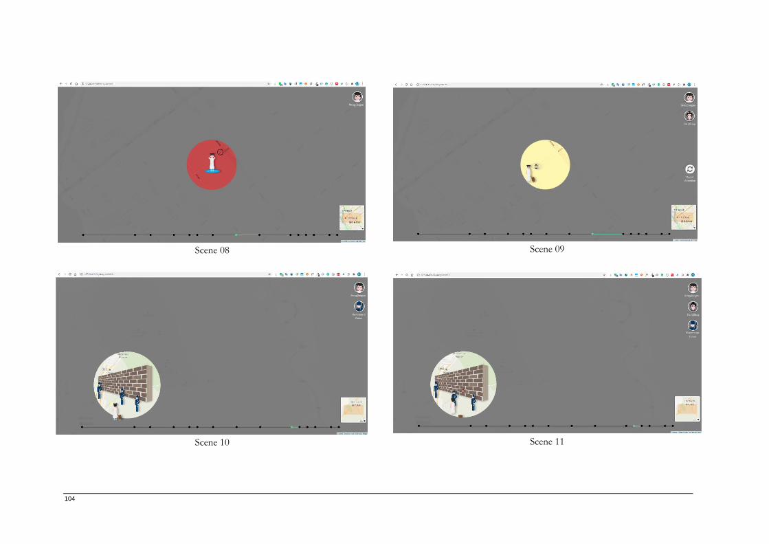
104
Scene 08 Scene 09
Scene 10 Scene 11
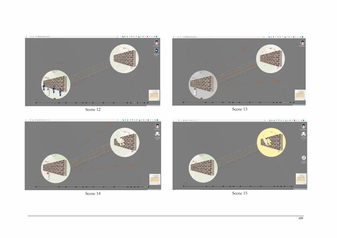
105
Scene 12 Scene 13
Scene 14 Scene 15
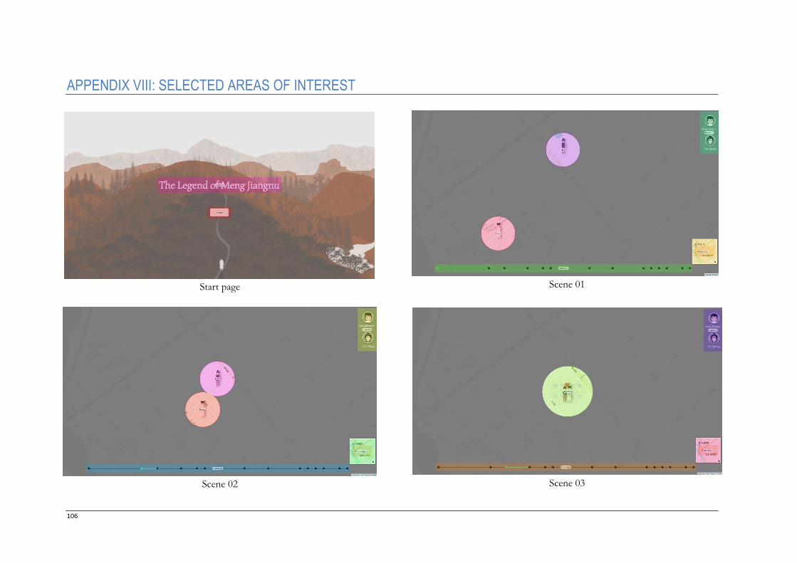
106
APPENDIX VIII: SELECTED AREAS OF INTEREST
Start page Scene 01
Scene 02 Scene 03
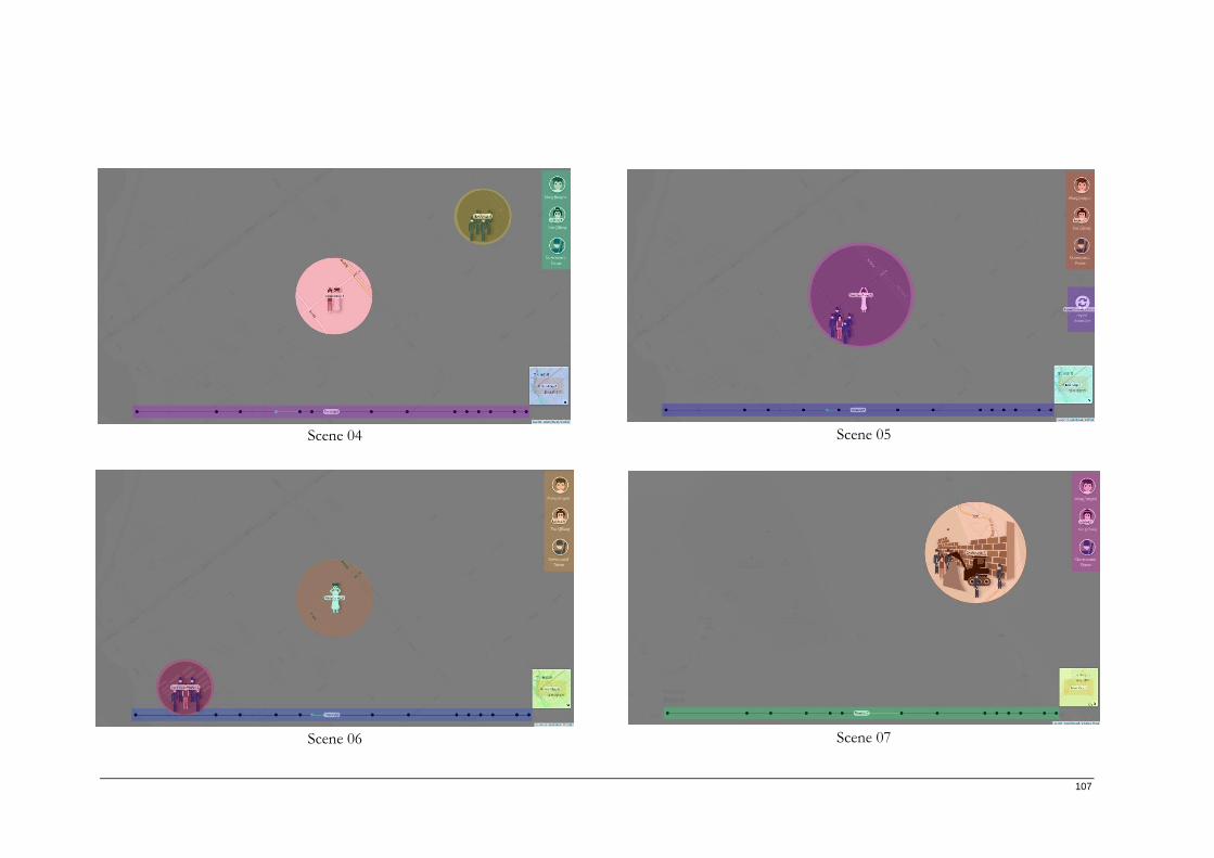
107
Scene 04 Scene 05
Scene 06 Scene 07
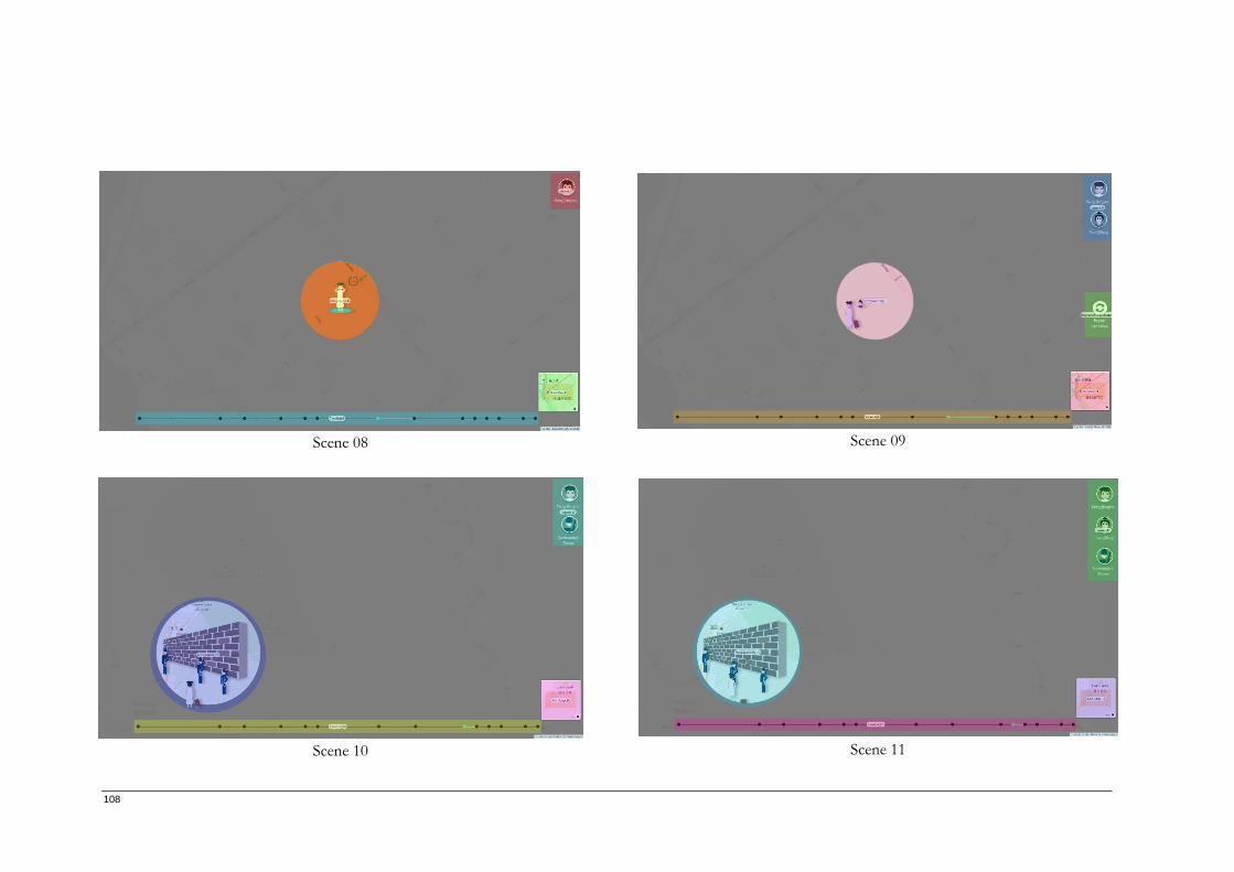
108
Scene 08 Scene 09
Scene 10 Scene 11
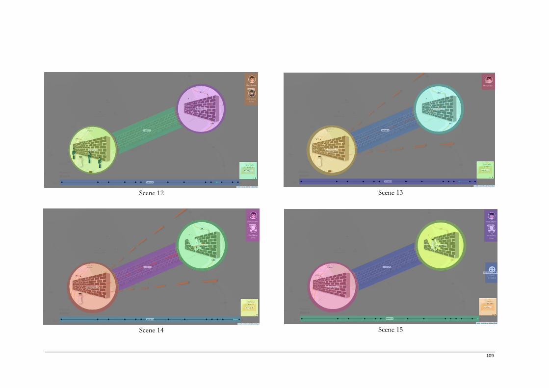
109
Scene 12 Scene 13
Scene 14 Scene 15
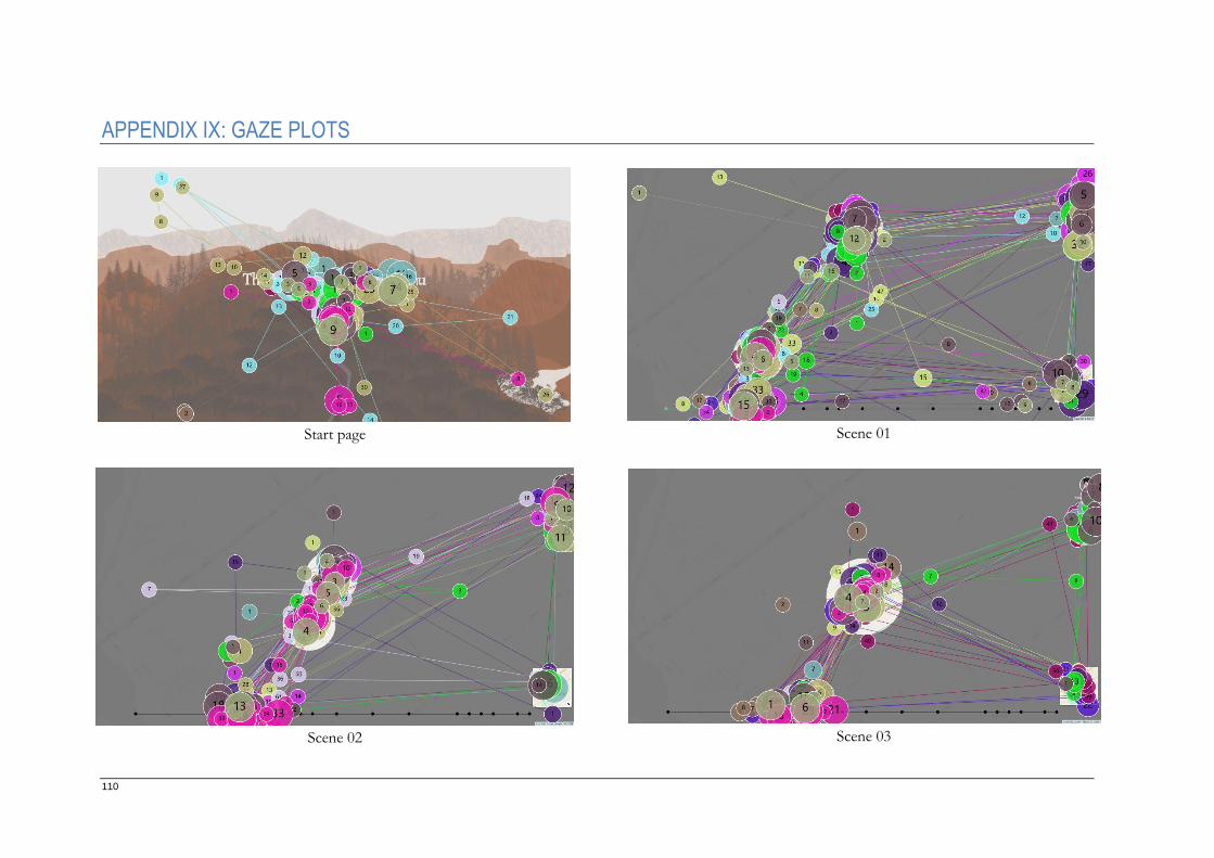
110
APPENDIX IX: GAZE PLOTS
Start page Scene 01
Scene 02 Scene 03
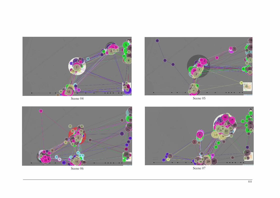
111
Scene 04 Scene 05
Scene 06 Scene 07
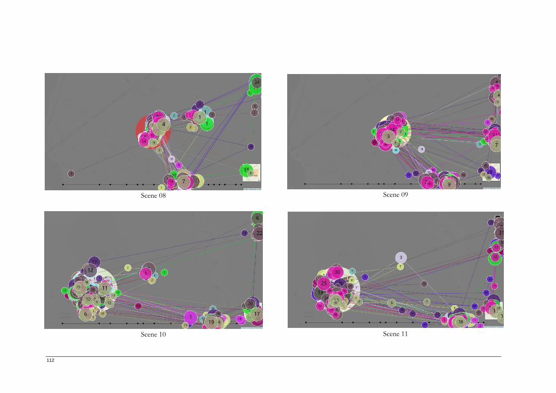
112
Scene 08 Scene 09
Scene 10 Scene 11
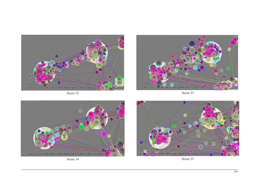
113
Scene 12 Scene 13
Scene 14 Scene 15
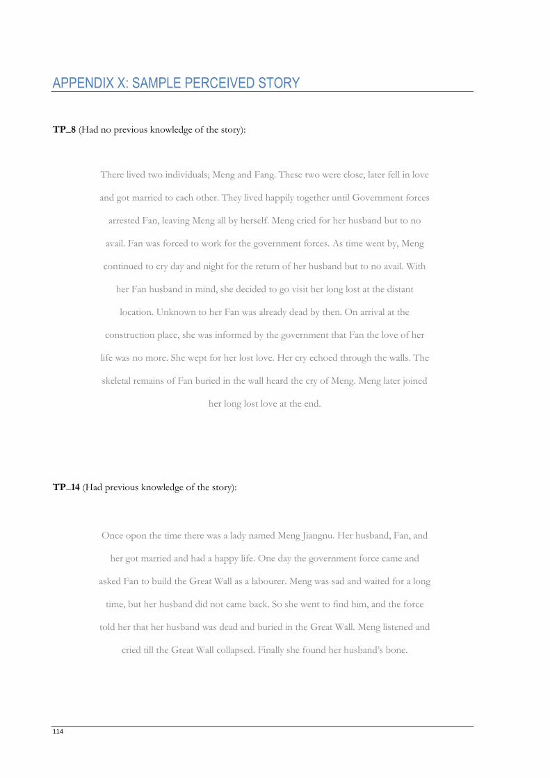
114
APPENDIX X: SAMPLE PERCEIVED STORY
TP_8 (Had no previous knowledge of the story):
TP_14 (Had previous knowledge of the story):
Once opon the time there was a lady named Meng Jiangnu. Her husband, Fan, and
her got married and had a happy life. One day the government force came and
asked Fan to build the Great Wall as a labourer. Meng was sad and waited for a long
time, but her husband did not came back. So she went to find him, and the force
told her that her husband was dead and buried in the Great Wall. Meng listened and
cried till the Great Wall collapsed. Finally she found her husband’s bone.
There lived two individuals; Meng and Fang. These two were close, later fell in love
and got married to each other. They lived happily together until Government forces
arrested Fan, leaving Meng all by herself. Meng cried for her husband but to no
avail. Fan was forced to work for the government forces. As time went by, Meng
continued to cry day and night for the return of her husband but to no avail. With
her Fan husband in mind, she decided to go visit her long lost at the distant
location. Unknown to her Fan was already dead by then. On arrival at the
construction place, she was informed by the government that Fan the love of her
life was no more. She wept for her lost love. Her cry echoed through the walls. The
skeletal remains of Fan buried in the wall heard the cry of Meng. Meng later joined
her long lost love at the end.
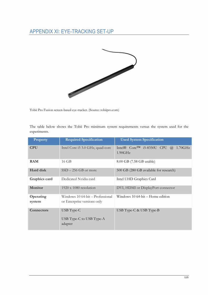
115
APPENDIX XI: EYE-TRACKING SET-UP
Tobii Pro Fusion screen-based eye-tracker. (Source: tobiipro.com)
The table below shows the Tobii Pro minimum system requirements versus the system used for the
experiments.
Property Required Specification Used System Specification
CPU Intel Core i5 3.0 GHz, quad-core Intel® Core™ i5-8350U CPU @ 1.70GHz
1.90GHz
RAM 16 GB 8.00 GB (7.58 GB usable)
Hard disk SSD – 256 GB or more 500 GB (280 GB available for research)
Graphics card Dedicated Nvidia card Intel UHD Graphics Card
Monitor 1920 x 1080 resolution DVI, HDMI or DisplayPort connector
Operating
system
Windows 10 64-bit – Professional
or Enterprise versions only
Windows 10 64-bit – Home edition
Connectors USB Type-C
USB Type-C to USB Type-A
adapter
USB Type-C & USB Type-B
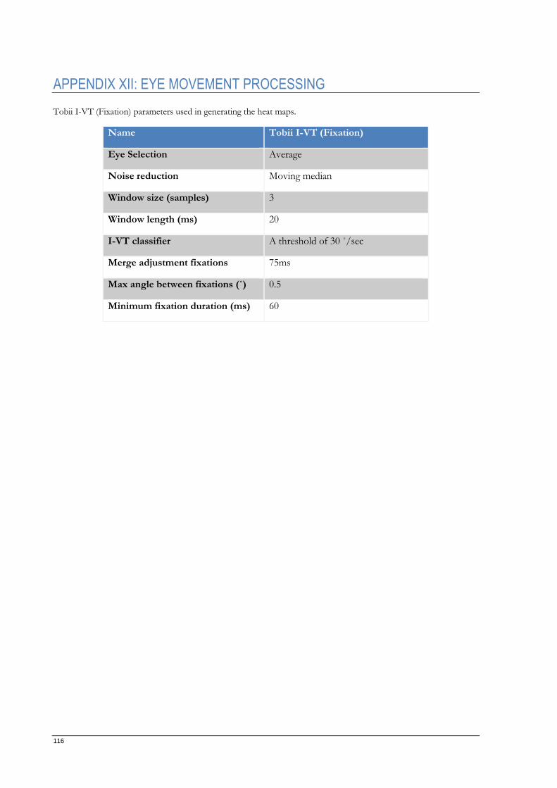
116
APPENDIX XII: EYE MOVEMENT PROCESSING
Tobii I-VT (Fixation) parameters used in generating the heat maps.
Name Tobii I-VT (Fixation)
Eye Selection Average
Noise reduction Moving median
Window size (samples) 3
Window length (ms) 20
I-VT classifier A threshold of 30 ˚/sec
Merge adjustment fixations 75ms
Max angle between fixations (˚) 0.5
Minimum fixation duration (ms) 60
Related Documents