Evaluation Question Two Penny Watkins

Welcome message from author
This document is posted to help you gain knowledge. Please leave a comment to let me know what you think about it! Share it to your friends and learn new things together.
Transcript
Evaluation Question Two
Penny Watkins
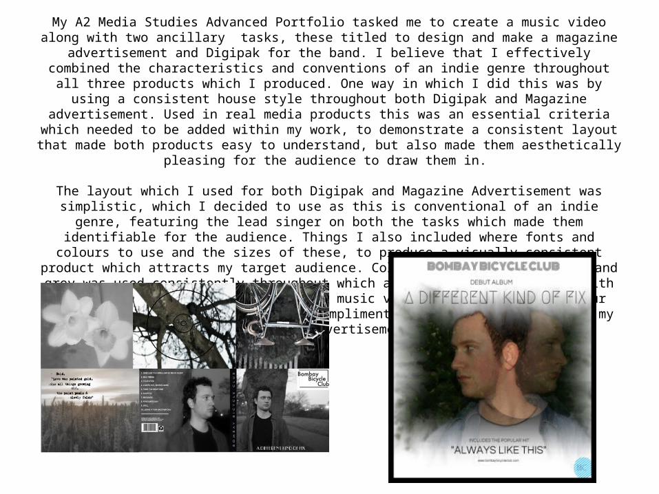
My A2 Media Studies Advanced Portfolio tasked me to create a music video along with two ancillary tasks, these titled to design and make a magazine advertisement and Digipak for the band. I believe that I effectively
combined the characteristics and conventions of an indie genre throughout all three products which I produced. One way in which I did this was by using a consistent house style throughout both Digipak and Magazine
advertisement. Used in real media products this was an essential criteria which needed to be added within my work, to demonstrate a consistent layout that made both products easy to understand, but also made them
aesthetically pleasing for the audience to draw them in.
The layout which I used for both Digipak and Magazine Advertisement was simplistic, which I decided to use as this is conventional of an indie genre, featuring the lead singer on both the tasks which made them identifiable
for the audience. Things I also included where fonts and colours to use and the sizes of these, to produce a visually consistent product which attracts my target audience. Colours such as black, white and grey was used
consistently throughout which also effectively combined with the use of black and white within my music video, also the use of colour within my music video and how this compliments the use of colour within my Magazine
Advertisement.

I believe that my main product and ancillary tasks work effectively together in promoting a similar message and concept behind the bands roots, but also having influences of music video within the Digipak and
Magazine Advertisement. This includes the use of things such as; props, editing techniques, costume, hair and make up, certain colours and
fonts and the characters themselves. For example the male featuring in a black bomber jacket and casual jeans, which is conventional of the
indie genre. This is also similar to that in both my Magazine Advertisement and Digipak, for example the lead singer is seen
wearing a denim jacket and casual t-shirt conforming to the conventions of the indie genre, and creating a consistent theme
throughout all tasks.
Firstly, in relation to characters, I decided to separate those in which were featured within my music and video and the male which was featured in both Digipak and magazine advertisement. I gained inspiration from this due to Ed Sheeran's past
example of not featuring within his own music videos and using either another person or a duplicate as himself as the main focus of his video. I did this within my tasks, using a different male within the music video which wasn't the lead singer of the band and
instead have the main singer of the band on both the Digipak and Magazine Advertisement.
https://www.youtube.com/watch?v=S3op_3FZnYY

Furthermore I also used a consistent house style throughout both Magazine Advertisement and Digipak, using the bands logo and same font for the album's title 'A Different Kind Of Fix'. It was essential for
me to follow the same house style throughout, as I wanted this to become a recognizable font which the audience could link in with the band and remember them for. I also decided on using a close up shot/
mid shot of the artist within both Digipak and Magazine Advertisement so that the band was also recognizable for this aspect and to draw the audience into both tasks. Also the ages of the models in which I used within both tasks are similar to my intended audience,
thus meaning that the audience may feel as if they can relate more.
The overall mood and atmosphere is also consistent throughout all three tasks, being quite sombre and simplistic in which I decided to
use and develop from my research into existing indie products. I also used a certain colour scheme throughout which promoted each task
effectively, for example the use of black and white panels in my Digipak and the use of black and white within my music video.
Colours such as black, white and blue were also used consistently throughout, to further reinforce the simplistic indie nature of the
band. Furthermore I also used the 'hazy' effect within my Magazine Advertisement to reflect both the title of the album and the section
of my music video in which the shots become hazy, to reflect the heightened emotions of the song and to further imply that this is
continued throughout the album, giving the music video and magazine advertisement a visual link.
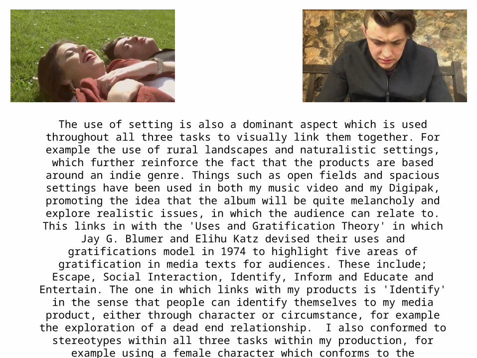
The use of setting is also a dominant aspect which is used throughout all three tasks to visually link them together. For example the use of rural landscapes and naturalistic settings, which further reinforce the fact that the products are based around an indie genre. Things such as open fields and spacious settings have been used in both my music video and my Digipak,
promoting the idea that the album will be quite melancholy and explore realistic issues, in which the audience can relate to. This links in with the 'Uses and Gratification Theory' in which Jay G. Blumer and Elihu Katz devised their uses and gratifications model in 1974 to highlight five areas of gratification in media texts for audiences. These include; Escape, Social Interaction, Identify, Inform and Educate and Entertain. The one in which links with my products is 'Identify' in the sense that people can identify themselves to my media product, either through character or circumstance, for example the exploration of a dead end relationship. I also conformed to
stereotypes within all three tasks within my production, for example using a female character which conforms to the stereotypical view of being attractive and the male being conventional of
the indie genre due to his casual outfits and laid back persona, in which can be relatable to a wider audience.
Related Documents