Welcome message from author
This document is posted to help you gain knowledge. Please leave a comment to let me know what you think about it! Share it to your friends and learn new things together.
Transcript


System31Q
~~ 0
~(i~ 'J>~
Ci ~·
~o
~~~
0 ·:::.~ ~
o~
,0~0 ... ~-·~ ~~ ~ &df;;? ....L...J@
# w1111n VTM .;s-0 ~NATED PLASTICS
0~ RALPH WILSON PLAST ICS COMPANY TEMPLE. TEXAS
~"<::' ARCH1TECTURAL PROOCJCTS DIVISION ~~=~Ji:
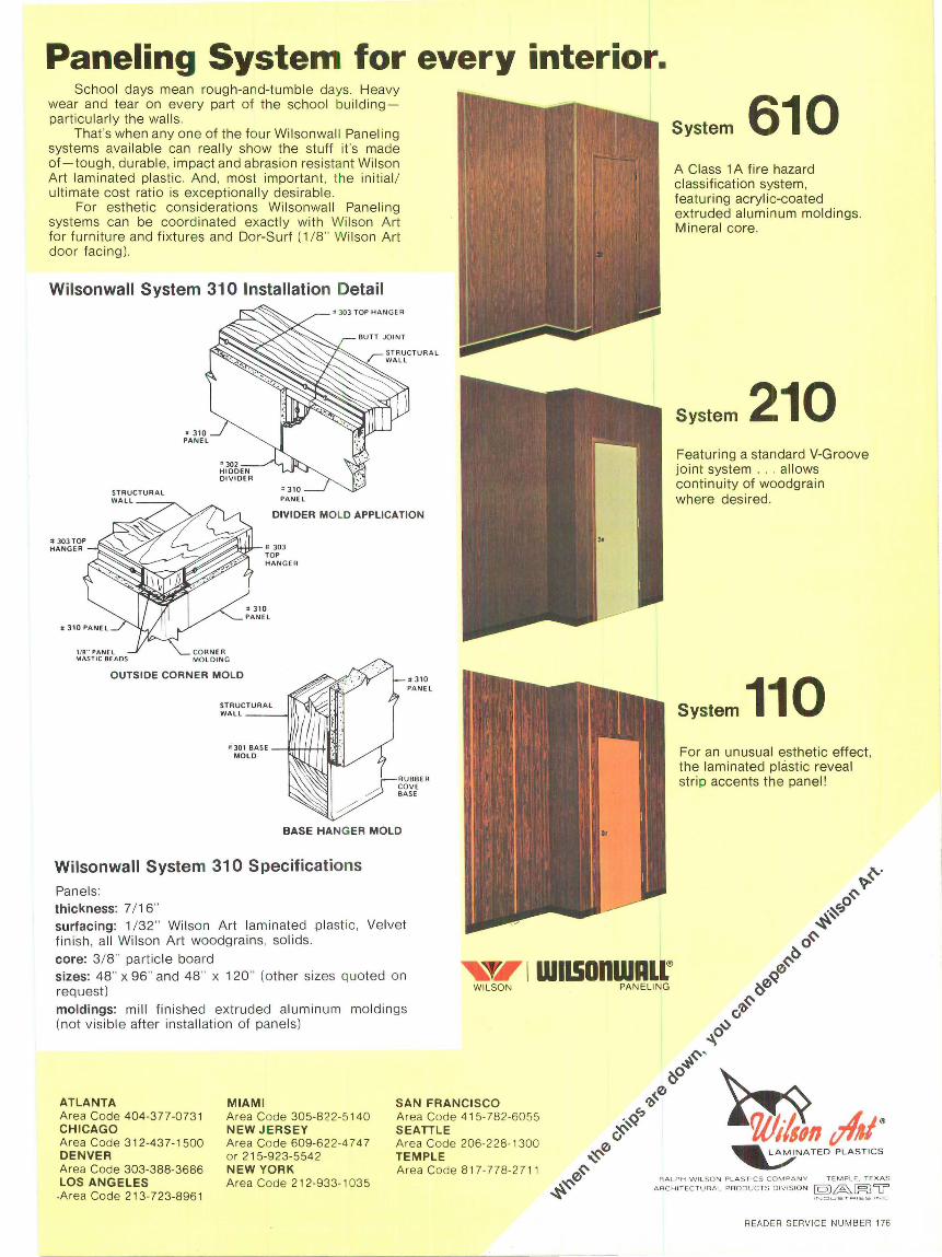
Paneling System for every interior. School days mean rough-and-tumble days. Heavy
wear and tear on every part of the school buildingpa rticularly the walls.
That's when any one of the four Wilsonwall Panel ing systems available can really show the stuff it's made of-tough, durable, impact and abrasion resistant Wilson Art laminated plastic. And, most important. the initial / ultimate cost ratio is exceptionally desirable .
For esthetic considerations Wilsonwall Paneling systems can be coordinated exactly with Wilson Art for furniture and fi xtures and Dor-Surf (1 / 8" Wilson Art door facing ).
Wilsonwall System 310 Installation Detail
ST RUC TURAL WALL __ ""7' PANEL
DIVIDER MOLD APPLICATION
# 303 TOP HANGER
1/8 .. PANEL MAS TI C BE ADS
#'.&"l+ttr- = 303
CORNER MOLDING
TOP HANGER
OUTSIDE CORNER MOLD
II 301 BASE --.+.....-...+•. MOLO
• 310 PANE L
RUBBER COVE BASE
BASE HANGER MOLD
Wilsonwall System 310 Specifications Panels: thickness: 7 / 16" surfacing: 1 / 32 " Wilson Art laminated plast ic, Velvet fini sh, all Wilson Art woodgrains, solids .
System 610 A Class 1 A fire hazard classification system, featuring acrylic-coated extruded aluminum moldings. Mineral core.
System 210 Featuring a standard V-Groove joint system . . . allows continuity of woodgrain where desired.
System 110 For an unusual esthet ic effect, the laminated plastic reveal strip accents the panel!
core: 3/8" particle board sizes: 48" x 96" and 48" x 120" (other sizes quoted on request)
~I \ WllSODWAll® WI LSON
moldings: mill finished extruded aluminum moldings (not visible after install at ion of panels)
ATLANTA Area Code 404-377-073 1 CHICAGO Area Code 312-43 7-1500 DENVER Area Code 303-388-3686 LOS ANGELES .Area Code 213- 723-8961
MIAMI Area Code 305-822-5140 NEW JERSEY Area Code 609-622-4 7 4 7 or 215-923-554 2 NEW YORK Area Code 212-933- 1035
SAN FRANC ISCO Area Code 41 5- 782 -6055 SEATTLE Area Code 206-228-1300 TEMPLE Area Code 8 17-77 8-271 1
PANELI NG
~v/AI' ~NATEO PLASTICS
RAL PH WI L SO N P L A S T ICS C O MPA NY T EM PLE. T E XAS
A RC HI TEC TUR A L PRODU C TS D IV IS IO N [Q)~~u •NC:H . ..JST <=>oE S •NC
READER SERV ICE NUMBER 176
11

Problem: Joints in Roof Insulation.
Solution: ZONOUTE Roof Decks .._,. - .....
......... -·--~" "".... . W:> ...
•
•
• •
-.
READER SERV ICE NUMBER 177
' -~ . . .. ,.
.-
Insulation joints are built-in failure points in roof systems.
Not only do they leak heat but they can also cause premature roofing failure. You can compensate for the joints being there by such methods as taping, but . ..
Joint elimination is a better way.
ZONOLITE® Roof Decks eliminate insulation joints and the problems they cause. ZONOLITE Insulating Concrete provides the ideal solution with smooth , cast-in-place, continuous insulation.
For full information write for booklet RD-237 to Construction Products Division, W . R. Grace & Co., 62 Whittemore Avenue, Cambridge, Massachusetts 02140.
In Canada: 66 Hymus Road, Scarborough, Ontario.
CGAACEJ CONSTRUCTION PRODUCTS
3

4
ERGO Darklights
for visual comfort and integration into architecture solve various light problems
ERGO Light System for flexible lighting
ERCO-tronics -for light modulation and control
ERGO Direction Lighting Fittings for safety and orientation
-==~-==11:11 the solution for your lighting problems
In cooperation with architects various product groups have been created to meet architectural requirements.
Information may be obtained from our Lighting Engineering Department.
ERCO-Leuchten KG D-588 Ludenscheid, Post Box 2460 Telephone 0 23 51/194-1
Cipher E 60a/
READER SERVICE NUMBER 157
Editor-in-Chief Peter Blake, FAIA
Managing Editor Ann Wilson
Art Director Charlotte Winte r
Ruth Gosser, Asso ci ate
Senior Editors Stanley Abercrombie
El len Perry Berke ley
James D. Morgan, AJA
Marguerite Villecco
Editor-at-Large Paul Grotz, AIA
Field Editors
Bombay Charles M. Correa, Architect
Buenos Aires Leonardo Aizenberg, Architect
London John Donat, ARIBA AAdip
Melbourne Neil Clerehan, FRA IA
Milan Vanna Beccian i
Munich Detlef Schreiber, BOA, DWB
Paris Gill es de Bu re
Tokyo Yasuo Uesaka, Arch itect
News Editor Virg inia Dajani
Chief Researcher Marie-Anne M. Evans
Editorial Assistant Patricia Lee Ellis
Contributors Ivan Chermayeff
Frarn;:oise Choay
Rosalind Constab le
George Cserna
George Dudley, AJA
C. Richard Hatch
Samuel Kaplan
Burnham Kelly, AJA
Leo Lionni
Wal ter McQuade, FAIA
Roger Montgomery
Charles W. Moore
Roger Schafer
Vincent Scul ly Jr.
Bernard P. Spring, AJA
Advertising Sales Manager Donald T. Lock
Circulation Manager Richard J. Brogan
Production Director Elai ne E. Sapoff
Administrative Assistant Robin Nowalk
Publisher Richard W. Shaver
ARCHITECTURE p I us The International Magazine of Architecture Ju ne 1973
6 Books
9 News + Reports and reviews from around the world.
14 Palacio of Commerce The Iturbide Palace, a distingu ished Mexico City landmark, has been transformed into a handsome bank by architect Ric ardo Legorreta.
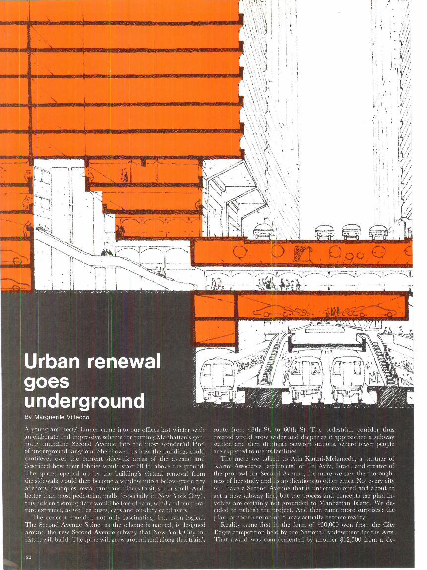
20 Urban renewal goes underground New York City's proposed Second Avenue subway would trigger an exciting urban experiment if architect Ada Karmi-Me lamede's ideas are realized .
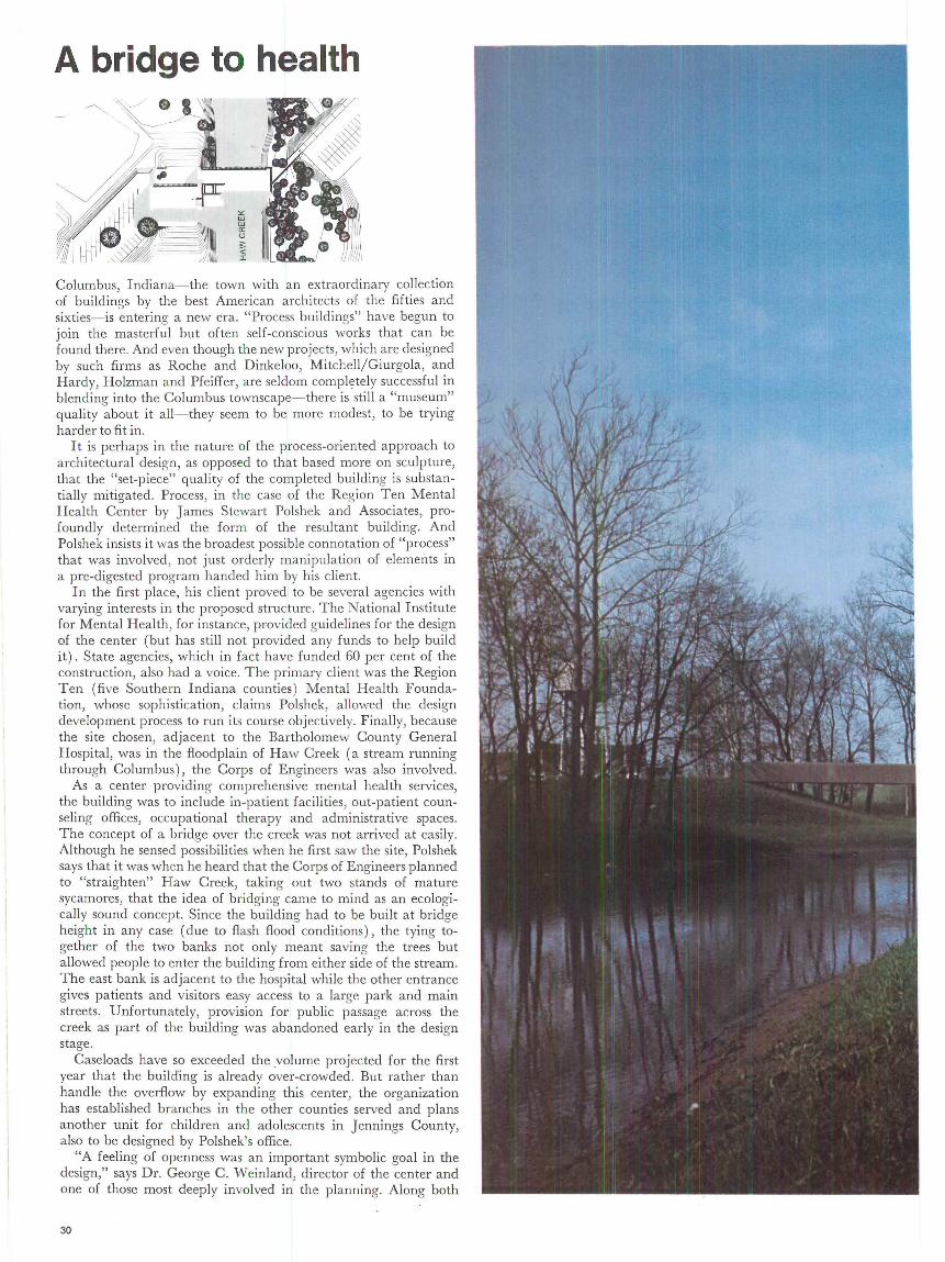
30 A bridge to health James Stewart Polshek has designed a mental health services center that spans a Columbus, Indiana creek.
36 Beyond Golden Lane, Robin Hood Gardens Alison and Peter Smithson have completed a large housing block in London that is the product of twenty years' thought. By Anthony Pangaro.
46 Learning from hamburgers A survey of White Tower restaurant architecture from 1926 to the present. By Paul Hirshorn and Steven lzenour.
56 Art in the wilderness George Staempfli , a New York gallery owner, has a recentlycompleted house in New Mexico that is filled with primitive art. By Rosalind Constable.
67 Letters
68 Films
70 Product Literature
72 Advertising Index
Cover design based upon a photograph of Robin Hood Gardens by Alison and Peter Smithson.
ARCHITECTURE PLUS JUNE 1973 VO LUME 1 NUMBER 5.
Publi shed monthly by Informal Publishing Corporation . Richard A. Hasha gen, Pres ident; Richard W. Shaver, Execut ive Vice President; Paul M. Wehrlin, Vice President; Richard J. Gash, Treasurer. Executive and Editorial offices at 1345 Sixth Avenue , New York, NY 10019. Ph one: 212 489-8697. Telex: RCA 224232 CIC-UR.
Business Publications Audit, Inc. (BPA) applied for July, 1972. Publication available, without charge , to all qualified , practici ng registered architects and/or assoc iationaffiliated specification writers throug hout the wor ld . Paid subsc ript ions for indi viduals in the f ield served available at an international rate of $18/1 year , $27/2 years, $36/ 3 years . Others at $24/ 1 year. Students and faculty members of accredited sc hools of arch itecture, $12/ 1 year. Single copies , $3 per issue. Cont rolled circulation pa id at Wash ington, D.C. and pending at New York, N.Y.
For all subscription information, including change of address, write Circu lation Department, Architecture PLUS, 1345 Sixth Avenue, New York, New York 10019.
© 1973 by Informal Publi shing Corporat ion. Al l rig hts rese rved.
5

Archigram ed ited by Peter Cook, supported by Warren Chalk, Den nis Crompton, David Greene, Ron Herron , and Michael Webb. Publ ished by Praeger Publishers, New York. 1973. 144 pages. Illustrated. $12.50.
Reviewed by Les Levi ne
The first illuminated gospel for the coming of the un-architect
The first four pages of Archigram's new book , celebrating the group's 10th anniversary, are taken up with comments from Arata Isozaki, Reyner Banham, Hans Holl ein and Peter Blake. All of these comments are praising revie\\·s of Archigram. In genera l, what they had to say was:
"Then Archigram struck and my world hasn't been the same since. I really would not have known where to look if it had not been for Arch igram. Everything, absolutely everything, suddenl y became architecture . So we all owe something very important to Archigram : the dram atic broadening of our perceptions, our visions. And beca use of what they have done, the " ·orld of architecture in this century and the next will never again be quite as projected. Whether they like it or not, the Archigram gang is a gang of wide-eyed poets.
"Archigram's esthetic is not functionalist nor is it mere id le fantasies . It is at once daring, hila riou <;, angry and socially concerned, enough to ask questions like, 'Do we really need cities?' Primari ly they are concerned with th e development of ideas by way of design as the mode of experiment. They disintegrate th e structure of their work from within almost as soon as it can be defined . This is consistent with their attitude toward change and their mistrust of 'definitive' architecture.
"In this society where informat ion is privileged above all els.e, Archigram has created the only style capable of inducing radi cal change. They have directed a virtual shower of projects at the entire wo rld and maintain that shower over a period of 10 yea rs. Their work has been totally divided from the pat terned logic architecture has created within itself. Archigram has established a new structure of values, a new syntax and demonstrated the possibil ity of an independent sub-culture. Pre-established systems of every kind are disintegrating before our eyes. What Archigram has done is to demon-
Les Levine is an artist, a professor of environmental design at New York University, and President of the Museum of Mott Art, Inc . in New York.
6
strate clearly one part of this process. "My son helped pack and fold Archigram 7!
T hey' re in the image business and they have been blessed with the power to create some of the most co mpelling images of our time-urban identity, spatial integri ty, alienation, and all that. There's been nothing much like Archigram since Frank Lloyd Wright, Mies and Corbu.
" Suddenly the dialogue started and has not stopped yet. As expressions of common hidden sub-conscious longings, Archigram became part of a new architectural vernacular."
Marshall McArchigram
After reading such a choice lush of gush (easily 50 ti mes as long ) where can a reviewer beginWell-what do you think about the cover? A music book or science fiction or a book about another world. Is there any harm in that? Do architecture books have to look boring? No, but if I was in a bookstore, it would just be something I would pass over. But the interesting thing about Archigram for me is that they have over a number of years created some kind of pop discourse on what archi tects should see and the way people should look at architecture. Essentially it's conceptual architecture.
The book is innovat ive from the point of view of architectural discourse; it a ttacks all the genres of a rchitecture. In a way it says that a rchitecture is a locked-in system, so what you have to do is approach it from a sensing, feeling, opening up of your mind towards many things outside that system and look at them differently. But what seems to be happening here is that while they're doing that, they've created their own genre which is as boring or even more boring than some of the genres they' re attacking. The book itself as a physical object, not what they're talking about because what they're talking about I think is damn interesting-you could descri be it as a Whole Earth Catalog . It comes off like a video freak catalog or hom emade graphics. Have they swallowed the McLuhan pill-whole-and given birth to Marshall McArchigram? The pages remind me conceptually of profiles of neuroti c art students. The arbitrary graphi c outlines look like the edge of a jigsaw puzzle and don't make much sense in terms of the structure of the book, and they don't attack the structure of a book to make you think, this is a new way to cope with a book, because one is very much aware of this kind of layout and mixing of things.
'Groovy'
It should reach the people who are already working so that they can consider these problems in their future work because usually established architects set up one pattern and by the time th ey reach 50, when they' re really doing a lot of work and have a lot of business, they just
keep going on that pattern because that's what they're expected to do. But maybe what Archigram figures is that these architects will not be interested in it really and that they should try to reach students or young people. Yes, but don' t students always turn out this kind of stuff anyway? Yes, but they don' t have as much thinking behind it. Usually what happens with architecture students, from \\·hat I've seen, is that they mistake design for a rchitecture. What you see with architecture students a lot is a great deal of 'groovy' graphic design with not much serious thought behind it and the discourse that they're involved in is always very shallow. Whereas in this book, I think the discourse is intense and good and powerful, but they've used a medium which has created the worst sense of that word 'groovy.' It's 'groovy' for the sake of being 'groovy.' You think they've been looking at bad art like pop art and op art and minimal art and tech art too much? That page is very much like a Bridget Riley with that sort of opti cal effect. But it's impossi ble for anybody to be pop today because the whole pop thing has lost currency. There's a lot of pretty extraordinary writing in here, extraordinary from a point of view of ways of looking at things and expressing a certain kind of phenomenology of the world and th e way it's made and the way you can look at the way it's made. And all of a sudden it's over-burdened by this intense concern with the medium of design . It looks to me like a cross between pop art and a Letraset catalog. I think they should mak e real models and photograph real models of their ideas rather than this. Yes, but they've done this. An argument could be, so what! It is confusing because the subject they're deal ing with is con fusing to some degree. There's a lot of confusion within the structure of what they're concerned with . Architecture and urban design and media design , and the way media influences design and architecture and urban design is somewhat of a confusing subject. But that 's the point. If these people have broken down enough con fusion already so that they can get it together in ll"ords, their layouts should elim inate any fur ther confusion.
'Way-out' In England
I don't think there's any reason to make an excuse to defend the graphics. They' re not graphic designers. They just want to be 'cool.' They want to be 'hip' and 'with-it.' I really think that th is is their idea of being 'cool.' But then there might be the problem that they're English so that they create a formalism about being 'cool' because this is a very form al, structured approach to being 'with -it .' And the English sensibil ity is to formalize everything. England is the only country in the world where hippies were accepted as a normal eccentric element within society. Hippies didn't repre-

sent any kind of revolution in England. There is a form alist way of being 'way-out' in England.
But Gordon Bunshaft wouldn't wa nt to read this book. But Gordon Bunshaft is not exactly at the center of any radical architectu ra l development. Anyone who can put up a few imposing, gigantic bui ldings in some of the most important cities in the world certainly has to be considered, right? Yes, but what Archigram is saying, is that putt ing up a few gigantic buildings in the most important cities in the world , is not rea ll y what it's all about. T he easies t thing in the world in th is society, that is so geared towards the making process, is to go ahead and build and make, but not enough people stop and think long enough to figure out the ou tcome of all this building and making. Exactly, and tha t's why they should read th is. I think in this day and age, an a rchitect is not needed as a builder or a maker. Builders themselves a re pretty good at building and making. And maybe an architect in this day and age should be somebody who's really seriously thinking about what is going to be made and the effect it will have on society and on individual personal feeling in the long run. But realis tica lly there will still be architects, so this should be read by the architects who are still going to keep designing these things. But these people who are makers will not consider this book because of the way it's put togeth er. Exactly! Exactly! Well, what about Walt Disney's work because he's the only per-son who is considera te of .... . . But I don't want to get into Walt D isney because I'm doing a book review of Archigram and I don 't want to review Disney World.
A kind of phenomenology
Archigram presented a very powerful kind of turbul ence within the notion of wha t architecture is as a concept. They weren't so much involved in the idea of what people should be building and making, but how people should be thinking about what they' re making and how they should be thinking about 11·hat is a lready made. And relative to tha t, what kinds of societa l systems force the kind of development in architecture tha t is occurring a ll the t ime. And I think that's what an a rchitect should be doin g. He should be thinking, what is the societal problem of architecture right now? What do people want of a living space, of an office, of a factory, of a subway, of a ca r? How can you make a symbioti c relationship between man and his environm en t? And it seems to me tha t Archigram has crea ted turbu lence in a sys tem th at has blinded itself to the fact that its product is used by hum an beings, that are not systemic- people that arc subj ect to all kinds of in-ffo11·s of in formation, emotions, habits, tha t by the ir nature create a kind of phenomenology that doesn't coll a te eas il y with sys tem ic st ructures. Maybe it's
ARC HITECTURE PLUS JU NE 1973
better to direct it to the people instead of the professionals because the people are the ones who are going to make the final decisions about what they want anyway.
Media soup
Running a review in Architecture PLUS, almost exclusively criticizing the form at although simul taneously praising the writing, is going to reall y put peop le off even more. I think you should st ress the good and underplay the bad. Sure, I like what they're doing, and I use 'like' in a very definitive way, not just as a question of tas te. I use it because I've read what they do and I think it has quality. T he academic's view would be to approach it by trying to understand th e stru cture. Now the easiest way to understand the structure is to simplify the structure to the point where it has absolute perfect form. The problem here is that the st ructure and the form are so at odds with one another that thei r m essage is almost wiped out by their medium. I think it \\'Ould be unfair not to say that. I think criti cism should be constructive discourse and some kind of feedback to the maker, but I also think that this book should be read. I hope I've sa id that. I say, if you have this book in your hands today and you are a person who has the possibili ty to affect design or a rchitecture or any kind of urban planning, you a re in the same position as the individual in pre-Gutenberg days who had the Bible in his hands. It 's the first illuminated gospel fo r the coming of the una rchitect. And illuminated gospels have always been confusing. You have access to an extraordinary kind of thinking and if you disregard that kind of thinking, you're cutt ing off a channel. The channel is a littl e mixed up, but there is certainly a lot of inform at ion com ing through that channel. So ,,·ha t I'm saying is, as an overa ll obj ect, Archi gram's book doesn ' t succeed because it's a llm1·ed itself to be 'groovy' to the point of boredom, on the one hand with its graphics and \1·ith its over- fascinat ion \1·ith mixing elements toge ther to the point where you've got MEDIA SOUP. But on the other hand, the contents, what they rea lly have to say and what th ey' re thinki ng abou t and what they're concern ed with, is vital to any considerat ion tha t an a rchitect or planner should have at this moment .
Archigram has made them have them
I think we need Archigram. But I want them to ge t to the point where we won't have to go th rough a ll th is jumble to get their ideas. Their conce rns a rc crucial. They're concerns tha t people should have had and Archigra m has made them have them, but as a book they have put together a muddling object. In a 11·ay it seems to be saying, " Instead of sitting down and talking about the p roblem, try standing on your tongue and ll'hist ling Dixie."
7
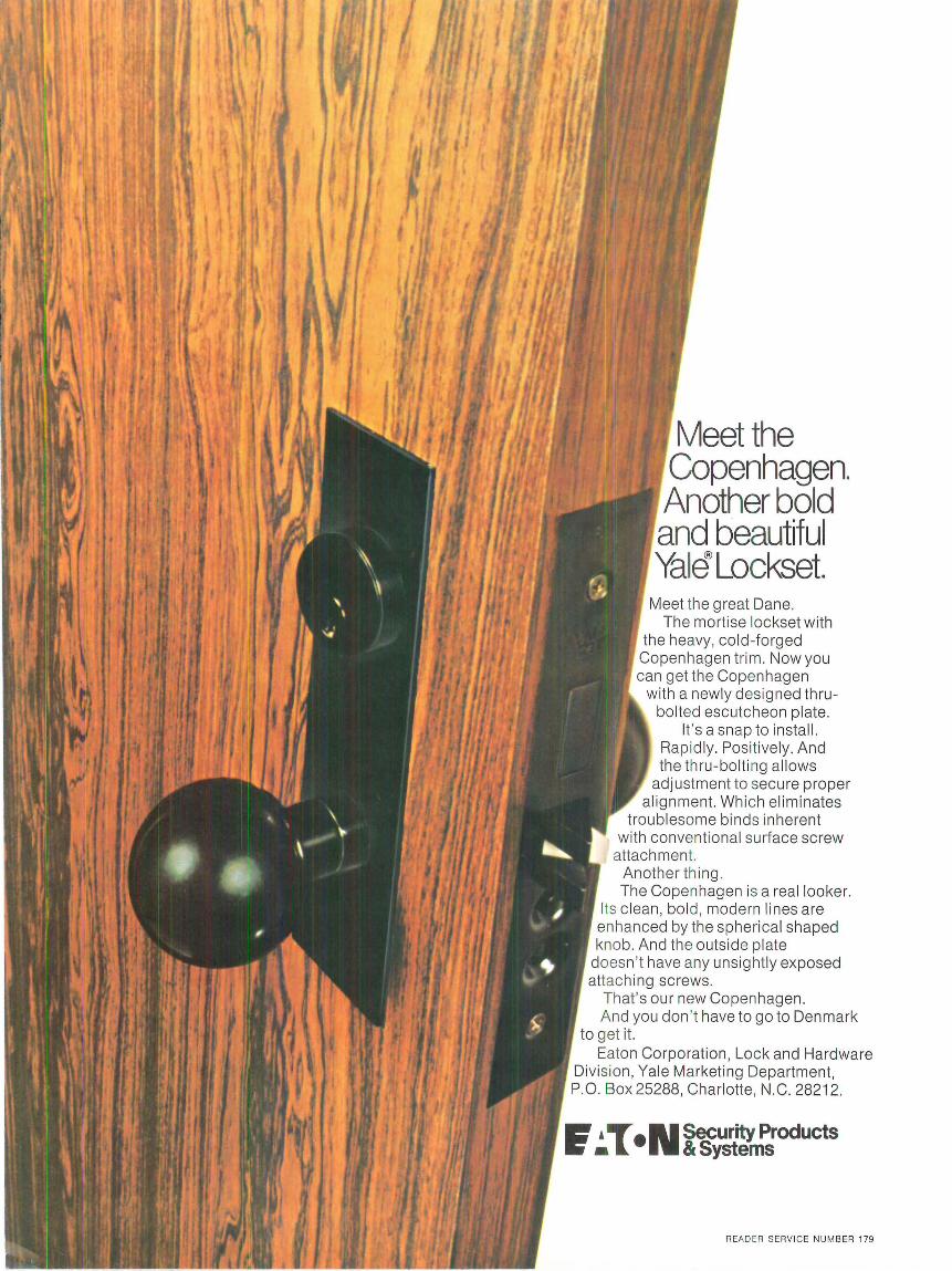
Meetthe Copenhagen. Another bold and beautiful Yale Lockset.
Meet the great Dane. The mortise lockset with
the heavy, cold -forged Copenhagen trim . Now you can get the Copenhagen
with a newly designed thrubolted escutcheon plate.
It's a snap to install. Rap idly. Positively. And the thru-bolting allows
adjustment to secure proper alignment. Which eliminates
troublesome binds inherent with conventional surface screw
attachment. Another thing. The Copenhagen is a real looker.
Its clean, bold, modern lines are enhanced by the spherical shaped knob. And the outside plate
doesn 't have any unsightly exposed attaching screws.
That 's our new Copenhagen. And you don 't have to go to Denmark
to get it. Eaton Corporation, Lock and Hardware
Divis ion, Yale Marketing Department, P.O. Box 25288, Charlotte, N.C. 28212.
~ , ...-• N Security Products Ii • l. & Systems
READER SERVICE NU M BER 179

ARCH ITECTURE PLUS JUNE 1973
news+
Last month, at the annual convention of the American Institute of Architects in San Francisco, there were the usual speeches and presentations and other intellectual offerings of varying quality (or lack thereof). There was also a brief talk by Sam Hurst, the clean of the School of Architecture and Fine Arts at the University of Southern California. Hurst aclclressecl himself to the "Challenge of Change", and proceeded to ask some fairly challenging questions (e.g., What if the AIA were to call for the nationalization of the housing industry?). And he concluclecl with this one: "What if this convention cleclarecl itself to be the last annual national convention for a three-year period, and initiated a new three-year cycle .. . with enormous conservation of public and professional energy?" All the thousands of compulsive convention-goers present were, predictably, stunned. And, of course, that was the encl of it.- PETER BLAKE
The top of the world is in Toronto
Comparison of the world's towers. Below, 6-story sky pod
The art of one-upmanship knows no bounds, or at least no height limits. Metro Centre, a 15-year development on 190 acres in Toronto, is nursing its first seedling-a beanstalk called CN Tower that will
grow to a formidable 1,805 feet, leaving behind (or below) all other contenders for the world's tallest st ructure.
Between 1,100 ft . and 1,200 ft. , a six-story "sky pod" will house broadcasting studios, sightseeing decks, and a revolving restaurant which CN (Canadian National Rai lways) officia ls are threatening to name "High Dive." A slender steel transmission mast will occupy the top 305 feet.
Below the "sky pod" the tower will be slipformed post-tensioned concrete. Above that it will be structural steel. Cost is estimated at $21 million .
Elevators in glass-faced shafts will carry visitors for a one-minute
Many of the news reports and comments are fr om our regular field editors: John Donat (London), Gilles de Bure (Paris), Detlef Schreiber (Munich), Vanna Becciani ( Milan) , Charles Correa (Bombay), Neil C lerehan ( Melbourne), Yasuo Uesaka ( Tokyo), and Leonardo Aizenberg (Buenos Aires) . Plus correspondents are identified by their initials; other contrib utors by their full names. The remainder is contribu ted by our New York staff .
9
ascent to the pod for dramatic views stretching 75 miles.
T he site is being excavated through 35 feet of overburden into 20 feet of rock. Special forms will be set and a concrete shaft poured continuous! y, around-the-clock, using the slipform method. The tower is expected to rise at the rate of 16 feet a day. To maintain non-stop operation, sets of forms will be elevated by a ring of "climbing jacks" around the structure. As the forms move up they will leave a continuous extrusion of hardened reinforced concrete. The tower is scheduled for 1974 completion.
Consulting architects are John Andrews/Webb, Zerafa, Menkes, Housden.
Managua-off to the side? A commission of experts, established at the request of the Government of Nicaragua and operating under the auspices of the Organization of American States, the Interamerican Development Bank and the World Bank, have studied the problem of the reconstruction of Managua, capital of Nicaragua, which was destroyed during the earthquake of December 3, 1972. The commission experts do not represent any government or organization in particular; they were chosen for their abilities in various fiel ds. The commission consists of Rubens Costa, president, Bank of Housing, Brazil; John Dyckman, professor of Urban Planning, University of California; Nicolaus Ambraseys, professor of Seismic Engineering, Imperial College of London; Pierre St. Amand, seismologist, Naval Station, China Lake, California; Carlos Acedo Mendoza, president, Foundation for the Developmen t of Venezuela; and A. J. Harrison, Chief, Urban Transportation Div., Dept. of the Human Environment of London.
After a preliminary meeting in Washington, D.C. the experts went to Managua for a fi rst-hand assessment, and looked over the proposal already made by a group of Mexican planners for the rebuilding of the ruined city. Their recommendations will be given to the Government of Nicaragua, who will decide later if new Managua will rise on the site of the old, destroyed city, or be moved off to the side a few kilometers.-L. A.
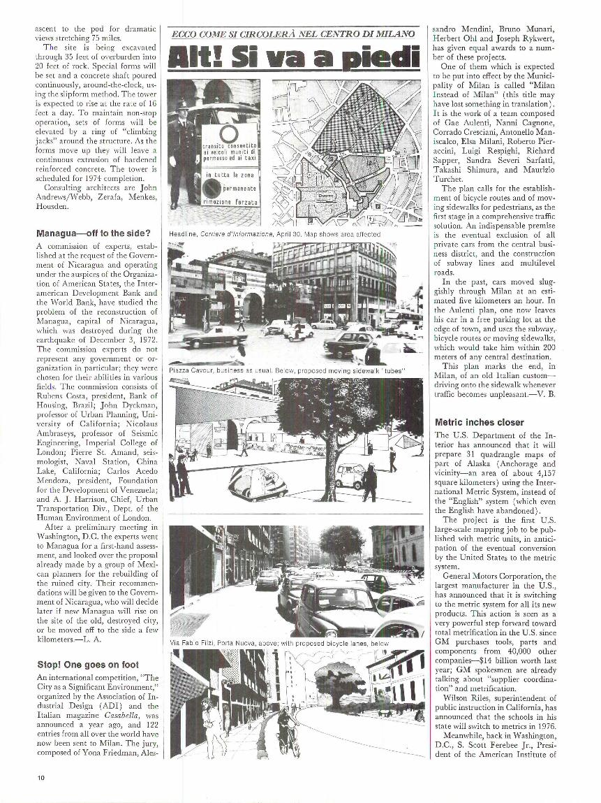
Stop! One goes on foot An international competition, City as a Significant Environment," organized by the Association of Industrial Design (ADI) and the Italian magazine Casabella, was announced a year ago, and 122 entries from all over the world have now been sent to Milan. The jury, composed of Yona Friedman, Ales-
10
ECCO COME SI CIRCOLERA NEL CENTRO DI MILANO
Headl ine, Corriere d '/nformazione, April 30. Map shows area affected
Piazza Cavour, bus iness as usual. Below, proposed moving sidewalk " tubes"
sandro Mendini, Bruno Munari, Herbert Ohl and Joseph Rykwert, has given equal awards to a number of these projects.
One of them which is expected to be put into effect by the Municipality of Milan is called "Milan Instead of Milan" (this ti tie may have lost something in translation) . I t is the work of a team composed of Gae Aulenti, Nanni Cagnone, Corrado Cresciani, Antonello Maniscalco, Elsa Milani, Roberto Pieraccini, Luigi Respighi, Richard Sapper, Sandra Severi Sarfatti, Takashi Shimura, and Maurizio Turchet.
The plan calls for the establishment of bicycle routes and of moving sidewalks for pedestrians, as the first stage in a comprehensive traffic solution. An indispensable premise is the eventual exclusion of all private cars from the central business distric t, and the construction of subway lines and multilevel roads .
In the past, cars moved sluggishly through Milan at an estimated five kilometers an hour. In the Aulenti plan, one now leaves his car in a free parking lot at the edge of town, and uses the subway,. bicycle routes or moving sidewalks, which would take him wi thin 200 meters of any central destination.
This plan marks the end, in Milan, of an old Italian customdriving onto the sidewalk whenever traffic becomes unpleasant.-V. B.
Metric inches closer The U.S . Department of the Interior has announced that it will prepare 31 quadrangle maps of part of Alaska (Anchorage and vicinity-an area of about 4,157 square kilometers) using the International Metric System, instead of the "English" system (which even the English have abandoned) .
The project is the first U.S . large-scale mapping job to be published with metric units, in anticipation of the eventual conversion by the United States to the metric system.
General Motors Corporation, the largest manufacturer in the U .S., has announced that it is switching to the metric system for all its new products. This action is seen as a very powerful step forward toward total metrification in the U.S. since GM purchases tools, parts and components from 40,000 other companies-$14 billion worth last year; GM spokesmen are already talking about "supplier coordination" and metrification.
Wilson Riles, superintendent of public instruction in California, has announced that the schools in his state will switch to metrics in 1976.
Meanwhile, back in Washington, D .C., S. Scott Ferebee Jr., President of the American Institute of
Architects, was speaking before a government subcommittee: "W c are opposed to rhe concept of evolutionary metrification, or 'let it happen naturally'. Increas ing use of the metric system without some program of coordina tion could cause difficulties which might eventually reach disastrous proportions." He said tha t archi tects would be able to convert in far less than ten years . The AIA has advocated conversion to a metric system since 1944.
Dead but not dirty The Pentagon, in a pious concern for pollution problems, has submitted to the U.S. Council on Environmental Quality a paper stating that the Bl strategic bomber now being developed for long-range nuclear bombing attacks, "as compared to current military aircraft ... will have less of an adverse environmental impact." It may drop bombs, but its engine will be quiet and "wi ll not emit smoke." That's a relief.
Costly culture A stabil e by Alexander Calder is to be erected next spring in the plaza of Mies von der Rohe's 42-story Federal bu ilding now under co nstructio n in Chicago . At $325,000 this is going to be the most expensive work of art ever provided by the Federal Government for a public building.
A model of the bright red, threelegged, ten-ton, carbon steel stabile was unveiled at the end of Apri l, and showed the legs as parts of a complex of intersecting planes. "It is supposed to be a stabile," said Calder, "but wi th Chicago's wind we have to be careful it doesn't become a mobile."
T wo other major outdoor works of art are more or less around the corner: the 50-ft. high metal sculpture by Picasso stands in the plaza of the Civic Center, and a mural by Marc Chagall is under construction in the new First National Bank plaza.
The Feds have come a long way from the day in 1855 when Congress hired Constantino Brumidi to paint frescoes for $8 a day.
Ch icago's Ca lder stabile
ARC HITECTURE PLUS JUNE 1973
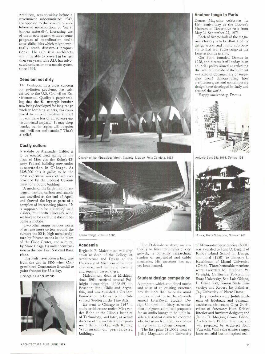
Church of the Miraculous Virgin, Navarte, Mexico, Felix Cande la, 1954
Kenzo Tange, Domus 1965
Academia Reginald F. Malcolmson will step down as dean of the Coll ege of Architecture and Design at the University of Michigan some time next year, and resume a teaching and research career there.
Malcolmson, dean at Michigan since 1964, received several Fulbright lectureships ( 1968-69) in Ecuador, Peru, Chile and Argentina, and was awarded a Graham Foundation fellowship for Advanced Studies in the Fine Arts.
He went to Chicago in 1947 to study architecture under Mies van der Rohe at the Illinois Institute of Technology, and later, as acting director of the architecture department there, worked with Konrad Wachsm ann on p re fabricated buildings.
The Dublin-born dean, an authority on linear principles of city growth, is currently researching studies of suspended and cable structures. His successor has not yet been named.
Student design competition A program ll'hich combined music and reuse of an existing structure brought more than twice the usual number of entries to the eleventh annual InterRoyal Student Design Competition. Sixty-seven student designers submitted proposals for an audio lounge to be built inside a sixty-foot di ameter concrete silo, forty-two feet high, located on an agricultural college campus.
The first prize ( $1,000) went to Jeffry Magnuson of the University
Another tango in Paris Domus Magazine celebrates its 45th anniversary at the Louvre's Museum of D ecorative Arts from May 31-September 23, 1973.
Each of five periods of the magazin e's history is to be illustrated by design works and music appropriate to that era. (The tango at the Louvre sounds terrific.)
Gio Ponti founded Domus in 1928, and directs it still today in an ed itorial policy aimed at reflecting the cultural climate of the mpment - a kind of documentary or magazine verite demonstrating how architecture, art and contemporary design have developed in Italy and around the world.
Happy anniversary, Domus.
Antonio Sant'Elia 1914, Domus 1931
House, Hans Scharoun, Domus 1943
of Minnesota. Second prize ( $500) was awarded to John C. Leggitt of Rhode Island School of Design, and third ( $250 ) to Timothy L. Hutchinson of Miami University (Ohio). Three honorable mentions were a warded to : Stephen W. Wraight, California Polytechnic State University, San Luis Obispo; L. Grant Gay, Kansas State University; and Robert Jay Palmiter, Jr., University of Notre Dame.
Jury members were Judith Edelman of Edelman and Salzman, architects, chairman; O lga Gueft, editor of Interiors; Hans Krieks, interior and furniture designer; and James D. Morgan, Senior Editor, Architecture PLUS. The program was prepared by Architect John Varrachi. While the entries ranged between solid but uninspired tech-
11
nical solutions and fanciful ones that would not work acoustically, the jury felt the best entries had in common a strong appreciation for human needs. They allowed maximum choice wi th minimum regimentation, often wi th a touch of humor. The first prize winner included a sliding pole and the second suggested that the individual listening spaces be recycled milk and bread trucks parked on the bottom floor.
Progress is pigs . .. It is a forward looking man who fo r the las t 17 years has been running his car on high-octane pig manure. The fu el has pushed Bri tish inventor Harold Bate's 1955 ca r up to 78 mph ; it crea tes no poll ution, and costs 3¢ a gallon.
Bate says that pig manure (and even its human equivalent) can yield odorl ess methane gas and he has devised an engine that runs on methane. He puts the gas into small steel cylinders in the trunk of his ca r, runs a hose from the cylinders to the engine, and then re li es on a small valve that works on suction created by th e carburetor and feeds the gas to the engine.
Bate sees his prospects as limitless. One human creates enough waste each day to make one cu. ft. of meth ane; 30 cu. ft. of manu re equal s one gallon. (Urban dog owners could even become loca l heroes !) Bate has learned that Britain produces 200 milli on tons of assorted manures each year : " Imagine what it must be fo r the whole world!"
. . . and sailing ships In another effort to conserve energy, shippers are reexamining commercial sail ing ships. There are now plans on the boards for a 400-ft. , 17,000-ton fre ighter with squ are-rigged sails. Computers would set, reef and furl its sails and push it a t 12 to 16 knots, while auxiliary engines would help during calms or in harbor areas. (T he diesels in existing ships average 10 to 15 knots.)
The sailing ship is being designed at the U niversity of Hamburg's Schiffbau Institut and, while it will reca ll the sails of days of yo re, its opera ti on will be thoroughl y modern. It will use the la tes t navigation aids, require a crew even small er than on a normal freighter today, and will use computers not onl y in its rigging, but in finding appropri ate weather an d directing the ship there. T he design calls for four masts, each one 200 ft. ta ll; sails would ro ll out from the center of th e mas ts, whi ch woul d rotate on command by a kind of hydraulic winch.
12
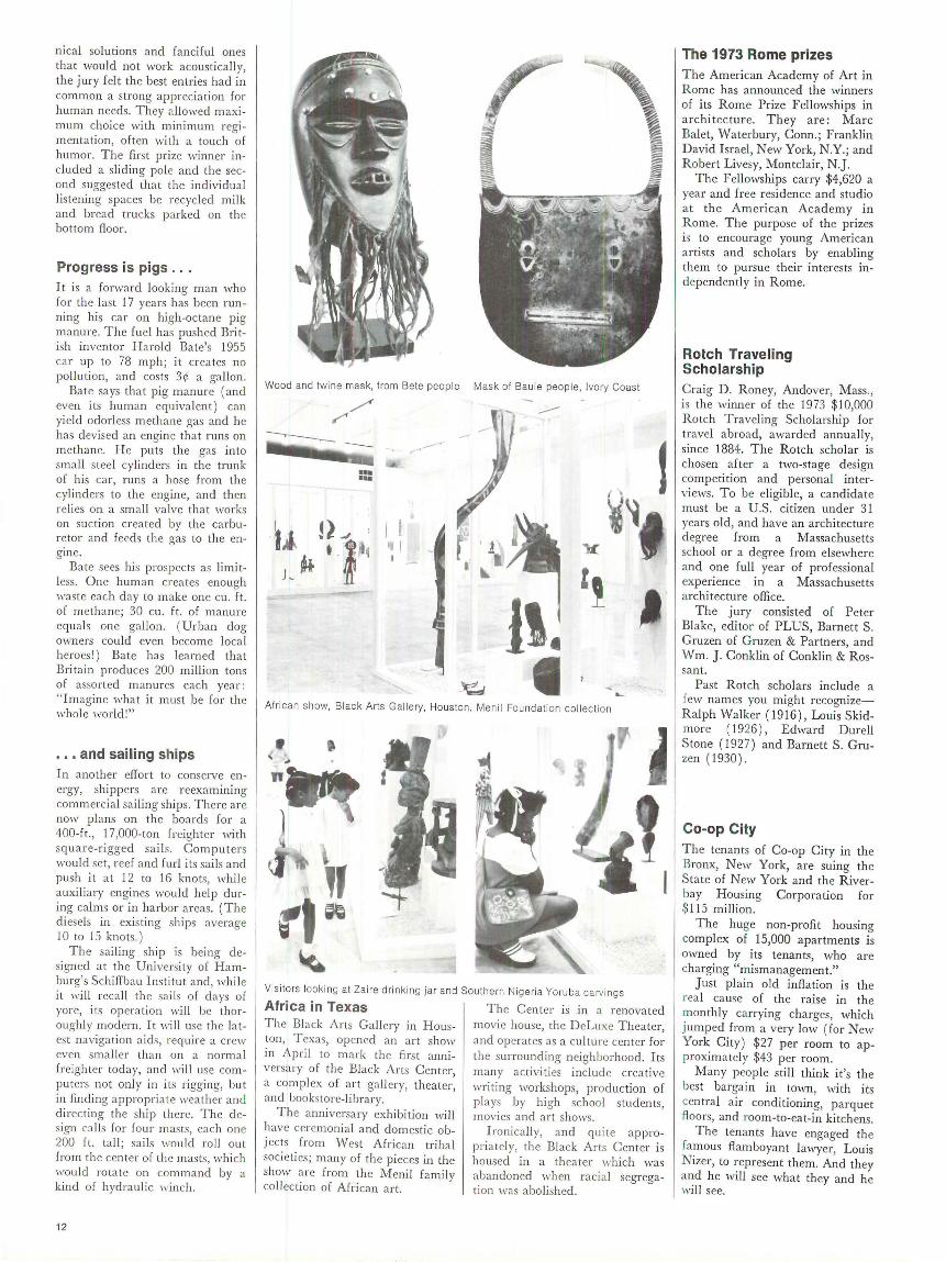
Wood and twine mask, from Bete peop le
••• •••
I I 1t I
Mask of Bau le peo ple, Ivory Coast
jl. I
African show, Black Arts Ga lle ry, Houston. Menil Foundat ion co l lection
• .. n
'' ,,~
Visitors looking at Za ire drinking jar and Southern Ni geria Yoruba carvings
Africa in Texas The Center is .in a renovated T he Black Arts Gall ery in Houston, Texas, opened an art show in Apri l to mark the fi rs t anniversary of the Black Arts Center, a compl ex of art ga ll ery, theater, and bookstore-l ibrary.
The anniversa ry exhibition will have ceremon ial and domestic objects from West African tribal societies; many of the pi eces in the show arc fro m the Menil family coll ection of African art.
movie house, the DeLuxe Theater, and opera tes as a cul ture center for the surrounding neighborhood. Its many ac tivities include creative writing workshops, production of plays by high school students, mov ies and ar t shows.
Ironicall y, and quite appropriately, the Black Arts Center is housed in a theater which was abandoned when racia l segregation was abolished .
The 1973 Rome prizes The American Academy of Art in Rome has announced the winners of its Rome Prize Fellowships in architecture. They are: Marc Balet, Waterbury, Conn.; Franklin David Israel, New York, N.Y.; and Robert Livesy, Montclair, N .J.
The Fellowships carry $4,620 a year and free residence and studio a t the American Academy in Rome. The purpose of the prizes is to encourage young American artists and scholars by enabling them to pursue their interests mdependently in Rome.
Rotch Traveling Scholarship Craig D. Roney, Andover, Mass. , is the winner of the 1973 $10,000 Rotch Traveling Scholarship for travel abroad, awarded annually, since 1884. The Rotch scholar is chosen after a two-stage design competition and personal interviews. To be eligible, a candidate must be a U.S . citizen under 31 years old, and have an architecture degree from a Massachusetts school or a degree from elsewhere and one full year of professional experience in a Massachusetts architecture office.
The jury consisted of Peter Blake, editor of PLUS, Barnett S. Cruzen of Cruzen & Partners, and Wm. J. Conklin of Conklin & Rossant.
Past Rotch scholars include a few names you might recognizeRalph Walker (1916), Louis Skidmore ( 1926 ) , Edward Durell Stone (1927) and Barnett S. Cruzen ( 1930) .
Co-op City The tenants of Co-op City in the Bronx, New York, are suing the State of N ew York and the Riverbay Housing Corporation for $115 million.
The huge non-profit housing complex of 15,000 apartments is owned by its tenants, who are charging "mismanagement."
Just pl ain old inflation is the rea l cause of the raise in the monthly carrying charges, which jumped from a very low (for New York City) $27 per room to app roximately $43 per room.
Many people still think it's the best bargain in town, with its central air conditioning, parquet floors, and room-to-eat-in kitchens.
The tenants have engaged the famous flamboyant lawyer, Louis Nizer, to represent them. And they and he will see what they and he will see.

~~J~ ••••• ••••• •••• •••• ••••• .....
ARCHITECTURE PLUS JUNE 1973
Bombay In the Air India housing project for its employees at Santa Cruz Airport, every tenant has a private garden entrance and individual outdoor stairs, washed by the rain and dried by the sun. The arrangement of living spaces was largely determined by local social custom. Verandas insure a sense of privacy
Ahmadabad The Central Bank of India, designed as a prototype for fu ture tower blocks in Ahmedabad, has the largest precast post tensioned beam structure in India for any multistoried office building. The clear span is 45 feet. The Central Bank occupies the ground floor and mezzanine; the six floors above are columnless office spaces. The plaza,
while one si ts or sleeps outdoors. The houses are brick covered with plaster, whitewashed each year after the monsoon season. The architects were Harry Weese & Associates of Chicago, in collaboration with the National Design Institute, Ahmedabad, India. T he Ford Foundation assisted in the design costs.
20 feet above the street, will link with adjoining buildings to create a pedestrian street removed from the traffic below. A suspended restaurant is level with the pedestrian plaza. Two floors below grade contain vaults, storage and parking facilities. At the top is a penthouse apartment with roof garden. The architec t is B. V. Doshi.
continued on page 62
13
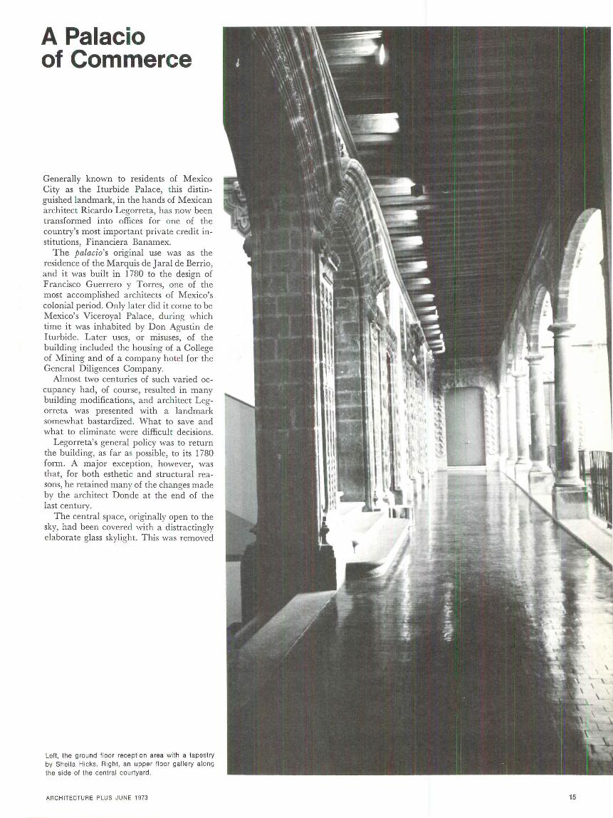
A Palacio of Commerce
Generally known to residents of Mexico City as the Iturbide Palace, this distinguished landmark, in the hands of Mexican architect Ricardo Legorreta, has now been transformed into offices for one of the country's most important private credit institutions, Financiera Banamex.
The palacio's original use was as the residence of the Marquis de J aral de Berrio, and it was built in 1780 to the design of Francisco Guerrero y Torres, one of the most accomplished architects of Mexico's colonial period. Only later did it come to be Mexico's Viceroyal Palace, during which time it was inhabited by Don Agustin de Iturbide. Later uses, or misuses, of the building included the housing of a College of Mining and of a company hotel for the General Diligences Company.
Almost two centuries of such varied occupancy had, of course, resulted in many building modifications, and architect Legorreta was presented with a landmark somewhat bastardized. What to save and what to eliminate were difficul t decisions.
Legorreta's general policy was to return the building, as far as possible, to its 1780 form. A major exception, however, was that, for both esthetic and structural reasons, he retained many of the changes made by the architect Donde at the end of the last century.
The central space, originally open to the sky, had been covered with a distractingly elaborate glass skylight. This was removed
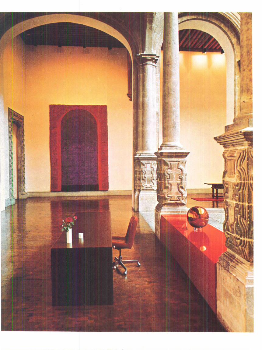
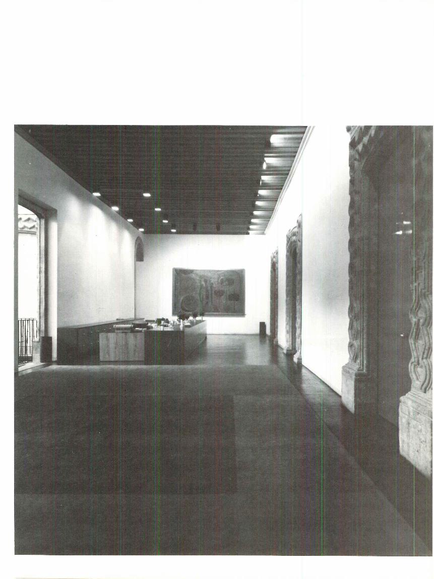
Left, the ground floor reception area with a tapestry by Sheila Hicks. Right, an upper floor gallery along the side of the central courtyard .
ARCHITECTURE PLUS JUNE 1973 15
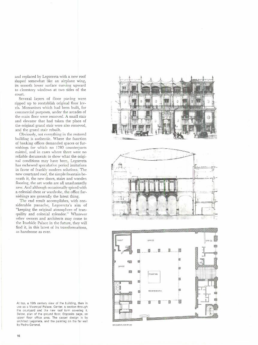
and replaced by Legorreta with a new roof shaped somewhat like an airplane wing, its smooth lower surface curving upward to clerestory windows at two sides of the court.
Several layers of fl oor paving were ripped up to reestablish original floor levels: Mezzanines which had been built, for commercial purposes, under the arcades of the main floor were removed. A small stair and elevator that had taken the place of the original grand stair were also removed, and the grand stair rebuilt.
Obviously, not everything in the restored building is authentic. Where the function of banking offices demanded spaces or furnishings for which no 1780 counterparts existed, and in cases where there were no reliable documents to show what the original conditions may have been, Legorreta has eschewed speculative period imitations in favor of frankly modern solutions. The new courtyard roof, the simple fountain beneath it, the new doors, stairs and wooden flooring, the art works are all unashamedly new. And although occasionally spiced with a colonial chest or wardrobe, the office furnishings are generally the latest thing.
The end result accomplishes, with considerable pa nache, Legorreta's aim of "keeping the original atmosphere of tranquility and colonial splendor." Whatever other owners and architects may come to the Iturbide Palace in the future, they will find it, in this latest of its transformations, as handsome as ever.
At top, a 19th centu ry view of the building, then in use as a Viceroyal Palace . Center, a section through the courtyard and the new roof form cove ring it. Below, plan of the ground fl oor. Opposite page, an upper floor office area. The carpet design is by archi tect Legorreta, and the painting on the far wa ll by Pedro Coronel.
16
OFFICE
~
GROUND FLOOR PLAN
OFFICE OFFICE
~- ---- ~ ---- f!il _____ ~-- ---~ ' : I '
d ~ I I I I
f'J I I
m I FOUNTAIN I I I I I
f1'l
I I
~ ROOFED PAT10 ~ ' I
' ' I '
~- --- -~-----~- ----~----~

18
Top , a detail of the exterior stonework. Left, two views of an office area typica lly furnished with a mixtu re of new and co lonial objects. Right , the great central courtyard with its new fountain .

..
' .,
' \ \ ···t
·-l i l
--\
,l \·. ·· .1
'.\\'~ . \~ ,
\ \' \ \ \
\ . \
l
1 . I , ; , J, I.
i; )j
i. l 1
I !
~' 1 1 .,
I\
\ '; / •I I ~ l j l : , . ; } . '
! ; . ; : ( 1rl.
1' '\ l .
l - i
' I !,'
- .f l
'/ I
---.... 1---, - ,-.----;-;---
' '

books that she carries around for presentations. The drawings seem to cover every contingency, yet remain schematic in nature . One of the most important things about this project is that it starts with a careful analysis of what already exists or is planned in the area and how these elements work together.
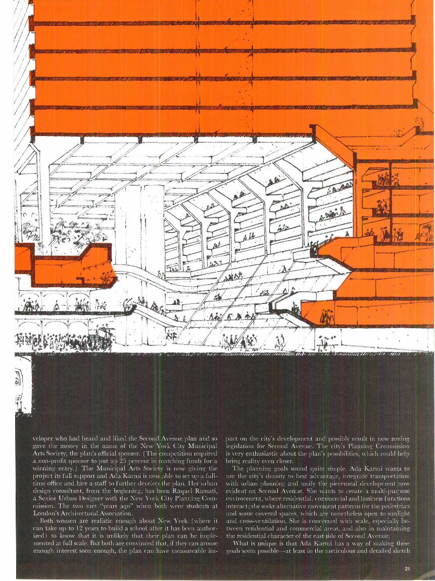
The givens for the project include the new subway. It will be built 60 ft. below street level and is expected to relieve some of the congestion on the older, parallel Lexington Avenue subway line. The spine project will not change established, major traffic patterns, nor will the city's existing street grid pattern be changed. Only one-third of the edge sites on the avenue are now fully developed. The rest remain vulnerable to speculators.
The city has been a pioneer in using "incentive" zoning to get developers to provide social amenities in return for extra rental space. But if the city decides to legislate new or special zoning requirements for Second Avenue, it will have to develop an entirely new concept of what zoning is, says Raquel Ramati. Zoning all over the world deals primarily with buildings as they rise from the
22
ground-regulations rarely apply to underground development, and this is the essence of Ada Karmi's concept. The zoning now existing for Second Avenue is the same for the east and west sides and limits construction to 30 residential floors and two stories of commercial space. Such uses may cover 40 percent of the site at the tower level and 66 percent at the base. This bulk is allowed only if the builder provides a plaza or arcade on 33 percent of the site.
The new proposal would call for different standards on either side of Second Avenue (see drawing above ) . On the west side, it would allow a building's tower to cover 50 percent of the site and a building's base to cover 100 percent . Instead of arcades, however, the developer would have to provide escalators to the subways and 50 percent store space adjacent to the underground spine; he would also have to construct the spine, an average 25 ft . underground, according to specifications; preserve townhouses in mid-block when required; and provide open space on intermediate roof levels for residential portions of the buildings.
The east side proposal calls for mixed use structures, but 60 percent would be for residential use and only 40 percent for commercial and institutional (including school and hospital ) structures. The new law would allow a 20 percent increase in bulk, greater site coverage and no plaza or arcade requirements. But it would require escalators to the subways, a double-height pedestrian route, a 50 percent space allowance for residentially-oriented shops, and a roof plan that a llows sun to shine on the west side of Second Avenue. Builders would also have to create street-level openings so that strollers could see the townhouse gardens in back, to preserve townhouses if required, and to create vest pocket parks in mid-block areas.
The configurations of the buildings may seem a little odd. They can overhang the sidewalks as long as the resultant profile does not block sunlight from the opposite side. On both sides of the avenue, building lobbies must be located 30 ft. above the ground, with cross street, not avenue, access.
Ada Karmi and Raquel Ramati have received favorable reactions and even enthusiasm from some of the developers they have approached. They have also talked to local community boards and will participate in a committee that the M unicipal Arts Society is assembling. The community, developers, city p lanning agencies, transit authority, American Institute of Architects and others will be represented, and progress documented. If the project doesn't succeed, Ada Karmi will know why.
One problem may be in explaining the proposal to the layman.
• 1
2
The new office for the Second Avenue Spine will prepare an exhibition as one of its first projects . With it, Ada Karmi hopes to 3 make Second Avenue a popular issue for politicians and laymen alike. But the concept is not easy for people to grasp, partly because it is three-dimensional in nature, and its dimensions and amenities change from one block to another.
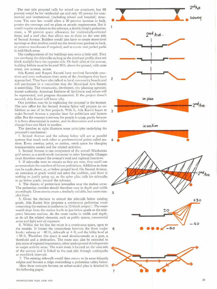
The sketches at right illustrate some principles underlying the proposal's conclusions:
1. Second Avenue and the subway below will act as parallel systems that touch each other at predetermined points called sta- 4 e tions . Every meeting point, or station, needs space for changing transportation modes and for related activities.
2. Second Avenue is one component of the overall Manhattan grid system as a north-south connector to other boroughs. Changes must therefore respect the avenue's total and regional functions.
3. If sidewalks were to remain as they are now, they could not accommodate the numbers of future pedestrians. Additions to these can be made above, at, or below ground level. On Second Avenue, an extension at grade would not solve the problem, and there is nothing to justify going up, so the spine plan calls for sidewalks to go below grade, toward the subways.
4. The density of pedestrians intensifies near the station areas. The pedestrian corridor should therefore vary in depth and width accordingly. Cross streets create a similarly variable, but more complex form.
5. Given the decision to extend the sidewalk below existing grade, Ada Karmi then proposes a continuous pedestrian route connecting the stations in midtown (a 12-block project ) . The route would slope from the station levels to just below grade at the midpoint between stations. As the route varies in width and depth, so do all the related elements, such as public spaces, commercial areas and light and air exposure.
6. Within the lot line the route is a continuous space, open to the outside. It houses the connections between the three major 6 levels: subway at -60 ft ., sidewalk at ± 0, and the lobby level at + 30 ft. Therefore this space is used simultaneously as a gate, a threshold and a destination. The route may also be extended to join areas of regional importance, other underground developments or major activity areas. The main route is located on the west side of the avenue and is linked to the east side through underpaths at two-block intervals.
7. The existing sidewalk would then return to its more leisurely origins and become a ridge overlooking a pedestrian valley below.
How these concepts become an urban-scaled plan is detailed in the following pages.
ARCHITECTURE PLUS JUNE 1973
9 ' 2~4Ave
' ' • 5"~
2M" ltve ·
'~ I ~
I
../~'--
•
+30
-40
•
23
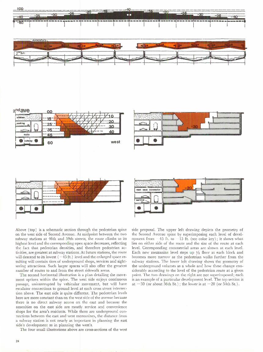
Above (top) is a schematic section through the pedestrian spine on the west side of Second Avenue. At midpoint between the two subway stations at 46th and 59th streets, the route climbs to its highest level and the corresponding open space decreases, reflecting the fact that pedestrian densities, and therefore pedestrian activities, are greatest at subway stations. At future stations, the route will descend to its lowest ( -45 ft.) level and the enlarged space resulting will contain tiers of underground shops, services and sightseeing attractions. Such larger spaces will also offer the greatest number of routes to and from the street sidewalk areas.
The second horizontal illustration is a plan detailing the movement options within the spine. The west side enjoys continuous passage, uninterrupted by vehicular movement, but will have escalator connections to ground level at each cross street intersection above. The east side is quite different. The pedestrian levels here are more constant than on the west side of the avenue because there is no direct subway access on the east and because the amenities on the east side are mostly service and convenience shops for the area's residents. While there are underground connections between the east and west mezzanines, the distance from a subway station is not nearly as important in planning the east side's development as in planning the west's.
The four small illustrations above are cross-sections of the west
24
•• •
side proposal. The upper left drawing depicts the geometry of the Second Avenue spine by superimposing each level of development from -45 ft. to -15 ft. (see color key); it shows what lies on either side of the route and the size of the route at each level. Corresponding commercial areas are shown at each level. Each new mezzanine level steps up y2 floor at each block and becomes more narrow as the pedestrian walks further from the subway stations. The lower left drawing shows the geometry of the underground volumes as a whole and how these change considerably according to the level of the pedestrian route at a given point. The two drawings on the right are not superimposed; each is an example of a pa rticular development level. The top section is at - 30 (or about 56th St.) ; the lower is at - 20 (or 54th St.).
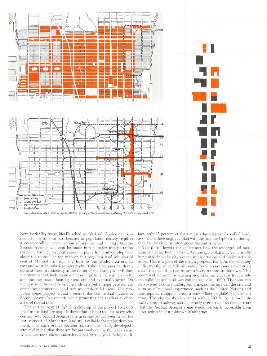
New York City seems ideally sui ted to this kind of spine development at this time, in part because its population density requires a corresponding concentration of services and in part because Second A\·enue will soon be made into a major tra nsportation corridor, with or without coherent plans for land development a long the route. The top map on this page is a land use plan of central l\1anhattan, from the East to the Hudson R i\·ers, its east and west boundaries respectively. It shows commercial devel opment most prominently in the center of the island; what it does not show is that such commercia l enterprise is increasing rapidly and pushing major housing areas out and eventuall y away. On the east side, Second Avenue stands as a buffer zone between encroaching commercial land uses and residential areas. The proposed spine project would preserve the commercia l nature of Second Avenue's west side whi le protecting the residential character of its east side.
The wrtical map a t right is a close-up of the project area outlined in the land use map. It shows that it is not too la te to exe rcise control over Second Avenue; the area has in fact been called the last reservoir of Manhattan land still avai lable for major de\·eloprnent. The map's orange portions indicate hard (ful ly developed ) sites and re\·eal that these are far outnumbered by the black areas, which a re now either underdeveloped or not yet developed. In
ARCHITECTUR E PLUS JUNE 1973
I I
• 'I " .. . I .Ir •rl ., ' ' II I
II •
fact, only 23 percent of the avenue edge sites can be called hard, and where these might confl ict with the proposed spine's con tinuity, t:iey can be circum\·ented under Second A\-cnue.
The third ( lower ) map illustrates how the underground mezzan ines created by the Second Avenue spine p lan may be naturally integrated into the city's other transportation and major actiYity areas . This is a plan of the design proposal itself. As the color key ind icates, the spine will ultimately form a continuous pedestrian space that will link t11·0 future subway stations in midtown. This space will connect the existing sidewalks, an elevator le\·el inside the bui ldings and a subway exit/entrance at -60 ft. The spine can also extend to other underground mezzanine levels in the city and to areas of regional importance, such as the United Nations and the popular shopping areas around Bloomingdale's department store. The circles, showing areas within 700 ft . (or a 3-rninute walk) from a subway station, nearly overlap and so demonstrate that the Second A\·enue spine would be easi ly accessible from most points in east midtown Manhattan.
25
'"'' . All Fl~ ~7~1 i__ l~=-,~~::=t.::~~:::.~ .... :'J rr ~1, : D _J - ·, (' .. -.../)
~ ... · ..
• - Hvt {or ca .... ilti/ed priio.1c. 144ovtv.. 4.AT
1-td pr f"rAillM-Ol/{CMt!1 •• :t, il•J'O Lti[ V!oF" 5F£-('.f tla..'f dlM"'({,(f-.
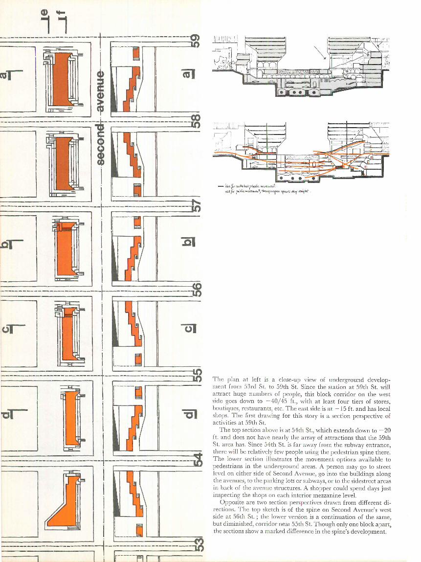
The plan at left is a close-up view of underground development from 53rd St. to 59th St. Since the station at 59th St. will attract huge numbers of people, this block corridor on the west side goes down to - 40/45 ft., with at least four tiers of stores, boutiques, restaurants, etc. The east side is a t - 15 ft . and has local shops. The first drawing for this story is a section perspective of activities at 59th St.
The top section above is at 54th St ., which extends down to - 20 ft. and does not have nearly the array of attractions that the 59th St. area has. Since 54th St. is far away from the subway entrance, there will be relatively few people using the pedestrian spine there. The lower section illustrates the movement options available to pedestrians in the underground areas. A person may go to street level on either side of Second Avenue, go in to the buildings along the avenues, to the parking lots or subways, or to the sidestreet areas in back of the avenue structures. A shopper could spend days just inspecting the shops on each interior mezzanine level.
Opposite are two section perspectives drawn from different directions. The top sketch is of the spine on Second Avenue's west side at 56th St.; the lower version is a continuation of the same, but diminished, corridor near 55th St. Though only one block apart, the sections show a marked difference in the spine's development.
:--Ii·------~ __ .. __
i -~
'
I
I
I-
-'~

I llllllllll lWttl!l.J llillllllll ----.__ ... IUWlll V\:lll!I M!i11 1111 11
I lr4Ar\ r ,-. 111 ~ .!!-~ .,,,-,,, "111 .u-.::,;~: ~.) I/ v:,.
--""·.·. II
T he section a t top was drawn facing west on Second Avenue at 58th St. (see plan on p. 26 ) . T he superimposed lines indicate the la rge number of entry a nd exit possibil ities at cross street intersections. Pedestrians may remain underground and walk beneath the cross street a t severa l levels, or they may ascend to sidewa lk level or go di rec tly into the buildings that line Second AYenue. All subway access and most major commercial fac ilities a re on the west si de. Ru t thi s section al so shows the changes tha t occur on the west side of the avenue as the stree ts a re further removed from the subway; the spine loses dep th and wid th as well as pa tro ns.
The plan contrasts the east a nd west sides of Second Avenue. T he west (top) side corresponds to the section above it and indicates deve lopmen t a t -40 ft. Across the avenue, the spine descends to - 15 ft. and the a rea is more shallow, and of neighborhood scale with a mid-block (off the sidestreet ) entry to a small shopping a rcade; one m ust cross the avenue to catch a subway.
At right is a view of the Second Avenue spine from the sidewalk above it. The planners hope their proposal will restore the sidewalk to i ts original use of years ag-o-a pleasan t place for a leisurely stroll-with the added excitement of a few peeks down into the new underground wonderland possible every now and then.
28
_,, /
'" "·
,. '\. ... ~
"' ;
A bridge to health
Columbus, Indiana-the town with an extraordinary collection of buildings by the best American architects of the fifties and sixties-is entering a new era. "Process buildings" have begun to join the masterful but often self-conscious works that can be found there. And even though the new projects, which are designed by such firms as Roche and Dinkeloo, Mitchell/Giurgola, and Hardy, Holzman and Pfeiffer, are seldom completely successful in blending into the Columbus townscape-there is still a "museum" quality about it all-they seem to be more modest, to be trying harder to fit in.
It is perhaps in the nature of the process-oriented approach to architectural design, as opposed to that based more on sculpture, that the "set-piece" quality of the completed building is substantially mitigated. Process, in the case of the Region Ten Mental Health Center by James Stewart Polshek and Associates, profoundly determined the form of the resultant building. And Polshek insists it was the broadest possible connotation of "process" that was involved, not just orderly manipulation of elements in a pre-digested program handed him by his client.
In the first place, his client proved to be several agencies with varying interests in the proposed structure. The National Institute for Mental Health, for instance, provided guidelines for the design of the center (but has sti ll not provided any funds to help build it). State agencies, which in fact have funded 60 per cent of the construction, also had a voice. The primary client was the Region Ten (five Southern Indiana counties ) Mental Health Foundation, whose sophistication, claims Polshek, allowed the design development process to run its course objectively. Finally, because the site chosen, adjacent to the Bartholomew County General Hos pi ta!, was in the floodplain of Haw Creek (a stream running through Columbus), the Corps of Engineers was also involved.
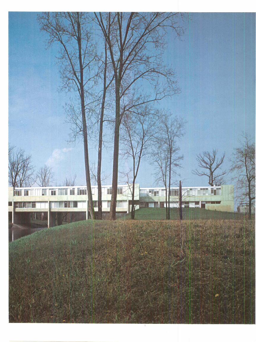
As a center providing comprehensive mental health services, the building was to include in-patient facilities, out-patient counseling offices, occupational therapy and administrative spaces. The concept of a bridge over the creek was not arrived at easily. Although he sensed possibilities when he first saw the site, Polshek says that it was when he heard that the Corps of Engineers planned to "straighten" Haw Creek, taking out two stands of mature sycamores, that the idea of bridging came to mind as an ecologically sound concept. Since the building had to be built at bridge height in any case (due to flash flood conditions), the tying together of the two banks not only meant saving the trees but allowed people to enter the building from either side of the stream. The east bank is adjacent to the hospital whi le the other entrance gives patients and visitors easy access to a large park and main streets. Unfortunately, provision for public passage across the creek as part of the building was abandoned early in the design stage.
Caseloads have so exceeded the .volume projected for the first year that the building is already over-crowded. But rather than handle the overflow by expanding this center, the organization has established branches in the other counties served and plans another unit for children and adolescents in Jennings County, also to be designed by Polshek's office.
"A feeling of openness was an important symbolic goal in the design," says Dr. George C. Weinland, director of the center and one of those most deeply involved in the planning. Along both
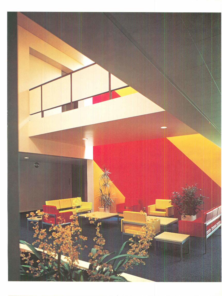
30

sides of the building, especially on the upper floor, a window wall which combines vertical and sloping glass opens patient rooms and offices (page 34) to the creek and trees along it. The ends of the building, in contrast to the linear character of the long elevations, are very solid concrete elements. It is here, unfortunately, that one feels most the "architecture" of the design. It is here that Polshek seems to fa ll between two stools, perhaps one should say, "schools."
Like so many other architects d'un certain age, he feels pulled in two directions, by process but also by product. On the one hand, he has done a remarkable job of letting process and developed program, with their potential for accommodating unforeseen change, dictate and shape the design. In this case, his early interest in becoming a psychiatrist and his work experience in hospitals has helped him to be objective. But on the other hand, he still sees himself as an "architect" who must make a formal statement, who must tidy up the consequences of the process and program. Unable to forget.his architectural history,, specifically Chenonceaux in the Loire Valley, he has insisted on a symmetrical facade for the wing crossing the creek (page 31) . The cantilevered concrete masses at each end seem to follow from that decision. In his own words, Polshek wanted " to make the distinction between the east entrance (mostly service and employees but some patients) and the west entrance unclear so there would not seem to be a 'front door'." Furthermore, he says that he did not think so much about entering as being and working inside the building. In fact, late in design the entry bridge was shifted to the diagonal and the mass lightened as much as possible to provide more sense of openness.
But this pastiche of modish yet brutal forms does not help. What is basically an austere building becomes, at this crucial point, a forbidding building. Where openness is most needed, to welcome those approaching for the first time with fears enough, there is none. What seems to have been overlooked "in the process" is the basic humanistic concern for the people who will use the building. In the case of a mental health services center, ~0<v
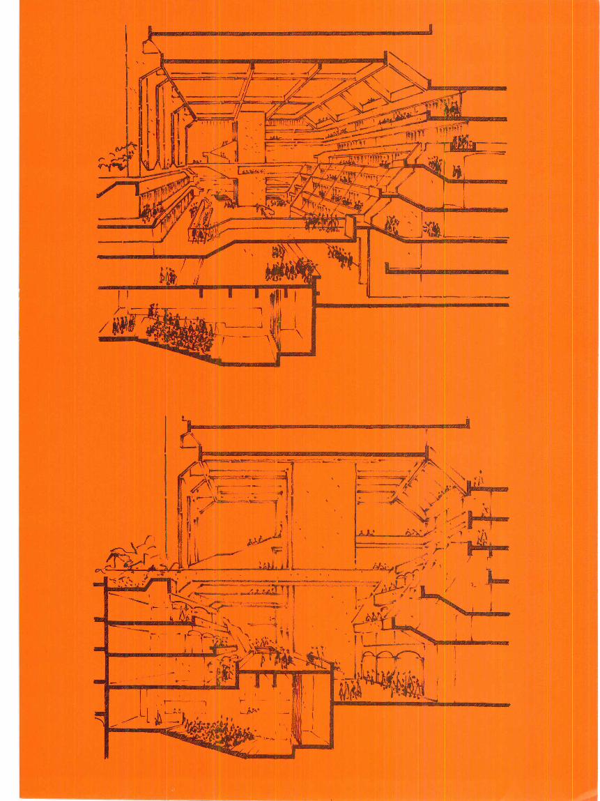
An entry bridge leads vi si tors and patients direc tl y to thEl reception area (above). Adjacent to it on the lower floor of the wing bridging the creek is the administration section. Abov.e it are the counse l ing offices. In the wing of the east bank, occupational activities are on the lower fl oor with in-patient facil iti es above. There is also a basement. A two story space (right) jo ins the two wings and is a focus of activity for the entire building.
UPPER LEVEL
especially regrettable oversight.- JIM MORGAN "~'lj~==='-'~""""'-~-_.--_,d-~-~-~ 'v~
MAIN LEVEL
32
l
34
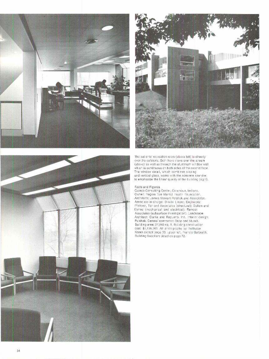
The patients' recreation room (above left) is directly over the cafeteria. Both have views over the stream (above) as well as throug h the aluminum window wal l which is continuous on both sides of the second floor. The window detai l, which comb ines sloping and vertica l glass, works with the conc rete spandrel to emphasize the linear qual ity of the bui lding (right).
Facts and Figu res Ouinco Consulting Center, Co lumbus, Indiana. Owner: Region Ten Mental Health Foundation. Architects: James Stewart Polshek and Associates. Associate-in -charge: Di mitri Linard. Eng ineers: Pfisterer, Tor and Associa te s (stru ctural); Dalton and Dunne (mec hanical and electric al); Ramoot Associates (subsurface inves tigation). Landscape Architect: Clarke and Ra pua no, Inc. Inter io r design: Polshek. General contrac tor: Repp and Mundt. Building area: 27,840 sq. ft. Building construction cost: $1,135,763. All photog raphy by Balthazar Korab except page 33, upper left, Franc is Galbraith . Bui lding Suppliers listed on page 72.


Beyond Golden Lane, Robin Hood Gardens London housing by the Smithsons is based on years of theory
By Anthony Pangaro
36

Left, looking south over Robin Hood Gardens' two blocks of flats . The London docks and river are beyond.
Alison and Peter Smithson, London architects, planners and theoreticians, have at last built an important block of city housing. The body of ideas which the Smithsons helped establish is one of the profession's most respected formal and ideological models, looked to by many in the United States as a tantalizing alternative to what we have been content to build as publicly assisted housing. Robin Hood Gardens, the Smithsons' first concrete realization from that model, is indeed far superior to most American public housing of the past two decades, and it deserves close scrutiny.
I consider it here from an American context, from the point of view of the American social and environmental dilemma: how does Robin Hood Gardens provide for community, for privacy, and (a particularly American question) for security? The answer seems to be that, while we still have much to learn from the Smithsons, the built reality of Robin Hood Gardens is less convincing than the theory behind it.
The Smithsons first came to international prominence with their competitionwinning secondary school at Hunstanton in 1951. A straightforward work of steel and glass, it was Miesian with a difference; and for this difference a new phrase was added to our vocabulary: the New Brutalism. Five years later, a group of architects and planners led by the Smithsons, by Candilis and Woods from France, Bakema and van Eyck from Holland, and others, was entrusted with the program for the 10th assembly of the Congres Internationaux d'Architecture Moderne (CIAM) in Dubrovnik. After the meeting, CIAM, having grown diffuse and unwieldy, disintegrated, and the spirited new group, called Team 10, took its place as the theoretical establishment of the modern movement. In further meetings, in many published writings, and in specific unbuilt proposals (beginning with the 1952 Deck Housing project for Golden Lane), the Smithsons have been conscientiously refining their concepts for housing.
Robin Hood Gardens is also the child of the Greater London Council, an agency well known for its extensive governing and rebuilding efforts since World War II. The
Anthony Pangaro is an architect with the design staff of the New York State Urban Development Corporation and teaches at the Columbia University School of Architecture.
37
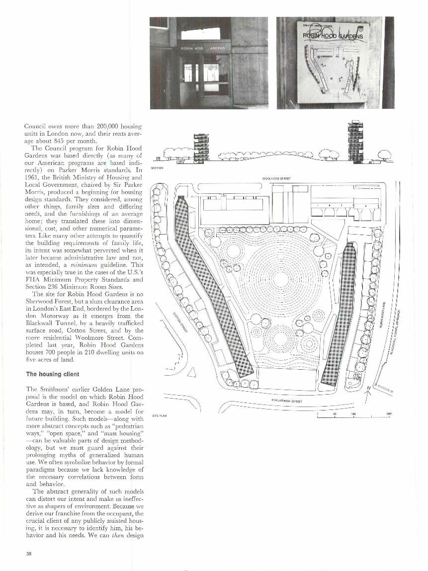
Council owns more than 200,000 housing units in London now, and their rents average about $45 per month.
The Council program for Robin Hood Gardens was based directly (as many of our American programs are based indirectly) on Parker Morris standards. In 1961, the British Ministry of Housing and Local Government, chaired by Sir Parker Morris, produced a beginning for housing design standards. T hey considered, among other things, family sizes and differing needs, and the furnishings of an average home; they translated these into dimensional, cost, and other numerical parameters. Like many other attempts to quantify the building requirements of family life, its intent was somewhat perverted when it later became administrative law and not, as intended, a minimum guideline. This was especially true in the cases of the U.S. 's FHA Minimum Property Standards and Section 236 Minimum Room Sizes.
The site for Robin Hood Gardens is no Sherwood Forest, but a slum clearance area in London's East End, bordered by the London Motorway as it emerges from the Blackwall Tunnel, by a heavily trafficked surface road, Cotton Street, and by the more residential Woolmore Street. Completed last year, Robin Hood Gardens houses 700 people in 210 dwelling units on five acres of land.
The housing client
The Smithsons' earlier Golden Lane proposal is the model on which Robin Hood Gardens is based, and Robin Hood Gardens may, in turn, become a model for future building. Such models-along with more abstract concepts such as "pedestrian ways," "open space," and "mass housing" -can be valuable parts of design methodology, but we must guard against their prolonging myths of generalized human use. We often symbolize behavior by formal paradigms because we lack knowledge of the necessary correlations between forn1 and behavior.
The abstract generality of such models can distort our intent and make us ineffective as shapers of environment. Because we derive our franchise from the occupant, the crucial client of any publicly assisted housing, it is necessary to identify him, his behavior and his needs. We can then design
38
SECTION
SITE PLAN
WOOLMOAE STREET
--- - - !..': __ _
POPLAR HIGH STREET
so 100 200'

Top left , the bui ldin show signs of g entrance and d' wear d 1rectory b th
a section through th:n vandalism. Center le~ perimeter of the d parking depression t, the man-mad . e.velopment, the two s on the Below left the hill in the central ope buildings, and one bu ' .' ,e site plan. Below n space.
ild1ng s facade for , the concrete grid f ms a backd o rop to the hill.
ARCHITECTURE PLUS JUNE 1973 39

Top, one of the "streets-in-the-air." Below left, a circu lar concrete play area recessed in the art ific ial hill. Below right, the depressed drive between parking areas and bu ild ings. The building facade is d ivided by two "streets." Opposite, three tenants' uses of their own parts of a "street."
' -- '' ' 1,,_ ~-' .
40
,,

ARCHITECTURE PLUS JUNE 1973
and test our intentions for his housi ng with a ll the participation-observation and in terview techniques made avail able to us by those with sociological insight.
Some recent feedback of this type has alerted us to dangers in the organization of highrise housing intended for use by fam ilies with child ren. Crime, famil y disintegration and anomie, once written off as characteristic of low income groups, are suddenly being correlated, in some degree, to building types themselves.
The design solu tion that attempts to recognize the occupant must deal with his activities, activities often so basic that we overlook their significance. For example, the observation and supervision of child ren from the dwelling; the sense of neighborhood and of security that comes from being able to see who comes and goes; the use of the dwelling for simultaneous acti,·ities without conflict, and so on. Work for the New York State Urban De,·elopment Corporation (the UDC ) by the Cornell Center for Urban Development Research, College of Human Ecology, has already verified many such factors as being of expressed importance to residents . In that light, the post-occupancy evaluation of seven UDC housing developments is now in progress.
The street in the air
At the 1953 congress of CIAM, the Smithsons said that in modern urban society there are no natural groupings above the level of the famil y. The consequence of their realization, because they believe tha t valid social entities can result from architectural decisions, has been a search for new physical equivalents for the old levels of association in the house, the street, the district and the city. The hierarchy of functions outlined in C IAM's 1933 Athens Charter (work places, living places, circulation places) needed to be rep laced, the Smithsons noted, by a hierarchy of human associations. Indeed, they said in T eam JO Primer, the " idea of street, not the reality of street . . . is important : the creation of effective group-spaces . .. making the socially vi ta! life-of-the-street possible." Such thinking was logical enough and a real step forward, but, to the extent that it overlooked the basic activities of those using the built product, it was short of the mark.
Robin Hood Gardens, like Golden Lane befo re it, is based on the idea of a "streetin-the-air," and critical to the success of the scheme is the success of that "street." E,·cn in the Smithsons' visualized multiplication of Golden Lane hous ing into Golden Lane C ity, with its pedestrian system a "multi-level continuous complex," these "streets" could fu nc tion as in tended only if they did more than link pedestrian pathsthat is, on ly if they served as the physical li nks between human activities.
In the Robin Hood Gardens model, neither the streets nor the dwellings accommodate activit ies usefu l for supervision or socia li zation . The wide access galleries are primarily circulation spaces and are only incidentally avail ab le for neighborhood exchange. T he outdoor areas ad jacent to the d\\'elling units miss their chance to serve as front porches or stoops because they a llow no definition of private territory or any sense of occupant ownership . The dwell ing units are a ll but disconnected from the "street" (imagine the difference if there were only a kitchen window on it, and a real stoop ) , and turn away from the link to the rest of the estate .
The "street-in- the-air" is therefore only a shadow of what it is meant to be-there are no real p lay spaces (except the stairwells ) , no gatheri ng spaces, and no activity connections to indoor communal spaces. It seems that once the presence of shops, views of outside community life, and the automobile have a ll been taken away, the thing that remains is only a corridor. Given public housing budgets, a t least in America, it is unlikely that this can be otherwise. We often hypothesize that a deck can be a street, yet the inclusion of enough deck-level space for communal activi ties is prohibitively expensive, and self-supporting commercial space would not find an adequate market there. Even our New York City tenant of last resort, an Off-Track Betting parlor, would not find enough exposure there.
The real action at Robin Hood Gardens is on the ground , and the only real connection to it is via that great interrupter, the elevator (already in this case, in "civilized" London, badly defaced and vandalized). The spaces at ground level are also generalized and impersonal, perhaps in theory because "people will decide what to do with them." Certainly some spaces
41
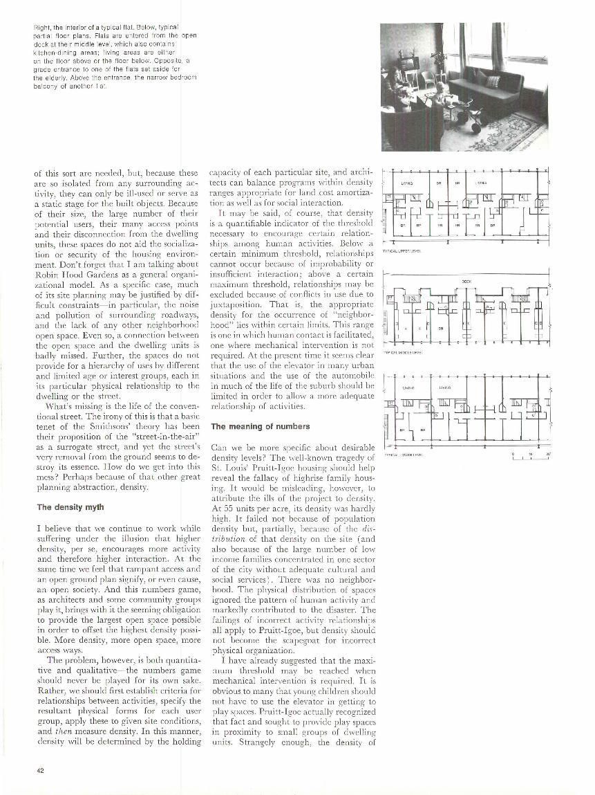
Right, the interior of a typical fla t. Below, typica l partial floor plans. Fla ts are entered from the open deck at their midd le level, which also contai ns ki tc hen-d ining areas; living areas are eith er on the floor above or the floor be low. Opposite, a grade en trance to one of the fl ats set asi de fo r the elderly. Above the entrance, the narrow bedroom balcony of another flat.
of this sort are needed, bu t, because these a re so isolated from any surrounding activity, they can only be ill-used or serve as a static stage for the built objects. Because of their size, the large number of their potential users, their many access points and their disconnection from the dwelling units, these spaces do not aid the socialization or security of the housing environment. Don't forget tha t I am talking about Robin Hood Gardens as a general organizational model. As a specific case, much of its site planning may be justified by difficult constraints-in particu la r, the noise and pollution of surrounding roadways, and the lack of any other neighborhood open space. Even so, a connection between the open space and the dwelling units is badly missed . Further, the spaces do not provide for a hierarchy of uses by different and limited age or interest groups, each in its particular physical relationship to the dwelling or the street.
What's missing is the life of the conventional street. T he irony of this is that a basic tenet of the Smithsons' theory has been their proposition of the "street-in-the-a ir" as a surrogate street, and yet the street's very removal from the ground seems to destroy its essence. How do we get into this mess? Perhaps because of that other great planning abstraction, density.
The density myth
I believe that we continue to work while suffering under the illusion tha t higher density, per se, encourages more activity and therefore higher interaction. At the same time we feel that rampant access and an open ground p lan signify, or even cause, an open society. And this numbers game, as architects and some community groups play it, brings with it the seeming obligation to provide the largest open space possible in order to offset the highest density possible. More density, more open space, more access ways.
T he problem, however, is both quantitative and qualitative-the numbers game should never be played for its own sake. Rather, we should first establish criteria for relationships between activities, spec ify the resu ltant physical forms for each user group, apply these to given site conditions, and then measure density. In this manner, density will be determined by the holding
42
capacity of each particular site, and architects can ba lance programs within density ranges appropriate for land cost amortization as well as for social interaction.
It may be said , of course, that density is a quantifiable indicator of the threshold necessary to encourage certain relationships among human activities. Below a certain minimum threshold, relationships cannot occur because of improbability or insuffi cient interaction; above a certain maximum threshold , rela tionships may be excl uclecl because of conflicts in use clue to juxtaposi tion . That is, the appropriate density for the occurrence of "neighborhood" lies within certain limits. This range is one in which human contact is facilitated, one where mechanical intervention is not required. At the present time it seems clear that the use of the elevator in many urban situa tions and the use of the automobile in much of the life of the suburb should be limited in order to allow a more adequate relationship of activities.
The meaning of numbers
Can we be more specific about desirable density levels ? The well -known tragedy of St. Louis' Pruitt- Igoe housing should help reveal the fallacy of highrise family housing. It would be misleading, however, to attribute the ills of the project to density. At 55 units per acre, its density was hardly high. It failed not because of population density but, partially, because of the distribution of that density on the site (and also because of the large number of low income fami lies concentrated in one sector of the city without adequate cultura l and social services) . T here was no neighborhood . T he physical distribution of spaces ignored the pattern of human activity and markedly contributed to the disaster. The failings of incorrect activity relationships all apply to Pruitt-Igoe, but density should not become the scapegoat for incorrect physical organization.
I have already suggested that the maximum threshold may be reached when mechanical intervention is required. It is obvious to many that young children should not have to use the elevator in getting to play spaces. Pruitt-Igoe actually recognized that fact and sought to provide play spaces in proximity to sm all groups of dwelling units . Strangely enough, the density of
TYPICAL UPPER LEVE L
OECK
TYPICAL M IDDLE LEVE L
LIVING
TYP ICAL LOWER LEVEL 20·

44
Below, a corner of the garden side of one of the blocks. Right, an "acoustic" wa ll (intended to refl ect traffic noise back to the street) is a form idable visual barrier as we ll. Parking is on a lower level between the wal l and the building .
activity in those spaces was not enough to sustain their continuous or varied use. Their connections to the dwelling units were incorrect: the play spaces became the unobserved and inactive spaces which encourage vandalism and crime.
It is clear that other physical organizations are possible at the same density. Most successful British housing projects are close to the density of Pruitt-Igoe ( Bonamy Street, 4 7 units per acre; Winstanley Road , 45) , but all have a better physical organization. Recent study by the UDC staff together with the Institute for Architecture and Urban Studies indicates that densities up to 80 units per acre are possible without elevator access.
At Park-Hill in Sheffield , England, the density more than doubles that of PruittIgoe. Here the designers were ingenious in trying to eliminate the disruption of activity relationships caused by the elevator. First, they tried to lift the conventional street as an appropriate channel of public activity from the ground in order to maintain a correct physical connection from dwell ing to access. Then they guaranteed density along the "street-in-the-air" through the use of a jJrivat e stair system from alternate floors, and fina lly they extended most streets through the length of the building to adjoining grade.
A good try, but still not enough. The elevator still interrupts activity even though it is shifted to a better position. The ParkHill street is still little more than a corridor. At such density ( 125 units per acre), we seem unable to sustain neighborhoods within construction cost limits because we cannot economically transpose large activity places from the ground.
In comparison, Robin Hood Gardens, at about 40 units per acre, is of rather low density, but it is the distribution of this density and of open space that determines the development's character and pattern of use.
Community vs. privacy
Although Robin Hood Gardens fails as a model for community, it does not as a model for privacy. The anonymity of its occupants is all but guaranteed, and, were it not for the American problem of security, its suitability as a design for mobile, small, upper middle class families might be high.

Perhaps this anonymity makes the design perfectly appropriate in a British context or in a middle class context, although for large fam ilies with chi ldren I doubt this to be the case. Taking highrise dwellings from the rich and giving them to the poor would be an injustice.
The individual dwelling units of Robin Hood Gardens must be discussed in relationship to the project's overall organization. The units are small, even by U.S. federal standards (whereas the outdoor spaces, by our standards, are very expansive) . The units do, however, provide through ventilation and dual aspect, seldom achieved in multi-story American construction. They also allow the useful separation of domains for ch ildren and adults by their duplex arrangement and by removing the dining space from the living space, so that the home can serve simultaneous and conflicting activities.
Conclusion: getting beyond Golden Lane
The gap between theory and application, between model and actuality, must be closed. We observe that the things we build don't work; is the theory behind them unfulfilled or is it wrong? As guiding princip les, the heuristic theories we presently use are too general and too vague, presenting as models bare representations of what we assume the physical framework of behavior ought to be.
The task is to determine, and then to insist upon, the set of amenities appropriate for a particular group in a particular context. We cannot continue to let land economics, in a realm of minimum standards and maximum saturation, determine quality of life. This policy has clearly produced unsatisfactory results .
The Smithsons were among the first to express concern for the proper relationship of the dwelling to the street, and for the continuum from dwelling and street to neighborhood to city. Now they have given us at least a fragmentary physical manifestation of their intentions. It is imperative that we thoroughly test it, both philosophically and socially, before we continue to retail it.
Photographs : Sandra Lousada, Whitecross Studio Ltd., except pages 38, 40 (bottom), 45 by Peter Blake.
AnCHITECTURE PLUS JUNE 1973 45

Everyone on the East Coast of the U.S. knows them : gleaming porcelain enamel boxes in downtowns ( 1) and along the roadside strips of the 40's and 50's, open all night, serving hamburgers and coffee ( 2) , but few are a ware of their remarkable architectural history.
The White Tower system, founded in 1926, is one of the oldest short order food chains in the country. Its development parallels that of the commercial vernacular of the last half-century. White Tower bui ldings are part of an extraordinarily complete story of stylistic variation and ingenious adaption to circumstances on one strict functional and symbolic theme. In tracing their evolution from downtown sites to the suburban commercial strips, a broad range of architectural conditions is encountered. Architectural decisions were always based on business and economic criteria, except when formal decisions affected business "image." White Tower managed to maintain its identity through many style changes
Th e authors are both Philadelphia architects who lunch frequently at Philadelphia #14. This deadpan dissertation m ay earn them an Honorary Doctorate in Pop History-or it may not .
2
ARCHITECTUR E PLUS JUN E 1973
and project an image of cleanliness and speedy service by a multitude of subtle (and not so subtle) architectural devices.
White Tower # 1
In the mid 20's Thomas E. Saxe, a recent graduate of the University of Minnesota, saw promise in the idea of a chain of street corner lunch counters located in industria l and commercial areas and offering a limited menu with fast service and moderate p rice. The first 5¢ White Tower hamburger was sold at Milwaukee #1 on November 17, 1926.
Milwaukee # 1 had most of the characteristic elements of all future White Towers. The building has the form of a white glazed brick block with an asymmetrically placed tower over the entrance ( 3). The gooseneck exterior lamps transformed a "Tower" by clay into an oasis of light by night. The simple white interior was a first attempt at creating an atmosphere of cleanliness both real and imagined . A typical feature of this original tower was its monumentality, derived from its minimal decoration and large-scale openings, and the two-dimensional effect of its facade ( 4 ), emphasized by the shallow tower and pseudo missionstyle buttresses on either side. The detached
3
4
neon sign was unique, although the message-"Hamburgers 5¢"-was basic.
To popularize the 5¢ hamburger White Tower relied on an evocative name with strong symbolic overtones. "White" implied whol esomen ess and cleanliness, and " towers" evoked social and gastronomic prommence.
After a year of modest local expansion and architectural experimentation, White Tower established itself as a large chain in 1928 and 1929. This was essentially clone by recognizing the potential of their working man's restaurant in industrial Detroit, and then taking a big risk . In one year they built over 40 White Towers there! These Detroit towers, built for less than $10,000 per building, were small and their interior finishes were modest ( 5), but their exteriors all were in the glazed brick style that was to become standard for the next five years. More important than architectural style was location and siting. In many photographs of early Detroit White Towers, an industrial giant (Chrysler, Sears) (6) looms in the background . In Philadelphia a new station on the Broad Street subway line would produce a new restaurant at the top of the subway stairs. But Detroit in 1928 and 1929 set the pattern of a clean,
5
6
-----
47
wholesome build ing, serving good food a t a popular price. In the next year the Depression made everybody a White Tower customer and success was assured.
I n the early years T. E. Saxe concentrated on day-to-day operations of White Tower while his father, J. E. Saxe, wheeled and dealed in the real estate aspects of the business, which were not inconsiderable, since White Tower bought and leased sites, remodeled existing buildings, and sometimes even moved their own ( 7) . In fact, ease of movement was a lways part of White Tower design.
Porcelain enamel
By 1933, White Tower had over 100 glazed brick towers spread across the industrial cities of Central and Northeastern U .S. Its clientele was fi rmly established. White Tower now moved to consolidate its image with its firs t major change of material and style. They first experimented with Vitroli te, a colored opaque glass. The most radical experiment was a checkerboard Tower sitting on a triangular corner site in Chicago ( 8 ). T he literal tower imagery was abstracted into a stepped Moderne motif. The checkerboard pattern was of such colossal size and precision that it seemed to
7
8
48
have no thickness as it stretched across the small box, knocking off the corners of the windows and just barely being contained by the black borders. But unlike m any buildings in the Moderne style, which carefully integrated and controlled graphics on the facade, here the sign was elevated and illuminated as a separate extravaganza"Hamburgers 5¢."
New York #10 continued the experiment with Vitrolite. It employed the same form and proportion as the standard glazed brick models as well as their corner tower, but was more expressive in its use of material. Chrome trimmed pale green columns supported the beveled cornered tower. Slit windows became mirrors, and crenelations (on cornice as well as tower top) became floral panels. The whole was whimsically topped off with a translucent hemisphere which glowed at night (9). The "Hamburger 5¢" sign was now baked into the Vitrolite panel above the window, where it became as much surface decoration as advertisement . The interior now fulfill ed the promise of the facade by using the same luxury materials-Vitrolite and stainless steel. The overall design image of the representational tower was contradicted by the flush details of the International Style. This
9
combination of the representational symbol with abstract forms and details has been used frequently by White Towers to their advantage.
The Syracuse # 1 porcelain tower, while not quite as lavish as the New York #10 ( 10 ), was a more direct development from t'1e glazed brick towers. In fact, it was as if a brick tower has been clad in porcelain overnight, right down to the tripl ed pilaster motif on the towers. This transformation was not literally true in this instance, but became true as buildings were renovated over time.
Applique towers
The next variant of this style in 1935 and 1936 strengthened the overall impact of the tower by eliminating the colored pilasters and floral app liques. Since the app lied facade became increasingly popular in the built-up areas of older New England cities, a device was needed to make the tower stand out from the building of wh ich it was a part. T he trick of surrounding the white tower in black paint or porcelain enamel, proved simple and effective. The most elegant example of this occurred at Hartford # 1 ( 1935 ) ( 11) where the black porce lain background for the corner tower (here
10
11

jazzed up with stainless steel stripes) continued past the tower to provide a unifying base for the entire building, the tower's pilasters echoed in the black porcelain enamel. The whole composition was set off with a Renaissance roundel over the main stair, in this case advertising the Hartford Academy of Hairdressing which resided on the Piano Nobile.
Hamburgers under glass, interiors
By simplifying their materials to white porcelain enamel and stainless steel for decoration, the White Towers achieved a very clean image. Due to the inexperience of porcelain fabricators the stainless steel strips were necessary to mask the frequent control joints . But the stainless steel a lso served another important function. The metal would shine, thus indicating a clean place to eat. The White Towers of the Depression not only looked clean ; they were. There was no shortage of men willing to staff the White Towers, and the buildings were completely washed clown twice a week inside and once a week outside. The glossy White Towers and the 30's movie palaces both tried to transfom1 the everyday world into something special. "In those days, the more 'gingerbread' there was on a building, the
12
13
ARC HITECTURE PLUS JUNE 1973
more luxurious it seemed ... A prominent theatrical designer in New York mentioned that they create gracious and ornate theaters so that when a person pays his buck and a half admission, he feels that he is part owner and he's in his own palace. It was similar with White Tower. The more metal that was on ... people asked if Andrew Mellon was behind White Tower," says Charles Johnson, White Tower architect.
The interiors fulfilled the expectations of the exteriors . What was done on the exterior by word, symbol, and material, was clone in the interior, except hamburgers were substituted for symbols. A typical tower had nine or ten seats at the counter, plus another six or seven facing the window. Walls and ceilings were carefully detailed white porcelain panels framed and edged in stainless steel ( 12 ). All fixtures, stools and trim were also stainless steel, while floor and base were patterned glazed tiles. The total effect of these shiny white surfaces was antiseptic and wholesome, and a perfect foil for the display of graphic menu boards ( 13 ), real food under glass ( 14) and hamburgers prepared at a grill consciously set where you could see and smell your hamburger cooking, served up by a Towerette topped off with a zig-zag tower cap ( 15).
14
Deluxe towers
O ccasionally White Tower built deluxe towers which more closely achieved the "palace" image that they alluded to in their buildings. In 1935, they hired B. Sumner Cruzen of Jersey City, New Jersey, to design Paterson #l (16). He approached the design with the vocabulary of the International Style rather than the evocative imagery of hamburger salesmanship. The obligatory entrance tower, porcelain facades and goose-neck lamps were there, to be sure, but the overall curving shape, due to the triangular shape of the property, was entirely new to White Tower at the time. The large bands of curving glass, set flush with the porcelain panels gave this giant tower a giant scale. Rather than resolving the verticality of the tower with pilasters or graphics, Cruzen chose the dramatic sweep of the awning trough which connected the exhaust fans in the back to the asymmetrical illuminated vertical on the tower. The stylish touches were picked up inside as well, where the basic sparkling White Tower interior was accented with special display cases with rounded corners set flush in the wall, and a special stainless steel message board with recessed lighting fixture slung
15
16
49
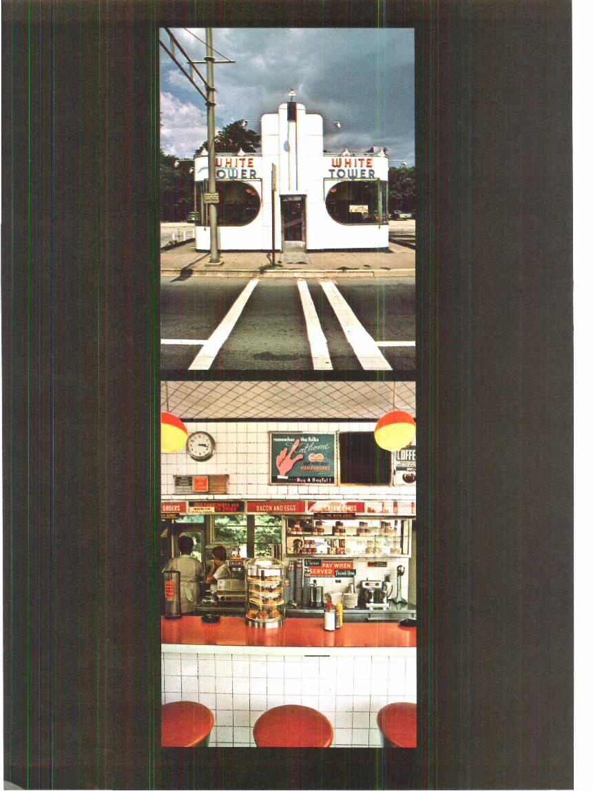
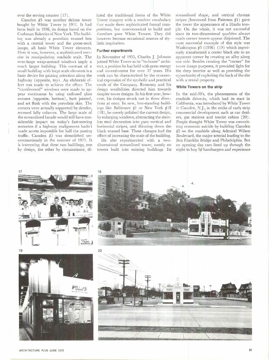
over the serving counter ( 17) . Camden #5 was another deluxe tower
bought by White T ower in 1941. It had been buil t in 1936, its design based on the Cushman Bakeries of New York. T he building was already a porcelain enamel box with a central tower and the goose-neck lamps, a ll basic White T ower elements. Here it was, however, a sophisticated exercise in manipu lating roadside scale. T he o, ·er-large wrap-around windo\1·s imply a much larger building. T his contrast of a small bui lding with large scale elements is a basic device for gaining attention along the highway (opposite, top) . An elabora te effor t was made to achieve the effec t. The "cantilevered" windows were made to appear con tinuous by using radiusec1 glass corners (opposite, bottom ) , butt jointed, and set flu sh with the porcelain skin . T he corners were actually supported by slender, recessed !a lly columns. The large scale of the streamlined facade would still have considerable impact on today' s fast-moving motorists if a highway realignment hadn' t made access impossible for half the passing traffic. Camden #5 was demol ished unceremoniously in the summer of 197 1. I t is interesting that these two buildings, one by design, the other by circumstance, di-
17
19
ARCH ITECTURE PLUS JUNE 1973
luted the traditional forms of the White T ower imagery with a modern vocabul ary that made them sophisticated formal compositions, but uneconom ical to build and therefore poor White Towers. T hey did however become occasional sources of stylistic insp ira tion .
Further experiments
In November of 1935 , Charles J. J ohnson joined White Tower as its "in-house" architect, a position he has held with great energy and inventiveness for over 37 years . H is work can be characterized by the economical expression of the symbolic and practical needs of the Company. Economy and h is design sensibilities di rected him towards simpler tower designs. In his fi rst year, however, his designs struck out in three d irections at once. In new, free-standing buildings like Baltimore #1 or New York #18 ( 18 ) , he merely polished the current design, by enlarging windows, abstracting the stainless steel decoration into pure vertical and horizontal stripes, and thinning down the black enamel base. T hese changes had the effect of increasing the scale of the building.
He also experimented with a twod imensional streamlined tower, mostly on towers built into existing buildings. I ts
18
20
streamli ned shape, and vertical chrome stripes (borrowed from Paterson #1) gave the tower the appearance of a Hindu temple. O n the whole, it was not successful since its two-dimensional qualities always made corner towers appear disjointed . T he most successful example of this style was Washington #3 ( 1936 ) ( 19) which ingeniously transformed a center block site to an apparent corner by creating an alley aiong one side. Besides creating the "corner" for tower image purposes, it provided light for the deep interior as well as providing the opportunity of exploiting the back of the site with a rental property.
White Towers on the strip
In the mid-30's, the phenomenon of the roadside drive-in , which had its start in California, was introduced by White T ower in Camden , N.J., in the midst of early strip commercial development such as car dealers, gas sta tions and tourist cabins ( 20 ) . People thought White T ower was committing economic suicide by building Camden #2 on the roadside along Admiral Wilson Boulevard, the major arterial leading to the Ben Franklin Bridge and Philadelphia. But on opening day cars lined up through the night to buy 5¢ hamburgers and experience
51

this taste of the streamlined fu ture. These roadside towers had a new sym
metrical design similar to Camden #5 with large, wrap-around windows and a stepped tower over the central doorway. The buildings were kept close to the road so they could act as signs. Although the windows were over-large and the building form simple, the large scale achieved in Camden #5 with over-large windows and normal sized door, was lost somewhat in the roadside towers by increasing the door height to line up horizontally wi th the windows and by making the tower disproportionately smal l. The resulting smaller scale reduced the building's impact at 40 mph and called for a change in approach from symbols and large scaled openings, to symbols and signs.
T he problem of visibility on the strip was resolved in two deluxe roadside restaurants built in 1938. The first, Camden #3, was built directly across the road from Camden #2 and called "Marbett's" to avoid direct competition (2 1) . It was a sizable porcelain rectangle, with horizontal windows and a cantilevered curving canopy of stainless steel supporting the concealed exterior lamps. T his horizontal, a basic stylistic element of drive-ins, was a break with the tradit ional form of the White Towers. The tower was no longer a symbol but a signpost,
21
22
52
with the addition of a streamlined cantilevered high reader sporting neon decoration and advertising "restaurant" (22). The building sat in a sea of asphalt and was serviced by an army of jauntily uniformed car hops and supervisor equipped with rollerskates. The facade of Marbett's and its twin in Silver Spring, Maryland, was eventually covered with all sorts of signs, applied and illuminated . T he building was a sign, a signpost and the image of speed and modern ity ( 23). The implied motion of Silver Spring # 1 's streamlining makes it seem the speediest machine in the parking lot ( 24 ) . Unfortunately, the deluxe White Tower failed economically where it succeeded visually. The country just wasn't ready for the 10¢ hamburger.
Variations on deluxe towers
Johnson had time for one more experiment before the war brought an end to new construction. At Washington #2A ( 25 ) he abstracted and simplified the deluxe tower themes to a fine edge. The windows were en larged and the frames diminished and painted out, giving a big scale and curtain wall openness to the long wall. Stainless steel trim was concentrated in the bold horizontal cantilevered overhang (borrowed directly from the deluxe restaurants), which con-
23
tains recessed down spots and makes emphatic the division between the windows and doors below, and the porcelain enamel and tower above. The tower, a very different broad squat block, was really a tower within a tower because of the large 'white tower' sign set in relief at the comer. The le tters were large, about 3 fee t high, and made of white porcelain enamel with narrow black channels giving them an illuminated quality (opposite) . In the 50's the sign on Washington #2A became even more dramatic when the letters were formed out of tripled tubes of red neon.
T he towers built just before and just after the war reverted to the standard asymmetrical corner tower theme. The tower was essentially a plain block with no decoration or graphics ( 26) . The facades were smooth porcelain planes, broken only by the one "White Tower" sign above the window. When old brick towers like Detroit #6 ( 1946) were covered with porcelain, their planar austerity was reminiscent of the original 1926 building, M ilwaukee # 1. Except for their la rger windows and occasional stainless steel bands, it was almost impossible to tell the new from the remodeled. This fact helped unify the "White Tower" image among the various towers, some of them nearing their 20th birthdays.
25
26
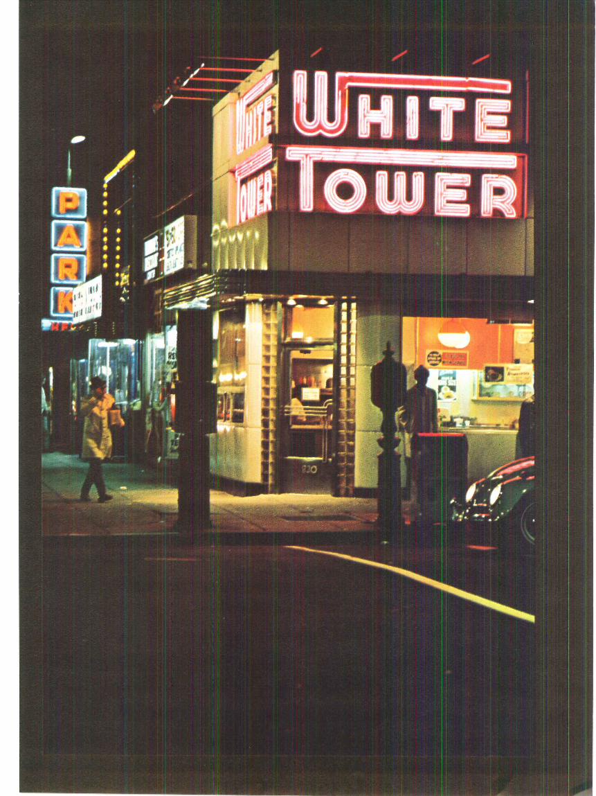
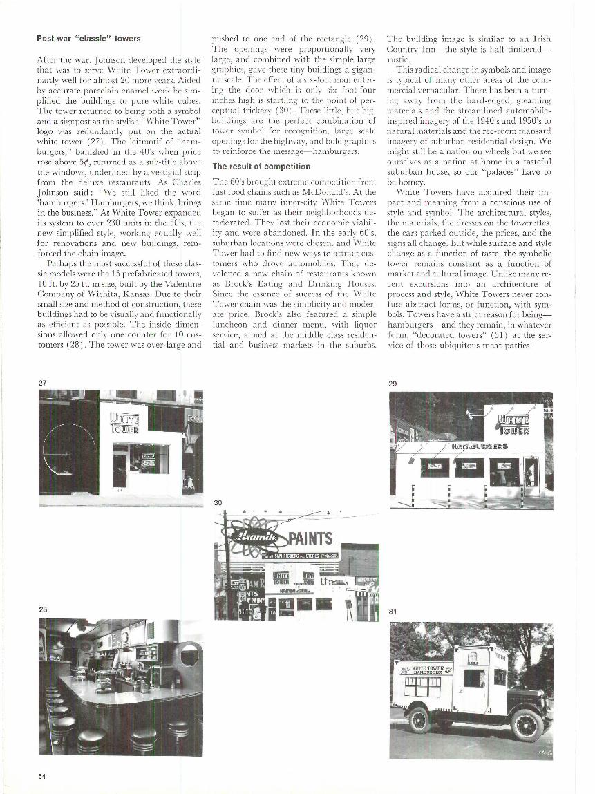
Post-war "classic" towers
After the war, Johnson developed the style that was to serve White Tower extraordinarily well for almost 20 more years. Aided by accurate porce lain enamel \vork he simp lifi ed the bui ldings to pure white cubes. The tower returned to being both a symbol and a signpost as the stylish "White Tower" logo was redu ndantly put on the actual white tower (27 ) . The le itmotif of "hamburgers," banished in the 40' s when price rose above 5¢, returned as a sub-title above the windows, underlined by a vestigia l strip from the del uxe restaurants. As Charles Johnson said : "We still liked the word 'hamburgers.' Hamburgers, we think, brings in the business." As White Tower expanded its system to over 230 units in the 50's, t''. e new simplified style, working equa lly well for renovations and new buildings, reinforced the chain image.
Perhaps the most successful of these classic models were the 15 prefabricated towers, 10 f t. by 25 ft. in size, built by the Valentine Company of Wichita, Kansas. Due to their small size and method of construction, these buildings had to be visually and functionally as efficient as possib le. The inside dimensions alloll'ed only one counter for 10 customers ( 28) . The tower was O\'er-la rge and
27
-
28
54
pushed to one end of the rectangle ( 29) . The openings ll'ere proportionall y very la rge, and combined with the simple large graphics, gave these tiny buildings a gigantic scale. T he effect of a si:--;-foot man entering the door which is only six foot-four inches high is startling to the point of percep tua l trickery ( 30 ) . These little, but big. bui ldings are the perfect combination of tower symbol for recognition, large scale openings for the highway, and bold g raphics to re inforce the message-hamburgers.
The result of competition
The 60's brought extreme competit ion from fa st food chains such as McDonald's. At the same time many inner-city White To,1·ers began to suffer as their neighborhoods dete rio rated . They lost their economic viability and were abandoned. In the early 60's, suburba n locations were chosen, and White Tower had to find new ways to att rac t customers who drove automobiles. T hey de,·eloped a new cha in of res taurants kno,1·n as Brock's Eating and Drinking Houses. Since the essence of success of the \Vh ite Tower chain was the simplicity and moderate price, Brock's a lso featured a simple luncheon and dinner menu, with liquor service, a imed at the m iddle class residential and business markets in the suburbs.
30 .. • 1!:""'"'~"'~~7<>=-____ -
The building image is similar to an Irish Country Inn-the style is half timberedrustic.
This radical change in symbols and image is typical of many other areas of the commercia l vernacula r. There has been a turning away from the hard-edged , gleaming materials and the streamlined automobileinsp ired imagery of the 19.+0's and 1950's to natural materials and the rec-room mansard imagery of suburban residential design . We might still be a nation on wheels but we see ourselves as a nation at home in a tasteful suburban house, so our "palaces" have to be homey.
W hite Towers have acquired their impact and meaning from a conscious use of style and symbol. The architectural styles, the materia ls, the dresses on the towerettes, the cars parked outside, the prices, and the signs a ll change. But while surface and style change as a function of taste, the symbolic tower remains constant as a function of market and cultural image. Unlike many recent excursions into an architecture of process and style, White Towers never confuse abstract forms , or function , with symbols. Towers have a strict reason for beingham burgers-and they remain , in whatever form, "decorated towers" (31 ) at the service of those ubiquitous meat patties.
29
J
31

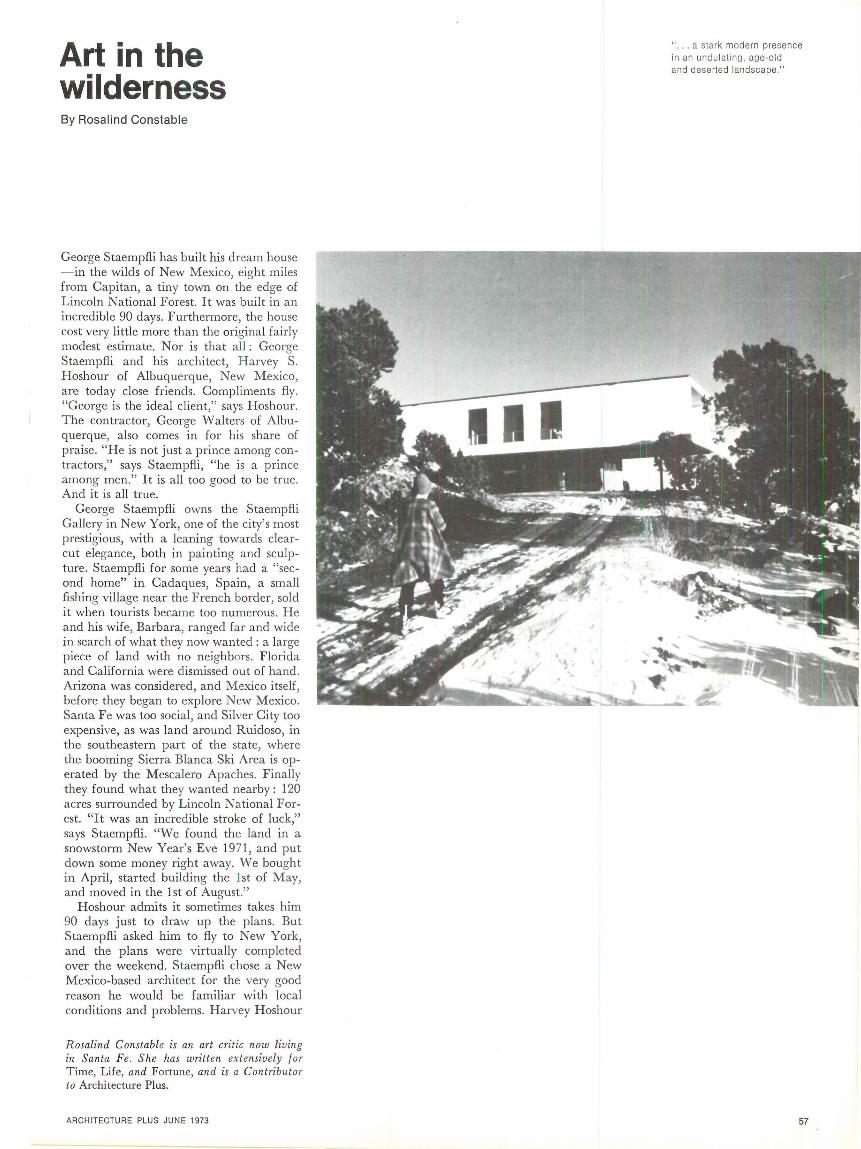
Art in the wilderness By Rosalind Constable
George Staempfli has built his dream house - in the wilds of New Mexico, eight miles from Capitan, a tiny town on the edge of Lincoln National Forest. It was built in an incredible 90 days. Furthermore, the house cost very little more than the original fairly modest estimate. Nor is that all: George Staempfli and his architect, Harvey S. Hoshour of Albuquerque, New Mexico, are today close friends . Compliments fly. "George is the ideal client," says Hoshour. The contractor, George Walters of Albuquerque, also comes in for his share of praise. "He is not just a prince among contractors," says Staempfli, "he is a prince among men." It is all too good to be true. And it is all true.
George Staempfli owns the Staempfli Gallery in New York, one of the city's most prestigious, with a leaning towards clearcut elegance, both in painting and sculpture. Staempfli for some years had a "second home" in Cadaques, Spain, a small fishing village near the French border, sold it when tourists became too numerous. He and his wife, Barbara, ranged far and wide in search of what they now wanted: a large piece of land with no neighbors. Florida and California were dismissed out of hand. Arizona was considered, and Mexico itself, before they began to explore New Mexico. Santa Fe was too social, and Silver City too expensive, as was land around Ruidoso, in the southeastern part of the state, where the booming Sierra Blanca Ski Area is operated by the Mescalero Apaches. Finally they found what they wanted nearby: 120 acres surrounded by Lincoln National Forest. "It was an incredible stroke of luck," says Staempfli. "We found the land in a snowstorm New Year's Eve 1971, and put down some money right away. We bought in April, started building the 1st of May, and moved in the 1st of August."
Hoshour admits it sometimes takes him 90 days just to draw up the plans. But Staempfli asked him to fly to New York, and the plans were virtually completed over the weekend. Staempfli chose a New Mexico-based architect for the very good reason he would be familiar with local conditions and problems. Harvey Hoshour
Rosalind Constable is an art critic now living in Santa Fe. She has written extensively for Time, Life, and Fortune, and is a Contributor to Architecture Plus.
ARCHITECTURE PLUS JUNE 1973
111
. a stark modern presence in an undulating, age-old and deserted landscape."
57

58
was recommended and, says Staempfli, "very soon after seeing his own clean house I asked him if he wanted to do ours. Luckily he had time, and it worked out very well."
"We wanted a house just as large as our apartment in New York," says Staempfli. "Two bedrooms, two bathrooms, and a big living room." What he got is best described (by Staempfl.i himself ) as a matchbox on stilts. The main house ( 72 feet long by 24 feet wide ) is built of stucco over wood, and is balanced on a concrete block, the extremities supported on steel I -beams. The concrete block yielded a bonus, at almost no extra cost, of two rooms, one of them now a utility room. "Picture windows," uniformly 7 feet by 5 feet, frame the last ridges of the Rocky Mountains to the north, the Sierra Blanca to the south.
Harvey Hoshour comes by his "purity" through having worked first with Harry Weese, then with Mies van der Rohe in Chicago, and with I. M. Pei in New York. In 1962 he left New York and, accompanied by a pretty French bride, moved to Albuquerque. But Hoshour himself attributes his "purity" to his Pennsylvania Dutch ancestry. "I come from a long line of Lutheran ministers, which is why I am such a pure architect," he says only half-jokingly. The glass, steel and concrete structures (office buildings, small branch banks, private houses) he has designed since moving to Albuquerque have earned him both prizes and criticism from adobe-oriented New Mexico. Ironically, Hoshour himself lives in an adobe house, an old farmhouse which he remodeled, the pure white walls of the interior constructed and finished by hand by Indians from nearby Santa Ana Pueblo. The entire furniture of the large living room consists of four Mies van der Rohe (Brno) chairs and a Mies van der Rohe glass table.
Not surprisingly, Hoshour tries to persuade his clients to preserve the purity of his architecture by keeping furnishings to a minimum. But Staempfl.i was determined to furnish h is house to his liking. "I had no intention of living with four chairs and a table," he says. As a result there was, for example, a slight hassle over the kitchen stove. Hoshour had selected an electric stove of exquisite simplicity. But it did not have a self-cleaning oven, which Staempfl.i insisted on. So he chose one himself. When

SECTION
0
PLAN 10
ARCHI TECTU RE PLUS JUNE 1973
20'
The contrast between new and primitive is seen not only in th e house but in its furnishings. Left above, looking southwest from the sta ir hall towards the Sierra Blanca mountains. Left below, next to a prefabricated fireplace, Staempfli's co llection of ce remonial clubs and paddles from South Pacific is lands. On th is page , simple cabinetwork hous ing West African wood carvings , con temporary bronzes and carved uchus from the Sa n Blas Islands .
59
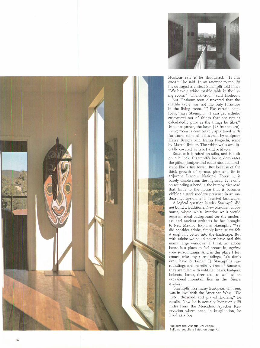
60
Hoshour saw it he shuddered. "It has knobs!" he said. In an attempt to mollify his outraged architect Staempfli told him : "We have a white marble table in the living room." "Thank God!" said Hoshour.
But Hoshour soon discovered that the marble table was not the only furniture in the living room. "I like certain comforts," says Staempfli. "I can get esthetic enjoyment out of things that are not as calculatedly pure as the things he likes." In consequence, the large (23 feet square) living room is comfortably splattered with furniture, some of it designed by sculptors Harry Bertoia and Isamu Noguchi, some by Marcel Breuer. The white walls are liberally covered with art and artifacts.
Because it is raised on stilts, and is built on a hillock, Staempfli's house dominates the pinon, juniper and cedar-studded landscape like a fire tower. But because of the thick growth of spruce, pine and fir in adjacent Lincoln National Forest it is barely visible from the highway. It is only on rounding a bend in the bumpy dirt road that leads to the house that it becomes visible : a stark modern presence in an undulating, age-old and deserted landscape.
A logical question is why Staempfli did not build a traditional New Mexican adobe house, whose white interior walls would seem an ideal background for the modern art and ancient artifacts he has brought to New Mexico. Explains Staempfli: "We did consider adobe, simply because we felt it might fit better into the landscape. But with adobe we could never have had this many large windows. I think an adobe house is a place to feel secure in, against your surroundings. And in this place I feel secure with my surroundings. We don't even have curtains." If Staempfli's surroundings are mercifully free of humans, they are filled with wildlife: bears, badgers, bobcats, hares, deer etc., as well as an occasional mountain lion in the Sierra Blanca.
Staempfli, like many European children, was in love with the American West. "We lived, dreamed and played Indians," he recalls. Now he is actually living only 25 miles from the Mescalero Apaches Reservation where once, in imagination, he lived as a boy.
Photographs: Annette Del Zappa. Building suppliers listed on page 72.
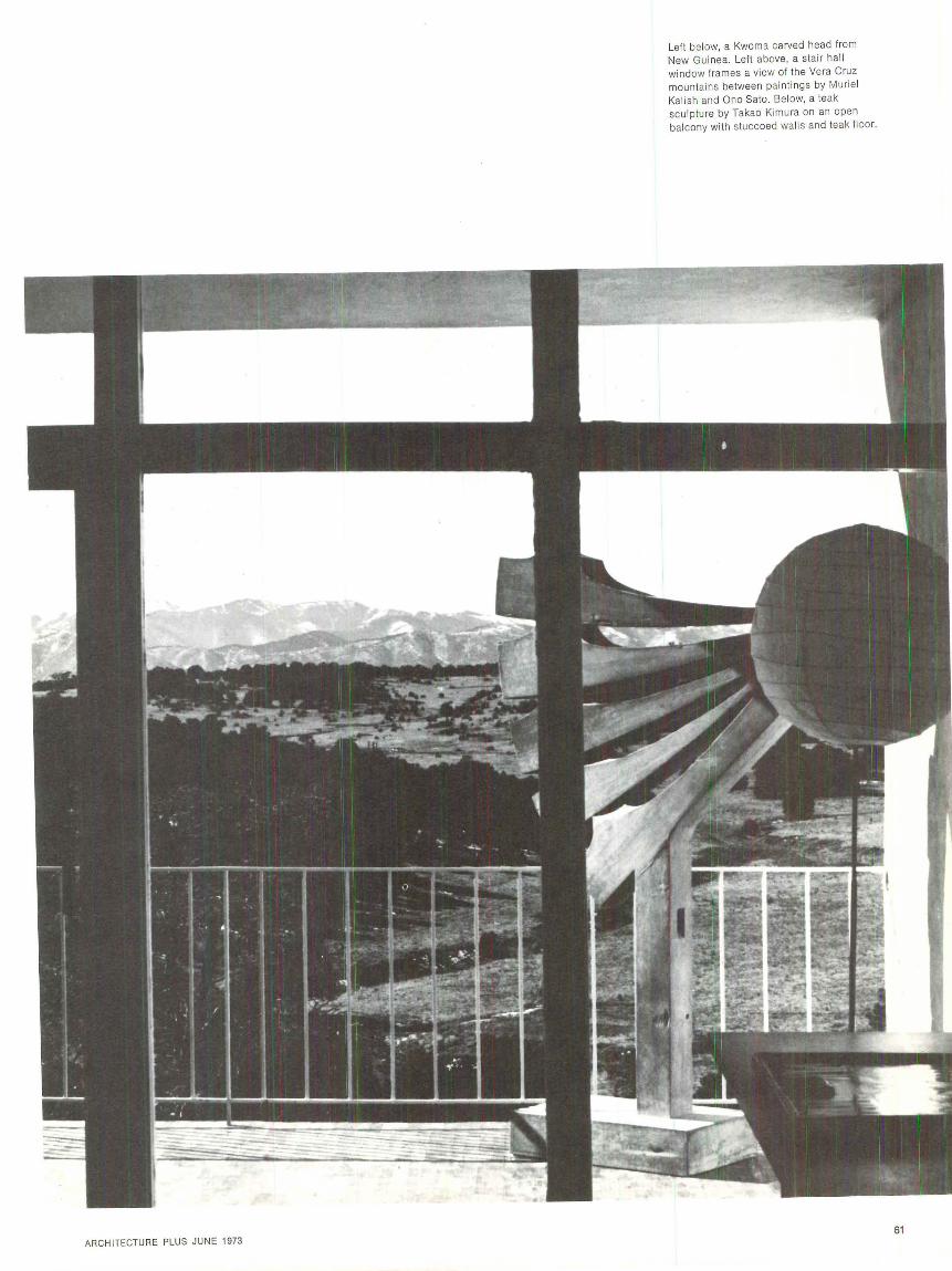
ARCHI TECTURE PLUS JUNE 1973
Left below, a Kwoma carved head from New Guinea. Left above, a stai r hall window frames a view of the Vera Cruz mountains between paintings by Murie l Kalish and Ono Sato. Below, a teak sculp ture by Takao Kimura on an open balcony with stuccoed walls and teak fl oor.
61

news+ continued from page 13
62
Glass partitions and fluorescent cei ling lights create prisms
Prisms in Wall Street A new branch of the Dresdner Bank (a wholesale, as opposed to a retail, bank) has opened in New York City's financial district.
The lighting system is the most important element of the design concept. It harmonizes with the mu] ti-angled perimeter shape of the space and emphasizes its uniqu eness. The angle is strongly articulated by means of continuous, regularly spaced, flush troughs of fl uorescent ligh ting.
All interior partitions stop 4Y2 ft . below the ceiling. Where privacy is essential, clear glass without mullions continues the parti-
tion to the ceiling. This solution has the double effect of not interrupting the clear view of the lightpatterned ceiling, and of creating a prismatic effect-a result of the diagonal lighting pattern crossing the right-angled grid of glasstopped partitions-with a startling visua l impact.
The colors are simple and subtle: off-white through gray to small accents of black. Designers: Interior Concepts, Inc. of N.Y.
"Five into Three," a sculpture eight feet tall and 27 feet long, of brushed aluminum, is by the New York artist, Tania.
Argentine stadium The winning entry in the competition for a sports stadium, held by the City of La Plata, Argentina, was submitted by a team of three architects: Antonio Antonini, Gerardo Schon and Eduardo Zemborain.
The project requirements included meeting International Soccer Federation guidelines, and flexibility, allowing the grandstand to be divided into two sections for spectacles of lesser magnitude.
The covered section consists of a continuous graded area 63m. by 160m.
The roof is a suspension type metal structure, projecting 21m. in both directions.-L. A.
What are you working on these days-Monticello? Have you been secretly envying Perry, Shaw and Hepburn their commission to restore Wi ll iamsburg? Now you can build the Governor's Palace yourself. Or the White House. Or Mont icello.
Several Williamsburg model kits, in cardboard, at 1/s" = 1 ', are available from Freund Enterprises, P.O. Box 800, Brooklyn, N.Y., 11202, for as little as $3.65. And for even less money, at the scale of ~fo" = 1', Monte Enterprises, P.O. Box 2391, New Bern, N.C., 28560, offers the Robie house, the R enwick Gallery, an d others mentioned above. If you're really ambitious (or absolutely out of 1rnrk ), Monte can supply you with the 13-building village crossroads of Cooperstown, N.Y.
Gove rn or's pa lace
White House
Monticello

The main facade restored Interior, bank offices
Reynolds Metals Company 1973 design prizes The bombed-out and burned shell of a Renaissance-style railway station in Braunschweig, West Germany, has been handsomely reconstructed for use as bank offices; and its designer, Hannes Westermann, has won the 1973 R. S. Reynolds Memorial Architecture Award of an original aluminum sculpture (by Richard Hunt of Chicago) and $25,000. The award is given annually for "a distinguished architec tural design in which a significant use is made of aluminum."
The jury, consisting of Max 0. Urbahn, past president of the AIA, Worley K . Wong of San Francisco, and Willi Walter of Zurich ( last year's winner) praised the German architect for "the sensitive way in which he restored the classic railway building for a useful purpose, as offices of Norddeutsche Landesbank."
A prefabricated solar living unit has won for its designers the Reynolds award of $5,000, given annually to architecture students "for the best original architectural design in which creative use of aluminum is an important contributing fa ctor."
The winners, Raymond D. Snowden and Steven Lee Kinzler, both fifth-year students, will share the
AR CHITECTURE PLUS JUNE 1973
prize money with their school, the University of Arkansas.
The students' solar mechanical system utilized thin aluminum bonded to transparent plastic to form concave mirrors reflecting the sun 's rays into a solar collector.
Santiago's new town The Chilean Government, in a joint effort with the International Union of Architects, last year sponsored a design competition for a most ambitious project-the total redevelopment of 25 hectares of downtown Santiago, capital of Chile.
The first prize was won by a team from Argentina: Architects Enrique Bares, Santiago B6, Tomas Garcia, Roberto Germani and Emilio Sessa. Design problems included the integration of public areas, housing structures, parking facilities, some green area, commercial and office spaces into one complex with half the area committed to housing. In addition, commercial and public spaces had to be sufficient to serve the entire ci ty.
A major artery-Norte-Sur Avenue-bisects the center of the town, and a double perimeter-ring of vehicular circulation circum-
scribes and defines the pedestrian zone. Interior streets are only for services and access to parking areas. The pedestrian walks, separated from vehicle roads, are on two levels : one 5,60m. high connecting the public areas, and the other 3,00m. high giving access to the residential buildings.
The living units are con tained in towers of 21 floors and walk-ups
India design competition
of four floors. All housing is located in four sections near the center of the complex.
Commercial and government offices are found in a band of buildings.-L. A.
Rumor has it that several submimons from the U.S. were "passed over" on ideological grounds by a jury made up largely of Cuban and Chilean judges.-Ed.
The all-India middle-income hous- ment Design Facility (Mathur, ing competition was concluded in Pereira, Gan ju and Bhan); and the Apri l. Staged by the Delhi Devel- K alkaji th ird prize winn er, Suresh opment Authority on the truly re- Goel & Associates. markable initiative of its vice-chair- Commendable as were the efforts man, Mr. Jag Mohan, this design of both the DDA and the prize-wincontest drew a great number of ni ng entrants, the fact remains that entries, not only from all over India the 5,000 rupee purchase price is but from Indians working in the strictly a middle income figure, at U.K., the U.S. and elsewhere. least five times as much money as
Three sites were given to the 40 percent of the Indian population competitors, and each had its own ca n afford. What India needs, in range of prizes. The largest site was order to solve the housing probDilshad Garden ( 35 acres); the !ems of lower income groups, is next was Malviya Nagar (22 accommodations which will not acres ); and the smallest was Kai- cost more than $100 for each famkaj i ( 16 acres). The entrants were ily. And $100, alas, will not even asked to submit integrated layout purchase brick and concrete for a plans, including parks, shops and simple dwelling. All we can afford playgrounds. The housing units here are patterns of sites and serwere to vary in size from 25 sq .m. vices. But perhaps Jag Mohan will to 60 sq.m.; and in cost from 5,000 make this problem the basis of the to 20,000 rupees ($700 to $2,800). next DDA competition.-C. C. Since the densities specifi ed in the The Consulate of India in Wash-residential areas were in the range ington explains that the "purchase of 280 persons per acre, most of the price" of the housing built by the winn ing schemes were reasonably government, such as those de-clever lowrise high-density solu- scribed above, buys a 99 -year lease tions. Shown are two of the win- on the unit; the government re-ners, both from the Kalkaji site: tains ownershijJ of the land, and Kalkaji 2nd p~·ize winn er, Environ- eventually reclaims the dwelling.
Third prize, Kalkaji scheme, Suresh Goel, architect
Second prize, Kalkaji scheme , Environment Design Facility, architects
63
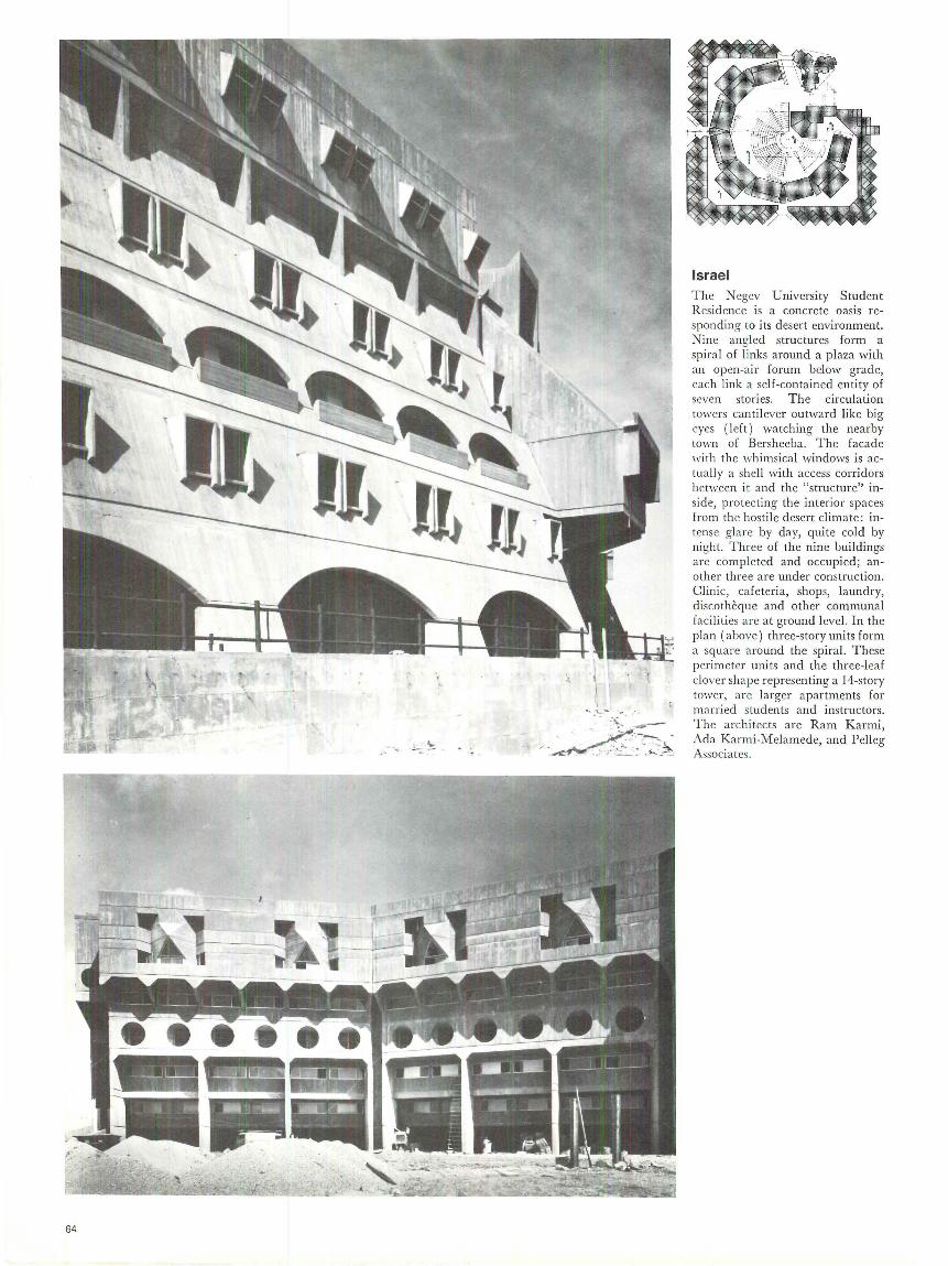
64
Israel The Negev University Student Residence is a concrete oasis responding to its desert environment. Nine angled structures form a spira l of links around a plaza with an open-air forum below grade, each link a self-contained entity of seven stories. The circulation towers cantilever outward like big eyes (l eft) watching the nearby town of Bersheeba. The facade with the whimsical windows is actually a shell with access corridors between it and the "structure" inside, protecting the interior spaces from the hostile desert climate: intense glare by day, quite cold by night. Three of the nine buildings are completed and occupied; another three are under construction. Clinic, cafeteria, shops, laundry, discotheque and other communal facilities are at ground level. In the plan (above) three-story units form a square around the spiral. These perimeter units and the three-leaf clover shape representing a 14-story tower, a re larger apartments for married students and instructors. The architects are Ram Karmi, Ada Karmi-Melam ede, and Pelleg Associates.
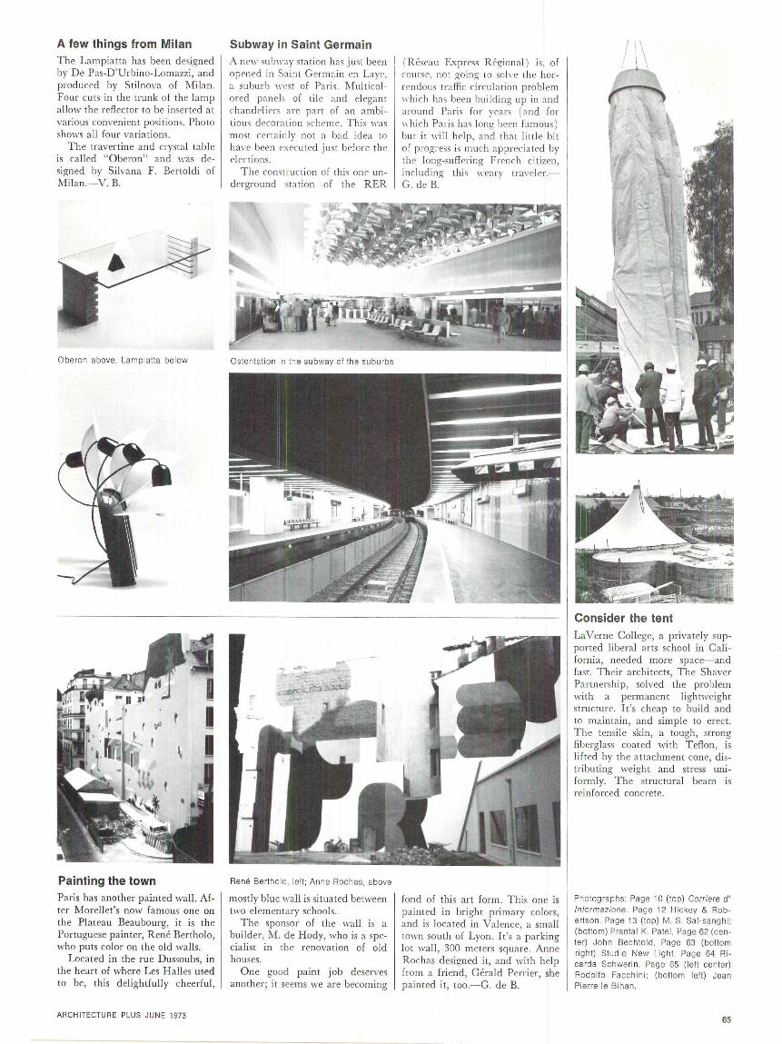
A few things from Milan The Lampiatta has been designed by De Pas-D'Urbino-Lomazzi, and produced by Stilnova of Milan. Four cuts in the trunk of the lamp a llow the reflector to be inserted at various convenient positions. Photo shows all four variations.
The travertine and crystal table is ca lled "Oberon" and was designed by Silvana F. Bertoldi of Mi lan. - V. B.
Oberon above, Lampiatta below
Painting the town Paris has another painted wal l. After Morellet's now famous one on the Plateau Beaubourg, it is the Portuguese painter, Rene Bertholo, who puts color on the old walls.
Located in the rue Dussoubs, in the hear t of where Les Halles used to be, this delightfully cheerful ,
ARCH ITECTURE PLUS JUNE 1973
Subway in Saint Germain A ne11· sub11·ay sta tion has jmt been opened in Saint Germ ain en Laye , a suburb wes t of Paris. Multi colored panels of til e and elegant chandeli ers are part of an ambitious decora tion sc heme. This 11·as most certa inly not a bad idea to
ha,·e been execu ted just before the elec ti ons.
The construction of this one underground station of th e RER
Rene Be rtho lo , left; Anne Rochas, above
most ly blue wall is situated between two elementary schools.
The sponsor of the wall is a builder, M. de Hody, who is a specia list in the renovation of old houses.
One good paint job deserves another; it seems we are becoming
( Reseau Express R egional ) is, of course, not going to so h-e the horrendou s traffic circulation problem 1d1ich has been build ing up in and around Paris for yea rs (and for 1d1ich Par is has long been famou s) but it will help, and that littl e bit of progress is much appreciated by thP long-suffer in g French citizen, including thi s m '•a ry traveler.G. de B.
fond of this art form. This one is painted in bright primary colors, and is located in Va lence, a small town south of Lyon. It's a parking lot wall , 300 meters square. Anne Rochas designed it , and with help from a friend, Gerald Perrier, she painted it, too.-G. de B.
LaVerne Coll ege, a privately supported li beral arts school in California, needed more space--and fa st. Their architects, The Shaver Partnership, solved the probl em with a permanent lightweight structure. It's cheap to build and to mainta in , and simple to erect. The tensile skin, a tough, strong fiberglass coated with Teflon, is li fted by the a ttachment cone, distributing weight and stress uniform ly. The structural beam is reinforced concrete.
Photographs: Page 1 O (top) Corriere d' lnformazione. Page 12 Hickey & Robertson. Page 13 (top) M. S. Sal-sanghi; (bottom) Prantal K. Patel. Page 62 (cente r) John Bechtold. Page 63 (bottom right) Studio New Light. Page 64 Ricarda Schwerin . Page 65 (left cente r) Rodolfo Facchini ; (bottom left) Jean Pie rre le Bihan .
65
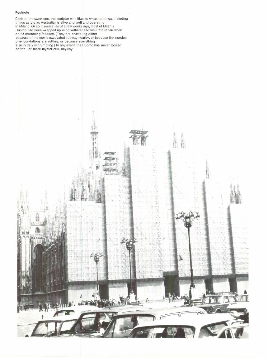
Footnote
Christo (the other one, the sculptor who likes to wrap up things, including things as big as Australia) is alive and well and operat ing in Milano. Or so it seems ; as of a few weeks ago, most of Milan's Duomo had been wrapped up in polyethelene to facilitate repair work on its crumbling facades. (They are crumbling either because of the newly excavated subway nearby, or because the wooden pile-foundations are rotting, or because everything else in Italy is crumbl ing .) In any event, the Duomo has never looked better-or more mysterious, anyway.
Letters
E ll en Leopold 's article on th e 7-t 7 was \·cry interesting and informative . It be longs in your fine thoughtprornking magazine . But she must not draw concl usions that doll"ngracle the architectural profession withou t doing a meaning ful study o f archi tec tural design as practi ced by large a rchitec tural firm s. She \1·ou ld be surprised at the compute ri zed techniques tha t are emp loyed in ana lyzing, stru ctural design, a nd specification writing. But the prac ti ce of architecture is more than ad vanced technology. Too oft en our people, after studying at length in our a rchit ectural schools, emerge with a masters degree in " non-architecture." They often beco me advocates of mechani cal systems and technology as the means for reso lving all of socie ty's d esign problems. Shelter for people is more than an assembly of minimum Ii f e-support systems. Wh en Pan American wants a single airl in e termina l building to be erected to enhance and serve an existing community of people it selects an experi enced architectural firm to design th e project. The result is wha t we call "a rchitecture. " The difference between architecture and engin eering should be understood by our journalists and it doesn' t help to clarify the issue by suggcstin~
that beca use the 747 is wonderful architects shou ld be replaced by engin eers. HOWARD B. CAIN Architect, Cleveland
I have read with great pl easurc your handsome first issue of Architecture PLUS. You shou ld be very proud of this accomplishm ent. I wish I could think of some criticism to pass on, but you ha\·en't left m e any opportunities.
Mrs. Miller and I look forward to enjoying future issues . IRWIN ~!ILLER
Cha irman, Cummins Engine Co . Inc. Co lumbus, Ind.
I wonder if you have the courage to publish my eva luation of Architecture PLUS, which na turally is of greate r use in your pages than in a ny of the other American a rchitectural magazines . . . .
If your publication continues only to exhibit the exhibitionists, it
ARCHITECTURE PLUS JUNE 1973
11·ill , in my opinion, commit suicid e and co nt ribute to the d ea th of the nobl e art of architecture.
Why can ' t you return to exampl es of tom1 planning and buildings shaped by basic human values'
Why not publish exa mples where harmony, protection, enclosure, \·iew, orien tation, materials, function , econo my and adaptation to th e existing environment arc th e dominant factors ;i
\Vhy not show examples by unknown , anonymous archit ects, exa mples chosen by non-architects? HA NS ASPLU N D Professo r of Architecture U ni1·ersit y o f Lund, Sweden
JI! hy not, indeed ;i ( For an example, see I he JI! hite T ower article in I his issue.)-Ed.
Wh y The Pop'
With toil et tissue , you skirted the ! SSU C
Of the tall es t Boston topic , \Ve're 1rnndering ll"h ethcr your
ne11·s editor H as spent the past year in the
tropi cs. The Hancock Tower H as gone q uite sour vVe thought we'd just let you know, For by th is poem , \/\/ e hope to show 'em \>\That 11·as tota ll y omitted From your report.
Wh y th e pop' ! At the Hancock Toll"e r. Why th e pop ;i ! It's a real glass shower. You've clone no service just made
us more nervous at the sight , It 's the Plywood Palace, Not \l\/onderland, Ali ce, It's a God dam sham e. \V c' re im·o lved, \ ·V c' rc the local gen try, \/\/ c' re concerned For the shiny Lower. Please tell us soon that the truth is
near at hand, 'Cause, Peter, we' re a t the bottom, Why the pop'! VIUIA BARR Cambridge, i\lass.
For detailed comment on the Boston J ohn Ha ncock To wer, see the AjJril 1973 issue, page 76.- ED.
I heartil y agree ll"ith Editor Blake's opening sen tence in his editorial: " ... thi s \1· i!l be a magazine tha t interprets a rchitecture in the broades t possible sense-geographica ll y, conceptual! y, technologica lly,philosophica lly." Yes, indeed . MAURICE LAVANOUX
New York
As a "collaborator" listed on the masthead of the original Plus, I was d eligh ted to receive the new Architecture PLUS . W hen the original Plus arrived in December 1938 as a supplement to the Archi-
tcctu ral F arum it opened up to me the wealt h and sophi st ica tion of 11·orld architec ture a nd th e relation of a l I the a rts to our own art. It was sad that the origina l Plus had to fold a fter three issues but I suppose th a t this is often th e fate of a good idea born before its time.
I believe that with the auspicious first ed ition of Architecture PLUS it is off to a flying start wh ich will ca rry forward its a im s a nd ideals for many years to com e. HARRIS AR~ l ST R0='1 G
Architect, St. Loui s
In m y experience I have perused many, man y architec tural magazines, but I cannot remember an issue as interesting as the March 1973 issu e of Archit ecture PLUS. ROBERT E. SPAULDING Archit ec t, ~It. Prospect, I ll.
In response to my article on the Niagara competiti on in your April issue, I have recei\·cd tll"O letters requesting that furth er credits be given. The submiss ion attributed to Paul Willen should have been attributed equally to him and to Virendra Girclhar. The subm ission attributed to Russe ll C. Lewis was actually a team effort by his group, Planning Research Organization for a Better Environm ent (PROBE), the other m embers of which are Willi am Ahlstrom , Mark Attwood, Paul C hu Lin, and T ed Nolte. CHA RLE S HILGEN H U RS T
New York State Urba n Development Corporation
Cancel my subscription- I'm already non-plussed with PLUS for its hand ling of an A-plus building ( re. Boston City Ha ll ) . Do you really 1rnnt to ca ter to the " untra in ed eye"? There a rc som e remarkabl e successes in Miami and Disneyl and. CHARLES H. WHEELE R Arch itect, Paris
P.S. If you publish my letter, don't cancel my subsc ript ion as I won't get to sec it.
I am most gratified at the universa lity to 11·hich PLUS is committed. I have read the lette rs from your readers and have to agree with th em that Archi tec ture PLUS fill s a Jong recognized void. It is like Architect ural R eview, Architecture Aujourd'h ui, and fa/Jan Architect all roll ed up into one .... It already appea rs to m e to be the number on e a rch itec tural -urban journal in the \1·orld . C HARLE S A. BLESS ING Di rector-Secretary City Plan Commission, Detroit
Congrat ulations! I have just seen Architecture PLUS. Looks like a grea t potentia l for a truly international flavor. .J AMES M. S l!ILSTONE Pres ident , A rchitectural Concrete Consultants Dallas, Texas
Errata: We regret the misspelling in our April issue of the names of Guatemalan architects Jose and Raul Minondo.
VOLCLAY® PANELS ALL BENTONITE
FOUNDATION WATERPROOFING FOR CONCRETE WALLS-UNDER SLABS
Effective-Economical Install with ease in all seasons
Performance proven on major projects Coast to Coast Service
Subway System, Washington, D.C . Deleuw, Cather & Company, General Engineering Consullant
For information call or write:
AMERICAN COLLOID COMPANY Building Materials Division
5100 SUFFIELD COURT SKOKIE, ILL 60076 Area: 312-583-0400
READER SERV ICE NUMBER 180 67
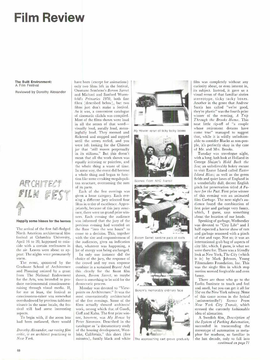
Film Review
The Built Environment: A Film Festi val
Reviewed by Dorothy Alexander
Happily some hisses for the heroes
T he arrival of the first full-fledged North American architectural film fes tiva l at Columbia University, Apri l 16 to 20, happened to coincide with a certa in restlessness in the air. Leaves were about to appear. T he nights were prematurely warm.
T he event, sponsored by the Graduate School of Archi tecture and Planning assisted by a grant from The National Endowment fo r the Arts, was in tended to produce environmental consciousnessraising through visual media. If, for me at least, the festival as consciousness-raiser was somewhat overshadowed by previous tableaux vivants in the same locale, the f estival still had some interesting aspects.
To begin with, if the zoom lens had been outlawed, there would
Dorothy Alexander, our roving film critic, is an architec t practicing in New York.
68
have been (except for animations) on ly two films left in the festival, Ousmane Sembene's Borom Sarret and Michael and Sanford Wurmfe ld 's Primaries 1970, both fine films (described below), but two films just don' t make a festival. As it was, a convenient catalogue of cinematic cliches was compiled. Most of the films shown were loud in a ll the senses of that wordvisually loud, aurally loud, meaningfully loud. T hey zoomed and flickered and stopped and zapped until the senses reeled, and you were left looking for the Chinese jar that "still moves perpetuall y in its stillness." But ~his doesn' t mean that a ll the work shown was equall y irritating or pointl ess, and the whole thing a waste of time. In some way, the event did become a whole thing and began to function like some creaking megalopolitan structure, overcoming the sum of its parts.
Each of the five evenings was given a loose category. Each evening a different jury selected four fi lms in order of excell ence. Appropri a tely, because of this ju ry st ru cture, there were no grand prize winners. Each evening the audi ence was informed that the jury of the previous evening had wrest led on the floor " into the wee hours" to come to a decision. This, together with the size and responsiveness of the audiences, gives an indication that, whatever was happening, a lot of energy was being exchanged .
I n only one instance did the choice of the jury, the response of the crowd and my own response co mbine in a sustained Bravo! And th is clearly for the finest. film shown, Borom Sarret, so maybe there is so mething to be said for the democratic process.
Monday was devoted to "Viewpoints on Archi tecture." It was th e most conventionally archi tectural of the five eveni ngs. Some of the fi lms actually showed architects' work, among which that of Gaudi , Goff and Kahn. T he first prize winner, however, was My House by Pete r Sim mons . Described in the cata logue as "a documentary study of the housing development, Westlake, Califo rnia," this short (five minutes ) , fuzzil y black and white The approaching ca rt grows gradua lly
film was completely without any curiosity about, or even interest in, its subj ect. Instead, it gave us a visual rerun of that fa miliar sixties stereotype , ticky ta cky boxes. Another in the genre that Andrew Sarris has called "we're good, they're plastic" was the fourth prize winner of the evening, A Trip Through the Brooks H ome. This neat little rip-off of "a couple whose re tirement dreams have come true" managed to suggest that, whi le it is wildly unfashionable to consider Blacks as non-people, it's perfect ly okay in the case of Mr. and Mrs. Brooks. .
Tuesday was travelogue night , with a long, lush look at H olland in George Sluizer's H old Back the Sea; an unbeli evably hokey excuse to visit Easter Island ca lled Easter Island R ises; as well as the green fields and quiet lanes of England in a wonderfully dull , decent English pitch for preservation titled A Future for the Past . First prize winner of this evening was an animated fi lm Garbage. The next night's audience found the combination of first prize and garbage very funny, which, I guess, says something about the location of our heads.
Speaking of garbage, Wednesday was devoted to "City Life" and I half expected a horror show of rats and garbage seasoned with a pinch of riot and ra pe. Not so; it was an international grab bag of aspects of city life, which, I guess, is what we were there for. There was a fri endly lookatNewYork, The City (whi ch it is) by Mark Johnson, Young Filmmakers Foundation, Inc . This was the single film in which stop motion seemed forgivable and even funny.
There are those who go to the Esalin Institute to touch and feel and smell , but you can get it all for 35¢ on the New York subway. None of this came across in the lyrical ( unintentionlly?) Scenes From New York City Transit, which stressed the currently fashionable idea of alienation.
A Swedish film , D escription of the System of Parking Automation, succeeded in transcending the stereotype of automation as metaphor for madness, so fam iliar in the last decade, on! y to fa ll in to
continued on page 71
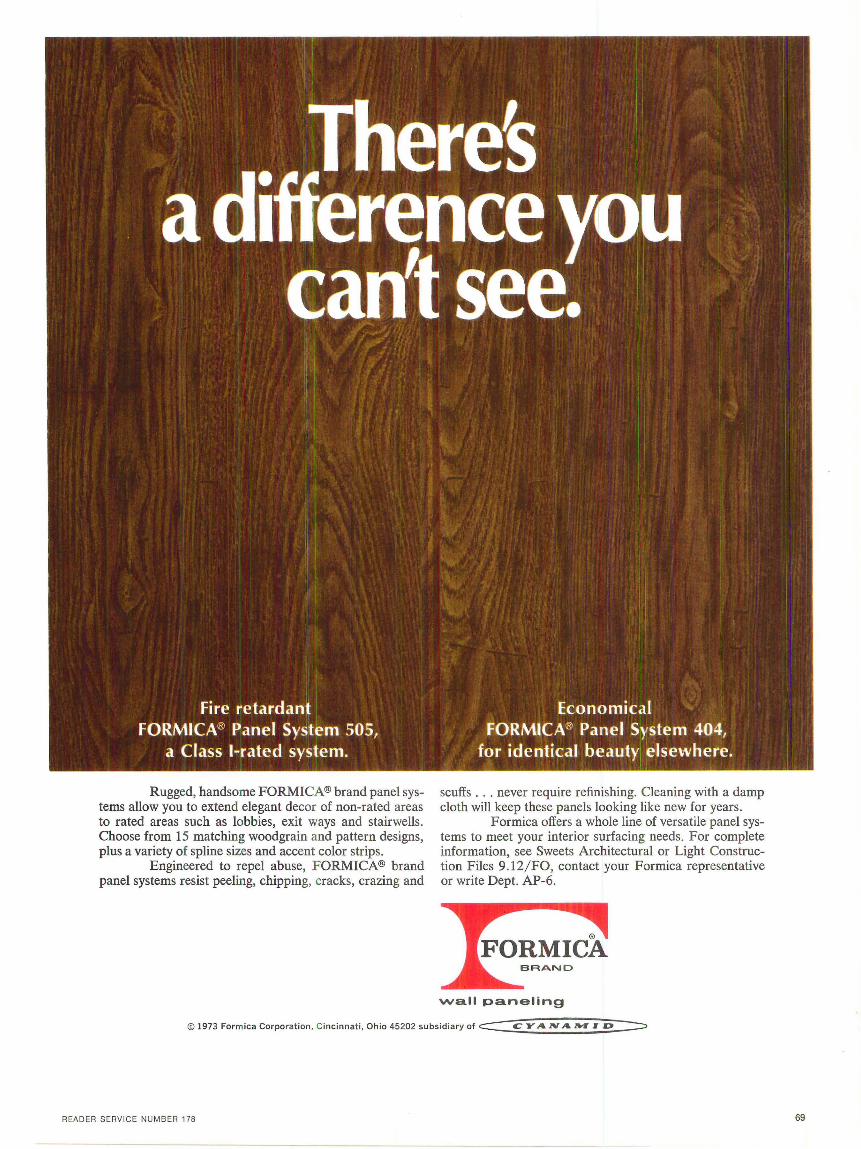
Rugged, handsome FORMICA® brand panel systems allow you to extend elegant decor of non-rated areas to rated areas such as lobbies, exit ways and stairwells. Choose from 15 matching woodgrain and pattern designs, plus a variety of spline sizes and accent color strips.
Engineered to repel abuse, FORMICA® brand panel systems resist peeling, chipping, cracks, crazing and
scuffs . . . never require refinishing. Cleaning with a damp cloth will keep these panels looking like new for years.
Formica offers a whole line of versatile panel systems to meet your interior surfacing needs. For complete information, see Sweets Architectural or Light Construction Files 9.12/FO, contact your Formica representative or write Dept. AP-6.
wall paneling
© 1973 Formica Corporation, Cincinnati, Ohio 45202 subsidiary of C:::::::: C: YAN A ...,. z D -=::::,
READER SERVICE NUMB ER 178 69
Product Literature
ACRYLICS
Swedcast Division, Swedlow, I nc. has prepared folde r including da ta sheets on their commercial acrylic sheet. Reader Service Number 24 1.
BU ILD ING SYSTEMS
Three new systems brochures for selecting and specifying building materials have been released by Sonneborn Building Products Division of Contech, Inc. Reader Service Number 242.
CARPETING
The Jute Carpet Backing Council has announced the 15th printing of their architectural guide specification for glue-down installation of double jute-backed carpets. Reader Service Number 243.
Construction and performance specifications , and installation recommendations are provided in pamphlet on Milstar® carpet developed by Deering Milliken, Inc. Reader Service Number 244.
Hercules Incorporated offers 24-page brochure providing performance characteristics, construction, installation, and specification information for Herculon® fiber . Reader Service Number 245.
CE ILING SYSTEMS
Insta llation data for the Gold Bond Panelectric ceiling system, comprising a radiant heating system as an integral part of a gypsum drywall ceiling, is given by Gold Bond Building Products Division of National Gypsum Company. Reader Service Number 246 .
CERAM IC TILE
Udono, Ltd. of J apan offers details on their na tural tile and pebble stone . Reader Service Number 247.
From Milan, Ital y Cedit Ceramiche D'Italia offers brochure covering their complete line of ceramic tile. Reader Service Number 248.
Elon, Inc. announces availability of color catalog including specifica t ion data for handmade Mexican tile. Reader Service Number 249.
CHALKBOARDS
A new brochure is being offered by the Alliance Wall Corporation which contains a color chart of all the firm's standard chalkboard colors. Reader Service Number 250.
70
COATINGS
Devoe Paint Division of Celanese Coatings Company has issued a specification manual for their complete line of protective and decorative coatings for all types of surfaces and environments. Reader Service Number 251.
DECORATIVE GLASS
Pittsburgh Corning Corporation 15-page booklet contains selection and application information on decorative glass block. Reader Service Number 252.
U nusual design possibilities crea ted by Plexiglas™ mirror are illustrated in six-page pamphlet released by Rohm and Haas Company. Reader Service Number 253.
DOORS
Amarlite, the architectural products division of Anaconda Aluminum, presents the new Safetyline concept of aluminum framed glass entrances in litera ture now available. Reader Service Number 254.
DRAWINGS
A booklet of drawing shortcuts designed specifically for architects is offered by Eas tman Kodak Company. Reader Service Number 255.
FENCING
An entirely new, 12-page color booklet, "Redwood Fences" is now available from the California Redwood Association. Reader Service Number 256 .
FLOORING
The 1973 edition of Azrock's catalog of resilient flooring products, containing information on sizes, gauges, uses , installation, and light reflectance values, is now being offered. Reader Service Number 25 7.
GLASS
A comprehensive guide to architectura l glass p roducts for windows and doors is ava ilable from PPG Industries. Reader Service Number 258.
HANDRAILING
Carlstadt acrylic/wood handrailing combines the natural beauty of fin e hardwood with the hardness of reinforced plastic, explains a new brochure from Julius Blum & Co., I nc. Reader Service Number 259.
HARDWARE
Konan Industries, Inc. of Japan has available li terature on their line of
door locks and builder's fasteners. Reader Service Number 260.
INSULATION
A brochure outlining shipping information and speci fication data on Johns-Manville fiber glass building insulation can now be ob tained. Reader Service Number 261.
KITCHEN, LAUNDRY, WAS HROOM EQUIPMENT
General Electric Co . provides a colorful , 24-page idea stimulator containing illustrated kitchen and laundry concepts for large and small a reas. Reader Service Number 262.
A toilet compartment catalog for 1973, inclu ding additions to their laminated plastic prod uct line, has been released by Bo brick Wash room Equipment, Inc. Reader Service Number 263.
LIGHTING
Wide-Lite Corporation has announced a new indoor luminaire for HID lamps offering a computer-designed reflec tor and optional highstrength film lens. Reader Service Number 264.
PANELING
Application and specifica tion data for fl exible fire panel is given in a 10-page brochure issued by BASF. Reader Service Number 265.
Fire-test paneling tha t meets building codes and safety requirements for interior cons truction is available now from Marlite, Division of Masonite Corpora tion. Reader Service Number 266.
PLUMBING FIXTURES
Eljer Plumbingware Divis ion, Wallace-Murray Corporation, has available a specifying guide for architects covering their line of hospital/ institutional plumbing fixtures and fittings. Reader Service Number 267.
PLYWOOD
A new, full-color brochure introducing Finnish p lywood is offered by The F innish Plywood Development Associa tion-USA. Reader Service Number 268.
Alstergren P ty. Ltd. of Australia provides pamphlet on prefinished plywood panels and par ticle board. Reader Service Number 269.
ROOFING
Specification information for TerneCoated Stainless Steel, deve loped for
a broad range of applications incl uding roofing and weathersealing, is given by Follansbee Steel Corp. Reader Service Number 270.
SEALANTS
The enti re family of General Electric silicone rubber sealants is described in four-page pamphlet recently released. Reader Service Number 2 71.
SEATING
J G Furniture Co., Inc. has prepared a specifica tions catalog for their auditorium seating. Reader Serv ice Number 272.
SECURITY SYSTEMS
Hager Hinge Company has published "Building Security into Building Plans." The booklet lists facts about major components and optional security equipment available from Hager. Reader Service Number 273.
SIGNAGE
J as. H. Matthews & Co. has prepared a color catalog on thei r identification sys tems, featuring custom designed packages using unified signage, pictorial systems and color-keying. Reader Service Number 274.
WALL COVERINGS
James Seeman Studios, Inc. displays their supergraphic murals screenprinted on vinyl in color booklet recently released. Reader Service Number 275.
WALL SYSTEMS
U-Forms In ternational, Inc. makes available information on a new structural wall system that cu ts heating and cooling energy requirements while increasing investment return. Reader Service Number 276.
A 12-page brochure containing specification, performance, and test da ta on lnryco wall systems is offered by Inland-Ryerson Construction Products Company. Reader Service Number 277.
The Acordial -Group, Europe's largest wall manufacturer, offers color brochure on the Planacord mobile wall system with maximum sound insulation. Reader Service Number 278.
WATER TREATMENT
A new line of low priced reverse osmosis water treatment plants are announced by Ajax International Corporation. Reader Service Number 279.

Film Review continued from page 67
tha t worn sexist subplot of bumbling father figure upstaged by sexy superior Lolita. In this case, father and daughter trying to esca pe from a pa rki ng ga rage of the title after los ing the exit token.
T he tll'O ove rt propaganda films of the evening were both French , La Cite D es Hammes, representing the ri gh t (o r, a ll 's for the best in this best of all possibl e wor lds) and Hist oire d'un Crime rep resenting the left (or, al l's for the worst in this worst of all possibl e worlds). It would be difficult to dec id e \\·hi ch laid it on thicker but , pred ictably, at Columbia , the left \\·as cheered, th e right \\·as hissed , and nobody seemed to make the French connection.
The expected horror show on ly surfaced once in Eddie, whi ch th e cata logue listed as "an at tempt to dramati ze conditi ons in \\·el fare hotels ... and th e needs of the elderly and lonely living there." Inste:icl , \\· e were treated to seventeen t itillat ing minutes in the life of a drunken Irishman ( rac ism, mine), complete with roaches, shit in th e bed and dozens and clozem of emp ty bot tl es. But the Irishman put on a tic \\·hen the mo\·ie peopl e came ca lling, and I can't l1e lp \1·011-cler ing where so me o f those bottles came from.
Racism as a subject never came up , exact ly, but there was the wellbrecl Eastern -accented voice-over in Festival of Playgrounds, saying perfec tly pleasantly that, whil e there had been no (Bla ck ) com munity participatio;i in the (form of ) making the playground , there woul d be community in the MAINTAINI NG of it. But th e Black co mmunity managed to demonstrate its extraordinary res ilience as well, as its abi lity to recognize a Yale man , in 0 ne IV ay, d escribed as "the explosive beginnings of the Black workshop at the Yale G rad uate School of Art and Architecture."
In spite of these di stractions, W ed nescla y was domina tee! by a film about people and power and powerlessness . Borom Sarret, the work of Ousmane Sembene, is set in Dakar, Senegal. The Boro m Sarret of the title is a Black man who makes his living with a horse and cart which functions as a rather ca-
ARC HITECTURE PLUS JUNE 1973
Side Issue: tas tefull y di scomposing
Skyscraper: 1959 Fifth Avenue
SKYSCRAPER
end less fresh flowe rs
sual form of publi c transportation. The story line, the road, leads to a brief but incisive look a t aspects of his community, beautifull y presen tee! visua ll y in a sequence of spare, haunting black and ll'hite images-the curve of a road in \1·h ich the approaching ca rt grows gradually to dominate th e space; a s::t rdine pack of roof tops; a begga r looking up a t Borom and Boro m looki ng back, his outs tre tched feet cra dling th e subt itl e, " What's th e use of a nswerin g? There' re so many beggars" ; or hi s memorably ordinary face \1· ith subti tle, "The new life may have brought me to th is slavery." A lthough not explicitl y stated, it seems from th e frequent repet ition o f th e \l"Ords Borom Sarret that this mi ght be a general expression of prohibition, roughly mean ing "Black \\"Orker , keep out." So the man and his name are particul ar expressions of the universa l experi ence of oppress ion and po\\·er lessncss . Beca use the people who abuse, defraud and eventua ll y d efeat Borom are a ll Black, the re is no One W ay confusion of class and skin color. Again, as in rea l life, the man Borom is neither good nor bad . Up to a point , he has compassion . The money th at he re fu ses the begga r is \1·illingly ha nd ed ove r to a shaman \1·ho sings to him that his ances tors \1·ere brave men. Feeling brave, he takes th e chance of entering symboli ca ll y "hi gh" forbidden grou nd and loses everything but his ho rse which he le::i ds slowly back to hi s own quarter, where hi s wi fe will go out to find the even ing meal in an er rand that is left to the imaginat ion, but which has always been avai !able to th e oppressed.
Com ing down from thi s, Thursd ay was concerned with "Experim ental Images." On the whole, the fi lms shown seem ed more concerned with under! ining preconception than with expanding percep tion. A no table exception was the W urmfelcl Primaries wh ich won no prizes but almost made the evening wor th sitting through. It consisted of a screen fu ll o f silence and pure primary color changing gradually, leaving the viewer to figure out what was ha ppening (which I didn' t). It didn't try to make you sick or confused or exhausted or
embarrassed as did, in that order, Side Issue ( the American roadsid e tastefull y draped with d ead and decomposing ani ma ls), Oakland Ed Ace, Th e House Construction H ome Movie, and th e first pri ze \1·inner, Corridor. The last m ed the ca mera's repea ted penetrat ion o f the corri or as a m etaphor fo r a , uh, universa l experi ence which just didn' t get it up th ere lik e the Stones' "Goin' Home".
Ah well, nothing like four evenings of four hours of film to scour out the ol d cleadll'oocl of th e mind. On Friday the first prize winn~rs \\·ere reshown, togeth er \1·ith some classics, so me11·ha t d isrupted by p robl ems at the :Museum of Modern Art film d epartment whi ch didn't provide the expected films. In spite of \1·hich, Shirley Clarke's Bridges Co R ound went around t\1·ice, and her 1959 Skyscra /1 er perfectly embalmed the look of 1959 Fifth Avenue. Ilut where \1·as tha t look? In the length of a skirt , the men wearing ha ts, the quality of li ght or the buildings no longer th ere? The di sa ppoin tment of the evening, however, \\«lS C harl es and R ay Eames' H ouse ( 1955). I 've know about the film for maybe 15 years and thought how wonderfu l it wou ld be. But it wasn ' t wonderful, o r toma toes-at-the-screen awful, just discreetly sad. If I see the Katsura d etached palace, I don' t lose my lunch; I don ' t say, tha t was fifties or sixt ies or forties. The Villa Savoye, I'm em ba rrassed to say, is the same way. Maybe the Eames house isn't as bad-surely not-as the E ames film . Endless beauti ful objects, endless fresh flowers, en dless breakfas ts wi th croissants. It reminded me of a voice on the radio in the car going home, a young woman singer ta lking about a song she had presumed to write fot· Janice Joplin: a yea r ago I decided to sto/J singing and went-in toa-meclitation-center. So exquisitely a nd se lf-consc iously unself-conscious, so unimportantly important. An d J an i ce : Fr eedom's just an ot her word for nuthin' left to lose . .. What's that got to do with the Katsura d etached palace? Something? Truth is beautiful? No, no, babe, it may no t be beautiful, but it' s not six ties or fifti es or forti es.
71
Advertising Index
AllianceWall Corporation Battle Advert ising , Inc. . . . . . . . . .... . . . . . ... .. ..... . .. .. . BC
American Colloid Company Cat Productions . . ....... . .. . . . . . . . ... . . . .. . .. . .. . . .. .. . .... 67
Eaton Corporation, Yale Marketing Department Fuller & Sm ith & Ross, Inc ... .... . ...... . .. .. . . . .. ............. 8
ERCO Leuchten KG Wirtschafts-und Werbeagentur B. Keysselitz ' .. . . . . . .. . . . ........ 4
Formica Corporation Clinton E. Frank, Inc.
W.R. Grace & Company, Construction Products Division Fuller & Smith & Ross , Inc. . .. . .... .
Staempfli Gallery
.. . . ... . .. . 69
...... . .. .. 3
Ridgefield Advertising , Inc . . ... . ..... . ... ...... ... ..... . .. · .. . · 2
Thone! Industries, Inc. APCL&K, Inc . . . . ... .. ... . ... ..• ... . ... .. .. . . .... . . . . .. . . · .. IBC
Ralph Wilson Plastics Jack T. Holmes & Associates, Inc. . . . . ..... . ... . ....... . .... IFC-1
Advertising Sales Offices Bllldal, Sweden
Chicago, U.S.A.
Cleveland, U.S.A.
Frankfurt, Germany
Milan, Italy
New York, U.S.A.
Tokyo, Japan
72
John Bacos Scandic Trading Box 1010 Bi lldal, Sweden 43081
Robert A. Jobson 625 North Michigan Avenue Chicago, Illinois 6061 1 phone : 312-787-5858
Charles S. Glass 32 West Orange Street Chagr in Falls, Ohio 44022 phone: 216-247-5461
Manfred Wettlaufer 6232 Bad Soden/Ts. Postfach 1566, Germany regional phone: 06196 local phone: 26 3 26 telex: Frankfurt/Main 413569
Etas Kompass Via Mantegna 6 20154 Milan, Italy phone: 347051/384798 te lex : 33152 Kompass
Annie Damaz, Special Representative Richard E. Kielb Donald T. Lock 1345 Sixth Avenue New York, New York 10019 phone : 212-489-8697 te lex: RCA 224232 CIC-UR cable: Publinform
Barbara Dorf Uesaka & Co llaborat ive 9-3 Shoto 1 Chome Shibuya, Tokyo, Japan phone: 469-3431 telex: KAGH l-J-24877, Tokyo cable: Yasuesaka Tokyo
Looking ahead
. Thick windowless wal ls covered in a blend of dark brick; skyl ights admitt ing sun even on gloomy winter days; extensive glazed openings for views of the leaden sky . .. " says Architect Shin'ichi Okada of his Niigata Faculty, Nippon Dental College, to be featured in the July issue of PLUS.
Building Suppliers STAEMPFLI RESIDENCE
Arch itect: Harvey S. Hoshour. (Materials and manufacturers as submitted by the architect.) Concrete & Cement: Huey Concrete Co. Structural Steel: Hausman Steel Co. Floor & Deck Systems: Blueher Lumber Co. Roof Materials: Rubberoid. Therma l Insulation: Pueblo Wool, Celotex Sheath ing. Fenes tra tion: Donn Mfg. Glass: LOF. Interior Partitions: U.S. Gypsum. Doors: Blue her Lumbe r Co. Hardware: Schlage. Interior Materials: American Olean. Paint: Sherwin Willi ams. Electrical Equip: Raywall. Lighting Fixtures: Lightol ier, Prescolite. Plumb ing Fixtures: American Standard . Intercom Systems: NuTone. Ceil ing Materials: U.S. Gypsum. Kitchen Equip: Whirlpool. Finish Flooring: Bruce Hardwood Floor. Furniture: Knoll. Other Products: El Rey Stucco Co.
QUI NCO CONSUL TING CENTER
Arch itects: James Stewart Polshek and Associates. (Materials and manufacturers as submitted by the architects.) Piling : Lee Turzillo Contracting Co.
Concrete & Cement: Baker Forms Co., Louisvi lle Cement, Ryerson . Acoustical Ma terials : Johns-Manvil le. Glass: PPG. Elevators & Electric Stairways: WhiteEvans Elevator Co. Doors : PPG , Weyerhaeuser, Emenco. Hardware: Sargent, Hager Hinge, Glyn Johnson. Interior Ma terials: Flintkote, Lees Carpets. Pa int: Pratt & Lambert, Devoe. Electrical Equip: Continental. Lighting Fixtures: Metalux Corp . Plumbing Fixtures: American Standard . Heating Boilers: H. B. Smith Co. Uni t Ventilators, Radia tors, Convectors: DunhamBush . Heating Valves, Pip ing, Controls: Honeywell. Air Conditioning Compressor, Fan Unit : McQuay, Inc. Diffusers, Ducts, Pumps: Bel l & Gossett, Flygt Corp., Ti tus Mfg . Special Fans & Ventilators: Buffalo Forge Co., Clarage Fan Co. Intercom Systems, Radio & TV Systems: Dukane Corp. Sprinkle r System & Fire Protection Equip: Standard Fire Hose Co., Simplex System. Ceiling Materials: Johns-Manville, National Gypsum. Water Coolers : Halsey Taylor. Venetian Blinds & Shades : Alcan Aluminum Corp. Kitchen, Laundry, Laboratory Equip: Foremost-McKesson Systems.
Related Documents