Writing up reports: statistics and other factual data Describing graphs
To describe movement in graphs, there is a rather standardised vocabulary. The words below are particularly useful for line graphs but they can also be used where appropriate to describe the other types of graph (pie charts, bar graphs). Further vocabulary can easily be found by reading newspaper articles on the economy.
Expressing the Movement of a Line Expressing the Movement of a Line
verbs nouns adjectives adverbs
rise (to) a rise dramatic dramatically
increase (to) an increase sharp sharply
go up to huge hugely
grow (to) growth enormous enormously
climb (to) a climb steep steeply
boom a boom substantial substantially
peak (at) (reach) a peak (at) considerable considerably
fall (to) a fall (of) significant significantly
decline (to) a decline (of) marked markedly
decrease (to) a decrease (of) moderate moderately
dip (to) a dip (of) slight slightly
drop (to) a drop (of) small
go down (to) -- minimal Minimally
reduce (to) a reduction (of)
a slump describing the speed of a change
level out a levelling out adjectives adverbs
no change no change rapid rapidly
remain stable (at) -- quick quickly
remain steady (at) -- swift swiftly
stay (at) -- sudden suddenly
stay constant (at) -- steady steadily
maintain the same level -- gradual gradually
slow slowly

CILTA / Academic Writing Oct. 2009 – Feb. 2010 Unit 04 © Gill Philip 2009
TASK 1: Describing movement on a graph
GRAPH A GRAPH B
Life expectancy in the USA 1900-2000 Correct responses in test (items 27-82)
A - Look at the graphs above and state where you can find:
...a peak
...a dramatic drop
...a steady increase
...a marked decrease
...a rapid decline
...a recovery
...a sharp rise
...a slump
...a dip
B – Describe what happens in a full sentence. You may use the verb form if it fits better:,
otherwise use the noun with its correct verb collocate. The first one is done for you
...a peak � The number of correct responses reached a peak at item 55, with 40% of
students responding correctly.
...a dramatic drop �
...a steady increase �
...a marked decrease �
...a rapid decline �
...a recovery �
...a sharp rise �
...a slump �
...a dip �

CILTA / Academic Writing Oct. 2009 – Feb. 2010 Unit 04 © Gill Philip 2009
TASK 2: Describing data in a chart
Write a 150-word report describing the information shown in the graph. The introductory sentence
is already provided. Continue the report, presenting the data in a logical order, comparing and
contrasting the changes that have occurred, and offering your own interpretation of the reasons for
the changes. You should spend no more than 20 minutes on this task.
The graph shows the changing age profile of Internet users in the UK between 2005 and 2007.
CILTA / Academic Writing Oct. 2009 – Feb. 2010 Unit 04 © Gill Philip 2009
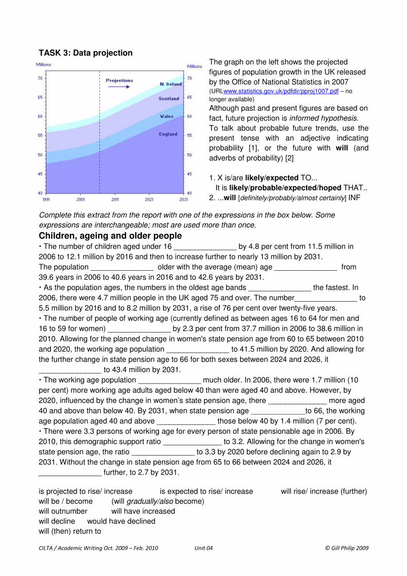
TASK 3: Data projection The graph on the left shows the projected
figures of population growth in the UK released
by the Office of National Statistics in 2007 (URLwww.statistics.gov.uk/pdfdir/pproj1007.pdf – no
longer available)
Although past and present figures are based on
fact, future projection is informed hypothesis.
To talk about probable future trends, use the
present tense with an adjective indicating
probability [1], or the future with will (and
adverbs of probability) [2]
1. X is/are likely/expected TO...
It is likely/probable/expected/hoped THAT..
2. ...will [definitely/probably/almost certainly] INF
Complete this extract from the report with one of the expressions in the box below. Some
expressions are interchangeable; most are used more than once.
Children, ageing and older people � The number of children aged under 16 _______________ by 4.8 per cent from 11.5 million in
2006 to 12.1 million by 2016 and then to increase further to nearly 13 million by 2031.
The population _______________ older with the average (mean) age _______________ from
39.6 years in 2006 to 40.6 years in 2016 and to 42.6 years by 2031.
� As the population ages, the numbers in the oldest age bands _______________ the fastest. In
2006, there were 4.7 million people in the UK aged 75 and over. The number_______________ to
5.5 million by 2016 and to 8.2 million by 2031, a rise of 76 per cent over twenty-five years.
� The number of people of working age (currently defined as between ages 16 to 64 for men and
16 to 59 for women) _______________ by 2.3 per cent from 37.7 million in 2006 to 38.6 million in
2010. Allowing for the planned change in women's state pension age from 60 to 65 between 2010
and 2020, the working age population _______________ to 41.5 million by 2020. And allowing for
the further change in state pension age to 66 for both sexes between 2024 and 2026, it
_______________ to 43.4 million by 2031.
� The working age population _______________ much older. In 2006, there were 1.7 million (10
per cent) more working age adults aged below 40 than were aged 40 and above. However, by
2020, influenced by the change in women’s state pension age, there ______________ more aged
40 and above than below 40. By 2031, when state pension age _____________to 66, the working
age population aged 40 and above ______________ those below 40 by 1.4 million (7 per cent).
� There were 3.3 persons of working age for every person of state pensionable age in 2006. By
2010, this demographic support ratio ______________ to 3.2. Allowing for the change in women's
state pension age, the ratio _______________ to 3.3 by 2020 before declining again to 2.9 by
2031. Without the change in state pension age from 65 to 66 between 2024 and 2026, it
_______________ further, to 2.7 by 2031.
is projected to rise/ increase is expected to rise/ increase will rise/ increase (further)
will be / become (will gradually/also become)
will outnumber will have increased
will decline would have declined
will (then) return to
CILTA / Academic Writing Oct. 2009 – Feb. 2010 Unit 04 © Gill Philip 2009
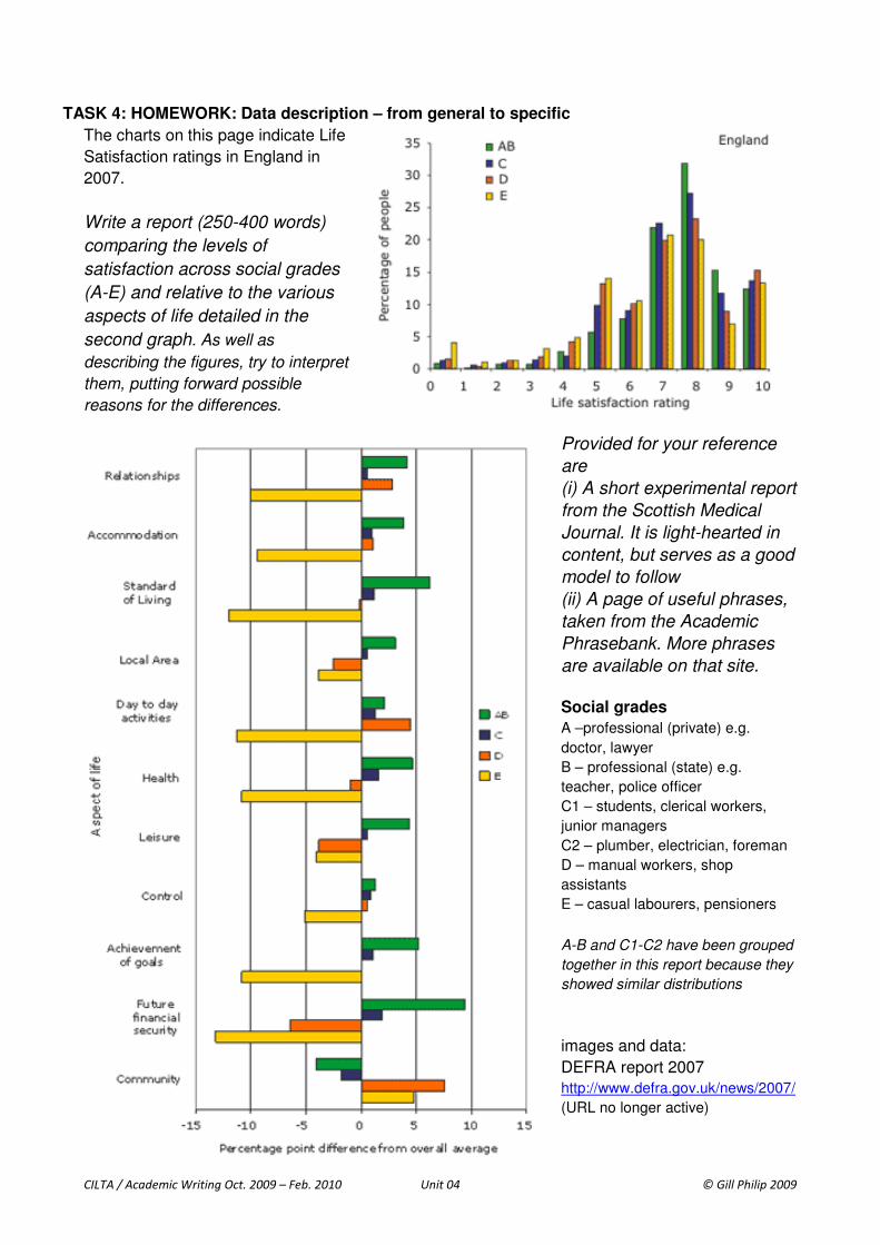
TASK 4: HOMEWORK: Data description – from general to specific
The charts on this page indicate Life
Satisfaction ratings in England in
2007.
Write a report (250-400 words)
comparing the levels of
satisfaction across social grades
(A-E) and relative to the various
aspects of life detailed in the
second graph. As well as
describing the figures, try to interpret
them, putting forward possible
reasons for the differences.
Provided for your reference
are
(i) A short experimental report
from the Scottish Medical
Journal. It is light-hearted in
content, but serves as a good
model to follow
(ii) A page of useful phrases,
taken from the Academic
Phrasebank. More phrases
are available on that site.
Social grades
A –professional (private) e.g.
doctor, lawyer
B – professional (state) e.g.
teacher, police officer
C1 – students, clerical workers,
junior managers
C2 – plumber, electrician, foreman
D – manual workers, shop
assistants
E – casual labourers, pensioners
A-B and C1-C2 have been grouped
together in this report because they
showed similar distributions
images and data:
DEFRA report 2007
http://www.defra.gov.uk/news/2007/
(URL no longer active)

CILTA / Academic Writing Oct. 2009 – Feb. 2010 Unit 04 © Gill Philip 2009
CILTA / Academic Writing Oct. 2009 – Feb. 2010 Unit 04 © Gill Philip 2009
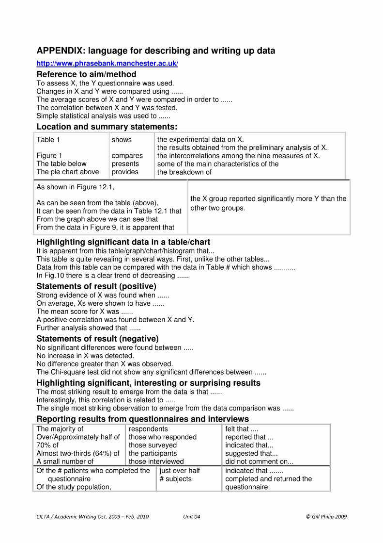
APPENDIX: language for describing and writing up data
http://www.phrasebank.manchester.ac.uk/
Reference to aim/method To assess X, the Y questionnaire was used. Changes in X and Y were compared using ...... The average scores of X and Y were compared in order to ...... The correlation between X and Y was tested. Simple statistical analysis was used to ......
Location and summary statements:
Table 1
Figure 1 The table below The pie chart above
shows
compares presents provides
the experimental data on X. the results obtained from the preliminary analysis of X. the intercorrelations among the nine measures of X. some of the main characteristics of the the breakdown of
As shown in Figure 12.1,
As can be seen from the table (above), It can be seen from the data in Table 12.1 that From the graph above we can see that From the data in Figure 9, it is apparent that
the X group reported significantly more Y than the
other two groups.
Highlighting significant data in a table/chart It is apparent from this table/graph/chart/histogram that... This table is quite revealing in several ways. First, unlike the other tables... Data from this table can be compared with the data in Table # which shows ........... In Fig.10 there is a clear trend of decreasing ......
Statements of result (positive) Strong evidence of X was found when ...... On average, Xs were shown to have ...... The mean score for X was ...... A positive correlation was found between X and Y. Further analysis showed that ......
Statements of result (negative) No significant differences were found between ..... No increase in X was detected. No difference greater than X was observed. The Chi-square test did not show any significant differences between ......
Highlighting significant, interesting or surprising results The most striking result to emerge from the data is that ...... Interestingly, this correlation is related to ..... The single most striking observation to emerge from the data comparison was ......
Reporting results from questionnaires and interviews The majority of Over/Approximately half of 70% of Almost two-thirds (64%) of A small number of
respondents those who responded those surveyed the participants those interviewed
felt that .... reported that ... indicated that... suggested that... did not comment on...
Of the # patients who completed the questionnaire
Of the study population,
just over half # subjects
indicated that ....... completed and returned the questionnaire.
CILTA / Academic Writing Oct. 2009 – Feb. 2010 Unit 04 © Gill Philip 2009
Exercise 4 – original text
Children, ageing and older people
� The number of children aged under 16 is projected to increase by 4.8 per cent from 11.5 million
in 2006 to 12.1 million by 2016 and then to increase further to nearly 13 million by 2031.
The population will gradually become older with the average (mean) age expected to rise from
39.6 years in 2006 to 40.6 years in 2016 and to 42.6 years by 2031.
� As the population ages, the numbers in the oldest age bands will increase the fastest. In 2006,
there were 4.7 million people in the UK aged 75 and over. The number is projected to increase to
5.5 million by 2016 and to 8.2 million by 2031, a rise of 76 per cent over twenty-five years.
� The number of people of working age (currently defined as between ages 16 to 64 for men and
16 to 59 for women) is projected to rise by 2.3 per cent from 37.7 million in 2006 to 38.6 million in
2010. Allowing for the planned change in women's state pension age from 60 to 65 between 2010
and 2020, the working age population will increase further to 41.5 million by 2020. And allowing
for the further change in state pension age to 66 for both sexes between 2024 and 2026, it will
increase further to 43.4 million by 2031.
� The working age population will also become much older. In 2006, there were 1.7 million (10 per
cent) more working age adults aged below 40 than were aged 40 and above. However, by 2020,
influenced by the change in women’s state pension age, there will be more aged 40 and above
than below 40. By 2031, when state pension age will have increased to 66, the working age
population aged 40 and above will outnumber those below 40 by 1.4 million (7 per cent).
� There were 3.3 persons of working age for every person of state pensionable age in 2006. By
2010, this demographic support ratio will decline to 3.2. Allowing for the change in women's state
pension age, the ratio will then return to 3.3 by 2020 before declining again to 2.9 by 2031.
Without the change in state pension age from 65 to 66 between 2024 and 2026, it would have
declined further, to 2.7 by 2031.