


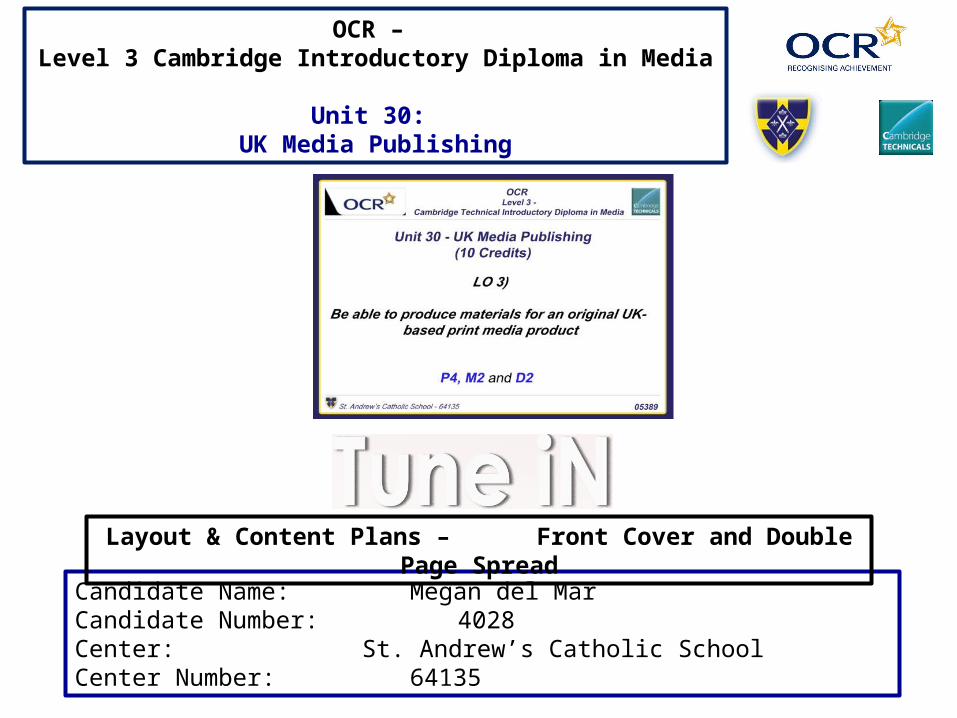
Candidate Name: Megan del MarCandidate Number: 4028Center: St. Andrew’s Catholic SchoolCenter Number: 64135
Layout & Content Plans – Front Cover and Double Page Spread
OCR – Level 3 Cambridge Introductory Diploma in Media
Unit 30: UK Media Publishing
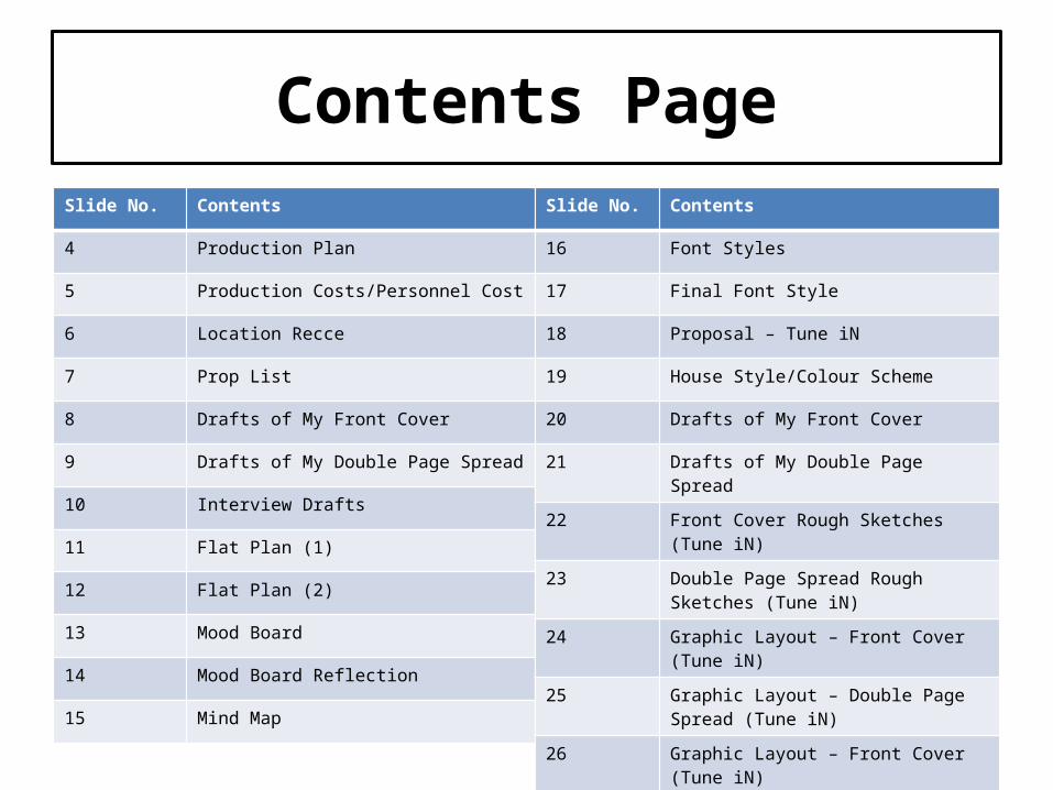
Contents PageSlide No. Contents
4 Production Plan
5 Production Costs/Personnel Cost
6 Location Recce
7 Prop List
8 Drafts of My Front Cover
9 Drafts of My Double Page Spread
10 Interview Drafts
11 Flat Plan (1)
12 Flat Plan (2)
13 Mood Board
14 Mood Board Reflection
15 Mind Map
Slide No. Contents
16 Font Styles
17 Final Font Style
18 Proposal – Tune iN
19 House Style/Colour Scheme
20 Drafts of My Front Cover
21 Drafts of My Double Page Spread
22 Front Cover Rough Sketches (Tune iN)
23 Double Page Spread Rough Sketches (Tune iN)
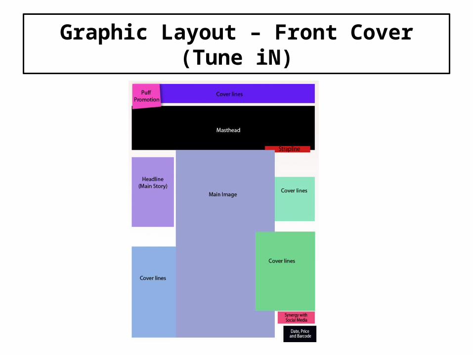
24 Graphic Layout – Front Cover (Tune iN)
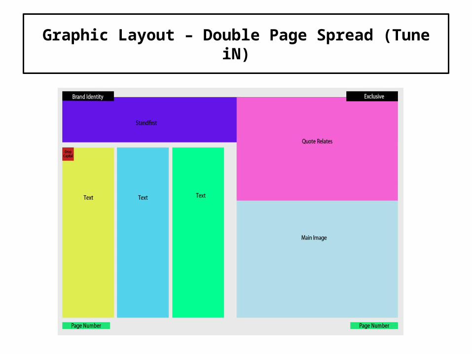
25 Graphic Layout – Double Page Spread (Tune iN)
26 Graphic Layout – Front Cover (Tune iN)
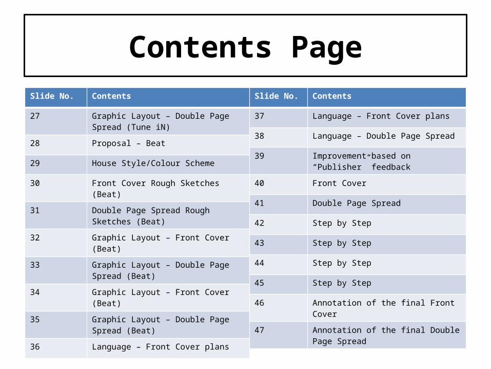
Contents PageSlide No. Contents
27 Graphic Layout – Double Page Spread (Tune iN)
28 Proposal – Beat
29 House Style/Colour Scheme
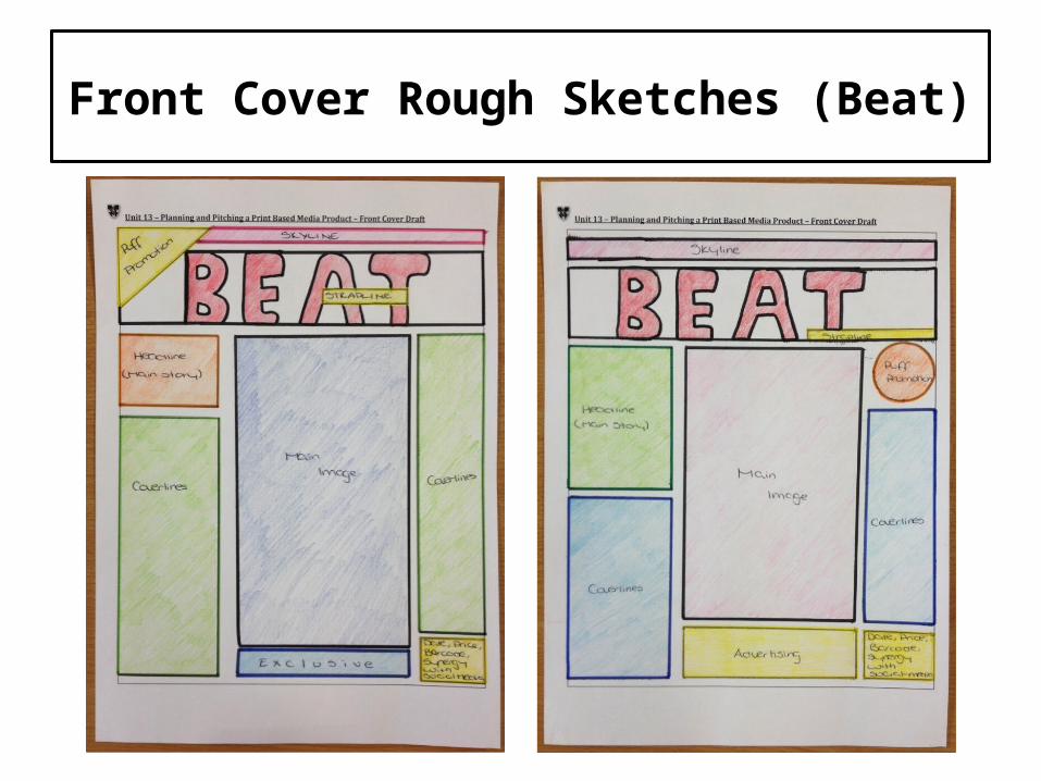
30 Front Cover Rough Sketches (Beat)
31 Double Page Spread Rough Sketches (Beat)
32 Graphic Layout – Front Cover (Beat)
33 Graphic Layout – Double Page Spread (Beat)
34 Graphic Layout – Front Cover (Beat)
35 Graphic Layout – Double Page Spread (Beat)
36 Language – Front Cover plans
Slide No. Contents
37 Language – Front Cover plans
38 Language – Double Page Spread
39 Improvement based on “Publisher” feedback
40 Front Cover
41 Double Page Spread
42 Step by Step
43 Step by Step
44 Step by Step
45 Step by Step
46 Annotation of the final Front Cover
47 Annotation of the final Double Page Spread
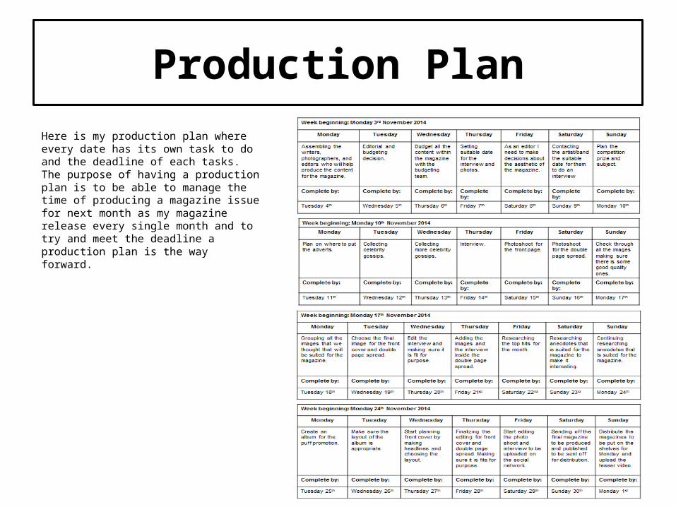
Production Plan
Here is my production plan where every date has its own task to do and the deadline of each tasks. The purpose of having a production plan is to be able to manage the time of producing a magazine issue for next month as my magazine release every single month and to try and meet the deadline a production plan is the way forward.

Production Costs/Personnel Cost
Job roles Salaries
Finance team £25,000
Editorial team £15,000
Journalists £15,000
Reporters £24,170
Advertising team £25,000
Production manager £35,000
Social media executive £22,000
Total £161,000
Start up costs: £140,000Start up expenses to fund – £80,000Start up assets to fund – £60,000 Total: £140,000
Marketing costs:Adverts: £795 per dayFestivals: £25 per thousand leafletsFacebook: 0.15p per click
http://www.prospects.ac.uk/magazine_journalist_salary.htmhttp://www.blurb.co.uk/pricing-calculator
Printing/publishing costs:Magazines: 10,000 / 2 = 5,000Pages: 24 / 2 = 12 x 4 = 48Cost: 1,149 / 2 = 574.5 x 4 = £2,298
Distribution costs:(£45 per thousand)45 x 5 = £225
Promotion at music festivals:Leaflets
Income: AdvertisingSubscriptions Profit from sales

Location RecceThis is my location reece where you will find the location of the images that has been taken, time of day, when I am going to take them, the picture needed/required, permission from each locations and lastly the potential hazards/risks that I may encounter whilst doing the photo shoot.

Name Image Cost? Where?
Camera (Canon) Cost – £329Where – Curry'sSource – http://www.currys.co.uk/gbuk/cameras/digital-cameras/dslr-cameras/canon-eos-100d-dslr-camera-with-18-55-mm-telephoto-zoom-lens-extra-battery-lens-cloth-21324789-pdt.html#cat-0
Studio lights Cost – £66.99Where – AmazonSource – http://www.amazon.co.uk/Continuous-Lighting-50x70cm-Photography-Softboxes/dp/B0089HTJE4/ref=sr_1_5/280-4646683-9575918?s=photo&ie=UTF8&qid=1426771822&sr=1-5
Tripod Cost – £33.94Where – AmazonSource – http://www.amazon.co.uk/Hahnel-Triad-30-Professional-Aluminium/dp/B00361EC1S/ref=sr_1_9?s=electronics&ie=UTF8&qid=1426771885&sr=1-9&keywords=tripod
Guitar Cost – £166Where – Guitar guitarSource – http://www.guitarguitar.co.uk/acoustic_guitars_detail.asp?stock=05022815115228
Prop List
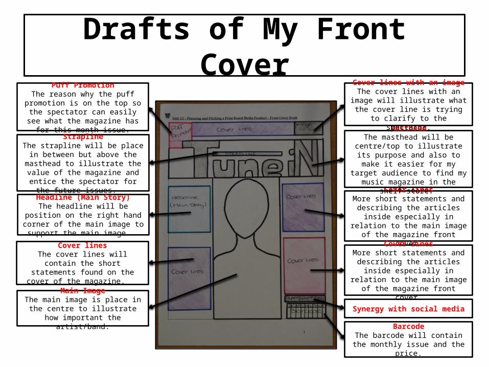
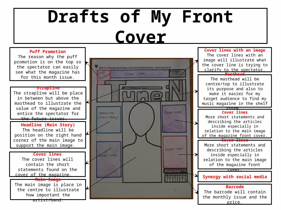
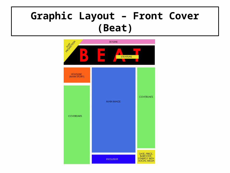
Drafts of My Front CoverPuff Promotion
The reason why the puff promotion is on the top so the spectator can easily see what the magazine has
for this month issue.
Cover linesMore short statements and
describing the articles inside especially in relation to the main
image of the magazine front cover.
MastheadThe masthead will be centre/top to
illustrate its purpose and also to make it easier for my target audience to find my music
magazine in the shelf store.
Cover lines with an imageThe cover lines with an image will
illustrate what the cover line is trying to clarify to the spectator.
Main ImageThe main image is place in the
centre to illustrate how important the artist/band.
Cover linesThe cover lines will contain the short
statements found on the cover of the magazine.
Headline (Main Story)The headline will be position on the right hand corner of the main image
to support the main image.
StraplineThe strapline will be place in
between but above the masthead to illustrate the value of the magazine
and entice the spectator for the future issues.
BarcodeThe barcode will contain the monthly issue and the price.
Synergy with social media
Cover linesMore short statements and
describing the articles inside especially in relation to the main
image of the magazine front cover.
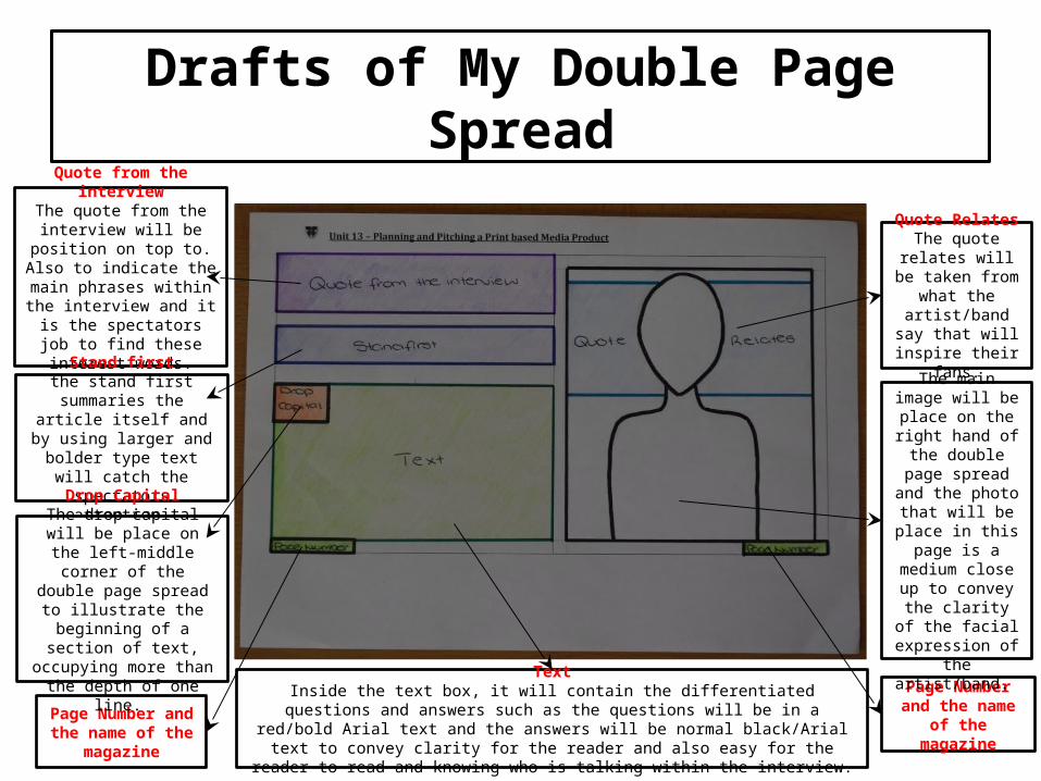
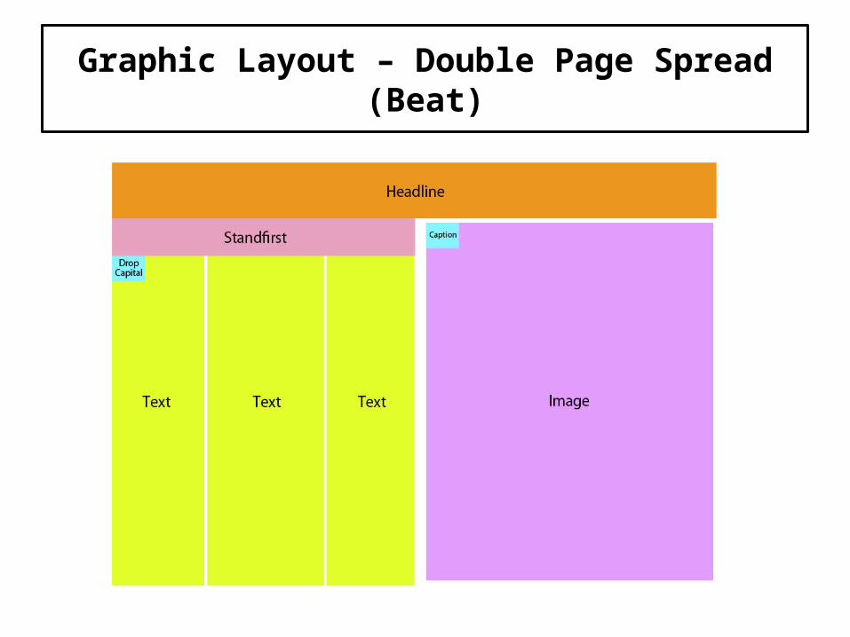
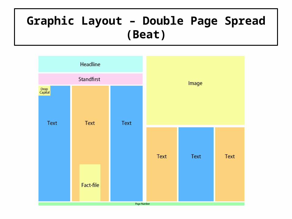
Drafts of My Double Page Spread
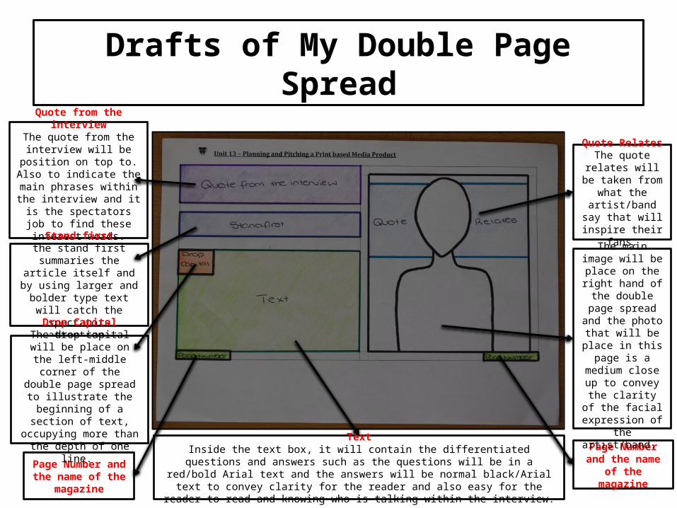
Quote from the interviewThe quote from the
interview will be position on top to. Also to indicate the main phrases within the interview and it is the
spectators job to find these interest words.
Page Number and the name of
the magazine
Main ImageThe main image will be place on the right hand of the double page spread and the
photo that will be place in this page is a medium close up to convey the
clarity of the facial expression of the
artist/band.
Quote RelatesThe quote relates will be taken from
what the artist/band say that will inspire
their fans.
TextInside the text box, it will contain the differentiated questions and answers such as the questions will be in a red/bold Arial text and the answers will be normal black/Arial text to convey clarity for the reader and also easy for the reader to read and knowing who
is talking within the interview.
Page Number and the name of the
magazine
Stand firstthe stand first summaries
the article itself and by using larger and bolder type text will catch the spectators attention.
Drop CapitalThe drop capital will be place on the left-middle
corner of the double page spread to illustrate the
beginning of a section of text, occupying more than
the depth of one line.

Interview Drafts
Here is my draft interview for my double page spread. As you can see I have already differentiate the questions and the answers to make it easier for me to change when I transfer this into Photoshop. Also I have varied the questions such as asking open and close questions to keep the conversation going and make the artist think.
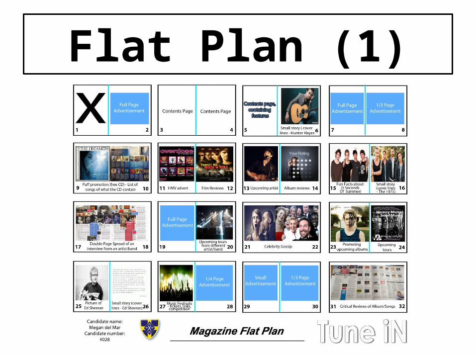
Flat Plan (1)
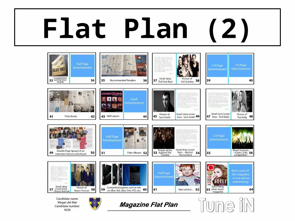
Flat Plan (2)

Mood Board

Mood Board ReflectionMy magazine will contain a puff promotion which is similar to the magazine that I have been analysing which is Mojo magazine because in my opinion this is one of their idea to retain their target audience.
My magazine will comprehend a shade of blue to connote wisdom, confidence, intelligence, faith and truth. The connotation about these words is that I want my target audience to feel as this music magazine is going to be one of the blockbuster music magazine out there.
For my magazine, the masthead will be similar with the masthead of Mojo magazine as it is very effective, bold, simple and eye catching. The connotation of the masthead is that I am not only taking inspirations from different categories of music magazines but to demonstrate to my target audience that this magazine is going to be the best of the best.
As a finishing product, my magazine will have a similar front cover to this. The purpose why I have chosen this specific front cover because it is very bright, it relaxes the target audiences eyes because of the use of different shades of colour such as pink, white and blue and lastly, the use of text which are very bold and easy to attract audiences with the use of large text around the main image and also the main colour that has their own purpose.
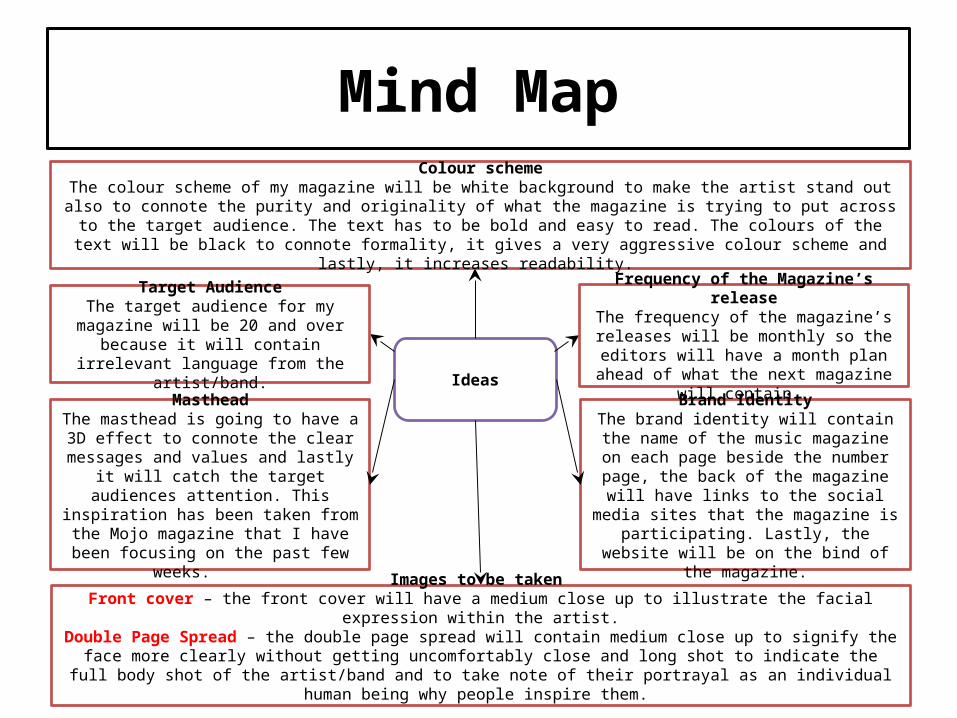
Mind Map
Ideas
Brand IdentityThe brand identity will contain the
name of the music magazine on each page beside the number page, the
back of the magazine will have links to the social media sites that the
magazine is participating. Lastly, the website will be on the bind of the
magazine.
Images to be taken Front cover – the front cover will have a medium close up to illustrate the facial expression within the
artist.Double Page Spread – the double page spread will contain medium close up to signify the face more
clearly without getting uncomfortably close and long shot to indicate the full body shot of the artist/band and to take note of their portrayal as an individual human being why people inspire them.
Colour schemeThe colour scheme of my magazine will be white background to make the artist stand out also to
connote the purity and originality of what the magazine is trying to put across to the target audience. The text has to be bold and easy to read. The colours of the text will be black to connote formality, it
gives a very aggressive colour scheme and lastly, it increases readability.
Target AudienceThe target audience for my
magazine will be 20 and over because it will contain irrelevant language from the artist/band.
MastheadThe masthead is going to have a 3D effect to connote the clear messages and values and lastly it will catch the
target audiences attention. This inspiration has been taken from the
Mojo magazine that I have been focusing on the past few weeks.
Frequency of the Magazine’s release
The frequency of the magazine’s releases will be monthly so the editors will have a month plan ahead of what
the next magazine will contain.

Font StylesI have chosen this font style specifically because it is bold which will make my music magazine stand out of other magazines. However, I could improve this font by making it a 3D effect, for example Mojo magazine, because I am inspired by their magazine and would like to have the same approach from their target audience whether I have met their criteria. The reason why I have chosen this font style because it has a similar effect to the Mojo magazine such as the 3D effect. However, I could improve this font style by making the shadow effect darker to make it stand out but this could be hard to grab my target audience attention as it does not have that similar effect compare to the Mojo masthead.
I have chosen this font because of the style is different but however it is not similar to Mojo magazine so I may not use this font style as the font style has to be similar to the masthead that I am inspired to.
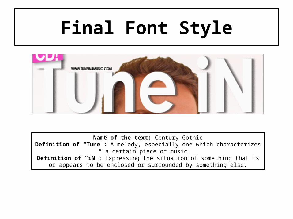
Final Font Style
Name of the text: Century GothicDefinition of “Tune”: A melody, especially one which characterizes a certain
piece of music.Definition of “iN”: Expressing the situation of something that is or appears
to be enclosed or surrounded by something else.

Proposal – Tune iN
House Style/Colour Scheme
House style
The house style is going to be bold text and bright colours everywhere to make it easier for my target audience to familiar with the layout and font types of the magazine. Moreover, to enhance the quality of my product it has to contain high quality photographs and it has to be done in a professional way. Lastly, what inspired me to do this is that every music magazine has their own originality and this is one of their own ideas to entice their target audience.
Colour scheme
The colour scheme of my magazine will be white background to make the artist stand out also to connote the purity and originality of what the magazine is trying to put across to the target audience. The text has to be bold and easy to read. The colours of the text will be black to connote formality, it gives a very aggressive colour scheme and lastly, it increases readability.
Drafts of My Front CoverPuff Promotion
The reason why the puff promotion is on the top so the spectator can easily see what
the magazine has for this month issue.
Cover linesMore short statements and
describing the articles inside especially in relation to the main
image of the magazine front cover.
MastheadThe masthead will be centre/top to illustrate its purpose and also to make it easier for my target
audience to find my music magazine in the shelf store.
Cover lines with an imageThe cover lines with an image
will illustrate what the cover line is trying to clarify to the
spectator.
Main ImageThe main image is place in the
centre to illustrate how important the artist/band.
Cover linesThe cover lines will contain the short statements found on the
cover of the magazine.
Headline (Main Story)The headline will be position on
the right hand corner of the main image to support the
main image.
StraplineThe strapline will be place in
between but above the masthead to illustrate the value of the magazine and entice the spectator for the future issues.
BarcodeThe barcode will contain the monthly issue and the price.
Synergy with social media
Cover linesMore short statements and
describing the articles inside especially in relation to the main
image of the magazine front cover.
Drafts of My Double Page Spread
Quote from the interviewThe quote from the
interview will be position on top to. Also to indicate the main phrases within the interview and it is the
spectators job to find these interest words.
Page Number and the name of
the magazine
Main ImageThe main image will be place on the right hand of the double page spread and the
photo that will be place in this page is a medium close up to convey the
clarity of the facial expression of the
artist/band.
Quote RelatesThe quote relates will be taken from
what the artist/band say that will inspire
their fans.
TextInside the text box, it will contain the differentiated questions and answers such as the questions will be in a red/bold Arial text and the answers will be normal black/Arial text to convey clarity for the reader and also easy for the reader to read and knowing who
is talking within the interview.
Page Number and the name of the
magazine
Stand firstthe stand first summaries
the article itself and by using larger and bolder type text will catch the spectators attention.
Drop CapitalThe drop capital will be place on the left-middle
corner of the double page spread to illustrate the
beginning of a section of text, occupying more than
the depth of one line.
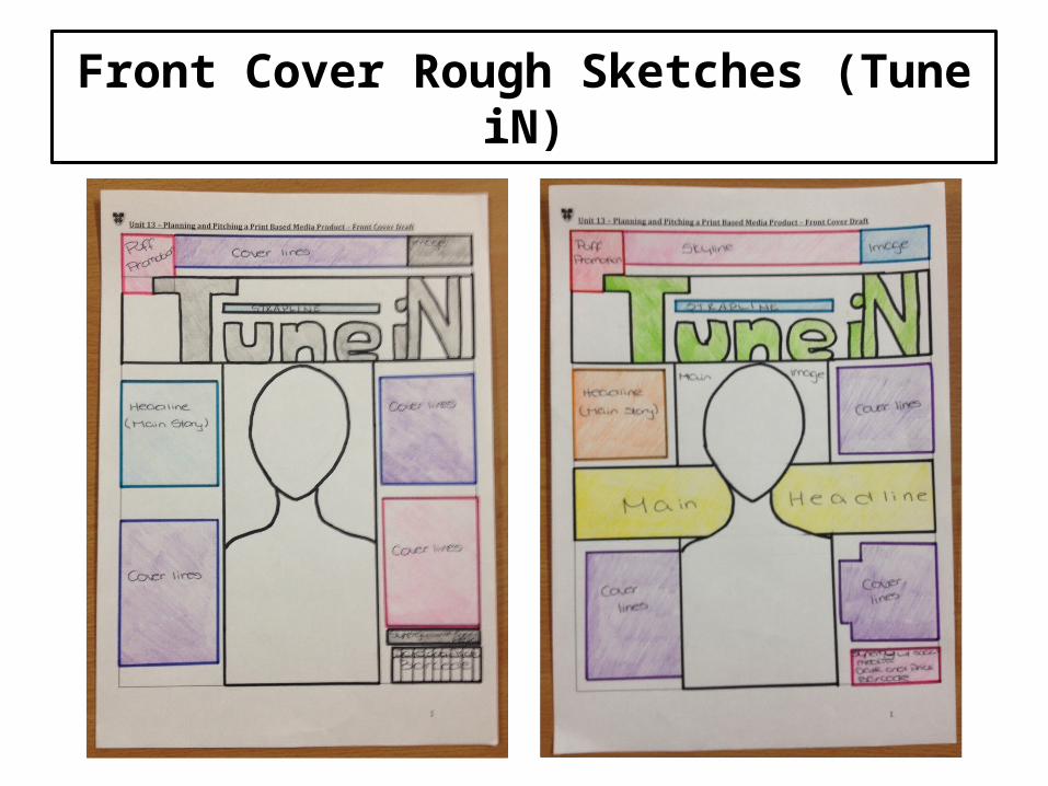
Front Cover Rough Sketches (Tune iN)
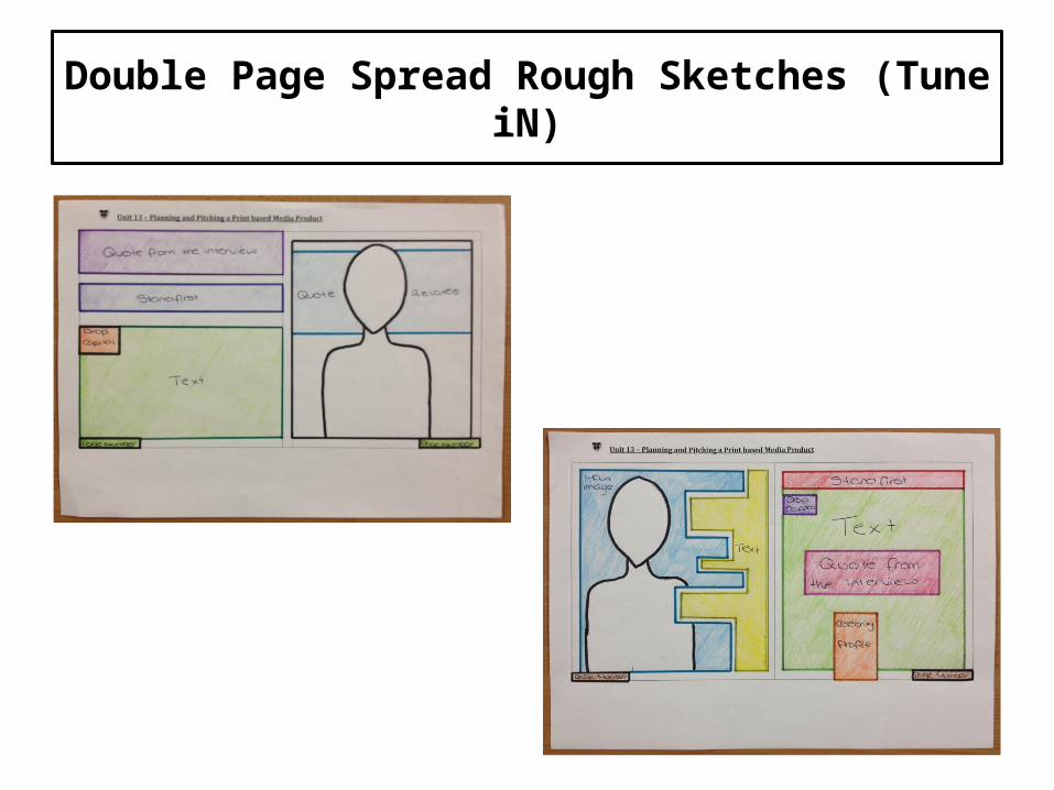
Double Page Spread Rough Sketches (Tune iN)
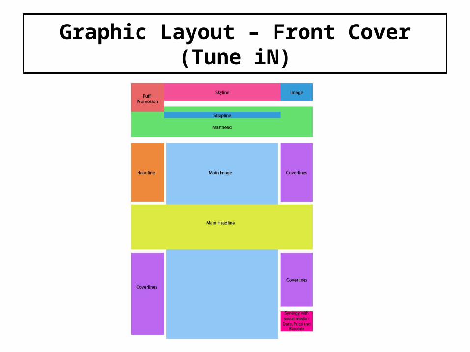
Graphic Layout – Front Cover (Tune iN)

Graphic Layout – Double Page Spread (Tune iN)
Graphic Layout – Front Cover (Tune iN)
Graphic Layout – Double Page Spread (Tune iN)

Proposal – Beat
House Style/Colour Scheme
House style
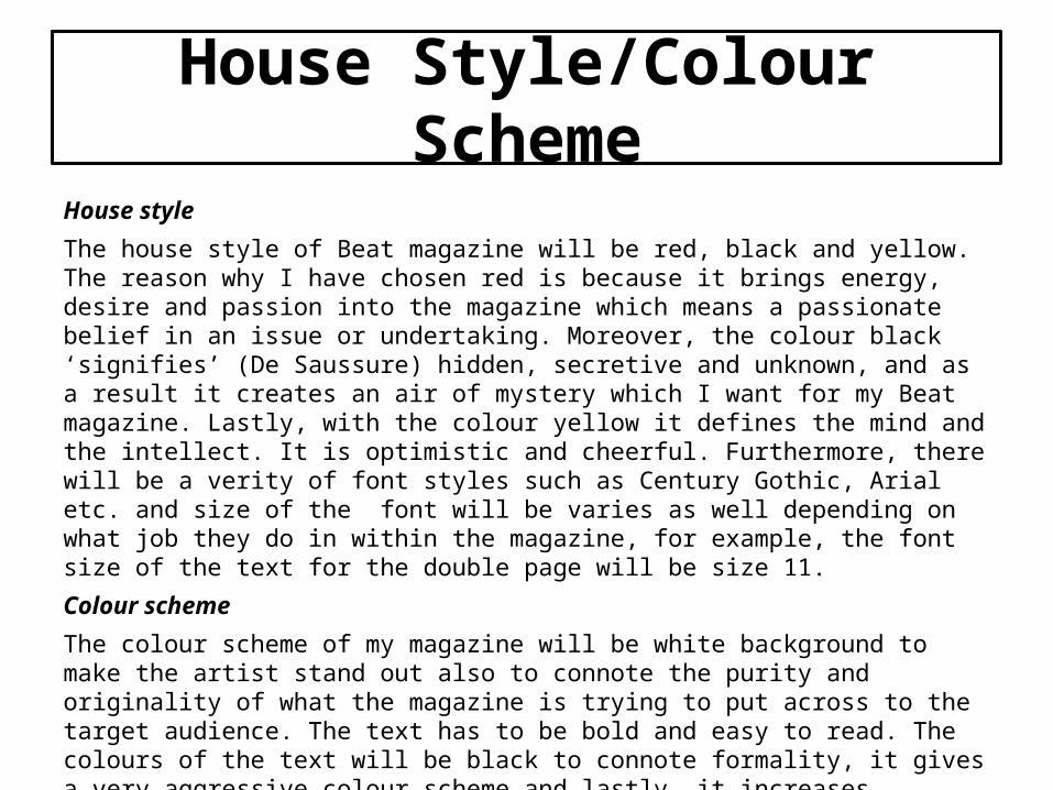
The house style of Beat magazine will be red, black and yellow. The reason why I have chosen red is because it brings energy, desire and passion into the magazine which means a passionate belief in an issue or undertaking. Moreover, the colour black ‘signifies’ (De Saussure) hidden, secretive and unknown, and as a result it creates an air of mystery which I want for my Beat magazine. Lastly, with the colour yellow it defines the mind and the intellect. It is optimistic and cheerful. Furthermore, there will be a verity of font styles such as Century Gothic, Arial etc. and size of the font will be varies as well depending on what job they do in within the magazine, for example, the font size of the text for the double page will be size 11.
Colour scheme
The colour scheme of my magazine will be white background to make the artist stand out also to connote the purity and originality of what the magazine is trying to put across to the target audience. The text has to be bold and easy to read. The colours of the text will be black to connote formality, it gives a very aggressive colour scheme and lastly, it increases readability.
Front Cover Rough Sketches (Beat)

Double Page Spread Rough Sketches (Beat)
Graphic Layout – Front Cover (Beat)
Graphic Layout – Double Page Spread (Beat)

Graphic Layout – Front Cover (Beat)
Graphic Layout – Double Page Spread (Beat)
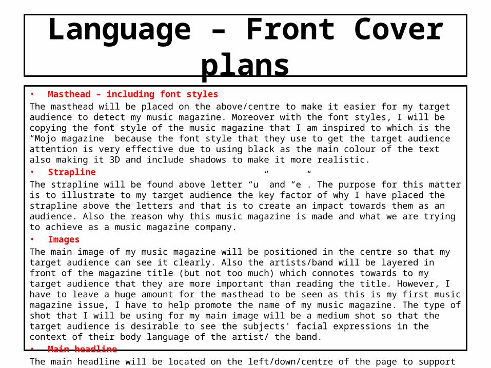
Language – Front Cover plans• Masthead – including font styles
The masthead will be placed on the above/centre to make it easier for my target audience to detect my music magazine. Moreover with the font styles, I will be copying the font style of the music magazine that I am inspired to which is the “Mojo magazine” because the font style that they use to get the target audience attention is very effective due to using black as the main colour of the text also making it 3D and include shadows to make it more realistic. • Strapline
The strapline will be found above letter “u” and “e”. The purpose for this matter is to illustrate to my target audience the key factor of why I have placed the strapline above the letters and that is to create an impact towards them as an audience. Also the reason why this music magazine is made and what we are trying to achieve as a music magazine company. • Images
The main image of my music magazine will be positioned in the centre so that my target audience can see it clearly. Also the artists/band will be layered in front of the magazine title (but not too much) which connotes towards to my target audience that they are more important than reading the title. However, I have to leave a huge amount for the masthead to be seen as this is my first music magazine issue, I have to help promote the name of my music magazine. The type of shot that I will be using for my main image will be a medium shot so that the target audience is desirable to see the subjects' facial expressions in the context of their body language of the artist/ the band.• Main headline
The main headline will be located on the left/down/centre of the page to support the main image. The main headline has to be bold and big so it is recognisable and also to illustrate that the main headline belongs to the main image.
Language – Front Cover plans• Languages devices
The type of languages devices that my music magazine will contain such as an hyperbole which is an overstatement or exaggeration of speech for an effect. I thought this was a good idea to use because of the magazine that I am inspired to, Mojo magazine, uses words such as “greatest” and “the genius returns”. This connotes that Mojo magazine likes to compliment their client and as an aspire towards their work, I have to include exaggeration in my magazine to grab my target audiences attention. • Cover lines
I will have four cover lines around the magazine to cover every key factors inside the magazine but mainly the key factors of the main image to support its quality of being the front cover of my magazine. Also if there are words such as an hyperbole it will be in bold and bright colours such as pink and blue to illustrate its purpose and make it easier for the target audience to read as well. • Puff promotion
The puff promotion will be placed on the very top left hand corner so my target audience can easily see it and to do this I have to place it on a shape with bold colours and text to go along with it so my target audience will feel that authority of receiving a free merchandise off a music magazine. • Synergy with social media
To gain more popularity for my music magazine I have to collaborate with the social media as many people nowadays use this as open forum to which everyone is invited to collaborate and share ideas, experiences and interests.• House Style
The house style is going to be bold text and bright colours everywhere to make it easier for my target audience to familiar with the layout and font types of the magazine. Moreover, to enhance the quality of my product it has to contain high quality photographs and it has to be done in a professional way. Lastly, what inspired me to do this is that every music magazine has their own originality and this is one of their own ideas to entice their target audience.
Language – Double Page Spread
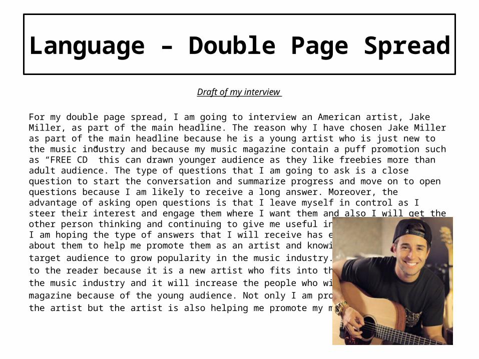
Draft of my interview
For my double page spread, I am going to interview an American artist, Jake Miller, as part of the main headline. The reason why I have chosen Jake Miller as part of the main headline because he is a young artist who is just new to the music industry and because my music magazine contain a puff promotion such as “FREE CD” this can drawn younger audience as they like freebies more than adult audience. The type of questions that I am going to ask is a close question to start the conversation and summarize progress and move on to open questions because I am likely to receive a long answer. Moreover, the advantage of asking open questions is that I leave myself in control as I steer their interest and engage them where I want them and also I will get the other person thinking and continuing to give me useful information about them. I am hoping the type of answers that I will receive has enough information about them to help me promote them as an artist and knowing how to engage my target audience to grow popularity in the music industry. This will appeal to the reader because it is a new artist who fits into the sub genres of the music industry and it will increase the people who will buy the magazine because of the young audience. Not only I am promoting the artist but the artist is also helping me promote my music magazine.
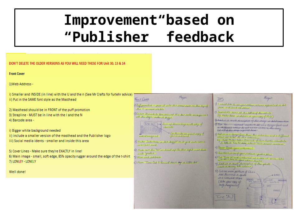
Improvement based on “Publisher” feedback

Front Cover
As you can see I have included my
first draft to see the comparison with my final piece. I have
adjusted the alignments and
making sure that all the cover lines and headlines are all
line. Moreover, with the main image I
have made the artist brighter to make him
stand out. Furthermore, I have stick into the colour
scheme such as blue, pink and
black.
Before After
Text
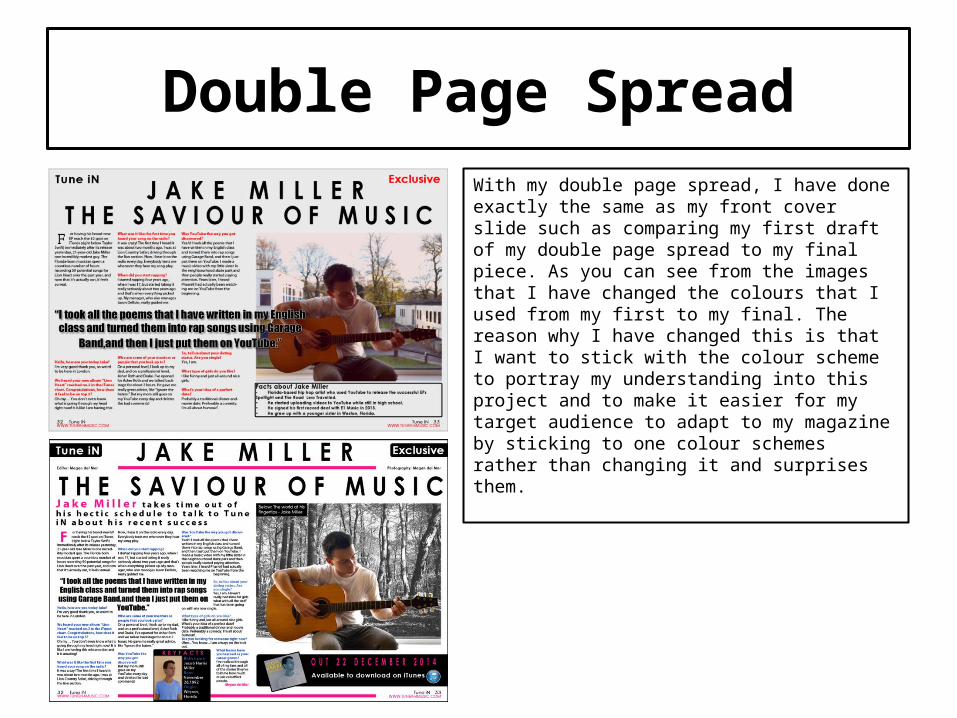
Double Page SpreadWith my double page spread, I have done exactly the same as my front cover slide such as comparing my first draft of my double page spread to my final piece. As you can see from the images that I have changed the colours that I used from my first to my final. The reason why I have changed this is that I want to stick with the colour scheme to portray my understanding into this project and to make it easier for my target audience to adapt to my magazine by sticking to one colour schemes rather than changing it and surprises them.
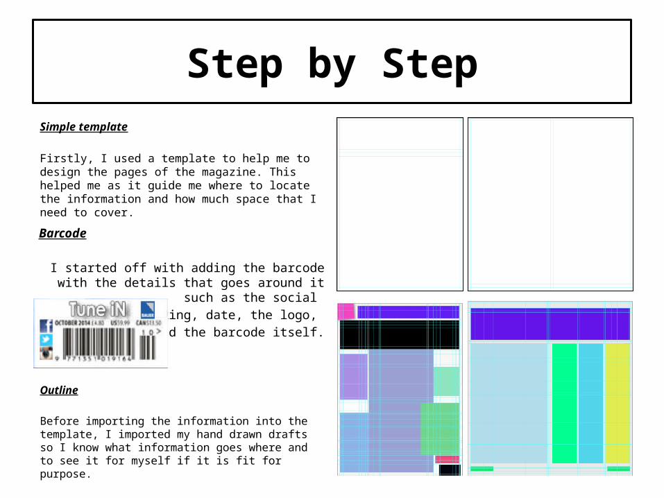
Step by StepSimple template
Firstly, I used a template to help me to design the pages of the magazine. This helped me as it guide me where to locate the information and how much space that I need to cover.
Outline
Before importing the information into the template, I imported my hand drawn drafts so I know what information goes where and to see it for myself if it is fit for purpose.
Barcode
I started off with adding the barcode with the details that goes around it such as the social
networking, date, the logo, price and the barcode itself.

Step by Step
Interview & quote relates
I have added the text from the interview and picked the most interesting line from the interview and made them bigger and bold to make it interesting.
Main image on the double page spread
I have displayed the main image and created another text underneath the image about fun facts of the artist.
Headline
I have added the headline (main story) beside the main image to connote that the headline is announcing the artist and to have a title illustrate that he is important.
Editing
As you can see, I have edited the main image of the front cover.
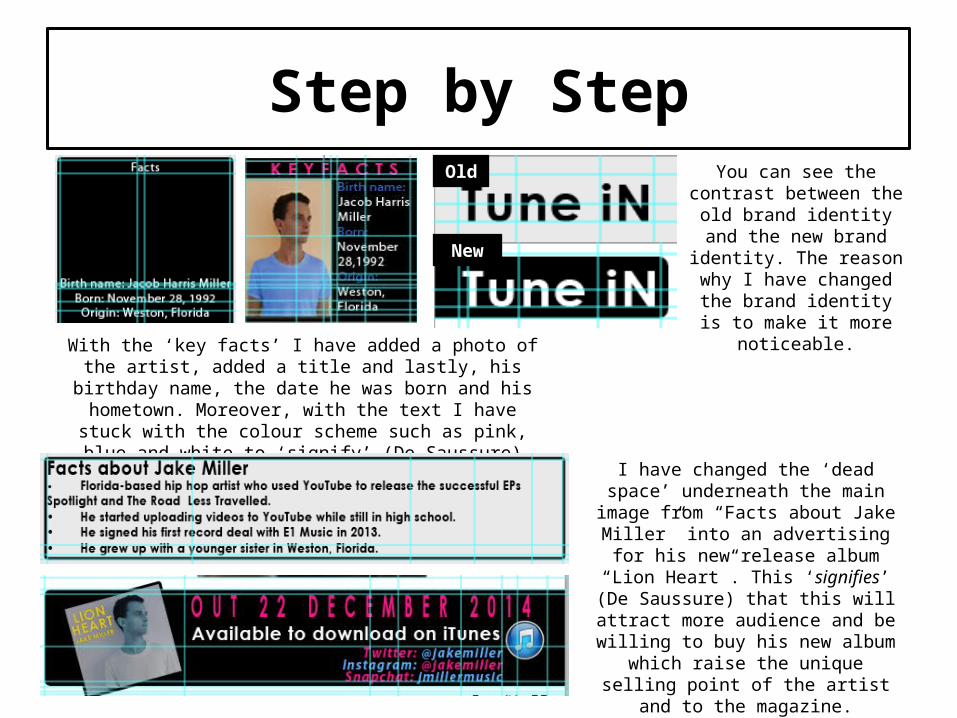
Step by Step
With the ‘key facts’ I have added a photo of the artist, added a title and lastly, his birthday name, the date he was born
and his hometown. Moreover, with the text I have stuck with the colour scheme such as pink, blue and white to ‘signify’
(De Saussure) brand identify within the magazine.
You can see the contrast between the old brand
identity and the new brand identity. The reason why I have changed the brand
identity is to make it more noticeable.
I have changed the ‘dead space’ underneath the main image from “Facts about Jake Miller” into an advertising for
his new release album “Lion Heart”. This ‘signifies’ (De Saussure) that this
will attract more audience and be willing to buy his new album which raise the unique selling point of the artist and to the magazine. Moreover, I have added
his social media account such as Twitter, Instagram and Snapchat.
New
Old
Step by Step
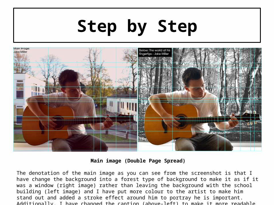
Main image (Double Page Spread)
The denotation of the main image as you can see from the screenshot is that I have change the background into a forest type of background to make it as if it was a window (right image) rather than leaving the background with the school building (left image) and I have put more colour to the artist to make him stand out and added a stroke effect around him to portray he is important. Additionally, I have changed the caption (above-left) to make it more readable and noticeable towards my target audience.
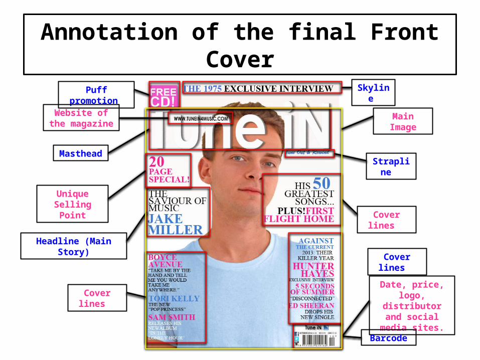
Annotation of the final Front Cover
Puff promotion
Masthead
Headline (Main Story)
Strapline
Cover lines
Date, price, logo, distributor and social media
sites.
Barcode
Skyline
Cover lines
Cover lines
Unique Selling Point
Main ImageWebsite of the magazine
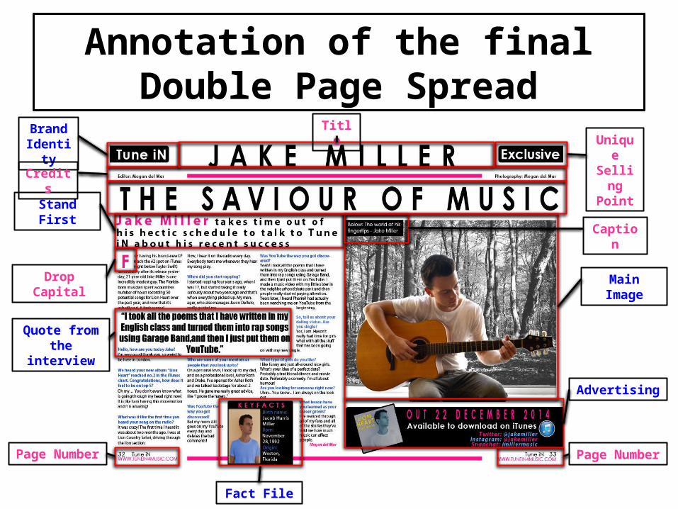
Annotation of the final Double Page Spread
Main Image
Stand First
Drop Capital
Page NumberPage Number
Caption
Quote from the interview
Advertising
Unique Selling Point
Brand Identity
Fact File
Title
Credits


![U1.1 lesson3[lo3]](https://static.cupdf.com/doc/110x72/58eceb391a28ab8d308b462b/u11-lesson3lo3.jpg)


![U1.6 lesson4[lo3]](https://static.cupdf.com/doc/110x72/58f099731a28ab47428b45e5/u16-lesson4lo3.jpg)
