THINKING INSIDE THE BOX 1
1
Thinking Inside the Box: How Seeing Products on, or Through, the 2
Packaging Influences Consumer Perceptions and Purchase Behaviour 3
4
5
Gregory Simmonds A 6
& Charles Spence A, * 7
8
A Crossmodal Research Laboratory, Department of Experimental Psychology, University of 9
Oxford, South Parks Road, Oxford, OX1 3UD, UK 10
* Corresponding author. E-mail address: [email protected]. 11
12

THINKING INSIDE THE BOX 2
13
Abstract 14
15
Images of food constitute salient visual stimuli in the mind of the consumer. They are capable 16
of promoting both feelings of hunger and the desire for food. It should not, then, come as any 17
surprise that many product packages present the food contained within as a salient aspect of 18
their visual design. Conventionally, this has been achieved primarily by the use of attractive 19
visual imagery showing the product on the outside of the packaging. Nowadays, however, 20
developments in packaging are increasingly enabling designers to add transparent elements, 21
thus allowing consumers to directly see the product before purchase. Yet relatively little is 22
known about the effectiveness of product imagery as compared with transparent packaging. 23
In this review, we address the various ways in which seeing (images of) food influence the 24
consumer. The implications for packaging designs which include: (a) images of food, and (b) 25
transparent elements, are investigated. Guidelines are also provided for designers and brands 26
on the ways in which to take advantage of these effects of being able to see the food. 27
28
Keywords: Packaging; Packaging design; Transparent packaging; Food aesthetics; 29
Consumption. 30
31

THINKING INSIDE THE BOX 3
1. Introduction 32
Packaging is far more than merely a convenient means of getting a product to the 33
store/consumer without damage (see Hine, 1995; Spence, 2016, for reviews). Over the past 34
couple of decades, it has increasingly been realised that product packaging constitutes a 35
powerful marketing tool in its own right (e.g., Rundh, 2005), and as such requires the same 36
attention and techniques used in other areas of marketing to maximise commercial success 37
(see Ahmed, Ahmed, & Salman, 2005). As such, the effects of packaging should be of great 38
importance for designers, marketers, and brand managers alike. It has been estimated that: 39
over three-quarters of food/drink purchase decisions are made at the point of sale (Connolly 40
& Davison, 1996; POPAI, 2014; see also WPP, n.d.); 90% of consumers make a purchase 41
after only examining the front of pack; and 85% of consumers make a purchase without 42
having picked up an alternative product (Urbany, Dickson, & Kalapurakal, 1996). Making 43
purchase decisions is no simple matter either – the average consumer will typically buy only 44
0.7% of the available products in-store over the course of a year (Catalina, 2014), despite 45
having a range of over 30,000 products from which to choose (e.g., Sainsbury, n.d.). As a 46
result, consumers must find, evaluate, and compare the products that they want from the vast 47
range of products available in-store. There is rarely the opportunity to sample products in-48
store, and so consumers must make these judgments concerning the likely taste of the food 49
based on the packaging and branding. According to Glanz, Basil, Maibach, Goldberg, and 50
Snyder (1998), consumers primarily buy foods and drinks based on their expected taste and 51
flavour (see also Food Processing, 2013), thus it is important for designers and marketers to: 52
(1) grab the consumer’s attention; and (2) create positive associations and expectations in 53
their minds (such as the expectation of a great taste/flavour experience) in order to ensure the 54
long-term commercial success of a product. 55
THINKING INSIDE THE BOX 4
Packaging can help achieve these goals both at the point of sale and the point of consumption 56
(see Hawkes, 2010; Hine, 1995; Spence, 2016, for reviews). However, there are many 57
options and parameters of packaging design to consider when it comes to ensuring that the 58
packaging transmits the most effective messaging, captures the attention of the consumer in-59
store, and achieves its full potential as a tool with which to enhance product experience. A 60
number of studies have been conducted over the last few decades in order to identify how the 61
various elements of product packaging contribute to these effects. Such studies have 62
investigated elements of packaging including the main colour of the packaging (e.g., Danger, 63
1987; Gimba, 1998; Piqueras-Fiszman & Spence, 2011), packaging shape (Lindstrom, 2005; 64
Meyers, 1991; Velasco, Salgado-Montejo, Marmolejo-Ramos, & Spence, 2014), weight 65
(Kampfer, Leischnig, Ivens, & Spence, submitted; Piqueras-Fiszman & Spence, 2012), shape 66
curvature (Becker, van Rompay, Schifferstein, & Galetzka, 2011; Salgado-Montejo, Leon, 67
Elliot, Salgado, & Spence, 2015), and typeface (Velasco, Woods, Hyndman, & Spence, 68
2015), to name but a few (see Spence, 2016, for a review). Furthermore, a growing body of 69
research suggests that the sight of food is capable of triggering a diverse range of 70
neurological and physiological responses, which include increased hunger, more favourable 71
taste evaluations, and the priming of reward networks (see Spence, Okajima, Cheok, Petit & 72
Michel, in press, for a review). However, to date, comparatively little research has been 73
conducted to investigate the confluence of these two streams of research. That is, the effect of 74
seeing a product on subsequent product evaluations. 75
Packaging can enable the consumer to see the product contained within in one of two ways. 76
Either through images of the product printed on the packaging, or through transparency as an 77
element of the packaging. The prevalence of the latter approach would appear to be on the 78
rise, and a trend that is set to continue (Mintel, 2014). Estimates from the US suggest that 79
transparency is present in between 20% to 77% of all packaging, depending on product 80
THINKING INSIDE THE BOX 5
category (20% of chips, 20% of cookies, 23% of crackers, 77% of nuts; Deng & Srinivasan, 81
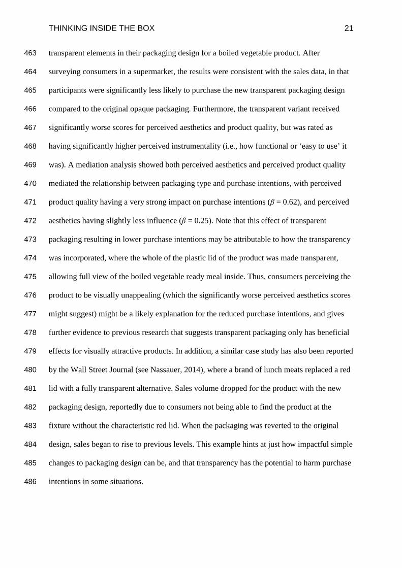
2013). See Figure 1 for examples of packaging that feature product imagery or transparency. 82
[Insert Figure 1 here] 83
This review investigates the evidence concerning how food imagery, either delivered through 84
food images on pack, or else via the use of transparent windows, can influence the consumer. 85
This review also provides guidelines as to how this effect can be levied to the benefit of 86
packaging designers and brand managers. 87
88
2. The effects of seeing food 89
According to the extant literature, images of food tend to constitute salient visual stimuli (see 90
Spence et al., in press, for a review). As such, it would seem natural that this could offer food 91
companies a relatively cheap and easy means of attracting the attention of the customer in-92
store. 93
Testing this hypothesis, Nijs, Muris, Euser, and Franken (2010) combined eye-tracking with 94
a visual probe task in order to identify whether images of food (e.g., of chocolate, a donut) 95
would capture attention more effectively than neutral images (e.g., a stapler, or paperclips). 96
These images were matched in terms of their shape, colour, background colour, and position. 97
Attention was robustly captured by food images in all participants1. These results were 98
supported by a P300 peak after the presentation of food stimuli. This particular Event-Related 99
Potential (ERP) is thought to be related to the orienting of selective attention (Cuthbert, 100
Schupp, Bradley, Birbaumer, & Lang, 2000). Thus, as these images were task-irrelevant to 101
1 Note that these results were found regardless of whether the participant was overweight/obese, or normal-weight; and whether they were hungry (following a 17-hr fast), or satiated.

THINKING INSIDE THE BOX 6
the visual probe task, it would seem that images of food do indeed involuntarily capture 102
people’s attention. 103
di Pellegrino, Magarelli, and Mengarelli (2011) used a similar paradigm (again using a visual 104
probe task) in order to investigate whether such attentional capture caused by images of food 105
was contingent on relative food preferences. The results demonstrated the same pattern of 106
attentional bias towards food cues before eating. However, if the participant was tested on the 107
visual probe task after having eaten a food that had previously been seen in a separate cueing 108
task, then the effect of attentional capture of this same stimulus was markedly reduced. Yet 109
for foods seen previously but not eaten, attentional capture remained at the same level. Such 110
results highlight the fact that attentional capture by food imagery may be modulated by the 111
phenomenon of ‘sensory-specific satiety’ (see Piqueras-Fiszman & Spence, 2014). This 112
phenomenon suggests that satiety is specific to different sensory food characteristics such 113
that one may still be motivated to eat some food type (e.g., sweet foods) even after being 114
sated on another (e.g., savoury foods). A similar mechanism of heightened cognitive bias 115
towards food cues has also been identified in participants who were hungry (Piech, Pastorino, 116
& Zald, 2010); those who are in a bad mood (Hepworth, Mogg, Brignell, & Bradley, 2010); 117
and those who are overweight (Werthmann et al., 2011). 118
A potential explanation for this attentional capture comes from a recent paradigm shift that 119
has taken place in attentional theory. Traditionally, attentional control was thought of as 120
being governed dichotomously. That is, on the one hand by exogenous selection, which is 121
caused involuntarily by feature properties present in the environment, such as distinctive 122
colours, shapes and movements. On the other, by endogenous, or voluntary selection, guided 123
by an observer’s goals (see Theeuwes, 2010, for a review). However, a revised framework 124
has introduced a third factor: namely, selection- and reward-history (see Awh, Belopolsky, & 125

THINKING INSIDE THE BOX 7
Theeuwes, 2012). Previously-rewarded or selected targets can elicit attentional capture, even 126
after long periods of extinction, or when not goal-relevant (e.g., Anderson, Laurent, & 127
Yantis, 2011; Anderson & Yantis, 2013; Camara, Manohar, & Husain, 2013; Chelazzi, 128
Perlato, Santandrea, & Della Libera, 2013). Food seems to be an inherently rewarding 129
stimulus, especially when they taste pleasant. This association between food and reward can 130
be explained through positive reinforcement, such as from eating/smelling/etc. pleasant 131
foods; as well as through negative reinforcement, from the avoidance of feelings of hunger 132
(see Berridge, 1996; Rogers & Hardman, 2015). Indeed, a cognitive bias towards food cues 133
has been identified (Brignell, Griffiths, Bradley, & Mogg, 2009), as well as preferential 134
visual processing for images of foods that have a higher-fat and higher-carbohydrate content 135
(Harrar, Toepel, Murray, & Spence, 2011). As such, it is perhaps not so surprising that food 136
stimuli should be so effective in terms of commanding our attention. 137
Viewing food seems to have effects other than simply just attentional capture. Wansink, 138
Painter, and Lee (2006) found that presenting sweets in clear as compared to opaque jars 139
resulted in significantly higher consumption. When a jar was close and transparent, 140
participants ate an average of 7.7 sweets per day, as compared to 4.6 when it was opaque. 141
And when it was placed 2 meters away, the same effect was also found: an average daily 142
consumption of 5.6 when visible, and 3.1 when opaque. This effect was so strong that the 143
participants themselves noted that the sweets were both significantly harder to resist and 144
more attention-capturing when in a transparent jar. As reported in Wansink (2004), a similar 145
effect was found when participants were provided with sandwich quarters: if they were in a 146
transparent wrap, participants consumed more, as compared to a non-transparent wrap 147
condition. Furthermore, Bodenlos and Wormuth (2013) identified that food does not have to 148
be accessible to cause this effect. Participants consumed more calories after watching a food-149
based programme, as compared to a nature program, thus supporting recent claims that the 150

THINKING INSIDE THE BOX 8
rich and rapidly growing world of ‘gastroporn’ may be driving us to increased levels of food 151
consumption (see Spence et al., in press, for a review). Passamonti et al. (2009) found that 152
such sensitivity to food was also especially potent when viewing appetising as compared to 153
bland food images, and concluded that “external food cues, such as the sight of appetizing 154
food can evoke a desire to eat, even in the absence of hunger” (Passamonti et al., 2009, p. 155
43). 156
A number of neurological substrates have also been identified. In a comprehensive meta-157
analysis by van der Laan, de Ridder, Viergever, and Smeets (2011), fMRI data from 158
participants viewing food vs. non-food images found multiple foci of activation in, for 159
example: the lateral orbitofrontal cortex, an area associated with judging the expected 160
pleasantness of food; the lateral occipital complex, associated with heightened attention and 161
visual processing of emotional stimuli (such as food); the middle insular cortex, an area 162
thought to be involved in food cravings or imagining the taste of foods; and the amygdala, 163
which is well documented in its involvement with reward processing (see Figure 2). Research 164
by Volkow et al. (2002) found heightened dopamine levels in the dorsal striatum, and 165
suggested that this region is likely involved in generating food motivation when viewing food 166
images. These neurological activations provide further evidence that viewing images of food 167
can lead to preferential attentional processing, as well as presumably influencing evaluations 168
of the product and its packaging. Thus, using food imagery as a graphical component on 169
packaging could be a powerful tool in the designer’s arsenal. 170
[Insert Figure 2 here] 171
Aside from increased consumption, other effects of seeing foods have also been identified, 172
such as increased craving for food, increased hunger, and changes in salivation (see Spence, 173
2011; Wansink, 2004, for reviews). Indeed, Rogers and Hill (1989) identified that 174
THINKING INSIDE THE BOX 9
overconsumption due to the presentation of appetising food was preceded by increased 175
ratings of hunger and salivation. Increased hunger and food cravings have, in turn, have been 176
found to promote purchase intentions (Pachauri, 2001; Wilcock, Pun, Khanona, & Aung, 177
2004), thus suggesting there could be a clear pathway from seeing images of a food product 178
to being more likely to purchase it. As such, using food visuals would seem like a potentially 179
powerful means of attracting the consumer’s attention and influencing their subsequent 180
purchase behaviour. 181
Understanding this effect with respect to packaging design is crucial, such that designers and 182
marketers can provide consumers with what they want, thus satisfying consumers as well as 183
potentially increasing sales volume, as well as for public health policy-makers to make 184
decisions regarding the circumstances under which seeing foods on packaging would be 185
appropriate (see Hawkes, 2010, for a commentary on the rationale for regulating packaging 186
designs for products aimed at children). Consumers are increasingly demanding to see what 187
they are buying either on, or preferably through, the packaging, with 54% of consumers 188
agreeing it’s important to be able to see a product through the packaging itself (Mintel, 2014). 189
This appears set to be a trend that will continue to grow in the years to come (see also Mintel 190
News, 2014). 191
192
3. Food imagery on product packaging 193
Although the field of research concerning the use of food imagery on product packaging is 194
still relatively modest in size, there are nevertheless already some important lessons to be 195
learned. First, that on-pack product images can provide an effective means of communicating 196
with the consumer. For example, in Schifferstein, Fenko, Desmet, Labbe and Martin’s (2013) 197
study, food imagery on-pack was seen to help inform consumers concerning key product 198
THINKING INSIDE THE BOX 10
information. Members of a representative consumer panel were recruited to investigate the 199
sensory experiences of a product at various stages, ranging from evaluation through to 200
consumption. Packages used during experimentation either had large visuals of the product 201
on the packaging, or else had no graphic at all. The results revealed that a majority of the 202
consumers (85.1%) relied on looking at the packaging in order to determine what to expect 203
from the product at the point of purchase, and almost a third (28.7%) would use the image to 204
infer what the product would taste like. 205
Underwood and Klein (2002) found that packages incorporating an image of the product 206
transmitted information about the brand – not just the product – and were capable of giving 207
rise to, or manipulating, brand beliefs. In this study, consumers who placed the most 208
importance on these brand beliefs formed more favourable evaluations overall if the 209
packaging incorporated an image of the product. As such, the evidence that has been 210
published to date suggests on-pack product imagery is an important way for consumers to 211
gain an understanding of a product from its packaging, and a potential way in which to give 212
clarity to product and brand positioning. 213
Venter and colleagues (2011) suggest that this product information obtained from imagery 214
also enables more direct comparison of products, as well as attracts the consumer’s attention. 215
In an exploratory study, consumers’ perceptions of food packaging were investigated through 216
25 semi-structured interviews. Ambiguous packaging was on-hand to prompt discussion. 217
Content analysis was conducted on coded responses. The results revealed that consumers 218
were attracted to images of the product on pack. This was found to act as a key source of 219
information for many consumers, allowing them to identify product features through a 220
trustworthy source and compare different products in the category. Some participants 221
identified that the same effect could also be achieved, if not augmented, by the use of 222

THINKING INSIDE THE BOX 11
transparent packaging, but that this would only be relevant for visually-appealing products. 223
Moreover, this insight is consistent with findings from the Mintel (2014) Food Packaging 224
Trends report, where it was found that consumers – especially older consumers – find 225
transparent packaging helpful in terms of gauging the freshness of products, enabling health-226
conscious and quality-seeking shoppers to find exactly what they want (see also Mintel 227
News, 2014). 228
Food imagery may also be capable of enhancing later perceptions of the food, as well as 229
increasing the propensity for the consumer to purchase the product. In order to test this 230
notion, Mizutani and colleagues (2010) manipulated product imagery on packaging in order 231
to try and understand whether a product image could influence flavour evaluation in the case 232
of orange juice. Images were attached to cups, used as a proxy for packaging, with the image 233
attached varying along two dimensions: congruency (whether all of the images in the set 234
were of oranges, or random neutral stimuli), and valence (whether all images were pleasant 235
or unpleasant, e.g., fresh or rotten). Those juices which were presented with pleasant images 236
were judged as tasting fresher and more palatable, and those presented with congruent images 237
were judged as having better aromas. Such results suggest that product images on-pack 238
provide a simple but effective means to favourably influence later product evaluations. 239
In addition to this enhancement of product evaluations, product imagery has also been shown 240
to increase purchase intentions. For example, Gofman, Moskowitz, Fyrbjork, Moskowitz, and 241
Mets (2009) found that the presence of a product-related graphic (in this case, an image of 242
either grapes or a wine bottle) on the front-facing facet of boxed wine helped to increase 243
purchase intentions significantly, as compared to when no product graphic was displayed. 244
Furthermore, the colour of the product image seemed to influence the magnitude to which 245
purchase intentions were increased. A purple wine bottle graphic convinced a greater number 246
THINKING INSIDE THE BOX 12
of respondents to state that they ‘would buy’ the boxed wine, as compared to a green bottle 247
graphic which was otherwise identical. Similarly, Piqueras-Fiszman, Velasco, Salgado-248
Montejo, and Spence (2013) identified that replacing textual information regarding the 249
ingredients with visual information on the front of packaging was also capable of influencing 250
purchase intentions. Their results revealed that the flavour-relevant imagery accounted for 251
59% of the relative importance of willingness-to-try ratings, as opposed to the textual 252
information. This translated into an average 1.32-point increase on a 9-point purchase intent 253
scale when the image was present, hinting at just how impactful graphics on front-facing 254
facets of packaging can be on the intentions of the consumer. 255
However, while there may be compelling reasons to advocate the use of product imagery on 256
packaging, care must be taken not to negatively impact the packaging aesthetics. Prior 257
research suggests that aesthetically pleasing packaging designs can increase desire to own the 258
product (Norman, 2004), encourage willingness to pay a higher price (Bloch, Brunel, & 259
Arnold, 2003), and increase preference over well-known brands (Reimann, Zaichkowsky, 260
Neuhaus, Bender, & Weber, 2010). Perhaps this should come as little surprise, as the halo-261
effect has long been known to cause otherwise-unjustified positive inferences about people or 262
things that are deemed attractive (e.g., Bloch, 1995; Pritchard & Morgan, 1996; Reichert & 263
McRee Walker, 2005). Furthermore, changing packaging designs for well-established brands 264
has the potential to remove elements of the design that consumers rely on to identify the 265
product. As Lee, Gao, and Brown (2010) reported, Tropicana (a global juice brand) saw a 266
drop of 20% in the sales of their orange juice in the US after redesigning the juice carton. An 267
image of an orange was replaced with an image of a glass of orange juice, in an effort to 268
show consumers the appetising ‘inside’ of the orange (i.e., the juice), not the relatively less 269
appetising ‘outside’ of the orange (i.e., the peel). This simple change reportedly resulted in 270
consumers not being able to find the product, as the previous design had become integral to 271
THINKING INSIDE THE BOX 13
the identification of the brand, and represented an estimated $27.3 million loss in revenue due 272
to reduced sales. As such, thorough market research is strongly recommended for any 273
potential redesign of packaging, in order to identify what the impact will be on consumer 274
evaluations and purchase behaviour, and thus to ensure market success and mitigate loss. 275
A further constraint on the use of product imagery would be to make sure that such imagery 276
is not perceived as dishonest. Underwood and Ozanne (1998) highlighted how effective 277
packaging must ultimately communicate effectively to consumers. In six interviews in which 278
participants were guided through a store, opinions were recorded concerning the packaging of 279
around 50 products that the participant selected themselves. One key theme that emerged was 280
that participants often felt tricked or duped by packaging, such as by images that were 281
perceived as being intentionally misleading (e.g., images that had been overly digitally 282
enhanced, or had ‘healthy’ visual cues when this could not be justified by looking at the 283
product’s nutritional content). The researchers theorised that it is in the interest of the brand 284
manager to follow four norms for the development of packaging design: the norms of 285
truthfulness, sincerity, comprehensibility, and legitimacy. Respondents actively avoided 286
those products that defied these norms, resulting in their feeling deceived. Thus, while 287
product imagery does seem to convey many potentially positive benefits, care must be taken 288
to avoid over-emphasising the product visuals, and so, being potentially dishonest. 289
Conversely, using transparent windows as part of product packaging has been suggested to 290
help dispel any such perceptions of deception, instead helping to make the brand seem 291
‘honest’ (Burrows, 2013). 292
293
4. Transparent packaging 294

THINKING INSIDE THE BOX 14
Rather than showing an image of the product, it is becoming increasingly viable to show the 295
consumer exactly what’s inside the packaging by using transparent elements in packaging. 296
The field of research investigating how transparent packaging influences consumer 297
evaluations and behaviour is, though, still in its infancy. However, it is important to 298
understand the impact of such packaging on consumers in order to determine whether it is an 299
effective or worthwhile design decision, especially given its increasing prevalence, as 300
mentioned previously. 301
Previous findings regarding the features of packaging design which have the capacity to 302
influence consumer evaluations and purchase decisions allow predictions to be made about 303
those features of transparent elements which may elicit similar effects. For example, a 304
general preference amongst consumers for rounded shapes (as compared to angular shapes) 305
has been noted (see Bar & Neta, 2006), which leads to higher purchase intentions for 306
packages that display rounded shapes (see Gómez-Puerto, Munar, & Nadal, 2016, for a 307
review). In addition, rounded shapes on packaging have also been found across several 308
studies to promote evaluations of sweetness for the product inside, with angular shapes 309
promoting evaluations of bitterness and sourness (for reviews of these taste-shape 310
correspondences, see Spence, 2011; Spence & Deroy, 2013; Spence, 2012; Velasco, Woods, 311
Deroy, & Spence, 2015; and Velasco, Woods, Petit, Cheok, & Spence, 2016). Certain 312
benefits are afforded if the taste expectations promoted by the angularity of shapes in the 313
packaging design matches that of other expectations, or the consumer’s later experience of 314
the product. Specifically, such a correspondence has been found to result in consumers 315
experiencing less confusion regarding the product (Piqueras-Fiszman & Spence, 2011), 316
associating the product with more positive emotions (Salgado-Montejo, Velasco, Olier, 317
Alvarado, & Spence, 2014), being able to locate it faster (Velasco et al., 2015; see also 318
Sunaga, Park, & Spence, 2016), and rating the taste of the product as more liked and more 319

THINKING INSIDE THE BOX 15
intense (Barnett & Spence, in press; Okamoto et al., 2009; for a review, see Piqueras-320
Fiszman & Spence, 2015). As such, one might expect that the angularity of the shape of a 321
transparent window to have an impact on consumer evaluations and purchase decisions in a 322
similar fashion. Note that it is not the intention of this review to list the effect of every design 323
element on the consumer. However, other dimensions of transparent windows (or transparent 324
packaging more generally) that might feasibly be thought to influence the consumer, based 325
on prior findings, might include: the position of the transparent window (e.g., Deng & Kahn, 326
2009; Westerman et al., 2013), the orientation of the transparent window (e.g., Shen, Wan, 327
Mu & Spence, 2015; Velasco, Woods & Spence, 2015), the colour of the transparent window 328
(e.g., Piqueras- Fiszman & Spence, 2011; Spence, Levitan, Shankar, & Zampini, 2010), the 329
colour contrast between packaging and the product (discussed later), the size of the 330
transparent window (e.g., van Rompay, Hekkert, & Muller, 2005), and the aesthetic/visual 331
balance with other design elements (e.g., Bloch, Brunel, & Arnold, 2003; Norman, 2004; 332
Reimann, Zaichkowsky, Neuhaus, Bender, & Weber, 2010). 333
The remainder of this section will focus on reviewing those studies that have assessed these 334
elements with respect to transparent packaging. Investigating how transparent window tint 335
and shape may impact consumer evaluations, Engels (2015) revealed that the coloured tint of 336
the window itself (when presented as a part of cardboard packaging) is not of great 337
importance to product perceptions. However, coloured windows were found to lead to more 338
positive ratings for perceptions of taste and post-taste purchase intent if the window colour 339
contrasts well with the colour of the product. Interviews with experts (presented alongside the 340
same research) revealed that the latter agreed that tinted windows would be obstructive to the 341
goal of letting the consumer see what’s inside, and so would avoid using them, perhaps 342
except for more creative/limited edition designs. Furthermore, the results suggested angular 343
(vs. rounded) windows can result in more positive ratings of pack attractiveness, the 344

THINKING INSIDE THE BOX 16
perceived and actual taste perceptions of the product (both pre- and post-taste), as well as, 345
importantly, purchase intent. However, it should be noted that the greater benefits conferred 346
by angular windows here contrasts with prior research, suggesting a general preference for 347
rounded shapes (Bar & Neta, 2006; Westerman et al., 2012). While untested, it can be 348
speculated that angular windows may only confer such benefits for penne-shaped pasta, due 349
to some attribute such as its shape, size, or taste. Indeed, previous findings regarding shape-350
taste correspondences (as already discussed at the start of this section) might well predict that 351
the most effective window shape may vary by product category. As such, the careful choice 352
of window shape could be used to tap into such shape-taste correspondences, and potentially 353
influence consumer product evaluations. This is definitely an area that is deserving of future 354
investigation. 355
Transparent packaging has also been identified as having an impact on the amount of food 356
consumed from the package. Deng and Srinivasan (2013) reported that participants consume 357
significantly more by weight (as much as 69% more) from transparent packaging as 358
compared to opaque, plain packaging, but only in the case of visually-attractive foods (e.g., 359
Froot Loops, which are a variety of bright, attractive colours; vs. Cheerios, which are a 360
homogenous beige). However, this also seems to be specific to smaller food items: the 361
consumption of individual M&Ms compared to larger M&M cookies elicited very different 362
results in transparent packaging. That is, the participants consumed 58% more M&Ms when 363
they were presented in transparent as compared to opaque packaging, but ate 28% less M&M 364
cookie(s) under the same conditions. A further caveat is that consumption seems to become 365
reduced for healthier foods when presented in transparent packaging: that is, participants ate 366
78% fewer carrot sticks when presented in transparent as compared to opaque packaging. 367
THINKING INSIDE THE BOX 17
Deng and Srinivasan (2013) also posit a theoretical model to explain why transparent 368
packaging increases consumption under certain circumstances. They suggest that being able 369
to see the food increases its salience (the salience effect), but at the cost of being able to see 370
how much has already been consumed (the monitoring effect). Whichever effect is greater 371
dictates the likelihood of consumption (and thus purchase intent), where the salience effect 372
will increase consumption, and the monitoring effect will decrease it. Empirical testing 373
confirmed this hypothesis, and thus suggests smaller food items should be presented in 374
transparent packaging, and larger or healthier foods in opaque packaging, in order to drive 375
desire to consume, and thus purchase intentions, up. 376
Billeter, Zhu, and Inman (2012) assessed the effect of transparency in packaging with respect 377
to consumer purchase decisions. This was achieved by comparing product evaluations for 378
both opaque and transparent packaging designs. The results revealed that transparent 379
packaging led to: inferences that the product was more trustworthy (even after controlling for 380
freshness and quality judgements); greater consumer preference; and greater purchase intent. 381
Further, a visually unattractive (‘puke’ green) product gave rise to reduced trust in the 382
product if presented in transparent packaging. Note, however, that several of these findings 383
were based on inedible products, such as liquid detergent, so cannot be directly extrapolated 384
to edible goods. Nevertheless, such results do suggest tentatively that transparent packaging 385
is only truly effective when the food presentation is visually appealing. 386
Furthermore, Chandran, Batra, and Lawrence (2009) also compared transparent and opaque 387
packages, with the aim of investigating how perceptions of quality and product trust impacted 388
purchase intentions for both familiar and unfamiliar brands. In an exploratory study, for an 389
unfamiliar brand of mouthwash, participants evaluated the product being of significantly 390
better quality if it was in transparent packaging, and would pay significantly more for it. 391

THINKING INSIDE THE BOX 18
However, for a familiar brand (i.e., Listerine2), the product was thought to be of significantly 392
worse quality when in a transparent bottle, but with no significant difference for purchase 393
intentions compared to the opaque pack. Qualitative analysis of open-ended questions 394
suggested this effect was due to consumer scepticism over the contents of an unknown brand, 395
which transparent packaging helped to alleviate. However, for known brands, there was no 396
distrust of the product contents regardless of the packaging. Two further studies determined 397
product trust was indeed a mediating variable in the process of making inferences of product 398
quality from packaging. Specifically, when packaging was consistent with recorded 399
consumer expectations for the packaging (i.e., that toilet bleach should be presented in 400
opaque packaging), product trust was high, leading to perceptions that the product was of 401
higher quality. However, when such expectations were violated (i.e., that cough syrup should 402
be presented in transparent packaging), trust was lower, as were perceptions of quality. While 403
it should again be noted that none of these products are to be ingested, nor designed to 404
optimise product taste, some important learnings can still be gained. First, that transparent 405
packaging is capable of manipulating perceptions of product quality and product trust 406
through being able to directly see the product (in agreement with the results from Billeter, 407
Zhu, & Inman, 2012; see also Sogn-Grundvag & Ostli, 2009), which influences purchase 408
intentions. Second, that the degree of product trust mediates perceptions of product quality, 409
such that when product trust is high, perceptions of quality will likely also be high. Finally, 410
that transparent packaging might be most effective when consumers are unfamiliar with the 411
brand. That is, consumers could use the opportunity to see the product to judge its quality, 412
and then use this judgement to inform their purchase decision. 413
2 Interestingly, the vast majority of Listerine’s products have been sold in transparent packaging since the inception of the brand. Currently, only the premium ‘whitening mouthwash’ range is sold in opaque packaging, which might provide one explanation as to why opaque packaging for Listerine may be seen as related to higher quality products.
THINKING INSIDE THE BOX 19
The link between the use of transparent packaging and perceived healthfulness of a product 414
has also been investigated, but with somewhat contradictory results. In an exploratory study 415
outlined in Sioutis (2011), participants were recruited online and had to rank different 416
packaging designs for either a cereal or an orange juice product in order of perceived 417
healthfulness. The designs varied across four variables, each having two levels. These were: 418
colour (green vs. red), shape (square vs. rounded packaging), graphic (product image vs. 419
image of a landscape), and visibility (transparent window vs. no window). Conjoint analysis3 420
was used to interpret the results, finding that transparent packaging was judged to be more 421
healthful compared to non-transparent designs. Furthermore, visibility was found to be the 422
most important factor for perceptions of healthfulness within the cereal designs (contributing 423
39.8% of the total importance for all attributes), and the second most important for the orange 424
juice designs (23.2% of total importance). Yet while these initial findings suggest 425
transparency could be a promising way to highlight the healthfulness of a product, 426
subsequent research has found orthogonal results. Riley, da Silva and Behr (2015) also 427
investigated whether the use of transparent packaging (amongst other design elements) could 428
affect perceived healthfulness of a product. Similarly to Sioutis (2011), a conjoint analysis 429
was used, investigating the level of information (showing a product description vs. not 430
showing a description), imagery (a flavour-relevant drawing or image vs. a transparent 431
window), the presence of an organic logo (present vs. not), and packaging colour (green vs. 432
orange). Three different product categories (coffee, carrot soup and carrot baby food) were 433
judged on packaging design preference in terms of healthfulness. The results suggested 434
transparent windows were slightly less preferred to show healthfulness for all product 435
categories tested, with an image instead being the preference. In addition, these ‘visual’ 436
aspects were found to be of relative importance, second only to the level of information 437 3 Conjoint analysis is a widely-used technique in market research, and uses preference scores for different possible designs of a product. The results ultimately provide an estimation of how much value consumers implicitly ascribe to each attribute manipulated.

THINKING INSIDE THE BOX 20
present on the packaging. That is, having detailed product information on-pack was found to 438
account for a most of the relative importance for preference judgements (40.1% for baby 439
food, 48.8% for soup, and 40.1% for coffee), with imagery/transparency following as the 440
second most important attribute (20.4% for baby food, 19.1% for soup, and 22.0% for 441
coffee). Thus, while transparency may be preferred when it comes to showing healthfulness 442
in some categories, it appears imagery would certainly be more beneficial in others. Perhaps 443
one explanation for these results is that those products that were perceived as less healthful 444
within transparent packaging had less aesthetically pleasing products to showcase. For 445
example, the carrot soup product used was a dark brown colour, which may have not matched 446
expectations of bright and vibrant colours for a fresh and healthy product. In addition, the 447
coffee beans shown through a window looked much lighter than one might expect coffee 448
beans to, which again may have reduced the impression of wholesome and healthy produce. 449
Indeed, making judgements for the healthfulness of coffee beans may have not been an 450
intuitive task for participants, since coffee itself typically contains very few calories assuming 451
nothing is added to the drink afterwards and that no other ingredient has been added to the 452
beans during production (as would seem uncommon). Since participants performed a forced 453
choice task (and one where the resulting scores did not signify any specific quantity between 454
ranks, only the ranks themselves), these results might feasibly have been inflated if the 455
designs were actually judged to have performed very similarly, but participants were unable 456
to reflect this in their responses. It is clear that further investigation is required before the 457
impact of transparent packaging on judgements of product healthfulness is fully understood. 458
It is also important to note that the use of transparency in packaging has been found to have 459
negative impact on product perceptions under certain circumstances. For instance, Vilnai-460
Yavetz and Koren (2013) report an experimental study that investigated the mechanisms 461
responsible for a ready meal brand seeing a 30% decline in sales after incorporating 462
THINKING INSIDE THE BOX 21
transparent elements in their packaging design for a boiled vegetable product. After 463
surveying consumers in a supermarket, the results were consistent with the sales data, in that 464
participants were significantly less likely to purchase the new transparent packaging design 465
compared to the original opaque packaging. Furthermore, the transparent variant received 466
significantly worse scores for perceived aesthetics and product quality, but was rated as 467
having significantly higher perceived instrumentality (i.e., how functional or ‘easy to use’ it 468
was). A mediation analysis showed both perceived aesthetics and perceived product quality 469
mediated the relationship between packaging type and purchase intentions, with perceived 470
product quality having a very strong impact on purchase intentions (β = 0.62), and perceived 471
aesthetics having slightly less influence (β = 0.25). Note that this effect of transparent 472
packaging resulting in lower purchase intentions may be attributable to how the transparency 473
was incorporated, where the whole of the plastic lid of the product was made transparent, 474
allowing full view of the boiled vegetable ready meal inside. Thus, consumers perceiving the 475
product to be visually unappealing (which the significantly worse perceived aesthetics scores 476
might suggest) might be a likely explanation for the reduced purchase intentions, and gives 477
further evidence to previous research that suggests transparent packaging only has beneficial 478
effects for visually attractive products. In addition, a similar case study has also been reported 479
by the Wall Street Journal (see Nassauer, 2014), where a brand of lunch meats replaced a red 480
lid with a fully transparent alternative. Sales volume dropped for the product with the new 481
packaging design, reportedly due to consumers not being able to find the product at the 482
fixture without the characteristic red lid. When the packaging was reverted to the original 483
design, sales began to rise to previous levels. This example hints at just how impactful simple 484
changes to packaging design can be, and that transparency has the potential to harm purchase 485
intentions in some situations. 486
THINKING INSIDE THE BOX 22
So what can we conclude about the inclusion of transparency as an aspect of packaging 487
design? First, that it’s capable of driving increased consumption of the product, supporting 488
the evidence of the effects of food image presentation discussed earlier. Second, that it can 489
lead to an increase in purchase intent, in the perception of brand transparency, and it can 490
modify expected and actual taste evaluations. These effects are thought to be moderated by 491
the desirability, or visual attractiveness, of the product itself (as suggested by results of Deng 492
& Srinivasan, 2013; and Vilnai-Yavetz & Koren, 2013). Third, that transparent packaging is 493
likely to be especially impactful for brands consumers are unfamiliar with, as it gives them 494
the ability to assess the quality of the product within more easily. Fourth, that transparent 495
packaging can also lead to more negative product evaluations (such as perceived 496
healthfulness, aesthetics, and quality) and purchase intentions depending on the brand, the 497
product category, and how visually appealing the product is. As such, transparency in 498
packaging seems a promising tool to be able to increase product evaluations and purchase 499
intentions under certain circumstances, but new packaging designs should still be subjected to 500
extensive consumer testing before being implemented to ensure the results are indeed 501
beneficial. 502
Some of these benefits of transparency in product packaging might also be explained by 503
higher-level, or more abstract, accounts. For example, adding transparency may have 504
symbolic value, aside from the visual effects of being able to see a product, which leads to 505
inferences and evaluations regarding the product. In language, the notion of ‘transparency’ is 506
synonymous with ‘openness’, ‘trustworthiness’, and ‘comprehensibility’. Furthermore, 507
transparency may promote representations of ‘being able to see (understand)’ something. The 508
field of cognitive semiotics might argue that, by an observer recognising an element of 509
packaging as transparent, corresponding semantic or metaphorical representations (such as 510
those listed above) might also become activated, and transfer the same meaning of these 511

THINKING INSIDE THE BOX 23
representations to the product itself (see Brandt & Brandt, 2005; Burrows, 2013; Zlatev, 512
2012). Alternatively, through a brand actively choosing to show consumers what is within the 513
package, they potentially give the impression that they have ‘nothing to hide’, thus leading to 514
a similar effect of increased perceived trustworthiness. Indeed, the previously discussed 515
findings from Billeter, Zhu, and Inman (2012) are consistent with such theories, given that 516
participants inferred that the products (and their respective brands) shown in transparent 517
packaging were more trustworthy. Having said this, showing the consumer the product 518
upfront may reduce any anticipation or ‘intrigue’ consumers might otherwise feel when 519
opaque packaging is used. For instance, Patrick, Atefi and Hagtvedt (in press) recently 520
reported that opaque packaging may allow the product to be ‘unveiled’, the act of which was 521
found to increase perceived product value. In the same article, they also reported that 522
transparent packaging removed this effect, and resulted in a significantly lower perceived 523
value. While such results and hypotheses may shed some insight into the mechanics between 524
transparent packaging and consumer evaluations, a wider range of higher-level accounts have 525
not yet been empirically tested in the research that has been published to date. This, then, 526
certainly seems like a niche that future research should fill to broaden our understanding of 527
the impacts of packaging design on the consumer. 528
Further investigation is certainly needed in order to fully validate these findings, and doing so 529
is essential to our understanding of whether transparent windows are more efficacious as 530
compared to their more traditional graphical counterparts. In addition, much of the research 531
in the field thus far has used very plain packaging (either plain cardboard boxes or brown 532
paper bags), or otherwise relatively basic mock-ups of product packaging designs. Thus, the 533
application of these findings to current packaging design for actual products may not be 534
expected to yield similar results, and highlights a need for experiments using more 535
ecologically-valid stimuli. So, while it would certainly seem that transparent packaging 536
THINKING INSIDE THE BOX 24
confers a wide array of potential benefits, more research is needed before we can fully 537
understand the phenomenon and thus make more informed recommendations. 538
539
5. Further implications of transparent packaging 540
In addition to the empirical evidence highlighting the benefits of transparent packaging, there 541
remains some more pragmatic considerations and implications of the use of transparency or 542
windows as part of the design of packaging. 543
One such consideration might be that the product, or the arrangement of the product as seen 544
through a transparent window, may not be as visually appealing as intended once it reaches 545
the store shelf. As an example of this, covering a window in cardboard packaging with a thin 546
or non-rigid plastic window may be likely to reduce the overall structural integrity of the 547
packaging, thus potentially leading to an increase in the number of products damaged in-548
transit, or more complicated shipping requirements. Naturally, using a thicker, more robust 549
plastic pane would help to resolve this issue, but at an expected additional cost. Further, 550
products may become dislodged or disordered inside their packaging during haulage, 551
potentially making them less visually attractive. If the consumer can see this, they might be 552
less likely to purchase a visually unappealing product (as discussed previously), or one that is 553
damaged. Even in the case of products such as cereals or crisps, any settling of the food(s) 554
within the package may serve to make the product look denser or less appealing than 555
intended, especially if some of the product disintegrates during transit. To combat this, the 556
products would need to be tightly packed in order to ensure little gets dislodged in the event 557
that the package does get shaken or disturbed. As far as the settling of the product is 558
concerned, windows would be best placed away from the very lowest portion of the 559
packaging, where the accumulation of dust, broken bits, or settling may be visible for some 560

THINKING INSIDE THE BOX 25
products. Conversely, placing a window in the upper portion of a pack may not show any of 561
the product at all if it has settled below this level. As Stuart Leslie, founder of ‘4sight’, a New 562
York design firm, said recently in a Wall Street Journal article (Nassauer, 2014): “You don't 563
want to hit people over the head with, 'Look, there are 2 inches of space on the top of this 564
container'”. As such, the position of the window is critical and needs to be carefully 565
considered, as several experts also suggested during the interviews in Engels (2015). Lastly, 566
if the product has a mix of different elements, such as cereals with currants or nuts, the 567
consumer may expect to be able to clearly see these through any transparency in the 568
packaging – if not, they may feel deceived, and their perception of the product may suffer. 569
Indeed, reformulations to recipes with visibility in mind may be necessary to ensure that the 570
product looks appealing, will remain intact, and clearly showcases all of the ingredients that 571
the product claims elsewhere to contain (see Oster, 2014). 572
Another important consideration for the inclusion of transparent elements into packaging 573
would likely be cost. From a rudimentary search online of ready-to-use packaging with and 574
without windows, packaging with windows seems to be consistently slightly more expensive 575
(some 10-30% for pre-assembled paper bags, from the author’s own research) than their 576
windowless counterparts. Equally, adding a hermetic seal to ensure food safety can further 577
increase the cost, although some categories, such as chilled pizzas or cereals, can avoid this 578
by packaging the product in a plastic wrap to achieve a seal, and not covering any window 579
with plastic to mitigate costs. This being said, with recent advances in the field of die-cutting 580
and the services now proffered by packaging solutions companies, transparency as part of 581
packaging now offers equivalent levels of food safety. Furthermore, transparent elements can 582
reportedly be built in for marginal extra cost if producing packaging is produced on a large 583
scale. According to one source, the cost of adding transparency can mostly be offset from any 584
cost of embossing or foil decoration that would be used to attract attention in place of the 585

THINKING INSIDE THE BOX 26
transparency (Greasley, 2012). Note also that some categories may not be suited to the 586
incorporation of transparent packaging for reasons of spoilage. Examples of such product 587
categories include those which would oxidise in contact with sunlight, such as cream-based 588
liqueurs, or those where raw ingredients might discolour, such as for potato tubers (see 589
Martin & Sheppard, 1983). However, perhaps transparent packaging will, in the future, be 590
able to give us advanced warning of spoiled food. For example, researchers at the Fraunhofer 591
EMFT have developed a transparent film that changes colour if the meat inside has gone off 592
(Fraunhofer Mikroelektronik, 2011). 593
Further implications for the use of transparency in packaging design include the additional 594
design opportunities that using windows, specifically, could bring. For example, there are 595
opportunities to design windows to take advantage of the benefits of relevant shape 596
symbolism (e.g., Ngo et al., 2013; Spence, 2012; Spence & Ngo, 2012; Spence, Ngo, 597
Percival, & Smith, 2013). As suggested by the research reported by Fairhurst, Pritchard, 598
Ospina, and Deroy (2015), sweeter-tasting products will be better suited to have packaging 599
designs featuring rounded windows, and sour- or bitter-tasting products with a more angular 600
one (as discussed already). As a further example, a leaf-shaped window may well instil in the 601
mind of the consumer the notion that the product is natural or fresh. As an extension of this, 602
using any transparency at all has the capacity to signal a premium offering, innovativeness 603
and modernity in a product and brand (especially if transparent packaging is not a ‘category-604
norm’; see Burrows, 2013); as well as the notions of freshness (see also Nikolaidou, 2011), 605
honesty, and quality assurance already discussed in Billeter, Zhu, and Inman (2012). 606
Additionally, the benefits of transparency could also be augmented by using product visuals 607
alongside, although careful steps would need to be taken to avoid a design that appears too 608
visually-cluttered. There are, however, also risks of using such packaging when trying to 609
convey the legacy of a brand, thus consumer testing of new packaging design concepts would 610
THINKING INSIDE THE BOX 27
still be advisable. For instance, one manufacturer was reticent to use too much transparency, 611
to avoid undermining the heritage which the packaging originally conveyed, and for which 612
the product was known (Murray, 2016). Conversely, a ‘best of both worlds’ approach might 613
also be effective in some situations: for example, in by using a very narrow transparent area, 614
or a semi-transparent element, to elicit perceptions of mystery or intrigue by ‘not giving it all 615
away’ at the point of sale. See Figure 3 for some recent examples of creative designs that 616
have used transparency. 617
[Insert Figure 3 here] 618
One further aspect that is also worth noting is that the impact of a transparent window is 619
likely to be moderated by the main colour of the packaging around it. The field of visual 620
attention has long held colour to be a key component of attentional capture, being especially 621
capable of attracting our attention if the contrast between foreground-background is greater 622
(e.g., Treisman & Souther, 1985; Folk, Remington, & Wright, 1994; Theeuwes, 1994; see 623
Wolfe & Horowitz, 2004, for a review). Indeed, high contrast between packaging colours has 624
been found to attract the attention of consumers to a product (Bix, Seo, & Sundar, 2013; 625
though see also Sunaga, Park, & Spence, 2016) as well as to important elements in 626
advertising (Schindler, 1986) In addition, the perceived attractiveness of vegetables has 627
recently been found to differ depending on the background colour the vegetable is presented 628
on, with quite different background colours proving optimal for the vegetables tested (see 629
Schifferstein, Howell, & Pont, 2016) . Given that visual attention is attracted to regions of 630
high contrast, perhaps this could play a pertinent role with respect to transparent windows. 631
For example, orange-coloured baked beans, visible through an otherwise-teal container (as is 632
the case with Heinz products) would likely make the product stand out more and attract 633
attention. Examples of other brands that could use transparency to leverage high contrast 634
THINKING INSIDE THE BOX 28
between packaging- and product-colour might include Cadbury’s (purple packaging, with 635
brown-coloured chocolate) and Barilla (dark blue packaging, with light-yellow pasta). 636
However, where the product and the packaging have low contrast, such as pasta in beige 637
packaging, say, the effect may be lessened. If transparency is used, a strong contrast between 638
product and brand colours would likely be beneficial. However, while likely an important 639
consideration, this has yet to be addressed by research so no clear guidance can be offered at 640
this point (though see Lyman, 1989). 641
There can also be functional benefits to transparent elements of packaging: using a narrow 642
strip of transparency can help the consumer to monitor how much of the product has already 643
been consumed. Furthermore, transparent elements allow an easier means of assessing 644
whether or not the food has spoiled, thus potentially reducing the amount of food wasted by 645
disposing of it simply when the printed expiry date is met, not when it is actually inedible. 646
Such benefits may not be so impactful at the point of sale, but could certainly bring added 647
value to the consumer at home. 648
One must also be aware of a recent demand from consumers to be able to recycle product 649
packaging, which may deter them from purchasing some plastic packages (e.g., Mainieri, 650
Barnett, Valdero, Unipan, & Oskamp, 1997; Rokka & Uusitalo, 2008). Note that transparent 651
windows and plastic packaging can now be readily obtained from recycled plastics (such as 652
rPET), which could help mitigate such problems of recycling (see Mintel, 2016, for a 653
review). Additionally, providing clear and comprehensive recycling instructions may help 654
alleviate any concerns consumers have regarding recycling and packaging waste (Langley, 655
Turner, & Yoxall, 2011). 656
657
6. Guidelines 658
THINKING INSIDE THE BOX 29
Based on the empirical evidence reviewed here, we would offer the following guidelines: 659
• Use product imagery as an effective means of capturing the customer’s attention, 660
enhancing their perception of the product, and increasing purchase intent. 661
• Product imagery, if used, should avoid being disingenuous or overly digitally-662
enhanced, as consumers will be unlikely to purchase again if the design ultimately 663
gives rise to a negative disconfirmation of expectation(s). 664
• Use transparent packaging, only if the product is not visually unappealing, in order to 665
promote consumption, perceived quality and brand trust and higher purchase 666
intentions, especially as the consumer demand for transparent packaging is currently 667
on the rise. 668
• Thorough market research should be used in order to test any new packaging designs, 669
in order to fully understand the likely impact on consumer evaluations and purchase 670
behaviour. 671
Previous findings can also be taken to suggest that: (1) angular windows would likely be 672
preferred by consumers compared to rounded windows; (2) coloured tints for transparency 673
are unlikely to have a negative impact on consumer evaluations or behavioural intentions; (3) 674
transparent packaging is likely most effective for brands which a consumer is unfamiliar 675
with, in order to allow them to gauge the quality of the product prior to an initial purchase; 676
and (4) that perceived product healthfulness can be strongly influenced by the presence of 677
transparent packaging, but whether this is beneficial or detrimental to the product likely 678
depends on the product category in question and how appealing the product itself looks. 679
However, these findings have yet to be tested robustly through the use of several experiments 680
and product categories, and caution would be advised in treating these as guidelines. 681
7. Conclusions 682
THINKING INSIDE THE BOX 30
In summary, the research clearly suggests that enabling the consumer to see the product, 683
either through, or on, the packaging has a marked effect on consumer behaviour. As such, the 684
correct use of product imagery and/or transparency as part of packaging design plays a 685
critical role in influencing the success of products in the marketplace. However, the existing 686
literature regarding transparent packaging currently remains scant, with many areas in need 687
of further investigation. Some of the questions that have yet to be answered properly include 688
the following: How does the size and position of transparent windows on product packaging 689
mediate any effect on consumer perceptions and purchase behaviour? Does the use of 690
transparency raise the accepted price (or willingness-to-purchase) of the product? (And does 691
that benefit outweigh the additional cost?) Would any benefit be conferred by using both 692
transparent packaging alongside product visuals? Does the colour contrast between the 693
contents of the packaging (as seen through a window) and the rest of the packaging 694
influence/modulate these effects? These are just some of the research questions that will need 695
to be answered carefully in order to benefit designers, marketers, and those with an interest in 696
public health alike. 697
Fortunately, the means of answering such questions are becoming increasingly accessible. As 698
Woods, Velasco, Levitan, Wan and Spence (2015) highlighted recently, the use of online 699
research testing methods is becoming an increasingly valid and viable methodology for 700
perceptual research, and even preferable compared to laboratory research in many respects. 701
In addition, understandings of multisensory perception (especially between vision and taste) 702
are growing fast, and will help identify further avenues for understanding consumer 703
psychology (see Velasco, Woods, & Spence, 2015; Velasco et al., 2014; for a couple recent 704
examples). Indeed, as more and more brands incorporate multisensory aspects into their 705
packaging design (Johnson, 2007; Spence, 2016; Spence & Wang, 2015), the capacity and 706

THINKING INSIDE THE BOX 31
demand for such research will likely increase dramatically, and this demand needs to be both 707
acknowledged and met by the academic literature. 708
THINKING INSIDE THE BOX 32
709
Acknowledgements 710
711
CS would like to thank the AHRC grant entitled ‘Rethinking the senses’ (AH/L007053/1) for 712
supporting this research. 713
714
Author’s contributions 715
716
GS and CS both contributed to the writing of this paper. Both authors read and approved the 717
final version of the manuscript. 718
719
Funding sources 720
721
This research was supported by an AHRC grant entitled ‘Rethinking the senses’ 722
(AH/L007053/1) to CS. 723
724

THINKING INSIDE THE BOX 33
725
References 726
727
Ahmed, A., Ahmed, N., & Salman, A. (2005). Critical issues in packaged food business. 728
British Food Journal, 107(10): 760–780. 729
Anderson, B. A., Laurent, P. A., & Yantis, S. (2011). Value-driven attentional capture. 730
Proceedings of the National Academy of Sciences of the USA, 108(25), 10367–10371. 731
http://doi.org/10.1073/pnas.1104047108 732
Anderson, B. A., & Yantis, S. (2013). Persistence of value-driven attentional capture. Journal 733
of Experimental Psychology: Human Perception and Performance, 39(1), 6–9. 734
http://doi.org/10.1037/a0030860 735
Awh, E., Belopolsky, A. V., & Theeuwes, J. (2012). Top-down versus bottom-up attentional 736
control: A failed theoretical dichotomy. Trends in Cognitive Sciences, 16(8), 437–443. 737
http://doi.org/10.1016/j.tics.2012.06.010 738
Bar, M., & Neta, M. (2006). Humans prefer curved visual objects. Psychological Science, 739
17(8), 645–648. http://doi.org/10.1111/j.1467-9280.2006.01759.x 740
Barnett, A., & Spence, C. (2016). Assessing the effect of changing a bottled beer label on 741
taste ratings. Nutrition and Food Technology, 2:4. 742
Becker, L., Van Rompay, T. J. L., Schifferstein, H. N. J., & Galetzka, M. (2011). Tough 743
package, strong taste: The influence of packaging design on taste impressions and product 744
evaluations. Food Quality and Preference, 22(1), 17–23. 745
http://doi.org/10.1016/j.foodqual.2010.06.007 746
Berridge, K. C. (1996). Food reward: Brain substrates of wanting and liking. Neuroscience & 747
Biobehavioral Reviews, 20(1), 1–25. http://doi.org/10.1016/0149-7634(95)00033-B 748

THINKING INSIDE THE BOX 34
Billeter, D., Zhu, M., & Inman, J. J. (2012). Transparent packaging and consumer purchase 749
decisions. In J. Sevilla (Ed.), When it’s what’s outside that matters: Recent findings on 750
product and packaging design. Paper presented at Association for Consumer Research 751
2012 Conference, Vancouver, Canada (pp. 308–312). 752
Bix, L., Seo, W., & Sundar, R. P. (2013). The effect of colour contrast on consumers’ 753
attentive behaviours and perception of fresh produce. Packaging Technology and Science, 754
26(2), 96–104. http://doi.org/10.1002/pts.1972 755
Bloch, P. H. (1995). Seeking the ideal form: Product design and consumer response. Journal 756
of Marketing, 59(3), 16–29. http://doi.org/10.2307/1252116 757
Bloch, P. H., Brunel, F. F., & Arnold, T. J. (2003). Individual differences in the centrality of 758
visual product aesthetics: Concept and measurement. Journal of Consumer Research, 759
29(4), 551–565. http://doi.org/10.1086/346250 760
Bodenlos, J. S., & Wormuth, B. M. (2013). Watching a food-related television show and 761
caloric intake. A laboratory study. Appetite, 61, 8–12. 762
http://doi.org/10.1016/j.appet.2012.10.027 763
Boon, B., Stroebe, W., Schut, H., & Jansen, A. (1998). Food for thought: Cognitive 764
regulation of food intake. British Journal of Health Psychology, 3(1), 27–40. 765
http://doi.org/10.1111/j.2044-8287.1998.tb00553.x 766
Brandt, L., & Brandt, P. A. (2005). Making sense of a blend: A cognitive-semiotic approach 767
to metaphor. Annual Review of Cognitive Linguistics, 3(1), 216–249. 768
https://doi.org/10.1075/arcl.3.12bra 769
Brignell, C., Griffiths, T., Bradley, B. P., & Mogg, K. (2009). Attentional and approach 770
biases for pictorial food cues. Influence of external eating. Appetite, 52(2), 299–306. 771
http://doi.org/10.1016/j.appet.2008.10.007 772

THINKING INSIDE THE BOX 35
Burrows, J. (2013). Visually communicating ‘honesty’: A semiotic analysis of Dorset 773
Cereals’ packaging. Doctoral dissertation, Institute of Communications Studies, 774
University of Leeds. 775
Camara, E., Manohar, S., & Husain, M. (2013). Past rewards capture spatial attention and 776
action choices. Experimental Brain Research, 230(3), 291–300. 777
http://doi.org/10.1007/s00221-013-3654-6 778
Catalina (2014). Engaging the selective shopper. Retrieved from 779
http://www.catalinamarketing.com/ws_download/engaging-selective-shopper/#download 780
Chandran, S., Batra, R. K., & Lawrence, B. (2009). Is seeing believing? Consumer responses 781
to opacity of product packaging. Advances in Consumer Research, 36, 970 (eds. A. L. 782
McGill & S. Shavitt, Duluth, MN: Association for Consumer Research). 783
http://www.acrwebsite.org/volumes/14463/volumes/v36/NA-36. 784
Chelazzi, L., Perlato, A., Santandrea, E., & Della Libera, C. (2013). Rewards teach visual 785
selective attention. Vision Research, 85, 58–72. 786
http://doi.org/10.1016/j.visres.2012.12.005 787
Connolly, A., & Davison, L. (1996). How does design affect decision at point of sale? 788
Journal of Brand Management, 4(2), 100–107. http://doi.org/10.1057/bm.1996.33 789
Cuthbert, B. N., Schupp, H. T., Bradley, M. M., Birbaumer, N., & Lang, P. J. (2000). Brain 790
potentials in affective picture processing: Covariation with autonomic arousal and 791
affective report. Biological Psychology, 52(2), 95–111. http://doi.org/10.1016/S0301-792
0511(99)00044-7 793
Danger, E. P. (1987). Selecting colour for packaging. Aldershot, Hants: Gower Technical 794
Press. 795

THINKING INSIDE THE BOX 36
Deng, X., & Kahn, B. E. (2009). Is your product on the right side? The “location effect” on 796
perceived product heaviness and package evaluation. Journal of Marketing Research, 797
46(6), 725–738. https://doi.org/10.1509/jmkr.46.6.725 798
Deng, X., & Srinivasan, R. (2013). When do transparent packages increase (or decrease) food 799
consumption? Journal of Marketing, 77(4), 104–117. http://doi.org/10.1509/jm.11.0610 800
di Pellegrino, G., Magarelli, S., & Mengarelli, F. (2011). Food pleasantness affects visual 801
selective attention. The Quarterly Journal of Experimental Psychology, 64(3), 560–571. 802
http://doi.org/10.1080/17470218.2010.504031 803
Engels, M. W. (2015). Looking through the colour and the shape of food packaging: The use 804
of crossmodal correspondences in the design of food packaging windows. Retrieved from 805
https://uhdspace.uhasselt.be/dspace/handle/1942/19221. 806
Fairhurst, M. T., Pritchard, D., Ospina, D., & Deroy, O. (2015). Bouba-Kiki in the plate: 807
Combining crossmodal correspondences to change flavour experience. Flavour, 4(1):1–5. 808
http://doi.org/10.1186/s13411-015-0032-2 809
Folk, C. L., Remington, R. W., & Wright, J. H. (1994). The structure of attentional control: 810
Contingent attentional capture by apparent motion, abrupt onset, and color. Journal of 811
Experimental Psychology: Human Perception and Performance, 20(2), 317–329. 812
http://doi.org/10.1037/0096-1523.20.2.317 813
Food Processing (2013). Taste remains consumers' top preference for new foods and 814
beverages. Retrieved from http://www.foodprocessing.com/articles/2013/market-view-815
taste/ 816
Fraunhofer Mikroelektronik (2011). Red card for rotten meat. Retrieved from 817
http://www.mikroelektronik.fraunhofer.de/en/press-and-media/microelectronics-818
news/news/detail/News/red-card-for-rotten-meat-592.html 819
Gimba, J. G. (1998). Color in marketing: Shades of meaning. Marketing News, 32(6), 16. 820

THINKING INSIDE THE BOX 37
Glanz, K., Basil, M., Maibach, E., Goldberg, J., & Snyder, D. (1998). Why Americans eat 821
what they do: Taste, nutrition, cost, convenience, and weight control concerns as 822
influences on food consumption. Journal of the American Dietetic Association, 98(10), 823
1118–1126. http://doi.org/10.1016/S0002-8223(98)00260-0 824
Gofman, A., Moskowitz, H. R., Fyrbjork, J., Moskowitz, D., & Mets, T. (2009). Extending 825
rule developing experimentation to perception of food packages with eye tracking. The 826
Open Food Science Journal, 3, 66–78. 827
Gómez-Puerto, G., Munar, E., & Nadal, M. (2016). Preference for curvature: A historical and 828
conceptual framework. Frontiers in Human Neuroscience, 9:712. 829
https://doi.org/10.3389/fnhum.2015.00712 830
Greasley, S. (2012). 9 tips to help reduce the cost of packaging. Retrieved from 831
http://howtobuypackaging.com/9-tips-to-help-reduce-the-cost-of-packaging/. 832
Harrar, V., Toepel, U., Murray, M., & Spence, C. (2011). Food’s visually-perceived fat 833
content affects discrimination speed in an orthogonal spatial task. Experimental Brain 834
Research, 214, 351–356. 835
Hawkes, C. (2010). Food packaging: The medium is the message. Public Health Nutrition, 836
13(2), 297–299. https://doi.org/10.1017/S1368980009993168 837
Hepworth, R., Mogg, K., Brignell, C., & Bradley, B. P. (2010). Negative mood increases 838
selective attention to food cues and subjective appetite. Appetite, 54(1), 134–142. 839
http://doi.org/10.1016/j.appet.2009.09.019 840
Hine, T. (1995). The total package: The secret history and hidden meanings of boxes, bottles, 841
cans, and other persuasive containers. New York, NY: Little Brown. 842
Johnson, A. (2007). Tactile branding leads us by our fingertips - CTV News, Shows and 843
Sports - Canadian 844
THINKING INSIDE THE BOX 38
Television.http://www.ctv.ca/servlet/ArticleNews/print/CTVNews/20070803/tactile_bran845
ding_070803/20070804/?hub=MSNHome&subhub=PrintStory 846
Juravle, G., Velasco, C., Salgado-Montejo, A., & Spence, C. (2015). The hand grasps the 847
centre, while the eyes saccade to the top of novel objects. Frontiers in Psychology: 848
Perception Science, 6:633. http://dx.doi.org/10.3389/fpsyg.2015.00633 849
Kampfer, K., Leischnig, A., Ivens, B. S., & Spence, C. (submitted). Touch-taste-transference: 850
Assessing the effect of the weight of product packaging on flavor perception and taste 851
evaluation. PLoS ONE. 852
Langley, J., Turner, N., & Yoxall, A. (2011). Attributes of packaging and influences on 853
waste. Packaging Technology and Science, 24(3), 161–175. 854
http://doi.org/10.1002/pts.924 855
Lee, J-Y., Gao, Z., & Brown, M. G. (2010). A study of the impact of package changes on 856
orange juice demand. Journal of Retailing and Consumer Services, 17, 487–491. 857
http://dx.doi.org/10.1016/j.jretconser.2010.08.003 858
Lindstrom, M. (2005). Brand sense: How to build brands through touch, taste, smell, sight 859
and sound. London, UK: Kogan Page. 860
Lyman, B. (1989). A psychology of food, more than a matter of taste. New York, NY: Avi, 861
van Nostrand Reinhold. 862
Mainieri, T., Barnett, E. G., Valdero, T. R., Unipan, J. B., & Oskamp, S. (1997). Green 863
buying: The influence of environmental concern on consumer behavior. The Journal of 864
Social Psychology, 137(2), 189–204. http://doi.org/10.1080/00224549709595430 865
Martin, S. K., & Sheppard, R. L. (1983). Effect of different packaging materials and light 866
exposure time on chlorophyll concentration in 2 cultivars of potato. New Zealand Journal 867
of Experimental Agriculture, 11, 63–67. 868

THINKING INSIDE THE BOX 39
Meyers, H. M. (1981). Determining communication objectives for package design. In W. 869
Stern (Ed.), Handbook of package design research (pp. 22-38). New York, NY: Wiley 870
Interscience. 871
Mintel (2014). Global packaging trends – US – July 2014. Retrieved from 872
http://store.mintel.com/food-packaging-trends-us-july-2014. 873
Mintel (2016). Global packaging trends 2016. Retrieved from http://www.mintel.com/global-874
packaging-trends. 875
Mintel News (2014, August 26). Thought bubble: Clear packaging sees the light [web log 876
post]. Retrieved from http://www.mintel.com/blog/food-market-news/thought-bubble-877
clear-packaging-sees-the-light. 878
Mizutani, N., Okamoto, M., Yamaguchi, Y., Kusakabe, Y., Dan, I., & Yamanaka, T. (2010). 879
Package images modulate flavor perception for orange juice. Food Quality and 880
Preference, 21(7), 867–872. http://doi.org/10.1016/j.foodqual.2010.05.010 881
Murray, F. (2016). Clear window of opportunity for modern brands. Retrieved from 882
http://www.thedrinksreport.com/news/2016/16442-clear-window-of-opportunity-for-883
modern-brands.html. 884
Nassauer, S. (2014). See-through food packaging boosts sales. The Wall Street Journal. 885
August 13th. Retrieved from http://www.wsj.com/articles/see-through-food-packaging-886
boosts-sales-1407884666. 887
Ngo, M. K., Velasco, C., Salgado, A., Boehm, E., O’Neill, D., & Spence, C. (2013). 888
Assessing crossmodal correspondences in exotic fruit juices: The case of shape and sound 889
symbolism. Food Quality and Preference, 28(1), 361–369. 890
http://doi.org/10.1016/j.foodqual.2012.10.004 891
Nijs, I. M. T., Muris, P., Euser, A. S., & Franken, I. H. A. (2010). Differences in attention to 892
food and food intake between overweight/obese and normal-weight females under 893
THINKING INSIDE THE BOX 40
conditions of hunger and satiety. Appetite, 54(2), 243–254. 894
http://doi.org/10.1016/j.appet.2009.11.004 895
Nikolaidou, I. (2011). Communicating naturalness through packaging design. In P. M. A. 896
Desmet & H. N. J. Schifferstein (Eds.), From floating wheelchairs to mobile car parks 897
(pp. 74-79). The Hague: Eleven International. 898
Norman, D. A. (2005). Emotional design: Why we love (or hate) everyday things. New York, 899
NY: Basic Books. 900
Okamoto, M., Wada, Y., Yamaguchi, Y., Kimura, A., Dan, H., Masuda, T., … Dan, I. 901
(2009). Influences of food-name labels on perceived tastes. Chemical Senses, 34(3), 187–902
194. https://doi.org/10.1093/chemse/bjn075 903
Oster, E. (2014). Does see-through packaging really boost sales? Maybe but some things are 904
best left unseen. Adweek, August 14th. http://www.adweek.com/news/advertising-905
branding/does-see-through-packaging-really-boost-sales-159496. 906
Pachauri, M. (2001). Consumer behaviour: A literature review. The Marketing Review, 2(3), 907
319–355. http://doi.org/10.1362/1469347012569896 908
Passamonti, L., Rowe, J. B., Schwarzbauer, C., Ewbank, M. P., von dem Hagen, E., & 909
Calder, A. J. (2009). Personality predicts the brain’s response to viewing appetizing 910
foods: The neural basis of a risk factor for overeating. The Journal of Neuroscience, 911
29(1), 43–51. http://doi.org/10.1523/JNEUROSCI.4966-08.2009 912
Patrick, V. M., Atefi, Y., & Hagtvedt, H. (in press). The allure of the hidden: How product 913
unveiling confers value. International Journal of Research in Marketing. 914
https://doi.org/10.1016/j.ijresmar.2016.08.009 915
Piech, R. M., Pastorino, M. T., & Zald, D. H. (2010). All I saw was the cake. Hunger effects 916
on attentional capture by visual food cues. Appetite, 54(3), 579–582. 917
http://doi.org/10.1016/j.appet.2009.11.003 918

THINKING INSIDE THE BOX 41
Piqueras-Fiszman, B., & Spence C. (2011). Crossmodal correspondences in product 919
packaging: Assessing color-flavor correspondences for potato chips (crisps). Appetite, 57, 920
753–757. 921
Piqueras-Fiszman, B., & Spence, C. (2012). The weight of the bottle as a possible extrinsic 922
cue with which to estimate the price (and quality) of the wine? Observed correlations. 923
Food Quality & Preference, 25, 41–45. 924
Piqueras-Fiszman, B., & Spence, C. (2014). Colour, pleasantness, and consumption 925
behaviour within a meal. Appetite, 75, 165–172. 926
Piqueras-Fiszman, B., & Spence, C. (2015). Sensory expectations based on product-extrinsic 927
food cues: An interdisciplinary review of the empirical evidence and theoretical accounts. 928
Food Quality and Preference, 40, 165–179. 929
https://doi.org/10.1016/j.foodqual.2014.09.013 930
Piqueras-Fiszman, B., Velasco, C., Salgado-Montejo, A., & Spence, C. (2013). Using 931
combined eye tracking and word association in order to assess novel packaging solutions: 932
A case study involving jam jars. Food Quality and Preference, 28(1), 328–338. 933
http://doi.org/10.1016/j.foodqual.2012.10.006 934
POPAI (2014). Mass merchant shopper engagement study. Retrieved from: 935
http://university.popai.com/Research%20Library/popai-mass-merchant-shopper-936
engagement-study.pdf 937
Pritchard, A., & Morgan, N. J. (1996). Sex still sells to Generation X: Promotional practice 938
and the youth package holiday market. Journal of Vacation Marketing, 3(1), 68–80. 939
http://doi.org/10.1177/135676679600300106 940
Reichert, T., & McRee Walker, K. (2005). Sex and magazine promotion. Journal of 941
Promotion Management, 11(2-3), 131–141. http://doi.org/10.1300/J057v11n02_09 942
THINKING INSIDE THE BOX 42
Reimann, M., Zaichkowsky, J., Neuhaus, C., Bender, T., & Weber, B. (2010). Aesthetic 943
package design: A behavioral, neural, and psychological investigation. Journal of 944
Consumer Psychology, 20(4), 431–441. http://doi.org/10.1016/j.jcps.2010.06.009 945
Riley, D., Martins da Silva, P., & Behr, S. (2015). The impact of packaging design on health 946
product perceptions (pp. 81–89). Presented at the Marketing and Business Development 947
(MBD) International Conference 2015, Bucharest, Romania. Retrieved from 948
http://www.mbd.ase.ro/?p=103 949
Rogers, P. J., & Hardman, C. A. (2015). Food reward: What it is and how to measure it. 950
Appetite, 90, 1–15. http://doi.org/10.1016/j.appet.2015.02.032 951
Rogers, P. J., & Hill, A. J. (1989). Breakdown of dietary restraint following mere exposure to 952
food stimuli: Interrelationships between restraint, hunger, salivation, and food intake. 953
Addictive Behaviors, 14(4), 387–397. http://doi.org/10.1016/0306-4603(89)90026-9 954
Rokka, J., & Uusitalo, L. (2008). Preference for green packaging in consumer product 955
choices – Do consumers care? International Journal of Consumer Studies, 32(5), 516–956
525. http://doi.org/10.1111/j.1470-6431.2008.00710.x 957
Rundh, B. (2005). The multi‐faceted dimension of packaging: Marketing logistic or 958
marketing tool? British Food Journal, 107(9), 670–684. 959
http://doi.org/10.1108/00070700510615053 960
Sainsbury (n.d.). How many products does Sainsbury’s supermarkets sell? Retrieved from 961
http://www.j-sainsbury.co.uk/extras/faqs/media/how-many-products-does-sainsburys-962
supermarkets-sell/. 963
Salgado-Montejo, A., Leon, I. T., Elliot, A. J., Salgado, C. J., & Spence, C. (2015). Smiles 964
over frowns: When curved lines influence product preference. Psychology & Marketing, 965
32(7), 771–781. https://doi.org/10.1002/mar.20817 966

THINKING INSIDE THE BOX 43
Salgado-Montejo, A., Velasco, C., Olier, J. S., Alvarado, J., & Spence, C. (2014). Love for 967
logos: Evaluating the congruency between brand symbols and typefaces and their relation 968
to emotional words. Journal of Brand Management, 21(7-8), 635–649. 969
https://doi.org/10.1057/bm.2014.29 970
Schifferstein, H. N. J., Fenko, A., Desmet, P. M. A., Labbe, D., & Martin, N. (2013). 971
Influence of package design on the dynamics of multisensory and emotional food 972
experience. Food Quality and Preference, 27(1), 18–25. 973
http://doi.org/10.1016/j.foodqual.2012.06.003 974
Schifferstein, H. N. J., Howell, B. F., & Pont, S. (2016). Colored backgrounds affect the 975
attractiveness of fresh produce, but not it’s perceived color. Food Quality and 976
Preference. DOI: 10.1016/j.foodqual.2016.10.011 977
Schindler, P. S. (1986). Color and contrast in magazine advertising. Psychology and 978
Marketing, 3(2), 69–78. http://doi.org/10.1002/mar.4220030203 979
Shen, X., Wan, X., Mu, B., & Spence, C. (2015). Searching for triangles: An extension to 980
food & packaging. Food Quality & Preference, 44, 26–35. 981
Sogn-Grundvag, G., & Ostli, J. (2009). Consumer evaluation of unbranded and unlabelled 982
food products: The case of bacalhau. European Journal of Marketing, 43(1/2), 213–228. 983
Spence, C. (2011). Mouth-watering: The influence of environmental and cognitive factors on 984
salivation and gustatory/flavour perception. Journal of Texture Studies, 42, 157–171. 985
Spence, C. (2012). Managing sensory expectations concerning products and brands: 986
Capitalizing on the potential of sound and shape symbolism. Journal of Consumer 987
Psychology, 22(1), 37–54. http://doi.org/10.1016/j.jcps.2011.09.004 988
Spence, C. (2016). Multisensory packaging design: Colour, shape, texture, sound, and smell. 989
In M. Chen & P. Burgess (Eds.), Integrating the packaging and product experience: A 990
route to consumer satisfaction (pp. 1–22). Oxford, UK: Elsevier. 991
THINKING INSIDE THE BOX 44
Spence, C., & Deroy, O. (2013). Tasting shapes: A review of four hypotheses. Theoria et 992
Historia Scientiarum, 10, 207–238. 993
Spence, C., Levitan, C. A., Shankar, M. U., & Zampini, M. (2010). Does food color influence 994
taste and flavor perception in humans? Chemosensory Perception, 3(1), 68–84. 995
https://doi.org/10.1007/s12078-010-9067-z 996
Spence, C., & Ngo, M. (2012). Assessing the shape symbolism of the taste, flavour, and 997
texture of foods and beverages. Flavour, 1:12. http://doi.org/10.1186/2044-7248-1-12 998
Spence, C., Ngo, M. K., Percival, B., & Smith, B. (2013). Crossmodal correspondences: 999
Assessing shape symbolism for cheese. Food Quality and Preference, 28(1), 206–212. 1000
http://doi.org/10.1016/j.foodqual.2012.08.002 1001
Spence, C., Okajima, K., Cheok, A. D., Petit, O., & Michel, C. (in press). Eating with our 1002
eyes: From visual hunger to digital satiation. Brain & Cognition. 1003
Spence, C., & Wang, Q. (J.) (2015). Sensory expectations elicited by the sounds of opening 1004
the packaging and pouring a beverage. Flavour, 4:35. https://doi.org/10.1186/s13411-1005
015-0044-y 1006
Sunaga, T., Park, J., & Spence, C. (2016). Effects of lightness-location consumers’ purchase 1007
decision-making. Psychology & Marketing, 33(11), 934–950. 1008
https://doi.org/10.1002/mar.20929 1009
Theeuwes, J. (1994). Stimulus-driven capture and attentional set: Selective search for color 1010
and visual abrupt onsets. Journal of Experimental Psychology: Human Perception and 1011
Performance, 20(4), 799–806. http://doi.org/10.1037/0096-1523.20.4.799 1012
Theeuwes, J. (2010). Top–down and bottom–up control of visual selection. Acta 1013
Psychologica, 135(2), 77–99. http://doi.org/10.1016/j.actpsy.2010.02.006 1014
THINKING INSIDE THE BOX 45
Treisman, A., & Souther, J. (1985). Search asymmetry: A diagnostic for preattentive 1015
processing of separable features. Journal of Experimental Psychology: General, 114(3), 1016
285–310. http://doi.org/10.1037/0096-3445.114.3.285 1017
Underwood, R. L., & Klein, N. M. (2002). Packaging as brand communication: Effects of 1018
product pictures on consumer responses to the package and brand. Journal of Marketing 1019
Theory and Practice, 10(4), 58–68. http://doi.org/10.1080/10696679.2002.11501926 1020
Underwood, R. L., & Ozanne, J. L. (1998). Is your package an effective communicator? A 1021
normative framework for increasing the communicative competence of packaging. 1022
Journal of Marketing Communications, 4(4), 207–220. 1023
http://doi.org/10.1080/135272698345762 1024
Urbany, J. E., Dickson, P. R., & Kalapurakal, R. (1996). Price search in the retail grocery 1025
market. Journal of Marketing, 60(2), 91–104. http://doi.org/10.2307/1251933 1026
van der Laan, L. N., de Ridder, D. T. D., Viergever, M. A., & Smeets, P. M. (2011). The first 1027
taste is always with the eyes: A meta-analysis on the neural correlates of processing 1028
visual food cues. NeuroImage, 55(1), 296–303. 1029
http://doi.org/10.1016/j.neuroimage.2010.11.055 1030
van Rompay, T., Hekkert, P., & Muller, W. (2005). The bodily basis of product experience. 1031
Design Studies, 26(4), 359–377. https://doi.org/10.1016/j.destud.2004.08.001 1032
Velasco, C., Salgado-Montejo, A., Marmolejo-Ramos, F., & Spence, C. (2014). Predictive 1033
packaging design: Tasting shapes, typographies, names, and sounds. Food Quality & 1034
Preference, 34, 88–95. 1035
Velasco, C., Wan, X., Salgado-Montejo, A., Woods, A., Oñate, G. A., Mu, B., & Spence, C. 1036
(2014). The context of colour–flavour associations in crisps packaging: A cross-cultural 1037
study comparing Chinese, Colombian, and British consumers. Food Quality and 1038
Preference, 38(1), 49–57. http://doi.org/10.1016/j.foodqual.2014.05.011 1039
THINKING INSIDE THE BOX 46
Velasco, C., Wan, X., Knoeferle, K., Zhou, X., Salgado-Montejo, A., & Spence, C. (2015). 1040
Searching for flavor labels in food products: The influence of color-flavor congruence 1041
and association strength. Frontiers in Psychology, 6:301. 1042
https://doi.org/10.3389/fpsyg.2015.00301 1043
Velasco, C., Woods, A. T., Deroy, O., & Spence, C. (2015). Hedonic mediation of the 1044
crossmodal correspondence between taste and shape. Food Quality and Preference, 1045
41(1), 151–158. http://doi.org/10.1016/j.foodqual.2014.11.010 1046
Velasco, C., Woods, A. T., Hyndman, S., & Spence, C. (2015). The taste of typeface. i-1047
Perception, 6(4):1–10. http://doi.org/10.1177/2041669515593040 1048
Velasco, C., Woods, A. T., & Spence, C. (2015). Evaluating the orientation of design 1049
elements in product packaging using an online orientation task. Food Quality and 1050
Preference, 46(1), 151–159. http://doi.org/10.1016/j.foodqual.2015.07.018 1051
Venter, K., van der Merwe, D., de Beer, H., Kempen, E., & Bosman, M. (2011). Consumers’ 1052
perceptions of food packaging: An exploratory investigation in Potchefstroom, South 1053
Africa. International Journal of Consumer Studies, 35(3), 273–281. 1054
http://doi.org/10.1111/j.1470-6431.2010.00936. 1055
Vilnai-Yavetz, I., & Koren, R. (2013). Cutting through the clutter: purchase intentions as a 1056
function of packaging instrumentality, aesthetics, and symbolism. The International 1057
Review of Retail, Distribution and Consumer Research, 23(4), 394–417. 1058
https://doi.org/10.1080/09593969.2013.792743 1059
Volkow, N. D., Wang, G.-J., Fowler, J. S., Logan, J., Jayne, M., Franceschi, D., … Pappas, 1060
N. (2002). ‘Nonhedonic’ food motivation in humans involves dopamine in the dorsal 1061
striatum and methylphenidate amplifies this effect. Synapse, 44(3), 175–180. 1062
http://doi.org/10.1002/syn.10075 1063
THINKING INSIDE THE BOX 47
Wansink, B. (2004). Environmental factors that increase the food intake and consumption 1064
volume of unknowing consumers. Annual Review of Nutrition, 24(1), 455–479. 1065
http://doi.org/10.1146/annurev.nutr.24.012003.132140 1066
Wansink, B., Painter, J. E., & Lee, Y.-K. (2006). The office candy dish: Proximity’s 1067
influence on estimated and actual consumption. International Journal of Obesity, 30(5), 1068
871–875. http://doi.org/10.1038/sj.ijo.0803217 1069
Werthmann, J., Roefs, A., Nederkoorn, C., Mogg, K., Bradley, B. P., & Jansen, A. (2011). 1070
Can(not) take my eyes off it: Attention bias for food in overweight participants. Health 1071
Psychology, 30(5), 561–569. http://doi.org/10.1037/a0024291 1072
Westerman, S. J., Gardner, P. H., Sutherland, E. J., White, T., Jordan, K., Watts, D., & Wells, 1073
S. (2012). Product design: Preference for rounded versus angular design elements. 1074
Psychology and Marketing, 29(8), 595–605. http://doi.org/10.1002/mar.20546 1075
Westerman, S. J., Sutherland, E. J., Gardner, P. H., Baig, N., Critchley, C., Hickey, C., … 1076
Zervos, Z. (2013). The design of consumer packaging: Effects of manipulations of shape, 1077
orientation, and alignment of graphical forms on consumers’ assessments. Food Quality 1078
and Preference, 27(1), 8–17. https://doi.org/10.1016/j.foodqual.2012.05.007 1079
Wolfe, J. M., & Horowitz, T. S. (2004). What attributes guide the deployment of visual 1080
attention and how do they do it? Nature Reviews Neuroscience, 5(6), 495–501. 1081
http://doi.org/10.1038/nrn1411 1082
Woods, A. T., Velasco, C., Levitan, C. A., Wan, X., & Spence, C. (2015). Conducting 1083
perception research over the internet: a tutorial review. PeerJ, 3:e1058. 1084
http://doi.org/10.7717/peerj.1058 1085
WPP (n.d.). Shopper decisions made in-store by OgilvyAction. Retrieved from 1086
http://www.wpp.com/wpp/marketing/consumerinsights/shopper-decisions-made-instore/. 1087
THINKING INSIDE THE BOX 48
Zlatev, J. (2012). Cognitive semiotics: An emerging field for the transdisciplinary study of 1088
meaning. Public Journal of Semiotics, 4(1), 2–24. 1089
1090
Figure Legends 1091
1092
Figure 1 (a): Examples of front-facing product imagery as part of packaging design in four 1093
Fast Moving Consumer Goods (FMCG) food categories; (b): Examples of transparency as 1094
part of packaging design in four FMCG food categories. 1095
1096
Figure 2: Activation Likelihood Estimation meta-analysis results, showing brain regions 1097
with significant maxima (p < .05, FDR-corrected for multiple comparisons, cluster size > 100 1098
mm3). Circled regions show a presence of these foci in at least a third of all studies analysed. 1099
Red regions highlight the difference in activation between different image presentation 1100
conditions. Combined, these slices show the regions most activated when presented with 1101
images of foods. Slices A-D highlight the difference in activation between food vs. non-food 1102
image presentations. Specifically, the labels show: (A) a cluster from the left posterior 1103
fusiform gyrus to the middle occipital gyrus; (B) the right posterior fusiform gyrus; (C) the 1104
inferior frontal gyrus of the left lateral orbitofrontal cortex; and (D) the left middle insula. 1105
Slices E-F highlight the difference between hungry vs. satiated state. (E) shows a cluster from 1106
the right parahippocampal gyrus to the right amygdala; and (F) shows a cluster in the inferior 1107
frontal gyrus of the left lateral orbitofrontal cortex. Finally, (G) shows a cluster between the 1108
hypothalamus and the caudate, from image presentations of high energy vs. low energy 1109
foods. Reprinted with thanks from van der Laan, de Ridder, Viergever, and Smeets (2011), 1110
Figure 2. 1111
1112

THINKING INSIDE THE BOX 49
Figure 3: Examples of innovative transparent packaging design across several FMCG food 1113
categories. 1114
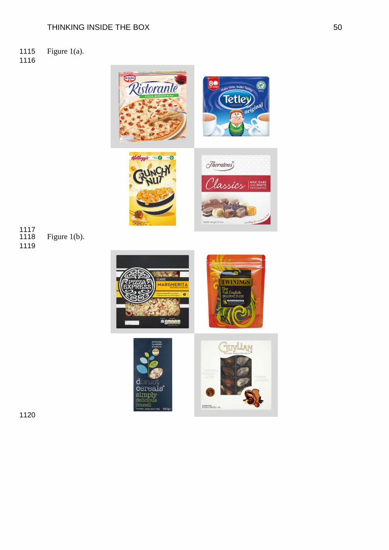
THINKING INSIDE THE BOX 50
Figure 1(a). 1115 1116
1117 Figure 1(b). 1118 1119
1120
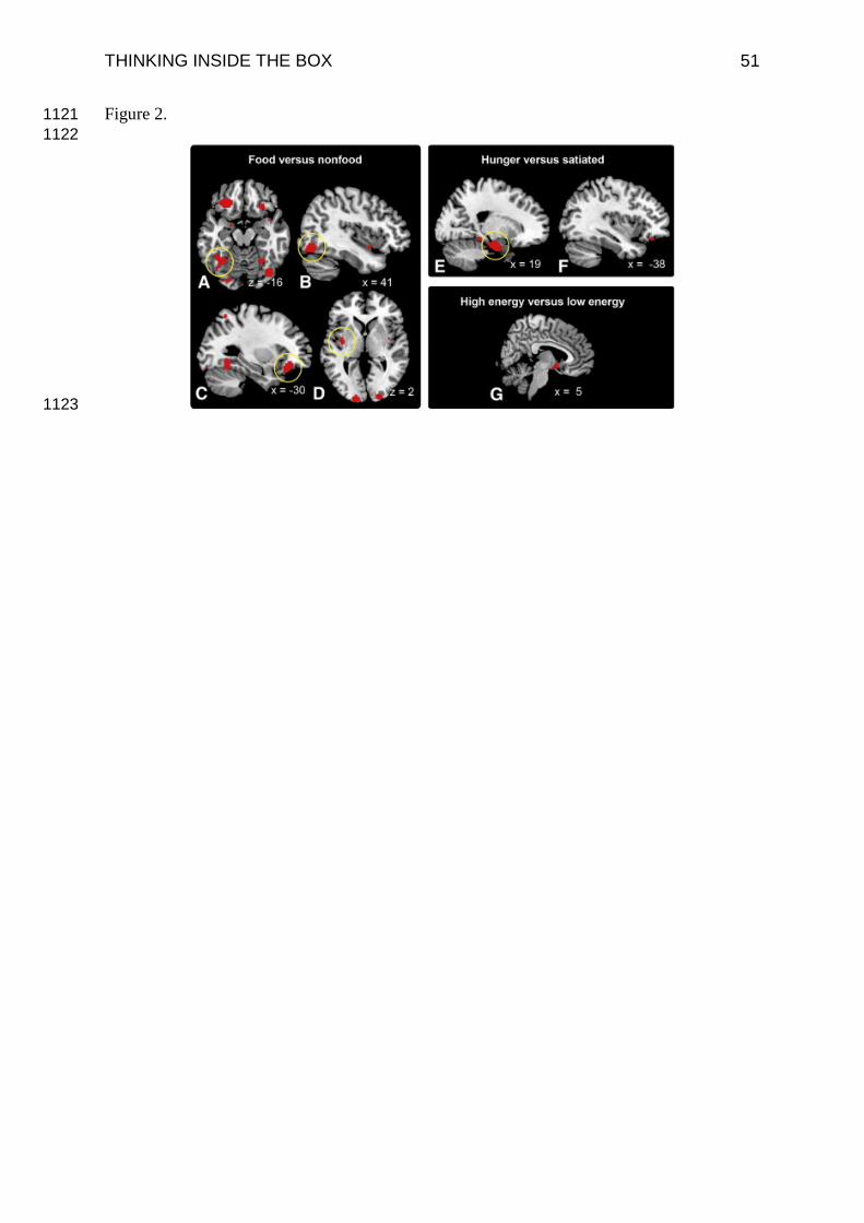
THINKING INSIDE THE BOX 51
Figure 2. 1121 1122
1123

THINKING INSIDE THE BOX 52
Figure 3. 1124
1125