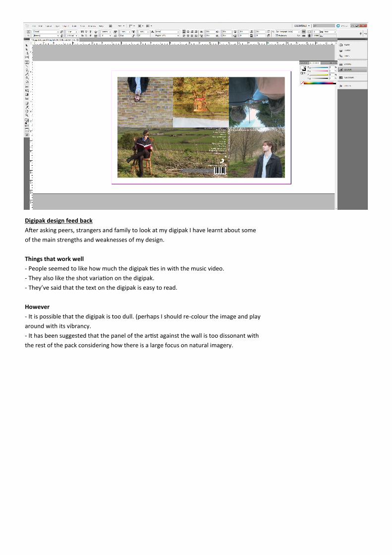
Digipak design feed back
After asking peers, strangers and family to look at my digipak I have learnt about some
of the main strengths and weaknesses of my design.
Things that work well
- People seemed to like how much the digipak ties in with the music video.
- They also like the shot variation on the digipak.
- They’ve said that the text on the digipak is easy to read.
However
- It is possible that the digipak is too dull. (perhaps I should re-colour the image and play
around with its vibrancy.
- It has been suggested that the panel of the artist against the wall is too dissonant with
the rest of the pack considering how there is a large focus on natural imagery.
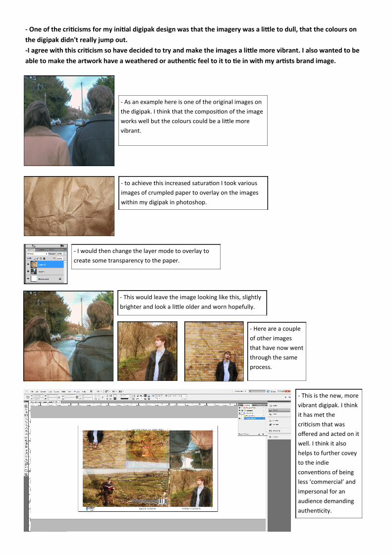
- One of the criticisms for my initial digipak design was that the imagery was a little to dull, that the colours on
the digipak didn't really jump out.
-I agree with this criticism so have decided to try and make the images a little more vibrant. I also wanted to be
able to make the artwork have a weathered or authentic feel to it to tie in with my artists brand image.
- As an example here is one of the original images on
the digipak. I think that the composition of the image
works well but the colours could be a little more
vibrant.
- to achieve this increased saturation I took various
images of crumpled paper to overlay on the images
within my digipak in photoshop.
- I would then change the layer mode to overlay to
create some transparency to the paper.
- This would leave the image looking like this, slightly
brighter and look a little older and worn hopefully.
- Here are a couple
of other images
that have now went
through the same
process.
- This is the new, more
vibrant digipak. I think
it has met the
criticism that was
offered and acted on it
well. I think it also
helps to further covey
to the indie
conventions of being
less ‘commercial’ and
impersonal for an
audience demanding
authenticity.