ComponentOne
Gauges for WPF
Copyright 1987-2012 GrapeCity, Inc. All rights reserved.
ComponentOne, a division of GrapeCity
201 South Highland Avenue, Third Floor
Pittsburgh, PA 15206 • USA
Internet: [email protected]
Web site: http://www.componentone.com
Sales
E-mail: [email protected]
Telephone: 1.800.858.2739 or 1.412.681.4343 (Pittsburgh, PA USA Office)
Trademarks
The ComponentOne product name is a trademark and ComponentOne is a registered trademark of GrapeCity, Inc. All other trademarks used herein are the properties of their respective owners.
Warranty
ComponentOne warrants that the original CD (or diskettes) are free from defects in material and workmanship, assuming normal use, for a period of 90 days from the date of purchase. If a defect occurs during this time, you may return the defective CD (or disk) to ComponentOne, along with a dated proof of purchase, and ComponentOne will replace it at no charge. After 90 days, you can obtain a replacement for a defective CD (or disk) by sending it and a check for $25 (to cover postage and
handling) to ComponentOne.
Except for the express warranty of the original CD (or disks) set forth here, ComponentOne makes no other warranties, express or implied. Every attempt has been made to ensure that the information contained in this manual is correct as of the time it was
written. We are not responsible for any errors or omissions. ComponentOne’s liability is limited to the amount you paid for the product. ComponentOne is not liable for any special, consequential, or other damages for any reason.
Copying and Distribution
While you are welcome to make backup copies of the software for your own use and protection, you are not permitted to make
copies for the use of anyone else. We put a lot of time and effort into creating this product, and we appreciate your support in seeing that it is used by licensed users only.
This manual was produced using ComponentOne Doc-To-Help™.

iii
Table of Contents
ComponentOne Gauges for WPF Overview ...................................................................................................1
WPFWPFWPFWPFWPFHelp with ComponentOne Studio for WPF ....................................................... 1
Key Features ................................................................................................................................................3
Gauges for WPF Quick Start .........................................................................................................................3
Step 1 of 3: Setting up the Application ........................................................................................................... 3
Step 2 of 3: Adding Code to the Application ................................................................................................. 4
Step 3 of 3: Running the Application ............................................................................................................. 6
About Gauges for WPF ................................................................................................................................9
Why Use Gauge Controls?............................................................................................................................. 9
Using C1RadialGauge ................................................................................................................................. 10
C1RadialGauge Values .................................................................................................................. 10
C1RadialGauge StartAngle and SweepAngle ................................................................................ 11
C1RadialGauge Decorators ........................................................................................................... 12
C1RadialGauge Pointer and PointerCap ....................................................................................... 14
C1RadialGauge Face and Cover .................................................................................................... 15
Using C1LinearGauge ................................................................................................................................. 15
C1LinearGauge Values .................................................................................................................. 16
C1LinearGauge Orientation........................................................................................................... 17
C1LinearGauge Decorators ........................................................................................................... 18
C1LinearGauge Pointer ................................................................................................................. 19
C1LinearGauge Face and Cover .................................................................................................... 19
Using C1Knob.............................................................................................................................................. 20
C1Knob Values............................................................................................................................... 20
C1Knob StartAngle and SweepAngle ............................................................................................ 21
C1Knob Interaction ........................................................................................................................ 21
C1Knob Decorators ........................................................................................................................ 21
Layout and Appearance .............................................................................................................................. 23
Templates ..................................................................................................................................................... 23
XAML Elements .......................................................................................................................................... 24

iv
ComponentOne ClearStyle Technology ...................................................................................................... 24
How ClearStyle Works ................................................................................................................... 25
C1DataGrid Themes .................................................................................................................................... 25
Gauges for WPF Samples ........................................................................................................................... 29
Gauges for WPF Task-Based Help ............................................................................................................... 29
Setting the Start Value .................................................................................................................................. 29
Setting the Minimum and Maximum Values .............................................................................................. 30
Adding Labels to the Gauge ........................................................................................................................ 31
Adding Tick Marks to the Gauge................................................................................................................. 32
Customizing Tick Marks .............................................................................................................................. 34
Customizing the Gauge Shape ..................................................................................................................... 35
Customizing the Pointer's Appearance ........................................................................................................ 37
1
ComponentOne Gauges for WPF
Overview ComponentOne Gauges™ for WPF includes seven controls to
enhance your data visualizations and business dashboards. Provide an interactive and attractive way to display information graphically. The
C1.WPF.Gauge assembly includes three main controls:
C1RadialGauge
Uses a rotating pointer to show a value along a curved scale. This is similar to a typical speedometer.
C1LinearGauge Uses a linear pointer to show a value along a linear scale. This is similar to a typical thermometer.
C1Knob
Extends a C1RadialGauge to let the user select a numerical value by rotating the pointer. Perfect if you want to simulate the volume knob of a music player.
Both the C1RadialGauge and C1LinearGauge derive from a common
abstract class C1Gauge that provides the base functionality common to all
gauges.
For a list of the latest features added to ComponentOne Studio for
WPF, visit What's New in Studio for WPF.
Getting Started
Get started with the following topics:
- Key Features (page 3)
- Quick Start (page 3)
- Why Use Gauge
Controls? (page 9)
WPFWPFWPFWPFWPFHelp with ComponentOne Studio for WPF Getting Started
For information on installing ComponentOne Studio for WPF, licensing, technical support, namespaces and creating a project with the control, please visit Getting Started with Studio for WPF.
What's New
For a list of the latest features added to ComponentOne Studio for WPF, visit What's New in Studio for WPF.


3
Key Features ComponentOne Gauges for WPF allows you to create customized, rich applications. Make the most of Gauges
for WPF by taking advantage of the following key features:
Various Range Types
Create non-linear or linear shapes for the range. Using non-linear shapes, you can show growth and add visual appeal to the gauge.
Generate Sleek Linear Gauges
Common linear gauges include rulers and thermometers. Use simple properties to customize their scale, tick marks, ranges, and pointer.
Create Professional-looking Radial Gauges
Common radial gauges include dials and speedometers. Use simple properties to customize their start and sweep angles, tick marks, ranges, and pointer.
Support for the Off Mode
If there is no value, you can set the off position outside the range.
Create Knob-style Gauges
The C1Knob control, an extension of the C1RadialGauge, enables the end-user to drag the pointer to a
value.
Support for Label Formats
Format the labels; for example, set the labels to display the values in currency format ($).
Extensive XAML-free Customization
C1LinearGauge and C1RadialGauge have properties that provide extensive customization without
requiring any changes to the XAML template. Of course, if you prefer to use XAML and extend the customization even further, that’s also possible.
Additional Controls
Gauges for WPF provides several additional controls that can be used when formatting familiar gauge
controls. These include the C1SpeedometerGauge, C1VolumeGauge, C1RulerGauge, and C1RegionKnob controls.
Gauges for WPF Quick Start The following quick start guide is intended to get you up and running with Gauges for WPF. In this quick start
you'll start in Visual Studio and create a new project, add Gauges for WPF controls to your application, and customize the appearance and behavior of the controls.
You will create an application that includes the C1RadialGauge, C1LinearGauge, and C1Knob controls. At run time when a user changes the value of the knob, the value of the gauges will also change.
Step 1 of 3: Setting up the Application In this step you'll begin in Visual Studio to create a WPF application using Gauges for WPF. In this step you'll set
up the application by adding C1RadialGauge, C1LinearGauge, and C1Knob controls to the project as well as a
standard TextBox control which will display the current value of the gauge controls.

4
To set up your project and add the gauge controls to your application, complete the following steps:
1. Create a new WPF project in Visual Studio.
2. Right-click your project in the Solution Explorer and choose Add Reference.
3. In the Add Reference dialog box, locate and choose the C1.WPF.dll, C1.WPF.Gauge.dll, and
WPFToolkit.dll assemblies and click OK to add references to those assemblies to your application.
4. Navigate to the Toolbox and double-click the following icons to add the controls to Window1:
C1RadialGauge
C1LinearGauge
C1Knob
C1TextBox
5. Resize the window and arrange the controls in the window so that they appear similar to the following:
You've successfully set up your application's user interface – you've created a WPF application, added
ComponentOne Gauges for WPF controls to the application, and customized those controls. In the next step you'll add code to your application.
Step 2 of 3: Adding Code to the Application In the previous step you created a new WPF project and added Gauges for WPF controls to the application. In this step you'll add code to your application to customize it.
Complete the following steps:
1. Double-click TextBox1 to switch to Code view and create the TextBox1_TextChanged event handler.
2. Add the following imports statements to the top of the page:
Visual Basic
5
Imports C1.WPF
Imports C1.WPF.Gauge
C# using C1.WPF;
using C1.WPF.Gauge;
3. Add code to the TextBox1_TextChanged event handler so that it appears like the following:
Visual Basic Private Sub TextBox1_TextChanged(ByVal sender As System.Object, ByVal e
As System.Windows.Controls.TextChangedEventArgs) Handles
TextBox1.TextChanged
Me.C1LinearGauge1.Value = Me.TextBox1.Text
Me.C1RadialGauge1.Value = Me.TextBox1.Text
Me.C1Knob1.Value = Me.TextBox1.Text
End Sub
C# private void textBox1_TextChanged(object sender, TextChangedEventArgs
e)
{
this.c1LinearGauge1.Value = Convert.ToDouble(this.textBox1.Text);
this.c1RadialGauge1.Value = Convert.ToDouble(this.textBox1.Text);
this.c1Knob1.Value = Convert.ToDouble(this.textBox1.Text);
}
When a number is entered in the text box at run time, the value of the gauge controls will be set to that number.
4. Choose View | Designer to return to Design view.
5. Click C1Knob1 to select it, and navigate to the Properties window.
6. Click the Events (lightning bolt) button on the Properties window to view events.
7. Double-click the box next to the ValueChanged event. This will switch to Code view and create the
C1Knob1_ValueChanged event handler.
8. Enter the code in the C1Knob1_ValueChanged event handler to set the gauge and text box control values. It will look like the following:
Visual Basic Private Sub C1Knob1_ValueChanged(ByVal sender As System.Object, ByVal e
As C1.WPF.PropertyChangedEventArgs(Of System.Double)) Handles
C1Knob1.ValueChanged
Me.C1LinearGauge1.Value = Me.C1Knob1.Value
Me.C1RadialGauge1.Value = Me.C1Knob1.Value
Me.TextBox1.Text = Me.C1Knob1.Value.ToString
End Sub
C# private void c1Knob1_ValueChanged(object sender,
PropertyChangedEventArgs<double> e)
{
this.c1LinearGauge1.Value = this.c1Knob1.Value;
this.c1RadialGauge1.Value = this.c1Knob1.Value;
this.textBox1.Text = Convert.ToString(this.c1Knob1.Value);
}
In this step you completed adding code to your application. In the next step you'll run the application and observe run-time interactions.
6
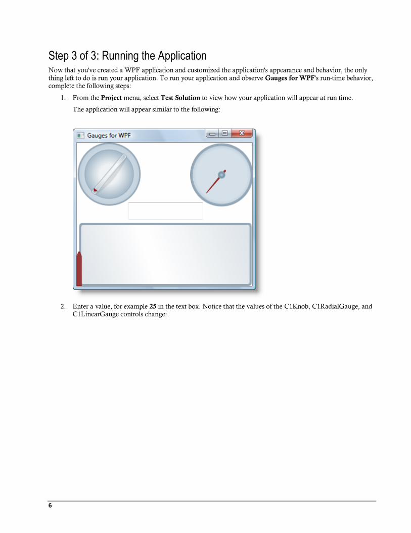
Step 3 of 3: Running the Application Now that you've created a WPF application and customized the application's appearance and behavior, the only
thing left to do is run your application. To run your application and observe Gauges for WPF's run-time behavior, complete the following steps:
1. From the Project menu, select Test Solution to view how your application will appear at run time.
The application will appear similar to the following:
2. Enter a value, for example 25 in the text box. Notice that the values of the C1Knob, C1RadialGauge, and C1LinearGauge controls change:
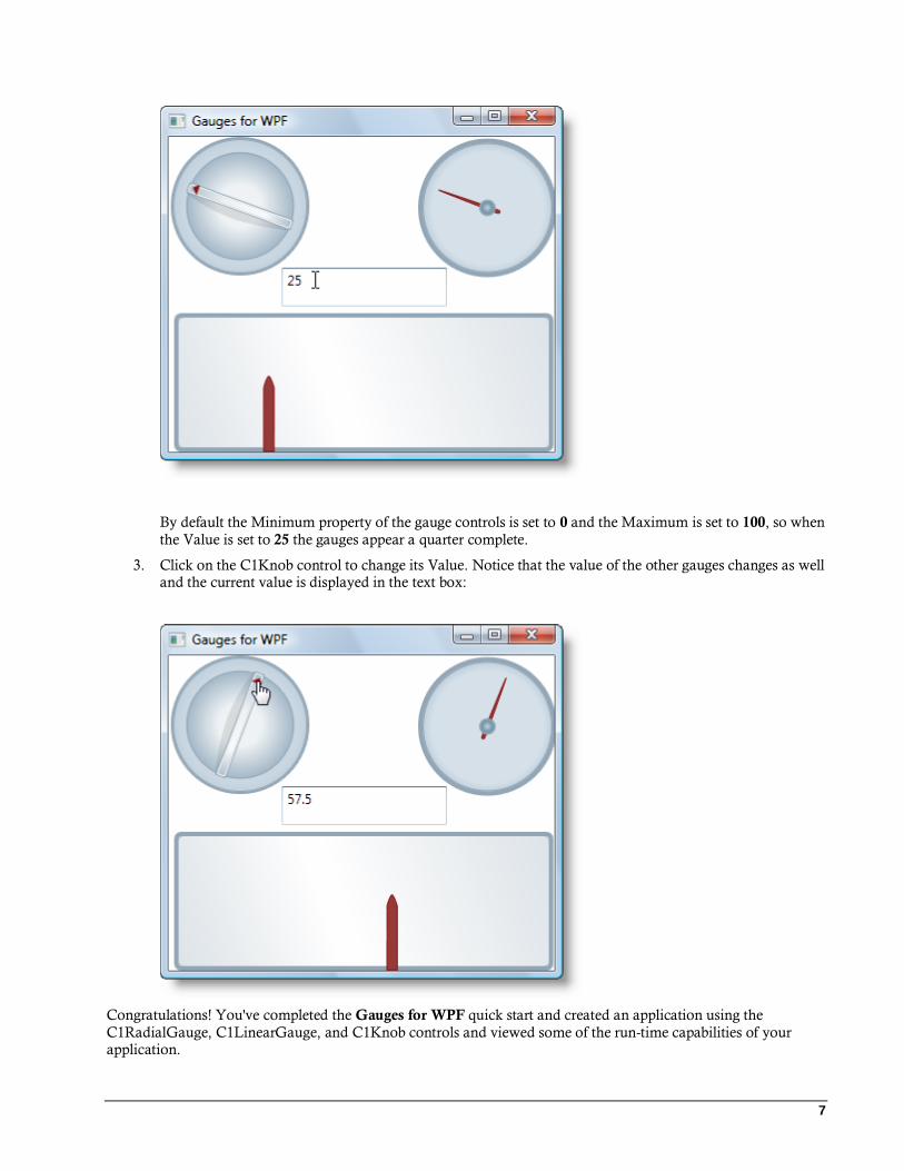
7
By default the Minimum property of the gauge controls is set to 0 and the Maximum is set to 100, so when
the Value is set to 25 the gauges appear a quarter complete.
3. Click on the C1Knob control to change its Value. Notice that the value of the other gauges changes as well and the current value is displayed in the text box:
Congratulations! You've completed the Gauges for WPF quick start and created an application using the
C1RadialGauge, C1LinearGauge, and C1Knob controls and viewed some of the run-time capabilities of your application.

9
About Gauges for WPF ComponentOne Gauges for WPF includes these main controls:
C1RadialGauge Uses a rotating pointer to show a value along a curved scale. This is similar to a typical speedometer.
C1LinearGauge Uses a linear pointer to show a value along a linear scale. This is similar to a typical thermometer.
C1Knob Extends a C1RadialGauge to let the user select a numerical value by rotating the pointer. Perfect if you
want to simulate the volume knob of a music player.
Both the C1RadialGauge and C1LinearGauge derive from a common abstract class C1Gauge that provides the
base functionality common to all gauges. ComponentOne Gauges for WPF includes the following additional controls:
C1RegionKnob
Based on the C1Knob control, this control provides an easy way of adding region-type gauges to your application.
C1RulerGauge Based on the C1LinearGauge control, this control provides an easy way of adding ruler-type gauges to your application.
C1SpeedometerGauge
Based on the C1RadialGauge control, this control provides an easy way of adding speedometer-type gauges to your application.
C1VolumeGauge Based on the C1RadialGauge control, this control provides an easy way of adding volume-type gauges to your application.
These controls are derived from the C1RadialGauge, C1LinearGauge, and C1Knob controls.
Why Use Gauge Controls? You might be asking why you'd need to use gauge controls – after all, gauges just display a single value and you could display that value using a simple label instead of a gauge.
Gauges are better because they also display a range, allowing users to determine instantly whether the current value is low, high, or intermediate. You could use two additional labels to display the range as well as the current value, but that would make your user interface more confusing. That is why many applications use progress indicators that are simple linear gauges, instead of showing progress simply as a label.
Gauges are also more visually attractive than simple labels (or sliders or scrollbars), and that adds value to your applications.
But why use a gauge control instead of simply asking a designer to create a visually attractive gauge in XAML and then animating an element to show the current value? Why use a control?
There are a couple of reasons for that. First, you may not be a great designer and may not have access to one.
Second, you probably don't need a single gauge in your application. You may need several, showing values that span different ranges. Maybe you don't even know the actual range when you are writing the application (what's the maximum value of sales this quarter?).
Gauge controls provide the flexibility to adjust the ranges programmatically, based on data, rather than hardwiring them in XAML.

10
Using C1RadialGauge C1RadialGauge uses a rotating pointer to show a value along a curved scale. The C1RadialGauge control displays
a value using a rotating pointer. The value is represented by a Value property and the range is defined by the
Minimum and Maximum properties. The C1RadialGauge control appears similar to a typical speedometer:
Creating and using a C1RadialGauge typically involves the following steps:
1. Creating the C1RadialGauge control and setting its main properties: Minimum, Maximum, StartAngle, and SweepAngle.
2. Adding C1GaugeMark and C1GaugeLabel decorators to show the scale. Each element may show a set of labels, tick marks, or both.
3. Optionally adding C1GaugeRange decorators to highlight parts of the scale. Ranges are typically used to indicate ranges that are too low, acceptable, or too high. Ranges can also be dynamic, moving automatically when the Value property changes.
4. Optionally customizing gauge elements with XAML templates.
5. Setting the Value property to display the value you want to show.
C1RadialGauge Values
You can use the C1RadialGauge control's Minimum, Maximum, and Value properties to specify the available range and the selected value in that range:

11
The Minimum and Maximum properties specify the range of values the gauge is designed to show. For example, a thermometer may have a scale ranging from -40 to 100 degrees, and a speedometer may have range of 0 to 140
miles per hour. The range is specified through the Minimum and Maximum properties (of type double). The
default range for a C1RadialGauge control is from 0 to 100.
The Value property indicates the current value of the gauge. In the C1RadialGauge control, this is indicated visually by the value the Pointer element is pointing to. The default Value for a C1RadialGauge control is 50.
C1RadialGauge StartAngle and SweepAngle
Once the range has been defined, you need to specify the angles that match the Minimum and Maximum values. The StartAngle defines the position of the pointer when the Value property is set to the Minimum value in the range. The SweepAngle specifies the rotation added to the StartAngle when the Value property is set to the Maximum value in the range.
All angles are specified in degrees, measured clockwise from the top of the control. The angles may be negative,
but the absolute value of the SweepAngle may not exceed 360 degrees. The default values for StartAngle is -140 and for SweepAngle is 280.
The images below show the effect of the StartAngle and SweepAngle properties:
StartAngle = 0
SweepAngle = 90
StartAngle = 0
SweepAngle = -90
StartAngle = 45
SweepAngle = 270

12
StartAngle = -160
SweepAngle = 180
StartAngle = -160
SweepAngle = -180
StartAngle = -140
SweepAngle = 280
C1RadialGauge Decorators
By default, the C1RadialGauge control displays only a blue-gray background and a pointer. In most applications, you'll also want to display a scale composed of labels and tick marks that allow users to see what the current value is and where it lies within the gauge's range. This is done by adding C1GaugeMark, C1GaugeLabel, and C1GaugeRange elements to the gauge's Decorators collection:
The decorators are displayed at specific positions on the scale, determined by the value of the From, To, and Interval properties.
In the image above, you'll see one C1GaugeMark and one C1GaugeLabel element:
<!-- Add label marks -->
<c1:C1GaugeLabel From="0" To="100" Interval="20" Location="1.1"/>
<!-- Add tick marks -->
<c1:C1GaugeMark From="0" To="100" Interval="5" Location=".9"/>
The C1GaugeLabel element shows labels for the values 0 to 100 along the scale. The C1GaugeMark element shows tick marks spaced 5 units apart.
In addition to showing the scale, you may want to highlight parts of the scale range. For example, you may want to add a red marker to indicate that values in that range are too low (sales) or too high (expenses). This can be done easily by adding one or more C1GaugeRange elements to the gauge's Decorators collection.
In the image above, you'll see three C1GaugeRange elements:
<!-- Add three colored ranges -->
<c1:C1GaugeRange From="80" To="100" Location="0.7" Fill="Red" />
<c1:C1GaugeRange From="50" To="80" Location="0.7" Fill="Yellow" />
<c1:C1GaugeRange From="0" To="50" Location="0.7" Fill="Green" />
The C1GaugeRange elements show red, yellow, and green range areas. Each C1GaugeRange element displays a
curved swath along the scale. The color of the swath is determined by the Fill property, and the position is
13
determined by the From and To properties. You can control the thickness of the ranges using the StrokeThickness property.
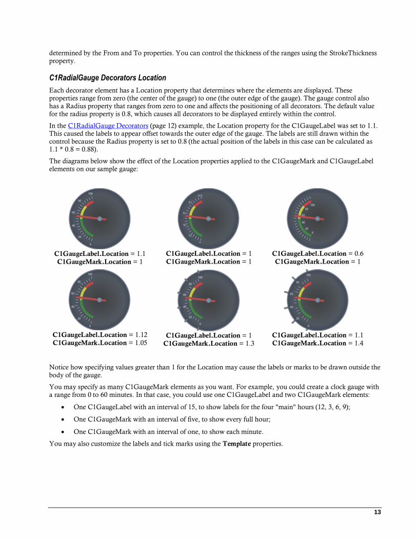
C1RadialGauge Decorators Location
Each decorator element has a Location property that determines where the elements are displayed. These properties range from zero (the center of the gauge) to one (the outer edge of the gauge). The gauge control also has a Radius property that ranges from zero to one and affects the positioning of all decorators. The default value for the radius property is 0.8, which causes all decorators to be displayed entirely within the control.
In the C1RadialGauge Decorators (page 12) example, the Location property for the C1GaugeLabel was set to 1.1. This caused the labels to appear offset towards the outer edge of the gauge. The labels are still drawn within the control because the Radius property is set to 0.8 (the actual position of the labels in this case can be calculated as 1.1 * 0.8 = 0.88).
The diagrams below show the effect of the Location properties applied to the C1GaugeMark and C1GaugeLabel elements on our sample gauge:
C1GaugeLabel.Location = 1.1
C1GaugeMark.Location = 1
C1GaugeLabel.Location = 1
C1GaugeMark.Location = 1
C1GaugeLabel.Location = 0.6
C1GaugeMark.Location = 1
C1GaugeLabel.Location = 1.12
C1GaugeMark.Location = 1.05
C1GaugeLabel.Location = 1
C1GaugeMark.Location = 1.3
C1GaugeLabel.Location = 1.1
C1GaugeMark.Location = 1.4
Notice how specifying values greater than 1 for the Location may cause the labels or marks to be drawn outside the body of the gauge.
You may specify as many C1GaugeMark elements as you want. For example, you could create a clock gauge with a range from 0 to 60 minutes. In that case, you could use one C1GaugeLabel and two C1GaugeMark elements:
One C1GaugeLabel with an interval of 15, to show labels for the four "main" hours (12, 3, 6, 9);
One C1GaugeMark with an interval of five, to show every full hour;
One C1GaugeMark with an interval of one, to show each minute.
You may also customize the labels and tick marks using the Template properties.

14
C1RadialGauge Decorators Value Binding
The ranges are not restricted to static values. You can use the ValueBinding property to bind the range's starting or ending positions to the current value being displayed by the gauge. For example, the code below would cause the
red range to appear only when the speed exceeded 80 miles per hour:
<!-- Add three colored ranges -->
<c1:C1GaugeRange From="80" ValueBinding="To" Location="0.7" Background="Red"
/>
<c1:C1GaugeRange From="50" To="80" Location="0.7" Fill="Yellow" />
<c1:C1GaugeRange From="0" To="50" Location="0.7" Fill="Green" />
The diagrams below show the effect of this change as the Value property changes:
Value = 55
Value = 90
Value = 100
C1RadialGauge Pointer and PointerCap
The C1RadialGauge control includes a pointer which indicates the selected Value of the control. The pointer
consists of the actual Pointer element and the PointerCap element:
The PointerOrigin property sets the location of the pointer; you can customize the location of the pointer by setting this property – for example the point (0, 0) is the top-left corner of the control and the point (0.5, 0.5) is the center of the control. The Location property sets the relative location of the Pointer element.
The Pointer element appears by default as a brown tapering element, but you can customize the appearance of the Pointer element by setting several properties, including the PointerFill, PointerLength, PointerOffset, PointerStroke, PointerStrokeThickness, PointerStyle, PointerVisibility, and PointerWidth properties.
15
The PointerCap element appears by default as a gray circle, but you can customize the appearance of the PointerCap element by setting several properties, including the PointerCap, PointerCapFill, PointerCapStroke, PointerCapStrokeThickness, and PointerCapStyle properties. You can also edit the PointerCapSize template. For more information, see Templates (page 23).
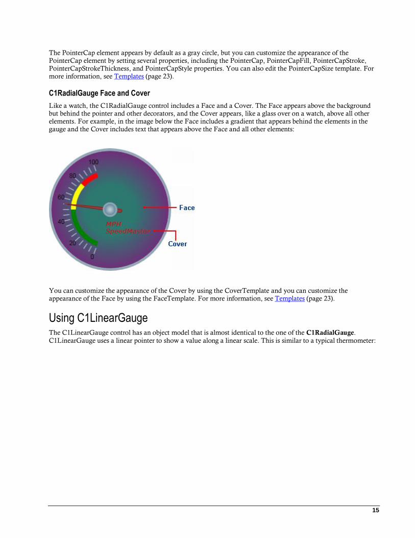
C1RadialGauge Face and Cover
Like a watch, the C1RadialGauge control includes a Face and a Cover. The Face appears above the background but behind the pointer and other decorators, and the Cover appears, like a glass over on a watch, above all other elements. For example, in the image below the Face includes a gradient that appears behind the elements in the gauge and the Cover includes text that appears above the Face and all other elements:
You can customize the appearance of the Cover by using the CoverTemplate and you can customize the appearance of the Face by using the FaceTemplate. For more information, see Templates (page 23).
Using C1LinearGauge The C1LinearGauge control has an object model that is almost identical to the one of the C1RadialGauge.
C1LinearGauge uses a linear pointer to show a value along a linear scale. This is similar to a typical thermometer:

16
The steps involved in creating and using a C1LinearGauge control are the same as the ones we described before for the C1RadialGauge:
1. Create the C1LinearGauge control and set its main properties: Minimum, Maximum, and Orientation.
2. Add C1GaugeMark decorators to show the scale. Each C1GaugeMark element may show a set of labels, tick marks, or both.
3. Optionally add C1GaugeRange decorators highlight parts of the scale. Ranges are typically used to indicate ranges that are too low, acceptable, or too high. Ranges can also be dynamic, moving automatically when the Value property changes.
4. Optionally customize gauge elements with XAML templates.
5. Set the Value property to display the value you want to show.
C1LinearGauge Values
You can use the C1LinearGauge control's Minimum, Maximum, and Value properties to specify the available range and the selected value in that range:

17
The Minimum and Maximum properties specify the range of values the gauge is designed to show. For example, a thermometer may have a scale ranging from -40 to 100 degrees, and a speedometer may have range of 0 to 140
miles per hour. The range is specified through the Minimum and Maximum properties (of type double). The
default range for a C1LinearGauge control is from 0 to 100.
The Value property indicates the current value of the gauge. In the C1LinearGauge control, this is indicated visually by the value the Pointer element is pointing to. The default Value for a C1LinearGauge control is 0; in the above image, the Value was set to 10.
C1LinearGauge Orientation
C1LinearGauge controls do not have the StartAngle and SweepAngle properties used with radial gauges. Instead, they have an Orientation property that you can use to create vertical or horizontal gauges.
By default, the Orientation property is set to Horizontal and the gauge appears displayed horizontally in the
application:
You can set the Orientation property to Vertical to create a vertical gauge:
By default, the vertical C1LinearGauge control will display a scale from top to bottom – for example 0 to 100 in the example above. To reverse the direction of the scale you would need to set the following properties:
Set XAxisLocation to 1
Set XAxisLength to -1
18
The scale will be reversed so 100 is at the top and 0 is at the bottom of the gauge.
A linear gauge has many applications. For example, a vertical linear gauge could be used as a thermometer such as the one displayed in the Using C1LinearGauge (page 15) topic.
C1LinearGauge Decorators
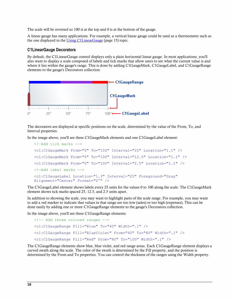
By default, the C1LinearGauge control displays only a plain horizontal linear gauge. In most applications, you'll also want to display a scale composed of labels and tick marks that allow users to see what the current value is and where it lies within the gauge's range. This is done by adding C1GaugeMark, C1GaugeLabel, and C1GaugeRange elements to the gauge's Decorators collection:
The decorators are displayed at specific positions on the scale, determined by the value of the From, To, and Interval properties.
In the image above, you'll see three C1GaugeMark elements and one C1GaugeLabel element:
<!—Add tick marks -->
<c1:C1GaugeMark From="0" To="100" Interval="25" Location="1.1" />
<c1:C1GaugeMark From="0" To="100" Interval="12.5" Location="1.1" />
<c1:C1GaugeMark From="0" To="100" Interval="2.5" Location="1.1" />
<!—Add label marks -->
<c1:C1GaugeLabel Location="1.3" Interval="25" Foreground="Gray"
Alignment="Center" Format="0°" />
The C1GaugeLabel element shows labels every 25 units for the values 0 to 100 along the scale. The C1GaugeMark element shows tick marks spaced 25, 12.5, and 2.5 units apart.
In addition to showing the scale, you may want to highlight parts of the scale range. For example, you may want to add a red marker to indicate that values in that range are too low (sales) or too high (expenses). This can be done easily by adding one or more C1GaugeRange elements to the gauge's Decorators collection.
In the image above, you'll see three C1GaugeRange elements:
<!-- Add three colored ranges -->
<c1:C1GaugeRange Fill="Blue" To="40" Width=".1" />
<c1:C1GaugeRange Fill="BlueViolet" From="40" To="80" Width=".1" />
<c1:C1GaugeRange Fill="Red" From="80" To="100" Width=".1" />
The C1GaugeRange elements show blue, blue violet, and red range areas. Each C1GaugeRange element displays a curved swath along the scale. The color of the swath is determined by the Fill property, and the position is determined by the From and To properties. You can control the thickness of the ranges using the Width property.
19
C1LinearGauge Decorators Location
Decorators are positioned with the C1LinearGauge control compared to the C1RadialGauge control. Recall that the C1RadialGauge control has a Radius property that determines how far from the center of the gauge that
decorators are displayed. The Radius property ranges from zero (center of the gauge) to one (outer edge of the
gauge). Individual decorators are offset from the Radius by an amount specified by the Location property.
The C1LinearGauge has a YAxisLocation property that is analogous to Radius. This property ranges from zero (top of the gauge) to one (bottom of the gauge). Individual decorators are offset from the YAxisLocation by an amount specified by their Location property.
The default value for the YAxisLocation property is zero. The default value for the Location of the C1GaugeMark decorators is one (causing these elements to appear at the bottom of the gauge by default). The default value for the Location property of the C1GaugeRange decorator is zero (causing it to appear at the top of the gauge by default).
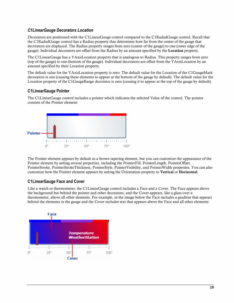
C1LinearGauge Pointer
The C1LinearGauge control includes a pointer which indicates the selected Value of the control. The pointer consists of the Pointer element:
The Pointer element appears by default as a brown tapering element, but you can customize the appearance of the Pointer element by setting several properties, including the PointerFill, PointerLength, PointerOffset, PointerStroke, PointerStrokeThickness, PointerStyle, PointerVisibility, and PointerWidth properties. You can also
customize how the Pointer element appears by setting the Orientation property to Vertical or Horizontal.
C1LinearGauge Face and Cover
Like a watch or thermometer, the C1LinearGauge control includes a Face and a Cover. The Face appears above the background but behind the pointer and other decorators, and the Cover appears, like a glass over a thermometer, above all other elements. For example, in the image below the Face includes a gradient that appears behind the elements in the gauge and the Cover includes text that appears above the Face and all other elements:

20
You can customize the appearance of the Cover by using the CoverTemplate and you can customize the appearance of the Face by using the FaceTemplate. For more information, see Templates (page 23).
Using C1Knob The C1Knob control extends a C1RadialGauge control to let the user select a numerical value by rotating the pointer. For example, C1Knob is perfect if you want to simulate the volume knob of a music player. By default, the C1Knob control appears similar to the following image:
Creating and using a C1Knob control is similar to creating a C1RadialGauge control and typically involves the similar steps:
1. Creating the C1Knob control and setting its main properties: Minimum, Maximum, StartAngle, and SweepAngle.
2. Setting how users interact with the knob, by setting the InteractionMode property.
3. Adding C1GaugeMark and C1GaugeLabel decorators to show the scale. Each element may show a set of labels, tick marks, or both.
4. Optionally customizing gauge elements with XAML templates.
5. Setting the Value property to display the value you want to initially show.
C1Knob Values
You can use the C1Knob control's Minimum, Maximum, and Value properties to specify the available range and the selected value in that range:

21
The Minimum and Maximum properties specify the range of values the knob is designed to show. The range is
specified through the Minimum and Maximum properties (of type double). The default range for a C1Knob control is from 0 to 100.
The Value property indicates the current value of the gauge. In the C1Knob control, this is indicated visually by the value the Pointer element is pointing to. The default Value for a C1Knob control is 50.
C1Knob StartAngle and SweepAngle
Once the range has been defined, you can specify the angles that match the Minimum and Maximum values. The StartAngle defines the position of the pointer when the Value property is set to the Minimum value in the range. The SweepAngle specifies the rotation added to the StartAngle when the Value property is set to the Maximum value in the range.
All angles are specified in degrees, measured clockwise from the top of the control. The angles may be negative, but the absolute value of the SweepAngle may not exceed 360 degrees.
C1Knob Interaction
The InteractionMode property controls what interactions are possible with the control at run time – you can choose whether users can move the knob by clicking, dragging, or both.
You can set the InteractionMode property to one of the following KnobInteractionMode values:
Value Description
Drag Moves the pointer when the user drags it.
Click Moves the pointer when the user clicks inside the knob.
ClickOrDrag Moves the pointer when the user clicks inside the knob or drags the
pointer.
By default the InteractionMode property is set to Click.
C1Knob Decorators
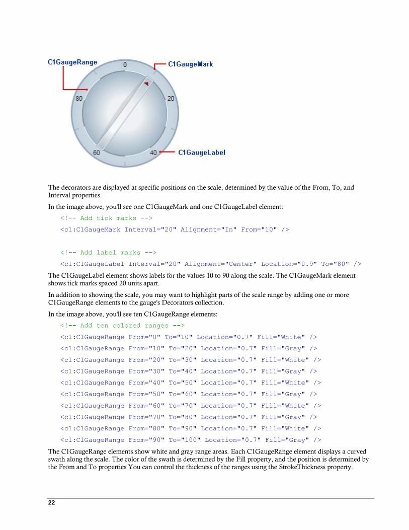
By default, the C1Knob control displays a simple blue-gray background and a pointer. Like with C1RadialGauge and C1LinearGauge, you can customize the indicators of the grid by adding the C1GaugeMark, C1GaugeLabel, and C1GaugeRange elements to the gauge's Decorators collection:
22
The decorators are displayed at specific positions on the scale, determined by the value of the From, To, and Interval properties.
In the image above, you'll see one C1GaugeMark and one C1GaugeLabel element:
<!-- Add tick marks -->
<c1:C1GaugeMark Interval="20" Alignment="In" From="10" />
<!-- Add label marks -->
<c1:C1GaugeLabel Interval="20" Alignment="Center" Location="0.9" To="80" />
The C1GaugeLabel element shows labels for the values 10 to 90 along the scale. The C1GaugeMark element shows tick marks spaced 20 units apart.
In addition to showing the scale, you may want to highlight parts of the scale range by adding one or more C1GaugeRange elements to the gauge's Decorators collection.
In the image above, you'll see ten C1GaugeRange elements:
<!-- Add ten colored ranges -->
<c1:C1GaugeRange From="0" To="10" Location="0.7" Fill="White" />
<c1:C1GaugeRange From="10" To="20" Location="0.7" Fill="Gray" />
<c1:C1GaugeRange From="20" To="30" Location="0.7" Fill="White" />
<c1:C1GaugeRange From="30" To="40" Location="0.7" Fill="Gray" />
<c1:C1GaugeRange From="40" To="50" Location="0.7" Fill="White" />
<c1:C1GaugeRange From="50" To="60" Location="0.7" Fill="Gray" />
<c1:C1GaugeRange From="60" To="70" Location="0.7" Fill="White" />
<c1:C1GaugeRange From="70" To="80" Location="0.7" Fill="Gray" />
<c1:C1GaugeRange From="80" To="90" Location="0.7" Fill="White" />
<c1:C1GaugeRange From="90" To="100" Location="0.7" Fill="Gray" />
The C1GaugeRange elements show white and gray range areas. Each C1GaugeRange element displays a curved swath along the scale. The color of the swath is determined by the Fill property, and the position is determined by the From and To properties You can control the thickness of the ranges using the StrokeThickness property.

23
C1Knob Decorators Location
Each decorator element has a Location property that determines where the elements are displayed. These properties range from zero (the center of the gauge) to one (the outer edge of the gauge). The gauge control also
has a Radius property that ranges from zero to one and affects the positioning of all decorators. The default value for the radius property is 0.8, which causes all decorators to be displayed entirely within the control.
For example, if you set the Location property for the C1GaugeLabel was to 1.1 the labels will appear offset towards the outer edge of the knob. The labels are still drawn within the control because the Radius property is set to 0.8 (the actual position of the labels in this case can be calculated as 1.1 * 0.8 = 0.88).
Layout and Appearance The following topics detail how to customize the gauge controls' layout and appearance. You can use built-in layout options to lay your controls out in panels such as Grids or Canvases. Themes allow you to customize the appearance of the grid and take advantage of WPF's XAML-based styling. You can also use templates to format and layout the grid and to customize grid actions.
Templates One of the main advantages to using a WPF control is that controls are "lookless" with a fully customizable user interface. Just as you design your own user interface (UI), or look and feel, for WPF applications, you can provide
your own UI for data managed by ComponentOne Gauges for WPF. Extensible Application Markup Language
(XAML; pronounced "Zammel"), an XML-based declarative language, offers a simple approach to designing your UI without having to write code.
Accessing Templates
You can access templates in Microsoft Expression Blend by selecting a gauge control and, in the menu, selecting
Edit Control Parts (Templates) or Edit Other Templates. Choose a template and select Edit a Copy to create an
editable copy of the current template or Create Empty, to create a new blank template. For example, in
C1RadialGauge:
Note: If you create a new template through the menu, the template will automatically be linked to that template's
property. If you manually create a template in XAML you will have to link the appropriate template property to the template you've created.

24
Included Templates
The following templates are included in Gauges for WPF:
Template Description
PointerCapStyle Style bound to the PointerCap element. This element is not available in
the C1LinearGauge control.
CoverTemplate DataTemplate used to generate the element placed on top of the C1Gauge. After the DataTemplate is loaded, the FrameworkElement can be
accessed through the Top property.
DefaultBigMarkTemplate Default DataTemplate for the big Marks.
DefaultMiddleMarkTemplate Default DataTemplate for the middle Marks.
DefaultSmallMarkTemplate Default DataTemplate for the small Marks.
FaceTemplate DataTemplate used to generate the element placed over the C1Gauge background. After the DataTemplate is loaded, the FrameworkElement can
be accessed through the Bottom property.
Note that you can use the Template property to customize the templates.
XAML Elements Several auxiliary XAML elements are installed with ComponentOne Gauges for WPF. These elements include
templates and themes and are located in the Gauges for WPF installation directory. You can incorporate these elements into your project, for example, to create your own theme based on the default theme.
Included Auxiliary XAML Elements
The following auxiliary XAML element is included with Gauges for WPF:
Element Folder Description
generic.xaml XAML Specifies the templates for different styles and the initial style
of the control.
ComponentOne ClearStyle Technology ComponentOne ClearStyle™ technology is a new, quick and easy approach to providing Silverlight and WPF control
styling. ClearStyle allows you to create a custom style for a control without having to deal with the hassle of XAML
templates and style resources.
Currently, to add a theme to all standard Silverlight controls, you must create a style resource template. In Microsoft Visual Studio this process can be difficult; this is why Microsoft introduced Expression Blend to make the task a bit
easier. Having to jump between two environments can be a bit challenging to developers who are not familiar with Blend
or do not have the time to learn it. You could hire a designer, but that can complicate things when your designer and your
developers are sharing XAML files.
That's where ClearStyle comes in. With ClearStyle the styling capabilities are brought to you in Visual Studio in the
most intuitive manner possible. In most situations you just want to make simple styling changes to the controls in your
application so this process should be simple. For example, if you just want to change the row color of your data grid this
should be as simple as setting one property. You shouldn't have to create a full and complicated-looking template just to
simply change a few colors.
25
How ClearStyle Works
Each key piece of the control's style is surfaced as a simple color property. This leads to a unique set of style properties
for each control. For example, a Gauge has PointerFill and PointerStroke properties, whereas a DataGrid has
SelectedBrush and MouseOverBrush for rows.
Let's say you have a control on your form that does not support ClearStyle. You can take the XAML resource created by
ClearStyle and use it to help mold other controls on your form to match (such as grabbing exact colors). Or let's say
you'd like to override part of a style set with ClearStyle (such as your own custom scrollbar). This is also possible
because ClearStyle can be extended and you can override the style where desired.
ClearStyle is intended to be a solution to quick and easy style modification but you're still free to do it the old fashioned
way with ComponentOne's controls to get the exact style needed. ClearStyle does not interfere with those less common situations where a full custom design is required.
C1DataGrid Themes ComponentOne DataGrid for WPF incorporates several themes that allow you to customize the appearance of your
grid. The default theme appears similar to the following:
This is the control's default appearance. You can change this appearance by using one of the built-in themes or by creating your own custom theme. All of the built-in themes are based on WPF Toolkit themes. The built-in themes are described and pictured below; note that in the images below, a row has been selected to show selected styles:
Theme Name Theme Preview

26
C1ThemeBureauBlack
C1ThemeExpressionDark
C1ThemeExpressionLight

27
C1Blue
C1ThemeShinyBlue
C1ThemeWhistlerBlue
To set an element's theme, use the ApplyTheme method. First add a reference to the theme assembly to your project, and then set the theme in code, like this:
Visual Basic Private Sub Window_Loaded(sender As System.Object, e As
System.Windows.RoutedEventArgs) Handles MyBase.Loaded
Dim theme As New C1ThemeExpressionDark
28
' Using ApplyTheme C1Theme.ApplyTheme(LayoutRoot, theme)
C# private void Window_Loaded(object sender, RoutedEventArgs e)
{
C1ThemeExpressionDark theme = new C1ThemeExpressionDark();
//Using ApplyTheme
C1Theme.ApplyTheme(LayoutRoot, theme);
}
To apply a theme to the entire application, use the System.Windows.ResourceDictionary.MergedDictionaries property. First add a reference to the theme assembly to your project, and then set the theme in code, like this:
Visual Basic Private Sub Window_Loaded(sender As System.Object, e As
System.Windows.RoutedEventArgs) Handles MyBase.Loaded
Dim theme As New C1ThemeExpressionDark
' Using Merged Dictionaries
Application.Current.Resources.MergedDictionaries.Add(C1Theme.GetCurrentThem
eResources(theme))
End Sub
C# private void Window_Loaded(object sender, RoutedEventArgs e)
{
C1ThemeExpressionDark theme = new C1ThemeExpressionDark();
//Using Merged Dictionaries
Application.Current.Resources.MergedDictionaries.Add(C1Theme.GetCurrentThem
eResources(theme));
}
Note that this method works only when you apply a theme for the first time. If you want to switch to another ComponentOne theme, first remove the previous theme from
Application.Current.Resources.MergedDictionaries.
29
Gauges for WPF Samples Please be advised that this ComponentOne software tool is accompanied by various sample projects and/or demos, which may make use of other ComponentOne development tools included with the ComponentOne
Studios. Samples can be accessed from the ComponentOne Studio for WPF ControlExplorer. To view samples,
on your desktop, click the Start button and then click All Programs | ComponentOne | Studio for WPF |
Samples | WPF ControlExplorer.
C# Samples
The following C# sample is included:
Sample Description
ControlExplorer The Gauges pages in the ControlExplorer sample demonstrate examples of using the C1RadialGauge, C1SpeedometerGauge, C1VolumeGauge,
C1LinearGauge, C1RulerGauge, C1Knob, and C1RegionKnob controls. The
Speedometers, Clock, and Thermometers pages detail advanced customization of
the gauge controls.
Gauges for WPF Task-Based Help The task-based help assumes that you are familiar with programming in Visual Studio .NET and know how to use
the gauge controls in general. If you are unfamiliar with the ComponentOne Gauges for WPF product, please see the Gauges for WPF Quick Start (page 3) first.
Each topic in this section provides a solution for specific tasks using the ComponentOne Gauges for WPF
product.
Each task-based help topic also assumes that you have created a new WPF project and added a gauge control to the project.
Setting the Start Value In this topic you'll change the C1LinearGauge control's Value property. The Value property determines the
currently selected number. By default the C1LinearGauge control starts with its Value set to 0 but you can customize this number at design time, in XAML, and in code. Note that although this topic sets the Value of the C1LinearGauge control, the same steps can be used to customize the Value of other controls.
At Design Time
To set the C1LinearGauge control's Value property at run time, complete the following steps:
1. Click the C1LinearGauge control once to select it.
2. Navigate to the Properties window, and enter a number, for example "20", in the text box next to the Value property.
This will set the Value property to the number you chose.
In XAML
For example, to set the Value property add Value="20" to the <c1:C1LinearGauge> tag so that it appears
similar to the following: <c1:C1LinearGauge Height="89" Margin="47,57,33,43" Name="C1LinearGauge1"
Width="287" Value="20">
30
In Code
For example, to set the Value property, add the following code to your project:
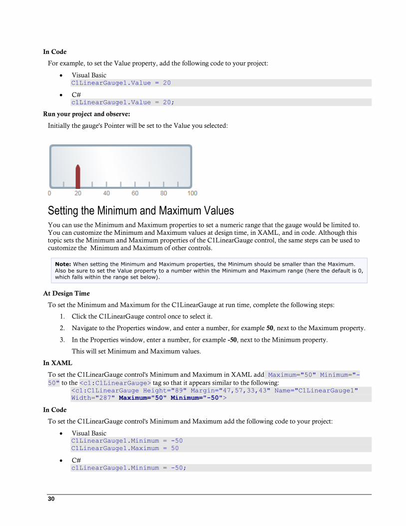
Visual Basic C1LinearGauge1.Value = 20
C# c1LinearGauge1.Value = 20;
Run your project and observe:
Initially the gauge's Pointer will be set to the Value you selected:
Setting the Minimum and Maximum Values You can use the Minimum and Maximum properties to set a numeric range that the gauge would be limited to. You can customize the Minimum and Maximum values at design time, in XAML, and in code. Although this topic sets the Minimum and Maximum properties of the C1LinearGauge control, the same steps can be used to customize the Minimum and Maximum of other controls.
Note: When setting the Minimum and Maximum properties, the Minimum should be smaller than the Maximum.
Also be sure to set the Value property to a number within the Minimum and Maximum range (here the default is 0, which falls within the range set below).
At Design Time
To set the Minimum and Maximum for the C1LinearGauge at run time, complete the following steps:
1. Click the C1LinearGauge control once to select it.
2. Navigate to the Properties window, and enter a number, for example 50, next to the Maximum property.
3. In the Properties window, enter a number, for example -50, next to the Minimum property.
This will set Minimum and Maximum values.
In XAML
To set the C1LinearGauge control's Minimum and Maximum in XAML add Maximum="50" Minimum="-
50" to the <c1:C1LinearGauge> tag so that it appears similar to the following: <c1:C1LinearGauge Height="89" Margin="47,57,33,43" Name="C1LinearGauge1"
Width="287" Maximum="50" Minimum="-50">
In Code
To set the C1LinearGauge control's Minimum and Maximum add the following code to your project:
Visual Basic C1LinearGauge1.Minimum = -50
C1LinearGauge1.Maximum = 50
C# c1LinearGauge1.Minimum = -50;

31
c1LinearGauge1.Maximum = 50;
Run your project and observe:
The gauge will be limited to the selected range at run time:
Adding Labels to the Gauge You can add and customize the C1RadialGauge control's labeling in the Properties window, XAML, or through code. Although this topic sets the C1GaugeLabel properties of the C1RadialGauge control, the same steps can be used to customize the C1GaugeLabel of other controls.
At Design Time
To add labeling to the C1RadialGauge control in the Properties window at design time, complete the following steps:
1. Click the C1RadialGauge control once to select it.
2. Navigate to the Properties window, and click the ellipsis button next to the Decorators item. The
Decorators collection editor will open.
3. Choose C1GaugeLabel in the drop-down list in the top-left of the editor and click the Add button. A
C1GaugeLabel decorator will be added to the collection and will be selected.
4. In the right-side properties pane, set the C1GaugeLabel element's Location to 1.
5. Set the C1GaugeLabel element's Interval to 20.
This will set the control's label.
In XAML
To add labeling to the C1RadialGauge control in XAML add the <c1:C1GaugeLabel> tag to the
<c1:C1RadialGauge> tag so that it appears similar to the following: <c1:C1RadialGauge Height="189" Margin="42,29,188,31" Name="C1RadialGauge1"
Width="189">
<c1:C1GaugeLabel Interval="20" Location="1" />
</c1:C1RadialGauge>
In Code
Right-click the window and select View Code to open the Code Editor. Add code to the Window1_Loaded event handler, so it appears similar to the following:
Visual Basic Window1_Loaded(ByVal sender As System.Object, ByVal e As
System.Windows.RoutedEventArgs) Handles MyBase.Loaded
Dim c1gl As New C1.WPF.Gauge.C1GaugeLabel
c1gl.Location = 1
c1gl.Interval = 20
Me.C1RadialGauge1.Decorators.Add(c1gl)
End Sub
32
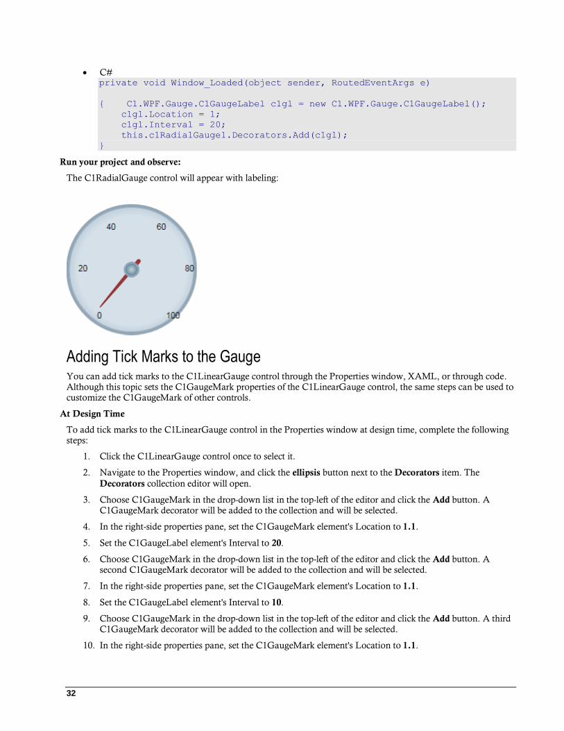
C# private void Window_Loaded(object sender, RoutedEventArgs e)
{ C1.WPF.Gauge.C1GaugeLabel c1gl = new C1.WPF.Gauge.C1GaugeLabel();
c1gl.Location = 1;
c1gl.Interval = 20;
this.c1RadialGauge1.Decorators.Add(c1gl);
}
Run your project and observe:
The C1RadialGauge control will appear with labeling:
Adding Tick Marks to the Gauge You can add tick marks to the C1LinearGauge control through the Properties window, XAML, or through code. Although this topic sets the C1GaugeMark properties of the C1LinearGauge control, the same steps can be used to customize the C1GaugeMark of other controls.
At Design Time
To add tick marks to the C1LinearGauge control in the Properties window at design time, complete the following steps:
1. Click the C1LinearGauge control once to select it.
2. Navigate to the Properties window, and click the ellipsis button next to the Decorators item. The
Decorators collection editor will open.
3. Choose C1GaugeMark in the drop-down list in the top-left of the editor and click the Add button. A C1GaugeMark decorator will be added to the collection and will be selected.
4. In the right-side properties pane, set the C1GaugeMark element's Location to 1.1.
5. Set the C1GaugeLabel element's Interval to 20.
6. Choose C1GaugeMark in the drop-down list in the top-left of the editor and click the Add button. A second C1GaugeMark decorator will be added to the collection and will be selected.
7. In the right-side properties pane, set the C1GaugeMark element's Location to 1.1.
8. Set the C1GaugeLabel element's Interval to 10.
9. Choose C1GaugeMark in the drop-down list in the top-left of the editor and click the Add button. A third C1GaugeMark decorator will be added to the collection and will be selected.
10. In the right-side properties pane, set the C1GaugeMark element's Location to 1.1.
33
11. Set the C1GaugeLabel element's Interval to 5.
In XAML
To add labeling to the C1LinearGauge control in XAML add three <c1:C1GaugeMark> tags to the
<c1:C1LinearGauge> tag so that it appears similar to the following: <c1:C1LinearGauge Height="89" Margin="90,72,41,88" Name="C1LinearGauge1"
Width="287">
<c1:C1GaugeMark Interval="20" Location="1.1" />
<c1:C1GaugeMark Interval="10" Location="1.1" />
<c1:C1GaugeMark Interval="5" Location="1.1" />
</c1:C1LinearGauge>
In Code
Right-click the window and click View Code to switch to the Code Editor. And add code to the
Window1_Loaded event handler,, so it appears similar to the following:
Visual Basic Window1_Loaded(ByVal sender As System.Object, ByVal e As
System.Windows.RoutedEventArgs) Handles MyBase.Loaded
Dim c1gm1 As New C1.WPF.Gauge.C1GaugeMark
c1gm1.Location = 1.1
c1gm1.Interval = 20
Me.C1LinearGauge1.Decorators.Add(c1gm1)
Dim c1gm2 As New C1.WPF.Gauge.C1GaugeMark
c1gm2.Location = 1.1
c1gm2.Interval = 10
Me.C1LinearGauge1.Decorators.Add(c1gm2)
Dim c1gm3 As New C1.WPF.Gauge.C1GaugeMark
c1gm3.Location = 1.1
c1gm3.Interval = 5
Me.C1LinearGauge1.Decorators.Add(c1gm3)
End Sub
C# private void Window_Loaded(object sender, RoutedEventArgs e)
{
C1.WPF.Gauge.C1GaugeLabel c1gm1 = new C1.WPF.Gauge.C1GaugeMark();
c1gm1.Location = 1.1;
c1gm1.Interval = 20;
this.c1LinearGauge1.Decorators.Add(c1gm1);
C1.WPF.Gauge.C1GaugeLabel c1gm2 = new C1.WPF.Gauge.C1GaugeMark();
c1gm2.Location = 1.1;
c1gm2.Interval = 10;
this.c1LinearGauge1.Decorators.Add(c1gm2);
C1.WPF.Gauge.C1GaugeLabel c1gm3 = new C1.WPF.Gauge.C1GaugeMark();
c1gm3.Location = 1.1;
c1gm3.Interval = 5;
this.c1LinearGauge1.Decorators.Add(c1gm3);
}
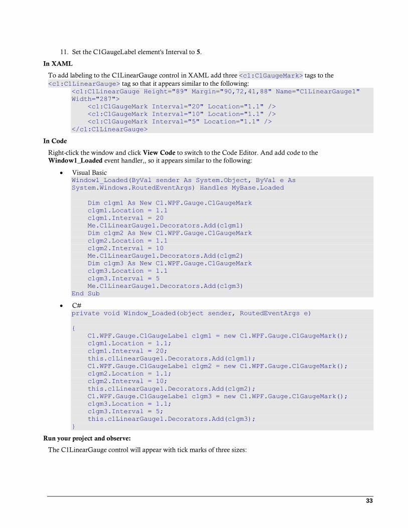
Run your project and observe:
The C1LinearGauge control will appear with tick marks of three sizes:
34
Customizing Tick Marks By default, gauge marks are drawn as blue-gray rectangles. You can customize their appearance by assigning a custom template to the Template property of the C1GaugeMark element. In the following steps, you'll create a
new DataTemplate which defines the C1GaugeMark appearance and then you'll assign that template to the C1GaugeMark element's Template property in the C1RadialGauge control.
Complete the following steps:
1. Switch to XAML view and add three <c1:C1GaugeMark> tags to the <c1:C1LinearGauge> tag so
that it appears similar to the following: <c1:C1LinearGauge Height="89" Margin="90,72,41,88"
Name="C1LinearGauge1" Width="287">
<c1:C1GaugeMark From="0" To="100" Interval="10"
Template="{StaticResource MyMarkTemplate}"/>
<c1:C1GaugeMark Interval="5" Location="1.1" />
</c1:C1LinearGauge>
2. Add the following markup just under the Window tag to add a template: <Window.Resources>
<!-- Template used to render the gauge marks -->
<DataTemplate x:Key="MyMarkTemplate">
<Rectangle Width="4" Height="18" Fill="BlueViolet"
Stroke="Black" StrokeThickness=".5"/>
</DataTemplate>
</Window.Resources>
This template defines the appearance of the tick marks.
3. Next, set the Template property on the first C1GaugeMark element you added to reference the new template's key:
<c1:C1GaugeMark From="0" To="100" Interval="10"
Template="{StaticResource MyMarkTemplate}"/>
Run your project and observe:
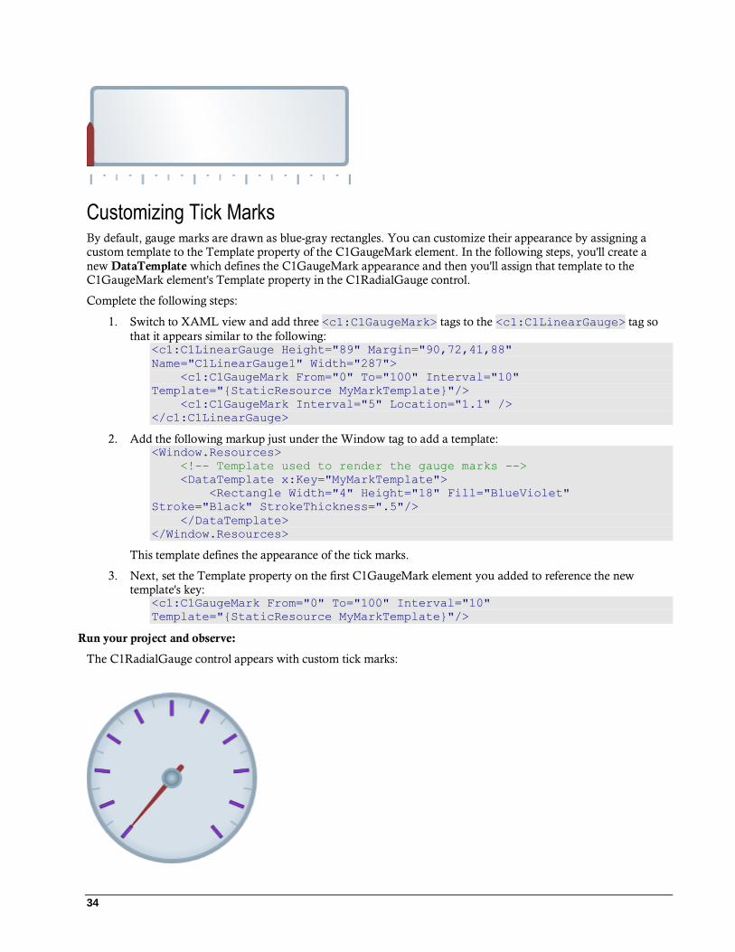
The C1RadialGauge control appears with custom tick marks:
35
Notice that the marks are drawn from the position specified by the Location property and grow inward. If you
increase the Height of the rectangles used to show the marks, the tick marks will extend farther toward the center of the gauge. To make them extend out you would change the Location property on the C1GaugeMark element.
Also, notice how elements used to show tick marks are rotated along the scale; elements used to show labels are not (see Adding Labels to the Gauge (page 31)).
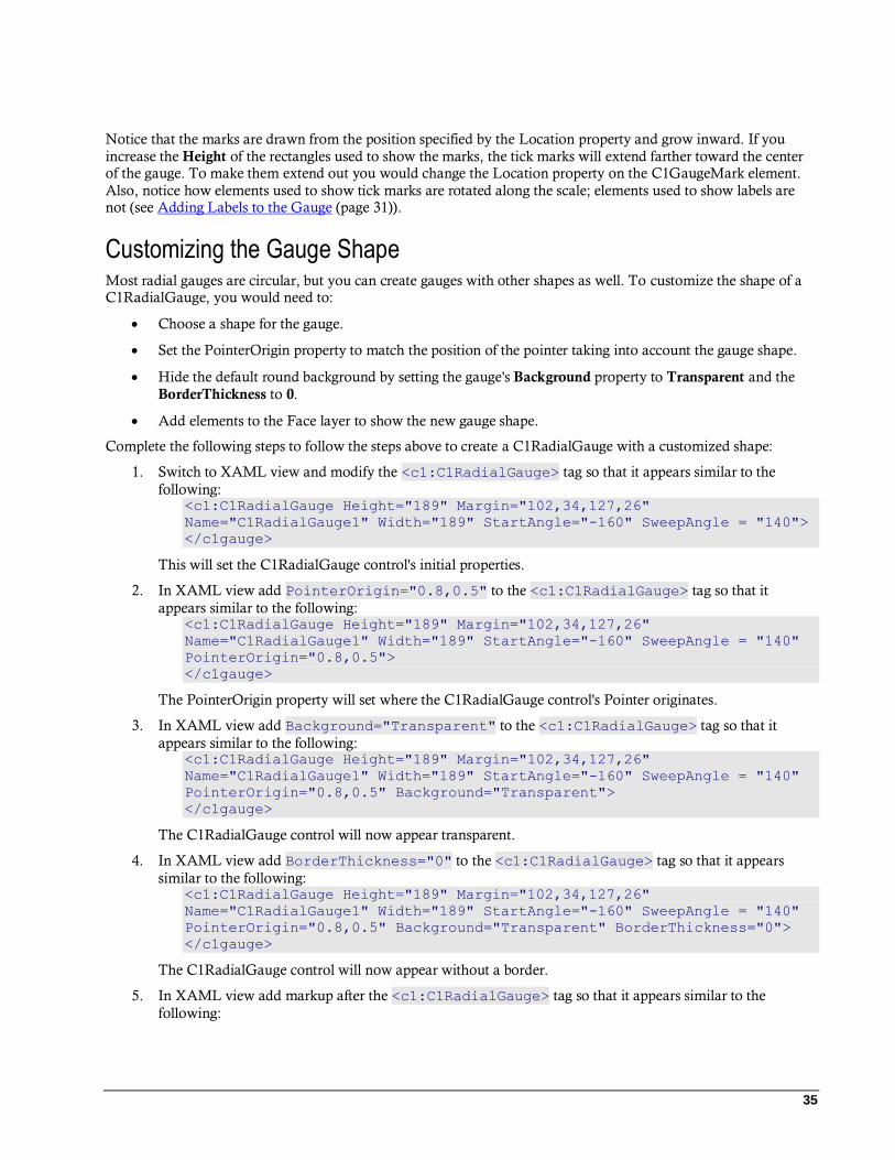
Customizing the Gauge Shape Most radial gauges are circular, but you can create gauges with other shapes as well. To customize the shape of a C1RadialGauge, you would need to:
Choose a shape for the gauge.
Set the PointerOrigin property to match the position of the pointer taking into account the gauge shape.
Hide the default round background by setting the gauge's Background property to Transparent and the
BorderThickness to 0.
Add elements to the Face layer to show the new gauge shape.
Complete the following steps to follow the steps above to create a C1RadialGauge with a customized shape:
1. Switch to XAML view and modify the <c1:C1RadialGauge> tag so that it appears similar to the
following: <c1:C1RadialGauge Height="189" Margin="102,34,127,26"
Name="C1RadialGauge1" Width="189" StartAngle="-160" SweepAngle = "140">
</c1gauge>
This will set the C1RadialGauge control's initial properties.
2. In XAML view add PointerOrigin="0.8,0.5" to the <c1:C1RadialGauge> tag so that it
appears similar to the following: <c1:C1RadialGauge Height="189" Margin="102,34,127,26"
Name="C1RadialGauge1" Width="189" StartAngle="-160" SweepAngle = "140"
PointerOrigin="0.8,0.5">
</c1gauge>
The PointerOrigin property will set where the C1RadialGauge control's Pointer originates.
3. In XAML view add Background="Transparent" to the <c1:C1RadialGauge> tag so that it
appears similar to the following: <c1:C1RadialGauge Height="189" Margin="102,34,127,26"
Name="C1RadialGauge1" Width="189" StartAngle="-160" SweepAngle = "140"
PointerOrigin="0.8,0.5" Background="Transparent">
</c1gauge>
The C1RadialGauge control will now appear transparent.
4. In XAML view add BorderThickness="0" to the <c1:C1RadialGauge> tag so that it appears
similar to the following: <c1:C1RadialGauge Height="189" Margin="102,34,127,26"
Name="C1RadialGauge1" Width="189" StartAngle="-160" SweepAngle = "140"
PointerOrigin="0.8,0.5" Background="Transparent" BorderThickness="0">
</c1gauge>
The C1RadialGauge control will now appear without a border.
5. In XAML view add markup after the <c1:C1RadialGauge> tag so that it appears similar to the
following:

36
<c1:C1RadialGauge Height="189" Margin="102,34,127,26"
Name="C1RadialGauge1" Width="189" StartAngle="-160" SweepAngle = "140"
PointerOrigin="0.8,0.5" Background="Transparent" BorderThickness="0">
<!-- Add tick marks to the gauge -->
<c1:C1GaugeMark Interval="10" Location="1"/>
<c1:C1GaugeMark Interval="5" Location="1" />
</c1gauge>
This will add C1GaugeMark elements and tick marks to the gauge.
6. In XAML view add markup after the <c1:C1RadialGauge> tag so that it appears similar to the
following: <c1:C1RadialGauge Height="189" Margin="102,34,127,26"
Name="C1RadialGauge1" Width="189" StartAngle="-160" SweepAngle = "140"
PointerOrigin="0.8,0.5" Background="Transparent" BorderThickness="0">
<!-- Add tick marks to the gauge -->
<c1:C1GaugeMark Interval="10" Location="1"/>
<c1:C1GaugeMark Interval="5" Location="1" />
<!-- Add a face with custom shape -->
<c1:C1RadialGauge.Face>
<Grid>
<Grid.ColumnDefinitions>
<ColumnDefinition Width="4*" />
<ColumnDefinition Width="10*" />
<ColumnDefinition Width="1*" />
</Grid.ColumnDefinitions>
<Border Grid.Column="1" Background="Black"
BorderBrush="LightGray" BorderThickness="4"
CornerRadius="140,60,60,140"/>
</Grid>
</c1:C1RadialGauge.Face>
</c1gauge>
This will add a customized Face to the gauge.
Run your project and observe:
The C1RadialGauge control appears with a customized face:
You can customize the Face of the C1RadialGauge control even further. For example, take a look at the following
customized gauges included on the SpeedometersPage.xaml page of the GaugeSamples sample installed with
Studio for WPF:
37
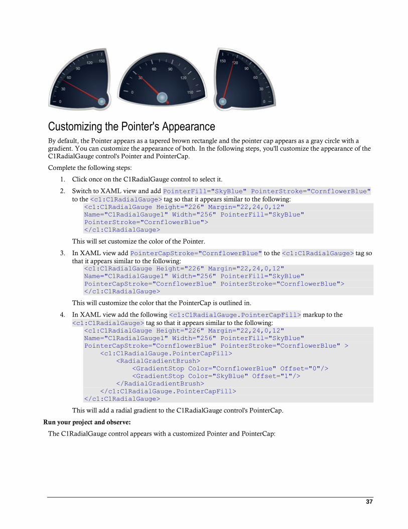
Customizing the Pointer's Appearance By default, the Pointer appears as a tapered brown rectangle and the pointer cap appears as a gray circle with a gradient. You can customize the appearance of both. In the following steps, you'll customize the appearance of the C1RadialGauge control's Pointer and PointerCap.
Complete the following steps:
1. Click once on the C1RadialGauge control to select it.
2. Switch to XAML view and add PointerFill="SkyBlue" PointerStroke="CornflowerBlue"
to the <c1:C1RadialGauge> tag so that it appears similar to the following: <c1:C1RadialGauge Height="226" Margin="22,24,0,12"
Name="C1RadialGauge1" Width="256" PointerFill="SkyBlue"
PointerStroke="CornflowerBlue">
</c1:C1RadialGauge>
This will set customize the color of the Pointer.
3. In XAML view add PointerCapStroke="CornflowerBlue" to the <c1:C1RadialGauge> tag so
that it appears similar to the following: <c1:C1RadialGauge Height="226" Margin="22,24,0,12"
Name="C1RadialGauge1" Width="256" PointerFill="SkyBlue"
PointerCapStroke="CornflowerBlue" PointerStroke="CornflowerBlue">
</c1:C1RadialGauge>
This will customize the color that the PointerCap is outlined in.
4. In XAML view add the following <c1:C1RadialGauge.PointerCapFill> markup to the
<c1:C1RadialGauge> tag so that it appears similar to the following: <c1:C1RadialGauge Height="226" Margin="22,24,0,12"
Name="C1RadialGauge1" Width="256" PointerFill="SkyBlue"
PointerCapStroke="CornflowerBlue" PointerStroke="CornflowerBlue" >
<c1:C1RadialGauge.PointerCapFill>
<RadialGradientBrush>
<GradientStop Color="CornflowerBlue" Offset="0"/>
<GradientStop Color="SkyBlue" Offset="1"/>
</RadialGradientBrush>
</c1:C1RadialGauge.PointerCapFill>
</c1:C1RadialGauge>
This will add a radial gradient to the C1RadialGauge control's PointerCap.
Run your project and observe:
The C1RadialGauge control appears with a customized Pointer and PointerCap:

38