53
CHAPTER 4
LAND DEGRADATION STUDIES IN THE NILGIRIS
4.1 INTRODUCTION
Land degradation is a composite term; it has no single readily
identifiable feature, but how one or more of the land resources (soil, water,
vegetation, rocks, air, climate, relief) has changed for worse. The land
degradation generally signifies temporary or permanent decline in the
productive capacity of the land. The main causes of land degradation are soil
erosion and deforestation. In the Nilgiris the degradation is caused by the
conversion of natural forest into commercial plantations, increased
agricultural/horticultural activities, urbanization and human influence and
natural causes due to inherent characteristics. For example the area under tea
has increased from 19,191 hectare in 1957 to 46,542 hectare in 1994.
Considering the fragile condition of the ecosystem of Nilgiris, it is
necessary to take up conservation measures in judicious manner to maintain
the ecological balance. In order to take up the remedial measures we have to
identify the highly degraded area which are to be tackled on priority basis.
The study has been conducted by preparing various thematic maps such as
landuse, slope, drainage density, lineament density and geomorphology and
assigning weight and rank based on their influence on land degradation. The
degradation status map is prepared by using weighted overlay analysis
method in GIS environment.

54
4.2 METHODOLOGY
The study has been carried out in a phased manner. The different
phases are as follows:
Phase-1: Collection of data (Satellite, Conventional)
Phase-2: Preparation of various thematic maps/layers
Phase-3: Ground truth-using GPS survey
Phase-4: Post Ground Truth mapping
Phase-5: Final preparation of various thematic maps/layers
Phase-6: Digital Database Creation
Phase-7: Integration and overlay analysis
Phase-8: Zonation of Ecodegradable areas.
Figure 4.1 is a flow chart depicting the methodology adopted in this
study.
4.3 DATA COLLECTION
The first phase involved collection of various data and information
such as IRS-1B and Landsat-MSS satellite image data and conventional data
such as topographical maps from survey of India, Geological survey of India,
publication and reports from different line departments.

55
Figure 4.1 Flow chart
Satellite Data Conventional Data
Thematic Maps
Geomorphology Lineament LU/LC-1973 LU/LC-1993
Thematic Maps
Digitization
Analysis (GIS Integration)
Zonation of degradation prone areas
Topographical Data
Thematic Maps
* Drainage * Drainage Density * Slope
LAND DEGRADATION
Geology (From GSI)

56
4.4 DATA USED
4.4.1 Satellite Data
Indian Remote sensing satellite, IRS IB LISS II (1993, Feb),
Geocoded, FCC.
LANDSAT MSS Data-1973.
4.4.2 Collateral Data
Survey of India. Top sheet No.58A and 58E
Geological survey of India – Geological
Map of Tamil Nadu on 1:500,000 scale and land slide report.
4.5 FIELD OBSERVATION
After carrying out preliminary interpretation of satellite data,
extensive field transverse in the district have been carried out between
Feb. 18-28, 2000. Detailed data / information were collected on various
features during the field survey. And GPS survey also carried out as a part for
ground truth verification.
4.5.1 GPS Survey
The acronym GPS stands for Global Positioning system which
comprised of 24 satellites or more. With a GPS receiver any one, any where
in the world can determine his/ here location at any time of day or night. The
GPS aided navigation has many advantages over conventional systems.

57
GPS has enormously improved rescue operations because it has
now become possible to pinpoint the exact location of where the disaster has
occurred. It has also found application in the field of forestry.
GPS survey was carried out in the study areas to know the locations
of specific land use / land cover types as this information may be correlated
with the image data. Table 4.1 shows the coordinates of a few location
obtained by GPS survey and the corresponding land use/ land cover found in
the locations.
The above mentioned table has been helpful to understand the
different land use types and also in correcting the land use maps prepared
using satellite data.
4.6 DESCRIPTION OF THEMATIC MAPS
The entire Nilgiri district is covered in 2 top sheets on 1:250,000
scale. They are 58A and 58E, for each theme map has been described below:
4.6.1 Base Map
The base map is a cartographic base on which various thematic
information generated for the study is compiled. SOI maps were used for the
preparation of base map on 1:250,000 scale. All the major roads, railway
lines, rivers, major streams, big tanks, reservoirs, important settlements etc.,
are shown on base map.

58
Table 4.1 GPS surveyed ground truth location
S. No. Lat Long
Ht. in Meters
Above MSL Land use / land cover
1 N11˚
26’30’’ E 76˚
40’ 20’’ +2123 m
Around the point the dry lake is present and opposite to the road the eucalyptus and pine trees are seen along with the built up land. Some settlements are also present nearer to the built up land.
2 N11˚]
26’ 34’’ E76˚
38’ 42’’ +2041 m
Around the point tall eucalyptus trees and tea plantation is seen. In the upland side there is some settlements for sheep breeding and above that forest area is starting.
3. N11˚
29’45’’ E76˚
39’ 39’’ +1742 m
The point is in the upland side around that the tea plantation along the down land and far away from the point there is some continuous hills are seen with dense forest and some of them are to being converted in to tea plantation.
4 N11˚
25’ 38’’ E79˚
55’ 49’’ +1664 m
Around the location both in the up and down land side tea plantation is seen named as Deepdale tea estate.
5 N11˚
25’ 37’’ E76˚
54’ 57’’ +1652
Around the point of location the tea plantation is seen along both the sides. Behind the point dense forest is seen.
6 N11˚
28’ 33’ E76˚
54’ 38’’ +1895 m
The place is called Hallada around that the built up land cabbage, beans, carrot cultivation is going on. In the up land side dense forest is seen.

59
Table 4.1 (Continued)
S. No. Lat Long
Ht. in Meters
Above MSL Land use / land cover
7 N11˚
26’ 47’’ E76˚
57’ 41’’ +1346 m
The point is present on the way to Bomman tea estate. The tea plantation is seen on both sides of the road and some dense forest is seen far away from the point
8 N11˚
28’ 08’’ E76˚
58’ 39’’ +1603
The point is located near Kadasolai, around that point tea plantation seen. The hill areas near this point are covered with dense forest and in between the hills the Bhavanisagar reservoir is seen.
9 N11˚
25’ 49’’ E76˚
57’ 94’’ +1257 m
The point is present in the KKTA area where intense cultivation of tea is going on. Around that point the dense forest is continuing.
10 N11˚
26’ 30’’ E76˚
07’ 27’’ + 2093 m
The location name is Piemund. Near the point some built up land is seen and hills with moderate vegetation are also seen.
11
N11˚ 25’ 87’’
E76˚ 08’ 37’’
+2248 m
The point is located in the School compound. Near by some shola vegetation is seen.

60
Figure 4.2 Slope map of the study area (Nilgiris)
4.6.2 Slope Map
The slope and aspect of a region are vital parameters in deciding
suitable landuse for the area, based on the degree, nature of slope and landuse
that could be supported. It is also helpful in prioritizing areas for development
measures and in deciding sites for hydel and irrigation projects, rail-road
alignment forestation programmes etc.
The slope map on 1:250,000 scale was derived from SOI toposheets
by ‘WENTWORTH’ method (Figure 4.2). A 1 cm square grid was prepared
for the study area in 1:250,000 scales and then it is superposed over the
toposeheet. The total number of contour cuttings for each grid is counted, the
total no. of contour cutting value converted into degrees and minutes and for
this the following formula used.

61
Total no. of contour cutting/km Slope in degrees = ×contour interval Contour interval= 100 mts.
The slope classes are described in the following Table 4.2.
Table 4.2 Slope classes
Slope class (%) Description
0 – 1 Nearly level
1 – 3 Very gentle sloping
3 – 5 Gently sloping
5 – 10 Moderately sloping
10 – 15 Strongly sloping
15 – 35 Moderately steep to Steep sloping
Above 35 Very steep sloping
4.6.3 Landuse / Landcover Map
The landuse / land cover map was prepared by using two different
satellite image data such as:
LANDSAT MSS – FEB -1973
IRS IB LISS II – FEB – 1993 FCC on 1:250,000 scales, geocoded
along with GPS field survey observations and use of collateral data for
finalizing the map (Figures 4.3 and 4.4).

62
Figure 4.4 Landuse/Landcover map 1993
Figure 4.3. Landuse/Landcover map 1973

63
Nilgiri district is characterized by the presence of vast forest, tea
plantations, vegetable crops and barren steep slopes. The northern part of the
district is of deciduous forest area (Mudumalai), the western part is
predominantly grassland and shola (Mukurthi). Tea plantations are seen
mainly in the central, eastern part of the district. Annual cropped areas are
seen in and around Ooty and Coonor and central part of the district.
Ever green forest, sholas are in seen Mukurthi and southeastern and
northeastern part of the district.
4.6.4 Geology Map
It is prepared from the preexisting GSI Geological mineral map on
1:500,000 scale converted to 1:250,000 scale (Figure 4.5).
Figure 4.5 Geology map of the study area

64
Structurally the area is highly disturbed and is subjected to faulting.
Block faulting resulted in upliftment of the plateau. Due to the tectonic
activities the deep seated metamorphic rockshave undergone considerable
deformation during Precambrian times which resulted in different structural
features such as folds, faults and joints. Laterites are found in large quantities
in the district. Bauxite with other minerals are also found in the district.
4.6.5 Geomorphology Map
It is prepared using IRS-IB LISS II geocoded FCC on 1:250,000
scale of Feb. 1993 (Figure 4.6). The collateral data and field observation are
used for finalization of the map. The various land forms identified are
structural hill, denudational hill, hill slopes, bazada, barried pediment, barried
pediment (deep) and shallow pediment. The entire district is comprised of
plateau land forms Number of large and small fractures is seen in the district.
Figure 4.6 Geomorphology map

65
4.6.6 Drainage Density Map
The drainage morphometry throws, light on lithologic, structural
controls of the watershed, relative run off, recharge, erosional aspects and etc.
in the study area the drainage pattern is parallel to sub parallel, dendritic to
sub dendritic and trellis.
Drainage density map was prepared by using watershed map. The
following formula is used to calculate D.D.
Total length of streams Drainage density = Area of microwater shed
The drainage density contour map was drawn using spatial analysis
in ARC VIEW VERSION (Figure 4.7).
Figure 4.7 Drainage density map of the study area

66
4.6.7 Lineament Density Map
From lineament map, the lineament density map was prepared. The
lineament density map is divided into five groups. Finally suitable rank and
wightage are assigned. The lineament density contour map was drawn using
spatial analysis in ARC VIEW VERSION (Figure 4.8).
Figure 4.8 Lineament Density map
4.7 DATA BASE CREATION
It involved the creation of digital database for entire Nilgiris district
on 1:250,000. all the thematic maps / layers were digitized in Geographical
information system (GIS) environment.

67
4.8 DATA INTERGRATION
The spatial data for entire district integrated using the decision rules
arrived at by incorporating the inputs from various layers / maps.
4.9 GIS ANALYSIS
4.9.1 General
Geographic Information System is used to monitor the degradation
status. The major inputs are the various themes and their attribute table
generated. The degradation status is obtained by associating the relevant
weight and rank of the respective themes. The analysis is done on a polygon
by polygon basis on the composite coverage. The analysis is preformed by
using the basic overlay operations.
4.9.2 Concept of Model
The aim of study is to assess the degradation status in the Nilgiris
district. The study is carried out with considerations of relevant parameters
such as are Landuse / Landcover, geomorphology, slope, geology, drainage
density, and lineament density. Weights and ranks are assigned to each theme
separately for this study the required values, which is the sum of product of
weightage and rank of the scheme is given by
DI = ∑W*R (4.1)
where, DI - Degradation index
W - Weight of each theme
R - Rank of each class present in the theme

68
4.9.3 Assigning Ranks and Weightage
It is the primary input for the multi criterion analysis. The weight
and ranks for the themes are assigned based on their influence on degradation.
The criterions, which are considered for the study, are Landuse/ Landcover,
geomorphology, Geology, slope, lineament density, and Drainage density.
4.9.3.1 Weightage for themes
It is determined by their close contribution to the zonation for the
degradation status. The separate weightages are given in the percentage as
given in Table 4.3.
Table 4.3 Weitage for themes
Themes Weights
1) Landuse / Land cover 30
2) Slope 30
3) Geomorphology 20
4) Drainage density 15
5) Lineament density 5
Total 100
4.9.3.2 Assigning ranks to the themes
4.9.3.2.1 Landuse/ Land cover
It is the indicator of present status of the land utilization, for the
degradation status. The suitability ranks are assigned by considering the dense
forest category is less prone for degradation. The next LU category is

69
deciduous forest, which is of low rate degradation. The next group is the Tea,
coffee plantation that is moderately prone to degradation. The grasslands are
degraded easily attain higher rank The last LU categories Built up land attains
more erosion and attains higher rank of 5 (Table 4.4).
Table 4.4 Rank for landuse
Classes Category Rank
1 Dense forest 1
2 Deciduous forest 2
3 Tea coffee plantation 3
4 Scrubland 4
5 Grass land 4
6 Crop Land 4
7 Built upland 5
4.9.3.2.2 Slope
It is determined by the Physiography of the region. The slope and
aspect of region are vital parameters in deciding suitable landuse for the area.
In general, the terrain of the Nilgiris district is highly undulating and hilly.
The slope varies from gentle in valley region to very steep in dissected slopes.
Based on the slope classes a ranks are assigned as furnished in Table 4.5.

70
Table 4.5 Rank for slope
Slope class (%) Rank
0 – 1 1
1 – 3 1
3 – 5 2
5 – 10 2
10 – 15 3
15 – 35 4
Above 35 5
4.9.3.2.3 Geology
The study area enormously comprises of major rock type of
charnockite which is prone for erosion due to joint and fracture pattern
present in that rock type, and also it is easily weathered by natural agencies so
it is contributing to the erosion.
4.9.3.2.4 Geomorphology
The ranks for the various geomorphic units are given in Table 4.6.

71
Table 4.6 Rank for geomorphology
Classes Rank
Structural Hill 1
Denudational Hill 2
Hill Slopes 4
Buried Pediment 2
Bazada 3
Shallow Pediment 2
Buried Pediment (Deep) 1
4.9.3.2.5 Drainage density
The drainage density map is prepared from drainage map. The
ranks are assigned based on the drainage density as given in Table 4.7.
Table 4.7 Rank for drainage density
Drainage density Rank
Low 1
Moderate 2
High 3
Very high 4

72
4.9.3.2.6 Lineament density
The lineament density map is prepared from lineament map. The
ranks for different categories are assigned as given in Table 4.8.
Table 4.8 Rank for lineament density
Category Rank
Low 1
Moderate 2
High 3
Very high 4
4.9.4 GIS Based Statistical Analysis and Zonation
The aim of this analysis is to Zonate the degradable areas. Using
the Overlay module of Arc/Info based GIS Software, the above thematic
layers were overlayed with suitable ranks and weights. The final map contains
numerous polygons having the characteristics of all above themes. In order
group them into four classes, a statistical analysis was made assuming the
distribution is normal. Considering the 1- sigma criteria, a final degradation
map has been delineated into four classes namely, highly degraded,
moderately degraded, less degraded and not degraded. The zonation
categories are based on the statistics generated from the composite coverage.
The separate statistics are given in the following Table 4.9.
73
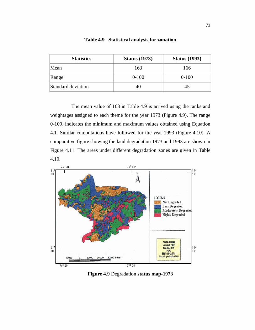
Table 4.9 Statistical analysis for zonation
Statistics Status (1973) Status (1993)
Mean 163 166
Range 0-100 0-100
Standard deviation 40 45
The mean value of 163 in Table 4.9 is arrived using the ranks and
weightages assigned to each theme for the year 1973 (Figure 4.9). The range
0-100, indicates the minimum and maximum values obtained using Equation
4.1. Similar computations have followed for the year 1993 (Figure 4.10). A
comparative figure showing the land degradation 1973 and 1993 are shown in
Figure 4.11. The areas under different degradation zones are given in Table
4.10.
Figure 4.9 Degradation status map-1973

74
Figure 4.10 Degradation status map-1993
Figure 4.11 Degradation status 1973 and 1993
Highly Degraded Area Moderately Degraded Area Less Degraded Area Not Degraded Area
1973
1993

75
Table 4.10 Areal extent of the types of degradation (in sq.km) in the
Nilgiris during 1973 and 1993
S.No. Description Areal Extent in Square Kilometer
1973 1993
1. Highly Degraded Area 331 855
2. Moderately Degraded Area 654 327
3. Less Degraded Area 746 938
4. Not Degraded Area 818 429
TOTAL 2549 2549
4.9.5 Conclusion
The degradation has been carried out for the years 1973 and 1992.
The study has been conducted by preparing thematic layers such as landuse,
drainage density, slope, geomorphology and lineament density. These themes
have direct influence on the degradation. Suitable ranks and weights are
assigned to the themes based on their influence on the degradation. Overlying
the thematic layers in the GIS environment, the areas are divided into four
zones based on the intensity of degradation.
From the degradation zonation map it is observed that during 1973
the highly degraded area is 331 sq.km and the areas not affected by
degradation is 818 sq.km. But, in the year 1992 the highly degraded area has
increased to 855 sq.km from 331 sq.km and the areas not affected by
degradation has reduced to 429 sq.km. From the figures we can understand
the intensity of the problem.

76
Some of the factors which cause the degradation are increased tea
and annual crop cultivation in all slopes. From the landuse map prepared for
1973 and 1993 it seen that forest and shoals are converted into tea. The data
collected from the department indicate over the years area under tea has been
increased from 19191 ha in 1957 to 48170 in 1993. Contrary to the belief that
lush green tea estates does not cause the degradation, it is observed that
during initial four years of new tea plantation still the lushes came up, the soil
loss is estimated to be around 3 tons/year.
The deforestation and human impact are also major causes for
degradation the 1993 degradation status map show the higher degradation in
and around all the urban centers of Nilgiris district.
4.10 UNDERSTANDING THE STATUS OF SOIL EROSION IN
THE NILGIRIS USING SATELLITE DATA (RADIANCE
PARAMETERS)
4.10.1 General
Based on the fieldwork carried out and based on enquiries with the
local people, it has been realized that erosion in the Nilgiris district, is
prevalent. Watershed management options would include measuring and
quantifying soil erosion and degradation. Since the area is characterized by a
humid climate and mountainous terrain. Field-based methods would be
difficult, time-consuming and expensive. Review of literature on monitoring
of soil erosion suggests that there exist many field-based methods. In the
absence of data on the rates of soil erosion or degradation in an area,
surrogate measures of soil erosion are possible, which are based on
information derived from remote sensing imagery. A few researchers have
attempted to generate albedo images from Landsat satellite scenes, which
represent the spatial distribution, number, and size of soil patches. This

77
information, when obtained in a temporal manner, can be directly related to
the extent of degradation an area has undergone. Soil Stability Index,
suggested by Pickup and Nelson (1984) is one such information that can be
generated for the Nilgiris to understand the process of erosion.
4.10.2 Objectives
The objectives of this chapter are listed below:
To generate the Soil Stability indices (SSI) for 1973 and
1992 for the Nilgiris using temporal satellite image data,
To explain the significance of SSI in relation to the status of
erosion/degradation or sediment deposition, and
To relate the imagery derived SSI values and the process of
degradation in the Nilgiris watershed from 1973 to 1992.
4.10.3 Previous Works
Robinove et al (1981) monitored the direct changes in the temporal
and spatial dynamics of soil albedo patches in arid lands by examining the
difference albedo image that results from subtracting albedo images from two
different time periods. The Landsat albedo, or percentage of incoming
radiation reflected from the ground in the wavelength range of 0.5 µm to
1.1 µm was calculated from an equation using the Landsat digital brightness
values and solar irradiance values, and correcting for atmospheric scattering,
multispectral scanner calibration, and sun angle. The albedo calculated for
each pixel was used to create an albedo image, whose grey scale is
proportional to the albedo. Differencing sequential registered images and
mapping selected values of the difference was used to create quantitative

78
maps of increased or decreased albedo values of the terrain. The authors
conclude that decreases of albedo may indicate improvement of land quality;
increases may indicate degradation. This approach can be directly adopted
and tested for the Nilgiris watershed to understand the process of degradation.
There are many more studies that have directly related the
reflectance of soils to soil properties which affect reflectance, particularly
surface roughness, structure, moisture content, particle size distribution
(texture), and the content of organic matter, carbonates, clay, minerals, and
iron oxides (Myers and Allen 1968; Stoner and Baumgardner 1981; Wessman
1991). Frank (1984) examined the residual image that results from regression
analysis of different bands of Landsat imagery to quantify soil degradation,
while Kauth and Thomas (1977) examined the temporal trend of a soil
brightness index (SBI) generated using the Kauth-Thomas tasseled-cap
transformation.
In relation to soil erosion studies, it has been shown by Stoner and
Baumgardner (1981) and Wessman (1991) that increases in organic matter
content lead to a darkening of soils and increased reddening of soils is a
function of an increase in iron oxides. This increase in iron oxide is seen to be
consistent with the stage of erosion. Stoner and Baumgardner (1981) showed
that differing amounts of organic matter and iron oxide in soils could be
detected by the change in their spectral response curves and demonstrated that
iron oxide content increased with the degree of erosion. Frazier and Cheng
(1989) found that plots of the ratioed data could be clustered, subdivided, and
discretely mapped to the landscape to show various levels of organic matter
and iron oxides. Consequently, the authors mapped the amount of soil erosion
as these factors related to a change in soil quality at specific locations.

79
Pickup and Nelson (1984) carried out a study on the red-yellow
soils within Australia's central arid region by stratifying a landscape's
land-forms into four categories of erosional status: stable, transitional,
depositional, and erosional. Reflectance in the four Landsat Multispectral
Scanner (MSS) bands was measured using an airborne Exotech radiometer for
groups of surfaces in each category and the response plotted against each
other to determine which band combinations (10 nonreciprocal combinations)
best separated the erosion categories in Cartesian space. The authors found
that the ratio of the MSS green (band 1, 0.5 - 0.6 µm) divided by the near
infra-red (NIR, band 3, 0.7 - 0.8 µm) or the 1/3 ratio, plotted against the ratio
of the red (band 2, 0.6 - 0.7 µm) divided by band 3 or the 2/3 ratio best
discriminated the surfaces in spectral space (Figure 4.12).
Figure 4.12 Landsat MSS bands 1/3 vs 2/3 and TM bands 2/4 vs 3/4 and
the discrimination of landform erosion states by the Soil
Stability Index (SSI) (Source: Pickup and Nelson 1984)

80
Although MSS data are only available in four bands, a wide range
of derived parameters may be calculated. Some of these parameters may be
sensitive to different types of ground condition but others may be functionally
equivalent (Perry and Lautenschlager 1984). In this investigation, ten radiance
parameters were used, namely, the raw radiance values in each band and the
various band ratios.
4.10.4 Band Ratios
Band ratios were incorporated for several reasons. Firstly, they
have a tendency to partially normalize data for factors such as variations in
sun angle, haze, topography, and system-generated noise. This is important if
the derived soil stability index is to be used for multi-temporal comparisons to
indicate rangeland degradation or recovery. Secondly, band ratios minimize
albedo differences between soil or rock surfaces but enhance the subtle
differences between reflectance between bands that are diagnostic of
variations in surface material. Thirdly, ratios of visible to infrared bands
provide a good distinction between green vegetation and dry vegetation and
soil. This is particularly useful in distinguishing deposition areas, as these
usually have a more dense green cover than other soil stability types.
In the context of the present study in the Nilgiris, it must be
mentioned here that band ratios have been incorporated for the following
reasons:
1. The Nilgiris being a hilly terrain with typical undulating
topography, band ratios are best suited, as the process of
ratioing implifies the effect of undulations in the terrain and
also the effect of shadow caused due to undulation. This fact
has been well illustrated by Lillesand and Kiefer (2000).

81
2. A multi-temporal comparison of land degradation has been
attempted here and hence, use of band ratios to compute SSI
is imperative.
3. Green vegetation, dry vegetation and soil are present in
various proportions in the watersheds of the Nilgiris in the
various years taken up for study. According to Pickup and
Nelson (1984) such a situation warrants the use to band
ratios to distinguish areas of deposition from the areas
characterized by erosion.
The derivation of an index of soil stability from the band 1 / band 3
and band 2 / band 3 values requires only simple trigonometry. The data space
consists of a lower line that appears to represent extensive deposition and an
upper line representing extreme erosion that is the opposite condition.
Intermediate states occur between the lines and as distance from the lower
line increases, the type of deposition becomes less extensive until a transition
to erosion occur. The erosion becomes progressively more developed as the
upper line is approached.
4.10.5 Generating Soil Stability Index for the Nilgiris
From the Figure 4.12, it may be inferred that the various zones in
the scatter plot are clearly related to the status of erosion in a given area. To
decipher the status of erosion in Nilgiris watershed, a multi-temporal image
data set was used to generate ratio images and then the SSI.
TM bands 2 (green), 3 (red), and 4 (NIR) are similar to the MSS
bands (Table 4.11) and can be directly substituted for them (Crist and Cicone
1984). Thus the TM band ratio 2/4 would be substituted for MSS band ratio

82
1/3 and TM band ratio 3/4 for MSS band ratio 2/3. Consequently, Pickup and
Nelson (1984) found that not only could they map soil condition to the
landscape, but they had also produced a continuous measure of soil stability
that integrated vegetation reflectance characteristics by including the MSS
green band. Other workers determined the trend of soil condition using an
MSS time series and this analysis indicated when and where a landscape
changed to different states of stability (Pickup and Chewings 1988; Pickup
1990; Stafford-Smith et al 1992, Dube 1994).
Table 4.11 MSS and TM bands
Band No. MSS Bands μm TM Bands μm
1 0.5 – 0.6 0.45 – 0.52
2 0.6 – 0.7 0.52 – 0.60
3 0.7 – 0.8 0.63 – 0.69
4 0.8 – 1.1 0.76 – 0.90
5 -- 1.55 – 1.75
6 -- 10.40 – 12.5
7 -- 2.08 – 2.35
The procedure is as follows:
(1) Use image algebra to calculate either the MSS or TM ratio
images using the image scene in order to represent the entire
reflectance range of landscape features.
(2) Cartesian plotting of either MSS band ratio 1/3 or TM band
ratio 2/4 on the x-axis versus MSS band ratio 2/3 or TM
band ratio 3/4 on the y-axis (Figure 4.12).

83
(3) Determine the upper and lower bounding line.
(4) Determine the regions in the scatter plot that correspond to
the areas of severe erosion, moderate erosion, no erosion
(stable areas), minor deposition and extensive deposition.
Also determine the corresponding pixels in the image (i.e.
pixels characterized by severe erosion, moderate erosion, no
erosion (stable areas), minor deposition, extensive
deposition.
If the imagery we are assessing is a Landsat TM scene, we can
directly substitute similar TM bands for MSS bands (Crist and Cicone 1984).
Thus the band ratio 2/4 can be substituted for band ratio 1/3 and band
ratio 3/4 for 2/3.
The result of generation of the SSI for the years 1973 and 1992 for
the Nilgiris is shown in Figure 4.13. Figure 4.13 I(a) and II(a) are the two
input multi-spectral images for 1973 (MSS) and 1972 (TM) respectively.
Figure 4.13 I(b) and II(b) are the scatter plot of MSS 1/3 Vs TM 2/4 for the
year 1973 and 1992 respectively. Figure 4.13 I(c) and II(c) depict the images
showing regions of erosion, stable regions and region of deposition in the
Nilgiris. These images are similar to classified images, wherein the training
class. Pixels have been selected from the scatter plots. That is, pixels
representing classes of severe erosion are selected from the data space near
the upper line in the scatter plot, while pixels representing classes of Non-
erosion (i.e., stable classes) are selected from the data space near the central
diagonal line in the scatter plot. Similarly, the pixels representing classes of
deposition are selected from the data space near the bottom line in the scatter
plot.

84
4.10.6 Description of the SSI Images
Pixels in yellow colour are those representing fluvial, including
stream terraces, channels, reservoirs, and flood plains. These landforms are all
depositional features. Agriculture and forestlands are also represented as
depositional areas.
Pixels in blue indicate areas in stable to transitional state, a
category which dominates the landscape. Green pixels represent areas that are
moderately exposed and hence, the erosion is moderate in this region. Red
colored pixels represent areas that are exposed and can be considered
erosional features. The 1992 SSI image is dominated by these Red colored
pixels.
I (a) I (b) I (c)
II (a) II (b) II (c)
Figure 4.13 SSI Image for Nilgiris district I) 1973 II) 1992

85
It has been shown by Pickup & Nelson (1984) that a radiance
measure based on the 1/3-2/3 MSS data space may be used to categorize
eroding, stable, and depositional surfaces in the arid lands of central Australia.
The measure does depend on having a uniform level of greenness in the area
under study.
4.10.7 Conclusion
To sum up, the soil stability index computed using satellite image
data allows rapid survey of the erosion status of large areas commensurate
with the size of management units. The areas under erosion are more in 1992
compared to 1973 and this compares with the results of the degradation study
carried out using GIS analysis.