advertising for
Or: what will replace the display banner?
12 exciting new ways of
digital publishers
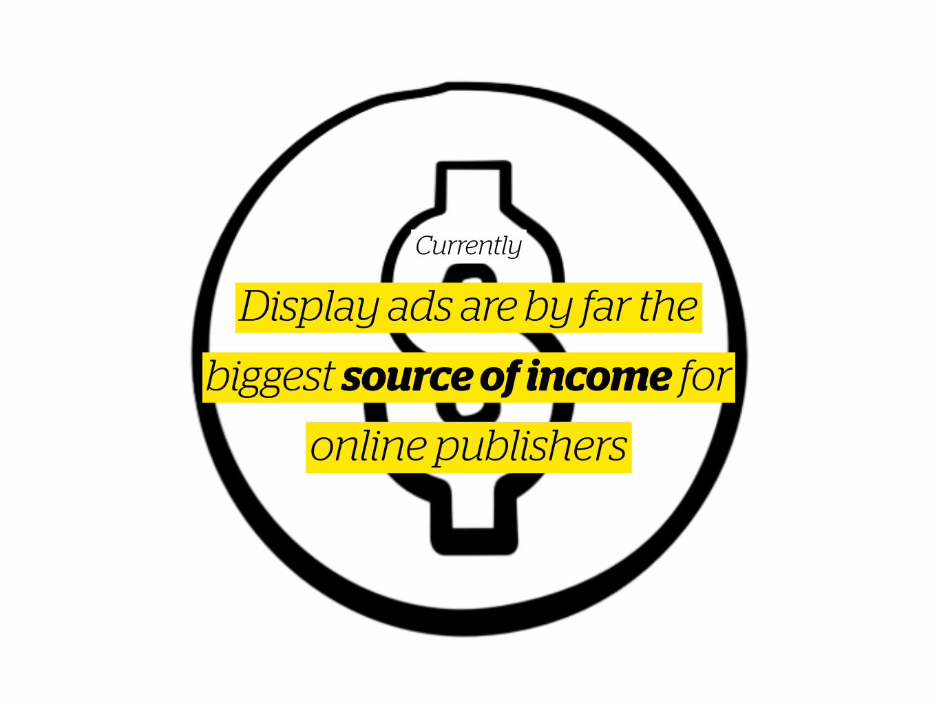
Display ads are by far the
biggest source of income for
online publishers
Currently
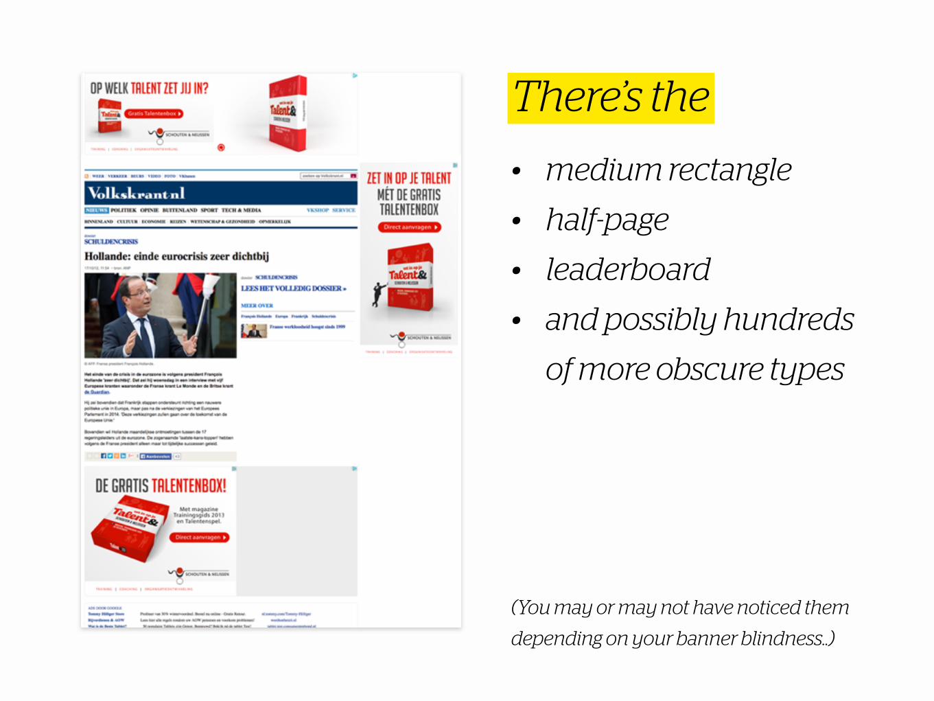
• medium rectangle
• half-page
• leaderboard
• and possibly hundreds
of more obscure types
(You may or may not have noticed them
depending on your banner blindness..)
There’s the
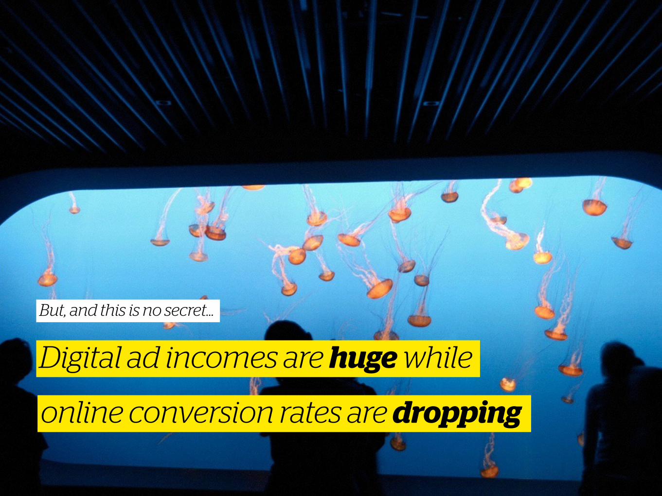
online conversion rates are dropping
Digital ad incomes are huge while
But, and this is no secret…
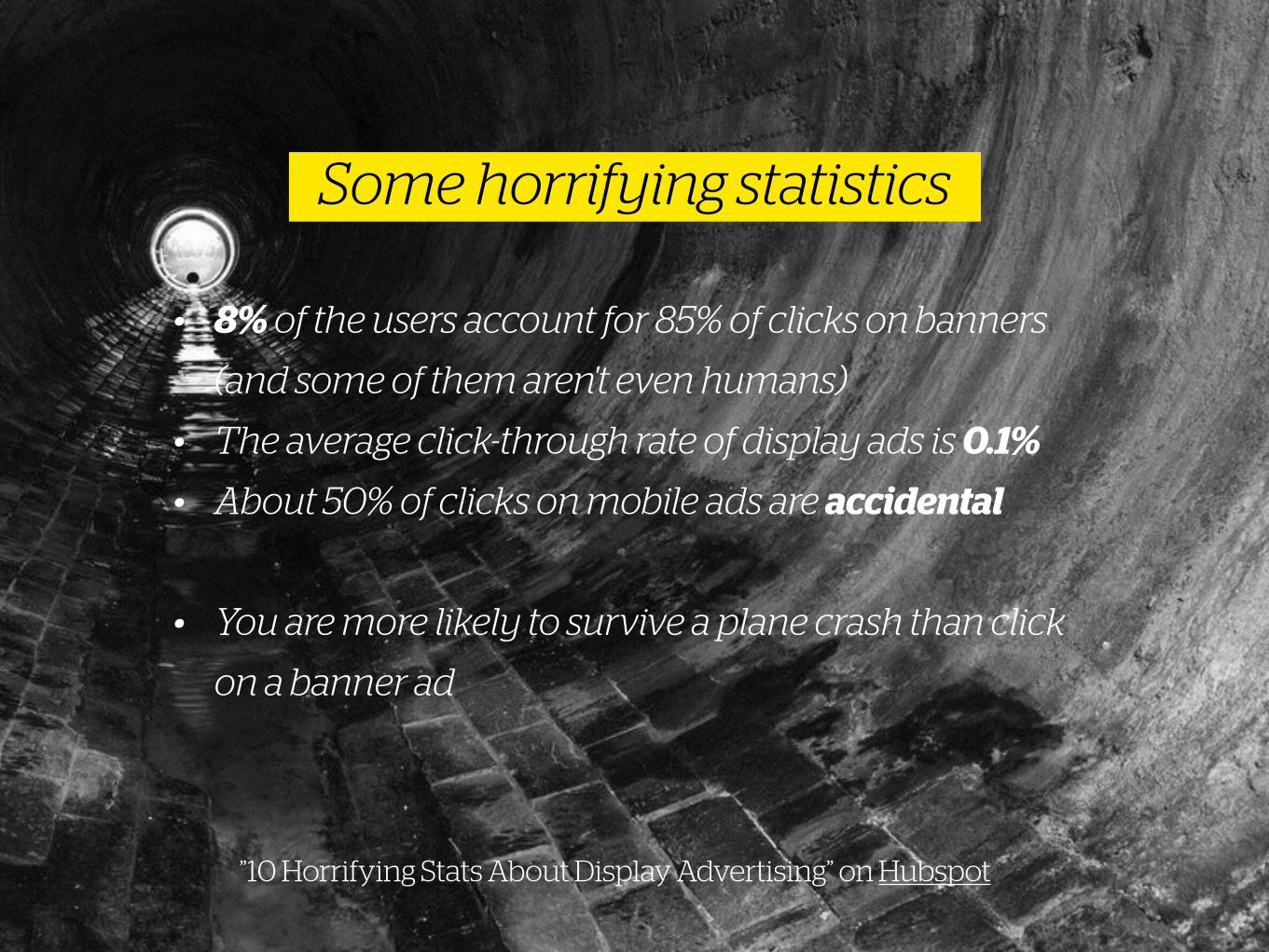
• 8% of the users account for 85% of clicks on banners
(and some of them aren't even humans)
• The average click-through rate of display ads is 0.1%
• About 50% of clicks on mobile ads are accidental
• You are more likely to survive a plane crash than click
on a banner ad
”10 Horrifying Stats About Display Advertising” on Hubspot
Some horrifying statistics
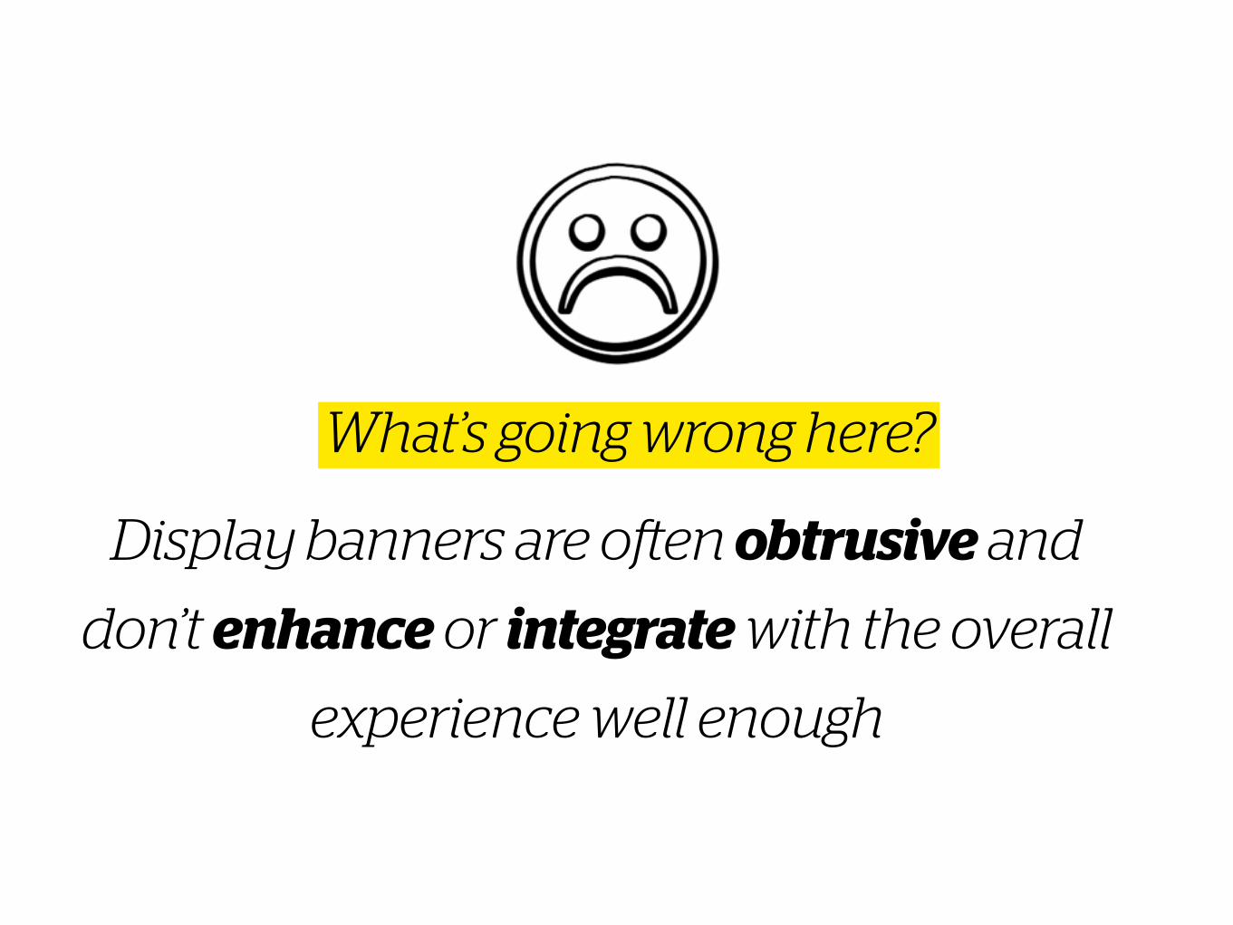
Display banners are often obtrusive and
don’t enhance or integrate with the overall
experience well enough
What’s going wrong here?
With today’s ‘everything online is open and
free’ standard, publishers struggle to find
the sweet spot for just-enough advertising
The online playing field
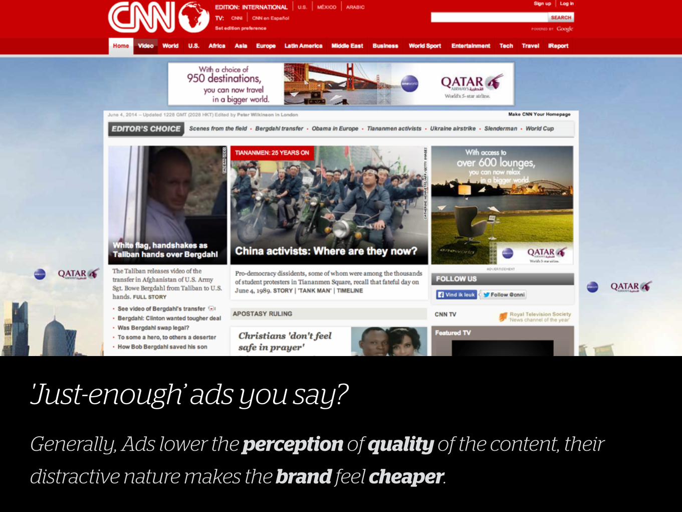
'Just-enough’ ads you say?
Generally, Ads lower the perception of quality of the content, their
distractive nature makes the brand feel cheaper.
More cognitive load means
harder on the eye
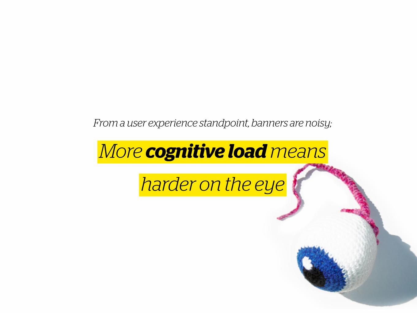
From a user experience standpoint, banners are noisy;
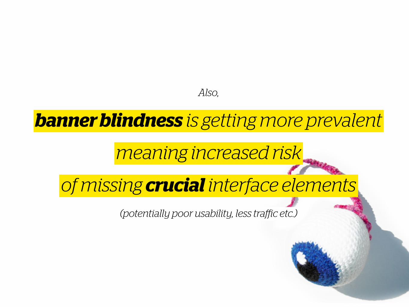
banner blindness is getting more prevalent
meaning increased risk
Also,
of missing crucial interface elements(potentially poor usability, less traffic etc.)
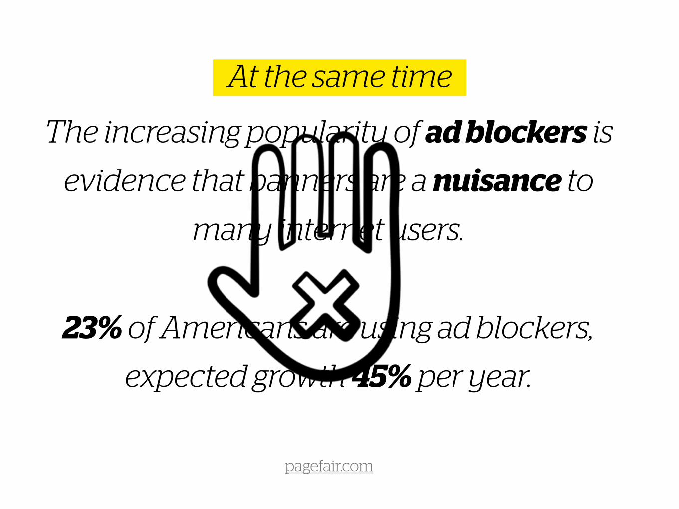
The increasing popularity of ad blockers is
evidence that banners are a nuisance to
many internet users.
23% of Americans are using ad blockers,
expected growth 45% per year.
pagefair.com
At the same time
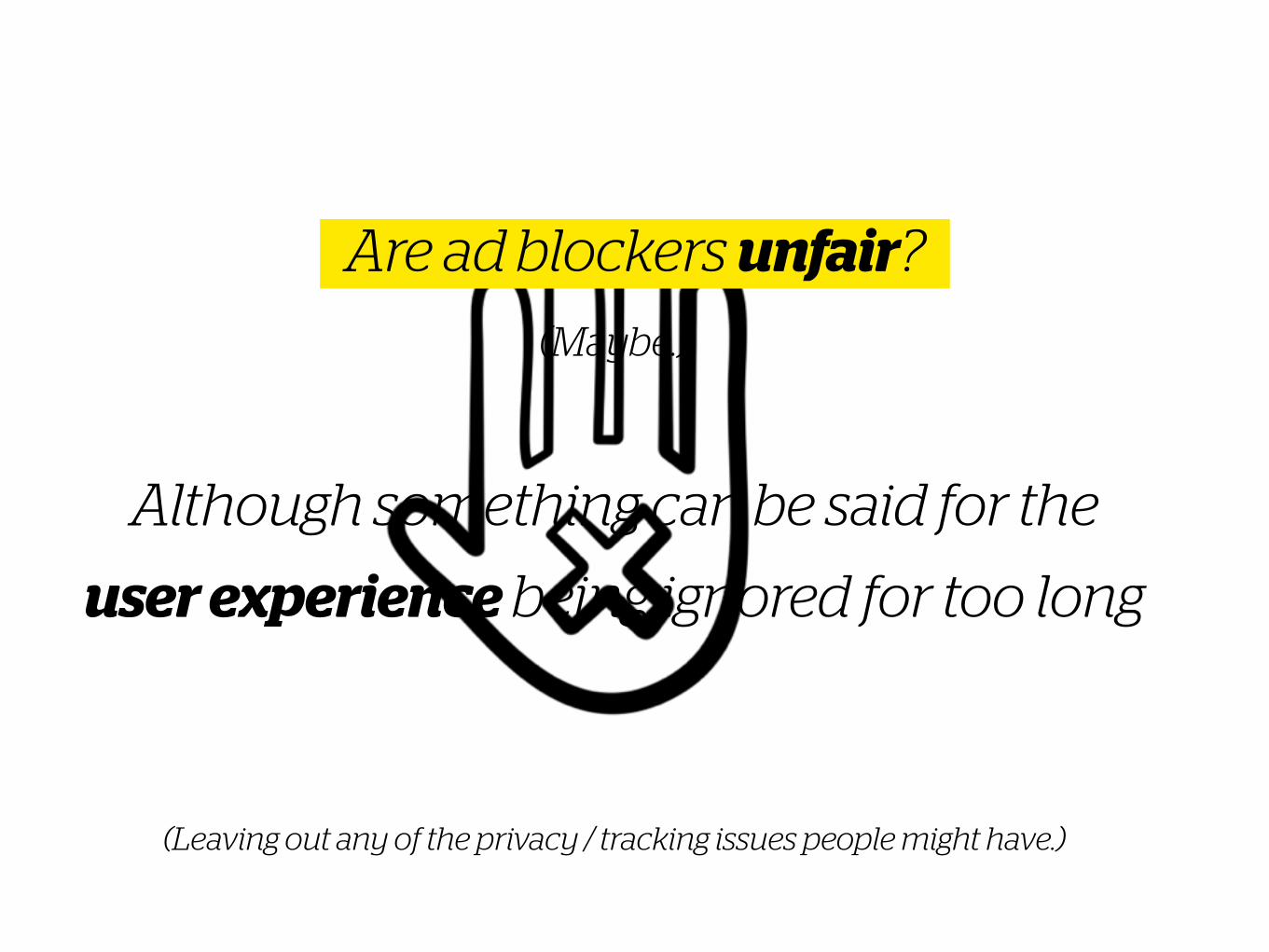
(Maybe.)
!
Although something can be said for the
user experience being ignored for too long
(Leaving out any of the privacy / tracking issues people might have.)
Are ad blockers unfair?
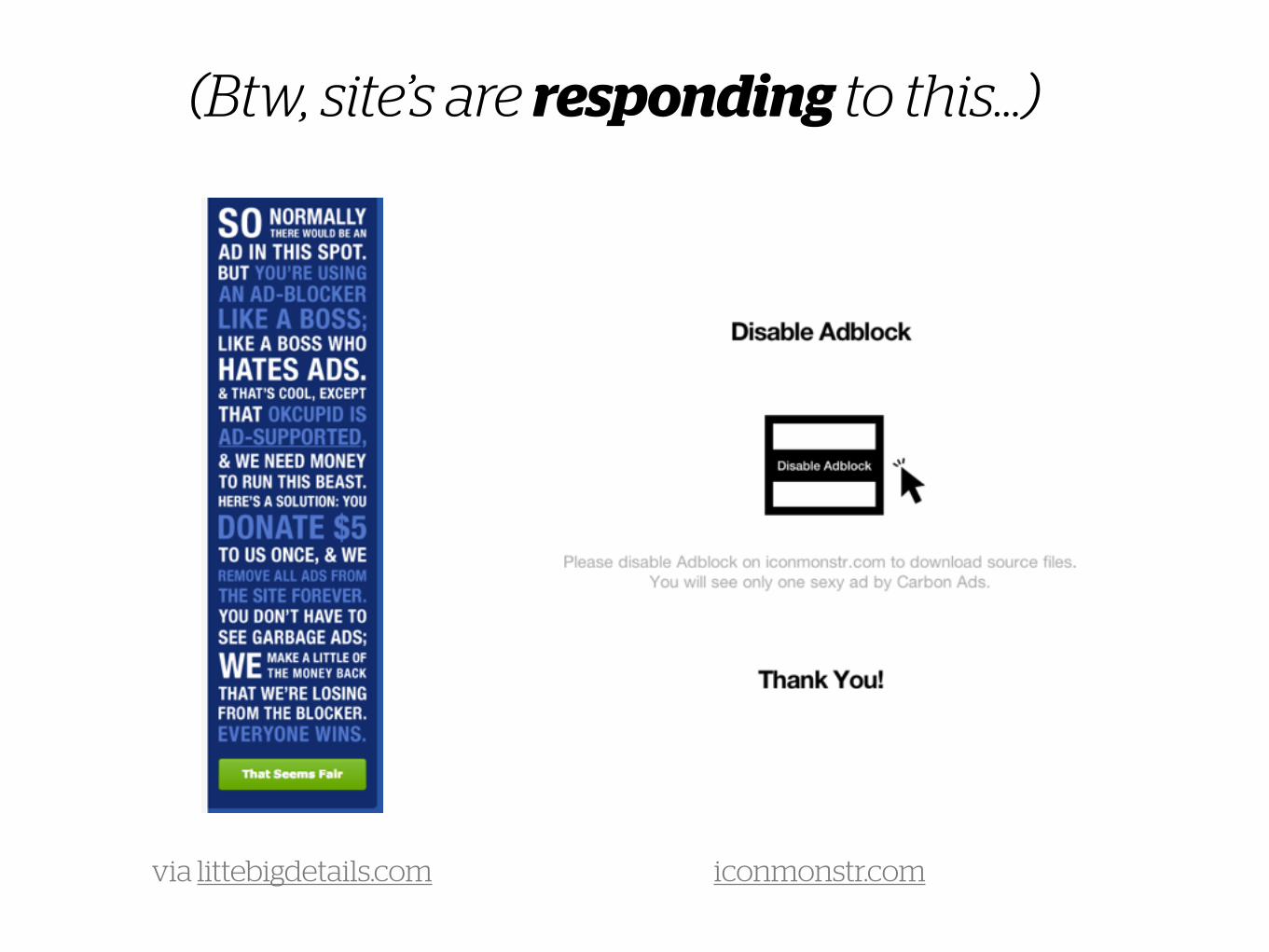
(Btw, site’s are responding to this…)
via littebigdetails.com iconmonstr.com
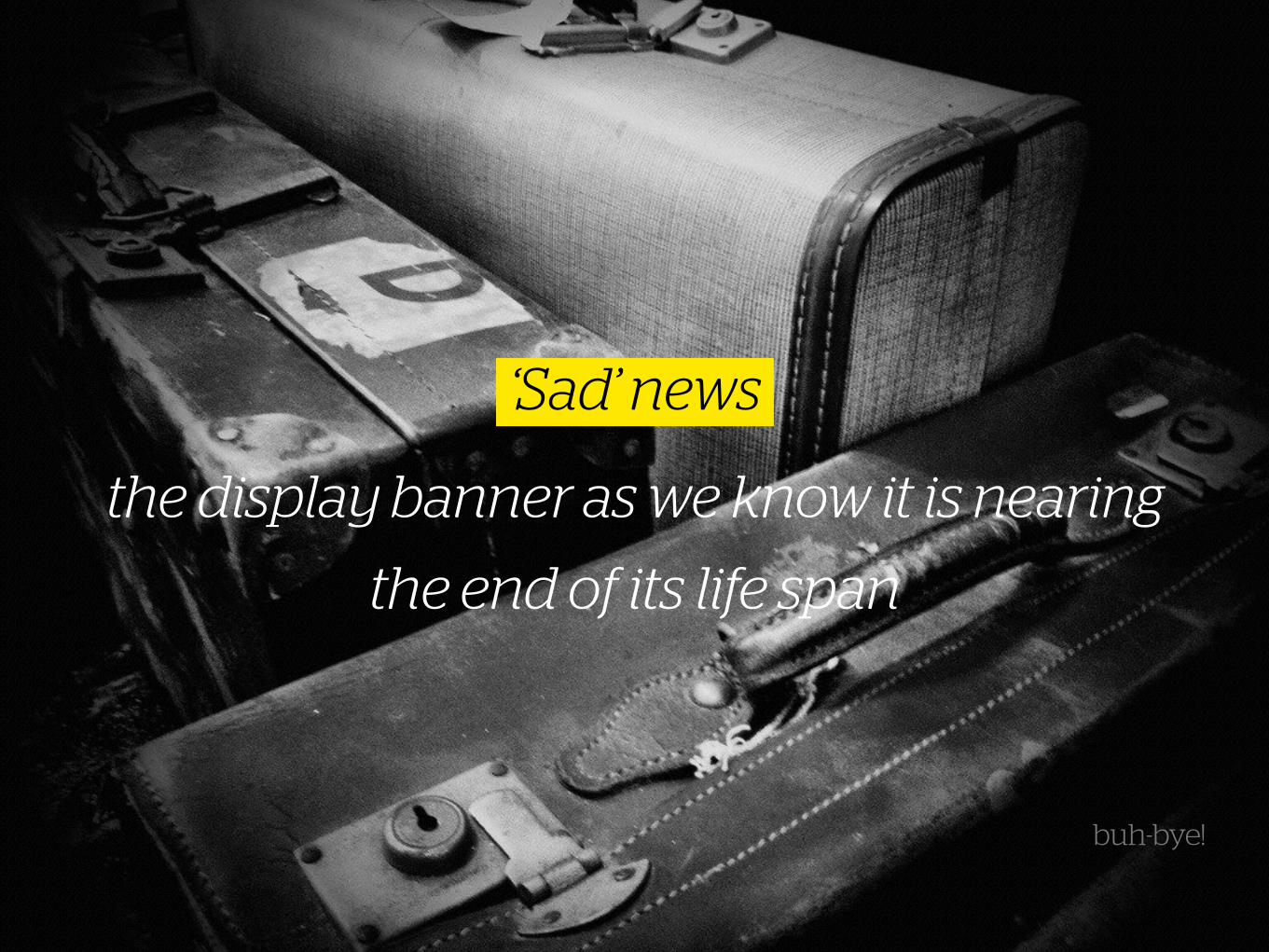
the display banner as we know it is nearing
the end of its life span
‘Sad’ news
buh-bye!
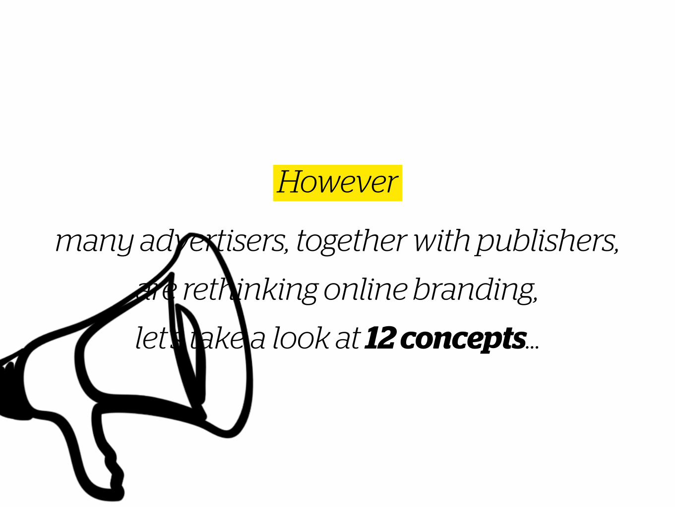
many advertisers, together with publishers,
are rethinking online branding,
let’s take a look at 12 concepts…
However
From conversion to brandingAdvertising concept
1
* see our blogpost on emotional design
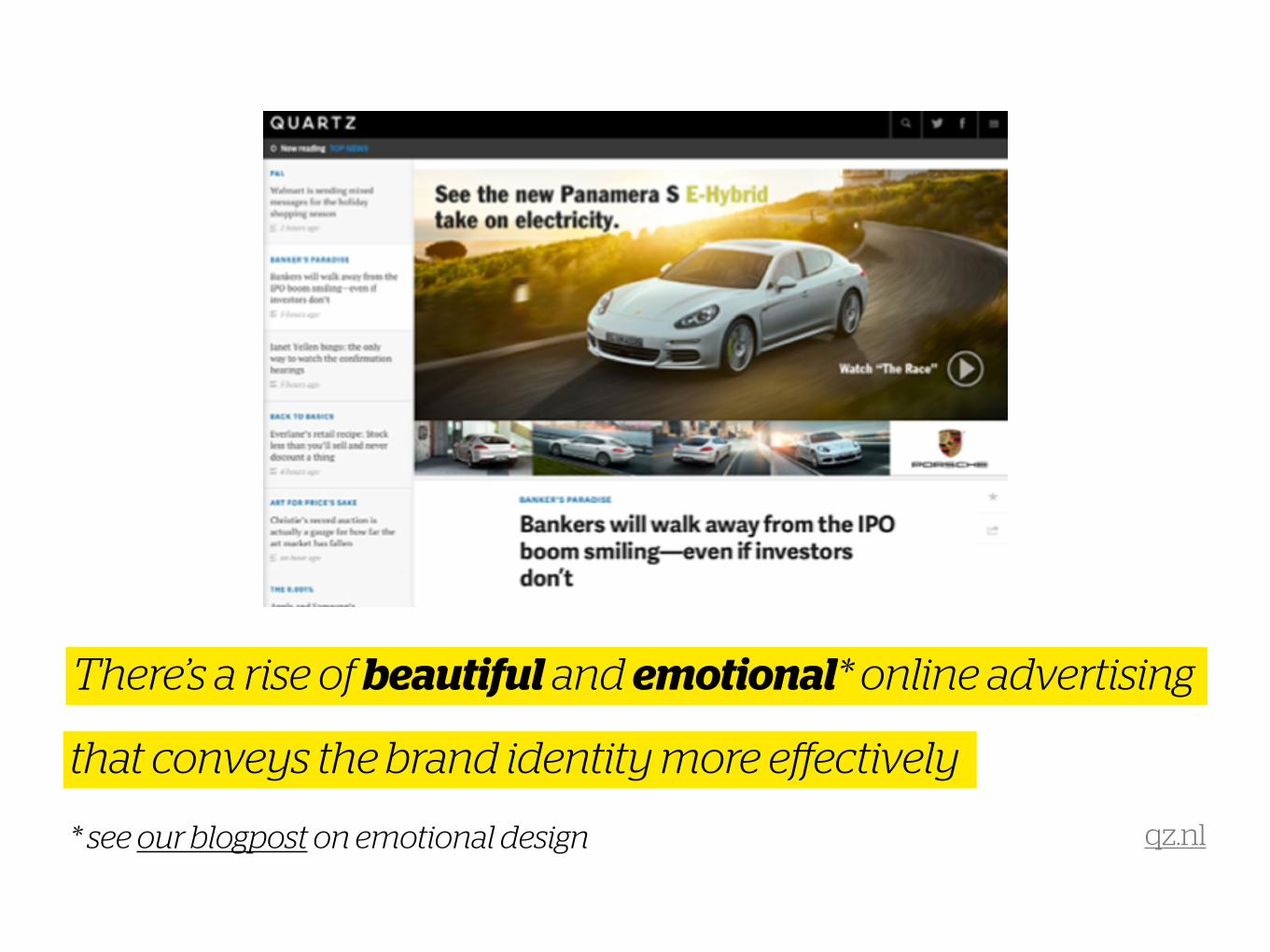
There’s a rise of beautiful and emotional* online advertising
that conveys the brand identity more effectively
qz.nl
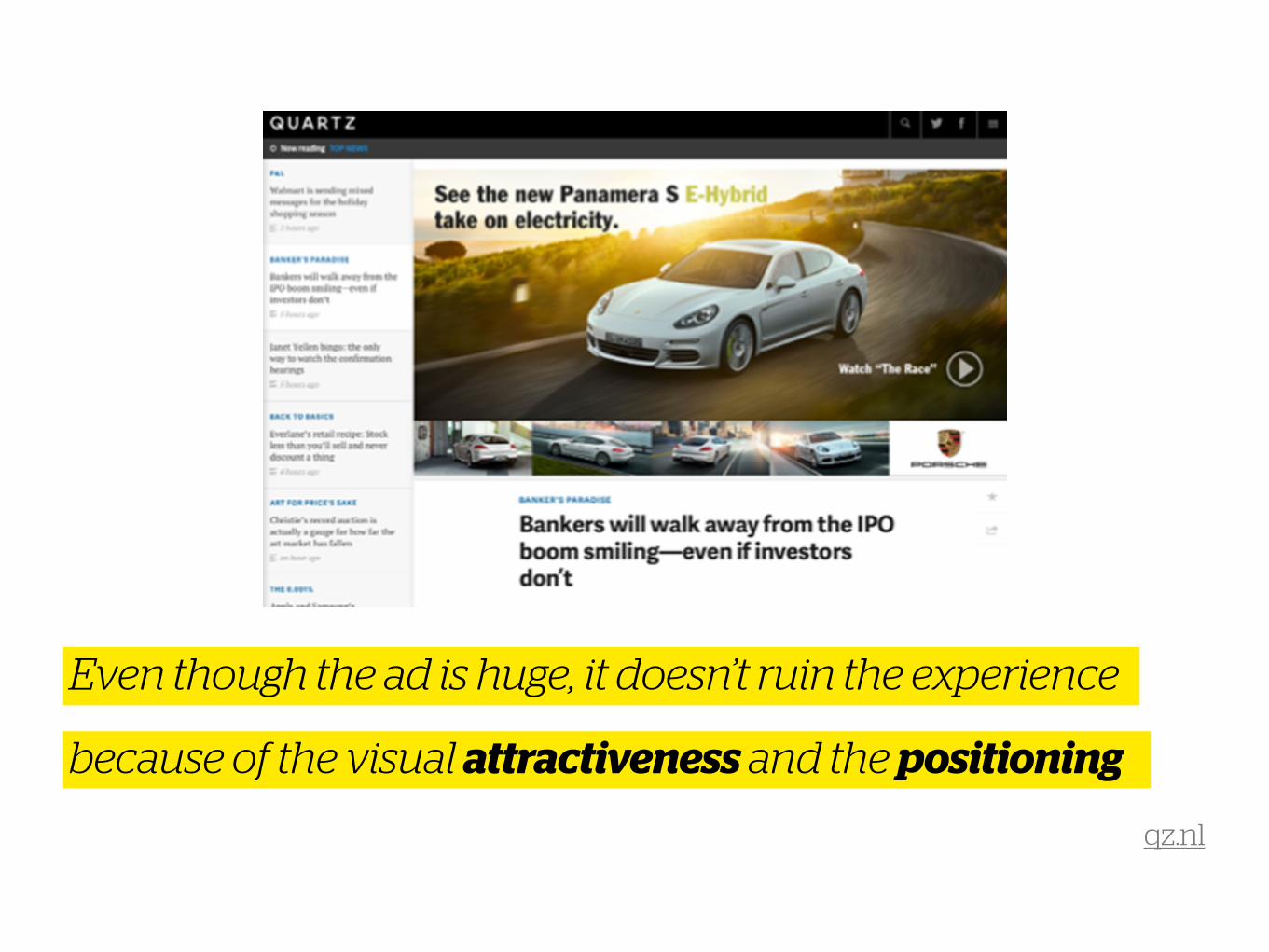
Even though the ad is huge, it doesn’t ruin the experience
because of the visual attractiveness and the positioning
qz.nl
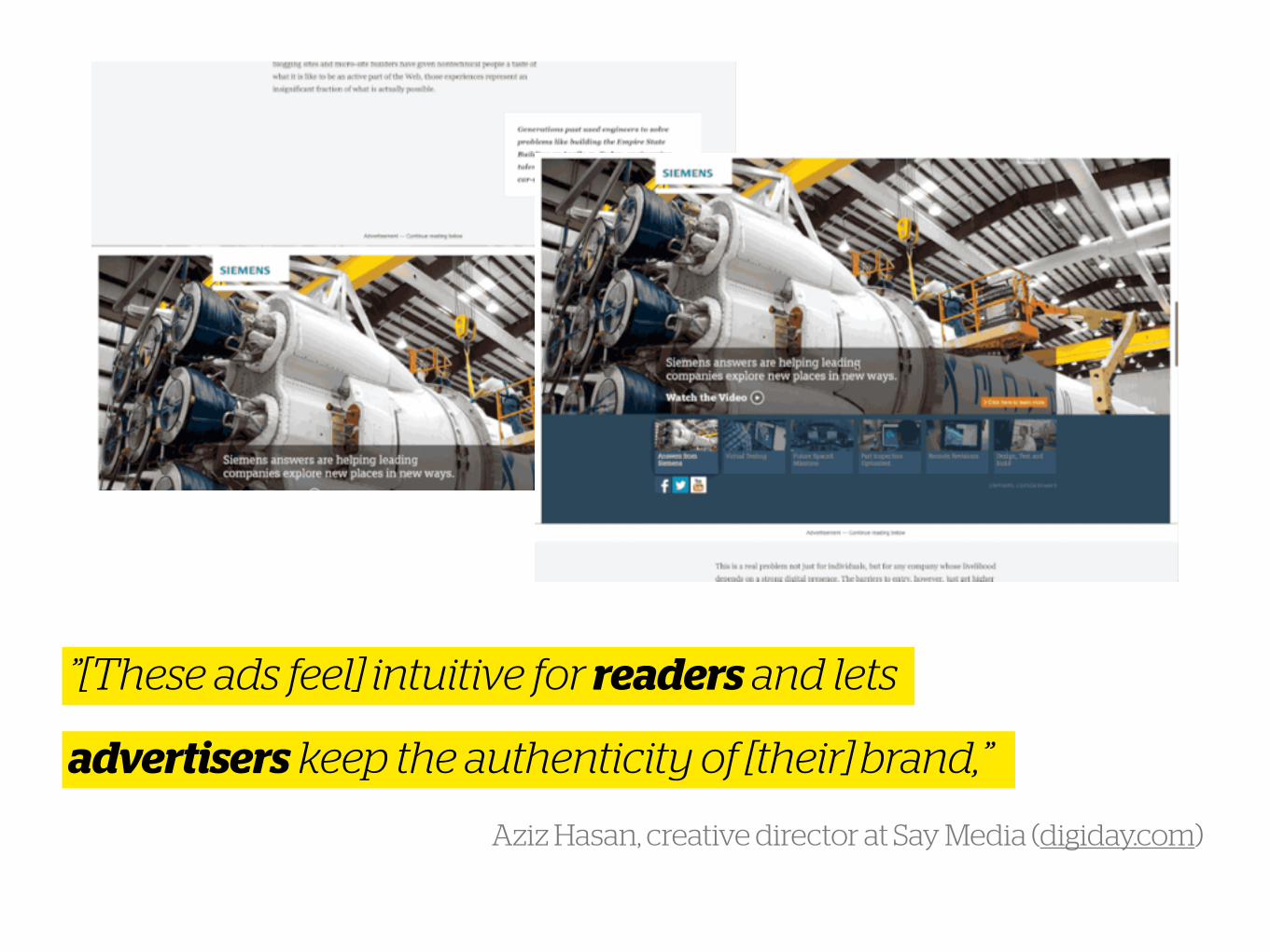
”[These ads feel] intuitive for readers and lets
Aziz Hasan, creative director at Say Media (digiday.com)
advertisers keep the authenticity of [their] brand,”
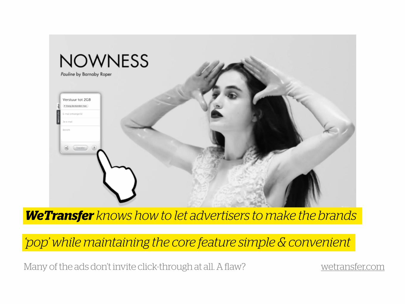
WeTransfer knows how to let advertisers to make the brands
‘pop’ while maintaining the core feature simple & convenient
wetransfer.com Many of the ads don’t invite click-through at all. A flaw?
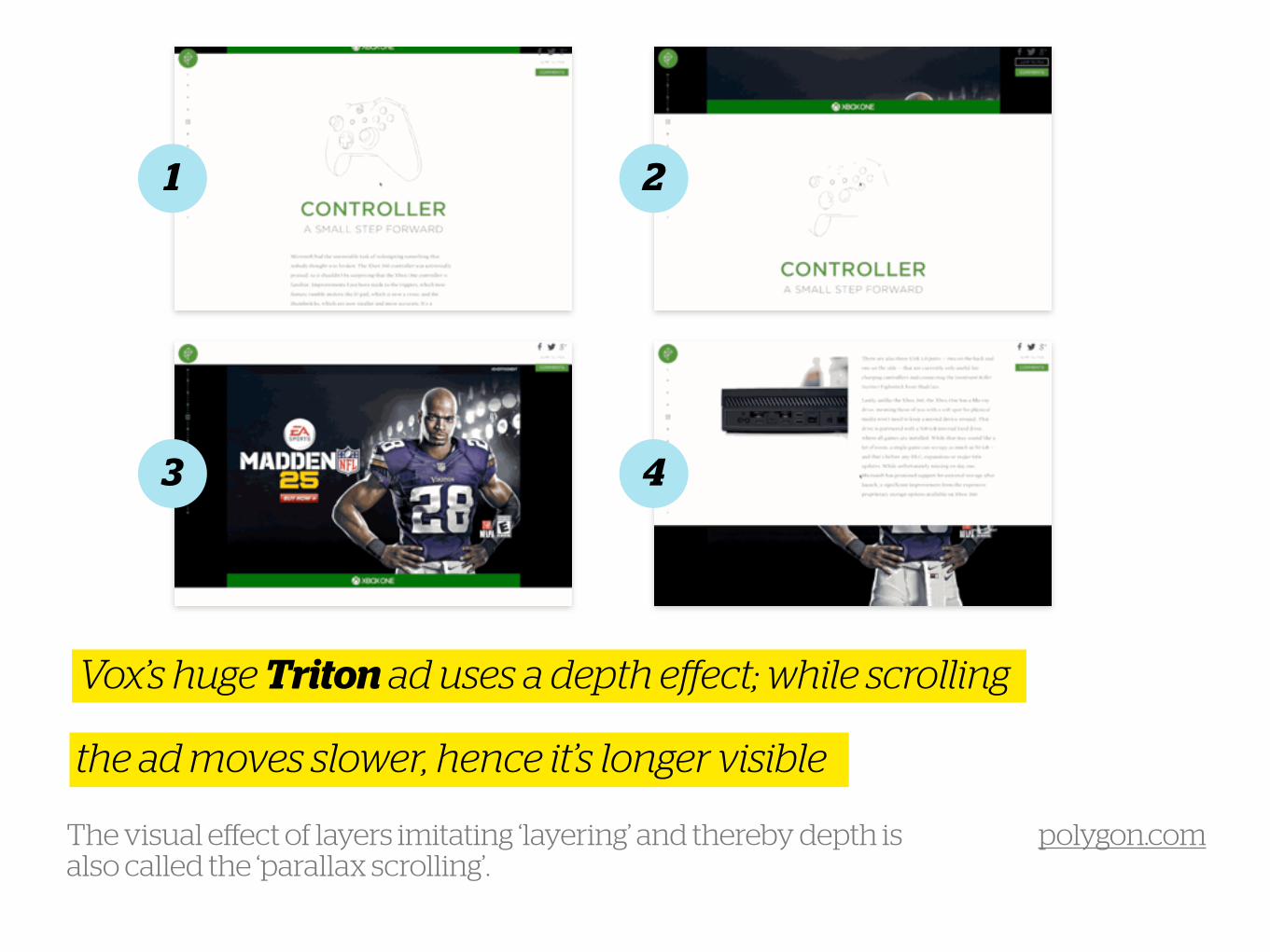
Vox’s huge Triton ad uses a depth effect; while scrolling
the ad moves slower, hence it’s longer visible
polygon.com The visual effect of layers imitating ‘layering’ and thereby depth is also called the ‘parallax scrolling’.
1 2
3 4
(A bit like a micro-site)
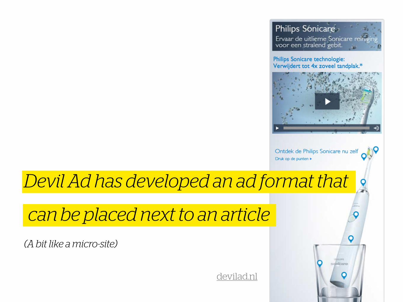
Devil Ad has developed an ad format that
can be placed next to an article
devilad.nl
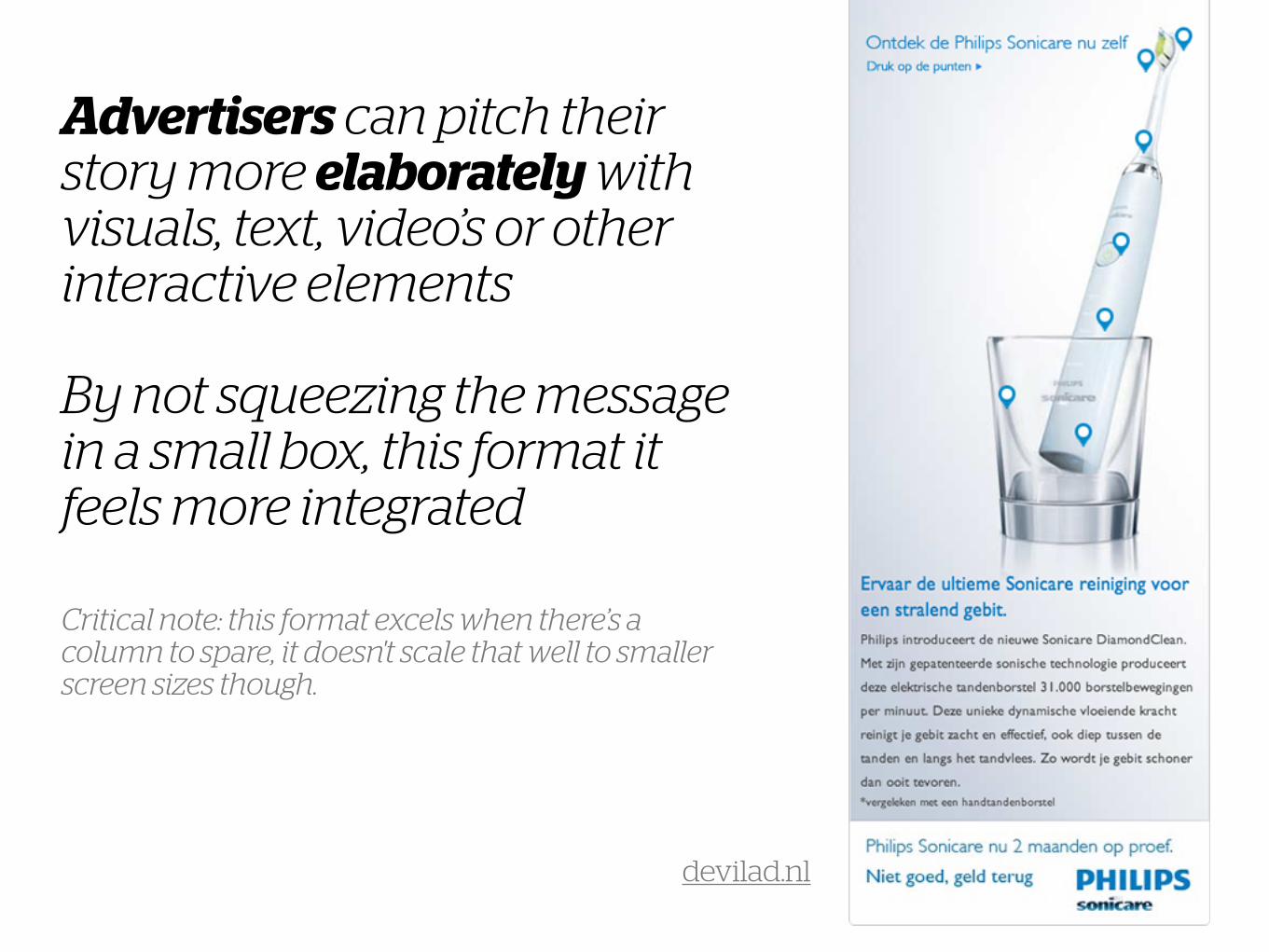
Advertisers can pitch their story more elaborately with visuals, text, video’s or other interactive elements !By not squeezing the message in a small box, this format it feels more integrated
Critical note: this format excels when there’s a column to spare, it doesn't scale that well to smaller screen sizes though.
devilad.nl
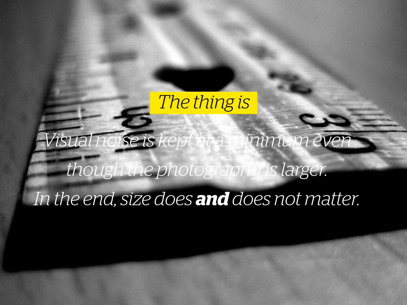
Visual noise is kept at a minimum even
though the photography is larger.
In the end, size does and does not matter.
The thing is
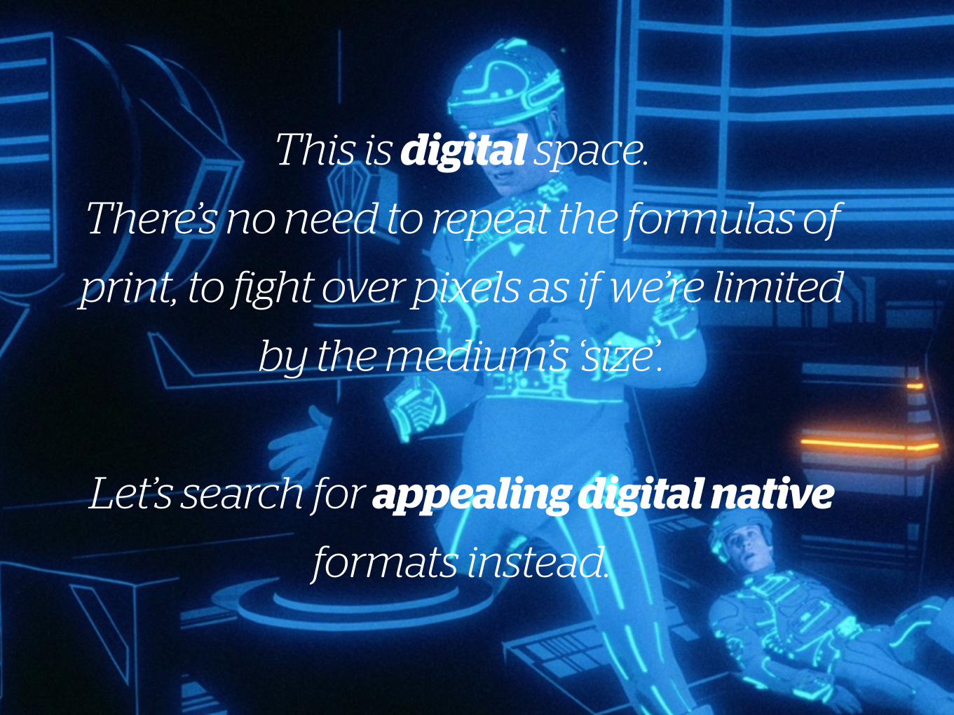
This is digital space.
There’s no need to repeat the formulas of
print, to fight over pixels as if we’re limited
by the medium’s ‘size’.
!
Let’s search for appealing digital native
formats instead.

Swipecube(Mobile) advertising concept
2
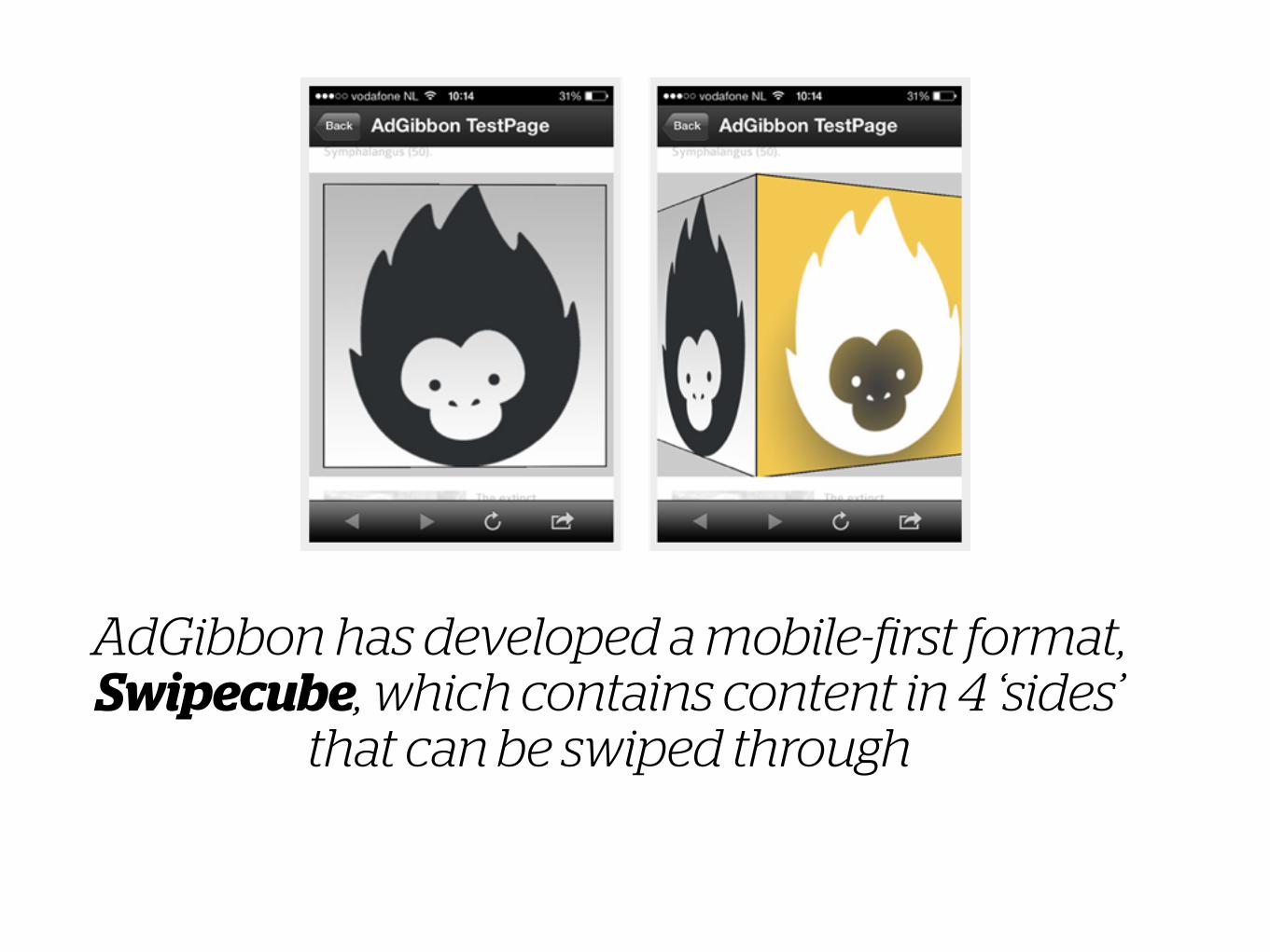
AdGibbon has developed a mobile-first format, Swipecube, which contains content in 4 ‘sides’
that can be swiped through
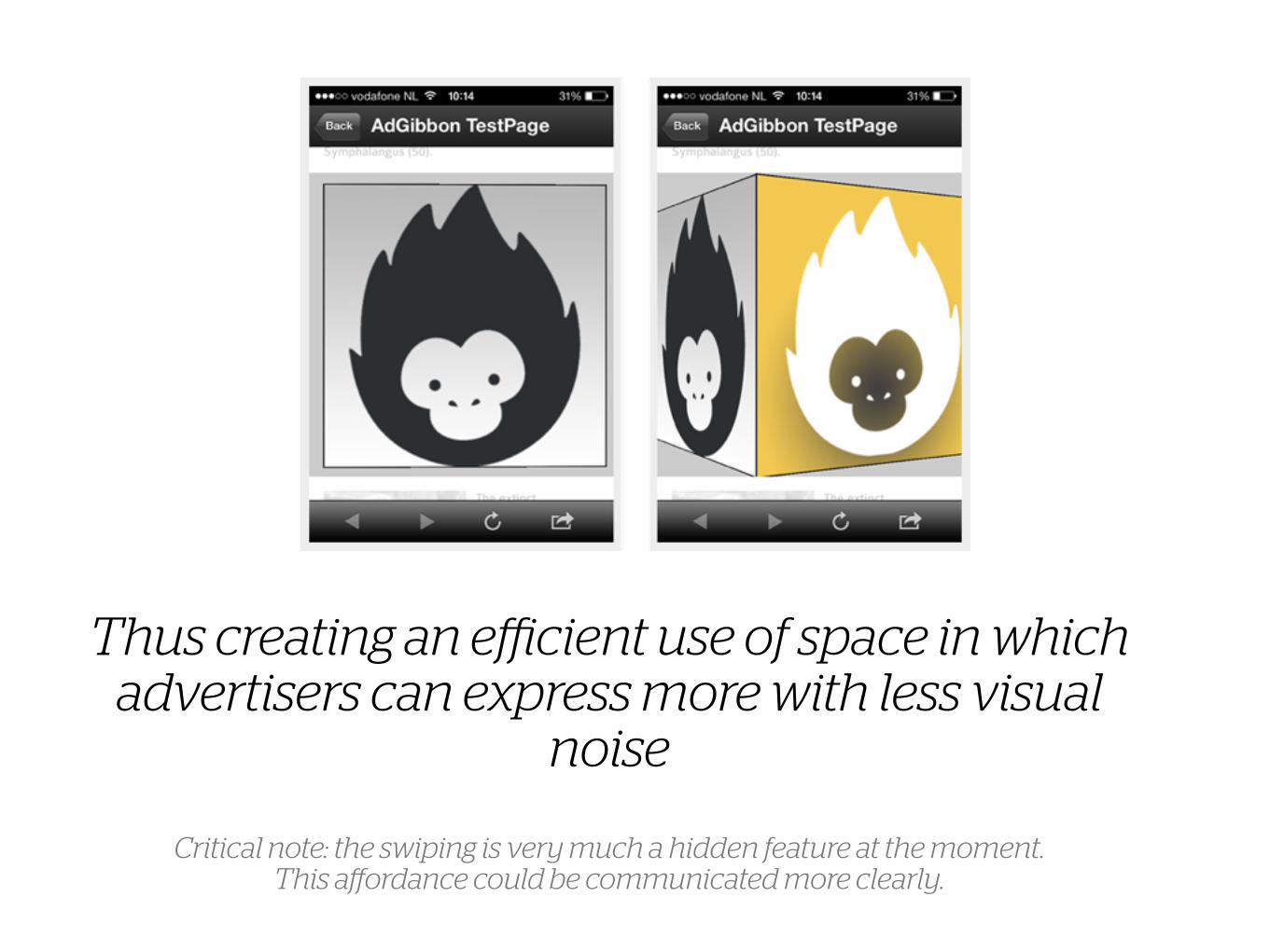
Thus creating an efficient use of space in which advertisers can express more with less visual
noise
Critical note: the swiping is very much a hidden feature at the moment. This affordance could be communicated more clearly.
Snap banners(Mobile) advertising concept
3
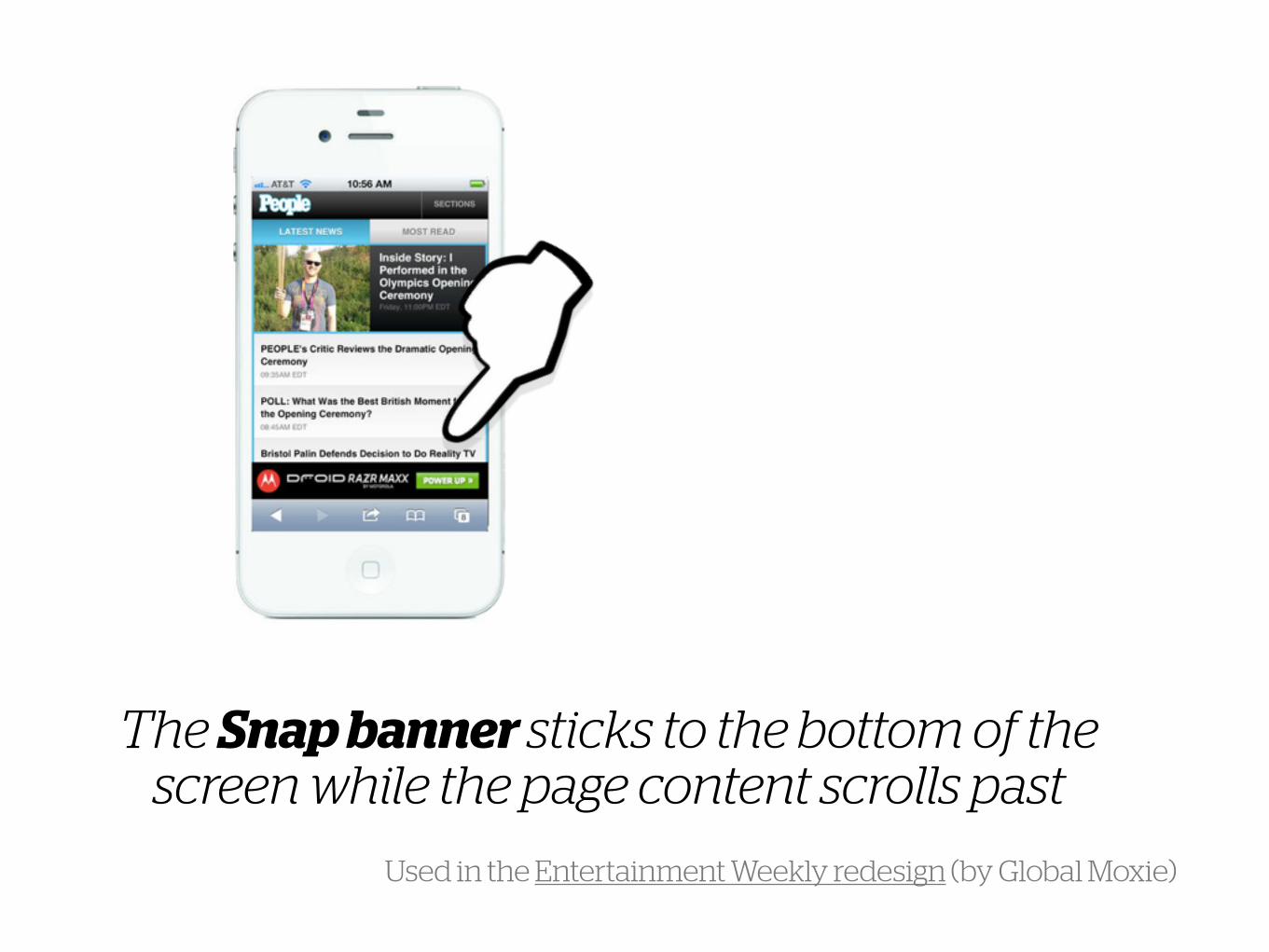
The Snap banner sticks to the bottom of the screen while the page content scrolls past
Used in the Entertainment Weekly redesign (by Global Moxie)
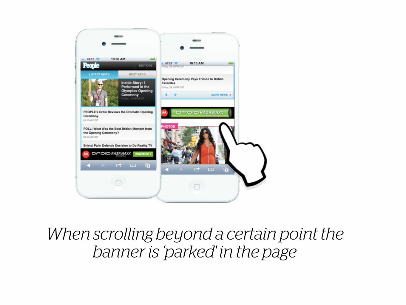
When scrolling beyond a certain point the banner is ‘parked' in the page
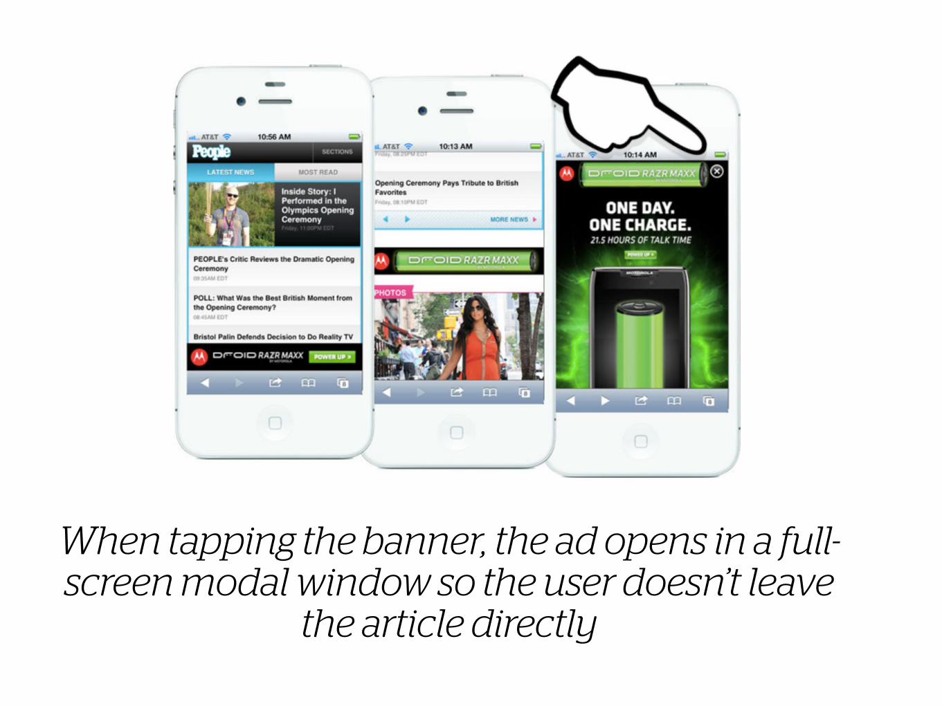
When tapping the banner, the ad opens in a full-screen modal window so the user doesn’t leave
the article directly
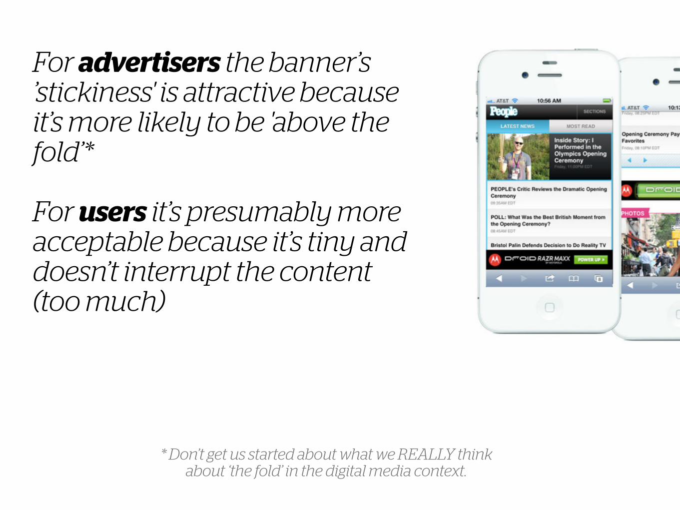
For advertisers the banner’s ’stickiness' is attractive because it’s more likely to be 'above the fold’* !For users it’s presumably more acceptable because it’s tiny and doesn’t interrupt the content (too much)
* Don’t get us started about what we REALLY think about ‘the fold’ in the digital media context.
Display ads in GoogleAdvertising concept
4
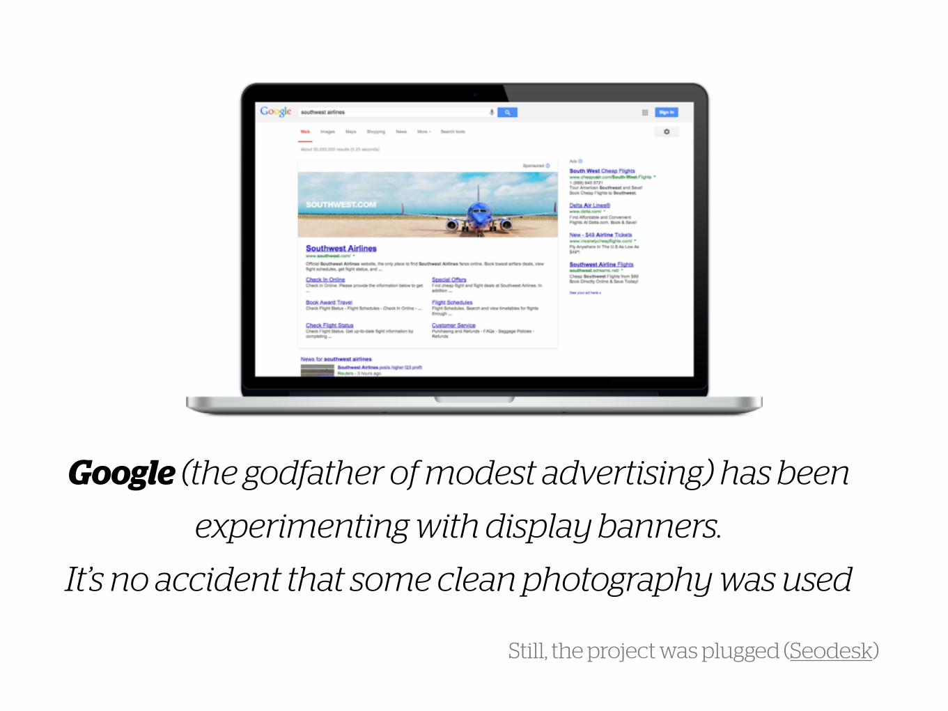
Google (the godfather of modest advertising) has been
experimenting with display banners.
It’s no accident that some clean photography was used
Still, the project was plugged (Seodesk)
Interactive bannersAdvertising concept
5
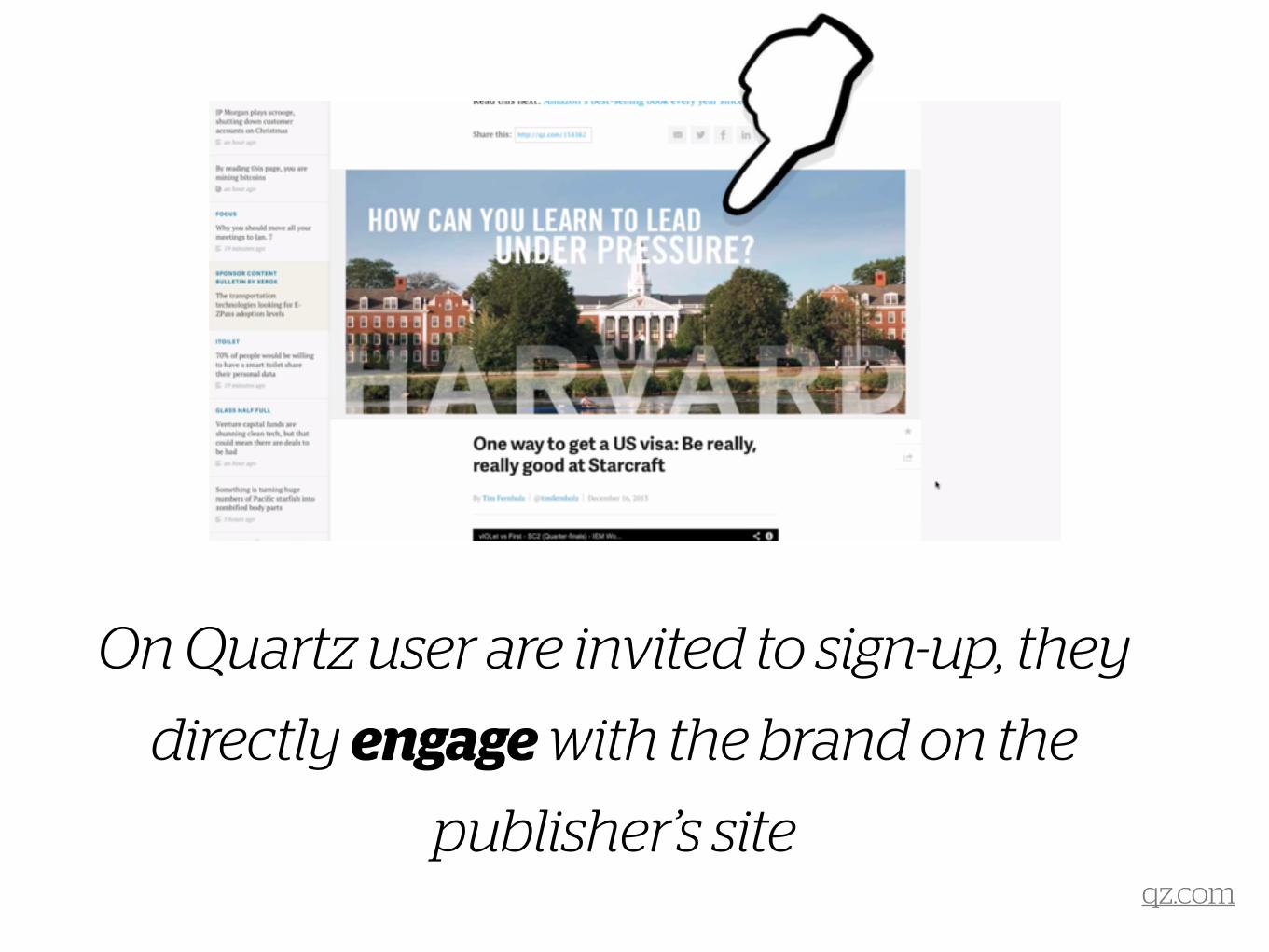
On Quartz user are invited to sign-up, they
directly engage with the brand on the
publisher’s siteqz.com

The user is triggered by a question and
can submit contact information, all within
the siteqz.com
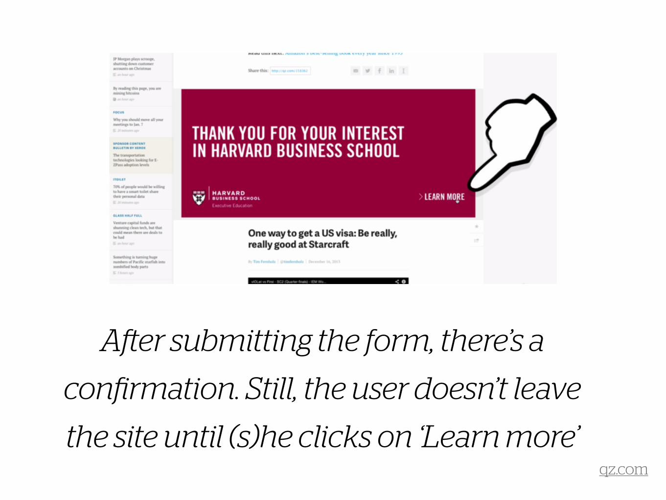
After submitting the form, there’s a
confirmation. Still, the user doesn’t leave
the site until (s)he clicks on ‘Learn more’qz.com
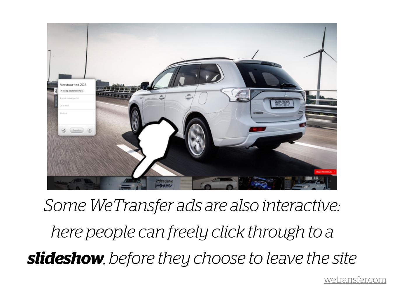
Some WeTransfer ads are also interactive:
here people can freely click through to a
slideshow, before they choose to leave the sitewetransfer.com
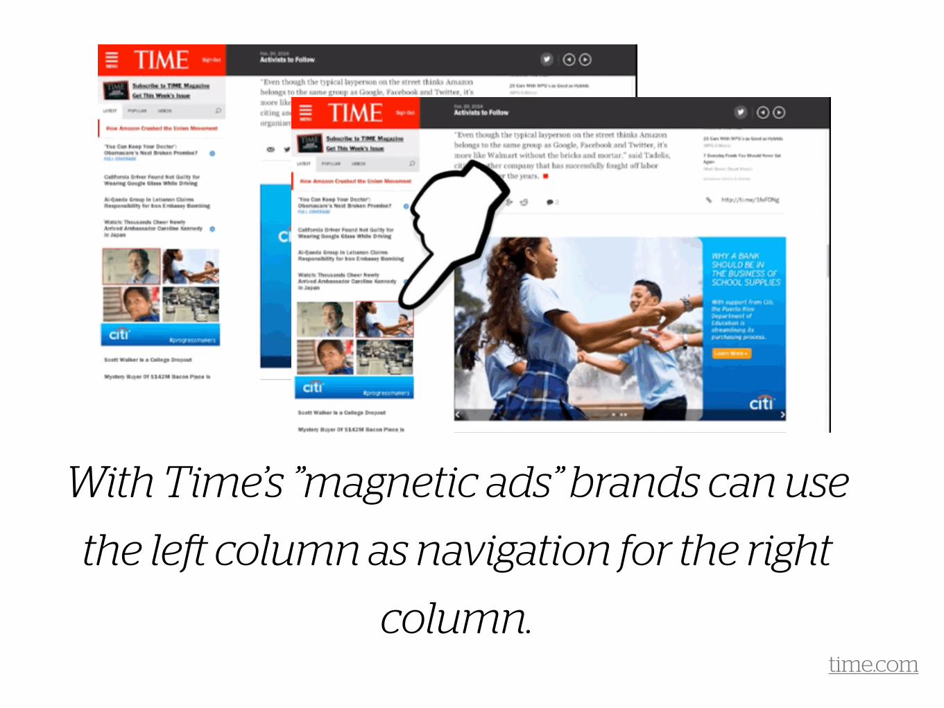
With Time’s ”magnetic ads” brands can use
the left column as navigation for the right
column.time.com
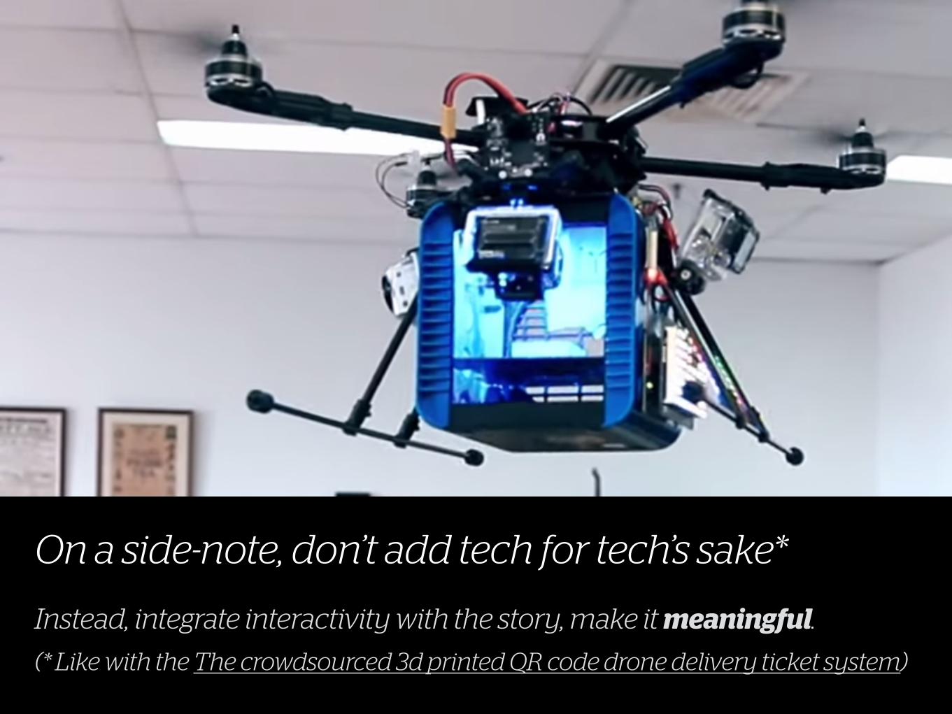
On a side-note, don’t add tech for tech’s sake*
Instead, integrate interactivity with the story, make it meaningful. (* Like with the The crowdsourced 3d printed QR code drone delivery ticket system)
PrestitialsAdvertising concept
6
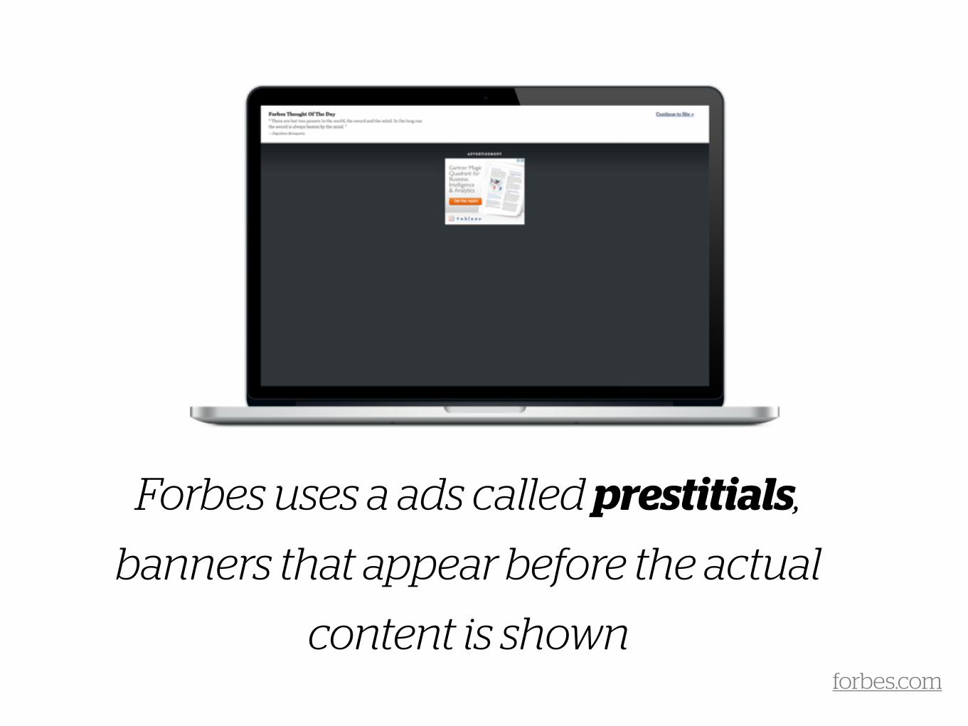
Forbes uses a ads called prestitials,
banners that appear before the actual
content is shownforbes.com
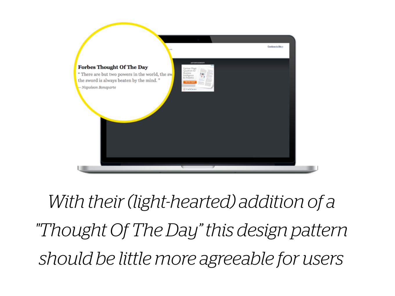
With their (light-hearted) addition of a
"Thought Of The Day” this design pattern
should be little more agreeable for users
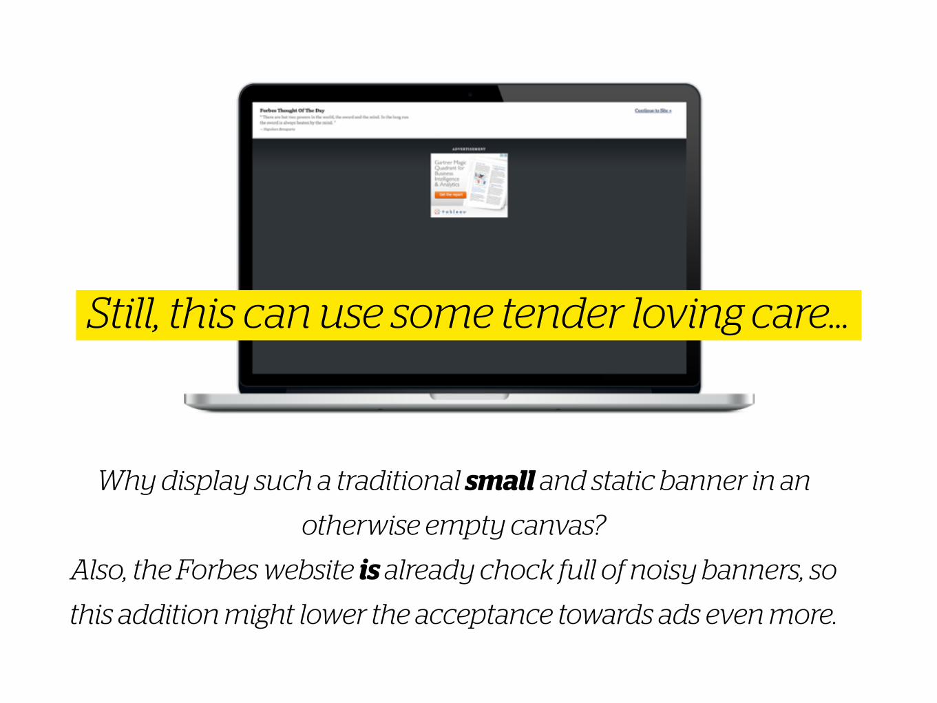
Why display such a traditional small and static banner in an
otherwise empty canvas?
Also, the Forbes website is already chock full of noisy banners, so
this addition might lower the acceptance towards ads even more.
Still, this can use some tender loving care…
AdvertorialsAdvertising concept
7
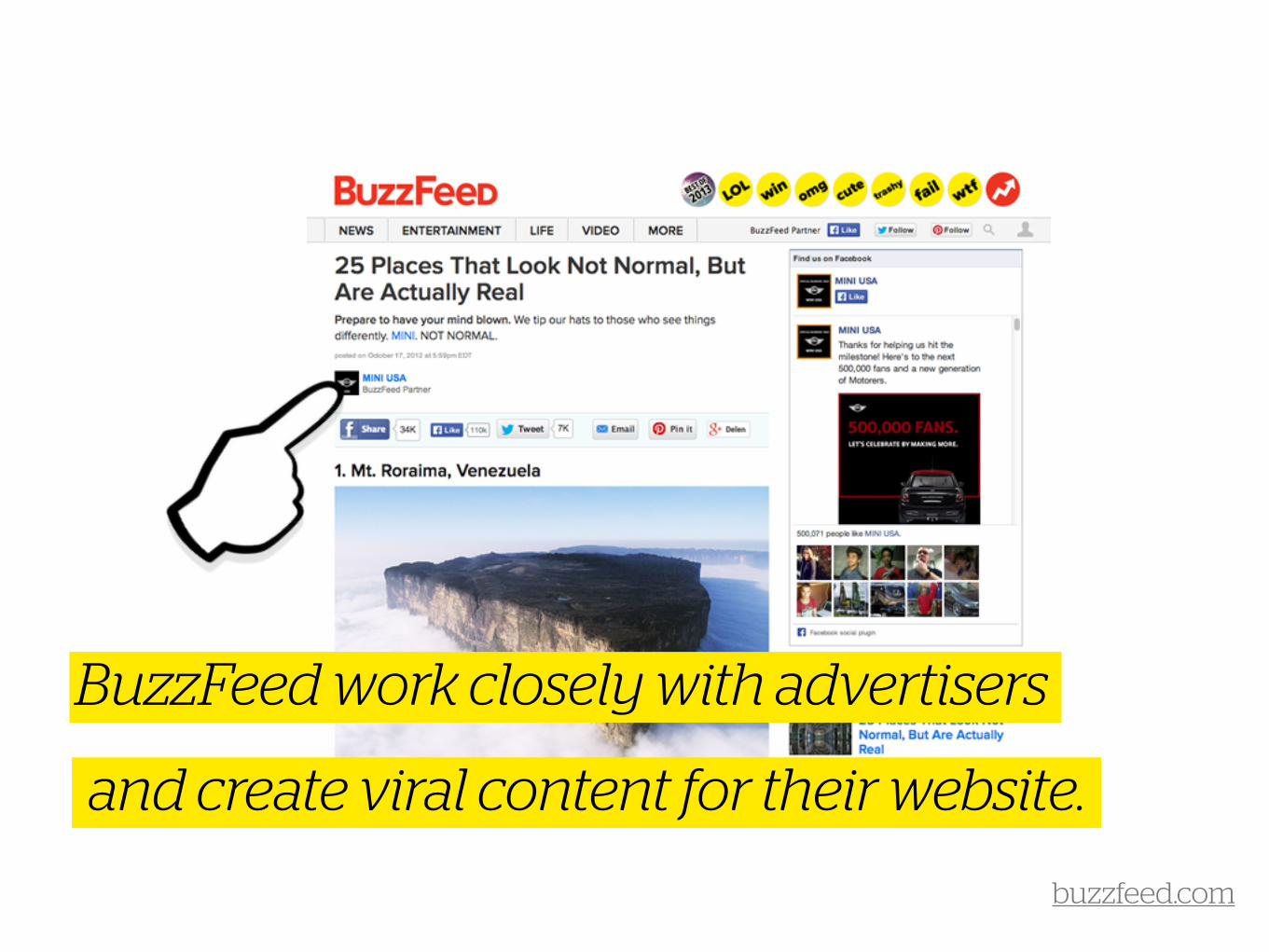
BuzzFeed work closely with advertisers
and create viral content for their website.
buzzfeed.com
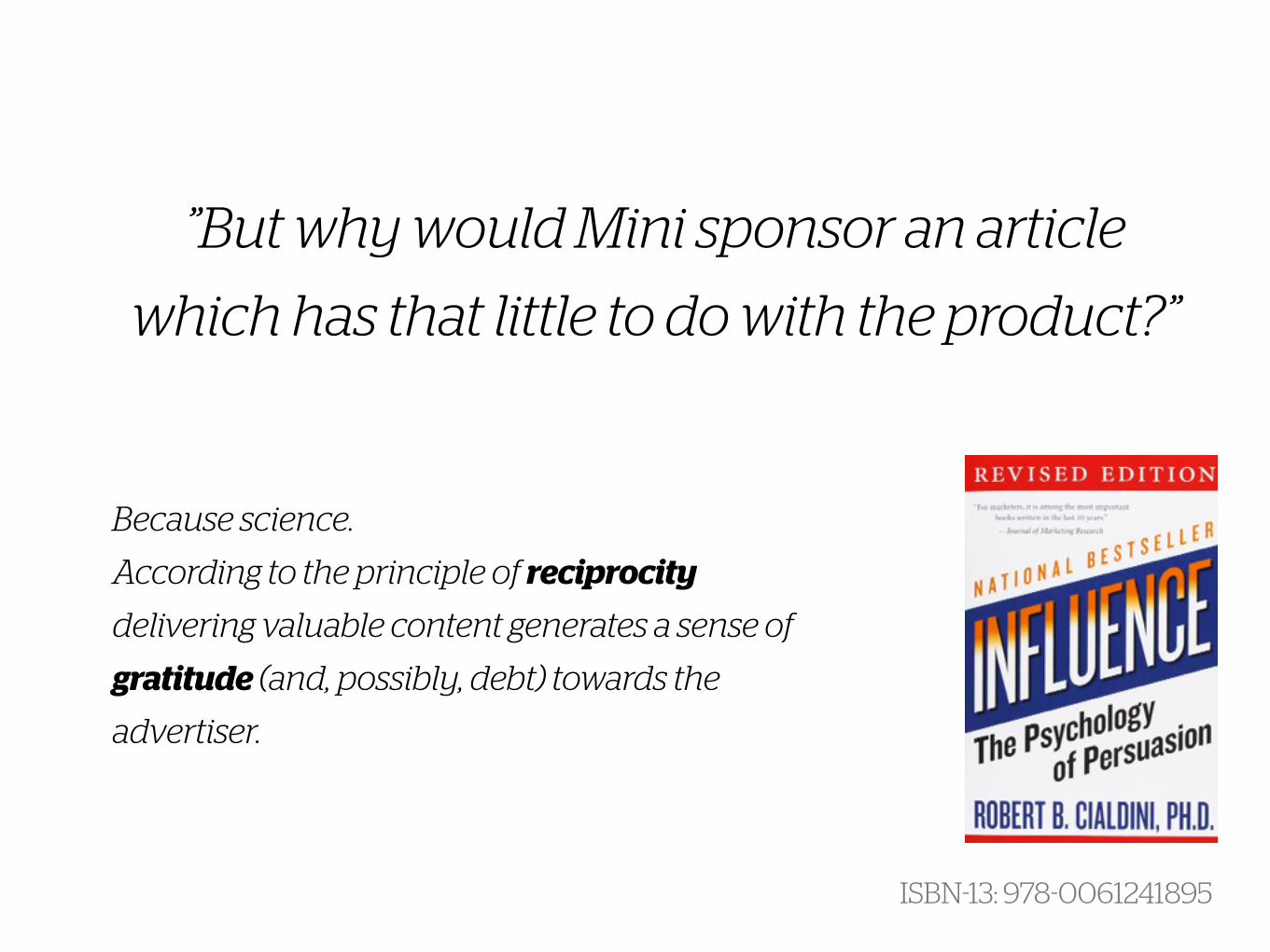
Because science.
According to the principle of reciprocity
delivering valuable content generates a sense of
gratitude (and, possibly, debt) towards the
advertiser.
”But why would Mini sponsor an article
which has that little to do with the product?”
ISBN-13: 978-0061241895
On nrc.nl the commercial blends in nicely
with the editorial content.
!
However
(1) Mixing the two can affect a company’s credibility and integrity, this
can be particularly troublesome for news corps like NRC (2) Google tends to rank sites that don’t or poorly separate commercial
from editorial content lower*
* searchengineland.com
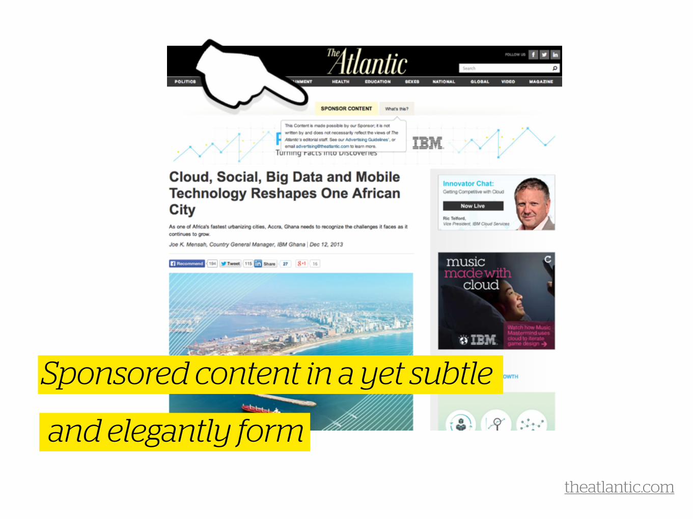
Sponsored contentAdvertising concept
8
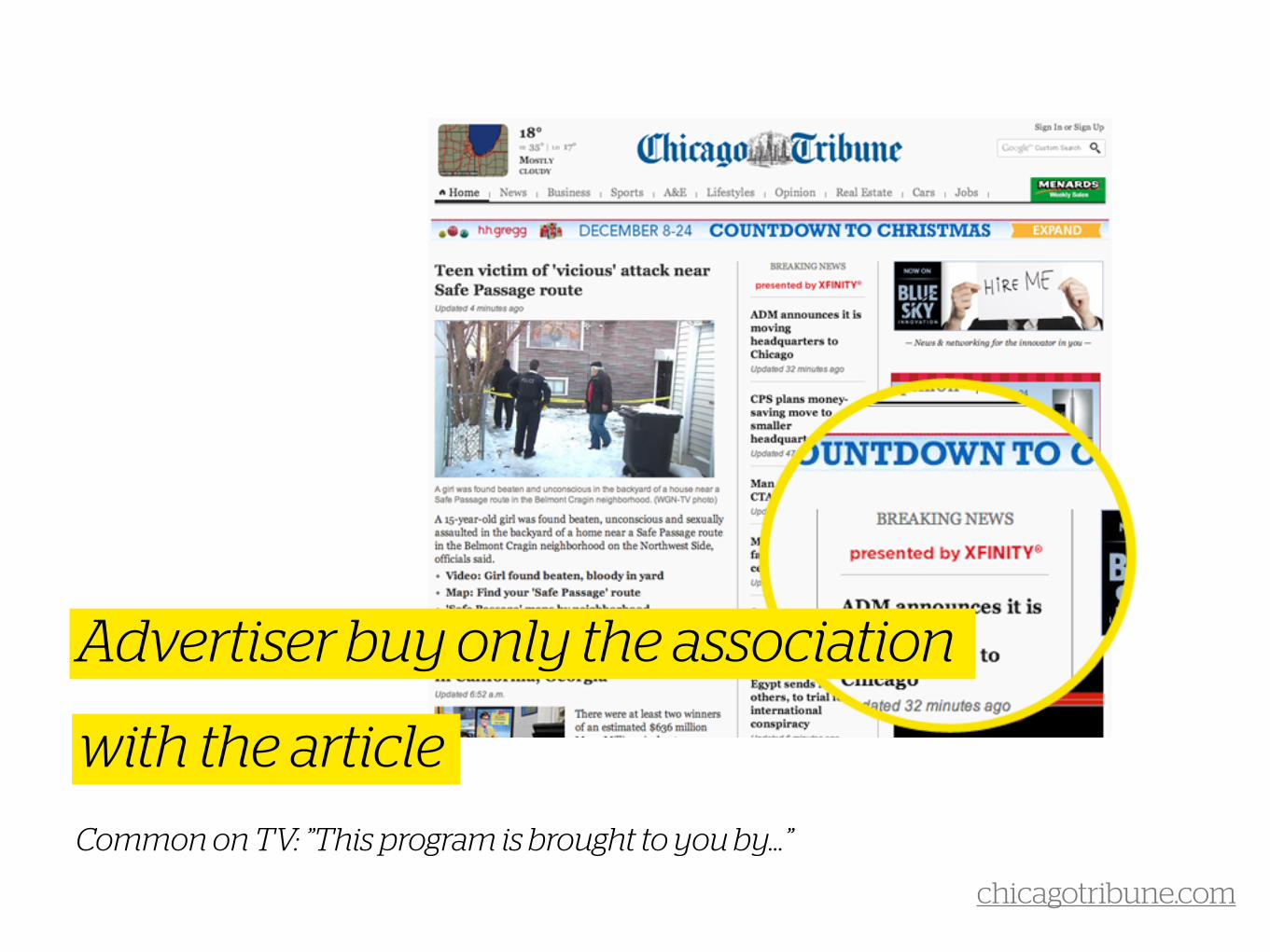
Advertiser buy only the association
with the articleCommon on TV: ”This program is brought to you by…”
chicagotribune.com

Another way of jumping the ‘ad-less era
bandwagon’ while maintaining an online
presence. Well played, Shuttershock.
thenextweb.com
Sponsored channelsAdvertising concept
9
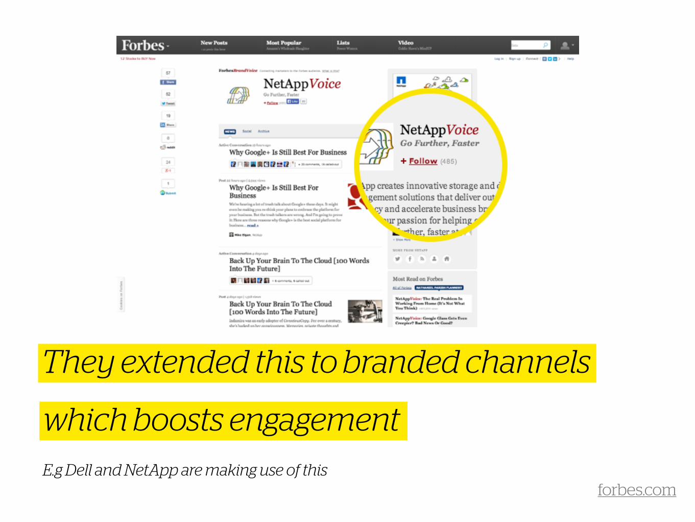
They extended this to branded channels
which boosts engagementE.g Dell and NetApp are making use of this
forbes.com
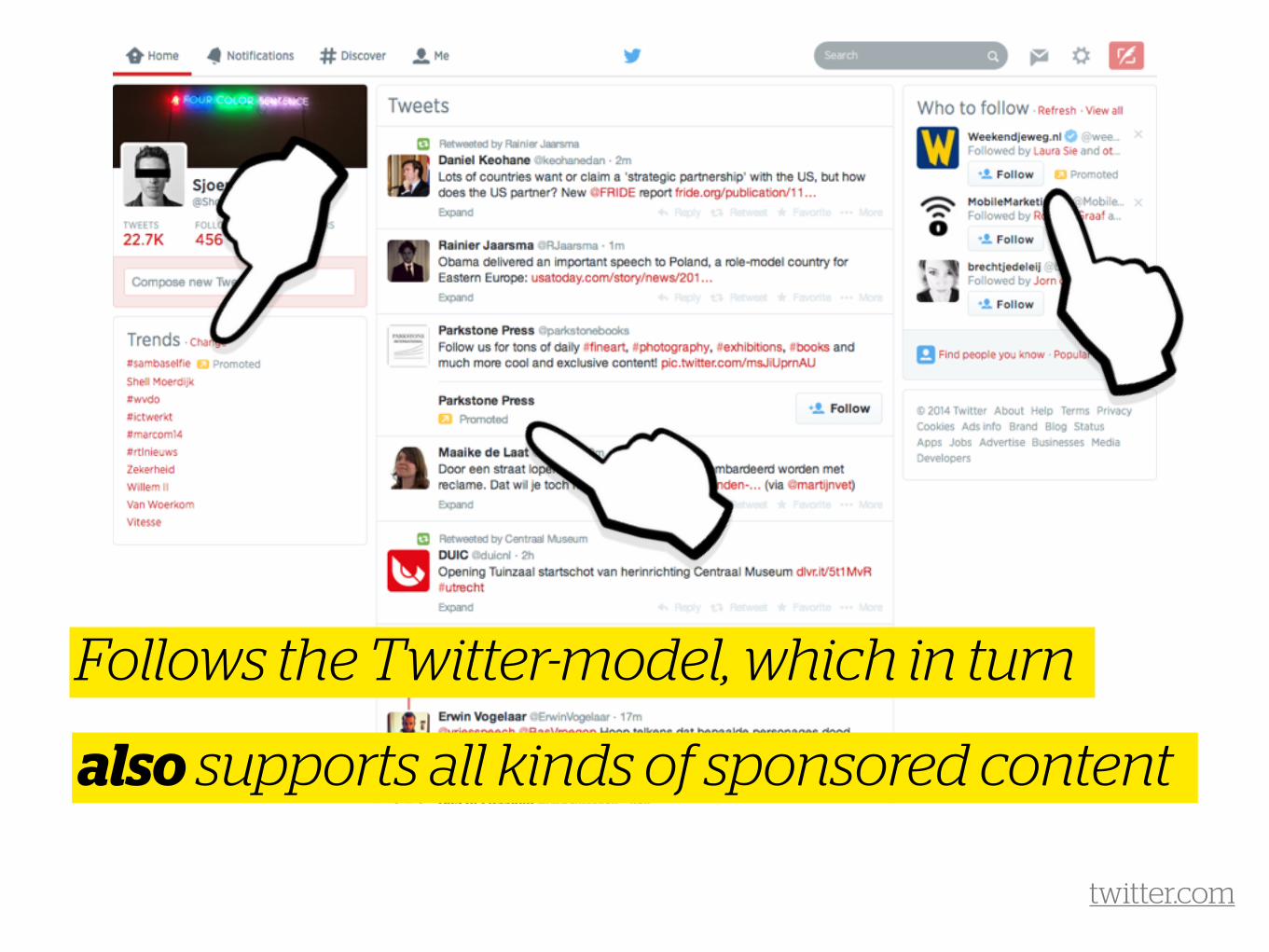
Follows the Twitter-model, which in turn
also supports all kinds of sponsored content
twitter.com
Sponsored featuresAdvertising concept
10

Like an annotation feature, which can
of course be slightly branded
Help building features that people can appreciate
qz.com
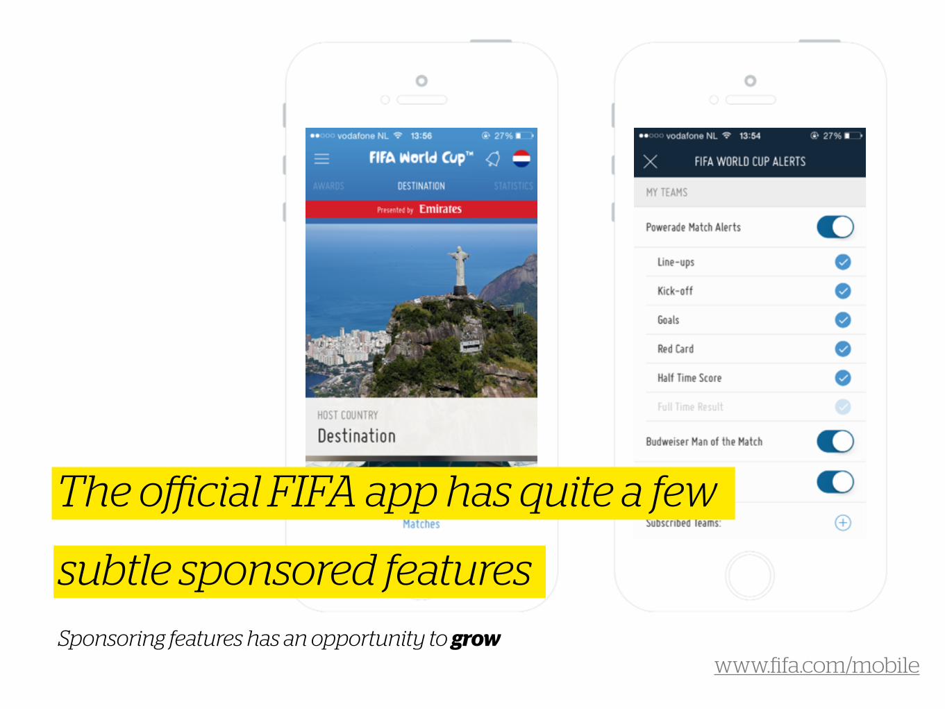
The official FIFA app has quite a few
subtle sponsored features
www.fifa.com/mobile Sponsoring features has an opportunity to grow
No ads, when payingAdvertising concept (?)
11
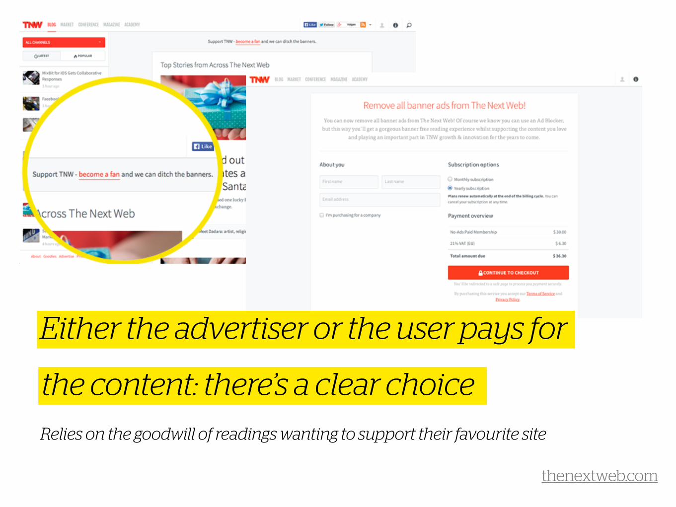
Either the advertiser or the user pays for
the content: there’s a clear choiceRelies on the goodwill of readings wanting to support their favourite site
thenextweb.com
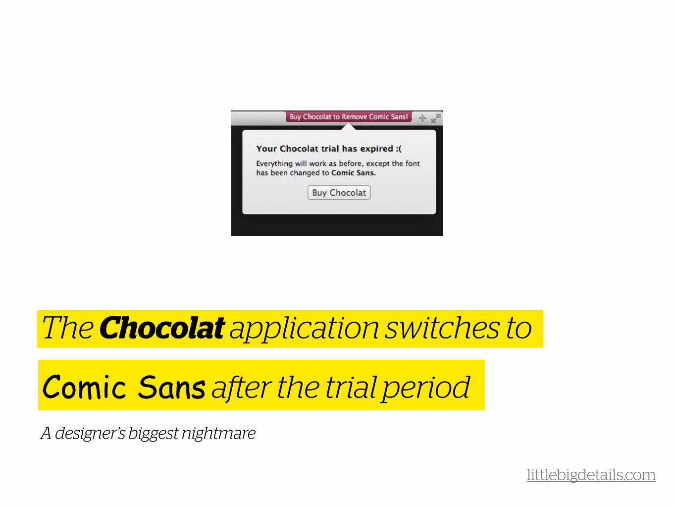
The Chocolat application switches to
Comic Sans after the trial periodA designer’s biggest nightmare
littlebigdetails.com
No ads, … EVERAdvertising concept (?)
12

De Correspondent offers paid subscriptions
but everything’s accessible for anyoneThat is: anyone who has the link, preferably via a subscriber
decorrespondent.nl
To summarise…
The future is exiting!
Know any other great examples? Mail us at [email protected]
• There are no absolutes (if there ever were any) of what
works to best in which situation
• It’s up to advertisers, publishers and designers to
discover the perfect solution
• Granted, developing new formats costs a lot more effort
and money than your average banner
• But we think (while display banners are losing
relevance) that the potential and possible learnings
should outweigh this
• We wish all of you good luck with your innovations!