Color What would our world look like without Color? There have been many studies into the psychological effects of Color. Artists have used Color in such ways as to create a mood or feeling of a piece of work. This is done by using colors realistically and by using colors "creatively". Color is also a very important Element of Art. Here we will take a look at the science of Color, how we have organized Color and how artists have used Color to express their ideas and feeling in their artwork. What is Color? The most expressive element of art. The element of design that is a property of light. The visual response to the wavelengths of light, identified as red, blue, green, etc. The visual sensation dependent on the reflection or absorption of light from a given surface. The Science of Color Color is the product of light. A ray of white light passing through a prism is separated into the colors seen in a rainbow. If a room is dark no color is seen. A color is seen on an object or surface because light bounces off the surface reflecting a particular light wave. A Light Menu What do x-rays, sun tanning, the warmth from a candle, TVs, and radios all have in common? Believe it or not, they're all forms of light Some light you can see, and some light you cannot. The light you can't see includes x-rays and radio signals. The light you can see is called the visible spectrum. The visible spectrum is like a rainbow. When you see a rainbow, you are seeing the visible spectrum. A rainbow is formed when rain drops break the sun light (called white light into the visible spectrum). Isaac Newton first used the word spectrum (Latin for "appearance" or "apparition") in print in 1671 in describing his experiments in optics . Newton observed that, when a narrow beam of white sunlight strikes the face of a glass prism at an angle , some is reflected and some of the beam 1

Welcome message from author
This document is posted to help you gain knowledge. Please leave a comment to let me know what you think about it! Share it to your friends and learn new things together.
Transcript
Natural Spectrum – The RainbowWhite Light Prism SpectrumWhat is the color that is always at the top of the rainbow?
Color
What would our world look like without Color? There have been many studies into the psychological effects of Color. Artists have used Color in such ways as to create a mood or feeling of a piece of work. This is done by using colors realistically and by using colors "creatively". Color is also a very important Element of Art. Here we will take a look at the science of Color, how we have organized Color and how artists have used Color to express their ideas and feeling in their artwork.
What is Color?The most expressive element of art.The element of design that is a property of light.The visual response to the wavelengths of light, identified as red, blue, green, etc.The visual sensation dependent on the reflection or absorption of light from a given surface.
The Science of ColorColor is the product of light. A ray of white light passing through a prism is separated into the colors seen in a rainbow. If a room is dark no color is seen. A color is seen on an object or surface because light bounces off the surface reflecting a particular light wave.
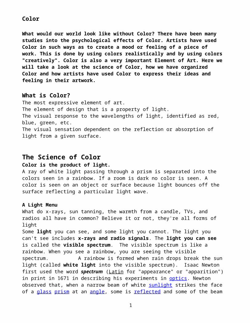
A Light MenuWhat do x-rays, sun tanning, the warmth from a candle, TVs, and radios all have in common? Believe it or not, they're all forms of lightSome light you can see, and some light you cannot. The light you can't see includes x-rays and radio signals. The light you can see is called the visible spectrum. The visible spectrum is like a rainbow. When you see a rainbow, you are seeing the visible spectrum. A rainbow is formed when rain drops break the sun light (called white light into the visible spectrum). Isaac Newton first used the word spectrum (Latin for "appearance" or "apparition") in print in 1671 in describing his experiments in optics. Newton observed that, when a narrow beam of white sunlight strikes the face of a glass prism at an angle, some is reflected and some of the beam passes into and through the glass, emerging as different colored bands.
In nature, a rainbow is white light that is broken apart by the moisture in the air.
1
ROYGBIV
Isaac Newton (1642-1726)
Colors of the Rainbow are always arranged in the same order because of the length of the individual light rays. Remember, we see a rainbow because of light breaking down through the rain drops (sort of like a prism). A way to remember them is ROY G. BIV, a man's name. The order stands for Red, Orange, Yellow, Green, Blue, Indigo and Violet (also known as purple). Indigo is a blue-violet color. Newton was first to divide the spectrum and named it into seven colors
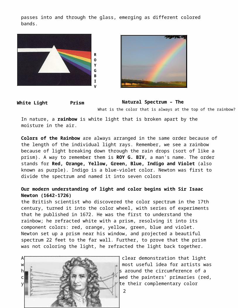
Our modern understanding of light and color begins with Sir Isaac Newton (1642-1726) the British scientist who discovered the color spectrum in the 17th century, turned it into the color wheel, with series of experiments that he published in 1672. He was the first to understand the rainbow; he refracted white with a prism, resolving it into its component colors: red, orange, yellow, green, blue and violet. Newton set up a prism near his window, and projected a beautiful spectrum 22 feet to the far wall. Further, to prove that the prism was not coloring the light, he refracted the light back together.
Artists were fascinated by Newton’s clear demonstration that light was only the begetter of color. His most useful idea for artists was his conceptual arrangement of colors around the circumference of a circle, the Color Wheel, which allowed the painters’ primaries (red, yellow, blue) to be arranged opposite their complementary color (e.g., red opposite green), as a way of denoting that each complementary would enhance the other’s effect through optical contrast.
How does light "bend"? What happens when you dangle your feet in the pool? Or when you place a pencil in a glass of water? Does the object seem bent at the surface of the water? This phenomenon is due to the bending, or refraction, of light at the interface between the water and the air. Notice that the words refraction and reflection are very similar but have two completely different meanings. Refraction occurs when light passes into a transparent material. Reflection occurs when light bounces off an opaque material.
2
A Prism can be used to break apart or refract white light into its component colors. This shows that white light is a mixture of the projected colors.
How Do We See Color?
Color is also a physiological manifestation of the Human Eye. When the image of the apple's red skin is focused at the back of the eye, it effects red sensitive receptors to a greater extent. The color is then perceived as being red. There are also color receptors (cones) that are particularly sensitive to the other primary colors of light. All other colors effect these receptors to varying degrees so that we are able to discern a great range of various color mixtures.
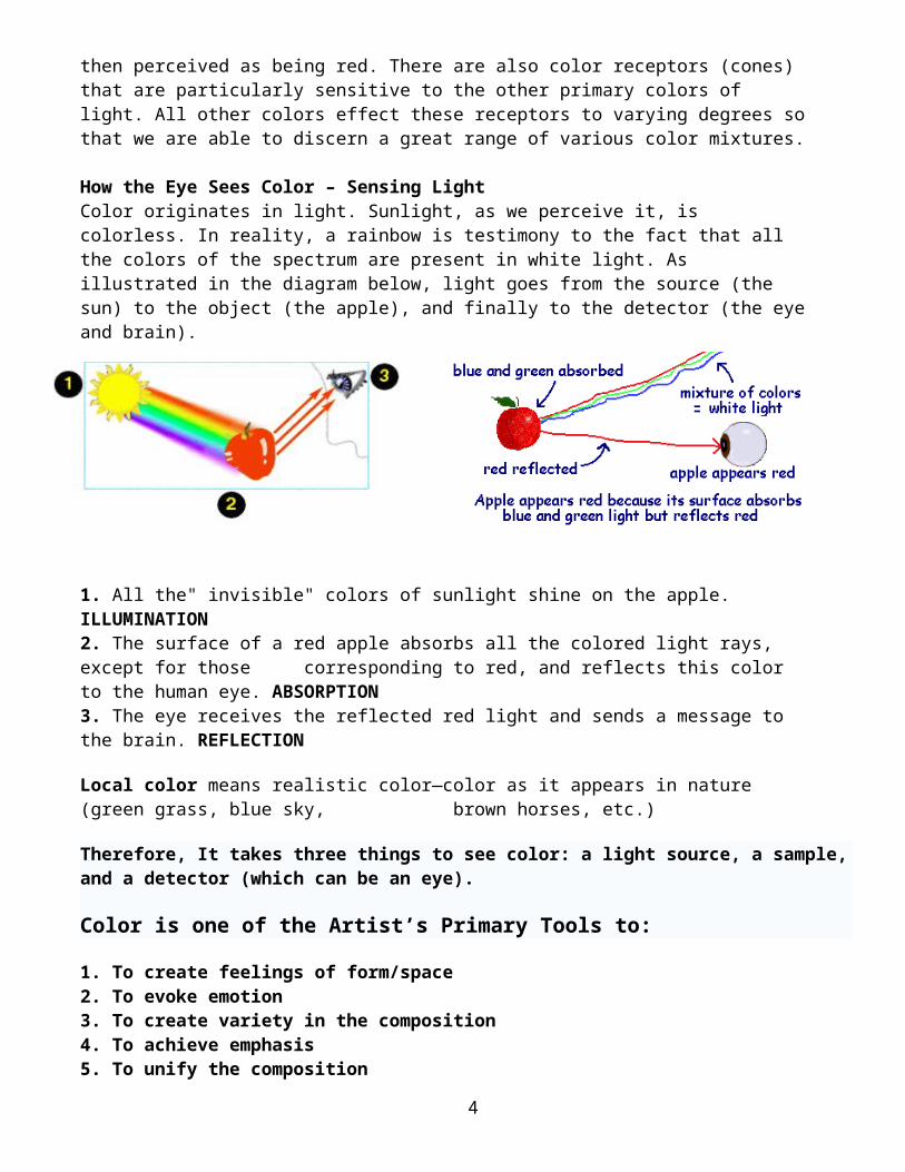
How the Eye Sees Color – Sensing Light Color originates in light. Sunlight, as we perceive it, is colorless. In reality, a rainbow is testimony to the fact that all the colors of the spectrum are present in white light. As illustrated in the diagram below, light goes from the source (the sun) to the object (the apple), and finally to the detector (the eye and brain).
1. All the" invisible" colors of sunlight shine on the apple. ILLUMINATION2. The surface of a red apple absorbs all the colored light rays, except for those corresponding to red, and reflects this color to the human eye. ABSORPTION3. The eye receives the reflected red light and sends a message to the brain. REFLECTION
Local color means realistic color—color as it appears in nature (green grass, blue sky, brown horses, etc.)
Therefore, It takes three things to see color: a light source, a sample, and a detector (which can be an eye).
Color is one of the Artist’s Primary Tools to:
1. To create feelings of form/space 2. To evoke emotion 3. To create variety in the composition
3
Color Wheel
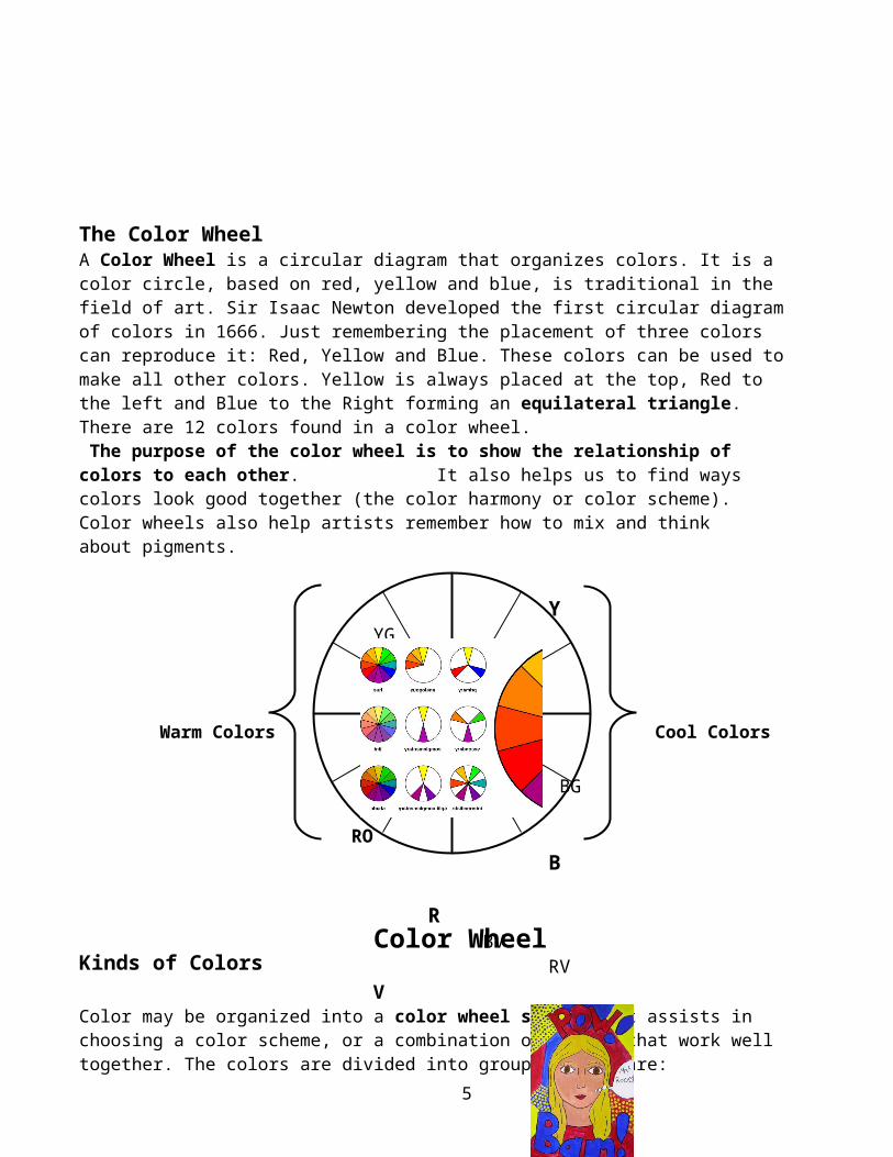
Warm Colors Cool Colors
4. To achieve emphasis 5. To unify the composition
The Color WheelA Color Wheel is a circular diagram that organizes colors. It is a color circle, based on red, yellow and blue, is traditional in the field of art. Sir Isaac Newton developed the first circular diagram of colors in 1666. Just remembering the placement of three colors can reproduce it: Red, Yellow and Blue. These colors can be used to make all other colors. Yellow is always placed at the top, Red to the left and Blue to the Right forming an equilateral triangle. There are 12 colors found in a color wheel. The purpose of the color wheel is to show the relationship of colors to each other. It also helps us to find ways colors look good together (the color harmony or color scheme). Color wheels also help artists remember how to mix and think about pigments.
Kinds of Colors
Color may be organized into a color wheel system that assists in choosing a color scheme, or a combination of colors that work well together. The colors are divided into groups. There are:
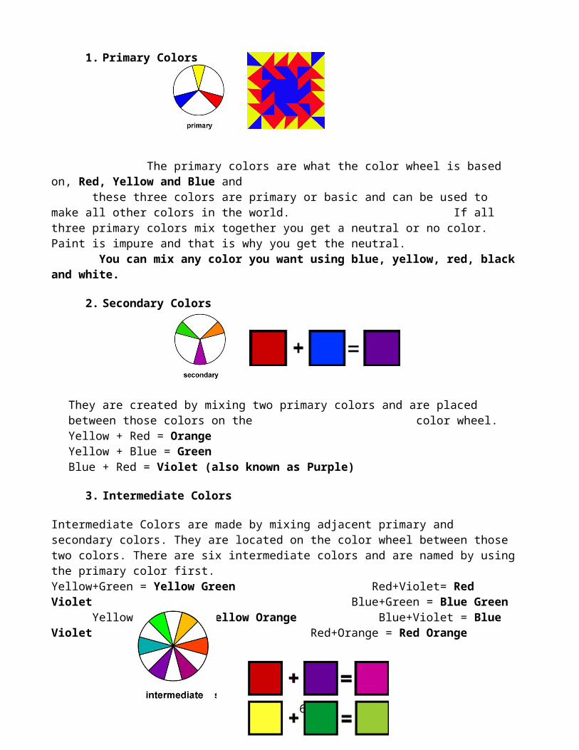
1. Primary Colors
The primary colors are what the color wheel is based on, Red, Yellow and Blue and
4
Y YG YO G
O BG
RO B
R BV RV V
these three colors are primary or basic and can be used to make all other colors in the world. If all three primary colors mix together you get a neutral or no color. Paint is impure and that is why you get the neutral.
You can mix any color you want using blue, yellow, red, black and white.
2. Secondary Colors
They are created by mixing two primary colors and are placed between those colors on the color wheel. Yellow + Red = Orange Yellow + Blue = Green Blue + Red = Violet (also known as Purple)
3. Intermediate Colors
Intermediate Colors are made by mixing adjacent primary and secondary colors. They are located on the color wheel between those two colors. There are six intermediate colors and are named by using the primary color first. Yellow+Green = Yellow Green Red+Violet= Red Violet Blue+Green = Blue Green Yellow +Orange = Yellow Orange Blue+Violet = Blue Violet Red+Orange = Red Orange
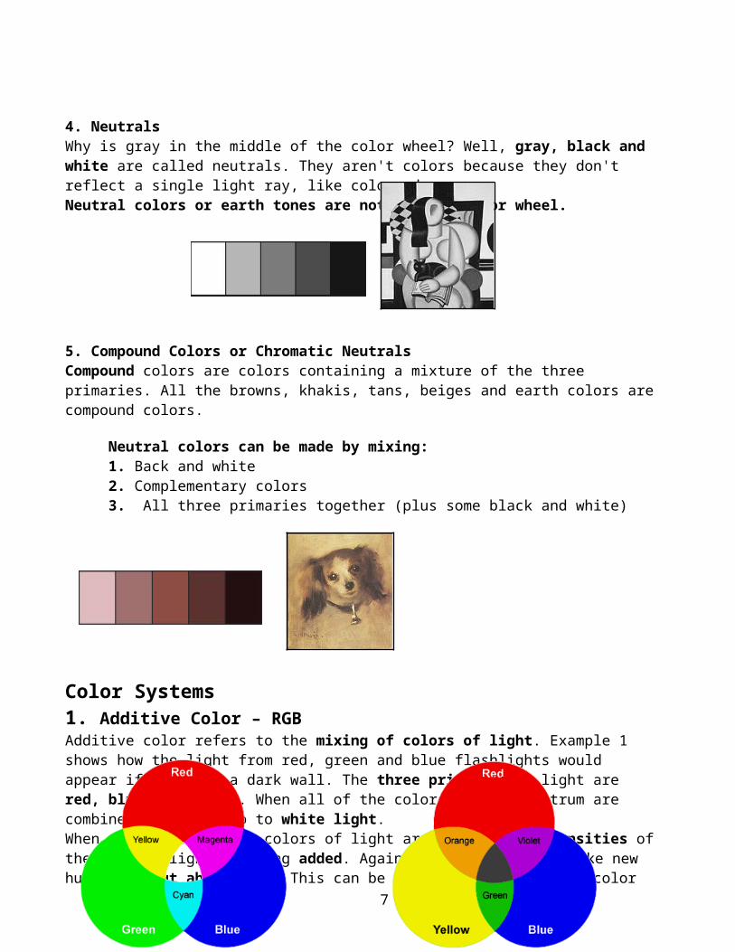
4. Neutrals Why is gray in the middle of the color wheel? Well, gray, black and white are called neutrals. They aren't colors because they don't reflect a single light ray, like colors do. Neutral colors or earth tones are not seen on color wheel.
5. Compound Colors or Chromatic Neutrals Compound colors are colors containing a mixture of the three primaries. All the browns, khakis, tans, beiges and earth colors are compound colors.
5
Neutral colors can be made by mixing: 1. Back and white 2. Complementary colors 3. All three primaries together (plus some black and white)
Color Systems 1. Additive Color – RGB Additive color refers to the mixing of colors of light. Example 1 shows how the light from red, green and blue flashlights would appear if shine on a dark wall. The three primaries in light are red, blue, and green. When all of the colors of the spectrum are combined, they add up to white light. When the three primary colors of light are mixed, the intensities of the colored light is being added. Again it ADDS colors to make new hues (without absorbing). This can be seen where the primary color illumination overlaps. The yellow formed when red light is added to green light is equal to the illumination of the red and green combined. Likewise the cyan formed by adding green and blue light is brighter than its components. The same goes for the magenta and its red and blue components. Television screens and PC monitors use an additive color process. This system applies only to devices employing light. What colors again would mix to make yellow?
Additive Color - RGB Subtractive Color - RYB
2. Subtractive Color - RYB
Subtractive color refers to the mixing of colors of pigment, such as paint or the ink in your computer's printer. This type of color is what is used in the art and design world. When
6
learning basic color theory, students typically use familiar colors like red, yellow, and blue, its three primary colors. The Red, Yellow and Blue of mixing pigments and SUBTRACTS colors to create new hues. When these three colors are mixed together they form BLACK COLOR. So when we mix paints or filters, lots of colors are getting absorbed in the mixture, and the result is that our mixture is darker. We can't mix colors in our palette and make white. We only get BLACK if we keep mixing different colors; the resulting pigment is absorbing all the wavelengths. When we mix colors using paint, or through the printing process, we are using the subtractive color method. Subtractive color mixing means that one begins with white and ends with black; as one subtracts color, the result gets darker and tends to black. Those colors used in painting—an example of the subtractive color method.
Color Harmony Harmony can be defined as a pleasing arrangement of parts, whether it be music, poetry, color, or even an ice cream sundae.
In visual experiences, harmony is something that is pleasing to the eye. It engages the viewer and it creates an inner sense of order, a balance in the visual experience. When something is not harmonious, it's either boring or chaotic. At one extreme is a visual experience that is so bland that the viewer is not engaged. The human brain will reject under-stimulating information. At the other extreme is a visual experience that is so overdone, so chaotic that the viewer can't stand to look at it. The human brain rejects what it can not organize, what it can not understand. The visual task requires that we present a logical structure. Color harmony delivers visual interest and a sense of order.
Color Schemes - a plan for organizing colors.- the pleasing combination or arrangement of colors. - set of colors that are used in an artwork, and the way they are combined in an artwork.
Color schemes are used as a guide to find groups of colors that consistently look good together. They are based on the color wheel. Color schemes are used for decorating in homes, fabric designs and by artists in general. Color schemes may be used to create a mood.
Some Formulas for Color Harmony or Color Schemes are:
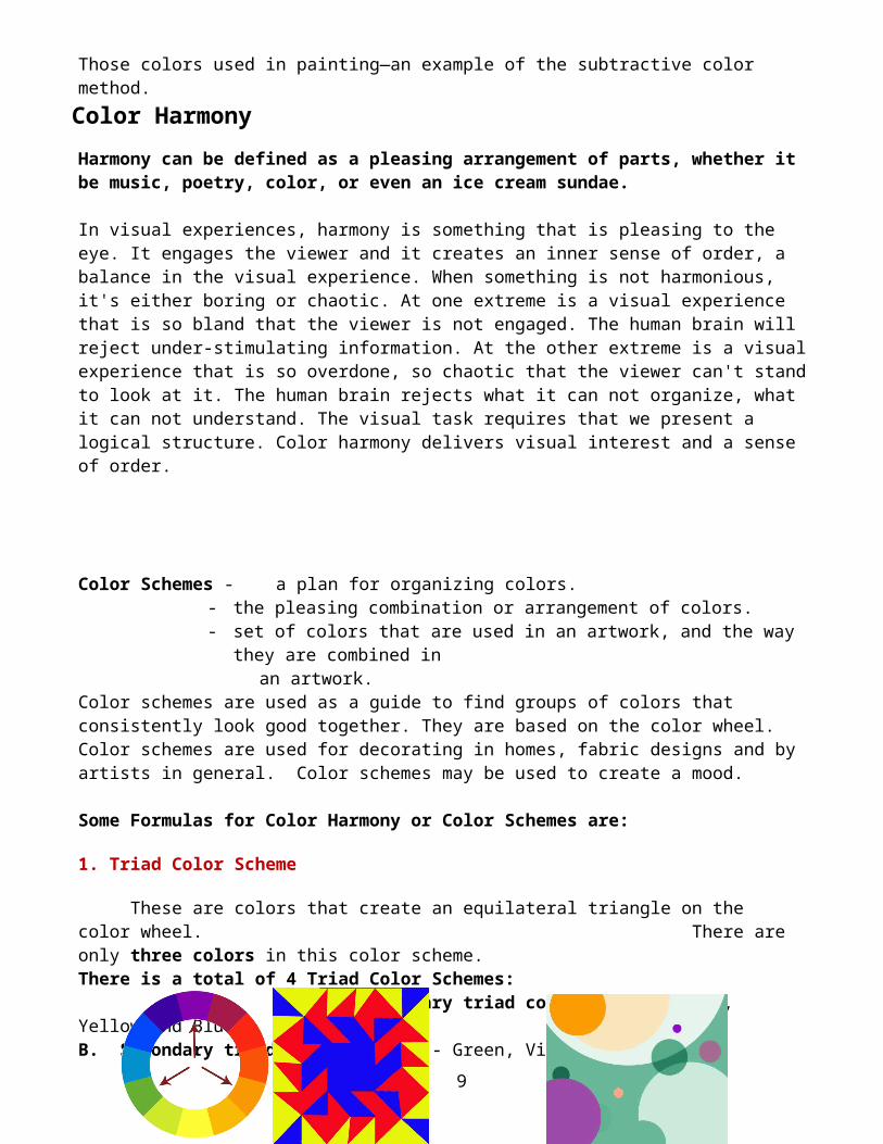
1. Triad Color Scheme
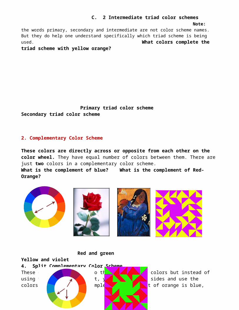
These are colors that create an equilateral triangle on the color wheel. There are only three colors in this color scheme. There is a total of 4 Triad Color Schemes: A. Primary triad color scheme - Red, Yellow and Blue B. Secondary triad color scheme - Green, Violet, Orange C. 2 Intermediate triad color schemes Note: the words primary, secondary and intermediate are not color scheme names. But they do help one understand specifically which triad scheme is being used. What colors complete the triad scheme with yellow orange?
7
Primary triad color scheme Secondary triad color scheme
2. Complementary Color Scheme These colors are directly across or opposite from each other on the color wheel. They have equal number of colors between them. There are just two colors in a complementary color scheme.What is the complement of blue? What is the complement of Red-Orange?
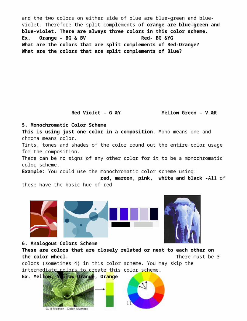
Red and green Yellow and violet 4. Split Complementary Color Scheme These colors are similar to the complementary colors but instead of using the colors complement, you split to the sides and use the colors next to it. For example, the complement of orange is blue, and the two colors on either side of blue are blue-green and blue-violet. Therefore the split complements of orange are blue-green and blue-violet. There are always three colors in this color scheme. Ex. Orange – BG & BV Red- BG &YG What are the colors that are split complements of Red-Orange? What are the colors that are split complements of Blue?
Red Violet – G &Y Yellow Green – V &R
8
5. Monochromatic Color Scheme This is using just one color in a composition. Mono means one and chroma means color. Tints, tones and shades of the color round out the entire color usage for the composition.There can be no signs of any other color for it to be a monochromatic color scheme.Example: You could use the monochromatic color scheme using: red, maroon, pink, white and black -All of these have the basic hue of red
6. Analogous Colors Scheme These are colors that are closely related or next to each other on the color wheel. There must be 3 colors (sometimes 4) in this color scheme. You may skip the intermediate colors to create this color scheme. Ex. Yellow, Yellow Orange, Orange
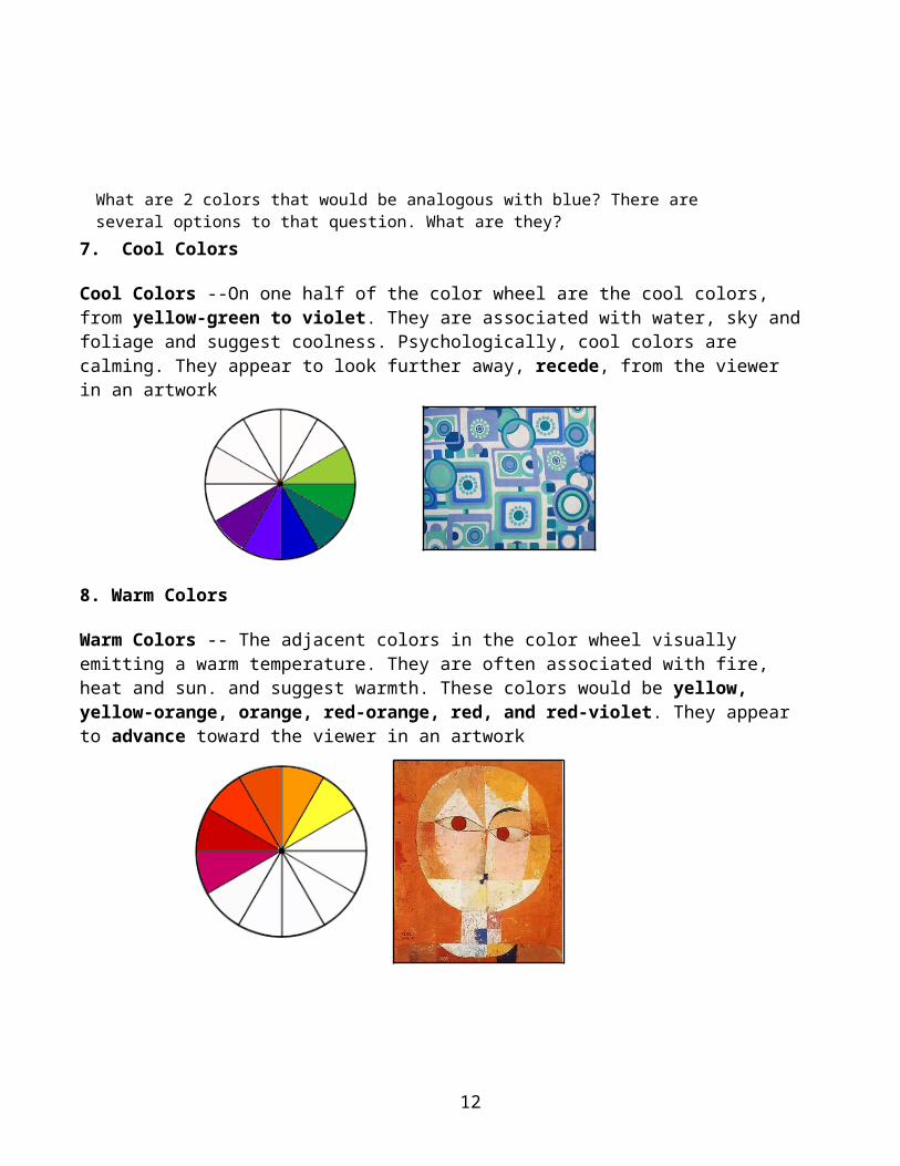
7. Cool Colors
Cool Colors --On one half of the color wheel are the cool colors, from yellow-green to violet. They are associated with water, sky and foliage and suggest coolness. Psychologically, cool colors are calming. They appear to look further away, recede, from the viewer in an artwork
8. Warm Colors
Warm Colors -- The adjacent colors in the color wheel visually emitting a warm temperature. They are often associated with fire, heat and sun. and suggest warmth. These colors would be yellow, yellow-orange, orange, red-orange, red, and red-violet. They appear to advance toward the viewer in an artwork
9
What are 2 colors that would be analogous with blue? There are several options to that question. What are they?
Three Properties of Color
All colors possess three basic qualities. A color is described in three ways: by its name, how pure or desaturated it is, and its value or lightness. Although all reds: pink, red, and brick are different hues distinguished by their chroma, saturation, intensity, and value.
1. Hue - is another word for color and it is basically means the color pigment present. - the name of colors such as blue, green , red etc.
Some unusual color hues, it reminds us of flowers, gemstones, fruits etc.Which of these has a shade of blue, red, yellow or violet?crimson, burgundy, maroon, carmine, viridian, mint, turquoise, emerald, cerulean, denimcobalt, lapis, tangerine, mustard, lemon, saffron, amber, lavender, lilac, mauve, amethyst
2. Value – is the physical properties of color that distinguishes between the lightness and darkness of a color or the quantity of light a color reflects. A color is made lighter by adding white and darker by adding black. Each color also has natural value. From lightest to darkest are: Yellow, Orange, Red and Green, Blue and Violet.
3. Intensity - is the brightness or dullness of a color. A color can't be made brighter than the way the pigment comes to you in the paint tubeAlso called chroma or saturation. It refers to the brightness of a color (a color is full in intensity only when pure and unmixed). Color intensity can be changed by adding gray, or an opposite color on the color wheel.
Color Symbolism Since color can express ideas and emotions, we must know exactly what colors should be use to accurately express that idea or emotion. Artists have been using colors to symbolize meaning in their art works since they first starting drawing in caves.
10
A symbol is a quick easy way to communicate without using words. Instead of saying, "Whoa! Be careful, kids. This bottle is poison and will kill you!" we can put a skull and crossbones on a bottle to say the same thing.
Red means stopYellow means slow downGreen means go
What this symbols stands for?
As we said colors can express emotions. They are also used as symbols by many cultures. But to understand the meaning of a symbol you have to know that culture. Simple color symbolism is the colors in traffic light; these symbols are easy to understand once you learn them.
But not all symbols are simple to understand. Usually, you have to learn about where and when the artist lived to understand the symbols.
Symbol - is a picture, object or color that stands for something else. Color Symbolism - describes the use of color as a symbol throughout cultures and religions.
An understanding of color theory has been around since ancient times. Colors have been recognized for their symbolic power across many cultures and in nature herself.
1. Red through its association with fire and blood is used to represent danger, anger and violence. For the same reason it is also associated with affairs of the heart: love and passion. 2. Orange symbolizes creativity and endurance. As a secondary color it combines elements of the colors used to mix it. It unites the creative passion of red with the clarity and wisdom of yellow. 3. Yellow is the color of the sun - the life support for our planet. As such it has come to represent life, energy, happiness, hope and wisdom. 4. Green, as the color of plants and grass, is the color of nature and all that is associated with health and growth. However, it is also used to represent more negative traits such as envy and inexperience. 5. Blue is the coolest and most calming of all the colors. As the color of the sky, it has been used since ancient times to represent heaven. In classical mythology, blue was the color associated with the gods, Venus and Jupiter. In Christianity, it becomes the symbol of the Virgin Mary as Queen of Heaven. As the color of the ocean, it is also suggests qualities like freshness, purity and hygiene. 6. Purple is the color of royalty, wealth and power. In times past, purple dyes were rare and expensive. Only the rich and powerful could afford to wear clothes of this luxurious color. 7. Brown is the color of earth, wood and stone. As such, it evokes craftsmanship and the great
11
outdoors. It is also used to represent humility: a down to earth virtue. 8. Black and its association with darkness is used to represent death, evil, witchcraft, fear and sorrow. Grey is the natural color of some metals and stone, but it also has negative associations with the weather, boredom and old age. 9. White and its association with light is used to represent peace, purity and goodness.
The above is not an exclusive list of the symbolic uses of color as there are different interpretations of color theory across a range of countries and cultures.
12
Related Documents