1 Visual Communication Editorial Design ©Talya Shachar-Albocher

Welcome message from author
This document is posted to help you gain knowledge. Please leave a comment to let me know what you think about it! Share it to your friends and learn new things together.
Transcript

8/3/2019 Visual Communication - Editorial Design
http://slidepdf.com/reader/full/visual-communication-editorial-design 1/17
1
Visual Communication Editorial Design
©Talya Shachar-Albocher

8/3/2019 Visual Communication - Editorial Design
http://slidepdf.com/reader/full/visual-communication-editorial-design 2/17
2
What is editorial design?
Editorial design is the collaboration between a writer and a designer to create aninteresting piece of written material, sometimes punctuated by photography or otherillustration.
The best written plain English document won't be effective - or perhaps won't evenbe read - if it is badly designed. Clear design is just as important as good writing.
“readability” - regards the writing of the material, how easy it is for the reader tounderstand the information contained. This is the job of the writer/editor.
“legibility” - using design to make the material easy on the eye, aid reading flow andenhance the message.

8/3/2019 Visual Communication - Editorial Design
http://slidepdf.com/reader/full/visual-communication-editorial-design 3/17
3
Design: Abby Roc
8/3/2019 Visual Communication - Editorial Design
http://slidepdf.com/reader/full/visual-communication-editorial-design 4/17
4
Give Visual Cues
Help your reader find his way around thematerial by understanding hierarchy: thesignposts throughout the text guide the
reader. These are headers and subheads,bullets and initial capitals, evennumbered lists or paragraphs.
What's important? How can we tell?
Size
Weight -bold, italicSpace around – a line/half line spacebefore or after a paragraph or headingPlacement on the pageUsage of lines and rules
8/3/2019 Visual Communication - Editorial Design
http://slidepdf.com/reader/full/visual-communication-editorial-design 5/17
5
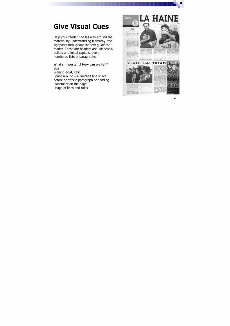
“Breaking up” areas of type
Long, grey "slabs" of typeare like a long, boring
speech -- people tend totune out.
The designer can break upthe layout with spaces,short headings, lines,
areas of color, illustrationsand other images.
These help the reader toeasily find the section theywant.

8/3/2019 Visual Communication - Editorial Design
http://slidepdf.com/reader/full/visual-communication-editorial-design 6/17
6
Design: Ado Design

8/3/2019 Visual Communication - Editorial Design
http://slidepdf.com/reader/full/visual-communication-editorial-design 7/17
7
Room to breathe - using white spaceWhite space is an important aidto legibility.Wide margins and plenty of
room at the top and bottom of your page aid to focus thereader's attention withoutgiving an uncomfortablecrowded feeling.
Wider margins used are alsohelpful in eliminating imbalancethat can be caused byimperfect production – if cutting isn't perfect, narrowmargins are a recipe fordisaster.
Design: Charlie Echo
8/3/2019 Visual Communication - Editorial Design
http://slidepdf.com/reader/full/visual-communication-editorial-design 8/17
8
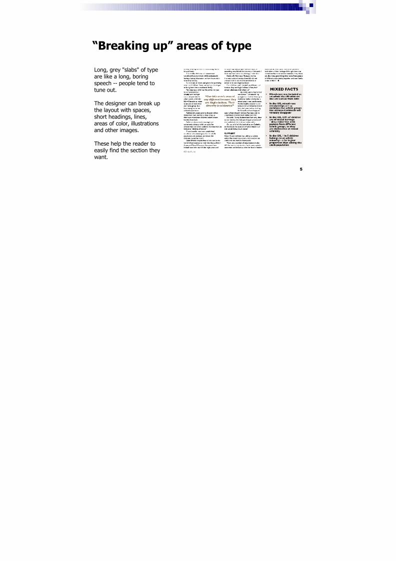
White space doesn't need
to be white:Case study
The individual framelayout used here meansthe the space lookscomfortably filled in spiteof the fact that there isnot that much content:there are marginsbetween the page edgesto the frames, and thenagain inside the frames to
the beginning of the texts.
What problems can youpinpoint in this layout?

8/3/2019 Visual Communication - Editorial Design
http://slidepdf.com/reader/full/visual-communication-editorial-design 9/17
9
Legibility forlong-running texts
Typeface (font) choice is probably the most
important of all editorial design decisions. A typeface for long running texts (as opposedto headlines, subheads or callouts/pull-quotes)should be a serif font, not decorative.
A typeface's "x-height" is another important
factor in readability. The x-height is the heightof letters such as x, a and e, which have noascenders (like h) or descenders (like y),compared with capital letters or letters withascenders. Typefaces with a larger x-heightare easier to read than typefaces with asmaller x-height.
Choose clear typefaces for your
main text. Quirky or unusualtypefaces can add character tocovers and headings, but whenused for text they will make yourmaterial much harder to read.

8/3/2019 Visual Communication - Editorial Design
http://slidepdf.com/reader/full/visual-communication-editorial-design 10/17
10
Design: SP Design
Negative text:Case study
While the layout lookscool and the
hierarchy is clear, if areader would try toread the articlethrough, he wouldfeel uncomfortable.Laying out long textsin reverse -ie whitetext on black background- is adeterrent, and shouldbe avoided.What could lightenthe load in this case?
8/3/2019 Visual Communication - Editorial Design
http://slidepdf.com/reader/full/visual-communication-editorial-design 11/17
11
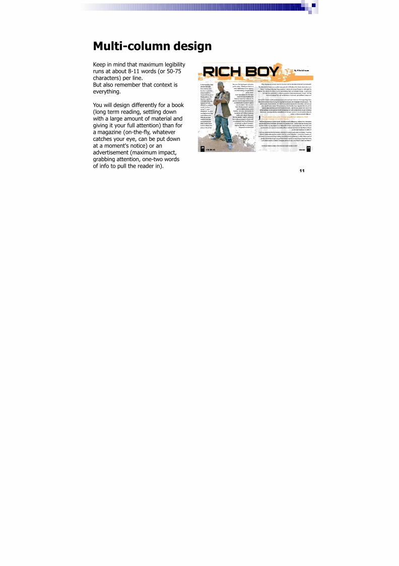
Multi-column design
Keep in mind that maximum legibilityruns at about 8-11 words (or 50-75characters) per line.
But also remember that context iseverything.
You will design differently for a book (long term reading, settling downwith a large amount of material and
giving it your full attention) than fora magazine (on-the-fly, whatevercatches your eye, can be put downat a moment's notice) or anadvertisement (maximum impact,grabbing attention, one-two words
of info to pull the reader in).
8/3/2019 Visual Communication - Editorial Design
http://slidepdf.com/reader/full/visual-communication-editorial-design 12/17
12
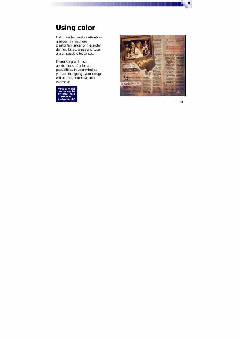
Using colorColor can be used as attentiongrabber, atmospherecreator/enhancer or hierarchy
definer. Lines, areas and typeare all possible instances.
If you keep all theseapplications of color aspossibilities in your mind as
you are designing, your designwill be more effective andevocative.

8/3/2019 Visual Communication - Editorial Design
http://slidepdf.com/reader/full/visual-communication-editorial-design 13/17
13

8/3/2019 Visual Communication - Editorial Design
http://slidepdf.com/reader/full/visual-communication-editorial-design 14/17
14
Using photographs
Design: Brad Keller
Images placed into articlestell an additional story to thatwithin the text. The photos or
illustrations give atmosphere,explanation, and visualinterest.
How the photos are handles(cropping, clipping,duplicating, colormanipulation, percent of pagecoverage) will affect theoverall outlook of thematerial, and should be usedin accordance with themessage of the writtenarticle.
8/3/2019 Visual Communication - Editorial Design
http://slidepdf.com/reader/full/visual-communication-editorial-design 15/17
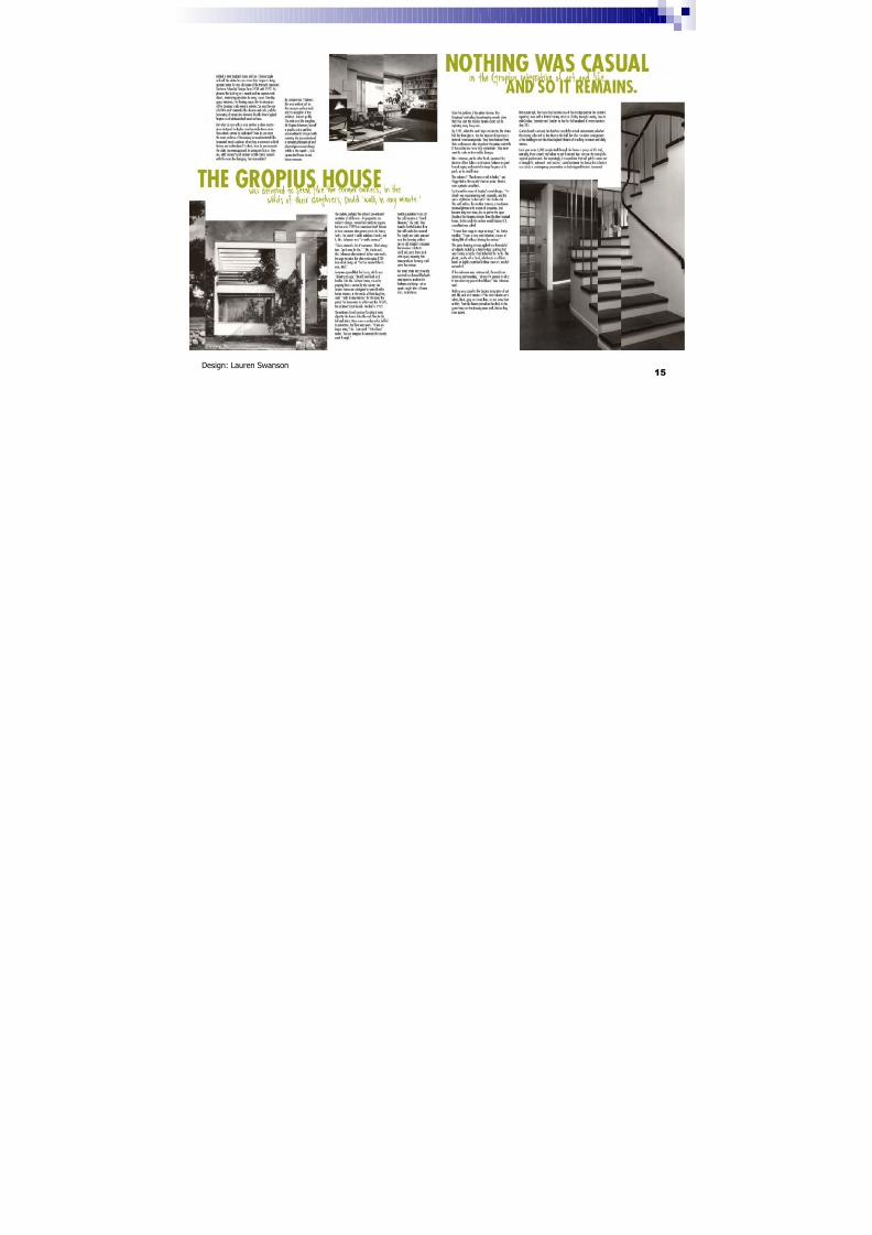
15 Design: Lauren Swanson

8/3/2019 Visual Communication - Editorial Design
http://slidepdf.com/reader/full/visual-communication-editorial-design 16/17
16
Text wraparound
Design: Kris Zabala
The interaction between the text and theimages should be handled with care.
The designer wants the reader to be able tointuitively carry on reading the naturalcontinuation of the text, and not findthemselves confused as to where theyshould be looking next.
Images with tight contoured shapewraparound can enhance the design greatly,but since they tend to create a feeling of less structure, they should be limited inusage.
8/3/2019 Visual Communication - Editorial Design
http://slidepdf.com/reader/full/visual-communication-editorial-design 17/17
17
Further interest
http://www.articlesbase.com/entrepreneurship-articles/restaurant-layout-follow-these-simp
http://findarticles.com/p/articles/mi_m3065/is_1_29/ai_58836541/
http://www.designtoday.net/print-design/rules-of-color-in-print-design.html
Related Documents