Using Basic Data Visualization Methods to Explore LibQUAL+ ® Data Ray Lyons & Martha Kyrillidou 9th Northumbria International Conference on Performance Measurement in Libraries and Information Services University of York, August 22-26, 2011

Using Basic Data Visualization Methods to Explore LibQUAL+ ® Data Ray Lyons & Martha Kyrillidou 9th Northumbria International Conference on Performance.
Dec 16, 2015
Welcome message from author
This document is posted to help you gain knowledge. Please leave a comment to let me know what you think about it! Share it to your friends and learn new things together.
Transcript
Using Basic Data Visualization Methods to Explore LibQUAL+® Data
Ray Lyons & Martha Kyrillidou
9th Northumbria International Conference on Performance Measurement in Libraries and Information Services
University of York, August 22-26, 2011
Graphs help us comprehend data more thoroughly and effectively
• Reveal patterns, trends, and exceptional values
• Enable quick and repeated comparisons of large collections of data.
• Facilitate a “feel” of the data

“[Graphs] extend the capacity of our memory, making available in front of our eyes what we couldn’t otherwise hold all at once in our minds. In simple terms, information visualization helps us think.”
- Stephen Few (2009)
Radar Charts
• Hallmark LibQUAL+® graphic • Rich summary of mean service quality
findings• Positive and negative adequacy and
superiority gaps encoded in yellow/blue/red/green scheme
Radar Charts
• Complexity can make them difficult to interpret
• Unfamiliar style may discourage novices from examining the charts closely
• Visual comparisons must be made along spokes of the radial

Radar Charts
Spokes are actually ‘stacked bars’
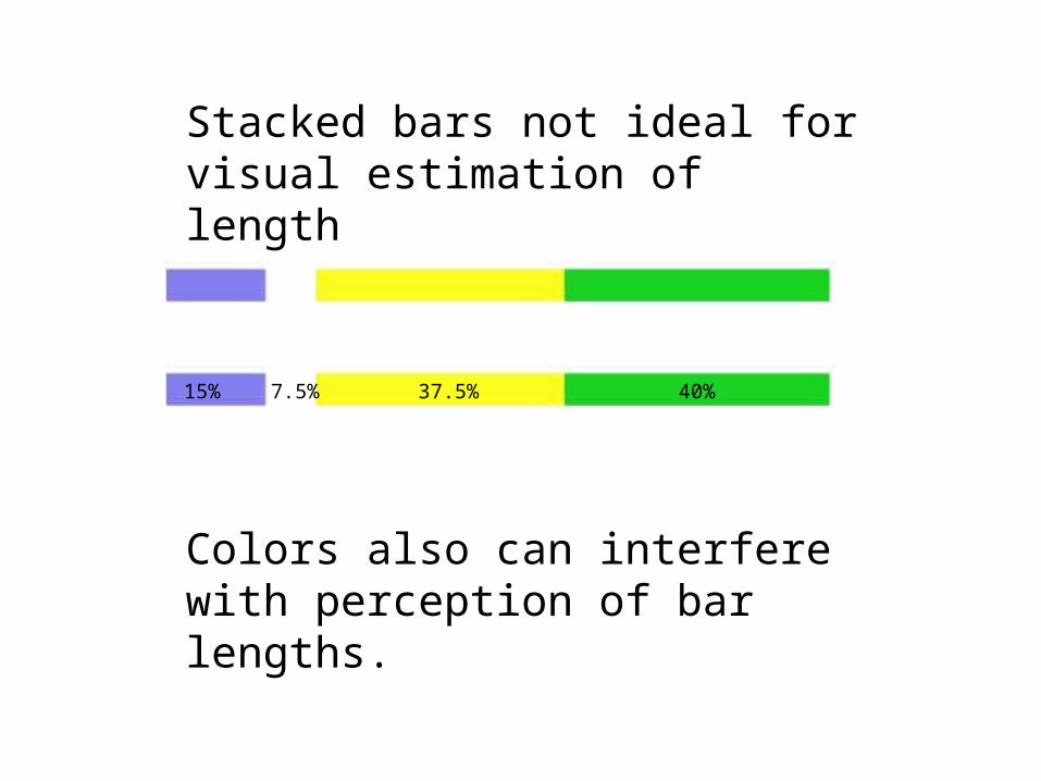
Stacked bars not ideal for visual estimation of length
Colors also can interfere with perception of bar lengths.
15% 7.5% 37.5% 40%
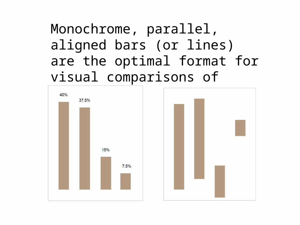
Monochrome, parallel, aligned bars (or lines) are the optimal format for visual comparisons of lengths
Bar charts can supplement radar charts
• Allow more accurate assessment of detailed comparisons
• Allow ‘drill down’ to see details• More comprehensible format for
beginners
Charts presented here developed using Tableau Software (public version)
• Quick chart development; advanced features set
• Includes interactive graphic features
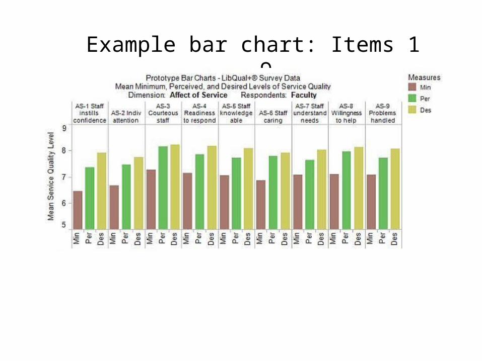
Example bar chart: Items 1 - 9
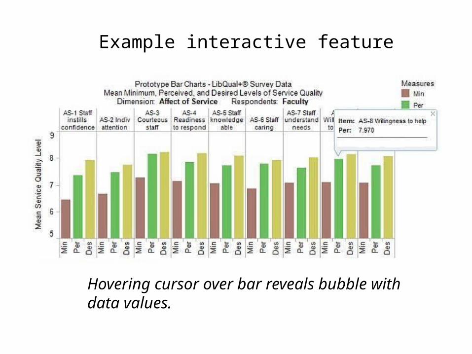
Example interactive feature
Hovering cursor over bar reveals bubble with data values.

Example interactive feature:
Selecting Min(imum) in chart legend highlights that measure; other bars grayed out
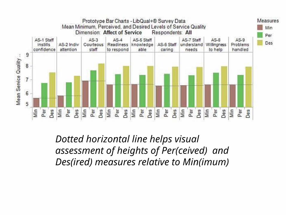
Dotted horizontal line helps visual assessment of heights of Per(ceived) and Des(ired) measures relative to Min(imum)
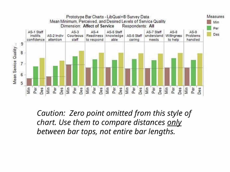
Caution: Zero point omitted from this style of chart. Use them to compare distances only between bar tops, not entire bar lengths.
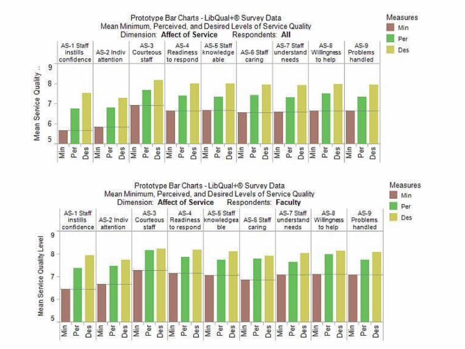
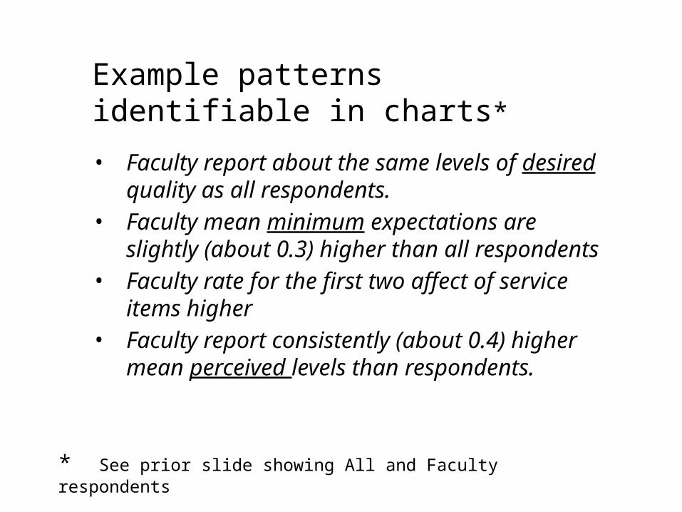
Example patterns identifiable in charts*
• Faculty report about the same levels of desired quality as all respondents.
• Faculty mean minimum expectations are slightly (about 0.3) higher than all respondents
• Faculty rate for the first two affect of service items higher
• Faculty report consistently (about 0.4) higher mean perceived levels than respondents.
* See prior slide showing All and Faculty respondents

All Faculty
Pattern: For affect dimension items, upper edge of yellow areas in two charts nearly identical
Interpretation: Faculty report about the same levels of desired quality as all respondents
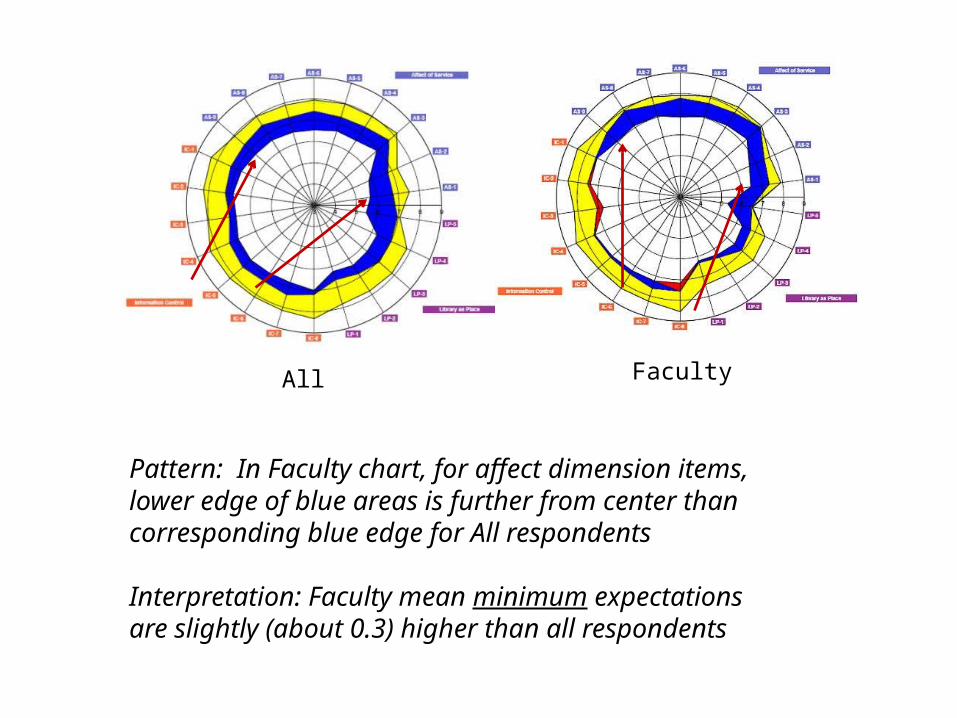
All Faculty
Pattern: In Faculty chart, for affect dimension items, lower edge of blue areas is further from center than corresponding blue edge for All respondents
Interpretation: Faculty mean minimum expectations are slightly (about 0.3) higher than all respondents
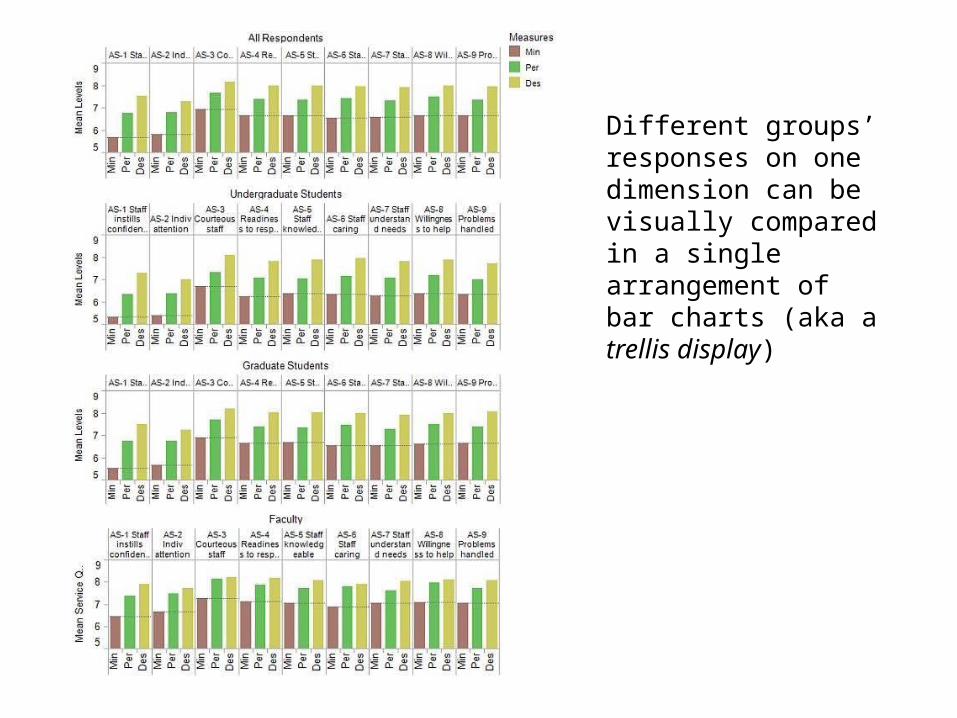
Different groups’ responses on one dimension can be visually compared in a single arrangement of bar charts (aka a trellis display)
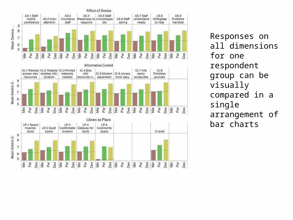
Responses on all dimensions for one respondent group can be visually compared in a single arrangement of bar charts
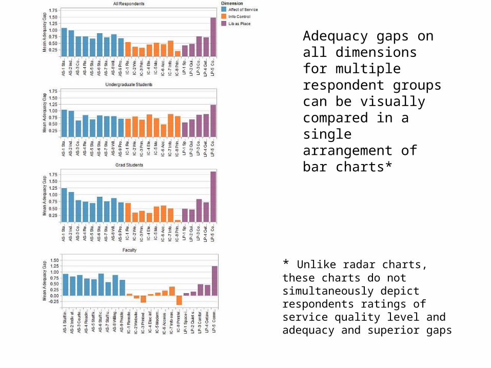
Adequacy gaps on all dimensions for multiple respondent groups can be visually compared in a single arrangement of bar charts*
* Unlike radar charts, these charts do not simultaneously depict respondents ratings of service quality level and adequacy and superior gaps
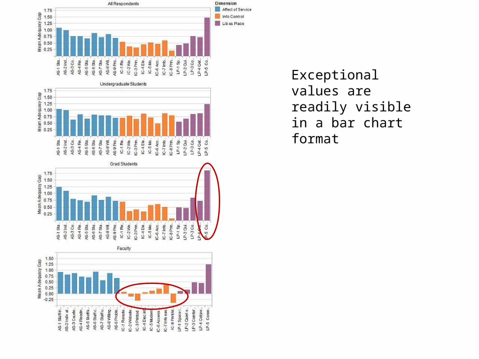
Exceptional values are readily visible in a bar chart format
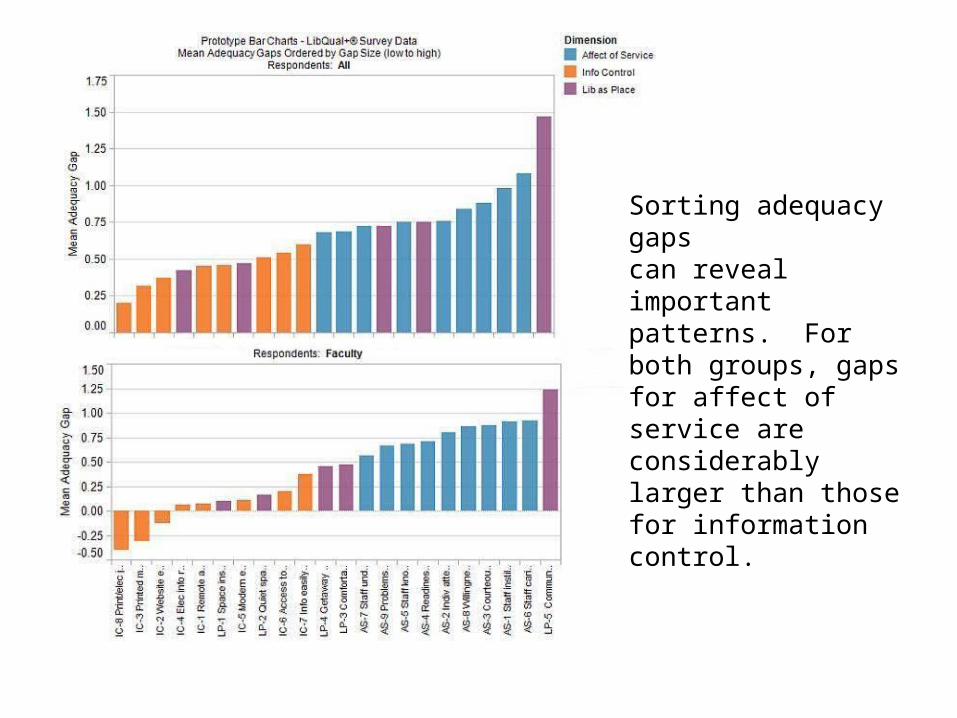
Sorting adequacy gapscan reveal important patterns. For both groups, gaps for affect of service are considerably larger than those for information control.
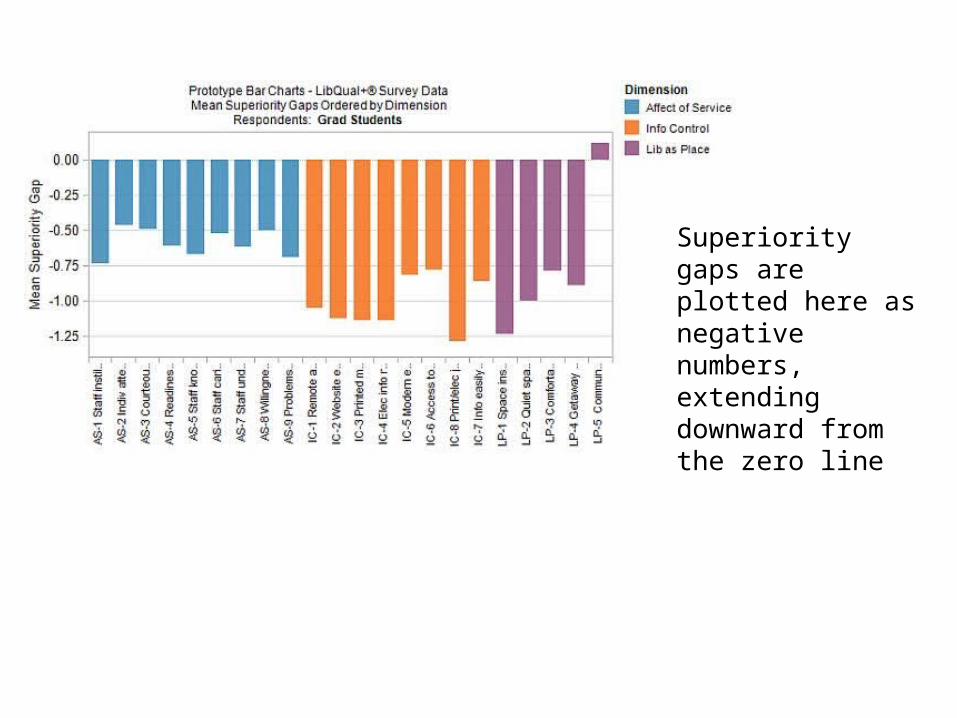
Superiority gaps are plotted here as negative numbers, extending downward from the zero line
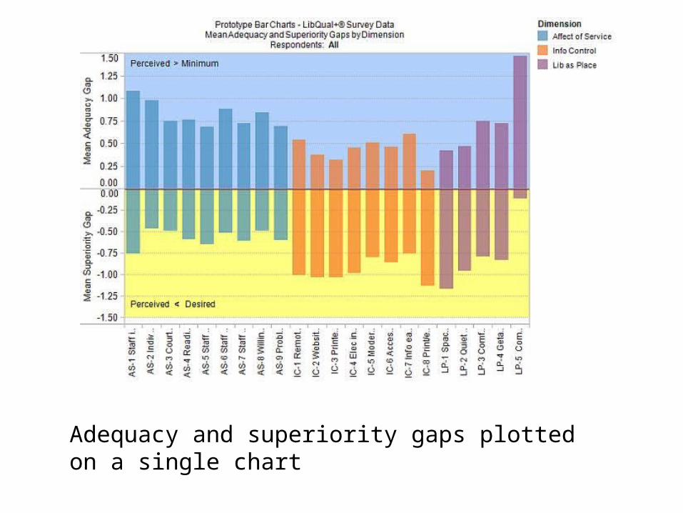
Adequacy and superiority gaps plotted on a single chart
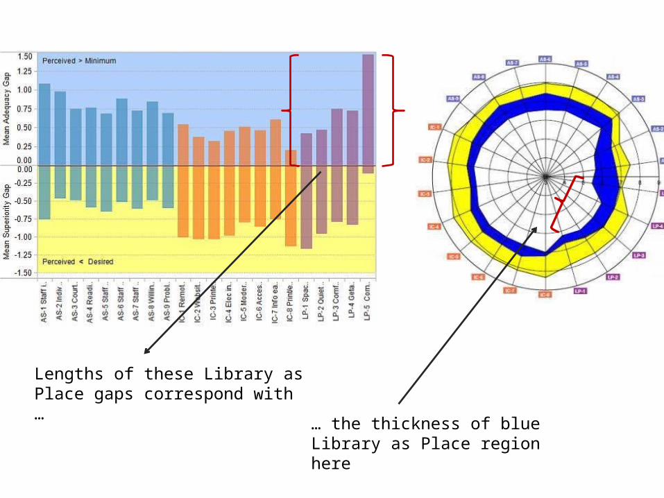
Lengths of these Library as Place gaps correspond with …
… the thickness of blue Library as Place region here
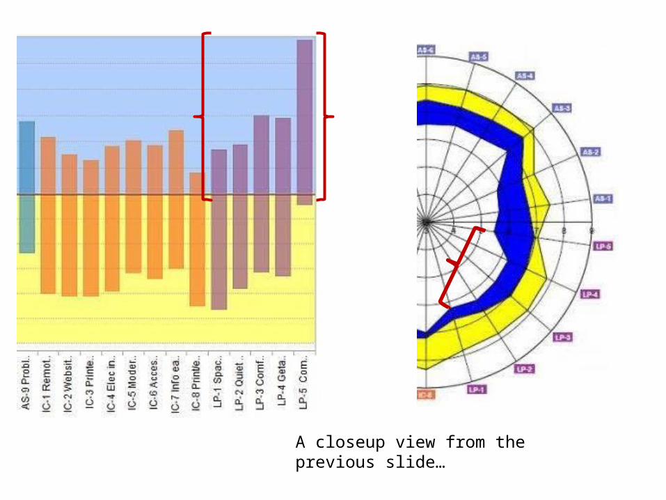
A closeup view from the previous slide…
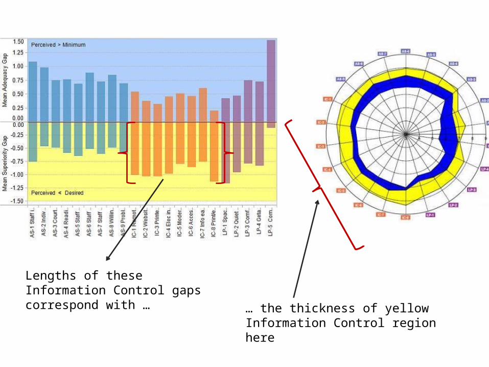
Lengths of these Information Control gaps correspond with …
… the thickness of yellow Information Control region here
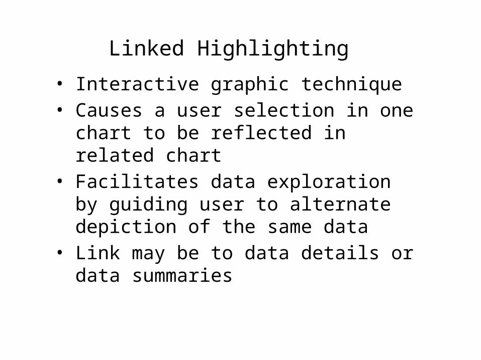
Linked Highlighting
• Interactive graphic technique• Causes a user selection in one chart to
be reflected in related chart• Facilitates data exploration by guiding
user to alternate depiction of the same data
• Link may be to data details or data summaries
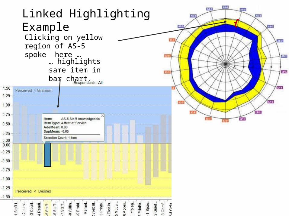
Clicking on yellow region of AS-5 spoke here …
… highlights same item in bar chart.
Linked Highlighting Example
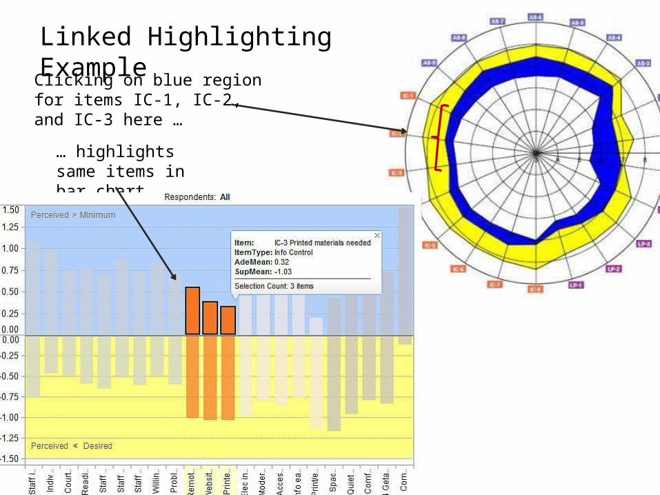
Clicking on blue region for items IC-1, IC-2, and IC-3 here …
… highlights same items in bar chart.
Linked Highlighting Example

When a respondent group’s adequacy gaps are all positive and its superiority gaps all negative, the chart’s vertical axis is a continuous scale with zero separating the upper half from the lower half.
Pastel blue and yellow indicate positive adequacy gaps and negative superiority gaps, respectively.
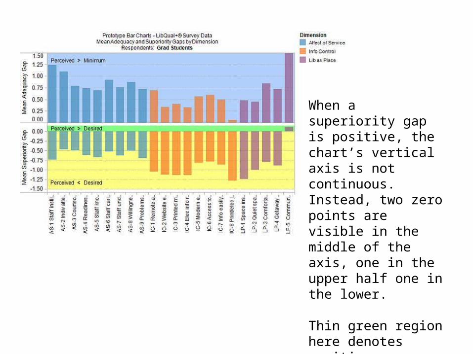
When a superiority gap is positive, the chart’s vertical axis is not continuous. Instead, two zero points are visible in the middle of the axis, one in the upper half one in the lower.
Thin green region here denotes positive superiority gap for item LP-5.
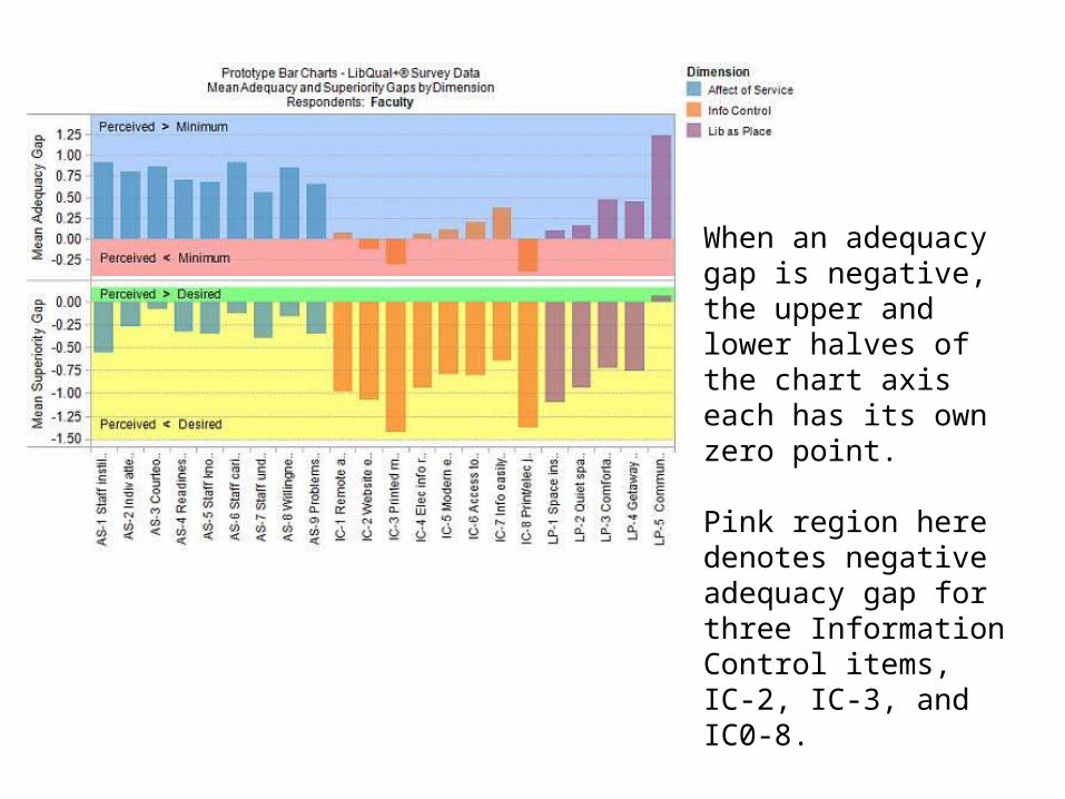
When an adequacy gap is negative, the upper and lower halves of the chart axis each has its own zero point.
Pink region here denotes negative adequacy gap for three Information Control items, IC-2, IC-3, and IC0-8.

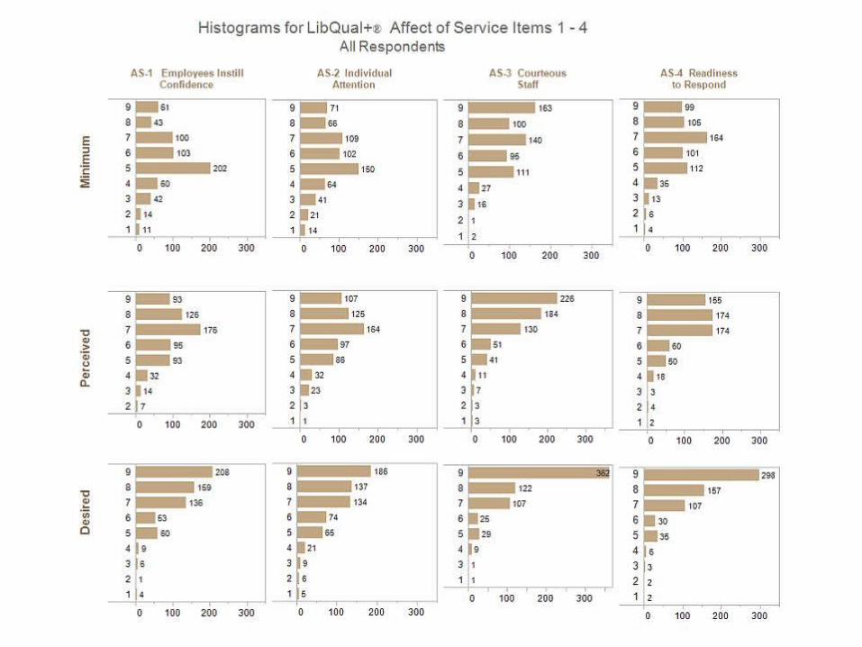
Means tell us about the centrality of data
Exploring data requires examining and getting a feel for the variation in the data, i.e., its distribution
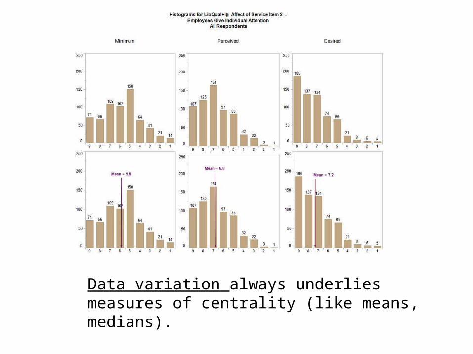
Data variation always underlies measures of centrality (like means, medians).
Explore data variability in order to:
• Understand full scope of the data• Identify minorities of respondents
whose needs/perspectives may tend to be neglected
• Examine changes/differences in variability for data from different survey periods
blahblabhh

blahblabhh

• Simple graphing tools enable a more thorough understanding of survey data
• Require creativity and discipline to create detailed graphs relevant to management questions
• Hundreds of graphs may need created in order to explore for most meaningful patterns
• Explore data by ‘drilling down’:• By meaningful respondent groups and
sub-groups
• Minorities who tend to be outliers from the majority
• Comparisons over time

• Utility of graphical formats presented here depend upon feedback from users
• Further research is needed to determine which formats and contents are useful for libraries of different sizes/types/missions
• Analysis of LibQUAL+® survey data should take the form of generalizations about patterns and trends taking relevant to library management’s quality and performance assessment efforts
• Take the time to get a feel for your survey data!
Related Documents