When on 17 April 2012 Trevor Jones died, the world of bookbinding lost an artist of remarkable originality. Trevor Jones was born in Wembley in 1931. At the age of 14 he went to Harrow School of Art, followed by two years of national service as a radar operator in the raf , before returning to art school in 1952. His was an old-fashioned, traditional art education, learning about colour theory, perspective, lettering and anatomy, and spending much time on life-drawing, as well as drawing still-lifes and antique casts. After acquiring his National Diploma in Design for Illustration a year later, he moved on to Hornsey College of Art to obtain the University of London Art Teachers’ certificate. Trevor’s training in illustration had strengthened his interest in books and ty- pography. While teaching at a secondary school for boys in Stanmore, he went to evening classes to study bookbinding with Arthur Johnson, who taught craft and design and whose influence is discernible in a very few of Trevor’s earliest designs. He was also instructed by Mr E. Sidders, a trade binder, who concentrated on the more practical and commercial aspects of the craft. Both approaches bore fruit, al- though Trevor, lacking an interest in mere skill, never became a master craftsman. His technical skills improved over time, but he used techniques and structures as a means to an end. 1955 turned out to be an important year. He had moved on to teach at Harrow, but it was Arthur Johnson’s invitation to attend the inaugural meeting of the newly- established Guild of Contemporary Bookbinders that launched Trevor’s career as a designer-bookbinder. Meeting giants of bookbinding, such as Bernard Middleton and – more importantly – Edgar Mansfield, turned out to be a watershed. It was Edgar Mansfield, himself trained and active as an artist, who told him to visit art galleries and steep himself in modern art and design. Mansfield’s influence, not only on Trevor Jones, but on all English creative designer-bookbinders, was far-reaching and profound. Through his teaching and by example, he transformed the language of fine binding from one historically based on, and inspired by, the decorative arts into one based on fine art, especially modern fine art. Already as a student Trevor had fallen under the spell of French artist-binders, such as Rose Adler, Pierre Legrain, Henri Creuzevault and Paul Bonet. He compared their innovative approaches to design with bindings by Cobden-Sanderson, the Doves Bindery, Douglas Cockerell and their followers, and while he could admire the craftsmanship of this typically British school of bookbinding, he also wondered at the absence of daring and creative risk-taking. TREVOR JONES DESIGNER BOOKBINDER 9

Welcome message from author
This document is posted to help you gain knowledge. Please leave a comment to let me know what you think about it! Share it to your friends and learn new things together.
Transcript
When on 17 April 2012 Trevor Jones died, the world of bookbinding lost an artist of remarkable originality.
Trevor Jones was born in Wembley in 1931. At the age of 14 he went to Harrow School of Art, followed by two years of national service as a radar operator in the raf, before returning to art school in 1952. His was an old-fashioned, traditional art education, learning about colour theory, perspective, lettering and anatomy, and spending much time on life-drawing, as well as drawing still-lifes and antique casts. After acquiring his National Diploma in Design for Illustration a year later, he moved on to Hornsey College of Art to obtain the University of London Art Teachers’ certificate.
Trevor’s training in illustration had strengthened his interest in books and ty-pography. While teaching at a secondary school for boys in Stanmore, he went to evening classes to study bookbinding with Arthur Johnson, who taught craft and design and whose influence is discernible in a very few of Trevor’s earliest designs. He was also instructed by Mr E. Sidders, a trade binder, who concentrated on the more practical and commercial aspects of the craft. Both approaches bore fruit, al-though Trevor, lacking an interest in mere skill, never became a master craftsman. His technical skills improved over time, but he used techniques and structures as a means to an end.
1955 turned out to be an important year. He had moved on to teach at Harrow, but it was Arthur Johnson’s invitation to attend the inaugural meeting of the newly-established Guild of Contemporary Bookbinders that launched Trevor’s career as a designer-bookbinder. Meeting giants of bookbinding, such as Bernard Middleton and – more importantly – Edgar Mansfield, turned out to be a watershed. It was Edgar Mansfield, himself trained and active as an artist, who told him to visit art galleries and steep himself in modern art and design.
Mansfield’s influence, not only on Trevor Jones, but on all English creative designer-bookbinders, was far-reaching and profound. Through his teaching and by example, he transformed the language of fine binding from one historically based on, and inspired by, the decorative arts into one based on fine art, especially modern fine art.
Already as a student Trevor had fallen under the spell of French artist-binders, such as Rose Adler, Pierre Legrain, Henri Creuzevault and Paul Bonet. He compared their innovative approaches to design with bindings by Cobden-Sanderson, the Doves Bindery, Douglas Cockerell and their followers, and while he could admire the craftsmanship of this typically British school of bookbinding, he also wondered at the absence of daring and creative risk-taking.
TREVOR JONE S DE SIGNER B O OKBINDER
Fig.2 | Sewn books in tj’s bindery.
9
pink, cavort on delicately-tinted natural goatskin, alluding to the happy reconcilia-tion at the end of this comedy.
Already in the early 1970s there were signs in fine arts of a move away from Modernism and a return to historicism and eclecticism. Abstract art was losing favour to the representational. Architecture experimented with structures visible on the outside (such as the Centre Pompidou in Paris or the Lloyds building in London). In bookbinding too, structure as a design feature became more important – possibly inspired by the new architecture, but also by the rescue work during the 20 years or so following the Florence flood of 1966. This brought several binders into close contact with simple, open, visible structures, so common in the sixteenth century. Their easy functionality was adopted by many conservators, but their appearance too seemed to have inspired the renewed interest in structures shown by several designer-binders in their experiments with different and visible sewing and lacing-in techniques.
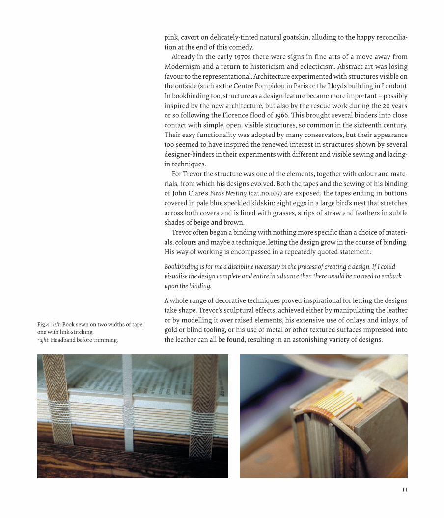
For Trevor the structure was one of the elements, together with colour and mate-rials, from which his designs evolved. Both the tapes and the sewing of his binding of John Clare’s Birds Nesting (cat.no.107) are exposed, the tapes ending in buttons covered in pale blue speckled kidskin: eight eggs in a large bird’s nest that stretches across both covers and is lined with grasses, strips of straw and feathers in subtle shades of beige and brown.
Trevor often began a binding with nothing more specific than a choice of materi-als, colours and maybe a technique, letting the design grow in the course of binding. His way of working is encompassed in a repeatedly quoted statement:
Bookbinding is for me a discipline necessary in the process of creating a design. If I could visualise the design complete and entire in advance then there would be no need to embark upon the binding.
A whole range of decorative techniques proved inspirational for letting the designs take shape. Trevor’s sculptural effects, achieved either by manipulating the leather or by modelling it over raised elements, his extensive use of onlays and inlays, of gold or blind tooling, or his use of metal or other textured surfaces impressed into the leather can all be found, resulting in an astonishing variety of designs.
Fig.4 | left: Book sewn on two widths of tape, one with link-stitching. right: Headband before trimming.
In the early 1960s Trevor came across a group of people responsible for introduc-ing what they called the Basic Course in art education, focusing on dissecting and analysing forms and discovering structural principles and systems. Much of this movement was influenced by the German Bauhaus, by Paul Klee and Moholy-Nagy. Its inspiration also reached graphic design and binding design, as can be seen on Trevor’s binding of De Fontenelle, A Plurality of Worlds (cat.no.35).
Trevor’s own teaching career took him in 1959 to St John’s College, York, where he lectured in Art and Crafts. The College merged in 1975 with Ripon College to become the College of Ripon and York, St John, an institute of higher education affiliated to the University of Leeds. For the next nine years he taught bookbinding there as well as the history of art and architecture. Both these subjects continued to inspire his own bindings.
When painting and also sculpture became non-figurative, their ideas were more readily translatable into binding design. Abstraction opened the way to a greater variety of interpretation. For many modern binders the representational had become inhibiting. It took Trevor himself 20 years before he felt at ease with the idea that his training as an illustrator could be of legitimate use for his binding designs, and many of his later bindings have representational designs, such as The Hue and Cry (cat.no.144) with its running naked male figures, inspired by the photographs by Edweard Muybridge, whose sequence of the human figure in motion also inspired the designs for both the bindings of Bannet’s Amazons with their walking women (cat.nos 49 and 69) and the fast-moving characters flitting in and out of parts of stage sets on the binding of Terence’s Andria (cat.no.134).
The binding on Thomas Browne’s Urne Buriall (cat.no.133), showing a buried urn, a worm emanating from the eye of a skull, narrow-leaved plants beneath a burn-ing sun, in colours reminiscent of Paul Nash’s illustrations for this book, also has figurative elements. Its design is retrospective in mood, evocative of a desert garden, of decay, death and burial. But, unlike many pictorial bindings from the past, these bindings do not just show a picture or an illustration. They transform, subvert even, the representation into an evocation of the spirit of the book. The haunting design for Death of a Salesman (cat.no.118) provides another good example. This binding, made in 1993, shows the same face (based on the binder’s own) twice, first with a slightly melancholy expression, then frightened and despairing, the mouth open in a silent scream.
Although from the 1970s onwards many of Trevor’s designs showed representa-tions, often of (parts of) the human form, or combined the figurative with the non-figurative, the majority of his binding designs were abstract, formally geometric or more purely decorative. His use of spirit dyes combined with stencils or resist techniques, sometimes together with other decorative methods, enabled him to extend the range of possibilities while experimenting with colours and shapes.
The use of dyes or paint was nothing new: several eighteenth- and nineteenth-century binders in particular used stains, inks in different shades, as well as paint for decorative effects. Yet their patterns and pictures are a far cry from the subtle colour shading and the forms, either sharply defined or blurred, that we see on Trevor’s bindings. One of the many examples of his use of this technique can be seen on the binding of Aristophanes’ Lysistrata (cat.no.52), where naked bodies, shaded
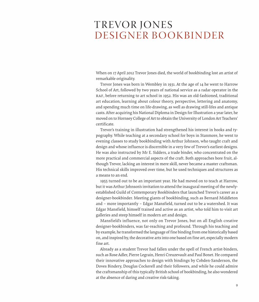
Fig.3 | ‘Portrait of the Artist as a Young Bookbinder’ from Wembley News, 1959.
1 0 1 1
pink, cavort on delicately-tinted natural goatskin, alluding to the happy reconcilia-tion at the end of this comedy.
Already in the early 1970s there were signs in fine arts of a move away from Modernism and a return to historicism and eclecticism. Abstract art was losing favour to the representational. Architecture experimented with structures visible on the outside (such as the Centre Pompidou in Paris or the Lloyds building in London). In bookbinding too, structure as a design feature became more important – possibly inspired by the new architecture, but also by the rescue work during the 20 years or so following the Florence flood of 1966. This brought several binders into close contact with simple, open, visible structures, so common in the sixteenth century. Their easy functionality was adopted by many conservators, but their appearance too seemed to have inspired the renewed interest in structures shown by several designer-binders in their experiments with different and visible sewing and lacing-in techniques.
For Trevor the structure was one of the elements, together with colour and mate-rials, from which his designs evolved. Both the tapes and the sewing of his binding of John Clare’s Birds Nesting (cat.no.107) are exposed, the tapes ending in buttons covered in pale blue speckled kidskin: eight eggs in a large bird’s nest that stretches across both covers and is lined with grasses, strips of straw and feathers in subtle shades of beige and brown.
Trevor often began a binding with nothing more specific than a choice of materi-als, colours and maybe a technique, letting the design grow in the course of binding. His way of working is encompassed in a repeatedly quoted statement:
Bookbinding is for me a discipline necessary in the process of creating a design. If I could visualise the design complete and entire in advance then there would be no need to embark upon the binding.
A whole range of decorative techniques proved inspirational for letting the designs take shape. Trevor’s sculptural effects, achieved either by manipulating the leather or by modelling it over raised elements, his extensive use of onlays and inlays, of gold or blind tooling, or his use of metal or other textured surfaces impressed into the leather can all be found, resulting in an astonishing variety of designs.
Fig.4 | left: Book sewn on two widths of tape, one with link-stitching. right: Headband before trimming.
In the early 1960s Trevor came across a group of people responsible for introduc-ing what they called the Basic Course in art education, focusing on dissecting and analysing forms and discovering structural principles and systems. Much of this movement was influenced by the German Bauhaus, by Paul Klee and Moholy-Nagy. Its inspiration also reached graphic design and binding design, as can be seen on Trevor’s binding of De Fontenelle, A Plurality of Worlds (cat.no.35).
Trevor’s own teaching career took him in 1959 to St John’s College, York, where he lectured in Art and Crafts. The College merged in 1975 with Ripon College to become the College of Ripon and York, St John, an institute of higher education affiliated to the University of Leeds. For the next nine years he taught bookbinding there as well as the history of art and architecture. Both these subjects continued to inspire his own bindings.
When painting and also sculpture became non-figurative, their ideas were more readily translatable into binding design. Abstraction opened the way to a greater variety of interpretation. For many modern binders the representational had become inhibiting. It took Trevor himself 20 years before he felt at ease with the idea that his training as an illustrator could be of legitimate use for his binding designs, and many of his later bindings have representational designs, such as The Hue and Cry (cat.no.144) with its running naked male figures, inspired by the photographs by Edweard Muybridge, whose sequence of the human figure in motion also inspired the designs for both the bindings of Bannet’s Amazons with their walking women (cat.nos 49 and 69) and the fast-moving characters flitting in and out of parts of stage sets on the binding of Terence’s Andria (cat.no.134).
The binding on Thomas Browne’s Urne Buriall (cat.no.133), showing a buried urn, a worm emanating from the eye of a skull, narrow-leaved plants beneath a burn-ing sun, in colours reminiscent of Paul Nash’s illustrations for this book, also has figurative elements. Its design is retrospective in mood, evocative of a desert garden, of decay, death and burial. But, unlike many pictorial bindings from the past, these bindings do not just show a picture or an illustration. They transform, subvert even, the representation into an evocation of the spirit of the book. The haunting design for Death of a Salesman (cat.no.118) provides another good example. This binding, made in 1993, shows the same face (based on the binder’s own) twice, first with a slightly melancholy expression, then frightened and despairing, the mouth open in a silent scream.
Although from the 1970s onwards many of Trevor’s designs showed representa-tions, often of (parts of) the human form, or combined the figurative with the non-figurative, the majority of his binding designs were abstract, formally geometric or more purely decorative. His use of spirit dyes combined with stencils or resist techniques, sometimes together with other decorative methods, enabled him to extend the range of possibilities while experimenting with colours and shapes.
The use of dyes or paint was nothing new: several eighteenth- and nineteenth-century binders in particular used stains, inks in different shades, as well as paint for decorative effects. Yet their patterns and pictures are a far cry from the subtle colour shading and the forms, either sharply defined or blurred, that we see on Trevor’s bindings. One of the many examples of his use of this technique can be seen on the binding of Aristophanes’ Lysistrata (cat.no.52), where naked bodies, shaded
Fig.3 | ‘Portrait of the Artist as a Young Bookbinder’ from Wembley News, 1959.
1 0 1 1
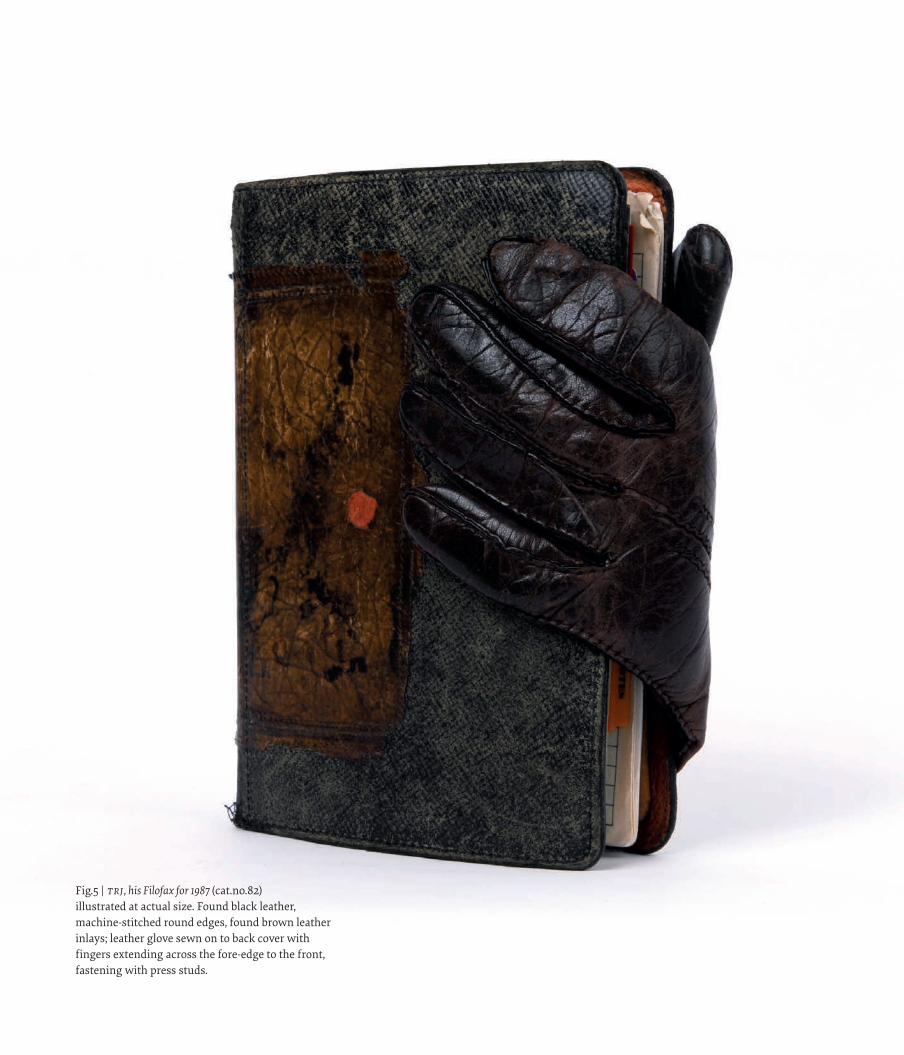
The materials themselves were also instrumental in the binding’s development. The natural marks and imperfections in vellum, the characteristics, grain and edge contours of the leather, or better still, the found materials, including bits of old handbags or discarded gloves, bootlaces or pieces of fur, were all employed to extraordinary effect. Each binding became an adventure, the outcome sometimes a happy accident, often light-hearted, containing an element of mischief, eliciting delight rather than reverence or awe in those who see and handle his bindings. His design philosophy was, after all, to make his bindings fun.
Around 1975 Trevor began to bring design elements from the outside to the in-side of the boards. He made use of leather doublures, either to continue the play of shapes and colours that formed the images on the covers or to create a new field for artistic endeavour. Endpapers were often paste-papers made with maize starch and powdered watercolours, producing a wide variety of textures, shades and patterns. The endbands, their colours matching or complementing those of the covers, sewn in different ways, all contributed to the finished whole.
But it was the book that remained central to Trevor’s approach: the author, the language, the text itself, the illustrations, but also the paper, the layout, the typo-graphy, its format and its shape. All these elements and his response to them were necessary to create his bindings.
His response to a particular author or a particular text was by no means always the same, nor is it always easy to understand. Sometimes it is necessary to be famil-iar with the text, thinking about possible interpretations, attempting to get inside the artist’s mind, but in other cases it is enough to let the atmosphere of the book emerge from its binding.
Fig.6 | Detail from Percy Bysshe Shelley, Selected Poems (cat.no.88).
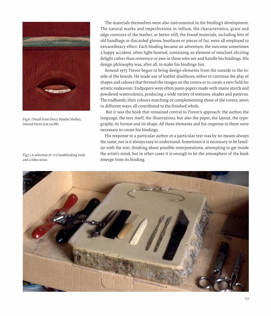
Fig.7 | A selection of tj’s bookbinding tools and a litho stone.
Fig.5 | TRJ, his Filofax for 1987 (cat.no.82) illustrated at actual size. Found black leather, machine-stitched round edges, found brown leather inlays; leather glove sewn on to back cover with fingers extending across the fore-edge to the front, fastening with press studs.
1 3
The materials themselves were also instrumental in the binding’s development. The natural marks and imperfections in vellum, the characteristics, grain and edge contours of the leather, or better still, the found materials, including bits of old handbags or discarded gloves, bootlaces or pieces of fur, were all employed to extraordinary effect. Each binding became an adventure, the outcome sometimes a happy accident, often light-hearted, containing an element of mischief, eliciting delight rather than reverence or awe in those who see and handle his bindings. His design philosophy was, after all, to make his bindings fun.
Around 1975 Trevor began to bring design elements from the outside to the in-side of the boards. He made use of leather doublures, either to continue the play of shapes and colours that formed the images on the covers or to create a new field for artistic endeavour. Endpapers were often paste-papers made with maize starch and powdered watercolours, producing a wide variety of textures, shades and patterns. The endbands, their colours matching or complementing those of the covers, sewn in different ways, all contributed to the finished whole.
But it was the book that remained central to Trevor’s approach: the author, the language, the text itself, the illustrations, but also the paper, the layout, the typo-graphy, its format and its shape. All these elements and his response to them were necessary to create his bindings.
His response to a particular author or a particular text was by no means always the same, nor is it always easy to understand. Sometimes it is necessary to be famil-iar with the text, thinking about possible interpretations, attempting to get inside the artist’s mind, but in other cases it is enough to let the atmosphere of the book emerge from its binding.
Fig.6 | Detail from Percy Bysshe Shelley, Selected Poems (cat.no.88).
Fig.7 | A selection of tj’s bookbinding tools and a litho stone.
Fig.5 | TRJ, his Filofax for 1987 (cat.no.82) illustrated at actual size. Found black leather, machine-stitched round edges, found brown leather inlays; leather glove sewn on to back cover with fingers extending across the fore-edge to the front, fastening with press studs.
1 3
Related Documents