UNIVERSITY OF SHEFFIELD The energy costs of commuting: a spatial microsimulation approach by Robin Lovelace, MSc BSc A thesis submitted as partial fulfilment of the requirements for the degree of Doctor of Philosophy in the Faculty of Social Sciences Department of Geography January 2014

Welcome message from author
This document is posted to help you gain knowledge. Please leave a comment to let me know what you think about it! Share it to your friends and learn new things together.
Transcript

UNIVERSITY OF SHEFFIELD
The energy costs of commuting: a
spatial microsimulation approach
by
Robin Lovelace, MSc BSc
A thesis submitted as partial fulfilment of the requirements for the
degree of Doctor of Philosophy
in the
Faculty of Social Sciences
Department of Geography
January 2014


“A finales del siglo XX, y gracias a su automovil privado, un simple trabajador podıa
residir en un lugar determinado pero desempenar su trabajo, diariamente, en otro lugar
que se encuentra a 50 o 60 km de distancia. Este hecho, que para tal ciudadano formaba
parte de la rutina de su vida cotidiana, constituye, sin duda, uno de los mas grandes
enigmas de la antropologıa y la historia”
Jose Ardillo, El Salario del Gigante
“Towards the end of the 20th century, and thanks to the private automobile, a simple
worker could live in one place but carry out their work, daily, 50 to 60 km away. This
fact, which for the citizen formed part of their everyday routine, constitutes, without
doubt, one of the greatest enigmas of Anthropology and History”
Author’s translation

Abstract
Commuting is a daily ritual for a large proportion of the world’s population. It is
important materially, consuming large amounts of time, money and natural resources.
As with many routine activities travel to work is often taken for granted but its energy
consumption is of particular interest due to its heavy reliance on fossil fuels and the
inflexibility of the demand for commuting. This understudied area of knowledge, the
energy costs of travel to work, forms the basis of the thesis.
There is much research into commuting and transport energy use as separate fields,
but they have rarely been combined in the same analysis, let alone at high levels of
geographical resolution. The well-established field of spatial microsimulation offers tools
for investigating commuting patterns in detail at local and individual levels, with major
potential benefits for transport planning. For the first time this method is deployed to
study commuter energy use between and within small administrative zones.
The maps of commuter energy use presented in this thesis illustrate this variability at
national, regional and local levels. Supporting previous research, the results suggest that
a range of geographical factors influence energy use for travel. This has important policy
implications: when high transport energy use in commuting is due to lack of jobs in the
vicinity, for example, modal shift (e.g. from cars to bicycles) on its own has a limited
potential to reduce energy costs. Such insights are quantified using existing aggregate
data. The main methodological contribution of this work, however, is to add individual-
level factors to the analysis — creating the potential for policy makers to also assess
the distributional impacts of their interventions and target specific types of commuters
having high transport energy costs, rather than treat areas as homogeneous blocks. This
potential is demonstrated with a case study of South Yorkshire, where commuting energy
use is cross-tabulated by socio-economic variables and disaggregated over geographical
space. The areas where commuting energy use is less evenly distributed across the
population, for example in urban centres, are likely to benefit most from policies that
target the specific groups. Areas where commuter energy use is more even, such as
Stocksbridge (in Northwest Sheffield), will benefit from more universal policies.
The thesis contributes to human knowledge new information about the energy costs
of commuting, its variability at various levels and insight into the implications. New
methods of generating and analysing individual-level data for the analysis of commuter
energy use have also been developed. These are reproducible (see the GitHub repository
“thesis-reproducible” for example code and data) and will be of interest to researchers
and policy makers investigating the energy security, resource efficiency and potential
welfare impacts of interventions in personal travel systems.

Acknowledgements
It should be acknowledged at the outset that some parts of the thesis have been pub-
lished:
• Parts of section 4.5 have been published in Computers, Environment and Urban
Systems (Lovelace and Ballas, 2013).
• The tutorial “Spatial microsimulation in R”, a supplement to Lovelace and Ballas
(2013), is based on Section 4.5.3.
• The results presented in chapter 7 have been published in the Journal of Transport
Geography (Lovelace et al., 2013).
• Results presented in chapter 8 have been published in Geoforum (Lovelace and
Philips, 2014).
Thanks to my supervisors Dimitris Ballas, Matt Watson and Stephen Beck for unceasing
encouragement and guidance throughout. Dimitris has been instrumental in developing
the methodological direction of the PhD project. I will be forever grateful for the
guidance provided in the research and beyond.
Many thanks to Carlota for keeping my spirits up throughout. To Engineers Without
Borders for allowing me to get my hands dirty, a feature too often missing from modern
research. To my house-mates for providing a fun and homely habitat in Sheffield. To
my parents, who instigated trips into the Peak District — the ultimate antidote to
square-eyes. To my dear friends in Sheffield, especially James Folkes for providing pedal-
powered entertainments and Joseph Moore for ‘moore’ distractions.
Thanks to the E-Futures Doctoral Training Centre. E-Futures was vital to this PhD,
not only for providing funding that allowed its students financial security to dedicate
themselves to study. E-Futures also provided a forum for debate. The encouragement
from peers and across disciplines was inspirational. Neil Lowrie deserves special mention
here, as he helped channel my energy away from confrontations with coal-fired power
station operators and towards research. Thanks.
Thanks to the Department of Geography, for providing an academic home and a quiet
desk. Members of the Social and Spatial Inequalities group (SASI), especially, provided
feedback on my work, and encouraged the investigation of how commuting affects people,
not just energy. I thank Luke Temple and Mark Green in particular in this regard.
Thanks to the open source software movement in general and to the developers of R
and LATEX (in which the document was written) in particular. Hadley Wickham stands
v

out in this regard, whose own thesis (Wickham, 2008), led to the ggplot2 package used
for many of the visualisations. Thanks to Github for hosting code and data that should
make the methods and results more accessible and reproducible for others.1
The thesis has benefited from the feedback of people who read early drafts of various
sections and chapters: Milan Delor, Ian Philips, Jake Gower, Chris Hunter, Charlotte
Bjork and my father David Lovelace. Dan Olner’s input was especially beneficial in the
final stages. Thanks to all for providing additional feedback and support outside of the
usual academic channels.
My penultimate thank you is for writers who awoke my interest in this topic: Ivan Illich,
John Michael Greer, Howard T. Odum, George Monbiot and Vaclav Smil.
The final thank you is to the examiners of the thesis, Charles Pattie and Michael Batty.
1Sample code and data used can be found on github.com/Robinlovelace/. In particular, reproducibleversions of the results can be found in the thesis-reproducible repository.

Contents
Abstract iv
Acknowledgements v
Table of Contents vii
List of Figures xi
List of Tables xv
Abbreviations xvii
Symbols xix
1 Introduction 1
1.1 The ‘Big Picture’ . . . . . . . . . . . . . . . . . . . . . . . . . . . . . . . . 1
1.1.1 Climate change . . . . . . . . . . . . . . . . . . . . . . . . . . . . . 2
1.1.2 Peak oil and resource depletion . . . . . . . . . . . . . . . . . . . . 8
1.1.3 Inequality and well-being . . . . . . . . . . . . . . . . . . . . . . . 10
1.2 Commuter energy use: everyday realities . . . . . . . . . . . . . . . . . . . 12
1.3 The importance of commuting . . . . . . . . . . . . . . . . . . . . . . . . . 15
1.3.1 Trips . . . . . . . . . . . . . . . . . . . . . . . . . . . . . . . . . . . 15
1.3.2 Distance . . . . . . . . . . . . . . . . . . . . . . . . . . . . . . . . . 15
1.3.3 Time . . . . . . . . . . . . . . . . . . . . . . . . . . . . . . . . . . . 17
1.4 Thesis overview . . . . . . . . . . . . . . . . . . . . . . . . . . . . . . . . . 18
1.5 Aims and objectives . . . . . . . . . . . . . . . . . . . . . . . . . . . . . . 19
1.5.1 Aims . . . . . . . . . . . . . . . . . . . . . . . . . . . . . . . . . . . 20
1.5.2 Objectives . . . . . . . . . . . . . . . . . . . . . . . . . . . . . . . . 20
1.5.3 Methods . . . . . . . . . . . . . . . . . . . . . . . . . . . . . . . . . 21
2 Personal transport, energy and commuting 23
2.1 The sustainable mobility paradigm . . . . . . . . . . . . . . . . . . . . . . 24
2.1.1 Active travel . . . . . . . . . . . . . . . . . . . . . . . . . . . . . . 27
2.2 Commuting research: individual to national levels . . . . . . . . . . . . . 29
2.2.1 Personal factors: psychology, family and community . . . . . . . . 30
2.2.2 Behavioural economics and its impacts on commuting . . . . . . . 31
2.2.3 The local and regional economy . . . . . . . . . . . . . . . . . . . . 33
vii

contents
2.2.4 National and global considerations . . . . . . . . . . . . . . . . . . 35
2.3 Energy use and CO2 in transport studies . . . . . . . . . . . . . . . . . . 36
2.3.1 The energy costs of urban form: urban sprawl and compact cities . 38
2.3.2 The energy costs of different transport modes . . . . . . . . . . . . 38
2.3.3 The climate impacts of transport . . . . . . . . . . . . . . . . . . . 40
2.4 The energy impacts of commuting . . . . . . . . . . . . . . . . . . . . . . 42
2.5 Commuting and energy use research: tools of the trade . . . . . . . . . . . 43
2.5.1 ‘Scientific’ approaches to energy and transport . . . . . . . . . . . 44
2.5.2 Visualisation methods . . . . . . . . . . . . . . . . . . . . . . . . . 46
2.5.3 Harnessing the ‘data deluge’ . . . . . . . . . . . . . . . . . . . . . . 47
2.6 Concepts in energy and commuting . . . . . . . . . . . . . . . . . . . . . . 47
2.7 Summary of the literature . . . . . . . . . . . . . . . . . . . . . . . . . . . 49
3 Spatial microsimulation and its application to transport problems 51
3.1 Definitions: what is spatial microsimulation? . . . . . . . . . . . . . . . . 52
3.2 The history of spatial microsimulation . . . . . . . . . . . . . . . . . . . . 56
3.2.1 Pre-computer origins . . . . . . . . . . . . . . . . . . . . . . . . . . 56
3.2.2 The digital revolution . . . . . . . . . . . . . . . . . . . . . . . . . 59
3.2.3 Statistical methods for estimation . . . . . . . . . . . . . . . . . . 60
3.2.4 Modern spatial microsimulation . . . . . . . . . . . . . . . . . . . . 63
3.3 Spatial microsimulation: state of the art . . . . . . . . . . . . . . . . . . . 64
3.3.1 Types of spatial microsimulation models . . . . . . . . . . . . . . . 64
3.3.2 Reweighting algorithms . . . . . . . . . . . . . . . . . . . . . . . . 65
3.3.3 Transport applications . . . . . . . . . . . . . . . . . . . . . . . . . 67
3.4 Microsimulation in urban modelling . . . . . . . . . . . . . . . . . . . . . 69
3.4.1 Dedicated transport models . . . . . . . . . . . . . . . . . . . . . . 70
3.4.2 Land-use transport models . . . . . . . . . . . . . . . . . . . . . . 72
3.5 Summary: research directions and applications . . . . . . . . . . . . . . . 73
4 Data and methods 77
4.1 Introduction . . . . . . . . . . . . . . . . . . . . . . . . . . . . . . . . . . . 77
4.2 Energy use data . . . . . . . . . . . . . . . . . . . . . . . . . . . . . . . . 81
4.3 Social survey data . . . . . . . . . . . . . . . . . . . . . . . . . . . . . . . 83
4.3.1 Geographically aggregated data . . . . . . . . . . . . . . . . . . . . 84
4.3.2 The Understanding Society dataset . . . . . . . . . . . . . . . . . . 88
4.3.3 The National Travel Survey . . . . . . . . . . . . . . . . . . . . . . 89
4.3.4 Other commuting datasets . . . . . . . . . . . . . . . . . . . . . . . 93
4.4 Geographical data: infrastructure and environment . . . . . . . . . . . . . 95
4.4.1 Infrastructure . . . . . . . . . . . . . . . . . . . . . . . . . . . . . . 95
4.4.2 Topographic data . . . . . . . . . . . . . . . . . . . . . . . . . . . . 100
4.4.3 Remoteness . . . . . . . . . . . . . . . . . . . . . . . . . . . . . . . 101
4.5 Building a spatial microsimulation model in R . . . . . . . . . . . . . . . . 103
4.5.1 Why R? . . . . . . . . . . . . . . . . . . . . . . . . . . . . . . . . . 105
4.5.2 IPF theory: a worked example . . . . . . . . . . . . . . . . . . . . 107
4.5.3 Implementing IPF in R . . . . . . . . . . . . . . . . . . . . . . . . 111
4.6 Model checking and validation . . . . . . . . . . . . . . . . . . . . . . . . 118
4.6.1 Model checking . . . . . . . . . . . . . . . . . . . . . . . . . . . . . 118

contents ix
4.6.2 Model validation . . . . . . . . . . . . . . . . . . . . . . . . . . . . 120
4.6.3 Additional validation methods . . . . . . . . . . . . . . . . . . . . 125
4.7 Integerisation . . . . . . . . . . . . . . . . . . . . . . . . . . . . . . . . . . 127
4.7.1 Method . . . . . . . . . . . . . . . . . . . . . . . . . . . . . . . . . 128
4.7.2 Results . . . . . . . . . . . . . . . . . . . . . . . . . . . . . . . . . 138
4.7.3 Discussion and conclusions . . . . . . . . . . . . . . . . . . . . . . 142
5 Energy use in personal travel systems 145
5.1 Fundamentals of energy use in transport . . . . . . . . . . . . . . . . . . . 147
5.1.1 The factors driving energy use in transport . . . . . . . . . . . . . 149
5.1.2 System boundaries . . . . . . . . . . . . . . . . . . . . . . . . . . . 149
5.1.3 Early quantifications of energy use in transport . . . . . . . . . . . 152
5.2 Direct energy use: published estimates . . . . . . . . . . . . . . . . . . . . 153
5.3 Calculating system level energy use . . . . . . . . . . . . . . . . . . . . . . 157
5.3.1 The embedded energy of fuel . . . . . . . . . . . . . . . . . . . . . 159
5.3.2 Vehicle manufacture . . . . . . . . . . . . . . . . . . . . . . . . . . 164
5.3.3 Guideway manufacture . . . . . . . . . . . . . . . . . . . . . . . . . 168
5.4 Additional factors affecting energy use . . . . . . . . . . . . . . . . . . . . 170
5.4.1 Frequency of trip . . . . . . . . . . . . . . . . . . . . . . . . . . . . 171
5.4.2 Occupancy . . . . . . . . . . . . . . . . . . . . . . . . . . . . . . . 175
5.4.3 Efficiency impacts of trip distance . . . . . . . . . . . . . . . . . . 177
5.4.4 Circuity . . . . . . . . . . . . . . . . . . . . . . . . . . . . . . . . . 179
5.4.5 Efficiency impacts of congestion . . . . . . . . . . . . . . . . . . . . 182
5.4.6 Behaviour . . . . . . . . . . . . . . . . . . . . . . . . . . . . . . . . 184
5.4.7 Environmental conditions . . . . . . . . . . . . . . . . . . . . . . . 185
5.5 Variability over time . . . . . . . . . . . . . . . . . . . . . . . . . . . . . . 187
5.5.1 The improving fleet efficiency of cars . . . . . . . . . . . . . . . . . 187
5.5.2 Modal shift . . . . . . . . . . . . . . . . . . . . . . . . . . . . . . . 190
5.5.3 Future efficiency improvements . . . . . . . . . . . . . . . . . . . . 194
5.6 Variability over space: local fleet efficiencies . . . . . . . . . . . . . . . . . 198
5.7 Final energy use estimates . . . . . . . . . . . . . . . . . . . . . . . . . . . 204
6 The energy costs of commuting 207
6.1 Commuter energy use at the national level . . . . . . . . . . . . . . . . . . 208
6.2 Regional and sub-regional patterns . . . . . . . . . . . . . . . . . . . . . . 212
6.3 Total commuting energy use and comparisons with other sectors . . . . . 218
6.4 Local and individual level variability . . . . . . . . . . . . . . . . . . . . . 223
6.4.1 A case study from South Yorkshire . . . . . . . . . . . . . . . . . . 224
6.5 A comparison of commuter energy use in England and the Netherlands . . 227
6.5.1 Data, method and results . . . . . . . . . . . . . . . . . . . . . . . 229
6.5.2 Explaining Dutch commuter energy use . . . . . . . . . . . . . . . 231
6.5.3 Data inconsistencies and caveats . . . . . . . . . . . . . . . . . . . 233
6.6 Discussion . . . . . . . . . . . . . . . . . . . . . . . . . . . . . . . . . . . . 235
7 Social and spatial inequalities in commuter energy use 237
7.1 The importance of distributional impacts in transport studies . . . . . . . 237
7.2 Model implementation . . . . . . . . . . . . . . . . . . . . . . . . . . . . . 242

contents
7.3 Assigning work location . . . . . . . . . . . . . . . . . . . . . . . . . . . . 244
7.4 Model validation . . . . . . . . . . . . . . . . . . . . . . . . . . . . . . . . 247
7.5 Results . . . . . . . . . . . . . . . . . . . . . . . . . . . . . . . . . . . . . . 250
7.6 Discussion . . . . . . . . . . . . . . . . . . . . . . . . . . . . . . . . . . . . 255
8 Scenarios of change 259
8.1 Modal shift: ‘going Dutch’ . . . . . . . . . . . . . . . . . . . . . . . . . . . 261
8.1.1 An aggregate level model of modal shift . . . . . . . . . . . . . . . 262
8.1.2 A spatial microsimulation implementation . . . . . . . . . . . . . . 265
8.1.3 Taking the scenario further . . . . . . . . . . . . . . . . . . . . . . 267
8.2 Reducing commute frequency: ‘going Finnish’ . . . . . . . . . . . . . . . . 268
8.3 Reduction in commute distance: ‘eco-localisation’ . . . . . . . . . . . . . . 271
8.4 Oil vulnerability . . . . . . . . . . . . . . . . . . . . . . . . . . . . . . . . 273
8.4.1 Metrics of vulnerability: resources, jobs, money . . . . . . . . . . . 274
8.4.2 Results: trips, distance and energy use . . . . . . . . . . . . . . . . 277
8.4.3 Local and individual level results . . . . . . . . . . . . . . . . . . . 280
8.5 Discussion: policy relevance and limitations . . . . . . . . . . . . . . . . . 284
8.5.1 Policy relevance of findings . . . . . . . . . . . . . . . . . . . . . . 285
8.5.2 Limitations of the approach . . . . . . . . . . . . . . . . . . . . . . 287
9 Conclusions 291
9.1 Methodological contribution . . . . . . . . . . . . . . . . . . . . . . . . . . 292
9.2 Policy relevance and limitations . . . . . . . . . . . . . . . . . . . . . . . . 294
9.3 Summary of findings . . . . . . . . . . . . . . . . . . . . . . . . . . . . . . 295
9.4 Further work . . . . . . . . . . . . . . . . . . . . . . . . . . . . . . . . . . 297
9.5 Thesis evaluation and summary . . . . . . . . . . . . . . . . . . . . . . . . 299
Bibliography 303
Index 339

List of Figures
1.1 UK transport emissions by source in 2009 (DECC, 2011c). . . . . . . . . . 3
1.2 The greenhouse gas emissions per unit energy of various fuels . . . . . . . 6
1.3 Biofuels’ contribution to global transportation energy use . . . . . . . . . 9
1.4 Average prices of Brent Crude oil spot prices, 1992 – 2012 . . . . . . . . . 10
1.5 UK Gini index for market and disposable income in context (OECD, 2011). 11
1.6 Commuting options to Tyrrell’s crisp factory . . . . . . . . . . . . . . . . 13
1.7 Average number of trips per person per year across Great Britain. . . . . 16
1.8 Average trip length by purpose in Great Britain. . . . . . . . . . . . . . . 16
1.9 Total distance travelled by mode in Great Britain. . . . . . . . . . . . . . 17
1.10 Time spent commuting in Great Britain . . . . . . . . . . . . . . . . . . . 18
2.1 The sustainable transport hierarchy (Kay et al., 2011). . . . . . . . . . . . 26
2.2 Proportion of trips by active travel by distance and mode . . . . . . . . . 29
2.3 Schematic for organising research commuting research by scale. . . . . . . 30
2.4 Energy performance of different modes, from (Radtke, 2008). . . . . . . . 39
3.1 Schematic a transport simulation model . . . . . . . . . . . . . . . . . . . 53
3.2 MATSim schema (permission: Michael Balmer) . . . . . . . . . . . . . . . 71
4.1 Idealised data schema for studying energy use in commuting . . . . . . . . 78
4.2 Questions 33 and 34 of the 2001 UK Census . . . . . . . . . . . . . . . . . 83
4.3 National, regional and city-wide scales of analysis . . . . . . . . . . . . . . 85
4.4 Cross-tabulated dataset containing mode/age/sex variables . . . . . . . . 87
4.5 Bar-plot of frequency of working from home . . . . . . . . . . . . . . . . . 92
4.6 Schematic of transport networks and vehicles . . . . . . . . . . . . . . . . 96
4.7 Visualisation of the OSM data source of the transport network. . . . . . . 97
4.8 The Meridian 2 transport network dataset. . . . . . . . . . . . . . . . . . 98
4.9 The Ordnance Survey’s Integrated Travel Network dataset. . . . . . . . . 99
4.10 Distribution of employment in Sheffield . . . . . . . . . . . . . . . . . . . 103
4.11 Illustration of how distance to employment centre was calculated. . . . . . 104
4.12 Scatter plot of the fit between census and survey data . . . . . . . . . . . 115
4.13 Scatter plot showing the fit after constraining by age. . . . . . . . . . . . 117
4.14 Improvement of model fit with iterations . . . . . . . . . . . . . . . . . . . 117
4.15 Diagnostic plot to check the sanity of age and sex inputs. . . . . . . . . . 119
4.16 Diagnostic plots to identify model error . . . . . . . . . . . . . . . . . . . 120
4.17 Scatter plot of simulated vs official estimated income . . . . . . . . . . . . 122
4.18 Scatter plot of error introduced in Nomis data . . . . . . . . . . . . . . . . 124
4.19 Errors associated with Casweb census variables . . . . . . . . . . . . . . . 124
xi

List of Figures
4.20 Scatter plot of the proportion of male drivers . . . . . . . . . . . . . . . . 125
4.21 Overplotted scatter graph showing the distribution of IPF weights . . . . 131
4.22 Histograms of original microdata and integerised weights . . . . . . . . . . 133
4.23 Overplotted scatter graphs of index against weight . . . . . . . . . . . . . 135
4.24 Scatter graph of the index values of individuals . . . . . . . . . . . . . . . 135
4.25 Visualisation of IPF method . . . . . . . . . . . . . . . . . . . . . . . . . . 137
4.26 Scatter graph illustrating the fit between census and simulated aggregates 137
4.27 Scatterplots of actual (census) and simulated population totals . . . . . . 139
5.1 Schematic diagram of the factors causing energy use in transport. . . . . . 150
5.2 Relative importance of fixed and variable costs of car ownership . . . . . . 151
5.3 Schematic of physical system boundaries in personal transport systems. . 152
5.4 Screen shot of the spreadsheet used to calculate system level energy costs. 159
5.5 UK transport energy consumption by mode and energy source . . . . . . 163
5.6 Iron ore mine and 3D CAD images of two modern car engines . . . . . . . 165
5.7 Frequency of trips to work each week, by distance . . . . . . . . . . . . . 172
5.8 Proportion of trips by distance for different trip frequencies . . . . . . . . 173
5.9 Relationship between trip frequency and distance . . . . . . . . . . . . . . 174
5.10 Average car occupancies over time in three regions . . . . . . . . . . . . . 177
5.11 The impact of car speed on efficiency, from (Anas and Hiramatsu, 2012). . 178
5.12 Line graph of energy intensity vs trip distance . . . . . . . . . . . . . . . . 179
5.13 Schematic of Euclidean and network distances . . . . . . . . . . . . . . . . 179
5.14 The decay of circuity with distance travelled . . . . . . . . . . . . . . . . . 180
5.15 EU test cycle . . . . . . . . . . . . . . . . . . . . . . . . . . . . . . . . . . 182
5.16 Urban and extra-urban energy use of selected models . . . . . . . . . . . . 183
5.17 The commuting ‘rush hours’ . . . . . . . . . . . . . . . . . . . . . . . . . . 184
5.18 Fleet efficiency of UK vehicles over time . . . . . . . . . . . . . . . . . . . 189
5.19 Comparison of UK car fleet efficiency estimates over time (DfT, 2013). . . 190
5.20 Fleet efficiencies of new cars in the UK and USA, 1977-2012 . . . . . . . . 191
5.21 Mode of transport to work, 1890-1990 . . . . . . . . . . . . . . . . . . . . 192
5.22 Estimates of energy use per commuter trip, 1890-1990 . . . . . . . . . . . 193
5.23 Modal split of travel to work over two decades . . . . . . . . . . . . . . . 193
5.24 The growing dominance of the car, 1981 to 2001 . . . . . . . . . . . . . . 194
5.25 Fuel energy use of future car technologies . . . . . . . . . . . . . . . . . . 195
5.26 Barpolt of 2001 car registrations by emission band . . . . . . . . . . . . . 201
5.27 Scatterplots of estimated fleet efficiencies at MSOA level . . . . . . . . . . 202
5.28 Car fleet efficiencies in Yorkshire and the Humber in 2001 . . . . . . . . . 203
5.29 Final energy use estimates, from a range of sources. . . . . . . . . . . . . 205
5.30 Fuel energy use of UK transport modes, 1991 . . . . . . . . . . . . . . . . 206
6.1 Distance bands and average distance travelled for motorised modes . . . . 211
6.2 Distance bands and average distance travelled for active modes . . . . . . 212
6.3 Mode and distance categories of commute in England . . . . . . . . . . . 213
6.4 Comparison of commute energy costs between England and Wales. . . . . 213
6.5 Average energy use per trip (Etrp, in MJ) in English regions . . . . . . . 214
6.6 Raw count data of commuters by mode and distance. . . . . . . . . . . . . 214
6.7 Average energy use per commuter trip at the county level . . . . . . . . . 216

List of Figures xiii
6.8 Average energy use per commuter trip at the district level . . . . . . . . . 217
6.9 Average energy use per trip (Etrp, in MJ) in English wards . . . . . . . . 218
6.10 Proportion of energy use caused by train trips . . . . . . . . . . . . . . . . 219
6.11 Proportion of total energy use in the UK consumed by commuting . . . . 221
6.12 Proportion of transport energy use in the UK consumed by commuting. . 222
6.13 Commuter energy use in South Yorkshire. . . . . . . . . . . . . . . . . . . 226
6.14 Proportion of energy used for commuting by the top 20% . . . . . . . . . 226
6.15 Relative energy use by top social classes . . . . . . . . . . . . . . . . . . . 228
6.16 Comparison of commuter energy use in England and the Netherlands . . . 230
6.17 Modal split of commuter trips in England and the Netherlands . . . . . . 231
6.18 Distance of commuting by mode, England and the Netherlands . . . . . . 232
6.19 Population density against commuter energy use . . . . . . . . . . . . . . 233
6.20 Average commuter trip distance over time in Great Britain . . . . . . . . 234
6.21 Modal split of commuter trips, Great Britain 1995 - 2009 . . . . . . . . . 234
7.1 Trip distance and mode by household income . . . . . . . . . . . . . . . . 238
7.2 Heatmap of mode of travel by income group . . . . . . . . . . . . . . . . . 239
7.3 Fit between simulated and census data . . . . . . . . . . . . . . . . . . . . 243
7.4 Employment density at the local level in Sheffield . . . . . . . . . . . . . . 244
7.5 Flow diagram of commuter destinations from Stocksbridge . . . . . . . . . 245
7.6 Simulated route choice for 20 randomly selected individuals . . . . . . . . 246
7.7 Circuity as a function of distance in Sheffield . . . . . . . . . . . . . . . . 247
7.8 Comparison of census and simulated results at the aggregate level . . . . 248
7.9 Mean equivalised household income from official and simulated data . . . 249
7.10 Proportion of trips, distance, and energy by mode . . . . . . . . . . . . . 252
7.11 Average distance travelled to work in Yorkshire and the Humber . . . . . 253
7.12 Average distance to employment centre in South Yorkshire . . . . . . . . 253
7.13 Scatter plot of distance vs energy costs in Yorkshire and the Humber . . . 254
7.14 a) Income and household traits; b) Lorenz curves of commute distances . 256
7.15 Low-income car-free families and bus-stops in South Yorkshire . . . . . . 257
8.1 Estimated energy savings from car-bicycle modal shift . . . . . . . . . . . 264
8.2 The relationship between age and bicycle use . . . . . . . . . . . . . . . . 266
8.3 Energy savings from car-bike modal shift in South Yorkshire . . . . . . . . 267
8.4 Differences between individual and aggregate level implementations . . . . 268
8.5 Energy savings from telecommuting scenario in South Yorkshire. . . . . . 270
8.6 Vulnerability of commuter patterns in Yorkshire and the Humber . . . . . 278
8.7 Scatterplot matrix of vulnerability metrics . . . . . . . . . . . . . . . . . . 279
8.8 Chloropleth map of deprivation in Yorkshire and the Humber . . . . . . . 280
8.9 Distance to employment centre from zone centroids . . . . . . . . . . . . . 281
8.10 MSOA zones in York, coloured according to distance travelled to work . . 282


List of Tables
1.1 Top 5 UK sectors in terms of greenhouse gas emissions, 1990-2010 . . . . 4
3.1 Typology of spatial microsimulation methods . . . . . . . . . . . . . . . . 65
3.2 Five entities central to urban modelling, after Wilson (2000) . . . . . . . . 69
4.1 Sample of regional transport energy consumption statistics . . . . . . . . 82
4.2 Aggregate data on energy costs of commuting by scale . . . . . . . . . . . 85
4.3 Selected individual level variables related to commuting . . . . . . . . . . 89
4.4 Comparison of data sources for travel networks . . . . . . . . . . . . . . . 97
4.5 A hypothetical input microdata set . . . . . . . . . . . . . . . . . . . . . . 108
4.6 Hypothetical small area constraints data (s). . . . . . . . . . . . . . . . . 108
4.7 Small area constraints expressed as marginal totals . . . . . . . . . . . . . 108
4.8 The aggregated results of the weighted microdata set . . . . . . . . . . . . 109
4.9 Reweighting the hypothetical microdataset in order to fit Table 4.6. . . . 109
4.10 Aggregated results after constraining for age . . . . . . . . . . . . . . . . . 110
4.11 Summary data for the spatial microsimulation model . . . . . . . . . . . . 136
4.12 Accuracy results for integerisation techniques.* . . . . . . . . . . . . . . . 141
4.13 Differences between census and simulated populations. . . . . . . . . . . . 142
5.1 The direct and indirect energy costs of personal travel (Fels, 1975) . . . . 153
5.2 Direct energy use of selected modes . . . . . . . . . . . . . . . . . . . . . . 154
5.3 Direct greenhouse gas emissions by mode . . . . . . . . . . . . . . . . . . 154
5.4 Conversion table from emissions to energy use by size of car . . . . . . . . 155
5.5 Emissions data and calculated energy use of motorised modes . . . . . . . 157
5.6 Estimates of the energy costs of car manufacture (EMv) . . . . . . . . . . 167
5.7 Average frequency of trips for Euclidean distance bins . . . . . . . . . . . 173
5.8 Average occupancy of car journeys by reason for trip . . . . . . . . . . . . 176
5.9 Vehicle emissions bands of registered vehicles since 2001 . . . . . . . . . . 199
5.10 Average energy usage of cars by tax band . . . . . . . . . . . . . . . . . . 200
5.11 Correlation matrix of estimated fleet efficiencies, 2002-2010 . . . . . . . . 201
5.12 The first 5 rows of the raw DfT emissions band data . . . . . . . . . . . . 203
5.13 Final estimates of the direct and indirect energy use of 8 modes . . . . . . 204
6.1 Average distance travelled by mode and distance band . . . . . . . . . . . 210
6.2 Correlation matrix of energy use for commuting and emissions . . . . . . 222
6.3 Sample of the spatial microsimulation model output . . . . . . . . . . . . 224
6.4 Sample of individual level spatial microsimulation output . . . . . . . . . 225
6.5 Commuter energy use in South Yorkshire areas by class . . . . . . . . . . 227
6.6 Comparison of basic national attributes in England and the Netherlands . 229
xv

List of Tables
6.7 Sample of the raw Dutch commuting data . . . . . . . . . . . . . . . . . . 230
7.1 Aggregate level inputs into the spatial microsimulation model . . . . . . . 243
7.2 The 2nd most common mode of commuting compared with other factors . 246
7.3 Summary statistics of the commuting behaviour of in South Yorkshire . . 250
7.4 Contingency table of variables related to commuting . . . . . . . . . . . . 255
7.5 Commuting characteristics cross-tabulated by income bands . . . . . . . . 255
8.1 Proportion of trips (T), distance (D) and energy (E) by mode . . . . . . . 277
8.2 Summary statistics of vulnerability metrics . . . . . . . . . . . . . . . . . 283
8.3 Individual level characteristics of ‘oil vulnerable’ commuters . . . . . . . . 284
8.4 Differences between commuters affected by the ‘Dutch’ and ‘Finnish’ sce-narios . . . . . . . . . . . . . . . . . . . . . . . . . . . . . . . . . . . . . . 287

Abbreviations
Acronym What it Stands For
kJ kilojoules (103 J)
MJ megajoules (106 J)
GJ gigajoules (109 J)
TJ terajoules (1012 J)
PJ petajoules (1015 J)
EJ exajoules (1018 J)
kWh kilowatt hour (3.6 MJ)
CO2 Carbon dioxide
EROI Energy return on (energy) investment
IPF Iterative proportional fitting
pkm passenger-kilometres
vkm vehicle-kilometres
TRS Truncate replicate sample (integerisation method)
DECC Department of Energy and Climate Change
Defra Department for Environment Food & Rural Affairs
NTS National Travel Survey
ONS Office for National Statistics
OSM Open Street Map
USd Understanding Society dataset
xvii


Symbols
symbol name unit
dE Euclidean distance km
dR route distance km
Etrp direct primary energy use per trip J
ET total energy use of all commuter trips in a given area GJ
ETyr total primary energy per year GJ/yr
Esys total primary energy use (direct and indirect) MJ/km
Ef Direct fuel (including electricity and food) energy use per kilometre MJ/vkm
Efp Energy costs of fuel production MJ/vkm
Ev Energy costs of vehicle production per unit distance MJ/vkm
Eg Energy costs of guideway construction per unit distance MJ/vkm
EMv embodied energy of vehicle production GJ/vehicle
EMg embodied energy of guideway production GJ/km
EI energy intensity of transport per passenger kilometre MJ/pkm
FE fuel economy of vehicle L/100 vkm
Lf load factor of vehicle or mode
Lg lifespan of guideway vehicle passes
Lv lifespan of vehicle vkm
m mode of transport (e.g. car, train)
Oc occupancy, the number of people in each vehicle people/vehicle
P power W (Js−1)
Q circuity: route distance divided by Euclidean distance
η energy conversion efficiency ( Energy inEnergy out)
Toe tonnes of oil equivalent
xix


Chapter 1
Introduction
The research presented in this thesis focuses on commuting and its energy costs. UK
datasets from the beginning of the 21st century form the empirical foundation of the
work. Travel to work statistics are described, analysed and in later chapters modelled to
assess the variability of energy use for this commuting. The underlying motivations are
broader and play an important role throughout the thesis, from the choice of method-
ology (chapter 4) to the specification for scenarios of change (chapter 8). It is therefore
important to lay out these wider issues at the outset, before highlighting the impact of
commuting at the individual and national scale (in sections 1.2 and 1.3). These ‘big
picture’ motivations also inform the research aims and objectives (section 1.5).
1.1 The ‘Big Picture’
Our increasingly interconnected global civilisation is facing challenges that are unique
in the history of humankind. Environmental and social-economic changes are occurring
to a greater extent and faster than ever before (Rifkin, 2011; Ehrlich and Ehrlich, 2013).
Perhaps more importantly, this generation is in the privileged position of being able to
monitor, predict and respond to these changes as they occur (Evans, 1998; Smil, 2008;
IPCC, 2007). This work is firmly situated in the context of these changes and aims
to contribute to humanity’s understanding of them. Following the academic tendency
for specialisation whilst avoiding the pitfalls of dogmatic allegiance to any particular
discipline or worldview (Kates and Burton, 1986), this thesis focuses on one ‘bite-sized’
yet important part of these wider issues.
Energy intensive transport contributes to pressing environmental, social and economic
problems of the 21st century. Climate change, resource depletion, and growing levels of
1

Chapter 1. Introduction 2
economic inequality are global problems aggravated by energy use. Travel is a major
energy consumer. Yet transport systems powered by fossil fuels have become integral to
modern life: by the 1970s ‘automobility’ was central to social change (Illich, 1974) and
since then motorised transport has become even more central to modern life (Rodrigue
et al., 2009). This means that policy-makers, businesses, and individuals will have
to make difficult decisions in the coming decades. According to some the situation is
urgent: “Rapid decisions now need to be made so that the impacts of transport on
the environment can be minimised and fossil fuel resources conserved” (Chapman, 2007,
p. 354). Rapid decisions are not always good decisions, however: rational choices depend
on good information about the world.
Because of the scale and complexity of the previously mentioned global problems, it
is tempting to focus solely on the detail of energy use in commuting as one aspect of
personal travel about which good datasets are available. It is however important to
understand the wider context of transport energy use in order to decide the most useful
applications of and directions for future research in this area. An introduction to the
broader context that motivates this research is therefore provided, focussing on the three
‘big issues’ of climate change, peak oil, and economic inequality which are also long-term
political priorities in the UK (UKERC, 2010).
1.1.1 Climate change
The Earth’s climate has always changed: it is a complex system with non-linear re-
sponses to internal and external drivers and a number of feedback loops (IPCC, 2007).
The changes during the 20th and 21st centuries are, however, different from those ob-
served in the paleoclimate record: “It is important to realize that the current change in
atmospheric CO2 is proceeding at a rate more than 200 times faster than any natural
change in Earth’s past history, except the Cretaceous-Tertiary boundary event gener-
ally attributed to impact of an asteroid with the Earth” (Hay, 2011). The other major
difference is that today climate change is caused by the combustion of fossil fuels by
humans. Commuting, composed of millions of motorised trips to work and back each
day, is a small yet important contributor. The desire to reduce these emissions, for the
maintenance of a “safe operating space for humanity” (Rockstrom et al., 2009) provides
an important motivation for this research. An underlying aim is to contribute ideas and
information to the ongoing debate about how to mitigate anthropogenic climate change
(Matschoss and Kadner, 2011).
This aim appears to be shared by others: academic interest in transport emissions has
proliferated in recent years (Akerman et al., 2006; Chapman, 2007; Schwanen et al.,

3 Chapter 1. Introduction
2011), although less so in the specific area of commuting (chapter 2). Because energy
use is directly related to greenhouse gas emissions (Mackay, 2009), this research is also
about climate change.
UK greenhouse gas emissions
At the UK level, the emissions associated with commuter energy are subsumed within
‘transport emissions’. These include emissions from shipping, aviation and military
transport, as well as the road and rail sectors (DECC, 2011c). Road transport dominates,
accounting for more than 90% of the UK’s transport emissions (figure 1.1).
Figure 1.1: UK transport emissions by source in 2009 (DECC, 2011c).
An interesting feature of the UK’s emissions reporting strategy is that ‘transport’ is
generally presented as a monolithic category (e.g. DECC, 2010), despite the wide variety
of transport modes and purposes presented in figure 1.1. This makes it difficult to
identify the specific drivers of growth in UK transport emissions since 1970 (Gasparatos
et al., 2009) and stagnation since 1990 . What is clear in both cases is that energy use
and hence emissions from transport have increased (since 1970) or stagnated (since 1990)
while those of other sectors have declined. Between 1990 and 2010, transport was the
only sector other than housing in which emissions increased; transport now accounts for
just over 20% of UK emissions (table 1.1, below). This research project quantifies the
contribution of commuting to this total in terms of energy use, and provides evidence
about which strategies may be effective for reducing the emissions due to transport to
work.
The UK’s climate change commitments are unambiguous, agreed upon by all major
parties, and legally binding: emissions in 2050 must be below 20% of their 1990 level
(Committee on Climate Change et al., 2008). This means that the total permitted

Chapter 1. Introduction 4
emissions in 2050 across all sectors are roughly equal to the emissions from just the
transport sector today. This fact underlines the scale of the proposed changes: transport
to work represents a small but important component of this challenge that affects millions
of working people every day.
Table 1.1: Top 5 UK sectors in terms of greenhouse gas emissions, 1990-2010(MtCO2e). Data from DECC (2011a)
1990 2000 2010 % change % emissions (2010)
Energy Supply 273.4 220.1 204.3 -25.3 34.8
Transport 121.5 126.7 121.9 0.3 20.7
Residential 80.8 90.1 89.9 11.3 15.3
Business 113.2 111.3 89 -21.4 15.1
Agriculture 63.1 58 50.7 -19.7 8.6
Other 117.4 65.8 32 -72.7 5.4
Total 769.4 672 587.8 -23.6 100.0
Emissions from transport to work
Of the 20% of UK emissions that arise from transport, only a small fraction are due
to transport to work. How small? No official breakdowns of emissions are provided by
reason for trips, but estimates can be made by analysing the make-up of the transport
sector. As shown in figure 1.1, 5% of transport emissions can be accounted for by military
vehicles, aviation and shipping: none of these are usually involved in transport to work.
Also, 31% of road transport emissions arise from goods vehicles (HGVs and LGVs); the
remaining 69% arise from road vehicles for personal transport – buses, motorcycles and
cars (DECC, 2011b). From these figures, it is possible to estimate that 80 MtCO2e
result from personal travel in the UK. 19.5% of passenger kilometres travelled by all
personal transport modes in the UK are due to travel to work (DfT, 2011b). Transport
to work can be estimated to cause ∼16 MtCO2e of emissions or around 3% of the UK’s
total. (In section 6.3 a more refined estimate of commuter energy use is presented, based
on geographically disaggregated data: commuting was found to account for 4.1% of total
energy use and 14.4% of transport energy use.)
It is important to undertake such ‘back of the envelope’ calculations at the outset of
research into emissions reduction strategies or sustainable energy to ensure that time is
not wasted on negligible issues such as phone chargers (Mackay, 2009). David MacKay,
Chief Scientific Advisor at the Department of Energy and Climate Change (DECC),
puts this argument in lay terms by proposing a rule for energy-saving interventions:
“A gizmo may be discussed only if it could lead to energy savings of at least 1% ...
because the public conversation about energy surely deserves to be focussed on bigger
fish” (MacKay, 2009). Applying this reasoning more broadly to areas of energy use,

5 Chapter 1. Introduction
transport to work clearly deserves attention according to this rule, although emissions
cuts in commuting will have to be matched in all other sectors for targets to be met.
However, there are reasons to believe that making cuts in the transport sector generally,
and in transport to work in particular, will be especially difficult, and therefore worthy
of dedicated investigation. These include:
• The transport sector is overwhelmingly dependent on petrol and diesel: motorised
transport (which accounts for most trips and the vast majority of the distance
travelled, as shown in chapter 5) is 95% dependent on refined oil products (Wood-
cock et al., 2007). This is problematic because there are no commercially viable,
low emissions alternatives to crude oil for liquid fuels. Biofuels are the only ‘re-
newable’ option on the table, but their potential contribution is low (Grady et al.,
2006; Michel, 2012), they can conflict with food production (Pimentel et al., 2009),
and currently used crops may increase greenhouse gas emissions due to land use
change (Fargione et al., 2008).
• Linked with the previous point, low carbon technology is far less promising in the
transport sector than in other large emitting sectors. For electricity generation and
residential heating the technologies for renewable alternatives are becoming more
commercially viable (Chu and Majumdar, 2012). By contrast, the penetration of
electric, hydrogen, and biofuel-powered cars may be slow, largely due to their high
cost (Proost and Van Dender, 2011; Vaughan, 2011).
• The current transport system is built around road (and to a lesser extent rail)
infrastructure that took many decades and large capital investments to complete.
The dependence of society on the car is deeply embedded, yet a low-energy (and
hence low emissions) transport system may require a shift away from personal
ownership of automobiles altogether (Mackay, 2009; Moriarty, 2010), something
that will take decades to accomplish.
These difficulties make de-carbonising transport systems problematic compared with
the other large energy users — electricity and heat production.1 Despite these issues,
transport is rarely framed in terms of energy use and greenhouse gas emissions (chap-
ter 2). In addition to its impacts on climate change via direct and indirect greenhouse
gas emissions, commuting is also vulnerable to the effects of climate change, as discussed
in section 8.5.2.1These can convert more easily to renewable sources — e.g. via stationary wind turbines and solar
hot water panels — than can transport systems. This is because transport systems are inherentlymobile, therefore requiring a high energy density power source. Fossil fuels are unrivalled in terms oftheir energy density — almost 100 times greater than the best non-agrofuel commercial alternative:lithium ion batteries. Hydrogen fuel cells have been proposed as a solution, but these are still far fromcommercial viability, and have been precluded by DECC’s Chief Scientific Advisor on the grounds thatthey are highly inefficient (Mackay, 2009).

Chapter 1. Introduction 6
1.1.1.1 Climate change and energy
Most studies looking at the impact of one aspect of the economy on climate change do so
through the emissions that it produces. These studies generally measure environmental
impact in terms of kilograms of carbon or CO2 equivalent caused by different modes of
travel. This seems logical if one is concerned about climate change: it is the greenhouse
gases that trap the heat (Houghton et al., 1990). However, others have suggested that
the best way to tackle the problem is from an energy perspective: “climate change is
an energy problem”, as a group of 18 prominent US academics put it (Hoffert et al.,
2002, p. 981). What is meant by this is that energy use and greenhouse gas emissions
are currently two sides of the same coin. More than 80% of commercial total primary
energy supply (TPES) worldwide is provided by fossil fuels (Smil, 2008) and in the
transport sector this is even higher. It is true that not all forms of energy have the same
emissions. Yet, as illustrated in figure 1.2, CO2 emissions per unit energy are in fact
surprisingly similar across a wide range of transport fuels. In addition, even if it were
possible to decarbonise electricity production in the near-term, the fact remains that
uptake of low-energy sources will almost certainly be gradual (Smil, 2010b). Another
issue is that technologies that have low emissions per unit of energy use during the
usage phase of their lifecycle often have an energy intensive production phase. Because
much modern food production depends upon fossil fuel energy, the energy approach
can also help in the assessment of wide-boundary energy impacts. Some environmental
impacts of transport such as noise, road-kill and the need to frequently resurface roads
pummelled by powerful vehicles are not included in most emissions estimates. Energy
use can to some degree encapsulate these additional impacts.
Figure 1.2: The greenhouse gas emissions per unit energy of various fuels. Data takenfrom Defra (2012) (additional sources for electricity and biofuel emissions were used)
and converted into SI units. The dominant transport fuels are black for emphasis.

7 Chapter 1. Introduction
The reasons for advocating a focus on energy use, and not emissions directly, can be
summarised as follows:
• Emissions can be variable depending on the energy/fuel source, whereas energy is
constant across fuel sources.
• If energy use is reduced overall, carbon-intensive forms can be phased out. How-
ever, if emissions from one sector fall, they may well rise in another as fossil energy
resources are freed-up.2
• Energy is the ‘master resource’ from which all others (including more energy) can
be obtained; emissions are the end result of energy use.
• It can be argued that energy use is at the root of the linked ‘big picture’ problems
mentioned in this chapter, not just climate change. Therefore tackling the energy
problem could have numerous co-benefits.
All this suggests that the climate debate should be much more closely linked to the energy
debate. Specifically, the carbon content of proven fuel reserves should be compared with
the carbon dioxide content that can safely be burned. Doing this analysis, based on
recently released data on fossil fuel assets, has led to an alarming finding: “for all the
talk about finite resources and peak oil, scarcity is resoundingly not the problem. From
the climate’s perspective, there is far too much fossil fuel” (Berners-Lee and Clark, 2013,
p. 29). Berners-Lee and Clark (2013) show that for there to be at least a 75% chance
that the global temperature increase remains below two degrees humanity can burn
only around a half of economically viable reserves. In terms of personal transport, this
means phasing out petrol and diesel and avoiding carbon-intensive electricity sources: a
fundamental shift.
Most greenhouse gas emissions stem from fossil fuel use, and once extracted, these fuels
are invariably burned. This has led to the conclusion amongst some that the solution
must be top-down: fossil fuel companies must be forced to leave most of their assets un-
tapped. This can be achieved either through plummeting prices of fossil fuels or through
regulation. The former case is currently highly unlikely due to the surge of fuel demand
from emerging economies, combined with the sheer utility of fossil fuels.3 The latter also
2For example, imagine if transport emissions rapidly dropped to zero due to electrification and rapiduptake of renewables. The additional load on the grid caused by this new user (Dyke et al., 2010) couldlead to an increase in the emissions stemming from space heating because the total supply of renewableenergy is fundamentally limited by the laws of physics (Mackay, 2009). Berners-Lee and Clark (2013)describe this problem with emission reduction plans overall as squeezing a balloon: savings in one areatend to bulge out in another.
3However, if governments, in coordination, prioritise minimising energy use while maximising uptakeof renewable energy, the former possibility would become more feasible.

Chapter 1. Introduction 8
seems unlikely, following the failure of UN talks in Copenhagen to arrive at a consensus
on legally binding and enforceable emission targets for the major emitter. This research
is relevant in any case: if fuel prices remain high there is a strong economic incentive
to reduce energy imports. If leaders worldwide agree to tackle climate change through
top-down or bottom-up policies, there will clearly be a strong interest in how best to
reduce reliance on fossil fuels in every sector that is vital for well-being. Regardless of
the level of regulation (whether it occurs at the point of extraction or use of fuel), it
implies high consumer prices for fuels, through policies such as taxes, a ‘carbon cap’ or
even energy rationing.4 Another pragmatic benefit of the energy approach is that even
if one questions the need to tackle climate change, the arguments to reduce dependence
on finite fossil fuels for other reasons are very strong.
1.1.2 Peak oil and resource depletion
In addition to the impacts of climate change, depletion of our fossil energy resources is
another non-negotiable reason for transition away from fossil fuels, to a “post-carbon”
economy (Heinberg, 2005, 2009; Heinberg and Fridley, 2010; Kunstler, 2006). Oil is the
most rapidly depleting resource yet motorised transport is almost entirely dependent
on liquid fossil fuels derived from it (Gilbert and Perl, 2008). Multinational personal
transport industries tend to downplay or deny the risks of peak oil, pointing to non-
conventional oil resources and technological advance as reasons not to worry. Prototype
biofuels, electric cars and hydrogen fuel cells are often cited as ways of overcoming high
prices. This is ironic because each technology is highly dependent on oil for resource
extraction, manufacture, distribution and waste disposal stages of their life-cycle: high
oil prices could make the batteries for electric cars, to take one example, even more
expensive, far out of the reach of the median global citizen. Each technology is still in
the research phase of development, relies on scarce public subsidies to be commercially
viable and cannot operate on the scale needed within modern transport infrastructures
even if production lines producing them were scaled up before a major oil shock. Biofuels,
to take the most heavily subsidised example, can only ever produce a small fraction of
current transport energy demand even if all available resources were exploited to the
maximum (figure 1.3).
For this reason peak oil is a major motivation for research into energy and transport.
How will transport systems operate beyond 2050, when oil production will be a fraction
of its current level? (Aftabuzzaman and Mazloumi, 2011). How will people get to work
in the event of shortages? (Noland et al., 2006). These are just a couple of examples
4Interestingly, high prices of fossil fuels is also the end result of many scenarios of resource depletion,which has historically been another major driver of research into energy and transport (Berry and Fels,1973).

9 Chapter 1. Introduction
Figure 1.3: Biofuels’ current (2010) and potential contribution to global transporta-tion energy use (Aleklett, 2012, p. 228). Image used with permission of author. Data
originally presented in Johansson et al. (2010).
of the kinds of questions that are being asked in preparation for declining oil supply.
A parallel question (explored in section 8.4) is: how will commuters be affected by oil
price shocks, depending on where they live and their socio-demographic characteristics?
The potential problems posed by peak oil for motorised transport systems are severe and
include collapse of complex economic activity due to the highly inter-dependent nature of
the global economy (Friedrichs, 2010; Korowicz, 2011). For this reason an introduction
to peak oil, and how it relates to commuting, will help to place this research in the wider
context. Gilbert and Perl (2008) provide a comprehensive reference on the subject, from
a North American perspective.
Peak oil is the point at which global oil production enters terminal decline due to deple-
tion of large oil fields (Greer, 2008). It is an inevitable event during the 21st century, as
oil is a finite resource, approximately half of which has been used (Aleklett et al., 2010).
However, there remains controversy about the exact timing of the peak (Smil, 2008).
An in-depth review by the UK’s Energy Research Centre (UKERC, 2009) found that
the weight of evidence suggests a peak in the near-term, before 2030. This is well before

Chapter 1. Introduction 10
the 20 years that the famous Hirsh Report (Hirsch, 2005) indicated would be needed
to prepare for declining supplies of liquid fuel. The implications are stark: if peak oil
does occur before 2030, as the evidence reviewed by UKERC (2009) suggests, urgent
preparations must begin now.
As economists have long indicated (Solow, 1974), it is not only the amount of oil left in
the ground that directly affects peoples’ lives. It is the price of oil that affects transport
systems, with knock-on impacts on human lives. Price is also affected by changes in
demand and technologies for extraction and substitution (Perman, 2003). Over the
past decade there has been increasing evidence that depletion plays a major role in
determining global oil prices, however, with high and volatile prices likely in the future
(Aleklett, 2012). The price of crude oil during the past 20 years has shown both volatility
and (when a smoothed by a rolling average function) a near inexorable upward trend
figure 1.4.
Figure 1.4: Average prices of Brent Crude oil spot prices per week, January 1992 untilOctober 2012 (dots) and a 2 year rolling average (blue line) Data from the U.S. EnergyAdministration (http://www.eia.gov/dnav/pet/pet_pri_spt_s1_d.htm) plotted us-
ing the R package ggplot2.
Despite these upward trends, UK government energy policies are still largely based on the
assumption that oil prices will remain below $100 per barrel into the 2020s (UKERC,
2010). Thus methods that estimate the oil-reliance of households based on readily
available commuter statistics could be highly relevant to politicians and planners making
long-term decisions. The ability to quantitatively explore the impact of high oil prices

11 Chapter 1. Introduction
and other scenarios of change at the individual level is an output of this research that
could have applications in transport policy evaluation and development. See chapter 7.
1.1.3 Inequality and well-being
Peak oil and climate change are important because we depend on the resources and pro-
cesses of the natural environment to survive. Humans also depend on the relationships
between each other, not simply for survival, but for quality of life. “It is only in the
backward countries of the world”, wrote John Stuart Mill, “that increased production
is an important object; in those most advanced, what is needed is a better distribution”
(Mill 1857, in Perman 2003: p. 6).
With more than 150 years of hindsight, Mill’s statement seems all but Utopian: economic
growth is still the number one priority of most governments worldwide, even in wealthy
countries such as the UK where evidence suggests that further growth may do more
harm than good, for people and the environment (Latouche, 2008). To such an extent
does economic growth dominate modern decision making, regardless of consideration of
how growth is distributed, that authors such as Charles Eisenstein and John Michael
Greer refer to it as the founding story of our age (Eisenstein, 2011; Greer, 2009). In
contrast to this dogmatic growth focus, evidence suggests that other things, including
equality of economic and social opportunities, lead to quality of life (Jackson and Day,
2008; Jackson, 2009).
The growth-at-all-costs mentality, combined with our debt-based capitalist economy5
has caused inequalities to grow worldwide (OECD, 2011). The UK has one of the
highest levels of inequality in Europe (figure 1.5).
This problem is important in the context of the energy costs of commuting because em-
ployment opportunities are greatly affected by one’s ability to find and affordably travel
to work. Variable transport opportunities amplify social and economic inequalities: 38%
of jobseekers say transport problems prevent them from getting a job (Social Exclusion
Unit, 2002). “No jobs nearby” and “lack of personal transport” were the first and second
most frequently cited barriers to getting or keeping a job in a survey of young people in
the UK (Bryson et al., 2000).
Paid employment, and the economic independence it brings, is a foundation for life
satisfaction (Jahoda, 1982). Work is “a principal source of identity for most adults”
5As explained by Eisenstein (2011), the very existence of positive interest rates ensures that thosewho have money tend to have more. According to this view, growing levels of economic inequality is builtinto the monetary system, and can only revert back to low levels with crises such as wars or depressions,planned debt annulments or (preferably for Eisenstein) negative interest rates.

Chapter 1. Introduction 12
Figure 1.5: UK Gini index for market and disposable income in context (OECD,2011).
(Tausig, 1999) and can promote good health (if the work is satisfying) (Graetz, 1993).
By corollary unemployment, the proportion of working-aged people without a proper
job, “is a crucial indicator of the welfare and economic performance of different areas”
(Coombes and Openshaw, 1982, 141). Yet without accessible means of travelling to and
from work each day, these benefits are impossible to reach.
Given the importance of work, and the high proportion of work that is undertaken
outside the home, it should come as no surprise that people will commute even if it
an arduous task damaging to their health. Taking a broad definition of health, these
impacts range from those narrowly associated with breathing urban air to more subjec-
tive consequences for mental health including stress. From a human ecology perspective
commuting can be understood as a stressful relocation from one’s ‘domestic habitat’ to
a more hostile, hierarchical workplace. The trip to get there will often coincide with
thousands of other commuters, all using the same road, railway or path. With these
factors in mind, the finding that, “For most people, commuting is a mental and physical
burden” should come as little surprise (Stutzer and Frey, 2007).6 The entrenched issue
of inequality is tackled from the perspective of commuting by measuring it in energy (as
opposed to purely monetary) terms (section 6.4) and providing methods for assessing
the distributional impacts of future what-if scenarios (chapter 7 and chapter 8).
6The question “how much of a burden” is open to debate, however. The finding of Stutzer andFrey (2008), that subjective well-being declines proportionally with time, was not replicated in a recentanalysis of data from the BHPS (Dickerson et al., 2012).

13 Chapter 1. Introduction
1.2 Commuter energy use: everyday realities
The large scale processes of change mentioned above tend to be thought of in the ab-
stract, using inevitably simplified versions of reality. They are often best represented
through statistics, inherently simplified and aggregated for visualisation. Seeing the
issues quantitatively and at ‘arms length’ may be necessary to gain an objective un-
derstanding of their evolution. Yet this may also lead to lack of understanding of their
local level manifestations and poor retention in memory: although physical reality may
be best understood through numbers, human brains seem better able to retain infor-
mation that has emotional or personal content (Laird et al., 1982; Green, 2012). When
explaining my research to others, the following question has been found to effectively
transform a purely academic and boring issue into something interesting and relevant:
“What would a doubling of global oil prices mean for your family?” For this reason,
and to introduce some themes that are used throughout this thesis in ‘layman’s terms’,
this section is based on a brief personal story: that of Chris Fisher.
Chris was born and bred in Weobley, a small town nestled between Hereford, Leominster
and Kington (figure 1.6). Since finishing at Weobley secondary school he has worked
in a wide range of jobs in the local area, including for Weobley’s largest employer (and
sponsor of the village football team) Primasil and a local restaurant called Joules. His
current job, held for over 3 years now, is to provide manual labour in Tyrrell’s crisp
factory.
Commuting and the economic cost it exacts has a large impact on Chris’s life. Ideally
he would like to move to Hereford as that is where more of his friends live and because
there is more going on in the city than in Weobley. However, Chris feels bound to
continue living with his mum in Weobley due to the costs of commuting. The numbers
work out like this: it’s an 8 to 9 mile round trip to work from Weobley, whereas the
distance would approximately double if he lived in Hereford. The location of his job also
essentially forces car ownership: there are no buses between Weobley and the Tyrrell’s
crisp factory, car sharing options are limited and relying on a bicycle does not seem
feasible for winter shifts that end at 6 am. In addition to location, other downsides
include long hours (12 hour shifts for everyone, 4 days on, 4 days off), poor pay (£8
per hour) and unpleasant working conditions (the factory contains no windows, meaning
that during some day shifts you do not see the sun for 4 days in a row). For these reasons
Chris was tempted to quit when Tyrrell’s decided to move towards 24 hour production
following increased demand from the USA: previous to this change 8 hour shifts were
the norm; afterwards 12 hour shifts were implemented, broken up by three 20 minute
breaks.

Chapter 1. Introduction 14
Figure 1.6: Commuting options to Tyrrell’s crisp factory for Chris Fisher if he livesin Weobley (7 km one way) or Hereford (13 km one way), as illustrated by the thick
red lines.
Despite these issues Chris has so far decided to stay on at Tyrell’s because “if you live in
Weobley, there are not many jobs.” This context is important, because it illustrates how
commuting interacts with everyday life dilemmas, in this case between moving house or
staying put and between quitting an exploitative job or finding a new one. Ideally, Chris
would like to sell his car, get a job in Hereford and be able to walk to work each day.
However, he’s adapted to the new shifts, and enjoys the 4 days of freedom he is allocated
out of every 8, using them to climb mountains, go to gigs and relax. The need to own
a car (on which 20% of his income goes) and the expenditure on commuting (5 to 10%
of his income) are disadvantages that can be endured for now.
Chris almost always drives to work. He has cycled a few times in nice weather and
would like to cycle to work more frequently. However, the prospects for modal shift are
not great at present: his bike is not much good, and the prospect of cycling 5-odd miles
at 6 in the morning after a physically punishing 12 hour shift is not attractive. Chris
is very interested in the cycle to work scheme, and believes he would cycle more if he
had a decent bike — a friend was able to get a £900 bicycle through it. That’s the

15 Chapter 1. Introduction
semi-solution that will be pursued in the short-term, and that goes well with Chris’s
fitness hobbies. When asked about the impact of the commute on his quality of life
Chris gave a short answer: “not a lot really.” For him commuting is simply a means to
an end — to get to paid employment — which in itself is just a way to earn a living.
The sheer complexity of commuting on a national scale is well illustrated by considering
that Chris’s commuting behaviour, plans and experiences are just one data point out
of hundreds of thousands. Subtleties of his current behaviour, let alone the transient
nature of his working hours, shift patterns, home location and employment status are
not picked up by questions in the census or, to varying degrees, in the national travel
surveys (see chapter 4). Nevertheless, the things that Chris allocated importance to —
the distance to work, the time and money costs of the commute and the availability of
alternative modes — indicate that quantitative analysis of these aspects of the problem
of commuting is appropriate and relevant to everyday life.
There are certainly many unknown and highly varied individual circumstances, such as
Chris’s that can never be squeezed into simple numerical models. However, the variables
about which good geographical data are available (mode and distance) and the variables
which can be calculated with varying levels of uncertainty (e.g. economic costs, potential
for modal shift), match the factors that held most sway for Chris, except for the location
of his friends.
1.3 The importance of commuting
The previous two sections have illustrated the importance of commuting in terms of its
impact at the individual level, and in the global context. In many countries, however,
the importance of commuting can be investigated using a more detailed source of in-
formation: national transport statistics. This section introduces aggregate level travel
to work statistics from the UK Census, which form the foundation of analysis in the
coming sections, and outlines the variability of commuting patterns nationally. Based
on these statistics, it also illustrates the importance of commuting in comparison with
other reasons for travel.
1.3.1 Trips
Trips are the basic unit of travel, “a one-way course of travel with a single main pur-
pose” (Department for Transport, 2011b, p. 6). The data presented in figure 1.7 (and
henceforth) therefore counts the daily journey to work and back as two trips. The value

Chapter 1. Introduction 16
for commuting provided by this dataset (150 trips per year) may therefore seem surpris-
ingly low, implying that people only work an average of 75 days per year — Hall et al.
(2011) estimate that roughly 400 commuter two-way trips are made per capita per year
worldwide. However, the National Travel Survey samples all citizens, including children
and the elderly; the average number of trips made by commuters — the focus in this
thesis — is estimated to be double this figure, around 320 (section 5.4.1).
Figure 1.7: Average number of trips per person per year across Great Britain.
1.3.2 Distance
The distance made by all trips is their number multiplied by their average distance.
Commuter trips averaged 14.2 km in 2009/10, slightly longer than the 11.3 km average
for all trips in Great Britain and the third longest, following holiday and business trips.
The average length of the latter are greatly increased by flying. This information are
illustrated in figure 1.8.
The average distance of each trip helps characterise commuting as relatively long-
distance compared with other trip purposes such as shopping (6.9 km). However, total
travel distance is more important from an energy perspective: long leisure trips, for ex-
ample, are comparatively unimportant in energy terms if they are infrequent. The data
shows that leisure travel7 dominates trip distances, despite the sporadic nature of inter-
national holidays. Commuting is in second place, responsible for 2160 km of personal
7Leisure trips include holidays and social trips, in the 2010 National Travel Survey (Department forTransport, 2011b).

17 Chapter 1. Introduction
Figure 1.8: Average trip length by purpose in Great Britain.
travel each year for UK citizens, including those under 16. For commuters, the average
total distance of commute would be approximately double this value (figure 1.9).
Figure 1.9: Total distance travelled by mode in Great Britain.
1.3.3 Time
From the commuter’s perspective, the number and distance of commuter trips made
may seem relatively unimportant: in the formal economy, time is money and people

Chapter 1. Introduction 18
are increasingly rushed to face up to professional and family commitments (Eisenstein,
2011). Therefore, time is another measure of importance that should receive attention in
any introduction to commuting. Overall commuting is the most time-consuming reason
for personal travel in the UK, accounting for 19% of trip time, consuming 70 hours per
year. Because both the numerator and the denominator in this measure (hours per year)
have time units, travel to work can also be presented as the percentage of one’s life spent
travelling to and from work8 (figure 1.10).
Figure 1.10: The average time spent by citizens of Great Britain travelling to workand back each year. The right hand axis illustrates the same information, this time as
a proportion (data source: National Travel Statistics, 2012).
There is pronounced regional variation in the average time spent travelling to work.
This variation is linked to the average time per commuter trip (high total work travel
time values are influenced by how frequently people work), the distance to workplace,
and, of prime importance, levels of congestion.
1.4 Thesis overview
The thesis is divided into 9 chapters which can be classified into four parts: introduc-
tion, methods, results and conclusions. Chapters 1, 2 and 3 provide background to the
research. The present chapter provides context. The purpose is to show how the thesis
is motivated by and informs some of the grand debates of the 21st century: environmen-
tal, economic and social. Chapter 2 is a more conventional academic literature review,
8This is a potentially poignant metric for those who spend more than 5 hours per working day ormore than 10% of their life simply getting to work and then turning around going home again!

19 Chapter 1. Introduction
focusing on the research that is most closely related to the thesis topic rather than its
wider context. Chapter 2 tackles the following questions: what is the range of methods
used to investigate energy use in transport from a policy perspective? To what extent
is the literature coherent in its assessment of the reasons for energy intensive transport
behaviour and appropriate solutions? Chapter 3 is the methodological literature review.
It traces the various incarnations and uses of spatial microsimulation and related meth-
ods. The purpose is to illustrate the reasons for choosing to apply the technique to the
research questions outlined in chapter 2.
Chapters 4 and 5 are methodological. The data available to analysts interested in
commuting are explained in detail in chapter 4, with reference to an ideal dataset.
Later in the same chapter, the underlying theory and computer code developed and
used to generate spatial microdata is described in detail. The aim is to allow the results
to be replicated by anyone provided with the same input data as used in the thesis. To
this end numerous script files are provided which allow many of the analyses performed
to be re-run on any computer using free software.9 Chapter 5 describes and analyses the
factors affecting energy use in personal transport. Methods for converting CO2 emissions
data (the best official source on the matter) into energy cost values per unit distance are
described and put to work on the best available data. Chapter 5 culminates in a table
summarising the best estimates for the efficiency of each commonly used mode of travel
to work.
The subsequent three chapters present the results and conclusions. Chapter 6 harnesses
the data and methods described in previous chapters to calculate the energy costs of
travel to work at a range of levels, in England and within the case study region of
South Yorkshire. (A brief detour in section 6.5 compares English and Dutch commuter
energy use to illustrate the international applicability of the methods.) There is some
discussion of the links between energy use and other variables under investigation such
as home-work distance, mode of travel, age, sex and socio-economic class. However,
most of the results at this stage are descriptive: no attempt is made here to evaluate
political implications of the results. The desirability of the commuting patterns that have
been observed is more the topic of chapter 7, which discusses inequalities in commuter
patterns. In chapter 8 the attention is turned to the future. The analysis is informed by
‘what if’ scenarios made possible through spatial microsimulation and a case study of ‘oil
vulnerability’ in Yorkshire and the Humber. The former creates quantitative scenarios
to describe futures of high cycling uptake and a shift to Finnish levels of telecommuting.
Based on these assumptions, the total energy savings from each scenario is estimated
and the spatial and social distribution of the impacts analysed. The latter investigates
9Sample code and data used can be found here: github.com/Robinlovelace/

Chapter 1. Introduction 20
the likely impacts of high oil prices on different social groups and places and is designed
to show the policy-relevance and usefulness of the methods.
Chapter 9 draws together the various threads of the thesis to arrive at overall con-
clusions about the energy costs of commuting: current patterns are not as simple as
first-impression thinking may indicate and neither are the solutions. A particularly
surprising result for the author was that cycling can only make small savings in the
current context compared with the relatively overlooked options of telecommuting and
car sharing.
1.5 Aims and objectives
This chapter has argued that the energy costs of commuting is an important and policy-
relevant area of research, that links with some of the major issues of the age. This
recognition of the potential applications of the research is reflected in the aims and
objectives. These, which have helped to guide the research throughout, are as follows:
1.5.1 Aims
A1 Investigate the energy cost of transport to work, its variability at individual and
geographic levels, drivers, and policy implications.
A1.1 Examine the variation of energy cost of trips to work, at geographic, house-
hold and individual levels, and over time.
A1.2 Identify and explain the geographic and socio-economic factors most closely
associated with high and low energy use.
A1.3 Formulate and analyse scenarios of change to inform decision makers about
how commuter energy use can be reduced.
A2 Explore and evaluate the potential of spatial microsimulation models for the social
and spatial analysis of the energy costs of commuting.
1.5.2 Objectives
O1 Conduct a review of literature pertaining to the socio-economic and geographical
factors of energy use and identify studies most relevant to the aims of this thesis.
O2 Calculate the energy costs of transport to work at different geographic levels and
interpret the results.

21 Chapter 1. Introduction
O3 Develop and use a spatial microsimulation model to simulate the characteristics
of different types of commuter and estimate the variability of energy costs at the
individual level.
O4 Identify the links between individual characteristics, geographic variables and en-
ergy use and analyse them further using the microsimulation model.
O5 Apply the energy use formula described by (Fels 1975) to individual level commut-
ing data to create estimates of the energy costs of transport to work in Yorkshire
(A1, O2).
O6 Formulate and test ‘what if’ scenarios of future change in variables associated with
commuter behaviour with the use of microsimulation and identify the likely energy
impacts of policy measures for commuters.
O7 Discuss the results in the context of high future energy prices and the desire for
reduced dependence on fossil fuels.
1.5.3 Methods
M1 Descriptive statistics, time-series analysis, and GIS mapping (A1.1, O2).
M2 Development of a spatial microsimulation model (A1, A2, O3, O4).
M3 Use the spatial microsimulation to investigate the impact of change on commuter
behaviour and energy consumption (A1.3, A2, O6, O7).


Chapter 2
Personal transport, energy and
commuting
The traditional preoccupation with the supply side of transport policy — the
provision of additional road, air and rail infrastructures — is no longer ap-
propriate socially, economically and environmentally.
(Peake, 1994, p. 5)
Any review of research into the energy consumption of commuters is bound to encounter
wider issues such as transport infrastructure, the spatial characteristics of labour markets
(Ballas et al., 2006), population densities of settlements (Breheny, 1995) and the price
of oil (Sexton et al., 2012). Transport research is often multidisciplinary (Hoyle et al.,
1992). This element is even more important in the present study because commuting and
energy use in transport are not academic disciplines, or even established fields, of their
own right. Rather they are issues, tackled from a range of perspectives using various
methods.
As illustrated by the quote that opens this chapter, research into energy in transport is
contested. Almost 20 years since it was written there has undoubtedly been much more
focus on the demand side; social and environmental considerations have increasingly
been taken into account; and transport studies have become more multi-disciplinary.
Yet fundamental differences in the methods used by researchers persist. Battle lines can
be seen emerging in the literature, for example, between those who advocate a greater
role for the social sciences (Schwanen et al., 2011) and those who advocate a scientific
approach (Simini et al., 2012; Marshall, 2008). The transport-energy nexus has also
received attention from disciplines not traditionally associated with either issue, such as
computer science, physics and psychology. It is therefore necessary to impose some kind
23

Chapter 2. Personal transport, energy and commuting 24
of order on the mass of work that is related to the topic. With this aim in mind, the
literature reviewed is divided into six sections:
• the ‘sustainable mobility’ paradigm (section 2.1)
• commuting research, at various scales (section 2.2)
• energy use and emissions in personal transport generally (section 2.3)
• energy impacts of commuting specifically (section 2.4)
• ‘tools of the trade’ — methods for studying energy and commuting (section 2.5)
• key concepts in energy and commuting (section 2.6)
These sections initially deal with commuting and transport energy use as separate en-
tities, because they have rarely overlapped. The studies that do tackle the interface
between these issues are generally conducted from within pre-existing disciplines, such
as economics or transport geography, rather than adopting a completely multidisci-
plinary approach or attempting to start a new field in ‘transport and energy’, let alone
‘energy use in commuting studies’. Section 2.4 therefore focuses on two studies that
deal with energy and commuting from two different perspectives: transport geography
and economics. Because this research area is quite specific, the section is the only one
in which comprehensive coverage is attempted. The other sections attempt only to
outline influential strands of research and highlight findings of direct relevance to this
project. Section 2.5 provides an overview of the techniques used in the research areas
covered, and introduces one of the main methods: spatial microsimulation. (The spatial
microsimulation literature is covered in more detail in chapter 3.) The current chapter
concludes with a summary of important knowledge gaps in the area of commuter energy
costs, and promising research directions that are related to the thesis (section 2.7).
2.1 The sustainable mobility paradigm
As outlined in chapter 1, energy use in transport is bound up with a number of issues —
climate change, energy, inequality. Diverse as these are, they all fall within the umbrella
term of sustainability. It is not surprising, therefore, that much of the work linking
transport and energy use has been conducted within the context of sustainability, espe-
cially since the 1990s when sustainability became a buzzword in politics and academia.
Here is not the place to discuss of what sustainability does and does not mean.1 For the
1See (Pezzey, 1997) for an attempt to define the term rigorously or (Steg and Gifford, 2005) for adiscussion of ‘sustainable transportation’.

25 Chapter 2. Personal transport, energy and commuting
purposes of this section, suffice to say that sustainability relates to long-term environ-
mental, social and economic well-being. According to Banister (2008), in a paper with
the same title as this section, sustainable mobility is an approach to transport research
and policy that differs from conventional transport planning priorities in the following
ways:
• its focus on people and social outcomes rather than infrastructure, vehicles and
traffic
• localised and specific in its approach to intervention, rather than large scale and
homogeneous
• a focus on potential scenarios of the future rather than univariate ‘modelling’
• travel modes placed in a hierarchy with pedestrians and cyclists at the top, rather
than a focus on motorised transport
• multi-criteria assessment methods used for project assessment rather than just
economic valuation
On all counts, the world-view adopted in this research project fits firmly into the sus-
tainable mobility paradigm, so this is the starting point for the literature review. Energy
use in personal transport may seem a technical consideration, suitable for consideration
only by traffic engineers and natural resource economists. Yet the energy intensity of
transport systems has a direct impact on resource depletion (and therefore economic sus-
tainability), the natural environment and, by amplifying inequalities in access to physical
and cultural resources, people’s lives. The energy costs of commuting are therefore of
critical importance to the ability of modern economies to sustain themselves.
Probably the most high-profile UK government report written from the perspective of the
sustainable mobility was published by the Sustainable Development Commission (SDC)
(Kay et al., 2011).2 ‘Fairness in a Car Dependent Society’ takes a broad perspective
when analysing personal transport. As advocated by Banister (2008), it focuses on
people rather than traffic and infrastructure, while also mentioning the potential for
environmental and (long-term) economic gain. The report urges the prioritisation of
“quality of life, safety and the environment” for all members of society affected by
personal travel systems over the speed and convenience of wealthy travellers (Kay et al.,
2011, p. 5). The report’s findings are especially powerful because it provided a very
2This report, incidentally, was published just before the SDC was dissolved by the coalition govern-ment in March 2011. No follow-up research in the area has been conducted.

Chapter 2. Personal transport, energy and commuting 26
large body of evidence to support its findings, rather than to simply repeat the ‘anti-
car’ mantra expounded by some based on the strength of rhetoric, social theory and a
smattering of technical facts (e.g. Dennis and Urry, 2009).
Kay et al. (2011) is also useful as a source of inspiration about future interventions, as
it provides strong and specific policy recommendations. The most general of these, that
can be applied to nearly every intervention affecting transport, is that a clear order of
priorities should be followed by transport policy-makers (figure 2.1). Incidentally, this
is the same order of priorities that would be followed if reducing energy use were the
primary objective of transport policy, as the evidence presented in chapter 1 suggests it
should be.
This thesis is therefore closely related to the SDC study (and the sustainable mobility
paradigm more generally) in a number of ways. It begins from the same world-view
as Banister (2008), but focuses on energy as a way to include all the various factors
affecting sustainability. The purpose of this research mirrors that of Kay et al. (2011):
to highlight the wider impacts of personal mobility. The methods are quite different,
however: based on the knowledge that a range of social, economic and environmental
ills are associated with energy intensive transport highlighted in chapter 1, the focus
is on energy use. This thesis does also highlight the wider costs to society of personal
travel advocated in the ‘sustainable mobility paradigm’, but indirectly, via energy use,
and with a focus on only one type of trip: commuting.
Figure 2.1: The sustainable transport hierarchy (Kay et al., 2011).

27 Chapter 2. Personal transport, energy and commuting
2.1.1 Active travel
Although not always explicitly part of the sustainable mobility paradigm, many of the
studies from the loosely defined ‘active travel’ literature3 make reference to the sus-
tainability benefits of walking and cycling. For the purposes of this literature review,
research into non-motorised modes is therefore considered as part of sustainable mobil-
ity, although the term has been used in different contexts.4 Much of the active travel
literature has a clear health agenda (e.g. Jarrett et al., 2012); here the focus is on studies
that also report energy and emissions implications.
Woodcock et al. (2007) investigated the links between transport, the environment and
health by projecting the rate of active travel up to 2030 in London. The outcome of
policies to encourage cycling were found to be wide ranging, including positive impacts on
road injury rates (a ‘neglected epidemic’), physical inactivity and associated degenerative
diseases, climate change and pollution, ‘community severance’, as well as difficult-to-
measure impacts on energy security and rates of transmission of infectious diseases.
Clearly it is not possible to accurately measure each of these impacts in a single study,
but it is useful to bear in mind the broader benefits of walking and cycling, which are
also particularly energy efficient. In a similar vein, Jacobsen et al. (2009) provided
evidence to suggest that as well as competing with healthier and lower-energy active
travel modes for trips and space, motorised traffic also discourages walking and cycling
through perceived danger levels. Although their methodology was relatively rudimentary
(a review of statistics from the academic and policy literature), Jacobsen et al. (2009)
provide the basis for an interesting hypothesis: that strategies to reduce car use may be
more effective than pro-active travel measures in terms of energy and health outcomes.
The case study comparing commuter energy use between the UK and the Netherlands
presented in section 6.5 provides some empirical support for this hypothesis.
With the emergence of newly available datasets from GPS devices, mobile phones and
bicycle rental schemes, more sophisticated methods have emerged in the realm of active
travel research. Ogilvie et al. (2010), for example, provide details of how GPS measure-
ments for individuals can be used estimate both physical activity levels and CO2 savings
3This area of research has also been referred to ‘non-motorised transport’, or simply ‘walking andcycling’. The term ‘active travel’ is preferred as it is more concise and encapsulates all methods of travelto work that rely on human muscles rather than mass-produced motors as prime-movers (see Smil, 2008for more on the contrasts and surprising similarities between the two). The rare but growing categoryof muscle-motor hybrid vehicles such as electric bicycles is ambiguous is in this regard: as the ratio ofmotive energy provided by personal exertion and inanimate energy sources will vary between zero andinfinity from case to case. The approach taken here is to exclude it from active travel completely asmotors and their energy supply must be included for a realistic energy assessment.
4Lawrence Burns, who directs the Program on Sustainable Mobility at Columbia University’s EarthInstitute, uses ‘sustainable mobility’ primarily to describe shifts in car technology and use, includingdriver-less cars and electrification Burns (2013). Aftabuzzaman and Mazloumi (2011) uses the term todescribe a transport system resilient in the face of peak oil.

Chapter 2. Personal transport, energy and commuting 28
of active travel. In-depth questionnaires were also used to estimate “physical activity
energy expenditure (PAEE) and total energy expenditure (TEE)” (Ogilvie et al., 2010,
p. 7). GPS data was combined with accelerometer data by Cooper et al. (2010) to esti-
mate physical activity. Although this metabolic energy consumption of the human body
is not generally seen in the same light as energy use by vehicles, both can be measured
in the same units and compared directly. It is argued in chapter 5 that this fact is a
further benefit of the energy approach to commuting: substituting motorised energy use
with muscular energy has a direct impact on obesity and chronic inactivity levels. Thus
energy measurements can encapsulate (to some degree) health as well as environmental
impacts of travel.
In line with this new abundance of data, advances have been made in characterising and
modelling active travel patterns as well. Millward et al. (2013) used GPS data to sup-
plement survey findings on walking trip characteristics in a US city. The combination
allowed for accurate characterisation of both quantitative variables such as speed, time
and distance of travel as well as qualitative information about the reason for the trip.
Of particular relevance to scenarios of future change, is work looking at the ‘impedance
functions’ of active travel modes with respect to distance under various conditions (Ia-
cono et al., 2010). Here, impedance refers to the disincentive to make trips by active
travel per unit distance. Impedance influences p, the proportion trips that take place
between A and B made by walking or cycling. Due to the impedance or ‘resistance’ to
travel associated with these modes being highly dependent on distance compared with
faster and less physically demanding motorised modes, the proportion of trips made by
them can be expressed as a function of distance (p = f(d)). Based on this reasoning p
should be high for the shortest trips, dropping rapidly as the distance increases beyond a
few kilometres and levelling-off towards 0% after around 5 km for walking and 15 km for
cycling. This hypothesis has indeed been born-out in practice. Based on travel survey
data, Iacono et al. (2010) calculated the rate at which the proportion of trips made by
bicycle and walking decreases with increasing distance for different trip reasons, includ-
ing shopping and commuting figure 2.2. The average proportion of trips (p) made by a
particular mode in a particular context (e.g. bicycles for shopping in a given settlement)
was found by Iacono et al. (2010) to take the following functional form:
p = α× e−β×d (2.1)
where α, the proportion of made for the shortest distances and β, the rate of decay are
parameters to be calculated from empirical evidence. This equation is interpreted in
chapter 8 as a proxy for the probability of car-bicycle modal shift.

29 Chapter 2. Personal transport, energy and commuting
Figure 2.2: Proportion of trips made by active travel by distance and mode. Func-tional form from equation (2.1); parameter values taken from (Iacono et al., 2010).
In summary, the sustainable mobility literature provides a strong foundation for investi-
gating energy costs in commuting. The emerging field of active travel also has a strong
interest in energy, although this is rarely linked to the energy use of motorised modes.
Sustainable mobility provides both a world-view and methodological guidance for the
thesis, yet is still only a minor influence on commuting research overall, as shown in the
subsequent section.
2.2 Commuting research: individual to national levels
The energy costs of commuting depend on commuting behaviour. As Smith (2011,
p. 297) put it regarding CO2 emissions from travel to work, they are “essentially a
weighted combination of the mode-choice and travel distance patterns.” Understanding
the factors driving travel behaviour is key, therefore, to understanding energy costs.
‘Behaviour’ can be understood from a range of perspectives, from the internal workings
of the mind to the macro-economic forces driving the type and spatial distribution of
jobs (figure 2.3). This section is structured to reflect the multiple levels that affect
commuter patterns.
Many important factors influencing the decision of whether, how and how far to travel to
work depend on the global economy, which is largely beyond anyone’s control (Eisenstein,
2011): the price of crude oil, industrial production5 are all determined outside the
sovereignty of any person or even country, yet these factors, determined by the global
5Production of cars, trains and machinery, for example, is a prerequisite for the construction andmaintenance of transport infrastructure.

Chapter 2. Personal transport, energy and commuting 30
economic system, clearly have large knock-on effects on commuting patterns. National-
scale physical factors also play a role. The transport network, shifting vehicle fleet
efficiencies and the nation’s topography all help determine the ease with which different
commutes are undertaken, and their energy costs. Large-scale political and economic
processes, such as congestion charges, fuel taxes and house price gradients also affect
commuting behaviour. Zooming in on the local scale, the strength and nature of the
local economy will decide whether suitable jobs are available locally or whether one’s job
search must go further afield. Community and family ties could both make commuting
distances shorter (by providing support to family and friends searching for work — the
“home-field advantage” identified by Simini et al. 2012, p. 100), or longer (by creating
a disincentive for people to move closer to where they work Green et al., 1999). At the
simplest level, however, the decision to get up in the morning and commute to work is
ultimately made by individuals figure 2.3).
Increas ing sca le, complexity and im
p act
Incr
easi
ng le
vel o
f co
ntro
l
Society, global economy
National-regional
Local economy
Community
Individual
Factors affecting commuting Scale of analysis(and selected associated references)
Economic specialisation
Green et al. (1999)
Family
Car ownership and income
Brand et al. (2013)
AttitudesGaterblasen and Haddad (2013)
Simini et al. (2012)
Breheny (1995)
Titherage and Hall (2006)
Regional infrastructure
Local labour market
Technological advance
Peak oil and fuel prices
Macroeconomics
Globalisation
Brady et al. (2011)
Sexton et al. (2010)
Ruppert et al. (2009)
Bryceson et al. (2010)
Urban form
Household economics
Local ties
Local facilities
Gatersleben and Uzzel (2007)
North (2010)
Pooley and Turnbull (2000)
Roberts (2011)
Levtnson and Kumay (1997)
Buehler (2012)
Figure 2.3: Schematic for organising research commuting research by scale.
2.2.1 Personal factors: psychology, family and community
As Chris Fisher’s story demonstrated (section 1.2), human beings are not merely eco-
nomic machines motivated solely by money. We make decisions based on a wide and
interrelated range of factors (Pinker, 1997). Some are instinctive, others are carefully

31 Chapter 2. Personal transport, energy and commuting
planned (Kahneman, 2012). While money plays an important role, it is within an array
of factors along with family considerations and proximity to friends and home.
In some ways, long-distance commuting is the ultimate manifestation of the conflict
between work and family life. If money were the only objective, people would be far more
mobile, willing to pack their bags and leave to live near better salaried jobs whenever
opportunities arrive. This is obviously not the case: “job relocation almost always
involves a move not only of one individual’s job, but also of his/her household’s home
and of jobs/schools for other household members” (Green et al., 1999, p. 52).6 Over the
past 50 years, perhaps due to the perceived social costs of this upheaval, job relocation
has increasingly not led to house relocation, but longer commutes instead (Green et al.,
1999; Nielsen and Hovgesen, 2008).
This trend has been labelled the ‘commuting paradox’ due to the seeming irrational-
ity of the decision to spend much of one’s time travelling to work and back (Stutzer
and Frey, 2008), in face of evidence of negative impacts on well-being (Novaco et al.,
1990). Approaching the problem at the individual level makes sense: people are not
economic machines, yet assuming that people make a personal cost-benefit analysis for
each available option allows the powerful tools of microeconomics to be used. Applied
to commuting, each individual would evaluate all work-home (and hence commuting)
options and select the best (Stutzer and Frey, 2008).7
Research into commuting at the individual level generally uses psychology (e.g. Van
Lange et al., 1998) or microeconomic theory (e.g. Van Ommeren et al., 1999) to explain
why people choose their commuting behaviours. Yet the level of analysis is generally
weaker when it comes to describing how commuting patterns — the aggregate pattern
of many individual flows — are configured and how much energy or other resources
these patterns use relative to other activities. The relationship between commuting and
larger scale processes is generally not considered in individual level studies, although
there is a move towards more holistic understanding of individuals. One study that
analysed both environmental and psychological determinants of individual level com-
muting behaviour found conclusive evidence (from a sample of 130 university students)
that “cognitive variables play a more important role in the prediction of active com-
muting than do environmental variables” (Lemieux and Godin, 2009, p. 9). Because
6This decision, to move for personal reasons rather than work, is also well-expressed in everydayspeech: “I’d much rather have a crap job and be with Richard than have a good job and be miserable”,as one person told me (Emma, 2013, personal communication).
7Mysteriously, as the authors of the ‘commuting paradox’ point out, this cost-benefit analysis isoften performed in a less that rational way, leading to commuting costs (predominantly on unquantifiedwell-being) that far outweigh the benefits in many cases (Stutzer and Frey, 2008).

Chapter 2. Personal transport, energy and commuting 32
of the non-geographical nature of this study and its small sample size, however, it pro-
vides little evidence on the factors related to aggregate level variability in commuter flow
patterns. Local, regional and national level studies are needed.
2.2.2 Behavioural economics and its impacts on commuting
Behavioural economics seeks to explain a large part of human behaviour in advanced
capitalist societies where making money is often (implicitly or otherwise) seen as the
number one raison d’etre of life (Eisenstein, 2011). The underlying assumption that
human beings are rational beings has of course come under attack from many quarters.
To take one example, “There is probably no other hypothesis about human behaviour
[than economic rationality] so thoroughly discredited on empirical grounds that still
operates as a standard working assumption in any discipline” (Anderson, 2000; cited in
van Excel, 2011, p. 34). Despite these criticisms it is easier to create testable models in
economics than the social sciences (Perman, 2003).
Indeed, many economists would be quick to point out that the term ‘economics’ has
been conflated with what is in fact ‘neoclassical economics’ in the public consciousness
and in other academic disciplines. It has been argued that it is only with the recent
focus on money exclusively (instead of the physical reality that underpins its value)
that utility and profit have been conflated (Porritt, 2007; Eisenstein, 2011). Clearly, it
is not money per se that affects commuting energy costs, but its indirect influence on
behaviour. It is for this reason that behavioural economics is the branch of the dis-
cipline with most insight into travel to work patterns. At its most tempered, modern
behavioural economics completely accepts that much of human behaviour follows a ra-
tionality other than the profit motive. Many behavioural economists acknowledge the
findings of Nobel Laureate Daniel Kahneman, neatly summarised in the book Thinking,
Fast and Slow (Kahneman, 2012), which explains that humans are servants to both cool
rational thought processes (when ‘system 2’ is dominant) and also to quick-fire decisions
based on spontaneous urges and heuristic reasoning (when ‘system 1’ is dominant). The
caveat in the quantitative analysis underlying economic analyses becomes “when hu-
mans are acting rationally, with the objective of maximising profit” which is only some
of the time.
If these limitations are understood, behavioural economics can provide a powerful frame-
work for explanation. The framework is consistent with anecdotal evidence about the
reasons behind travel behaviours (e.g. Chris Fisher’s decision not to move to Hereford
because commuting to the Tyrrell’s crisp factory would then become too expensive) and
the observed behaviour that people react predictably to price signals. The framework

33 Chapter 2. Personal transport, energy and commuting
can also be called upon to explain more general (and less testable) trends, such as the
increasing dominance of the car throughout the 20th century: “One important reason for
the automobile’s increasing dominance in passenger transport is that ... the price of car
travel relative to public transport has largely remained steady while the (system) quality
of car travel has considerably increased relative to public transport” (van Excel, 2011,
p. 149). Far from assuming humans are soulless economic machines, such explanations,
taken as descriptors of aggregate behaviour, assume citizens are simply careful with
their cash. Such explanations are supported by multiple studies of transport elasticity
(e.g. Goodwin et al., 2004).
2.2.3 The local and regional economy
The idea that localised environmental factors can influence behaviour patterns has a
strong tradition in geography. In terms of the impact of local factors on commuting,
existing research has focussed on transport infrastructure, the built environment,8 to-
pography and local economies, as well as the more abstract concept of ‘urban form’.
A common research strategy for exploring these links is to take aggregate travel be-
haviour in different areas as the dependent variable and set-up a multiple regression
model to identify which factors can best explain its variation. This strategy has pro-
vided a number of insights into commuting behaviour and its dependence on geographical
factors:
• Buehler (2012) ran a logistic regression model and found that the provision of show-
ers and bicycle parking by employers (which had not previously been included in
regression models of commuter behaviour) were significantly related to the chances
of respondents cycling to work. The provision of bicycle lanes and free car park-
ing also had large impacts on the odds ratio of a person cycling in the expected
direction, supporting past literature on the matter. Significantly, this study also
combined household level variables; it was found that a high number of bicycles
(and low number of cars) per household member also increased the propensity to
cycle, as did high income and ‘white’ ethnicity.
• Titheridge and Hall (2006) used distance of commute as the dependent variable
in their study of commuter patterns in the East of England. It was found that
distance from London, social class and level of car ownership in each ward affected
8The built environment is defined as “equipment, facilities or infrastructures in one’s environment”that influence travel behaviour by Lemieux and Godin (2009, p. 2). The built environment can thus beseen as a superset of transport infrastructure, which includes features such as parks, street lights andeven showers designed to encourage running or cycling to work.

Chapter 2. Personal transport, energy and commuting 34
distance in the expected ways. Population density, which would be expected to
be associated with lower energy costs based on the ‘compact city’ concept, was
positively associated with commuting distance in their model. This contrasts the
idea that bunched-up living is a panacea for travel costs and was explained by
Titheridge and Hall (2006) in terms of accessibility to transport infrastructure.
• Muniz and Galindo (2005) performed a regression analysis exploring the impacts
of urban form on the ‘ecological footprint’ (which is closely related to energy
use) of commuting in Barcelona Metropolitan Region. It was found that, for the
163 municipalities that constituted the case-study area, low population densities,
high ‘accessibility’ (which seems to have been defined simply as distance from
central Barcelona) and high average income all were positively associated with
the dependent variable. Although this study was conducted at only one scale (it
may suffer from the ecological fallacy and does not prove causality), the authors
concluded that factors relating to urban form “have a greater capacity to explain
municipal ecological footprints variability than other factors” (Muniz and Galindo,
2005, p. 511).
Such studies, which use geographical zones as the unit of analysis, have revealed some of
the factors that are closely related to certain commuting patterns. Some of these, such
as propensity to cycle and distance to workplace, have important energy implications.
When the independent variables include factors over which policy makers have some
degree of influence, such as employers’ provision of showers investigated by Buehler
(2012), the findings can be used to predict changes resulting from new policies. Even
in cases where the independent variables are largely beyond anyone’s control — such
as population density and home-work distances — regression analysis can be useful: it
can be used to identify anomalies where commuting patterns differ greatly from what
would be expected based on explanatory variables alone. In these cases, it must be
acknowledged that other processes are in operation, which can lead to new avenues
for research. However, regression analysis used in this way is limited: causality is not
proved; relationships may not hold at different levels of analysis; and standard regression
does not take space into account (spatially weighted regression can be used to tackle
this problem). Partly to overcome these limitations, a number of other strategies have
been used to explore the geographical determinants of commuting behaviour.
In a study of commuting behaviour in northern Sweden, descriptive statistics and maps
were used to characterise commuter patterns in the region (Sandow, 2008). Making
use of the abundant anonymous spatial microdata made available by the Swedish state,
an individual level logit model, with long or short distance commute set as the binary
variable, was used to explore the reasons for and impacts of the observed patterns. It

35 Chapter 2. Personal transport, energy and commuting
was found that people living in more sparsely populated areas were more likely to travel
far to work than those living in dense areas. This was as expected (but in contrast to
Titheridge and Hall (2006)). The individual level data allowed for the investigation of
socio-demographic variables: education and income were associated with longer com-
mutes. Interestingly (in contrast to UK data), commuting distance decreases with every
age group above the 16-25 band. Gender differences were also apparent: men travelled
further than women and the impact of marriage and children on the probability of com-
muting far was greater on females. Thus it was concluded that family commitments
“constrain women to a higher extent than men” (Sandow, 2008, p. 24).
2.2.4 National and global considerations
While regional approaches have tended to focus on detailed sub-regional factors affecting
commuting, national approaches tend to be broader. The large quantity of data available
(albeit often at a high level of spatial aggregation and low temporal resolution) make
the national level well suited to analysing shifts over time and persistent patterns within
commuter flows. Larger study areas also shift attention towards universal concepts, that
should, in theory, apply anywhere with similar underlying conditions.
In the context of the compact city debate, an individual level regression model involving
47,000 people across the US was undertaken by Levinson and Kumay (1997) to ascertain
the impact of population density on travel to work distance and time (and hence average
speed also). A wide range of individual and geographical factors (the latter aggregated
at the level of Metropolitan Statistical Areas (MSA), roughly equivalent to county level
in the UK) were used as explanatory variables. These were carefully selected based on
theory and previous findings. They included a measure of polycentricity (the number of
‘activity centres’ — meaning employment centres — in each MSA), population growth
rate and three variables to quantify the transport technology in use in each area. It was
found that for car drivers, travel speed and distance were negatively associated with
density. Time, which had received little attention in the compact city debate previously,
was found to be negatively associated increased residential density up to a certain limit
and then actually increase above this threshold. It was concluded that this indicates
diminishing returns as the density of settlements increased if cars are the main form of
transport, due to congestion. Public transport users, by contrast, “displayed a negative
relationship between travel time and density both above and below the 10,000 ppsm
density threshold”, suggesting that these modes are less affected by traffic (and hence
more attractive) in dense urban areas (Levinson and Kumay, 1997, p. 168).

Chapter 2. Personal transport, energy and commuting 36
Building on these findings, Levinson (2012) returned to the question of the factors
affecting commute time in US MSAs with updated datasets and more sophisticated
tools for analysis. It was found that accessibility was the major determining factor of
travel to work characteristics at the MSA level, and had a strong negative association
with average time and mode share of cars. Accessibility (a slightly refined version of
which was used in the final model) was defined, for given time thresholds, as follows:
at = π ×[Vn × tQ
]2× pemp (2.2)
where Vn is average network velocity, Q is circuity — see page xix for definition and
figure 5.13 for illustration — and pemp is the urban density (measured in jobs per km2).
A number of other mathematical entities were used to define the transport network, the
most influential of which were treeness (roughly speaking, the proportion of the network
going to new places), connectivity (measured in five metrics, from alpha to gamma)
and circuity. The relevance of (Levinson, 2012) for this thesis is that it provides strong
evidence to suggest key aspects of the journey to work are influenced by road and
settlement factors, and a set of tools for measuring and assessing the effects of these
factors. These techniques are not used in a model of commuter energy use in the case
studies presented in this thesis, but could be in the future.
Commuting has been studied and understood from a wide range of perspectives. For
the purposes of this thesis, insights are taken from economics, ecology, and transport
geography. The first assumes commuters to be free thinking utility maximisers (Sexton
et al., 2012); the second sees humans as “mobile, interacting animals” who “are no dif-
ferent from our fellow species” (Brockmann, 2012, p. 40). Transport geography tends
to be agnostic in its explanatory framework, taking insights from the spatial structure
of transport networks, supply and demand centres, and the physical environment (Ro-
drigue et al., 2009). Interestingly, considering the ubiquity of commuting worldwide, no
research into commuting as a global phenomenon could be found, let alone systematic
comparisons between nations. This suggests that there is a research gap in the area
of international commuting studies, which may be partially filled by a comparison of
the UK and the Netherlands later in this thesis section 6.5, as recommended in the
conclusions (see section 9.4).
2.3 Energy use and CO2 in transport studies
The traditional reasons for interest in commuting and personal transport more generally
include its links to urban structure, industrial location, productivity of workers and
37 Chapter 2. Personal transport, energy and commuting
quality of life. Economic factors have tended to be dominant in past research, but energy
use and its environmentally destructive impacts, predominantly quantified in the form
of greenhouse gas emissions, are increasingly becoming a focus for transport researchers
(Chapman, 2007). Although CO2 production is a direct result of energy consumption,
depending on emission factors (Defra, 2012; see figure 1.2), some studies continue to
treat them as separate issues. Boussauw and Witlox (2009), for example, calculate the
energy costs of commuting in Flanders, but nowhere does the paper mention the link to
climate change: results are also, in essence, a map of CO2 emissions due to commuting,
relevant to EU targets. On the other hand, it is possible and equally valid (if one’s
primary concern is climate change) to only quantify CO2 emissions and acknowledge
that the results essentially show energy use (Smith, 2011).
Simonsen and Walnum (2011) harness the knowledge that energy use and greenhouse gas
emissions are two sides of the same coin to use the same energy analysis model to quantify
both. In their analysis of cars in Norway, it was found that only electric vehicles powered
by renewable sources (hydro-electric plants in this case, which are bountiful in Norway)
performed well. The approach taken in this thesis follows Simonsen and Walnum (2011)
in seeing the link between energy and emissions. Moreover, it is assumed that the former
is a close enough proxy of the latter at the system level that only energy use needs to be
calculated to gain an understanding of both.9 This prevents the complexity of having
to report two (very highly correlated) sets of indicators for the energy and emissions
impacts. They are assumed to be essentially the same thing.
Underlying drivers of this interest in energy use in transport and associated emissions
include peak oil and climate change (chapter 1). This attention has led to methods and
findings directly related to the thesis. Although there has been a recent proliferation of
interest in the contribution of transport energy use to climate change (Schwanen et al.,
2011), the topic has received attention, intermittently, over many years. Interest seems
to have peaked during the 1970s, following the major oil crises of that decade (Greer,
2009). Since then the topic has largely been confined to the following fields:
• Urban sprawl: the phenomenon of low density housing, also known as suburbia,
is highly car dependent and has attracted attention investigating its impacts on
transport energy use. The antithesis to this is the ‘compact city’. Investigation of
continuum between these two extremes has led to many insights on the impact of
urban form on transport energy use.
9‘At the system level’ in this context means emissions arising from knock-on impacts of interventionsin the transport system are taken into account. For example, if rapid uptake of electric cars leads toslower phasing out of fossil fuel fired power plants, this would constitute additional emissions at thesystem level that are not included in official emissions inventories.

Chapter 2. Personal transport, energy and commuting 38
• The energy costs of transport modes: quantifying which modes of transport use
most, and least energy per unit distance, typically per passenger, vehicle or tonne
kilometre: pkm, vkm or Tkm.
• The climate impacts of transport, usually quantified through estimates of the
quantity of CO2 directly emitted by vehicles.
Transport and energy use is a broad area of research, so it is inevitable that not all
of it fits neatly into these four categories. A fifth category, miscellaneous studies on
transport and energy, will emphasise this diversity of approaches, and touch on the
interdisciplinary nature of the work.
2.3.1 The energy costs of urban form: urban sprawl and compact cities
The links between urban form and consumption of fossil fuels (primary energy) have been
of interest since at least the 1940s, especially amongst utopian town planners (Steadman,
1977). Of the various types of urban form under consideration, from the fictional ‘City of
Efficient Consumption’ (Goodman and Goodman, 1947) to the ‘compact city’ (Breheny,
1995), none have received more critical attention than that of urban sprawl (Marshall,
2008). Urban sprawl has long been identified as an energy intensive settlement pattern,
with social and environmental knock-on effects: “Urban sprawl not only consumes more
natural ecosystems and has a higher cost per unit of development in both money and
materials, but once completed it requires higher inputs of energy and generates more air
and water pollution” (Bormann, 1976).
Such statements may seem obvious, yet without evidence questions about the extent
of the problem, and how to mitigate it, remain unanswered. This is a key motivation
behind methods which seek to measure aggregate energy use over space, and provide
breakdowns of how much energy is used where, and insights into why. One implicit
assumption underlying much of this research is that energy use is the defining variable
of a settlement and hence requires most attention. This reasoning was stated explicitly
by Marique and Reiter (2012), who note that despite the primacy of the transport sector
in driving up energy use in sprawling suburbs, “transport energy consumption is rarely
taken into account” (p. 1). In response to this negligence, the authors quantify the
average transport energy costs in four settlements, based on travel statistics. Their
analysis shows commuting to be the most important determinant of transport energy
consumption in Belgium. Commuting consumes more than double the amount of energy
(4000 to 6000 kWh/p/yr) than the next largest transport energy user (trips to school)
(Marique and Reiter, 2012). These findings lend support to the topic of this thesis and
encourage further analysis of energy use in personal travel overall.

39 Chapter 2. Personal transport, energy and commuting
Despite the use of census data, Marique and Reiter (2012) present their findings only at
high levels of aggregation, for entire settlements. The distribution of energy consumption
within the areas is not considered. Nor are the types of people responsible for high energy
use for commuting. These gaps in their research suggest more detail would be welcome:
providing a method to calculate the energy costs of commuting at lower geographies that
is capable of providing breakdowns of energy use at the individual level would constitute
a step forward for this research.
2.3.2 The energy costs of different transport modes
The relative energy use of different ways of travelling per unit distance or time has
been of interest to researchers at least since the 1800s when Tredgold (1835) was taking
measurements from railway engines to ascertain their coal consumption. A more univer-
sal approach to energy use in transportation was taken by Von Karman and Gabrielli
(1950), who characterised the energy performance of different modes, for given speeds
and loads. This model included jet fighters, helicopters and even a horse, as well as more
traditional vehicles such as cars, bicycles and trains. Although largely unnoticed by the
academic community (it has been cited 11 times according to Google Scholar), this pa-
per was seminal in its approach to comparing widely varying forms of transport, and
the findings still largely hold today (although efficiency gains have been made) (Yong
et al., 2005). An updated analysis, which uses a simpler energy performance metric,
kilogram-metres per Joule, multiplied by speed (kg ∗m2/J/s) applied the method to a
wide range of modern vehicles, confirming the relatively poor energy performance of cars
in comparison with trains and bicycles (Radtke, 2008, figure 2.4). This is a recurring
theme in chapter 5.
Von Karman and Gabrielli (1950) and their successors made large advances in under-
standings of the relative energy costs of widely different transport modes. It is therefore
surprising that methods and findings stemming from this work are not more frequently
used in transport studies. One limitation of the research area is that it omits indirect
energy impacts from the analysis. This is problematic because vehicle and infrastruc-
ture manufacture obviously require large amounts of energy: inclusion of direct energy
costs only “might lead to serious faults in estimating environmental impacts of new in-
frastructure or modal shift policies” (Wee et al., 2005, p. 23). A pioneering paper that
sought to overcome this issue quantified both the direct and indirect energy costs per
unit kilometre of the main US modes of personal travel shortly after the 1973 oil shock
(Fels, 1975).

Chapter 2. Personal transport, energy and commuting 40
Figure 2.4: Energy performance of different modes, from (Radtke, 2008).
In hindsight, Fels’ research seems to have stood at the beginning of a research area,
dedicated to assessing the wide-boundary energy impacts of personal travel. Key papers
in this area include Lenzen (1999), who used updated versions of Fels’ early methodology
to calculate the total energy and emissions impacts of the Australian transport system
and Ramanathan (2000) used a new method (‘data envelope analysis’) to investigate the
relative energy costs of Indian road and rail transport. Another group of researchers have
researched essentially the same issue, but with different methodologies and terminologies
(the ‘well-to-wheels’ approach) from the life cycle analysis (LCA) perspective (e.g. Wang,
2002; see section 5.3.1). Because research rooted in LCA tends to be concerned with
emissions rather than energy use per se, it is of slightly less relevance to this thesis.
Surprisingly, there seems to be limited overlap between the well-to-wheels approach and
the aforementioned system level energy use studies. Despite the activity of these research
areas, there has been limited uptake of system level energy cost estimates in transport
studies overall. Direct emissions and their climate impacts have received more attention.

41 Chapter 2. Personal transport, energy and commuting
2.3.3 The climate impacts of transport
Since 1985, when Professor James Hansen of NASA’s Goddard centre testified to the
US congress about the threat posed by climate change, there has been a growing con-
cern about the issue from all quarters, including the media (Boykoff and Boykoff, 2007).
While media insistence on ‘balance’ seems to have actually led to bias in climate change
reporting, providing excessive coverage to contrarian views (Boykoff and Boykoff, 2004),
academia has largely risen to the challenge in practical terms. A multitude of arti-
cles has been written on how to reduce emissions in everything ranging from catering
(Gossling et al., 2011) to the Indian cement industry (Kumar Mandal and Madheswaran,
2010). Acknowledging that transport is responsible for roughly a quarter of emissions,
researchers in the sector have been no exception. Modelling scenarios of future change
proposing new policies for emissions reductions are now common themes in the transport
literature (see reviews by Chapman, 2007 Ross Morrow et al., 2010).
Without delving further into this large and diverse body of literature, a few generalised
criticisms of it can serve to highlight where improvements can be made. It is acknowl-
edged that these observations do not apply to all research into transport and climate
change. The reason for voicing these concerns, summarised in the bullet points below,
is that they help focus attention on areas within the field lacking in coverage.
• Transport and emissions studies have tended to focus exclusively on direct emis-
sions, to the detriment of understanding of the system level or ‘embedded’ emis-
sions resulting from transport policies, such as road construction and vehicle man-
ufacture (Lenzen, 1999; Wee et al., 2005).
• Because of the focus on the national level, papers in the area could be argued as
offering little in the way of support to local and regional transport planners. This
is an important oversight because local and regional level transport planners vastly
outnumber national policy makers (in staff, if not in terms of political influence).
• The various scenarios of the future often appear to be overly academic, arbitrary
and unrealistic. This is problematic because impenetrable models and scenar-
ios may prevent engagement and interaction with the possible futures presented,
by either the public at large or policy makers. To overcome this issue, partici-
patory models such as that published online by the Department of Energy and
Climate Change (2050-calculator-tool.decc.gov.uk) have been advocated (Fulton
et al., 2012).
Despite these issues, this thesis fits within the field: although the emissions benefits are
not calculated explicitly, it is not a large jump from energy costs to emissions (CO2eq

Chapter 2. Personal transport, energy and commuting 42
output would be easy to estimate, based on the emissions factors present in chapter 5).
The efforts to estimate system level energy costs of different modes presented in the
same chapter are aimed at overcoming the focus on direct emissions alone, prevalent in
the transport-climate change literature. Regarding scale, in some ways it makes sense
that many of the studies in the area operate at a large scale because climate change is
inherently a global issue. The problem is that there is an excess of studies that operate
only at the national level, with relatively little work focussing on larger or smaller
geographical unit of analysis. The methods presented in this thesis are well-suited to
smaller geographical unit areas, although they can also be applied to nations (chapter 6).
The methods presented in this thesis are not participatory (unless one is willing to learn
to code in R and apply it to spatial microsimulation!). However, effort has been made
to make the code and data underlying the models as accessible as possible.10
2.4 The energy impacts of commuting
The intersection between these two study areas, each large in its own right and with
substantial interaction, is surprisingly small. As described in the previous two sections,
major advances in understanding commuting behaviour and energy use in transport have
been made. The problem is that these insights into commuting are often not translated
into energy use estimates.11 Or, conversely, existing estimates of energy use of different
modes and other personal variables are not combined with readily available commuting
statistics. The energy cost of commuting is not a ‘pure’ research area, in the sense that
it relies on combining data from sources that often are not linked.
The study that most closely fits the title of this section was based on aggregated census
data from Flanders. Without relying on regression analysis or sophisticated statistics
Boussauw and Witlox (2009) provided a detailed account of the factors linked to areas
with high and low average commuter energy costs. By mapping average energy con-
sumption per person per day (ranging from almost zero to above 30 kWh/p/d) for small
administrative zones, the impacts of modal split (minimal), distance (“paramount”) and
urban morphology and infrastructure on energy use for commuting were determined.
These are new and important findings that need to be tested in other countries and at
different scales before they are accepted as ‘universal’ relationships that can form the
basis of policies worldwide. It was concluded that “the energy performance of the trans-
port system is an important approximate indicator for the sustainability of a spatial
10See http://rpubs.com/robinlovelace, which contains links to reproducible result, via sample codeand data. Github has also been used to make some experimental analyses available.
11This step is in fact relatively straightforward, once the energy use of different modes is well-known(chapter 5).

43 Chapter 2. Personal transport, energy and commuting
structure” (Boussauw and Witlox, 2009, 590). This observation was a major motivation
for the subject matter of this thesis. The political implications of the research are wide-
ranging: the prevailing focus on mode-split in Belgium (and in many other countries,
including the UK where uptake of cycling has become a major political issue) seems to
be misguided. Governments should instead focus on enabling their citizens to live closer
to their place of work.
Boussauw and Witlox (2009) did not provide ‘further research’ type conclusions. How-
ever, the arguments made throughout for a greater role for energy-based metrics of trans-
port system performance and sustainability clearly imply that more research measuring
energy use in commuting is needed. The paper therefore provides a strong intellectual
foundation on which this thesis is built. The methodological guidance was limited as
the analysis was quite simple. From this was taken the importance of seeing method
as a means to an end, rather than an end in itself, an issue that has been debated in
academia for many years.
While Boussauw and Witlox (2009) were writing from the perspective of transport ge-
ography, the primary concern being spatial variation of energy costs, the issue of energy
costs has also been tackled from the perspective of mainstream economics. Sexton et al.
(2012) set out to test a hypothesis: that the 2008 sub-prime mortgage crisis was trig-
gered by high liquid fuel prices. The mechanism for this was commuting energy costs
— those who live closer to their place of work were found to be less affected. This was
shown through a number of maps illustrating the change in average house prices over
space. Areas furthest from employment centres had the greatest falls, whereas house
prices in more central locations were relatively unaffected. This study demonstrates the
importance of energy costs of commuting, not just in abstract terms of environmental
impact or global resource depletion, but in terms of direct impacts on peoples’ lives. No
attempt is made to replicate the economic methods used by Sexton et al. (2012) in this
thesis. However, section 8.4 was heavily influenced by the paper. It takes from Sexton
et al. (2012) the need to assess potential future impacts of high oil prices on different
social groups.
2.5 Commuting and energy use research: tools of the trade
The previous section illustrates that energy use in commuting can be seen in at least two
different ways: a dependent variable influenced by geography, or an explanatory variable
affecting household expenditure. Many other ways of looking at commuter energy use
are possible and each would suit different methods for describing and explaining energy

Chapter 2. Personal transport, energy and commuting 44
use. While research methods and explanations can be closely bound together,12 differ-
ent research methodologies can also be used to investigate the problem from a single
perspective. For this reason the methods discussed below are considered separately from
the other sections of this literature review. Theories are hypotheses about how the world
should be, based on experience, concepts and intuition, while the methods help uncover
facts about how the world is. This is the standard model of science, which progresses
by falsifying ideas which fail to explain observed reality, and leads to the acceptance of
systems that have most explanatory power (Popper, 1959).
In some ways, this scientific approach can be seen as a tool of the trade in itself: it
provides a framework within which competing theories can be impartially compared,
and provides a mechanism to discard ineffective explanations, ‘sorting the wheat from
the chaff’ in terms of ideas about the world. For this reason the scientific method, as it
has been intermittently applied to research into commuting, is discussed as the primary,
and most broadly defined, tool of the trade. Visualisation techniques have progressed
alongside advances in data availability and analysis are considered as a key method in
the research area. Finally, the ‘data deluge’ precipitated by the widespread adoption
of handheld GPS devices and traffic monitoring technology is briefly considered. This
source of information may, one day, rival official commuting statistics as a dataset from
which to understand the energy costs of work travel.
2.5.1 ‘Scientific’ approaches to energy and transport
Science is a contested concept but has undoubtedly had a large impact on methods
of researching energy use in transport. Rather than be restricted to Popper’s narrow
definition of science (as any knowledge that can produce falsifiable hypotheses), the
literature is more usefully seen as falling into a continuum, ranging from “scientific” on
the one side, to “not scientific” on the other. This is not to make a value judgement
about which research is ‘better’. (Indeed, one could argue that commuting is not a
research area that is amenable to true science at all, due to the complexity of human
decision making and the impossibility of controlled experiments.) It is simply to say that
some methodological approaches borrow more heavily from the formalisation of theory
and emphasis on quantification and testability of science than others.
A well-established ‘scientific’ theory about commuter patterns is the gravity law. The
law is falsifiable (and has been falsified on numerous occasions!) because it predicts the
12Simini et al. (2012), for example, harness a vast commuter dataset covering the USA to supporttheir general numerical model of commuting: the model to a large extent contains explanation implicitly.

45 Chapter 2. Personal transport, energy and commuting
number of trips (T ) from location i to location j using the following formula:
Tij =mαi n
βj
f(rij)(2.3)
wheremi and nj are the populations of the start and destination settlements respectively,
r is the Euclidean or ‘straight line’ distance of the journey, and α and β are parameters
to be calculated based on evidence. The functional form of the denominator is open
to interpretation, making the gravity law more of a modelling framework. Proponents
have claimed that the framework can predict commuter flows between two settlements,
once the functional form of equation (2.3) has been learnt.
This is quite a sweeping statement. Clearly, the model cannot be correct all the time
because it is deterministic. It can, however, produce a sufficiently close fit with reality,
across a number of transport flows, that it has become “the prevailing framework with
which to predict population movement, cargo shipping volume and inter-city phone calls,
as well as bilateral trade flows between nations” (Simini et al., 2012). The gravity law
has been applied to commuting on a number of occasions with results pertinent to energy
use. Gargiulo et al. (2012) presented a spatial interaction model based on the gravity
law. It was configured using a single parameter (β in equation (2.3)), and was used to
calculate the probability of individuals travelling from their home to workplace zones.
Although no energy implications were investigated by Gargiulo et al. (2012), the model
could be used to predict energy costs via trip counts between different zones. In a related
paper, Lenormand et al. (2012) presented results of a model that calculates commuter
flows between zones about which the number of incoming and outgoing commuters is
already known. From this input dataset could be estimated the flow between each zone
pair, to a high degree of accuracy. The authors compared the results of a stochastic
implementation of a spatial interaction model, described in (Gargiulo et al., 2011) and
based on the ‘gravity law’ (see section 2.5.1), against the ‘radiation model’. It was found
that the former outperformed the latter, in terms of reproducing the known origin-
destination matrix of commuter flows. It is to this radiation model, another scientific
approach to commuting, that attention is directed below.
The gravity law has been recently criticised by Simini et al. (2012), who proposed an
alternative that they refer to as a ‘radiation model’. In this model, the flow rate between
two zones is defined probabilistically. The average flux is estimated as follows:
〈Tij〉 = Timinj
(mi + sij)(mi + nj + sij)(2.4)
where sij is defined as the total population living within a circle, the centre of which
lies in the centroid of zone i and the radius of which is the distance between zones i and
Chapter 2. Personal transport, energy and commuting 46
j. Thus, the greater the population living within the commute distance, the lower the
estimated flow rate. This is key to the radiation model: it accounts not only for the
characteristics of the origin and destination zones, but also the surroundings. Not only
does this model have strong theoretical underpinnings, it also performed well against
commuting data from US counties: the flow between each county pair was predicted with
a high level of accuracy, based solely on the population of each. The potential utility of
this model in energy applications is considerable: it is highly flexible so could be used
in its raw state, before adding refinements to explain the impact of infrastructure. Also,
the concept of impedance (introduced towards the end of section 2.1.1) could be used
to create modified versions of equation (2.4) for each commonly used form of transport.
With both modifications in place, such a model should be able to predict the energy
implications for commuters of both new settlements and new infrastructure.
Another area where the mathematical formalisation of theory has been useful in energy-
transport research is in the creation of future scenarios. Kohler et al. (2009) used an
agent-based model to create scenarios of behavioural change and uptake of new transport
technologies between the years 2000 and 2050. The novelty introduced by their model
was use of different ‘agents’ — people (‘consumers’) interacting with higher level ‘niches’
and ‘regimes’ to determine the final outcome. The modelling framework is flexible, and
allowed for complex dynamic behaviour to be simulated. A downside of the model was
that it depended heavily on user input to set initial parameters. These parameters were
set in a “scenario storyline of a successful transition” (Kohler et al., 2009, p. 2988), in
which hydrogen fuel cell cars become widely available by the 2040s. Clearly, this scenario
of the future is more the product of human imagination than the scientific method, and
the future may take an entirely different technological path than that imposed by the
authors. However, the sophistication of the approach shows that scenario creation can
go beyond simple population models (Lovelace et al., 2011) or user-defined snapshots of
the future (Akerman et al., 2006).
2.5.2 Visualisation methods
People tend to think visually and often lack the concentration or ability to read through
long verbal descriptions or understand mathematical formulae. For this reason visualisa-
tion is important: “A picture really can be worth a thousand words, and human beings
are very adept at extracting useful information from visual presentations” (Kabacoff,
2011, p. 4). A list of some of the main visualisation techniques for representing is there-
fore timely at the outset, to provide context and justification for the use of figures in
this thesis:

47 Chapter 2. Personal transport, energy and commuting
• Choropleth maps are very common in geographical commuting research, providing
an insight into the areas where particular behaviours are most prevalent. A minor
difference between the maps used in most previous research and this is the use of
continuous colour scales in this thesis, instead of bins for communicating energy
costs (see chapter 6). This can be problematic if a distribution is highly distorted
by outliers, in which case bins would be preferable, but can provide additional
information to the reader if neighbouring zones have values at the opposite ends
of a single colour bin.
• Geographical flow maps, with thickness of lines joining origin-destination pairs
proportional to the flow (e.g. Smith et al., 2009). This technique is employed in
section 7.3 to illustrate the important of knowing where commuters are travelling
to for local transport decisions that consider commuter energy use. Often these
maps lack direction, however, leading to the use of arrows or asymmetries in lines
being added (e.g. (Nielsen and Hovgesen, 2008))
• On-line visualisations have become increasingly common as software such as Pro-
cessing, OpenLayers (for maps) and an R package called Shiny have become in-
creasingly available and user friendly. Although no on-line visualisations have been
created for the main thesis, ‘Google Fusion Tables’ and ‘Geoserver’ options were
considered to make the results more accessible.13
2.5.3 Harnessing the ‘data deluge’
The increasing market penetration of hand-held GPS devices, in dedicated packages
(Oliver et al., 2010) and more recently embedded within ‘smartphones’ (Gong et al.,
2011), has lead to an ‘overabundance’ of spatial data which must be filtered, prioritised,
ordered, sorted and analysed to provide meaningful results.14 This ‘data deluge’ is still
in its early stages (Bell et al., 2009), yet is already having an effect on approaches to
geospatial data analysis (Jiang, 2011). The data analysed come from more conventional
sources (primarily the Census and official surveys). However, it is important to be aware
of the potential for this research to contribute to knowledge about commuter energy use.
13A presentation on this topic was given by the author at the FOSS4G (Free Open Source Softwarefor Geospatial) annual conference 2013. The slides can be viewed online.
14This was the topic of the Sixth International Workshop on “Geographical Analysis, Urban Modeling,Spatial Statistics”, held in Salvador de Bahia, Brazil, June 2012. The problem neatly summarised on theconference’s web-page: “During the past decades the main problem in geographical analysis was the lackof spatial data availability. Nowadays the wide diffusion of electronic devices containing geo-referencedinformation generates a great production of spatial data. Volunteered geographic information activities(e.g. Wikimapia, OpenStreetMap), public initiatives (e.g. Spatial Data Infrastructures, Geo-portals)and private projects (e.g. Google Earth, Microsoft Virtual Earth, etc.) produced an overabundanceof spatial data, which, in many cases, does not help the efficiency of decision processes” (http://www.unibas.it/utenti/murgante/geog_an_mod_11/index.html, accessed February 2012).

Chapter 2. Personal transport, energy and commuting 48
2.6 Concepts in energy and commuting
The diversity of research on energy and commuting is great, yet within this body of
work lies a set of concepts that appear repeatedly. The purpose of this short section is
to summarise some of these ideas and to help tie together the literature reviewed in this
chapter. The first two will act as points of reference in later sections.
• Circuity (Q): This is the ratio of network distance to Euclidean distance between
two places (Levinson and El-Geneidy, 2009):
Q(i, j) =dE(i, j)
dR(i, j)(2.5)
Circuity is important due to its impact on energy use (Levinson, 2012) and be-
cause other metrics of the transport network’s performance can be derived from
it (Barthelemy, 2011). Circuity impacts energy use because in highly circuitous
networks, more energy must be expended to go the same distance. In addition,
if circuity is low for energy intensive modes (e.g. the route between settlements
joined by a motorway), these modes will be preferred.
Circuity is also important practically: the distance bins used to disseminate UK
census data measure Euclidean distances, whereas the actual distance travelled
depends on network distance: to calculate energy use, the circuity factor Q, must
be used to translate between the two. The second reason for circuity’s importance
is that other useful metrics of transport system performance can be derived from
it. These include the accessibility of a location (how circuitous is the average route
to that place), and the global efficiency of the network. These additional concepts
which grew out of the understanding of circuity have strict mathematical defini-
tions and could be used to quantify the impact of network structure on scenarios
of the future, including the likely resilience of different parts of the travel network
under scenarios of natural disaster Barthelemy (2011). This is a research area with
great potential for the future. In this thesis, however, circuity is the only quanti-
tative description of the transport network to be implemented: in 5.4.4 circuity is
described as a mechanism to map the Euclidean distances reported in the census
to the route distances reported in survey data.
• Efficiency (η): Efficiency is an important concept in transport and energy studies.
As with its everyday use, often its meaning is not strictly defined in the transport
literature. “This is not an efficient use of time” is a typical use of the term, meaning
that the benefits (outputs) are low considering the time input.

49 Chapter 2. Personal transport, energy and commuting
Regarding energy use, the meaning is the same, although the mathematical defi-
nition allows for precision:
η =EoutEin
(2.6)
Where Eout is energy that is useful (e.g. electricity), and Ein is the primary energy
input (e.g. calorific content of petrol). Of course, the definition of ‘useful’ is open
to interpretation(Patterson, 1996), leading to various measures of efficiency, rang-
ing from pure thermodynamic definitions 15 through to economic-thermodynamic
definitions16, to purely economic definitions17. The concept of efficiency — and
related concepts of fuel economy and energy intensity — is well established in re-
search on the energy requirements of freight transport (Kamakate and Schipper,
2009). It has rarely been used to compare the performance of different transport
modes, however (Fels, 1975; Lovelace et al., 2011).
A general principal of energy efficiency measures is that they should reflect the
purpose of the process they describe (Patterson, 1996). In commuting, the trans-
port of people is the aim, so the commonly used fuel economy metric (l/100 km)
is not an appropriate measure of the performance of the system (Mackay, 2009).
The preferred energy metric for this research is therefore energy intensity:
EI =MJ
pkm(2.7)
The energy intensity of passenger transport modes are described (after a large
body of evidence on the matter is considered) in section 5.7. In everyday speak
when transport modes are described as ‘efficient’ people are generally referring to
energy intensity rather than thermodynamic efficiency. Following this convention,
‘efficiency’ when used in this thesis also generally refers to energy intensity.
In terms of the energy costs of commuting, the preferred metric is the average
energy costs per commuter per two-way commuter trip (MJ/trp). This is similar to
the units of kWh/p/day used by Boussauw and Witlox (2009), but the denominator
is the number of commuters in this study, not the number of people (making the
results impervious to variable unemployment rates) here. To translate MJ into
kWh, multiply by 3.6. The energy per trip results are presented in chapter 6 at a
variety of scales.
15The efficiency of electricity production, for example.16For example, the efficiency of freight transport can be defined as tonne-kilometres per unit energy
input (tkm/MJ) (Simongati, 2010). This hybrid economic-thermodynamic measure is more commonlyexpressed as fuel economy of freight, its reciprocal (MJ/tkm).
17This is measured as the proportion of an activity’s monetary cost that is spent on energy — theproportion of bus a bus fare that goes towards diesel costs, for example.

Chapter 2. Personal transport, energy and commuting 50
• Resilience: this is measure of a system’s capacity to function after enduring ex-
ternal shocks (Holling, 1973)18. Despite its origins in Ecology, the concept is
applicable to any complex system, and is especially relevant to the relationships
between the economy and the natural environment (Holling, 2001). In the sustain-
ability literature, the term is rarely quantified (see Bridge, 2010). However, there
has been progress in defining resilience mathematically for networks, which could
theoretically be used to calculate the impacts of large collapses, such as blackouts,
or, by corollary, failure of the transport network (Barthelemy, 2011). At present
however, this quantitative branch of the resilience concept lacks empirical appli-
cation. The term is harnessed to discuss the long term sustainability of commuter
systems and their capacity to function in the event of oil shortages.
• Inertia: in its original physical definition, inertia is the characteristic of mass by
which it “endeavours to preserve [itself] in its present state, whether it be of rest
or of moving uniformly forward in a straight line” (Newton, 1848, p. 73). In the
context of transport systems, inertia is used to describe ‘lock-in’ to the current
transport system in the short term, and its resistance to change: “Transport sys-
tems and urban lay-outs have great inertia and take years to change” (Chapman,
2007, p. 365).
2.7 Summary of the literature
This chapter has highlighted the range of methodologies and disciplinary diversity of
studies investigating the energy costs and greenhouse gas emissions of personal travel.
The sustainable mobility paradigm provides a useful label that can be applied to much
of this research, differentiating it from the traditional supply-side approach bemoaned
in the opening quote. The majority of the literature in transport and energy is not
concerned with such high level discussion, however, generally preferring to ‘let the facts
speak for themselves’. The area of study is quite new (except for a flurry of work following
the 1970s oil shocks, exemplified by Fels (1975)), perhaps explaining why geographical
studies into energy use for transport are still largely descriptive (e.g. Marique et al., 2013;
Boussauw and Witlox, 2009), content to explain spatial variability intuitively rather than
with the use of a predictive model. This thesis takes a similar approach and is primarily
concerned with describing the variability of commuter energy costs at geographic and
individual levels. This appears not to have been done before in the UK.
18The seminal definition of resilience is that it is “a measure of the persistence of systems and of theirability to absorb change and disturbances”, while maintaining their functionality (Holling, 1973, p. 14).

51 Chapter 2. Personal transport, energy and commuting
Transport and energy use has been investigated from a wide range of disciplinary per-
spectives, from psychology and economics through to engineering and physics. This is
because energy use depends not only on the efficiency of transport technologies, but also
the behavioural factors that determine how they are used. Following this diversity, the
research presented in this thesis is also explicitly multi-disciplinary: claiming allegiance
to any one discipline would likely be at the expense of another, potentially hindering
understanding of the complexity of factors at work.
The energy costs of transport, and their underlying causes, have been explored at a
range of different scales. Individual factors including family and career commitments
have an important role to play, but whether or not these can be modelled using quanti-
tative data from surveys remains to be seen. At the regional level, geographical factors
influencing energy use in transport have been explored with reference to the ‘compact
city’ hypothesis. CO2 emissions and energy studies have tended to operate at large na-
tional or regional levels, despite the fact that most transport planners and other decision
makers implement policies (especially in the realm of active travel) at the local level.
This suggests a gap in the literature and highlights the need for energy and transport
studies focussed more locally. Moreover, because the factors affecting commuting be-
haviour operate at many levels, there is a need for further development of methods that
allow factors operating at individual and geographical levels to be taken into account
simultaneously.


Chapter 3
Spatial microsimulation and its
application to transport problems
The modellers’ task is to predict how people and organisations will live in
‘good’ and ‘sustainable’ cities; how the infrastructure will, or should, grow;
and how activities and traffic flows are, where appropriate, best managed,
priced and regulated.
(Wilson, 1998, p. 3)
Microsimulation can have variable meanings depending on whether you are a geographer,
transport planner, or economist (see Ballas et al., 2005d; Liu et al., 2006; Bourguignon
and Spadaro, 2006 for examples). This chapter reviews existing work that uses individual
level data and modelling techniques to investigate transport and related problems. It
also introduces static spatial microsimulation, a particular type of microsimulation that
is central to the thesis. The method enables individual level and geographical variation
in commuting behaviour to be analysed in tandem. Operational definitions, based on
established research, are important for clarity, repeatability and to show how the work
presented here builds on past research. A number of key terms will be frequently used
throughout the thesis, so this chapter begins with definitions. This is followed by an
overview of the history (section 3.2) and current state of the art (section 3.3) of the
technique as it relates to transport issues such as travel to work.
As implied in the quotation above, transport does not happen in isolation from other
phenomena. It is part of the complex web of social relations, the environment, infrastruc-
tures, economics, policies and decisions that define modern settlements. From this per-
spective, spatial microsimulation for transport applications is just one branch of a long-
standing tradition of urban modelling (Wilson, 1970; Batty, 1976, 2007). Other branches
53
Chapter 3. Spatial microsimulation 54
include dedicated transport modelling techniques (e.g. SATURN Software, 2012), inte-
grated land-use transport models (Wegener, 2009) and agent-based approaches (Gilbert,
2008). These research areas are related to the thesis and in some cases have the potential
to build on its results. In this chapter they are grouped together under the broad term
‘urban modelling’ and discussed in section 3.4. The final section of this chapter (sec-
tion 3.5) summarises the literature and explains how it relates to methods implemented
in the thesis.
3.1 Definitions: what is spatial microsimulation?
Microsimulation, as its name suggests, refers to the modelling of individual units —
e.g. people, household, companies — which operate in a wider system. Used in this
sense, the term originates in economics, where it signified a theoretical turn away from
aggregate level analyses and towards a focus on individual behaviour. “This shift of
focus, from sectors of the economy to the individual decision making units is the basis
of all microsimulation work that has followed from Orcutt’s work” (Clarke and Holm,
1987, p. 145; see section 3.2.2 for further reference to this work). Microsimulation
overall therefore has a wide meaning, from individual vehicles in a transport model
(Liu et al., 2006; Ferguson et al., 2012) to the inventories of competing firms over time
(Bergmann, 1990). The term has a narrower definition in this thesis, however, that
is more concerned with modelling the distribution of behaviours of individuals over
space than over time. This thesis is predominantly concerned with only one subset of
microsimulation: spatial microsimulation, modelling the distribution of individuals over
space. Within the category of spatial microsimulation, different types can be specified
(section 3.3.1).
Spatial microsimulation of the static kind can be formally defined as follows: the simula-
tion of individual level variables within the geographic zones under investigation (Ballas
and Clarke, 2003; Ballas et al., 2007). The models that perform this operation have also
been referred to as ‘population synthesizers’ (Mohammadian et al., 2010). This term
is useful in the context of transport applications, because small area micro-population
generation is only one stage of a wider process of individual level transport modelling
(Pritchard and Miller, 2012; figure 3.1).
During static spatial microsimulation individuals are sampled from a non-geographical
dataset via reweighting, based on what have become known as ‘constraint variables’
from early combinational optimisation work (Williamson et al., 1998). The key feature
of these variables is that they are present in both individual level and geographically

55 Chapter 3. Spatial microsimulation
Geographically aggregated data
Individual level data
Householddata
Re-weightingalgorithm
Activitiesplanning
Agent interaction
Route andmode decisions
Dynamic microsimulation
Output: individual, aggregate, time-stamped
Scenariosof change e.g. prices,
infrastructure,public policy
External variables
Results
Model components and flows
Input data
Model stage
Analysis
Travel network
Population synthesizer
Transportmicrosimulation model
Figure 3.1: Schematic of the components of a complete transport simulation modelsuch as TRANSIMS, after Nagel et al. (1999) and Mohammadian et al. (2010). This
thesis is primarily concerned with the first two stages.
aggregated data sets.1 Figure 3.1 shows the technique in the wider context of transport
modelling. Spatial microsimulation here refers to only the top two stages in the diagram.
It represents a computationally small but important (for social analysis at least) part of
the wider simulation process. It is important to clarify this distinction, as the meaning
of ‘spatial microsimulation’ can be ambiguous. It can refer either to the process of
population synthesis (Chin and Harding, 2006; Ballas et al., 2005a; Hynes et al., 2008),
or the entire urban modelling process that builds on the spatial microdata (Wegener,
2011). Spatial microsimulation here refers to the former case. The results could thus
be harnessed as inputs into more complex dynamic models in which individuals interact
with each other and other entities in a wider urban model. The terms dynamic spatial
microsimulation or agent-based models will be used to refer to the wider modelling
process.
1Constraint variables must be categorical variables (such as ‘male’, ‘age: 16 to 19’ or ‘works 0 to 2km away from home’) that are shared between the micro level data and known geographical aggregates,usually from the census. Continuous variables have not been used in the microsimualtion literaturereviewed, although they could theoretically be used, by constraining variables’ spread, skewness andcentral tendency.

Chapter 3. Spatial microsimulation 56
Static spatial microsimulation (generally and henceforth referred to simply as spatial
microsimulation) involves sampling rows of survey data (one row per individual, house-
hold, or company) to generate lists of individuals (or weights) for geographic zones that
expand the survey to the population of each geographic zone considered. The problem
that it overcomes is that most publicly available census datasets are aggregated, whereas
individual level data are generally much more detailed (Ballas and Clarke, 2003). The
ecological fallacy, whereby relationships found at one level are incorrectly assumed to
apply to all others (Openshaw, 1983), for example, can be tackled to some extent using
individual level data allocated to geographical zones (Hermes and Poulsen, 2012). This
‘spatial’ or ‘small area’ microdata is the output of spatial microsimultion.
Despite its ability to output geolocated individuals, spatial microsimulation should never
be seen as a replacement for the ‘gold standard’ of real, small area microdata (Rees
et al., 2002, p. 4). From the perspective of social scientists, it would be preferable for
governments around the world to follow Sweden’s example and release such small area
microdata anonymously. However, this prospect is unlikely to materialise in the UK
in the short term, adding importance to the process of model validation. In any case,
the experience of spatial microsimulation development and testing can help prepare
researchers for the analysis of real spatial microdata. Also, the technique’s links to
modelling make spatial microsimulation useful for investigating the impacts of policy
or other changes in the real spatial microdata (Clarke and Holm, 1987). The method’s
practical usefulness (see Tomintz et al., 2008) and testability (Edwards and Clarke, 2009)
are beyond doubt.
Assuming that the survey microdataset is representative of the individuals living in
the zones under investigation,2 the challenge can be reduced to that of optimising the
fit between the aggregated results of simulated spatial microdata and aggregated census
variables such as age and sex (Williamson et al., 1998). These variables are often referred
to as ‘constraint variables’ or ‘small area constraints’ (Hermes and Poulsen, 2012). The
term ‘linking variables’ can also be used, as they link aggregate and survey data. Based
on the literature, the technique seems to have been used for five main purposes, to:
• model variables whose spatial distribution at the aggregate level is otherwise un-
known (e.g. Ballas et al., 1999).
• estimate the individual level distributions of variables within small areas about
which only aggregate counts or summary statistics are known (e.g. distance trav-
elled to work)
2The suitability of this assumption is further discussed in chapter 8.

57 Chapter 3. Spatial microsimulation
• understand the spatial distribution of discrete behaviours (such as visiting ‘stop
smoking’ centres — Tomintz et al., 2008) and thus the likely local level effects of
policy change (Ballas and Clarke, 2001)
• project future changes at the local level, based on past trends (Ballas et al., 2005b)
• provide a foundation for agent-based models, which rely on discrete individuals
(Ballas et al., 2007; Pritchard and Miller, 2012; Wu et al., 2010)
The main purposes of spatial microsimulation here are related to bullet points one and
two above. However, elements from each will be harnessed at some point. In essence,
spatial microsimulation merges individual level data (a list of individuals, each with
their own ID) with geographical data (a list of zones, each with its own ID). It therefore
relies on two types of input data:
The microdataset is the individual level data from which individuals are weighted or
probabilistically selected. It is referred to as the survey dataset (Wu et al., 2008) or
simply as ‘individual data’ (Simpson and Tranmer, 2005). The input microdata should
be as representative of the zones being studied as possible3 and sufficiently diverse.
The constraint variables, ‘small area constraints’ or ‘linking variables’ are the aggregate
level variables that link the zonal and individual datasets together. They must (for
current methods, at least) be categorical and the categories in the two datasets must be
the same (re-categorisations may be needed).
Target variables are the variables that spatial microsimulation seeks to estimate. Typ-
ically they are not reported at all at the small area level (e.g. income), leading to the
term ‘small area estimation’ being used to describe spatial microsimulation when it is
used to estimate the average values of unreported variables for small areas. But spatial
microsimulation can also be used to simulate the distribution of variables that are al-
ready known. Thus, although distance is a constraint variable in our model, it is also
in some ways a target variable: little is likely to be known about its distribution within
each distance bin. Finally, counts of interaction variables (e.g. male, over 50, high social
class and car driver) are typically not reported from the Census. These can therefore
also be referred to as target variables. Overall, target variables is the term given to the
information targeted for estimation by the spatial microsimulation model.
3For example, the date of survey data collection should be close to date of at which the zonal datawas collected. Also, the survey data should preferably be from the same geographic region as the zonesunder investigation, or at least weighted so that individuals from the region under investigation aremore likely to be sampled (Ballas et al., 2005c). An alternative way of making the survey dataset morerepresentative is to preferentially sample individuals from areas with the same classification as the theirzone being modelled.

Chapter 3. Spatial microsimulation 58
Reweighting is the process by which individuals are assigned a weight for each of the zones
under investigation. Harland et al. (2012) provide an overview of the methods available
for this process, which is also known as ‘population synthesis’. The higher the weight for
a particular area, the more representative is the individual of that area, compared with
the rest of the survey dataset. Combinational optimisation and deterministic reweighting
are the two main methods for reweighting (Hermes and Poulsen, 2012).
Combinatorial optimisation is an approach to reweighting that uses repeated randomised
sampling to repeatedly select individuals from the survey microdataset and allocate
them to zones (Williamson et al., 1998; Voas and Williamson, 2000). Based on the fit
between simulated and known aggregate counts after each iteration, the parameters of
the resampling algorithm can be adjusted (e.g. via simulated annealing).
Deterministic reweighting refers to non-random methods of allocating weights to individual-
zone combinations (Ballas et al., 2007; Tomintz et al., 2008). Iterative proportional fit-
ting (IPF) is a widely used deterministic reweighting algorithm and is used in the spatial
microsimulation model throughout. Whole cases are generated using integerisation.
Integerisation is the process by which integer weights are generated from the non-integer
weight matrix (see section 4.7).
Cloned individuals are rows in the survey microdataset that have been replicated more
than once in the spatial microdataset for a particular area (Smith et al., 2009). The
cloning of individuals can be represented by an integer weight above one, or simply by
repeating identical rows multiple times. In practice these two forms of representing data
are interchangeable; the latter takes up more disk space (Holm et al., 1996) but may
make certain types of analysis easier.
3.2 The history of spatial microsimulation
This section outlines the history of spatial microsimulation. It would be easy to repeat
past work here.4 To avoid this, the focus is on developments that influence the way
spatial microsimulation is and can be used for transport applications. These include:
• the influence of location on individual behaviour via transport costs
• the question of data vs theory driven approaches
• converting a spatial microdataset into a behavioural model
4Readers interested in a comprehensive history of the field are directed towards Ballas and Clarke(2009).

59 Chapter 3. Spatial microsimulation
• the impact of rapidly advancing computers and data sources
These themes are present throughout the section, which is ordered roughly chronologi-
cally.
3.2.1 Pre-computer origins
The theoretical origins of spatial microsimulation stretch back to before the turn of the
20th century. It was only with the emergence of large scale data sets, methods of anal-
ysis and conventions of mathematical notation that quantitative analysis of variables
that vary over time and space could actually occur (Ballas and Clarke, 2009). De-
spite (or perhaps partly because of) the absence of these pre-requisites for the analysis
and simulation of large populations at the individual level, much progress was made
in thinking about how individuals behave within environments that vary in predictable
ways over space before computers were available. Consideration of travel costs (which
were much higher before most people travelled by motorised modes) was integral to
both Christaller’s central place theory and Von Thunen’s concentric agricultural zones.
Lacking reliable data with which to test their ideas, the early quantitative geographers
had to make do by developing theories based on personal observation. Some of these
theories are still influential today (Clarke and Wilson, 1985). Ideas developed in the
pre-computer age can be seen as the theoretical forefathers of the microsimulation mod-
els of transport behaviour, and frameworks for interpreting the results, that are in use
today.
One explanation for the greater theoretical focus of pre-computer work is that empirical
data seldom fit into any neat model and therefore distract from explanation. This point
was made as early as the 1970s, accompanied by the warning that the accelerating deluge
of new datasets and quantitative methods was leading some to conflate quantification
with theory (Wilson, 1972). Much theoretical work has been done since this cautionary
tale. Yet the same problems of being blinded by new information (to the detriment of
deductive thinking) face modellers now, probably to a greater extent. This, in com-
bination with the fame enjoyed by early theoretical geographers (as opposed to more
recent empirical geographers who modified or rejected their work), goes a long way to
explain why researchers continue to cast back to the pre-computer age for theoretical
insight. Two of the early theories that are most pertinent to simulation of travel patterns
are Von Thunen’s, on the spatial distribution of agricultural activity and Christaller’s
central place theory.
Von Thunen’s work in the early 1800s is a seminal example of this early theoretical
thinking. His model of concentric zones of agriculture was described verbally and in

Chapter 3. Spatial microsimulation 60
the evolving language of mathematics but rarely tested on real data (Moore, 1895).5
Von Thunen’s work exerts a strong influence, even in the 21st century (e.g. Lankoski
and Ollikainen, 2008) due to its use of geographically defined variables, strictly defined
assumptions and extensibility (Sasaki and Box, 2003). The approach describes individual
units based in Cartesian space, that can be seen both as discrete zones, or as a continuous
variable (as an input into the cost of travel) (Stevens, 1968). The model’s insight into
the variability of individual level behaviour depending on their zone of habitation can
therefore be seen as a direct precursor to spatial microsimulation models. These also seek
to describe the characteristics and behaviour of individual units living in geographical
zones.
Walter Christaller’s central place theory of the 1930s provided an integrated theory of
spatially variable behaviour (primarily shopping) and the location of settlements of vary-
ing sizes (Matthews and Herbert, 2008). Based on the assumption of a continuous and
even geographical space ready for urban growth, the theory proved fertile for hypothesis
testing and extension to other sectors. Following Von Thunen, Christaller attempted a
‘scientific’ explanation of the behaviour of individuals based on where they live. The
mechanistic nature of the approach has since been superseded by more advanced and
probabilistic models yet central place theory continues to influence many areas of spatial
modelling (Wilson, 1972; Sonis, 2005; Farooq and Miller, 2012). Applied to commuting,
the theory provides a ready made model about where people travel to work: the settle-
ment that can provide the best pay, minus travel costs. Of course, both pay and travel
costs vary greatly depending on a number of individual and geographic variables that
cannot be known in every case. However estimates can be made (even in the absence
of now readily available data) and applied stochastically. This theoretical approach has
subsequently helped explain spatial distributions in travel to work patterns, using mod-
els based on Christaller’s ideas (Tabuchi and Thisse, 2006). Christaller was a major
advocate of explaining theories in mathematics: “the equilibrium of the location sys-
tem ... can only be represented by a system of equations” (Christaller, 1933; quoted
in Wilson, 1972, p. 35). More recent research suggests that urban systems are rarely
in equilibrium (Batty, 2007). In any case, Christaller provided a hypothesis about why
some settlements grow more than others, attracting more people, trade and commuters.
More prosaically, Christaller’s theory also helps explain why long-distance commuting
appears to be more common into large cities than small ones (see chapter 6).
The preceding discussion provides only a small snapshot of pre-computational spatial
analysis, based on two influential thinkers. The focus was on deductive reasoning, rather
5For example, “although [Von Thunen] claims that his advantage over Ricardo consists in his abilityto reduce the co-operation of capital to terms of labour, the validity of that claim has not been tested”(Moore, 1895, p. 126).

61 Chapter 3. Spatial microsimulation
than inductive methods, whereby large amounts of data are processed in the hope of
finding some underlying pattern. This emphasis can provide a lesson for the future:
despite the clear disadvantages faced by researchers before the digital revolution, one
advantage they seem to have had a clear theoretical focus and this may have been due
in part to absence of large and distracting datasets and computers. The danger that
this historical perspective flags is that the masses of micro level data now available could
distract from explanation. As Wilson (1972) emphasised, it is explanation and theory
development, not mere description, that enables a discipline to progress.
Despite this risk, the emergence of powerful computers have allowed theories to be
developed and tested in ways that were previously impossible. The digital revolution
can thus be seen as the single most important event in the history of spatial simulation.
3.2.2 The digital revolution
At the present time, the speed and capacity of electronic computers would
still put economic limits on the number of units that could be handled in the
above fashion.
(Orcutt, 1957, p. 120)
After World War II a number of factors drove interest in modelling human behaviour
and transport. Important among these were a couple of influential new technologies:
the mass produced car and electronic computers. The former expanded rapidly in the
West before the oil price shocks of the 1970s, during a sustained period of stability and
economic growth. Nowhere was this more apparent than in the USA, where the rapid
uptake of the car was forcing planners to reconsider city layouts in order to cope with the
influx. Linked to this pressure, the broadly defined art/science of ‘Urban Modelling’ also
began, originating in the USA (Batty, 1976) and continuing to this day in a paradigm
that can be described as the ‘science of cities’ (Batty, 2012).
In the early phase of this research program, planning for the future of cities in a resource-
constrained world was a research priority for some, even before the severity of environ-
mental problems such as climate change was fully understood (Rouse and Smith, 1975).
The potential of numerical models to tackle the mismatch between economic develop-
ment and resource and energy issues was not overlooked, although models were also used
to investigate how best to accommodate anticipated growth in populations, economies
and car use (Irwin and McNally, 1973). Still, there were calls to harness these newly
discovered methods for consideration of the relative performance of radically different
options from first principles (Manheim et al., 1968; The Urban Institute, 1972).

Chapter 3. Spatial microsimulation 62
Beyond changing mobility patterns (the impact of which was largely to provide moti-
vation, but not method), it was the appearance of computers that drove forward and
facilitated progress in the field. Although many now take fast and efficient processors
for granted, for example by using hand-held computers to play ‘Angry Birds’ and check
Facebook accounts, computers increasingly are used in vital areas of daily life, from
education to the design of traffic lights. The digital revolution should not be seen as
a single transformative event: it is an ongoing and accelerating set of changes in the
way information is stored, processed and communicated. Combined with the internet,
the digital revolution has ongoing impacts on society (Rushkoff, 2011), including travel
to work patterns (Orloff and Levinson, 2003) and of course the methods available to
investigate human behaviour over space.
As with other areas of rapid technological progress, there is no fixed point at which
there is ‘enough’ computing power to solve the most pressing issues: an interesting
phenomenon with computing power is that, much like the problem of roads driving
demand for driving up, the more there is the more demand grows. Throughout the
20th century computing power was often seen as the limiting factor preventing accurate
simulation of social systems.6 This is no longer the case: “Modern computing is now
sufficiently powerful to deal with most [urban] models ... models based on individuals
are now feasible both in terms of their computation and their representation using new
programming languages” (Batty, 2007, p. 5).
Regardless of our insatiable thirst for processing power, these external factors — the
digital revolution and wider societal changes embodied in the car — undoubtedly drove
forward research seeking to understand and model transport systems in detail. The
aim was to harness the marvel of computing power to better understand the rapid
shifts taking place. This was most apparent in applied urban modelling: “Increasing car
ownership during the 1940s and early 1950s led to the growing realisation that cities with
their traditional physical form could simply not cope with the new mobility” (Batty,
1976, p. 6). The new methods formed an important tool for enabling planners to deal
with this shift. Some of the descendants of this early transport modelling work are
described in section 3.4.1.
6This is well illustrated by the quote that begins this section. To put the quote into its propercontext, consider the following: the IBM 704 had the equivalent of 18,432 bytes of RAM. This wasthe first mass produced computer and was considered as the state of the art at the time of Orcutt’spaper: subsequently in the article it was referred to as a ‘powerful giant’ (Orcutt, 1957). Now one canpurchase a laptop with 16 Gigabytes of RAM for approximately 5% of average UK wages (£1,000). Thisis 1,000,000,000 times more memory than was available to the IBM, operating millions of times fasterand costing thousands of times less in real terms. Yet still people complain about lack of computingpower! In other words, as computing power has advanced exponentially, approximately by Moore’s law— which accurately predicts the exponential shrinkage of electronic components, by a factor of 0.7 every3 years (Kish, 2002) — our hunger for more and faster processing has increased even faster.

63 Chapter 3. Spatial microsimulation
3.2.3 Statistical methods for estimation
In statistics too, more sophisticated methods were being considered during and after
World War II. Increasingly large and complex datasets were an additional driver of
advancement here: the increased automation and rigour of data collection led to new
data management problems. Placing his seminal work on iterative proportional fitting
(IPF) in context, Deming (1940, p. 427) provides the following example of this data-
driven methodological development: “in the 1940 census of population a problem of
adjustment arises from the fact that although there will be a complete count of certain
characters for the individuals in the population, considerations of efficiency will limit
to a sample many of the cross-tabulations (joint distributions) of these characters.” In
other words, IPF was developed not to simulate populations but to fill in empty cells
in situations where storing all possible cross-tabulations of categorical data was not
feasible or where internal cells needed to be updated based on new marginal constraints:
“The iterative proportional fitting method was originally developed not for fitting an
unsaturated model to a single body of data but for combining the information from two
or more sets of data” (Bishop et al., 2007, p. 97). To provide a concrete example of this
“classical” use of IPF, Bishop et al. (2007) reproduce Friedlander (1961) who updated
cross-tabulations of counts of women by age and marital status from the complete 1957
table by 1958 margins. More than 50 years later, IPF was still in use, to tackle the same
issue (Jirousek and Peucil, 1995).
Parallel to these developments the concept of ‘entropy maximisation’ emerged. This
method aims to “produce the maximum-likelihood estimate — the distribution [of cell
values] that is most likely to occur given no other constraints [on their marginal totals]
than those imposed” (Johnston, 1985, p. 95). Originally proposed and formalised math-
ematically in the field of statistical mechanics (Jaynes, 1957), the concept was used to
estimate probability distributions that satisfy all conditions without making any further
assumptions about the data. “Mathematically, the maximum entropy distribution has
the important property that no possibility is ignored; it assigns positive weight to ev-
ery situation that is not absolutely excluded by the given information” (Jaynes, 1957,
p. 623). This definition is very similar to the maximum likelihood estimate attained
through iterative proportional fitting. The mathematics underlying entropy maximisa-
tion is complex, involving Lagrangian multipliers and a series of interrelated equations
containing exponentials (Jaynes, 1957). Its relevance here is that it is a way of esti-
mating unknown probability distributions, based on a limited set of constraints. In the
language of spatial microsimulation, this means calculating internal cell values based on
marginal constraints. Thus entropy maximisation can be used to estimate the maximum
likelihood of individual level attributes for areas about which only counts are available.
Chapter 3. Spatial microsimulation 64
Because of this, iterative proportional fitting has been shown to be a specific form of
entropy maximisation (Beckman et al., 1996; Ye et al., 2009; Rich and Mulalic, 2012).
It was not until the 1990s that IPF (and, often unconsciously, entropy maximisation) was
discovered by human geographers and ‘put on the researcher’s desk’ (Norman, 1999) for
spatial microsimulation.7 An early advocate was Wong (1992); early applications that
produced spatial microdata included Birkin and Clarke (1988), who used IPF in com-
bination with Monte Carlo sampling to create completely synthetic microdata. Ballas
et al. (1999) used IPF to allocate individual level survey data to areas. Mitchell et al.
(2002) used IPF to create cross-tabulations of categorical marginal totals to investigate
the changing geography of health inequalities in the UK.
Deming’s methodological innovation was not especially outstanding in the context of
rapidly advancing 1940s statistics, but it is worth considering in more detail. The IPF
procedure that it was built upon (Deming, 1940) is now frequently used in spatial mi-
crosimulation models for automatically allocating individuals from a survey dataset to
the zones for which they are most representative. New applications and refinements to
Deming’s method continued in the proceeding years within statistics (Stephan, 1942;
Friedlander, 1961), although the term ‘iterative proportional fitting’ was only used to
describe it after Fienberg (1970). Since then, IPF has continued to be refined and ap-
plied to various statistical problems involving the estimation of missing data, but these
advances are generally contained in a literature that is separate from the body of work
that is the focus of this chapter.8 The reasons for using IPF instead of combinato-
rial optimisation or other related methods of discrete multivariate analysis described
in Bishop et al. (2007) include speed of computation, simplicity and the guarantee of
convergence (Deming, 1940; Mosteller, 1968; Fienberg, 1970; Wong, 1992; Pritchard and
Miller, 2012). Rich and Mulalic (2012) endorsed IPF over alternatives in the context
of transport modelling. Summarising past literature, they state that IPF can arrive at
the same (maximum likelihood) result as other maximum entropy (ME) approaches, but
faster: “The popularity of the IPF is therefore mainly due to the fact that it provides a
solution which is equivalent to that of the ME approaches, but attained in a much more
computationally efficient way” (Rich and Mulalic, 2012).
7There were a few earlier exceptions, including its application to model the diffusion of Dutch Elmdisease in the UK (Sarre, 1978).
8As a relevant aside, history of IPF provides an interesting example of fragmentation in academicresearch, as the statistical community continued to use Deming and Stephen’s method of estimating inter-nal cell values based on known marginal subtotals, but using a totally different name: “The methodologybecame known as ‘raking’ and found widespread application in sampling, especially at the US CensusBureau and other national statistical offices” Fienberg and Rinaldo (2007). It is important to note thisdivergence, as the statistical uses of IPF (or ‘raking’) have the potential to aid the technique’s usage inspatial microsimulation.

65 Chapter 3. Spatial microsimulation
It was only with the intervention of Guy Orcutt that such methodological advancements
were combined with new computing capabilities to provide new possibilities for social
science, based on the simulation of individuals. Although Orcutt is often cited as one of
the founders of social simulation, arguably his most important contribution was to place
computerised methods in a wider conceptual framework of policy analysis. Instead of
using a single ‘representative agent’ with averaged values, the microsimulation method
enabled the evolution of multiple micro units to be traced, under different scenarios
(Mitton et al., 2000, p. 176). This helps explain why Orcutt (1957; 1961) is frequently
cited as one of the founding fathers of the field (e.g. Clarke et al., 1989; Wu et al.,
2008; Ballas et al., 2012). Granted, he successfully exported the concept of manipulating
individual level variables based on estimated probabilities of change, but Orcutt was not
particularly interested in spatial analysis.9 Building on Orcutt’s methods, simulation
grew popular in the increasingly quantitative social sciences. Uptake was greatest in
economics, where the technique gained a strong following as a method for evaluating
the impact of changing policy and economic conditions at the individual level (see Merz,
1994 for an overview). The branch of microsimulation associated with spatial problems
emerged later (Tanton and Edwards, 2013a), although it has clear links with earlier
shifts towards modelling within the wider field of quantitative geography (e.g. Clarke
and Wilson, 1985).
The shift to the practical application of microsimulation to explicitly spatial problems
was not to happen until around 30 years after the 1960s applications. This can partly
be attributed to the computational limits emphasised by Guy Orcutt at the outset of
this chapter, but partly also to a disinterest in quantitative models on the part of geog-
raphers. A seminal paper (Clarke and Holm, 1987) reviewed the limited experience of
microsimulation models for spatial applications up to that point. The authors warned of
“the possibility of the method being reinvented by different researchers independently”
if the new techniques continued to be ignored by geographers (Clarke and Holm, 1987,
p. 145) and provided a coherent argument in favour spatial microsimulation, culminating
in the following conclusion: “With micro-modelling it is possible to use and formulate
theoretical concepts and hypotheses about social action on at least the same level of
detail as sometimes found in other social sciences without neglecting the apparent and
9Although Orcutt was instrumental in advocating and demonstrating micro level methods for policyevaluation, he was more concerned with time than he was with space. Neither IPF nor combinationaloptimisation, two of the main tools used for generating spatial microdata in spatial microsimulationresearch today, are mentioned in his seminal works (Orcutt, 1957; Orcutt et al., 1961). Instead, he laiddown the tantalizing possibilities of simulating society, in very general (and seldom validated) terms,using the newly available mainframe computers. The following is a typical example of the clarity,enthusiasm and sense of purpose of his vision: “The following method is feasible, readily comprehensibleand may serve to illustrate still further the proposed model. Using this approach the model would besimulated on a large electronic machine, such as the IBM 704 or the UNIVAC II, or some improvedsuccessor to these powerful giants” (Orcutt, 1957, p. 119).

Chapter 3. Spatial microsimulation 66
important elements of spatial interdependence seldom found in studies outside geog-
raphy” (Clarke and Holm, 1987, p. 163). Thus the gauntlet was laid down to future
researchers entering this emerging field: develop spatial microsimulation models to take
advantage of newly available computers, programming languages and datasets. Since
then “the speed of development has gathered pace”(Clarke and Harding, 2013, p. 259).
Spatial microsimulation is now a field of social and spatial analysis in its own right, with
an expanding range of applications.
3.2.4 Modern spatial microsimulation
Geographers are not generally taught computer programming. This, and the ‘erosion of
quantitative literacy’ (ESRC, 2013) helps explain why spatial microsimulation has been
limited to a small field within geography and related disciplines. Spatial microsimulation
now constitutes “a relatively small community” that can be considered a field in its own
right (Wilson, in Tanton and Edwards, 2013b, p. vi).
This community can roughly be identified as those with links to the International Mi-
crosimulation Association (IMA), who publish spatial microsimulation work in peer re-
viewed journals10 and whose work is referred to in recent overviews of the field (Tanton
and Edwards, 2013b; O’Donoghue et al., 2013). In summary, spatial microsimulation has
emerged from pre-computer origins and mid 20th century theoretical quantitative geog-
raphy to tackle the research challenge set out by Clarke and Holm (1987). Since powerful
computers became available at the turn of the 21st century, methods and applications
have proliferated and accelerated. Spatial microsimulation now provides small-area es-
timates of individual level variables and projections of future change. Transport, along
with a number of other phenomena, has been identified as an area for future application
of the modelling framework (Clarke and Harding, 2013).
3.3 Spatial microsimulation: state of the art
Spatial microsimulation can now be seen as a field in its own right, with roots in Eco-
nomics, Geography, Statistics and Regional Science. It is evolving, so any rigid definition
of the ‘state of the art’ is likely to become obsolete quickly. Instead, the scope of spatial
microsimulation is explained below in terms of the types and applications of models in
use, the variety of reweighting algorithms and recent transport applications.
10The following journals are common places for the publication of spatial microsimulation research:Computers, Environment and Urban Systems, The international Journal of Microsimulation, Journal ofArtificial Societies and Social Simulation and Environment and Planning A. Applied spatial microsim-ulation research is also published in a wide range of regional science and geography journals.

67 Chapter 3. Spatial microsimulation
3.3.1 Types of spatial microsimulation models
The wide range of methods available for spatial microsimulation can be divided into
static, dynamic, deterministic and probabilistic approaches (Table 3.1). Static ap-
proaches generate small area microdata for one point in time. These can be classified
as either probabilistic methods which use a random number generator and deterministic
reweighting methods, which do not. The latter produce fractional weights. Dynamic ap-
proaches project small area microdata into the future. They typically involve modelling
of life events such as births, deaths and migration on the basis of random sampling from
known probabilities on such events (Ballas et al., 2005a; Vidyattama and Tanton, 2010);
more advanced agent-based techniques, such as spatial interaction models and household
level phenomena, can be added to this basic framework (Wu et al., 2008, 2010). There
are also ‘implicitly dynamic’ models, which employ a static approach to reweight an ex-
isting microdata set to match projected change in aggregate level variables (e.g. Ballas
et al., 2005c).
Table 3.1: Typology of spatial microsimulation methods
Type Reweightingtechnique
Pros Cons Example
Determ-inistic
Re-weighting
Iterative pro-portional fitting(IPF)
Simple, fast, accurate,avoids local optima andrandom numbers
Non-integer weights (Tomintzet al., 2008)
Integerised IPF Builds on IPF, providesinteger weights
Integerisation re-duces model fit
(Ballas et al.,2005a)
GREGWT,generalisedreweighting
Fast, accurate, avoids lo-cal optima and randomnumbers
Non-integer weights (Mirantiet al., 2010)
Probab- ilisticCombin-atorial optim-isation
Hill climbing ap-proach
The simplest solution toa combinatorial optimi-sation, integer results
Can get stuck in localoptima, slow
(Williamsonet al., 1998)
Simulated an-nealing
Avoids local minima,widely used, multi levelconstraints
Computationally in-tensive
(Kavroudakiset al., 2012)
Dynamic
Monte Carlorandomisationto simulateageing
Realistic treatement ofstochastic life eventssuch as death
Depends on accurateestimates of life eventprobabilities
(Vidyattamaand Tanton,2010)
Implicitly dy-namic
Simplicity, low computa-tional demands
Crude, must projectconstraint variables
(Ballas et al.,2005d)
In practice, the typology presented in table 3.1 is an oversimplification. The spatial
microdata generated during the same spatial microsimulation project can be used for
both static and dynamic applications and different reweighting algorithms can be applied
to the same dataset with similar results. Spatial microsimulation can thus be seen as an
evolving process rather than a ‘once-through’ analysis. A typical spatial microsimulation

Chapter 3. Spatial microsimulation 68
project, for example, may involve some or all of the following four steps (the first four
are from Ballas and Clarke, 2003):
• construct a micro-dataset, usually from surveys
• reweight the individual level data to create a spatial microdataset
• static what-if scenarios (implicitly dynamic scenarios in table 3.1) to assess the
impact of instantaneous change
• agent-based modelling, to better understand how the individuals in each zone
interact with the environment and each other
3.3.2 Reweighting algorithms
To run a spatial microsimulation model, a prerequisite is a mechanism by which indi-
viduals from the survey are selected to ‘populate’ the areas under investigation. For
the technique to be worthwhile, it is vital that individuals who are in some way repre-
sentative of each area should be selected (Ballas et al., 2005b). Doing this manually is
clearly not feasible, so a number of computerised techniques have been developed to cre-
ate weight matrices automatically. This section provides an overview of the reweighting
techniques that have been used in published research; the findings fit directly into the
choice of microsimulation model used in this research.
Reweighting algorithms allocate individuals counts or weights for target areas based
on a number of matching or linking variables that are shared between area and survey
datasets. A number of options are available and these can be broken down into the
following categories: deterministic/randomised, integer/ratio and count/weight. The
option used in this thesis is deterministic sampling based on IPF. This reweighting
procedure was chosen due to the repeatability of the results,11 relative simplicity and
past experience with the technique.
Randomised (combinatorial optimisation) sampling strategies have the advantage of
robustness against local optima, which may mean that deterministic models may not
always arrive at the optimal solution (Williamson et al., 1998). Also, a combinatorial
optimisation sampling strategy has the inherent advantage of keeping individuals as
integers (as opposed to deterministic reweighting, which results in fractional weights).
This makes it easier to understand the simulated population, analyse the results (e.g. the
11“One advantage of a deterministic model is that the estimated population distributions will be thesame each time the model is run” (Smith et al., 2009). Thus, the results of any model to be replicatedwithout the need to “set the seed” of a known list of Pseodo-random numbers (Robert and Casella,2009): this makes results easier to test and update when new data emerges.

69 Chapter 3. Spatial microsimulation
Gini Index calculation is more straightforward if integer weights are used) and select
subsets of the simulated population with certain characteristics. In addition, integer
weights are needed for agent-based models. On the other hand, integer results can be
associated with large differences between simulated and actual cell values (Ballas et al.,
2005b).
In order to calculate the probabilities of survey individuals appearing in statistical areas,
iterative proportional fitting (IPF) has been used. By altering the cell values in a 2
dimensional matrix, IPF is used to match “disaggregated data from one source with
the aggregated data from another” (Norman, 1999, p. 1). This is done iteratively: each
iteration brings the column and row totals of the simulated dataset closer to those of
area in question.
Another, more fundamental, disadvantage of IPF is its inability to simulate individuals
based on data at multiple levels, for example household and individual: “it can control
either for agent level or for group level attributes but not for both simultaneously” (Ax-
hausen and Muller, 2010, p. 5). This problem has long challenged researchers because
“working at the household/family and person levels simultaneously can introduce con-
flicts between the competing goals of achieving good fit at both levels” Pritchard and
Miller (2012, p. 694). Pritchard and Miller (2012) have tackled this problem by matching
either individuals to known family attributes, for example based on conditional probabil-
ities of the spouse sharing given attributes (age, level of education). These results offer
the promise of allowing family level microdata generation from deterministic reweighting
algorithms such as IPF.
Despite the wide range of reweighting options available and even wider range of imple-
mentations, there has been relatively little work comparing different approaches. Most
model experiments evaluate goodness-of-fit for only a subset of reweighting algorithms,
changing just one or two variables at a time (Voas and Williamson, 2000; Smith et al.,
2009; Rahman et al., 2010). Another problem is the wide range of evaluation tools on
offer, leading to confusion about which method is appropriate for a given application:
“Different researchers use different methods to test the reliability of their results. This
makes it more difficult for ‘outsiders’ to evaluate the value of a model or set of artificial
population data” (Hermes and Poulsen, 2012, p.282). This issue is tackled with respect
to the problem of integerisation in section 4.7 and discussed in more general terms in
section 4.6.2. One group of ‘outsiders’ that could benefit from more accessible code and
reproducible testing of it is the transport community, who are increasingly turning to
spatial microsimulation to meet the need to include social factors in scenario evaluation.

Chapter 3. Spatial microsimulation 70
3.3.3 Transport applications
It was mentioned in section 3.1 that ‘population synthesis’ is a synonym for (static) spa-
tial microsimulation. The term is used by transport modellers to describe the process
of generating individuals as inputs into wider transport models. Thus spatial microsim-
ulation is used in transport applications. Whether to classify any given transport study
as spatial microsimulation for transport analysis, or a transport model with spatial mi-
crosimulation ‘bolted on’, is a question of semantics not dwelt on here.12 In any case,
there is clearly a large degree of overlap between the two approaches. This section
describes transport research that focuses on the individual (human, not vehicle) level,
primarily through spatial microsimulation. Section 3.4.1 outlines dedicated transport
models, which can also harness spatial microsimulation data as an addition to assess
social impacts.
Transport modelling has a long history with strong links to engineering ,13 strategic
planning (Wilson, 1998) and hence large contracts. Aggregate economic return on in-
come has thus played a central role in project evaluation and has become a focus of
various modelling efforts (Masser et al., 1992). Perhaps due to this narrow technical
and economic heritage, traffic models have tended to omit people from the analysis.
Technical questions, such as ‘how much congestion will intervention x alleviate?’, pre-
dominate, rather than social questions more common in spatial microsimulation research
such as ‘which groups will benefit most from intervention x?’. Thus it has been rare
for socio-economic variables to be included in the model-based evaluation of transport
projects, although social impacts are increasingly considered (Masser et al., 1992; Tribby
and Zandbergen, 2012). This explains growing interest in spatial microsimulation for
transport applications. It is in this context — a divide between the transport com-
munity, with its focus on traffic and aggregate economic performance and the spatial
microsimulation community, with its focus on distributional impacts and public policy
— that these studies are conducted.
Pritchard and Miller (2012) advocated harnessing spatial microsimulation for method-
ological reasons, including the computational benefits of sparse data storage for transport
12Ballas et al. (2012) treat activity-based transport models as an add-on to spatial microsimulationmethods. The approach taken here is to deal with spatial microsimulation models that have sometransport considerations added-on (this section) separately from dedicated transport models that alsosimulate individuals (section 3.4.1).
13The strength of engineers’ influence is emphasised in the following passage: “If the main brief of theplanners is to recommend the ‘shape’ of cities, then it is usually left to the engineers to design, buildand manage the transport systems. Engineers, therefore, can use models as design tools: for predictingloads ... network optimisation ... they will have concerns with project appraisal” (Wilson, 1998, p. 16).

71 Chapter 3. Spatial microsimulation
models.14 These efficient data structures have origins in early spatial microsimulation
research (Clarke and Holm, 1987; Williamson et al., 1998) and have the additional ben-
efit of providing ready-made inputs into agent-based transport models such as ILUTE
(see section 3.4.1).
PopGen is a program used to generate spatial micro-data on the characteristics of in-
dividuals living, and using transport services, in the study region (Ravulaparthy and
Goulias, 2011). It is essentially a static spatial microsimulation model that combines
non-spatial survey data with ‘marginal tables’ (constraint variables). Three input files
can be used at each level — individual, household and optional ‘groupquarters’ (these
are generally students living away from home) — leading to a high level of detail. The
use of iterative proportional updating (IPU) is key to the ability of PopGen to simul-
taneously match individual and household level characteristics, during the process of
allocating individuals to household (Ye et al., 2009). PopGen is made freely available
to anyone from Arizona State University and has been used as a population synthesizer
for other tranpsort studies (Pendyala et al., 2012).
Popgen-T is a different (albeit confusingly similar in name) population synthesiser devel-
oped specifically for the purpose of analysing the distributional impacts of new transport
schemes such as congestion charges (Bonsall and Kelly, 2005). The method uses IPF to
combine data from a very wide range of sources, although the exact mechanism is not
explained.15 Since the 2005 paper, no further implementations of the Popgen-T method
could be found.
3.4 Microsimulation in urban modelling
Urban modelling goes beyond the estimation of individual level characteristics, as per-
formed in spatial microsimulation. It attempts to include influential factors from the
entirety of urban experience, from house prices and the labour market to the transport
network and land-use. It is therefore inherently an ambitious project, that could claim
to encapsulate transport models and explain travel to work patterns in their wider con-
text. Only recently have data and computational power emerged to make this ‘dream’
14Sparse storage here refers to data structures whereby only non-zero values are stored and replicationweights are used instead of repeating statistically identical individuals multiple times. This also avoidsproblems associated with arbitrary categories, e.g. for age: “Complete array storage is proportional tothe number of categories used for each attributes, while the sparse storage scheme is not affected by thecategorization of the attributes” (Pritchard and Miller, 2012, p. 691).
15In the 2005 paper, the following information on data sources was provided: “The data sources usedin this application include the Household Census, the National Travel Survey, the Journey to WorkCensus, the Household Income Survey, The Household Expenditure Survey, the New Earnings Surveyand a number of local travel surveys” (Bonsall and Kelly, 2005, p. 410). The data are further explainedin a 2002 working paper, but this could not be found.

Chapter 3. Spatial microsimulation 72
reality; many of the approaches to urban modelling are related to this research. The
most relevant are outlined below.
Five entities central to any urban model have been identified by Wilson (2000) and it is
the interaction between these that determines the final model outcome. The importance
of each for influencing commuter flows, level of data availability and ease of incorporation
into quantitative models is presented in table 3.2. Ultimately, these considerations
should determine whether, and at what stage, each of these entities are included in urban
models. Based on the basic multi-criteria analysis presented in table 3.2, the following
Table 3.2: Five entities central to urban modelling, after Wilson (2000)
Entity Data availability Importance for com-muter flows
Ease of model inclu-sion
People High: commutingdata collected in theCensus and surveys
High: personal be-haviour
High: individuals arebasic unit of analysis
Organisations Low: rapid change(especially in privatesector operators)and poor account-ability in manycases
Medium: councilsand companies influ-ence travel patterns
Low: organisationsoften diffuse bodies
Commodities,goods, ser-vices
Low: petrol salesand bus ticket datanot publicly avail-able
Medium: travel is ef-fected by price of fuel
Medium: can be de-fined by price of oil;depends on elasticity
Land High: maps of ter-rain and land usereadily available
Medium: networkdistance and ter-rain alter travelbehaviour
Medium: via influ-ence of topology anddistance
Infrastructure Medium: OpenStreet Map andOrdnance Surveydata
High: personal traveldepends on infras-tructure
Medium: can influ-ence local travel de-cisions
hierarchy of entities for inclusion was established, in descending order of priority:
people > infrastructure > land > commodities > organisations.
This priority list was considered when compiling the data in chapter 4, although only
the first and second are included in the methods of this thesis. Due to the importance of
road network planning, much of the research in the broader field of urban modelling is
dedicated to the development of dedicated transport models, which focus on the second
element of Wilson’s (2000) list.

73 Chapter 3. Spatial microsimulation
3.4.1 Dedicated transport models
Transport modelling is a large field within the wider framework of urban modelling. It
has a long history, but has undergone a rapid evolution in the last decade, largely due
to the emergence of the internet, which allows large collaborative software projects to
flourish. Three dedicated transport models, of increasing levels of sophistication have
been selected from the vast array of options to illustrate the state of transport modelling
and its relation to this thesis (see Rasouli and Timmermans, 2012 for a technical review).
SATURN is a commercial transport model, originally developed at the University of
Leeds (Boxill and Yu, 2000). Its current incarnation is version 11, a stable package
running only on Windows (SATURN Software, 2012). The SATURN model is a mature
tool for determining traffic loads on road networks given a known origin-destination flow
matrix, and is used for this purpose in local authorities in the UK (Boyce and Williams,
2005).
OpenTraffic addresses many of the issues arising from commercial, closed-source traf-
fic simulation models such as SATURN: “Most commercial traffic simulation packages
primarily offer only ready-to-use functionality and do not facilitate the addition of new
functionality by users or provide a transparent picture of how the underlying compo-
nents are implemented” (Tamminga et al., 2012, 44). This recently developed simulation
framework has a modular design and is therefore useful in a wide range of applications,
from ‘car follow’ to activity planning (Tamminga et al., 2012).
MATSim is a more mature open source transport model that improves on previous trans-
port modelling programmes in a number of ways (Rieser et al., 2007). The model allows
individual attributes to be maintained throughout agent-based simulation and ensures
that trips made throughout the day are realistically inter-dependent (see figure 3.2 for
the model’s structure). For example, being late for one trip will have an impact on the
start-time of the next (Balmer et al., 2009). Since the project was first made available
as a free open source project in 2006 (see sourceforge.net), uptake has been rapid with
applications ranging from agent-based modelling of trips for leisure and shopping (Horni
et al., 2009) to intensive performance testing, in which MATSim is shown to accurately
model real world travel patterns (Balmer et al., 2008; Gao et al., 2010). MATSim has
also been used to model commuter patterns in Pretoria, South Africa, incorporating
previously omitted trip-chaining behaviours (der Merwe, 2011).
Because MATSim builds on Kai Nagel’s experience as a computer scientist, who also
developed the highly successful TRANSIMS model (described below), it has several
advantages over competitors. These include:

Chapter 3. Spatial microsimulation 74
• “MATSim is consistently constructed around the notion that travellers (and possi-
bly other objects of the simulation, such as traffic lights) are ‘agents’, which means
that all information for the agent should always kept together in the simulation
at one place” (Balmer et al., 2009, p. 9). This allows demographic data on each
traveller to be instantly available, rather than being completely unavailable (as in
most transport models), or available in a fractured file system (as in TRANSIMS).
• MATSim is fast to run in comparison with other transport models with similar
specifications.
• Strong user community. As of May 2013, there is a comprehensive new tutorial
on how to install and use MATSim (see MATSim.org’s tutorials site), and daily
commits to the source code (see sourceforge.net).
For these reasons, and due to its accessibility to anyone with a modern computer, MAT-
Sim has been identified as the most appropriate pre-existing model for interacting with
the data and methods presented in this thesis. MATSim was carefully designed from the
ground up to be the most powerful, user-friendly and fast agent-based transport model
Figure 3.2: Schema of the MATSim model (Balmer et al., 2009). Thanks to MichaelBalmer for permission.

75 Chapter 3. Spatial microsimulation
available. It is important to recognise that in order to avoid trying to ‘re-invent the
wheel’.16
3.4.2 Land-use transport models
Researchers now have decades of experience modelling individual agents (Ortuzar, 1982),
transport flows (Wilson, 1970) and the land-uses that lead personal transit to take place
(Batty, 1976). Of course, each of these elements depends to some extent on the others, so
integrated land-use transport models have long been regarded as the holy grail in urban
modelling. It is only recently that the computational requirements of this task have been
available.17 Despite the daunting complexity and data and computational requirements
of such models, their design and implementation has been theorised and attempted since
the 1960s, with limited levels of success (Timmermans, 2003). The author of this critical
review went so far as to suggest that the costs invested in ambitious land-use transport
models generally outweigh the benefits. On the other hand, some have argued that it is
only with modern computers and software that integrated land-use transport models can
move from a mere ‘dream’ (Timmermans, 2003) into reality: “recently, the development
of large-scale integrated land-use and transportation microsimulation systems such as
ILUTE ... ILUMASS ... and UrbanSim has generated a new excitement in the field”
(Pinjari et al., 2011, p. 935). These models, and TRANSIMS, are outlined below.
ILUTE represents the ‘third wave’ of transport-land use models based on individual level
data: “[it] represents an experiment in the development of a fully microsimulation mod-
elling framework for the comprehensive, integrated modelling of urban transportation-
land use interactions and, among other outputs, the environmental impacts of these
interactions” (Timmermans, 2003, p. 15). Thus ILUTE can be used to analyse a wide
range of phenomena: it is an integrated urban model in the fullest sense of the word
and has been even been used to analyse the distribution of house prices in and large city
over time (Farooq and Miller, 2012).
UrbanSim, like ILUTE, is a micro level integrated land-use transport model, aimed at
“incorporating the interactions between land use, transportation, the economy, and the
environment” (urbansim.org, 2012). The source code (written in Java and Python) is
open source and remains under continued development (Nicolai, 2012). Perhaps because
the software is free for anyone to download, use and modify, it has been used for a range
16See section 7.3 for a crude attempt to integrate the road network in the spatial microsimulation —a MATSim implementation may have been more appropriate given sufficient time.
17The memory requirements alone of storing a detailed transport network in RAM are large. Com-bining this with complex polygons defining administrative zones, a detailed microdataset and thenperforming calculations defining how each model object changes from one moment to the next in hightemporal resolution is clearly a taxing computational task.

Chapter 3. Spatial microsimulation 76
of applications including as a tool to aid planners in the evaluation of transport projects
(Borning et al., 2008). Although UrbanSim does not contain an advanced transport
module, work has been done to integrate the dedicated transport MATSim model (see
section 3.4.1) into it, via a plug-in (Nicolai, 2012).
TRANSIMS was developed at the Los Alamos National Laboratory with an ambitious
objective mirroring that of ILUTE: “to model all aspects of human behaviour related to
transport in one consistent simulation framework” (Nagel et al., 1999, p. 1). The model,
which is based on cellular automata, has been given a public licence (the NASA Open
Source Agreement Version 1.3), is cross-platform (with Windows and Linux binaries)
and has been widely adopted.18 The encouragement of community contributions and an
experienced development team has led the model to be extended various ways. For exam-
ple, TRANSIMS can be configured to take advantage of parallel processing (in which one
CPU is allocated to each area being modelled) (Nagel and Rickert, 2001), or external pro-
grams for the visualisation of results (http://sourceforge.net/projects/transimsstudio).
The sub-modules of TRANSIMS include a micro level population synthesizer, a trip
generator, route planner and microsimulator (which determines the location and be-
haviour of each individual at each time step). The model is being increasingly adopted
by Municipal Planning Organizations (MPOs) in the USA (Lawe et al., 2009; Ullah
et al., 2011) and has successfully simulated the entirety of Swiss travel flows (around 10
million trips), using a ‘Beowulf cluster’ of parallel computers (Raney et al., 2003).
The modular design of TRANSIMS means it can be used in conjunction with the spatial
microsimulation methods presented in this paper. The small area microdata could, when
allocated home-work pairs, be used as an input forming the baseline situation at time
zero. The potential for combining the spatial microsimulation methods presented in this
thesis with additional modelling tools is described in chapter 8.
3.5 Summary: research directions and applications
Over time the uses of spatial microsimulation, in its broadest sense, have expanded from
a way of providing quantitative geographers and others with individual level data, into
a more general modelling strategy harnessed to tackle many problems. In this thesis,
however, a narrower definition is used: spatial microsimulation here refers to the process
of generating spatial microdata, analogous to ‘population synthesis’ in transport models.
As in many fields, the rate of change has also increased, due to increased availability
of sophisticated software, large datasets and powerful computers. One could make the
18“TRANSIMS” was cited 166 time in Google Scholar in 2012 publications, many of which imple-mented the model for their own applications.

77 Chapter 3. Spatial microsimulation
argument that the uses of spatial microsimulation, as defined above, have become more
specialised as it is adopted by various fields for their own purposes, sometimes under
different names. This fragmentation is aggravated by the fact that many do not make
the code used for their analysis available, a practice prevalent across the sciences (Ince
et al., 2012). However, there are also signs of integration. With the continued growth of
open source software and the greater dissemination of code (e.g. through sites such as
Github), a kind of evolutionary process can be observed: winners are picked and then
generalised to be applied to a range of problems.19
The rate of change is fast, yet it is important to make use of more than 30 years .
Looking back, it is possible to reflect on what works and what does not work so well
in spatial microsimulation research. Summarising a large body of experience, Holm
and Makila (2013, p. 197) created the following ‘wish list’ of factors that future spatial
microsimulation researchers should consider when creating new, or updating existing,
models:
• use the most modern software
• use standard methods, shared by many users
• backward compatibility (so keeping our old models and subsystems running)
• avoid relearning
• develop solutions that are theoretically well designed
• transfer knowledge and know-how to new colleagues
It is interesting to note that this list could have been as applicable 30 years ago as it is
now, indicating key areas of continuity in the field. Effort has been invested throughout
to comply with these principles. It is hoped that the focus on the final point, dissem-
ination of methods, will enable spatial microsimulation to be used by policy makers.20
Indeed, its potential for policy evaluation, at individual and local levels, was one of the
major reasons for choosing the spatial microsimulation approach to tackle the problem,
19A good example of this positive-feedback process of picking winners, whereby the most promisingprojects receive much new attention and then grow most rapidly as a result (of peer feedback and newcollaborators), is MATSim. Released as an open source project in 2006, the project has rapidly gainedusers, contributors and policy applications. MATSim also illustrates the wide appeal of microsimulationsoftware, finding applications as ranging from a ‘plugin’ to pre-existing urban simulation models to aframework for modelling leisure and shopping trips (Nicolai, 2012; Horni et al., 2009).
20To this end, experiments to improve the performance of IPF and some other script files that may beof use to others have been put online via the dissemination portals www.rpubs.com/robinlovelace andwww.github.com/robinlovelace . Knowledge transfer was also behind the publication of a user manualalongside Lovelace and Ballas (2013).

Chapter 3. Spatial microsimulation 78
helping to fill the ‘scale gap’ between academic studies and policy interventions described
in chapter 2.
The literature summarised in this chapter should make it clear that the methods used
are not new: researchers have been modelling transport problems at the individual level
over two decades (Ortuzar, 1982), and developing the theory behind individual level
behaviour for even longer (Wilson, 1970). The novel contribution made in this thesis is
the practical application of the existing method of spatial microsimulation to the problem
of unsustainable commuting. Approaching the issue from a quantitative geography and
spatial microsimulation perspective allows the focus on spatial variability and social
inequalities in transport energy use, highlighted in chapter 6 to chapter 8 of this thesis.
This is in contrast to the transport modelling perspective, which is still largely traffic-
orientated. Before proceeding to apply the method, however, it is vital to understand
precisely how the spatial microsimulation model used in this thesis works and the input
data. That is the task of the next chapter.

Chapter 4
Data and methods
4.1 Introduction
To fully describe and understand the energy used in travel to work, a large amount of
data is needed. Behavioural, technical, infrastructural and even economic data would
be required at a high level of spatial and temporal resolution over a wide area and a
long timespan to provide a complete picture of the flows within the transport-to-work
energy system. The ideal dataset would also contain grid references of both the origin
and destination of every trip to and from work, the route distance (which may change
from one day to the next), the specifications of the primary vehicle used and, ideally,
measurement of the food or fuel consumed as a result.
It is worth briefly considering what this giant dataset would look like: the methods can
be seen as an attempt to approximate a simplified version this omniscient information
source, through modelling. Figure 4.1 illustrates the numerous connections to additional
datasets not traditionally included in travel surveys that would be needed for the most
detailed view. The thought experiment led to the imaginary Comprehensive Commuting-
Energy Database (CCED). This main dataset would be part of a wider ‘data schema’
of connected tables (Obe and Hsu, 2011) as it would depend on detailed additional
information about individuals, the vehicles they drive, up-to-date information on where
they live and work, as well as detailed information on every single trip to work they
make for an accurate assessment of energy costs and the factors influencing them. To
gain an understanding of the complexity of this dataset, let us picture its size for the
UK. Assume that 30 million people are employed,1 making, on average, 200 home-work
round trips per year. This would mean the CCED would need to contain 12 billion
1During the 3rd quarter of 2012, there were 29.86 million employed people in the UK according tothe Office for National Statistics
79

Chapter 4. Data and methods 80
Comprehensive Commuting-Energy Database (CCED)
PID VIDTrip n. H-WID
Mode M2M1 M3
Distance D2D1 D3 Euclidean
Energy (Direct) ED2ED1 ED3
Energy (Indirect) EI2EI1 EI3
Vehicle ID
Make
Purchase date
Model
Personal ID
HID
Socio-econmic variables
DOB
H-WID
Home-work (grid refs)
Origin
Destination
Comprehensive Energy-Intensity of Travel Database (CEITD)
By mode Topography Driving habitsFuel monitor Time
Ideal commuting data schema
Legend: Link Dataset Variable
Figure 4.1: Idealised data schema for studying energy use in commuting. The imag-inary CCED database would need to link to other, equally detailed datasets to work.
rows of data each year. Even ignoring the complexities added by the linked datasets,2
keeping this dataset updated live would be far beyond the government’s current official
data collection capabilities. The largest microsimulation run performed for this research
was of ∼2 million commuters in Yorkshire and the Humber, over 3 orders of magnitude
smaller that the CCED for a single year. Given that the analysis was unwieldy, it
seems such a large dataset would pose major problems to current mainstream computer
hardware.
Of course, the available datasets do not match the detail of the imaginary CCED.
Budgets for data collection, confidentiality and technical considerations combine with
the practical difficulties of monitoring the energy used by hundreds of thousands of
unique vehicles. Based on these difficulties, one could argue that the data limitations
are insurmountable and that more qualitative approaches are needed. This research is
based on the opposite view: that the inherent data limitations mean that the datasets
that are available are absolutely critical. Systematically collected data has a much better
2The CCED would need to link to the constantly changing home-work locations (currently untrackedby the government, except during the census), household composition, energy use data and vehicleownership datasets. This would require constant, probably automated monitoring and computer in-frastructure that is currently beyond most local authorities to store, analyse and interpret. Large datamanagement organisations such as Google and Facebook have shown that such vast ‘live’ databases arepossible, however. A state-controlled online data-logging system, which harnesses near-total smart-phonepenetration, could conceivably move towards this vision.

81 Chapter 4. Data and methods
chance of meeting the research aims, as set-out in section 1.5 than purely qualitative
information. Without good statistics, one would have to resort to personal observation
and anecdote, sources that are unlikely to be representative of the system as a whole
(Little and Rubin, 1987). Because the available datasets cannot be changed, whereas the
methods used to analyse and model them can, the approach taken here is data-driven (as
opposed to model driven) (Anselin, 1989): the starting-point is the available data. After
the introduction, this chapter describes the input datasets (section 4.2 to section 4.4) and
then explains the methods used to process them and evaluate the outputs (section 4.5
to section 4.6). The final section explores methods for generating integer results, which
are useful in agent-based applications (section 4.7).
Due to its policy relevance, the methods are treated primarily as means rather than
ends in themselves throughout the majority of the thesis. In this chapter the emphasis
reverses, and the methods (and the datasets on which they depend) become the focus.
It would be an exaggeration to say that the data and methods are seen here as ends in
themselves, as they all contribute towards the aims. Yet effort has been made to explain
them in general terms. An additional aim of this chapter is to illustrate clearly how the
methods were implemented, allowing others to replicate the results. It should also be
clear by the end of this chapter that the methods could be harnessed for purposes other
than assessment of the energy costs of travel to work. They could be used for a more
conventional economic evaluation of work travel, as the basis of agent-based models of
employee behaviour (see section 4.7 on integerisation) or for the analysis of individual
level processes based on aggregate data more generally.
As discussed in chapter 3, reproducibility of methods is one of the cornerstones of sci-
entific advancement yet it is often missing in spatial microsimulation and related fields.
Therefore, this an important chapter from an academic perspective: it allows others build
on the analysis, by applying the methods to new datasets and extending or modifying the
methods for their own purposes. There have been some methodological advancements
— such as a new algorithm for the integerisation of IPF weights and the allocation of
origin-destination co-ordinates to individuals simulated using spatial microsimulation.3
However, much of the work simply applies existing methods in a new context.
The advantages of spatial microsimulation over purely aggregate or individual level anal-
yses are described in general terms in the previous chapter. The reasons behind the
choice of spatial microsimulation for this particular application relate to the available
datasets, and should become clearer as they are described. Essentially, there is no single,
3Individuals have been allocated locations and other characteristics in existing micro level transportmodels such as MATSim (chapter 3). However, these models focus on transport: individual level at-tributes provide an optional add-on. The methods presented in this thesis operate the other way around:micro level characteristics generated by spatial microsimulation form the foundation; transport patternsare the add-on.

Chapter 4. Data and methods 82
comprehensive dataset on travel to work patterns in the UK and its energy implications,
such as the imaginary CCED described above. Various datasets are available, each with
its own advantages and disadvantages. Spatial microsimulation can be used to combine
the main official and un-official sources of data, and provide individuals whose travel
patterns can be modelled. The main datasets used in this thesis are:
• transport energy use data
• the 2001 Census of UK population
• the Understanding Society dataset (USd)
• the 2002-2008 National Travel Survey (NTS)
• transport infrastructure from Open Street Map (OSM) and other sources
The first data source to be described is on direct energy use in transport, in section 4.2,
as good energy data are vital to the results chapters. Although energy use can be cal-
culated based on mode, distance and other variables, this official source provides energy
data directly. Because of the limitations of these official energy use data (in terms of
coverage of modes, lack of disaggregation by reason for trip and course geographical
resolution), good data on commuting behaviour are needed to calculate energy costs
indirectly. This information is reported in section 4.3. Social survey data are made
available both as geographically aggregated counts from the census (section 4.3.1) and
more detailed individual level variables from nationwide surveys which take a representa-
tive sample of the UK population (section 4.3.2 and section 4.3.3). The final type of data
considered provides geographical context — the location of roads, railways and other
infrastructures, as well as information about elevation and other geographical variables.
These datasets are described in section 4.4.
Each data source has advantages and disadvantages. The census dataset is the most
geographically comprehensive (covering virtually every commuter in the country) but is
limited in terms of the number of variables on offer (mode and linear distance of home-
work travel) and the fact that it is geographically aggregated count data, providing little
sense of individual level variation. This can be supplemented by datasets that operate at
household, individual and (in the NTS) trip, stage and vehicle levels. The Understand-
ing Society dataset (USd) is a general purpose national survey, so it has a wide range
of socio-economic and attitudinal variables that are useful in explaining observed com-
muter patterns. It is also longitudinal, and provides some information on car ownership,
so could be useful for assessing how commuting patterns evolve over time and relate to
car ownership at the individual level. The National Travel Survey (NTS) is the other in-
dividual level dataset used. It is much more focussed on transport and provides detailed

83 Chapter 4. Data and methods
information on trip distance, duration, mode and the reasons behind travel. Because
this dataset is based on week-long travel diaries, and provides information collected over
all seasons over the course of 7 years, it allows assessment of commuter habits over time,
on weekly, seasonal and inter-annual time-scales. Additional datasets are geographical,
with accurate co-ordinates allocated to physical features and elements in the transport
network. Including these in the analysis is challenging, but provides useful insight into
the possible underlying environmental reasons behind variation in commuting habits.
4.2 Energy use data
Energy use in transport is, in general, uncertain, due to the various system boundaries,
conflicting sources and multiple definitions of what actually comprises energy (e.g. the
distinction between direct and indirect energy use). Official data on the subject therefore
provides a useful benchmark against which calculations of energy use can be compared.
(Estimates of energy use by mode, as opposed to the official datasets presented in this
chapter, are described and discussed in detail in chapter 5.) The uncertainty arises be-
cause energy costs of personal travel and hence commuting are not recorded in the same
way as household energy use (available at MSOA level from Neighbourhood Statistics)
or sub-regional fuel statistics (DECC, 2008a). Cars, for example, are mobile energy users
that can refuel anywhere, so tracking their use of fuel is not currently feasible.4 Similar
problems exist for public transport, where officially reported aggregate values are often
the only source of data (see London Underground, 2007). Worse, the estimated energy
costs of walking and cycling vary widely from study to study and are subject to a high
level of uncertainty (Coley, 2002; Brand, 2006; Lovelace et al., 2011).
As indicated in chapter 1, the energy costs of commuting have not been previously
analysed in detail. There is little direct evidence about the energy costs of transport to
work, let alone its geographic variation: fuel use can be estimated for motorised transport
vehicles, but regional statistics do not provide break-downs by trip reason, distance,
socio-demographic category or low (sub Local Authority) levels geographic aggregation.
One dataset (DECC, 2008b, 2013a) does provide direct estimates of transport energy
use (table 4.1).
4This has the potential to change with the emergence of in-car fuel use monitoring. Technologiesrange from the simple and cheap (FuelLog is a smartphone app which costs under £2) to the expensiveand complex (e.g. Scanguage — a retrofitted fuel monitor). Some models now come with fuel efficiencymonitors pre-installed (e.g. all Nissan Micra models, since 2007). Despite these advancements and theacknowledged important of fuel consumption Department for Transport currently has no plans to recordfuel use alongside other data such as odometer readings which are routinely taken during the MOT(Rachel Moyce, DfT employee, personal communication).

Chapter 4. Data and methods 84
Table 4.1: Sample of the regional transport energy consumption statistics released byDECC (2013a). 2010 data shown: available each year from 2002.
Energy consumption (Thousand tons of fuel)
LAU1 Code LAU1 Area Buses Diesel Cars Petrol Cars Motor-cycles
UKL1605 Blaenau Gwent 0.9 5.6 9 0.1UKL1705 Bridgend 3.1 21.2 30.6 0.3UKL1604 Caerphilly 3.2 18 28.8 0.3UKL2207 Cardiff 8.3 48.8 75.1 0.6
The data presented in table 4.1 is useful for providing an overall picture of the spatial
variability of energy use within the UK. (The units are easily converted into Joules,
the energy unit used here using the following conversion factor: 1 Toe = 42 GJ or
1 MToe = 42 PJ). The dataset also includes estimates of the energy consumption by
light and heavy goods vehicles (LGVs and HGVs respectively). This allows for personal
travel to be placed in the wider context of overall travel: energy use for freight is just
over half (55%) that of energy used for personal travel modes. This shows that energy
in transport studies should not be limited to personal travel alone; moving goods uses
over a third of the total energy use (35.3 GToe). In addition to these benefits, the data
are temporal: it would allow changes in the geographical distribution of energy use in
transport overall to be compared with shifting patterns of energy use for travel to work
estimated from census data.
The data does have limitations, however. First, there is no breakdown of the data by
reason for trip, so the fuel consumed by travel to work (as opposed to other types of trips
such as leisure) must be estimated as a proportion of the total. A simple way of doing
this is to simply multiply all fuel use values by 0.195, the proportion of total passenger
kilometres attributable to commuting (NTS, 2012).5 The most obvious problem with
this approach is that the proportion of distance travelled by each reason for trip varies
greatly from place to place, so such a crude estimate will be highly innacurate. More
sophisticated methods of translating the total into commuter energy use only could
be used, but these rely on datasets from which energy use estimates can be produced
directly anyway. Therefore the main strength of the dataset is that allows commuter
energy use to be compared with total energy use for personal travel at the LA level.
Another problem with the DECC (2008b) dataset is that it includes only road-based
traffic. Walking, cycling, trains, trams and the underground, which make up almost 1/4
of trips to work in the UK, are omitted from the analysis. This is especially problematic
for use of the dataset in what-if scenarios, as these are precisely the modes that would
5Commuting is jointly the greatest reason for person-kilometres in the UK (to the nearest percentagepoint) along with “visiting a friend” (19.7 %) and “other leisure” (20.4 %). This dataset is from 2010and can be found in Table NTS0402 from NTS (2012).

85 Chapter 4. Data and methods
need to grow fastest in a low energy future. In terms of distance travelled, the omission
could be justified as the three main road-based modes (car drivers, car passengers and
bus) accounted for 84% of passenger kilometres in 2010 (NTS, 2012). In terms of energy
use, non-road modes are even less important, as they consume a fraction (specifically,
less than one twentieth) of the energy per unit distance than cars and buses. The final
problem with the dataset is its coarse geography: it would be of little use for local
decision making processes. This coarseness is put in perspective table 4.2 and figure 4.3
below.
4.3 Social survey data
The best source of commuting data in terms of coverage in the UK is the national census,
which must be answered by every household. The dataset is released a year or so after
each census, which has taken place every 10 years (except 1941) since 1801. Dating back
to at least 1971 (the earliest date for which travel to work data are available via the
census data dissemination portal Casweb), there has been a question on mode of travel
to work figure 4.2 (left). This dataset is provided for a 10% sample before 2001, which
is problematic in small areas.6 Since 2001, the data has also provided breakdowns of
travel to work by distance, crucial to constraining estimates of energy use for travel to
work. (Distance is not reported directly by respondents, but calculated as the Euclidean
distance between the area centroids of home and work postcodes — see figure 4.2 (right).)
For all time periods, the data can be cross-tabulated by social class. This is important
for understanding how commuting energy costs vary across social class and the likely
distributional impacts of change.
These data are available at the individual level through the Sample of Anonymised
Records (SARs) for 1 and 2% samples of the entire survey. For the purposes of this
study, however, alternative sources of individual level commuting data were used, to
provide additional variables. The main use of census data, therefore, was as a source of
‘small area constraints’ (described in section 3.1) for spatial microsimulation, at various
levels of geographic aggregation. The main disadvantage of the census dataset is that
it only provides information about a small number of variables compared with more
specific surveys that have lower samples sizes. Only 57 questions were asked in the 2011
Census. By contrast, the number of variables in the NTS and the USd datasets runs
into several hundred.
6The dataset is provided down to enumeration district (ED) level, each of which contained ∼500residents since 1971, and down to the output area level (∼300 residents) since 2001.

Chapter 4. Data and methods 86
Figure 4.2: Questions 33 and 34 of the 2001 UK Census, which provide informationon mode (left) and distance (right) travelled to work, respectively.
4.3.1 Geographically aggregated data
Census data on commuting is disseminated by Casweb at a range of geographic scales
(figure 4.3) and with a variety of cross-tabulations. Before forging ahead and describing
how the datasets are used, it is worth taking stock of the scales of geographical aggrega-
tion at which they are available. Consideration of the range of options at the outset is
especially important because research findings can depend on the size and shapes of geo-
graphic zones, the ‘areal units’ of analysis (Horner and Murray, 2002; Openshaw, 1983).
Selecting zones that are too small relative to the study area can lead to long processing
times, messy maps and over-complexity. Analyses based on overly large zones, on the
other hand, can gloss over spatial variability by presenting space in extensive, homoge-
neous blocks. Regardless of the scale of analysis selected, it is important to remember
that all analysis based on geographically aggregated data may be susceptible to the
modifiable areal unit problem (MAUP) (Wong, 2009).
One of the advantages of spatial microsimulation is that it facilitates ‘frame-independent’
(scale independent) analysis (Horner and Murray, 2002). The results for any particular
region — a table of geo-located individuals equal in population to the commuting pop-
ulation of the region — should be roughly the same in terms of the size of the output
file and distributions of individual level variables, regardless of the scale of analysis. It
is still important to choose an appropriate scale, as lower geographies will provide more
localised information, yet be harder to analyse and visualise. Spatial datasets related to
commuting in the UK, and their scales of dissemination, are outlined in Table 4.2.7
7The administrative acronyms OA, LSOA, MSOA, and LA refer to Output Areas (which contain∼300 people), Lower Super Output Areas (∼1600 people), Medium Super Output Ares (∼7000 people)and Local Authorities (more than 100,000 people) respectively.

87 Chapter 4. Data and methods
Figure 4.3: National, regional and city-wide scales of analysis, as illustrated by arange of administrative boundaries. Yorkshire and the Humber (left), South Yorkshire
(top right) and Sheffield (bottom right) are the study areas used for this section.
Table 4.2: Aggregate data related to the energy costs of transport to work andthe scales at which they are available for South Yorkshire. The slash symbol (e.g. in“Mode/distance”) represents cross-tabulation. Source: Casweb, unless otherwise
stated.
Variable OA LSOA MSOA ST Ward LA
N. zones in South Yorkshire 4278 845 173 59 4Average population 296 1450 7320 21500 317000Mode of transport to work Ya Y Y Y YAverage distance N Y Y Y YDistance categories Ya Y c Yc Y YMode/Distance N N N Y YCar accessb Y Y Y Y YDomestic energy used N N Y N YTransport energy used N N N N YTotal energy used N N N N Ya Output area statistics are often unreliable because values less than 3 are randomly
allocated the value of 0 or 3. This is problematic for sparsely populated categories suchas those who travel 60 km or more to work.
b ‘Car access’ refers to the census dataset ‘cars or vans’ which provides counts for thenumber of houses with access to no cars, one car etc, and total number of cars in eacharea. This is for estimating reliance on public transport.
c Data provide by Nomis government data portal, providing various cross-tabulation op-tions (https://www.nomisweb.co.uk/Default.asp).
d Data provided by the Department of Energy and Climate Change (DECC, from http:
//www.decc.gov.uk/en/content/cms/statistics/energy_stats/regional/).

Chapter 4. Data and methods 88
As well as being available at different administrative geographies, the datasets presented
in Table 4.2 are variable in terms of reliability, their origin, and times of collection.
Following the ‘confidentiality principle’ of census data release (Rees and Martin, 2002),
small numbers (3 or below) are allocated as either 0 or 3 for census data. This makes
cross-tabulated datasets of unusual categories such as ‘cycles to work’ unreliable at the
smallest Output Areas (OA) level. Census data are the ‘gold standard’ in terms of
accuracy and geographical coverage (Rees et al., 2002, p. 4). However, as mentioned
earlier, the census lacks details covered by more specific surveys. Of relevance to energy
use, there is no information about the type of car that car commuters used, or the route
distance to work each of which can have a large impact on overall energy use. The
fact that census datasets are only released every 10 years is a major disadvantage for
dynamic analyses compared with rolling surveys such as the NTS and the USd. It should
be noted that while the data provided by Casweb and Nomis are essentially the same,
the DECC data on energy use was collected in a different way and at a different time,
running from 2005 to 2010, as opposed to 2001.
Cross-tabulated counts
Cross-tabulated count data refers to categories which are split up into subsections. The
cross-tabulation mode/distance, for example would contain the number of car drivers
who travel 0-2 km to work, 2-5 km etc. and the same sub-categories for every mode of
transport. The number of variables (and hence cells) multiplies with each additional
cross-tabulation. To provide another example, CAS119 (from Nomis) presents mode
of travel to work (car, bus etc.) as cross-tabulated by two other variables — age and
sex. This provides the potential for more accurate microsimulation (by constraining
by more, cross-tabulated, variables) and a foundation for validation. Disadvantages
of Nomis include the increased likelihood of empty cells in cross-tabulated data and
‘information overload’ for the researcher: it is difficult to analyse and visualise a 3
way cross-tabulated dataset including more than 100 variables, such as CAS119, using
standard methods of spatial data analysis.
Data size can be a problem: the selected variables presented in Fig. 4.4 represent 308,016
cells at the output area for South Yorkshire8 and takes up almost a megabyte of hard-
disk space just for Yorkshire and the Humber. All variables, downloaded for the entirety
of England (165,665 OA areas), would take up ∼80 Mb of hard disk space and require a
powerful computer for spatial analysis and mapping. Larger administrative boundaries
within a smaller case study area such as South Yorkshire present no such problems,
however, for cross-tabulated data.
86 age categories multiplied by 12 mode categories multiplied by 4,278 output areas.

89 Chapter 4. Data and methods
Figure 4.4: Cross-tabulated dataset containing mode/age/sex variables from Nomis(dataset CAS119).
Additional cross-tabulated datasets of relevance to commuting are provided by Nomis
and Casweb (the latter via ‘Census Area Statistics’) at each of the spatial scales presented
in Table 4.2, and a few others.9 A selection of these cross-tabulated datasets, and an
explanation of how they relate to commuter patterns, is presented below:
• CAS118: Number of employed persons in household/mode/numbers of cars or vans
in household. Useful for investigating rates of intra-household car sharing, links
between car ownership and employment, and household level microsimulation.
• CAS120: Sex/age/distance travelled to work. Investigation of the demographics
of people who depend on long-distance commuting.
• CAS122: NS-Sec/mode of travel to work. Allows investigation of the interaction
between class and mode of transport to work.
• CAS121 Sex/distance/mode of travel to work. Which modes are used for long and
short distance trips in each area?
9The complete set of Geographies at which these data are available via Casweb is: Country, GOR,County, Unitary Authority, District, ST Ward, CAS Wards, OA.

Chapter 4. Data and methods 90
4.3.2 The Understanding Society dataset
The aggregated census data described above form a solid foundation for analysing com-
muting patterns. However, they omit a number of relevant variables and mask intra-
zonal variability. To perform any kind of microsimulation study, a micro level dataset
must always be found as a starting point: “Before any attempts can be made at simula-
tion the first requirement is for a population sample to be obtained at the micro level”
(Clarke and Holm, 1987, p. 147). This sample can be based on a pre-existing survey
data-set, a bespoke survey tailored to the demands of the model, or, if these options
are unavailable, from synthetic populations based on Monte Carlo sampling techniques.
Data on commuting is collected by the government in surveys, so the first option is used
here.
Table 4.3 illustrates some important individual level ‘target variables’ (defined in sec-
tion 3.1) that are available through a single dataset: the Understanding Society dataset
(USd).10 Many more variables, covering many aspects of life are also available in this
dataset. The most important ones, from the perspective of spatial microsimulation are
the most basic ones: age, sex, socio-economic class, number of cars in household, hours
of work and house tenure. These provide a link to the aggregated census variables
described above via constraint (or ‘linking’) variables.
Crucially for this research, the USd also contains data on travel to work. In the British
Household Panel Survey (BHPS), that preceded the USd, mode of travel to work and
time of travel were the only variables available, and contained nothing on distance.11
However, from 2011 onwards the USd (which replaced the BHPS) contained a ques-
tion on distance travelled, resulting in the variable “workdis” (ESDS, 2011), which is
the route distance reported by the respondent, to the nearest mile. This is the first
time distance has been included in any major British longitudinal survey (Buck, 2011,
personal communication).12 However, the variable has only a 47.2% completion rate
among those who travel to work, meaning the sample size is reduced from 10,681 to
5,043. Including the dropping of respondents who do not travel to work (48.0%), the
10Understanding Society replaces the British Household Panel Survey (BHPS) as the UK’s largestnational governmental survey (see www.understandingsociety.org.uk). The Department for Travel’sNational Travel Survey and the Living Costs and Food Survey provide additional options for individuallevel variables related to commuting. The USd is the most comprehensive (with a longitudinal samplesize of 50,000), so was the first option that was used.
11These variables resulted from the following questions: “About how much time does it usually takefor you to get to work each day, door to door?” and “And what usually is your main means of travel towork?” ( www.iser.essex.ac.uk/bhps ).
12Prof. Nick Buck, director of the UK Longitudinal Studies Centre, by telephone, 05/10/2011. TheNational Transport Survey (NTS, 2009) also contains some information on transport to work but isonly available to the public in aggregate forms, and is not comprehensive because it provides little onnon-transport characteristics.

91 Chapter 4. Data and methods
cleaning process reduced the sample size of the Understanding Society dataset by 3/4
from its original value of 22,265 employed people.
Table 4.3: Selected individual level variables related to commuting, available fromthe Understanding Society dataset.
Attribute Variable Measurement Comment
Type of car Householdvariable 146
Engine size of cars:< 1.4, 1.4− 1.9, or ≥ 2l
Data on additional carsalso available
Household in-come
Householdvariable 193
Net household income,£/month
Equivalised incomemust be calculated
point Telecom-muting poten-tial
Individuallevel variable953
7 point scale from no ac-cess to everyday
Must be linked withtype of work
Ease of movinghome
Householdvariable 171
Number of children(aged 15 or under) inhousehold
One indication of howsettled household is
It should be noted that the USd variables described in Table 4.3 are proxies of the
attributes assigned to them: therefore they should be interpreted with caution. The
propensity of households to move (linked to commuting via job mobility), for example,
does not just depend on the number of children:13 it also depends on other factors such
as the ownership status of the house, years left on mortgage, time spent at current lo-
cation and satisfaction with the local community (Mellander et al., 2011). Some of this
information is in fact provided by the USd (in variables ‘hsownd’ and ‘mglife’, at the
household level and ‘mvyr’ and ‘lkmove’ in the individual questionnaire): Table 4.3 rep-
resents only a snapshot of the available variables. For more detailed information about
personal travel (but less more general data) the National Travel Survey was analysed.
4.3.3 The National Travel Survey
More detailed information on commuting behaviour is provided by the 2002-2008 Na-
tional Travel Survey (NTS). This household and individual level survey was commis-
sioned by the government to better understand transport issues. A stratified random
sample of ∼8,000 households each year took place, resulting in detailed travel diary data
for 152,344 (un-weighted) individuals or ∼20,000 in each of the 7 sample years.
The household level dataset is most useful at providing insight into people’s percep-
tions of their surroundings from a transport perspective. Issues probed within the 165
variables of the 63,952 row dataset include:
13To provide another example, the USd provides three categories of car engine size rather than de-scribing the exact make and model, a substantial oversimplification from the perspective of energy use.

Chapter 4. Data and methods 92
• The accessibility of public infrastructure nodes (e.g. variable H13, “Walk time to
bus stop” or H15, “walk time to railway station”).
• Quality of the travel network (e.g. h122: “Rate the frequency of local buses” and
h127: “Rate the provision of local cycle lane/paths [on a 5 point Likert scale]”).
• Ownership and availability of vehicles (e.g. Number of bicycles or cars/vans (h35a
and h55) and h57: “Household vehicle availability”).
• Importance of travel in quality of life (e.g. variable H148, “Importance of public
transport in choice of home”).
• Proximity of essential services: Journey time to nearest GP, hospital, shopping
centre, school, post-office etc (variables h160 to h168).
These variables are not used directly in the spatial microsimulation model presented
here. They could, however, be useful for evaluating the impact of environmental factors
and household possessions on transport energy use and for comparing energy use for
travel to work with energy use for other types of transport at the household level.
At the individual level, the NTS also provides a range of useful variables, many of
which are not available in other surveys. These include basic social and demographic
details: age, sex, employment status (self employed vs employee), economic status (full
time, part time, unemployed etc.). In addition, via links to the household level dataset,
tenancy, household income (in three bands), social class (of household representative)
and car ownership can also be allocated at the individual level. These basic variables
are also collected by the Census. This would enable the NTS to be used as an input
micro-dataset for spatial microsimulation models.
The individual level dataset consists of 175 variables which contain more detailed in-
formation about travel habits than any other major British survey. These interrogate
many aspects of individuals’ travel experiences, from expenditure on public transport to
driving experience and from frequency of flights to where they cycle. A selection of the
most relevant questions (which are not directly related to commuting) are summarised
below.
• Variable i182A — Driving licence (yes, no or provisional): this may help separate
those who do not drive because they cannot from those who do not drive out of
choice (although some may choose not to own a driving licence).
• I203 — Access to car (with answers falling into the following 5 categories: company
car, main driver, not main driver of household car, car available but non driver,
driver but no car): enables use of car to be linked to car accessibility.

93 Chapter 4. Data and methods
• I283 — Method of school travel (and many questions about the reasons for this):
enables investigation of the links between mode of travel to work to be linked with
mode of school commute, at different distances.
• Frequency of walking and cycling — would allow researchers to investigate the link
between walking and cycling to work and for other reasons. If one replaces the
other, the energy impact of shift to these modes may be more positive.
As with the household level variables, the main utility of these is adding subtleties,
quantifying uncertainties and demonstrating the complexity of variables that interact
with travel behaviour overall. None of the NTS variables mentioned so far deal with
travel to work directly, however. Commuting data are provided by variable I180 (“usual
means of travel to work”) and I92 (“work place”, which provides four categories about
their work location: a single location, 2 places (visiting each at least twice per week
consecutively), different places or mostly from home). The main drawback of the NTS
dataset from a commuting perspective is that it does not provide information on the
distance between home and work directly.14 An individual level “distance to work”
variable can be calculated based on the trips database, which would enable the NTS
dataset to be used as a complete replacement for the USd dataset in terms of constraint
variables.
The main strength of the NTS dataset, that is directly related to commuting and pro-
vided directly at the individual level, is its provision of detail about travel behaviour.
Used in addition to the more general USd, it allows complexities of travel to work to be
examined quantitatively. Quantitative information about travel to work usually over-
simplifies of reality — person X travels to work by mode of transport Y. Yet in the
real world things are rarely that simple. The NTS tackles this issue at both individual
and trip levels. At the individual level questions probe the extent to which the same
trip to work is a regular event. Variable I309 provides a binary yes/no answer to the
question: “Possible to work at home?”. Variable I310 adds subtly to this by providing
seven categorical answers to the question: “How often work at home?” ranging from “3
or more times per week” to “less than once a year or never”. The prevalence of each
answer (figure 4.5) becomes useful during attempts to improve the accuracy of relatively
crude energy cost estimates and discussions of the reliability of the results. To provide
14Data on trip commuting trip distance is provided in a separate NTS database entitled ‘commuting-trips’, a small subset (38 Mb, in .sav format) of the larger (225 Mb) complete ‘trips’ file. Variable jdprovides the most precise data on the responses to this question, to the nearest tenth of a mile andjdungross provides the rounded average. Variable j34 provides this data as relatively fine categoricaldata. 12 variables are provided: “under 1 mile”, “1 to under 2 miles” ... “200 miles and over”, withfurther bin breaks at 3, 5, 10, 20, 15, 25, 35, 50 and 100 miles. This trips provides 44 variables in total onthe origin, destination duration time, distance and (for public transport) costs, with one row allocatedper trip.

Chapter 4. Data and methods 94
Figure 4.5: Bar-plot of frequency of working from home (wfh) in the NTS, 2002-2008.Note: only 7% of the individual level sample answered this question; around half of the
non-respondents do not work.
another example, the extent to which mode of travel to work varies can be explored with
the variable i316: “Journey to work another way”, which is rated on a 5 level scale from
very easy to very difficult. Subsequent questions ask what the greatest problem with
travelling to work by another mode is (e.g. cost of public transport) and main reason
for using/not using the car for the daily commute. Each of these questions helps to
understand the likelihood of modal shift away from the car and the factors impeding
this shift in scenarios of the future.
At the trip level, the NTS contains the following data that can add subtlety and com-
plexity to our understandings of travel to work. A selection of the variables that do this
are:
• D1, J31 and J31A: Journey day and time. This can provide information about
likely level of congestion of work trips on average, and compared with other trips.
• J23: Number of stages. This data mitigates against the simplistic idea, reinforced
by many questionnaires, that all trips consist of only one stage and one form
of transport. The prevalence of multi-stage trips can be investigated using this
variable and, in even finer detail, using the ‘stages’ dataset which breaks every
trip up into its constituent stages.
• JTOTCOST: Total cost of public transport trips. This variable provides an in-
sight into the costs of public transport and, if the costs of alternative modes are
estimated, the changes that would make more efficient modes more efficient than
driving financially.

95 Chapter 4. Data and methods
‘Zooming in’ in even further, data on the individual stages taken and vehicles used for
each trip is provided by the NTS in separate files, linked by multiple (e.g. household,
individual) IDs. The ‘stages’ file provides 2.2 million rows of data (only 5% more than
the trips dataset, as 96.7% of trips taken consist of just a single stage) on occupancy,
parking and even the cost of parking. Clearly, this dataset is invaluable for identifying
the types of multi-stage trip in travel to work, and how these impact on the energy cost
estimates calculated via the assumption that all trips to or from work consist of just
one stage. The ‘vehicles’ dataset contains only 5 types of motorised vehicle, including
cars, motorcycles/scooter/moped, “landrover/jeep”, “light van” or other. The type of
bicycle used to travel to work is not included, making it impossible to accurately estimate
the embodied energy costs of cycling to work based on the NTS dataset. Surprisingly,
details on the engine size is not provided, although this is not an issue from an energy
use perspective as the CO2 band of the vehicle (which can be converted into energy
efficiency estimates) is included (in variable V164b). Other relevant variables from the
vehicle dataset include annual mileage (V46), annual commuting mileage (V140) —
these could be used to determine the extent to which people are dependent on their cars
for commuting, compared with other reasons for trips — and age of car (V91a).
The final feature of the NTS dataset to consider is its geographic coverage. It is a
stratified sample within Great Britain. It does contain some geographic information at
the household level, about the type of area in which the household is based (variable
h154a).15 Also, the region of each respondent can be inferred by linking individual and
household ids to variable J57G (GOR of trip origin) of the trips dataset. The NTS
dataset has an impressive response rate to key question which tend to have a lot of NA
values, and are very patchy. This would allow an additional constraint variable to be
used for individual level NTS data as an input into a spatial microsimulation model.
4.3.4 Other commuting datasets
Internationally, the availability of commuting data varies greatly. This is important, be-
cause it can frustrate attempts to compare commuting patterns across nations. However,
if the methods are to make a major contribution, it should be possible to implement
them worldwide. This depends on access to appropriate data. Using the aforemen-
tioned UK data as a benchmark, Dutch and Colombian datasets will be evaluated in
terms of their suitability for the spatial microsimulation methods set out below. These
datasets were selected because they represent very different levels of detail, aggregation
and availability.
15The following 6 categories are provided: Met built-up areas, Other urban over 250K, Urban over25K to 250K, Urban over 10K to 25K, Urban over 3K to 10K, Rural.

Chapter 4. Data and methods 96
The Dutch data (shown in section 6.5.1) is provided to the public16 at a very high level
of aggregation. The following attributes are provided for each mode of transport for
each area to two decimal places:
• the proportion of all commuters travelling by each mode
• average distance of trip
• average time per trip
The Netherlands data publication policy can be characterised as providing a very high
level of accessibility, but for quite low quality data: it would not be possible to use
this dataset as the basis of a spatial microsimulation model because, even if socio-
demographic constraints were obtained, the information is provided as averages, telling
us nothing about the distribution of trip distances in each area. For more detailed
geographically aggregated, one would have to manually aggregate the Dutch equivalent
of the National Travel Survey.17 However, the Dutch data does allow for calculation of
energy costs, as both mode, distances and proportions are available (section 6.5).
On the other extreme, many geo-referenced micro level datasets on commuting behaviour
have been collected. These are generally small in geographical coverage (at least rel-
ative to the nationwide aggregate level commuting datasets collected through national
censuses) and sometimes in scope also (for example, it is very common for large or-
ganisations to conduct travel surveys of their staffs’ travel patterns). In many cases, a
precise geo-reference is allocated to each individual participating in the survey, although
this dataset is generally not released due to its sensitivity.18 A very large and detailed
example of a geo-referenced individual level dataset is the Encuesta de Movilidad de Bo-
gota 2011 (Centro Nacional de Consultoria, 2012), in which 16,157 ‘valid’ questionnaires
were collected. In addition to questions about travel (mode, distance and frequency of
travel to work and other places), a range of socio-economic details were collected, includ-
ing type of housing, social class, income, ‘motorisation’ (access to cars, motorbikes and
bicycles) and level of education. Unsurprisingly this dataset is not available publicly,
but is available to Colombian researchers with international collaborators (Ana Moreno
Monroy, personal communication). To some extent such a rich dataset would render
the process of generating spatial microdata unnecessary (although such datasets could
16See http://statline.cbs.nl, (full link embedded in the pdf version of this thesis.)17Piet Rietveld, personal communication. In fact, there is a plan to do precisely this to provide data
to help explain the differences between English and Dutch energy use, described in section 6.5.18A potential case study for this thesis was to take data from the Ordnance Survey’s travel survey
as the basis for assessing the energy impacts of organisation level change. This did not materialise inpart due to time constraints and in part due to concern over access to the geo-referenced individual leveldata.

97 Chapter 4. Data and methods
be very useful for validation and testing of these methods). However, the methods of
analysis used to interpret the datasets presented in the latter sections of this chapter
and in section 7.3 could well be applicable to these valuable micro level datasets.
4.4 Geographical data: infrastructure and environment
The datasets presented so far, on energy use of personal travel and commuting behaviour,
are sufficient to calculate the energy costs of commuting at individual and aggregate
levels. The scope of this work extends beyond mere description, however. Additional
input information is required to explain why commuting costs are as they are and to
determine the factors likely to influence the energy costs of commuting beyond those
considered so far. These additional data are classified into infrastructure and topography,
and remoteness.
4.4.1 Infrastructure
As discussed further in section 5.4.4, the Euclidean distances reported in the census
constraint variable categories (0 - 2 km; 2 - 5 km etc.) are often not the same as
the actual distance travelled to work. This is due to many reasons, many of them
behavioural. Trip chaining (e.g. taking a detour on the return journey from work to
do the shopping or on the way there to ‘drop off the kids’), habitual use of a certain
non-optimum route to work or even preference for certain parking spaces can all affect
circuity. However, infrastructure also has a large, probably dominant, role to play in
determining how far people actually travel to work relative to the linear distance between
home and work. In most cases it is physically impossible to travel from A to B in a
straight line across an urban area due to various impassible objects that lie in the way,
such as building, fences and rivers (for all modes of transport) and one-way streets,
pedestrianised zones, prohibitive congestion charges and bollards (for cars). Public
transport is the most constrained geographically, as buses and railed vehicles can only
follow pre-defined paths. Thus, although trains (and to a limited extent buses, when
dedicated bus lanes are present) tend to take more direct routes into the centre of cities,
this does not guarantee that trips by these modes will be less circuitous than car travel.
Theoretically, the infrastructure on which every mode of transport can usefully be
thought of as a set of points and one-dimensional lines that overlay the 2D geographical
surface. This is reflected in available data on transport networks: they are a complex in-
teracting masses of lines (representing the guideways) and points (intersections between
these lines, places to enter the network such as train and bus stations and motorway

Chapter 4. Data and methods 98
link roads). In order to differentiate between the different transport systems, they can
be represented as completely separate (implicitly non-interacting) layers (figure 4.6).
Alternatively, attributes can be assigned to each line and point on the entire transport
network that includes all nodes and lines from all networks. These attributes (when
present) can be used to determine the modes that are able to travel on each, the size of
the pathway, information about speed of travel and, in some cases, direction of travel
and other qualities. With the growth of internet-connected monitoring systems, ‘live’
attributes are increasingly feasible (although not yet available in any dataset the author
knows of), such as frequency and destination of departures and congestion.
Road
Rail
Tram
Underground
Train
Motorbike
Trams
Tube
Bus lanes
Car
Footpaths
Walk
Cycleways
Cycle
Bus
Legend
Network
Vehicle
Figure 4.6: Schematic of main transport networks used for personal travel and thevehicles that can use them. Diagram based on Bolbol and Cheng (2013).
Clearly, this is a complex body of information, and different datasets deal with it dif-
ferently (table 4.4). Only the top three data sources in table 4.4 are available free
for academic purposes; these are illustrated in figure 4.7 to figure 4.9. Each of these
data sources has its advantages and disadvantages, the most relevant of which (for the
purposes of analysing energy use in personal travel) will be briefly discussed.
The Open Street Map dataset is the most suitable ‘on paper’ due to its coverage of all
transport systems in a single file, its level of detail (between the two free Ordnance Survey
offerings: not so large as to make it unwieldy; not too small to lack detail) and frequent

99 Chapter 4. Data and methods
Table 4.4: Comparison of data sources for travel networks
Network data source Networkscovered
Key attributes Availability
Open Street Map All Frequent updated, routing-compatible, official and unofficial
Free
Meridian 2 Road, rail Lightweight (< 1 Gb for all UK), na-tional coverage
Via Edina
Mastermap ITN Road,pedestrian
Large (∼100 Gb for all UK), de-tailed with routing
Via Edina
ITN Urban Paths Pedestrian,cycle
Large, detailed map of UK’s urbanpaths and cycleways
Priced
Figure 4.7: Visualisation of the OSM data source of the transport network.
rate of update. Another major advantage of the OSM dataset is its global coverage: this
means that analyses conducted on it for one country can easily be replicated anywhere
in the world. This is not the case with the Ordnance Survey datasets, as they are
proprietary (not available to non-academic or foreign users) and unique to the UK.
The Ordnance Survey datasets do offer some advantages, however. These can be sum-
marised as reliability, stability and links to policy makers. All data entries into the Ord-
nance Survey system are conducted by professionals who have been formally trained,
and operate to carefully defined standards. OSM data, by contrast, can be added by

Chapter 4. Data and methods 100
Figure 4.8: The Meridian 2 transport network dataset.
anyone with an internet connection. This ‘democratisation’ of data offers various auxil-
iary benefits to its participants (Foresman, 2008) but also raises issues of data quality.
How can one trust the location and attributes of pathways on a map if they were en-
tered by amateurs? This is not a question that will be tackled here, but the interested
reader is directed towards the University of Nottingam’s OSM-GB (Open Street Map
Great Britain) project19 and an academic paper on the subject (Haklay, 2010). Hak-
lay (2010) notes the lack of systematic studies comparing the quality of traditional and
open source (referred to as ‘volunteered geographic information’) approaches to maps,
and sets-out to fill the research gap. It was found that datasets derived from OSM are
generally accurate, especially for large infrastructures such as motorways, which had an
80% overlap with the Ordnance Survey data for 2008 data. However, inconsistencies in
the quality of OSM data were also noted, with rural and deprived areas tending to be
more poorly represented in terms of the existence of objects and the accuracy of their
attributes. Quality of digitisation ranged from “fairly sloppy in the area of Highgate”
to “consistent and careful in South Norwood” (Haklay, 2010, p. 699). Large errors were
far rarer than small ones and overall the OSM dataset was evaluated as being of ‘very
good’ quality.
19This project combines OSM data with information from official sources aims to measure and improvethe quality of the OSM database. See http://www.osmgb.org.uk/ for more detail and to see their map.

101 Chapter 4. Data and methods
Figure 4.9: The Ordnance Survey’s Integrated Travel Network dataset.
The second major concern is stability: because the OSM dataset is continually being
updated, it is in constant flux. While most of these changes are small, and unlikely to
alter the results of a particular routing operation, larger changes do sometimes occur.
This is because every aspect of OSM is open to debate and change. There are, for
example, around 5,000 object categories and growing for OSM objects and users are
continuously adding new ones and debating the structure of the database.20 The same
issue also applies to the centralised Ordnance Survey datasets, although these update
in a more systematic manner.
The final point to consider is usability. While OSM datasets are available worldwide,
it is not the standard dataset in use by local planning departments, which generally
have institutional access to Ordnance Survey data. The OSM data source is generally
20See http://wiki.openstreetmap.org/.

Chapter 4. Data and methods 102
also more difficult for non-expert users to find and download.21 Therefore, one could
argue, analyses conducted using the official datasets will be more likely to be used
officially. Of course, this point will vary from organisation to organisation and methods
applicable to one network dataset are generally applicable to others. In OSM’s favour,
public administrations in the UK have recently been recommended to use open source
alternatives wherever possible, so the perception that only official sources are valid may
fade.22
Consideration of these points led OSM to be the favoured source for most applications
due to its comprehensive coverage of transport networks in a single file and wide range of
attributes for every transport path and node. The Meridian 2 dataset seems to be best
suited for road coverage over large areas and is ideal for investigating road accessibility of
different locations and network distances by car, as it is available in a handful of polygons
for the entire country. Finally, Ordnance Survey’s ITN and Urban Paths layers should
be useful for low level analysis of likely routes of non-motorised modes. However, the
former was found to be difficult to use and the latter appears to be unavailable under
an academic licence.
4.4.2 Topographic data
Topography is potentially useful both as an explanatory variable of non-motorised travel
and an input into calculations of energy use, due the addition energy use of driving
uphill compared with driving on the flat.23 The extra mechanical energy use of vertical
displacement is the same as the potential energy (PE, measured in Joules) gained by
climbing:
PE = mgh (4.1)
which is determined by the mass of the vehicle (m, in kg), the gravitational constant (g
— ∼10 m/s2 on Earth) and height gained (h, in meters).
21The OSM transport dataset presented in figure 4.7, for example, was not accessed directly as the.osm file in which the dataset is typically stored due to problems with downloading, extracting andloading the files in QGIS. Instead, pre-processed shapefiles, derived from the original OSM data weredownloaded from download.bbbike.org http://download.bbbike.org/osm/bbbike/Cambridge/. Geofab-rik.de, and cloudmade also offer OSM data in forms that are more user friendly for desktop GIS users.(OSM is well suited to use in geo-databases such as PostGIS.)
22These recommendations were published in the Government Service Design Manual, as reportedin the story “New UK government manual for public administrations promotes open source” byhttps://joinup.ec.europa.eu/news/new-uk-government-manual-public-administrations -promotes-open-
source.23This energy could theoretically be regained via regenerative breaking. This technology is currently
available in only a handful of models, and their “charge/discharge capabilities are limited” (Clarke et al.,2010). Due to the added cost and complexity of regenerative braking systems, their commercialisationfor cars and other vehicles is deemed to be long-way off (if it ever takes off).

103 Chapter 4. Data and methods
Topographic datasets for the UK are available from the following sources, ranging from
the coarsest to the finest:
• The Advanced Spaceborne Thermal Emission and Reflection Radiometer (ASTER)
sensor mounted on the Space Shuttle has produced a dataset that has been anal-
ysed by the Japanese and US space agencies. This has resulted in the Global
Digital Elevation Model Version 2 (GDEM V2). The GDEM has global coverage,
a 30 meter resolution, and is free to download from a handful of websites, provid-
ing a user account and reason for download are provided.24 The dataset forms the
basis of digital elevation model used by Google Earth and other Google products.
• The Ordnance Survey provides height data, either as contour lines or as interpo-
lated points, for the entirety of the UK and Ireland. The former has a 5 m vertical
resolution with an error margin of 2.5 m; the latter has a spatial resolution of 10
m and an accuracy that depends on the complexity of the terrain from with points
are interpolated.
• To improve its flood analysis capabilities, the Environment Agency paid for a
private company to produce high quality LIDAR (light detection and ranging)
data for the majority of the island of Great Britain. The data can be ordered from
the Geomatics website at 25 cm, 50 cm, 1 m, and 2 m resolution, as either a digital
terrain model (DTM, with buildings and vegetation included) or as a surface model
(DSM, representing the ‘bare’ surface). The coverage increases from less than 1%
for the 25 cm data (for areas most at risk from flooding) to around 95% for the 2
m data. The data can be downloaded commercially for £100 per square kilometre,
or free for non-commercial purposes.
These datasets were not used directly in the thesis. Their inclusion could, however, pro-
vide background and interesting avenues for further research for example as a predictor
of the rate of cycling and walking or as a local modifier of energy economy estimates.
4.4.3 Remoteness
In addition to the transport infrastructure of each area, remoteness was expected to
influence commuter energy use, primarily via distance travelled and car dependence.
Intuitively, remote areas are likely to have high energy costs simply by virtue of the
average distance to jobs. Distance to nearest urban centre is a potentially useful proxy to
24See the following hyperlinks: cdex.cr.usgs.gov, http://reverb.echo.nasa.gov andhttp://www.jspacesystems.or.jp. A digital elevation dataset was successfully downloaded fromthe first site.

Chapter 4. Data and methods 104
measure this type of remoteness. This, and related classification of areas, form the basis
of this section. The example described applies to medium super output areas (MSOAs)
in Yorkshire and the Humber; the same method could just as easily be applied other
geographies or regions.
The starting point for this is analysis to consider the opposite of remoteness: living
within a city centre. City inhabitants are clearly not isolated in terms of amenities and
social connection, but living in a city does not actually guarantee proximity to good
jobs.25 To tackle this issue the concept of ‘employment centre’, meaning an area with
a high concentration of jobs, was used against which to measure remoteness. In order
to calculate the remoteness of each MSOA area from employment centres, it was first
necessary to define what constitutes an employment centre and what does not. Of course,
the availability of jobs is not determined by the Euclidean distance to one dimensional
points on the map: employment density varies continuously over space depending on
the location of businesses, schools and other major employers (figure 4.10). However,
employment centres can provide a neat simplification of reality, a model to simplify and
help understand the complexity of the labour-market commuting interaction.
Initially, settlements were selected based on their populations. However, the selection
of a threshold population will inevitably be arbitrary and would not necessarily reflect
the employment opportunities of the area. (On the contrary, one could argue that
jobs in some high population areas would be harder to get and more fought-over than in
prosperous countryside areas.) To overcome this problem, the government’s official travel
to work areas (TTWAs) were used. These are defined as geographically contiguous areas
within which 75% of the population both lives and works (ONS, 2011). They are named
according to the main economic centre(s) within each. In some cases the TTWAs two
main employment centres, as reflected in their name, for example Malton & Pickering.
To use these TTWA centres as the basis for distance to work calculations, points were
allocated to the named employment centre(s) within each TTWA (see the white stars
in figure 4.11) using Ordnance Survey’s Strategic vector layer of place names. The
next stage was to convert the MSOA areas into points. Care was taken to use the
population-weighted centres of each area, rather than the more commonly used area-
weighted centroids, to reflect distances for typical commuters in each MSOA. The use
of population-weighted centroids reduced the average distance to employment centres.
This is illustrated clearly in the case of “Ryedale 002” in North Yorkshire, which extends
more than 10 km North of Pickering town centre (located above the “i” in “Malton and
25A good example of this is Hull, which has the highest unemployment rate of any UK city: 8.7%ofthe adult population was receiving unemployment benefit as of March 2013 (Rogers, 2013).

105 Chapter 4. Data and methods
Figure 4.10: Distribution of employment in Sheffield, based on flow data from Nomis.Blueness is proportional to the number of jobs; red lines represent the home-work trips
of people who work in the four Output Areas that employ the most.
Pickering”) while its population centre is located less than 2 km from the employment
centre, hence the blue colour.
The algorithm to calculate the distance to the nearest neighbour in a separate layer is
available in QGIS using the Ftools plugin. However, this produced erroneous results,
so the analysis was transferred to R where the function nncross from the package
spatstat was used to produce the correct output. These results were converted back into
the vector geographic file format of shapefiles using QGIS for plotting. The resulting
Euclidean distances are depicted in figure 4.11. The variable is interpreted as ‘distance
from employment centre’ and a proxy for remoteness.
4.5 Building a spatial microsimulation model in R
The previous sections have established the availability of high quality data on commuting
behaviour at geographic and individual levels. Associated variables such as remoteness
and proximity to key transport networks and nodes can also be inferred based on good

Chapter 4. Data and methods 106
Figure 4.11: Illustration of how distance to employment centre was calculated.
geographic data. The challenge now from a modelling perspective is to join all these
elements together. Travel to work is clearly an activity that occurs at the individual
level. Overall patterns of commuting can be expected to be closely related to larger
scale processes — such as the nature of labour and housing markets, cultural norms and
the main sectors of local economic activity. However, commuting behaviour is always
undertaken by individuals making decisions over which they have some degree of control.
From short-term choices about at what time to get into work (increasingly common due
to ‘flexi-time’) to strategic decisions about where to live and work, individuals influence
their commuting patterns.
The critical next step, therefore, is to generate spatial microdata on commuting: indi-
vidual level data allocated to spatial areas. This is where spatial microsimulation comes
in, to combine the aggregate level commuting data with the individual level data pre-
sented in the previous section. The technique used in this thesis is Iterative Proportional
Fitting (IPF), which is described in chapter 3. The IPF algorithm allocates a weight to
each individual for each area under consideration. If the individual is highly representa-
tive of the area (relative to the individual level dataset) the weight will increase; if the

107 Chapter 4. Data and methods
individual is not representative of the area in question (or is not present), the weight
will decrease.
As discussed in chapter 3, computer hardware has long influenced, and even determined
the types of analysis that can be conducted at the individual level. Hardware limitations
are far less of a constraint than they used to be, elevating the importance of software.
As Clarke and Holm (1987) made clear more than 20 years ago, the choice of software
also has a major impact on the model’s flexibility, efficiency, reproducibility and ease of
coding. It was noted that “little attention is paid to the choice of programming language
used” (Clarke and Holm, 1987, p. 153), an observation that appears to be as true now
as it was then. For this research, a conscious decision was made early on to use R, and
this has had an impact on the model construction, features, analysis and even design
philosophy. It is at this stage, therefore, that R as a platform for undertaking spatial
microsimulation is discussed in some detail. The theory is discussed in section 4.5.2
4.5.1 Why R?
The majority of the quantitative analysis conducted for this thesis, and the entirety of
the spatial microsimulation model used, was written in R. This was a deliberate choice
made at the outset rather than an arbitrary decision based on predecessors. This section
briefly explains the importance of choosing appropriate computer software in academic
research in general, with respect to reproducibility, a cornerstone of science. The choice
of R in particular is then described. R was chosen for its virtues, which are summarised
well in Matloff (2011):
• “a public-domain implementation of the widely-regarded S statistical language;
R/S is the de facto standard among professional statisticians
• comparable, and often superior, in power to commercial products in most senses
• available for Windows, Macs, Linux
• in addition to enabling statistical operations, it’s a general programming language,
so that you can automate your analyses and create new functions
• object-oriented and functional programming structure
• your data sets are saved between sessions, so you don’t have to reload each time
• open-software nature means its easy to get help from the user community”

Chapter 4. Data and methods 108
Matloff (2011) also provides five examples of the type of people who would be inter-
ested in programming in R, rather than using it as a quick and easy tool for graphing
and numerical analysis. Of particular relevance to this thesis is the second of Matloff’s
categories of people for whom R is recommended: “Academic researchers developing
statistical methodology that is either new or combines existing methods into an inte-
grated procedure that needs to be codified for usage by the general research community”
(Matloff, 2011, p. xiii).
The quote also suggests some of the potential advantages of writing multi-use scripts
in R rather than a collection of unrelated functions: by its very nature modelling is an
iterative exercise, so it is important to be able to invoke specific chunks of code (e.g. using
the source() command) that are modular. While this capability is not unique to R,
the range of statistical functions that can be performed within a unified environment
is. The rapidly growing use of R for spatial data analysis was another factor that
makes it well-suited to spatial-microsimulation and other types of geographic modelling
(e.g. Singleton and Stephenson, 2013). R overcomes the need to switch between several
different programs (e.g. one for analysis, one for graphing, one for mapping), increasing
simplicity and (eventually) productivity.
Despite all these advantages, R has a number of weaknesses itemised below along with
techniques and projects which mitigate them:
• R loads everything into RAM. This can be problematic when querying large
datasets, of which only one part needs to be accessed at a time.26 There are
numerous tools that overcome this constraint by querying databases (stored on
the hard-disk) from within R, including RMySQL (James and DebRoy, 2012)
and Rattle (Williams, 2009). Singleton and Stephenson (2013) queried a PostGIS
database from within R to estimate the route taken by school commuters, for the
estimation of associated CO2 emissions.
• R can be slow, for example running for loops and when used as a general program-
ming language which is not Rs main purpose. R being an interpreted language
there are times when the performance advantages of a compiled language such as
C/C++ are needed. To this end the RCPP package was developed, which provides
“Seamless R and C++ integration” (Eddelbuettel and Francois, 2011). Packages
are also available to integrate R with Java (rJava), Python (rpy2) and text markup
languages such as Markdown and LATEX(knitr). Also, the base installation of R
provides an inbuilt C compiler for doing the ‘heavy lifting’ tasks such as kernel
density estimation (Peng and de Leeuw, 2002). These links to other languages
26 This is especially common with geographical analysis, which often focus on a small area of a largemap at a time (Obe and Hsu, 2011).

109 Chapter 4. Data and methods
could be useful for porting pre-existing algorithms for spatial microsimulation into
R (e.g. Williamson, 2007; Ballas et al., 2007).
• R’s base graphics are unattractive and unintuitive. This problem has been tackled
most comprehensively in a PhD thesis by Hadley Wickham (Wickham, 2008). The
aim was to implement the ‘grammar of graphics’ (Wilkinson and Wills, 2005), a
comprehensive and coherent approach to data visualisation, into an existing open-
source statistical programming language. The result is ggplot2, which has a very
active user and developer community (Wickham, 2011). ggplot2 has been used
throughout this thesis for plotting with help from key references (Wickham, 2011;
Chang, 2012).
• R’s visualisations are not dynamic. This problem has been partly overcome in the
realm of GIS with two QGIS plugins: ManageR and Home range. For dynamic
web applications, the R package Shiny provides similar interactive functionality as
Google’s Fusion tables project. There is also a nascent interface between R and
Processing (rprocessing), an abstraction of Java ideal for dynamic visualisations
of geographic data (e.g. Wood et al., 2010).
4.5.2 IPF theory: a worked example
In most modelling texts there is a strong precedence of theory over application: the
latter usually flows from the former. The location of this section after a description of
the programming language R is therefore a little unconventional but there is a logic to
this order. Having demonstrated the power and flexibility of the programming language
in which the model is written, the next stage is to analyse the task to which it is to be
set. More importantly for reproducible research, this theory section is illustrated with
a simple worked example that culminates in a question to the reader, to test his or her
understanding.
IPF is a simple statistical procedure, “in which cell counts in a contingency table con-
taining the sample observations are scaled to be consistent with various externally given
population marginals” (McFadden et al., 2006). In other words, and in the context of
spatial microsimulation, IPF produces maximum likelihood estimates for the frequency
with which people appear in different areas. The method is also known as ‘matrix raking’
or the RAS algorithm, (Birkin and Clarke, 1988; Axhausen and Muller, 2010; Simpson
and Tranmer, 2005; Kalantari et al., 2008; Jirousek and Peucil, 1995) and has been de-
scribed as one particular instance of a more general procedure of ‘entropy maximisation’
(Johnston and Pattie, 1993; Blien and Graef, 1998). The mathematical properties of
IPF have been described in several papers (Bishop et al., 1975; Fienberg, 1970; Birkin

Chapter 4. Data and methods 110
and Clarke, 1988). Illustrative examples of the procedure can be found in Saito (1992),
Wong (1992) and Norman (1999). Wong (1992) investigated the reliability of IPF and
evaluated the importance of different factors influencing the its performance. Similar
methodologies have since been employed by Mitchell et al. (2000), Williamson et al.
(2002) and Ballas et al. (2005a; 2005b) to investigate a wide range of phenomena.
To illustrate how IPF works in practice, a simplified example is described below. This
is a modified version of a simpler demonstration from Ballas et al. (2005b).27 Table 4.5
describes a hypothetical microdataset comprising 5 individuals, who are defined by two
constraint variables, age and sex. Each has two categories. Table 4.6 contains aggregated
data for a hypothetical area, as it would be downloaded from census dissemination portal
Casweb. Table 4.7 illustrates this table in a different form, which shows our ignorance
of interaction between age and sex.
Table 4.5: A hypothetical input microdata set (the original weights set to one). Thebold value is used subsequently for illustrative purposes.
Individual Sex Age-group Weight
1 Male Over-50 12 Male Over-50 13 Male Under-50 14 Female Over-50 15 Female Under-50 1
Table 4.6: Hypothetical small area constraints data (s).
Constraint ⇒ i jCategory ⇒ i1 i2 j1 j2
Area ⇓ Under-50 Over-50 Male Female1 8 4 6 6
Table 4.8 presents the hypothetical microdata in aggregated form, that can be compared
directly to Table 4.7.
Using these data it is possible to readjust the weights of the hypothetical individuals,
so that their sum would add up to the totals given in Table 4.7 (12). In particular, the
27In Ballas et al. (2005b) the interaction between the age and sex constraints are assumed to beknown. (Their equivalent of table 4.7 contains data for every cell, not question marks.) This resultsin IPF converging instantly. However, in Census data, such cross-tabulation is often absent, and IPFmust converge over multiple constraints and iterations. This latter scenario is assumed in the workedexample below. Other worked examples of the principles are provided in Johnston (1985, Appendix 3)(for entropy maximisation), Norman (1999) and Simpson and Tranmer (2005) (using the proprietarystatistical software SPSS).

111 Chapter 4. Data and methods
Table 4.7: Small area constraints expressed as marginal totals, and the cell values tobe estimated.
Marginal totals jAge/sex Male Female T
iUnder-50 ? ? 8Over-50 ? ? 4T 6 6 12
Table 4.8: The aggregated results of the weighted microdata set (m(1)). Note, thesevalues depend on the weights allocated in Table 4.5 and therefore change after each
iteration
Marginal totals jAge/sex Male Female T
iUnder-50 1 1 2Over-50 2 1 3T 3 2 5
weights can be readjusted by multiplying them by the marginal totals, originally taken
from Table 4.6 and then divided by the respective marginal total in 4.8. Because the
total for each small-area constraint is 12, this must be done one constraint at a time.
This can be expressed, for a given area and a given constraint (i or age in this case), as
follows:
w(n+ 1)ij =w(n)ij × sTimT (n)i
(4.2)
where w(n + 1)ij is the new weight for individuals with characteristics i (age, in this
case), and j (sex), w(n)ij is the original weight for individuals with these characteristics,
sTi is element marginal total of the small area constraint, s (Table 4.6) and mT (n)i is
the marginal total of category j of the aggregated results of the weighted microdata,
m (Table 4.8). n represents the iteration number. Although the marginal totals of s
are known, its cell values are unknown. Thus, IPF estimates the interaction (or cross-
tabulation) between constraint variables. (Follow the emboldened values in the tables
to see how the new weight of individual 3 is calculated for the sex constraint.) Table
4.9 illustrates the weights that result. Notice that the sum of the weights is equal to the
total population, from the constraint variables.
After the individual level data have been re-aggregated (table 4.10), the next stage is
to repeat equation (4.2) for the age constraint to generate a third set of weights, by
replacing the i in sTi and mT (n)i with j and incrementing the value of n:

Chapter 4. Data and methods 112
Table 4.9: Reweighting the hypothetical microdataset in order to fit Table 4.6.
Individual Sex age-group Weight New weight, w(2)
1 Male Over-50 1 1× 4/3 = 43
2 Male Over-50 1 1× 4/3 = 43
3 Male Under-50 1 1× 8/2 = 44 Female Over-50 1 1× 4/3 = 4
35 Female Under-50 1 1× 8/2 = 4
w(3)ij =w(2)ij × sTjmT (2)j
(4.3)
To test your understanding of IPF, apply equation (4.3) to the information above and
that presented in table 4.10. This should result in the following vector of new weights,
for individuals 1 to 5:
w(3) = (6
5,6
5,18
5,3
2,9
2) (4.4)
As before, the sum of the weights is equal to the population of the area (12). Notice also
that after each iteration the fit between the marginal totals of m and s improves. The
total absolute error (TAE, see equation (4.6) below) from m(1) to m(2) improves from
14 to 6 in table 4.8 and table 4.10 above. TAE for m(3) (not shown, but calculated by
aggregating w(3)) improves even more, to 1.3. This number would eventually converge
to 0 through subsequent iterations, as there are no empty cells in the input microdataset;
a defining feature of IPF.
Table 4.10: The aggregated results of the weighted microdata set after constrainingfor age (m(2)).
Marginal totals iAge/sex Male Female T
jUnder-50 4 4 8Over-50 8
343 4
T 623 51
3 12
The above process, when applied to more categories (e.g. socio-economic class) and
repeated iteratively until a satisfactory convergence occurs, results in a series of weighted
microdatasets, one for each of the small areas being simulated. This allows for the
estimation of variables whose values are not known at the local level (e.g. income)
(Ballas et al., 2005b). An issue with the results of IPF (absent from combinatorial
optimisation methods), however, is that it results in non-integer weights: fractions of
individuals appear in simulated areas. As described in the introduction, this is not ideal
for certain applications. Integer weights allow the results of spatial microsimulation to be

113 Chapter 4. Data and methods
further processed using dynamic microsimulation and agent based modelling techniques
(Pritchard and Miller, 2012).
Spatial microsimulation can also provide insight into the likely distribution of individual
level variables about which only geographically aggregated statistics have been made
available. An issue with the results of IPF (absent from combinatorial optimisation
methods), however, is that it results in non-integer weights: fractions of individuals
appear in simulated areas.
4.5.3 Implementing IPF in R
The above example is best undertaken by hand, probably with a pen and paper to
gain an understanding of IPF, before the process is automated for larger datasets. This
section explains how the IPF algorithm described above was implemented in R, using a
slightly more complex example. (Lovelace and Ballas, 2013).28
Loading in the data
In the full model the input datasets are stored as .csv files, one for each constraint
and one for the input microdata, and read in with the command read.csv. For the
purposes of understanding how the model works, the dataset is read line by line, following
the example above. The following code creates example datasets, based on the same
hypothetical survey of 5 individuals described above, and 5 small areas. The spatial
microsimulation model will select individuals based on age and sex and mode of transport
(mode of transport is also used on the larger online example described in footnote 28).
For consistency with the (larger) model used for the paper, the individual level data
will be referred to as USd (Understanding Society dataset) and the geographic data as
all.msim (for all constraint variables). The code to read-in the individual level data are
presented in code sample 4.1. When called, the data are then displayed as a table (see
listing 4.2). The same procedure applies to the geographical data (listing 4.3).
IPF relies on the assumption that all constraint variables will contain the same number
of people. This is logical (how can there be more people classified by age than by
sex?) but can cause problems for constraint variables that use only a subset of the total
population, such as those who responded to questions on travel to work. To overcome
this problem, it is possible to normalise the constraint variables, setting the total for
each to the one that has the most reliable total population. This worked example simply
checks whether or not they are (listing 4.4).
28This tutorial is available from Rpubs, a site dedicated to publishing R analyses that are repro-ducible. It uses the RMarkdown mark-up language, which enables R code to be run and presentedwithin documents. See http://rpubs.com/RobinLovelace/5089 .

Chapter 4. Data and methods 114
# Read in the data in long form (normaly read.table () used)
c.names <- c("id", "age", "sex")
USd <- c( 1, 59, "m",
2, 54, "m",
3, 35, "m",
4, 73, "f",
5, 49, "f")
USd <- matrix(USd , nrow = 5, byrow = T) # Long data into matrix
USd <- data.frame(USd) # Convert this into a dataframe
names(USd) <- c.names # Add correct column names
USd$age <- as.numeric(levels(USd$age)[USd$age]) # Age is a numeric
Listing 4.1: Manual input of individual level data in R
USd # Show the data frame in R
## id age sex
## 1 1 59 m
## 2 2 54 m
## 3 3 35 m
## 4 4 73 f
## 5 5 49 f
Listing 4.2: Output of the USd data frame
category.labels <- c("16-49", "50+" # Age constraint
,"m", "f" # Sex constraint
# more constraints could go here
)
all.msim <- c( 8, 4, 6, 6, # Original aggregate data
2, 8, 4, 6, # Elderly
7, 4, 3, 8, # Female dominated
5, 4, 7, 2, # Male dominated
7, 3, 6, 4 # Young
)
all.msim <- matrix(all.msim , nrow = 5, byrow = T)
all.msim <- data.frame(all.msim) # Convert to dataframe
names(all.msim) <- category.labels # Add correct column names
Listing 4.3: Geographic data input
Reweighting the survey dataset
Iterative proportional fitting determines the weight allocated to each individual for each
zone to best match the geographically aggregated data. A weight matrix is therefore
created, with rows corresponding to individuals and columns to zones, as described in
section 4.5.2. In R, this, and the creation of the aggregated results matrix, is done with

115 Chapter 4. Data and methods
# Check totals for each constraint match
rowSums(all.msim [ ,1:2]) # Age constraint
## [1] 12 10 11 9 10
rowSums(all.msim [ ,3:4]) # Sex constraint
## [1] 12 10 11 9 10
rowSums(all.msim [ ,1:2]) == rowSums(all.msim [ ,3:4])
## [1] TRUE TRUE TRUE TRUE TRUE
Listing 4.4: R code to check the constrain populations match
code presented in listing 4.5).29
weights0 <- array(dim=c(nrow(USd),nrow(all.msim )))
weights1 <- array(dim=c(nrow(USd),nrow(all.msim )))
weights2 <- array(dim=c(nrow(USd),nrow(all.msim )))
weights0[,] <- 1 # sets initial weights to 1
USd.agg <- array(dim=c(nrow(all.msim),ncol(all.msim )))
USd.agg1 <- array(dim=c(nrow(all.msim),ncol(all.msim )))
USd.agg2 <- array(dim=c(nrow(all.msim),ncol(all.msim )))
colnames(USd.agg1) <- category.labels
Listing 4.5: Creating arrays of weights in R
It is important to note that in real survey data, the variables are not always neatly
categorised into the same bins as the levels of the aggregate data. Age, for example
can be classified in many different ways. Also, a wide form is useful for subsequent
steps. Therefore, it is necessary to convert the ‘thin’ survey dataset into a wider form,
by converting a single column such as age or sex into multiple columns corresponding
to the number of categories. Sometimes the cut-off points of the categories can be
decided (as with age), or categories can be merged (when many different NA options are
available, for example). The code that performs this important process for our example
dataset is presented in listing 4.6.
Another important step shown in section 4.5.2 was that of converting the ‘long’ survey
dataset into a form that can be compared directly with the aggregated constraint vari-
ables. Listing 4.7 shows how this is done in R, and the code needed to view the results.
(Notice that the first row of all.msim is the same as those displayed in table 4.6)
With the data loaded and processed into comparable formats, one is in a position to
start comparing how well our individual level survey dataset fits with the aggregate
29In subsequent versions of the model, single, multi-dimensional weight and aggregated result matricesare used, to reduce the length of the scripts.

Chapter 4. Data and methods 116
USd.cat <- array(rep(0), dim=c(nrow(USd),
length(category.labels !=0)))
USd.cat[which(USd$age < 50),1] <- 1 # Age , "< 50"
USd.cat[which(USd$age >= 50),2] <- 1 # "50+"
USd.cat[which(USd$sex =="m"),3] <- 1 # Sex constraint: "m"
USd.cat[which(USd$sex =="f"),4] <- 1 #"f"
sum(USd.cat) # Should be 10
Listing 4.6: R code to convert the survey dataset into binary form
for (i in 1:nrow(all.msim )){ # Loop creating aggregate values
USd.agg[i,] <- colSums(USd.cat * weights0[,i])
}
# Test results
USd.agg
## [,1] [,2] [,3] [,4]
## [1,] 2 3 3 2
## [2,] 2 3 3 2
## [3,] 2 3 3 2
## [4,] 2 3 3 2
## [5,] 2 3 3 2
all.msim
## 16-49 50+ m f
## 1 8 4 6 6
## 2 2 8 4 6
## 3 7 4 3 8
## 4 5 4 7 2
## 5 7 3 6 4
plot(as.vector(as.matrix(all.msim)),
as.vector(as.matrix(USd.agg)), xlab = "Constraints",
ylab = "Model output")
abline(a = 0, b = 1)
Listing 4.7: R code to aggregate the survey dataset
constraints (see listing 4.7). Note that for USd.agg, the results are the same for every
zone, as each individual has a weight of 1 for every zone. Note also the very poor fit
between the variables at the aggregate level, as illustrated by poor correlation between
the constraint and microdata variables (r = 0.05), and a plot of the fit presented in
figure 4.12. The next stage is to apply the first constraint, to adjust the weights of
each individual so they match the age constraints (listing 4.8 — note that the top row

117 Chapter 4. Data and methods
USd.agg1 is the same as table 4.10). After this operation, the fit between the constraint
variables and the aggregated microdata are far better (r = 0.67), but there is still a large
degree of error (figure 4.13).
Figure 4.12: Scatter plot of the fit between census and survey data. This plot can bere-created using the plot command in listing 4.7.
We will perform the same checks after each constraint to ensure our model is improving.
To see how the weights change for each individual for each area, one simply types
weights1, for constraint 1 (listing 4.9). Note that the first column of weights 1 is the
same as table 4.6.
## [,1] [,2] [,3] [,4] [,5]
## [1,] 1.333 2.667 1.333 1.333 1.0
## [2,] 1.333 2.667 1.333 1.333 1.0
## [3,] 4.000 1.000 3.500 2.500 3.5
## [4,] 1.333 2.667 1.333 1.333 1.0
## [5,] 4.000 1.000 3.500 2.500 3.5
Listing 4.9: The new weight matrix. Previously all weights were set to one.
To further improve the fit, one next constrains by the second aggregate constraint:
sex (listing 4.10). To check that our implementation in R produces the same results

Chapter 4. Data and methods 118
for (j in 1:nrow(all.msim)) {
weights1[which(USd$age < 50),j] <- all.msim[j,1]/USd.agg[j,1]
weights1[which(USd$age >= 50),j] <- all.msim[j,2]/USd.agg[j,2]
}
# Aggregate the results for each zone
for (i in 1:nrow(all.msim)) {
USd.agg1[i,] <- colSums(USd.cat * weights0[,i] * weights1[,i])
}
# Test results
USd.agg1
## 16-49 50+ m f
## [1,] 8 4 6.667 5.333
## [2,] 2 8 6.333 3.667
## [3,] 7 4 6.167 4.833
## [4,] 5 4 5.167 3.833
## [5,] 7 3 5.500 4.500
plot(as.vector(as.matrix(all.msim)),
as.vector(as.matrix(USd.agg1)), xlab = "Constraints",
ylab = "Model output")
abline(a = 0, b = 1)
Listing 4.8: Reweighting of first constraint and testing of results
as the hand-calculated example, the resulting weights where queried. As shown by
weights3[,1], these are the same as those calculated for w(3) above.
for (j in 1:nrow(all.msim)) {
weights2[which(USd$sex == "m"),j] <-
all.msim[j,3]/USd.agg1[j,3]
weights2[which(USd$sex == "f"),j] <-
all.msim[j,4]/USd.agg1[j,4]
}
weights3 <- weights0 * weights1 * weights2
for (i in 1:nrow(all.msim)) {
USd.agg2[i,] <- colSums(USd.cat * weights3[,i])
}
weights3 [,1]
## [1] 1.2 1.2 3.6 1.5 4.5
Listing 4.10: Code to constrain the weights by sex
The model fit improves greatly after constraining for sex (r = 0.992). However, to ensure
perfect fit more iterations are needed. Iterating just once more, as done on the online

119 Chapter 4. Data and methods
Figure 4.13: Scatter plot showing the fit after constraining by age.
Figure 4.14: Improvement of model fit after constraining by sex (left) and after twocomplete iterations (right).
version of this section30 results in a fit that is virtually perfect (figure 4.14). More
iterations are needed for larger datasets with more constraints to converge.
The worked code example in this section is replicable. If all the code snippets are
entered, in order, the results should be the same on any computer running R. There is
great scope for taking the analysis further: some further tests and plots are presented on
30See rpubs.com/RobinLovelace/6193

Chapter 4. Data and methods 120
the on-line versions of this section. The simplest case is contained in Rpubs document
6193 and a more complex case (with three constraints) can be found in Rpubs document
5089. The preliminary checks done on this code are important to ensure the model is
understood at all times and is working correctly. More systematic methods for model
checking are the topic of the following section.
4.6 Model checking and validation
The R scripts that implement the methods described in section 4.5 and section 4.7 con-
tain over 1000 lines of code. This means that making mistakes while writing the code
was almost inevitable, from time to time.31 The large size of the output files (approxi-
mately 250 Mb for 10 iterations of the spatial microsimulation model for Yorkshire and
the Humber) means that it would be easy to miss fundamental errors. Hence the need
for a systematic strategy of checking the output. Beyond checking the model’s internal
validity, it is necessary to test its external validity. This process, validation, is inher-
ently limited by lack of real spatial microdata. Validation is a crucial step to take before
the results are presented, discussed and used as the basis of policy guidance. To make
an analogy with corporate food safety standards, it is important be open about and
highlight times when things do go wrong, in order to achieve high standards (Powell
et al., 2011). Transparency is needed in modelling for similar reasons (Tamminga et al.,
2012). This section is therefore an overview of the methods used to find fault in the
model, rather than assuming that everything is working perfectly as the rest of the the-
sis does. It is divided into two halves: first the process of comparing the model results
with knowledge of how it should perform a-priori (model checking). Second, the inter-
nally consistent model results are compared with external empirical data (validation).
Validation is also discussed in the context of a single case study in section 7.4.
4.6.1 Model checking
A proven method of checking that data analysis and processing is working is wide ranging
and continual visual exploration of its output (Janert, 2010). This strategy has been
employed throughout the modelling process, both to gain a better understanding of the
31 A couple of examples serve to illustrate this point: during the construction of vulnerability metricsbased on the individual level output from the spatial microsimulation model, the estimated expenditureon commuting was divided by equivalised household income (a proxy of disposable income). One issuewas that trip cost estimates are per year while the income estimates are supplied per month in the USd.It took several more alterations and runs of the model before the cause of the high proportion of incomespent on commuting (sometimes over 100%) was realised. Another example is simple typing errors whilewriting the code. The results are presented in figure 4.16, and are described below.

121 Chapter 4. Data and methods
behaviour of the underlying R code, and to search for unexpected results. These were
often precursors to error identification.
An example of this, that illustrates the utility of ad-hock checks, is the continual plot-
ting of model inputs and outputs to ensure that they make sense. The R commands
summary() and plot() are ideal for this purpose. The former provides basic descriptive
statistics; the latter produces a graphical display of the object. Both are polymorphic,
meaning that command adapts depending on the type of object it has been asked to
process (Matloff, 2011). Thus, to check that the number of people in each age and sex
category in the input and output dataset made sense overall, the following command
was issued, resulting in the plot illustrated in figure 4.15:
plot(cut(USd$age , breaks =(seq (0 ,100 ,20))) , USd$sex)
Figure 4.15: Diagnostic plot to check the sanity of age and sex inputs. (Squarebrackets indicate that the endpoint is not included in the set — see International Orga-nization for Standardization (ISO) 80000-2:2009, formerly ISO 31-11 on “mathematical
signs and symbols for use in physical sciences and technology”).
These common-sense methods of data checking may seem overly simplistic to warrant
mention. Yet such basic sanity tests are the ‘bread-and-butter’ of quantitative analysis.
They ensure that the data are properly understood (Wickham, 2008). Had the input
data represented in figure 4.15 contained an equal proportion of people under 20 as over
20, for example, one would know that the input data for commuters was faulty. This
approach, whereby major problems are revealed early on in frequent tests, is preferable

Chapter 4. Data and methods 122
to waiting until the results of the full spatial microsimulation are analysed. Hours were
saved, and understanding of the input datasets was improved.32
The basic tenet of spatial microsimulation is that simulated and actual data should
match at the aggregate level (Ballas et al., 2007). This knowledge led to the continual
plotting of census vs simulated results in the early stages of the model construction, and
the development of more sophisticated plots (see figure 4.25). Still, the humble scatter
plot was used frequently for preliminary analysis. To provide an example, after the
model was run for Yorkshire and the Humber region for 20 iterations, I was confident
the results were correct: the results had been tested for Sheffield, and everything seemed
to be working as expected.
Knowledge of how model-census fit should look started alarm bells ringing when an
imperfect plot was discovered: figure 4.16 (A) was cause for concern, not only for the
low correlation between the two variables (which was still greater than 0.8), but because
the direction of the error: the model had always overestimated the number of people
travelling short distances to work in past runs. This seemed suspicious, and the relation-
ship was plotted for earlier constraints to identify where the problem was variables were
plotted. figure 4.16 (B) was the result of this, after constraining by distance. Something
had clearly gone wrong because no people who work from home had been registered in
the aggregate output. These issues led to a re-examination of the code contained within
the file cats.r. It was found that a faulty placement of an equals sign (such that values
“greater than or equal” to 0 were accepted as 0 - 2 km travel to work). The problem
was solved, and the model correlation improved as a result (figure 4.16 (C)).
The two examples described above provided insight into how the model was performing
by its own standards. The more challenging stage is to validate the model against factors
external to it.
4.6.2 Model validation
Beyond ‘typos’ or simple conceptual errors in model code, more fundamental questions
should be asked of spatial microsimulation models. The validity of the assumptions on
which they are built, and the confidence one should have in the results are important.
This is especially true of models designed to inform policies which have the potential to
influence quality of life. Yet evaluation and ‘validation’ are problematic for any models
that attempt to explain extensive, complex systems such as cities or ecosystems. The
32The use of the same command to check model output was crucial to the identification of importanterrors, including a small mistake in the code which led to large errors in the synthetic microdata outputfor the distance constraint variables.

123 Chapter 4. Data and methods
Figure 4.16: Three diagnostic plots used to identify a code error in the spatial mi-crosimulation model (for the distance category ‘travels 0–2 km to work’). The x-axis iscensus data, the y-axis is the simulated result. A) First plot analysed (for iteration 20);B) second plot, which illustrated the source of the problem, in the distance constraint;
C) satisfactory diagnostic plot, after the problem had been resolved.
urban modelling approach, of which spatial microsimulation of commuters is a subset,
has been grappling with this problem since its infancy. Lacking a crystal ball, time-
machine or settlements on which controlled experiments can be performed, the difficulty
of model evaluation can seem intractable: “only through time can a model be verified in
any conventional sense of the word”, by comparing the range of projected futures with
the reality of future change in hindsight (Batty, 1976, p. 15).
Why do urban models pose such a problem? Previously unknown knock-on impacts
cannot be ruled out due to the vast number of links between system elements.33 Rigorous
real-world testing is usually impossible due to the scale of the system and ethics involved
with intervening in peoples’ lives for the sake of research. Controlled experiments cannot
be performed on real settlements in the same way that experiments can be performed
in the physical sciences and, even if two similar settlements could be found on which
to apply different interventions, there is no guarantee that all other factors will be held
constant throughout the duration of the experiment.
Additional evaluation problems apply to spatial microsimulation models in particular
for a number of reasons, including:
• The aggregate values of categorical ‘small area’ constraint variables are already
known from the Census, so should be accurate. Checking the distribution of con-
tinuous variables such as age and distance travelled to work against these crude
categories is problematic.34
33It is, of course, impossible to know how every resident of an area interacts with every other, let alonepredict the future impacts of this interaction, even in the era of ubiquitous digital communications.
34For example, if 50% of commuters in a particular area travel 2–5 km to work according to theCensus, does that mean that there is a normal distribution of trip distances with the mean focussed on3.5? Or is it more likely that there is a single large employer located somewhere between 2 and 5 kmfrom the bulk of houses in the area, which accounts for the majority of these jobs and leads to a skewed

Chapter 4. Data and methods 124
• Target variables are not generally known as geographic aggregates. Therefore
checking their validity for small areas is difficult: new surveys may be needed.
• Spatial microsimulation results in long lists of individuals for each zone. With
thousands of individuals in each zone and hundreds of zones, the datasets can
become large and unwieldy.
Regarding the target variables, inaccuracies can be expected because they are determined
entirely by their relationships with constraint variables. Also it can be expected these
relationships will not remain constant for all places: perhaps in one area the number of
female drivers is positively correlated to distance travelled to work, yet there may be a
different strength of correlation, or the variables may be unrelated in another.
As mentioned above, validation of target variables is especially problematic due to lack
of data. To overcome this problem, two techniques were employed. First, the interaction
between constrained variables and unconstrained variables was tested using data from
the Census. Second, an additional dataset from the UK’s National On-line Manpower
Information System (Nomis) was harnessed to investigate the correlation between un-
constrained ‘interaction’ variables — those composed of two or more constraint variables
such as ‘female driver’.
The first approach tested the model’s ability to simulate income. Although income data
are lacking for small areas, Neighbourhood Statistics provides estimates of net and gross
household incomes at the MSOA level. For the purposes of this study, equivalised net
income was used. The fit between the Neighbourhood Statistics and simulated values
are displayed in figure 4.17.
The results show the microsimulation model could be used to predict income (modelled
income), accounting for almost 80% of the variation in the Neighbourhood Statistics data
using an ordinary least squares (OLS) regression model. This is impressive, given that
the aim of the model is not to simulate income but energy costs of work travel, based on
mode, distance, age/sex and class. Of these socio-economic class is the only constraint
variable traditionally thought to be closely associated with income. The main problem
with the income estimates generated through spatial microsimulation is the small range
of estimates simulated: the standard deviation was £1,194 and £3,596 for the simulated
and National Statistics data respectively. (Note the differences in the x and y axis scales
in figure 4.17.) This underestimation of variance can be explained because social class,
distance and modes of transport are not sufficient to determine the true variability in
distribution of home-work distances. In every event, spatial microsimulation will ignore such subtletiesand smooth out extreme skewness by approximating the national distance trends within each distancebin.
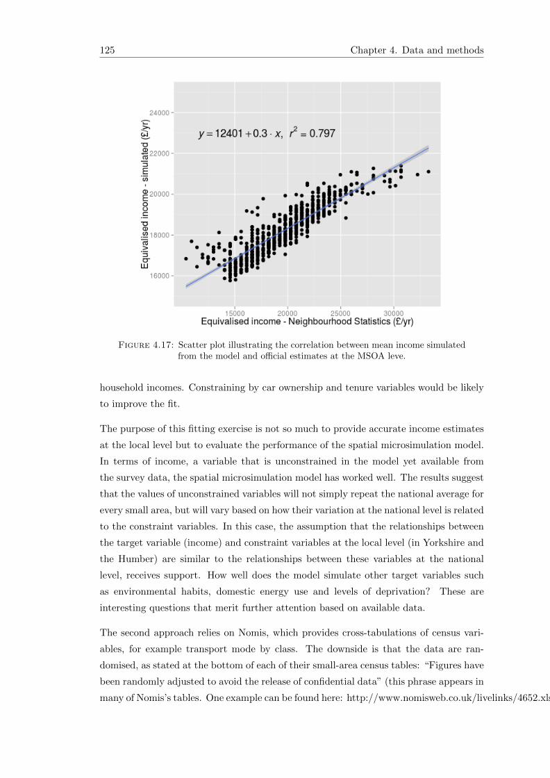
125 Chapter 4. Data and methods
Figure 4.17: Scatter plot illustrating the correlation between mean income simulatedfrom the model and official estimates at the MSOA leve.
household incomes. Constraining by car ownership and tenure variables would be likely
to improve the fit.
The purpose of this fitting exercise is not so much to provide accurate income estimates
at the local level but to evaluate the performance of the spatial microsimulation model.
In terms of income, a variable that is unconstrained in the model yet available from
the survey data, the spatial microsimulation model has worked well. The results suggest
that the values of unconstrained variables will not simply repeat the national average for
every small area, but will vary based on how their variation at the national level is related
to the constraint variables. In this case, the assumption that the relationships between
the target variable (income) and constraint variables at the local level (in Yorkshire and
the Humber) are similar to the relationships between these variables at the national
level, receives support. How well does the model simulate other target variables such
as environmental habits, domestic energy use and levels of deprivation? These are
interesting questions that merit further attention based on available data.
The second approach relies on Nomis, which provides cross-tabulations of census vari-
ables, for example transport mode by class. The downside is that the data are ran-
domised, as stated at the bottom of each of their small-area census tables: “Figures have
been randomly adjusted to avoid the release of confidential data” (this phrase appears in
many of Nomis’s tables. One example can be found here: http://www.nomisweb.co.uk/livelinks/4652.xls).

Chapter 4. Data and methods 126
In order to harness Nomis data to test the accuracy of the microsimulation model for
calculating, it was first necessary to establish how accurate Nomis data are. How much
have Nomis data been randomised, and in what way? This question is relatively easy to
answer because of the census variables shared between those published by Nomis and by
Casweb at the MSOA level. Scatter plots suggest Nomis data are faithful to the original
census results:
Figure 4.18: Scatter graphs illustrating the fit between Nomis and Casweb versionsof the same census variables. The correlation (Pearson’s r) is 0.9998 and 0.9969, for
the number of car drivers and number of cyclists in each MSOA respectively.
From figure 4.18 it is interesting to note that the correlation decreases for cyclists. This,
it was inferred, could represent an increase in the signal-to-noise ratio for variables with
small values to a fixed randomising factor. To test this, the errors were plotted for
variables with large (car drivers) and small (cyclists) totals. The results indicate that
the noise added by randomisation is equal for each variable, regardless of the cell count
(figure 4.19).
Figure 4.19: Errors (Casweb values – Nomis values) associated with car driver (right)and bicycle commuter (left) census variables.
The errors seem to be similar, with a range of approximately 70 and a mean of zero. This
observation is confirmed by descriptive statistics for each set of errors (standard deviation

127 Chapter 4. Data and methods
= 11.01, 9.47; mean = 0.15, 0.23) for car driver and cyclist variables respectively. We can
therefore conclude that the error added by randomisation is constant for each variable
and this was confirmed by plotting the errors for additional census variables. Q-Q
plots — which compare the quantile values of one distribution against another, in this
case those of the errors against those of the normal distribution — suggest that the
distribution of error is approximately normal.
These exploratory methods provide confidence in the Nomis data, but only for relatively
large cell counts (the signal-noise ratio approaches 1:1 as the cell count approaches 20):
therefore evaluations based on Nomis data are better suited to cross tabulated categories
that have high cell counts, for example car drivers. In our microsimulation model, both
gender and mode of transport are constrained, but not simultaneously, so the fit between
the Nomis cross-tabulation and the cross-tabulation resulting from our model provides
some indication of accuracy. The results are presented in figure 4.20. Interestingly, the
accuracy of this ‘partially constrained’ simulated target variable appears to be worse
than that of the completely unconstrained income variable (compare figure 4.20 and
figure 4.17). In both cases, the correlation is reasonably strong and positive (0.47 and
0.80 respectively). However, as with the income estimates, the distribution of estimates
arising from the model is less dispersed than actual data: the standard deviation for the
former (0.30) is substantially less than for the latter (0.44). This illustrates the tendency
of spatial microsimulation models to underestimate the extent of spatial variation.
4.6.3 Additional validation methods
The methods described above illustrate the techniques used to prevent model errors and
ensure that the results were compatible with external data sources. But they only scratch
the surface of what is possible in terms of model validation. This section will not go into
detail. Its purpose is to draw attention to additional methods that could be conducted
as lines of future research and discuss the merits of each. Specifically, the following
additional validation methods could (given sufficient resources) be implemented:
• Primary data collection of target variables at the individual level in specific areas
to validate the spatial microdata locally.
• Comparing of the spatial microdata over entire region with a survey data that
specifies home region of resident.
• Aggregating local model outputs to coarser geographical levels at which cross-
tabulated data are available.

Chapter 4. Data and methods 128
Figure 4.20: Scatter plot of the proportion of male drivers in each MSOA area inYorkshire and the Humber according to simulated and Nomis data.
• Comparison of mode and distance data with external correlates of personal travel
(e.g. MOT data on distance travelled and bus usage data).
Other than the sanity check of age-sex ratios presented in figure 4.15, the evaluation
methods considered above operate at the level of geographically aggregated counts.
However, the unique feature of spatial microsimulation is its simulation of individuals.
Evaluation techniques should therefore operate at the individual level as well. Because
simulation, almost by definition, estimates something that is not otherwise known, it is
hard to find reliable individual level data against which the estimates can be evaluated.
For this reason individual level surveys could be conducted in a specific area where
spatial microdata have been generated. To take one example, a randomised sample of
households could be taken in a single ward. Respondents would be asked the mode of
travel to work, distance and frequency of trip and other variables. This would allow
the model to be evaluated not only in terms of the correlations that it outputs between
different categories, but also for the evaluation of the assumptions on which the energy
calculations are based.
One of the main advantages of spatial microsimulation over just using aggregated data
is that it provides insight into the distribution of continuous variables within each zone,

129 Chapter 4. Data and methods
rather than just counts of categories which are often rather coarse. T-tests and Analysis
of Variance (ANOVA) tests could then be used to check if the mean and variance of
the simulated and survey data are statistically likely to be from the same population.
However, the raw results of IPF are not conducive to such tests at the individual level
because they do not contain whole individuals. Integerisation of the weight matrices is
needed.
4.7 Integerisation
An important advantage of spatial microsimulation models is their ability to model
individuals. Yet, as shown in the previous section, the IPF procedure does not result
in whole individuals, but fractions of individuals. This is not a problem if the aim of
spatial microsimulation is small area estimation (Ballas et al., 2005d). However, the
potential to model individual people using agent-based modelling techniques can make
spatial microsimulation much more powerful. One way to tackle this issue is by using
a different reweighting strategy to select representative individuals for each area. An
alternative is to convert the results of IPF into integer results. Lovelace and Ballas
(2013) tackled this issue in detail and developed a new method of integerisation. The
following section is therefore based on Lovelace and Ballas (2013) and repeats much of
the content.
The aim of IPF, as with all spatial microsimulation methods, is to match individual
level data from one source to aggregated data from another. IPF does this repeatedly,
using one constraint variable at a time: each brings the column and row totals of the
simulated dataset closer to those of the area in question (see Ballas et al., 2005d and
Fig. 4.25 below).
Unlike combinatorial optimisation algorithms, IPF results in non-integer weights. As
mentioned above, this is problematic for certain applications. In their overview of
methods for spatial microsimulation Williamson et al. (1998) favoured combinatorial
optimisation approaches, precisely for this reason: “as non-integer weights lead, upon
tabulation of results, to fractions of households or individuals” (p. 791). There are two
options available for dealing with this problem with IPF:
• Use combinatorial optimisation microsimulation methods instead (Williamson et al.,
1998). However, this can be computationally intensive (Pritchard and Miller,
2012).

Chapter 4. Data and methods 130
• Integerise the weights: Translate the non-integer weights obtained through IPF
into discrete counts of individuals selected from the original survey dataset (Ballas
et al., 2005a).
We revisit the second option, which arguably provides the ‘best of both worlds’: the
simplicity and computational speed of deterministic reweighting and the benefits of
using whole individuals rather than fractions.
IPF is an established method for combining microdata with spatially aggregated con-
straints to simulate target variables whose characteristics are not recorded at the local
level. Integerisation translates the real number weights obtained by IPF into samples
from the original microdata, a list of ‘cloned’ individuals for each simulated area. Inte-
gerisation may also be useful conceptually, as it allows researchers to deal with entire
individuals. The next section reviews existing strategies for integerisation.
4.7.1 Method
Despite the importance of integer weights for dynamic spatial microsimulation, and the
continued use of IPF, there has been little work directed towards integerisation. It has
been noted that “the integerization and the selection tasks may introduce a bias in the
synthesized population” (Axhausen and Muller, 2010, 10), yet little work has been done
to find out how much error is introduced.
To test each integerisation method, IPF was used to generate an array of weights that
fit individual level survey data to geographically aggregated census data (see Section
4.7.1.7). Five methods for integerising the results are described, three deterministic
and two probabilistic. These are: ‘simple rounding’, its evolution into the ‘threshold
approach’ and the ‘counter-weight’ method and the probabilistic methods: ‘proportional
probabilities’ and ‘truncate, replicate, sample’. TRS builds on the strengths of the other
methods, hence the order in which they are presented.
The application of these methods to the same dataset and their implementation in
R allows their respective performance characteristics to be quantified and compared.
Before proceeding to describe the mechanisms by which these integerisation methods
work, it is worth taking a step back, to consider the nature and meaning of IPF weights.
4.7.1.1 Interpreting IPF weights: replication and probability
It is important to clarify what is meant by ‘weights’ before proceeding to implement
methods of integerisation: this understanding was central to the development of the

131 Chapter 4. Data and methods
integerisation method presented in this section. The weights obtained through IPF are
real numbers ranging from 0 to hundreds (the largest weight in the case study dataset
is 311.8). This range makes integerisation problematic: if the probability of selection
is proportional to the IPF weights, as is the case with the ‘proportional probabilities’
method, the majority of resulting selection probabilities can be very low. This is why
the simple rounding method rounds weights up or down to the nearest integer weight to
determine how many times each individual should be replicated (Ballas et al., 2005a).
This ensures that replication weights do not differ greatly from non-integer IPF weights.
However, some of the information contained in the weight is lost during rounding: a
weight remainder of 0.501 is treated the same as 0.999.
This raises the following question: Do the weights refer to the number of times a partic-
ular individual should be replicated, or is it related to the probability of being selected?
The following sections consider different approaches to addressing this question, and the
integerisation methods that result.
IPF weights do not merely represent the probability of a single case being selected. They
also (when above one) contain information about repetition: the two types of weight are
bound up in a single number. An IPF weight of 9, for example, means that the individual
should be replicated 9 times in the synthetic microdataset. A weight of 0.2, by contrast,
means that the characteristics of this individual should count for only 1/5 of their whole
value in the microsimulated dataset and that, in a representative sampling strategy, the
individual would have a probability of 0.2 of being selected. Clearly, these are very
different concepts. As such, the TRS approach to integerisation isolates the replication
and probability components of IPF weights at the outset, and then deals with each
separately. Simple rounding, by contrast, interprets IPF weights as inaccurate count
data.
4.7.1.2 Simple rounding
The simplest approach to integerisation is to convert the non-integer weights into an
integer by rounding up if the decimal is 0.5 or above or down otherwise. Rounding
alone is inadequate for accurate results, however. As illustrated in Fig. 4.22 below,
the distribution of weights obtained by IPF is likely to be skewed, and the majority of
weights may fall below the critical 0.5 value and be excluded. As reported by Ballas
et al. (2005a, 25), this results in inaccurate total populations. To overcome this problem
Ballas et al. (2005a) developed algorithms to ‘top up’ the simulated spatial microdata
with representative individuals: the ‘threshold’ and ‘counter-weight’ approaches.

Chapter 4. Data and methods 132
4.7.1.3 The threshold approach
Ballas et al. (2005a) tackled the need to ‘top up’ the simulated area populations such
that Popsim ≥ Popcens. This is done by creating an inclusion threshold (IT ) set to 1
which iteratively reduced. This samples additional individuals with incrementally lower
weights.35 Below the exit value of IT for each zone, no individuals can be included
(hence the clear cut-off point around 0.4 in Fig. 4.21). In its original form, based on
rounded weights, this approach over-replicates individuals with high decimal weights.
To overcome this problem, the truncated weights were taken as the starting population,
rather than the rounded weights. This modified approach improved the accuracy of the
integer results and is therefore the meaning of the ‘threshold approach’ henceforth.36
The technique successfully tops up integer populations yet has a tendency to generate
too many individuals for each zone. This oversampling is due to duplicate weights —
each unique weight was repeated on average 3 times in our model — and the presence
of weights that are different, but separated by less than 0.001. (In our test, the mean
number of unique weights falling into non-empty bins between 0.3 and 0.48 in each area
— the range of values reached by IT before Popsim ≥ Popcens — is almost two.)
4.7.1.4 The counter-weight approach
An alternative method for topping-up integer results arrived at by simple rounding was
also described by Ballas et al. (2005a). The approach was labelled to emphasise its
reliance on both counter and a weight variables. Each individual is first allocated a
counter in ascending order of its IPF weight. The algorithm then tops-up the integer
results of simple rounding by iterating over all individuals in the order of their count.
With each iteration the new integer weight is set as the rounded weight plus the rounded
sum of its decimal weight plus the decimal weight of the next individual, until the desired
total population is reached.37
There are two theoretical advantages of this approach: its more accurate final popula-
tions (it does not automatically duplicate individuals with equal weights as the threshold
approach does) and the fact that individuals with decimal weights down to 0.25 may
35A more detailed description of the steps taken and the R code needed to perform them iterativelycan be found in the Supplementary Information, Section 3.2.
36An explanation of this improvement can be illustrated by considering an individual with a weightof 2.99. Under the original threshold approach described by Ballas et al. (2005a), this person would bereplicated 4 times: three times after rounding, and then a fourth time after IT drops below 0.99. Withour modified approach they would be replicated three times: twice after truncation, and again after ITdrops below 0.99. The improvement in accuracy in our tests was substantial, from a TAE (total absoluteerror, described below) of 96,670 to 66,762. Because both methods are equally easy to implement, onlyto the superior version of the threshold integerisation method is used.
37This process is described in more detail in the Supplementary Information.

133 Chapter 4. Data and methods
Figure 4.21: Overplotted scatter graph showing the distribution of weights and repli-cations after IPF in the original survey (left), those selected by inclusion thresholdsfor a single area (middle), and those selected by the counter-weight method (right) forzone 71 in the example dataset. The lightest points represent individuals who have
been replicated once, the darkest 5 times.
be selected. This latter advantage is minor, as IT reached below 0.4 in many cases
(Supplementary Information, Fig. 2) — not far off. A band of low weights (just above
0.25) selected by the counter-weight method can be seen in Fig. 4.21.
The total omission of weights below some threshold is problematic for all deterministic
algorithms tested here: they imply that someone with a weight below this threshold, for
example 0.199 in our tests, has the same sampling probability as someone with a weight of
0.001: zero! The complete omission of low weights fails to make use of all the information
stored in IPF weights: in fact, the individual with an IPF weight of 0.199 is 199 times
more representative of the area (in terms of the constraint variables and the make-up
of the survey dataset) than the individual with an IPF weight of 0.001. Probabilistic
approaches to integerisation ensure that all such differences between decimal weights are
accounted for.
4.7.1.5 The proportional probabilities approach
This approach to integerisation treats IPF weights as probabilities. The chance of an
individual being selected is proportional to the IPF weight:
p =w∑W
(4.5)
Sampling until Popsim = Popcens with replication ensures that individuals with high
weights are likely to be repeated several times whereas individuals with low weights are

Chapter 4. Data and methods 134
unlikely to appear. The outcome of this strategy is correct from a theoretical perspective,
yet because all weights are treated as probabilities, there is a non-zero chance that an
individual with a low weight (e.g. 0.3) is replicated more times than an individual with
a higher weight (e.g. 3.3). (In this case the probability for any given area is ∼ 1%,
regardless of the population size). Ideally, this should never happen: the individual
with weight 0.3 should be replicated either 0 or 1 times, the probability of the latter
being 0.3. The approach described in the next section addresses these issues.
4.7.1.6 Truncate, replicate, sample
The problems associated with the aforementioned integerisation strategies demonstrate
the need for an alternative method. Ideally, the method would build upon the simplicity
of the rounding method, select the correct simulated population size (as attempted by the
threshold approach and achieved by using ‘proportional probabilities’), make use of all
the information stored in IPF weights and reduce the error introduced by integerisation
to a minimum. The probabilistic approach used in ‘proportional probabilities’ allows
multiple answers to be calculated (by using different ‘seeds’). This is advantageous
for analysis of uncertainty introduced by the process and allows for the selection of
the best fitting result. Consideration of these design criteria led us to develop TRS
integerisation, which interprets weights as follows: IPF weights do not merely represent
the probability of a single case being selected. They also (when above one) contain
information about repetition: the two types of weight are bound up in a single number.
An IPF weight of 9, for example, means that the individual should be replicated 9
times in the synthetic microdataset. A weight of 0.2, by contrast, means that the
characteristics of this individual should count for only 1/5 of their whole value in the
microsimulated dataset and that, in a representative sampling strategy, the individual
would have a probability of 0.2 of being selected. Clearly, these are different concepts.
As such, the TRS approach to integerisation isolates the replication and probability
components of IPF weights at the outset, and then deals with each separately. Simple
rounding, by contrast, interprets IPF weights as inaccurate count data. The steps
followed by the TRS approach are described in detail below.
Truncate
By removing all information to the right of the decimal point, truncation results in inte-
ger values — integer replication weights that determine how many times each individual
should be ‘cloned’ and placed into the simulated microdataset. In R, the following
command is used:
count <- trunc(w)

135 Chapter 4. Data and methods
where w is a matrix of individual weights. Saving these values (as count) will later
ensure that only whole integers are counted. The decimal remainders (dr), which vary
between 0 and 1, are saved by subtracting the integer weights from the full weights:
dr <- w - count
This separation of conventional and replication weights provides the basis for the next
stage: replication of the integer weights.
Replicate
In spreadsheets, replication refers simply to copying cells of data and pasting them
elsewhere. In spatial microsimulation, the concept is no different. The number of times
a row of data is replicated depends on the integer weight: an IPF weight of 0.99, for
example, would not be replicated at this stage because the integer weight (obtained
through truncation) is 0.
To reduce the computational requirements of this stage, it is best to simply replicate the
row number (index) associated with each individual, rather than replicate the entire
row of data. This is illustrated in the following code example, which appears within a
loop for each area (i) to be simulated:
ints[[i]] <- index[rep(1:nrow(index),count)]
Here, the indices (of weights above 1, index) are selected and then repeated. This is
done using the function rep(). The first argument (1:nrow(index)) simply defines the
indices to be replicated; the second (count) refers to the integer weights defined in the
previous subsection. (Note: count in this context refers only to the integer weights
above 1 in each area). Once the replicated indices have been generated, they can then
be used to look up the relevant characteristics of the individuals in question.
Sample
As with the rounding approach, the truncation and replication stages alone are unable
to produce microsimulated datasets of the correct size. The problem is exacerbated by
the use of truncation instead of rounding: truncation is guaranteed to produce integer
microdataset populations that are smaller, and in some cases much smaller than the
actual (census) populations. In our case study, the simulated microdataset populations
were around half the actual size populations defined by the census. This under-selection
of whole cases has the following advantage: when using truncation there is no chance of
over-sampling, avoiding the problem of simulated populations being slightly too large,
as can occur with the threshold approach.

Chapter 4. Data and methods 136
0
500
1000
1500
0 1 2 3 4 5Weights of all individuals in microdata (n = 4933)
coun
t
0
50
100
150
200
250
300
0 1 2 3 4 5Weights of sampled individuals (n = 3415)
coun
t
Figure 4.22: Histograms of original microdata weights (above) and sampled microdataafter TRS integerisation (below) for a single area — zone 71 in the case study data.
Given that the replication weights have already been included in steps 1 and 2, only
the decimal weight remainders need to be included. This can be done using weighted
random sampling without replacement. In R, the following function is used:
sample(w, size=(pops[i,1] - pops[i,2]), prob= dr[,i])
Here, the argument size within the sample command is set as the difference between the
known population of each area (pops[i,1]) and the size obtained through the replication
stage alone (pops[i,2]). The probability (prob) of an individual being sampled is
determined by the decimal remainders. dr varies between 0 and 1, as described above.
The results for one particular area are presented in Fig. 4.22. The distribution of selected
individuals has shifted to the right, as the replication stage has replicated individuals as
a function of their truncated weight. Individuals with low weights (below one) still con-
stitute a large portion of those selected, yet these individuals are replicated fewer times.
After TRS integerisation individuals with high decimal weights are relatively common.
Before integerisation, individuals with IPF weights between 0 and 0.3 dominated. An
individual-by-individual visualisation of the Monte Carlo sampling strategy is provided
in Fig. 4.23. Comparing this with the same plot for the probabilistic methods (Fig. 4.21),
the most noticeable difference is that the TRS and proportional probabilities approaches

137 Chapter 4. Data and methods
include individuals with very low weights. Another important difference is average point
density, as illustrated by the transparency of the dots: in Fig. 4.21, there are shifts near
the decimal weight threshold (∼ 0.4 in this area) on the y-axis. In Fig. 4.23, by contrast,
the transition is smoother: average darkness of single dots (the number of replications)
gradually increases from 0 to 5 in both probabilistic methods.
Figure 4.23: Overplotted scatter graphs of index against weight for the original IPFweights (left) and after proportional probabilities (middle) and TRS (right) integerisa-
tion for zone 71. Compare with Fig. 4.21.
Fig. 4.24 illustrates the mechanism by which the TRS sampling strategy works to select
individuals. In the first stage (up to x = 1,717, in this case) there is a linear relationship
between the indices of survey and sampled individuals, as the model iteratively moves
through the individuals, replicating those with truncated weights greater than 0. This
(deterministic) replication stage selects roughly half of the required population in our
example dataset (this proportion varies from zone to zone). The next stage is prob-
abilistic sampling (x = 1,718 onwards in Fig. 4.24): individuals are selected from the
entire microdataset with selection probabilities equal to weight remainders.
4.7.1.7 The test scenario: input data and IPF
The theory and methods presented above demonstrate how five integerisation methods
work in abstract terms. But to compare them quantitatively a test scenario is needed.
This example consists of a spatial microsimulation model that uses IPF to model the
commuting and socio-demographic characteristics of economically active individuals in
Sheffield. According to the 2001 Census, Sheffield has a working population of just over
230,000. The characteristics of these individuals were simulated by reweighting a syn-
thetic microdataset based on aggregate constraint variables provided at the medium su-
per output area (MSOA) level. The synthetic microdataset was created by ‘scrambling’

Chapter 4. Data and methods 138
Figure 4.24: Scatter graph of the index values of individuals in the original sampleand their indices following TRS Integerisation for a single area.
a subset of the Understanding Society dataset (USd).38 MSOAs contain on average just
over 7,000 people each, of whom 44% are economically active in the study area; for the
less sensitive aggregate constraints, real data were used. These variables are summarised
in Table 4.11.
Table 4.11: Summary data for the spatial microsimulation model
Aggregate data Survey data71 zones, average pop.: 3077.5 4933 observations
Variable N. categories Most populous Mean Most populous
Age / sex 12 Male, 35 to 54 yrs 40.1 -Mode 11 Car driver - Car driverDistance 8 2 to 5 km 11.6 -NS-SEC 9 Lower managerial - Lower managerial
The data contains both continuous (age, distance) and categorical (mode, NS-SEC) vari-
ables. In practice, all variables are converted into categorical variables for the purposes
of IPF, however. To do this statistical bins are used. Table 4.11 illustrates similarities
between aggregate and survey data overall (car drivers being the most popular mode of
travel to work in both categories, for example). Large differences exist between indi-
vidual zones and survey data, however: it is the role of iterative proportional fitting to
apply weights to minimize these differences.
38See http://www.understandingsociety.org.uk/. To scramble this data, the continuous variables (seeTable 4.11) had an integer random number (between 10 and -10) added to them; categorical variableswere mixed up, and all other information was removed.

139 Chapter 4. Data and methods
IPF was used to assign 71 weights to each of the 4,933 individuals, one weight for
each zone. The fit between census and weighted microdata can be seen improving after
constraining by each of the 40 variables (Fig. 4.25). The process is repeated until an
adequate level of convergence is attained (see Fig. 4.26).39 The weights were set to an
Figure 4.25: Visualisation of IPF method. The graphs show the iterative improve-ments in fit after age, mode, distance and finally NS-SEC constraints were applied (see
Table 4.11). See footnote 4 for resources on how IPF works.
initial value of one.40 The weights were then iteratively altered to match the aggregate
(MSOA) level statistics.
Four constraint variables link the aggregated census data to the survey, containing a
total of 40 categories. To illustrate how IPF works, it is useful to inspect the fit between
simulated and census aggregates before and after performing IPF for each constraint
variable. Fig. 4.25 illustrates this process for each constraint. By contrast to existing
approaches to visualising IPF (see Ballas et al., 2005d), Fig. 4.25 plots the results for
all variables, one constraint at a time. This approach can highlight which constraint
variables are particularly problematic. After 20 iterations (Fig. 4.26), one can see that
distance and mode constraints are most problematic. This may be because both variables
depend largely on geographical location, so are not captured well by UK-wide aggregates.
39What constitutes an ‘adequate’ level of fit has not been well defined in the literature, as mentionedin the next section. In this example, 20 iterations were used.
40An initial value must be selected for IPF to create new weights which better match the small areaconstraints. It was set to one as this tends to be the average weight value in social surveys (the meanUnderstanding Society dataset interview plus proxy individual cross-sectional weight is 0.986).

Chapter 4. Data and methods 140
Figure 4.26: Scatter graph illustrating the fit between census and simulated aggre-gates after 20 IPF iterations (compare with Fig. 4.25).
Fig. 4.25 also illustrates how IPF works: after reweighting for a particular constraint,
the weights are forced to take values such that the aggregate statistics of the simu-
lated microdataset match perfectly with the census aggregates, for all variables within
the constraint in question. Aggregate values for the mode variables, for example, fit
the census results perfectly after constraining by mode (top right panel in Fig. 4.25).
Reweighting by the next constraint disrupts the fit imposed by the previous constraint
— note the increase scatter of the (blue) mode variables after weights are constrained
by distance (bottom left).
However, the disrupted fit is better than the original. This leads to a convergence of the
weights such that the fit between simulated and known variables is optimised: Fig. 4.25
shows that accuracy increases after weights are constrained by each successive linking
variable.
4.7.2 Results
This section compares the five previously describe approaches to integerisation — round-
ing, inclusion threshold, counter-weight, proportional probabilities and TRS methods.
The results are based on the 20th iteration of the IPF model described above. The
following metrics of performance were assessed:
• speed of calculation
• accuracy of results
– sample size
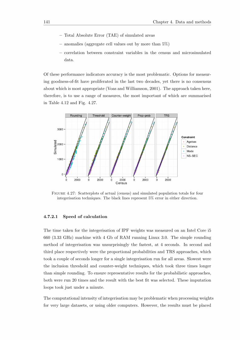
141 Chapter 4. Data and methods
– Total Absolute Error (TAE) of simulated areas
– anomalies (aggregate cell values out by more than 5%)
– correlation between constraint variables in the census and microsimulated
data.
Of these performance indicators accuracy is the most problematic. Options for measur-
ing goodness-of-fit have proliferated in the last two decades, yet there is no consensus
about which is most appropriate (Voas and Williamson, 2001). The approach taken here,
therefore, is to use a range of measures, the most important of which are summarised
in Table 4.12 and Fig. 4.27.
Figure 4.27: Scatterplots of actual (census) and simulated population totals for fourintegerisation techniques. The black lines represent 5% error in either direction.
4.7.2.1 Speed of calculation
The time taken for the integerisation of IPF weights was measured on an Intel Core i5
660 (3.33 GHz) machine with 4 Gb of RAM running Linux 3.0. The simple rounding
method of integerisation was unsurprisingly the fastest, at 4 seconds. In second and
third place respectively were the proportional probabilities and TRS approaches, which
took a couple of seconds longer for a single integerisation run for all areas. Slowest were
the inclusion threshold and counter-weight techniques, which took three times longer
than simple rounding. To ensure representative results for the probabilistic approaches,
both were run 20 times and the result with the best fit was selected. These imputation
loops took just under a minute.
The computational intensity of integerisation may be problematic when processing weights
for very large datasets, or using older computers. However, the results must be placed

Chapter 4. Data and methods 142
in the context of the computational requirements of the IPF process itself. For the
example described in Section 4.7.1.7, IPF took approximately 30 seconds per iteration
and 5 minutes for the full 20 iterations.
4.7.2.2 Accuracy
In order to compare the fit between simulated microdata and the zonally aggregated
linking variables that constrain them, the former must first be aggregated by zone. This
aggregation stage allows the fit between linking variables to be compared directly (see
Fig. 4.27). More formally, this aggregation allows goodness of fit to be calculated using
a range of metrics (Williamson et al., 1998). We compared the accuracy of integerisation
techniques using 5 metrics:
• Pearson’s product-moment correlation coefficient (r)
• total and standardised absolute error (TAE and SAE),
• proportion of simulated values falling beyond 5% of the actual values,
• the proportion of Z-scores significant at the 5% level
• size of the sampled populations
The simplest way to evaluate the fit between simulated and census results was to use
Pearson’s r, an established measure of association (Rodgers, 1988). The r values for
all constraints were 0.9911, 0.9960, 0.9978, 0.9989 and 0.9992 for rounding, threshold,
counter-weight, proportional probabilities and TRS methods respectively. IPF alone had
an r value of 0.9996. These correlations establish an order of fit that can be compared
to other metrics.
TAE and SAE are crude yet effective measures of overall model fit (Voas and Williamson,
2001). TAE has the additional advantage of being easily understood:
TAE =∑ij
|Uij − Tij | (4.6)
where U and T are the observed and simulated values for each linking variable (j) and
each area (i). SAE is the TAE divided by the total population of the study area. TAE
is sensitive to the number of people within the model, while SAE is not. The latter is
seen by Voas and Williamson (2001) as “marginally preferable” to the former: it allows
cross-comparisons between models of different total populations (Kongmuang, 2006).

143 Chapter 4. Data and methods
Table 4.12: Accuracy results for integerisation techniques.*
Method Variables TAE SAE (%) E > 5% (%) Zm2 (%)
IPF Age/sex 9 0.0 0.0 0.0Distance 4874 2.3 13.7 4.9Mode 4201 2.0 6.4 4.2NS-SEC 0 0.0 0.0 0.0All 9084 3.1 4.5 2.1
Round- Age/sex 26812 12.5 81.5 39.8ing Distance 31981 14.9 80.1 65.1
Mode 30558 14.2 81.4 48.9NS-SEC 27493 12.8 76.5 57.1All 116844 13.6 80.1 51.3
Thresh- Age/sex 11076 5.1 49.2 8.1old Distance 27146 12.6 82.4 57.7
Mode 14770 6.9 68.6 33.9NS-SEC 13770 6.4 55.2 24.1All 66762 7.8 62.5 28.7
Counter- Age/sex 10242 4.8 47.7 6.6weight Distance 17103 8.0 70.2 39.3
Mode 10072 4.7 60.4 21.6NS-SEC 11798 5.5 49.6 17.1All 49215 5.7 56.1 19.6
Propor- Age/sex 9112 4.2 48.0 3.1tional Distance 8740 4.1 47.4 10.4proba- Mode 8664 4.0 60.8 9.0bilities NS-SEC 7778 3.6 37.6 3.3
All 34294 4.0 49.0 6.2
TRS Age/sex 5424 2.5 27.9 0.4Distance 10167 4.7 48.8 16.4Mode 7584 3.5 56.1 6.7NS-SEC 5687 2.6 24.9 1.1Total 28862 3.4 39.2 5.5
* The probabilistic results represent the best fit (in terms of TAE) of 20 integerisationruns with the pseudo-random number seed set to 1000 for replicability — see Supple-mentary Information.
The proportion of values which fall beyond 5% of the actual values is a simple metric of
the quality of the fit. It implies that getting a perfect fit is not the aim, and penalises
fits that have a large number of outliers. The precise definition of ’outlier’ is somewhat
arbitrary (one could just as well use 1%).
The final metric presented in Table 4.12 is based on the Z-statistic, a standardised
measure of deviance from expected values, calculated for each cell of data. We use
Zm, a modified version of the Z-statistic which is a robust measure of fit for each cell
value Williamson et al. (1998). The measure of fit is appropriate here as it takes into
account absolute, rather than just relative, differences between simulated and observed

Chapter 4. Data and methods 144
cell count:
Zmij = (rij − pij)
/pij(1− pij))∑ijUij
1/2
(4.7)
where
pij =Uij∑
ijUij
and rij =Tij∑
ijUij
To use the modified Z-statistic as a measure of overall model fit, one simply sums the
squares of zm to calculate Zm2. This measure can handle observed cell counts below 5,
which chi-squared tests cannot (Voas and Williamson, 2001).
The results presented in Table 4.12 confirm that all integerisation methods introduce
some error. It is reassuring that the comparative accuracy is the same across all met-
rics. Total absolute error (TAE), the simplest goodness-of-fit metric, indicates that
discrepancies between simulated and census data increase by a factor of 3.2 after TRS
integerisation, compared with raw (fractional) IPF weights.41 Still, this is a major
improvement on the simple rounding, threshold and counter-weight approaches to in-
tegerisation presented by Ballas et al. (2005a): these increased TAE by a factor of 13,
7 and 5 respectively. The improvement in fit relative to the proportional probabilities
method is more modest. The proportional probabilities method increased TAE by a
factor of 3.8, 23% more absolute error than TRS.
The differences between the simulated and actual populations (Popsim − Popcens) were
also calculated for each area. The resulting differences are summarised in Table 5, which
illustrates that the counter-weight and two probabilistic methods resulted in the correct
population totals for every area. Simple rounding and threshold integerisation methods
greatly underestimate and slightly overestimate the actual populations, respectively.
Table 4.13: Differences between census and simulated populations.
Metric Rounding Threshold Others (CW, PP, TRS)
Mean -372 8 0Standard deviation 88 11 0Max -133 54 0Min -536 0 0Oversample (%) -13 0.3 0
41In the case of a sufficiently diverse input survey dataset, IPF would be able to find the perfectsolution: TAE would be 0 and the ratio of error would not be applicable.

145 Chapter 4. Data and methods
4.7.3 Discussion and conclusions
The results show that TRS integerisation outperforms the other methods of integerisa-
tion tested in this section. At the aggregate level, accuracy improves in the following
order: simple rounding, inclusion threshold, counter-weight, proportional probabilities
and, most accurately, TRS. This order of preference remains unchanged, regardless of
which (from a selection of 5) measure of goodness-of-fit is used. These results concur
with a finding derived from theory — that “deterministic rounding of the counts is
not a satisfactory integerization” (Pritchard and Miller, 2012, p. 689). Proportional
probability and TRS methods clearly provide more accurate alternatives.
An additional advantage of the probabilistic TRS and proportional probability meth-
ods is that correct population sizes are guaranteed.42 In terms of speed of calculation,
TRS also performs well. TRS takes marginally more time than simple rounding and
proportional probability methods, but is three times quicker than the threshold and
counter-weight approaches. In practice, it seems that integerisation processing time is
small relative to running IPF over several iterations. Another major benefit of these non-
deterministic methods is that probability distributions of results can be generated, if the
algorithms are run multiple times using unrelated pseudo-random numbers. Probabilis-
tic methods could therefore enable the uncertainty introduced through integerisation
to be investigated quantitatively (Beckman et al., 1996; Little and Rubin, 1987) and
subsequently illustrated using error bars.
Overall the results indicate that TRS is superior to the deterministic methods on many
levels and introduces less error than the proportional probabilities approach. We cannot
claim that TRS is ‘the best’ integerisation strategy available though: there may be
other solutions to the problem and different sets of test weights may generate different
results.43 The issue will still present a challenge for future researchers considering the
use of IPF to generate sample populations composed of whole individuals: whether to
use deterministic or probabilistic methods is still an open question (some may favour
deterministic methods that avoid psuedo-random numbers, to ensure reproducibility
regardless of the software used), and the question of whether combinatorial optimisation
algorithms perform better has not been addressed.
42Although the counter-weight method produced the correct population sizes in our tests, it cannotbe guaranteed to do so in all cases, because of its reliance on simple rounding: if more weights arerounded up than down, the population will be too high. However, it can be expected to yield the correctpopulation in cases where the populations of the areas under investigation are substantially larger thanthe number of individuals in the survey dataset.
43Despite these caveats, the order of accuracy identified in this section is expected to hold in mostcases. Supplementary Information (Section 4.4), shows the same order of accuracy (except the thresholdmethod and counter-weight methods, which swap places) resulting from the integerisation of a differentweight matrix.

Chapter 4. Data and methods 146
Our results provide insight into the advantages and disadvantages of five integerisation
methods and guidance to researchers wishing to use IPF to generate integer weights:
use TRS unless determinism is needed or until superior alternatives (e.g. real small area
microdata) become available. Based on the code and example datasets provided in the
Supplementary Information, other are encouraged to use, build on and improve TRS
integerisation.
A broader issue raised by this research, that requires further investigation before answers
emerge, is ‘how do the integerised results of IPF compare with combinatorial optimisa-
tion approaches to spatial microsimulation?’ Studies have compared non-integer results
of IPF with alternative approaches (Smith et al., 2009; Ryan et al., 2009; Rahman et al.,
2010; Harland et al., 2012). However, these have so far failed to compare like with
like: the integer results of combinatorial approaches are more useful (applicable to more
types of analysis) than the non-integer results of IPF. TRS thus offers a way of ‘levelling
the playing field’ whilst minimising the error introduced to the results of deterministic
reweighting through integerisation.
In conclusion, the integerisation methods presented in this section make integer results
accessible to those with a working knowledge of IPF. TRS outperforms previously pub-
lished methods of integerisation. As such, the technique offers an attractive alternative
to combinatorial optimisation approaches for applications that require whole individuals
to be simulated based on aggregate data.

Chapter 5
Energy use in personal travel
systems
The previous chapter described the data and methods needed to model the diversity of
commuting behaviours at individual and geographical levels. This chapter shows how the
results of spatial microsimulation can be translated into information about energy use.
Before any numbers are presented, however, this chapter takes a brief detour to consider
what energy actually is, and how it gets ‘used’ in personal transport (section 5.1). This
will ensure that the energy use estimates presented later on are interpreted correctly
(and not oversimplified). Physical considerations also help understand the potential for
and limitations of technological advance to reduce energy use into the future(Mackay,
2009). Future efficiency gains, important in what-if scenarios, are tackled in section 5.5.
As stated in the previous chapter, good official estimates of the energy costs of personal
travel overall, let alone for travel to work exclusively, are in short supply: they are
limited in terms of the modes covered, geographical resolution and temporal coverage.
The approach used here, therefore, is to infer energy use based on behaviour:1 the
mode, distance and frequency of travel to work. Of course, this requires good estimates
of vehicles’ energy use per unit distance to convert the distance travelled into energy
use. The best official data source for this task are the CO2 ‘emission factors’ compiled
by the government department Defra which (bizarrely) appear to be outside the remit
of the Department for Energy and Climate Change (DECC). These emission factors,
and the calculations that convert them into energy units, are described in section 5.2.
1The alternative is to use energy use statistics directly. Official datasets are limited here and unofficial,privately owned information on the subject is also limited. Petrol station data, for example, has thepotential to inform us about overall energy use in general areas, but is limited by the fact that consumerscan many miles to access the cheapest fuel, long-distance refuelling, the impossibility of disaggregatingby reason for trip and the public inaccessibility of petrol station sales data. There is, however, muchpotential for using this data source more, as no energy-transport studies could be found that do.
147

Chapter 5. Energy use in personal travel systems 148
The subsequent section presents data and equations for estimating energy use at the
system level, to include the additional energy costs of fuel, road and vehicle production
(section 5.3). Deeper analysis reveals that the energy use per mode estimates presented
in the preceding two sections (e.g. that buses use 2.13 MJ/pkm on fuel) are rather gross
oversimplifications of reality: there is strong evidence of substantial variability in energy
use for different types of vehicle, driver, trip and road/guideway conditions. Assumptions
about frequency of trips to work each year also have a large impact on estimated annual
energy use due to commuting. Evidence on these issues is reported, and their inclusion
in the models of energy use discussed, in section 5.4. Building on this evidence-base,
section 5.5 and section 5.6 discuss and attempt to quantify changing ‘fleet efficiencies’
of cars over time and space.
Finally, section 5.7 concludes the chapter by reporting our best estimates of energy use
by mode, which result from factors considered in the preceding sections. These values are
provided a section of their own, as they are used in subsequent sections and are critical
to the results of the model. Before looking at these issues in detail, a few comments on
complexity and the dominance of the car are in order.
An idea that any naive reader should dispel immediately is that energy use in transport
is simple. It is complex, more so than energy use in industrial and domestic settings,
so energy use values must be treated with care. There is no single ‘right’, global or
final answer to questions such as “how much energy does a person use per unit distance
travelled?” As with many such simplistic questions asked of complex systems, the answer
is ‘it depends’, on how the question is defined and a number of other factors, even before
considering spatial and temporal variation (International Energy Agency, 2005; Berry
and Fels, 1973; Lenzen, 1999). In rough descending order of importance, these include
the following, each of which is considered below:
• the make, model, and condition of the vehicle in use
• behavioural factors such as propensity to accelerate (which are in turn influenced
by legal, cultural and economic factors, as well as obstacles such as traffic lights)
• the nature of the physical and road environment such as road surface, topography
and traffic
• ambient conditions including temperature and wind
• circuity and straightness of roads
Because of the complexity of these interacting factors, effort has been made to make it
simple to update existing estimates of energy use (or refine them by adding geographical

149 Chapter 5. Energy use in personal travel systems
variability) if and when better energy use estimates emerge. (It is hoped that the
estimates presented in this section could spur better energy-in-transport reporting by
government agencies.) Another factor, not included in the above bullet points, that
cross-cuts all of them, is the system boundaries of energy analysis: energy use will
increase (in some cases substantially) as the indirect costs of fuel, vehicle, road/path
construction and even unquantifiable knock-on impacts of our transport systems are
included. This becomes apparent when the fundamentals of energy use in transport
(section 5.1) are considered. This is another reason for producing several estimates
for each mode of transport when calculating energy use in transport models, allowing
sensitivity analysis and scenarios of the future that incorporate the indirect energy costs
of transport.
The final introductory comment is that this chapter dedicates more attention to cars
than to other modes. This is a deliberate decision: cars totally dominate the energy
costs of commuting, using over 20 times more energy than all other modes put together.
5.1 Fundamentals of energy use in transport
Energy is an objective and quantifiable concept that spans the sciences. Frequently the
term is defined loosely as the ‘ability to do work’, but this raises the question: work on
what? and fails to convey the importance of energy for both the physical sciences and
modern life (Rouse and Smith, 1975, p. 99):
As we view the physical world, we find that energy is one of the most
fundamental and important concepts in science. Energy is essential to our
everyday experience. From the time we turn off the electric alarm clock to
the time we jump into our automobiles, ... until we sit down to the evening
meal, the use of energy in various forms is a central feature of our daily
activity.
This quote reinforces the reasons set out for the energy focus laid-down in the intro-
duction, and adds a new one: we depend on energy. How different would daily life be
in the absence of continuous flows of concentrated energy? The above quote illustrates
how embedded external (and often invisible) energy sources have become in our life.
Later in the book, Rouse and Smith (1975) urge others to shed light on energy costs of
different processes, in the context of the 1970s oil crisis. In the context of 21st century
environmental change and fossil fuel depletion, this thesis — by focussing the method

Chapter 5. Energy use in personal travel systems 150
on energy use — seeks to follow in the footsteps of other researchers who sought to use
energy as a yardstick against which to quantify and evaluate complex processes.2
Another physics textbook describes energy as “natural money” (Knight, 2007, p. 269).
This description is apt, amalgamating all the types of energy into a single concept that
conveys its importance as the enabler of change. A value is placed by the laws of physics
on every type of physical phenomenon, and this value can be approximated. Transport,
like everything else, must abide by the laws of thermodynamics:
1. Energy cannot be created or destroyed, just converted from one form to another.3
2. When energy is converted from one form to another in a closed system, the amount
of useful energy always decreases (entropy increases).
The second law of thermodynamics is critical here, because it means that only certain
types of energy allow us to do useful work; the rest is just background heat (Soddy, 1912).
Although the Earth is not a thermodynamically closed system in which net entropy
always increases, it is a materially closed system almost entirely dependent on the sun
for its energy supplies. From this understanding stems the realisation that humanity is
essentially spending its capital stock of energy: approximately 90% of all commercial
energy use (meaning energy conversion, staying true to the first law of thermodynamics)
comes from the burning of fossil fuels which took millions of years to accumulate in the
Earth’s crust and can never be replaced on human time-scales (Smil, 2008). Our reliance
on fossil fuels, combined with understanding of the second law of thermodynamics, leads
to the realisation that our economy is fundamentally unsustainable as it will eventually
run out of low-entropy resources, primarily fossil fuels. This, when considered alongside
the diffuseness and low energy-densities of renewable sources (Mackay, 2009), provides
a powerful argument to reduce to energy use in the medium-term. Even more urgently,
the best available evidence suggests that no more than half of commercially viable fossil
fuel resources can be burned to avoid ‘dangerous’ (2◦ C) climate change (Berners-Lee
and Clark, 2013).
2Other pioneers of energy-in-society research include Soddy (1933, 1935), Odum (1971); Odum andOdum (2001), Steadman (1977) and Smil (1993, 2005, 2008).
3If energy cannot be destroyed, the frequent use of the terms “energy use” and “energy consumption”in this thesis and other studies of energy in transport could be criticised for contradicting the laws ofthermodynamics. Based on literal, physical interpretations of energy the objection is entirely justified,and terms such as “consumption of low-entropy energy resources” or simply “fossil fuel use” may bemore appropriate. However, these alternative terms have their own problems, of long-windedness and in-accuracy (not all low-entropy energy resources worth conserving are derived from fossil fuels). Thereforethe term “energy use” is used throughout, based on the assumption that readers will interpret energy inthis sense to refer to high quality (low entropy) energy resources such as fossil fuels, food and electricity.

151 Chapter 5. Energy use in personal travel systems
5.1.1 The factors driving energy use in transport
With these laws in mind, let us return to the physical reasons for low-entropy energy
use (henceforth and beforehand shortened to ‘energy use’) in transport. Transport must
obey the laws of thermodynamics whilst “using up” energy, but where does all the energy
actually go? In a narrowly defined transport system (in which the system boundary
includes only the vehicle and its immediate surroundings — see figure 5.3), all energy
use in transport is dedicated to overcoming inertia (acceleration) and friction (e.g. wind
resistance). When the system boundary is expanded to accept the full complexity of
transport systems and their dependence on myriad sub-processes, many more energy
flows are added. Still, knowledge of thermodynamics can be used to understand how
transport degrades high quality energy resources into heat and ephemeral kinetic energy.
The latter is also eventually converted into low-grade heat through braking or other
sources of friction (figure 5.1).
5.1.2 System boundaries
As emphasised in chapter 1, transport does not happen in isolation from the wider world.
External considerations such as friends, family and quality of life all affect the commuter
patterns people follow. The same is true of energy use. Let us consider a car journey as
an example: does one only include the chemical energy stored in the petrol burned in
the pistons? Or do we also include the primary energy consumed in getting the fuel out
of the ground and into the petrol tank?4 Do we include the energy costs required to feed
active travel modes? Cooking requirements? The embodied energy in vehicles, roads,
footpaths and railways? The costs of decommissioning disused vehicles, or the net energy
they save through recycling? The list could go on and on, to include seemingly distant
energy costs such as washing machine and shower usage, influenced by whether the
transport mode is active or passive. Taken to its extreme, it could even include knock-
on impacts through society, such as shopping patterns, holiday destinations, health and
the reshaping of social space (Illich, 1974).
What is clear from the above is that the energy costs of transport is not the simple hard-
and-fast science that it appears at the outset. It is complex. A conceptual framework
is needed to deal with this complexity and help decide which factors to include in the
analysis and which ones to leave out. A useful analogy of this comes from economics: the
price of goods can vary depending on whether the additional costs incurred by ownership
4The extraction costs include searching for the oil, the embedded energy in the pipelines, drillingrigs, personnel and refinery processes. The distribution costs include diesel or electric pumps to forcethe oil to flow, shipping and trucking costs and even the embedded energy of the roads and ships neededto enable these systems to function.

Chapter 5. Energy use in personal travel systems 152
Figure 5.1: Schematic diagram of the factors causing energy use in transport.
are taken into account, let alone externalities such as pollution, bureaucracy and disposal
(Perman, 2003). The costs of personal transport can be divided into variable and fixed
costs, which in turn are sub-divided (figure 5.2). The precise proportion of the total cost
attributable to each of these is variable depending on the type of car and the regulatory
framework in the country in which the car is used.5 However, because only a couple of
these costs are highly visible to consumers (the initial price of the car and the petrol),
the wider system costs are often forgoten. The same is true of energy costs.
5In The USA, for example, fuel accounts for roughly one sixth of the overall lifetime cost; in theEuropean Union and Japan, higher taxes push this up, to over a third (Smil, 1993).

153 Chapter 5. Energy use in personal travel systems
Figure 5.2: Rough approximation of relative importance of fixed and variable costsof car ownership in the USA, based on Smil (1993, p. 114). Car image from opencli-
part.org.
A systematic method for analysing system level energy costs is provided by the frame-
work of system boundaries (Ekvall and Weidema, 2004). The system boundaries deter-
mining the energy costs of personal transport can be visualised as a set of concentric
components, whose magnitude tends to reduce, but become less certain, from the centre
to the edges figure 5.3. The order of components in figure 5.3 has been selected to re-
flect their ease of quantification and uncertainty (these tend to increase from the inner
component of direct fuel use to the outer category of vehicle disposal). This order of
energy-use components has influenced the decision of which ones to include in the anal-
ysis: vehicle disposal costs are small and difficult to calculate, so probably not worth
calculating. The indirect energy costs of fuel, vehicle and road production are larger and
probably easier to estimate, so more attractive for inclusion in energy analyses of the
transport. (This explains why these indirect energy costs are quantified in section 5.3,
while others were not.) Still, it is important to remember that most energy analyses of
transport systems include only the direct energy costs, so any expansion of energy cost
estimates beyond this single component should be advocated. The direct energy cost of
fuel use is always the easiest, and usually the largest, energy use component, however.
For this reason it is considered first.

Chapter 5. Energy use in personal travel systems 154
Figure 5.3: Schematic of physical system boundaries in personal transport systems.
5.1.3 Early quantifications of energy use in transport
The energy costs of different travel modes have been investigated since the advent of
motorised travel, in the form of railways.6 Since then there have been a number of
estimates and a great deal of speculation about which forms of travel are most efficient.
However, there still remains little hard data about real-world performance of different
modes.
The first comprehensive study into the energy impacts of personal travel that could
be found was Fels (1975). This detailed paper built on earlier work that investigated
the energy costs of automobile manufacture (Berry and Fels, 1973). The study was
pioneering in its inclusion of a wide range of indirect energy costs, and in the 1975
paper, these were calculated for the main US modes of transport. Table 5.1 shows the
results. This has been used (although not as much as one may have expected, given the
importance of transport) as an input in subsequent studies (e.g. McNeil and Hendrickson,
6Engineer Thomas Tredgold, for example, went to great lengths to calculate the efficiency of the steamengines of the day, expressing the result not in terms of ‘energy’ (a term which was still more commonlyused to describe individual enthusiasm and mental effort) but in terms of coal use. His intuitive andpractical unit of choice for efficiency was lbs of coal used for a day’s horse work. The results of hisinvestigations show an early interest in efficiency and wastage: “From the various causes of loss of effect,the quantities we have given may be increased about 30 percent, making the coals equivalent to theday’s work of a horse 123 lbs. in the best locomotive engines likely to be invented.
As for the engines on the Newcastle rail-roads, they at an average consume at least twice the lastquantity to do the same work” (Tredgold, 1835, p. 82).

155 Chapter 5. Energy use in personal travel systems
1985). Although seriously outdated by now, this research provide a benchmark against
which more recent estimates and methods can be compared.
Table 5.1: The direct and indirect energy costs of personal travel (Fels, 1975). (Orig-inal values converted into SI units (1 kWh/mile = 2.237 MJ/km).
Mode ⇒ Car TaxiContribution(MJ/km) ⇓
Big Small City bus Rail Petrol Diesel Moto. Bike Walk
Operation 7.14 3.65 21.41 37.36 11.70 6.06 1.34 0.09 0.14Vehiclemanufacture
0.87 0.47 0.67 0.89 1.21 1.83 0.11 0.09 -
Guidewaymanufacture
0.07 0.07 0.20 1.57 0.11 0.11 0.07 0.03 -
Total per ve-hicle mile
18.06 9.36 49.84 89.07 29.12 17.91 3.40 0.49 0.32
The main problem with Fels’ estimates is that they do not match the current transport
system in either space of time. Manufacturing techniques have advanced drastically in
the intervening 40 years and it is clear that the UK fleet and roads are different from
those of the USA, where things are larger. Therefore the numbers presented in Fels
(1975) are used only for comparison with more recent energy use data.
5.2 Direct energy use: published estimates
Official UK data on the energy costs of transport were not easy to find. Because of this
issue, the initial approach was to search for published estimates of energy costs of each
mode, one by one. This resulted in a ‘patchwork’ of results, with a different source for
each mode (table 5.2). There are numerous inconsistencies of date, place and method of
data collection in this dataset, but it was the best that could be found throughout the
majority of the thesis. The planned approach to this data quality issue was to follow
Lovelace et al. (2011) and accept the uncertainty of the estimates and take them into
account using sensitivity analysis.
In early 2013 a better data source was discovered (Defra, 2012).7 Although the Defra
dataset is primarily concerned with greenhouse gas emissions with the aim of complying
with the 2008 Climate Change Act, CO2 and energy use are two sides of the same
coin. In fact, emissions factors of different fuels per unit energy are contained within
the same report. This allows for direct conversion into energy costs, without needing to
7Thanks to Alex Singleton, who mentioned the dataset during a talk on the CO2 emissions fromthe school commute at the ‘GISRUK2013’ conference. This dataset was also used by Smith (2011), tocalculate the CO2 emissions from travel to work at the geographical level of administrative wards.

Chapter 5. Energy use in personal travel systems 156
Table 5.2: Direct energy use of selected modes
Mode Ef (MJ/vkm)
Bicycle 0.093a
Bus 7.34b
Car 2.98c
Metro – d
Motorbike 1.87e
Train 63.4b
Walking 0.13a
a: (Coley, 2002), b: (Hansard, 2005), c: (Mackay, 2009), d: (DfT, 2011a), d: (London Underground,
2007), e: (ORNL et al., 2011)
pass through the usual intermediary stage of volume, when the type of fuel is known.
The emissions allocated to each major mode of motorised transport (excluding cars)
and some sub-divisions are presented in table 5.3. This dataset is extremely useful, as
it already takes into account variations in occupancy and vehicle specification, allowing
average numbers to be used. Also, geographic variation is accounted for to a limited
extent through the distinction between sub-modes (i.e. light rail/tram vs Underground,
local bus vs London bus and regular taxi vs black cab, the latter of which dominate in
London).
Table 5.3: Direct greenhouse gas emissions associated with different forms of personaltransport (Defra, 2012).
Mode ⇓ kg CO2 eq./pkm ⇒ CO2 CH4 N2O Total
Taxi Regular Taxi 0.14626 0.00004 0.00126 0.14756Black cab 0.15587 0.00003 0.00118 0.15709
Bus Local bus 0.12269 0.00013 0.00098 0.12380London bus 0.08201 0.00007 0.00055 0.08263Av. local bus 0.11097 0.00012 0.00086 0.11195Coach 0.02810 0.00007 0.00057 0.02874
Rail National rail 0.05501 0.00005 0.00312 0.05818International rail 0.01502 0.00001 0.00009 0.01512Light rail/tram 0.06709 0.00003 0.00041 0.06753Underground 0.07142 0.00004 0.00044 0.07190
Ferry Foot passengers 0.01912 0.00001 0.00015 0.01928Car passengers 0.13216 0.00004 0.00101 0.13321Average 0.11516 0.00004 0.00088 0.11608
Further breakdowns of this data (by car model, bus region and occupancy level of trains,
for example) are contained within this report.8
8Notable examples of the level of breakdown include the type of train: national rail, international rail(Eurostar), light rail and tram and London Underground are each included. Converting CO2 emissionsinto energy use in the electrified cases rely on best estimates of the carbon intensity of grid electricity.

157 Chapter 5. Energy use in personal travel systems
In terms of car energy use, energy costs can be broken down to the level of emission tax
band, from A (“mini”) to I (“MPV”) for diesel and petrol cars and if the fuel type of
the car is unknown. Emission factors convertible into energy are also provided for cars
with the following alternative fuel types: hybrid, LPG (Liquified Petroleum Gas) and
CNG (Compressed Natural Gas). (Interestingly, no emissions estimates are provided for
battery-electric vehicles (BEVs) or electric bicycles, which are both growing in market
share and have been touted for their energy performance.)
The most important categorisation of cars from the perspective of the Understanding
Society dataset (USd), the primary source of individual level microdata in this project,
is into small, medium and large cars. These categories are used to classify vehicles at
the household level (variable ensize1 in the USd). The three bands are deemed to be
a suitable level of simplification to model and improve understanding of energy use in
transport, and can account for variations in the vehicle fleet in different areas. No fuel
type is specified in the USd, so the average energy use (Ef) of each engine band was
calculated. The following equation was used:
Ef(MJ/vkm) =∑ft
Pft ×kg CO2
vkm ft× MJ
kg CO2 ft
(5.1)
where ft represents fuel type (in this case only petrol or diesel, although more fuel types
could be included as their market share increases), P is the market share of the fuel
type, and kg CO2
vkm ftand MJ
kg CO2 ftrepresent the known emissions per kilometre and energy
release per kg CO2 released of the particular fuel type in question, respectively.9 The
closeness of the average energy costs of driving reported by Mackay (2009) (presented
in table 5.2) and our own estimates calculated through equation (5.1) and presented in
table 5.4 (2.98 and 3.02 MJ respectively) provide confidence in the suitability of our
method.
Because larger cars are more likely to have diesel engines, it is not adequate to assume
that the petrol/diesel split (which is roughly 3:1) remains constant over all car classes.
Defra (2012) do not state explicitly what proportion of cars are diesel in each category,
so this information was calculated using the following re-arrangement:
Ef = Pft1 × Eft1 + Pft2 × Eft2 (5.2)
9The first two arguments of this equation are displayed in table 5.4. The CO2 emissions resultingper unit of energy use are provided by (Defra, 2012, Table 1c) as 0.23963 and 0.24989 kg CO2 / kWhfor petrol and diesel respectively. To convert this into MJ per kg CO2 emitted, the final argument ofequation (5.1), take the inverse and multiply by 3.6 (the number of MJ in one kWh): 15.0 and 14.4MJ/kg CO2 for petrol and diesel respectively. Values for “100% mineral petrol” and “100% mineraldiesel” were used rather than biofuel blends as the undiluted product still dominates the market and isless susceptible to variability over time.

Chapter 5. Energy use in personal travel systems 158
Table 5.4: Conversion table from emissions (kg CO2/km, presented in the first threecolumns of data) to energy use by size of car, based on equation (5.1). Emissions data
and conversion tables from Defra (2012).
Engine size ⇓ Fuel ⇒ Petrol Diesel Unknown PPetrol Energy useUnits ⇒ Emissions (kg CO2/vkm) (%) (MJ/vkm)
Small (<= 1.4 l) 0.170 0.143 0.166 83.3 2.47Medium (1.41 to 2.0 l) 0.211 0.179 0.200 65.9 2.97Large (> 2.0 l) 0.298 0.242 0.268 46.8 3.95Weighted average 0.208 0.192 0.203 72.7 3.02
Pft1 =E − Eft2Eft1 − Eft2
(5.3)
where E are the emissions per unit distance and P is the proportion of cars in each fuel
type (ft). The results, also shown in table 5.4, show that it is dangerous to assume that
the 3:1 petrol:diesel split remains constant over all car classes and in all areas.
The methodology to convert the CO2 costs presented table 5.3 for buses, trains, trams
and taxis is simpler than that used for cars because there are fewer sub-divisions within
the other modes of transport. Also, a single fuel type can be assumed in most cases.10
A major difference between the energy cost estimates for cars and other modes is oc-
cupancy: the figures presented in table 5.4 apply per vehicle whereas those calculated
for other forms of transport apply per person. This is a major advantage of using the
Defra data rather than the variety of sources referenced in table 5.2: occupancy has
already been carefully factored in based on UK conditions by Defra, reducing the need
to identify occupancy figures at the national level and then decide which are the most
reliable.11
With estimates of the energy costs of different modes, the next stage is to calculate the
energy costs per trip. The average direct energy used per trip (ETf) is a simple function
of the fuel energy use of the mode in question multiplied by the distance:
ETf(i, j) = 2dR(i, j)× Ef (5.4)
10The dataset is less useful for trains because the emissions of trains combine both electric and dieselpower sources. A separate government document states that “CO2 emissions from diesel trains make upalmost 90% of rail GHG emissions” (Department for Transport, 2011a, p. 13). Electric trains have onlymarginally lower emissions — between 20 and 35 percent (Hickman, 2012) — and some trains still relyon coal and gas oil (pushing emissions in the opposite direction) (Department for Transport, 2011a).These facts suggest that assuming all national trains are powered by diesel would provide a reasonableestimate of the overall average energy costs. The energy costs of international rail is a different matternot tackled here as few people commute internationally by train.
11Clearly occupancy also varies from region to region and depending on the time of travel. For thepurposes of modelling energy use, however, a single national number is a good place to start.

159 Chapter 5. Energy use in personal travel systems
Table 5.5: Conversion of CO2 emissions data to energy use for motorised modes oftransport. Data from (Defra, 2012)
Mode Emissions Fuel type Carboncontent
Energycontent
Energyuse
Units ⇒ kgCO2
pkm - kgCO2
kWhMJ
kgCO2
MJpkm
Bus (local) 0.14754 Diesel 0.25 14.41 2.13Coach 0.03000 Diesel 0.25 14.41 0.43Motorbike 0.11606 Petrol 0.24 15.02 1.74Taxi 0.21040 Diesel 0.25 14.41 3.03Train 0.05340 Diesel 0.25 14.41 0.77Tram 0.07101 Electricity 0.45 8.08 0.57
where Ef is the fuel energy used per kilometre by mode and dR(i, j) is the route distance
between points i and j. The value is multiplied by two because trips to work are two
way. Chapter 6 describes how this equation can be used as the basis for estimating total
energy costs over the course of the year. The next stage, however, is to look into the
indirect energy costs of personal travel.
5.3 Calculating system level energy use
As described in section 5.1, transport consumes energy through a wide range of path-
ways, only the most obvious of which — energy directly consumed in vehicle engines
for propulsion — is covered by official statistics12 and the majority of energy-transport
research (e.g. Schipper et al., 1992; Wohlgemuth, 1998; Hickman et al., 1999; Brand
et al., 2013). The discussion presented in section 5.1 makes it clear that not all indirect
energy impacts can be realistically quantified. Therefore only a subset of the indirect
energy costs of commuting is included in this section. The three most important and
easily quantified costs are:
• the energy costs of fuel and food production (Efp)
• the energy costs of vehicle manufacture (Ev)
• the energy costs of guideway manufacture (e.g. roads and railways) (Eg)
12Even in terms of direct energy use of transport the governments statistics are limited. As describedin the previous section, geographical breakdowns do not extend below the coarse Local Authority level,or to non-road modes. There is no initiative to report energy or emissions by reason for trip, makingit hard for transport planners and other decision makers to know where to focus mitigation strategies.Also, energy use is not reported directly but as emissions. This means that researchers interested inenergy must convert emissions factors into energy use, as was done in the previous section.

Chapter 5. Energy use in personal travel systems 160
For the purposes of simplicity, it can be assumed that the system level energy costs
equal the sum of these indirect energy costs and direct energy costs:
Esys = Ef + Efp+ Ev + Eg (5.5)
This formula requires that all arguments are provided in the same units. The direct
energy costs of personal transport are calculated above in SI units of megajoules per
passenger kilometre (MJ/pkm). Yet the energy costs of producing a car or building a
road is generally reported as a single energy expenditure (e.g. ∼300 GJ per car) and not
per unit distance. The first paper that formalised this problem in the context of system
level energy costs of transport was by Fels (1975), so the calculation of energy costs in
this thesis is strongly influenced by this paper. Formally, the total (system level) energy
use for each trip (Esys) can be defined, for each mode (m), as follows Fels (1975):
Esysm = Efm +EMvmLvm
+EMgmLgm
(5.6)
where EMv and EMg are the ‘one-off’ embodied energy costs of vehicles and guideways
and Lvm and Lgm are their lifespans, measured in kilometres and vehicle-passes (the
number of passing vehicles a road can take before it needs to be replaced), respectively.
It should be instantly clearly that equation (5.5) is a simpler and more generalised
version of equation (5.6), and indeed it is derived from Fels’ work, where
Ev =EMv
LVand Eg =
Emg
Lg. (5.7)
Fels (1975) did not include the energy costs of fuel production, despite the size of this
component.
The above equations can be used to calculate system level energy costs for single trips to
work and back (ETsys): because Esys is provided in the same units as Ef , one simply
replaces the latter with the former in equation (5.4). However, the calculation of system
level energy costs is rarely undertaken, and merits further comment before discussing
the data that enable system level energy costs to be estimated.
Fels’ framework for calculating system level energy costs has been available to researchers
for almost 40 years. Despite this, most researchers continue to use only direct energy
costs in their analysis (notable exceptions include Treloar et al., 2004; Lenzen, 1999;
Mackay, 2009; Lovelace et al., 2011). This reluctance to engage with system level energy
costs can be attributed to a variety of factors, the most important of which are probably
the invisibility of indirect energy costs, the tendency to favour simple, easy energy
calculations and uncertainty. Uncertainty is the most critical of these: it is fine to
have formulae that can work out system level energy costs, but this is only useful if

161 Chapter 5. Energy use in personal travel systems
Figure 5.4: Screen shot of the spreadsheet used to calculate system level energy costs.
the input dataset is sufficiently reliable. The bulk of this section is therefore dedicated
to describing the evidence that is available on indirect energy costs of food and fuel
production, vehicle manufacture and the infrastructure these vehicles rely upon. It is
acknowledged that this adds complexity to the energy analysis, but the complexity can
be justified: indirect energy costs of vehicle production and road construction can have
a large impact on total energy use calculations (Lovelace et al., 2011; Lenzen, 1999;
Wee et al., 2000), with associated impacts for climate change and energy security. The
ultimate aim is to provide estimates of indirect energy costs per passenger kilometre
(pkm) of different modes. These estimates serve as inputs into energy use calculations
based on distance and mode, allowing the user to choose whether to focus attention on
direct or indirect energy use (figure 5.4). The results of these equations are given after
evidence on the magnitude of indirect energy costs has been presented, in table 5.13.
5.3.1 The embedded energy of fuel
In the context of multi-mode transport energy costs, ‘fuel’ here refers not only to petrol
and diesel, but to electricity and food as well. It is all too easy to assume that vehicles
only use the energy released by the degradation of these low-entropy resources. However,
each of these fuel sources require very large energy inputs before they are available at
the point of use.
5.3.1.1 Liquid fuels
Liquid fuels, which dominate transport energy costs, consume a huge amount of energy
even before they are burned in the oxygen-rich atmosphere. In fact, “the oil and gas
industry is traditionally the most energy-using industry”, at least in the USA (Guilford
et al., 2011). Most of these inputs are hidden from public view: consumers only interact
with the end product and even then it is kept out of sight by petrol pumps and hidden
fuel tanks. Energy is used during every stage however: in prospecting, drilling, pumping,

Chapter 5. Energy use in personal travel systems 162
refining, transport and, increasingly, enhanced oil recovery (EOR), horizontal drilling
and bitumen processing techniques. In layman’s terms, previous estimates include “only
the energy in the petrol, not the energy used at the oil refinery that makes the petrol,
nor the energy used in trundling the oil and petrol from A to B” (Mackay, 2009, p. 104).
The transformation of crude oil from a far-flung deposit of variable quality into a finished
product is difficult to follow. Its energy costs are therefore variable over time and space
(Cleveland, 2005); the same would apply to food or any other ‘fuel’, all of which require
energy to produce. The aim in this section, therefore, is to find best estimates of energy
costs, rather than exact answers. The few studies that are dedicated to these costs tend
to use round numbers and avoid error bars, emphasising that the level of uncertainty in
their estimates is unknown.
Estimates of the energy costs of producing liquid fuels products have been undertaken
by a number of researchers. Cleveland (2005) aimed at estimating the energy return on
energy investment (EROEI) of American crude oil production over time, based on data
from the Census of Mineral Industries. This is an unusually detailed dataset, which
“reports the quantities of fuel and electricity used in the petroleum sector at 5 year
intervals from 1954 to 1997” (Cleveland, 2005, p. 777). The findings show that oil is
energy intensive to produce and that these costs have increased over time, rising from
1/20th to 1/11th (EROEI values of 20:1 and 11:1) of the overall quality-adjusted energy
content of crude oil between the 1970s and 1990s. Building on this study, Guilford
et al. (2011) employed new datasets and methods to update the EROEI estimates into
the 21st century. They also found long-term increases in oil production energy costs,
reaching 1/10th of the energy content of the crude oil by 2007. Such detailed datasets of
oil industry energy use are not available for the UK, let alone worldwide, so the study
should be used as guidance only. There has, however, been one preliminary study of the
energy costs of global oil production, which broadly supported Cleveland’s findings. In
it, the EROEI of crude oil production was found to have dropped from 26:1 in 1992 to
18:1 in 2006: clear evidence of increasing indirect energy costs (Gagnon et al., 2009).
It is important to remember that the aforementioned EROEI studies focussed only the
energy costs of crude oil production: refining, distribution and other costs are omitted,
so the ‘well-to-wheel’ costs would be substantially higher. This problem is tackled in
the life cycle analysis (LCA) literature for biofuels (e.g. Cherubini et al., 2009), but
no study dedicated to the EROEI (or simply EROI as it is sometimes called) could be
found for the main transport fuels, petrol and diesel. Yet it would make little sense to
use values for crude oil production at the well head when in fact cars use much lighter
products at the petrol pump. The latter require far more complex and energy intensive
processes than pumping the oil alone. More research is needed into the energy costs of
liquid fuel production overall. However, this is not the place to conduct such an overdue

163 Chapter 5. Energy use in personal travel systems
energy analysis. Instead, ‘best’ (most reliable and broadly accepted in the academic
community) estimates from the literature must be relied upon. This seems to be the
approach taken by Professor David MacKay also, who uses an EROEI value of 2.5 for
transport fuels taken from a previous study. He provides the following justification: “Its
been estimated that making each unit of petrol requires an input of 1.4 units of oil and
other primary fuels (Treloar et al., 2004)” (Mackay, 2009, p. 30).13 This estimate is
neither up-to-date nor based on UK data. However, in the absence of comprehensive
well-to-wheel energy analyses for diesel and petrol production, it appears to be the best
source available, implying that Efp = Ef × 0.4 for modes that burn petrol and diesel.
More up-to-date estimates should be included as soon as they emerge.
5.3.1.2 Food
Bicycles and walking are sometimes portrayed as ‘zero emission’ travel options. This
statement is clearly misleading, on several levels. Bicycle and shoe manufacture (unless
second-hand bicycles or shoes are used) take energy, even though the implied emissions
would be a tiny fraction of that emitted from the energy costs of manufacturing a car. In
terms of direct emissions, the phrase appears, at face value, to be correct: no pollution
can be seen emanating from an accelerating bicycle, and the human power source can be
assumed to require food and drink inputs regardless of his or her activity levels (Brand,
2006). The possibility of limited correlation between food consumption and physical
activity is further supported by evidence of a worldwide ‘obesity epidemic’ (Caballero,
2007), which implies an excessive consumption of food, and therefore energy, amongst
some of the least active members of society (Michaelowa and Dransfeld, 2008).
On the other hand, it has been observed that exercise tends to increase food consump-
tion, although not in a linear or entirely predictable way (Melzer et al., 2005). Given
these uncertainties and caveats, past literature is relied upon. Lovelace et al. (2011)
assumed a linear relationship between cycling and food energy use for the purpose of
simplicity, and this approach is continued here. This assumption is based on the best
evidence that could be found on the subject of energy use correlates of walking and cy-
cling, from a widely cited paper published in Energy Policy (Coley, 2002). (The place of
publication is relevant in this case, because most literature related to energy intake and
physical activity is published in health journals, so is not directly applicable to energy
analysis.) Coley (2002) analysed this issue in detail, and concluded that it is a mistake
13This estimate is in fact based on an earlier study: “a primary energy factor of 1.4 was assumed forall liquid fuels, as it takes 1.4 GJ of oil and other primary fuels to make 1 GJ of petrol (Treloar, 1997)”(Treloar et al., 2004, p. 46). The 1997 article (which is highly cited) could not be accessed, however, sothe opinion of David MacKay that this estimate is reliable was deferred to in this case. The search forthis number reveals a wider question: how can such an important number be so little researched and sohard to find?

Chapter 5. Energy use in personal travel systems 164
not to provide emission factors for walking and cycling in the same way that they are
included for motorised forms. The work estimated the average energy intake for differ-
ent activities, with the aim of providing recommendations to overcome this shortfall.
The chemical and embodied energy of additional food used by cyclists was calculated be
94 kJ/km and 539 kJ/km respectively, assuming a fixed embodied:chemical energy ratio
of 5.75. For walking, the estimated energy costs are approximately 50% greater: 129
and 740 kj/km respectively. It is assumed that the change in food demand from driving
is negligible.14
These values are far from the final word on the matter, as the study failed to account
for differences in diet and food behaviours. Cyclists, for example could be assumed
to have a more environmentally aware diet as many identify with an environmentalist
identity (Gatersleben and Appleton, 2007). Amplifying this effect could be the issue of
food wastage: from an environmental perspective it is not the food eaten that causes
indirect energy use and emissions, but the act of purchasing the product that drives
demand. It is, of course, impossible to estimate how much more (or less) food walkers
and cyclists waste compared with those who travel by other modes.15 The system
boundary surrounding the energy costs of food consumption could expand even further,
to include the transportation energy costs of buying the food, which have been found
to be of critical importance (Coley et al., 2009). Again, however, this knock-on impact
is very hard to estimate and is therefore excluded from the analysis. This explains why
Coley’s estimates are used here: as with the EROEI question of liquid fuel production,
the best estimate from the literature is used. Taking Coley’s (2002) values, Efm for
food can be assumed to be 5.75 × Ef 0.74 and 5.4 MJ/pkm for walking and cycling
respectively.
5.3.1.3 Electricity
The final energy source used for transportation is electricity. Currently the share of
passenger kilometres powered by the national grid is low in the UK, amounting to just
over 1% of the total (Mackay, 2009, p. 104, table 18.3, figure 5.5).
Currently, electricity use for personal travel is limited to electric rail and a few hundred
electric cars (unless telecommuting is counted as personal travel, which it is not in this
thesis), although the proportion is forecast to grow into the future (Skea et al., 2010).
14One could argue that driving increases one’s marginal food intake in a similar way, but it seemsthat driving requires no more energy than average, everyday activities such as housework and shopping,based on an inventory of activity types and metabolic rate (Ainsworth et al., 2000). In fact the relativemetabolic rate of “driving at work” (MET = 1.5) is lower than that of many other common activitiessuch as “childcare” (MET = 2.5 - 3) and “putting away groceries” (MET = 2.5) (Ainsworth, 2003).
15Data from the Living Costs and Food Survey (LCFS) could potentially be used to analyse thevarying food buying habits of cyclists compared with non-cyclists as it contains questions on cycling.

165 Chapter 5. Energy use in personal travel systems
Figure 5.5: UK transport energy consumption by mode and primary energy sourcein 2006 (Mackay, 2009, p. 104).
Even ignoring the future energy use of electric cars, the indirect energy costs of electricity
production must be estimated if tram and underground trips are to be treated the same
as other modes in the system level energy cost calculations: to produce 1 kWh (3.6
MJ) of electricity at the point of use actually requires much more than that in terms of
fossil fuels due to efficiency losses during generation and distribution. Energy security
and climate change, the underlying issues driving this research, are both affected by
these efficiency losses, so it is important to include the fossil fuel energy consumed by
electricity production for fair evaluation.
As with food and liquid fuels, the production costs of electricity vary widely over time
and space. As more renewable energy sources (which are generally assumed to be 100%
efficient, but which do have a heavy reliance on fossil fuels for their construction) and
next-generation power plants come online, the fossil energy costs will surely decline. Yet
the power generation sector is notoriously slow-changing, so today’s estimates should
be approximately valid for the next few years. As with the energy costs of liquid fuel
production, there are also questions about the system boundary of the analysis: should
only the energy content of the input fuels (primarily coal and gas) be considered, or
should the energy costs of extraction be included also? One study on the life-cycle
emissions from British coal-fired power stations calculated indirect emissions arising from
transportation and mining: they were small (∼2%) compared with the direct emissions
of burning the coal (Odeh and Cockerill, 2008). Based on this estimate, and knowing
that carbon dioxide emissions are roughly proportional to energy use, it can be said that

Chapter 5. Energy use in personal travel systems 166
the energy costs of fossil fuel extraction for electricity production are unlikely to have a
major impact on the final result: only the energy content of the fuel is considered.
In 2012, the largest sources of electricity were coal (39% of electricity output) and gas
(28%) (DECC, 2013b). The rest was mostly produced by nuclear (19%) and renewables
(11%). However, these proportions shift around on an annual time-scale, depending on
demand and the price of different fuels: in 2011 40% of electricity was produced by gas
alone. Of course, each of these sources has different efficiencies that can be defined in
different ways. It therefore makes little sense to allocate precise values to the energy
costs of electricity production when they are so variable: efficiencies shift around even
during the day, as (generally inefficient) plants come online to meet the afternoon peaks.
A full estimation of the energy costs of electricity production for transport would take
all these factors into account, for example by comparing the usage times with the load
profile of the national grid.
The purpose of this section is not accuracy or precision, however; it is to gain insight
into the approximate impact of indirect energy costs of transportation on the overall
system level energy costs of transport to work. Therefore, simplifications are made
that should be approximately right over a long time, rather than a single precise value
that is correct for one very specific moment in time. So, following Mackay (2009), a
‘back-of-the-envelope’ calculation is made, based on the best available evidence.
Loosely speaking, electricity generation can be divided into thirds, with coal, gas and
nuclear/renewables each providing roughly equal input. Efficiencies of typical UK coal
and gas power plants are known: 35% and 50% respectively (Graus and Worrell, 2006).
Reliable numbers on the energy inputs into nuclear power plants (and they would be
much lower, excluding decommissioning) are lacking, so these are omitted from the
analysis for simplicity. The total fossil energy input required for 1 kWh of electricity
can therefore be calculated as:
1/3× (1/ηcoal + 1/ηgas) ≈ 5/3 kWh (5.8)
To avoid double-counting, the energy that has already been included as energy used
directly in the electric motors of the trams, trains and electric cars is subtracted16 (1
kWh): Efp ≈ 2/3Ef for electric modes.
16In practice, the efficiency of car batteries are not 100%, so this would be included in an assessmentaiming for high precision; another simplification.

167 Chapter 5. Energy use in personal travel systems
5.3.2 Vehicle manufacture
How much energy does it require to manufacture a car? This question has been asked
before, and a handful of estimates has been provided. These numbers are usually re-
ported in abstract energy units that bear little relation to everyday life for most people.
(Reported in megajoules, they can be used as inputs the system level energy cost cal-
culations described above). Before describing these numbers, this section begins with
a more intuitive way to understand the energy costs of car manufacture: to inspect,
in detail, the workmanship that goes into a modern engine (figure 5.6). The following
thought experiment serves this purpose well: first, study in detail an iron ore deposit
or mine, then spend an equal amount of time studying a car engine, and imagine the
processes that must occur for the former to turn into hundreds of thousands of the lat-
ter. The vast difference between the two should provide a qualitative insight into the
energy requirements of car manufacture that is more powerful than only knowledge of
the numbers. Categorising and quantifying these processes is a difficult task. The or-
ganisational supply chain that transforms low quality (high entropy) natural resources
into a complex and highly accurate vehicle component such as an engine is long and
complex. Tracing the manufacturing processes, technologies and material and energy
consumption is even harder; this is the subject matter of life cycle analysis (LCA), an
academic field in its own right, with a substantial branch dedicated to energy life cycle
analysis (Kuemmel et al., 1997; Cornelissen and Hirs, 2002). It should come as little
surprise, therefore that “the literature shows a large variation in estimates of the energy
needed to manufacture a car (Moll, 1993)” (Wee et al., 2000, p.139).17 As with the en-
ergy costs of fuel production, this is an uncertain science, and ‘best estimates’ from the
literature must be used, combined with some common sense and reason. Some estimates
of the energy costs of cars are presented in table 5.6. The range of methods and vehicles
analysed is reflected in the range of estimates: the highest (272 GJ) is more than three
times larger than the smallest. At this stage the following dilema presents itself: do we
select the estimate that seems: Most authoritative? Most recent? most related to the
UK car fleet? Do we use this as the basis for best and worst-case scenarios? Or do we
take some kind of average?
Presented with these choices, it was decided to follow Mackay (2009) and place compre-
hensibility over accuracy: 100 GJ is a round number that, to some degree, summarises
the estimates presented in table 5.6, and will be used as the central estimate of EMv.
This ‘rough estimate’ is a deliberate departure from previous work published by the
17The original 1993 dissertation, entitled “Energy counts and materials matter in models for sus-tainable development, dynamic life-cycle modelling as a tool for design and evaluation of long-termenvironmental strategies” is available on the University of Groningen’s website, but only as a scan ofthe introduction.

Chapter 5. Energy use in personal travel systems 168
Figure 5.6: Iron ore mine and 3D CAD images of two modern car engines. The ironore mine is located in Pilbara, western Australia (http://tinyurl.com/bde9y56). The 3DCAD images are of two modern car engines. These 6 (left) and 8 (right) cylinder Porscheengines may be larger than typical car engines, but are not much more intricate, andshare the same basic design as all modern internal combustion engines for cars (Grote
and Antonsson, 2009, p. 1043).
author (Lovelace et al., 2011), in which the most ‘authoritative’ figure was selected (the
272 GJ estimate used by the authority figure, Professor David MacKay, so was assumed
to be ‘correct’). The reasons for selecting using the 100 GJ value is that the variability
in previous estimates suggests that the true value is only really known to one significant
figure. In place of using an estimate that inspires confidence with its precision (e.g. 272
MJ), this estimate acknowledges that the energy costs of car manufacture are highly
uncertain and variable over time, and require updating with more evidence. As with the
energy costs of fuel production, any estimate that is overly precise risks being outdated

169 Chapter 5. Energy use in personal travel systems
very quickly.
To account for the fact that large cars require more natural resources and hence energy
to produce, Mikkola and Ahokas (2010) assumed that embodied energy costs of manu-
facture are roughly proportional to weight. Following this approach, the next stage is to
allocate the car categories that are provided in survey data (small, medium and large)
to average weights, and adjust the energy use estimate accordingly. In fact, weight data
on the UK car fleet was found to be elusive, especially cross-tabulated with the 3-way
categorisation of size used in the Understanding Society and National Travel Survey
datasets. The best source of information on the weight bands of different cars that
could be found was an appendix of Cars Fit for Their Purpose (Plowden and Lister,
2008).18 Five categories of ‘conventional’ cars, representative of the British car fleet,
were selected for comparison with ‘eco cars’: supermini, lower medium, upper medium,
executive and multi-purpose (4 X 4s and people carriers); with the follow weights: 1096,
1175, 1440, 1735, and 1674 kg. To match these to the 3 categories supplied by survey
data, it is assumed that the ‘small’ car category corresponds to the supermini class. For
the ‘medium’ and ‘large’ categories, the average of lower medium and upper medium,
and the average of executive and multi purpose vehicles are taken respectively. This
results in the following weights: 1.1, 1.3 and 1.7 tonnes. Thus, small and large cars are
assumed to be 15% and 30% lighter and heavier than the fleet average, respectively.19
Although these values are not considered to be accurate,20 they do coincide with other
weight figures (e.g. those presented in (Transport Research Laboratory, 2006, appendix
2), who quote an average weight for the EU’s fleet as 1376 kg.), reflecting the fact that
the weight distribution of cars is positively skewed and providing intuitively easy to re-
member values providing no false sense of accuracy. These average weights will be used
to adjust the 100 GJ Efcar value.
No research directly tackling the energy costs of bus manufacture could be found. How-
ever, an article looking at agricultural machinery approached the problem by focussing
on weight (Mikkola and Ahokas, 2010). The same approach is taken here: it is assumed
that the energy inputs per kilogram will be the same for cars as for larger vehicles. From
a search of bus specifications, it was discovered that buses tend to weigh a little more
18Another source of information considered was a joint report by national transport research con-sultancies for the European Union tackling the issue of safety (Transport Research Laboratory, 2006,appendix 2). They report the weights of 3 types of passenger vehicle specified by the British Standardon crash tests, EN 1317-1: 825, 1300, and 1500. These last two values seem representative comparedwith other figures, but the first is far lower than cars in the supermini class.
19These rounded values were attained by using the medium-sized car weight ((1440 + 1175) / 2 =1307.5) as the denominator: 1096/1307.5 = 0.838 was rounded up to 15% lighter for simplicity; (1735+ 1674) / (1440 + 1175) = 1.304.
20The definitions used to define small, medium and large cars are not defined in terms of weight inthe survey questionnaire, precluding any hope of precision.

Chapter 5. Energy use in personal travel systems 170
Table 5.6: Estimates of the energy costs of car manufacture (EMv)
Source EMv (GJ) MJ/kg Comments
Burnham et al.(2006)
110 Typical US car, assumes materialsare recycled
MacLean andLave (1998)
86.6 Detailed, widely referenced study
Mikkola andAhokas (2010)
81.2 134 Data presented in MJ/kg from alarge (1.6 tonne) car
Simonsen andWalnum (2011)
85.56 VW Golf (VW estimate)
Sorensen (2004) 87 Toyota CamrySorensen (2004) 88 VW Lupo, production and materi-
alsSorensen (2004) 178 DaimlerChrysler F-CellTreloar et al.(2004)
272 Economic-based calculation, used inMacKay (2009)
Uson et al. (2011) 114.3 Used commercial life cycle analysissoftware
than 10 tonnes.21 Inter-city coaches are heavier, due to their additional size (for seating
capacity and luggage space) and the fact they do not need to accelerate as frequently
as buses so are less dependent on weight for fuel consumption: they were assumed to be
on average 20 tonnes, or approximately 15 times the weight of a typical car.22 Based
on these weights, the energy cost of coach and bus manufacture was estimated to be
EMvcar multiplied by 10 and 15 respectively.
A similar logic was used to estimate the embodied energy of bicycles: a typical bicycle
weighs ∼12 kg, 100th the weight of an average car so the energy costs of its manufacture
are assumed to be 100 times less as well. Similar techniques could be used to estimate
the embedded energy costs of trains, trams and even walking (due to the energy costs
of new shoes). However, given the relatively small proportion of trips made by these
‘vehicles’, coupled with the lack of evidence about their embodied energy costs, EMv
was not calculated for these modes.
21Alexender Dennis’s Enviro200, “the world’s most popular midi bus” weighs 13.1 tonnes (alexander-dennis.com); the Enviro300, also very common in the UK, weighs 14.4 tonnes (Wikipedia); the double-decker Wrightbus NB4L, common in London, weighs 12.65 tonnes; the Cummins engine 23-34 passengersinner city bus weights 12 tonnes. At the top end of the range, the Alexender Dennis Enviro35OH, anelectric-hybrid bus (i.e. with additional weight due to batteries) weighs 19 tonnes. These weights weresupported by a paper comparing the fuel use of three ‘state of the art’ buses (Pelkmans et al., 2001):they each weighed between 11 and 14 tonnes. Incidentally, each of these boasts new and improved fueluse, due in part to their light weight.
22The Volvo 9700, for example, weighs 18 tonnes (volvobuses.com).

171 Chapter 5. Energy use in personal travel systems
As Fels’ formula (equation (5.6)) shows, the average vehicle lifespan (Lv) is needed to
convert these embodied energy costs into costs per unit distance. The best available
estimates that could be found of Lv were 150,000, 750,000 and 20,000 km for cars, buses
and bicycles respectively.
5.3.3 Guideway manufacture
Returning to the thought experiment conducted for vehicle manufacture, it should be
clear that it can be taken further. Imagine the car in isolation from the rest of society:
placed into the pre-industrial natural environment, it would be of little use, even if petrol
were available. It is only with supporting infrastructure including roads and the flat,
compressed ground that they depend on, petrol stations, garages, bridges etc. that cars
can move people. All of these objects require large one-off energy inputs to be created,
and continual energy inputs for maintenance. By considering the natural environment
next to the man-made environment for cars, another, longer-term energy cost becomes
clear: without incessant energy inputs the built environment would tend to degrade,
gradually returning to its natural state.23 The concept of entropy may be helpful here:
roads and other built objects can be seen as having a lower level of entropy than their
surroundings, an imposition of straight edges and surfaces on a largely stochastic and
fractal landscape. Yet the second law of thermodynamics states that entropy always in-
creases in closed dynamic systems; this explains why motorised transport infrastructure
not only requires large energy inputs at the outset, but also commits future generations
to future inputs if they want them to work.
The above discussion makes it clear that road and rail construction is a highly energy
intensive activity. However, only one recent study could be found that quantified the
energy costs of road construction. Treloar et al. (2004) conducted a very detailed ‘hybrid
life-cycle analysis’, attempting to convert the full range of processes and materials —
including the embodied energy contained in concrete, steel and cement, as well as the
processes of construction and financing needed to make the contract happen — into
energy units. Eight estimates of embodied energy were presented for eight different road
types, ranging from ‘granular’ tracks (42 TJ for 5 km, with a lifespan of 20 years) to heavy
duty ‘full-depth asphalt’ roads (195 TJ for 5 km, lifespan of 40 years). For their main
case study, of ‘continuously reinforced concrete’ roads, the energy costs of construction
were found to be 136 TJ for a 5 km stretch (27.2 GJ/m). Adding maintenance energy
23Post-collapse Soviet settlements and parts of Europe most seriously affect by the post-2008 recession(e.g. Southern Spain) illustrate this process well: tree roots eventually crack and rupture roads; weedsovertake abandoned petrol stations and bridges eventually fail without regular maintenance.

Chapter 5. Energy use in personal travel systems 172
costs of 4% per year, the total cost increased by a factor of 4.6. This is equivalent to
35,000 kWh/m overall.24
Mackay (2009, p. 90) used these estimates as the basis of his estimates of road energy
costs in the UK, per person: “Lets turn this into a ballpark figure for the energy cost
of British roads. There are 28,000 miles of trunk roads and class-1 roads in Britain
(excluding motorways). Assuming 35,000 kWh per metre per 40 years, those roads cost
us 2 kWh/d per person.”25 Given that roads are used for 500 billion pkm each year
(Mills, 2011), this translates into an average energy cost of EMgroad = 0.3 MJ/pkm.26
Of course, this value would vary greatly depending on a number of factors. It is entirely
feasible, for example, that larger cars cause more energy costs due to road maintenance
and that motorcycles cost less per pkm in terms of road repairs. However, this estimate
is so crude that adjusting it to account for such factors (which appear not to have
been sufficiently explored in the LCA literature) would be presumptuous. As with the
estimates of the energy costs of fuel and car manufacture, round numbers are used to
emphasise our uncertainty in the result.
The availability of data required for the calculation of EMg for railways is even worse, so
this value is applied to road-based modes (which account for ∼98% of commuting pkms)
only. The energy costs of bicycle lanes and footpaths would also be hard to calculate
and, in any case, would probably be negligible in comparison with the energy costs of
roads.
Of course, the values presented above vary from person to person and over time and
space, depending on a number of factors. This ‘intra-mode’ (within vehicles of the same
type) variability is the subject of the next three sections.
5.4 Additional factors affecting energy use
Of the factors causing energy use in transport described in the first section of this
chapter, only the mode of travel has been analysed in detail so far. Granted, mode of
travel incorporates to some degree many other factors such as mass, speed, acceleration
and aero dynamics27 and the indirect impacts of guideway and vehicle construction.
2427.2 × 4.6 = 125 GJ/m. 125 ÷ 3.6 = 35 MWh/m.25This result was independently verified as follows: 35,000 ÷ (40 × 365) = 2.40 kWh/m/d. 2.40 ×
(28,000 × 1.61 × 1000) m = 108,000,000 kWh/d. 108 ÷ 60 million people = 1.8 kWh/p/d.26125000 MJ/km × (28000 * 1.61 * 1000) = 5.64 PJ for all road transport over 40 years. 5.64 PJ
divided by the number of pkms travelled by UK citizens over that time (500 × 10ˆ9 × 40) provides thisanswer. The raw calculation using computer arithmetic in MJ, is as follows: (125000 * (28000 * 1.61 *1000) ) / (500 * 10ˆ9 * 40) = 0.282.
27These, in combination, help explain why the direct energy use of bicycles is approximately 30 timesless than that of cars per kilometre.

173 Chapter 5. Energy use in personal travel systems
However, there are a number of other factors that are mostly or completely omitted by
simple average values over all annual passenger kilometres which are seldom included
in estimates of energy use (Schipper et al., 1993). Factors not yet considered, in rough
descending order of importance, include the following:28
• Frequency of trip: the majority of this section assumes that distance is already
known, and this is true a large extent on a per trip basis. However, cumulative
distance travelled each year depends on how frequently the journey to work is
made, including holidays.
• Occupancy: full vehicles use less energy per pkm than empty ones.
• Trip distance: the average energy use per vkm varies greatly depending on the
trip’s distance: short trips tend to involve more frequent acceleration events per
unit distance and therefore entail higher energy intensities.
• Circuity, a concept first encountered in chapter 2, impacts on energy use directly
when distances are estimated based on known Euclidean distances, and indirectly
through the likelihood of twists and bends associated with circuitous routes.
• Traffic jams and general congestion are frequent in many settlements, and entail
much higher energy intensities per pkm than the open road.
• Behaviour clearly affects the energy performance of vehicles, although measuring
its impact is extremely difficult.
• Environmental conditions such as temperature, topography, road roughness and
precipitation all affect vehicle energy use in a variety of ways.
It is the impact of these factors on energy use, and their implications for the accuracy of
our energy cost estimates over time and space, to which our attention is now directed.
5.4.1 Frequency of trip
This chapter has, until now, made the implicit assumption that travel to work distance
is known, or can at least be estimated reliably based on census statistics. This is indeed
the case for estimates of usual one-way trip distance, with a few exceptions. However, if
the energy costs of travel to work are to be compared with other energy uses, it is vital
28Other factors could have been included on this list such as the diet of active travellers, speed limitsand demographics. These undoubtedly play a role, the scope of the analysis is limited, to avoid tryingto cover everything at the risk of covering nothing in detail. Another important factor is technological:recent and well-maintained vehicles tend to use less energy than old and poorly maintained ones. Thisissue is partly covered (for cars) in section 5.6.

Chapter 5. Energy use in personal travel systems 174
that they have the same denominator: not energy use per trip to work, but something
more common such as energy use per year.
The translation of energy use per trip (Etrp) into energy use per (ETyr) year is simple
in theory:
ETyr = ntrps× Etrp (5.9)
where ntrps is the number of return trips made to work each year. This number clearly
has a large effect on our estimates of annual energy use for commuting, as it is directly
proportional to ETry so it is important that good estimates are made.
On the individual level, the factors that affect ntrps are the type of job (part time or full
time), holidays (how many weeks per year multiplied by the number of trips usually made
per week) and days off sick or working from home. There is good data on each of these
variables (except duration of holidays) from the National Travel survey; Understanding
Society contains variables on number of hours worked (an imperfect proxy for number
of days) and whether the job is part or full-time.29 The number of trips made to work
and back each week can be extracted directly from the National Travel Survey, counting
the number of work trips made by individuals. This information is plotted in figure 5.7,
which shows the distribution of trip frequency by mode of travel to work.
Figure 5.7: Frequency of one-way trips to work each week, by route distance (binwidth = 2). Source: National Travel Survey 2002-2008.
The most common frequency of trip represented in figure 5.7 is 10 return trips per week,
the standard for a 5 day working week, as would be expected. However, people who make
29The variable ‘a pjbptft’ reports whether the current job is part-time or full-time; ‘a jbhrs’ reportsthe number of hours normally worked per week.

175 Chapter 5. Energy use in personal travel systems
9 to 11 trips per week (around 1/3 of respondents, bizarrely, report travelling on one-way
trips to work and back an odd number of times) account for only 30% of all commuters.
The average number of work trips made each week is actually substantially lower, 7.3
per week, due largely to the influence of part time workers. Based on this information, it
could be assumed that this average value is representative of all commuters and applied
to all individuals: it accounts both for the effect of part time work, and the fact that
many commuters work from home some of the time (see figure 4.5 in the previous
chapter). However, it is clear that shorter trips are likely to be made more frequently
than longer trips (figure 5.8), which reduces the annual energy use estimates. To take
this effect into account at the individual level, a simple regression model was run to
find the relationship between average trip distance and trip frequency, based on the
information plotted in figure 5.9. It was found that the relationship was approximately
linear (despite the non-linear appearance of figure 5.9, due to varying bin sizes on the x
axis), and the following formula could account for the majority (adjusted R-squared =
0.87) of the variation in average trip frequencies:30
f = 7.9− 0.023dR (5.10)
where dR is the route distance in km. At the aggregate level, this information is more
useful as a table of bin-wide averages, calculated after converting miles into km and
route distance into Euclidean distance (table 5.7). For aggregate level calculations,
these frequencies can be multiplied by the number of people travelling in each distance
band, before multiplying by the number of working weeks per year (assumed to be 44,
account for holidays and periods between jobs).
Table 5.7: Average frequency of trips for Euclidean distance bins
D (km, Euclidean) (0,2] (2,5] (5,10] (10,20] (20,30] (30,40] (40,60] (60,200]
F (trips/wk) 7.2 7.6 7.4 7.3 7.0 6.9 6.5 4.3
Another way of encapsulating these factors, harnessing data that is available in the Un-
derstanding Society dataset, is to express the number of trips made as a function of
hours worked. This makes sense for a number of reasons: it accounts for the fact that
‘full-time-ness’ and ‘part-time-ness’ are not the binary categorical variables that census
data claim, but a continuum between working all day every day to working a couple of
hours per week. In addition, it harnesses information that is available in the Under-
standing Society survey dataset (variable ‘a jbot’ hours worked per week) and produces
more realistic distribution of trips per year, that depend on social attributes, than the
single values per distance proposed above. (Also, one could add a part-time/full-time
30The R code to produce this result is available in the file “trip-plots.R” in the thesis-reproducibleGithub repository.

Chapter 5. Energy use in personal travel systems 176
Figure 5.8: Proportion of distance bands in for each frequency of one-way trips towork each week (bin width = 1). Source: National Travel Survey 2002-2008.
Figure 5.9: Number of trips made to work per week as a function of distance. Source:National Travel Survey 2002-2008.
constraint based on geographic census data, although this has not been done). The
difficulty here is to account for holidays and variable shift lengths.31 It was assumed
that the average shift length was 6 hours, based on “conventional working hours” being
09:00–17:00 (8 hours) (Harrington, 2001), combined with the knowledge that typical
shifts in hotels and restaurants are closer to 4 hours, and the fact that some people
3120 hours worked per week, for example, could imply 2 home-work trips for long 10 hour shifts or 4journeys if each shift is 5 hours long, the latter using double the energy of the former.

177 Chapter 5. Energy use in personal travel systems
travel home during lunchtimes or work half days during the weekend (each factor mak-
ing the working day shorter). Further, it was assumed that 6 weeks of holiday were
taken per year, meaning 44 weeks of work per year. This assumption follows a similar
logic as that employed to estimate the duration of an average working day: the mean
number of weeks worked per year by British adults is 47.5, but this number was reduced
to account for the fact that people change jobs (leaving a period of unemployment) and
do not always travel to work on ‘work days’ due either to time off sick or working from
home.
To include these crude estimates into our estimates of annual energy costs, the following
R code was used.
# Assuming 8 hr days , 44 weeks/yr (8 holiday)
trips <- round(all[[i]]$a_jbhrs / 8 * 44 ,digits =0)
# Preventing people travelling to work more than 365 times/yr
trips[which(trips > 365)] <- 365
# Assuming part -time work or telecommuting (no response in survey)
trips[which(trips < 10)] <- 100
Listing 5.1: Code used to translate hours worked per week into number of trips peryear
Of course, these estimates of number of trips per year are not at all accurate and therefore
introduce a large amount of uncertainty into our energy use estimates. For this reason,
for the majority of the analysis presented in the subsequent chapter, energy use is
represented in units of energy use per trip (Etrp). However, the ability to transfer these
estimates into energy use per year estimates proves useful when developing metrics of
vulnerability, or comparing the relative importance of commuting with other energy-
using activities.
5.4.2 Occupancy
Occupancy (Occ) is defined as the number of people travelling in a vehicle, and is often
presented as an average value, aggregated over large expanses of time and space. Al-
though occupancy is already factored in to the energy-use calculations mentioned above
(and is implicit in census statistics for cars, which discriminate between passengers and
drivers) it can vary widely, with large energy impacts. Occupancy is roughly inversely
proportional to energy use per person, meaning that a single passenger in a car can halve
its energy use per pkm compared with the driver being the sole occupant, whereas a

Chapter 5. Energy use in personal travel systems 178
single additional traveller on a bus containing 20 people will only result in a 5% energy
saving.32
An alternative way of expressing occupancy is the concept of load factor,33
Lf =OccaverageOccmax
(5.11)
the observed average occupancy divided by the mode’s “practical maximum” (Jackson,
1975, p. 562) capacity under ideal conditions. This metric is used primarily to standard-
ise occupancy rates for public transport modes (to account for the fact that maximum
occupancy varies), and has since been deployed to analyse energy use in public transport
(Pisarski and Terra, 1975; Schafer and Victor, 1999). Load factors have also been applied
to cars occasionally, resulting in the conclusion that empty seats in cars represent a vast
waste of resources (Jackson, 1975). The main advantage of load factors, for all modes,
is that they relate to the vehicles potential energy efficiency and its actual efficiency.
Based on both measures of occupancy, it is clear that small variations in low occupancy
modes can have a relatively large impact on energy use, whereas small variations in public
transport occupancies will make of less of a difference overall. With this characteristic
in mind, this section proceeds to discuss car occupancy primarily before tackling bus,
rail and coach occupancy rates.
The average occupancy of cars is reported at the national level and has tended to decline
over time in Britain, following trends in household occupancy, although the rate of
decline in occupancy rates is small compared with those reported for the European
Union as a whole and Ireland (figure 5.10). Car occupancy also varies substantially
depending on reason for trip, as shown in table 5.8. In fact, commuting is the type of
trip associated with the lowest rate of occupancy (1.2) and highest proportion of single-
occupant journeys (86% of car trips to work contain only a single person), joint with
business travel. The historical fall in occupancy rates, combined with the very low rates
of car sharing for the trip to work suggest there is much room for improvement here.
In terms of our energy calculations, these statistics make little difference. That is because
the Census sensibly treats driving to work separately from taking a lift in someone else’s
car. Therefore, the energy savings of car sharing show up as a result of fewer people
driving or travelling by other forms of transport. The alternative would be to merge
32These values assume that no extra energy is required of the vehicle in question, which is notstrictly true. Assuming that energy use is proportional to mass (in fact the relationship would be‘sub-proportional’ as extra weight has no impact on air or rolling resistance, the other two critical forcesin driving), a 1.3 tonne car carrying an extra 80 kg of person and luggage would use 6% more energy,which is treated as negligible. The marginal impact on a 12 tonne bus would be even less.
33Some authors have used the term ‘load factor’ interchangeably with the concept of occupancy(e.g. Jennings et al., 2013), which could lead to confusion.

179 Chapter 5. Energy use in personal travel systems
Figure 5.10: Average car occupancies over time in three regions. GB data from NTS(2012, table 0905), EU and Ireland data from (Jennings et al., 2013).
“car driver” (car.d) and “car passenger” (car.p) into the single category of the car, and
set its average energy costs as follows:
Efcar =car.d
Occcar(5.12)
This option adds extra complexity to the energy use calculations, however, hence our
reporting of car drivers and passengers as different modes. This approach also allows
for the calculation of the occupancy rate of commuter car trips in different areas:
Occ = 1 +car.p
car.d(5.13)
This formula, used in conjunction with origin-destination flow data by mode, could be
useful for identifying areas in which could benefit most from car sharing schemes.

Chapter 5. Energy use in personal travel systems 180
Table 5.8: Average occupancy of car journeys by reason for trip. Data from NTS(2012, table 0906).
Purpose Average occupancy Single occupancy rate
Commuting 1.2 86Business 1.2 86Education 2.0 36Shopping 1.7 50Personal business 1.4 68Leisure2 1.7 53Holiday/day trip 2.0 40Other including just walk 2.0 35Total 1.6 61
5.4.3 Efficiency impacts of trip distance
The European Union certified test cycle involves two separate tests of energy and emis-
sions performance for different driving scenarios. This, and the combined fuel economy
measure that results, reflect the understanding that more energy is used per unit distance
during short trips (which predominate in urban areas) than during long trips (generally
inter-city). It would therefore seem sensible to refine the estimates of Ef presented in
table 5.5 by the disaggregating them based on trip distance. If most car trips are short,
for example, our overall estimate could be optimistically low.
Some research has been conducted in this area, although there seems to be a reluctance to
make generalised statements about the relationship between distance and fuel economy
for different modes. This is because, as with so many things in transport systems, the
results will be context-dependent. In areas where long-distance car trips are associated
with very high speeds (e.g. between two towns connected by an unregulated fast-flowing
motorway), the fuel economy could in fact rise above the average because energy use
per unit distance rises rapidly above around ∼ 90kph (figure 5.11). As a general trend,
however, short car trips tend to be less fuel economical due to the stop-start nature of
urban traffic (Anas and Hiramatsu, 2012).
The best multi-mode quantitative evidence that could be found on the matter was
(Bouwman, 2000). Using a micro level model written in Matlab, simulated data record-
ing the impacts of infrastructure, congestion, and vehicle fleet on total energy use across
8 modes, as part of a PhD thesis (Bouwman, 2000). The results, which are normalised
(by dividing the values by the all-distance average for each mode) for a clear visualisation
of how the issue affects each mode differently, are presented in figure 5.12. Bouwman’s
2000 model results in relatively small shifts in fuel use as distance increases, declining

181 Chapter 5. Energy use in personal travel systems
Figure 5.11: The impact of car speed on efficiency, from (Anas and Hiramatsu, 2012).
by only 10% between the shortest trips and the least efficient trip distance, which was
deemed to be 10 to 20 km. The calculations made in the model are not described in
sufficient detail Bouwman’s thesis to comment on the likely reliability of the results, and
could not be accessed elsewhere. An additional problem with these estimates is that
they were developed for the Dutch transport system specifically, so may not be appli-
cable to the UK, even if there were high confidence in the estimates. Therefore, taking
these issues into account, it was decided not to include Bouwman’s (2000) estimates in
the final energy cost calculations: better evidence is needed on the matter.
Figure 5.12: Line graph of energy intensity vs trip distance. Data from Bouwman(2000).
In the event of discovering better national (or even localised) estimates of the relationship
between distance and average energy usage, the method of calculation is ready to accept
these values.

Chapter 5. Energy use in personal travel systems 182
5.4.4 Circuity
In practice, the network of roads, paths and other guideways of the transport system
rarely lead from a to b (or rather i to j, in our notation) directly. Instead they form
a more or less circuitous path (figure 5.13). Previous work on this has been conducted
with respect to transport to work. There is strong empirical evidence that circuity (Q)
is not constant, but varies depending on the length of trip (Levinson and El-Geneidy,
2009) and the structure of the transport network (Parthasarathi et al., 2012), which
varies between countries (Ballou et al., 2002) and continuously over space (Barthelemy,
2011).
Figure 5.13: Schematic of Euclidean and network distances. Thanks to David Levin-son, who licensed this work, originally published in Levinson and El-Geneidy (2009)
with a Creative Commons licence.
Regarding typical values, Q values between 1.21 and 1.23 have been reported for walking
trips to rail stations in Calgary, Canada (O’Sullivan, 1996). Levinson and El-Geneidy
(2009) analysed the circuity of 5,000 home-work trips in and around Portland, USA, and
found an average circuity of 1.18 overall. In the same study, it was also confirmed that
circuity is highly dependent on the distance travelled: for 50,000 random point-pairs,
circuity decreased from 1.58 to 1.2 as the distance increased from 5 km and less to over
45 km. Based on these results, a preliminary analysis suggests that the relationship is
logarithmic (figure 5.14). Circuity (referred to as a “detour index”) was reported by
Cole and King (1968, p. 565) for 12 districts in England, Scotland and Wales. Values
ranged from 1.17 (in Somerset) to 2.19 (Aberdovey); the mean was 1.4 overall.
This result was corroborated by Ballou et al. (2002), who found an average circuity of
1.4 for England as a whole, based on a sample of 37 points. Other than Levinson and El-
Geneidy (2009), none of these studies included the impact of distance on average circuity
values, instead reporting single values for entire areas. Levinson and El-Geneidy (2009)
provide strong evidence to suggest that circuity, taken as an average value over hundreds
of measurements, actually declines with distance, in a way that would be compatible
with all the previously mentioned estimates of circuity.

183 Chapter 5. Energy use in personal travel systems
Euclidean distance (km)
Ave
rage
circ
uity
1.2
1.3
1.4
1.5
1.6
1.7
●
●
●
●
●
●
●
●
●
●
10 20 30 40 50
Figure 5.14: The decay of circuity with distance travelled. Data from (Levinson andEl-Geneidy, 2009), plotted here with a logarithmic decay (y = a+ b ∗ log(x)), where a
= 1.72 and b = -0.14. Coefficients calculated using the command nls in R.
Analysis of the results from Levinson and El-Geneidy (2009) suggest that Q decays
logarithmically with increasing distance (see figure 5.14):
Q = a+ b× log(dE) (5.14)
where a and b are coefficients calculated to be 1.72 and -0.14, respectively, based on
the Levinson and El-Geneidy (2009) paper. Of course, using the results of a US study
as the basis for assumptions in the UK is no guarantee that the assumptions will hold
in practice, especially when Q varies from country to country (and almost certainly
at lower levels also, depending on the local road network and proximity of impassable
obstacles such as rivers, railways and motorways). There is additional support for Q
decaying with increasing dE from theoretical sources (Barthelemy, 2011). The evidence
reviewed suggests that, if one must assume that dR = f(dE) (as is the case here, as only
Euclidean distances are provided in the census data), equation (5.14) is likely to provide
a more accurate description of reality than assuming that dR = dE. The principle of
Occam’s razor states that the simplest solution that fits the data should generally be
preferred. In this case recent evidence shows that dR = dE simply does not fit the data,
so Q = 1.7+−0.14× log(dE) is used here. If a single circuity factor is required, Ballou’s

Chapter 5. Energy use in personal travel systems 184
(2002) estimate of 1.4 for the UK is recommended, especially as this coincides with the
circuity value interpolated in figure 5.14 around the 10 km mark, roughly the median
distance travelled to work in the UK.
Of course, circuity is affected by many other variables in addition to Euclidean dis-
tance. In addition, it is wrong to assume that more circuitous paths are always more
energy intensive, as a complex range of factors combine to determine the most energy
efficient path to take at any particular time (Ericsson et al., 2006). There are also large
inter-modal variations in circuity: pedestrians and cyclists have been found to have par-
ticularly low Q values (Iacono et al., 2010). It can be expected that public transport
users must endure longer route lengths due to the need to get to and from train sta-
tions, bus stops and other nodes to join the network, whereas cars and cycles can join
almost anywhere. In addition, it would be possible to weight Q area by area, based on
local estimates of global accessibility (see section 2.6) that can could be computed by
calculating the difference between dR and dE for randomly (or intelligently) selected
origin-destination pairs.
Beneficial as this process would be, yet these factors still omit the impact of car park
proximity, car sharing, and multi-mode trips: in a more complex (potentially agent-
based) model these could conceivably be included. For the time being it is assumed
that equation (5.14) holds for all trips of the same distance: quantitative evidence of
the impact of other factors is scarce. If more data to weight Q by other factors such as
mode emerges, the model should be updated.
5.4.5 Efficiency impacts of congestion
The increased energy use of inner city driving compared with the rarely realised (but
frequently advertised) ideal of driving on open roads is well established. It is a result of
far higher frequencies of acceleration/deceleration events, due to the increased number of
obstacles (e.g. traffic lights) on urban roads and the stop-start nature of congested traffic.
The impacts of this are reflected in the European Union’s test cycle requirements, that
are used as the basis of CO2 and fuel consumption values that must be displayed by law
on all car adverts (figure 5.15): two efficiencies are calculated — urban and extra-urban.
According to Pelkmans and Debal (2006), urban driving uses around 30% more energy
per unit distance than extra-urban driving in a Skoda Octavia TDi. Another paper
reporting real-world tests found that “fuel consumption was about two times higher [in
city traffic] than for ring roads, which generally gave the lowest values” (Vlieger et al.,
2000, p. 4649).

185 Chapter 5. Energy use in personal travel systems
Figure 5.15: EU test cycle. Up to the 800 second mark, the car is in the ‘urban’ partof the test. Beyond that point, the ‘extra-urban’ stage begins.(This test cycle design
explains why car adverts contain 2 or 3 mileage values.)
Part of the difference between the increased energy use of city driving reported in Pelk-
mans and Debal (2006) and Vlieger et al. (2000) is illustrated in figure 5.16, which shows
that the difference between inner city and rural driving is not constant across all cars. Of
the randomly selected sample of models plotted, the extra energy use of driving in cities
is on average 78% higher than the average energy costs of driving in the countryside, as
measured by the (imperfect) European test cycles (figure 5.15). The efficiency impact
ranges from a 34% increase for the Citroen C4 to more than double the energy use for
the heavier Audi A6 and Ford Mondeo models.
Because of this variability, and the fact that it is not known which models predominate
in different areas, it was decided not to include the energy impacts of city driving into
the model. (It would have been possible to simply double the energy use for short trips
in urban areas, but it was felt that there is not sufficient evidence for this additional
layer of complexity in the energy efficiency calculations at this stage.) In any case, the
energy impacts of congestion and city driving more generally undoubtedly has a very
large impact on energy use for personal transport overall and commuting in particular,
so attempts to quantify the effect should be included in future work. The reason why
commuting trips are more likely to suffer from the effects of traffic jams than other types
of trips is illustrated in figure 5.17 and can be summarised in two words: rush hour.

Chapter 5. Energy use in personal travel systems 186
Figure 5.16: Urban and extra-urban energy use of selected models. Data from theVehicle Certification Association.
The timing of commuter trips could therefore be an additional factor influencing overall
energy use estimates. No attempt to quantify this effect is made here, however: no
geographical data on the timings of commuter trips could be found. Rush hour traffic is
the culmination of many individual decisions. As shown below, these behavioural factors
are difficult to quantify.
5.4.6 Behaviour
The perceived impact of behaviour on vehicle energy use is demonstrated by Energy Sav-
ing Trust’s endorsement of ‘smart driving’ to reduce fuel use and the AA’s ‘eco-driving’
recommendations to “Save more than 10% on fuel”.34 A review of the literature to date
supports the AA’s claim: Barkenbus (2010) found that the handful of studies conducted
on the matter supported the view that promotion of environmentally conscious driving
could reduce fuel use by 10%, although values ranged from 5 to 25% and more research
is clearly needed on the topic.
34See energysavingtrust.org.uk and theaa.com/motoring advice for further details on this advice.

187 Chapter 5. Energy use in personal travel systems
Figure 5.17: The concentration of commuter trips into morning and afternoon ‘rushhours’. Data source: the National Travel Survey.
This understanding could be harnessed in scenarios of the future, yet is of limited use
in determining the impact of variability in driving habits on current energy use. It is
feasible, for example, that young males are less efficient drivers due to faster speeds
(Fleiter et al., 2007) and harder acceleration of this socio-demographic group. But this
hardly translates into a solid foundation from which to allocate certain socio-economic
groups to different efficiency bands, although this would be possible with the spatial
microdata. That is not to take away from the importance of driver behaviour on energy
use: empirical data from five passenger cars equipped with logging equipment in Sweden
(Ericsson, 2001) suggests that fuel use per kilometre can vary widely depending on the
driving style: the standard deviation of average efficiency measurements was 50% of
their mean value (∼10 L/km). If sufficient evidence were available it would, in theory, be
possible to weight our efficiency estimates by a range of variables known to be correlated
with efficient and inefficient driving styles. However, sufficient information does not
appear to exist anywhere, let alone for the UK at present. Even if such a study did exist
at the national level, there would be no guarantee that the relationships found would
apply in the same way to all areas.
Based on the evidence presented above, behaviour seems to be an important factor to
consider when estimating the energy costs of personal transport. The complexity of
the issue and lack of real world behaviour-energy use measurement mean that it cannot
be quantified and included in our model. Behaviour is one more variable that adds
uncertainty to our estimates, and further research will probably be needed to reduce
this uncertainty.

Chapter 5. Energy use in personal travel systems 188
5.4.7 Environmental conditions
The impacts of environmental conditions on transport energy use is a large and complex
area about which relatively little empirical work has been done (compared with the
amount of work on the potential energy impacts of projected technological change such
as electric cars, for example). The aim of this section is not to provide a comprehensive
analysis of the subject — which could probably constitute a PhD topic in its own right.
The approach from the outset has been to acknowledge that it is unrealistic to accurately
quantify environmental impacts but flag what seem to be the most important and easily
modelled issues for discussion and possible future research. ‘The environment’ in itself
is a vast domain, ranging from the chemical composition of micro-climates to the soil
permeability. Many of these would have an impact on the energy use of personal travel.35
For brevity, the focus is on environmental variables which have been found to have an
impact on transport energy use and can realistically be studied using existing techniques.
These are described in rough descending order of urgency of inclusion (a combination of
ease of accurate quantification and impact on energy use).
Topology has a large influence on energy use because extra energy is required to push
vehicles and their occupants up hills. Without regenerative braking systems (which can
never recover all the energy in any case), there is no way to restore this potential energy
back into forms useful in the human economy, unless one is able and willing to roll down
the hill every morning into work. Topology varies very little over time (unlike other
environmental variables), has a large impact on energy use and there are high quality
and ever-improving (due to the diffusion of low-cost remote sensing technologies such
as LiDAR) datasets on its spatial variability. Despite this, there appears to be (based
on searches of the academic literature) very little research on the impact of topology on
transport energy use.
Park et al. (2011) suggest that topology is the most important determinant of fuel use
on the road network. In an earlier study, Park and Rakha (2006) found that just a
1% road incline could lead to an 18 % increase in car energy use compared with flat
roads and that a 6% gradient, not uncommon in some UK cities, could lead to a 94%
increase in fuel consumption. This study was model-based. It would require real-world
validation before the results were used to modify energy use calculations. It appears
that many researchers do have a high level of confidence in their estimates of the energy
impacts of topology, however. This is illustrated in studies investigating the potential
35It is likely, for example, that vehicle operating in areas with high levels of particulate pollutionwould have increased energy use because of clogged air filters, although the impact is likely to benegligible compared with other factors. Similarly, one could argue that soil permeability affects energyuse indirectly through altered chances of flooding. Again, the impact of this environmental factor is soslight and so hard to measure that any accuracy benefits would likely small in comparison with the costsof added complexity and the addition of untested assumptions.

189 Chapter 5. Energy use in personal travel systems
for including topology in route-planning algorithms to maximise fuel economy (Minett
et al., 2011; Ahn et al., 2011). This area therefore has great potential both to improve
descriptions of current energy use and for creating scenarios of change. The Newtonian
physics that describe the influence of topology on energy use should also make this issue
fairly straightforward to include in high resolution geographical models of energy use.
Weather also has a major impact on fuel use, most notoriously through the phenomenon
of ‘cold starts’, whereby cold temperatures affect the performance of internal combustion
engines due to a range of factors including cold (and hence viscous) lubricants and
fuels and catalysts. In this matter, Weilenmann et al. (2009, 2422) found that “fuel
consumption increases almost linearly as a function of decreasing temperature” in the
range of -20 to 20 degrees Centigrade, with fuel use doubled at the low end of the scale.
This effect is only momentary however, lasting for ∼200 seconds according to one paper
(Singer et al., 1999). Therefore, the overall impact of cold starts is likely to be negligible.
Temperature and other weather variables such as precipitation, sunshine and wind also
affect energy costs indirectly, via impacts on behaviour. There is strong evidence of
seasonal variability in car use linked to cold weather, and Schipper et al. (1993) suggest
that the seasonal impact could be 10% or greater in northern countries. The modes
of transport most exposed to weather (walking and cycling) are also the lowest energy
users, another reason for expecting energy use to be higher in areas with, or during
periods of particularly inclement weather.
As with topography, there are readily available data about how key weather variables
vary over space, with the added complexity that these variables also change continuously
over time. The data collection, processing and matching to discrete travel events would
pose a major challenge to researchers wanting to include weather as an input variable
into energy use calculations. However, provided strong empirical evidence of the direct
and indirect impacts of weather phenomenon (currently lacking) emerge, these challenges
are not intractable. This area of future research will benefit from advances in computer
hardware and software that will make it easier to process and make sense of the ‘big data’
contained within the continuously variable time-space phenomenon that is weather.
Road roughness, including potholes, bumpiness and other irregularities from the ideal of
a perfectly smooth and flat motorway, like weather, have both direct and indirect effects
on energy use. The direct impact is primarily on tire rolling resistance, about which
there is strong evidence for “substantial and measurable increases in energy losses” due
to rough roads (Velinsky and White, 1980). Increased energy use of up to 20% are
reported in this study. More recent work has been done on the topic, but no conclusive
impacts, that would be amenable to inclusion in a large scale transport model, could
be found from the literature. This may be due partly to the complexity of the models

Chapter 5. Energy use in personal travel systems 190
employed to estimate the energy costs of power dissipation through vibration (Smith
and Swift, 2011).
An indirect (yet somehow more tangible) impact of poor road quality on transport energy
use is that it can discourage people from buying a low powered and energy efficient car.
This applies to the selection of sub-mode vehicle type36 as well as the more obvious inter-
mode choice such as a preference for driving over cycling in areas where the cycle paths
are relatively rough and potholed. (On the other hand, extremely bad road conditions
could encourage walking and cycling if motor vehicles physically cannot pass, although
this is unlikely to be a common scenarios in developed Western economies such as the
UK).
5.5 Variability over time
5.5.1 The improving fleet efficiency of cars
The previous section illustrates that fuel economy should not be seen simply as a fixed
number, such as 3 MJ/km for cars. Even at the aggregate level, the average efficiency
changes, depending on the year or geographical area of interest. Constant changes in
technologies and the range of models made available by car manufacturers, combined
with consumer trends such as the rush to “4 by 4s” in the early 2000s drive these
changes.37 Regulation is important too. In this context, the European Union is instru-
mental: it is a legal requirement that fuel economy and CO2 emissions are displayed
alongside car adverts (presumably affecting buying patterns). Perhaps more impor-
tantly, the European Commission has implemented (struggling) legislation stating that
the fleet-wide efficiency of all cars must reach 130 gCO2/vkm by 2015 (Fontaras and
Samaras, 2010), equating to 1.9 MJ/km.38 Because energy efficiencies are constantly
shifting, it is important to allocate times to our energy use estimates. The values pre-
sented in section 5.2 were published in 2011, so are presumably valid for that year. This
is problematic when one considers that the constraint variables taken primarily from the
2001 Census. (Fleet energy efficiency dropped from 2.89 to 2.46 MJ/km between 1999
and 2009, implying a 20% improvement in fleet efficiency within that decade, according
to calculations from DECC (2011c, table 2.8), a substantial issue). It is not the purpose
36For example, a powerful 4 by 4 would be preferred to a supermini in areas with very poor roadconditions; a mountain bike would tend to be used over a road bike if the path is very rough.
37This has been illustrated in a ‘gas guzzler’ map by the author. This time series choropleth map,uploaded to youtube (see http://www.youtube.com/watch?v=1r3joV82AuQ ) , shows the proportion ofvehicle sales falling into the tax bands M and L in Yorkshire and the Humber from 2002 to 2010. It isclear that this has had a major (but as yet unquantified) energy impact.
38Assuming an energy content of 14.6 MJ/kgCO2, which was calculated based on a 3:1 petrol:dieselsplit and emission factors of 14.4 and 15 MJ/kgCO2 respectively.

191 Chapter 5. Energy use in personal travel systems
of this section, however, to apply modifiers to previously reported energy efficiency es-
timates. This is because the values presented so far come from a single source for all
modes; altering the values for one mode whilst leaving the others unchanged would not
be consistent. The purpose is to flag the issue and to illustrate, in general terms, how
fleet efficiencies have shifted and how these changes can be accounted for.
Time-series statistics on energy use in transportation are reported in DECC (2011c),
which is based on a range of secondary data sources over the past 40 years. Energy
efficiency is reported in the preferred European fuel economy units of l/100 km. These
values were translated into energy costs using a fixed conversion factor of 33 MJ/l.39
The results show near constant improvements in new car energy performance since at
least the late 1970s, as illustrated in figure 5.18. The average fleet-wide (including new
and old cars) efficiency can also be derived from DECC (2011c), based on information on
total vehicle kilometres travelled and energy used by cars. The pattern of fleet efficiencies
relative to new car efficiencies presented in figure 5.18 is arguably predictable, as the
former appears to have more ‘inertia’, trailing the latter by a few years, and falling by an
average of 1.7% year over the last 10 years.40 Improvements in new cars have happened
more quickly, averaging 2.5% per year over the same period. The inertia of the existing
fleet has been reduced somewhat by the UK’s subsidised ‘scrappage scheme’, although
it still has major impacts for projections of energy efficiency into the future.
Figure 5.18: Energy consumption of new cars, the entire car fleet, and the energyintensity of road passengers transport kilometre over time. Data: (DECC, 2011c).
39This average energy content per litre of transport fuel was calculated assuming a petrol:diesel splitof 3:1 and volumetric energy densities of 32 and 36 MJ/l for each fuel respectively (Stephen et al., 2010).
40Between 1999 and 2009 the fleet efficiency of British cars fell by 15%, from 2.89 to 2.46 MJ/km. Thelargest annual change was between 2008 and 2009, in which time energy use per unit distance droppedby 2.9%.

Chapter 5. Energy use in personal travel systems 192
The above time-series data can be corroborated by a more recent statistical release
from the Department for Transport (DfT, 2013, table VEH0256). In this dataset, the
number of car sales in each emission band (from “up to 100” to “over 255 g/km”) is
reported every quarter since Q1 2003 until Q1 2012, alongside estimates of the average
emissions of new car sales each year. Using the same conversion technique described
in section 5.2, this was converted into average efficiency values in SI units. The results
inspire confidence: the values are within 7% of those derived from the DECC (2011c)
data. The accelerating downward trend continues for new cars, falling by an average of
2.7% per year between 2002 and 2012 and by over 4% per year since 2007, as illustrated
in figure 5.20. The dramatic acceleration in the rate of efficiency improvement seems
less impressive when placed in the broader perspective (and with a y axis that starts
at the origin): DfT (2013) and DECC (2011c) figures are compared in the same graph
in figure 5.19, which also shows historical data from the USA and the UK (Schipper
et al., 1993). It is interesting to note from this graph that rapid improvements in energy
efficiency can be achieved through regulation: following the aggressive implementation
of the Corporate Average Fuel Economy (CAFE) standards in the wake of the 1970s oil
crises, the average fuel use of new cars dropped on average by more than 5% per year
in the decade following 1973, before levelling out during the 1980s.
Figure 5.19: Comparison of UK car fleet efficiency estimates over time (DfT, 2013).

193 Chapter 5. Energy use in personal travel systems
Figure 5.20: Fleet efficiencies of new cars in the UK and USA, 1977-2012. Datacalculated from Schipper et al. (1993) (UK1, USA), assuming an energy content of fuelof 32 MJ/l, and the Department for travel (DfT, 2013, table VEH0256), assuming a
conversion factor of 14.4 between kg of CO2 and MJ.
The imperfect match between the estimates of energy efficiency over time from two
independent official sources (both of which are more than 10% below the 3 MJ/km figure
calculated from Defra (2012) in section 5.2), combined with the difficulty of ‘measuring’
energy economy in practice (Schipper et al., 1993),41 suggest that the DECC (2011c)
estimate of Ef should be treated as a “best estimate” rather than an exact value that
is set in stone. As highlighted throughout section 5.4, the performance of vehicles
varies greatly depending on a range of factors, so it is unlikely that even rigorous tests
that try to emulate real world driving match perfectly from actual figures. This point is
emphasised by the “real mpg” project hosted by www.honestjohn.co.uk, whereby drivers
are encouraged to enter their vehicles’ fuel economy data and compare the results with
official values.
41CO2 emissions tests, from which DECC’s Ef estimates are derived, are conducted in laboratoryconditions on new cars. Therefore, the resulting data may not be 100% applicable to reality. Coldstarts, driving behaviour, and congestion all influence Ef , meaning its variability is probably muchgreater than that illustrated here

Chapter 5. Energy use in personal travel systems 194
5.5.2 Modal shift
Because the differences of energy use between modes are greater than the differences
within modes (amongst current, commercially viable and desirable models at least),
modal shift probably has the greatest potential to alter energy costs of commuting
over time. The spatial microsimulation approach to estimating energy costs used here
assumes that mode and distance categories are already known from the census — these
constrain the spatial microsimulation model and thereby form the basis of our energy
calculations. This a-priori knowledge about the key attributes of commuting behaviour
allow us to focus on the more technical aspects influencing the energy costs of travel to
work. This is useful, and represents a step forward in terms of method (there would be
little point in attempting to quantify impact of many variables if not even the commonest
modes and distance bands were known). However, it also brings the risk that mode and
distance, which ultimately determine the energy costs of work travel, are taken for
granted. It is this issue to which our attention now turns. The focus is on past modal
shifts to provide understanding about the scale of the shift in our travel to work patterns
that have happened over the past 100 years. (Speculation about and scenario building
for future shifts are tackled in a later chapter.)
Increasing car dominance is the most striking feature of 20th Century transport to
work. Data from a large (n=1010) survey extending back to the 1890s illustrates this
shift (Turnbull, 2000; figure 5.21). The sampling technique used in this longitudinal
survey (self selection) and lack of national data for corroboration before 1971 mean
that these historical data may not precisely match the national picture. However, the
close match between the results and recent surveys suggest that these issues “have not
unduly distorted the picture of commuting” (Turnbull, 2000, p. 13). The data also show
that commuter patterns can shift quickly in times of rapid economic and technological
change: between 1940 and 1960, for example, the proportion of respondents driving to
work increased from 6 to 36%, a 6-fold increase in 20 years! When this modal shift
dataset is converted into energy use estimates, based on the (unfounded but useful)
assumption of fixed distances and efficiency of each mode taken from recent data, the
results are striking (figure 5.22): it appears that current commuter energy costs are
around an order of magnitude greater than they were at the beginning of the century,
with almost all the growth attributable to the rise to dominance of the car.
Recently, rates of modal shift at the national level have been much slower, however, as
illustrated by figure 5.23. Knowledge of the spatial distribution of transport patterns,
and how they have changed, is prerequisite to understanding geographical variation
in the energy costs of work travel. Rather than merely taking a snapshot of current
patterns overall, time-series maps can illustrate how the geography of different modes

195 Chapter 5. Energy use in personal travel systems
Figure 5.21: Mode of transport to work, 1890-1990, from a self-selected sample of1010 respondents (data from Turnbull, 2000).
Figure 5.22: Estimates of energy use per commuter trip, 1890-1990.

Chapter 5. Energy use in personal travel systems 196
Figure 5.23: Modal split of travel to work over time, from the BHPS and (for waveA*) the USd.
has shifted over time, in addition to the non-geographical aggregate shifts. Cars have
clearly risen to dominate the UK’s work travel (figure 5.21), but this has not happened
uniformly over space. This is dramatically illustrated by plotting the number of areas
in which driving a car (as opposed to being a car passenger) is a more common form of
commuting than all other commuter modes put together (figure 5.24).
The maps show that, although car drivers were already by far the most common type
of commuter by 1980, they still only constituted more than 50% of the total, excluding
those who work from home, in just over 1/3 of administrative areas (241 of 635 wards).
Also of interest is the fact that many of these areas were urban, such as Ecclesall in
central-west Sheffield, and city centre wards in Harrogate, Leeds and York. By 2001
car dominance was greater. Car drivers outnumbered all other commuters combined in
81% of MSOAs (563 of 694 areas). However, the trend for relatively high urban car use
had reversed by this stage. This is clear from the patches of white which are almost
exclusively limited to densely populated urban centres in 2001 figure 5.24.
5.5.3 Future efficiency improvements
A range of technological options exist to make cars ‘fit for their purpose’ in the short
term (Plowden and Lister, 2008) and remove their dependence on fossil fuels in the long
term by electrification. However, when talking about technological change in transport,
there is a tendency to idealise and exaggerate the rate of change possible.42 In reality,
the energy requirements of moving a large metal (or perhaps plastic, carbon fibre or
42A good example of this tendency is illustrated by an article published by the British BroadcastingCorporation (BBC) seriously touting the possibility of flying cars catering for personal travel needs inthe future: “As motorways become more and more clogged up with traffic, a new generation of flyingcars will be needed to ferry people along skyways” (BBC News). If even the well-respected BBC could

197 Chapter 5. Energy use in personal travel systems
Figure 5.24: Areas in which driving to work accounts for more than half of all com-muter trips in Yorkshire and the Humber. Ward level data from Casweb.
other material yet to be commercialised) box around at high speed are constrained by
Newtonian physics, and are always going to be high compared with walking, cycling or
the best public transport modes (Mackay, 2009). Focussing on the technologies that
have been proposed and are receiving serious funding for development, it is clear that
there are no ‘golden bullets’ to dramatically improve the efficiency of cars (the same
would apply to other modes). This is illustrated in figure 5.25.
Some of the new technologies presented in figure 5.25 seem quite promising, with a
few currently offering 3 fold energy savings compared with conventional cars. However,
in all four cases which require below 1.5 MJ per kilometre, a glance at the energy
source reveals the problem: each relies on either electricity — which requires around
double the energy content in fossil fuels to produce as is stored in the car’s battery
(section 5.3) — or hydrogen, which is a very long way from being (and may never be)
place sensation before evidence, there is no reason to suggest that media or funding-hungry academicscould not do the same.

Chapter 5. Energy use in personal travel systems 198
Figure 5.25: The fuel (or ‘tank to wheel’, TTW) energy use of a selection of the mostpromising future car technologies as they currently stand, from Baptista et al. (2012)alongside our own figure for the bicycle, for comparison. The acronyms are as follows:EV (electric vehicle), FC-HEV (fuel-cell hybrid electric vehicle), PHEV (plug-in hybrid
electric vehicle), ICE (internal combustion engine) and NG (natural gas).
commercially viable.43 Still, pending the rapid roll-out of new renewable and nuclear
generating capacity (Dyke et al., 2010), battery electric vehicles (BEVs) clearly have
huge potential to reduce energy costs due to the very high efficiencies of electric motors
(>90%), if their worst problems can be overcome. These include:
• Reliance on rare earth metals for the motors and electronics.
• Additional strain on an ailing electricity grid (Dyke et al., 2010; Webster, 1999).
• The fact that electric cars are more expensive than comparable conventional cars
due primarily to the costs of high quality lithium-ion batteries.
43Hydrogen is very wasteful of energy to produce (Smil, 2008). It is difficult and energy intensive tostore — due to high pressure and low temperature requirements — so is rejected as a realistic optionto transition away from fossil fuels by some scientists (Mackay, 2009; Kreith and West, 2004). Thisjudgement is followed here, avoiding the potential distraction of the ‘hydrogen economy’ advocated bysome researchers (e.g. Kleijn and van der Voet, 2010).

199 Chapter 5. Energy use in personal travel systems
• Poor range and (discounting a few models) performance.
Each of these factors have contributed to the poor UK sales of electric vehicles observed
in 2011 (Vaughan, 2011) and 2012 (Cornish, 2012; Massey, 2013). In combination, these
factors are likely to limit the penetration rate of BEVs below more optimistic projections
(e.g. Shepherd et al., 2012).44
The more realistic alternative replacement to the conventional car are hybrid models
which contain both electric and internal combustion engines. However, as illustrated in
figure 5.25 these options offer only minor improvements on the internal combustion en-
gine. It would seem that these benefits are outweighed by the energetic disadvantages of
hybrids: added weight and complexity of dual transmission systems imply greater accel-
eration and servicing energy costs, and the manufacturing requirements of the electrical
power supply implies increased system level energy costs.
Assessing the literature on technological change in cars, it seems that probably the
most viable option in the short to medium term is to better regulate conventional cars
powered by the internal combustion engine. This is the argument made powerfully by
Plowden and Lister (2008), who present strong evidence to suggest that manufacturers
could rapidly reduce the energy and environmental costs of new cars, now, based on
pre-existing, well established technology. Their lighter, lower-powered and more aero-
dynamic ‘eco cars’ were found, in a physics-based model, to emit around 30% less CO2
per km than conventional cars in five classes of car. These savings could be further
enhanced in the short-term if the ‘eco car’ models were rolled out alongside policies to
reduce speed, increase occupancy rates and discouraging the purchase and use of the
most energy intensive car classes (Plowden and Lister, 2008).
In terms of modelling future efficiency shifts, it seems that cars are sufficiently long-
lived to discount the possibility of major non-linearities or ‘step changes’ in overall fleet
efficiencies, barring fuel shocks (Lyons and Chatterjee, 2002) or drastic political inter-
vention such as fuel rationing. (Both events are possible, but very difficult to model.)
Based on this understanding of gradual change, there are two broad approaches to mod-
elling future fleet efficiencies, and both of them produce neat (potentially misleadingly
simplistic) curves of energy efficiency shifts. The first is showcased in Baptista et al.
(2012), which involves selecting a range of technologies, assessing their stage of commer-
cialisation, and proceeding to create scenarios of the future based on plausible (based on
past evidence) rates of change. In a recent development, an addition to this approach
has been suggested by Zuo et al. (2013). In this conference paper, a micro-simulation
model, analogous to demographic models, was proposed, in which vehicles are ‘born’
44Sales in the USA and Germany, two of the world’s largest and most lucrative car markets, have alsobeen poor (Hepker, 2012; Mihalascu, 2013).

Chapter 5. Energy use in personal travel systems 200
(are produced), ‘work’ (transporting people and goods) and then ‘die’. This approach
would add a level of realism to the approach by explicitly considering the impacts of
fleet longevity which, as illustrated in figure 5.18, can greatly slow the rate of change
compared to the average efficiency of new cars.45
The second option is simpler: it avoids the complexity of evaluating all the various
available technologies and their level of commercial viability by approaching the prob-
lem from the ‘top down’. This means simple extrapolations of existing fleet efficiency
data, perhaps combining the impact of trends in new car efficiencies based on the past
relationship between new and overall fleet efficiencies. Which of these approaches to
projecting fleet efficiencies is most is context specific and depends on the aims of the
research: if aggregate national averages are preferred, then the simpler option would
probably suffice. If the aim is accuracy and detail, and provided the its large appetite
for data is satisfied, the more complex ‘bottom up’ approach could be preferable. This
leaves open the intriguing possibility of modelling car fleets at the micro level.
The potential efficiency gains of public transport modes has received less attention in the
academic literature, but could have large energy impacts in some scenarios that include
investment in public transportation. From the government’s official figures, coaches are
the most efficient form of long-distance personal travel. Yet coaches too could become
more efficient by converting to electric drive chains, reducing losses in the engine. One
example of this potential that is already in production is a 12 metre rapid transit bus
powered by new Iron-Phosphate batteries. These, which are developed in China but
already exported internationally, boast 24 hour continuous operation and an 88 kph
cruising speed (Breaking Travel News, 2013). On the other hand, rail energy efficiencies
could decrease if the High Speed rail network (HS2) is implemented, as rail efficiencies
decrease rapidly with increasing speed of the trains. Buses have also become lighter and
more energy efficient in recent years.
45The inertia of the car fleet to change may be greater than previously expected, based on three factorsthat are potentially exacerbated by new technologies: 1) Cars become less energy efficient over time (thisapplies especially to any cars that rely on a battery for motive power, as batteries wear out rapidly aftera certain number of life cycles). 2) More robust vehicles (which are generally heavier and more energyintensive) tend to last longer than fragile ones: many cars boasting the latest technology may need tobe replace more quickly than ‘tried and tested’ conventional models. 3) There is an argument to suggestthat intensive models are used for longer trips than ‘eco car’ models (which tend to be aimed at purelyintra-city travel), so the shift in average fleet efficiency may be greater than the distance weighted fleetefficiency. The latter is most useful when modelling trips at an aggregate level. (This issue is to someextent overcome in the spatial microsimulation approach, as long-distance drivers would be more likelyto be allocated large cars if the phenomenon is present historically at the national level, which it shouldbe.) Each of these factors could be accounted for in the approach suggested by Zuo et al. (2013).

201 Chapter 5. Energy use in personal travel systems
5.6 Variability over space: local fleet efficiencies
The above analysis is explicitly non-geographical, taking national averages and best es-
timates of the different energy costs of the main commuter modes. It is clear that this
national homogeneity does not translate into reality, as regional bus operators, train ser-
vices, and taxi companies will have different ‘fleet efficiencies’ depending on a number of
factors. It may be assumed that human-powered transport modes (walking and cycling)
are less variable over space, as physiological differences between places are relatively
small (Hayter, 1992; Shetty, 2007). However, regional differences in diet, in topography,
and even behaviour can be expected to lead to variations in the energy efficiencies of
human-powered transport over space (e.g. due to different traditional diets), time-space
(as diets and fitness levels change in different areas) and at the individual level. Quan-
tifying such variability across all modes is a major challenge: publicly available and
geographically disaggregated data on the matter is lacking for most modes. Thus geo-
graphical variability in energy use of modes other than cars is outside the scope of the
PhD. It is fortunate that the best data exists for cars because, as emphasised throughout
this chapter, this mode accounts for the vast majority of the energy costs of personal
travel.
The efficiency of any given car is highly variable depending on factors about which
quantitative information is available: emission band, make, model and age condition. It
also varies due to factors about which less is known, such as behaviour and occupancy,
discussed in section 5.4). There is therefore a strong argument that using single ‘best
estimates’ for each mode is a substantial oversimplification. This is the reasoning of
Leith (2007), in which weighting factors were applied to different makes and models of
cars to address the issue. Of course, the issue applies to all modes: an old, rusty bicycle
requires more effort to ride than a shiny new one and new buses tend to be lighter
and therefore less energy intensive. However, this section is focussed on cars, favouring
depth for one dominant form of transport over breadth covering all. The geographical
scope of this section is also limited, to Yorkshire and the Humber, to make the analysis
of the large vehicle datasets more manageable. Before describing how fleet efficiencies
vary over space, it is worth considering the data sources for which these estimates can
be made.
Car efficiencies became a pressing political concern in the wake of the 1970s oil price
shocks. Since then, climate change regulations from Europe have forced manufacturers to
record the emissions from their vehicles in tests; this dataset is stored by the government
for every car registered since March 2001 in a geographically disaggregated dataset.
This dataset, which forms the basis of our estimates of the spatial variability of fleet

Chapter 5. Energy use in personal travel systems 202
efficiencies, is ultimately based on the measurement and classification of emissions bands,
described in table 5.9.
Table 5.9: Vehicle emissions bands of registered vehicles since 2001 and 2011 tax rates
Band ↓ CO2min CO2max CO2mean TaxUnits → gCO2/km gCO2/km gCO2/km /yr
A 80 100 90.0 0B 101 110 105.5 20C 111 120 115.5 30D 121 130 125.5 95E 131 140 135.5 115F 141 150 145.5 130G 151 165 158.0 165H 166 175 170.5 190I 176 185 180.5 210J 186 200 193.0 245K 201 225 213.0 260L 226 254 240.0 445M 255 400 327.5 460
The 13 tax bands, from A to M, are defined by the car’s CO2 emissions, measured dur-
ing tests in controlled conditions, “carried out either by independent test organisations
or by the manufacturers or importers themselves at their own test facilities” (Vehicle
Certification Agency 2001).46 These tests are designed to reflect typical driving con-
ditions. However, the data comes with the following caveat: “The fuel consumption
figures quoted in this guide are obtained under specific test conditions, and therefore
may not necessarily be achieved under ‘real life’ driving conditions. A range of factors
may influence actual fuel consumption” (Vehicle Certification Agency, 2011). Some of
these factors are outlined in section 5.4. This caveat, and the fact that the dataset is
only available since 2001, are major disadvantages of the dataset. However, the dataset
provides insight into the geographical variation costs because tax band data can be con-
verted energy efficiency values, as shown in section 5.2: combustion of 1 MJ’s worth of
fuel emits 73 grams of CO2 for petrol and 75 g for diesel (Dimitriou and Gakenheimer,
2009). Taking these values for carbon intensity of petrol and diesel fuels (intp and intd,
respectively), and an assumed fleetwide petrol split (sp) of 70% in 2001 (diesel’s share
has steadily risen since the 1970s, reaching 40% of new car sales by 2008 (Bonilla, 2009)),
it is possible to estimate the average energy efficiency of each tax band:
Ef = CO2× intp× sp+ CO2× intd× (1− sp) (5.15)
46Quote taken from http://www.dft.gov.uk/vca/fcb/the-fuel-consumption-testing-scheme.asp.

203 Chapter 5. Energy use in personal travel systems
Figure 5.26: Barpolt of 2001 car registrations by emission band (England and Wales).Raw data from DfT).
Applying this equation to the data presented in table 5.9 results in estimates of energy
efficiency, presented in table 5.10. Using the proportion of cars in each tax band (regs02
for 2002 data) to weight the data, it is possible to directly compare fleet efficiencies
estimated using this method with previously published estimates of fleet efficiencies:
Table 5.10: Estimates of average energy usage of cars by tax band in light of equa-tion (5.15)
Band ↓ efp efd efband Proportion of 02 registrationsUnits rightarrow MJ/km MJ/km MJ/km %
A 1.23 1.20 1.22 0.0B 1.45 1.41 1.43 0.3C 1.58 1.54 1.57 1.9D 1.72 1.67 1.71 1.3E 1.86 1.81 1.84 10.9F 1.99 1.94 1.98 13.6G 2.16 2.11 2.15 23.9H 2.34 2.27 2.32 10.3I 2.47 2.41 2.45 7.8J 2.64 2.57 2.62 10.1K 2.92 2.84 2.89 9.1L 3.29 3.20 3.26 6.8M 4.49 4.37 4.45 4.1
From this analysis, the energy use of vehicles in England and Wales in 2001 calculated
as 2.40 MJ/vkm. This is almost 20% lower than the figure calculated for the 2011 fleet
(which should be more energy efficient) in section 5.2 and the figure of used by Mackay

Chapter 5. Energy use in personal travel systems 204
Figure 5.27: Scatterplots of estimated fleet efficiencies at MSOA level in England andWales (MJ/km, both axes). Note the declines in correlation over time. See appendix
DFT data for details on the construction of this graph.)
(2009). The value is slightly closer to the fleet efficiency estimates based on DECC
(2011c) for 2001 (2.89 MJ/vkm). As alluded to by the Vehicle Certification Agency
(2011), such differences are not unexpected: real world use (reported in DECC (2011c))
is different from controlled tests. Another explanation for the low energy use value is
that the average efficiency of new cars has been improving over time so a lower value for
cars registered since 2001 is to be expected, compared with cars registered before 2001,
for which no emissions dataset is available: the data presented in figure 5.26 represents
new cars sold in 2002, and do not include any of the car fleet that was on the road
during 2001. The use of this data as a proxy for 2001 fleet efficiencies may be justified,
however, by the relatively high correlation between estimated fleet efficiencies of wards,
from year to year (figure 5.27, table 5.11).
In light of these considerations, the regional emissions band data seem to be better placed

205 Chapter 5. Energy use in personal travel systems
Table 5.11: Pearson’s correlation matrix of fit between estimated efficiencies, 2002-2010, based on DfT data at the MSOA level in England and Wales. Some years omitted
for simplicity.
2002 2003 2004 2006 2008 2010
2002 1.00 0.85 0.81 0.77 0.70 0.612003 0.85 1.00 0.86 0.81 0.72 0.642004 0.81 0.86 1.00 0.84 0.74 0.642006 0.77 0.81 0.84 1.00 0.77 0.672008 0.70 0.72 0.74 0.77 1.00 0.712010 0.61 0.64 0.64 0.67 0.71 1.00
as a way of providing weights for adjusting the national average fleet efficiency, rather
than absolute estimates of fleet efficiency. Caution should be used when interpreting the
results, acknowledging the fact that the 2002 dataset is much more sparse on emissions
estimates because the majority of cars in the vehicle fleet were registered before emission
bands were introduced. The raw data on which MSOA level fleet efficiency estimates
are based was provided by the DfT in 5 variables (table 5.12).47
Table 5.12: The first 5 rows of the raw DfT emissions band data. All 1.3 million rowsare available online at http://ubuntuone.com/6inKDTsdhLkFQNat0O6QOK
MidSOA BodyType Year CO2Group N
E02004277 CARS 2005 Band C: 111 - 120 21E02001092 CARS 2007 Band I: 176 - 185 6E02005251 OTHERS 2011 non-cars 4E02005506 CARS 2004 3E02003897 CARS 2007 Band F: 141 - 150 26
Once this data had been re-arranged into a more manageable form, converted into an
efficiency estimate using equation (5.15), and re-weighted to reflect the nation-wide
average fleet efficiency of 3 MJ/vkm, a subset including only 2002 registrations from
MSOAs within Yorkshire and the Humber was taken. These calculations suggest the
region’s car fleet is more efficient than the national average, although only by 3% (2.9
vs 3.0 MJ/km, respectively). Plotted at the regional scale, these estimates coincide
with the expected trend for rich and rural areas to have relatively inefficient car fleets
(figure 5.28).
Vehicle efficiency is clearly an important determinant of the energy costs of personal
transport, and figure 5.28 demonstrates that it does vary over space in a (more or
47Thanks to Daryl Lloyd, who created the bespoke dataset used for this purpose.

Chapter 5. Energy use in personal travel systems 206
Figure 5.28: Car fleet efficiencies in Yorkshire and the Humber in 2001. Data fromDfT.
less) predictable way. However, it is important to keep the relative ranges of these
variations in context. The deviation from the mean of the most and least efficient car
fleets at the MSOA level is only 25% and 27% respectively. This variability is far less
than the difference between the efficiencies of different transport modes (see figure 5.29
below, where 30 and 10-fold differences exists between the fuel requirements of cars and
bicycles for direct and system level fuel use respectively) and less than variability in the
distances that people travel to work. Due to the risk of ‘double counting’ the impact
of fleet efficiency (through the size of car variable and these fleet efficiency estimates),
the fact that these fleet efficiencies are not distance weighted and the relatively minor
variability of fleet efficiencies overall, this spatial dimension was not initially included in
the energy cost calculations presented in the subsequent section. A method for including
local fleet efficiencies has been demonstrated and this could be of use for policy makers
developing locally targeted transport interventions, researchers aiming to create more
spatially aware scenarios of the future and even businesses and 3rd sector organisations
marketing and advocating low-energy transport solutions.

207 Chapter 5. Energy use in personal travel systems
5.7 Final energy use estimates
This final section concludes the chapter on energy costs of personal travel with our final
“best estimates” of energy costs. Four types of energy costs are included: direct energy
use of the vehicle (Ef , calculated in section 5.2), and three indirect components of system
level energy use (Esys): the energy used in fuel production (Efp) and the embedded
energy of vehicles and guideways (Ev and Eg, see section 5.3). The results are presented
in table 5.13. Due to the importance of these estimates for the results of our model,
these results are also presented visually, in figure 5.29. It is interesting to compare these
estimates with estimates of fuel use of different modes made independently of this study,
over 20 years ago (figure 5.30).
Table 5.13: Final estimates of the direct and indirect energy use of the eight mostcommon modes of travel to work (10, including three car types), presented in MJ/pkm,under average occupancy rates for Great Britain (except for cars, which have units of
MJ/vkm).
Mode Ef Efp Ev Eg Esys
Bicycle 0.09 0.541 0.05 - 0.7Bus (local) 2.1 0.85 0.15 0.30 3.4Car (small) 2.5 0.99 0.57 0.30 4.3Car (average) 3.0 1.21 0.67 0.30 5.2Car (large) 3.9 1.58 0.87 0.30 6.7Coach 0.43 0.17 0.08 0.30 1.0Motorbike 1.7 0.70 0.33 0.30 3.1Train 0.77 0.31 - - 1.1Tram 0.57 0.38 - - 1.0Walking 0.13 0.75 - - 0.9
These values provide the EI values by mode that are fed into the model to calculate
energy costs by trip. Although the larger system level energy costs are deemed more
realistic, the majority of the analysis presented in chapter 6 to chapter 8 include only
direct energy costs. This decision was made because the direct energy costs are more
certain, come from official data sources and currently coincide with the UK’s reporting
of transport emissions Direct energy use should thus be more relevant to transport
planners needing to meet energy and climate targets in the short-term.48 Longer-term
scenarios are less constrained by such reporting conventions, so the scenarios presented
in chapter 8 use system level energy use estimates. Overall, the impact estimating energy
48In the UK and the European Union as a whole, this legislation comes primarily from the EU’s20/20/20 targets: 20% reduction in emissions, 20% of final energy delivered from renewable sources anda 20% increase in energy efficiency.

Chapter 5. Energy use in personal travel systems 208
Figure 5.29: Final energy use estimates, from a range of sources.
use at the system level including system level on relative energy use is minor, as it scales
proportionally with direct energy use for all modes of transport.

209 Chapter 5. Energy use in personal travel systems
Figure 5.30: Estimated fuel energy use of UK transport modes, from Hughes (1991).


Chapter 6
The energy costs of commuting
The preceding two chapters have demonstrated that there are both detailed data (at
various levels) on travel to work in the UK and methods that can be used to convert this
information on behaviour into estimates of energy use. Based on these foundations, this
chapter illustrates the main results, in terms of overall energy use. Estimates of energy
use at national (section 6.1), regional (section 6.2) and in comparison with other sectors
(section 6.3) levels are presented. The approach follows the principle of Occam’s razor,
whereby additional complexity is only added when necessary, in contrast to agent-based
approaches, where complexity is inherent at the outset (Batty et al., 2012). Therefore the
high level results are based on the simpler aggregate level methods. Results that emerge
from spatial microsimulation (and which would be inaccessible using aggregate level
methods alone) are presented later on, for a smaller case study region. South Yorkshire
is used here as the case study region here and in subsequent chapters for consistency
(section 6.4).1 In this section the spatial distribution of energy use for commuting is
illustrated at a low level. Indicators of how the energy use in each zone is distributed
between different members of society are also presented. The international applicability
of the methods for calculating the energy costs of work travel is tested in section 6.5,
which compares the energy intensity of commuting in England and the Netherlands. In
the final section the results are discussed with reference to the debate on energy use and
urban form, introduced in section 2.3.
1The reasons for choosing this case study area explained in section 6.4.1.
211

Chapter 6. The energy costs of commuting 212
6.1 Commuter energy use at the national level
Based on the data and discussion of it presented until now, we are well-placed to perform
a preliminary estimate of energy use at the aggregate level. This approach, starting sim-
ple to understand the fundamentals and most important factors influencing the system
before later adding details, follows the recommendation of Batty (1976).
Having considered the limitations of the data, and weighed up the costs and benefits of
complexity, it was decided to primarily calculate ET at the aggregate level, as a function
of only two parameters: mode and distance travelled. (These are the cross-tabulated
categorical variables provided as geographically aggregated count data at administrative
levels down to ST Wards — see table 4.2). This can be expressed for any particular area
as
ET =∑m
∑d
2dR(d,m) × Em (6.1)
where ET is the total work-day energy costs for all commuter trips that happen in that
area, d and m are distance and mode categories, dR is the mean average route distance
inferred from the mode-distance combination and E an estimate of the energy cost per
unit distance (direct or indirect), presented for each mode in table 5.13.
An alternative way to express this would be based on commuter flow data. If one know
the approximate origins (i) and destinations (j) of every commuter trip, this can be
expressed in a different way:
Eti =∑j
∑m
n(i,j) × 2Q× dE(i,j) × Efm (6.2)
where Q is the circuity factor which translates the Euclidean distance between two places
into an approximation of the network distance, defined by equation (5.14). Summing
Et for all the origin areas in the region of interest would provide an overall estimate of
energy costs.
Clearly, neither equation (6.1) nor equation (6.2) tell the entire story, as they omit
frequency of travel: how many days per week people travel to work (this is covered in
section 5.4.1). They also omit a number of other complicating factors that are discussed
in the previous chapter. However, they are enough to begin with, to create maps that
capture the spatial variability of energy costs of commuting at a coarse geographical
resolution. The approach summarised by equation (6.1) is used, because the input data
is much simpler, smaller and easier to manage. (Equation (6.2) could be used to verify
the estimates.)

213 Chapter 6. The energy costs of commuting
The input variable into equation (6.1) that has not yet been quantified is dR. Route
distance by mode and distance band is needed to account for the fact that Census data
on distance is presented in categories (with breaks at 2, 5, 10, 20, 30, 40 and 60 km),
whereas distance itself is continuous. The simplest way around this problem would be
to assume that route distance sits in the centre of the bins (i.e. 1, 3.5, 7.5, ... km).
However, this would be a very gross simplification because the route distance is certain
to be greater than the Euclidean distances calculated from home-work postcode pairs.
Also, because each mode has a different distance-frequency distribution, it is safe to say
that the average route distance will also vary depending on the mode of travel.2 To
take this into account, distance data from Understanding Society was used. First, the
values were converted into estimates of Euclidean distance and split into the Census
bands. Next, these were re-converted into the original route distances, and the average
was taken for each distance band/mode combination. The results, which are presented
in table 6.1 and visualised in figure 6.1 and figure 6.2 for motorised and non-motorised
modes, provide strong evidence of inter-mode variation in distance travelled within the
same distance band. However, these results are problematic due to the low quality of
the input data (n = 5,000 but less than 5 individuals were present for unusual categories
such as people walking more than 5 km to work) and were not entirely as expected. The
anomalies are summarised as follows:
• Bus journeys appear to be longer than the equivalent journeys by train, which was
expected to be associated with the longest trips (although train journeys are in
second place).
• The average bicycle trip was expected to be longer than walking trips in all cases.
This did apply in the 0-2 and 2-5 km categories, but after that the trend reversed.
This can be explained by sample size: a few unusual people walk far to work,
whereas cyclists, as expected, tend to cluster around the lower ends of the 5-10
and 10-20 km bins.
• The ‘inverse U’ shape of the bottom graphs in both cases were unexpected. This
could be explained by the tendency of people to round to 10: the average distance
travelled in the 30-40 km bin was the closest to the upper bound in all cases,
perhaps a result of people rounding to 25 miles for many trip distances in the 20s
(just under 40 km in Euclidean distance).
2One would, for example, expect people who walk 2 to 5 km in Euclidean distance to travel onaverage less far than those who drive between 2 to 5 km, as ‘impedance’ of walking rises rapidly afterthe first kilometre whereas the additional personal effort of driving an extra kilometre or two is muchlower (Iacono et al., 2010), discussed in chapter 2.

Chapter 6. The energy costs of commuting 214
It would be desirable to corroborate these findings with other individual level data on
travel to work. For the purposes of assessing the relative energy costs of commuting
in different areas, however, these estimates suffice: the concepts and code behind the
estimates would produce slightly different values given different input data, but, at
present, this is not our concern. With evidence-based estimates of dR(d,m) in place, we
can proceed to estimate the relative energy costs of commuting in different places.
Table 6.1: Average distance travelled by mode and distance band (km), from USddata.
Upper limit 2.0 5.0 10.0 20.0 30.0 40.0 60.0 250.0
Car driver 1.6 3.9 7.9 15.0 26.0 35.8 50.3 102.6Car passenger 1.5 3.9 7.9 15.2 26.5 36.4 48.0 95.0Motorbike 1.4 4.1 7.0 15.2 23.5 36.0 NA NABus 1.8 3.8 7.7 13.9 27.7 40.0 56.0 110.5Train 1.5 4.2 8.1 15.1 26.4 37.6 53.2 98.8Metro 1.7 4.0 8.1 14.7 25.8 NA NA 65.0Cycle 1.5 3.9 7.5 11.5 NA NA NA NAWalk 1.2 3.5 8.0 13.7 25.0 NA NA NAOther 1.0 4.3 7.6 13.5 27.8 37.5 42.0 130.0Taxi 1.7 3.0 9.0 12.0 NA NA NA NA
Based on these categories, and the values of Ef reported in the previous section, the 99
distance-mode variables of the cross-tabulated census table ST121 can each be allocated
an average energy costs. Originally the energy cost associated with the number of people
in each distance/mode category was calculated using the LibreOffice Calc spreadsheet
software. However, this soon became unwieldy so the analysis was transferred into R.
The main script file used to convert the raw count data (figure 6.6) into energy estimates
is available in the thesis-reproducible folder associated with this thesis.3 The benefit of
this script is that it can take input data of the type displayed in figure 6.6, regardless
of the number or scale of the geographic units.
At the national level, the distribution of trips by mode and distance is displayed in
figure 6.3. This graph shows the dominance of car drivers for all trip distances, except
for the 0-2 km bin. As expected, bicycle and walking trips are dominant in the lowest
distance categories and tail off to essentially zero after the 20 km mark. Another result
that was expected was the tendency of train journeys to be longer, probably due to the
possibility of working on the train and the use of this mode by high-income workers
travelling to London.
3Code and output were also embedded in RMarkdown, to show the output from R. Every step ofthis process is illustrated on the author’s RPubs website (rpubs.com/robinlovelace).

215 Chapter 6. The energy costs of commuting
0
30
60
90
0 20 40 60
Av.
dis
. (km
)
0.4
0.6
0.8
1.0
0 20 40 60Bin minimum (km)
Av.
dis
. / b
in m
ax.
mode bus card carp metro train
Figure 6.1: Distance bands and average distance travelled for motorised modes, ex-pressed as the relationship between lower bound and average distance (top) and thatbetween lower bound and the ratio of upper bound to average distance (below), fromUnderstanding Society data. ‘card’ and ‘carp’ refer to car driver and car passenger
respectively.
According to the methodology described above, this data was translated into energy
costs at the national level of Wales and England (the data table “ST121” is unavailable
for Scotland and Northern Ireland). As illustrated in figure 6.4, the energy costs of
commuting in Wales are higher per trip, by 10% (34.5 MJ in England, 38.0 in Wales).
In practice, it is probably not worth plotting this information geographically, as there
is very little geographical information to report: the values are aggregated over a very
wide area, so a choropleth map of the results makes little sense. However, the purpose
of figure 6.4 is primarily to introduce the subsequent geographical plots, which are of
increasingly small geographic zones.

Chapter 6. The energy costs of commuting 216
5
10
15
20
25
0.0 2.5 5.0 7.5 10.0
Av.
dis
. (km
)
0.60
0.65
0.70
0.75
0.80
0.0 2.5 5.0 7.5 10.0Bin minimum (km)
Av.
dis
. / b
in m
ax.
mode cycle walk
Figure 6.2: Distance bands and average distance travelled for non-motorised modes,expressed as the relationship between lower bound and average distance (top) and that
between lower bound and the ratio of upper bound to average distance (below).
6.2 Regional and sub-regional patterns
The average energy costs of commuter trips in England are illustrated at the regional
level in figure 6.5, to provide an overall impression of its spatial variability at the coarsest
geography. The high degree of geographical aggregation masks much of the variability,
yet there is still a substantial difference between regions. As expected, London is the
region with the lowest energy costs per commute at 20.8 MJ per one-way trip or 40%
below the average for all regions. Excluding London, energy costs were lowest in the
North West and highest in the East of England (closely followed by the South East).
The variability between these regions was less noticeable: they were 10% below and 12%
below the national average respectively.
To gain more insight into the spatial pattern of commuter energy costs, the same data

217 Chapter 6. The energy costs of commuting
Figure 6.3: Mode and distance categories of commuter trips in England, 2001.
Figure 6.4: Comparison of commute energy costs between England and Wales.

Chapter 6. The energy costs of commuting 218
Figure 6.5: Average energy use per trip (Etrp, in MJ) in English regions, based oncross-tabulated distance/mode geographically aggregated count data.
Figure 6.6: Raw count data of commuters by mode and distance, the first 5 columnsof regional level data, from Casweb table ST121. Data displayed in RMarkdown format,
illustrating the reproducibility of the results (see www.RPubs.com).

219 Chapter 6. The energy costs of commuting
was re-plotted at lower geographical scales, down to the ward level for the nation. Fig-
ure 6.7 shows the distribution of energy costs at the county level, constituting 88 poly-
gons (42 counties and an additional 46 Local Authorities to make-up areas not covered
by counties). This is a useful level for identifying case study cities and areas that have
unusually high or low levels of energy use, given their surroundings. As a general pat-
tern, large and high-density urban areas tend to have lower energy use, with the three
largest built-up areas in England (Inner London, Greater Manchester and the West Mid-
lands built-up area) all having average commuter energy costs below 30 MJ (the mean
is 36). Another pattern that emerges is the relationship between the very low energy
costs of commuting in London, and the relatively high costs of areas within a ∼100
km radius surrounding the centre: commuters in Bedford, Essex and Kent, all of which
contain ‘commuter belts’ feeding London, for example, use on average 45 MJ per trip
to work. The highest and lowest (outside London) values are found in Rutland (the
geographic centroid of which is located 109 km from central London, and which was the
last county in England to have a direct trainline to London) and the City of Kingston
upon Hull, respectively. Comparison of these two counties could make an interesting
case study to explore the reasons for underlying reasons behind high and low energy
costs of commuting in England.
The results for districts, of which there are 308 in England, are presented in figure 6.8.
As is apparent from the large and relatively homogeneous area of bright green in London
(and knowing its high population density), the districts with the lowest commuter energy
costs are found in the capital. In fact, 9 out of 10 of the districts with the lowest energy
costs per commuter trip are located in London (the lowest is found in the Isles of Scilly,
with an average of 7.6 MJ/trip). The district with the highest energy use per commuter
trip (60 MJ/trip, 10% more than the second highest zone) is South Northamptonshire,
visible in figure 6.8 as the red zone in the far south corner of the East Midlands. The
standard deviation of average energy use per trip at this level of geographic aggregation
was 9.0 MJ, 50% higher than the 6.0 MJ/trip standard deviation observed at the regional
level.
The same results are presented in figure 6.9, at the ward level. Here, much greater
variability is apparent (note the increased range of values represented in the colour
scale). The standard deviation is 11.6 and values range all the way from 5.1 to 88 MJ
per trip. It is interesting to note where these extreme values are found: the former is
located in the central London ward of Portsoken, where walking is the most common
mode of travel to work, followed closely by catching the tram. The latter was found
in Park Farm North, a suburban ward located in the far South East of England, just
south of Ashford, where car drivers account for 68% of all commutes. The complex
patchwork of average commuter energy costs displayed in figure 6.9 suggests that regional

Chapter 6. The energy costs of commuting 220
Figure 6.7: Average energy use per commuter trip at the county level. The letterstrings are abbreviations of the full county names (e.g. Dv is Devon).
level assessments, such as those presented in figure 6.5, are not able to capture the full
geographical variability of the variable at all well: there is much more variability within
zones than between them. One pattern that stands out from the ward level analysis is
the tendency of settlements to be directly surrounded by green areas associated with low
energy costs. Although only large cities (those with populations in excess of 100,000) are
displayed in figure 6.9, it seems that many towns and cities are immediately surrounded
by areas of low commuter energy costs. Haverhill (located in the East of England,
roughly half-way between Cambridge and Chelmsford), Hereford (in the south-west of
the West Midlands) and a number of coastal towns such as Sheringham (∼40 km north
of Norwich) and Scarborough (in Yorkshire and the Humber) are examples of this.
The method used to calculate energy costs creates estimates that are disaggregated by
mode and distance. This allows the aggregate energy use result in each area to be

221 Chapter 6. The energy costs of commuting
Figure 6.8: Average energy use per commuter trip at the district level.
subdivided. A policy-relevant example of this would be those areas in which short-
distance car journey constitute a large proportion of the energy costs of work travel
(these areas may benefit from improved walking and cycling infrastructure). Another
example is the proportion of commuter trip energy use in each area used by trains. The
result is interesting in itself, and provides confidence that the calculations are working
correctly: it is clear from figure 6.10 that there is a tendency for areas located close to
railways to be associated with a high proportion of per trip energy use to be composed
of rail travel. Also as expected, areas with fast rail connections to London seem to have
high energy use for this mode of travel.

Chapter 6. The energy costs of commuting 222
Figure 6.9: Average energy use per trip (Etrp, in MJ) in English wards. The blackdots are large (100,000 people or more) cities (from Brownrigg (2013)).
6.3 Total commuting energy use and comparisons with
other sectors
In chapter 5, reasons and methods for calculating commuter energy use on an annual
level were laid out. In this section, total energy use for commuting is presented, based
on the average frequency counts presented in table 5.7 and the assumption that people
work on average for 44 weeks per year. As acknowledged in section 5.4.1, these are
quite crude assumptions that could be updated if the true distribution of part and full
time jobs in each area were known and using spatial microdata. However, geographical

223 Chapter 6. The energy costs of commuting
Figure 6.10: Proportion of energy use caused by train trips, plotted alongside the railnetwork (black lines). Only areas above the national average (3%) are plotted.
breakdowns of energy use from other sectors are provided only at coarse levels of aggre-
gation, so using the spatial microsimulation approach in this case seemed unnecessary.
Moreover, total energy use for commuting is something that would be useful to estimate
at the national level, something which the spatial microsimulation methods described in
chapter 4 cannot handle.4
Using the script file ‘districten-yr’, the total energy costs of commuting across all of
England in 2001 was estimated to be 220 PJ, or 61 TWh. To put these large numbers
into context, total electricity usage in the UK (not just England) is 400 TWh (Mackay,
4If small samples of the spatial microdata were used (e.g. a 1% sample), a spatial microsimulationmodel would be possible for the whole of England, although the loss of information from sampling maynegate the benefits.

Chapter 6. The energy costs of commuting 224
2009). Overall, this represented 4.1% of total energy in England from all sectors and
14.4% of total transport energy use, based on the DECC’s 2003 NUTS level 4 estimates.5
As expected, commuting was found to be a large energy user.
Because commuter energy use scales with population, it was decided to represent total
energy use not in absolute terms, but relative to total energy use, in each area. Fig-
ure 6.11 illustrates the spatial distribution of the proportion of energy use across Eng-
land. It shows that although the average is just over 4%, in some areas it approaches
10%. Four areas were identified in which commuter energy use accounted for over 9%
of total energy use: Castle Point (a wealthy area in South Essex),6 Maldon (another
wealthy zone in Essex), Rushmore (East Hampshire) and Tamworth (an urban area on
the Northern outskirts of Birmingham). Whether or not these areas can be classified as
‘commuter belts’ or if there are other reasons for their high energy use was not explored
and remains an interesting question for future research. The only two Local Authori-
ties in which commuting was found to account for less than 1% of total energy use were
both in Central London. A similar picture is painted when the proportion of total trans-
port energy use consumed by commuting is plotted (figure 6.12). It inspires confidence
that when total transport energy use was plotted against commuter energy use, there
was a strong positive correlation (r = 0.75). This correlation was slightly higher than
when the simpler energy use per trip (Etrp) metric was used. This correlation increased
slightly when compared with total road energy use. Surprisingly, the correlation was
even greater between total commuting energy use and total energy use (r = 0.82). No
explanation for this finding could be found.
It is also interesting to compare the energy use estimates presented in the previous
section with official emission data, which have recently been released as 2005 estimates
(the closest to 2001 available) at the Local Authority level.7 It was found that the total
per trip costs were closely correlated to the official estimate of total transport energy (r
= 0.78) and that emissions from minor roads were most closely correlated (table 6.2).
It is interesting to note that the variable most highly correlated with per person energy
commuter energy costs was transport emissions from motorways. This can be explained
by considering that areas near to motorways tend to have longer commutes. There was
5This dataset is available from https://www.gov.uk/government/statistical-data-sets/ and includesbreakdowns of energy use by sector (industry & commercial, domestic and transport) and primary energysource (from coal to renewables). Because the national level commuting dataset I was using operatedat the Local Authority level, while the DECC data was presented as NUT 4 zones, which are slightlydifferent. Joining by zone name, 16 of the 354 Local Authorities were left blank, as shown in figure 6.11.
6Hints to its high commuter energy use, relative to its total can be found on its Wikipedia page:“Levels of home and car ownership in Hadleigh and Canvey are very high, social deprivation is relativelylow.” ‘Commuters’ are also identified as a major economic group in the area (see wikipedia link embeddedin pdf).
7These datasets can be accessed from https://www.gov.uk/government/publications.

225 Chapter 6. The energy costs of commuting
Figure 6.11: Proportion of total energy use in the UK consumed by commuting. Greyareas represent zones for which the DECC ‘NUTS 4’ level did not coincide with Local
Authorities from the census.
also a fairly strong positive correlation (r = 0.48) between per capita commuter energy
use and per capita transport use.
In the policy context, commuter energy use has been quantified at the national level and
disaggregated by Local Authority. It appears to be closely correlated with official data
on transport energy use and emissions. In the intuitive units recommended by Mackay
(2009), commuting has been found to use, on average, 7.9 kWh/p/d for each commuter
or 3.7 kWh/p/d for every man, woman and child living in England. In terms of the
total energy use figures developed by David MacKay (which includes embodied energy
and services such as defence), this equates to only 1.9% of per capita energy use. (The
system boundaries in the DECC analysis are far narrower, accounting for the differences

Chapter 6. The energy costs of commuting 226
Figure 6.12: Proportion of transport energy use in the UK consumed by commuting.
Table 6.2: Correlation matrix of energy use for commuting and emissions at the LocalAuthority level in England. ET and EAV are total and per capita commuter energy
costs, respectively.
ET EAV A roads M ways Minor roads Trans. Total
ET 1ETrp 0.06 1A roads 0.62 0.13 1M ways 0.36 0.25 0.16 1Minor roads 0.85 -0.08 0.55 0.25 1Trans. Total 0.78 0.18 0.71 0.74 0.74 1

227 Chapter 6. The energy costs of commuting
between MacKay’s figures and theirs.) Even without including the system level energy
costs of commuting described in chapter 5, this is a large energy user for something
that is so integral to a functioning society as getting to work. However, the aggregate
level is limited, and masks the large differences that exist within statistical zones. For
this reason, the next section investigates the variability of commuter energy costs at the
individual level.
6.4 Local and individual level variability
As with any research in which geographical zones are the unit of analysis, the maps of
energy use presented above mask individual level variability within zones. If interpreted
incorrectly, conclusions resulting from such analyses may be ‘ecological fallacies’, where
knowledge generated at one level of understanding is incorrectly applied to another.
To provide an example, the strength of the correlation between wealth and the energy
costs of work travel at the ward level is unlikely to be the same as the strength of the
correlation at the level of individuals. The process of geographic aggregation smooths
relationships, often making correlations seem greater and simpler that they really are
(Openshaw, 1983).
Spatial microsimulation can also be used to generate estimates of geographically aggre-
gated variables such as income, hence the use of the term ‘small area estimation’ used
to describe some spatial microsimulation models (see chapter 3). Regarding the energy
use of travel to work, spatial microsimulation can help overcome a major data constraint
at some geographical levels: energy use is roughly a function of mode and distance of
travel, yet in some cases no cross tabulations on this matter are provided. Even if aver-
age distances of travel to work are provided, it may be impossible to know which modes
of travel are responsible for high values. When distance band and mode of travel are
known but no cross-tabulations are provided between them (as is the case with Super
Output Area administrative geographical levels from the data portal Casweb), spatial
microsimulation can be used to ‘fill in the gaps’.
A final potential issue with the ward level analysis of the entire nation, as presented
above, is the assumption that relationships are constant over space. In many cases
this assumption may justified (e.g. for the relationship between population density and
travel-to-work distance, which can be assumed to be more-or-less universal), but some-
times relationships vary substantially from place to place. This is a central motivation
behind geographically weighted regression (Fotheringham et al., 2002).

Chapter 6. The energy costs of commuting 228
6.4.1 A case study from South Yorkshire
To illustrate the results of the spatial microsimulation model in terms of energy use,
a case study of South Yorkshire is used. This county case study is used rather than
the entirety of England because processing time and memory demands were found to
be problematic for larger areas.8 The reasons for selecting South Yorkshire over other
counties included the clearly defined cities of Sheffield and Barnsley, as well as the
region between Sheffield, Rotherham and Doncaster that may be described as the ‘South
Yorkshire conurbation’ (Barker et al., 1978) — it has a diverse range of settlements from
rural to urban and suburban. In addition, social inequalities are quite clearly inbuilt
into South Yorkshire’s geography. One can see, for example, where traits associated
with wealthy (to the west of Sheffield city centre, bordering the Peak District) and more
deprived (in the South-East of Sheffield, for example) are located by visual inspection.
The final reason is that the author is well-acquainted with this area of England, although
a different case study region could equally have been used: the purpose is to show the
kinds of result that the spatial microsimulation method can generate. For continuity,
South Yorkshire is also used as a case study region in the subsequent chapters.
After running the spatial microsimulation model outlined in chapter 4, constraining by
age/sex, mode, distance of commute and social class, an R object called a list is created.
The list is a collection of data tables, one for each administrative zone; each contains a
number of rows corresponding to the number of commuters in the area of interest. The
results for the first six individual in the first MSOA area in South Yorkshire in the list
(“Barnsley 001”) are displayed in table 6.3.
Table 6.3: Sample of the spatial microsimulation model output for South Yorkshire.The table was saved as a comma-delimited file with the command “intall[[1]]”, whichrefers to the data table corresponding to the first zone in Sheffield. In total, the R
object “intall” contains 532,130 individuals from 176 MSOA zones.
a hidp a pno pidp sex age dis mode nssec8 urb ncars
18 68041483 2 68041491 male 35 71 Car (d) Other rural 218 68041483 2 68041491 male 35 71 Car (d) Other rural 2
200 68303283 1 68303287 male 41 125 Car (d) Other urban 1200 68303283 1 68303287 male 41 125 Car (d) Other urban 1219 68323003 1 68323007 male 53 71 Car (d) Other urban 1219 68323003 1 68323007 male 53 71 Car (d) Other urban 1
From the household and personal ids (a hidp and a pidp) can be joined a wide range of
additional variables (table 6.4). Binding the information representing in table 6.3 for all
8The model was run for Yorkshire and the Humber, which contains just over 2 million commuters.Results were generated (as shown in section 8.4), but the time between IPF iterations, and the tendencyof the computer to lock-up after all available RAM had been used — on a computer with 12 Gb — ledto a smaller case study region being selected.

229 Chapter 6. The energy costs of commuting
176 zones (using the command do.call()) results in a single table representing all five
hundred thousand commuters in South Yorkshire. From here, energy use data can be
produced for each individual, using the same technique described for the calculation of
aggregate energy use. The additional refinement added at this individual level was the
size of car: large cars were allocated a higher value (3.9 MJ/km) than small cars (2.5
MJ/km).9
Table 6.4: Sample of individual level microsimulation output. The number of cars inthe individuals’ household and the engine size of their primary car are extracted using
the merge() function applied to the ID codes, that are also present in table 6.3
a hidp a pno pidp N. cars Engine size Et
18 68041483 2 68041491 2 Sheffield medium engine - 1.4 - 1.9999 312.318 68041483 2 68041491 2 small engine - 1.0 - 1.3999 268.3
200 68303283 1 68303287 1 inapplicable 743.8200 68303283 1 68303287 1 small engine - 1.0 - 1.3999 471.7219 68323003 1 68323007 1 inapplicable 423.0219 68323003 1 68323007 1 medium engine - 1.4 - 1.9999 312.3
The impact of car engine size on the relative average energy use of each zone was found
to be very small and the correlation between values calculated that did not take car
size into account and values that did was very high (r = 0.9985). The resulting spatial
distribution of energy costs of commuting at the MSOA level is plotted in figure 6.13.
This illustrates how spatial microsimulation can be used to create estimates of energy use
at the aggregate level when cross-tabulated distance/mode datasets are unavailable. At
the individual level, the standard deviation in per trip energy use is much greater than
at the geographical level in this case study: 95 MJ between individuals compared with
only 11 MJ between MSOA areas. This reflects the impact of geographical smoothing
and also provides an indication of the high level of inequality in energy use for work
travel between commuters living in the same area.
The individual level results are well-illustrated by plotting the proportion of energy
use consumed by different groups. The example plotted in figure 6.14 represents the
proportion of energy use for commuting consumed by the 20% most energy-intensive
commuters, which is also a proxy for inequality. This plot shows a very clear spatial
pattern, with city centres being associated with the most unequal distribution of com-
muter energy costs. We will return to this point in the subsequent chapter — for now
suffice to say it is an interesting result. To illustrate the method’s ability to disaggregate
by socio-economic categories, figure 6.15 shows the ratio of energy used for commuting
913.6% of responses to this question were “inapplicable” or some other ‘NA’ value, even amongstthose who drove a car. In these cases the energy costs were set equal to those of a medium-sized car.

Chapter 6. The energy costs of commuting 230
Figure 6.13: Energy use (direct and indirect) per commuter trip at the MSOA levelin South Yorkshire.
Figure 6.14: Proportion of energy used for commuting by the top 20% of commuters.Highest and lowest areas labelled for future reference.

231 Chapter 6. The energy costs of commuting
by the top social classes (1.1 and 1.2) compared with the average energy cost per com-
mute in each area. It is interesting to note that in all areas the value is above 1.4,
reaching more than 3 times the average in some areas.
In fact, one can use the simulated spatial microdata to cross-tabulate any combination
of variables within any area. This is illustrated in table 6.5, which shows the link
between socio-economic class and commuter energy use for 3 geographical zones: South
Yorkshire overall, as well as the same relationships in the most and least unequal areas,
defined in figure 6.14. The results indicate that in the centre of Sheffield (‘Sheffield
031’), the lowest classes tend to work closer to home, on average, than the averages for
their class overall and that distance travelled is highly unequally distributed. In North
Stocksbridge (‘Sheffield 001’), by contrast, there is much less difference between different
classes. It is also interesting to note that the average energy intensity of trips in the
city centre is lower for all classes than in Stocksbridge. This can be explained by the
proximity to tram and rail stations and the higher proportion of walking and cycling.
We build on these insights in chapter 7 to further explore the inequalities in commuting
and commuter energy use in the study region.
Table 6.5: Average commuter energy use (MJ/trip), distance (km) and energy inten-sity (MJ/km) in South Yorkshire (SOYO) by socio-economic class. The three areas areSOYO and the most and least unequal zones in terms of the distribution of individual
energy use (see figure 6.14)
Area → SOYO Shef 031 Shef 001Employment class Etrp Dis EI Etrp Dis EI Etrp Dis EI
large employers 111 27.5 4.1 141 39.6 3.6 119 28.4 4.2higher professional 73 17.8 4.1 102 27.3 3.7 86 19.9 4.3lower management 56 14.5 3.8 66 21.9 3.0 59 16.3 3.6intermediate 29 8.1 3.6 17 7.5 2.3 47 12.1 3.9lower supervisory 39 10.5 3.7 16 8.8 1.9 58 14.8 3.9semi-routine 20 8.4 2.4 10 11.1 0.9 28 13.7 2.0routine 26 8.1 3.2 9 5.8 1.6 42 12.7 3.3
More detailed analysis at the individual level is presented in chapter 7. The results
presented in this section demonstrate that individual level variability in commuter energy
use is important and in some cases potentially more so than inter-zone variation.
6.5 A comparison of commuter energy use in England and
the Netherlands
In order to demonstrate that the methods can be used internationally, this section
provides a short case study, comparing the energy costs of home-work travel in England

Chapter 6. The energy costs of commuting 232
Figure 6.15: Relative energy use by top social classes in South Yorkshire.
and the Netherlands. These countries were chosen for the following reasons:
• Geographically aggregated data could be found for both.
• There are reasons to expect the Netherlands to have commuting energy costs
substantially different from those in England. The working hypothesis we set out
to test was that the Netherlands would have lower energy costs, primarily due to
the high uptake of cycling, for which the nation is famous.
• The countries are similar ‘on paper’, in terms of population density, GDP per
capita and culture.
The final point is illustrated in table 6.6, which shows the extent to which England
and the Netherlands are similar according to a handful of basic measures. One major
difference between the two countries is in terms of income inequality, with England being
substantially more unequal. If only table 6.6 were considered, one would assume that the
energy costs of commuting would be roughly the same in the two countries. However,
a couple of factors led to the hypothesis that commuting in the Netherlands would be
less energy-intensive: its relative size (42,000 km2 vs 130,000 km2 for England) and its
famously high rate of cycling, which account for 27% of trips nationwide and above 50%
of trips in some cities (Pucher and Buehler, 2008).

233 Chapter 6. The energy costs of commuting
Table 6.6: Comparison of basic national attributes in England and the Netherlands
Attribute England Netherlands Units
Population density 407 406 ppl/km2GDP 50000 46000 $/capitaIncome inequality 34 (UK) 31 Gini IndexWellbeing 0.875 (UK) 0.921 UN HDI
6.5.1 Data, method and results
The input dataset for the Netherlands came in a different form from that of England.
The English data, downloaded from the Census, provided 88 key columns from which
energy values were generated: 8 distance bins for 11 modes of transport. Based on
average route distances estimated for each of the 8 Euclidean distance bins for the 8
modes whose energy costs are described in section 5.7, the energy costs per one-way
trip were calculated for each cell in all of the 88 columns. The values in each of the
cells of the English data are people counts, constraining the number of people in each
distance/mode category. The Dutch dataset, on the other hand, provided proportions,
average distances and average times for 8 modes of transport in a wide format (table 6.7).
The first challenge upon receiving this dataset was to understand the table’s structure
and translate the column headings into English. Another issue was finding geographical
data for Dutch provinces and their populations (this allowed for the energy costs per
province to be weighted, to provide an accurate estimate of average energy costs per
commuter trips nationwide). This data was provided by the open-data initiative Natural
Earth.10
Finally, the commuting dataset was matched to the geographical shapefile data in R.11
Despite these data preparation issues, the Dutch dataset was in fact easier to convert
into average energy costs per trip than the UK data, as it was simply the product of
mode efficiency (Ef), average route distance (dR) and modal split (p) for each mode:
Etrp =∑m
pm × Efm × dRm (6.3)
10http://www.naturalearthdata.com/11Initially this stage was problematic, as was discovered when the regions were plotted with their name
codes highlighted: the names were not associated with the correct geographical areas. The R code usedwas reviewed at each stage and it was discovered that the error was introduced through the “merge()”function, which allocated the tabular data to the geographical data by matching the zone codes. It wasfound that the default (silent) default argument of “merge()” is “sort=TRUE” . This meant that thefunction was re-ordering the geographical data alphabetically. Adding “sort=F” into the commandsolved the problem.

Chapter 6. The energy costs of commuting 234
Table 6.7: Sample of the first 4 columns of the raw Dutch commuting data. A further54 columns on the proportions travelling by and average time and distances of trips by
9 modes of transport are not shown.
Perioden 2010 2010 2010Vervoerwijzen Totaal Auto (bestuurder) Auto (passagier)Regio’s aantal aantal aantal
Nederland 0.48 0.25 0.03Groningen (PV) 0.44 0.22 0.03Friesland (PV) 0.45 0.24 0.02Drenthe (PV) 0.46 0.29 0.03Overijssel (PV) 0.48 0.26 0.03Flevoland (PV) 0.51 0.28 0.04Gelderland (PV) 0.47 0.26 0.03Utrecht (PV) 0.5 0.23 0.03Noord-Holland (PV) 0.48 0.22 0.03Zuid-Holland (PV) 0.49 0.23 0.03Zeeland (PV) 0.47 0.27 0.03Noord-Brabant (PV) 0.47 0.28 0.04Limburg (PV) 0.46 0.28 0.03
Figure 6.16: Comparison of commuter energy use in England and the Netherlands.
This formula was applied to Dutch regional data, and aggregate energy costs were calcu-
lated for England using the method described in section 6.1. The results, illustrated in
figure 6.16, came as a surprise: energy use for commuting is higher in the Netherlands,
which is relatively small, bicycle-friendly and has a low GDP, than in England. The dif-
ference is not as great as that represented in figure 6.16 (a 14% difference, when energy
use per trip is averaged across all zones), because the zones are not of equal population
or size. When commuter energy costs are weighted by population, the overall average
energy cost per commuter trip is still higher in the Netherlands, but less so — 8%: 37.5
MJ/trip in the Netherlands against 34.5 MJ/trip in England.

235 Chapter 6. The energy costs of commuting
Figure 6.17: Modal split of commuter trips in England and the Netherlands.
6.5.2 Explaining Dutch commuter energy use
To explore this non-intuitive result, the first stage was to look at the modal split of com-
muting in England and the Netherlands (figure 6.17). As expected, Dutch commuters
are far more likely to travel to work by bicycle. However, they are also less likely to
travel to work by walking, as a car passenger or by metro (due primarily to the Lon-
don Underground) — all low-energy modes — than UK commuters. The proportion of
people travelling by car, the most energy-intensive personal travel mode, is only slightly
lower in the Netherlands (57%) than in England (60%) despite the 27% of trips made
by bicycle. Modal split cannot account for unexpectedly high Dutch commuter energy
costs.
The next variable explored was distance. The average Dutch commute for the major
forms of transport is 1 km further than the English average at 15.5 km, from the data.
This may seem like a small amount, yet it is almost 7% further, accounting for most of the
variability in energy use. When we break this figure down by mode, as in figure 6.18,
it becomes clear that car trips are the reason for the increased distance of travel to
work in the Netherlands: all other modes are associated with shorter trip distances,
whereas the average commuter trip by car, the most energy intensive transport mode,
is 30% further than in England (24.6 km in the Netherlands, compared with 18.7 km).
It therefore seems that the prevalence of one particular trip type — long car trips —
explains why commuter energy use in the Netherlands is greater, per person, than in
the UK.
To explore the underlying reason for these high-distance car commutes, the length of
motorway in each country was found. In the Netherlands there are 2631 km of motorways
whereas in the England there are 3673 (Eurostat, 2013, via the UK Data Service). These
values equate to roughly 150 km of motorway per million people in the Netherlands,

Chapter 6. The energy costs of commuting 236
Figure 6.18: Average distance of commuter trip by mode in England and the Nether-lands.
compared with only 70 km per million in England, less than half. Despite this advanced
road network, and the bicycle infrastructure for which Holland is famous, road congestion
is a known problem (OECD, 2010). The average time for commutes in the Netherlands
is longer than for any other nation in the Organisation for Economic Cooperation and
Development, something that has been attributed to high population density and a rigid
housing market: “more than just transport policies are required to solve these problems”
(OECD, 2010, p. 8).
Regarding the spatial distribution of energy-intensive commuting, there is no clear pat-
tern at this coarse level of geographical aggregation. A pattern does emerge when energy
use is plotted against population density (figure 6.19), which shows a strong negative cor-
relation (r = -0.7, p < 0.001) between the two variables. The two clear outliers in terms
of energy use are London (20.8 MJ/trip) and Flevoland (54.8 MJ/trip), which are also
on opposite ends of the population density scale. Figure 6.19 is also useful as it shows
there is a large amount of overlap in commuter energy between the two countries, even
at this high level of geographical aggregation. Three English regions (the South East,
East of England and the East Midlands) have average commuter energy costs above the
Dutch national average; interestingly each of these zones is quite wealthy, with strong
links to London (implying commuting to London may be a cause of high energy use
here). The only Dutch province with average commuter energy costs below the English
average is Zuid (meaning South) Holland. This area has a very high population density
and includes large cities including the Hague and Rotterdam.

237 Chapter 6. The energy costs of commuting
Figure 6.19: Population density against commuter energy use, in Netherlands andEngland.
6.5.3 Data inconsistencies and caveats
A problem with the preceding national level comparison is that the data come from
different years, 2001 and 2010 for England and the Netherlands respectively. One could
argue that this is not an issue from the perspective of demonstrating the international
applicability of the methods. However, it is a major problem if the aim is to use the
empirical results to inform policy. for example to argue that a focus on modal split alone
may not be effective at increasing the sustainability of personal travel, if distance is not
considered as well. That energy use per commute is greater in the Netherlands than in
England is an interesting result in itself and merits corroboration with additional data
to confirm this result.
Figure 6.20 shows that the length of commuter trips in Great Britain (including Wales
and Scotland) has remained steady over time. It increased by only 5% between 1995/1997
and 2009 and only by 1% between 2002 (the closest data point to 2001) and 2009. In
addition, figure 6.21 demonstrates that the modal split of commuter trips has also been
relatively steady, with slight declines in car use suggesting that energy use may have
even declined.
Another issue is data quality. While both datasets are from official sources, the Dutch
dataset is far less detailed and provides only two significant figures for the proportions
of people travelling by each mode (e.g. 0.01). Thus, error up to 0.5% in these figures

Chapter 6. The energy costs of commuting 238
Figure 6.20: Average commuter trip distance over time in Great Britain. Data fromDfT (2011a, table 9), n > 15,000 for every year.
Figure 6.21: Modal split of commuter trips, Great Britain 1995 - 2009. Data fromDfT (2011a, table 9), n > 15,000 for every year.
is possible. Further, average distances were not provided for all modes of transport in
all areas, in which case the mode’s average figure for the areas that were reported were
used to fill in the gap. Finally, the figures for the proportion of people travelling by train
seemed very low, given that the Netherlands has an advanced rail network. As outlined
in chapter 4, there are also issues with the UK dataset. The translation of Euclidean
distance categories into average route distances is a particularly risky activity and may
introduce error in excess of the difference between Dutch and English average commuter
trip energy costs reported above.
In light of these caveats, it is concluded that a more robust dataset from the Netherlands
is needed to resolve the enigma of high Dutch commuter energy use. The basic method
used to calculate energy costs has been shown to be applicable to another country,
although more refinements (e.g. alterations in the average energy intensity of Dutch

239 Chapter 6. The energy costs of commuting
cars) will be needed if this result is to be seen as robust. If it holds up to further
investigation, it is an interesting and policy relevant result: it would illustrate that
promotion of urban cycling alone is not enough to reduce the overall energy costs of
personal transport nationwide.
6.6 Discussion
In this chapter the methods and data presented in chapter 4 have been combined with
the estimates of energy use by mode presented in chapter 5 to calculate the energy costs
of commuting at a range of scales. The main unit of measurement used to present these
results is energy use per one-way commuter trip. This is a useful measure, as it is robust
to variations in the employment rate and makes no assumptions about frequency of
trip. If the aim is to compare commuting with other energy-using activities, however,
the results would be more usefully presented as energy costs per person per day. This
approach was undertaken by Boussauw and Witlox (2009), which would allow direct
comparisons between commuter energy use and other ‘essential’ energy costs such as
electricity and gas use in the house and (depending on data availability), other travel
costs.
Despite these limitations, the findings are still useful in their own right. From inspection
of the district and ward level maps, it is clear that dense urban areas tend to have lower
average commuting costs than the countryside. London is the extreme manifestation
of this tendency, and has achieved commuting energy costs below the national average
throughout most of its wards. However, many of the areas within roughly 100 km but
outside Greater London have unusually high average energy costs per commute. This is
likely to be due to long-distance commuters and ‘commuter belts’ which serve London’s
vast service sector. It is concluded from this pattern that citywide personal transport
costs should not be evaluated only in terms of the internal flows within them: flows from
the surrounding areas should also be considered.
The results presented in this chapter provide much scope for further research. The pat-
tern of London as a centre of relative commuting sustainability surrounded by a ring
of high energy costs, for example, raises the following question: are cities, overall, as-
sociated with lower commuting energy costs than rural settlements, once long-distance
commuting has been taken into account? This question feeds into the ongoing debate
about compact cities and urban forms that are conducive to reduced energy use (Levin-
son, 2012). Moreover, the descriptive results require explanation. Is there a model that
can successfully explain the variability in energy use observed, based solely on popu-
lation distribution and infrastructure? If so, this would have implications for planning

Chapter 6. The energy costs of commuting 240
policy, as the energy impacts of new settlements (e.g. housing estates) and transport
infrastructure could be predicted.
This potential for policy relevance leads on to the tentative finding that Dutch com-
muter trips are, on average, more energy intensive than English ones. This, if it was
confirmed, would strongly suggest that simply trying to emulate the Netherlands in
terms of rates of urban cycling would not guarantee environmental and other benefits
of lowered energy use. The finding supports the conclusion of Boussauw and Witlox
(2009), that interventions aiming to reduce the distance between home and work may
be more effective than those aimed at changing modal split.
Before exploring some of these broad policy-relevant questions in chapter 8, the next
chapter zooms-in, to a single case-study area. This is to illustrate the ability of the spatial
microsimulation approach to explore local commuting patterns and evaluate specific
transport interventions.

Chapter 7
Social and spatial inequalities in
commuter energy use
There are many options open for manipulation of the transportation
system, and many impacts on different groups which must be considered.
Prediction of the impacts associated with a particular set of options requires
prediction of the corresponding pattern of flows which will occur in the mul-
timodal transportation network, using a complex system of models.
(Manheim et al., 1968)
7.1 The importance of distributional impacts in transport
studies
At the sub-national level, the relative costs and benefits of climate change-related poli-
cies are highly uneven. It has been calculated, for example that the bottom 10% of
households by income will benefit least from the government’s domestic energy policies
such as those contained in the Green Deal (Preston et al., 2013). This, the authors
point out, is unfair on three levels: poor people are least able to deal with the impacts
of climate change; they pay proportionally more for the mitigation strategies; yet they
have contributed least to the problem: the top 10% emit 3 times more emissions than
the bottom 10%, excluding indirect emissions caused by the products and services they
consume.
At the aggregate level, literature shows that behaviour varies depending on a range
of factors including distance to employment centres, transport infrastructure and the
241

Chapter 7. Social and spatial inequalities 242
number of local employment opportunities. Social characteristics are also closely linked
with commuting behaviour, as illustrated by DfT data on the average distance trav-
elled to work by mode, cross tabulated by household income (figure 7.1). Transport
modelling, and especially the related discipline of transport engineering, have tended
to be ‘hard’ subjects, focussed only on the technological performance of transport in-
terventions. However, as implied by the quote that begins this chapter, all transport
interventions will have some kind of distributional impacts, either favouring certain
places more than others or certain groups of people.
The dangers of omitting such social considerations from the analysis were recognised
early in the history of transport and urban modelling. In fact, ignorance of distribu-
tional impacts was implicated as one of the reasons for the perceived failure of the first
generation of urban models in the 1960s: “disillusionment with technology began to grow
as planners and politicians began to realise that long-term planning of transportation
and land use [which the models focussed on] had little or nothing to do with more imme-
diate problems of poverty and inequality” (Batty, 1976, p 10). This problem continues
today (see Tribby and Zandbergen, 2012 for one example), providing a strong remit for
this chapter and its focus on including social factors in the evaluation of travel patterns
and future interventions. Before moving on to the core results of this chapter — a case
study of inequalities in commuting patterns and energy used in South Yorkshire — it is
worth considering a few national statistics on the relationship between socio-economic
variables and transport to work, for context.
Figure 7.1: Average distance of commute by mode by income quintiles in GreatBritain in 2009. Data: (DfT, 2011a, Table 6).

243 Chapter 7. Social and spatial inequalities
Figure 7.1 illustrates that social inequalities are manifested not only in income and
material goods but also in terms of the daily trip to work. Workers in the top 20% of
households by income commuted on average 8 times further during 2009 than those from
the bottom 20%. From one income quintile to the next, average distance almost doubles
in every case, with the difference slowing only slightly towards the top quintiles.1 It
is notable from figure 7.1 that wealthier people also tend to use more energy-intensive
modes. However, the variability in mode of transport is far lower than the variability in
distance (figure 7.2).
Figure 7.2: Proportions of trips made by mode of transport in Great Britain, 2009.Data: (DfT, 2011a, Table 6).
These overall findings provide a strong message to policy makers: policies encouraging
behavioural change may be most effective if they target particular groups of commuters.
This differs from blanket policies such as efficiency-related tax bands which inherently
1Distance travelled to work increased by a factor of 1.8, 2.0, 1.5 and 1.4 between Q1 and Q2 in thefirst instance to Q4 and Q5 in the last.

Chapter 7. Social and spatial inequalities 244
assume commuter patterns are homogeneous. At sub-national level, such variability
depending on socio-economic status should also be taken into account by local planners.
However, in many cases, the data or analysis capabilities are not available to target
particular groups living in particular areas.
With these motivations, the present chapter builds on the kind of breakdowns in com-
muter behaviour by socio-economic variables illustrated in figure 7.1, but at lower levels.
This is where the simulated individuals provided by spatial microsimulation really come
into their own, as aggregate data tell us little about the socio-economic attributes of the
individuals that make up aggregate commuter patterns.
The following presents results which tackle these issues. Because the spatial microsim-
ulation model assigns characteristics to every single working person in the study area,
the analysis becomes unwieldy when applied to very large areas. (The IPF model took
30 minutes per iteration when applied to the 2 million commuters of Yorkshire and the
Humber on an Intel i5 ‘Sandy Bridge’ computer with 12 Gb RAM). Age/sex, mode, dis-
tance and social class categories were used as the constraints, from which a wide range
of simulated results were generated.
As noted in chapters 1 and 2, commuting is a major reason for personal travel, and
a broad research area within transport geography. In many cases zonally aggregated
census statistics — often the most reliable source of information about spatial variation
in commuter patterns — form the basis of geographical commuting research (Horner
and Murray, 2002; Titheridge and Hall, 2006). Advances in data availability and com-
putational methods have facilitated the analysis at the individual level, as outlined in
chapter 4. This trend — towards micro level social and spatial analysis — has several
potential benefits for decision makers. It is the aim of this section to highlight these
benefits and provide useful insights into the link between socio-economic attributes and
commuter behaviour. The case study region of South Yorkshire is the same as that
used in chapter 6, for continuity. The results showcase the potential benefits of spatial
microsimulation:
• the ability to target specific types of commuters
• the possibility of modelling the impacts of small scale interventions (e.g. a new
bicycle path or bus lane) on individuals living in the local area
• higher spatial resolution than is provided by aggregate data for certain cross-
tabulated variables (e.g. mode and distance). This could provide insight into the
impacts of change on network usage (e.g. identify likely points of congestion)
• a foundation for agent-based and dynamic microsimulation models.

245 Chapter 7. Social and spatial inequalities
The shift towards micro level analysis also has some potential disadvantages. These
limitations, and strategies to overcome them, can be summarised as follows:
• The individual level results are simulated, and are unlikely to be totally represen-
tative of the zones in question. We can have confidence in the constrained variables
(although large bin sizes for continuous attributes such as age may not fully cap-
ture unusual distributions),2 but the target variables are simply the result of their
relationship with constraint variables at the national level. This can be tackled
through validation methods (see Edwards and Clarke, 2009, and below) or, in the
long run, through increased access to real spatially disaggregated microdata.3 In
fact, awareness of the policy insights offered to researchers by spatial microdata
could encourage the release of real geographically disaggregated microdata (see
(Lee, 2009)).
• Lack of accurate distance travelled estimates in the main model (currently broad
distance categories are used). This could be overcome by creating more accurate
origin-destination pairs for individuals. Lower level commuter flow data (compared
with the data presented in Fig. 7.5) is available to do this.4 Also, undertaking
network analysis of roads, railways, and walkways (see Fig. 7.6 for an example)
for all individuals could allow more accurate estimates of route distance. However,
this is computationally challenging, although increasing feasible (Gao et al., 2010).
• Omission of explanatory variables such as car parks, the quality of paths, and
even the provision of showers for cyclists at work destinations. These variables
can be included by appropriate survey questions (Buehler, 2012) or analysis of
environmental variables (Rietveld, 2004).
Each issue presents a major methodological challenge, but none of them invalidates
spatial microsimulation as a modelling tool to better understand travel behaviour. These
issues are partly tackled in Section 7.4 and their implications discussed in the final section
of this case study.
2The distance bins presented in Table 7.1, for example, are quite widely spaced. In a situation wheremany people travelled a distance close to the edges of one of these bins — for example due to a factorylocated 11 km from an employment centre — the results, which would represent an even distribution ofall individuals in the sample who 10 to 20 km to work, would be inaccurate.
3For example, a dataset of geo-coded individuals and their workplaces provided by Finnish govern-ment allows destination/origin analysis and insights into the directions of flow (Helminen and Ristimaki,2007)
4Commuter flow datasets of the type presented in Fig. 7.5 are available at the much smaller OutputArea level (from the Office of National Statistics). However, the data are available only on a DVD, withthe following proviso: “analysis [of the Output Area commuter flow data] requires the use of specialistsoftware, which is not supplied with the product, but which is available from intermediary organisations(for more information contact Census Customer Services).”

Chapter 7. Social and spatial inequalities 246
These include greatly increased computational requirements for analysis, lack of avail-
able software or expertise, and the pitfalls of overcomplexity. As chapter 3 shows, new
techniques for spatial microsimulation, which model individual characteristics and be-
haviour, can overcome the majority of these problems. A more fundamental barrier
preventing the use of micro level methods in many contexts is that accurate, geocoded
microdata are simply unavailable. In the UK, for example, census-derived microdata are
made available only as a Sample of Anonymised Records (SARs) at coarse geographical
levels (Dale and Teague, 2002).5 More specific surveys (such as the UK’s National Travel
Survey) can provide further insight into travel patterns at the individual level but these
also omit high resolution geographical information to protect participants’ anonymity.
The more practical aim of this section is to bring micro level analysis within reach for
transport planners and researchers already acquainted with aggregated census data on
commuting. Detailed non-geographical microdatasets on commuting already exist, but
many analyses for evaluating the impact of commuting policies require spatial microdata.
As indicated above, there are a number of reasons why such spatial microdata may be
needed: planning for more sustainable commuting is a complex problem that operates on
a range of scales, including that of individuals (Vega, 2012; Verhetsel and Vanelslander,
2010). In the words of Li et al. (2012, p. 313), “a more spatially disaggregated method is
needed”. To summarise the research problem, tools to aid the design and evaluation of
policies affecting commuters are needed. These tools should be flexible, able to operate
at a range of levels and shed light on various issues, from the potential of telecommuting
(where internet access facilitates working from home, saving transport fuel) to levels of
access to public transport, walkways and cycle paths.
7.2 Model implementation
The method requires both aggregate and individual level datasets described in chapter 4
to share at least one ‘linking variable’. These linking (or constraint) variables, described
in Table 7.1, preferentially sampled representative individuals, in this case via IPF,
which was introduced in chapter 3. The target variables (Table 4.3) are thus simulated.
The mathematics (Fienberg, 1970) and code (Lovelace and Ballas, 2013, Supplementary
Information) used to implement IPF are described in detail in chapter 4. To ensure
the model is working, the simulated micro-data are aggregated and then compared with
census data. Total absolute error (TAE), a simple and effective goodness-of-fit metric
5The SARs are divided into two parts: the 2% SAR, which allocates each individual to a geographicregion with a population size of at least 120,000 (narrowing-down the results to one or more LocalAuthorities), and the 1% sample, which allocates each individual to countries (Dale and Teague, 2002).

247 Chapter 7. Social and spatial inequalities
Table 7.1: The four constraint variables and their associated categories used as theaggregate level inputs into the spatial microsimulation model. The category notationfor numeric variables follows the International Organization for Standardization (ISO)80000-2:2009: Square brackets indicate that the endpoint is not included in the set,
curved brackets indicate that the endpoint is included.
Variable N. Categories/binbreaks
Comments
Age/sex 12 (16,20] (20,25](25,35] (35,55](55,100]
Female and male categories, in employment (ex-cludes full-time students)
Mode 11 mfh metro trainbus moto car.dcar.p taxi cyclewalk other
Main mode of travel to work (no data on vari-ability of mode choice)
Distance 8 (0,2] (2,5] (5,10](10,20] (20,30](30,40] (40,60](60,250]
Euclidean distance between respondents’ homepostcode and their main place of work (does notcapture multiple work destinations)
NS-SEC 9 NS-SEC 1.1, 1.22, 3, 4, 5, 6, 7 andother
Classes range from higher managerial (NS-SEC1.1) to routine occupations (NS-SEC 7) — see(Chandola and Jenkinson, 2000) and on theONS website (www.ons.gov.uk)
(Williamson et al., 1998; Voas and Williamson, 2001), was calculated after constraining
for linking variable and after each complete iteration (Fig. 7.3). Further validation tests
are described in section 7.4.
The weighted data provided by IPF-based spatial microsimulation is bulky (containing
rows even for individuals who contribute very little: whose weight is close to zero),
making many types of analysis more difficult (e.g. contingency tables and Gini Lorenz
curves). To tackle this problem, and provide a single dataset for analysis using various
techniques (e.g. individual level, geographic, or agent-based methods), the ‘truncate,
replicate, sample’ method of integerisation was used Lovelace and Ballas (2013). Still,
the final output dataset contained 532,130 rows, representing every commuter in South
Yorkshire.
7.3 Assigning work location
The spatial microsimulation model results in a large dataset containing hundreds of
individuals for each zone under investigation. For micro level spatial analysis, origin-
destination pairs are needed: simulated places of home and work need to be geotagged.

Chapter 7. Social and spatial inequalities 248
Figure 7.3: Improving fit between simulated and census data across all 4 constraintvariables outlined in chapter 4, as illustrated by decreasing values of the total absoluteerror (TAE) (left) and decreases in the proportion of simulated aggregate cell valuesthat differ from census data by more than 5% (right) after each constraint and iteration.
The horizontal black lines represent 0 error and 5% of cell values, respectively.
The simplest solution to this problem is to allocate all individuals in each zone home
coordinates corresponding to the zone’s population-weighted centroid. Likewise, work
coordinates can be set to the nearest employment centre. This method allows for simple
analyses such as the proxy for geographic isolation presented in Fig. 7.12.
Rather than assuming that work centres are always located in the city centre, a more
realistic approach is to acknowledge that a variety of employment centres exist, and that
the relative importance of each varies from place to place. This is illustrated in Fig. 7.5,
a ward level flow diagram of the work locations of commuters based on the outskirts of
Sheffield. Although Barnsley is the closest city centre to Stocksbridge (see Fig. 7.12),
this analysis makes it clear that Sheffield is the primary non-home workplace.
At an even finer geographical level, it is possible to discern the localities within each
city and ward where people are most likely to work based on UK census data. This
is illustrated in Fig. 7.4. Although this level of geographic detail was not used in the
final results due to aggregation issues,6 it demonstrates the potential for highly localised
work allocation based on census-derived flow data.
The analyses presented in both Fig. 7.12 and Fig. 7.5 both greatly oversimplify trip
routes. The straight lines underestimate travel distance, completely ignoring the trans-
port network. A more realistic method is to randomly allocate each individual to a
unique home location based on population density (or, potentially, local area classifi-
cation) and estimate the route taken using shortest trip algorithms dependent on the
6The Output Area flow data presented in 7.4 is difficult to work with for individuals allocated tospecific zones, because any number between 1 and 4 is randomly set as either 0 or 3. This makes theflow data essentially probabilistic for single Output Area pairs, hence our limitation to aggregate levelanalysis of this dataset here.

249 Chapter 7. Social and spatial inequalities
Figure 7.4: Employment density at the local level in Sheffield (n is the numberof employees registered to each zone). These results were generated by summing allincoming flows to all of Sheffield’s 1,744 Output Area (OA) administrative zones. Data
provided on a CD, on request from http://www.nomisweb.co.uk/ .
Figure 7.5: Flow diagram illustrating popular commuter destinations for citizens ofStocksbridge. The thickness of the lines is proportional to the number of people whotravel there (for reference, 661 people travel to the centre of Sheffield — illustrated bythe thickest line — and 2036 people work in Stocksbridge — illustrated by the dot from
which all lines radiate. n = 6,338).

Chapter 7. Social and spatial inequalities 250
mode of transport used (Fig. 7.6). This latter method allows for the calculation of route
distances by mode, but is more complex and difficult to implement over large areas.
Table 7.2: Contingency table illustrating the link between 2nd most common modeof TTW in an area and average values for other variables.
2nd mode N. zones Total (%) D (km) Pcar (%) Dens (People/km2)
MFH 18 10 17.0 68 31Tram 4 2 10.8 53 179Bus 95 55 11.2 54 106Car (p) 10 6 13.5 63 40Foot 46 27 13.2 53 112
These methods of spatial analysis provide great insight into the meaning of aggregate
statistics for groups of individuals at the city level of policy intervention. However,
to gain insight into the impacts of schemes on individuals and local communities, agent
based models may be needed. In particular, there is great potential to link the work pre-
sented here with relevant agent-based simulation work in the social sciences (e.g. Gilbert
and Troitzsch, 2005; Gilbert, 2007) and attempts to add a geographical dimension to
this work (see Wu et al., 2008).
To this end Fig. 7.6 presents the simulated route choice of the 18 commuters selected from
the spatial microsimulation model, and contains both socio-demographic and geographic
detail.7
The distances travelled along the transport network are clearly substantially further than
represented by simple straight lines. This concept can be defined formally as circuity,
the ratio of straight-line distance to route distance (Ballou et al., 2002). Fig. 7.7 illus-
trates the impact of the road network on distance travelled. Overall, the route distance
represented in Fig. 7.6 is 223 km, 24% further than the straight-line distance (179 km)
for the 17 commutes. As in previous studies, circuity tends to decrease approximately
logarithmically as a function of distance (Levinson and El-Geneidy, 2009). The spatial
microsimulation method holds great potential for investigating the impact of the travel
network, especially when combined with new tools for batch-processing of shortest-route
algorithms.8
7For example, the simulated car passenger who commutes to central Sheffield in Fig. 7.6 is 16 yearsold, is classified as class ‘other’, and lives in a family that has access to 5 cars. These, and furthersimulated details such as income, could, once validated, contribute towards transport interventionstargeting specific commuter groups.
8The analysis conducted one trip at a time, using the QGIS plugin “Road Path” for a simple so-lution with a user-friendly interface. (http://plugins.qgis.org/ ). To automate the process, Routino(http://www.routino.org/), PGRouting (http://pgrouting.org/) or the recently released R package os-mar (http://cran.r-project.org/web/packages/osm) could be used. The rapid evolution of transportnetwork data and software provides avenues for methodological advance.

251 Chapter 7. Social and spatial inequalities
Figure 7.6: Simulated route choice for 20 randomly selected individuals from thespatial simulation model. Destinations were determined by 1) subsetting destinationwards by distance from Stocksbridge centre, 2) assigning probabilities of working ineach ward for each distance band (based on flow data presented in Fig. 7.5) and 3)randomly selecting points within the resulting destination wards. (Workplaces of 3
people who work from home are not mapped).
Figure 7.7: The circuity of the route distance as a function of the straight-line distancefor 17 commuter trips modelled in Stocksbridge.

Chapter 7. Social and spatial inequalities 252
Figure 7.8: Comparison of census and simulated results at the aggregate level for aselection of six categories from the mode and distance constraints. The 20 category, for
example, refers to the number of people travelling 10 to 20 km to work.
7.4 Model validation
Due to the dangers of using incorrect model data to inform policy, the importance
of validation has been emphasised repeatedly in the spatial microsimulation literature
(Clarke and Holm, 1987; Chin and Harding, 2006; Smith et al., 2009; Edwards et al.,
2010; Ballas et al., 2012). Because the outputs of spatial microsimulation are by nature
detailed and provided at the individual level, validation is challenging: “such detailed
information is virtually never available at the disaggregate level for an entire region”
(Ravulaparthy and Goulias, 2011, p. 37). In fact, one could argue that if individual
microdata were made available at the small area level, spatial microsimulation would be
obsolete.
Researchers using spatial microsimulation have been innovative at overcoming this ‘catch
22’ situation, using a variety of methods. In broad terms, there are two types of strategy
available: internal and external validation (Edwards and Tanton, 2013). The first of this
is relatively straightforward: the aggregated constraint variables are compared with the
aggregated results of the spatial microsimulation model for the same variables. In our
model, the results of this test were reassuring: the correlation between the aggregate
counts from the census and those generated in our spatial microsimulation were 0.9989
overall for all 6,920 data points (40 categories by 173 zones). However, the quality of
the fit was better for some constraint variables than for others: the r2 values for the
distance and mode variables were 0.9993 and 0.9983, primarily due to the inaccuracy or
our estimates of individuals who work mainly from home (mfh) (Fig. 7.8).

253 Chapter 7. Social and spatial inequalities
This internal validation result is less impressive when one considers that IPF always
converges towards the optimal result for known constraint variables: it is the unknown
cross-tabulations and target variables that are the most useful result, so external vali-
dation should, in many cases, be the focus (Morrissey et al., 2008; Edwards and Tanton,
2013). Four methods of corroborating spatial microsimulation results with external data
were identified:
• Compare simulation results with real spatial microdata.9
• Collect primary data from specific areas against which the simulated results can
be tested.10
• Compare simulation results at the aggregate level with estimates from a dataset
external to the model (Morrissey and ODonoghue, 2013).
• Aggregate-up the small area estimates provided by spatial microsimulation to com-
pare the results with real data that is provided at higher geographies (Edwards
and Clarke, 2009).
Each of these options was considered for our case study, but data constraints meant
that only one, comparison of aggregate data on a target variable with a reliable ex-
ternal dataset, was deemed viable. The target variable chosen for this was income;
Neighbourhood Statistics provides estimates of this at the MSOA level, allowing for di-
rect comparison with our results (Fig. 7.9). The results show high levels of correlation
(r2 = 0.93) between simulated incomes and official estimates, although the spread of the
values resulting from spatial microsimulation underestimated the true level of inter-zone
variation in average incomes.
7.5 Results
The results show that, at the aggregate level, South Yorkshire’s commuting behaviour is
comparable to the national average. Nevertheless, the microdata illustrate substantial
inter- and intra- zone variability. Table 7.3 illustrates the cross-tabulations (contingency
tables) that are made possible when spatial microdata are used. Univariate statistics
are available on mode of transport, age and number of cars but the interaction between
these variables remains hidden in aggregated Census data.
9Income, for example, is collected by the Census, but is not disseminated at aggregate levels, letalone the individual level geocoded data required to validate the individual level results of the spatialmicrosimulation model. Access to such sensitive real microdata limits the applicability of this method.
10In some cases (e.g. environmental attitudes) this may be the only reliable validation option, as theinformation is simply not collected in geo-coded surveys.

Chapter 7. Social and spatial inequalities 254
Figure 7.9: Scatter graph of mean equivalised household income produced as anoutput from the spatial microsimulation model (y axis) and official estimates from theOffice of National Statistics for the 173 Medium Super Output Areas of South Yorkshire.
Maximum and minimum official estimates labelled in blue.
Beyond illustrating the capability of spatial micrsimulation to provide estimated cross-
tabulations of aggregate level data, Table 7.3 also provides substantive information about
commuting patterns that could be applied to transport policy:
• Cars dominate travel to work in South Yorkshire, to an even greater extent than
in England as a whole.
• The dominance of cars is even greater when measuring travel to work in terms of
distance travelled: car commuters travel on average further than all other types of
commuters bar those who commute by train.
• There are also substantial differences in the age profiles of different commuting
modes: walking, which is often associated with older members of society, appears
to be more prevalent amongst the young. Bicycle commuters, who are sometimes
stereotyped as young (Daley and Rissel, 2011), are not much younger than the
average. Car drivers and home workers tend to be slightly older.

255 Chapter 7. Social and spatial inequalities
Table 7.3: Summary statistics of the commuting behaviour of individuals in SouthYorkshire disaggregated by mode. (Motorbike, taxi, metro and ‘other’ modes have been
removed for brevity).
Mode N. % % National Age Distance (km) Ncars
Bus 31486 7.2 7.4 38.3 7.5 0.5Car (d) 268496 61.1 54.6 40.1 14.3 1.9Car (p) 38233 8.7 5.9 33.5 14.5 1.5Cyc 4498 1.0 2.6 38.3 5.0 1.1MFH 45326 10.3 9.3 40.0 0.0 1.9Train 5709 1.3 4.6 36.9 24.6 1.2Walk 38406 8.7 9.7 36.6 3.1 0.8Average - - - 39.0 11.3 1.6
• Car ownership, which is seldom factored into transport policy assessments, (Kay
et al., 2011) varies with the mode of travel to work. Those who catch the bus or
walk are least likely to own a car, while a those who drive to work or work from
home own on average almost 2 cars per household.
As in England as a whole, it is clear that cars, in round numbers, constitute 70% of
trips (61% of commuters drive to work; 9% are passengers in other peoples’ cars). The
utility of the individual level results is illustrated at this aggregate level by observing
differences in average age and distance of commute between modes: car drivers and bus
passengers are on average older than those who walk to work. Unsurprisingly there are
also differences in the average distance travelled. Train passengers travel 13 km further
than average; those travelling by bus or non-motorised modes tend to live closer to home.
A predictable, yet rarely investigated, result from Table 7.3, is the high variability in the
average number of cars in households of different types of commuters: bus passengers
appear to have the fewest cars per household of all modes. Each model result has
the potential to inform policy. The final one, for example, provides support for the
argument that public transport policies are currently failing to “lure car users out of the
car” (Davison and Knowles, 2006, p. 193).11
From this, total distance travelled and energy use by mode per year can be calculated.
Fig. 7.10 presents these model results (of which distance is most robust, as it is con-
strained by Census data) for the average and range for all 694 MSOA zones in Yorkshire
and the Humber.
The proportion of energy used by cars for transport to work is 95.6%: this is more than
20 times the energy costs of all other modes of transport put together.
11As with the other non-constrained variables target variables described in Table 4.3, this model resultshould be validated by additional data before strong conclusions are drawn.

Chapter 7. Social and spatial inequalities 256
Figure 7.10: Proportion of trips, distance, and energy use accounted for by differentcommuter modes. The error bars represent the range of values within MSOA areas in
Yorkshire and the Humber.
An illustration of the increasing dominance of cars as one moves from trip number,
through distance travelled, and then energy use metrics, is provided in Fig. 7.10. Note
that in some regions car drivers account for less than a third of all commuter trips. Yet
in terms of energy use, cars consume more than 85% of all energy consumed for getting
people to work and back.
The results show a strong relationship between location and distance travelled. The role
of location, and distance to employment centres more specifically as a cause of distant
commutes was explored using travel to work (TTW) zones, defined by the Office for
National Statistics at the wider regional level of Yorkshire and the Humber (Fig. 7.11).12
Fig. 7.11 shows that MSOA areas located in and around the conurbations surrounding
Bradford, Sheffield and Hull tend to have low average commuter distances, while rural
locations such as the North York Moors are associated with long average commutes.
This result differs from that of suburban USA (where urban sprawl accounts for high
commuting costs even within major conurbations), but it is hardly new or surprising
(Marshall, 2008; Sexton et al., 2012). An unexpected result is the tendency of city
centres to be associated with high average commuter distances. This can be seen in red
patches surrounded by a sea of green in the centres of Bradford, Leeds, Scarborough
12The wider regional level of analysis of Yorkshire and the Humber (see Fig. 4.3) was used in this casebecause TTW zones are large: only 3 are found in South Yorkshire (Fig. 7.12), so a larger area is usefulto see the overall pattern. Travel to work zones are defined as “zones with a self- containment of at least75% (which is to say that less than 25% of those who work in an area live outside it, and less than 25%of the employed residents of that area commute to workplaces outside the same area)” (Coombes andOpenshaw, 1982).

257 Chapter 7. Social and spatial inequalities
Figure 7.11: Average distance travelled to work in Yorkshire and the Humber byMSOA zone. Black lines represent TTW zones.
and Sheffield. (One hypothesis to explain this is as follows: some city centres attract
wealthy individuals, who tend to commute further, often by train.) Energy costs are
directly proportional to distance travelled for all modes. It is therefore unsurprising that
average energy cost of commuter trips in each area are closely related to the distance
of commute (r = 0.97). Distance is the most important driver of energy costs at the
MSOA level within Yorkshire and the Humber; the correlation between average distance
and average energy use per commuter trip is 0.97. The geographical causes of energy
intensive commuting are therefore the same as the causes of high average commuter
distances at the MSOA level.
To explore this link further, the average distance from employment centre was calculated
(7.12) and plotted against the average energy cost of transport to work in each MSOA,
see dots in Fig. 7.13. The reversal of slope in the tick-shaped curve of the relationship
between distance to employment centre and energy use suggests that the link between
these variables is not as simple as one might expect: other factors are at play, possibly
linked to individual level variables such as income.
Spatial microsimulation allows one to ‘drill down’ to the individual level, target specific
groups and model who (in addition to where) is most likely to benefit from specific in-
terventions. Table 7.4, for example, shows simulated differences in commuting patterns

Chapter 7. Social and spatial inequalities 258
Figure 7.12: Average distance to employment centre in South Yorkshire. The left-hand map illustrates how distance was calculated (using the command nncross() inthe R package ‘spatstat’). The right-hand map illustrates the results — Sheffield and
Rotherham are grouped together in the same travel to work zone.
between high and low income citizens in South Yorkshire as a whole.13 Because the in-
dividual microdata are also geocoded, the same analyses could be conducted for specific
zones. Table 7.5 illustrates how the results of spatial microsimulation allow inter- and
intra-zone analysis to be combined. Table 7.5 indicates that Sheffield028 (an MSOA
zone) is more unequal in terms of income and distance travelled to work than Stocks-
bridge (a statistical Ward) (see Fig. 7.6 to see their respective locations). These results,
which can be compared with the regional data presented in Table 7.4, or re-calculated
for smaller zones, are thus (to the extent that administrative boundaries allow) ‘frame
independent’ (Horner and Murray, 2002).
To further explore differences in intra-zone inequality, commuter work travel distances
were plotted as Lorenz curves (Fig. 7.14b). These provide further insight into commuter
patterns in each of the zones described in Table 7.5, and illustrate that a small proportion
of the population living in Crookes accounts for a large part of the average trip distance.
Stocksbridge, by contrast, has a more even distribution of commuter patterns.
Regarding the categorical target variables described in Table 4.3, the results imply that
wealthy commuters in South Yorkshire drive larger cars, use the internet more frequently,
and may be less likely to want to move than those with low incomes (Fig. 7.14a).
7.6 Discussion
This chapter has demonstrated how spatial microsimulation can be used to model com-
muter patterns in concrete case study. Whole individuals from a detailed national survey
13The categories “very poor” to “affluent” used here are defined in (Ballas et al., 2005d). Statisticalbins are defined as proportions of the median income, with breaks at 50%, 75%, 100% and 125% of themedian (Ballas et al., 2005d, p. 91).

259 Chapter 7. Social and spatial inequalities
Figure 7.13: The relationship between distance to employment centre and averageenergy costs of commute for MSOAs in Yorkshire and the Humber. The blue and blacklines are smoothed moving quantiles (Q1 and Q3 represent the 25th and 75th percentiles
respectively), which indicate central tendency and heteroscedasticity.
Table 7.4: Contingency table of average values for continuous variables related tocommuting, cross-tabulated by income bands, based on the spatial microsimulation
model for South Yorkshire (n = 531,282).
Income group Proportion Age Dis (km) N.cars Income (£/yr) N.child
v.poor 10% 38 5.8 1.2 5519 0.9poor 18% 39 8.1 1.2 10158 1.0below.av 22% 39 8.3 1.4 13974 0.8above.av 18% 39 8.9 1.6 17902 0.6affluent 32% 40 16.5 1.9 29448 0.5
were allocated to geographic zones at various levels; this provided further insight into
intra-zone variability of commuting than is available from the use of aggregated census
data alone. In addition, the careful selection of target variables not included in the cen-
sus provided insight into the relationships between commuting behaviour and a variety
of ‘target variables’ such as income, internet use, desire to move home, type of car and
number of children.

Chapter 7. Social and spatial inequalities 260
Table 7.5: Contingency table of average values for continuous variables related to com-muting, cross-tabulated by income bands, based on the spatial microsimulation modelfor the Ward of Stocksbridge (n = 6,338) and MSOA Sheffield028, which corresponds
to Crookes (n = 2,470).
Income group Proportion Age Dis (km) N.cars Income(£/yr) N.child
Stocksbridge (13 km from centre)
v.poor 10% 39 9.5 1.2 5886 1.0poor 21% 38 12.3 1.0 10571 0.9below.av 19% 39 12.3 1.5 14560 0.7above.av 20% 39 12.9 1.8 18513 0.5affluent 30% 40 17.1 2.0 29198 0.5
Crookes (2 km from centre)
v.poor 10% 32 4.0 1.1 5208 0.8poor 16% 33 5.7 0.9 9972 0.9below.av 23% 31 7.4 1.1 14145 0.5above.av 14% 34 8.7 1.5 17914 0.5affluent 37% 36 25.0 1.8 29932 0.4
From the perspective of data-constrained policy makers, these results are attractive:
they provide a level of detail that is inaccessible for analyses based on geographically
aggregated census data alone. The ability to explore the commuter behaviour of subsets
of individuals based on age, distance travelled and class (constraint variables) or other
variables including size of car or income (target variables) will be useful in various
applications: being able to simulate the characteristics of commuters who are most
likely to benefit from certain interventions and identifying where these people live and
work clearly has huge potential for transport planning and policy. To illustrate the
point, the distribution of low-income households reliant on buses can be simulated and
mapped at the county level to help inform the location of new bus routes (Fig. 7.15). For
example, if this type of analysis had been properly conducted and validated during the
planning stages of the recently implemented rapid bus routes in Albuquerque mentioned
in Tribby and Zandbergen (2012), the system could have been designed such that low
income residents benefited from faster access to the city centre. In fact, relatively wealthy
households (who probably have more transport options already) benefited most from the
scheme (Tribby and Zandbergen, 2012). This illustrates the importance of considering
not only aggregate level impacts, but also taking into account the local and micro level
distributional effects of intervention.
The spatial microsimulation approach to modelling commuter patterns outlined in this
section provides a foundation for investigating such effects. In addition, it has been

261 Chapter 7. Social and spatial inequalities
Figure 7.14: a) Variability of vehicles (proportion of primary cars in household whoseengine size is 2.0 litres or more), internet use (proportion of commuters who use theinternet daily or weekly) and desire to move home depending on equivalised income.These categorical target variables are described in Table 4.3. b) Lorenz curves illus-trating the individual level variability in commuter distances for 3 zones. The Giniindices associated with these curves are 0.278, 0.294 and 0.305 for Stocksbridge, South
Yorkshire and Sheffield028 respectively.
shown that spatial microsimulation methods can enrich transport models with policy
relevant socio-economic variables at individual and small-area levels.
Despite these possibilities, it is important to remember that the results are simulated.
Consequently, linking variables — these are constrained by known census aggregates
and are therefore trustworthy — must be distinguished from target variables, which are

Chapter 7. Social and spatial inequalities 262
Figure 7.15: Proportion of population which earns less than 50% of South Yorkshire’smedian income and lives in a car free household within the 173 MSOA boundaries ofthe metropolitan county, according to the spatial microsimulation model. Translucent
red dots represent bus stops (data from data.gov.uk/dataset/nptdr).
more tentative estimates based on correlations between target and linking variables at
the national level. Target variable estimates rely on an often unstated assumption: that
the relationships between variables at the national level (e.g. between distance travelled
to work and income) tend to remain at local levels. This assumption cannot be expected
to hold everywhere, so results arising from target variables are expected to underplay
the true level of spatial variability. Where possible, target variable results should be
corroborated against independent datasets (Edwards and Clarke, 2009).
Many transport interventions have wide-ranging impacts on commuters. These depend
on geographical and individual level factors, and the importance of the latter especially
is often overlooked in transport policy (e.g. Tribby and Zandbergen, 2012). The mi-
cro level methods presented in this chapter therefore have great potential, to enable
researchers and transport planners to better model and predict the impacts arising from
various interventions. With the current focus on energy and sustainability in transport
(Chapman, 2007), there is a risk that distributional impacts continue to receive little or
no attention. Spatial microsimulation has the potential to address this issue, by helping
decision makers to design sustainable transport measures that are both effective and
fair.

Chapter 8
Scenarios of change
“In the 1970s, I used to wait for a break in the lines of car-plant workers
cycling to work on their bikes so that I could cross the road to get to school.
Today, there are almost no workers employed by that factory any more; much
of the work is done by robots ... So much has changed so quickly”
Dorling (2013, p. 106)
“There is no certainty where one can neither apply any of the mathematical
sciences nor any of those that are based on the mathematical sciences”
Leonardo da Vinci, Manuscript G, quoted in (Rosci, 1978, p. 13)
The preceding sections focus on understanding the energy costs of commuting currently
(based primarily on the 2001 Census, which may be considered out of date). The anal-
ysis so far has a number of important policy implications in the present, but transport
systems are constantly evolving. It is the evaluation of change that make transport
models so useful to policy-makers. This chapter therefore investigates the impacts of
change on commuting systems. More specifically, the focus is on evaluating the effects
of changed behaviour on commuter energy use. Behaviour was chosen in preference to
other types of change, such improved efficiency of vehicles due to new technology or new
infrastructure (which in itself can be an agent of change), for two main reasons. The first
is policy-related: behavioural change is at the top of the ‘sustainable transport hierarchy’
(in the form of demand reduction and modal shift) proposed by the Sustainable Devel-
opment Commission (figure 2.1, chapter 2). Changed behaviour can be brought about
quickly at low cost, whereas technological and infrastructural interventions tend to take
263

Chapter 8. Scenarios of change 264
longer. Despite these advantages, which are reinforced in a time of fiscal constraint, the
energy impacts of behavioural shifts have received little attention, relative to the energy
impacts of new technologies such as electric cars. Second, the impact of new policies on
behaviour is itself subject to a high degree of uncertainty: taking behaviour change as a
given and building on this (without worrying about how that change is brought about)
thus simplifies the modelling process and reduces the number of assumptions on which
it is based.
In developing the scenarios of change, the aim is not to create the most likely scenarios
possible, or even the optimal ones, but the most informative ones. The task is twofold: to
inform about the likely energy impacts of specific types of behaviour change (modal shift,
telecommuting and localisation of economic activity) and, secondly, to inform about how
spatial microdata can be harnessed, in general terms, for policy evaluation in relation
to commuting. The scenarios are presented as idealised cases of what could happen, not
what will or should happen. Consideration of how these changes are brought about and
which interventions most likely happen are omitted: it is assumed that these details can
best be provided by policy makers well-acquainted with their plans or by researchers
modelling the various factors that determine commuting behaviour (section 2.2).
A basic concept in modelling, embodied in the principle of parsimony often referred to
as ‘Occam’s razor’, is to use the simplest explanation wherever possible. This implies
modellers should start simply, only adding further complexity when necessary (Batty,
1976). It is vital when using mathematical models to investigate complex systems to
remember the following point, that recurs in the literature (Wilson, 1970; Smil, 1993;
Mackay, 2009): the purpose of the exercise is not to capture the totality of the system
(this is impossible in a truly complex system), but to enhance understanding of the
processes being modelled. The real world is heterogeneous, so “one size fits all” models,
with no critical interpretation, are of little use. Models that are “black boxes”, and not
set up for the particular (and often unique) problem that they are designed to solve may
even hinder understanding, by letting the computer provide an answer with no insight
into how or why it arrived at the answer. “In some senses, every application of a model
is unique and requires special adaptation to the problem in hand, and thus there is an
element of hypothesis testing in every predictive model design” (Batty, 1976, p. 4). It is
when the focus shifts away from testing, experimentation and understanding and towards
“generating the ‘right’ result” that models can become dangerous and politicised.
For this reason, this chapter is structured so that the simplest scenarios are presented
first, to ensure maximum transparency and understanding. There are five subsections.
The first two are named after the nations which inspired the scenarios contained within:
‘going Dutch’ for modal shift to cycling; ‘going Finnish’ for uptake of telecommuting.

265 Chapter 8. Scenarios of change
‘Going Dutch’ is implemented both at aggregate and individual levels, to highlight the
advantages of each approach: the aggregate level scenario allows energy savings to be
calculated nationwide, while the individual level implementation allows more sophis-
ticated determination of the chances of switching mode based on continuous age and
distance variables, rather than the simple dependence on distance bands assumed in
the aggregate level version. The code used to generate and analyse these scenarios is
provided, for reproducibility and transparency, in the ‘scenarios’ folder of the ‘thesis-
reproducible’ repository published alongside the thesis.1 Section 8.3 is concerned with a
more complex scenario which raises the issue of the limits to the spatial microsimulation
approach and modelling more generally. Section 8.4 explores another use of the model:
for evaluating the extent to which commuters are vulnerable to oil price shocks. Finally,
in section 8.5, the policy relevant findings from the chapter are summarised and the
limitations of the approach as a decision making tool are discussed in the context of
future uncertainty.
8.1 Modal shift: ‘going Dutch’
”I’ve got three ways of getting to work. The bus, the car and the bike. If I
go by car I know that if I leave between about 7:15 and 9 Oclock I’ll get stuck
in a jam and there’s no way round it. And then I’ve got to find somewhere
to park. If I go by bus, well the bus runs every 30 minutes and it gets stuck
in the same jams, except for the bit with the bus lane. But if I go by bike it
takes about the same time as the car for seven miles, I get exercise, I dont
have to wait anywhere and, I know I shouldn’t, but I get this smug feeling
when I overtake all the cars in the traffic jams. You talk about the car as a
symbol of freedom and independence - for me thats my bike, not the car!”
(Anonymous commuter, Goodwin et al., 1991, p. 61).
The quote above demonstrates that the individual benefits of modal shift to bicycles
can be large, even before any of the direct and indirect energy savings are considered.
Perhaps because of these highly tangible benefits, modal shift is seen by many as one of
the main ways to tackle energy intensive commuting. The recent announcement of £148
million (77 for 8 cycling cities, 71 distributed by local authorities) in cycling expenditure
by David Cameron underlines the perceived benefits increased cycling.
1This is available online from github and can be found by searching for ‘thesis-reproducible’ on thegithub.com website.

Chapter 8. Scenarios of change 266
Returning briefly to the basic comparison between the Netherlands and England pre-
sented in table 6.6, it is clear that the two countries are relatively similar, at least on
paper. Using the former’s famously high cycling rate of 25% for all commutes, it would
be possible to set this as a long-term goal for UK cities. Section 6.5 shows that a high
rate of cycling does not lead, on its own, to low overall commuter energy costs. Yet
it does provide an empirical basis for a what-if scenario of modal shift to cycling in
England.
8.1.1 An aggregate level model of modal shift
Starting at the national level, let us make assumptions about the people who transfer
to cycling from other modes in a very high cycling uptake scenario, for each Euclidean
distance band. Because cars are the main culprit of energy intensive commuting, and for
the sake of simplicity, only the car-bike shift is considered, after Lovelace et al. (2011):2
• a 50% shift for car journeys between 0 and 2 km
• 30% shift for trips between 2 and 5 km
• 5% of car commuters in the 5 to 10 km band shift, and
• just 1% of car commuters in the 10 to 20 km band shift3
These numbers are based on a loose interpretation of Dutch data: 43.6% of all trips
between 1 and 2.5 km, and 33.3% of trips up to 7.5 km were made by bicycle in the
Netherlands in the year 2000 (Rietveld, 2004). Still, in the British context it is acknowl-
edged that these values are quite arbitrary and ambitious: peoples’ uptake of cycling
may be different in England. 50% value for the shortest trips is certainly possible phys-
ically in most areas, but would take a transformation in travel to work habits for the
8% of commuters who travel 2 km or less by car (20% of commuters travel this distance
to work overall). Evidence from the Netherlands and Denmark show that it is possible
for more than 30% of all trips (not just those less than 2 km) can be made by bicycle
2In reality, it is likely that cycling would have an equally high tendency to replace the other commonmodes of short-distance travel — bus Dorling (2013) and walking trips. The former is due to the financialsavings to be made, the latter due to the increased speed of cycling over walking. It could be arguedthat neither of these shifts would have substantial energy implications compared to the car-bike shift,however: bus use and walking both constitute a lower share of commuting, even for short trips thancar trips; both are less energy intensive than driving (in the case of walking, greatly so); and even ifbus trips were replaced by bicycle trips for shorter trips, the energy savings that result would be highlyuncertain ue to the top-down nature of bus service planning — it is largely elderly citizens who are leastable to cycle who most depend on bus services.
3This number is so low because, knowing long-distance (7 miles plus, each way), bicycle commuters,the trip is usually only taken by bike a few times per week at most. In addition, this is far beyond thecapabilities of the majority of the population, so is still a very optimistic assumption.

267 Chapter 8. Scenarios of change
in some cities (Groningen, Munster, Copenhagen, for example), provided the correct
policies are in place (Rietveld, 2004; Pucher et al., 2010). In addition, an EU report
concluded that 30-50% of car trips below 5 km could be replaced by walking and cycling
combined.4 Beyond 5 km the drop-off is expected to be steep: cycling 6 miles of route
distance (roughly in the centre of the 5-10 km Euclidean distance bin) each way each
day requires a level of fitness and commitment held only by a few. Cycle-commuting
further than 10 km each day requires exceptional levels of fitness, but is not unheard of,
even in the current low-cycling context.5 Based on these assumptions it is possible to
calculate the energy savings from a modal shift to cycling:
∆Etrp =∑b
pb × EIcar,bdRcar,b ×Ncar,b − pb × EIbike,b × dRbike,b ×Ncar,b (8.1)
where b are distance bands (in this case from 0-2 to 10 to 20 km), p is the proportion
of car trips replaced by bicycle trips, EI is the energy intensity of travel (MJ/km, from
chapter 5), dR is the route distance and N is the number of people travelling by that
particular mode-distance combination.
Applied across England (simplifying to assume EI remains constant over all distance
bands considered), this analysis suggests that the average energy costs of commuter trips
could be reduced by 3.2% nationwide. Clearly, these are optimistic assumptions about
uptake of cycling, so the true figure offered by modal-shift to bicycles in the short-term
is likely to be lower. However, because the majority (60%) of commuters travel over
5 km, beyond which only a handful of drivers will switch to bikes, the proportion of
all trips is not as high in this scenario as might have been expected: it increases from
2.1% currently to 10.1% in the high cycling scenario — still far less than the 25% figure
for Dutch cycle commuters, and well below the rate of cycle commuting in the most
cycle-friendly areas of the UK. In the ward of Romsey, just east of central Cambridge,
for example, over 30% of commuters cycle to work.
Geographically, the energy savings of this what-if scenario vary considerably. At the
regional level, savings would be highest in the Northwest and lowest in the East of
England (3.7 and 2.5% respectively). At a lower levels, a clear geographical pattern
4“There is a considerable potential of car trips of less than 5 km that could be done by walking andcycling. The analysis carried out allows us to establish that it lies between 30% and 50% in Europeancountries” (Gnavi and Bonanni, 1999, p. 60).
5The following comments were taken from the online forum http://singletrackworld.com in responseto the question “how far is too far to commute by bicycle each day?”: “I found that doing 20 miles a day(10 each way) for 5-6 days meant I was knackered for any weekend riding.” “I do 23 miles each way butonly twice a week. I don’t think I could do 5 days a week!” “when I was very fit, I found 19 miles eachway 5days a week fairly hard going though I’ve never been any good at just cruising along.” “I’ve done13 miles each way every day through London (so lots of start stop) and that was ok most of the time.Done a [sic] asymmetric 17.5 miles there 13 miles back and that started to feel bit of a drag in terms oftime and effort. I think for me 15 miles each way would be my limit for 5 days a week. Although at themoment I’m very lazy and drive 8 miles to work 3 days a week and ride 2days a week!”

Chapter 8. Scenarios of change 268
Figure 8.1: Estimated energy savings from car-bicycle modal shift in Yorkshire andthe Humber at the Ward level. Size of x points represent size of settlements with over
30,000 people, rings illustrate circle 5 km from city centres.
emerges: the potential energy savings of replacing car commutes with bicycles tend
to be greatest in the urban areas directly surrounding town and city centres. Beyond
around 5 miles from city centres, the potential energy savings drop rapidly to below the
national average. Potential energy savings in central wards tend to be slightly lower
than this ring of between around 1 and 5 km from the city centre. This pattern is
clearly present in figure 8.1, which shows the results in the region of Yorkshire and the
Humber. From the perspective of transport planning, this result could be extremely
useful for allocating cycling investments to areas where it would have most impact. In
general, the results seem to support the prioritisation of routes into city centres from
the outskirts. It would be an interesting exercise to assess the extent to which current
bicycle path geography reflects areas of highest potential energy savings.
The above results are based on crude assumptions and simple back-of-the-envelope cal-
culations. They take no account of the characteristics of the people in each zone (young
people, for example are more likely to be willing to take up cycling), infrastructure or
terrain. A number of refinements could be made, based on simulated spatial microdata
and information about the environment in each zone. Based on the literature, socio-
demographic, infrastructural and environmental factors all play a role in determining

269 Chapter 8. Scenarios of change
the cycling rate. Thus, using the spatial microsimulation approach, the shift to cycling
could be modelled at the individual level, as a function of individual and geographical
factors, for example: route distances (for cars and bicycles), topography, climate, age,
sex, the price of driving and perceived attractiveness of cycling.
8.1.2 A spatial microsimulation implementation
The simplistic assumption that a fixed proportion of car commuters will shift to bicycle
for each distance band in all areas is clearly flawed. As mentioned above, a range of
factors conspire to influence the number of people cycling in any given area. The physical
ability to ride a bike has a strong age dependence and it is well-known that the current
wave of cycling uptake is driven largely by the young.6 Some areas will have a higher
proportion of older commuters, who would be less likely to be able, physically, to cycle
a long distance to work. An additional problem with the aggregate level model is that it
depends on distance/mode cross-tabulations, which are not available at all geographic
levels.
It is precisely this context, of multiple and interacting variables affecting an output,
operating on individual to regional levels, that spatial microsimulation becomes useful.
In this implementation, the outputs of the spatial microsimulation technique set out
in chapter 4 are used to create an individual level model of modal shift. To take the
age-dependence into account, the individual level implementation of the ‘Going Dutch’
was undertaken as follows:
• The probability of switch to bicycle depends on figure 2.2 set out in equation (2.1).
The “cycle to work” parameters from Iacono et al. (2010) were used: α = 0.402;
β = 0.203.
• The age dependence of the shift was estimated based on the National Travel Survey
data: the relationship between variable i272 (“Ridden a bicycle in the last 12
months”) was determined as a linear function of age (see figure 8.2) and this
simple linear model was used to normalize the previous probability estimates by
age.
• The sample size was set equal to the modal shift resulting from the aggregate
level implementation of the ‘go Dutch’ scenario, with the probability of switch
depending on age and distance, as described in the previous bullet points.
6Sex may also impact the probability of bicycle uptake: “Gender may be an issue when women haveto consider the social risks of travelling by bike during the evening” (Rietveld, 2004, p. 532), but thisreasoning is not deemed strong enough to merit a gender dependence here.

Chapter 8. Scenarios of change 270
Figure 8.2: The relationship between age and bicycle use, from the National TravelSurvey. Ordinary Least Squares regression was used to find how the probability ofhaving cycled in the past year (y axis) related with age — it was assumed to be linear
after visual inspection. The resulting formula was p = 0.74− 0.0091× age.
• The energy savings of a switch were calculated and aggregated for each zone.
Applied to South Yorkshire overall, the energy savings resulting from this scenario were
4.0% of total energy use, slightly above the national average. As with the national
level figures, the savings vary geographically: the lowest energy savings were found in
the city centres (most notably Sheffield’s), where cars are rarely used for short distance
trips (walking and public transport options are already popular). The areas of highest
energy savings tended to be found in annuli (rings) surrounding urban centres, with inner
and outer bounds approximately 2 and 5 km from the centres respectively (figure 8.3) .
Across the region as a whole, the difference between the individual level implementa-
tion (with age dependency) and the simplistic implementation (without age dependency
and probability bands, not a continuous probability variable dependent on distance) was
small: energy savings were 4.4% in the simplistic model, 0.4% percentage points greater.
This can be explained by the range of distances within distance bands: in the individual
level implementation a 9 km trip is less likely to switch to bicycle than a 6 km trip

271 Chapter 8. Scenarios of change
Figure 8.3: Energy savings from car-bike modal shift in South Yorkshire, from theindividual level implementation of the ‘go Dutch’ scenario.
whereas in the aggregate level model the probability is the same. The spatial distribu-
tion of the differences between the estimated energy savings in the individual level and
aggregate level implementations are shown in figure 8.4. Note that the individual level
savings were substantially lower in Stocksbridge (Northwest Sheffield).
An interesting feature of the ‘go Dutch’ scenario is that more energy is saved in areas
with below-average commuter energy costs than in areas where commuter energy costs
are high. (In the individual level implementation displayed in figure 8.3, the correlation
between current commuter energy use and predicted savings was -0.20, a statistically
significant result). This can be explained in terms of distance: areas with the highest
energy costs will tend to be too far from commuter centres for cycling.
8.1.3 Taking the scenario further
Using methods akin to the binomial regression model presented in Schoner et al. (2013),
the probability of a car-driving commuter switching to bicycles could be calculated.
Proxies for the more ambiguous quantitative concepts such as ‘topography’ (e.g. the
proportion of land area with a slope greater than more than 3% — see (Heinen et al.,
2010)), climate variables (e.g. number of days of rain per year), could be constructed.
The model could be calibrated based on existing data, and then used to evaluate specific
what-if scenarios. A new bicycle path, for example, could alter both dRbike and bikepath
variables; carbon taxes could increase the price of driving, whereas new cycle facilities

Chapter 8. Scenarios of change 272
Figure 8.4: Differences between individual and aggregate level implementations ofthe ‘go Dutch’ scenario across the MSOA zones of South Yorkshire.
could increase the attractiveness of cycling, for any particular area. Buehler (2012)
specified and ran such a logit model to investigate the impact of cyclist facilities on
cycling in Washington. Such an approach, based on spatial microdata, would signify a
major step forward in the sophistication of models of modal shift for policy evaluation
from the city-wide population model used by Lovelace et al. (2011) to estimate the
energy savings resulting from cycling uptake in Sheffield.
It is outside the scope of the thesis to design and implement this model. However, the
approach has great potential for assessing individual schemes in terms of energy use
and extending non-geographical work on modal shift (Lovelace et al., 2011). The main
barrier to the implementation for practical transport planning purposes would be not so
much the accessibility of data from which it could be tested and calibrated, but expertise
and time to create suitable spatial microdata with origin-destination points and accurate
zonal and individual level variables. Developing such a model would be an application
of the spatial microsimulation approach to assessing the energy costs of commuting with
important practical consequences. Indeed, a similar approach could also be used to
investigate the reduction of home-work distance, another oft-cited strategy for reducing
commuter energy use.

273 Chapter 8. Scenarios of change
8.2 Reducing commute frequency: ‘going Finnish’
If modal shift to active modes has less impact than expected, perhaps trip frequency is
key. With the spread of high-speed internet over the past two decades and the shift to
service sectors over the past century, the need to be physically present at work every
day for many people has diminished.7 This section therefore focusses on telecommuting.
The energy implications are clear: Although the energy calculations made so far are on
a per-trip basis, the overall energy costs of commuting depend on how frequency the
trip is made. An individual who commutes 5 miles 200 times per year, for example,
may use more energy than someone who makes a 10 mile trip on a part-time basis.
These frequency estimates are not made in the model because the spatial microdataset
is not constrained by hours of work (or even full-time/part-time status). However, it is
still possible to estimate the distribution of energy savings resulting from telecommut-
ing based on the obviously incorrect but analytically useful assumption that everyone
travels to work the same number of times each year. This assumption can be made
without a large impact on the results because the major factor determining energy sav-
ings from telecommuting will probably not be the prevalence of full/part time work, but
the possibility and willingness of people living in each zone to work from home. This
appears to be largely determined by distance to work8 and type of job. In Finland, for
example, “teleworking was almost non-existent among employees with a low educational
level and manual work,” whilst those with higher occupational positions were far more
likely to telework (Helminen and Ristimaki, 2007, p. 336). Due to the lack of firm ev-
idence about the determinants of telecommuting in the UK, this information is taken
as the basis of the telecommuting scenario (which should certainly be updated as more
evidence emerges). Using the South Yorkshire simulated spatial microdata described in
chapter 7, a simple interpretation of Helminen and Ristimaki (2007) is used as the basis
of energy savings. Thus, the scenario was as follows:
• Identify individuals in the highest socio-economic class, who are thought to be
likely to be able to telecommute.
7To take one anecdotal line of evidence, my girlfriend Carlota works for Skype. They are totallyfree to work wherever they want: there is no obligation to be in the office each working day. Theoffice is seen as a useful social hub than the basis of productivity. In this case it would be hard toargue that telecommuting reduces energy use (many of the staff spend time away from the office oninternational trips), but it at least shows the potential of large organisations to implement and evenencourage long-distance work.
8Helminen and Ristimaki (2007) found that the probability of telecommuting increased roughly ex-ponentially with increased distance, reaching a maximum of p = 0.12 for individuals travelling 150 kmto work

Chapter 8. Scenarios of change 274
Figure 8.5: Energy savings from telecommuting scenario in South Yorkshire.
• Sub-sample from these, with the probability of selection set as p = 1/e−y, where
y = 5.3 + 0.022 × dR (measured in km) (see Helminen and Ristimaki, 2007) and
the sample size proportional to the number of higher occupation workers.
• Create a new energy cost estimate for each area by subtracting the energy costs
of the sampled individuals from the total.
This resulted in a 9.2% energy saving overall, with substantial variation between zones
figure 8.5. What is fascinating about this result is the numbers involved: whilst ap-
proximately 8% of commuters were affected by the modal shift scenario developed in
the previous sector (with energy savings of only 3%), the numbers are almost reversed
in this scenario: altering the behaviour of only 2.7% of commuters could, in this case
result in energy savings approaching 10%.
The spatial distribution of energy savings reflects the areas of high wealth (Dore in
the West of Sheffield, for example is notoriously well off, and has large savings in this
scenario), long commuting distances and a preponderance of higher occupations and
managers. This is reflected in positive correlations between energy savings and average
trip length (r = 0.014, not significant), proportion of managers and workers in higher
occupations (r = 0.79, p < 2.2e-16) and mid-estimates of wealth for 2007-8 from the
Office of National Statistics (r = 0.63, p < 2.2e-16). Unlike the modal shift scenario,
the greatest energy savings tend to be made in areas with high average energy use for
commuting, and affect the most energy intensive commuters rather than the least.

275 Chapter 8. Scenarios of change
Another current trend that has large potential energy implications is the trend towards
part-time work. Using similar methods as those presented above, individuals likely to go
part-time could be identified, and energy savings could be calculated accordingly. Poli-
cies to promote this trend could include reducing taxes for part-time workers. However,
if the end result is the same amount of work being done by more people, the energy
savings could be negligible, as more trips would be made by newly employed people.
8.3 Reduction in commute distance: ‘eco-localisation’
The previous sections show that substantial energy savings can be made by building on
already existing social trends: towards pro bicycle and active travel policies and telecom-
muting. However, savings of more than 12% are needed: the government has committed
to reducing emissions by over 80% by 2050 and given the slow pace of technological
change (Smil, 2010a), this probably means large reductions in energy use. Of course, it
would be possible to develop more aggressive scenarios of modal shift and telecommuting
for South Yorkshire, but this section focusses on the ‘elephant in the room’ regarding
energy intensive commuting: distance. As already suggested in section 6.5 and empha-
sised by Boussauw and Witlox (2009), home-work distance is the most important driver
of energy-intensive commutes. In the absence of nationwide high speed rail or even an
international ‘hyperloop’,9 distance forces people to use the least efficient mode (cars)
and use them a lot. There is also a strong equality argument to be made for focussing on
distance: from the South Yorkshire case study, only 7% of commuters travel more than
30 km each day. Yet these individuals account for 41% of commuter energy use in the
model. Failing very high rates of telecommuting (with attendant social impacts), this
leads to the conclusion that home-work distances must be reduced to cut dramatically
energy usage for commuting.
How can this be done? Or more specifically for this research, how can realistic scenarios
of reduced commuter distances be created? In the current economic context, there are
essentially only two options available to workers wanting a job closer to home. These are:
1) move job or 2) move house. The former depends on an adequate job being available
closer to home, about which there is an extensive literature, based around the concept of
‘excess commuting’ (Buliung and Kanaroglou, 2002). The latter may not be feasible for
financially constrained families, due to the tendency of house prices to increase towards
city centre, where most jobs are to be found (Li et al., 2012),10 but would be an option
9The hyperloop was conceived by entrepreneur Elon Musk as a new mode of transport, locatedsomewhere between rail and aviation, faster than the former yet much more energy efficient than thelatter.
10Put in other terms, commuters are “trading off decreased house prices for longer commutes” (Liet al., 2012, p. 312).

Chapter 8. Scenarios of change 276
for the wealthiest commuters, who use a disproportionate amount of total commuting
energy use.
To realistically model this requires much information, including the spatial variability
of house prices, its interaction with transport links and the availability of specific types
of job. This data could be obtained, to varying degrees, and represented as part of an
integrated land-use transport model. Spatial microdata could fit into this approach. Yet
the complexity of data and modelling is beyond the scope of this project.
Instead, the focus of this section is shifted to more hypothetical ‘what if’ scenario founded
on the idea of the localisation of economic activity (North, 2010). The premise of
‘intentional eco-localisation’ is that “responses to peak oil and resource constraint as a
long term problem cannot be disconnected from the need to avoid catastrophic climate
change” (North, 2010, p. 585) and its main features are as follows:
• Its proponents are not willing to wait for either new technologies or high oil prices
to reduce energy use: lifestyles must change as part of an overall transition away
from economic growth.
• Any economic activity that can be undertaken locally (e.g. food production) will
become increasingly decentralised (meaning that jobs less concentrated in specific
areas).
• Suburbia in its current form gradually vanishes, and communities will become
“‘villagised’ so people could meet more of their needs from their neighbourhood
without commuting” (North, 2010, p. 591).
• Second locally useful professions will become common, to supplement conventional
jobs further from home.
Of course, translating such a broad vision into a quantitative scenario of change is highly
challenging (Winther, 2013). This scenario exists not only far in the future, but also
under the assumption that economic and social conditions will be very different from
what they are today. The socio-economic traits of individuals in South Yorkshire will
also have changed, reducing the relevance of the spatial microsimulation approach to
this problem.
Based on these difficulties, and heeding the warnings from Vaclav Smil about the dan-
gers of creating arbitrary quantitative scenarios about the future of complex non-linear
systems (Smil, 2000, 2008), it was decided to not quantify this scenario. The costs of
attempting to quantify energy savings of ‘eco-localistaion’ (the impression of simplicity

277 Chapter 8. Scenarios of change
and certainty, when in reality the long-term future contains a vast array of possibili-
ties) were deemed greater than the benefits (potential clarification of the mechanisms
by which it is assumed that commuter energy costs would be reduced). The main benefit
of quantitative scenarios are for policy evaluation: unlike modal shift or telecommuting,
the ‘eco-localisation’ scenario cannot be reduced to a single policy or change.
All this is not to say that one cannot imagine what the commuting pattern would be
under this scenario, or how much energy it would use. Because the major drivers for
‘intentional’ localisation (as opposed to forced localisation) are concern about climate
change and resource depletion, very little fossil energy would be consumed in it. In terms
of non-fossil energy (such as that consumed by electric cars and bicycles, and biofuel-
powered vehicles), the amount of energy use depends on two factors: the state of tech-
nology in these areas, and the widespread availability of vehicles. The eco-localisation
movement depicted by North (2010) is quite technologically pessimistic. Yet there is
strong evidence for rapid change in the sector, with fleets of electric taxis and buses
already being deployed in many countries.11 Electric bicycles, a cheaper option, are also
becoming more popular (Pierce et al., 2013). The impact these advancements could
have on an eco-localisation scenario, and depend to a large extent on their affordability
for the masses and the availability of cheap electricity for charging.
Regardless of the pace and direction of technological advance, commuter energy use in
a more localised economy would certainly be much lower than it current level. Whether
the localisation is confined to more material sectors of the economy (most likely, unless
the internet collapses!) or applies to the information economy also would have an effect,
as would myriad other assumptions about the future that cannot possibly be validated.
This scenario is limited use to policy makers in need of tools to aid with the day-to-day
tasks of evaluating different scenarios. Nevertheless, it could, in the right hands, be
the most powerful as it highlights how commuting is bound up in the wider economy
and illustrates the scale of changes needed to reduce energy use and emissions to a
fraction of their current levels, as climate science suggests. The other reason why the
eco-localisation scenario may be attractive is that it enables communities to reduce their
reliance on imported oil, potentially increasing energy security and ‘oil vulnerability’.
The next section investigates how the spatial microsimulation approach could contribute
to understanding, and efforts attempt to measure, the likely impacts of high oil prices.
11These include Colombia, Beijing and New York, according to contemporary news reports.

Chapter 8. Scenarios of change 278
8.4 Oil vulnerability
In addition to greenhouse gas emissions, one of the most problematic features of modern
transport systems in the long term is their high dependence on finite fossil fuels. This
is well illustrated by the fuel tax protests of 2000, when a small group of protesting
hauliers caused chaos in hundreds of petrol stations in the UK (Lyons and Chatterjee,
2002). The high vulnerability of transport systems to relatively minor perturbations
in the supply of oil has not gone unnoticed by the research community. McKinnon
(2006) investigated the impacts of a week-long cessation of fuel supplies to the UK’s
road distribution network and arrived at the worrying conclusion that it would lead
rapidly to economic collapse. Based on a detailed analysis of the 2008 spike in high
prices and subsequent collapse of the US housing market, Sexton et al. (2012) arrived
at the conclusion that the latter (and much economic strife) was caused by the former,
due primarily to high energy costs of commuting from low density suburbs.
These studies have provided strong evidence that modern transport systems are highly
vulnerable by speculating on possible future outcomes based on historical precedents.
However, few studies have sought to quantify the likely impacts or predict the people and
places most likely to be affected. This section explores methods of measuring ‘commuter
oil vulnerability’ based on spatial microdata of commuters in Yorkshire and the Humber,
and generates results indicating which types of area, and people may most affected by
another oil price spike.
8.4.1 Metrics of vulnerability: resources, jobs, money
Four metrics, which reflect economic, energetic and other perspectives on oil vulnerabil-
ity, were developed, and calculated for zones in Yorkshire and the Humber. The inputs
into the vulnerability metrics were supplied by the results of the spatial microsimulation
model. These metrics are as follows:
• Economic vulnerability: defined as commuter fuel poverty (Vcfp), the proportion
of people spending more than 10% of their income on work travel.
• Energy based metric 1: proportion of energy use expended on work travel (Ve)
• Energy based metric 2: proportion of individuals spending more than 10% of their
‘energy budget’ on work travel in each area (Vei).
• Hybrid vulnerability index based on distance to employment centre, dominance of
cars, and the average energy costs of commute (Vh).

279 Chapter 8. Scenarios of change
It should be noted that two of these metrics, Vcfp and Ve, also operate at the individual
level, allowing for the identification of characteristics associated with vulnerability to be
assessed in each zone (see Section 8.4.3). Both financial and energy metrics of commuter
vulnerability are used. The former has strong foundations in economics; the latter in
systems ecology. Finally, a more complex hybrid vulnerability metric is presented.
8.4.1.1 Economic vulnerability — commuter fuel poverty
The total monetary costs per trip (C) can be estimated as a function of the value
of time lost (cs) and direct monetary expenditure (cm) per unit distance (d) for each
mode of transport (Ommeren, 2006). Due to methodological difficulties in measuring cs
(Mokhtarian and Salomon, 2001), we focus on the direct monetary costs:
C = cm × d (8.2)
The standard definition of fuel poverty is spending more than 10% of disposable house-
hold income — specifically, equivalised income — on adequate home heating and cooking
(Boardman, 2010). Thus, ‘commuter fuel poverty’ can be defined as spending more than
10% of one’s equivalised income on commuting. At the individual level, commuter vul-
nerability can thus be defined either as a continuous (Vcfp, equation 8.3), or a binary
(Vcfpbin, equation 8.4b) variable. For zones, vulnerability can be defined simply as the
proportion of people living in commuter fuel poverty (Vcfpa, 8.5).
Vcfp = C/I (8.3)
Vcfpbin =
{1, if Vcfp ≥ 0.1 (8.4a)
0, if Vcfp < 0.1 (8.4b)
Vcfpa =
∑Vcfpbin
n(8.5)
8.4.1.2 Energy-based metrics
An alternative approach is to take the ecological view that energy is the ‘master resource’
(Smil, 2006), and measure vulnerability accordingly.12. The resulting metric would focus
12According to this view, a system’s performance can be assessed by the energy flows within it (Odum,1971)

Chapter 8. Scenarios of change 280
not on the monetary expenditure of transport to work, but on the energy costs. Using
the data presented in chapter 5, energy costs per trip (ET ) can be calculated based on
information on mode (m), distance (d), and energy consumption per kilometre (η):
ET = ηm × d (8.6)
This estimate can be used as a self-standing marker of vulnerability, if one assumes that
more energy intensive commuting patterns are inherently more vulnerable. Following
the logic of fuel poverty measures, an alternative to monitoring absolute energy use in
transport is the proportion of one’s energy budget expended on commuting (PET ):
PET =ET × TyrEyr
(8.7)
where Tyr is the number of commuter trips made per year and Eyr is total energy use
per year. These input values can be calculated at the individual level from the survey
data. At the individual level, the resulting energy-based vulnerability metrics (Vei) can
therefore be calculated as continuous or binary individual level variables. For geographic
zones, Vei is defined as the proportion of commuters who spend more than 10% of their
energy budget on work travel.
An alternative energy-based vulnerability metric that operates solely at the aggregate
level (Ve) is calculated as the total energy expenditure on commuting in the area divided
by total domestic energy use:
Ve =
∑ET × Tyr∑Eyr
(8.8)
8.4.1.3 Hybrid vulnerability metrics
A criticism of the aforementioned vulnerability indexes is their narrow focus, either on
energy or money. They take no account of other quantifiable factors that influence vul-
nerability, such as geographical isolation from employment centres, level of community
cohesion or the diversity of transport options in the area (Pickerill and Maxey, 2008;
North, 2010; Steele and Gleeson, 2010; Newman et al., 2009). For this reason, a hybrid
metric based on multiple risk factors may be more appropriate. The following is one
example of a hybrid index that operates at the aggregate level:
Vh = (PET + α)×√βDc × Pcar (8.9)

281 Chapter 8. Scenarios of change
where PET is the proportion of the individual’s energy budget spent on commuting, Dc
is distance to employment centre, Pcar is the proportion of work trips made by car in
the zone in question, and α and β are parameters to be set.
Vh acknowledges that the vulnerability of commuting patterns to high oil prices is com-
plex, and caused by multiple, self reinforcing factors. By changing the values of the
predefined parameters (or by modifying the equation) it is possible to increase or de-
crease the importance allocated to certain factors. Increasing the value of α, for example
makes the result far less sensitive to the proportion of energy used for commuting. Per-
haps isolation is seen as a more important determinant. In this case the value of β could
be increased.13
Each of these metrics has its limitations, not least the reliance on aggregate cost and
energy estimates that may vary significantly from place to place and person to person.
These limitations are further discussed in Section 4.7.3. For now the assumption is that
they are useful proxies of commuter oil vulnerability and, after exploring aggregate level
findings based on census data, investigate the results of each formulae in turn.
8.4.2 Results: trips, distance and energy use
The spatial microsimulation model allows cross-tabulations of commuter patterns by a
range of variables. Table 8.1 illustrates the importance of the three most popular modes
in terms of fundamental features: proportion of trips, distance, and energy use. The
dominance of the car is striking. Drivers (excluding car passengers) account for 55% of
trips, 75% of distance travelled and 96% of energy use. This result is predictable as the
region’s transport infrastructure is focussed on the car, and coincides with other findings
from the UK (Brand et al., 2013).14 Overall, cars consume more than 20 times more
energy than all other forms of transport to work put together whilst providing transport
for 62% of the workers.
An additional inequality surrounds distance: trips of more than 10 km account for 76%
of the distance travelled and 80% of the energy costs of transport to work, yet are made
by just 31% of employees. The results suggest that very long trips to work consume a
disproportionate amount of energy: 4% of commutes in Yorkshire and the Humber are
greater than 50 km, yet these account for almost 30% of energy costs.
13This assumes that Dc is a valid proxy for isolation. Whether or not the assumption holds is debatable,based on the method used to calculate Dc for each zone: Dc is defined here as the distance to the nearestemployment centre in each transport to work (TTW) zone. Dc was calculated for the population centroidof each medium super output area (MSOA) using the command ‘nncross’ from the ‘spatstat’ package inthe computer program R.
14Yorkshire and the Humber’s transport infrastructure contains 380 km of motorways, 2,300 km ofmajor roads and over 30,000 km of roads in total. By contrast there are 1,500 km of railways and lessthan 500 km of bicycle paths in the region.

Chapter 8. Scenarios of change 282
Table 8.1: Proportion of trips (T), distance (D) and energy (E) used by the threemost popular forms of transport in Yorkshire and the Humber.
Dis. Car* Walk Bus All modes(km) T D E T D E T D E T D E
0-2 1.2 0.1 0.2 3.5 0.4 0.0 0.2 0.0 0.0 16.8 0.6 0.22-5 12.8 3.8 4.9 5.9 1.4 0.1 4.8 1.5 0.5 28.3 8.1 5.65-10 15.5 10.4 13.4 0.4 0.3 0.0 3.8 2.5 0.9 23.4 15.7 14.610-20 14.0 17.3 22.2 0.7 0.8 0.0 0.9 1.1 0.4 17.7 21.7 23.020-50 7.9 21.1 27.0 0.0 0.0 0.0 0.3 0.8 0.3 10.0 26.5 27.750+ 3.0 22.3 28.6 0.0 0.0 0.0 0.0 0.0 0.0 3.8 27.5 28.8All 54.6 75.0 96.4 10.6 2.9 0.2 10.1 5.9 2.1 100 100 100
*Excludes car passengers
The spatial variability of the vulnerability indices is shown in Fig. 8.6. The metrics are
closely related, as illustrated by the concentration of high vulnerability in isolated rural
areas in all but one of the metrics. Spatially this correspondence can be seen as an arc
of vulnerable areas defined in terms of Vcfp, Ve and Vh in Fig. 8.6. This area runs from
East Leeds to Castleford Selby and north-east towards Hull and the Yorkshire Wolds.
The correlation between the metrics, at the MSOA level, is shown in Fig. 8.7.
An unexpected result is that some employment centres are associated with high levels
of commuter fuel poverty — measure a). This can be seen in the dark patches next to
Harrogate, Malton and Whitby and a number of urban settlements — for example to
the East of Sheffield. This result can be explained by distance of commute: each of the
areas mentioned is associated with long commutes15 and low levels of deprivation scores
in the surrounding areas.
In order to test the relationship between commuter oil vulnerability and broader social
disadvantage, the vulnerability measures were compared with the Index of Multiple
Deprivation (IMD). Because the IMD dataset is available at the lower super output area
(LSOA), aggregation was used to find the mean IMD score in each MSOA. This allowed
correlations to be calculated. Negative correlations were found between aggregated IMD
and all four vulnerability metrics; Pearson’s coefficient of correlation (r) ranged from -
0.59 to -0.22 for the Vei and V cfp measures respectively. This result implies that areas
at risk from high oil prices are not currently identified as being in urgent need of support.
A comparison of the chloropleth maps of IMD in Fig. 8.8 with the vulnerability metrics
(Fig. 8.6) illustrates the reason for negative correlations: deprivation is primarily an
15The average Euclidean distances of commutes in the area are 18, 15 and 23 km for MSOA areassurrounding Horrogate, Malton and Whitby, respectively. The average for the region is 11 km.

283 Chapter 8. Scenarios of change
Figure 8.6: Vulnerability of commuter patterns in Yorkshire and the Humber ac-cording to four metrics: a) Commuter fuel poverty, b) individual energetic, c) zonalenergetic, d) hybrid vulnerability. Bins were allocated by Jenks’ classification of natu-
ral breaks.
urban phenomenon in Yorkshire and the Humber (the three most deprived MSOA areas
are located near central Grimsby and Hull), whereas oil vulnerability tends to be rural.
To explore this link further, the average distance from employment centre16 was calcu-
lated, based on the population-weighted centroids of the MSOA areas and the economic
centre of each transport to work area, based on 2001 data. The results (illustrated
in Fig. 8.9) demonstrate the importance of taking account of population clustering in
the analysis of zones: population-weighted centroids are often much closer to employ-
ment centres than centroids that are based on area alone. The similarities between
the metrics plotted in Fig. 8.6 and the distance from employment centre illustrated in
Fig. 8.9 suggest a strong link between distance from employment hub, energy use, and
vulnerability.
16“Employment centre” here is defined as the towns and cities referred to in the names of the 2001transport to work areas (TTW) (ONS, 2011).

Chapter 8. Scenarios of change 284
Vcfp
0.10 0.15 0.20
0.75 0.58
0.25 0.30 0.35 0.40 0.45 0.50 0.55
0.20
0.30
0.40
0.70
0.10
0.15
0.20
●
●●
●
●
●
●●
●●
●
●
●●
●
●
●
●
●●
●
●
●
●
●
●
●
●
●
●
●
●
●
●●
●
●
●
●
●
●
●
●●
●●
●
●
●●●
●●
●
●
●
●
●
●
●
●
●
●
●●
●
●
●
●
●
●
●
●
●
●
●
●●
●
●
●
●
●
●
●●
●
● ●
●
●
● ●
●
●
●
●●
●
●
●●
● ●
●
●
●
●
●
●
●
●●
●●
●
●
●
●
●
●
●●●
●
●
●
●
●
●
●
●
●
●
●
●
●
●
●
●
●
●
●
●
●
●
●
●
●
●
●
●
●
●
● ●
●●
●●
●
●
●
●
●
●
●
●
●
●
●
●
●●
●
●● ●
●
●
●
●
●
●●
● ● ●
●
● ●●
●●
●●
● ●●
●●
●
●
●
●
●
●
●
●●
●
●
●
●
●
●
●
●
●
●
●
●●
●
●
●● ●●
●
●
●
●
●●
●
●
●
●
●
●
●●
●
●
●
●
●
●
●
●●
●
●
●
●
●
●
●
●
●
●
●
●●
●●
●
●
●
●
●
●
●●
● ●
●
●●
●●
●
●
●
●
●●
●●
●
●
●
●
●
●
●
●
●
●
●●
●
●
●●
●
●
●
●
●
●
●
●
●
●
●
●
●●
●
●●
●
●
●
●
● ●
●
●
●
●●
●●
●●
●
●
●
●
●
●
●
●
● ●●
●
●●
●
● ●
●
●
●
●
● ●●
●
●
●
●
●●
●
●
●●
●
●●
●
●
●
●
●
●
●
●
●
●
●
●
● ●
●
●
●
●●
●
●
●
●
●
●
●
●
●
●
●
●
●
●●
●● ●
●
●
●●
●
●
●
●
●
●
●
●●●●●
●
●●●●
●
●●
●
●
●
●
●
●
●
●
●
●
●
●●
●
●
●
●
●
●● ●
●
●
●
●
●
●
●
●
●
●●
●●
●
●●
●
●
●
●●
●
●
●
●●
●
●
●●
●
●
●
●
● ●●●
●
●●
●
●●
●
●
●●
●
●
●
●
●
●
●●
●
●
●
●
●
●
●
●
●
●
●●
●
●
●
●
●
●
●●
●
●
●
●
●
●
●
●
●
●
●
●●
●
●
●
●
●
●●
●
●
●
●
●
●
● ● ●
●
● ●
●
●
●●
●
●●
● ●
●
●
●
●
●●
●
●
●
●
●
●●
●
●
●
●
●
●
●
●
●
● ●
●
●
●
●
●
●
●
●
●
●
●
●
●
● ●
●
●
●
●
●
●
●
●
● ●
● ●
●
●
●
●
●
●●
●
●
●●
●
●
●
●
●
●
●
●
●
●●
●
●
●
●
●
●
●
●
●
●
●
●
●
●
●
●
●
●
● ●
●
●●
●
●
●
●
●
●
●
●
●
●
●
●
●
●
●●●
●
●
●
●
●
● ●
Ve 0.53 0.66
●
●
●
●
●●
●
●
●
●
●
●
●
●
●
●
●
●
●
●
●
●
●
●
●
●
●
●●●
●
●
●
●●●
●
●
●
●
●
●●
●
●
●●
●●
●
●
●
●●
●
●
●
●●
● ●●
●
●
●
●
●
●
●
●●
●●
●●
●
●●
●
●
●
● ●
●
●
●
●
●
●
●
●
●
●
●
●
●
●
●
●
●
●
●
●
●
●
●
●
●
●
●
●●●
●●
●
●
●
●
●
●●
●
●
●
●●
●
● ●● ●
●
●●
●●
●
●●
●●
●
●●
●
●
●
●
●
●
●●
●
●
●
●
●
●●
●
●
●
●
●
●
●
●
●
●
●
●
●
●
●●
●
●●
●
●
●
●
●
●●
●
●
●●
●●
●●
●
●
● ●●●●
●
●
●
● ●●
●
●
● ●
●
●
● ●
●
●
●
●
●
●
●●
●●●
●●
●
●
●
●●
●●
●
●
●
●●
●
●
●
●
●
●
●
●
●
●
●●
●●
●
●
●
●
●
●
●
●●●
●
●
●
●●
●
●
●
● ●
●
●
● ●
●
●
●
●
●●●
●
●
●
●
●
●
●
●
●
●
●
●
●●
●
●●
●
●
●
●
●
●●
●
●
●●
●
●
●
●
●
●●
●
●
●
●
●
●
●
●
●●●
●
●●●●
●
●
●●
●
●
●
●
●
●●
●●
●
●●
●
●●●●
●
●
●●
●●
●●
●
●
● ●
●
●●
● ●●
●
●
●●
●
●
●
●●
●
●
●
●●
● ●●
●●
●
●
●
●
●
●
●
●
●
●●
●
● ●●
●●●
●
●
●
● ●
●
●
●
●
●●
●
●●
●
●
●
●
●
●●
●●
●
●
●● ●●
●●●
●
●
●●
●
●
●
●●
●
●
●
●
●
●
●
●
●
●
●
●
● ●
●
●
●●●
●
●
●
●
●
●
●
●
●
●●●●●
●
●● ●●●
●●
●
●
●
●●
●
●
●
●
●
● ●●
● ● ●
●
●
●
●●
●●
●
●
●
●
●
●
●
●
●
●
●
●
●
●
●
●
●
●
●
●
●
●
●
●
●
●
●
●
●
●
●
●
●
●
●●
●
●●
●
●
●
●
● ●●
●
●
●
●
●
●
● ●●
●
●
●
●
●
●
●
●
●
●
●
●●●●
●
●
●
●
●
●
●
●●
●●
●
●●
● ●
●
●
●
●
●●
●
●
●
●
●
●
●
●
●
●
●
●
●●
●
●
●
●
●
●
●
●
●
●
●
●
●
●
●
●
●
●●
●
●
●
●●
●
●
●
●
●
●
●
●
●
●
●
●
●
●
●
●
●
●
● ●
●
●
●
●
●
●
●
●
●
●
●
●
●
●
●
●
●
●
●●
●
●
●
●
●
●
●
●
●
●
●
●●
●
●
●
●
●
●
●
●
●
●
●
●
●
●
●
●
●
●
●
●
●
●● ●
●
●
●
● ●●
●
●
●
●
●
●●
●
●
●●
●●
●
●
●
●●
●
●
●
●●
● ●●
●
●
●
●
●
●
●
●●
●●
●●
●
●●
●
●
●
● ●
●
●
●
●
●
●
●
●
●
●
●
●
●
●
●
●
●
●
●
●
●
●
●
●
●
●
●
●●●
●●
●
●
●
●
●
● ●
●
●
●
●●
●
● ●● ●
●
●●
● ●
●
●●
●●
●
●●
●
●
●
●
●
●
●●
●
●
●
●
●
●●
●
●
●
●
●
●
●
●
●
●
●
●
●
●
●●
●
●●
●
●
●
●
●
●●
●
●
●●●
●
●●
●
●
●●●●●
●
●
●
● ●●
●
●
●●
●
●
● ●
●
●
●
●
●
●
●●
●● ●
●●
●
●
●
●●
●●
●
●
●
●●
●
●
●
●
●
●
●
●
●
●
●●
●●
●
●
●
●
●
●
●
●●●
●
●
●
●●
●
●
●
● ●
●
●
● ●
●
●
●
●
●●●
●
●
●
●
●
●
●
●
●
●
●
●
●●
●
●●
●
●
●
●
●
●●
●
●
●●
●
●
●
●
●
●●
●
●
●
●
●
●
●
●
●●●
●
●● ●●
●
●
●●
●
●
●
●
●
●●
●●
●
●●
●
●● ●●
●
●
●●
●●
●●
●
●
● ●
●
●●
● ●●
●
●
●●
●
●
●
●●
●
●
●
●●
● ●●
●●
●
●
●
●
●
●
●
●
●
●●
●
● ●●
●●●
●
●
●
● ●
●
●
●
●
●●
●
●●
●
●
●
●
●
●●
●●
●
●
●● ●
●
●●●
●
●
●●
●
●
●
●●
●
●
●
●
●
●
●
●
●
●
●
●
●●
●
●
●●●
●
●
●
●
●
●
●
●
●
●●● ●●
●
●●● ●●●
●
●
●
●
●●
●
●
●
●
●
● ●●
● ● ●
●
●
●
●●
●●
●
●
●
●
●
●
●
●
●
●
●
●
●
●
●
●
●
●
●
●
●
●
●
●
●
●
●
●
●
●
●
●
●
●
●●
●
●●
●
●
●
●
●● ●
●
●
●
●
●
●
● ●●
●
●
●
●
●
●
●
●
●
●
●
●●●●
●
●
●
●
●
●
●
●●
●●
●
●●
● ●
●
●
●
●
●●
●
●
●
●
●
●
●
●
●
●
●
●
●●
●
●
●
●
●
●
●
●
●
●
●
●
●
●
●
●
●
●●
●
●
●
●●
●
●
●
●
●
●
●
●
●
●
●
●
●
●
●
●
●
●
●●
●
●
●
●
●
●
●
●
●
●
●
●
●
●
●
●
●
●
●●
●
●
●
●
●
●
●
Vh
0.1
0.2
0.3
0.4
0.5
0.83
0.20 0.25 0.30 0.35 0.40 0.45
0.25
0.35
0.45
0.55
●
●
●
●
●
●
●
● ●●
●
●
●
●
●
●
●
●
●
●
●
●
●
●
●●
●
●
●●
●
●
●
●
● ●●
●●
●
●
●
●●
●
●
●
●
●
●
●●
●
●
●
●
●
●
●
●
●
●
●
●
●
●
●
●●
● ●●●
●●
●
●
●
●
●
●
●
●
● ●●
●
●
●
●
●
● ●
●
●
●
●
●
●
●
●●
●
●
●
●
●
●
●
●
●●
●●
●
●
●
●
●
●
●●
●
●
●
●
●
●●
●●
●
●●
●
●
●
●
● ●
●
●
●
●
●
●
●●●
●
●
●
●●
●
●
●
●
●
●
●
●
●
●
●
●
●
●
●
●
●
●
●
●
●
●
●
●
●
●
●
●
●
●●
●●
●
●
●
●
●
●
●
●●
●●
●●●
●●
●
●●
●●
●
● ●
●
●
●
●
●
●
●●
●
●
●
● ●●
●
● ●
●
●
●
●●
●
●
●
●
●
●
●
●
●●●
●
●
●
●
●
●
●●
●
●●
●
●
●
●
●
●
●
●
● ●
●
●●
●●
●
●
●
●
●●
●
●●
●
●●
●
●
●
●
●
●
●
●
●●
●●
●
●
●
●
●
●
●
●
●
●
●●
●
●●
●
●
●
●
●
●
●
●
●
●●
●
●
●
●
●
●
●
● ●●
●
●
●
●●
●
●
●
●
●● ●
●
●
●
●
●
●
●
●
●●
●
●
●
●●
●
●
●
●
● ●●●
●
●
●
●
●
●●
●● ●
●
●
●
●
●
●
●
●
●
●
●
●
●●
●
● ●
●
●
●
●
●
●
●
●
●
●
●
●
●
●
●
●
●
●● ●
●
●
●
●
●
●
●
●
●
●
●
●
●
● ●●
●
●●
●
●
●●
●
●
●●
●●
●
●
● ●●●●
●
●
●
●
●
●
●●
●
●●
●●
●
● ●
●
●
●
●
●●●●
●
●
●
●
●
●
●
●
●
●
●●
●●
● ●●●●
●● ●●
●
●
●
●
●
●
●
●
●
●
●
●
●
● ●
●
●
●●
●
●
●●●
●●
●
●
●
●
●
●
●
●
●
●
●
●
●
●
●
●
●
●
●
●
●
●
●
●
●
●
●
●
●
●
●●
●
●● ●
●
●
●
●●
●
●
●
●
●
●●
●
●●
●●
●
●
●
●
●●
●
●
●
●●
●
●
●
●
●
●
●
●
●
●
●
● ●
●
●
●
●
●
●
●
●
●●
●
●
●●
●
●
●
●
●
●●
●
●
●
●
●●
●
●
●
●●
●
●
●
●
●
●
●
●●
●●
●
●
●
●●●
●
●
●
●
●
●●
●●
●
●●
●
●
●
●●
●
●
●●
●
●
●
●●
●
●
●
●
●
●
●
●
●
●
●
●
●●
●
●
●
●●
●
●
●
●
●
●
●
●
●
● ●●
●
●
●
●
●
●
●
●
●
●
●
●
●
●
●●
●
●
● ●
●
●
●
●
● ●●
●●
●
●
●
●●
●
●
●
●
●
●
●●
●
●
●
●
●
●
●
●
●
●
●
●
●
●
●
●●
● ●●●
●●
●
●
●
●
●
●
●
●
● ● ●
●
●
●
●
●
●●
●
●
●
●
●
●
●
●●
●
●
●
●
●
●
●
●
● ●
●●
●
●
●
●
●
●
●●
●
●
●
●
●
●●
●●
●
●●
●
●
●
●
● ●
●
●
●
●
●
●
●●
●
●
●
●
●●
●
●
●
●
●
●
●
●
●
●
●
●
●
●
●
●
●
●
●
●
●
●
●
●
●
●
●
●
●
●●
●●
●
●
●
●
●
●
●
●●
●●
●●●
●●
●
●●
●●
●
●●
●
●
●
●
●
●
●●
●
●
●
● ●●
●
●●
●
●
●
● ●
●
●
●
●
●
●
●
●
●●●
●
●
●
●
●
●
●●
●
● ●
●
●
●
●
●
●
●
●
●●
●
●●
●●
●
●
●
●
●●
●
●●
●
●●
●
●
●
●
●
●
●
●
●●
●●
●
●
●
●
●
●
●
●
●
●
●●
●
●●
●
●
●
●
●
●
●
●
●
●●
●
●
●
●
●
●
●
●●●
●
●
●
●●
●
●
●
●
●● ●
●
●
●
●
●
●
●
●
●●
●
●
●
●●
●
●
●
●
● ●●●
●
●
●
●
●
●●
●●●
●
●
●
●
●
●
●
●
●
●
●
●
●●
●
●●
●
●
●
●
●
●
●
●
●
●
●
●
●
●
●
●
●
●●●
●
●
●
●
●
●
●
●
●
●
●
●
●
●●●
●
●●
●
●
●●
●
●
●●
●●
●
●
● ●● ●●
●
●
●
●
●
●
●●
●
●●
● ●
●
● ●
●
●
●
●
●●●
●
●
●
●
●
●
●
●
●
●
●
●●
●●
● ●●● ●
●● ●
●
●
●
●
●
●
●
●
●
●
●
●
●
●
● ●
●
●
●●
●
●
●●●
●●
●
●
●
●
●
●
●
●
●
●
●
●
●
●
●
●
●
●
●
●
●
●
●
●
●
●
●
●
●
●
●●
●
●● ●
●
●
●
●●
●
●
●
●
●
●●
●
●●
●●
●
●
●
●
●●
●
●
●
●●
●
●
●
●
●
●
●
●
●
●
●
●●
●
●
●
●
●
●
●
●
●●
●
●
●●
●
●
●
●
●
●●
●
●
●
●
●●
●
●
●
●●
●
●
●
●
●
●
●
●●
●●
●
●
●
● ●●
●
●
●
●
●
●●
●●
●
●●
●
●
●
●●
●
●
●●
●
●
●
●●
●
●
●
●
●
●
●
●
●
●
●
●
● ●
●
●
●
●●
●
●
0.1 0.2 0.3 0.4 0.5
●
●
●
●
●
●
●
●●●
●
●
●
●
●
●
●
●
●
●
●
●
●
●
●●
●
●
●●
●
●
●
●
● ●●
●●
●
●
●
●●
●
●
●
●
●
●
●●
●
●
●
●
●
●
●
●
●
●
●
●
●
●
●
●●
●●●●
●●
●
●
●
●
●
●
●
●
●●●
●
●
●
●
●
● ●
●
●
●
●
●
●
●
●●
●
●
●
●
●
●
●
●
● ●
●●
●
●
●
●
●
●
●●
●
●
●
●
●
● ●
● ●
●
● ●
●
●
●
●
● ●
●
●
●
●
●
●
●●
●
●
●
●
●●
●
●
●
●
●
●
●
●
●
●
●
●
●
●
●
●
●
●
●
●
●
●
●
●
●
●
●
●
●
● ●
●●
●
●
●
●
●
●
●
●●
●●●
●●
●●
●
●●
●●
●
●●
●
●
●
●
●
●
● ●
●
●
●
●●●●
●●
●
●
●
● ●
●
●
●
●
●
●
●
●
● ●●
●
●
●
●
●
●
●●
●
●●
●
●
●
●
●
●
●
●
● ●
●
●●
●●
●
●
●
●
●●
●
●●
●
●●
●
●
●
●
●
●
●
●
●●
●●
●
●
●
●
●
●
●
●
●
●
●●
●
●●
●
●
●
●
●
●
●
●
●
●●
●
●
●
●
●
●
●
●●●
●
●
●
●●
●
●
●
●
● ● ●
●
●
●
●
●
●
●
●
●●
●
●
●
●●
●
●
●
●
● ●●●
●
●
●
●
●
●●
●●●
●
●
●
●
●
●
●
●
●
●
●
●
●●
●
● ●
●
●
●
●
●
●
●
●
●
●
●
●
●
●
●
●
●
●●●
●
●
●
●
●
●
●
●
●
●
●
●
●
●●●
●
●●
●
●
●●
●
●
●●
●●
●
●
●● ●●●
●
●
●
●
●
●
●●
●
● ●
●●
●
●●
●
●
●
●
●●●●
●
●
●
●
●
●
●
●
●
●
●●
●●
●●●●●
●●●
●
●
●
●
●
●
●
●
●
●
●
●
●
●
●●
●
●
●●
●
●
●●●
●●
●
●
●
●
●
●
●
●
●
●
●
●
●
●
●
●
●
●
●
●
●
●
●
●
●
●
●
●
●
●
●●
●
●●●
●
●
●
●●
●
●
●
●
●
●●
●
●●
●●
●
●
●
●
●●
●
●
●
●●●
●
●
●
●
●
●
●
●
●
●
●●
●
●
●
●
●
●
●
●
●●
●
●
●●
●
●
●
●
●
●●
●
●
●
●
●●
●
●
●
●●
●
●
●
●
●
●
●
● ●
●●
●
●
●
●●●
●
●
●
●
●
● ●
●●
●
●●
●
●
●
●●
●
●
●●
●
●
●
●●
●
●
●
●
●
●
●
●
●
●
●
●
●●
●
●
●
● ●
●
●
Vei
Vulnerability Scatterplot Matrix
Figure 8.7: Scatterplot matrix illustrating the relationships between each of the 4vulnerability metrics.
So far only geographically aggregated results have been presented. A key advantage of
spatial microsimulation, however, is that individual level characteristics can be modelled.
8.4.3 Local and individual level results
The spatial variability described in the previous section provides insight into the types
of places where commuters are expected to be most vulnerable to oil shocks. However,
high oil prices affect people, not places and a wide range of commuter habits are present
in every area. Geographically aggregated data therefore only tell part of the story and,
if interpreted incorrectly, can mask intra-zone variability. In a worst-case scenario this
could lead decision makers to overlook vulnerable groups. Indeed this situation has been
described in Albuquerque, where a new bus network failed to aid those most in need
(Tribby and Zandbergen, 2012).
Hypothetical commuters illustrate the point. We would expect a high-income manager,
for example, to have a low commuter fuel poverty (Vcfp) score due to high income. Their
individual level energy vulnerability (Vei) score may be higher, however, especially if they
live in an energy efficient home but drive a large car many miles to work and back every
day, as is common for high earners (Green et al., 1999). If they live in a car-dominated
area far from employment centres in a rural ‘commuter belt’, the area in which they live

285 Chapter 8. Scenarios of change
Figure 8.8: Chloropleth map illustrating the spatial variability of the Index of Mul-tiple Deprivation at the MSOA level. (Values are average IMD scores for LSOA cen-
troids.)
may well have a high aggregate energy vulnerability Ve score. These are clearly not the
characteristics of a deprived area. By contrast, an unskilled worker living in a deprived
urban area (with a poorly insulated house) who travels a few kilometres to work may
have a low Vei but high a Vcfp score if they spend a portion of their low income on
expensive bus tickets.
These suppositions may seem obvious but the relative numbers and spatial distribution
of different groups are not. Spatial microsimulation, by estimating the characteristics of
individuals, provides a means of gaining insight into the likely impacts of oil vulnerability
on people beyond aggregated statistics associated with the areas in which they live. An
example of three areas from the city of York (selected because it is the most unambiguous
employment centre surrounded by countryside in the region) serves to illustrate the
point: one is right in the city centre, the second is a low income suburb, and the third
is on the rural outskirts of York (Fig. 8.10).
Table 8.2 illustrates summary vulnerability statistics for each of the three areas num-
bered in Fig. 8.10, and the average weekly income for household in each zone.17 It is
interesting to note that the wealthiest zone, in the centre, is also the most oil vulnerable
according to Vei and the second most vulnerable in terms of Ve and Vcfp. This finding
17The income estimates are from the Office of National Statistics Neighbourhood Statistics service.The estimates presented in Table 8.2 are the central estimates for equivalised income from the table“Income: Model-Based Estimates at MSOA Level, 2007/08”.

Chapter 8. Scenarios of change 286
Figure 8.9: Distance to employment centre, calculated as the shortest distance be-tween zone population centroids and TTW zone employment centres (see blue lines,which illustrate this calculation for zones in Craven TTW zone). Compare with Fig. 8.6.
can be explained by the high average distance travelled to work by commuters living in
the city centre: wealthy people tend to commute further, leading to higher energy and
monetary expenditure on travel to work. Commuters in the rural zone (three) commute,
on average, the same distance yet they are deemed to be less vulnerable when vulnera-
bility is measured as the proportion of people spending more than 10% of their energy
budget on commuting. This can be explained by the higher baseline energy use in rural
areas (Druckman and Jackson, 2008), meaning that although commuting energy use is
high, it does not form a large proportion of total energy use for most. The rural zone
is most vulnerable in terms of Ve, Vcfp and Vh, illustrating the importance of income,
overall energy use and distance from employment centre for these metrics.
Because Ve and Vcfp are also calculated at the individual level, it is possible to estimate
the characteristics of vulnerable individuals at the local level. These results (presented
in Table 8.3) illustrate that different types of people are defined as ‘oil vulnerable’ in
different areas. The average income of people living in commuter fuel poverty (for whom
Vcfp ≥ 0.1), for example is much higher in the city centre than in the outskirts. Table
8.3 illustrates that the characteristics of individuals defined as ‘oil vulnerable’ can also
vary greatly within areas depending on how oil vulnerability is defined. People living in
commuter fuel poverty, for example, tend to be older than those for whom Vcfp ≥ 0.1. We
could hypothesise whether this is due to a greater reliance on motorised modes amongst
generally less active older citizens or perhaps also due to lower energy use amongst

287 Chapter 8. Scenarios of change
Figure 8.10: MSOA zones in York, coloured according to distance travelled to work.The zones 1, 2 and 3 are referred to below.
Table 8.2: Summary statistics of vulnerability metrics and income estimates for threeareas in York. All results presented as percentages, unless otherwise stated.
Variable Statistic 1: Central 2: Suburb 3: Outskirts
Income (£/wk) Mean 440 400 390
Distance (km) Mean 16.5 8.3 16.5
Vcfp Mean 2.0 1.1 2.1SD 3.5 2.8 4.9≥ 10% 3.3 1.7 5.9
Ve Mean 14.9 9.1 8.4SD 13.9 11.5 12.3≥ 10% 55.7 32.0 28.6
Vei - 17.0 10.0 18.0
Vh - 3.0 9.0 33.0
young people. Estimates of the average number of children under the care of commuters
were also generated by the model. These have no bearing on the vulnerability scores,
but illustrate how additional socio-demographic variables could be included to provide
additional information to the simple univariate oil vulnerability metrics. The distance
and mode of school travel, for example, could have a major impact on the viability
of working closer to home in cases where travel to work is combined with the school
run (Hensher and Reyes, 2000). Based on the results from our metrics, it would seem
that commuters living in commuter fuel poverty living in zone 2 and 3 are particularly

Chapter 8. Scenarios of change 288
vulnerable, with high levels of car dependence yet low incomes.
Table 8.3: Individual level characteristics of ‘oil vulnerable’ commuters in living inthe three zones of York depicted in Fig. 8.10, estimated by the spatial microsimulation
model.
Subset Statistic 1: Central 2: Suburb 3: Outskirts
V cfp N 241 51 151≥ 10% Average age 39 41 44
Average income 19100 15800 14300Income SD 9400 10100 8400N. children 0.51 0.88 0.67% drive to work 45 53 56
V e N 1168 990 2466≥ 10% Average age 35 31 41
Average income 18000 16600 19200Income SD 11900 8000 10300N. children 0.67 0.64 0.67% drive to work 43 40 61
All N 4085 3091 4424commuters Average age 36 41 42
Average income 19500 17900 19686Income SD 12600 10800 12000N. children 0.56 0.7 0.67% drive to work 25 49 61
By providing estimates for a range of individual level variables, spatial microsimulation
can highlight the various types oil vulnerability. Returning to the two hypothetical
commuters mentioned at the beginning of the section, one could further predict their
relation to policy interventions. Policies encouraging telecommuting may be more effec-
tive if targeted towards the manager (with the potential co-benefit of freeing up oil for
shorter commutes or public transport). The unskilled worker, by contrast, may be better
served by pro-cycling policies or subsidised buses to increase the viability of cheaper and
more active forms of travel. (Public transport is generally more active than driving, as
people tend to walk to and from bus stops (Besser and Dannenberg, 2005).) Based on
a dynamic spatial microsimulation models, the local impacts of these policies could be
projected (Ballas et al., 2005c). As with aggregate measures, commuter oil vulnerability
at the individual level clearly has multiple meanings and interpretations. The model
results support this view and could, if combined with additional vulnerability metrics
(e.g. those used in the IMD), be used as a multifaceted concept oil vulnerability overall.

289 Chapter 8. Scenarios of change
8.5 Discussion: policy relevance and limitations
In this chapter the potential of the spatial microsimulation approach for the analysis of
commuter patterns for informing policy has been tested. Three ‘what if’ scenarios of
change leading to lower commuting energy costs have been developed and two of these
have been quantified, yielding interesting and policy-relevant results. The first aim of
this thesis, set out in section 1.5, was to not only investigate the variability of commuter
energy costs, but also its policy implications. The previous two results chapters also
have policy-relevant findings, but it is only here that scenarios of change in commuting
patterns have been evaluated in energy terms. As set out in chapter 1, the motivation
behind this research was to some degree political: the perceived need for policies to
rapidly reduce the rate at which fossil fuels are burned, to avoid the worst impacts
of climate change and fuel depletion. It is easy to say that such policies are needed
in the transport sector (Chapman, 2007), but quite another to select precisely which
policies are likely to be most effective at achieving this aim.18 The second aim was to
“Formulate and analyse scenarios of change”. This has been achieved for case studies
in South Yorkshire, based on the potential of commuters to shift mode to bicycles and
reduce the frequency of their trips to work through telecommuting. Other plausible
scenarios of change could have been developed, such as increases in car sharing, and
shifts to other forms of transport. Both of these options have great potential to reduce
energy costs of commuting in the short-term, but were not formalised as quantitative
scenarios due to data and time constraints in the first case and the fact that widespread
investment in public transport, high speed railways notwithstanding, currently seem a
remote possibility in the latter.19 The spatial microsimulation method could be used for
evaluating many other scenarios of policy intervention, and can estimate change in many
other variables beyond energy use. The likely distributional impacts of proposed policy
interventions is an area where the method has greatest potential for policy influence.
Although there are many other unexplored scenarios that could usefully be evaluated
18Indeed, Berners-Lee and Clark (2013) show that many well-intentioned efforts to reduce emissionshave a tendency to simply displace emissions to a different time or place (they liken trying to reduceemissions to ‘squeezing a balloon’ — it always bulges out somewhere else). To provide one example inthe context of commuting, the shift to electric cars certainly reduces direct emissions at the point of use,but may increase emissions at the power plants that charge the batteries, and in the mines, factoriesand freight transport networks than are needed to produce electric cars.
19The potential of car sharing depends not only on the number of people driving similar distances towork, but also the direction of travel. This dataset is not used in the spatial microsimulation modelpresented thus far, although it is available at Output Area and Ward levels, as described in section 7.3.Car sharing, it is hypothesised, has great potential to reduce commuting energy costs, as it allows longdistance trips to be tackled, forming an interesting future direction for this research. The replacement ofcar journeys with public transport also has great potential as buses, coach, trams and trains are far moreefficient than cars. However, during this time of fiscal constraint, it seems unlikely that the large-scaleroll-out of new public transport services that this scenario would require will happen any time withinthe next decade or so. In fact, some bus services are in jeopardy of being cut altogether due to financialpressure (Owen et al., 2012).

Chapter 8. Scenarios of change 290
using spatial microsimulation, a strong argument can be made that the results generated
in this chapter are interesting and relevant in themselves.
8.5.1 Policy relevance of findings
A substantial shift to bicycles in England (with bike trips reaching 10% of all trips to
work) was modelled by the ‘go Dutch’ scenario. This would affect around 13% of the
population (and 14% of car drivers) but only reduce commuter energy use by 3%, an
unexpectedly low figure for such a dramatic shift. Perhaps this surprise comes primarily
as a result of preconceptions of the bicycles as being a ‘green’ mode of transport: it
is often assumed that promoting this mode of transport will lead to large and rapid
reductions in energy use and associate emissions.20 The results suggest than more than
uptake of cycling is needed for substantial reductions in energy use in the current system.
In addition, it was found that the greatest savings would accrue to individuals (who
drive short distances to work) and areas (located near to employment centres) that have
relatively low energy costs for commuting already.
In the ‘go Finnish’ telecommuting scenario, by contrast, altering the behaviour of a
small proportion of the population was found to have a disproportionately large effect
on total energy use in the case study region. Because a switch to telecommuting is more
likely amongst long-distance commuters, and long-distance commuting is associated with
higher incomes, it can be inferred that policies that promote telecommuting would be
‘energetically progressive’, affecting those who already use most energy the most. Pro-
cycling measures, on the other hand, could be seen as ‘energetically regressive’ based
on the results presented in this chapter: only people who already live relatively close
to home are, in general, able to switch to cycling. None of this is to say that cycling
promotion is ‘bad’ per se, simply that its energy and environmental benefits may not
be as great as expected, and lower than policies which target the most energy intensive
commuters. Differences between the individuals affected by the ‘go Dutch’ and ‘go
Finnish’ scenarios are illustrated in table 8.4. This table shows that the distribution
of climate/energy policies vary widely in the transport sector: those affected by the
telecommuting policy have a substantially higher average income than those affected by
the pro-bike scenario. One could argue that they would be better able to deal with the
20Studies that have quantified the likely savings tend to have similarly pessimistic findings, however:that potential energy and emissions savings from bicycling uptake alone are small in the grand scheme ofthings. Lovelace et al. (2011) found maximum savings of only 90 MJ/person/yr (less than 0.1 kWh/p/-day, well around 0.1% of current per capita energy use in the UK) by 2020 even under the most optimisticcycling scenario in one city. Lindsay et al. (2011) found that “Shifting 5% of vehicle kilometres to cyclingwould reduce vehicle travel by approximately 223 million kilometres each year, save about 22 millionlitres of fuel and reduce transport-related greenhouse emissions by 0.4%”, a strikingly similar findinggiven that transport causes around 1/4 of emissions.

291 Chapter 8. Scenarios of change
resulting effects. Most strikingly, the results show that those affected by the cycling
scenario already use quite little energy for their daily commute, whereas those who take
up telecommuting use on average more than 3 times more energy per trip to work than
the county-wide average. In energy terms, the ‘go Dutch’ scenario is regressive, whereas
the ‘go Finnish’ scenario is progressive. That’s not to say that the latter is ‘better’ —
energy and emissions will be only one of several considerations taken into account. The
analysis suggests that the two policies would complement each other well: The areas of
greatest energy savings from a shift to bicycles tend to be close to city centres where
many people commute a short distance by car. Telecommuting, by contrast will have
most impact in commuter belts far from urban centres.
Table 8.4: Differences between commuters affected by the ‘Dutch’ and ‘Finnish’ sce-narios, expressed as averages over all commuters in South Yorkshire
Variable All commuters ‘Go Dutch’ ‘Go Finnish’
% affected 100 8 2.8Etrp (MJ/trip) 39 22 134Income (£) 18090 17910 24357Age 39 40 41Distance (km) 11 5 33.5Energy saving (%) 0 2.8 9.2
The final scenario was by far the most ambitious. ‘Eco-localisation’, it was decided,
would occur long in the future. People would have different attributes, the distribution
of jobs would be different and the entire structure and function of urban systems may
have changed due to previously unforeseen processes and events (some driven by tech-
nology, others by unexpected ‘black swan’ incidents (Korowicz, 2011)). Based on these
features of this final scenario, it is difficult to model. It was decided that the spatial
microsimulation approach set-out in chapter 4 would not be appropriate to estimate
the energy savings of this scenario, as it would simply be a function of the author’s
(subjective) assumptions about what a more localised economy would look like in terms
of commuting. As Vaclav Smil has pointed out on several occasions (e.g. 1993; 2010a),
there are limits to quantification and modelling, and these are especially applicable in
long-term forecasts on the basis of which decisions must be made. It is important to con-
sider these limitations lest the results be misinterpreted, leading to ineffective policies.
Many of the limitations of the approach expounded in this thesis are well-exemplified
by the eco-localisation scenario, which would push any modelling approach to its limits.

Chapter 8. Scenarios of change 292
8.5.2 Limitations of the approach
Firstly, it is vital to remember that we are dealing with virtual individuals, whose
characteristics have been simulated based on a set of constraint variables. Even the total
population represented by these individuals in each area is not completely objective: the
total number varies in our dataset from one constraint to the next so one must be selected
(in this case mode of travel) and the others set equal to this. Beyond this minor issue
the constraint variables (and total counts within each constraint category) can be relied
upon as accurate if the process of spatial microsimulation works properly and the IPF
converges properly to a single result (see section 4.6.2): census data are highly reliable,
and the correct number of individuals with certain characteristics will be selected.
A critical distinction must be made when using data generated by spatial microsimu-
lation: between the aforementioned constraint variables and target variables that are
unconstrained. Income is a good example of a target variable because it is clearly linked
to age, sex, distance and mode of travel to work and especially to social class, but is not
totally determined by these constraints. The high (r ∼0.8) correlation between official
average income estimates and those generated by the spatial microsimulation presented
in figure 4.17 provide confidence that the model is working correctly but also raise the
question: what accounts for the other 20% of variability in average income between
wards? The answer is that the model, based on the current constraints, cannot tell
us. Even if more constraints such as car ownership and tenure were added, still not
all of income variability would be accounted for at the aggregate level, let alone the
local level. Reality is complex, and it must be acknowledged that models cannot (and
probably should not) attempt to encapsulate the totality of the interacting, sometimes
unquantifiable factors that are at work. In this context, the energy use variable that has
been calculated for individuals and regions is ‘semi-constrained’. By this is meant that
the main mode and (crudely binned) euclidean distance band for individuals’ usual (not
constant) trip to work is known. These two factors are the most important controls on
energy use chapter 5 and are constrained by census data, so the estimates are likely to
reflect the reality of commuter energy use to a large extent.
The second critical limitation of the approach with respect to future scenarios is that it
is static. No dynamics are included in the model, so the only way future change can be
represented is by updating the constraint variables and holding everything else constant,
or by selecting individuals based on certain attributes who are deemed to be most likely
to switch behaviour, as done here. This approach has the benefit of simplicity, clarity
and transparency, yet lacks the sophistication of agent-based models.

293 Chapter 8. Scenarios of change
Beyond these issues of interpretation and the need to develop carefully constructed
assumptions for the model to be of use to policy-makers, spatial microsimulation, as
implemented in this thesis, lacks the sophistication and detail of the recent breed of
agent-based transport models. MATSim, for example, can include individual level char-
acteristics, model trip demand and allocate this demand to the transport network in
near-continuous time (Balmer et al., 2009). On the other hand, such detail and sophis-
tication comes at a cost: MATSim may be harder to configure and interpret than the
comparatively simple approach taken here. Also, coming from the transport perspec-
tive, transport models tend to be inherently less interested in distributional impacts
than impacts on road traffic, although distributional impacts could still be built in pro-
vided appropriate input data (with socio-economic variables) is used. This raises the
possibility of using the output of the spatial microsimulation approach advocated in this
thesis as an input into more advanced model, something that is further considered in
the conclusion.
The final limitation of the modelling approach that has already been alluded to, and
that to some extent afflicts all models that are built on static assumptions about the
world, is the potential of unexpected events to render them ineffective. An ‘oil shock’ is
one example of this, that has already been tackled, in section 8.4. One near-certainty
about the future, however, is that climate change will continue to produce weather that
is extreme by historical standards (Koetse and Rietveld, 2009).
In summary of this chapter, it has been shown that scenarios about the future can
be modelled by a spatial microsimulation model of commuters, with important policy
implications. It is important to acknowledge the limitations of this approach, however,
which include its use of simulated individuals who may differ from real people, and its
treatment of an uncertain future. Overall great progress has been made towards meeting
the aims of the thesis.


Chapter 9
Conclusions
This thesis has investigated the energy costs of commuting and how they vary between
people and over space. Motivated by the major problems of climate change, peak oil and
social inequality, the research set out to offer evidence, and tools, to policy makers tack-
ling these issues in the realm of personal travel. To complete the task, the methodology
had to provide insight into the spatial distribution of commuter energy use, inequalities
in its social distribution and the likely social and spatial impacts of different intervention
options. Based on reviews of previous transport studies (in chapter 2) and individual
level methodologies (chapter 3), it was decided that a spatial microsimulation approach
was most appropriate, due to the maturity of the techniques involved, flexibility of ap-
plication and ease of use. A spatial microsimulation model was developed and tested,
building on previous work and implemented in the free and open source programming
language R (chapter 4). The model was used to combine geographically aggregated
count data from the UK’s 2001 National Census with individual level data from the
national Understanding Society dataset, resulting in simulated spatial microdata: indi-
vidual records which have been selectively sampled based on ‘constraint variables’ shared
between the individual and aggregate level datasets.
Spatial microdata form the foundation of the spatial microsimulation approach. Yet it is
during the subsequent analysis of this spatial microdata that value for decision makers
is generated: the interrogation of spatial microdata enables calculation of energy costs
at high geographical resolution (section 6.4), analysis of social and spatial inequalities in
the distribution of this energy use (chapter 7) and the development of quantitative ‘what
if’ scenarios to model the impacts of change (chapter 8). Thus the spatial microsimula-
tion approach developed here includes not only the generation of spatial microdata but
analysis, visualisation, testing and modelling as well.
295

Chapter 9. Conclusions 296
This thesis provides, for the first time, estimates of the energy costs of commuting at
a range of geographic scales in the UK, and an exploration of its social and spatial
variability. Some of the methods used to achieve this result are already well established.
What is new methodologically is the way that these methods, and datasets on which
they depend, have been integrated with one another in novel ways to provide results
that are reproducible and consistent regardless of the scale of analysis.
This chapter summarises what has been learned during the research project: method-
ological contribution (section 9.1), its policy relevance (section 9.2) and the central find-
ings (section 9.3). The research opens many new pathways for further research which
are discussed in section 9.4. Finally, the thesis is evaluated in terms of the original aims
and objectives, in section 9.5. It is worth reflecting on the conclusions in the context of
the two main aims of the thesis, introduced in section 1.5:
A1 Investigate the energy cost of transport to work, its variability at individual and
geographic levels, drivers, and policy implications.
A2 Explore and evaluate the potential of spatial microsimulation models for the social
and spatial analysis of the energy costs of commuting.
9.1 Methodological contribution
The main methodological contribution of this thesis is the application of spatial mi-
crosimulation to the social and spatial analysis of the energy costs of commuting. It is
concluded that commuting research is an area that can benefit from this increasingly
accessible technique. Individual level analysis is becoming the norm in transport mod-
elling (chapter 3) but often these omit distributional impacts of new policies. From
the geographical literature, the vast majority of analysis into the spatial variability of
transport energy use and commuting patterns operates solely at aggregate levels. Spa-
tial microsimulation has several practical advantages over these aggregate approaches,
enabling outcomes that are otherwise inaccessible. More specifically, the four central
methodological achievements of the work are as follows:
• The development and testing of algorithms to ‘integerise’ the weight matrices gen-
erated by iterative proportional fitting, allowing analysis to be conducted on whole
individuals rather than fractions of individuals (section 4.7).
• The calculation of energy costs per commuter trip in zones for which distance/mode
cross tabulated count data are unavailable (e.g. output area levels) from official
sources.

297 Chapter 9. Conclusions
• Insight into the intra-zone variability of commuting energy costs and the links
between commuter energy use and other socio-demographic variables, based on
analysis of spatial microdata.
• The manipulation of this dataset to achieve goals outside the reach of aggregate
level studies, such as the targeting of specific groups in what-if scenarios of the
future, and assessment of the distributional impacts of localised transport inter-
ventions.
Each of these points highlights the advantages of the spatial microsimulation to analysing
the energy costs of commuting and modelling travel to work. Although spatial microsim-
ulation has not been used to generate every energy cost estimate presented in this thesis
(it has been demonstrated that per trip energy use can be estimated based on geo-
graphical data that provides mode/distance cross-tabulations), the approach has been
critical to achieving the four outcomes listed above. These are arguably the most im-
portant outcomes from a policy and methods perspective, hence the title of this thesis
as a spatial microsimulation approach. During some sections (the national level results
presented in parts chapter 6 and chapter 8), a simpler ‘spatial approach’ has been used
to assess energy costs. Yet, as illustrated in section 8.1, the two approaches are not
incompatible. On the contrary, the scenario of modal shift shows that aggregate level
analysis can be useful for a rapid assessment of the basic determinants of change (in
this case mode and distance categories) and for generating national level results (which
would be overly resource consuming using spatial microsimulation). The progression
from aggregate to micro level undertaken in this scenario illustrates the benefits of using
a micro level approach in tandem with preliminary aggregate level analysis. The indi-
vidual level implementation of the scenario, based on spatial microsimulation, allowed
greater sophistication: new variables (age and distance as a continuous variable in this
case) were taken into account when estimating the extent of modal shift; the results
were displayed at a higher resolution, and information about the socio-demographics of
those affected was generated.
In the process of moving from an aggregate to a micro level model of modal shift many
new possibilities were opened up, not all of which were implemented (section 8.1.3).
The decision to commute, how far and by what mode, is ultimately determined by
individuals (section 2.2), so a micro level approach makes sense in theory. Of course,
transport infrastructure and other geographic factors also have a major influence, and the
spatial microsimulation approach would enable the interaction between geographical and
individual level factors to be included. The reason for choosing the topic were not only
academic, but related to issues that require an urgent policy response. Policy-makers
often lack the tools and skills needed to evaluate which policies would actually work to

Chapter 9. Conclusions 298
reduce energy use and emissions, let alone at local levels and taking consideration of the
social distribution of these changes (Banister, 2008; Tribby and Zandbergen, 2012).
In light of the evidence presented throughout the thesis, the kinds of question that the
spatial microsimulation approach helps answer seem to be precisely those that policy
makers should be asking before implementing new strategies to meet climate change
targets in fair way. Will the policy work? Are there more effective alternatives? and
which types of areas will be most affected, and is this fair? The thesis cannot answer
these questions in general terms, but the results show that the methods can provide
important evidence to aid the evaluation process, if the policy options are clearly defined.
The policy relevance of this work is one of its major strengths.
9.2 Policy relevance and limitations
Climate change, resource depletion and standard of living provide the underlying mo-
tivation for this research. One of the broad conclusions is that methods of calculating
energy costs of everyday activities are highly relevant to policy makers concerned with
sustainability. The ‘sustainable mobility’ paradigm requires new tools of assessment as
well as new concepts if it is to move out of pure academic discussions and into practice
around the world (Banister, 2008). In this respect, the research presented in this thesis
has much to offer. Too often, academic research into the energy and climate impacts of
transportation operates solely at the level of entire nations or regions (section 2.3). Yet
actual transport policies are often implemented locally.1 The spatial microsimulation
approach can help bridge such a ‘scale gap’ between academics and practitioners, by
making individual and local level analysis of personal travel patterns accessible.
Not all local transport policy makers will have the time, skills or desire to apply the
methods advocated in this thesis to their local areas and problems. However, some may
be prepared to use techniques, with potential gains in their ability to evaluate different
scenarios of change. Would increasing the cycling rate have greater impacts in location A
or B? This kind of question can be answered using the simple what-if scenarios presented
in chapter 8, and refined to provide insight into the distributional impacts using spatial
microdata.
1The recently announced £77 million funding to promote cycling in cities and national parks has beenallocated to 7 specific urban areas and particular routes within 4 national parks (Prime Minister’s Officeand Department for Transport, 2013). £20 million of this funding is allocated to Manchester alone, for56 km of new cycle paths, amongst other facilities. The question of where to invest these funds for thegreatest social and environmental benefit is of great policy importance.

299 Chapter 9. Conclusions
The spatial microsimulation approach is not without limitations: it is complex,2 re-
quires specialist knowledge to implement and produces simulated results that may be
prohibitively expensive to verify. For these reasons, it has been emphasised that spatial
microsimulation results should build on, rather than replace, simpler aggregate level
analyses for corroboration. There is a real danger that, without proper understanding
of the assumptions on which spatial microsimulation is based, the approach could lead
to incorrect interpretation of results or, in worst case scenarios, fudging of results for
political purposes (Openshaw, 1978). For this reason the reproducibility of the method
and results is of utmost importance if spatial microsimulation does become widespread
for evaluating real (and not just hypothetical) interventions in transport systems. Fol-
lowing best practice guidelines (Peng et al., 2006), government or private analyses can
be made both transparent and reproducible. Using free, open source and cross-platform
programs such as R can give analyses on which transport decisions are made attributes
vitally important in the democratic system: accessibility and transparency.
9.3 Summary of findings
Returning to energy in transport, a range of interesting results have been generated
using the methods developed during the PhD project. No single, overriding factor that
determines commuter energy has been found. In broad terms the findings presented
in chapter 6 support the conclusions of past research that energy use in transport is
complex, varies on a range of scales, and appears to be affected by many factors, es-
pecially urban form (Levinson and Kumay, 1997; Smith, 2011; Levinson, 2012). More
specifically, it has been found that at the regional level London is the ‘greenest’ area
in terms of commuter energy use, but that this is partly offset by the surrounding re-
gions which have the nation’s most energy intensive average commute. This finding
provides tentative support to the ‘compact city’ hypothesis (Breheny, 1995), but sug-
gests that the energy use in surrounding areas may be pushed up beyond the average
due to long-distance commuting to concentrated employment centres.
Nationally, it was calculated that commuting uses 4.1% of direct energy use in England.
Commuting was found to account for almost 15% of transport energy use, representing
an important and relatively inelastic contribution to the total. Individual level variability
was also explored in the same chapter (section 6.4). It was found that in urban centres
the 20% top energy consuming commuters can account for over 90% of commuter energy
use, a very high level of inequality.
2Spatial microsimulation is complex relative to simplistic cost-benefit scenarios, but not comparedwith some transport models currently used in local government such as SATURN (SATURN Software,2012).

Chapter 9. Conclusions 300
At lower geographical levels, the variability in average commuting energy costs increases
as would be expected, and a clear spatial pattern, in which urban centres and their direct
surroundings have low energy costs compared with the rural surroundings. However,
commuting energy costs still vary greatly between many areas that are similar ‘on paper’
at the level of statistical wards (section 6.2). At the local level, the pattern appears to
be more complex still, with a tendency for large city centres to be associated with above
commuter energy costs greater than their surroundings in South Yorkshire. Later, in
section 7.5 this finding is replicated in terms of the relationship between areas’ distance
to the nearest employment centre and average energy costs across Yorkshire and the
Humber, adding further evidence to suggest that the compact city hypothesis, in its
simplest form, is over simplistic.
In agreement with Boussauw et al. (2010), the average distance between home and work,
which in itself depends on a range of social and geographical factors, seems to be the
major driver of energy intensive commuting: when distances are large, the possibilities
for modal shift are greatly reduced, and telecommuting can only be seen as a realistic
solution for certain types of jobs, many of which are out of the reach of the most
vulnerable (chapter 8). Further modelling work could contribute to the debate about
the factors underlying transport energy use, providing statistical evidence about the
range of factors at play. But the focus here has been policy, not theory. To summarise,
the most important policy relevant findings are as follows:
• Energy use for commuting varies at all geographical levels and is distributed highly
unevenly between individuals in most zones. Even between areas that appear to
have similar levels of energy use at the aggregate level, there are great differences
in how commuter energy use is divided up between their inhabitants (section 7.5).
• At the scale of cities, there is a tendency for highest energy costs to appear furthest
from the city (around 60 km in the case of London), which tends to fall towards
the city centre, but then rising again in the city centre (figure 7.13).
• At the international level, England appears to have lower per-trip energy costs than
the Netherlands, despite Holland’s reputation for excellence in environmentally
benign transport planning.
• In terms of modes of travel, cars were found to completely dominate the energy
costs of commuting in most areas. This can be easily overlooked based on existing
statistics that focus on modal split by number of trips and distance. In Yorkshire
and the Humber over 95% of energy use for commuting was found to be due to
cars (section 7.5), implying that environmentally aware policy makers there should

301 Chapter 9. Conclusions
focus on reducing private car use as a priority rather than the current focus on
modal shift.
• The energy impacts of an ambitious scenario of modal shift from cars to bicycles
would be relatively modest, compared with telecommuting, which is rarely framed
as a transport policy. Active travel policies need to be supplemented by policies
encouraging car sharing, reducing demand for long-distance travel and, in the
long-term, reducing average home-work distances.
Each of these findings has implications for transport planning strategies in the UK in
broad terms. Exploring what these implications are on a case-by-case basis is outside the
scope of this thesis, and further exploration of the most policy relevant overall findings
provides a strong incentive for further work at the local level in different case study
areas. Because of the applied nature of this research, it is suggested that much of it is
conducted by policy makers. In terms of opportunities for building on the thesis in the
academic context, there is also much scope for further work, as outlined below.
9.4 Further work
The work undertaken has provided new contributions to knowledge, both empirical and
methodological. The latter contribution, used appropriately, could outlast the former:
the spatial microsimulation approach has the potential to generate many more interesting
results than are presented in the preceding chapters. The empirical results also raise
important research questions, by challenging conventional wisdom about the energy costs
of commuting and how these costs can be best be reduced.
It is therefore hoped that the thesis is not seen simply as an ‘end product’ or ‘final
result’ but as a tool for stimulating and enabling further lines of study into energy and
transportation. It is up to other researchers to judge how best to use the methods for
their own purposes, so the concluding remarks in this section are intended to provide
general guidance, rather than a prescriptive research agenda. It was decided that the
following research areas, in rough descending order of priority, would benefit from further
investigation, building on the methods and findings presented in this thesis:
• The use of spatial microdata as an input into agent-based transport models: the
recent advances in microsimulation in urban and transport models outlined in

Chapter 9. Conclusions 302
section 3.4 make modelling techniques simultaneously more accessible to trans-
port planners and much more powerful.3 Starting from the other side of the spa-
tial microsimulation versus transport planning/modelling divide, the addition of
agent-based models with inbuilt capability to load and interpret the road network
(e.g. from Open Street Map data), has the potential to vastly improve the ease
with which infrastructure interventions can be assessed by academics already ac-
quainted with spatial microsimulation. This approach could be far more advanced
(and potentially user friendly) than the crude methods presented in section 7.3.
• Extend the spatial microsimulation methods presented in chapter 4 so that they are
capable of classifying individuals into family units (Pritchard and Miller, 2012, see
section 3.3.2) and allocating their home and work locations to precise geographical
coordinates (as described in section 7.3).
• Development of more realistic and localised ‘what if’ scenarios: the modal shift
scenario presented in section 8.1 is useful to gauge the potential magnitude and
spatial distribution of cycling uptake in the UK, but is unlikely to be realistic as the
same proportion of short-distance car drivers are expected to shift in every area.
In reality, most transport interventions are localised. The recent allocation of £77
million to cycling cities schemes (BBC News, 2013), for example, will inevitably
be spent locally. Localised scenarios of different expenditure options could help
planners maximise the benefits resulting from this expenditure.
• Prediction of energy use: variation in energy use variable has been explained
intuitively as the result of a few key factors: wealth, distance to employment
centre and the nature of the surrounding transport network all seem to have an
influence (chapter 6). The next logical step forward would be the creation of a
predictive model to estimate energy use based on underlying geographical drivers.
This could include flow data (Simini et al., 2012) as well as more conventional
explanatory variables such as topology, wealth and connectivity measures. Such
a predictive model would be useful academically, enhancing understanding of the
geographical drivers of energy use (Steemers, 2003) and practically, as a basis to
project the energy impacts of future change.
• The application of the method to more countries at more time periods, to investi-
gate the generality of the findings and provide further guidance to policy makers
based on the international evidence.
3In this regard MATSim in particular seems to hold great promise for ‘open sourcing’ transportmodelling for the evaluation of specific schemes, due to its uptake by US planning authorities. Yetenvironmental/energy and distributional impacts are still under-reported in scheme evaluation. Com-bining the socio-demographic variables contained within simulated spatial microdata with models suchas MATSim therefore has great potential to further enhance the use of models for practitioners.

303 Chapter 9. Conclusions
This is a diverse set of recommendations that can be explored using a variety of methods.
It is therefore suggested that resulting research does not need to fit into the ‘spatial
microsimulation approach’ advocated in this thesis to build on its findings. However,
approach may offer certain advantages as a way of framing the research methodologically.
Returning to the central policy issue of energy use in transport it is recommended, if an
overriding agenda or paradigm is deemed beneficial at all (it may not be), that future
research in this area uses the sustainable mobility paradigm Banister (2008).
9.5 Thesis evaluation and summary
To evaluate the thesis by its own standards, we return to the aims and objectives in-
troduced at the end of the opening chapter (section 1.5), and discuss to what extent
they have been accomplished. The first aim (A1) was to “Investigate the energy cost
of transport to work, its variability at individual and geographic levels, drivers, and
policy implications.” This aim was mostly accomplished in chapter 6, in which national
commuter energy costs were estimated in terms of both energy use per trip and energy
use per year per commuter. In the same chapter commuter energy use was also found to
vary at all geographical scales, with the range of average values unsurprisingly increas-
ing at lower geographies and the spatial pattern becoming more complex at the local
level. In terms of individual level variability, it was shown in section 6.4 and throughout
chapter 7 that the distribution of energy use across the population varies greatly from
place to place and that socio-economic factors play an important role in determining an
individual’s use of energy to travel to work that is likely to be missed in analyses that
operate only at the aggregate level.
Sub aims 1.1, 1.2 and 1.3 relate to the variability of commuting energy costs; the factors
most closely associated with high and low energy use; and how the spatial microsimu-
lation approach can be used to inform policies using scenarios of change, respectively.
The following bullet points summarise progress in achieving these aims:
• The quantification of the variability of commuter energy costs at various levels has
been a major output of the research, as detailed above. However, the variability
over time has received less attention due to data constraints.4 Aim 1.1 was also
4The observation that energy costs have increased tenfold over the past century (section 5.5, fig-ure 5.22) was based on a small sample and crude assumptions about average distances travelled by,and efficiencies of, different modes of transport. Still, this is an interesting result. Also, the changingdistribution of car dominance for the trip to work, illustrated in figure 5.24, is an interesting findingthat likely relates to changes in the spatial distribution of energy intensive commuting over time.

Chapter 9. Conclusions 304
to investigate household level variability. This has not been achieved in the thesis,
although pointers of how to do this have been suggested.5
• The explanation of this variability set out in aim 1.2 was largely achieved. At the
aggregate level, distance from employment centre was found to account for much of
the variability in average commuter energy use, although this was not formalised
as a predictive model or linked to additional geographical factors such as the
road network. At the individual level it has been shown that average commuting
behaviour also varies depending on age, number of cars in household and, more
importantly for policy makers, by socio-economic class and income (section 7.5).
• Regarding the formulation of models for change (Aim 1.3), a number of ‘what if’
scenarios were considered in chapter 8. Only 2 of these (high cycling and telecom-
muting scenarios, based on evidence from Holland and Finland) were quantified,
but the results were interesting, policy relevant and surprising. As stated in the
previous section, there is great potential for further research in this area.
The second main aim was methodological, to test the potential of spatial microsim-
ulation for the “social and spatial analysis of the energy costs of commuting.” It is
concluded that the thesis has succeeded in meeting this aim: spatial microsimulation
has for the first time been applied to the investigation of this issue and the methodology
has been developed in a way that should be reproducible by others based on code and
documentation that has been made available to others.6 It is also concluded that the
benefits of using the spatial microsimulation approach outweigh the additional complex-
ity, computing and time costs of the individual level methodologies compared with more
common aggregate level approaches. The ability to target specific groups in scenarios of
change, to explore the interaction of individual and geographical factors in influencing
travel behaviours and to investigate the distributional impacts of change suggests the
approach has great potential as a tool for policy makers and academics. Overall the
thesis has achieved most aspects of all of its original aims, although further work is
needed to include household level impacts and better explain the variability of energy
use based on a wider range of variables than those used here.
In summary, this thesis has contributed methods and findings to the emerging area of
energy use in transport. The research was motivated by the seemingly intractable socio-
environmental problems of climate change and resource depletion, leading to a focus
on pragmatic policy relevance rather than theory. The methodological innovations of
5See the second bullet point in the list of further research in the previous section.6In the ‘thesis-reproducible’ repository and other personal repositories hosted on the social coding
site github.com

305 Chapter 9. Conclusions
integerisation and allocation of home-work locations in the context of spatial microsimu-
lation are relatively minor achievements academically, yet their application to real-world
transport planning decisions could yield major benefits for policy makers.
Some of the findings were unexpected and challenge conventional wisdom about what
constitutes ‘good’ transport policy environmentally. The current emphasis on bicycles,
for example, is at odds with its relatively minor potential for large emissions cuts (al-
though health and social considerations should also play their part in transport policy,
areas in which the bicycle has much more to offer). The key message for policy-makers
wanting to reduce fossil fuel dependence is that policies that can reduce the consumption
of the most energy intensive areas and individuals (such as telecommuting) should take
priority over policies that will further reduce energy use in places that are already quite
energy efficient in terms of travel to work. This finding was reinforced by the comparison
between commuter energy use in England and the Netherlands, where the Dutch were
unexpectedly found to use more energy for commuting.
These findings not only challenge wishful thinking in the area of energy and transport,
they lay the foundations for further work from which additional results can be gener-
ated. The findings are also important in their own right: they provide insight into the
interventions that would be needed if reducing energy use in personal transport becomes
a political priority. The impacts of this research may thus depend more on the extent
to which the approach is adopted by practitioners, than its direct influence in academia.
In terms of social and environmental impact, a single well-designed intervention in the
transport system resulting from this research could be worth several thousand words.


Bibliography
Aftabuzzaman, M., Mazloumi, E., 2011. Achieving sustainable urban transport mobility
in post peak oil era. Transport Policy 18, 695–702.
Ahn, K., Rakha, H., Moran, K., 2011. ECO-Cruise Control: Feasibility and Initial
Testing, in: Transportation Research Board 90th Annual Meeting.
Ainsworth, B.E., 2003. The compendium of physical activities.
Ainsworth, B.E., Haskell, W.L., Whitt, M.C., Irwin, M.L., Swartz, A.M., Strath, S.J.,
O’Brien, W.L., Bassett, D.R., Schmitz, K.H., Emplaincourt, P.O., Jacobs, D.R., Leon,
A.S., 2000. Compendium of physical activities: an update of activity codes and MET
intensities. Med Sci Sports Exerc 32, S498–504.
Akerman, J., Hojer, M., A kerman, J., Hojer, M., Ho, M., 2006. How much transport
can the climate stand? Sweden on a sustainable path in 2050. Energy Policy 34,
1944–1957.
Aleklett, K., 2012. Peeking at Peak Oil. Springer.
Aleklett, K., Hook, M., Jakobsson, K., Lardelli, M., Snowden, S., Soderbergh, B., 2010.
The Peak of the Oil Age Analyzing the world oil production Reference Scenario in
World Energy Outlook 2008. Energy Policy 38, 1398–1414.
Anas, A., Hiramatsu, T., 2012. The effect of the price of gasoline on the urban economy:
From route choice to general equilibrium. Transportation Research Part A: Policy and
Practice 46, 855–873.
Anselin, L., 1989. What is special about spatial data?: alternative perspectives on
spatial data analysis. National Center for Geographic Information and Analysis Santa
Barbara, CA.
Axhausen, K., Muller, K., 2010. Population synthesis for microsimulation: State of the
art. Technical Report August. Swiss Federal Institute of Technology Zurich.
307

Bibliography 308
Ballas, D., Clarke, G., Dorling, D., Eyre, H., Thomas, B., Rossiter, D., 2005a. SimBri-
tain: a spatial microsimulation approach to population dynamics. Population, Space
and Place 11, 13–34.
Ballas, D., Clarke, G., Dorling, D., Rossiter, D., 2007. Using SimBritain to model the
geographical impact of national government policies. Geographical Analysis 39, 44–77.
Ballas, D., Clarke, G., Hynes, S., Lennon, J., Morrissey, K., Donoghue, C.O., 2012.
A Review of Microsimulation for Policy Analysis, in: O’Donoghue, C., Ballas, D.,
Clarke, G., Hynes, S., Morrissey, K. (Eds.), Spatial Microsimulation for Rural Policy
Analysis. Springer Berlin Heidelberg, Berlin, Heidelberg. Advances in Spatial Science.
chapter 3, pp. 35–54.
Ballas, D., Clarke, G.P., 2001. Modelling the local impacts of national social policies:
a spatial microsimulation approach. Environment and Planning C: Government and
Policy 19, 587–606.
Ballas, D., Clarke, G.P., 2003. Microsimulation and regional science: 30 years of spatial
microsimulation of populations, in: 50th Annual North American Meeting of the
Regional Science Association, Philadelphia, USA, pp. 19–22.
Ballas, D., Clarke, G.P., 2009. Microsimulation and Regional Science: 30 years of spatial
microsimulation of populations, in: The SAGE handbood of spatial analysis. SAGE
Publications Ltd, p. 511.
Ballas, D., Clarke, G.P., Dewhurst, J., 2006. Modelling the Socio-economic Impacts of
Major Job Loss or Gain at the Local Level: a Spatial Microsimulation Framework.
Spatial Economic Analysis 1, 127–146.
Ballas, D., Clarke, G.P., Dorling, D., Eyre, H., Thomas, B., Rossiter, D., 2005b. SimBri-
tain: a spatial microsimulation approach to population dynamics. Population, Space
and Place 11, 13–34.
Ballas, D., Clarke, G.P., Turton, I., 1999. Exploring Microsimulation Methodologies
for the Estimation of Household Attributes, in: 4th International Conference on Geo-
Computation, Fredericksburg, Virginia, USA. pp. 1–46.
Ballas, D., Clarke, G.P., Wiemers, E., 2005c. Building a dynamic spatial microsimulation
model for Ireland. Population, Space and Place 11, 157–172.
Ballas, D., Dorling, D., Thomas, B., Rossiter, D., 2005d. Geography matters: simulating
the local impacts of national social policies. 3, Joseph Roundtree Foundation.

309 Bibliography
Ballou, R.H., Rahardja, H., Sakai, N., 2002. Selected country circuity factors for road
travel distance estimation. Transportation Research Part A: Policy and Practice 36,
843–848.
Balmer, M., Meister, K., Rieser, M., Nagel, K., Axhausen, K.W., 2008. Agent-based sim-
ulation of travel demand: Structure and computational performance of MATSim-T.
ETH, Eidgenossische Technische Hochschule Zurich, IVT Institut fur Verkehrsplanung
und Transportsysteme.
Balmer, M., Rieser, M., Nagel, K., 2009. MATSim-T: Architecture and simulation times.
Multi-agent systems for traffic and transportation engineering , 57–78.
Banister, D., 2008. The sustainable mobility paradigm. Transport Policy 15, 73–80.
Baptista, P.C., Silva, C.M., Farias, T.L., Heywood, J.B., 2012. Energy and environmen-
tal impacts of alternative pathways for the Portuguese road transportation sector.
Energy Policy 51, 802–815.
Barkenbus, J.N., 2010. Eco-driving: An overlooked climate change initiative. Energy
Policy 38, 762–769.
Barker, D.J., Dixon, E., Taylor, J.F., 1978. Perthes’ disease of the hip in three regions
of England. Journal of Bone & Joint Surgery, British Volume 60, 478–480.
Barthelemy, M., 2011. Spatial networks. Physics Reports 499, 1–101.
Batty, M., 1976. Urban modelling; algorithms, calibrations, predictions. Cambridge
University Press.
Batty, M., 2007. Cities and complexity: understanding cities with cellular automata,
agent-based models, and fractals. The MIT press.
Batty, M., 2012. Building a science of cities. Cities 29, S9–S16.
Batty, M., Crooks, A.T., See, L.M., Heppenstall, A.J., 2012. Perspectives on agent-based
models and geographical systems, in: Agent-Based Models of Geographical Systems.
Springer, pp. 1–15.
BBC News, . Flying cars swoop to the rescue. BBC News Channel http://news.bbc.
co.uk/1/hi/sci/tech/3676694.stm, accessed May 2012.
BBC News, 2013. Cycling gets 94m push in England. BBC News Channel http:
//www.bbc.co.uk/news/uk-23657010, accessed August 2013.
Beckman, R., Baggerly, K., McKay, M., 1996. Creating synthetic baseline populations.
Transportation Research Part A: Policy and Practice 30, 415–429.

Bibliography 310
Bell, G., Hey, T., Szalay, A., 2009. Beyond the Data Deluge. Science , 1297–1298.
Bergmann, B., 1990. A microsimulated model of inventories in interfirm competition.
Journal of Economic Behavior & Organization 14, 65–77.
Berners-Lee, M., Clark, D., 2013. The Burning Question: We can’t burn half the world’s
oil, coal and gas. So how do we quit? Profile Books.
Berry, R.S., Fels, M.F., 1973. The energy cost of automobiles. Science and Public Affairs
10, 58–60.
Besser, L., Dannenberg, A., 2005. Walking to public transit: steps to help meet physical
activity recommendations. American journal of preventive medicine 29.
Birkin, M., Clarke, M., 1988. SYNTHESIS – a synthetic spatial information system for
urban and regional analysis: methods and examples. Environment and Planning A
20, 1645–1671.
Bishop, Y., Fienberg, S., Holland, P., 1975. Discrete Multivariate Analysis: theory and
practice. MIT Press, Cambridge, Massachusettes.
Bishop, Y.M., Fienberg, S.E., Holland, P.W., 2007. Discrete multivariate analysis: the-
ory and practice. Springer.
Blien, U., Graef, F., 1998. Entropy optimizing methods for the estimation of tables, in:
Classification, Data Analysis, and Data Highways. Springer, pp. 3–15.
Boardman, B., 2010. Fixing fuel poverty: challenges and solutions. Earthscan, London.
Bolbol, A., Cheng, T., 2013. Matching GPS Data to Transport Networks, in: Singleton,
A. (Ed.), GISRUK 2013, Liverpool. pp. 1 – 11.
Bonilla, D., 2009. Fuel demand on UK roads and dieselisation of fuel economy. Energy
Policy 37, 3769–3778.
Bonsall, P., Kelly, C., 2005. Road user charging and social exclusion: The impact of
congestion charges on at-risk groups. Transport Policy 12, 406–418.
Bormann, F.H., 1976. An Inseparable Linkage: Conservation of Natural Ecosystems
and the Conservation of Fossil Energy. BioScience 26, 754–760.
Borning, A., Waddell, P., Forster, R., 2008. UrbanSim: Using simulation to inform
public deliberation and decision-making. Digital Government , 1–24.
Bourguignon, F., Spadaro, A., 2006. Microsimulation as a tool for evaluating redistri-
bution policies. The Journal of Economic Inequality 4, 77–106.

311 Bibliography
Boussauw, K., Neutens, T., Witlox, F., 2010. Relationship between Spatial Proximity
and Travel-to-Work Distance: The Effect of the Compact City. Regional Studies ,
1–20.
Boussauw, K., Witlox, F., 2009. Introducing a commute-energy performance index for
Flanders. Transportation Research Part A: Policy and Practice 43, 580–591.
Bouwman, M.E., 2000. Tracking Transport Systems: An Environmental Perspective on
Passenger Transport Modes. NUGI 687/837/825, Geo Press, Amsterdam.
Boxill, S.A., Yu, L., 2000. An Evaluation of Traffic Simulation Models for Supporting
ITS .
Boyce, D.E., Williams, H.C.W.L., 2005. Urban Travel Forecasting in the USA and UK.
Methods and Models in Transport and Telecommunications , 25–44.
Boykoff, M.T., Boykoff, J.M., 2004. Balance as bias: global warming and the US prestige
press. Global environmental change 14, 125–136.
Boykoff, M.T., Boykoff, J.M., 2007. Climate change and journalistic norms: A case-study
of US mass-media coverage. Geoforum 38, 1190–1204.
Brand, C., 2006. PERSONAL TRANSPORT AND CLIMATE CHANGE: Exploring
climate change emissions from personal travel activity of individuals and households.
Ph.D. thesis. University of Oxford.
Brand, C., Goodman, A., Rutter, H., Song, Y., Ogilvie, D., 2013. Associations of
individual, household and environmental characteristics with carbon dioxide emissions
from motorised passenger travel. Applied Energy 104, 158–169.
Breaking Travel News, 2013. Uruguay launches first Zero emissions pure-electric buses
— News — Breaking Travel News.
Breheny, M., 1995. The Compact City and Transport Energy Consumption. Transac-
tions of the Institute of British Geographers 20, 81.
Bridge, G., 2010. Geographies of peak oil: The other carbon problem. Geoforum 41,
523–530.
Brockmann, D., 2012. Complex systems: Spotlight on mobility. Nature 484, 40–41.
Brownrigg, R., 2013. maps: An R package to draw geographical maps.
Bryson, A., Knight, G., White, M., 2000. New Deal for young people: National survey
of participants: Stage 1. Technical Report. Policy Studies institute.

Bibliography 312
Buehler, R., 2012. Determinants of bicycle commuting in the Washington, DC region:
The role of bicycle parking, cyclist showers, and free car parking at work. Transporta-
tion research part D: transport and environment 17, 525–531.
Buliung, R.N., Kanaroglou, P.S., 2002. Commute minimization in the Greater Toronto
Area: applying a modified excess commute. Journal of Transport Geography 10,
177–186.
Burnham, A., Wang, M.Q., Wu, Y., 2006. Development and applications of GREET
2.7–The Transportation Vehicle-CycleModel. Technical Report. ANL.
Burns, L.D., 2013. Sustainable mobility: A vision of our transport future. Nature 497,
181–182.
Caballero, B., 2007. The global epidemic of obesity: an overview. Epidemiologic reviews
29, 1–5.
Centro Nacional de Consultoria, 2012. Informe de indicadores Encuesta de Movilidad
de Bogota 2011. Technical Report. SECRETARIA DISTRITAL DE MOVILIDAD.
Bogota.
Chandola, T., Jenkinson, C., 2000. The new UK National Statistics Socio-Economic
Classification (NS-SEC); investigating social class differences in self-reported health
status. Journal of Public Health 22, 182–190.
Chang, W., 2012. R Graphics Cookbook. O’Reilly Media, Inc.
Chapman, L., 2007. Transport and climate change: a review. Journal of Transport
Geography 15, 354–367.
Cherubini, F., Bird, N.D., Cowie, A., Jungmeier, G., Schlamadinger, B., Woess-Gallasch,
S., 2009. Energy-and greenhouse gas-based LCA of biofuel and bioenergy systems:
Key issues, ranges and recommendations. Resources, Conservation and Recycling 53,
434–447.
Chin, S.F., Harding, A., 2006. Regional dimensions: creating synthetic small-area mi-
crodata and spatial microsimulation models. National Centre for Social and Economic
Modelling, Canberra.
Chu, S., Majumdar, A., 2012. Opportunities and challenges for a sustainable energy
future. Nature 488, 294–303.
Clarke, G., Harding, A., 2013. Conclusions and Future Research Directions, in: Spatial
Microsimulation: A Reference Guide for Users. Springer, pp. 259–273.

313 Bibliography
Clarke, M., Holm, E., 1987. Microsimulation methods in spatial analysis and planning.
Geografiska Annaler. Series B. Human Geography 69, 145–164.
Clarke, M., Longley, P., Williams, H., 1989. Microanalysis and simulation of housing
careers: subsidy and accumulation in the UK housing market. Papers in Regional
Science 66, 105–122.
Clarke, M., Wilson, A.G., 1985. The dynamics of urban spatial structure: the progress of
a research programme. Transactions of the Institute of British Geographers , 427–451.
Clarke, P., Muneer, T., Cullinane, K., 2010. Cutting vehicle emissions with regenerative
braking. Transportation Research Part D: Transport and Environment 15, 160–167.
Cleveland, C.J., 2005. Net energy from the extraction of oil and gas in the United States.
Energy 30, 769–782.
Cole, J.P., King, C.A.M., 1968. Quantitative geography: techniques and theories in
geography. Wiley London.
Coley, D., Howard, M., Winter, M., 2009. Local food, food miles and carbon emissions:
A comparison of farm shop and mass distribution approaches. Food Policy 34, 150–
155.
Coley, D.A., 2002. Emission factors for human activity. Energy Policy 30, 3–5.
Committee on Climate Change, Change, C., Climate Change Act, 2008. Building a
low-carbon economy the UK s contribution to tackling climate change. December,
The Stationery Office/Tso.
Coombes, M., Openshaw, S., 1982. The use and definition of travel-to-work areas in
Great Britain: Some comments. Regional Studies , 37–41.
Cooper, A.R., Page, A.S., Wheeler, B.W., Griew, P., Davis, L., Hillsdon, M., Jago,
R., 2010. Mapping the walk to school using accelerometry combined with a global
positioning system. American journal of preventive medicine 38, 178–83.
Cornelissen, R.L., Hirs, G.G., 2002. The value of the exergetic life cycle assessment
besides the LCA. Energy conversion and management 43, 1417–1424.
Cornish, D., 2012. Toyota doubts the future of the all-electric car.
Dale, A., Teague, A., 2002. Microdata from the census: Samples of anonymised records,
in: Williamson, P., Rees, P., Martin, D. (Eds.), The census data system. Wiley.
chapter 14.

Bibliography 314
Daley, M., Rissel, C., 2011. Perspectives and images of cycling as a barrier or facilitator
of cycling. Transport Policy 18, 211–216.
Davison, L.J., Knowles, R.D., 2006. Bus quality partnerships, modal shift and traffic
decongestion. Journal of Transport Geography 14, 177–194.
DECC, 2008a. Experimental total final energy consumption at regional and local au-
thority level 2003, 2004. Technical Report.
DECC, 2008b. Road transport energy consumption at regional and local authority level,
2002 - 2004.
DECC, 2010. Quarterly energy prices December 2010 .
DECC, 2011a. 2010 UK Greenhouse Gas Emissions, Final Figures. Technical Report
February. UK Depatment of Energy and Climate Change (DECC).
DECC, 2011b. Energy Consumption in the UK: Transport data tables 2011 update.
DECC, 2011c. GHG Inventory summary Factsheet: Transport. Technical Report. UK
Depatment of Energy and Climate Change (DECC).
DECC, 2013a. Road transport energy consumption at regional and local authority level.
DECC, 2013b. Section 5 Electricity. Technical Report March. Department of Energy
and Climate Change.
Defra, 2012. 2012 Guidelines to Defra / DECCs GHG Conversion Factors for Company
Reporting: Methodology Paper for Emission Factors.
Deming, W., 1940. On a least squares adjustment of a sampled frequency table when
the expected marginal totals are known. The Annals of Mathematical Statistics .
Dennis, K., Urry, J., 2009. After the car. Polity, Cambridge.
Department for Transport, 2011a. Factsheet: UK transport greenhouse gas emissions.
Technical Report. Department for Transport.
Department for Transport, 2011b. National Travel Survey : 2010 Notes and Definitions.
Technical Report.
DfT, 2011a. Commuting and business travel factsheet tables April 2011. Technical
Report. Department for transport.
DfT, 2011b. National Travel Survey 2010. Technical Report. Department for Transport.
DfT, 2013. Vehicle licensing statistics 2012.

315 Bibliography
Dickerson, A., Hole, A.R., Munford, L., 2012. The Relationship Between Well-being
and Commuting Re-visited: Does the choice of methodology matter ?, in: Sheffield
Economic Research Paper Series, University of Sheffield.
Dimitriou, H.T., Gakenheimer, R., 2009. Urban transport in the developing world:
perspectives from the first decade of the new millenium. Edward Elgar Publishing.
Dorling, D., 2013. Population 10 Billion. Constable & Robinson Ltd.
Druckman, a., Jackson, T., 2008. Household energy consumption in the UK: A highly
geographically and socio-economically disaggregated model. Energy Policy 36, 3177–
3192.
Dyke, K.J., Schofield, N., Barnes, M., 2010. The impact of transport electrification on
electrical networks. Industrial Electronics, IEEE Transactions on 57, 3917–3926.
Eddelbuettel, D., Francois, R., 2011. Rcpp: Seamless R and C++ integration. Journal
of Statistical Software 40, 1–18.
Edwards, K.L., Clarke, G.P., 2009. The design and validation of a spatial microsimula-
tion model of obesogenic environments for children in Leeds, UK: SimObesity. Social
science & medicine 69, 1127–34.
Edwards, K.L., Clarke, G.P., Thomas, J., Forman, D., 2010. Internal and External
Validation of Spatial Microsimulation Models: Small Area Estimates of Adult Obesity.
Applied Spatial Analysis and Policy 4, 281–300.
Edwards, K.L., Tanton, R., 2013. Validation of Spatial Microsimulation Models, in:
Spatial Microsimulation: A Reference Guide for Users. Springer. chapter 15, pp. 249–
258.
Ehrlich, P.R., Ehrlich, A.H., 2013. Can a collapse of global civilization be avoided?
Proceedings of the Royal Society B: Biological Sciences 280.
Eisenstein, C., 2011. Sacred Economics: Money, Gift, and Society in the Age of Transi-
tion. Evolver Editions.
Ekvall, T., Weidema, B., 2004. System boundaries and input data in consequential
life cycle inventory analysis. The International Journal of Life Cycle Assessment 9,
161–171.
Ericsson, E., 2001. Independent driving pattern factors and their influence on fuel-
use and exhaust emission factors. Transportation Research Part D: Transport and
Environment 6, 325–345.

Bibliography 316
Ericsson, E., Larsson, H., Brundell-Freij, K., 2006. Optimizing route choice for lowest
fuel consumption Potential effects of a new driver support tool. Transportation
Research Part C: Emerging Technologies 14, 369–383.
ESDS, 2011. Understanding society. Technical Report. Economic and Social Data
Service.
ESRC, 2013. International Benchmarking Review of UK Human Geography. ESRC.
Evans, L.T., 1998. Feeding the Ten Billion: Plants and Population Growth. Cambridge
University Press.
van Excel, J., 2011. Behavioural Economic Perspectives on Inertia in Travel Decision
Making. Vrije Universiteit, Amsterdam.
Fargione, J., Hill, J., Tilman, D., Polasky, S., Hawthorne, P., 2008. Land clearing and
the biofuel carbon debt. Science 319, 1235–8.
Farooq, B., Miller, E.J., 2012. Towards integrated land use and transportation : A
dynamic disequilibrium based microsimulation framework for built space markets.
Transportation Research Part A 46, 1030–1053.
Fels, M.F., 1975. Comparative energy costs of urban transportation systems. Trans-
portation Research 9, 297–308.
Ferguson, M., Maoh, H., Ryan, J., Kanaroglou, P., Rashidi, T.H., 2012. Transferability
and enhancement of a microsimulation model for estimating urban commercial vehicle
movements. Journal of Transport Geography 24, 358–369.
Fienberg, S., 1970. An iterative procedure for estimation in contingency tables. The
Annals of Mathematical Statistics 41, 907–917.
Fienberg, S.E., Rinaldo, A., 2007. Three centuries of categorical data analysis: Log-
linear models and maximum likelihood estimation. Journal of Statistical Planning
and Inference 137, 3430–3445.
Fleiter, J., Lennon, A., Watson, B., 2007. Choosing not to speed: A qualitative explo-
ration of differences in perceptions about speed limit compliance and related issues.
Proceedings of the Australasian Road Safety Research Policing and Education Con-
ference .
Fontaras, G., Samaras, Z., 2010. On the way to 130gCO2/kmEstimating the future
characteristics of the average European passenger car. Energy Policy 38, 1826–1833.
Foresman, T., 2008. Evolution and implementation of the Digital Earth vision, technol-
ogy and society. International Journal of Digital Earth 1, 4–16.

317 Bibliography
Fotheringham, A.S., Brunsdon, C., Charlton, M., 2002. Geographically Weighted Re-
gression: The Analysis of Spatially Varying Relationships. Wiley-Blackwell.
Friedlander, D., 1961. A technique for estimating a contingency table, given the marginal
totals and some supplementary data. Journal of the Royal Statistical Society. Series
A 124.
Friedrichs, J.J., 2010. Global energy crunch: How different parts of the world would
react to a peak oil scenario. Energy Policy 38, 4562–4569.
Fulton, E.A., Finnigan, J.J., Adams, P., Bradbury, R., Pearman, G.I., Sewell, R., Steffen,
W., Syme, G.J., 2012. Exploring futures with quantitative models. Negotiating our
future: Living scenarios for Australia to 2050 , 152–187.
Gagnon, N., Hall, C.A.S., Brinker, L., 2009. A Preliminary Investigation of Energy
Return on Energy Investment for Global Oil and Gas Production. Energies 2, 490–
503.
Gao, W., Balmer, M., Miller, E.J., 2010. Comparison of MATSim and EMME/2
on greater Toronto and Hamilton area network, Canada. Transportation Research
Record: Journal of the Transportation Research Board 2197, 118–128.
Gargiulo, F., Lenormand, M., Huet, S., Baqueiro Espinosa, O., 2012. Commuting Net-
work Models: Getting the Essentials. Journal of Artificial Societies and Social Simu-
lation 15, 6.
Gargiulo, F., Lenormand, M., Huet, S., Espinosa, O.B., 2011. A commuting network
model: going to the bulk. Arxiv preprit 1102.5647.
Gasparatos, a., Elharam, M., Horner, M., 2009. A longitudinal analysis of the UK
transport sector, 19702010. Energy Policy 37, 623–632.
Gatersleben, B., Appleton, K.M., 2007. Contemplating cycling to work: Attitudes and
perceptions in different stages of change. Transportation Research Part A: Policy and
Practice 41, 302–312.
Gilbert, G.N., 2008. Agent-Based Models. Sage Publications.
Gilbert, N., 2007. Agent-Based Models (Quantitative Applications in the Social Sci-
ences). SAGE Publications.
Gilbert, N., Troitzsch, K.G., 2005. Simulation for the Social Scientist. Open University
Press.
Gilbert, R., Perl, A., 2008. Transport revolutions: moving people and freight without
oil. Earthscan.

Bibliography 318
Gnavi, F., Bonanni, C., 1999. Deliverable D6 How to enhance walking and cycling
instead of shorter car trips and to make these modes safer. Technical Report. European
Commission. Helsinki.
Gong, H., Chen, C., Bialostozky, E., Lawson, C.T., 2011. A GPS/GIS method for travel
mode detection in New York City. Computers, Environment and Urban Systems .
Goodman, P., Goodman, P., 1947. Communitas: means of livelihood and ways of life.
Columbia University Press.
Goodwin, P., Dargay, J., Hanly, M., 2004. Elasticities of road traffic and fuel consump-
tion with respect to price and income: a review. Transport Reviews 24, 275–292.
Goodwin, P., Hallett, S., Kenny, F., Stokes, G., 1991. Transport, the New Realism.
October.
Gossling, S., Garrod, B., Aall, C., Hille, J., Peeters, P., 2011. Food management in
tourism: Reducing tourisms carbon foodprint. Tourism Management 32, 534–543.
Grady, R.T.O., Beardsley, T.M., Verdier, D.D., Art, P.M., Williams, J.A., Patzek, D.,
Pimentel, T., 2006. Green plants, fossil fuels, and now biofuels. Bioscience 56, 875–875.
Graetz, B., 1993. Health consequences of employment and unemployment: longitudinal
evidence for young men and women. Social science & medicine 36, 715–24.
Graus, W., Worrell, E., 2006. Comparison of efficiency: fossil power generation. Tech-
nical Report. Ecofys. Utrecht.
Green, A.E., Hogarth, T., Shackleton, R.E., 1999. Longer distance commuting as a
substitute for migration in Britain: a review of trends, issues and implications. Inter-
national Journal of Population Geography 5, 49–67.
Green, M.A., 2012. Mapping Inequality in London: A Different Approach. The Carto-
graphic Journal 49, 247–255.
Greer, J.M., 2008. The Long Descent. New Society Publishers.
Greer, J.M., 2009. The Ecotechnic Future: Envisioning a Post-Peak World. Aztext
Press.
Grote, K.H., Antonsson, E.K., 2009. Springer handbook of mechanical engineering.
volume 10. Springer.
Guilford, M.C., Hall, C.a.S., OConnor, P., Cleveland, C.J., 2011. A New Long Term
Assessment of Energy Return on Investment (EROI) for U.S. Oil and Gas Discovery
and Production. Sustainability 3, 1866–1887.

319 Bibliography
Haklay, M., 2010. How good is volunteered geographical information? Acomparative
study of OpenStreetMap and Ordnance Survey datasets. Environment and Planning
B: Planning and Design 37, 682–703.
Hall, C.M., Hultman, J., Gossling, S., Mcleod, D., Gillespie, S., 2011. Tourism mobility,
locality and sustainable rural development. Sustainable Tourism in Rural Europe:
Approaches to Development , 28–42.
Hansard, 2005. House of Commons Hansard questions: 20 Jul 2005 : Column 1800W.
Harland, K., Heppenstall, A., Smith, D., Birkin, M., 2012. Creating Realistic Syn-
thetic Populations at Varying Spatial Scales: A Comparative Critique of Population
Synthesis Techniques. Journal of Artificial Societies and Social Simulation 15, 1.
Harrington, J.M., 2001. Health effects of shift work and extended hours of work. Occu-
pational and Environmental medicine 58, 68–72.
Hay, W.W., 2011. Can humans force a return to a Cretaceous climate? Sedimentary
Geology 235, 5–26.
Hayter, J.E., 1992. The variability of energy expenditure in populations of different
geographic origins. Ph.D. thesis. Oxford Polytechnic.
Heinberg, R., 2005. The party’s over: oil, war and the fate of industrial societies.
Clairview Books.
Heinberg, R., 2009. Blackout: coal, climate and the last energy crisis. New Society
Publishers.
Heinberg, R., Fridley, D., 2010. The end of cheap coal. Nature 468, 367–369.
Heinen, E., van Wee, B., Maat, K., 2010. Commuting by Bicycle: An Overview of the
Literature. Transport Reviews 30, 59–96.
Helminen, V., Ristimaki, M., 2007. Relationships between commuting distance, fre-
quency and telework in Finland. Journal of Transport Geography 15, 331–342.
Hensher, D., Reyes, A., 2000. Trip chaining as a barrier to the propensity to use public
transport. Transportation 27, 341–361.
Hepker, C., 2012. BBC News - Electric car industry stays hopeful despite poor sales.
BBC News .
Hermes, K., Poulsen, M., 2012. A review of current methods to generate synthetic
spatial microdata using reweighting and future directions. Computers, Environment
and Urban Systems 36, 281–290.

Bibliography 320
Hickman, J., Hassel, D., Joumare, R., Sorenson, S., 1999. Methodology for calculating
transport emissions and energy use. Technical Report 3011746. Commission of the
European Communities.
Hickman, L., 2012. How green are electric trains?
Hirsch, R., 2005. Peaking of World Oil Production: Impacts, Mitigation, and Risk
Management. .
Hoffert, M.I., Caldeira, K., Benford, G., Criswell, D.R., Green, C., Herzog, H., Jain,
A.K., Kheshgi, H.S., Lackner, K.S., Lewis, J.S., Lightfoot, H.D., Manheimer, W.,
Mankins, J.C., Mauel, M.E., Perkins, L.J., Schlesinger, M.E., Volk, T., Wigley,
T.M.L., 2002. Advanced technology paths to global climate stability: energy for
a greenhouse planet. Science 298, 981–7.
Holling, C.S., 1973. Resilience and Stability of Ecological Systems. Annual Review of
Ecology and Systematics 4, 1–23.
Holling, C.S., 2001. Understanding the Complexity of Economic, Ecological, and Social
Systems. Ecosystems 4, 390–405.
Holm, E., Lindgren, U., Malmberg, G., Makila, K., 1996. Simulating an entire nation,
in: Clarke, G.P. (Ed.), Microsimulation for urban and regional policy analysis. Pion.
number 6 in European research in regional science, pp. 164–186.
Holm, E., Makila, K., 2013. Design Principles for Micro Models, in: Tanton, R., Ed-
wards, K. (Eds.), Spatial Microsimulation: A Reference Guide for Users. Berlin, Hei-
delberg. chapter 12, pp. 195–207.
Horner, M., Murray, A., 2002. Excess commuting and the modifiable areal unit problem.
Urban Studies 39, 131.
Horni, A., Scott, D.M., Balmer, M., Axhausen, K.W., 2009. Location choice modeling
for shopping and leisure activities with MATSim. Transportation Research Record:
Journal of the Transportation Research Board 2135, 87–95.
Houghton, J.T., Jenkins, G.J., Ephraims, J.J., 1990. Climate change: The IPCC Scien-
tific Assessment. Technical Report.
Hoyle, B.S., Knowles, R.D., of British Geographers. Transport Geography Study Group,
I., 1992. Modern transport geography. Belhaven Press.
Hughes, P., 1991. The role of passenger transport in CO2 reduction strategies. Energy
Policy 19, 149–160.

321 Bibliography
Hynes, S., Farrelly, N., Murphy, E., Odonoghue, C., 2008. Modelling habitat conser-
vation and participation in agri-environmental schemes: A spatial microsimulation
approach. Ecological Economics 66, 258–269.
Iacono, M., Krizek, K.J., El-Geneidy, A., 2010. Measuring non-motorized accessibility:
issues, alternatives, and execution. Journal of Transport Geography 18, 133–140.
Illich, I., 1974. Energy and equity. Harper & Row, New York. 1 edition.
Ince, D.C., Hatton, L., Graham-Cumming, J., 2012. The case for open computer pro-
grams. Nature 482, 485–8.
International Energy Agency, 2005. Making Cars More Fuel Efficient Technology for
Real Improvements on the Road: Technology for Real Improvements on the Road.
OECD Publishing.
IPCC, 2007. Climate Change 2007 - The Physical Science Basis: Working Group I
Contribution to the Fourth Assessment Report of the IPCC. Cambridge University
Press.
Irwin, N.A., McNally, R.A., 1973. Simulation models in regional planning. SIGSIM
Simul. Dig. 4, 70–80.
Jackson, A., Day, D., 2008. Collins Complete Energy-Saving DIY. HarperCollins UK.
Jackson, G., 1975. Conserving Transportation Energy: An Argument for Equity and
Comprehensiveness. Oregon Law Review 54.
Jackson, T., 2009. Prosperity Without Growth. Earthscan.
Jacobsen, P.L., Racioppi, F., Rutter, H., 2009. Who owns the roads? How motorised
traffic discourages walking and bicycling. Injury prevention : journal of the Interna-
tional Society for Child and Adolescent Injury Prevention 15, 369–73.
Jahoda, M., 1982. Employment and Unemployment: A Social-Psychological Analysis.
volume 1982. CUP Archive.
James, D.A., DebRoy, S., 2012. RMySQL: R interface to the MySQL database. R
package version 0.9-3 .
Janert, P.K., 2010. Data analysis with open source tools. O’Reilly Media.
Jarrett, J., Woodcock, J., Griffiths, U.K., Chalabi, Z., Edwards, P., Roberts, I., Haines,
A., 2012. Effect of increasing active travel in urban England and Wales on costs to
the National Health Service. Lancet 379, 2198–205.

Bibliography 322
Jaynes, E.T., 1957. Information theory and statistical mechanics. Physical review 106,
620.
Jennings, M., O Gallachoir, B.P., Schipper, L., 2013. Irish passenger transport: Data
refinements, international comparisons, and decomposition analysis. Energy Policy
56, 151–164.
Jiang, B., 2011. Information Fusion and Geographic Information Systems, in: Popovich,
V.V., Claramunt, C., Devogele, T., Schrenk, M., Korolenko, K. (Eds.), Information
Fusion and Geographic Information Systems. Springer Berlin Heidelberg, Berlin, Hei-
delberg. volume 5 of Lecture Notes in Geoinformation and Cartography. chapter 2,
pp. 13–18.
Jirousek, R., Peucil, S., 1995. On the effective implementation of the iterative propor-
tional fitting procedure. Computational Statistics & Data Analysis 19, 177–189.
Johansson, K., Liljequist, K., Ohlander, L., Aleklett, K., 2010. Agriculture as Provider
of Both Food and Fuel. Ambio 39, 91–99.
Johnston, R.J., 1985. The geography of English politics: the 1983 general election.
Croom Helm London.
Johnston, R.J., Pattie, C.J., 1993. Entropy-Maximizing and the Iterative Proportional
Fitting Procedure. The Professional Geographer 45, 317–322.
Kabacoff, R., 2011. R in Action. Manning Publications Co.
Kahneman, D., 2012. Thinking, Fast and Slow. Penguin.
Kalantari, B., Lari, I., Ricca, F., Simeone, B., 2008. On the complexity of general matrix
scaling and entropy minimization via the RAS algorithm. Mathematical Programming
112, 371–401.
Kamakate, F., Schipper, L., 2009. Trends in truck freight energy use and carbon emis-
sions in selected OECD countries from 1973 to 2005. Energy Policy 37, 3743–3751.
Kates, R.W., Burton, I., 1986. Geography, Resources and Environment, Volume 1:
Selected Writings of Gilbert F. White. volume 1. University of Chicago Press.
Kavroudakis, D., Ballas, D., Birkin, M., 2012. Using Spatial Microsimulation to Model
Social and Spatial Inequalities in Educational Attainment. Applied Spatial Analysis
and Policy 6, 1–23.
Kay, D., Reynolds, J., Rodrigues, S., Lee, A., Anderson, B., Gibbs, R., Monkhouse, C.,
Gill, T., 2011. Fairness in a car dependent society. Sustainable Development .

323 Bibliography
Kish, L.B., 2002. End of Moore’s law: thermal (noise) death of integration in micro and
nano electronics. Physics Letters A 305, 144–149.
Kleijn, R., van der Voet, E., 2010. Resource constraints in a hydrogen economy based
on renewable energy sources: An exploration. Renewable and Sustainable Energy
Reviews 14, 2784–2795.
Knight, R.D., 2007. Physics for Scientists and Engineers: A Strategic Approach with
Modern Physics. Addison-Wesley. 2 edition.
Koetse, M.J., Rietveld, P., 2009. The impact of climate change and weather on transport:
An overview of empirical findings. Transportation Research Part D: Transport and
Environment 14, 205–221.
Kohler, J., Whitmarsh, L., Nykvist, B., Schilperoord, M., Bergman, N., Haxeltine, A.,
2009. A transitions model for sustainable mobility. Ecological Economics 68, 2985–
2995.
Kongmuang, C., 2006. Modelling Crime : A Spatial Microsimulation Approach. Ph.D.
thesis. University of Leeds.
Korowicz, D., 2011. On the cusp of collapse: complexity, energy, and the globalised
economy, in: Douthwaite, R., Fallon, G. (Eds.), Fleeing Vesuvius. FEASTA, Dublin.
chapter 2, p. 30.
Kreith, F., West, R., 2004. Fallacies of a hydrogen economy: a critical analysis of
hydrogen production and utilization. Transactions of the ASME-M-Journal of Energy
Resources Technology 126, 249–257.
Kuemmel, B., Kruger Nielsen, S., Sø rensen, B., 1997. Life-cycle analysis of energy
systems .
Kumar Mandal, S., Madheswaran, S., 2010. Environmental efficiency of the Indian
cement industry: an interstate analysis. Energy Policy 38, 1108–1118.
Kunstler, J.H., 2006. The Long Emergency: Surviving the End of Oil, Climate Change,
and Other Converging Catastrophes of the Twenty-First Century. Grove/Atlantic.
Laird, J.D., Wagener, J.J., Halal, M., Szegda, M., 1982. Remembering what you feel:
Effects of emotion on memory. Journal of Personality and Social Psychology 42,
646–657.
Lankoski, J., Ollikainen, M., 2008. Bioenergy crop production and climate policies: a
von Thunen model and the case of reed canary grass in Finland. European Review of
Agricultural Economics 35, 519–546.

Bibliography 324
Latouche, S., 2008. La apuesta por el decrecimiento : como salir del imaginario domi-
nante? Icaria.
Lawe, S., Lobb, J., Sadek, A.W., Huang, S., Xie, C., 2009. TRANSIMS Implementation
in Chittenden County, Vermont. Transportation Research Record: Journal of the
Transportation Research Board 2132, 113–121.
Lee, A., 2009. Generating Synthetic Microdata from Published Marginal Tables and
Confidentialised Files. Technical Report. Statistics New Zealand. Wellington.
Leith, A., 2007. Travel to Work in Nottingham: An Analysis of Environmental Impacts
and Mitigating Policies.
Lemieux, M., Godin, G., 2009. How well do cognitive and environmental variables
predict active commuting? The international journal of behavioral nutrition and
physical activity 6, 12.
Lenormand, M., Huet, S., Gargiulo, F., Deffuant, G., 2012. A Universal Model of
Commuting Networks. PLoS ONE 7, e45985.
Lenzen, M., 1999. Total requirements of energy and greenhouse gases for Australian
transport. Transportation Research Part D: Transport and Environment 4, 265–290.
Levinson, D., 2012. Network structure and city size. PloS one 7, e29721.
Levinson, D., El-Geneidy, A., 2009. The minimum circuity frontier and the journey to
work. Regional Science and Urban Economics 39, 732–738.
Levinson, D.M., Kumay, A., 1997. Density and the Journey to Work. Growth and
Change 28, 147–172.
Li, T., Corcoran, J., Burke, M., 2012. Disaggregate GIS modelling to track spatial
change: exploring a decade of commuting in South East Queensland, Australia. Jour-
nal of Transport Geography 24, 306–314.
Lindsay, G., Macmillan, A., Woodward, A., 2011. Moving urban trips from cars to
bicycles: impact on health and emissions. Australian and New Zealand journal of
public health 35, 54–60.
Little, R., Rubin, D., 1987. Statistical analysis with missing data. Wiley Series in
Probability and Statistics. 1st edition.
Liu, R., Vanvliet, D., Watling, D., 2006. Microsimulation models incorporating both
demand and supply dynamics. Transportation Research Part A: Policy and Practice
40, 125–150.

325 Bibliography
London Underground, 2007. London Underground Environment Report 2007. Technical
Report. Transport for London.
Lovelace, R., Ballas, D., 2013. Truncate, replicate, sample: A method for creating integer
weights for spatial microsimulation. Computers, Environment and Urban Systems 41,
1–11. /arxiv.org/abs/1303.5228.
Lovelace, R., Ballas, D., Watson, M., 2013. A spatial microsimulation approach for the
analysis of commuter patterns: from individual to regional levels. Journal of Transport
Geography .
Lovelace, R., Beck, S.B.M., Watson, M., Wild, A., 2011. Assessing the energy impli-
cations of replacing car trips with bicycle trips in Sheffield, UK. Energy Policy 39,
2075–2087.
Lovelace, R., Philips, I., 2014. The oil vulnerability of commuter patterns: A case study
from Yorkshire and the Humber, UK. Geoforum 51, 169–182.
Lyons, G., Chatterjee, K., 2002. Transport lessons from the fuel tax protests of 2000.
Ashgate.
Mackay, D., 2009. Sustainable energy without the hot air. UIT, Cambridge.
MacKay, D.J.C., 2009. Talk of ’kinetic energy plates’ is a total waste of energy.
MacLean, H., Lave, L., 1998. Peer reviewed: A life-cycle model of an automobile.
Environmental Science & Technology .
Manheim, M.L., Ruiter, E.R., Bhatt, K.U., 1968. SEARCH AND CHOICE IN TRANS-
PORT SYSTEMS PLANNING. VOLUME 1. SUMMARY REPORT. Technical Re-
port. Defense Technical Information Center.
Marique, A.F., Dujardin, S., Teller, J., Reiter, S., 2013. School commuting: the relation-
ship between energy consumption and urban form. Journal of Transport Geography
26, 1–11.
Marique, A.F., Reiter, S., 2012. A method for evaluating transport energy consumption
in suburban areas. Environmental Impact Assessment Review 33, 1–6.
Marshall, J.D., 2008. Energy-efficient urban form. Environmental science & technology
42, 3133–7.
Masser, I., Svidn, O., Wegener, M., 1992. From growth to equity and sustainability :
Paradigm shift in transport planning? Futures 24, 539–558.

Bibliography 326
Massey, R., 2013. Government invests another 37m in electric cars despite only 2,000
being sold last year.
Matloff, N., 2011. The Art of R Programming. No Starch Press.
Matschoss, P., Kadner, S., 2011. IPCC Special Report on Renewable Energy Sources
and Climate Change Mitigation. volume 5. Cambridge University Press.
Matthews, J.A., Herbert, D.T., 2008. Geography: a very short introduction. volume
185. OUP Oxford.
McFadden, D., Heiss, F., Jun, B.h., Winter, J., 2006. On testing for independence in
weighted contingency tables. Medium for Econometric Applications 14, 11–18.
McKinnon, A., 2006. Life without trucks: the impact of a temporary disruption of road
freight on a national economy. Journal of Business Logistics 27, 227–250.
McNeil, S., Hendrickson, C., 1985. A regression formulation of the matrix estimation
problem. Transportation Science 19, 278–292.
Mellander, C., Florida, R., Stolarick, K., 2011. Here to StayThe Effects of Community
Satisfaction on the Decision to Stay. Spatial Economic Analysis 6, 5–24.
Melzer, K., Kayser, B., Saris, W.H.M., Pichard, C., 2005. Effects of physical activity on
food intake. Clinical nutrition 24, 885–95.
der Merwe, J., 2011. Agent-Based Transport Demand Modelling for the South African
Commuter Environment. Ph.D. thesis. University of Pretoria.
Merz, J., 1994. Microsimulation: A Survey of Methods and Applications for Analyzing
Economic and Social Policy.
Michaelowa, A., Dransfeld, B., 2008. Greenhouse gas benefits of fighting obesity. Eco-
logical Economics 66, 298–308.
Michel, H., 2012. The Nonsense of Biofuels. Angewandte Chemie International Edition
51, 2–4.
Mihalascu, D., 2013. Despite Poor Sales, Angela Merkel Still Wants 1 Million EVs on
German Roads by 2020.
Mikkola, H.J., Ahokas, J., 2010. Indirect energy input of agricultural machinery in
bioenergy production. Renewable Energy 35, 23–28.
Mills, J., 2011. Keeping Britain moving The United Kingdoms transport infrastructure
needs. Technical Report. McKinsey. London.

327 Bibliography
Millward, H., Spinney, J., Scott, D., 2013. Active-transport walking behavior: destina-
tions, durations, distances. Journal of Transport Geography 28, 101–110.
Minett, C.F., Salomons, A.M., Daamen, W., Van Arem, B., Kuijpers, S., 2011. Eco-
routing: comparing the fuel consumption of different routes between an origin and
destination using field test speed profiles and synthetic speed profiles, in: Integrated
and Sustainable Transportation System (FISTS), 2011 IEEE Forum on, IEEE. pp.
32–39.
Miranti, R., McNamara, J., Tanton, R., Harding, A., 2010. Poverty at the Local Level:
National and Small Area Poverty Estimates by Family Type for Australia in 2006.
Applied Spatial Analysis and Policy 4, 145–171.
Mitchell, R., Dorling, D., Shaw, M., 2002. Population production and modelling
mortality–an application of geographic information systems in health inequalities re-
search. Health & place 8, 15–24.
Mitchell, R., Shaw, M., Dorling, D., 2000. Inequalities in Life and Death: What If
Britain Were More Equal? Policy Press, London.
Mitton, L., Sutherland, H., Weeks, M., 2000. Microsimulation modelling for policy
analysis: challenges and innovations. volume 65. Cambridge University Press.
Mohammadian, A.K., Javanmardi, M., Zhang, Y., 2010. Synthetic household travel
survey data simulation. Transportation Research Part C: Emerging Technologies 18,
869–878.
Mokhtarian, P.L., Salomon, I., 2001. How derived is the demand for travel? Some
conceptual and measurement considerations. Transportation Research Part A: Policy
and Practice 35, 695–719.
Moore, H.L., 1895. Von Thunen’s theory of natural wages. The Quarterly Journal of
Economics 9, 388–408.
Moriarty, P., 2010. World car travel under environmental and resource constraints.
Technical Report June. The University of Melbourne.
Morrissey, K., Clarke, G., Ballas, D., Hynes, S., O’Donoghue, C., 2008. Examining access
to GP services in rural Ireland using microsimulation analysis. Area 40, 354–364.
Morrissey, K., ODonoghue, C., 2013. Validation Issues and the Spatial Pattern of House-
hold Income, in: O’Donoghue, C., Ballas, D., Clarke, G., Hynes, S., Morrissey, K.
(Eds.), Spatial Microsimulation for Rural Policy Analysis. Springer Berlin Heidelberg.
Advances in Spatial Science. chapter 5, pp. 87–102.

Bibliography 328
Mosteller, F., 1968. Association and estimation in contingency tables. Journal of the
American Statistical Association 63, 1–28.
Muniz, I., Galindo, A., 2005. Urban form and the ecological footprint of commuting.
The case of Barcelona. Ecological Economics 55, 499–514.
Nagel, K., Beckman, R.J., Barrett, C.L., 1999. TRANSIMS for urban planning, in: 6th
International Conference on Computers in Urban Planning and Urban Management,
Venice, Italy, Citeseer.
Nagel, K., Rickert, M., 2001. Parallel implementation of the TRANSIMS micro-
simulation. Parallel Computing 27, 1611–1639.
National Travel Statistics, 2012. Hours travelled per person per year by purpose, region
and area type: Great Britain.
Newman, P., Beatley, T., Boyer, H., 2009. Resilient cities: responding to peak oil and
climate change. Island Press.
Newton, I., 1848. Newton’s Principia: The mathematical principles of natural philoso-
phy. Daniel Adee, New York.
Nicolai, T., 2012. Using MATSim as a travel model plug-in to UrbanSim. Technical
Report. Berlin Institute of Technology. Berlin.
Nielsen, T.A.S., Hovgesen, H.H., 2008. Exploratory mapping of commuter flows in
England and Wales. Journal of Transport Geography 16, 90–99.
Noland, R.B., Cowart, W.a., Fulton, L.M., 2006. Travel demand policies for saving oil
during a supply emergency. Energy Policy 34, 2994–3005.
Norman, P., 1999. Putting Iterative Proportional Fitting (IPF) on the Researchers Desk.
Technical Report October. School of Geography, University of Leeds.
North, P., 2010. Eco-localisation as a progressive response to peak oil and climate change
- A sympathetic critique. Geoforum 41, 585–594.
Novaco, R.W., Stokols, D., Milanesi, L., 1990. Objective and subjective dimensions of
travel impedance as determinants of commuting stress. American journal of commu-
nity psychology 18, 231–257.
NTS, 2012. National Travel Statistics 2010: 1995 to 2010. Technical Report. Department
for Transport.
Obe, R., Hsu, L., 2011. PostGIS in Action. Manning Publications.

329 Bibliography
Odeh, N.A., Cockerill, T.T., 2008. Life cycle analysis of UK coal fired power plants.
Energy Conversion and Management 49, 212–220.
O’Donoghue, C., Ballas, D., Clarke, G., Hynes, S., Morrissey, K., 2013. Spatial mi-
crosimulation for rural policy analysis. Springer.
Odum, H.T., 1971. Environment, power, and society. Wiley-Interscience.
Odum, H.T., Odum, E.C., 2001. A prosperous way down. University Press of Colorado.
OECD, 2010. OECD Economic Surveys: Netherlands, June 2010. Technical Report
June. Organisation of Economic Cooperation and Development.
OECD, 2011. Divided We Stand: Why Inequality Keeps Rising. Paris. 1 edition.
Ogilvie, D., Griffin, S., Jones, A., Mackett, R., Guell, C., Panter, J., Jones, N., Cohn,
S., Yang, L., Chapman, C., 2010. Commuting and health in Cambridge: a study of
a ’natural experiment’ in the provision of new transport infrastructure. BMC public
health 10, 703.
Oliver, M., Badland, H., Mavoa, S., Duncan, M.J., Duncan, S., 2010. Combining GPS,
GIS, and accelerometry: methodological issues in the assessment of location and in-
tensity of travel behaviors. Journal of physical activity & health 7, 102–8.
Ommeren, J.V., 2006. The optimal choice of commuting speed: consequences for com-
muting time, distance and costs. Journal of Transport Economics 40, 279–296.
ONS, 2011. Travel to Work Areas. Technical Report. Office of National Statistics.
Openshaw, S., 1978. Using Models in Planning: A Practical Guide. Retailing and
Planning Associates.
Openshaw, S., 1983. The modifiable areal unit problem. Geo Books Norwich,, UK.
Orcutt, G., 1957. A new type of socio-economic system. The Review of Economics and
Statistics 39, 116–123.
Orcutt, G.H., Greenberger, M., Korbel, J.J., Rivlin, A.M., Others, 1961. Microanalysis
of socioeconomic systems: A simulation study. volume 6. Harper New York.
Orloff, E., Levinson, K., 2003. The 60-Second Commute: A Guide to Your 24/7 Home
Office Life. Financial Times/ Prentice Hall.
ORNL, Davis, S.C., Diegel, S.W., Boundy, R.G., 2011. Transport Energy Data Book
30th Edition. ORNL.

Bibliography 330
Ortuzar, J.d.D., 1982. Fundamentals of discrete multimodal choice modelling. Transport
Reviews 2, 47–78.
O’Sullivan, S., 1996. Walking distances to and from light-rail transit stations. Trans-
portation research record: journal of , 19–26.
Owen, D., Hogarth, T., Green, A.E., 2012. Skills, transport and economic development:
evidence from a rural area in England. Journal of Transport Geography 21, 80–92.
Park, S., Rakha, H., 2006. Energy and environmental impacts of roadway grades. Trans-
portation Research Record: Journal of the Transportation Research Board 1987, 148–
160.
Park, S., Rakha, H., Ahn, K., Moran, K., 2011. Predictive eco-cruise control: Algorithm
and potential benefits. 2011 IEEE Forum on Integrated and Sustainable Transporta-
tion Systems , 394–399.
Parthasarathi, P., Hochmair, H., Levinson, D., 2012. Network structure and spatial
separation. Environment and Planning-Part B 39, 137.
Patterson, M.G., 1996. What is energy efficiency? Concepts , indicators and method-
ological issues. Energy Policy 24, 377–390.
Peake, S., 1994. Transport in Transition: Lessons from the History of Energy Policy.
Earthscan Ltd.
Pelkmans, L., De Keukeleere, D., Lenaers, G., 2001. Emissions and fuel consumption of
natural gas powered city buses versus diesel buses in real-city traffic. VITOFlemish
Institute for Technological Research (Belgium) .
Pelkmans, L., Debal, P., 2006. Comparison of on-road emissions with emissions measured
on chassis dynamometer test cycles. Transportation Research Part D: Transport and
Environment 11, 233–241.
Pendyala, R.M., Bhat, C.R., Goulias, K.G., Paleti, R., Konduri, K.C., Sidharthan, R.,
Hu, H.H., Huang, G., Christian, K.P., 2012. Application of Socioeconomic Model
System for Activity-Based Modeling. Transportation Research Record: Journal of
the Transportation Research Board 2303, 71–80.
Peng, R.D., Dominici, F., Zeger, S.L., 2006. Reproducible epidemiologic research. Amer-
ican journal of epidemiology 163, 783–9.
Peng, R.D., de Leeuw, J., 2002. An Introduction to the. C Interface to R. UCLA:
Academic Technology Services, Statistical Consulting Group .
Perman, R., 2003. Natural resource and environmental economics. Pearson Education.

331 Bibliography
Pezzey, J., 1997. Sustainability vs constraints vs optimality vs intertemporal concern,
and axioms vs data. Land Economics 73, 448–466.
Pickerill, J., Maxey, L., 2008. Low Impact Development: The future in our hands.
Pierce, J.M.T., Nash, A.B., Clouter, C.a., 2013. The in-use annual energy and carbon
saving by switching from a car to an electric bicycle in an urban UK general med-
ical practice: the implication for NHS commuters. Environment, Development and
Sustainability .
Pimentel, D., Marklein, A., Toth, M., Karpoff, M., Paul, G., McCormack, R., Kyriazis,
J., Krueger, T., 2009. Food Versus Biofuels: Environmental and Economic Costs.
Human Ecology 37, 1–12.
Pinjari, A.R., Pendyala, R.M., Bhat, C.R., Waddell, P.a., 2011. Modeling the choice
continuum: an integrated model of residential location, auto ownership, bicycle own-
ership, and commute tour mode choice decisions. Transportation 38, 933–958.
Pinker, S., 1997. How the Mind Works. W.W. Norton & Company, Inc.
Pisarski, A., Terra, N.D., 1975. American and European transportation responses to
the 197374 oil embargo. Transportation 4, 291–312.
Plowden, S., Lister, S., 2008. Cars fit for their purpose-what they would be and how to
achieve them .
Popper, K.R., 1959. The Logic of scientific discovery: Karl R. Popper. Hutchinson.
Porritt, J., 2007. Capitalism as if the World Matters. Earthscan.
Powell, D.a., Jacob, C.J., Chapman, B.J., 2011. Enhancing food safety culture to reduce
rates of foodborne illness. Food Control 22, 817–822.
Preston, I., White, V., Thumim, J., Bridgeman, T., Brand, C., 2013. Distribution of
carbon emissions in the UK: implications for domestic energy policy. Technical Report
March 2013. Josheph Roundtree Foundation.
Prime Minister’s Office, Department for Transport, 2013. Government shifts cycling up
a gear - press release.
Pritchard, D.R., Miller, E.J., 2012. Advances in population synthesis: fitting many
attributes per agent and fitting to household and person margins simultaneously.
Transportation 39, 685–704.
Proost, S., Van Dender, K., 2011. What Long-Term Road Transport Future? Trends
and Policy Options. Review of Environmental Economics and Policy 5, 44–65.

Bibliography 332
Pucher, J., Buehler, R., 2008. Making Cycling Irresistible: Lessons from The Nether-
lands, Denmark and Germany. Transport Reviews 28, 495–528.
Pucher, J., Dill, J., Handy, S., 2010. Infrastructure, programs, and policies to increase
bicycling: An international review. Preventive Medicine 50, S106 – S125.
Radtke, J.L., 2008. The Energetic Performance of Vehicles. The Open Energy & Fuels
Journal 1, 11–18.
Rahman, A., Harding, A., Tanton, R., 2010. Methodological Issues in Spatial Mi-
crosimulation Modelling for Small Area Estimation. The international Journal of
Microsimulation 3, 3–22.
Ramanathan, R., 2000. A holistic approach to compare energy efficiencies of different
transport modes. Energy Policy 28, 743–747.
Raney, B., Cetin, N., Vollmy, A., 2003. An agent-based microsimulation model of Swiss
travel: First results. Networks and Spatial Economics , 23–41.
Rasouli, S., Timmermans, H., 2012. Uncertainty in travel demand forecasting models:
literature review and research agenda. Transportation Letters: The International
Journal of Transportation Research 4, 55–73.
Ravulaparthy, S., Goulias, K., 2011. Forecasting with Dynamic Microsimulation: Design,
Implementation, and Demonstration: Final Report on Review, Model Guidelines,
and a Pilot Test for a Santa Barbara County Application. Technical Report May.
University of California Transportation Center (UCTC). California.
Rees, P., Martin, D., 2002. The debate about census geography, in: Rees, P., Williamson,
P., Martin, D. (Eds.), The census data system. Wiley, London. chapter 2.
Rees, P., Martin, D., Williamson, P., 2002. Census data resources in the United King-
dom, in: Rees, P., Martin, D., Williamson, P. (Eds.), The census data system. Wiley,
London. chapter 1.
Rich, J., Mulalic, I., 2012. Generating synthetic baseline populations from register data.
Transportation Research Part A: Policy and Practice 46, 467–479.
Rieser, M., Nagel, K., Beuck, U., Balmer, M., Rumenapp, J., 2007. Agent-oriented cou-
pling of activity-based demand generation with multiagent traffic simulation. Trans-
portation Research Record: Journal of the Transportation Research Board 2021, 10–
17.
Rietveld, P., 2004. Determinants of bicycle use: do municipal policies matter? Trans-
portation Research Part A: Policy and Practice 38, 531–550.

333 Bibliography
Rifkin, J., 2011. The Third Industrial Revolution: How Lateral Power is Transforming
Energy, the Economy, and the World. Palgrave Macmillan.
Robert, C.P., Casella, G., 2009. Introducing Monte Carlo Methods with R. Use R,
Springer Verlag.
Rockstrom, J., Steffen, W., Noone, K., Persson, A., Chapin, F.S., Lambin, E.F., Lenton,
T.M., Scheffer, M., Folke, C., Schellnhuber, H.J., Nykvist, B., de Wit, C.A., Hughes,
T., van der Leeuw, S., Rodhe, H., Sorlin, S., Snyder, P.K., Costanza, R., Svedin,
U., Falkenmark, M., Karlberg, L., Corell, R.W., Fabry, V.J., Hansen, J., Walker, B.,
Liverman, D., Richardson, K., Crutzen, P., Foley, J.A., 2009. A safe operating space
for humanity. Nature 461, 472–475.
Rodgers, J., 1988. Thirteen ways to look at the correlation coefficient. American Statis-
tician 42, 59–66.
Rodrigue, J.P., Comtois, C., Slack, B., 2009. The Geography of Transport Systems.
volume 60. Routledge.
Rogers, S., 2013. Youth unemployment mapped.
Rosci, M., 1978. The Hidden Leonardo. Phaidon.
Ross Morrow, W., Gallagher, K.S., Collantes, G., Lee, H., 2010. Analysis of policies
to reduce oil consumption and greenhouse-gas emissions from the US transportation
sector. Energy Policy 38, 1305–1320.
Rouse, R.S., Smith, R.O., 1975. Energy: resource, slave, pollutant. Macmillan.
Rushkoff, D., 2011. Program or Be Programmed: Ten Commands for a Digital Age.
Soft Skull Press.
Ryan, J., Maoh, H., Kanaroglou, P., 2009. Population synthesis: Comparing the major
techniques using a small, complete population of firms. Geographical Analysis 41,
181–203.
Saito, S., 1992. A multistep iterative proportional fitting procedure to estimate co-
hortwise interregional migration tables where only inconsistent marginals are known.
Environment and Planning A 24, 1531–1547.
Sandow, E., 2008. Commuting behaviour in sparsely populated areas: evidence from
northern Sweden. Journal of Transport Geography 16, 14–27.
Sarre, P., 1978. The diffusion of Dutch elm disease. area , 81–85.

Bibliography 334
Sasaki, Y., Box, P., 2003. Agent-based verification of von Th{u}nen’s location theory.
Journal of Artificial Societies and Social Simulation 6.
SATURN Software, 2012. The SATURN manual. Technical Report. Simulation and
Assignment of Traffic to Urban Road Networks. Leeds.
Schafer, A., Victor, D.G., 1999. Global passenger travel : implications for carbon dioxide
emissions. Energy 24, 657–679.
Schipper, L., Figueroa, M.J., Price, L., Espey, M., 1993. Mind the gap The vicious circle
of measuring automobile fuel use. Energy Policy 21, 1173–1190.
Schipper, L., Steiner, R., Duerr, P., An, F., Strø m, S., 1992. Energy use in passenger
transport in OECD countries: changes since 1970. Transportation 19, 25–42.
Schoner, J., Cao, X., Levinson, D., South, A., 2013. Catalysts and Magnets: built
environment effects on bicycle commuting. Nexus 2.
Schwanen, T., Banister, D., Anable, J., 2011. Scientific research about climate change
mitigation in transport: A critical review. Transportation Research Part A: Policy
and Practice 45, 993–1006.
Sexton, S., Wu, J.J., Zilberman, D., 2012. How High Gas Prices Triggered the Housing
Crisis: Theory and Empirical Evidence. Technical Report. University of California,
Berkeley.
Shepherd, S., Bonsall, P., Harrison, G., 2012. Factors affecting future demand for electric
vehicles: A model based study. Transport Policy 20, 62–74.
Shetty, P., 2007. Energy requirements of adults. Public Health Nutrition 8, 994–1009.
Simini, F., Gonzalez, M.C., Maritan, A., Barabasi, A.L., 2012. A universal model for
mobility and migration patterns. Nature , 8–12.
Simongati, G., 2010. Multicriteria decision making support tool for freight integrators:
Selecting the most sustainable alternative. Transport 25, 89–97.
Simonsen, M., Walnum, H., 2011. Energy Chain Analysis of Passenger Car Transport.
Energies 4, 324–351.
Simpson, L., Tranmer, M., 2005. Combining sample and census data in small area
estimates: iterative proportional fitting with standard software. The Professional
Geographer 57, 222–234.
Singer, B.C., Kirchstetter, T.W., Harley, R.A., Kendall, G.R., Hesson, J.M., 1999. A
Fuel-Based Approach to Estimating Motor Vehicle Cold-Start Emissions. Journal of
the Air & Waste Management Association 49, 125–135.

335 Bibliography
Singleton, A., Stephenson, T.G., 2013. CO2 emissions and the Pupil School Commute,
in: GISRUK 2013.
Skea, J., Ekins, P., Winskel, M., 2010. Energy 2050: Making the transition tio a secure
carbon energy system. Earthscan, London.
Smil, V., 1993. Global ecology: environmental change and social flexibility. Routledge.
Smil, V., 2000. Perils of long-range energy forecasting: reflections on looking far ahead.
Technological Forecasting and Social Change 65, 251–264.
Smil, V., 2005. Energy at the crossroads. MIT Press.
Smil, V., 2006. Energy. Oneworld Publications.
Smil, V., 2008. Energy in nature and society. MIT Press.
Smil, V., 2010a. Energy Myths and Realities: Bringing Science to the Energy Policy
Debate. AEI Press.
Smil, V., 2010b. Energy Transitions: History, Requirements. Prospects , 178.
Smith, D.A., 2011. Polycentricity and Sustainable Urban Form: An Intra-Urban Study
of Accessibility, Employment and Travel Sustainability for the Strategic Planning of
the London Region. Ph.D. thesis. University College London.
Smith, D.M., Clarke, G.P., Harland, K., 2009. Improving the synthetic data generation
process in spatial microsimulation models. Environment and Planning A 41, 1251–
1268.
Smith, M.C., Swift, S.J., 2011. Power dissipation in automotive suspensions. Vehicle
System Dynamics 49, 59–74.
Social Exclusion Unit, 2002. Making the Connections : Transport and Social Exclusion
Interim findings from the Social Exclusion Unit. Technical Report. UK Government
Social Exclusion Unit.
Soddy, F., 1912. Matter and energy. Williams and Norgate.
Soddy, F., 1933. Wealth, virtual wealth and debt: the solution of the economic paradox.
E.P. Dutton.
Soddy, F., 1935. The role of money: what it should be, contrasted with what it has
become. Harcourt, Brace and Co.
Solow, R., 1974. The economics of resources or the resources of economics. The American
Economic Review 64, 1–14.

Bibliography 336
Sonis, M., 2005. Central Place Theory after Christaller and Losch: Some further explo-
rations. Proceedings of 45th congress of the Regional Science Association , 1–30.
Sorensen, B., 2004. Total life-cycle assessment of PEM fuel cell car, in: Paper 3-1189
in Proc. 15th World Hydrogen Energy Conf., Yokohama. CDROM, World Hydrogen
Energy Association.
Steadman, P., 1977. Energy and Patterns of Land Use. JAE 30, 62 – 67.
Steele, W.E., Gleeson, B., 2010. Mind the governance gap: oil vulnerability and urban
resilience in Australian cities. Australian planner 47, 302–310.
Steemers, K., 2003. Energy and the city: density, buildings and transport. Energy and
Buildings 35, 3–14.
Steg, L., Gifford, R., 2005. Sustainable transportation and quality of life. Journal of
Transport Geography 13, 59–69.
Stephan, F.F., 1942. An iterative method of adjusting sample frequency tables when
expected marginal totals are known. The Annals of Mathematical Statistics , 166–178.
Stephen, J.D., Mabee, W.E., Saddler, J.N., 2010. Biomass logistics as a determinant
of second-generation biofuel facility scale, location and technology selection. Biofuels,
Bioproducts and Biorefining 4, 503–518.
Stevens, B.H.B., 1968. Location theory and programming models: The von Thunen
case. Papers in Regional Science 21, 19–34.
Stutzer, A., Frey, B., 2007. Commuting and life satisfaction in Germany. Informationen
zur Raumentwicklung 2, 179–189.
Stutzer, A., Frey, B.S., 2008. Stress that Doesn’t Pay: The Commuting Paradox. Scan-
dinavian Journal of Economics 110, 339–366.
Tabuchi, T., Thisse, J., 2006. Regional Specialization, Urban Hierarchy, and Commuting
Costs. International Economic Review 47.
Tamminga, G., Miska, M., Santos, E., van Lint, H., Nakasone, A., Prendinger, H.,
Hoogendoorn, S., 2012. Design of Open Source Framework for Traffic and Travel
Simulation. Transportation Research Record: Journal of the Transportation Research
Board 2291, 44–52.
Tanton, R., Edwards, K., 2013a. Introduction to Spatial Microsimulation: History,
Methods and Applications, in: Tanton, R., Edwards, K. (Eds.), Spatial Microsimula-
tion: A Reference Guide for Users. Springer. chapter 1, pp. 3–8.

337 Bibliography
Tanton, R., Edwards, K., 2013b. Spatial Microsimulation: A Reference Guide for Users.
Springer.
Tausig, M., 1999. Work and Mental Health, in: Aneshensel, C.S., Phelan, J.C. (Eds.),
Handbook of the Sociology of Mental Health. Springer US. Handbooks of Sociology
and Social Research, pp. 255–274.
The Urban Institute, 1972. Research, 1968-1971. Operations Research 20, 516–557.
Timmermans, H., 2003. The saga of integrated land use-transport modeling: how many
more dreams before we wake up?, in: Keynote paper, Moving through nets: The Phys-
ical and social dimension of travel, 10th International Conference on Travel Behaviour
Research, Lucerna, www. ivt. baug. ethz. ch/allgemein/pdf/timmermans. pdf.
Titheridge, H., Hall, P., 2006. Changing travel to work patterns in South East England.
Journal of Transport Geography 14, 60–75.
Tomintz, M.N.M., Clarke, G.P., Rigby, J.E.J., 2008. The geography of smoking in
Leeds: estimating individual smoking rates and the implications for the location of
stop smoking services. Area 40, 341–353.
Transport Research Laboratory, 2006. IMPROVER: impact assessment of road safety
measures for vehicles and road equipment. Subproject 1: impact on road safety due to
the increasing of sports utility and multipurpose vehicles. Technical Report. European
Union.
Tredgold, T., 1835. A practical treatise on rail-roads and carriages. JB Nichols and
Sons.
Treloar, G.J., 1997. Extracting embodied energy paths from input–output tables: to-
wards an input–output-based hybrid energy analysis method. Economic Systems Re-
search 9, 375–391.
Treloar, G.J., Love, P.E.D., Crawford, R.H., 2004. Hybrid Life-Cycle Inventory for Road
Construction and Use. Journal of Construction Engineering and Management 130,
43.
Tribby, C.P., Zandbergen, P.a., 2012. High-resolution spatio-temporal modeling of public
transit accessibility. Applied Geography 34, 345–355.
Turnbull, C., 2000. Modal choice and modal change: the journey to work in Britain
since 1890. Journal of Transport Geography 8, 11–24.
UKERC, 2009. Global Oil Depletion: An assessment of the evidence for a near-term
peak in global oil production. UK Energy Research Centre.

Bibliography 338
UKERC, 2010. Energy 2050: Making the Transition to a Secure Low Carbon Energy
System. Earthscan.
Ullah, M.S., Rahman, A., Morocoima-Black, R., Mohideen, A., 2011. Travel Demand
Modeling for a Small MPO Using TRANSIMS, in: Transportation Research Board
90th Annual Meeting.
Uson, A.A., Capilla, A.V., Bribian, I.Z., Scarpellini, S., Sastresa, E.L., 2011. Energy
efficiency in transport and mobility from an eco-efficiency viewpoint. Energy 36,
1916–1923.
Van Lange, P.A.M., Vugt, M.V., Meertens, R.M., Ruiter, R.A.C., 1998. A Social
Dilemma Analysis of Commuting Preferences: The Roles of Social Value Orientation
and Trust1. Journal of Applied Social Psychology 28, 796–820.
Van Ommeren, J., Rietveld, P., Nijkamp, P., 1999. Job moving, residential moving, and
commuting: a search perspective. Journal of Urban Economics 46, 230–253.
Vaughan, A., 2011. Electric car UK sales sputter out.
Vega, A., 2012. Using Place Rank to measure sustainable accessibility. Journal of
Transport Geography 24, 411–418.
Vehicle Certification Agency, 2011. VCA Manual. Technical Report March. Directgov.
Velinsky, S.A., White, R.A., 1980. Vehicle energy dissipation due to road roughness.
Vehicle System Dynamics 9, 359–384.
Verhetsel, A., Vanelslander, T., 2010. What location policy can bring to sustainable
commuting: an empirical study in Brussels and Flanders, Belgium. Journal of Trans-
port Geography 18, 691–701.
Vidyattama, V.Y., Tanton, R., 2010. Projecting Small Area Statistics with Australian
Spatial Microsimulation Model (SpatialMSM). Australasian Journal of Regional Stud-
ies 16, 99–120.
Vlieger, I.D., Keukeleere, D.D., Kretzschmar, J., 2000. Environmental effects of driving
behaviour and congestion related to passenger cars. Atmospheric Environment 34.
Voas, D., Williamson, P., 2000. An evaluation of the combinatorial optimisation ap-
proach to the creation of synthetic microdata. International Journal of Population
Geography 366, 349–366.
Voas, D., Williamson, P., 2001. Evaluating Goodness-of-Fit Measures for Synthetic
Microdata. Geographical and Environmental Modelling 5, 177–200.

339 Bibliography
Von Karman, T., Gabrielli, G., 1950. What price speed? Specific power required for
propulsion of vehicles. Mechanical Engineering 72, 775–781.
Wang, M., 2002. Fuel choices for fuel-cell vehicles: well-to-wheels energy and emission
impacts. Journal of Power Sources 112, 307–321.
Webster, R., 1999. Can the electricity distribution network cope with an influx of electric
vehicles? Journal of power sources 80, 217–225.
Wee, B.V., Janse, P., Brink, R.V.D., 2005. Comparing energy use and environmental
performance of land transport modes. Transport Reviews 25, 3–24.
Wee, B.V., Moll, H.C., Dirks, J., Van Wee, B., 2000. Environmental impact of scrapping
old cars. Transportation Research Part D: Transport and Environment 5, 137–143.
Wegener, M., 2009. Land-use transport interaction: state of the art. Berichte aus dem
Institut fur Raumplanung 47.
Wegener, M., 2011. From Macro to MicroHow Much Micro Is Too Much? Transport
Reviews 31, 161–177.
Weilenmann, M., Favez, J.Y., Alvarez, R., 2009. Cold-start emissions of modern pas-
senger cars at different low ambient temperatures and their evolution over vehicle
legislation categories. Atmospheric Environment 43, 2419–2429.
Wickham, H., 2011. ggplot2. Wiley Interdisciplinary Reviews: Computational Statistics
3, 180–185.
Wickham, H.A., 2008. Practical tools for exploring data and models. Ph.D. thesis.
Wilkinson, L., Wills, G., 2005. The grammar of graphics. Springer Science+ Business
Media.
Williams, G., 2009. Rattle: a data mining GUI for R. The R Journal 1, 45–55.
Williamson, P., 2007. CO Instruction Manual: Working Paper 2007/1 (v. 07.06.25).
Technical Report June. University of Liverpool.
Williamson, P., Birkin, M., Rees, P.H., 1998. The estimation of population microdata by
using data from small area statistics and samples of anonymised records. Environment
and Planning A 30, 785–816.
Williamson, P., Mitchell, G., McDonald, A.T., 2002. Domestic Water Demand Fore-
casting: A Static Microsimulation Approach. Water and Environment Journal 16,
243–248.

Bibliography 340
Wilson, A., 1970. Entropy in Urban and Regional Modelling. Pion Ltd, London.
Wilson, A., 1972. Theoretical geography: some speculations. Transactions of the Insti-
tute of British Geographers 57, 31–44.
Wilson, A., 1998. Land-use/transport interaction models: Past and future. Journal of
Transport Economics and Policy 31, 3–20.
Wilson, A.G., 2000. Complex spatial systems: the modelling foundations of urban and
regional analysis. Pearson Education.
Winther, A., 2013. Transport, Energy and Socio-Economic Transformation: Solutions
for Sustainability, in: RGS-IBG.
Wohlgemuth, N., 1998. World transport energy demand modelling–methodology and
elasticities. Fuel and Energy Abstracts 39, 74.
Wong, D.W.S., 1992. The Reliability of Using the Iterative Proportional Fitting Proce-
dure. The Professional Geographer 44, 340–348.
Wong, D.W.S., 2009. The modifiable areal unit problem (MAUP), in: Fotheringham, S.,
Rogerson, P.A. (Eds.), The SAGE Handbook of Spatial Analysis. Sage Publications,
New York. chapter 7.
Wood, J., Dykes, J., Slingsby, A., 2010. Visualisation of origins, destinations and flows
with OD maps. The Cartographic Journal 47, 117–129.
Woodcock, J., Banister, D., Edwards, P., Prentice, A.M., Roberts, I., 2007. Energy and
health 3 - Energy and transport. Lancet 370, 1078–1088.
Wu, B., Birkin, M.M., Rees, P., 2008. A spatial microsimulation model with student
agents. Computers, Environment and Urban Systems 32, 440–453.
Wu, B.M., Birkin, M.H., Rees, P.H., 2010. A Dynamic MSM With Agent Elements for
Spatial Demographic Forecasting. Social Science Computer Review 29, 145–160.
Ye, X., Konduri, K., Pendyala, R.M., Sana, B., Waddell, P., 2009. A methodology
to match distributions of both household and person attributes in the generation
of synthetic populations, in: 88th Annual Meeting of the Transportation Research
Board, Washington, DC.
Yong, J., Smith, R., Hatano, L., Hillmansen, S., 2005. What price speed-revisited.
Ingenia 22, 46–51.

341 Bibliography
Zuo, C., Birkin, M., Clarke, G., McEvoy, F., Bloodworth, A., 2013. Modelling the
transportation of primary aggregates in England and Wales: exploring initiatives to
reduce CO2 emissions, in: IGU Conference 2013: Applied GIS and Spatial Modelling,
Hosted by the Centre for Spatial Analysis and Policy, School of Geography, University
of Leeds, Leeds.


Index
bicycle, 158, 259–261
electric, 152
British Household Panel Survey, 85
car, 145
electric, 160
circuity, 177
cloning, 54
combinatorial optimisation, 53
electricity, 160
energy, 145
energy use, 201
road construction, 166
direct, 151
fuel production, 156
vehicle manufacture, 162
entropy maximisation, 59
EROEI, 157
Euclidean distance, 177
fairness, 24
food, 158
fuel, 157
geographic aggregation, 82
home working, 89
ILUTE, 70
impedance, 26
integerisation, 124
MATSim, 68
mode of travel, 259
National Travel Survey, 87
Occam’s razor, 258
PopGen, 66
remoteness, 99
roads, 166
route distance, 177
scale, 82
system boundaries, 148
thermodynamics, 147
topography, 182
TRANSIMS, 71
trip duration, 16
Understanding Society dataset, 86
UrbanSim, 70
work from home, 89
343
Related Documents


