SINAP Results First Quarterly Public Report July 2010 – June 2011 admissions An interactive slideshow allowing you to click on links to take you to the key indicators that you want to see. For example, you can click on a key indicator link on the next page to take you to its description. Then you can click on “Graph” to see a graph of national figures for that indicator.

SINAP Results First Quarterly Public Report July 2010 – June 2011 admissions An interactive slideshow allowing you to click on links to take you to the.
Dec 17, 2015
Welcome message from author
This document is posted to help you gain knowledge. Please leave a comment to let me know what you think about it! Share it to your friends and learn new things together.
Transcript

SINAP Results First Quarterly Public Report
July 2010 – June 2011 admissions
An interactive slideshow allowing you to click on links to take you to the key indicators that you want to see.
For example, you can click on a key indicator link on the next page to take you to its description. Then you can click on “Graph” to see a graph of national figures for that indicator.
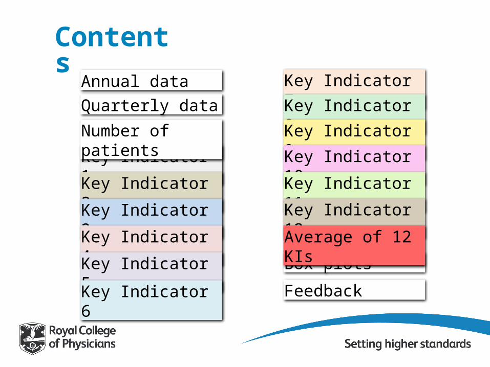
ContentsAnnual dataQuarterly data
Box plots
Key Indicator 1
Key Indicator 2
Key Indicator 3
Key Indicator 4
Key Indicator 5
Key Indicator 6
Key Indicator 7
Key Indicator 8
Key Indicator 9
Key Indicator 10
Key Indicator 11
Key Indicator 12
Average of 12 KIs
Feedback
Number of patients
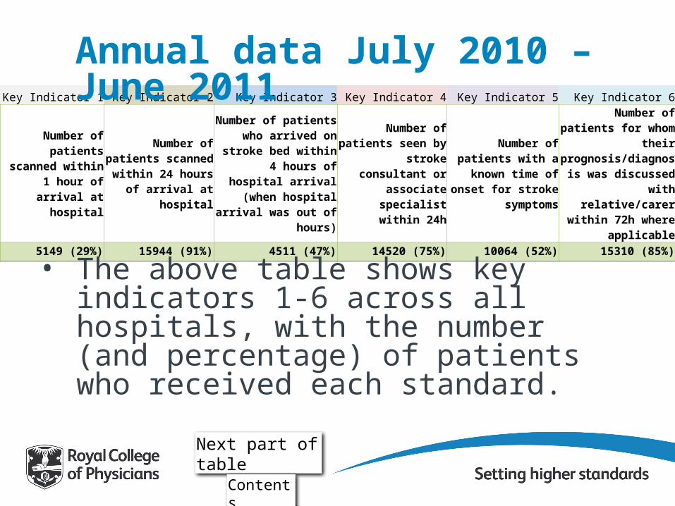
Key Indicator 1 Key Indicator 2 Key Indicator 3 Key Indicator 4 Key Indicator 5 Key Indicator 6
Number of patients scanned within 1 hour of arrival at
hospital
Number of patients scanned within 24 hours of arrival at
hospital
Number of patients who arrived on stroke bed
within 4 hours of hospital arrival (when hospital
arrival was out of hours)
Number of patients seen by stroke
consultant or associate specialist within 24h
Number of patients with a known time of
onset for stroke symptoms
Number of patients for whom their
prognosis/diagnosis was discussed with
relative/carer within 72h where applicable
5149 (29%) 15944 (91%) 4511 (47%) 14520 (75%) 10064 (52%) 15310 (85%)
Annual data July 2010 – June 2011
• The above table shows key indicators 1-6 across all hospitals, with the number (and percentage) of patients who received each standard.
Next part of table
Contents
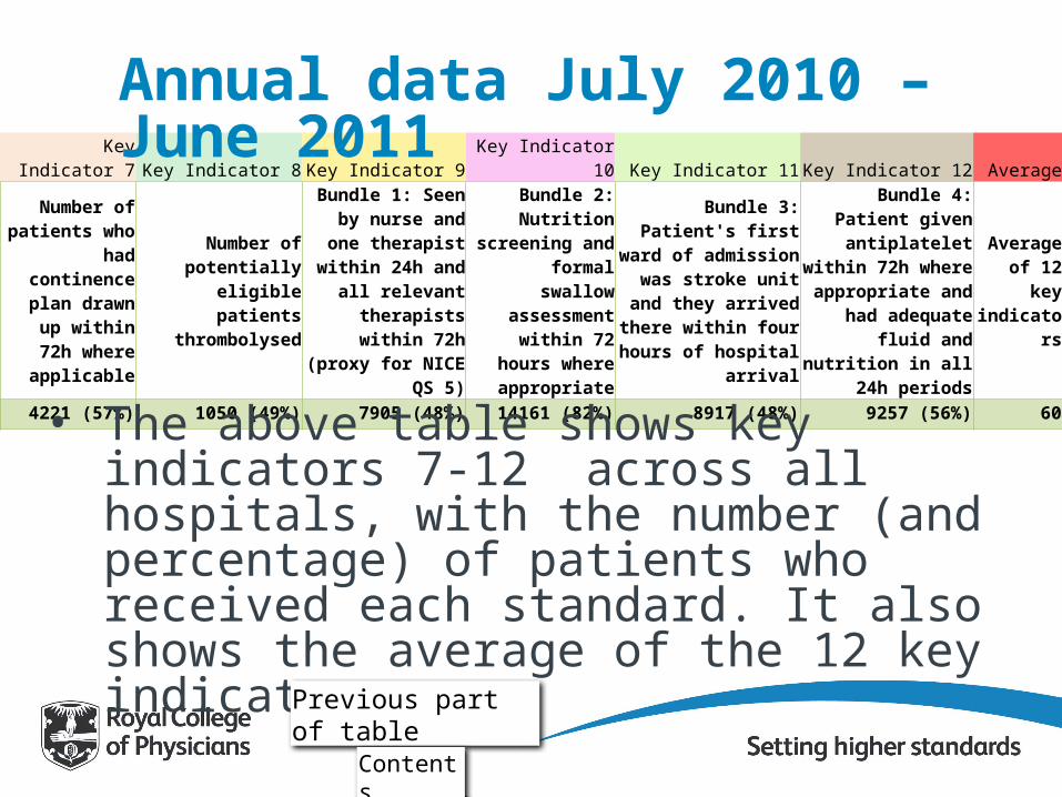
Key Indicator 7 Key Indicator 8 Key Indicator 9 Key Indicator 10 Key Indicator 11 Key Indicator 12 Average
Number of patients who had
continence plan drawn up within
72h where applicable
Number of potentially eligible patients
thrombolysed
Bundle 1: Seen by nurse and one
therapist within 24h and all relevant
therapists within 72h (proxy for NICE QS 5)
Bundle 2: Nutrition screening and
formal swallow assessment within
72 hours where appropriate
Bundle 3: Patient's first ward of admission was
stroke unit and they arrived there within four hours of hospital arrival
Bundle 4: Patient given antiplatelet within 72h where appropriate and had adequate fluid and
nutrition in all 24h periods
Average of 12 key
indicators
4221 (57%) 1050 (49%) 7905 (48%) 14161 (82%) 8917 (48%) 9257 (56%) 60
Annual data July 2010 – June 2011
• The above table shows key indicators 7-12 across all hospitals, with the number (and percentage) of patients who received each standard. It also shows the average of the 12 key indicators.
Previous part of table
Contents
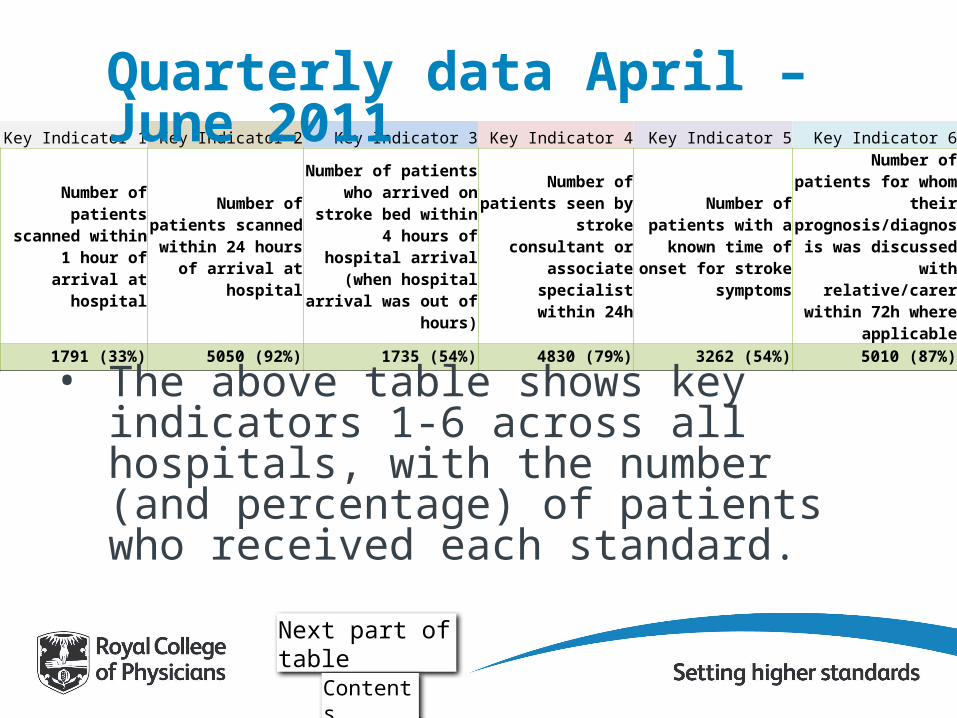
Key Indicator 1 Key Indicator 2 Key Indicator 3 Key Indicator 4 Key Indicator 5 Key Indicator 6
Number of patients scanned within 1 hour of arrival at
hospital
Number of patients scanned within 24 hours of arrival at
hospital
Number of patients who arrived on stroke bed
within 4 hours of hospital arrival (when hospital
arrival was out of hours)
Number of patients seen by stroke
consultant or associate specialist within 24h
Number of patients with a known time of
onset for stroke symptoms
Number of patients for whom their
prognosis/diagnosis was discussed with
relative/carer within 72h where applicable
1791 (33%) 5050 (92%) 1735 (54%) 4830 (79%) 3262 (54%) 5010 (87%)
Quarterly data April – June 2011
• The above table shows key indicators 1-6 across all hospitals, with the number (and percentage) of patients who received each standard.
Next part of table
Contents
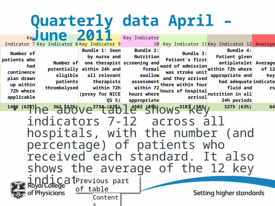
Key Indicator 7 Key Indicator 8 Key Indicator 9 Key Indicator 10 Key Indicator 11 Key Indicator 12 Average
Number of patients who had
continence plan drawn up within
72h where applicable
Number of potentially eligible patients
thrombolysed
Bundle 1: Seen by nurse and one
therapist within 24h and all relevant
therapists within 72h (proxy for NICE QS 5)
Bundle 2: Nutrition screening and
formal swallow assessment within
72 hours where appropriate
Bundle 3: Patient's first ward of admission was
stroke unit and they arrived there within four hours of hospital arrival
Bundle 4: Patient given antiplatelet within 72h where appropriate and had adequate fluid and
nutrition in all 24h periods
Average of 12 key
indicators
1406 (62%) 362 (52%) 2734 (53%) 4502 (85%) 3187 (55%) 3275 (63%) 64
• The above table shows key indicators 7-12 across all hospitals, with the number (and percentage) of patients who received each standard. It also shows the average of the 12 key indicators.
Quarterly data April – June 2011
Previous part of table
Contents

Number of stroke patients per month
Contents

Key Indicator 1Key indicators• Number of patients scanned within 1 hour of
arrival at hospital– This is for stroke patients only. Patients who
were already in hospital at the time of stroke are not included, as arrival time is irrelevant here. This indicator is for Accelerating Stroke improvement (ASI) Metric 4 (and is also linked to NICE Quality Standard 2).
Contents
Graph

Key Indicator 1Key indicators• Number of patients scanned within 1 hour of
arrival at hospital
Information
Contents
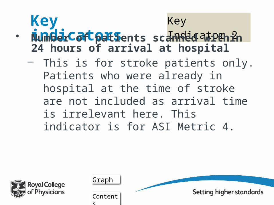
Key Indicator 2Key indicators• Number of patients scanned within 24 hours of
arrival at hospital– This is for stroke patients only. Patients who
were already in hospital at the time of stroke are not included as arrival time is irrelevant here. This indicator is for ASI Metric 4.
Graph
Contents

Key Indicator 2Key indicators• Number of patients scanned within 24 hours of
arrival at hospital
Information
Contents

Key Indicator 3Key indicators• Number of patients who arrived on stroke bed
within 4 hours of hospital arrival (when hospital arrival was out of hours) – This is based on stroke patients who arrived out of
hours. Out of hours means the patient arrived after 6pm or before 8am Monday-Friday, or at the weekend or on a Bank Holiday. Patients who were already in hospital at the time of stroke are not included as arrival time is irrelevant here. This indicator is used to distinguish hospitals which have well organised direct admission to stroke units 'out of hours'.
Graph
Contents

Key Indicator 3Key indicators• Number of patients who arrived on stroke bed
within 4 hours of hospital arrival (when hospital arrival was out of hours)
Information
Contents
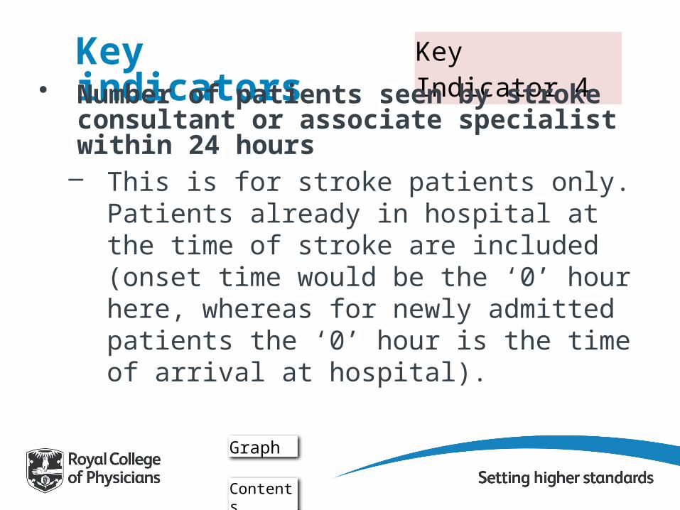
Key Indicator 4Key indicators• Number of patients seen by stroke consultant or
associate specialist within 24 hours– This is for stroke patients only. Patients already
in hospital at the time of stroke are included (onset time would be the ‘0’ hour here, whereas for newly admitted patients the ‘0’ hour is the time of arrival at hospital).
Graph
Contents

Key Indicator 4Key indicators• Number of patients seen by stroke consultant or
associate specialist within 24 hours
Information
Contents

Key Indicator 5Key indicators• Number of patients with a known time of onset
for stroke symptoms– This is based on stroke patients only. It includes
patients who were already in hospital at time of stroke. This is included as a key indicator to reward those services which are putting effort into establishing the onset time for more of their patients. Also, it contributes to higher quality and more useful data, as more standards can be measured according to onset time.
Graph
Contents

Key Indicator 5Key indicators• Number of patients with a known time of onset
for stroke symptoms
Information
Contents

Key Indicator 6Key indicators• Number of patients for whom their
prognosis/diagnosis was discussed with relative/carer within 72 hours where applicable– This is for stroke patients only. Patients already
in hospital at the time of stroke are included. This is used as a key indicator as it is a measure which looks at whether hospitals are involving carers/relatives.
Graph
Contents
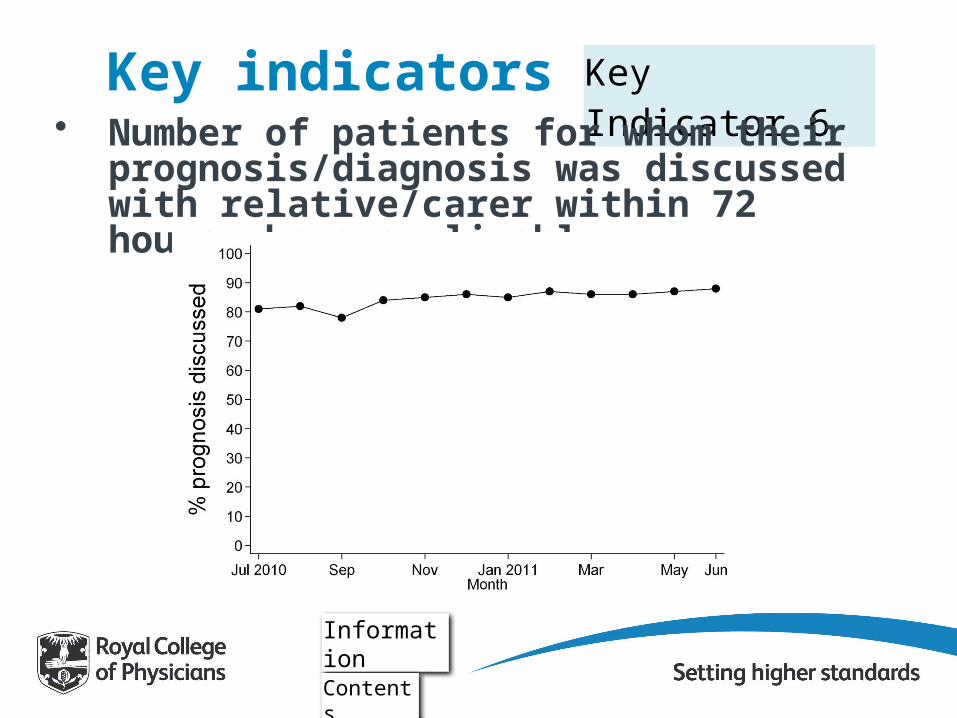
Key Indicator 6Key indicators• Number of patients for whom their
prognosis/diagnosis was discussed with relative/carer within 72 hours where applicable
Information
Contents

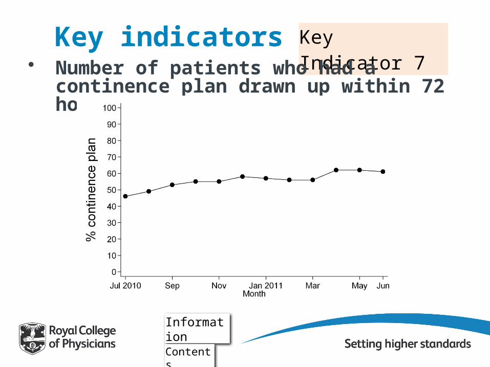
Key Indicator 7Key indicators• Number of patients who had a continence plan
drawn up within 72 hours where applicable– This is for stroke patients only. This includes
patients already in hospital at the time of stroke. The management of continence is consistently highlighted by patients as being one of the most important aspects of care.
Graph
Contents
Key Indicator 7Key indicators• Number of patients who had a continence plan
drawn up within 72 hours where applicable
Information
Contents

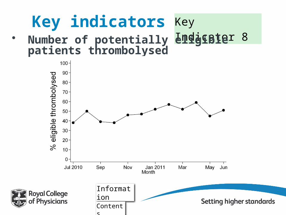
Key Indicator 8Key indicators• Number of potentially eligible patients
thrombolysed– Eligible patients are those with infarction; aged 80 and
under; whose onset of stroke to arrival at hospital time was less than 3 hours or who had their stroke in hospital; who did not refuse treatment; and who were not contra-indicated due to co-morbidity, medication or another reason. This is linked to NICE Quality Standard 3.
Graph
Contents
Key Indicator 8Key indicators• Number of potentially eligible patients
thrombolysed
Information
Contents

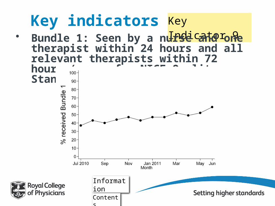
Key Indicator 9Key indicators• Bundle 1: Seen by a nurse and one therapist
within 24 hours and all relevant therapists within 72 hours (proxy for NICE Quality Standard 5)– This is for stroke patients only. This includes
patients already in hospital at the time of stroke. This is linked to NICE Quality Standard 5 but does not have 'documented multidisciplinary goals agreed within 5 days' which is part of the NICE Quality Standard. (This is because this is outside of SINAP’s 72 hour remit).
Graph
Contents
Key Indicator 9Key indicators• Bundle 1: Seen by a nurse and one therapist
within 24 hours and all relevant therapists within 72 hours (proxy for NICE Quality Standard 5)
Information
Contents
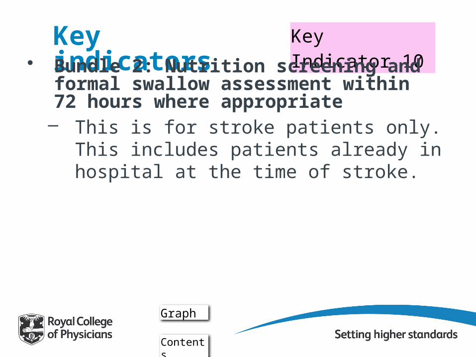
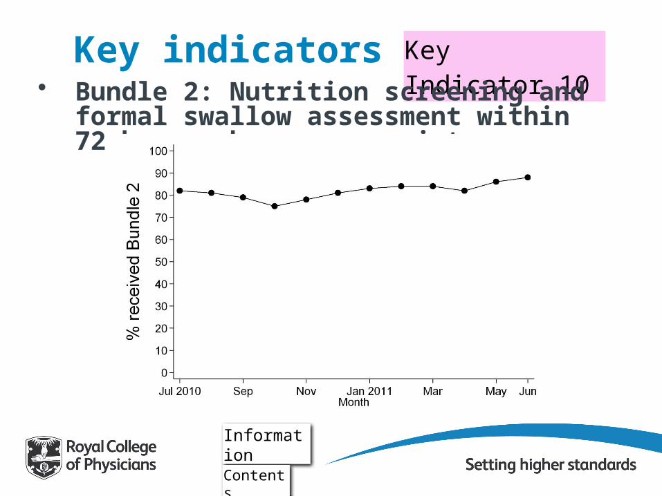
Key Indicator 10Key indicators• Bundle 2: Nutrition screening and formal swallow
assessment within 72 hours where appropriate– This is for stroke patients only. This includes
patients already in hospital at the time of stroke.
Graph
Contents
Key Indicator 10Key indicators• Bundle 2: Nutrition screening and formal swallow
assessment within 72 hours where appropriate
Information
Contents
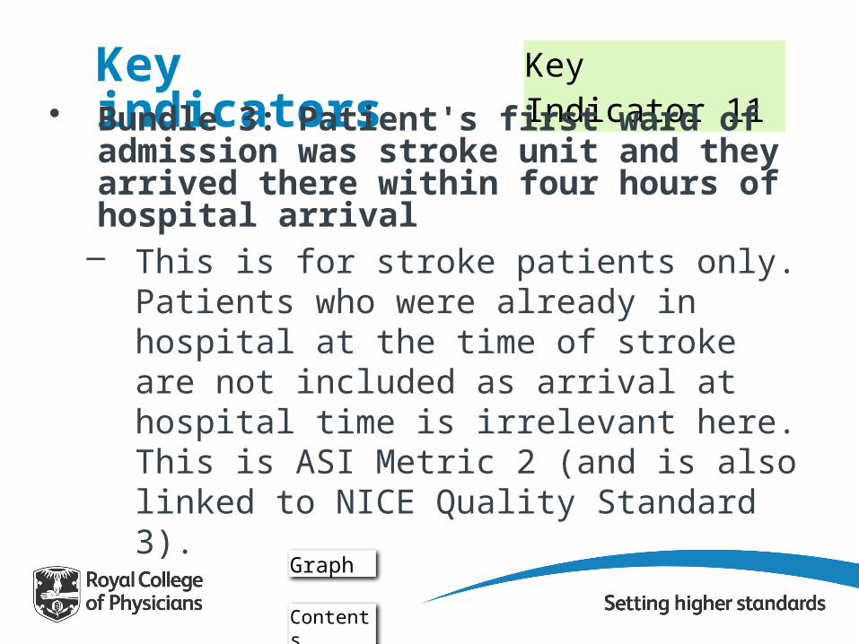
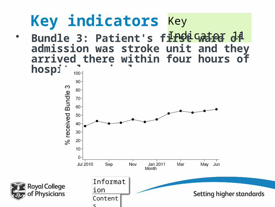
Key Indicator 11Key indicators• Bundle 3: Patient's first ward of admission was
stroke unit and they arrived there within four hours of hospital arrival– This is for stroke patients only. Patients who
were already in hospital at the time of stroke are not included as arrival at hospital time is irrelevant here. This is ASI Metric 2 (and is also linked to NICE Quality Standard 3).
Graph
Contents
Key Indicator 11Key indicators• Bundle 3: Patient's first ward of admission was
stroke unit and they arrived there within four hours of hospital arrival
Information
Contents

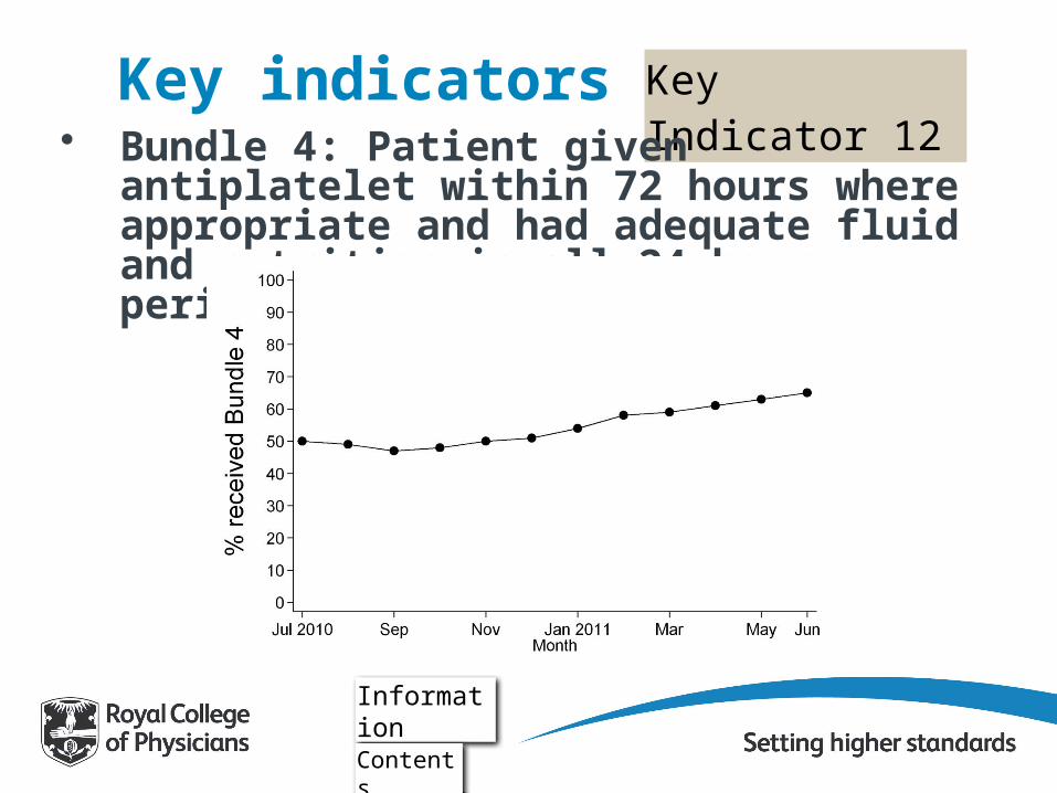
Key Indicator 12Key indicators• Bundle 4: Patient given antiplatelet within 72
hours where appropriate and had adequate fluid and nutrition in all 24 hour periods– This is for stroke patients only. This includes
patients already in hospital at the time of stroke.
Graph
Contents
Key Indicator 12Key indicators• Bundle 4: Patient given antiplatelet within 72
hours where appropriate and had adequate fluid and nutrition in all 24 hour periods
Information
Contents
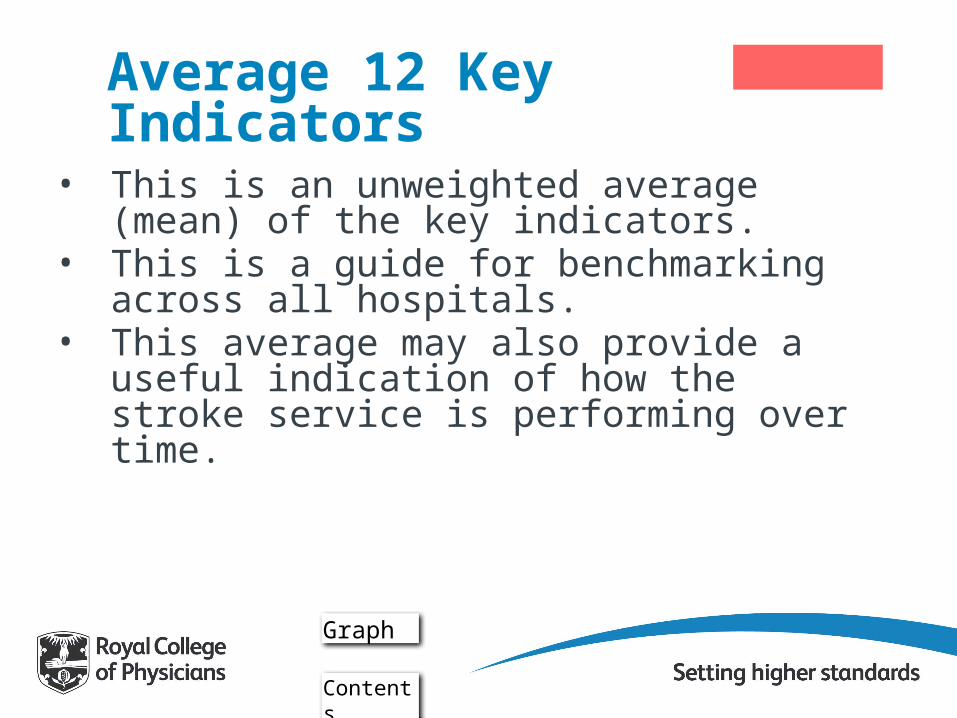
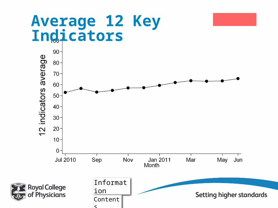
Average 12 Key Indicators
• This is an unweighted average (mean) of the key indicators.
• This is a guide for benchmarking across all hospitals.
• This average may also provide a useful indication of how the stroke service is performing over time.
Graph
Contents
Information
Average 12 Key Indicators
Contents

Key to box plots
Contents
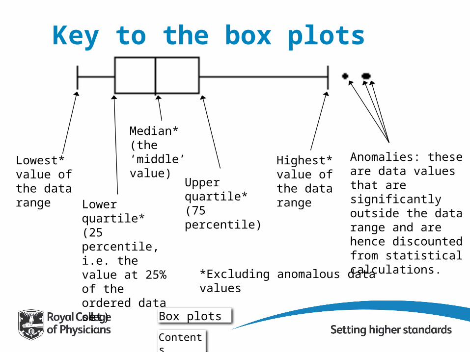
Lowest* value of the data range
Lower quartile*(25 percentile, i.e. the value at 25% of the ordered data set)
Median*(the ‘middle’ value)
Upper quartile*(75 percentile)
Highest* value of the data range
Anomalies: these are data values that are significantly outside the data range and are hence discounted from statistical calculations.
*Excluding anomalous data values
Key to the box plots
Box plots
Contents

Feedback• We are keen to have feedback on this
presentation, and particularly if you have used it for quality improvement purposes.
• Please send feedback to: [email protected]
• For more information, please visit:www.rcplondon.ac.uk/sinap
Contents
Related Documents
![Are You Running a 'Don't Contact' Center? [Slideshow]](https://static.cupdf.com/doc/110x72/545783b4b1af9fc0638b5275/are-you-running-a-dont-contact-center-slideshow.jpg)