8th Edition Your Online Resource for Chronic Disease Information™ www.managedcaredigest.com In this Volume New Program Characteristics and Medicaid Expansion Looking Forward to Next Generation ACOs 5,084,961 4,167,528 3,872,430 3,235,205 1,741,087 1,992,400 2,901,006 7,368,458 8,846,328 6,713,789 13.6% 4.6% 14.3% 22.8% 5.6% 9.5% 7. 8 % 10.0% 3.1% 6.4% MANAGED CARE DIGEST SERIES ® SIN C E 1 9 8 7 Public Payer Digest | 2016

Welcome message from author
This document is posted to help you gain knowledge. Please leave a comment to let me know what you think about it! Share it to your friends and learn new things together.
Transcript

8th EditionYour Online Resource for Chronic Disease Information™www.managedcaredigest.com
In this VolumeNew Program Characteristics and Medicaid Expansion
Looking Forward to Next Generation ACOs
5,084,9614,167,528
3,872,4303,235,2051,741,087
1,992,40 02,901,0 067,368,458 8,846,3286,713,789
13.6%4.6%
14.3%22.8%
5.6%9.5%7.8%
10.0 %3.1%6.4%
MANAGED CAREDIGEST SERIES®
SINCE 1987
Public Payer Digest | 2016

PUBLIC PAYER DIGEST 2016 SANOFI / MANAGED CARE DIGEST SERIES® / WHERE INFORMATION BECOMES INTELLIGENCE.™
Leading the Health Care Discussion
The nationally renowned Sanofi Managed Care Digest Series®—now in its 30th year—is part of our
ongoing commitment to provide you with essential data on the important trends in U.S. health care.
Our goal is to help you remain on the leading edge of health care developments in America, and we
hope that this information helps you identify trends that may assist your organization, as the health care
delivery landscape continues to evolve.
Sanofi is pleased to provide you with your complimentary copy of this eighth edition of the
Public Payer Digest, the second report in the three-part Managed Care Digest Series® for 2016. This
Digest features extensive long-term trended data on, and in-depth analyses of, the Medicare and
Medicaid programs, as well as a variety of long-term care institution types. In addition, it is a rich source
of patient-level, chronic disease-specific, and hospital diagnosis-related discharge data.
Your Sanofi account executive or sales representative would be happy to provide you with additional
information on our products and services. Thank you for your commitment to the quality of health care
in America. We look forward to continuing our partnership with you in this important endeavor.
Sincerely,
Garrett Ingram U.S. Country Head of Market Access sanofi-aventis U.S. LLC A SANOFI COMPANY
Managed Care digest series® 2016
Commissioned, sponsored and underwritten by Sanofi, Bridgewater, NJ
Developed and produced by Forte Information Resources LLC, Denver, CO
Data provided by IMS Health, Parsippany, NJ
www.managedcaredigest.com
Inquiries relating to the mailing or distribution of the Managed Care Digest Series® can be addressed by calling 1-800-529-9615.
Managed Care Digest Series® is a registered trademark of Sanofi © 2016 sanofi-aventis U.S. LLC, A SANOFI COMPANY

1SANOFI / MANAGED CARE DIGEST SERIES® / WHERE INFORMATION BECOMES INTELLIGENCE.™ PUBLIC PAYER DIGEST 2016
CO
NTE
NTS
CONTENTS, VOL. 8
INTRODUCTION .................................................................................................3
EXECUTIVE SUMMARY .......................................................................................4
MEDICAREBackgrounder ..............................................................................................................................5
DemographicsMedicare Advantage Continues to Expand ............................................................................. 6
MA HMO Enrollment Edges That of MA PPOs in 2015 ................................................................ 7
UnitedHealth Remains Largest MA Organization, Grows Nearly 9% ....................................... 8
Enrollment Climbs for Medicare Advantage Plans .................................................................. 9
Medicare Inpatient Case Shares Climb for Six Selected Dxs ................................................. 10
UtilizationAdmissions Ratio Falls, ALOS Rises for Medicare HMO Members ........................................... 11
ALOS for Diabetes Mellitus Is Highest Among Profiled Dxs ...................................................... 12
Length of Stay Rises for Diabetes Mellitus Inpatient Cases ..................................................... 13
FinancialsManaged Care Share of Medicare Spending Grows ............................................................ 14
Inpatient Charges per Medicare Case Climb Steadily .......................................................... 15
Medicare Inpatient Reimbursement Increases ....................................................................... 16
Medicare Reimbursement Rate for Heart Failure Falls Again ................................................ 17
PharmacyDrug Cost Limits Shift Up for Part D Participants in 2016 .......................................................... 18
Ingredient Cost per Medicare HMO Rx Shrinks in 2015 ........................................................... 19
LIS Shares Dip Among Part D Diabetes, Oncology Patients ................................................... 20
Membership Grows for Most Top 10 PDP Enrollment States ................................................... 21
Pharmacy Costs per Staffed Bed Are Lower at Non-IHS Hospitals ........................................ 22
Part D Shares of Total Rxs Climb in 12 Common Drug Classes ............................................... 23
OOP Costs for Part D Rxs Fall for Half of Profiled Drug Classes ............................................... 24
Generic Shares of Common Medicare Prescriptions Rise ...................................................... 25
Numbers of Part D Retail Rxs Grow in Most Drug Classes ....................................................... 26
MEDICAIDBackgrounder ..................................................................................................................................... 27
Demographics
Medicaid Managed Care Penetration Nears 85% ................................................................. 28
Medicaid Portions Grow for Nearly Half of Profiled Inpatient Dxs ......................................... 29
Medicaid IP Case Portions Grow for Four Profiled Diagnoses ................................................ 30
Utilization
Hospital Days, Admit Ratios Fall at Not-for-Profit Medicaid HMOs ........................................ 31
Medicaid Discharges, Patient-Days Decline; ALOS Is Unchanged ....................................... 32
Financials
Provider Charges Climb for Medicaid Lipid Disorder Patients ............................................... 33
Pharmacy
Number of Prescriptions Dips per Member per Year for Medicaid ....................................... 34
Medicaid Portions of Retail Prescriptions Climb Steadily ........................................................ 35
Medicaid OOP Retail Rx Costs Rise for Most Drug Classes ..................................................... 36
One in Five Asthma Rxs for Males Is Covered by Medicaid ................................................... 37
Vast Majority of Profiled Medicaid Drugs Are Generic ........................................................... 38
2 PUBLIC PAYER DIGEST 2016 SANOFI / MANAGED CARE DIGEST SERIES® / WHERE INFORMATION BECOMES INTELLIGENCE.™
CO
NTE
NTS LONG-TERM CARE
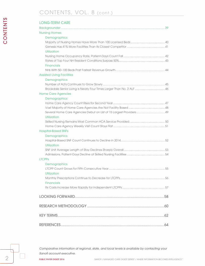
Backgrounder ............................................................................................................................39
Nursing Homes
DemographicsMajority of Nursing Homes Have More Than 100 Licensed Beds ........................................... 40
Genesis Has 41% More Facilities Than Its Closest Competitor ................................................ 41
UtilizationNursing Home Occupancy Rate, Patient-Days Count Fall .................................................... 42
Rates of Top Four NH Resident Conditions Surpass 50% .......................................................... 43
FinancialsNHs With 50–100 Beds Post Fastest Revenue Growth .............................................................. 44
Assisted Living Facilities
DemographicsNumber of ALFs Continues to Grow Slowly .............................................................................. 45
Brookdale Senior Living Is Nearly Four Times Larger Than No. 2 ALF ...................................... 46
Home Care Agencies
DemographicsHome Care Agency Count Rises for Second Year ................................................................. 47
Vast Majority of Home Care Agencies Are Not Facility Based .............................................. 48
Several Home Care Agencies Debut on List of 15 Largest Providers .................................... 49
UtilizationSkilled Nursing Remains Most Common HCA Service Provided ............................................. 50
Home Care Agency Weekly Visit Count Stays Flat ................................................................. 51
Hospital-Based SNFs
DemographicsHospital-Based SNF Count Continues to Decline in 2014........................................................ 52
UtilizationSNF Unit Average Length of Stay Declines Sharply Overall .................................................... 53
Admissions, Patient-Days Decline at Skilled Nursing Facilities ................................................ 54
LTCPPs
DemographicsLTCPP Count Grows for Fifth Consecutive Year ....................................................................... 55
UtilizationMonthly Prescriptions Continue to Decrease for LTCPPs ........................................................ 56
FinancialsRx Costs Increase More Rapidly for Independent LTCPPs ...................................................... 57
LOOKING FORWARD.......................................................................................58
RESEARCH METHODOLOGY ...........................................................................60
KEY TERMS ........................................................................................................62
REFERENCES .....................................................................................................64
CONTENTS, VOL. 8 (cont.)
Comparative information at regional, state, and local levels is available by contacting your
Sanofi account executive.

The Medicare section reviews the most important
aspects of this crucial program, including
demographic overviews of Medicare Advantage
(MA), Medicare HMOs and hospital-based
Medicare. Utilization measures are also
showcased, and feature chronic-disease specific
hospital metrics for Medicare HMO members.
The financial section includes inpatient charges
for the treatment of Medicare beneficiaries and
Medicare reimbursement rates for common
diagnoses and procedures. Pharmacy utilization,
out-of-pocket costs, and retail prescription use are
also tracked. The effects of developing payment
models such as accountable care organizations
(ACOs), the Medicare Shared Savings Program,
and Next Gen ACOs are spotlighted in this section.
The Medicaid section includes trended
data on the program and its unparalleled
expansion, and spotlights how the industry is
adapting to care for its growing population.
Demographic data on common diagnoses
and procedures for Medicaid recipients are
featured, along with inpatient payer shares
of chronic disease cases. Hospital utilization,
including discharges, patient-days and length
of stay, is tracked for Medicaid HMO members
and the Medicaid population overall. Provider
and facility charges for Medicaid recipients in
inpatient and outpatient settings are featured,
as are key pharmacy benchmarks, such as
out-of-pocket costs and retail prescription
spending for common therapeutic drug classes.
The Long-Term Care section profiles the providers
and institutions serving the senior population—
again a growing sector in the health care
industry—including nursing homes, assisted living
facilities, home care agencies, hospital-based
skilled nursing facilities, and long-term care
pharmacy providers. Demographic, utilization,
financial, and pharmacy metrics are provided,
including facility counts, admission, and
occupancy rates, and commonly provided
services. Data about the nation’s largest
long-term care chains are likewise featured.
Backgrounders for each section of the Public
Payer Digest provide an overview of the topic
at hand, and key takeaways contextualize the
metrics, examining the implications of the subjects
under discussion. The data that appear in the
Public Payer Digest continue to distinguish this
important work, as well as the Managed Care Digest Series® as a whole. Decade-long trends
of industry measures are featured throughout
this Digest, lending historical perspective to
health care topics examined. Data analyzing
the significant impact of chronic disease—
patient-level claims data and diagnosis-related
hospital discharge data—likewise appear
throughout and provide valuable insight into how
Medicare beneficiaries, Medicaid recipients, and
long-term care patients are being treated for
chronic conditions. Important industry trends and
chronic disease metrics are often examined at the
regional, state, or MSA level to highlight how health
care is managed and delivered at the local level.
Sanofi is pleased to present volume 8 of the Public Payer Digest, the second report in the Sanofi
Managed Care Digest Series® for 2016. Since 1987, the Managed Care Digest Series® has focused on
helping health care organizations develop strategies, control costs, and assess value. Now in its 30th year,
the Managed Care Digest Series® remains a trusted source for the most reliable health care data and
progressive analysis, including detailed diagnosis-related, chronic disease-specific patient claims and
hospital discharges. As the population changes and the health care industry evolves, the Managed Care Digest Series® maintains its commitment to leading the health care discussion.
Medicare and Medicaid cover more lives than ever, making the in-depth profiles in the
Public Payer Digest uniquely valuable and more relevant than ever. The 2016 edition examines
the many facets of these programs and explores how legislative reforms affect them. The Digest
also analyzes the various long-term care institutions providing health care services to a large and
growing segment of the U.S. population. The three main topics (Medicare, Medicaid, and long-term
care) of this Digest are each divided into four distinct subsections of data elements: demographics,
utilization, financials, and pharmacy. Clear analyses and insightful key takeaways bring perspective to
the Public Payer Digest’s unparalleled data sets.
3SANOFI / MANAGED CARE DIGEST SERIES® / WHERE INFORMATION BECOMES INTELLIGENCE.™ PUBLIC PAYER DIGEST 2016
INTR
OD
UC
TION
INTRODUCTION

Medicare• In 2015, Medicare insured 54.5 million
Americans, or roughly one in every six people.
Of this population, 17.3 million beneficiaries
were enrolled in Medicare Advantage (MA)
plans, a 6.1% increase from 2014 (16.3 million).
• Six of the top 10 MA organizations, by
enrollment, recorded membership growth
between 2014 and 2015.
• For only the second time since 2010, MA HMO
enrollment increased faster than that of
MA PPO plans, with enrollment in MA HMO
plans (6.5%) narrowly outpacing that of
MA PPO plans (5.6%) from 2014 to 2015.
• The number of hospital admissions per
1,000 Medicare HMO members decreased
for the second consecutive year in
2015, to 250.2 from 253.4 in 2014.
• For the 11th consecutive year, the managed
care share of total Medicare expenditures
increased, to 27.4% in 2015 from 26.7% in 2014.
• For eight of the 10 top states, by Medicare
Part D prescription drug program (PDP)
enrollment, membership counts increased from
2015 to 2016. Collectively, PDP enrollment in
these top 10 states increased by 2.1%.
Medicaid• At the end of 2015, the Medicaid program
covered 72.4 million individuals, a 20.7%
increase in average monthly enrollment
from the 2013 pre-Affordable Care Act
(ACA) expansion baseline of 60 million.
• Medicaid recipients enrolled in a managed
care organization (MCO) represented 84.9%
of total Medicaid enrollees in 2015, up 14.6
percentage points from 2008 (70.3%).
• From 2014 to 2015, the number of hospital
days and admissions per 1,000 Medicaid HMO
members decreased at not-for-profit HMOs;
these ratios increased at for-profit HMOs.
• The average number of Medicaid hospital
discharges fell fractionally (1.1%) from 2013
(1,104.0) to 2014 (1,092.4). Meanwhile, average
length of stay (ALOS) per inpatient Medicaid
case remained unchanged, at 4.4 days.
• Average annual professional charges for
Medicaid lipid disorder patients rose by double-
digit percentages across profiled care settings
from 2013 to 2015, most notably at skilled nursing
facilities (47.8%) and emergency rooms (28.5%).
• From midyear 2014 to midyear 2015, out-
of-pocket (OOP) costs per Medicaid
retail prescription grew across eight
of the 12 featured drug classes.
Long-Term Care• Following an increase from 2013 (1.65 million) to
2014 (1.67 million), the total number of licensed
nursing home beds in the U.S. grew for a second
year, to 1.68 million in 2015 (up 1.5% since 2013).
• From 2014 (82.2%) to 2015 (81.5%), the
average occupancy rate for nursing
homes (NHs) overall declined fractionally,
as did total facility patient-days (to 32,142
from 32,553), and the total facility ALOS
rose by two days (to 180 from 178).
• NHs reported annual increases in revenue
from 2014 to 2015, regardless of bed size;
NHs with 50 to 100 beds posted the largest
percentage gains, by bed count, at 4.0%.
• After a decline over the three-year period
from 2010 to 2012, the total number of
assisted living facilities (ALFs) in the U.S.
rose, to 15,836 in 2015 from 15,447 in 2012,
topping the previous high of 15,781 in 2010.
• In 2015, a total of 11,543 home care
agencies (HCAs) were not physically
located in hospital facilities, up 4.0% from
2013 (11,104). Non-facility-based agencies
accounted for nearly 90% of all HCAs.
• ALOS at skilled nursing facilities (SNFs)
dropped 10.8% from 2013 (179.9 days) to
2014 (160.4). Overall SNF unit admissions and
patient-days also fell during this period.
4 PUBLIC PAYER DIGEST 2016 SANOFI / MANAGED CARE DIGEST SERIES® / WHERE INFORMATION BECOMES INTELLIGENCE.™
EX
EC
UTI
VE
SU
MM
AR
Y
EXECUTIVE SUMMARY

5SANOFI / MANAGED CARE DIGEST SERIES® / WHERE INFORMATION BECOMES INTELLIGENCE.™ PUBLIC PAYER DIGEST 2016
In 2015, Medicare insured 54.5 million Americans,
or roughly one in every six people in the U.S.1 A
wide variety of entities, from traditional payers
to emergent institutions like accountable care
organizations (ACOs), are aiding the program in
managing the care of this significant population.
Indeed, private managed care organizations
are assuming a greater role in handling the
health of Medicare beneficiaries, as enrollment
in Medicare Advantage (MA) plans—including
Medicare HMOs—grows alongside Medicare
membership. Yet Medicare is still very much a
public program, subject to legislative changes
and limited resources. Should these limited
resources necessitate reduced payments to
providers, physician participation may be
negatively affected. The Medicare Access and
CHIP Reauthorization Act of 2015 (MACRA) was
designed to prevent a major cut, but still set
payment updates at a rate that lags expected
cost increases.2 This, too, may impact physician
participation at a time of heightened demand.
MEDICAREBackgrounder
6.2 6.2 6.6 7.4 7.6
10.4 11.08.7
9.9 10.4 11.012.5
14.716.3
17.3
44.2 44.8 45.8 46.4 48.4 50.2 51.8 53.4 54.5
2007 2008 2009 2010 2011 2012 2013 2014 20150
7
14
40
60
Enro
llme
nt (
Mill
ion
s)
Medicare HMOs MA Plans Medicare
8.7 9.4
13.3
MA Plan and Medicare HMO Enrollment vs. Medicare Overall, 2007–20153
LONG-TERM TREND
Data sources: IMS Health and the Centers for Medicare & Medicaid Services © 2016
1 U.S. Census Bureau. (2016). U.S. and World Population Clock. Retrieved from http://www.census.gov/popclock/2 Centers for Medicare & Medicaid Services. (2016). 2016 Annual Report of the Boards of Trustees of the Federal Hospital Insurance and Federal
Supplemental Medical Insurance Trust Funds. Retrieved from https://www.cms.gov/Research-Statistics-Data-and-Systems/Statistics-Trends-and-Reports/ReportsTrustFunds/Downloads/TR2016.pdf
3 Enrollment figures are year-end totals, and do not include Medicare Advantage enrollees in Puerto Rico and U.S. territories.

TOP 10 STATES, RANKED BY MEDICARE ADVANTAGE ENROLLMENT, 2014–20151
STATE Enrollment 2014 Enrollment 2015 Percentage Change 2014–2015
California 2,230,464 2,353,403 5.5%
Florida 1,543,127 1,650,256 6.9
New York 1,193,779 1,223,595 2.5
Texas 1,084,129 1,212,507 11.8
Pennsylvania 996,122 1,022,260 2.6
Ohio 879,957 829,795 –5.7
Michigan 581,964 647,611 11.3
North Carolina 501,674 535,977 6.8
Minnesota 472,927 506,126 7.0Georgia 451,894 500,143 10.7
1 Enrollment figures are year-end totals and do not include Medicare Advantage enrollees in Puerto Rico and U.S. territories.2 Jacobsen, G., et al. (2015). Medicare Advantage 2016 Data Spotlight: Overview of Plan Changes. Retrieved from http://kff.org/medicare/
issue-brief/medicare-advantage-2016-data-spotlight-overview-of-plan-changes/
Key Takeaway
In 2016, beneficiaries enrolling in an MA plan have, on average, 19 different plans to choose from,
offered by six different insurance providers.2 Yet participants who remain with their current plans may
see an increase in cost sharing: premiums for enrollees in MA plans with a prescription drug component
will rise by 8%, and out-of-pocket limits on Parts A and B benefits will also go up.2 Plans may continue to
shift how they share costs with enrollees, as they also adjust to higher enrollment and medical costs.
4%
11%
18%
25%
32%
2
6
10
14
18
Enro
llme
nt (
Mill
ion
s)
2004 2005 2006 2007 2008 2009 2010 2011 2012 2013 2014 2015
MA
Pen
etra
tion
Total Enrollees Total Penetration
5.56.0
7.2
8.7
9.910.4
11.0
12.513.3
14.7
12.8%13.6%
16.8%
19.5%
22.1% 22.7%23.6%
25.7% 26.4%28.4%
16.3
30.5%
17.3
31.7%
MEDICARE ADVANTAGE ENROLLMENT AND PENETRATION INTO MEDICARE, 2004–20151
Data sources: IMS Health and the Centers for Medicare & Medicaid Services © 2016
66
DEMOGRAPHICSM
ED
ICA
RE
PUBLIC PAYER DIGEST 2016 SANOFI / MANAGED CARE DIGEST SERIES® / WHERE INFORMATION BECOMES INTELLIGENCE.™
• Total MA membership grew from 2014 to 2015
in nine of the 10 top states (Ohio excepted).
Double-digit enrollment growth occurred in Texas
(11.8%), Michigan (11.3%), and Georgia (10.7%).
• Collectively, MA enrollment in these 10 states
increased by 5.5% from 2014 (9.9 million) to 2015
(10.5 million), accounting for more than 60% of
national enrollment in such plans in 2015.
Most States With High MA Enrollment See Continued Growth in Membership Counts
STATE SPOTLIGHT
• Medicare Advantage (MA) plans enrolled
17.3 million beneficiaries in 2015, a 6.1%
increase over 16.3 million the prior year. From
2004 (5.5 million) to 2015, total participation in
such plans has grown more than threefold.
• The MA share of beneficiaries also rose in
2015, to 31.7% from 30.5% in 2014. However,
this increase (1.2 percentage points) in
penetration represented a slowdown from the
2.1 point growth from 2013 (28.4%) to 2014.
Medicare Advantage Continues to ExpandLONG-TERM TREND

Data sources: IMS Health and the Centers for Medicare & Medicaid Services © 2016
0.0%
17.0%
34.0%
51.0%
68.0%
Ave
rag
e L
eng
th o
f Sta
y (D
ays
)
PPO HMO
2009 2010 2011 2012 2013 2014 2015
17.0%
63.9%
25.7%
60.1%
28.3%
63.6%
28.3%
65.4%
30.4%
63.8%
31.1%
63.5%
31.0%
63.8%
SHARE OF MA ENROLLMENT BY PLAN TYPE, 2009–2015
MEDICARE ADVANTAGE (MA) ENROLLMENT, BY PLAN TYPE, 2010–20151
PLAN TYPE 2010 2011 2012 2013 2014 2015HMO 7,136,633 7,919,458 8,690,663 9,388,510 10,350,493 11,024,064
PPO 2,818,592 3,526,360 3,739,660 4,481,424 5,064,674 5,347,728
PFFS 572,540 516,975 405,954 305,965 258,189 237,033
Other2 442,179 491,271 442,092 548,675 615,456 662,478TOTAL 10,969,944 12,454,064 13,278,369 14,724,574 16,288,812 17,271,303
1 Enrollment figures are year-end totals and do not include Medicare Advantage enrollees in Puerto Rico and U.S. territories.2 “Other” includes Cost, MSA, PACE, PSO (state license), and Pilot plans.3 Jacobsen, G., et al. (2015). Medicare Advantage 2016 Data Spotlight: Overview of Plan Changes. Retrieved from http://kff.org/medicare/issue-
brief/medicare-advantage-2016-data-spotlight-overview-of-plan-changes/4 Abrahams, B. (2016). The Different Types of Medicare Advantage Plans. Medicare.com. Retrieved from: https://medicare.com/medicare-
advantage/the-different-types-of-medicare-advantage-plans/
7
DEMOGRAPHICS
7
ME
DIC
AR
E
SANOFI / MANAGED CARE DIGEST SERIES® / WHERE INFORMATION BECOMES INTELLIGENCE.™ PUBLIC PAYER DIGEST 2016
Key Takeaway
MA PPO plans are often less restrictive than MA HMO plans because they allow enrollees to seek
specialty care without a referral and offer partial coverage for out-of-network care.3 Such flexibility
may explain the rising share of PPO enrollment as a portion of total MA enrollment. However, given that
out-of-pocket costs for MA plans are rising,3 and that MA PPO plans usually have higher costs to begin
with,4 it remains unclear whether growth in the PPO percentage of MA enrollment has leveled off.
PPO Portion of Total MA Enrollment in 2015 Is Almost Twice That of 2009
• From 2009 (17.0%) to 2015 (31.0%), PPO
enrollment as a percentage of total MA
enrollment nearly doubled. During this
period, the share peaked at 31.1% in 2014.
• The HMO portion of total MA enrollment
remained virtually flat from 2009 (63.9%) to 2015
(63.8%). This percentage was at its highest in
2012 (65.4%) and its lowest in 2010 (60.1%).
• The percent rise in MA HMO enrollment from
2014 to 2015 (6.5%) narrowly surpassed that of
MA PPO plans (5.6%), marking only the second
time since 2010 that MA HMO enrollment
increased more than that of MA PPO plans.
• From 2010 (2,818,592) to 2015 (5,347,728),
MA PPO enrollment climbed 89.7%, notably
faster than the percent rise in MA HMO
enrollment (54.5%; to 11,024,064 from 7,136,633).
Conversely, enrollment in PFFS plans declined.
MA HMO Enrollment Edges That of MA PPOs in 2015LONG-TERM TREND

88
DEMOGRAPHICSM
ED
ICA
RE
PUBLIC PAYER DIGEST 2016 SANOFI / MANAGED CARE DIGEST SERIES® / WHERE INFORMATION BECOMES INTELLIGENCE.™
10 LARGEST MEDICARE ADVANTAGE ORGANIZATIONS, BY ENROLLMENT, 20152
0 900,000 1,800,000 2,700,000 3,600,000
MA Enrollment
Health Net Inc.
Highmark Inc.
Blue Cross Blue Shield of Michigan
WellCare Health Plans Inc.
Cigna
Anthem Inc.
Aetna Inc.
Kaiser Foundation Health Plan Inc.
Humana Inc.
UnitedHealth Group Inc. 3,505,904
3,253,465
1,347,939
1,278,486
627,252
505,800
405,911
355,136
295,946
291,897
ENROLLMENT BY PLAN TYPE, HUMANA INC., 2011–20152
2011 2012 2013 2014 20150
900,000
1,800,000
2,700,000
3,600,000
MA
En
rollm
en
t
696,032
23,629460,778
271,476
880,512
72,854
797,783
241,478
1,028,549
45,768
816,903
211,252
1,312,628
17,522
880,213
19,376 174,942
1,582,841
5,659
986,012
17,556 156,719
489,875
330,992391,030
528,897
504,678
HMO HMO-POS Local PPO Medicare-Medicaid Plan HMO PFFS3 Regional PPO
MA Enrollment in Humana HMOs and Local PPOs Doubles From 2011 to 2015
• Over the five years profiled, Humana MA
enrollment more than doubled in HMO (to
1.6 million in 2015 from 696,032 in 2011) and
local PPO (to 986,012 from 460,778) plans.
• Meanwhile, membership in Humana’s HMO-POS
and PFFS plans fell over this time frame by 76.1%
and 42.3%, respectively. Humana regional
PPO enrollment rose by a modest 3.0%.
Data source: Centers for Medicare & Medicaid Services © 2016
UnitedHealth Remains Largest MA Organization, Grows Nearly 9%
• UnitedHealth Group was again the largest
Medicare Advantage (MA) organization,
by enrollment, in 2015, with more than
3.5 million members, up 8.7% from 2014.1
• Six of the top 10 MA organizations, by enrollment,
recorded membership increases between 2014
and 2015. Membership in Humana and Aetna
MA plans each rose by 10.9% during this period.
PLAN SPOTLIGHT
1 See the Public Payer Digest for 2015.2 Data are current as of end-of-year 2015.3 Private fee-for-service4 Merle, R., and Johnson, C. (2016). Justice Department Sues to Block Two Health-Care Mega-Mergers. The Washington Post. Retrieved from
https://www.washingtonpost.com/news/business/wp/2016/07/21/justice-department-sues-to-block-anthem-acquisition-of-cigna/
Key Takeaway
In 2015, two health plan mergers (Aetna with Humana and Anthem with Cigna) totaling $85 billion
were announced. In July 2016, the U.S. Department of Justice sued to block these deals, citing lack
of competition for both commercial and MA plans. Although the corporations argue that merging
provides network expansion and efficiencies for consumers, these groundbreaking deals may not pass
regulatory scrutiny, unless the companies make structural changes to alleviate antitrust concerns.

1 CMS. (2016). Medicare Shared Savings Program Accountable Care Organizations. Retrieved from https://data.cms.gov/ACO/2016-Medicare-Shared-Savings-Program-Accountable-C/i683-k66m
2 Dawe, C., et al. (2016). Today’s Most Attractive National ACO Model Is Offered by . . . CMS. Health Affairs. Retrieved from: http://healthaffairs.org/blog/2016/04/15/todays-most-attractive-national-aco-model-is-offered-bycms/
3 See page 7 of this Public Payer Digest.
Data source: Centers for Medicare & Medicaid Services © 2016
Data source: IMS Health © 2016
9
DEMOGRAPHICS
9
ME
DIC
AR
E
SANOFI / MANAGED CARE DIGEST SERIES® / WHERE INFORMATION BECOMES INTELLIGENCE.™ PUBLIC PAYER DIGEST 2016
Key Takeaway
In its Next Generation ACO pilot, the Centers for Medicare & Medicaid Services (CMS) attempted
to address provider criticisms of the Shared Savings Program, including the percentage of
savings providers are entitled to receive, beneficiary assignment processes, network design,
and risk adjustment.2 If the Next Generation model succeeds, it could be the catalyst that
prompts greater provider acceptance of, and participation in, the ACO program.
MEDICARE ADVANTAGE ENROLLMENT VS. MEDICARE HMO ENROLLMENT, 2007–2015
2007 2008 2009 2010 2011 2012 2013 2014 20154
8
12
16
20
Enro
llme
nt (
Mill
ion
s)
Medicare HMOsMedicare Advantage Plans
6.2 6.2 6.67.4 7.6
8.79.4
10.411.08.7
9.910.4
11.0
12.513.3
14.7
16.317.3
Enrollment Climbs for Medicare Advantage (MA) Plans LONG-TERM TREND
• From 2007 (6.2 million) to 2015 (11.0 million), the
number of MA HMO enrollees increased 77.4%.
Total MA enrollment rose 98.8%, to 17.3 million
from 8.7 million, during the same time period.
• Between 2007 and 2008, the MA HMO
percentage of total MA enrollment fell from
71.3% to 63.6%. Since then, this portion of MA
enrollment has never risen above 65.5%.3
Concentration ofACOs by State
1–7
8–15
16–23
24–31
32–39
40+
Next Gen ACOs
0
2
2
22
2
1
11
1
1
1
1
1
CONCENTRATION OF SSP ACCOUNTABLE CARE ORGANIZATIONS (ACOs), 20161
Next Generation ACOs Debut in 13 States as Part of CMS Pilot Program
ACO SPOTLIGHT

1010
DEMOGRAPHICS
PUBLIC PAYER DIGEST 2016 SANOFI / MANAGED CARE DIGEST SERIES® / WHERE INFORMATION BECOMES INTELLIGENCE.™
ME
DIC
AR
E
1 Percentages do not sum to 100% because there is also an “other” payer category that is not shown, which includes self-pay, charity, workers’ compensation, and unknown payer sources.
2 Includes HMOs, PPOs, point-of-service plans, and exclusive provider organizations.3 Graham, J. (2013). Medicare to Cover More Mental Health Costs. New York Times. Retrieved from http://newoldage.blogs.nytimes.
com/2013/12/27/medicare-to-cover-more-mental-health-costs/?_r=0
Data source: IMS Health © 2016
NUMBER AND PERCENTAGE OF INPATIENT CASES PER HOSPITAL PER YEAR, BY PAYER TYPE, 2013–20141
Medicare Medicaid Commercial Insurance2
# of Cases % of Cases # of Cases % of Cases # of Cases % of Cases
DISEASE STATE 2013 2014 2013 2014 2013 2014 2013 2014 2013 2014 2013 2014
ACS 120.7 123.1 68.2% 66.4% 15.4 19.3 6.4% 8.1% 39.7 43.2 19.1% 20.2%
Angina 23.3 37.1 65.5 66.4 4.5 8.4 7.7 7.2 8.7 17.3 19.8 21.7
Asthma 163.0 132.2 35.8 37.2 120.8 89.4 26.3 24.3 126.3 113.5 28.0 30.9
Breast Cancer 18.7 86.3 44.1 45.3 6.9 32.9 13.4 11.9 17.0 85.8 37.6 38.6
Depression 132.9 38.8 35.7 42.9 95.2 22.1 24.8 21.9 98.8 26.7 25.8 25.1
Diabetes Mellitus 799.0 578.8 61.3 60.6 150.9 113.5 11.6 11.6 239.7 200.2 18.8 20.8
Hypertension 1,160.9 926.7 60.0 59.3 182.8 153.0 9.4 9.6 417.0 383.5 22.1 24.4
Lipid Disorders 625.8 640.7 64.5 64.3 59.1 72.1 5.7 6.8 234.3 243.0 23.6 23.9
Osteoarthritis 109.8 55.5 59.0 58.9 8.7 7.6 3.5 3.5 63.5 35.2 32.3 33.3
Prostate Cancer 27.2 40.2 64.9 67.4 3.5 5.7 3.5 2.5 15.3 24.9 27.3 27.3
Rheumatoid Arthritis 51.6 45.4 67.1 67.1 7.1 6.9 7.2 6.6 17.3 18.2 20.7 22.7
Stroke 133.8 37.2 70.6 72.7 14.4 4.9 6.2 4.7 33.8 13.1 16.4 18.0
CHRONIC DISEASE
MEDICARE PAYER SHARE OF INPATIENT CASES, 2010–2014
20%
35%
50%
65%
80%
Perc
en
tag
e o
f Ca
ses
2010 2011 2012 2013 2014
Asthma Depression Prostate Cancer Stroke
33.9% 34.3% 34.1%
35.8%
37.2%
35.3% 35.5% 36.0%
35.7%
42.9%
62.7% 62.0% 63.7% 64.9%67.4%
70.6% 70.0% 70.2% 70.6% 72.7%
LONG-TERM TREND
Key Takeaway
As required by the Medicare Improvements for Patients and Providers Act of 2008, Medicare began
covering 80% of beneficiaries’ outpatient psychological counseling costs in 2014—the same amount
as that of most other medical services.3 Lower patient costs may have prompted more beneficiaries to
seek psychological care, perhaps leading to a rise in diagnoses that resulted in inpatient treatment.
• The Medicare percentages of inpatient
cases per hospital increased from 2013 to
2014 for angina, asthma, breast cancer,
depression, prostate cancer, and stroke.
• Of the profiled disease states, stroke (72.7%)
accounted for the largest share of inpatient
Medicare cases and asthma (37.2%)
made up the smallest portion in 2014.
Medicare Inpatient Case Shares Climb for Six Selected Dxs
• From 2010 (35.3%) to 2014 (42.9%), the
Medicare portion of inpatient depression
cases grew 7.6 percentage points, with most
of the growth occurring from 2013 to 2014.
• Similarly, after remaining virtually flat from 2010
through 2013 (70.6%), the share of Medicare
inpatient stroke cases expanded 2.1 percentage
points from 2013 to 2014, reaching 72.7%.
Medicare Percentage of Inpatient Depression Cases Increases Rapidly

11
UTIL IZATION
11
ME
DIC
AR
E
SANOFI / MANAGED CARE DIGEST SERIES® / WHERE INFORMATION BECOMES INTELLIGENCE.™ PUBLIC PAYER DIGEST 2016
Data source: IMS Health © 2016
Key Takeaway
Hospital admissions per 1,000 Medicare HMO members fell 9.2% from 2013 to 2015, indicating that
efforts to shift care away from the inpatient setting may be working. However, after also dropping
from 2013 to 2014, both hospital days and ALOS increased from 2014 to 2015. This may be attributable
to a variety of factors, but it is quite possibly a reflection of the balance hospitals are trying to strike
between the cost of extended inpatient stays and the penalties they face for excess readmissions.
Admissions Ratio Falls, ALOS Rises for Medicare HMO Members
• The number of hospital admissions per 1,000
Medicare HMO members fell in 2015, to 250.2
from 253.4 in 2014. This was the second year of
decline, following an increase from 2012 to 2013.1
• Even as admission counts fell, average
length of stay (ALOS) per Medicare hospital
admission continued to rise, reaching 6.7 days
in 2015, from 6.6 in 2014 and 6.3 in 2013.1
NUMBER OF HOSPITAL DAYS PER 1,000 MEDICARE HMO MEMBERS, 2005–20152
UTILIZATION RATES FOR MEDICARE HMO MEMBERS, 2014–20152
Hospital Days per 1,000 Medicare HMO Members
Hospital Admissions per 1,000 Medicare HMO Members
ALOS (Days) per Medicare
Hospital Admission
MD Encounters per Medicare
HMO Member3
Ambulatory Visits per Medicare
HMO Member3
TAX STATUS OF HMO 2014 2015 2014 2015 2014 2015 2014 2015 2014 2015
For-Profit 1,685.0 1,732.2 252.0 247.0 6.8 7.0 10.4 10.3 4.9 5.5
Not-for-Profit 1,530.0 1,536.5 256.5 257.1 6.1 6.0 9.8 8.9 4.0 4.1
OVERALL AVG. 1,638.3 1,672.4 253.4 250.2 6.6 6.7 10.2 9.9 4.7 5.0
Medicare HMO Hospital-Days Ratio Increases at For-Profit HospitalsLONG-TERM TREND
• Hospital days per 1,000 Medicare HMO members
at for-profit hospitals climbed 47 days from
2014 (1,685) to 2015 (1,732), compared with just
seven (to 1,537 from 1,530) at not-for-profits.
• Although the rate of growth in the hospital-
days ratio at not-for-profit facilities from 2005
to 2015 (32.7%) was more than three times
that of their for-profit counterparts (10.8%).
1 See the Public Payer Digest for 2014 and 2015.2 Only HMOs that enroll Medicare beneficiaries are included.3 Ambulatory visits differ from physician encounters. Ambulatory visits are visits by an HMO member to an HMO clinic or physician’s office that do not
require the services of a physician. Such visits are usually made for tests, prescription refills, immunizations, etc. The term “physician encounter” is self-explanatory.
1,000
1,250
1,500
1,750
2,000
Nu
mb
er o
f Da
ys
1,5631,642
1,5731,527
1,558
1,6181,645
1,597
1,7631,685
1,732
1,158
1,342 1,355
1,452
1,601
1,5901,639
1,616
1,645
1,530 1,537
2005 2006 2007 2008 2009 2010 2011 2012 2013 2014 2015
For-Profit Not-for-Profit

1212
UTIL IZATION
PUBLIC PAYER DIGEST 2016 SANOFI / MANAGED CARE DIGEST SERIES® / WHERE INFORMATION BECOMES INTELLIGENCE.™
ME
DIC
AR
E
Data source: IMS Health © 2016
• In 2014, average length of stay (ALOS) per
inpatient (IP) Medicare diabetes mellitus
case exceeded those of the other profiled
diagnoses, regardless of hospital size or
multihospital system (MHS) ownership.
• For six of the nine profiled diagnoses, ALOS
for inpatient Medicare cases at non-MHS-
owned facilities surpassed the corresponding
means for MHS-owned hospitals, as well
as the overall averages, in 2014.
ALOS for Diabetes Mellitus Is Highest Among Profiled Dxs
CHRONIC DISEASE
2012
Ave
rag
e L
en
gth
of S
tay
(Da
ys)
2013 2014
0
1
2
3
4
In a Highly IntegratedHealth System
Not in a Highly IntegratedHealth System
Overall Average
3.6
— 2.5 —
3.7
2.6 2.7
3.6
— 2.5 —
AVERAGE LENGTH OF STAY (DAYS) PER INPATIENT PROSTATE CANCER CASE, 2012–2014
AVERAGE LENGTH OF STAY (DAYS) PER MEDICARE HOSPITAL INPATIENT CASE, 2014
SIZE ACS Angina Asthma Breast Cancer
Diabetes Mellitus
Hyper-tension
Prostate Cancer
Rheu-matoid Arthritis
Stroke
<50 Beds 1.9 — 3.7 2.2 3.9 2.5 1.5 — 3.5
50–119 Beds 2.3 2.0 3.9 2.5 4.4 2.5 1.9 — 3.5
120–249 Beds 2.4 2.5 4.2 2.7 5.0 2.7 2.7 3.0 4.0
250+ Beds 2.5 2.2 4.3 2.9 5.6 2.7 2.5 3.6 4.6
MHS OWNERSHIP
MHS Owned 2.4 2.2 4.2 2.8 5.0 2.7 2.5 3.6 4.0
Non-MHS Owned 2.7 2.4 4.3 3.3 4.8 2.9 2.9 3.1 3.9
OVERALL AVG. 2.4 2.2 4.2 2.8 4.9 2.7 2.5 3.5 4.0
ALOS Declines for Inpatient Prostate Cancer Cases in Integrated, Non-Integrated Facilities
• Regardless of affiliation with a highly integrated
health care system, ALOS per inpatient
prostate cancer case decreased from 2012
to 2014. Nationally, ALOS for such cases fell
to 2.5 days from 3.6 days during this time.
• ALOS per inpatient prostate cancer case at
hospitals not belonging to a highly integrated
health system (2.7 days) remained above that
of hospitals in highly integrated systems as well
as the overall average in 2014 (both 2.5 days).
Key Takeaway
That diabetes inpatients had the highest ALOS of the profiled disease states, regardless of
hospital size or ownership, might reflect the complicated nature of the disease. Diabetes patients
often have multiple comorbidities, and a recent study found that 27% of such patients had
undiagnosed conditions, which could lead to poor outcomes and increased hospital utilization.1
1 Lin, P. (2015). Multiple Chronic Conditions in Type 2 Diabetes Mellitus. Prevalence and Consequences. AJMC.com. Retrieved from http://www.ajmc.com/journals/issue/2015/2015-vol21-n1/multiple-chronic-conditions-in-type-2-diabetes-mellitus-prevalence-and-consequences/p-3
NOTE: Some length-of-stay data were unavailable for angina and rheumatoid arthritis.

13
UTIL IZATION
13
ME
DIC
AR
E
SANOFI / MANAGED CARE DIGEST SERIES® / WHERE INFORMATION BECOMES INTELLIGENCE.™ PUBLIC PAYER DIGEST 2016
Data source: Centers for Medicare & Medicaid Services © 2016
Key Takeaway
Driven by provisions in the Affordable Care Act, the Centers for Medicare & Medicaid Services (CMS)
have been working since October 2012 to reduce hospital readmissions via payment cuts for facilities
with higher-than-expected readmission rates. Payers are also incentivized to reduce readmissions, as
their Medicare Star ratings are partly dependent on this measure. CMS efforts appear to be paying off:
readmissions among Medicare fee-for-service members fell by roughly 14% from 2011 to 2013.
• For six of the eight regions (South Central
and South Atlantic excepted), average
length of stay (ALOS) per inpatient diabetes
mellitus case increased from 2013 to 2014.
• ALOS was highest for diabetes cases, by region,
in the Mid-Atlantic, at 5.9 days in 2014. This
region also had the highest ALOS for asthma,
hypertension, prostate cancer, and stroke.
ACUTE HOSPITAL READMISSIONS, MEDICARE FEE-FOR-SERVICE, 2008–2013
Length of Stay Rises for Diabetes Mellitus Inpatient Cases
CHRONIC DISEASE
• The number of Medicare FFS inpatient
readmissions within 30 days of an acute hospital
stay fell again in 2013, to 1,656,930, the third
consecutive annual drop since 2010 (1,949,430).
• Of these 1.7 million readmissions in 2013, 74.5%
(1.2 million) were for patients age 65 and over,
though readmissions among patients in this
age group also declined (data not shown).1
1 Health Indicators Warehouse. (2016). Acute Hospital Readmissions (Number). Retrieved from http://www.healthindicators.gov/Indicators/Acute-hospital-readmissions-number_278/Profile/ClassicData
NOTE: Some length-of-stay data were unavailable for the Mountain, East North Central, and New England regions.
Data source: IMS Health © 2016
2008 2009 2010 2011 2012 20131,600
1,700
1,800
1,900
2,000
Num
be
r of R
ea
dm
issi
ons
(00
0)
Inpatient Readmissions
1,992
1,945 1,9491,929
1,820
1,657
Number of Medicare Fee-for-Service (FFS) Inpatient Readmissions Declines AgainLONG-TERM TREND
AVERAGE LENGTH OF STAY (DAYS) PER MEDICARE HOSPITAL INPATIENT CASE, BY REGION, 2013–2014
Angina Asthma Diabetes Mellitus
Hyper-tension
Prostate Cancer
Rheuma-toid Arthritis Stroke
REGION 2013 2014 2013 2014 2013 2014 2013 2014 2013 2014 2013 2014 2013 2014
Pacific 1.5 1.9 4.0 3.9 4.9 5.0 2.6 2.4 2.4 2.2 2.5 2.7 3.9 3.9
Mountain 1.6 — 3.8 3.9 4.3 4.6 2.3 2.3 2.4 2.4 3.2 — 3.5 3.5
West North Central 1.9 2.4 4.0 3.8 4.4 4.5 2.4 2.7 2.3 2.2 2.7 3.7 3.5 3.4
East North Central 2.6 — 4.0 4.0 4.4 4.5 2.7 2.6 2.5 2.6 3.6 3.2 3.8 3.7
South Central 2.3 2.5 4.3 4.3 4.8 4.8 2.7 2.7 2.5 2.5 3.9 3.5 4.0 4.1
New England — — 4.1 3.9 4.7 4.8 2.9 2.9 2.5 2.4 4.0 3.9 3.7 3.8
Mid-Atlantic 2.3 2.4 4.8 4.6 5.7 5.9 3.1 3.0 3.2 3.3 3.7 3.8 4.9 4.8
South Atlantic 2.4 2.1 4.3 4.3 5.0 5.0 2.6 2.6 2.4 2.5 3.7 3.4 4.3 4.2

MANAGED CARE PORTION OF TOTAL MEDICARE EXPENDITURES, 2004–20152
METHODS OF PHYSICIAN COMPENSATION USED BY MEDICARE HMOs, 2012–20153,4
Not-for-Profit For-Profit Overall Average
METHOD 2012 2013 2014 2015 2012 2013 2014 2015 2012 2013 2014 2015
Salary 17.3% 17.0% 14.8% 14.5% 1.9% 1.9% 1.8% 1.9% 7.0% 6.9% 6.4% 6.6%
Fee-for-Service 53.8 50.9 50.8 50.0 61.9 61.7 62.5 61.9 59.2 58.1 58.4 57.5
Capitation 71.2 71.7 72.1 72.6 70.5 67.3 67.0 68.6 70.7 68.8 68.8 70.1
Bonus Program 38.5 41.5 39.3 38.7 12.4 13.1 12.5 13.3 21.0 22.5 22.0 22.8
Profit Sharing 5.8 7.5 6.6 6.5 1.9 1.9 1.8 1.9 3.2 3.8 3.5 3.6
0%
7%
14%
21%
28%
Ma
na
ge
d C
are
Sh
are
of
Tota
l Me
dic
are
Exp
en
ditu
res
2004 2005 2006 2007 2008 2009 2010 2011 2012 2013 2014 2015
12.8%14.0%
15.8%
18.0%
21.0%22.1% 22.2% 22.8%
24.9% 25.2%26.7% 27.4%
1414
FINANCIALSM
ED
ICA
RE
PUBLIC PAYER DIGEST 2016 SANOFI / MANAGED CARE DIGEST SERIES® / WHERE INFORMATION BECOMES INTELLIGENCE.™
Key Takeaway
As enrollment in Medicare Advantage plans continues to grow (see page 5), so too does the
managed care portion of the program’s expenditure. Medicare’s expense in this category has
expanded, and the payer has also invested more in value-based reimbursement initiatives, such as
those that reward higher Star ratings. Medicare managed care plans subject to these arrangements
will likely be on the lookout for more ways to share risks with the physicians in their networks.
Data source: IMS Health © 2016
• For the 11th consecutive year, the managed care
share of total Medicare expenditures increased
in 2015, to 27.4% from 26.7% the prior year. Since
2004, this percentage has grown by 14.6 points.
• The amount Medicare spent on managed care
grew by 8.6% from 2014 ($155.9 billion) to 2015
($169.3 billion), while fee-for-service expenditures
rose by 2.7% (to $376.9 billion; data not shown).1,2
Expanding Percentage of Medicare HMOs Compensate Physicians via Capitation
• In 2015, the portion of all Medicare HMOs
using capitation to reimburse physicians
increased slightly, to 70.1%, but did not match
the corresponding 2012 measure of 70.7%.
• Not-for-profit Medicare HMOs were more
likely than their for-profit counterparts to use
capitation in 2015, though this share grew
faster at for-profit plans from 2014 to 2015.
1 Centers for Medicare & Medicaid Services (CMS). (2014). CMS Financial Report Fiscal Year 2014: Transforming Health Care for All Americans. Retrieved from https://www.cms.gov/Research-Statistics-Data-and-Systems/Statistics-Trends-and-Reports/CFOReport/Downloads/CMS-Financial-Report-for-Fiscal-Year-2014.pdf
2 CMS. (2015). CMS Financial Report Fiscal Year 2015: Keeping Us Healthy for 50 Years. Retrieved from https://www.cms.gov/Research-Statistics-Data-and-Systems/Statistics-Trends-and-Reports/CFOReport/Downloads/2015_CMS_Financial_Report.pdf
3 Only HMOs that enroll Medicare beneficiaries are included.4 HMOs gave multiple answers. Totals add up to more than 100%. Other reimbursement methods used by HMOs included discounted fee-for-service,
fee schedules, per diems, and return of risk pools/withholds.
Managed Care Share of Medicare Spending GrowsLONG-TERM TREND
Data source: Centers for Medicare and Medicaid Services, 2016

15
FINANCIALS
15SANOFI / MANAGED CARE DIGEST SERIES® / WHERE INFORMATION BECOMES INTELLIGENCE.™ PUBLIC PAYER DIGEST 2016
ME
DIC
AR
E
Inpatient Charges per Medicare Case Climb SteadilyLONG-TERM TREND
Key Takeaway
Starting in 2013, Medicare began releasing data for inpatient charges for common procedures at
hospitals around the nation, revealing that charges for the same services can vary wildly. For example,
in 2013, a joint replacement costs an average of $5,300 in Ada, Oklahoma, and $223,000 in Monterey
Park, California.3 Medicare reimbursements also vary depending on the hospital, with differences
driven by average patient morbidity, as well as local costs at the hospitals themselves.3
Data source: IMS Health © 2016
HOSPITAL INPATIENT CHARGES PER MEDICARE CASE, 2010–20141
DISEASE STATE 2010 2011 2012 2013 2014 % Change 2010–2014
ACS $22,250 $23,507 $25,593 $26,994 $31,141 40.0%
Angina 18,721 20,354 21,651 25,747 27,369 46.2
Diabetes Mellitus 33,715 35,651 37,730 41,226 44,170 31.0
Hypertension 17,745 18,887 19,766 22,443 24,603 38.6
Osteoarthritis 47,346 49,488 51,635 50,054 55,241 16.7
Stroke 34,859 37,392 39,270 42,024 44,477 27.6
• From 2010 to 2014, average hospital inpatient
charges per Medicare case grew nearly every
year across all of the profiled disease states,
increasing the most for angina (46.2%).
• Although charges for Medicare hypertension
cases remained lower than those for other
diagnoses shown, they rose 38.6%, a larger jump
than for osteoarthritis (16.7%) and stroke (27.6%).
AMI Stroke Hypertension$0
$23,000
$46,000
$69,000
$92,000
Ch
arg
es
pe
r Ca
se
$16,999
$30,874
$56,061
$86,715
$15,957
$25,087
$38,239
$48,463
$5,737
$23,096 $22,954 $25,264
CMI <1.0 CMI 1.0 to <1.2 CMI 1.2 to <1.5 CMI 1.5+
HOSPITAL INPATIENT CHARGES PER MEDICARE CASE, BY SEVERITY, 20141,2
1 Charge data are per-case averages for inpatients with a particular diagnosis of interest. Charges may be for treatment related to other diagnoses. Data reflect the total charges billed by the hospital for the entire episode of care, and may include accommodation, pharmacy, laboratory, radiology, and other charges not billed by the physician. Data do not necessarily indicate final amounts paid.
2 Severity is approximated by the case mix index (CMI), which is a statistical measure of the average amount of resources consumed per Medicare inpatient case at a hospital. Hospitals that tend to treat more resource-intensive (i.e., severe) cases will have a higher calculated CMI.
3 Daly, R. (2013). CMS data show wide variation in hospital billing. Modern Healthcare. Retrieved from http://modernhealthcare.com/article/20130508/NEWS/305089960
Hospital Case Mix Index Drives Up Charges for Select Cardiovascular Diagnoses
• In 2014, for all three cardiovascular diagnoses
profiled, hospitals with the most severe case
mix index (CMI; 1.5 or more) generated the
highest charges per inpatient Medicare case.
• For example, inpatient charges per AMI
case were $86,715 for hospitals with a CMI of
1.5 or above, more than five times those for
facilities with a CMI of less than 1.0 ($16,999).
1616
FINANCIALS
PUBLIC PAYER DIGEST 2016 SANOFI / MANAGED CARE DIGEST SERIES® / WHERE INFORMATION BECOMES INTELLIGENCE.™
ME
DIC
AR
E
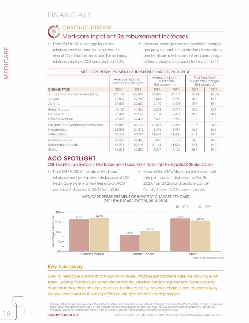
• From 2013 to 2014, average Medicare
reimbursement per inpatient case rose for
nine of 12 profiled disease states. For example,
reimbursement per ACS case climbed 17.3%.
• However, average inpatient Medicare charges
also grew for each of the profiled disease states,
and Medicare reimbursement as a percentage
of these charges decreased for nine of the 12.
Medicare Inpatient Reimbursement Increases
CHRONIC DISEASE
1 Charge data are per-case averages for inpatients with a particular diagnosis of interest. Charges may be for treatment related to other diagnoses. Data reflect the total charges billed by the hospital for the entire episode of care, and may include accommodation, pharmacy, laboratory, radiology, and other charges not billed by the physician. Data do not necessarily indicate final amounts paid.
Key Takeaway
Even as Medicare payments to hospitals increase, charges per inpatient case are growing even
faster, leading to narrowed reimbursement rates. Whether Medicare payments are tenable for
hospitals may remain an open question, but the disparity between charges and payments likely
will spur continued cost-cutting efforts on the part of health care providers.
Data source: IMS Health © 2016
MEDICARE REIMBURSEMENT OF INPATIENT CHARGES PER CASE, OSF HEALTHCARE SYSTEM, 2013–20141
MEDICARE REIMBURSEMENT OF INPATIENT CHARGES, 2013–20141
Average Inpatient Medicare Charges
Average Inpatient Medicare
Reimbursement
% of Inpatient Medicare Charges
Reimbursed
DISEASE STATE 2013 2014 2013 2014 2013 2014
Acute Coronary Syndromes (ACS) $26,154 $29,944 $4,019 $4,713 15.4% 15.8%
Angina 22,539 27,267 3,441 3,760 15.3 13.8
Asthma 27,672 29,605 5,170 5,458 18.7 18.4
Breast Cancer 40,100 44,466 6,258 6,711 15.6 15.1
Depression 23,491 24,542 7,139 7,419 30.4 30.2
Diabetes Mellitus 35,003 37,438 7,600 7,962 21.7 21.3
Hip and Knee Replacement/Revision 58,888 60,735 12,536 12,461 21.3 20.5
Hypertension 21,898 24,012 3,496 3,981 16.0 16.6
Osteoarthritis 54,657 56,297 11,523 11,460 21.1 20.4
Prostate Cancer 47,297 49,488 7,016 7,185 14.8 14.5
Rheumatoid Arthritis 53,211 59,906 10,164 11,521 19.1 19.2
Stroke 35,038 37,256 7,257 7,152 20.7 19.2
• From 2013 to 2014, the rate of Medicare
reimbursement per inpatient stroke case at OSF
HealthCare System, a Next Generation ACO
participant, dropped to 22.2% from 23.8%.
• Meanwhile, OSF’s Medicare reimbursement
rate per inpatient diabetes mellitus (to
23.2% from 24.2%) and prostate cancer
(to 14.7% from 12.2%) case increased.
OSF HealthCare System’s Medicare Reimbursement Rate Falls for Inpatient Stroke CasesACO SPOTLIGHT
Diabetes Mellitus Prostate Cancer Stroke0%
7%
14%
21%
28%
Perc
en
tag
e R
eim
bu
rse
d
2013 2014
23.2% 24.2% 23.8%22.2%
12.2%14.7%

17
FINANCIALS
17SANOFI / MANAGED CARE DIGEST SERIES® / WHERE INFORMATION BECOMES INTELLIGENCE.™ PUBLIC PAYER DIGEST 2016
ME
DIC
AR
E
MEDICARE REIMBURSEMENT OF HEART FAILURE INPATIENT PER-CASE CHARGES, 2011–20141
• Average Medicare reimbursement per
inpatient heart failure case decreased
in each of the profiled years, to 24.8% of
average charges in 2014 from 28.5% in 2011.
• Meanwhile, average Medicare charges per
inpatient heart failure case increased each
year from 2011 to 2014. Such charges rose 20.1%
during this period, to $29,735 from $24,767.
Medicare Reimbursement Rate for Heart Failure Falls Again
CHRONIC DISEASE
$0
$9,000
$18,000
$27,000
$36,000
Ch
arg
es/
Reim
bu
rse
me
nt
Average Charges Average Reimbursement Percentage Reimbursed
28.5% 27.9%25.2% 24.8%
2011 2012 2013 2014
$24,767
$7,049
$25,932
$7,228
$28,855
$7,279
$29,735
$7,358
1 Charge data are per-case averages for inpatients with a particular diagnosis of interest. Charges may be for treatment related to other diagnoses. Data reflect the total charges billed by the hospital for the entire episode of care, and may include accommodation, pharmacy, laboratory, radiology, and other charges not billed by the physician. Data do not necessarily indicate final amounts paid.
2 CMS. (2015). FY 2016 IPPS Hospitals Readmission Reduction Program Supplemental Data File (Final Rule and Correction Notice). Retrieved from http://www.cms.gov/Medicare/Medicare-Fee-for-Service-Payment/AcuteInpatientPPS/Downloads/FY2015-FR-Readmit-Supp-Data-File.zip
3 The total number of hospitals evaluated and penalized may include institutions that have closed or merged with other facilities. Evaluated hospitals include those in Maryland, even though they were exempted from penalties.
Percentage of Hospitals Penalized for Excess Readmissions Grows
• From 2015 to 2016, the share of hospitals
assessed a penalty for excess readmissions under
the Hospital Readmissions Reduction Program
(HRRP) increased, to 78.8% from 75.9%.
• The share of penalized hospitals assessed the
smallest penalty rose (to 80.8% from 79.8%) during
this period, as did the share of hospitals receiving
the largest penalty (to 4.3% from 4.1%).
Key Takeaway
In 2015, chronic obstructive pulmonary disease (COPD) and hip or knee replacement were added to
the set of conditions on which CMS rates hospital readmission performance. This expansion may have
contributed to the increased share of hospitals receiving penalties for 2016 Medicare reimbursement.
PERCENTAGE (NUMBER) OF HOSPITALS PENALIZED UNDER THE HOSPITAL READMISSIONS
REDUCTION PROGRAM, FY 20162,3
Not Penalized
Penalized
78.8%(2,592)
21.2%(697)
PERCENTAGE (NUMBER) OF PENALIZED HOSPITALS, BY REIMBURSEMENT PENALTY, FY 20162,3
0.01–1.0% Reimbursement Penalty
1.01–2.0% Reimbursement Penalty
2.01–3.0% Reimbursement Penalty 4.3%(111)
80.8%(2,095)
14.9%(386)
Data source: Centers for Medicare & Medicaid Services © 2016
Data source: IMS Health © 2016
2015Penalized: 75.9% (2,638)
Not Penalized: 24.1% (838)
20150.01–1.0%: 79.8% (2,105)
1.01–2.0%: 16.1% (424)
2.01–3.0%: 4.1% (109)

Patient pays 25%of drug cost
Patient pays 5% of drug cost
Annualdeductible
2016
Initial Phase4 Coverage Gap (the “donut hole”)1,2 Catastrophic Phase
Enrollee Drug Company Part D Drug Plan
45% 50%
45% 50% 5%
5%
2016
2017
2018
2019
Patient pays 25%of drug cost
Patient pays 5% of drug cost
Annualdeductible2020
Initial Phase Coverage Gap (the “donut hole”) Catastrophic Phase
50%
50%
50%
10%
15%
20%
40%
35%
30%
50%25% 25%
$360 Max $3,310 $4,850
STANDARD MEDICARE PRESCRIPTION DRUG BENEFIT, 2016–20203
1818
ME
DIC
AR
E
PUBLIC PAYER DIGEST 2016 SANOFI / MANAGED CARE DIGEST SERIES® / WHERE INFORMATION BECOMES INTELLIGENCE.™
Data source: Centers for Medicare & Medicaid Services © 2016
Less Than a Third of Part D Patients on Diabetes Rxs Reach the Coverage Gap
• In 2014, 41.6% of Florida Part D participants who
filled diabetes drugs reached the coverage gap,
the highest share among the profiled states. In
California, this percentage was 21.1%.
• Nationally, 17.2% of Part D participants who
received diabetes drugs were dual-eligible; 15.3%
received a low-income subsidy. Neither group
was subject to the coverage gap in 2014.
Drug Cost Limits Shift Up for Part D Participants in 2016
• Medicare raised per-enrollee spending limits for
the initial phase of coverage in 2016 (to $3,310
from $2,960 in 2015), as well as the upper limit
of the coverage gap (to $4,850 from $4,700) for
the standard prescription drug benefit.
• In 2016, participants in their initial phase pay
25% of total costs for covered drugs, until a total
expenditure of $3,310. In the coverage gap,
enrollees’ share of drug expenses is 45% for
branded drugs and 58% for generics.
PHARMACY
1 For brand-name drugs, patient pays 45% of drug cost, manufacturer pays 50%. Out-of-pocket (OOP) spending that counts toward coverage gap up to catastrophic coverage includes both patient and manufacturer spending (95% of drug price). Also included in OOP costs are payments made by patient for covered prescription if plan has a coverage gap. Excluded from OOP costs are plan spending on drug cost (5% of drug price), plan premium, and plan spending on pharmacy dispensing fee (patient pays 55% of fee).
2 For generic drugs, patient pays 58% of drug price. This is the only expense that counts toward OOP spending in the coverage gap. Manufacturer’s contribution of 42% of drug price does not count toward OOP maximum.
3 Centers for Medicare & Medicaid Services. (2016). Costs in the Coverage Gap. Retrieved from http://www.medicare.gov/part-d/costs/coverage-gap/part-d-coverage-gap.html
4 Patient and drug spending combined, to include deductible ($360 maximum), copayments, and coinsurance.
PERCENTAGE OF DIABETES PATIENTS, BY COVERAGE GAP STATUS, 2014
Subject to Coverage Gap Not Subject to Coverage Gap
MARKET Did Not Reach Coverage Gap
Voluntary—Reached Coverage Gap Dual Eligible Low-Income Subsidy
California 29.7% 21.1% 44.5% 4.5%
Florida 36.0 41.6 8.1 14.1
New York 37.5 31.2 20.0 11.2
Ohio 46.9 27.6 10.2 15.3
Pennsylvania 46.5 22.7 18.1 12.7
Texas 28.0 37.1 13.2 21.6
NATION 36.4% 31.0% 17.2% 15.3%
STATE SPOTLIGHT

1919
ME
DIC
AR
E
SANOFI / MANAGED CARE DIGEST SERIES® / WHERE INFORMATION BECOMES INTELLIGENCE.™ PUBLIC PAYER DIGEST 2016
Ingredient Cost per Medicare HMO Rx Shrinks in 2015
• Average ingredient costs per prescription for
Medicare HMO members fell to $56.80 in 2015
from $57.80 in 2013; during the same period,
the share of Medicare HMOs that penalized
physicians for prescribing policy violations rose.
• Despite a decrease in ingredient costs per
prescription, and a growing generic share of
drugs dispensed, the pharmacy percentage
of total operating costs at Medicare HMOs
increased only fractionally during this time.
PHARMACY BENCHMARKS AND POLICIES FOR HMOs WITH MEDICARE MEMBERS, 2013–20151,2
PHARMACY BENCHMARKS 2013 2014 2015
No. of Prescriptions per Member per Year 29.4 29.9 29.7
Average Ingredient Cost per Prescription $57.80 $57.20 $56.80
Pharmacy Costs as % of Total Operating Costs 14.2% 14.8% 14.8%
% of Prescriptions Filled With Generics 78.1% 78.7% 78.8%
PHARMACY POLICIES% of HMOs Allowing Choice of Branded or Generic
Pharmaceuticals 90.3% 91.5% 90.0%% of HMOs Penalizing Physicians for Violations of
Prescribing Policy 13.6% 15.5% 15.4%
Key Takeaway
The spike in the share of generic prescriptions dispensed starting in 2012 is largely attributable
to the number of branded drugs that lost patent protection between 2011 and 2013. However,
the greater complexity of biologics could impact this trend. It is more difficult and expensive
to produce biosimilar biologics than chemical compound drugs, limiting generic drug makers’
ability to rapidly bring to market generic replacements for biologics that go off patent.3
Data source: IMS Health © 2016
PHARMACY
1 Data are as of midyear 2015 and represent the numbers/percentages of prescriptions dispensed, by drug class, to all patients.2 Only HMOs that enroll Medicare beneficiaries are included.3 The Economist. (2015). Going Large: A Wave of New Medicines Known as Biologics Will Be Good for Drugmakers, but May Not Be So Good for
Health Budgets. Retrieved from: http://www.economist.com/node/21637387/print
Number of Rxs Dispensed per Medicare HMO Member Rises 20.2% From 2006LONG-TERM TREND
• From 2006 (24.7) to 2015 (29.7) the average
annual number of prescriptions dispensed
per Medicare HMO member climbed 20.2%.
• The percentage of prescriptions that were filled
with generic drugs at Medicare HMOs also
grew, to 78.8% in 2015 from 49.6% in 2006.
NUMBER OF PRESCRIPTIONS PER MEDICARE HMO MEMBER PER YEAR AND PERCENTAGE OF PRESCRIPTIONS FILLED WITH GENERICS, 2006–20151,2
40%
50%
60%
70%
80%
Perc
en
tag
e o
f Presc
riptio
ns
0
8
16
24
32
Nu
mb
er o
f Pre
scrip
tion
s
2006 2007 2008 2009 2010 2011 2012 2013 2014 2015
24.725.6
27.2
30.0 29.6 29.929.3 29.4 29.9 29.7
49.6%
53.6%55.1%
58.5%
63.2%
63.7%
76.9%78.1% 78.7% 78.8%
Total Medicare Prescriptions Percentage of Prescriptions Filled with Generics

2020
ME
DIC
AR
E
PUBLIC PAYER DIGEST 2016 SANOFI / MANAGED CARE DIGEST SERIES® / WHERE INFORMATION BECOMES INTELLIGENCE.™
Data source: IMS Health © 2016
Key Takeaway
In 2014, Part D participants filling prescriptions in the coverage gap paid just under half (47.5%)
of their out-of-pocket expenses for branded drugs and nearly three-fourths (72%) of their generic
costs.1 Whether Medicare is able to continue assuming larger shares of costs for drugs filled during
the gap—as called for under the Affordable Care Act (ACA)—depends not just on how well the
program manages future prescription expenses, but also on the long-term viability of the ACA itself.
Monthly Out-of-Pocket Costs for California Part D Oncology Rxs Top U.S. Averages
• Regardless of their coverage gap status, Part D
enrollees in California who received oncology
prescriptions had higher monthly out-of-pocket
costs than their counterparts nationally in 2014.
• For example, California oncology patients with
Part D coverage paid roughly $93 a month
during the coverage gap for prescriptions in
2014, 10.9% higher than the U.S. mean of $83.60.
LIS Shares Dip Among Part D Diabetes, Oncology Patients
• From 2013 to 2014, the percentages of Medicare
Part D enrollees who were dual eligible or low-
income subsidy (LIS) declined among those who
filled diabetes, cholesterol, or oncology drugs.
• Less than a third of Part D patients receiving
prescriptions in any of the profiled categories
reached the coverage gap in 2014; among
these classes, this share was lowest for cholesterol.
PHARMACY
PERCENTAGE OF PART D PATIENTS, BY COVERAGE GAP STATUS, 2013–2014
Dual Eligible Low-Income Subsidy Did Not Reach the Coverage Gap
Reached the Coverage Gap
DRUG CLASS 2013 2014 2013 2014 2013 2014 2013 2014
Diabetes 19.1% 17.2% 15.9% 15.3% 38.1% 36.4% 26.9% 31.0%
Cholesterol 14.9 13.5 12.9 12.2 48.2 46.5 24.0 27.8
Oncology 12.6 10.7 13.0 12.2 48.4 46.8 25.8 30.1
2013
California Nation
2014 2013 2014$0
$25
$50
$75
$100
Ou
t-of-P
oc
ket C
ost
s
$40.23
$79.48
$88.39
$37.02
$71.65
$92.70
$36.81
$60.06
$82.47
$35.18
$60.29
$83.60
Did Not Reach the Coverage Gap Before the Gap During the Gap
PART D MONTHLY OUT-OF-POCKET COSTS, BY COVERAGE GAP STATUS, ONCOLOGY, 2013–2014
CHRONIC DISEASE
STATE SPOTLIGHT
1 See the Public Payer Digest for 2014, page 19.

21
PHARMACY
21
ME
DIC
AR
E
SANOFI / MANAGED CARE DIGEST SERIES® / WHERE INFORMATION BECOMES INTELLIGENCE.™ PUBLIC PAYER DIGEST 2016
0%
25%
50%
75%
100%PDP PenetrationMA Penetration
Pen
etra
tion
Ra
te
MN HI OR CA FL
43.7%
55.2%
26.4%
45.8%
31.2%
44.4%
37.2%
41.4%
35.4%
40.8%
0%
25%
50%
75%
100%
ND VT DE IA SD
PDP PenetrationMA Penetration
Pen
etra
tion
Ra
te
67.2%
18.8%
66.5%
7.6%
65.6%
9.3%
63.6%
17.4%
61.8%
20.6%
TOP 10 STATES, BY MEDICARE PDP ENROLLMENT, 2015–20161
STATE Enrollment 2015 Enrollment 2016 Enrollment Change 2015–2016
% of Total PDP Enrollment
California 2,049,217 2,139,382 4.4% 8.7%
Texas 1,572,794 1,578,834 0.4 6.4
Florida 1,406,540 1,456,163 3.5 5.9
New York 1,391,896 1,428,702 2.6 5.8
Michigan 1,097,544 1,091,790 –0.5 4.4
Illinois 1,042,146 1,079,166 3.6 4.4
Pennsylvania 1,036,172 1,064,450 2.7 4.3
Ohio 1,032,188 1,019,985 –1.2 4.1
New Jersey 880,828 898,562 2.0 3.7
North Carolina 788,192 803,424 1.9 3.3
Key Takeaway
Nearly 76% of the nation’s eligible Medicare beneficiaries were enrolled in either an MA or PDP
plan as of March 2016, though PDP plans constituted a larger portion of total Part D membership.
As Part D plans evolve, it is likely they will continue to attract even higher percentages of Medicare
beneficiaries, thus increasing the program’s share of all pharmacy expenses nationally.
Data source: Centers for Medicare & Medicaid Services © 2016
1 Data are as of March of the year listed.
Membership Grows for Most Top 10 PDP Enrollment States
• For eight of the 10 top states, by
Medicare Part D prescription drug
program (PDP) enrollment, membership
counts increased from 2015 to 2016.
• Collectively, PDP enrollment in these top
10 states increased by 2.1%; as of March
2016, more than half (51.0%) of the nation’s
PDP enrollees were in these states.
Medicare Advantage Penetration Exceeds 55% in Minnesota
• As of March 2016, 55.2% of eligible Minnesota
Medicare beneficiaries were in a Medicare
Advantage (MA) plan; MA and PDP plans
enrolled 98.9% of the state’s eligible population.
• In the other four states with the highest
MA penetration rates, MA and PDP plans
together accounted for no more than
78.6% of all eligible Medicare members.
STATE SPOTLIGHT
MA AND PDP PENETRATION, 20161
TOP FIVE STATES, BY MA PENETRATION TOP FIVE STATES, BY PDP PENETRATION

2222
PHARMACYM
ED
ICA
RE
PUBLIC PAYER DIGEST 2016 SANOFI / MANAGED CARE DIGEST SERIES® / WHERE INFORMATION BECOMES INTELLIGENCE.™
Key Takeaway
Pharmacy cost per staffed bed rose 0.7% from 2014 to 2015, and pharmacy cost per discharge
climbed a more notable 8.2% during this period. The fractional increase in the former may reflect a
more precipitous reduction in bed counts than in admissions, as hospitals seek to reconcile projected
overcapacity and operating costs.1 Growth in the latter could be influenced by efforts to reduce
readmissions and improve medication therapy management—and outcomes—across transitions of
care. For example, by beginning post-acute care therapeutic regimens before patients are discharged.
Data source: IMS Health © 2016
Pharmacy Costs per Staffed Bed Are Lower at Non-IHS Hospitals
• In 2014, average pharmacy cost per staffed
bed was lower for hospitals that were not
affiliated with an integrated health system (IHS;
$48,862) than for hospitals that were ($61,508).
• However, average pharmacy cost
per discharge was slightly higher at
non-IHS hospitals ($1,537) than at
their IHS counterparts ($1,511).
PHARMACY COSTS PER STAFFED BED, ALLINA HEALTH VS. NATION, 2013–2014
PHARMACY COSTS PER DISCHARGE, ALLINA HEALTH VS. NATION, 2013–2014
$0
$22,000
$44,000
$66,000
$88,000
Pha
rma
cy
Co
sts
pe
r Sta
ffed
Be
d
2013 2014
Allina Health Nation
$82,462$86,890
$55,789 $56,166
Pharmacy Costs per Discharge Drop Steeply at Allina Health Hospitals
• Average pharmacy cost per discharge at Allina
Health hospitals fell 24.3%, from 2013 ($2,025)
to 2014 ($1,533), even as it rose 8.2% across all
hospitals nationally (from $1,406 to $1,521).
• Meanwhile, average pharmacy cost per
staffed bed grew 5.4% at Allina Health, to
$86,890 from $82,462, and notably exceeded
the national average of $56,166 in 2014.
ACO SPOTLIGHT
$1,000
$1,260
$1,520
$1,780
$2,040
Pha
rma
cy
Co
sts
pe
r Dis
cha
rge
2013 2014
Allina Health Nation
$2,025
$1,533
$1,406
$1,521
AVERAGE TOTAL STAFFED BEDS AND PHARMACEUTICAL EXPENSES, PER HOSPITAL, 2014
SIZE Average Total Staffed Beds
Average Pharmacy Cost per Staffed Bed
Average Pharmacy Cost per Discharge
<50 Beds 24.9 $49,419 $1,686
50–119 Beds 81.6 54,782 1,418
120–249 Beds 177.9 58,625 1,407
≥250 Beds 421.4 67,981 1,512
MHS OWNERSHIP
MHS Owned 188.4 61,144 1,488
Non-MHS Owned 76.2 48,130 1,588
INTEGRATED SYSTEM AFFILIATION
In an IHS 181.1 61,508 1,511
Not in an IHS 104.6 48,862 1,537
OVERALL AVG. 149.8 $56,166 $1,521
1 Evans, M. (2015). Hospitals Face Closures as “New Day in Health Care” Dawns. Modern Healthcare. http://www.modernhealthcare.com/article/20150221/MAGAZINE/302219988

23
PHARMACY
23
ME
DIC
AR
E
SANOFI / MANAGED CARE DIGEST SERIES® / WHERE INFORMATION BECOMES INTELLIGENCE.™ PUBLIC PAYER DIGEST 2016
Data source: IMS Health © 2016
• From 2013 to 2015, the Medicare Part D
percentages of the total number of
retail prescriptions filled rose in each of
the 12 profiled therapeutic classes.
• The 2015 Part D share for osteoporotics (55.4%)
was the highest of the classes, up from 49.7% in
2013; hypertensives again accounted for the
largest number of prescriptions filled.
Key Takeaway
It stands to reason that, as more eligible Medicare beneficiaries sign up for Part D plans, the
program would naturally record an increase in total numbers of prescriptions filled at retail, which
certainly occurred from 2013 to 2015. On the one hand, Part D’s growing shares of retail pharmacy
prescriptions across key drug categories indicate a sizable—and growing—expense category for
a publicly funded program. On the other, it speaks to Part D’s increasing influence on the retail
pharmacy landscape in general and ability to command lower prices for the prescriptions it fills.
Numbers of Medicare Part D Prescriptions Filled Increase Across Most Selected Classes
• The numbers of Medicare Part D retail prescription
drugs dispensed grew from 2013 to 2015 for all
but one the profiled drug classes, and most
notably for gastrointestinal drugs (35.7%).
• Although the Part D payer share of osteoporosis
drugs was the highest of the selected drug classes
in 2015, the number of Part D retail prescriptions
dispensed in this category shrank 8.4% from 2013.
1 Data are as of midyear 2015 and represent the numbers/percentages of prescriptions, dispensed by drug class, to all patients.
MEDICARE PART D RETAIL RX PAYER SHARE AND TOTAL NUMBER OF RXs PER YEAR, 2013–20151
2013 2014 2015
DRUG CLASS Payer Share Number Payer Share Number Payer Share Number
Allergies 15.5% 8,276,116 16.8% 9,188,517 18.8% 10,295,318
Antiplatelets 46.5 27,636,804 48.8 29,576,516 51.0 31,307,226
Arthritis 20.7 20,161,050 22.0 22,122,193 22.2 23,692,740
Asthma 23.0 31,074,633 24.4 33,711,325 25.4 37,349,351
Cholesterol 34.0 76,304,718 35.8 80,898,179 37.5 84,501,122
Depression 20.8 51,315,266 21.9 56,170,356 22.9 61,933,987
Diabetes 32.2 51,501,947 33.1 55,185,142 33.7 59,827,093
Gastrointestinal 20.5 3,340,309 22.6 3,908,712 24.7 4,531,978
Hypertension 34.5 213,093,323 35.9 225,983,990 36.8 233,987,353
Oncology 31.8 4,503,734 33.1 4,791,135 34.0 5,008,755
Osteoporosis 49.7 8,664,231 52.8 8,282,157 55.4 7,939,882
Sleep Disorder 21.8 12,032,321 24.8 13,075,759 25.2 12,762,069
Part D Shares of Total Rxs Climb in 12 Common Drug Classes
CHRONIC DISEASE
PERCENTAGE CHANGE IN NUMBER OF MEDICARE PART D RETAIL PRESCRIPTIONS, 2013–20151
–12%
0%
12%
24%
36%
Perc
ent
ag
e C
hang
e
Allergies Anti-platelets
Arthritis Asthma Choles-terol
Depres-sion
Diabetes Gastro-intestinal
Hyper-tension
Oncology Osteo-porosis
SleepDisorder
24.4%
13.3%17.5%
20.2%
10.7%
16.2%
35.7%
9.8% 11.2%
–8.4%
6.1%
20.7%

2424
PHARMACYM
ED
ICA
RE
PUBLIC PAYER DIGEST 2016 SANOFI / MANAGED CARE DIGEST SERIES® / WHERE INFORMATION BECOMES INTELLIGENCE.™
Out-of-Pocket Costs Drop for Branded Part D Gastrointestinal Drugs in California
STATE SPOTLIGHT
2013 2014 2015 $0
$15
$30
$45
$60
Brand Generic Total
Ou
t-of-P
oc
ket C
ost
s
$56.76
$6.41
$13.63
$50.33
$7.99
$17.71
$44.14
$6.82
$16.70
OUT-OF-POCKET COSTS PER MEDICARE PART D RETAIL GASTROINTESTINAL RX, CALIFORNIA, 2013–20152,3
OOP Costs for Part D Rxs Fall for Half of Profiled Drug Classes
CHRONIC DISEASE
Key Takeaway
The decrease in out-of-pocket costs per Medicare Part D retail prescription across several of the
profiled drug classes could be a reflection of increasing use of generics and the further reduction
in the prescription drug coverage gap for Medicare beneficiaries. In 2014, in the so-called
donut hole, beneficiaries were responsible for 47.5% of branded drug costs; in 2015, the share
contracted to 45.0%. However, the share of Part D drug plans that require coinsurance has
climbed,4 so whether out-of-pocket costs continue to drop for some classes is yet to be seen.
• From midyear 2013 to midyear 2015,
out-of-pocket costs (OOP) per Medicare
Part D retail prescription decreased for
half of the profiled drugs classes.1
• Meanwhile, among the drug classes for which
OOP costs increased, the largest gain was for
antiplatelet drugs (29.2%). Part D OOP costs
were highest in all three years for asthma drugs.
Data source: IMS Health © 2016
• In California, average OOP costs for Medicare
Part D beneficiaries filling branded gastrointestinal
(GI) drugs declined 22.2%, to $44.14 in
midyear 2015 from $56.76 in midyear 2013.
• Such Medicare OOP costs for generic GI
prescriptions grew 6.4%, to $6.82 from $6.41 during
the same time. The overall average OOP cost for
branded and generic GI drugs rose 22.5%.
OUT-OF-POCKET COSTS PER MEDICARE PART D RETAIL RX, BY DRUG CLASS, 20152,3
Sleep Disorder
$0
$6
$12
$18
$24
Ou
t-of-P
oc
ket C
ost
s
Onco-logy
Asthma Osteo-porosis
Cho-lesterol
Arthritis Allergies Hyper-tension
Depres-sion
Diabetes Gastro-intestinal
Anti-platelets
$23.03$21.93$22.70
$21.10
$14.81$12.76
$17.24
$10.58$8.71
$7.57 $7.19 $6.68
1 See Public Payer Digest for 2014.2 Data are as of midyear 2015 and represent the numbers/percentages of prescriptions dispensed, by drug class, to all patients.3 “Out-of-pocket cost” is the actual amount paid by the patient for the individual prescription. This cost mainly includes copayments, but can also
include tax, deductibles, and cost differentials where applicable.4 Andrews, M. (2016). Coinsurance Trend Means Senior Likely to Face Higher Out-Of-Pocket Drug Costs, Report Says. Kaiser Health News. Retrieved
from http://khn.org/news/coinsurance-trend-means-seniors-likely-to-face-higher-out-of-pocket-drug-costs-report-says/

25
PHARMACY
25
ME
DIC
AR
E
SANOFI / MANAGED CARE DIGEST SERIES® / WHERE INFORMATION BECOMES INTELLIGENCE.™ PUBLIC PAYER DIGEST 2016
0%
10%
20%
30%
40%
Me
dic
are
Pa
rt D
Pa
yer S
hare
Branded Generic
Arthritis Asthma Cholesterol Diabetes Hypertension
32.4%
20.8%
29.5%
17.5%
38.5% 37.4% 36.3%
32.1%
36.8% 36.8%
MEDICARE PART D PAYER SHARE OF BRANDED AND GENERIC DRUGS, 20151
• From 2013 to 2015, the portions of Medicare Part D
prescriptions filled with generic drugs grew in
eight of the 12 profiled classes. In 2015, the largest
generic share was for sleep disorder drugs (97.6%).
• The most notable increase in Medicare Part D
generic drug percentages was for osteoporosis
drugs (a 17.9 percentage point increase),
followed by allergy medications (6.5 points).
Key Takeaway
In 2015, the Centers for Medicare & Medicaid Services released data identifying the top 40 drugs
influencing Medicare Part D prescription drug spending growth. Interestingly, eight of the top 10 drugs
with the largest increase in cost per unit between 2013 and 2014 were generic, with growth between
77% and 329%.2 Although branded drugs still account for most of the total Medicare Part D prescription
drug spend, the rising cost of generic medications will likely have a greater influence in the future.
Data source: IMS Health © 2016
Percentages of Profiled Medicare Part D Payer Branded Drug Prescriptions Lead Generics
• In 2015, the Medicare Part D portions of
total branded drug prescriptions were
larger than those of generic drugs in four
of five selected medication classes.
• For instance, this disparity between Part D payer
shares for branded and generic prescriptions
was greatest for arthritis (32.4% versus 20.8%)
and asthma medications (32.4% versus 20.8%).
PERCENTAGE OF MEDICARE PART D RETAIL RXs FILLED WITH BRANDED VS. GENERIC DRUGS, 2013–20151
Branded Drugs Generic DrugsDRUG CLASS 2013 2014 2015 2013 2014 2015
Allergies 18.1% 15.9% 11.6% 81.9% 84.1% 88.4%
Antiplatelets 17.8 22.0 26.8 82.2 78.0 73.2
Arthritis 21.4 24.1 18.0 78.6 75.9 82.0
Asthma 79.7 77.1 76.3 20.3 22.9 23.7
Cholesterol 21.8 23.0 15.7 78.2 77.0 84.3
Depression 11.3 6.8 12.1 88.7 93.2 87.9
Diabetes 38.9 39.7 41.7 61.1 60.3 58.3
Gastrointestinal 18.2 24.8 29.6 81.8 75.2 70.4
Hypertension 7.3 6.2 4.4 92.7 93.8 95.6
Oncology 6.1 5.8 4.6 93.9 94.2 95.4
Osteoporosis 27.0 22.7 9.1 73.0 77.3 90.9
Sleep Disorder 8.3 6.8 2.4 91.7 93.2 97.6
1 Data are as of midyear 2015 and represent the numbers/percentages of prescriptions dispensed, by drug class, to all patients.2 Medicare Drug Spending Dashboard 2014 (2015). Retrieved from https://www.cms.gov/Research-Statistics-Data-and-Systems/Statistics-Trends-and-
Reports/Dashboard/Medicare-Drug-Spending/Drug_Spending_Dashboard.html
Generic Shares of Common Part D Prescriptions Rise
CHRONIC DISEASE

2626
PHARMACYM
ED
ICA
RE
PUBLIC PAYER DIGEST 2016 SANOFI / MANAGED CARE DIGEST SERIES® / WHERE INFORMATION BECOMES INTELLIGENCE.™
Data source: IMS Health © 2016
• From 2013 to 2015, total Medicare Part D retail
prescription volumes increased for 34 of the 40
profiled common prescriptions. In seven of eight
drug classes, volume was highest for generics.
• Of the profiled drugs, two generic cholesterol
reducers, atorvastatin calcium (28.1 million)
and simvastatin (27.0 million), had the largest
numbers of Part D prescriptions in 2015.
COMMON MEDICARE PART D RETAIL RXs DISPENSED, BY DRUG CLASS, 2013–20151
Number of Medicare Part D Prescriptions per Year
DRUG CLASS/PRODUCT Brand/Generic 2013 2014 2015
AntidepressantsSertraline Generic 7,100,568 7,840,096 8,661,681
Trazodone Hydrochloride Generic 5,831,397 6,744,380 7,813,633
Citalopram Hydrobromide Generic 6,027,760 6,104,518 6,038,511
Fluoxetine Generic 4,583,315 4,787,470 5,398,289
Escitalopram Oxalate Generic 3,619,236 4,459,008 5,290,651
AntihypertensivesAmlodipine Besylate Generic 22,707,801 25,173,209 26,175,439
Lisinopril Generic 21,286,614 22,827,112 24,830,359
Furosemide Oral Generic 17,566,647 18,235,985 18,785,519
Metoprolol Tartrate Generic 14,360,672 15,237,048 15,858,169
Metoprolol Succinate Extended Release Generic 12,723,754 14,109,247 15,313,313
AntipsychoticsQuetiapine Fumarate Generic 3,441,833 3,925,620 4,572,442
Risperidone Generic 2,646,323 2,704,891 2,710,256
Abilify Brand 1,696,069 1,818,891 1,816,071
Olanzapine Generic 1,495,793 1,623,956 1,804,955
Ziprasidone Hydrochloride Generic 727,071 746,154 781,718
Chemotherapeutic AgentsMethotrexate Generic 1,433,090 1,513,686 1,593,875
Anastrazole Generic 776,302 861,199 931,677
Letrozole Generic 300,718 344,800 384,867
Tamoxifen Generic 291,925 333,042 367,758
Megestrol Oral Susp Generic 345,068 293,459 243,054
Cholesterol ReducersAtorvastatin Calcium Generic 16,494,949 21,919,916 28,060,756
Simvastatin Generic 27,778,664 27,618,036 26,951,154
Crestor Brand 7,365,297 7,922,179 8,220,105
Pravastatin Generic 6,397,523 6,482,325 5,912,730
Fenofibrate Generic 3,117,982 3,991,875 4,094,961
Gastrointestinal AgentsDicyclomine Hydrochloride Generic 917,464 1,114,721 1,317,618
Metoclopramide Generic 1,118,956 1,072,108 1,047,983
Linzess Brand 30,209 264,521 616,105
Sulfasalazine Generic 249,113 238,930 287,729
Delzicol Brand 30,689 165,575 149,926
Nonsteroidal Anti-Inflammatory DrugsMeloxicam Generic 5,168,925 6,116,480 6,898,045
Ibuprofen Generic 3,462,368 3,607,746 4,041,074
Naproxen Generic 2,580,802 2,784,928 2,933,711
Celebrex Brand 2,526,632 2,650,369 1,410,173
Voltaren Gel Brand 1,240,873 1,718,051 1,971,891
Respiratory AgentsProAir HFA Brand 5,369,410 6,243,069 7,189,343
Montelukast Sodium Generic 3,618,507 4,874,158 5,753,531
Spiriva Brand 4,716,601 5,029,012 5,200,588
Advair Diskus Brand 4,767,556 4,748,976 4,570,030
Symbicort Brand 1,762,382 2,247,419 2,875,394
1 Data are as of midyear 2015 and represent the numbers/percentages of prescriptions dispensed, by drug class, to all patients.
Numbers of Part D Retail Rxs Grow in Most Drug Classes
CHRONIC DISEASE

27SANOFI / MANAGED CARE DIGEST SERIES® / WHERE INFORMATION BECOMES INTELLIGENCE.™ PUBLIC PAYER DIGEST 2016
Medicaid has become the single largest health
care payer, by enrollment, in the United States.
At the end of 2015, the program covered
72.4 million individuals, a 20.7% increase in
enrollment from the 2013 pre-Affordable Care
Act (ACA) expansion baseline of 60 million.
Following the influx of new recipients, Medicaid
enrollment growth is projected to slow to a
much more modest annual rate of 1.6% and
eventually cover 78.1 million enrollees by 2024.1
As enrollment climbed as a result of Medicaid
expansion, so, too, did spending. For 2015, total
program spending is estimated at $548.8 billion, a
10.7% jump from $495.8 billion in 2014. However,
growth in Medicaid outlays is also projected to
slow going forward, averaging 5.6% annually, to
reach a still considerable $915.4 billion by 2024.1
To date, 31 states and the District of Columbia have
chosen to expand Medicaid, and 19 states have
not. Six of these expansion states (Arkansas, Indiana,
Iowa, Michigan, Montana, and New Hampshire)
received Section 1115 Medicaid demonstration
waivers, allowing them to introduce provisions
not otherwise provided for by law. Such variations
include charging premiums, providing premium
assistance to purchase health insurance exchange
plans, and establishing healthy behavior incentives.
As these state-driven modifications are implemented
and studied, their effectiveness in terms of cost of
care and outcomes likely will inform future policy.
Likewise, as more Medicaid benefits are delivered
by managed care organizations, the performance
of these plans also will be studied to determine
whether they offer greater constraints on spending
growth compared with fee-for-service Medicaid.
MEDICAIDBackgrounder
1 Centers for Medicare & Medicaid Services. (2016). Office of the Actuary Projected National Health Expenditures. Retrieved from https://www.cms.gov/research-statistics-data-and-systems/statistics-trends-and-reports/nationalhealthexpenddata/nationalhealthaccountsprojected.html
2 Enrollment totals for 2010, 2011, and 2012 are from June of that year.
0
31
46
61
76
Enro
llme
nt (
Mill
ion
s)
2004 2005 2006 2007 2008 2009 2010 2011 2012 2013 2014 2015
43.5 44.5 44.7 44.9 46.149.5 50.3
52.656.0
60.0
67.172.4
Total Number of Medicaid Recipients, 2004–20152
LONG-TERM TREND
Data sources: IMS Health and the Centers for Medicare & Medicaid Services © 2016

28
DEMOGRAPHICSM
ED
ICA
ID
PUBLIC PAYER DIGEST 2016 SANOFI / MANAGED CARE DIGEST SERIES® / WHERE INFORMATION BECOMES INTELLIGENCE.™
Key Takeaway
The vast majority of Medicaid recipients (84.9%) are enrolled in MCOs, far exceeding MCO penetration
into Medicare (31.7%; see page 6). Even though Medicaid enrollment growth is expected to slow
in coming years (see page 27), the effectiveness of managed care approaches to controlling cost
growth will be a key variable in the financial burden Medicaid imposes on state budgets.
Medicaid Enrollment Grows in Both Expansion and Non-Expansion States
• Medicaid enrollment climbed 34% in
expansion states and 12% in non-expansion
states, from the July-through-September 2013
expansion enrollment period to April 2016.
• Medicaid enrollment doubled in Kentucky during
this period, and rose by more than 50% in eight
other expansion states. Tennessee (29%) had the
highest rate of growth in non-expansion states.
40%
52%
64%
76%
88%
Pen
etra
tion
0
17
34
51
68
Enro
llme
nt (
Mill
ion
s)
2008 2009 2010 2011 2012 2013 2014 2015
Total Enrollment Penetration
32.435.2
38.340.6
43.9 45.5
54.9
61.5
70.3% 71.2%
76.9% 77.1%75.2% 75.9%
81.8%
84.9%
MEDICAID MCO ENROLLMENT AND PENETRATION INTO MEDICAID, 2008–2015
Medicaid Managed Care Penetration Nears 85%LONG-TERM TREND
• Medicaid recipients enrolled in a managed
care organization (MCO) represented 84.9%
of total Medicaid enrollees in 2015, up
14.6 percentage points from 2008 (70.3%).
• During this period, the total number of
Medicaid MCO enrollees increased at an
even greater rate (89.8%), to 61.5 million
in 2015 from 32.4 million in 2008.
Expansion States: 34%
Non-Expansion States: 12%
All States, Regardless of Expansion: 27%
Overall Percentage Change (2013–2016)
WA59%
OR68%
CA53%
NV83%
AZ39% NM
67%
CO72%
ND23%
MN17%
IA25%
AR48%
LA4%
MT54%
IL18%
IN31%
OH26%
KY100%
WV60%
MI20%
PA18%
NY13%
VT 19%
NH 47%
Expansion States Non-Expansion States
MA 26%
RI 47%
CT N/A
NJ 36%
DE 7%
MD 40%
D.C. 12%
HI19%
AK24%
PERCENTAGE CHANGE IN MEDICAID ENROLLMENT IN MEDICAID EXPANSION STATES, 2013–20161
Data source: IMS Health © 2016
Data source: Department of Health and Human Services
1 The net change in Medicaid enrollment is based on data from the 49 states reporting both enrollment from April 2016 and baseline enrollment from July 2013 through September 2013 (the period before the initial marketplace open enrollment) that contain comparable enrollment groups.

29
DEMOGRAPHICS
SANOFI / MANAGED CARE DIGEST SERIES® / WHERE INFORMATION BECOMES INTELLIGENCE.™ PUBLIC PAYER DIGEST 2016
ME
DIC
AID
COMMON DIAGNOSES FOR MEDICAID INPATIENTS, BY ICD-9 CODE, 2013–2014
Type of Diagnosis Medicaid Patient %
ICD-9 CODE 2013 2014
Infectious and Parasitic Diseases (001–139)008 Intestinal infections due to other organisms 8.9% 8.6%042 Human immunodeficiency virus (HIV) 27.0 25.4
Endocrine, Nutritional, and Metabolic Diseases, and Immunity Disorders (240–279)
250 Diabetes mellitus 13.1% 14.7%276 Disorders of fluid, electrolyte, and acid-base balance 10.4 9.8
Mental Disorders (290–319)292 Drug-induced mental disorders 24.1% 29.4%295 Schizophrenic disorders 31.2 30.7303 Alcohol dependence syndrome 16.4 20.8304 Drug dependence 24.1 26.8311 Depressive disorder, not elsewhere classified 20.5 23.8
Diseases of the Respiratory System (460–519)466 Acute bronchitis and bronchiolitis 29.9% 26.5%493 Asthma 18.7 19.0
Diseases of the Digestive System (520–579)540 Acute appendicitis 13.4% 15.1%571 Chronic liver disease and cirrhosis 16.8 18.3577 Diseases of pancreas 11.0 13.5
Complications of Pregnancy, Childbirth, and Puerperium (630–679)642 Hypertension complicating pregnancy, childbirth, and the puerperium 32.3% 27.8%644 Early or threatened labor 37.8 34.3646 Other complications of pregnancy, not elsewhere classified 41.1 37.0660 Obstructed labor 29.0 26.1663 Umbilical cord complications during labor and delivery 34.1 29.6
COMMON PROCEDURES FOR MEDICAID INPATIENTS, BY ICD-9 CODE, 2013–2014
Type of Procedure Medicaid Patient %
ICD-9 CODE 2013 2014
Operations on the Nervous System (01–05)01 Incision and excision of skull, brain, and cerebral meninges 10.1% 10.7%02 Other operations on skull, brain, and cerebral meninges 16.6 17.003 Operations on spinal cord and spinal canal structures 15.1 15.6
Operations on the Respiratory System (30–34)31 Other operations on larynx and trachea 15.9% 15.5%33 Other operations on lung and bronchus 8.9 9.134 Operations on chest wall, pleura, mediastinum, and diaphragm 6.8 7.2
Operations on the Cardiovascular System (35–39)35 Operations on valves and septa of heart 7.1% 6.8%38 Incision, excision, and occlusion of vessels 9.8 9.739 Other operations on vessels 8.2 8.3
Operations on the Digestive System (42–54)43 Incision and excision of stomach 7.8% 7.5%47 Operations on appendix 13.7 15.453 Repair of hernia 7.0 7.6
Obstetrical Procedures (72–75)73 Other procedures inducing or assisting delivery 34.1% 30.1%74 Cesarean section and removal of fetus 31.0 27.2
Miscellaneous Diagnostic and Therapeutic Procedures (87–99)87 Diagnostic radiology 9.3% 9.6%94 Procedures related to the psyche 23.3 27.395 Ophthalmologic and otologic diagnosis and treatment 29.1 25.0
Data source: IMS Health © 2016
Medicaid Portions Grow for Nearly Half of Profiled Inpatient Dxs
• The Medicaid shares for nine of 19 common
inpatient diagnoses climbed from 2013 to 2014.
The largest such rise occurred for drug-induced
mental disorders (5.3 percentage points).
• The highest Medicaid share in 2014,
by profiled diagnosis, was for other
complications of pregnancy (37.0%), despite
decreasing from 41.1% the prior year.

0%
5%
10%
15%
20%
Perc
en
tag
e o
f Ca
ses
California Alaska New York Maryland Wyoming
13.6% 14.1%15.6%
11.6% 11.7%14.7%
16.2% 16.0%14.6%
11.5% 11.2%
14.4%
9.7% 9.2%
13.9%
2012 2013 2014
STATE SPOTLIGHT
DEMOGRAPHICS
PUBLIC PAYER DIGEST 2016 SANOFI / MANAGED CARE DIGEST SERIES® / WHERE INFORMATION BECOMES INTELLIGENCE.™ 30
ME
DIC
AID
1 Includes HMOs, PPOs, private fee-for-service, and exclusive provider organizations.2 “Other” includes self-pay, charity, workers’ compensation, and unknown payer sources.3 Doyle, K. (2015). Medicaid Linked With Better Blood Pressure Control. Reuters Health. Retrieved from http://www.reuters.com/article/us-health-
medicaid-hypertension-idUSKCN0T627D20151117
Key Takeaway
The expansion of Medicaid could be one of several factors in the rise of the payer’s shares
of inpatient cases for some diseases. Medicaid patients with some chronic diseases are
more apt to visit a physician than those without health insurance.3 It is possible that a
significant portion of newly covered Medicaid recipients who deferred health care services
before receiving coverage—resulting in greater levels of disease severity—are now being
identified and referred for more intensive treatment, such as hospital inpatient services.
Data source: IMS Health © 2016
• The Medicaid shares of inpatient (IP) cases for
four profiled diagnoses rose from 2013 to 2014.
The benchmark for acute coronary syndromes
climbed the fastest, to 8.1% from 6.4%.
• The Medicaid percentage for asthma cases
(24.3%) was the highest of the profiled
diagnoses in 2014, despite falling from 26.3% in
2013; prostate cancer was the lowest (2.5%).
PERCENTAGE OF HOSPITAL INPATIENT CASES, BY PAYER, 2013–2014
Medicaid Medicare Commercial Insurance1 Other2
DISEASE STATE 2013 2014 2013 2014 2013 2014 2013 2014
Acute Coronary Syndromes (ACS) 6.4% 8.1% 68.2% 66.4% 19.1% 20.2% 6.3% 5.4%
Angina 7.7 7.2 65.5 66.4 19.8 21.7 6.9 4.7
Asthma 26.3 24.3 35.8 37.2 28.0 30.9 9.9 7.6
Breast Cancer 13.4 11.9 44.1 45.3 37.6 38.6 5.0 4.1
Depression 24.8 21.9 35.7 42.9 25.8 25.1 13.6 10.1
Diabetes Mellitus 11.6 11.6 61.3 60.6 18.8 20.8 8.3 7.1
Hypertension 9.4 9.6 60.0 59.3 22.1 24.4 8.5 6.8
Lipid Disorders 5.7 6.8 64.5 64.3 23.6 23.9 6.2 5.0
Osteoarthritis 3.5 3.5 59.0 58.9 32.3 33.3 5.2 4.2
Prostate Cancer 3.5 2.5 64.9 67.4 27.3 27.3 4.3 2.9
Rheumatoid Arthritis 5.5 6.6 68.4 67.1 21.7 22.7 4.3 3.6
Stroke 6.2 4.7 70.6 72.7 16.4 18.0 6.9 4.5
Medicaid IP Case Portions Grow for Four Profiled Diagnoses
CHRONIC DISEASE
TOP FIVE STATES BY MEDICAID SHARE OF INPATIENT HYPERTENSION CASES, 2012–2014
Medicaid Percentages of IP Hypertension Cases Rise in Four of the Top Five Markets
• Of the five states with the highest shares
of Medicaid inpatient hypertension cases,
four recorded an increase in the portions
of such cases from 2012 to 2014.
• The largest occurred in Wyoming, where
the percentage of Medicaid inpatient
hypertension cases climbed 4.2 percentage
points (to 13.9% from 9.7%).

• From 2011 to 2015, the number of hospital
admissions per 1,000 HMO members fell for
all three profiled payers. For Medicaid HMO
members, it dipped 2.8% (to 95.7 from 98.5).
• Meanwhile, this ratio declined 6.3% for
Medicare HMO members (to 250.2 from
266.9), and 4.9% for HMO members with
commercial insurance (to 54.6 from 57.4).
HMO Hospital Admissions Ratio Declines Over Five Years, Regardless of PayerLONG-TERM TREND
NUMBER OF HOSPITAL ADMISSIONS PER 1,000 HMO MEMBERS, BY PAYER TYPE, 2011–2014
UTILIZATION FOR MEDICAID HMO MEMBERS, 2014–20151
Hospital Days per 1,000 Medicaid HMO Members
Hospital Admissions per 1,000 Medicaid HMO Members
ALOS (Days) per Medicaid
Hospital Admission
MD Encounters per Medicaid
HMO Member2
Ambulatory Visits per Medicaid
HMO Member2
TAX STATUS OF HMO 2014 2015 2014 2015 2014 2015 2014 2015 2014 2015
Not-for-Profit 405.8 403.5 106.0 103.8 4.5 4.7 4.9 4.7 2.6 2.5
For-Profit 387.0 391.2 87.3 90.0 4.6 4.7 4.8 4.7 3.1 3.1
OVERALL AVG. 394.7 396.1 95.4 95.7 4.6 4.7 4.8 4.7 2.9 2.9
1 Only HMOs that enroll Medicaid recipients are included.2 Ambulatory visits differ from physician encounters. Ambulatory visits are visits by an HMO member to an HMO clinic or physician’s office that do
not require the services of a physician. Such visits are usually made for tests, prescription refills, immunizations, etc. The term “physician encounters” is self-explanatory.
3 Only HMOs that enroll Medicare beneficiaries are included.4 Includes HMOs, PPOs, point-of-service plans, and exclusive provider organizations.5 See the Public Payer Digest for 2014.
0
75
150
225
300
2011 2012 2013 2014 2015
266.9
98.5
57.4
265.8
97.6
58.4
275.6
98.8
58.0
253.4
95.4
53.8
250.2
95.7
54.6
Medicare3 Medicaid1 Commercial4
Nu
mb
er o
f Ad
mis
sio
ns
31
ME
DIC
AID
SANOFI / MANAGED CARE DIGEST SERIES® / WHERE INFORMATION BECOMES INTELLIGENCE.™ PUBLIC PAYER DIGEST 2016
UTIL IZATION
Key Takeaway
From 2012 to 2015, ALOS and the numbers of hospital days and ambulatory visits per Medicaid
HMO member each increased notably,5 likely reflecting the influx of patients identified as newly
eligible for Medicaid under the Affordable Care Act’s expansion of the program, as well as greater
enrollment in non-expansion states facilitated by more avenues to apply for benefits. Still, from
2014 to 2015, Medicaid HMO utilization for patients under the umbrella of a managed care model
changed only slightly, perhaps suggesting better management of earlier pent-up demand.
Data source: IMS Health © 2016
Hospital Days, Admit Ratios Fall at Not-for-Profit Medicaid HMOs
• The numbers of hospital days and admissions per
1,000 Medicaid HMO members decreased from
2014 to 2015 at not-for-profit HMOs. At for-profit
HMOs, these ratios increased, but were still lower
than the means of not-for-profit HMOs in 2015.
• The average length of stay (ALOS) per inpatient
Medicaid hospital admission was 4.7 days at
not-for-profit and for-profit HMOs alike in 2015;
however, Medicaid members in for-profit HMOs
averaged more ambulatory visits (3.1 versus 2.5).

MEDICAID HOSPITAL UTILIZATION, 2012–2014
Discharges Patient-Days ALOS (Days)SIZE 2012 2013 2014 2012 2013 2014 2012 2013 2014<50 Beds 106.4 106.8 107.1 349.2 353.9 346.6 3.6 3.7 3.750–119 602.0 608.1 607.0 1,870.2 1,850.3 1,880.6 4.0 4.0 4.0
120–249 Beds 1,288.6 1,286.7 1,277.3 5,036.1 5,035.0 5,030.0 4.6 4.6 4.6
250+ Beds 3,065.2 3,067.6 3,105.5 15,551.5 15,551.7 15,699.5 5.7 5.7 5.7
OWNERSHIPGovernment 867.4 877.2 866.5 4,328.9 4,379.1 4,307.7 4.1 4.1 4.1
Not-for-Profit 1,252.4 1,259.3 1,249.4 5,657.1 5,681.6 5,684.0 4.6 4.6 4.6
For-Profit 910.3 909.9 890.2 3,551.8 3,554.8 3,548.5 4.1 4.1 4.0
REGIONPacific 1,521.2 1,532.3 1,511.4 7,329.4 7,382.5 7,369.2 4.7 4.7 4.7
Mountain 1,049.3 1,049.1 1,035.9 4,321.1 4,332.7 4,342.7 4.8 4.8 4.8
W. North Central 493.7 504.3 505.0 2,123.0 2,167.1 2,129.5 3.5 3.4 3.4
E. North Central 967.2 966.7 954.4 3,850.2 3,851.9 3,848.0 3.8 3.9 3.8
South Central 1,000.9 939.5 987.0 4,047.9 3,690.2 4,090.1 4.1 4.1 4.2
New England 1,263.1 1,269.8 1,269.7 5,799.7 5,827.6 5,858.0 4.7 4.6 4.6
Mid-Atlantic 1,126.5 1,132.3 1,116.1 7,967.2 7,977.0 7,851.7 7.1 7.0 7.1
South Atlantic 1,528.8 1,531.2 1,527.8 6,559.3 6,564.2 6,575.1 4.1 4.2 4.1
NATION 1,097.5 1,104.0 1,092.4 4,949.6 4,975.8 4,961.9 4.4 4.4 4.4
AVERAGE NUMBER OF MEDICAID PATIENT-DAYS AND AVERAGE LENGTH OF STAY, CALIFORNIA, 2012–2014
STATE SPOTLIGHTCalifornia Medicaid Patient-Days and ALOS Surpass National Benchmarks
• Medicaid patient-day counts at California
hospitals remained virtually flat between
2012 (8,791) and 2014 (8,789), yet consistently
exceeded the national means in all three years.
• During this period, ALOS per Medicaid case
in California held steady at 5.2 days, and
was 0.8 days higher than the corresponding
national average of 4.4 days in 2014.
1,000
3,000
5,000
7,000
9,000
2
3
4
5
68,791 8,815 8,789
5.2 5.2 5.2
Medicaid Patient-Days Average Length of Stay
Patie
nt-D
ays
ALO
S (Da
ys)
2012 2013 2014
32
UTIL IZATION
PUBLIC PAYER DIGEST 2016 SANOFI / MANAGED CARE DIGEST SERIES® / WHERE INFORMATION BECOMES INTELLIGENCE.™
ME
DIC
AID
Medicaid Discharges, Patient-Days Decline; ALOS Is Unchanged
• Despite rising at hospitals with fewer than
50 beds or more than 250 beds, the average
number of Medicaid hospital discharges overall
fell 1.1% from 2013 (1,104.0) to 2014 (1,092.4).
• Meanwhile, Medicaid patient-days fell
fractionally across the U.S., to 4,961.9 from 4,975.8,
while average length of stay (ALOS) per inpatient
Medicaid case remained the same, at 4.4 days.
Key Takeaway
Fewer inpatient discharges for Medicaid recipients may indicate that efforts to reduce inpatient
hospital admissions are having an effect. However, if Medicaid expansion in 2013 introduced deferred
health care demand into the market in 2014, utilization trends may be impacted more dramatically in
subsequent years of coverage. Indeed, hospital admissions per 1,000 members rose (albeit slightly) for
Medicaid HMOs from 2014 to 2015—perhaps a precursor of things to come for the program overall.
Data source: IMS Health © 2016

33
ME
DIC
AID
SANOFI / MANAGED CARE DIGEST SERIES® / WHERE INFORMATION BECOMES INTELLIGENCE.™ PUBLIC PAYER DIGEST 2016
AVERAGE ANNUAL PROFESSIONAL INPATIENT CHARGES FOR MEDICAID RECIPIENTS WITH LIPID DISORDERS, 2013–20151
Provider Charges Climb for Medicaid Lipid Disorder Patients
CHRONIC DISEASE
Data source: IMS Health © 2016
Key Takeaway
According to the American Heart Association, the majority of adult Medicaid recipients (53%, or more
than 16 million) have a history of some type of cardiovascular illness, including hypertension, high
cholesterol, coronary heart disease, and stroke.2 With professional charges rising across most settings for
Medicaid lipid disorder patients, early interventions and lifestyle modifications to treat such conditions
before they become severe will likely become increasingly important in this high-need population.
F INANCIALS
• Average annual professional charges for
Medicaid lipid disorder patients rose by double-
digit percentages from 2013 to 2015 in five of
the six settings shown (office/clinic excluded).
• Most notably, such professional charges for
Medicaid lipid disorder patients treated in skilled
nursing facilities increased by 47.8% over this
period, and in emergency rooms by 28.5%.
AVERAGE ANNUAL PROFESSIONAL CHARGES FOR MEDICAID RECIPIENTS WITH LIPID DISORDERS, BY SETTING, 2013–20151
SETTING 2013 2014 2015
Hospital Inpatient $3,246 $3,659 $3,712
Hospital Outpatient 1,417 1,551 1,588
Ambulatory Surgery 3,132 3,583 3,645
Emergency Room 1,630 1,811 2,094
Office/Clinic 2,334 2,453 2,473
Skilled Nursing Facility/ICF 1,147 1,473 1,695
Inpatient Provider Charges Grow Rapidly for Medicaid Lipid Disorder Patients in L.A., CA
• From 2013 to 2015, average professional inpatient
charges per year for Medicaid lipid disorder
patients more than doubled in Los Angeles, and
expanded by nearly 50% across California.
• Such charges increased by 14.4% nationally
over this time. Despite this more modest growth,
national charges ($3,712) remained higher than
the California average ($3,415) in 2015.
LOCAL SPOTLIGHT
1 Professional charges are those generated by the providers delivering care to lipid disorder patients in various settings.2 American Heart Association. (2014). Critical Coverage for Heart Health: Medicaid and Cardiovascular Disease. Retrieved from https://www.heart.
org/idc/groups/heart-public/@wcm/@adv/documents/downloadable/ucm_461513.pdf
NOTE: ICF is intermediate care facility.
2013 2014 2015
Los Angeles California Nation$0
$1,200
$2,400
$3,600
$4,800
Ave
rag
e C
ha
rge
s
$2,028
$3,985
$4,483
$2,280
$3,020$3,415 $3,246
$3,659 $3,712

34
PHARMACYM
ED
ICA
ID
PUBLIC PAYER DIGEST 2016 SANOFI / MANAGED CARE DIGEST SERIES® / WHERE INFORMATION BECOMES INTELLIGENCE.™
Key Takeaway
Pharmacy spending as a percentage of overall Medicaid operating costs was only 0.8 percentage
points higher in 2015 than 10 years before in 2006 (15.1%).1 In combination with relative stability in the
number of Medicaid HMO PMPY prescriptions (up from 8.9 in 2006, but down from 10.2 in 2009), this
modest increase in the share of spending attributed to pharmacy seems to suggest that, even though
Medicaid MCO enrollment grew notably during this period, managed care models have made
progress in controlling both Medicaid prescription usage and costs.
Number of Prescriptions Dips per Member per Year for Medicaid
• After holding steady at 9.6 from 2013
to 2014, the number of prescriptions
per Medicaid HMO member per year
(PMPY) inched down to 9.5 in 2015.
• Despite this decline, pharmacy costs as
a percentage of total operating costs
grew at HMOs with Medicaid members,
to 15.9% in 2015 from 15.0% in 2014.
• From 2014 ($50.70) to 2015 ($51.80), the average
ingredient cost per Medicaid HMO prescription
increased by a modest 2.2%. However, such costs
have expanded by 8.6% since 2011 ($47.69).
• Meanwhile, the share of Medicaid HMO
prescriptions filled with generics posted a
year-on-year decrease, albeit fractional,
to 75.0% in 2015 from 75.1% in 2014.
Data source: IMS Health © 2016
1 See the Public Payer Digest for 2009, page 32.2 See the Public Payer Digest for 2009, page 34.
PHARMACY BENCHMARKS AND POLICIES FOR HMOs WITH MEDICAID MEMBERS, 2013–2015PHARMACY BENCHMARKS 2013 2014 2015
No. of Prescriptions per Member per Year 9.6 9.6 9.5
Average Ingredient Cost per Prescription $48.40 $50.70 $51.80
Pharmacy Costs as % of Total Operating Costs 14.6% 15.0% 15.9%
% of Prescriptions Filled With Generics 73.0% 75.1% 75.0%
PHARMACY POLICIES% of HMOs Allowing Choice of Branded or
Generic Pharmaceuticals93.0% 94.4% 93.8%
% of HMOs Penalizing Physicians for Violations of Prescribing Policy
13.0% 12.0% 11.8%
PERCENTAGE OF PRESCRIPTIONS FILLED WITH GENERICS AND AVERAGE INGREDIENT COST PER PRESCRIPTION, MEDICAID HMO MEMBERS, 2011–2015
2011 2012 2013 2014 201556%
61%
66%
71%
76%
$44
$46
$48
$50
$52
Perc
en
tag
e o
f Pre
scrip
tion
s Ave
rag
e Ing
red
ient C
ost
62.6%
71.7%73.0%
75.1%
$47.69
$48.30 $48.40
$50.70
75.0%
$51.80
Percentage of Prescriptions Filled with Generics Average Ingredient Cost
Average Ingredient Cost per Medicaid HMO Prescription Continues to GrowLONG-TERM TREND

35
PHARMACYM
ED
ICA
ID
SANOFI / MANAGED CARE DIGEST SERIES® / WHERE INFORMATION BECOMES INTELLIGENCE.™ PUBLIC PAYER DIGEST 2016
• From 2013 to 2015, the Medicaid shares of all
retail prescriptions dispensed in each of 12
profiled drug classes increased, and were highest
for asthma, allergy, and arthritis drugs in 2015.
• By volume, total retail prescriptions for Medicaid
recipients grew the most during this period for
arthritis (47.6%), cholesterol (36.7%), diabetes
(34.7%), and hypertension (33.0%) drugs.
Data source: IMS Health © 2016
Key Takeaway
Average monthly Medicaid enrollment expanded 26.6% from October 2013 to March 2016.2
Consequently, increased Medicaid shares of retail prescription volume in common drug
classes seem to reflect the larger number of people eligible for the program. Gains in Medicaid
prescription market shares that surpass the rate of growth in Medicaid enrollment may bolster the
supposition that these patients are introducing deferred health-care needs into the market.
MEDICAID RETAIL RX PAYER SHARE AND TOTAL NUMBER OF RXs PER YEAR, 2013–20151
2013 2014 2015
DRUG CLASS Payer Share Number Payer Share Number Payer Share Number
Allergies 13.8% 7,372,144 13.9% 7,602,174 15.8% 8,638,883
Antiplatelets 4.1 2,410,400 4.3 2,586,166 5.0 3,073,864
Arthritis 10.6 10,357,788 11.1 11,202,761 14.3 15,286,764
Asthma 18.0 24,414,624 18.3 25,234,106 19.6 28,796,028
Cholesterol 4.3 9,659,192 4.6 10,459,449 5.9 13,205,949
Depression 9.5 23,504,609 9.6 24,677,046 11.3 30,514,975
Diabetes 7.0 11,164,753 7.2 12,026,760 8.5 15,037,993
Gastrointestinal 8.2 1,337,368 8.2 1,413,428 9.1 1,675,998
Hypertension 5.1 31,786,685 5.5 34,746,539 6.7 42,291,492
Oncology 5.6 790,021 5.8 845,321 6.7 986,152
Osteoporosis 3.9 677,296 4.1 635,430 4.6 655,852
Sleep Disorder 5.8 3,199,352 5.3 2,777,519 5.9 2,979,813
• The Medicaid percentage of all retail arthritis
prescriptions filled in New Jersey climbed
to 20.3% in 2015 from 14.1% in 2013—an
increase of 6.2 percentage points.
• Meanwhile, the national Medicaid share of such
prescriptions rose 3.7 percentage points, to 14.3%
from 10.6%, and trailed those of New Jersey and
the Mid-Atlantic region in all three years.
Medicaid Share of Retail Arthritis Prescriptions Grows Faster in New Jersey Than Nationwide
STATE SPOTLIGHT
0%
6%
12%
18%
24%
Me
dic
aid
Pa
yer S
ha
re
2013 2014 2015
New Jersey Mid-Atlantic Region Nation
14.1%15.0%
20.3%
16.5%17.8%
20.5%
10.6% 11.1%
14.3%
MEDICAID PAYER SHARE OF RETAIL ARTHRITIS PRESCRIPTIONS, 2013–20151
1 Data are as of midyear 2015 and represent the numbers/percentages of prescriptions dispensed, by drug class, to all patients.2 CMS. (2016). Medicaid & CHIP: March 2016 Monthly Applications, Eligibility Determinations and Enrollment Report. Retrieved from
https://www.medicaid.gov/medicaid-chip-program-information/program-information/downloads/march-2016-enrollment-report.pdf
Medicaid Portions of Retail Prescriptions Climb Steadily
CHRONIC DISEASE

36
PHARMACYM
ED
ICA
ID
PUBLIC PAYER DIGEST 2016 SANOFI / MANAGED CARE DIGEST SERIES® / WHERE INFORMATION BECOMES INTELLIGENCE.™
• Out-of-pocket (OOP) costs per Medicaid retail
prescription grew in eight of the 12 profiled drug
classes from 2014 to 2015. By drug class, such
costs rose most quickly for arthritis (13.1%).
• Meanwhile, Medicaid retail prescription spending
expanded in nine of the 12 drug classes. The
largest such increases were for diabetes (52.1%),
gastrointestinal (41.3%), and arthritis (31.5%) drugs.
Key Takeaway
Federal regulations limit Medicaid prescription cost sharing. As a result, copayments for recipients
earning less than 150% of the Federal Poverty Level are limited to “nominal” amounts based on
preferred or non-preferred status for a given drug.3 This limits the impact on recipients that would result
from price increases for many common drugs. However, for the Medicaid program overall, aggregate
prescription spending likely will continue to grow due to Medicaid expansion and new drug therapies,
and this may in turn drive further experimentation in Medicaid plan models at the state level.
Overall OOP Costs per Medicaid Retail Oncology Prescription Grow Slowly
• Overall OOP costs for Medicaid retail oncology
prescriptions grew 4.7%, to $4.94 in 2015
from $4.72 in 2014. Only sleep disorder and
hypertension drugs posted smaller gains.
• OOP costs per Medicaid retail prescription for
generic oncology drugs dropped fractionally
during this time, to $3.50 from $3.52, but increased
for branded oncology drugs, to $30.86 from $20.30.
Data source: IMS Health © 2016
1 Data are as of midyear 2015 and represent the numbers/percentages of prescriptions dispensed, by drug class, to all patients.2 The total full price the pharmacy charges the patient for the product, regardless of the copayment situation.3 Medicaid.gov. Retrieved from: https://www.medicaid.gov/medicaid-chip-program-information/by-topics/cost-sharing/cost-sharing-out-of-
pocket-costs.html
NOTE: “Out-of-pocket costs” is the actual amount paid by the patient for the individual prescription. This cost mainly includes copayments, but can also include tax, deductibles, and cost differentials where applicable.
OUT-OF-POCKET COSTS PER MEDICAID RETAIL RX AND TOTAL MEDICAID RX SPENDING, 2014–20151,2
Out-of-Pocket Costs Medicaid Retail Rx Spending (in Millions)
DRUG CLASS 2014 2015 % Change 2014 2015 % Change
Allergies $4.81 $4.74 –1.5% $275.3 $286.5 4.1%
Antiplatelets 3.88 4.21 8.6 261.8 317.3 21.2
Arthritis 3.40 3.84 13.1 483.8 636.0 31.5
Asthma 5.84 6.27 7.3 2,532.1 2,931.8 15.8
Cholesterol 3.21 2.98 –7.2 383.2 406.1 6.0
Depression 3.22 3.22 –0.1 813.5 792.4 –2.6
Diabetes 5.03 5.57 10.6 1,768.0 2,688.4 52.1
Gastrointestinal 4.62 5.06 9.5 155.4 219.6 41.3
Hypertension 2.72 2.73 0.4 514.1 563.3 9.6
Oncology 4.72 4.94 4.7 265.6 320.6 20.7
Osteoporosis 3.41 3.08 –9.5 28.2 27.3 –3.1
Sleep Disorder 3.31 3.35 1.2 64.8 48.3 –25.4
Generic Brand Total$0
$8
$16
$24
$32
Ou
t-of-P
oc
ket C
ost
s
2014 2015
$3.52 $3.50
$20.30
$30.86
$4.72 $4.94
OUT-OF-POCKET COSTS PER MEDICAID RETAIL RX, ONCOLOGY, 2014–20151
Medicaid OOP Retail Rx Costs Rise for Most Drug Classes
CHRONIC DISEASE
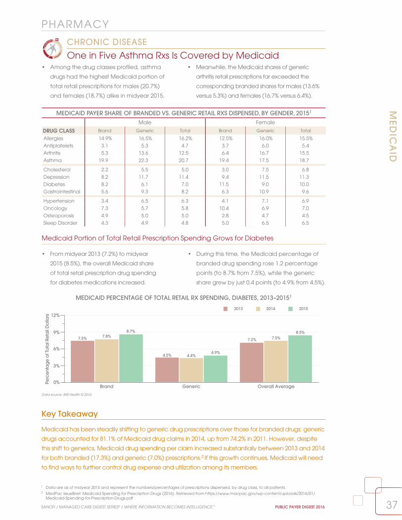
37
PHARMACYM
ED
ICA
ID
SANOFI / MANAGED CARE DIGEST SERIES® / WHERE INFORMATION BECOMES INTELLIGENCE.™ PUBLIC PAYER DIGEST 2016
MEDICAID PERCENTAGE OF TOTAL RETAIL RX SPENDING, DIABETES, 2013–20151
Key Takeaway
Medicaid has been steadily shifting to generic drug prescriptions over those for branded drugs: generic
drugs accounted for 81.1% of Medicaid drug claims in 2014, up from 74.2% in 2011. However, despite
this shift to generics, Medicaid drug spending per claim increased substantially between 2013 and 2014
for both branded (17.3%) and generic (7.0%) prescriptions.2 If this growth continues, Medicaid will need
to find ways to further control drug expense and utilization among its members.
• Among the drug classes profiled, asthma
drugs had the highest Medicaid portion of
total retail prescriptions for males (20.7%)
and females (18.7%) alike in midyear 2015.
• Meanwhile, the Medicaid shares of generic
arthritis retail prescriptions far exceeded the
corresponding branded shares for males (13.6%
versus 5.3%) and females (16.7% versus 6.4%).
Medicaid Portion of Total Retail Prescription Spending Grows for Diabetes
• From midyear 2013 (7.2%) to midyear
2015 (8.5%), the overall Medicaid share
of total retail prescription drug spending
for diabetes medications increased.
• During this time, the Medicaid percentage of
branded drug spending rose 1.2 percentage
points (to 8.7% from 7.5%), while the generic
share grew by just 0.4 points (to 4.9% from 4.5%).
Data source: IMS Health © 2016
MEDICAID PAYER SHARE OF BRANDED VS. GENERIC RETAIL RXS DISPENSED, BY GENDER, 20151
Male Female
DRUG CLASS Brand Generic Total Brand Generic Total
Allergies 14.9% 16.5% 16.2% 12.5% 16.0% 15.5%
Antiplatelets 3.1 5.3 4.7 3.7 6.0 5.4
Arthritis 5.3 13.6 12.5 6.4 16.7 15.5
Asthma 19.9 22.3 20.7 19.4 17.5 18.7
Cholesterol 2.2 5.5 5.0 3.0 7.5 6.8
Depression 8.2 11.7 11.4 9.4 11.5 11.3
Diabetes 8.2 6.1 7.0 11.5 9.0 10.0
Gastrointestinal 5.6 9.3 8.2 6.3 10.9 9.6
Hypertension 3.4 6.5 6.3 4.1 7.1 6.9
Oncology 7.3 5.7 5.8 10.4 6.9 7.0
Osteoporosis 4.9 5.0 5.0 2.8 4.7 4.5
Sleep Disorder 4.3 4.9 4.8 5.0 6.5 6.5
1 Data are as of midyear 2015 and represent the numbers/percentages of prescriptions dispensed, by drug class, to all patients.2 MedPac IssueBrief: Medicaid Spending for Prescription Drugs (2016). Retrieved from https://www.macpac.gov/wp-content/uploads/2016/01/
Medicaid-Spending-for-Prescription-Drugs.pdf
0%
3%
6%
9%
12%
Perc
enta
ge
of T
ota
l Ret
ail
Do
llars
Brand Generic Overall Average
2013 2014 2015
7.5% 7.8%8.7%
4.5% 4.4%4.9%
7.2% 7.5%8.5%
One in Five Asthma Rxs Is Covered by Medicaid
CHRONIC DISEASE

38
PHARMACYM
ED
ICA
ID
PUBLIC PAYER DIGEST 2016 SANOFI / MANAGED CARE DIGEST SERIES® / WHERE INFORMATION BECOMES INTELLIGENCE.™
Data source: IMS Health © 2016
1 Data are as of midyear 2015 and represent the numbers/percentages of prescriptions dispensed, by drug class, to all patients.
• Of the common Medicaid retail prescriptions
shown, 34 of 40 were generic, including the
leading drug, by volume, in each product class.
• Yet Linzess, the drug with the largest percentage
growth from 2013 to 2015 (over 1400%) among
the profiled Medicaid prescriptions, was branded.
Vast Majority of Profiled Medicaid Drugs Are Generic
CHRONIC DISEASE
COMMON MEDICAID RETAIL RXs DISPENSED, BY DRUG CLASS, 2013–20151
Number of Medicaid Prescriptions per YearDRUG CLASS/PRODUCT Brand/Generic 2013 2014 2015
AntidepressantsSertraline Generic 3,721,365 4,180,959 5,259,993
Trazodone Hydrochloride Generic 2,985,343 3,274,700 3,940,795
Fluoxetine Generic 3,359,329 2,588,283 3,465,080
Citalopram HBR Generic 2,474,504 2,580,292 2,903,230
Escitalopram Oxalate Generic 1,110,644 1,584,746 2,243,887
AntihypertensivesLisinopril Generic 4,093,335 4,522,011 6,027,791
Amlodipine Besylate Generic 3,195,578 3,486,019 3,947,288
Hydrochlorothiazide Generic 2,451,855 2,710,761 3,392,342
Clonidine Generic 2,735,130 2,901,771 3,140,443
Metoprolol Tartrate Generic 2,049,341 2,250,278 2,721,163
AntipsychoticsRisperidone Generic 2,872,796 2,832,051 2,557,744
Quetiapine Fumarate Generic 1,925,092 2,010,943 2,395,500
Abilify Brand 2,005,327 2,119,228 1,960,672
Olanzapine Generic 649,864 694,130 758,990
Ziprasidone Hydrochloride Generic 439,343 496,757 490,136
Chemotherapeutic AgentsMethotrexate Generic 243,757 263,959 328,195
Tamoxifen Generic 116,879 135,245 159,212
Anastrozole Generic 104,128 107,659 121,887
Letrozole Generic 53,695 56,008 63,686
Hydroxyurea Generic 39,452 44,848 50,689
Cholesterol ReducersSimvastatin Generic 4,172,678 4,399,977 5,170,331
Atorvastatin Calcium Generic 1,687,036 2,584,700 4,413,600
Pravastatin Generic 904,745 946,884 994,887
Fenofibrate Generic 426,509 499,364 664,626
Gemfibrozil Generic 390,805 419,912 496,087
Gastrointestinal AgentsDicyclomine Hydrochloride Generic 415,847 432,739 539,974
Metoclopramide Generic 403,894 393,711 421,973
Hyoscyamine Generic 129,094 138,544 139,315
Linzess Brand 7,764 50,601 119,079
Glycopyrrolate Generic 84,001 84,467 88,097
Nonsteroidal Anti-Inflammatory DrugsIbuprofen Generic 5,221,425 5,439,626 8,145,176
Naproxen Generic 1,959,366 2,168,711 2,605,570
Meloxicam Generic 1,158,831 1,442,944 1,963,774
Diclofenac Sodium Generic 197,947 274,605 362,094
Voltaren Gel Brand 183,930 250,151 291,440
Respiratory AgentsMontelukast Sodium Generic 3,763,556 4,568,133 5,061,577
Ventolin HFA Brand 3,600,722 3,637,920 4,868,227
ProAir HFA Brand 3,381,586 3,816,027 4,528,201
Albuterol Nebulizer Solution Generic 3,495,291 3,473,004 3,619,013
Flovent HFA Brand 1,409,090 1,398,292 1,559,647

39SANOFI / MANAGED CARE DIGEST SERIES® / WHERE INFORMATION BECOMES INTELLIGENCE.™ PUBLIC PAYER DIGEST 2016
LONG-TERM CAREBackgrounder
The U.S. Department of Health and Human
Services estimates that 70% of people turning 65
can expect to use some form of long-term care
during their lives.1 The number of Americans in
that age bracket grew by nearly 19% from 2010
to 2015, and was estimated at 47.8 million as of
2015.2 As that number is expected to continue
to expand, it is not surprising that the number of
nursing homes (NHs), assisted living facilities (ALFs),
and home care agencies (HCAs) nationwide all
increased from 2014 to 2015. The long-term care
pharmacy providers3 servicing these organizations
have also grown more numerous in recent
years as that market swells. Despite the growth
opportunities, the number of hospital-based skilled
nursing facilities (SNFs) continued to slide, to 681 in
2014, a 33.9% reduction from 1,030 facilities in 2006.
As the long-term care market enters a new era
of heightened demand in the face of expected
labor shortages,4 it is difficult to predict how the
forces that shaped current trends will change in
the short-term, but one can perhaps safely assume
that efficiency—both financial and operational—
will be paramount in years to come.
2,000
0
12,000
14,000
16,000
Nu
mb
er o
f Fa
cili
ties
15,174 15,160 15,094
15,007 15,004 15,020 14,957 14,947 15,116
13,87114,157 14,995
15,070
15,781 15,72715,447 15,461
15,684
13,333 13,30913,069 13,262 13,357 13,469
13,23113,010
13,255
1,030 996 965 930 868 821 765 733
2006 2007 2008 2009 2010 2011 2012 2013 2014 2015
NHs ALFs HCAs SNFs
15,219
15,836
13,314
681
1 U.S. Department of Health and Human Services. (2016). Who Needs Care? Retrieved from http://longtermcare.gov/the-basics/who-needs-care/2 U.S. Census Bureau. (2015). Annual Estimates of the Resident Population for Selected Age Groups by Sex: April 1, 2010 to July 1, 2015. National
Characteristics: Vintage 2015. Retrieved from https://www.census.gov/popest/data/national/asrh/2015/index.html 3 Long-term care pharmacy providers (LTCPPs) are those pharmacies that have an implied contract/agreement to perform pharmaceutical
consulting and/or dispensing services to long-term care facility patients on an ongoing basis. LTCPPs tracked in this Digest must have at least one licensed pharmacist employed at the location and generate at least 50% of their revenue from long-term care facilities.
4 See the Public Payer Digest for 2015, page 59.
NOTE: Data on hospital-based skilled nursing facilities (SNFs) are current as of calendar year 2014.
Numbers of Long-Term Care Facilities, 2006–2015LONG-TERM TREND
Data source: IMS Health © 2016

40 PUBLIC PAYER DIGEST 2016 SANOFI / MANAGED CARE DIGEST SERIES® / WHERE INFORMATION BECOMES INTELLIGENCE.™
Data source: IMS Health © 2016
Majority of Nursing Homes Have More Than 100 Licensed Beds
• Facilities with more than 100 licensed beds
made up the majority of all nursing homes
in 2015, at 52.9%. However, this percentage
declined from 53.3% in both 2013 and 2014.
• Conversely, the portion of all nursing homes with
100 or fewer licensed beds increased from 2013
(46.8%) to 2015 (47.1%); such homes held 28.7% of
all licensed nursing home beds in 2015.
LON
G-T
ER
M C
AR
E:
NU
RSI
NG
HO
ME
S
DEMOGRAPHICS
NURSING HOMES, LICENSED BEDS, 2013–2015
Percentage of All Nursing Homes
Percentage of All Licensed Beds
Medicare-Certified Percentage of
All Nursing Homes
SIZE (# Licensed Beds) 2013 2014 2015 2013 2014 2015 2013 2014 2015
<50 Beds 9.7% 9.7% 9.9% 3.3% 3.3% 3.4% 89.0% 89.7% 89.6%
50–100 Beds 37.1 37.0 37.2 25.0 25.0 25.3 97.0 97.1 96.8
101–150 Beds 36.0 36.3 36.1 39.3 39.6 39.6 97.8 97.7 97.6
151–200 Beds 11.3 11.1 11.0 17.7 17.4 17.3 97.9 97.8 97.5
201+ Beds 6.0 5.9 5.8 14.7 14.7 14.4 96.8 96.4 96.5
TOTAL/OVERALL AVERAGE 100.0% 100.0% 100.0% 100.0% 100.0% 100.0% 96.6% 96.6% 96.4%
• The total number of licensed nursing home
beds grew for a second year in 2015, to
1.68 million, up by 1.5% from 1.65 million in 2013.
• However, the number of such beds per 1,000
individuals aged 65 or older fell again in 2015, to
35.1 from 36.2 in 2014, the 10th straight decline.
Total Nursing Home Licensed Bed Count Increases AgainLONG-TERM TREND
NUMBER OF LICENSED NURSING HOME BEDS AND NUMBER OF NURSING HOME BEDS PER 1,000 PEOPLE AGE 65 AND OLDER, 1994–20151
1994 1996 1998 2000 2002 2004 2006 2008 2010 2012 2013 2014 20151,635
1,660
1,685
1,710
1,735
32
38
44
50
56
Num
be
r of L
ice
nse
d B
ed
s (0
00)
Num
be
r of Be
ds p
er 1,000 Pe
op
le A
ge
65+
Number of Licensed Beds Number of Beds per 1,000
1,678.3
1,658.3
1,710.8
1,716.91,721.2 1,719.9
1,700.0
1,658.3
1,667.9
1,659.11,653.5
1,672.91,678.2
53.251.9 51.9
49.748.3
47.446.2 42.7
41.440.4
38.3
36.235.1
1 “Beds/1,000” represents the number of licensed nursing home beds per 1,000 people age 65 and older. Population data are a projection of the U.S. Department of Commerce Bureau of the Census, Population Distribution Branch, published July 2015.
2 Centers for Disease Control and Prevention. (2015). Trends in Nursing Homes. Retrieved from http://www.cdc.gov/nchs/nnhs/nursing_home_trends.htm3 Decker, F. (2005). Nursing Homes, 1977–1999: What Has Changed, What Has Not? National Center for Health Statistics. Retrieved from
http://www.cdc.gov/nchs/data/nnhsd/nursinghomes1977_99.pdf
NOTE: “Medicare-certified” refers to those nursing home beds that are eligible for Medicare payment under Title XVIII of the Social Security Act.
Key Takeaway
In 1985, nursing homes with fewer than 50 beds accounted for nearly a third of all homes, the largest
share, by size. That portion was roughly halved over the next decade, as homes with between 100
and 199 beds came to dominate the marketplace,2 and the number of individuals in nursing homes
climbed.3 As seniors search for ways to get necessary services in noninstitutional settings, smaller
homes that provide care in a more home-like atmosphere may thrive.

TOP FIVE NURSING HOME CHAINS, BY NUMBER OF STAFFED BEDS, 2014–20151
0
13,000
26,000
39,000
52,000
Nu
mb
er o
f Sta
ffed
Be
ds
2014 2015
Genesis HealthCare HCR ManorCare Golden Living Life Care Centersof America
Sava Senior Care
42,397
50,058
37,138 37,079
30,123 29,90927,667 26,745
23,185 23,127
41SANOFI / MANAGED CARE DIGEST SERIES® / WHERE INFORMATION BECOMES INTELLIGENCE.™ PUBLIC PAYER DIGEST 2016
Data source: IMS Health © 2016
Genesis Has 41% More Facilities Than Its Closest Competitor
• In 2015, Genesis HealthCare, the largest nursing
home chain by number of facilities, had 41.1%
more homes and 67.4% more staffed beds than
Golden Living, the second largest chain.
• The top 15 nursing home chains, combined,
accounted for 16.4% of the total number of
facilities (15,219) and 17.2% of the total number of
staffed beds (1.7 million) nationwide in 2015.
LON
G-TE
RM
CA
RE
: NU
RSIN
G H
OM
ES
DEMOGRAPHICS
NATION’S 15 LARGEST NURSING HOME CHAINS, BY NUMBER OF NURSING HOMES, 20151,2
CHAIN / HEADQUARTERS Current Rank
Previous Rank
Tax Status
Total # of NHs
Total # of Staffed
Beds
Avg. # of Beds/NH
Number of States
Genesis HealthCare / Kennett Square, PA 1 1 FP 419 50,058 119.5 35
Golden Living / Plano, TX 2 2 FP 297 29,909 100.7 21
HCR ManorCare / Toledo, OH 3 3 FP 280 37,079 132.4 29
Life Care Centers of America / Cleveland, TN 4 4 FP 215 26,745 124.4 29
Consulate Health Care3 / Maitland, FL 5 6 FP 190 21,123 111.2 21
Sava Senior Care / Atlanta, GA 6 5 FP 190 23,127 121.7 22
Evangelical Lutheran Good Samaritan Society / Sioux Falls, SD 7 7 NFP 162 11,258 69.5 24
Ensign Group, Inc. / Mission Viejo, CA 8 10 FP 129 13,803 107.0 12
Signature HealthCARE, LLC / Louisville, KY 9 11 FP 116 14,154 122.0 11
Kindred Healthcare, Inc. / Louisville, KY 10 9 FP 94 11,666 124.1 19
Trilogy Health Services, LLC / Louisville, KY 11 15 FP 93 6,652 71.5 4
PruittHealth / Norcross, GA 12 12 FP 85 9,711 114.2 4
National HealthCare Corporation / Murfreesboro, TN 13 13 FP 79 9,826 124.4 11
Senior Care Centers / Dallas, TX 14 31 FP 76 9,549 125.6 2
Veterans Health Administration / Washington, DC 15 16 NFP 75 14,190 189.2 30
TOTAL/AVERAGE 2,500 288,850 117.2 18
1 IMS Health updated its data methodology for 2014 and 2015 to account for evolving definitions of long-term care facilities. 2 This table includes all nursing homes owned and leased by these chains, and the licensed beds within those homes, as of December 2015.3 Consulate Health Care was acquired by LaVie Care Centers in late 2012. The combined company retained the Consulate Health Care name.
Only One of Top Five Nursing Home Chains, by Number of Staffed Bed, Grows in 2015
• From 2014 (42,397) to 2015 (50,058), the number
of staffed beds at Genesis HealthCare expanded
18.1%, but the average number per facility rose
by less than one bed (to 119.5 from 118.8).
• Bed counts decreased fractionally at four of
the top five nursing home chains during this
time. Life Care Centers of America recorded a
3.3% contraction in the number of beds.

42 PUBLIC PAYER DIGEST 2016 SANOFI / MANAGED CARE DIGEST SERIES® / WHERE INFORMATION BECOMES INTELLIGENCE.™
As Occupancy Rate Decreases, Total Facility ALOS VariesLONG-TERM TREND
LON
G-T
ER
M C
AR
E:
NU
RSI
NG
HO
ME
S
UTIL IZATION
• From 2011 to 2015, the average nursing home
occupancy rate fell 1.9 percentage points, to
81.5% from 83.4%. The only annual increase during
this period was from 2012 (82.7%) to 2013 (82.8%).
• Although total facility ALOS rose from 2014
to 2015, this measure fluctuated from 2011
(187 days) to 2015 (180). In this span, ALOS was
lowest in 2012 and 2014 (178 days both years).
Nursing Home Occupancy Rate, Patient-Days Count Fall
• From 2014 (82.2%) to 2015 (81.5%), the
average occupancy rate for nursing homes
overall declined fractionally, as did total
facility patient-days (to 32,142 from 32,553).
• Meanwhile, total facility average length of stay
(ALOS) rose, to 180 days from 178. By bed size,
ALOS grew at facilities with 101–150 beds and,
especially, at those with more than 201 beds.
NURSING HOMES, UTILIZATION RATES, 2014–2015Average Occupancy Rate
(Licensed Beds)Total Facility
Patient-Days per YearTotal Facility Average Length of Stay (Days)
SIZE (# Licensed Beds) 2014 2015 2014 2015 2014 2015
<50 Beds 83.9% 83.1% 11,846 11,770 230 226
50–100 Beds 82.3 81.7 21,882 21,769 189 186
101–150 Beds 81.5 80.7 34,648 34,396 159 163
151–200 Beds 81.8 81.2 50,022 49,511 168 166
201+ Beds 83.4 83.2 76,285 75,900 184 213
OWNERSHIPGovernment Owned 84.6% 84.7% 41,408 41,423 328 307
Not-for-Profit 84.6 83.9 32,509 31,875 188 184
For-Profit 81.2 80.4 32,151 31,801 167 172
OVERALL AVERAGE 82.2% 81.5% 32,553 32,142 178 180
80%
81%
82%
83%
84% Ave
rag
e O
cc
up
an
cy Ra
te
0
50
100
150
200
Ave
rag
e L
en
gth
of S
tay
(Da
ys)
2011 2012 2013 2014 2015
ALOS Average Occupancy Rate
187178 180 178 180
83.4%
82.7% 82.8%
82.2%
81.5%
AVERAGE OCCUPANCY RATE AND TOTAL FACILITY AVERAGE LENGTH OF STAY, 2011–2015
Key Takeaway
The role of nursing homes within the continuum of care has undergone a transformation
in recent years. Whereas these facilities were once primarily oriented toward providing
long-term care for elderly residents, they are increasingly providing medical, rehabilitative, and
physical-therapy services to people of varying ages, who return to live independently after
these interventions.1 This trend may influence many nursing home characteristics, including, but
not limited to,facility size, occupancy rates, and patient-days.
Data source: IMS Health © 2016
1 Marak, C. (2016). Recent Trends in Nursing Home Care. SkilledNursingFacilities.org. Retrieved from http://www.skillednursingfacilities.org/resources/nursing-home-trends/

43SANOFI / MANAGED CARE DIGEST SERIES® / WHERE INFORMATION BECOMES INTELLIGENCE.™ PUBLIC PAYER DIGEST 2016
Rates of Top Four NH Resident Conditions Surpass 50%
CHRONIC DISEASE
Data source: IMS Health © 2016
LON
G-TE
RM
CA
RE
: NU
RSIN
G H
OM
ES
UTIL IZATION
• In 2015, the majority of nursing home (NH)
residents had bladder incontinence (62.8%),
depression (52.4%), Alzheimer’s-type dementia
(51.3%), or bowel incontinence (50.4%).
• From 2014 to 2015, the incidence of eight of
the most common conditions for nursing home
residents rose. The most common, bladder
incontinence, increased 1.1 percentage points.
BladderIncontinence
DocumentedDepression
Alzheimer's-Type
Dementia
BowelIncontinence
DocumentedPsychiatricDiagnosis
BehavioralSymptoms
DocumentedWeight Loss
PressureSores
SkinRashes
0%
16%
32%
48%
64%
Perc
enta
ge
of
Nus
ring
Ho
me
Resid
ents
2014 201561.7% 62.8%
51.4% 52.4% 50.3% 51.3% 49.5% 50.4%
29.1% 29.6%25.4% 25.9%
7.0% 7.1% 6.4% 6.5%—3.9%—
NURSING HOME RESIDENT CONDITIONS FROM MOST COMMON TO LEAST COMMON
PERCENTAGE OF NURSING HOME RESIDENTS RECEIVING VARIOUS TREATMENTS, BY BED SIZE, 2015
Pain Management Program Injections Specialized Rehabilitation Services0%
14%
28%
42%
56%
Perc
en
tag
e o
fN
urs
ing
Ho
me
Re
sid
en
ts
<50 Beds 50–100 Beds 101–150 Beds 151–200 Beds 201+ Beds Overall Average
51.4%45.9% 43.9% 42.4% 43.1% 45.1%
17.7%20.5%
23.3% 23.6% 24.6%21.9% 23.4% 25.3%
29.0% 28.2% 29.4% 27.1%
Key Takeaway
The landscape of nursing home care is expanding to offer not only long-term end-of-life care for the
elderly, but also short-term rehabilitation services for other patients. One possible explanation for this
shift is that Medicare covers skilled nursing facility care for short-term rehabilitation patients at $500–$600
per day, while Medicaid covers long-term nursing care at about $125 per day. However, long-term
Medicaid patients may benefit from “spillover effects”: nursing homes with more short-term Medicare
residents have better financial resources; therefore, all patients may receive better care.1
Smaller Nursing Homes Are More Apt to Have Pain Management Programs
• In 2015, pain management programs were
more common at nursing homes with fewer
than 50 beds than they were at nursing
homes with a larger number of beds.
• Conversely, larger nursing homes were
more likely to have specialized rehabilitation
services or to administer injections in
2015 than their smallest counterparts.
1 Lepore, M., and Leland, M.E. (2015). Nursing Homes That Increased the Proportion of Medicare Days Saw Gains in Quality Outcomes for Long-Stay Residents. Health Affairs, 34(12): 2121–2128.
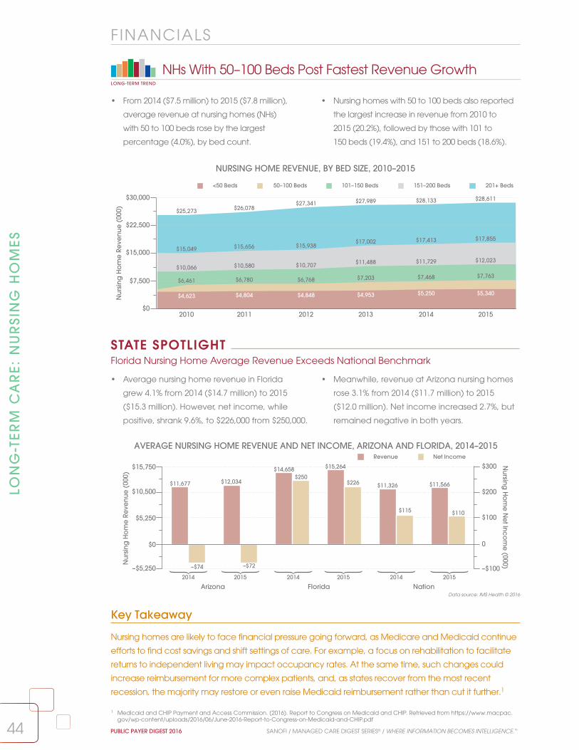
44 PUBLIC PAYER DIGEST 2016 SANOFI / MANAGED CARE DIGEST SERIES® / WHERE INFORMATION BECOMES INTELLIGENCE.™
–$5,250
$0
$5,250
$10,500
$15,750
–$100
0
$100
$200
$300
Nur
sing
Ho
me
Re
venu
e (
000)
Nursing
Ho
me
Ne
t Inco
me
(000)
$11,677
–$74
$12,034
–$72
$14,658$250
$15,264
$226 $11,326
$115
$11,566
$110
Revenue Net Income
Arizona Florida Nation2014 2015 2014 2015 2014 2015
Data source: IMS Health © 2016
Key Takeaway
Nursing homes are likely to face financial pressure going forward, as Medicare and Medicaid continue
efforts to find cost savings and shift settings of care. For example, a focus on rehabilitation to facilitate
returns to independent living may impact occupancy rates. At the same time, such changes could
increase reimbursement for more complex patients, and, as states recover from the most recent
recession, the majority may restore or even raise Medicaid reimbursement rather than cut it further.1
LON
G-T
ER
M C
AR
E:
NU
RSI
NG
HO
ME
S
FINANCIALS
• From 2014 ($7.5 million) to 2015 ($7.8 million),
average revenue at nursing homes (NHs)
with 50 to 100 beds rose by the largest
percentage (4.0%), by bed count.
• Nursing homes with 50 to 100 beds also reported
the largest increase in revenue from 2010 to
2015 (20.2%), followed by those with 101 to
150 beds (19.4%), and 151 to 200 beds (18.6%).
NHs With 50–100 Beds Post Fastest Revenue GrowthLONG-TERM TREND
NURSING HOME REVENUE, BY BED SIZE, 2010–2015
2010 2011 2012 2013 2014 2015$0
$7,500
$15,000
$22,500
$30,000
Nu
rsin
g H
om
e R
eve
nu
e (
000)
<50 Beds 50–100 Beds 101–150 Beds 151–200 Beds 201+ Beds
$4,623 $4,804 $4,848 $4,953 $5,250 $5,340
$6,461 $6,780 $6,768 $7,203 $7,468 $7,763$10,066 $10,580 $10,707 $11,488 $11,729 $12,023
$15,049 $15,656 $15,938$17,002 $17,413 $17,855
$25,273 $26,078$27,341 $27,989 $28,133 $28,611
AVERAGE NURSING HOME REVENUE AND NET INCOME, ARIZONA AND FLORIDA, 2014–2015
1 Medicaid and CHIP Payment and Access Commission. (2016). Report to Congress on Medicaid and CHIP. Retrieved from https://www.macpac.gov/wp-content/uploads/2016/06/June-2016-Report-to-Congress-on-Medicaid-and-CHIP.pdf
• Average nursing home revenue in Florida
grew 4.1% from 2014 ($14.7 million) to 2015
($15.3 million). However, net income, while
positive, shrank 9.6%, to $226,000 from $250,000.
• Meanwhile, revenue at Arizona nursing homes
rose 3.1% from 2014 ($11.7 million) to 2015
($12.0 million). Net income increased 2.7%, but
remained negative in both years.
Florida Nursing Home Average Revenue Exceeds National Benchmark
STATE SPOTLIGHT

45
LON
G-TE
RM
CA
RE
: ASSISTE
D LIV
ING
FAC
ILITIES
SANOFI / MANAGED CARE DIGEST SERIES® / WHERE INFORMATION BECOMES INTELLIGENCE.™ PUBLIC PAYER DIGEST 2016
Data source: IMS Health © 2016
Key Takeaway
The first of nearly 76 million baby boomers in the U.S. hit retirement age in 2011, and, by 2030, about
20% of the country’s population will be 65 or older. The U.S. Department of Health and Human Services
estimates that roughly 70% (about 54 million people) of this generation will need some form of long-term
care.1 As of the first quarter of 2016, the occupancy rate in ALFs across the nation was already at
88.3%.2 Although the total numbers of ALFs, and beds in these facilities, are slowly increasing, it is unclear
if there will be enough of either to accommodate the growing elderly population of the country.
Corporately Owned ALF Bed Volume Rises From 2011 to 2015
• From 2011 to 2015, the total number of beds at
corporately owned ALFs grew each year, and
9.1% overall. At independent ALFs, however, the
number of beds shrank by 3.6% during this time.
• In 2011, ALF beds at corporately owned
facilities accounted for 38.3% of the total
available ALF beds nationwide. By 2015, this
percentage had climbed to 41.3% of the total.
Number of ALFs Continues to Grow SlowlyLONG-TERM TREND
• After a dip from 2010 to 2012, the number
of assisted living facilities (ALFs) in the U.S.
rose, to 15,836 in 2015 from 15,447 in 2012,
topping the previous high of 15,781 in 2010.
• From 2006 to 2015, nearly 2,000 (1,965)
ALFs were added across the nation.
However, almost all of this growth (97.2%)
occurred between 2006 and 2010.
DEMOGRAPHICS
2006 2007 2008 2009 2010 2011 2012 2013 2014 201512,000
13,000
14,000
15,000
16,000
Nu
mb
er o
f ALF
s
13,87114,157
14,955 15,070
15,781 15,72715,447 15,461
15,68415,836
2011 2012 2013 2014 20150
130
260
390
520
Tota
l Be
ds
(000
)
Corporately Owned Independent
299.0
480.7
302.9
479.7
308.8
468.6
312.8
482.7
326.2
463.6
NUMBER OF ASSISTED LIVING FACILITIES, 2006–2015
TOTAL NUMBER OF ASSISTED LIVING FACILITY BEDS, BY OWNERSHIP, 2011–2015
1 McGrath, D. (2015). “There aren’t enough nursing-home beds to meet demand.” Retrieved from http://www.cnbc.com/2015/12/07/there-arent-enough-nursing-home-beds-to-meet-demand.html.
2 National Investment Center for Senior Housing and Care (2016). “Seniors Housing Occupancy Slips Ten Basis Points in the First Quarter to 90.0%.” Retrieved from http://www.nic.org/news--press/seniors-housing-occupancy-skips-ten-basis-points-first-quarter-90-0.

46
LON
G-T
ER
M C
AR
E:
ASS
ISTE
D L
IVIN
G F
AC
ILIT
IES
PUBLIC PAYER DIGEST 2016 SANOFI / MANAGED CARE DIGEST SERIES® / WHERE INFORMATION BECOMES INTELLIGENCE.™
Key Takeaway
The percentage of senior living providers that did not have a relationship with a health care
system decreased to 15% from nearly 30% in 2009 in 2014, and many in the industry expect this
trend to continue.2 As ALFs maneuver to achieve the economies of scale needed to establish
these partnerships, it is likely that consolidation among providers will continue in the future.
Data source: IMS Health © 2016
Brookdale Senior Living Is Nearly Four Times Larger Than No. 2 ALF
• In 2015, Brookdale Senior Living, the top assisted
living chain by number of centers, had almost
four times the number of facilities (993) as Sunrise
Senior Living (238), the second largest ALF.
• Meanwhile, Senior Lifestyle Corporation,
Genesis HealthCare, and Bickford Senior
Living were the only ALFs in the top 15 in
2015 that climbed in ranking from 2014.
DEMOGRAPHICS
TOP FIVE ASSISTED LIVING CHAINS, BY NUMBER OF FACILITIES, 2014–20151
BrookdaleSenior Living
SunriseSenior Living
Enlivant Five StarQuality Care
Atria Senior Living
0
250
500
750
1,000
Nu
mb
er o
f ALF
s
893
993
240 238194 184
135 159 131 135
2014 2015
NATION’S 15 LARGEST ASSISTED LIVING CHAINS, 20151
NAME / HEADQUARTERS Current Rank Previous Rank # of ALFs # of States
Brookdale Senior Living / Brentwood, TN 1 1 993 46
Sunrise Senior Living / McLean, VA 2 2 238 30
Enlivant / Chicago, IL 3 3 184 20
Five Star Quality Care, Inc / Newton, MA 4 4 159 24
Atria Senior Living / Louisville, KY 5 5 135 28
Senior Lifestyle Corporation / Chicago, IL 6 8 111 23
Americare Systems, Inc. / Sikeston, MO 7 7 106 5
Bee Hive Homes Assisted Living / Boise, ID 8 6 104 13
Elmcroft Senior Living Communities / Louisville, KY 9 — 85 19
Capital Senior Living Corporation / Dallas, TX 10 10 85 21
HCR ManorCare / Toledo, OH 11 11 60 12
Ashley Manor / Meridian, ID 12 — 52 3
Genesis HealthCare / Kennett Square, PA 13 23 50 15
Bickford Senior Living / Olathe, KS 14 15 49 9
Benchmark Senior Living / Wellesley, MA 15 14 48 6
• Brookdale Senior Living (11.2%) , Quality
Care (17.8%), and Atria Senior Living (3.1%)
were the only ALFs among the top five
that expanded from 2014 to 2015.
• Enlivant contracted 5.2%, to 184 facilities in
2015 from 194 in 2014, and Sunrise shrank
a fractional 0.8%, to 238 facilities from 240.
The changes did not affect their rankings.
1 IMS Health updated its data methodology for 2014 and 2015 to account for evolving definitions of long-term care facilities. 2 Perkins Eastman. (2015). Senior Living 2015 Survey: An Industry Poised for Change. Retrieved from http://www.perkinseastman.com/dynamic/
document/week/asset/download/3424005/3424005.pdf
Three of Top Five Assisted Living Chains Add Facilities Between 2014 and 2015 LONG-TERM TREND

TOTAL NUMBER OF HOME CARE AGENCIES (HCAs), 2002–2015
NUMBER OF HCAs PER 1,000 PEOPLE AGED 65+, 2014–2015
California Florida TexasNew YorkIllinois Nation0.0
0.25
0.50
0.75
1.00
HC
As
pe
r 1,0
00
2014 2015
0.20 0.16
0.410.34 0.36 0.33
0.24 0.21
0.97
0.77
0.330.28
47SANOFI / MANAGED CARE DIGEST SERIES® / WHERE INFORMATION BECOMES INTELLIGENCE.™ PUBLIC PAYER DIGEST 2016
• From 2014 to 2015, in each of the five states
with the largest total HCA counts, as well as
nationally, the number of HCAs per 1,000
people aged 65 and older decreased.
• For instance, in Texas, which had more HCAs than
any other state and the highest ratio of HCAs per
1,000 retirement-aged individuals in 2014 and
2015, this ratio contracted to 0.77 from 0.97.
Data source: IMS Health © 2016
LON
G-TE
RM
CA
RE
: HO
ME
CA
RE
AG
EN
CIE
S
DEMOGRAPHICS
11,819 11,903
12,284
13,313 13,333 13,309
13,06913,262 13,357
13,469
13,23113,010
13,255 13,314
2002 2003 2004 2005 2006 2007 2008 2009 2010 2011 2012 2013 2014 201511,000
11,750
12,500
13,250
14,000
Num
be
r of H
om
e C
are
Ag
enc
ies
Key Takeaway
Although the total number of HCAs in 2015 was essentially the same as it was in 2005, it
is possible that the count could decline steadily in the coming years—despite an aging
population. The market is highly fragmented, with more than half of HCAs generating less than
$3 million in revenue.1 Government reimbursement cuts through 2018 are likely to strain small
HCAs, preventing them from achieving the operational scale needed to compete with larger
organizations, leading to consolidation in the market.1
Home Care Agency Count Rises for Second Year LONG-TERM TREND
• The total number of home care agencies (HCAs)
nationally increased a fractional 0.4% from 2014
(13,255) to 2015 (13,314), marking the second
straight year the total HCA count has grown.
• The HCA count was virtually the same in 2015
as it was in 2005 (13,313), despite fluctuating
between these years. However, it was up 12.6%
from 2002, when there were 11,819 HCAs.
1 Harris Williams & Co. (2013). Home Health Market Overview. Retrieved from http://www.harriswilliams.com/sites/default/files/industry_reports/home_health_market_overview.pdf
Ratio of HCAs to Retirement-Aged Adults Declines in Top Five States and the Nation
STATE SPOTLIGHT

HOME CARE AGENCY INDUSTRY PROFILE, 2013–2015
# of Agencies % Agencies
TYPE OF AGENCY 2013 2014 2015 2013 2014 2015
Hospital Based 842 935 931 6.6% 7.1% 7.0%Nursing Home Based 145 143 142 1.1 1.1 1.1Rehab. Facility Based 4 4 4 0.0 0.0 0.0Official Govt. Agency 431 453 452 3.4 3.4 3.4Other 246 245 242 1.9 1.8 1.8Not Facility Based 11,104 11,475 11,543 86.9 86.6 86.7MSA SIZEMetropolitan 9,675 9,874 9,918 74.4% 74.5% 74.5%Nonmetropolitan 3,335 3,381 3,396 25.6 25.5 25.5AVG. VISITS/WEEK1–100 3,320 3,685 3,670 25.5% 27.8% 27.6%101–300 2,779 2,708 2,695 21.4 20.4 20.2301–500 1,180 1,069 1,067 9.1 8.1 8.0501+ 1,679 1,587 1,585 12.9 12.0 11.9Not Known1 4,052 4,206 4,297 31.1 31.7 32.3CERTIFICATIONMedicare-certified 9,231 10,184 9,516 71.0% 76.8% 71.5%Noncertified 3,779 3,071 3,798 29.0 23.2 28.5TOTAL 13,010 13,255 13,314 100.0% 100.0% 100.0%
48 PUBLIC PAYER DIGEST 2016 SANOFI / MANAGED CARE DIGEST SERIES® / WHERE INFORMATION BECOMES INTELLIGENCE.™
1 “Not Known” includes home care agencies that did not report an average number of visits per week.2 Percentages indicate the overall share of patients with Medicare or Medicaid coverage in the responding home care agencies.3 Seegert, L. (2013). Demand for Home-Based Health Care Expected to Rise. Association of Health Care Journalists. Retrieved from
http://healthjournalism.org/blog/2013/11/demand-for-home-based-health-care-expected-to-rise/
Medicare-Certified HCAs Are More Likely to Provide Rehabilitation Therapies
• In 2015, Medicare-certified HCAs were more apt
than noncertified agencies to offer occupational
(68.2% versus 22.6%), physical (75.3% versus
24.1%), or speech therapy (63.9% versus 21.3%).
• Larger shares of noncertified HCAs offered
services such as personal care (63.0%) and
skilled nursing (82.3%) than did Medicare-
certified HCAs (45.8% and 77.1%, respectively).
Vast Majority of Home Care Agencies Are Not Facility Based
• In 2015, 11,543 home care agencies (HCAs)
were not based in facilities, a climb of 4.0%
from 2013 (11,104). Non-facility-based agencies
accounted for nearly 90% of all HCAs.
• Approximately half (47.8%) of HCAs across
the country averaged 300 or fewer visits per
week in 2015. Only 11.9% of HCAs nationally
had more than 500 patient visits per week.
LON
G-T
ER
M C
AR
E:
HO
ME
CA
RE
AG
EN
CIE
S
DEMOGRAPHICS
Data source: IMS Health © 2016
0%
25%
50%
75%
100%
Perc
en
tag
e o
f HC
As
Medicare-certified Noncertified
SkilledNursing
PhysicalTherapy
OccupationalTherapy
SpeechTherapy
SocialServices
AssistedLiving
PersonalCare
NutritionalGuidance
IV InfusionTherapy
24.2%30.8%
74.0%
54.4%
35.1%31.7%
68.2%
22.6%
45.8%
63.0%75.3%
24.1%
77.1%82.3%
60.6%
20.4%
63.9%
21.3%
PERCENTAGE OF HOME CARE AGENCIES, WITH OR WITHOUT MEDICARE CERTIFICATION, BY SERVICE, 20152
Key Takeaway
According to the National Association for Home Care and Hospice, it costs Medicare nearly $2,000 per
day for a hospital stay and $559 per day for a nursing home stay, but just $44 per day for home health
care.3 With the senior population continuing to grow, and Medicare struggling to cut costs, it is possible
there may be a shift away from nursing home care to home health care for elderly adults.

49SANOFI / MANAGED CARE DIGEST SERIES® / WHERE INFORMATION BECOMES INTELLIGENCE.™ PUBLIC PAYER DIGEST 2016
LON
G-TE
RM
CA
RE
: HO
ME
CA
RE
AG
EN
CIE
S
Several Home Care Agencies Debut on List of 15 Largest Providers
• Eight of the 15 largest home care chains
expanded from 2014 to 2015, most notably
HealthSouth Corporation (to 138 agencies from
five), which was not among the top 15 in 2014.
• Of the top 15 home care providers, seven
recorded fewer agencies in 2015 than in 2014.
Apria Healthcare contracted the most (11.1%; to
304 from 342), and also served one less state.
DEMOGRAPHICS
THE NATION’S 15 LARGEST HOME CARE CHAINS, 2014–20151
Rank Number of Agencies Number of StatesNAME/HEADQUARTERS Current Previous 2014 2015 2014 2015
Lincare Holdings Inc. / Clearwater, FL 1 1 649 599 47 47
Kindred Healthcare, Inc. / Louisville, KY 2 16 97 470 6 41
Amedisys / Baton Rouge, LA 3 3 397 365 40 37
Apria Healthcare / Lake Forest, CA 4 4 342 304 47 46
BAYADA Home Health Care / Moorestown, NJ 5 6 245 248 22 22
DaVita / Denver, CO 6 9 173 215 35 37
Maxim Healthcare Services / Columbia, MD 7 7 212 203 39 39
ResCare, Inc. / Louisville, KY 8 8 187 172 31 31
LHC Group, Inc. 9 11 153 163 16 23
Almost Family, Inc. / Louisville, KY 10 10 157 148 13 12
HealthSouth Corporation / Birmingham, AL 11 205 5 138 3 16
HCR ManorCare / Toledo, OH 12 13 118 114 25 24
Option Care Enterprises, Inc. / Bannockburn, IL 13 — — 103 — 40
CVS Health / Woonsocket, RI 14 17 90 100 37 38
Medical Services of America, Inc. / Lexington, SC 15 15 100 94 11 11
TOTAL/AVERAGE 2,925 3,436 27 31
Key Takeaway
Between 2011 and 2014, home health care and hospice acquisitions increased 80%, and Kindred
Healthcare, Inc.’s, 2014 $1.8 billion deal for Gentiva Health Services (at the time, the second largest
home care agency in the nation) was, perhaps, the most significant of them.2 Merger and acquisition
activity volume decreased by 33% in 2015, possibly indicating greater stability in the market to come.
Data source: IMS Health © 2016
TOP TWO HOME CARE CHAINS, BY NUMBER OF HCAs AND STATES SERVED, 2014–20151
• From 2014 (97 agencies ) to 2015 (470), Kindred
Healthcare, Inc., expanded 384.5%, becoming
the second-largest home health care agency in
the nation behind Lincare Holdings Inc. (599).
• Although it served the same number of states in
2015 (47) as in 2014, Lincare Holdings’ number
of agencies fell 7.7%, to 599 from 649; Kindred
served 41 states in 2015, up from six in 2014.
Agency Count at Kindred Healthcare, Inc., Climbs Nearly 385% from 2014
1 IMS Health updated its data methodology for 2014 and 2015 to account for evolving definitions of long-term care facilities.2 Nelson, M. (2016). Home Health M&A Trends: Deal Volume Rose, Dollar Value fell. Retrieved from http://homehealthcarenews.com/2016/08/home-
health-ma-trends-deal-volume-rose-dollar-value-fell/
0 200 400 600 800Number of Home Care Agencies
2014 2015
KindredHealthcare, Inc.
LincareHoldings Inc.
649
599
97
470
0 12 24 36 48Number of States Served
2014 2015
KindredHealthcare, Inc.
LincareHoldings Inc.
47
47
6
41

50 PUBLIC PAYER DIGEST 2016 SANOFI / MANAGED CARE DIGEST SERIES® / WHERE INFORMATION BECOMES INTELLIGENCE.™
Data source: IMS Health © 2016
Non-Profit HCAs Employ a Higher Number of Nurses per Agency
• Not-for-profit HCAs staffed 20.4 nurses per
agency in 2015, the highest number, by
ownership type, that year. Meanwhile, their
for-profit counterparts staffed 15.1 nurses.
• On average, government-owned HCAs staffed
the fewest nurses, by ownership type, in 2015, at
10.4. By comparison, the overall average number
of nurses per agency was 51.9% higher, at 15.8.
Skilled Nursing Remains Most Common HCA Service Provided
• In 2015, 78.3% of home care agencies
(HCAs) provided skilled nursing care, the
most common service offered. Assisted living
services were provided by 69.3% of HCAs.
• The portions of HCAs that provided physical,
occupational, or speech therapy all grew slightly
from 2014 to 2015. The percentage providing
IV/infusion therapy dipped to 25.8% in 2015.
LON
G-T
ER
M C
AR
E:
HO
ME
CA
RE
AG
EN
CIE
S
UTIL IZATION
PhysicalTherapy
OccupationalTherapy
SpeechTherapy
SocialServices
62.8% 63.1%
57.1% 57.3%53.5% 53.8%
50.8% 51.0%
69.3%
AssistedLiving
69.8%
0%
20%
40%
60%
80%
Pere
cent
ag
e o
f Ag
enc
ies
2014 2015
SkilledNursing
PersonalCare
NutritionalGuidance
IV/InfusionTherapy
LaboratoryServices
78.2% 78.3%
50.2% 49.9%
34.5% 34.3%
25.9% 25.8% 24.2% 24.1%
PERCENTAGE OF HCAs PROVIDING VARIOUS SERVICES
Key Takeaway
Due to the predicted spike in demand from increased numbers of baby boomers requiring their
services , coupled with a shortage in individuals able to provide them, HCAs will likely adjust both their
services and their staffing in the years to come. It stands to reason that the share of HCAs offering
skilled nursing will grow, as more seniors may choose home care over assisted living or nursing home
settings. Such a shift would require additional nursing staff as well, if they are available.
Government Not-for-Profit For-Profit Total0
6
12
18
24
Nu
mb
er o
f Nu
rse
s p
er A
ge
nc
y
10.4
20.4
15.115.8
NUMBER OF NURSES PER AGENCY, BY OWNERSHIP TYPE, 2015

NUMBER OF PATIENT VISITS PER AGENCY PER WEEK, 2013–2015TAX STATUS 2013 2014 2015Government 315.5 285.0 284.3
For-Profit 310.5 290.3 291.4
Not-for-Profit 438.3 426.2 426.2
TYPE OF FACILITYHospital Based 360.4 338.8 338.6
Nursing Home Based 383.9 362.9 364.1
Rehabilitation Facility Based 536.3 536.3 536.3
Official Government Agency 332.7 305.9 305.6
Other 240.7 245.4 247.1
Not Facility Based 344.1 324.7 325.1
CERTIFICATIONMedicare-certified 336.9 319.3 320.9
Noncertified 366.4 346.3 335.4
OVERALL AVERAGE 344.7 324.4 324.7
51SANOFI / MANAGED CARE DIGEST SERIES® / WHERE INFORMATION BECOMES INTELLIGENCE.™ PUBLIC PAYER DIGEST 2016
Data source: IMS Health © 2016
Key Takeaway
HCAs can play an important role in reducing costs and improving outcomes. However, one
emerging reimbursement model—the Centers for Medicare & Medicaid Services’ Independence
at Home Demonstration—focuses on increasing the involvement of primary care providers in home
care. It is unclear what effect this will have on HCAs, which continue to face financial pressure,
including a 1.0% reduction in Medicare reimbursement in 2017, as well as increased labor costs.1
Home Care Agency Weekly Visit Count Stays Flat
• Following a decline from 2013 (344.7) to
2014 (324.4), the average number of home
care agency (HCA) patient visits per week
increased only fractionally, to 324.7 in 2015.
• However, such visits were down 5.8% overall
from 2013 to 2015. By tax status, the decrease
was largest for government agencies (9.9%)
and lowest for non-profit (2.8%) agencies.
LON
G-TE
RM
CA
RE
: HO
ME
CA
RE
AG
EN
CIE
S
UTIL IZATION
NUMBER OF PATIENT VISITS PER AGENCY PER WEEK, BY MEDICARE CERTIFICATION STATUS, 2010–2015
2010 2011 2012 2013 2014 2015310
325
340
355
370
Patie
nt V
isits
pe
r We
ek
Medicare-certified Noncertified
339.9 341.0
339.0 336.9
319.3
328.1331.5
341.1
366.4
346.3
320.9
335.4
• From 2014 (346.3) to 2015 (335.4), the average
number of weekly visits by non-Medicare-certified
HCAs patient visits dropped 3.1%. This followed
a 5.5% decrease from 2013 (366.4) to 2014.
• Meanwhile, the weekly visit count at
Medicare-certified HCAs increased to
320.9 in 2015 from 319.3 in 2014. Since 2011
(341.0), such visits have declined 5.9%.
Number of Weekly Visits at Noncertified Home Care Agencies Falls Again LONG-TERM TREND
1 Dickson, V. (2016). CMS Proposes $180 Million Pay Cut for Home Health. Modern Healthcare. Retrieved from http://www.modernhealthcare.com/article/20160627/NEWS/160629911uploads/2013/02/Unaudited-Financial-Highlights-ResCare-3Q-14-Results.pdf
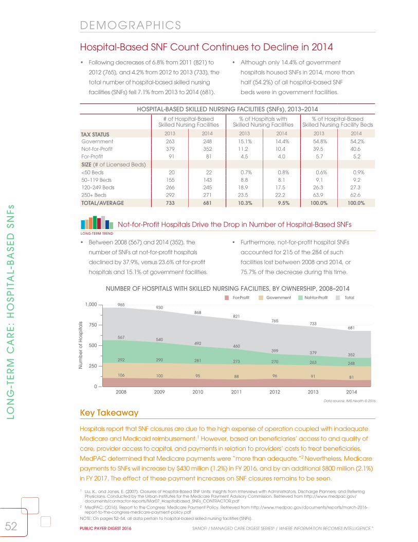
52 PUBLIC PAYER DIGEST 2016 SANOFI / MANAGED CARE DIGEST SERIES® / WHERE INFORMATION BECOMES INTELLIGENCE.™
LON
G-T
ER
M C
AR
E:
HO
SPIT
AL-
BA
SED
SN
Fs
Hospital-Based SNF Count Continues to Decline in 2014 • Following decreases of 6.8% from 2011 (821) to
2012 (765), and 4.2% from 2012 to 2013 (733), the
total number of hospital-based skilled nursing
facilities (SNFs) fell 7.1% from 2013 to 2014 (681).
• Although only 14.4% of government
hospitals housed SNFs in 2014, more than
half (54.2%) of all hospital-based SNF
beds were in government facilities.
Data source: IMS Health © 2016
DEMOGRAPHICS
0
250
500
750
1,000
Nu
mb
er o
f Ho
spita
ls
292 290 281 273 270
567540
492 460399
106 100 95 88 96
2008 2009 2010 2011 2012 2013 2014
GovernmentFor-Profit TotalNot-for-Profit
292 290 281 273 270 263
567 540492
460399 379 352
248
106 100 95 88 96 91 81
965930
868821
765733
681
NUMBER OF HOSPITALS WITH SKILLED NURSING FACILITIES, BY OWNERSHIP, 2008–2014
HOSPITAL-BASED SKILLED NURSING FACILITIES (SNFs), 2013–2014# of Hospital-Based
Skilled Nursing Facilities% of Hospitals with
Skilled Nursing Facilities% of Hospital-Based
Skilled Nursing Facility Beds
TAX STATUS 2013 2014 2013 2014 2013 2014
Government 263 248 15.1% 14.4% 54.8% 54.2%Not-for-Profit 379 352 11.2 10.4 39.5 40.6For-Profit 91 81 4.5 4.0 5.7 5.2
SIZE (# of Licensed Beds)<50 Beds 20 22 0.7% 0.8% 0.6% 0.9%50–119 Beds 155 143 8.8 8.1 9.1 9.2120–249 Beds 266 245 18.9 17.5 26.3 27.3250+ Beds 292 271 23.5 22.2 63.9 62.6
TOTAL/AVERAGE 733 681 10.3% 9.5% 100.0% 100.0%
• Between 2008 (567) and 2014 (352), the
number of SNFs at not-for-profit hospitals
declined by 37.9%, versus 23.6% at for-profit
hospitals and 15.1% at government facilities.
• Furthermore, not-for-profit hospital SNFs
accounted for 215 of the 284 of such
facilities lost between 2008 and 2014, or
75.7% of the decrease during this time.
Not-for-Profit Hospitals Drive the Drop in Number of Hospital-Based SNFsLONG-TERM TREND
Key Takeaway
Hospitals report that SNF closures are due to the high expense of operation coupled with inadequate
Medicare and Medicaid reimbursement.1 However, based on beneficiaries’ access to and quality of
care, provider access to capital, and payments in relation to providers’ costs to treat beneficiaries,
MedPAC determined that Medicare payments were “more than adequate.”2 Nevertheless, Medicare
payments to SNFs will increase by $430 million (1.2%) in FY 2016, and by an additional $800 million (2.1%)
in FY 2017. The effect of these payment increases on SNF closures remains to be seen.
1 Liu, K., and Jones, E. (2007). Closures of Hospital-Based SNF Units: Insights from Interviews with Administrators, Discharge Planners, and Referring Physicians. Conducted by the Urban Institutes for the Medicare Payment Advisory Commission. Retrieved from http://www.medpac.gov/documents/contractor-reports/Mar07_Hospitalbased_SNFs_CONTRACTOR.pdf
2 MedPAC. (2016). Report to the Congress: Medicare Payment Policy. Retrieved from http://www.medpac.gov/documents/reports/march-2016-report-to-the-congress-medicare-payment-policy.pdf
NOTE: On pages 52–54, all data pertain to hospital-based skilled nursing facilities (SNFs).

100
145
190
235
280
Ave
rag
e L
en
gth
of S
tay
(ALO
S)
20102009 2011 2012 2013 2014
Not in an IHN In an IHN Overall Total
179.8
205.4 210.3
227.9
263.3
245.7
118.5128.8 129.4 130.2
124.4
108.8
145.0
161.9 163.3171.2
179.9
160.4
SKILLED NURSING FACILITY UNIT ALOS (DAYS), BY SYSTEM AFFILIATION, 2009–2014
SKILLED NURSING FACILITY UTILIZATION, 2013–2014SNF Unit
AdmissionsSNF Unit
Patient-DaysSNF Unit
Occupancy SNF Unit
ALOS (Days)
TAX STATUS 2013 2014 2013 2014 2013 2014 2013 2014
Government 299.1 295.3 29,656.7 28,154.5 74.5% 71.2% 256.2 208.5
Not-for-Profit 395.2 392.2 17,993.5 18,298.9 73.2 71.7 127.9 123.1
For-Profit 288.3 294.1 10,555.5 10,656.2 73.8 73.8 151.2 160.3
BED SIZE<50 Beds 140.2 129.5 5,009.8 9,055.3 66.1% 64.9% 270.1 280.1
50–119 Beds 239.7 236.5 9,866.7 10,657.7 74.9 72.9 177.0 162.3
120–249 Beds 311.8 312.9 17,482.4 17,712.4 74.7 73.5 155.4 157.1
250+ Beds 447.9 444.9 32,596.7 30,788.7 72.8 70.0 200.5 155.0
OVERALL AVG. 346.6 343.9 21,527.8 21,191.9 73.8% 71.8% 179.9 160.4
53SANOFI / MANAGED CARE DIGEST SERIES® / WHERE INFORMATION BECOMES INTELLIGENCE.™ PUBLIC PAYER DIGEST 2016
LON
G-TE
RM
CA
RE
: HO
SPITA
L-BA
SED
SNFs
SNF Unit Average Length of Stay Declines Sharply Overall• Overall skilled nursing facility (SNF) average length
of stay (ALOS) fell 10.8% from 2013 (179.9 days)
to 2014 (160.4). SNF unit admissions, patient-days,
and occupancy also dropped during this period.
• The decrease in SNF unit ALOS was steepest
at government facilities (18.6%), while ALOS at
not-for-profit facilities dipped a more modest
3.8%. At for-profit SNFs, ALOS increased 6.0%.
Data source: IMS Health © 2016
UTIL IZATION
• From 2013 to 2014, ALOS at SNFs affiliated with
an integrated health network (IHN) fell 12.5%,
to 108.8 days from 124.4. ALOS at IHN-affiliated
SNFs dropped 16.4% from 2012.
• ALOS at non-IHN-affiliated SNFs decreased 6.7%
from 2013 to 2014. This marked the first reduction
since in the years shown, and ALOS at these
facilities was still 36.7% higher in 2014 than in 2009.
Key Takeaway
Decreases in SNF utilization may be attributed to a number of factors, including efforts to improve
chronic-disease management prior to and during inpatient episodes. However, proposed Medicare
and Medicaid reimbursement changes that place greater emphasis on patient characteristics
(age, diagnosis, functional status, and more) than on services rendered are expected to raise
payments to SNFs with medically complex cases.1 It is possible that these new payment models,
based on episode of care rather than length of stay, will further reduce ALOS at SNFs.
1 Medicare Payment Advisory Commission. (2016). Report to the Congress: Medicare and the Health Care Delivery System. Retrieved from http://medpac.gov/documents/reports/june-2016-report-to-the-congress-medicare-and-the-health-care-delivery-system.pdf
NOTE: On pages 52–54, all data pertain to hospital-based skilled nursing facilities (SNFs).
LONG-TERM TREND
IHN-Affiliated SNFs Record Largest Decrease in Average Length of Stay

SKILLED NURSING FACILITY UTILIZATION, BY REGIONSNF Unit
AdmissionsSNF Unit
Patient-DaysSNF Unit
ALOS (Days)2013 2014 2013 2014 2013 2014
Pacific 325.4 307.8 20,616.4 20,481.4 286.5 254.8
Mountain 296.1 296.6 14,445.6 14,665.8 75.0 71.9
West North Central 311.5 272.0 18,513.3 17,788.1 124.9 146.4
East North Central 389.5 400.3 15,937.1 17,460.1 131.7 103.5
South Central 347.4 357.8 17,348.0 15,291.9 130.6 101.8
New England 380.8 384.4 17,283.7 16,799.7 167.8 171.0
Mid-Atlantic 392.8 408.6 37,189.7 37,537.2 186.7 161.7
South Atlantic 311.0 312.2 20,534.4 20,270.2 182.4 178.5
OVERALL AVG. 346.6 343.9 21,527.8 21,191.9 179.9 160.4
54 PUBLIC PAYER DIGEST 2016 SANOFI / MANAGED CARE DIGEST SERIES® / WHERE INFORMATION BECOMES INTELLIGENCE.™
Data source: IMS Health © 2016LON
G-T
ER
M C
AR
E:
HO
SPIT
AL-
BA
SED
SN
Fs
Admissions, Patient-Days Decline at Skilled Nursing Facilities• From 2013 to 2014, the number of admissions
per hospital-based skilled nursing facility (SNF)
unit decreased overall, to 343.9 from 346.6,
despite increasing in six of eight profiled regions.
• Average SNF unit patient-days fell 1.6%
nationally, to 21,191.9 from 21,527.8, during this
period. Yet patient-days rose in the Mountain,
East North Central, and Mid-Atlantic regions.
Key Takeaway
Traditional Medicare requires a qualifying three-day inpatient hospital admission prior to patients
being transferred to a skilled nursing facility.2 As a result, decreases in inpatient admission counts can
be expected to reduce SNF admissions. As the drive to decrease inpatient admissions continues, it
seems likely that SNF admissions may continue to fall. Meanwhile, an enhanced focus on population
health and chronic-disease management may also help to drive down SNF patient-days.
UT IL IZATION
17,000
18,250
19,500
20,750
22,000
Nu
mb
er o
f Patie
nt-D
ays
342
346
350
354
358
Num
be
r of A
dm
issi
ons
2009 2010 2011 2012 2013 2014
SNF Unit Admissions SNF Unit Patient-Days
352.2
354.5
351.4
344.6
346.6
343.9
18,728.2
19,448.3
20,124.1
21,002.5
21,527.821,191.9
• After climbing 24.8% from 2007 (17,251.4)1 to 2013
(21,527.8), SNF unit patient-days decreased 1.6%
from 2013 to 2014 (21,191.9), but still remained
above the 2012 benchmark (21,002.5).
• Meanwhile, SNF unit admissions decreased
modestly from 2013 (346.6) to 2014 (343.9), and
were down 2.4% from 2009 (352.2), despite rising
from 2009 to 2010 and again from 2012 to 2013.
SNF Unit Patient-Days Decrease for First Time Since 2007LONG-TERM TREND
SKILLED NURSING FACILITY UTILIZATION, 2009–2014
1 See the Public Payer Digest for 2014.2 MedPAC. (2016). Report to the Congress: Medicare and the Health Care Delivery System. Retrieved from: http://medpac.gov/documents/reports/
june-2016-report-to-the-congress-medicare-and-the-health-care-delivery-system.pdf
NOTE: On pages 52–54, all data pertain to hospital-based skilled nursing facilities (SNFs).

55SANOFI / MANAGED CARE DIGEST SERIES® / WHERE INFORMATION BECOMES INTELLIGENCE.™ PUBLIC PAYER DIGEST 2016
LTCPP Count Grows for Fifth Consecutive YearLONG-TERM TREND
Retail Pharmacy Shares of LTCPP Prescriptions Dispensed Increase in 2015
• The percentages of LTCPP prescriptions
dispensed declined for all customer types except
retail and other pharmacies from 2014 to 2015.
The retail share grew to 25.6% from 22.5%.
• From 2013 (10.1%), the corporately affiliated retail
pharmacy share of the LTCPP customer mix rose
4.2 percentage points, while the corresponding
nursing home portion fell 3.2 percentage points.2
Data source: IMS Health © 2016
• From 2014 (1,329) to 2015 (1,403), the number
of long-term care pharmacy providers
(LTCPPs) increased 5.6%, marking the fifth
straight year the total count has risen.
• After contracting 1.1% from 2009 (1,200)
to 2010 (1,187), the number of LTCPPs
nationally expanded 18.2%. From 2005
(1,079) to 2015, the total climbed 30.0%.
LON
G-TE
RM
CA
RE
: LTCP
Ps
DEMOGRAPHICS
2005 2006 2007 2008 2009 2010 2011 2012 2013 2014 20151,020
1,120
1,220
1,320
1,420
Nu
mb
er o
f LTC
PPs
1,0791,105
1,125
1,245
1,2001,187
1,211
1,246
1,282
1,329
1,403
NUMBER OF LONG-TERM CARE PHARMACY PROVIDERS, 2005–2015
LONG-TERM CARE PHARMACY PROVIDER CUSTOMER MIX, 2014–2015
Percentage of Prescriptions Dispensed
Nursing Home
Residential Care Retail Mental Health
Facility Hospital Other1
SIZE (# of FTE Pharmacists)
2014 2015 2014 2015 2014 2015 2014 2015 2014 2015 2014 2015
1 FTE Pharmacist 42.5% 39.6% 8.6% 7.9% 36.5% 41.2% 1.6% 1.4% 2.1% 1.9% 8.8% 8.2%2 FTE Pharmacists 38.0 36.1 10.8 9.8 36.1 38.7 5.1 5.2 1.0 1.4 9.1 8.93–4 FTE Pharmacists 54.8 50.1 8.9 9.3 23.1 28.1 2.7 2.5 3.8 3.3 6.7 6.85+ FTE Pharmacists 67.4 66.9 10.1 9.7 7.4 8.4 1.9 2.0 6.1 5.7 7.2 7.2Size Unknown 57.4 57.3 12.1 11.6 15.0 15.7 4.5 4.2 2.4 2.2 8.7 9.0
OWNERSHIPCorporate 66.4% 63.9% 10.3% 9.3% 11.2% 14.3% 3.3% 3.3% 2.7% 2.5% 6.4% 6.7%Independent 45.1 42.2 12.1 10.1 28.9 32.6 3.2 3.2 3.2 3.1 9.1 8.8
OVERALL AVERAGE 52.8% 50.4% 10.3% 9.8% 22.5% 25.6% 3.3% 3.2% 3.1% 2.8% 8.1% 8.2%
Key Takeaway
Two LTCPPs account for nearly 50% of the total U.S. market,3 making for significant competition for
the remaining 50% among the 1,400 smaller providers. In 2012, the Federal Trade Commission (FTC)
objected to an attempt by Omnicare, the largest LTCPP, to acquire PharMerica, the second largest,
prompting Omnicare to drop its bid.3,4 The subsequent acquisition in 2015 of Omnicare by CVS could
be the start of more LTCPPs–retail chain integration, as they compete for their share of the market.
1 “Other” includes retirement communities, hospices, home health agencies, correctional centers, substance abuse centers, and all others.2 See the Public Payer Digest for 2015.3 Avalere Health LLC. (2015). Long-Term Care Pharmacy: The Evolving Marketplace and Emerging Policy Issues. Retrieved from http://www.mhainc.com/
uploadedFiles/Content/Resources/Avalere_LTC%20Pharmacy%20the%20Evolving%20Marketplace%20and%20Emerging%20Policy%20Issues....pdf4 FTC. (2012). In the matter of Omnicare. Retrieved from https://www.ftc.gov/enforcement/cases-proceedings/111-0239/omnicare-inc-corporation-matter
NOTE: On pages 55–57, long-term care pharmacy provider (LTCPP) data pertain only to those pharmacies that have an implied contract/agreement to perform pharmaceutical consulting and/or dispensing services to long-term care facility patients on an ongoing basis. They must have at least one licensed pharmacist employed at the location and generate at least 50% of their revenue from long-term care facilities.

Cardio-vascular
Hyper-tension
Psychiatric Diabetes Pain Gastro-intestinal
Anti-arthritics
InfectiousDisease
Alzheimer’sDisease
BehavioralConditions
0%
4%
8%
12%
16%
Perc
ent
ag
e o
f LTC
PP R
xs
13.2%12.9% —12.9%—
10.7%10.4%
—8.7%—
7.3% 7.4% 7.6% 7.4% 7.1% 7.3%—6.4%— 6.2% 5.9%
3.4% 3.7%
2014 2015
MOST COMMON PRESCRIPTIONS DISPENSED BY LONG-TERM CARE PHARMACY PROVIDERS, 2014–2015
NUMBER OF NURSING HOME PRESCRIPTIONS PER LONG-TERM CARE PHARMACY PROVIDER PER MONTH, 2013–2015
SIZE (# of FTE Pharmacists) 2013 2014 2015
1 FTE Pharmacist 2,753.1 2,732.5 2,770.5
2 FTE Pharmacists 4,170.1 4,142.5 4,090.7
3–4 FTE Pharmacists 6,757.3 6,706.8 6,798.5
5+ FTE Pharmacists 23,654.5 23,482.9 23,188.0
Size Unknown 17,585.9 17,585.9 17,505.9
OWNERSHIPCorporate 21,305.9 21,219.5 19,885.3
Independent 7,381.7 7,318.8 7,352.5
OVERALL AVERAGE 12,830.3 12,736.2 12,569.4
56 PUBLIC PAYER DIGEST 2016 SANOFI / MANAGED CARE DIGEST SERIES® / WHERE INFORMATION BECOMES INTELLIGENCE.™
Data source: IMS Health © 2016
Monthly Prescriptions Continue to Decrease for LTCPPs
• The number of nursing home prescriptions
dispensed per long-term care pharmacy provider
(LTCPP) per month dipped from 2014 (12,736.2) to
2015 (12,569.4), the second consecutive decline.
• Corporate-owned LTCPPs dispensed 6.7% fewer
monthly nursing home prescriptions in 2015
(19,885.3) than in 2013 (21,305.9), but still far
more than their independent counterparts.
LON
G-T
ER
M C
AR
E:
LTC
PP
s
UTIL IZATION
Key Takeaway
The declining number of nursing home prescriptions per LTCPP since 2013 is likely a result of the
decreasing percentage of nursing homes as part of the LTCPP customer mix, which fell to 50.4%
in 2015 from 54.0% in 2013. Meanwhile, the retail pharmacy share climbed to 25.6% from 20.5%.1
LTCPPs are diversifying their market to reflect the changing long-term care landscape.
Cardiovascular and Hypertension Drugs Make Up Largest Percentages of LTCPP Rxs
• Cardiovascular medications accounted for
12.9% of LTCPP prescriptions to nursing homes
in 2015, as did hypertension medications,
the highest shares, by drug class, in 2015.
• Even as the psychiatric share of LTCPP
prescriptions contracted from 2014 (10.7%)
to 2015 (10.4%), the portion of drugs treating
behavioral conditions inched up.
1 See the Public Payer Digest for 2015, page 55.

AVERAGE PRESCRIPTION COSTS FOR LONG-TERM CARE PATIENTS, BY LTCPP OWNERSHIP, 2006–2015
$48
$60
$72
$84
$96
Ave
rag
e C
ost
$60.99 $61.62
$62.39
$62.84 $61.93 $61.72 $63.60 $62.24 $63.12
$50.06$52.21
$62.56
$70.92$72.91 $74.18 $74.80 $74.22
$89.07
$82.60
$92.53
2006 2007 2008 2009 2010 2011 2012 2013 2014 2015
Independent Corporate
LONG-TERM CARE PHARMACY PROVIDER FINANCIALS, 2014–2015
Average Prescription Costs for Long-Term Care Patients
% of Total LTCPP Drug Sales to Long-Term Care Facilities
% of Total LTCPP Drug Revenue from Long-Term
Care FacilitiesOWNERSHIP 2014 2015 2014 2015 2014 2015
Corporate $89.07 $92.53 89.7% 87.0% 89.5% 87.8%
Independent 63.12 82.60 71.9 68.6 71.7 67.7
REGIONPacific $74.14 $80.57 85.4% 85.6% 84.9% 84.9%
Mountain 86.20 83.27 84.6 83.4 78.6 75.2
West North Central 101.33 145.05 57.3 53.9 60.1 56.2
East North Central 80.52 77.73 80.8 77.4 79.5 76.4
West South Central 43.06 44.38 78.2 74.8 77.6 74.3
East South Central 51.12 107.42 90.9 87.0 89.2 84.9
New England 69.73 67.56 79.0 73.8 80.2 75.4
Mid-Atlantic 73.13 72.68 85.3 83.7 84.3 82.9
South Atlantic 53.57 52.46 85.5 84.3 85.8 85.8
OVERALL AVERAGE $72.75 $86.46 79.3% 76.4% 79.1% 76.3%
57SANOFI / MANAGED CARE DIGEST SERIES® / WHERE INFORMATION BECOMES INTELLIGENCE.™ PUBLIC PAYER DIGEST 2016
Data source: IMS Health © 2016
Rx Costs Increase More Rapidly for Independent LTCPPs
• From 2014 ($63.12) to 2015 ($82.60), the
average cost per prescription dispensed
by independent long-term care pharmacy
providers (LTCPPs) grew 30.9%.
• Meanwhile, such costs rose just 3.9% for
corporate-owned LTCPPs, to $92.53 from $89.07.
Prescription costs for long-term care patients,
regardless of LTCPP ownership, climbed 18.8%.
LON
G-TE
RM
CA
RE
: LTCP
Ps
Key Takeaway
Relatively dramatic jumps in average prescription costs for long-term care patients may be reflective
of several factors, including increases in generic drug pricing and growth in the use of specialty
drugs, like those used to treat hepatitis C. Indeed, according to one industry study, specialty
prescription volume for hepatitis C patients in long-term care rose 289% from 2013 to 2014.1 Whether
demand for such drugs has plateaued will likely be a factor in future LTCPP spending trends.
F INANCIALS
• The difference in average prescription costs
between corporate and independent LTCPPs
was 41.1% in 2014, but shrank to 12.0% in 2015
as such costs at independent LTCPPs jumped.
• Nevertheless, the average per-patient
prescription cost for corporate LTCPPs ($92.53)
was nearly $10 higher than that of their
independent counterparts ($82.60) in 2015.
Gap Between Independent, Corporate LTCPP Average Rx Costs NarrowsLONG-TERM TREND
1 Binaso, K., et. al. (2015). 2015 Specialty Trends in Senior Care. Specialty Pharmacy Times. Retrieved from http://www.specialtypharmacytimes.com/publications/specialtypharmacytimes/2015/august-2015/2015-specialty-trend-in-senior-care

58 PUBLIC PAYER DIGEST 2016 SANOFI / MANAGED CARE DIGEST SERIES® / WHERE INFORMATION BECOMES INTELLIGENCE.™
Medicare Looks to Next Gen ACO Model to Improve SavingsThe Centers for Medicare and Medicaid Services
(CMS) estimted that the implementation of
accountable care organizations (ACOs) would
lead to a savings of approximately $470 million
from 2012 to 2015.1 At the end of 2014, CMS
reported that its two sponsored ACO programs, the
Pioneer ACO Program and the Medicare Shared
Savings Program (MSSP), had generated more
than $411 million in savings.2 However, after paying
bonuses, these programs netted a loss of $2.6 million
to the Medicare trust fund.3 Morever, only about
half (15 of 20 Pioneer ACOs and 181 of 333 MSSP
participants) had reduced costs when compared
with their established financial baselines in 2014, and
a significant number of ACOs had increased costs.2
According to health system executives, three
challenges hinder the MSSP ACO model in particular:
(1) sharing a maximum of 50% of generated savings
provides insufficient funding for changing practice
behavior; (2) physicians do not know which patients
they are fiscally responsible for until the end of the
year, hampering care management; and (3) there
is no incentive for patients to receive care within a
particular ACO network, reducing providers’ ability to
coordinate care—one of the main goals of ACOs.4
As a response to these concerns, CMS unveiled the
Next Generation (Next Gen) ACO model, which will
start in 2017. In the Next Gen model, CMS will allow
ACOs to elect to share up to 100% of the savings
that they generate, the ACO population will be
predefined, and physicians will have autonomy
over how patients are managed. Furthermore,
CMS promises timely delivery of data sets necessary
to improve quality measurements, and spending
benchmarks will be adjusted based on the risk
of the population served.4 With these changes
implemented, Next Gen ACOs may be poised to
deliver the savings that CMS originally envisioned.
LOO
KIN
G F
OR
WA
RD
LOOKING FORWARD
1 CMS. (2011). Final Rule on Medicare Program; Medicare Shared Savings Program: Accountable Care Organizations. Federal Register. Retrieved from https://www.federalregister.gov/articles/2011/11/02/2011-27461/medicare-program-medicare-shared-savings-program-accountable-care-organizations
2 McClellan, M., Kocot, S. L., and White, R. (2015). Medicare ACOs Continue to Show Care Improvements—and More Savings Are Possible. Health Affairs. Retrieved from http://healthaffairs.org/blog/2015/11/04/medicare-acos-continue-to-show-care-improvements-and-more-savings-are-possible/
3 Kaiser Family Foundation (2015). Are Medicare ACOs Working? Experts Disagree. Kaiser Health News. Retrieved from http://khn.org/news/are-medicare-acos-working-experts-disagree/
4 Dawe, C., Lewine, N., and Miesen, M. (2016). Today’s Most Attractive National ACO Model Is Offered By . . . CMS. Health Affairs. Retrieved from http://healthaffairs.org/blog/2016/04/15/todays-most-attractive-national-aco-model-is-offered-bycms/
5 Lynne, B., et al. (2016). Breaking Down the MACRA Proposed Rule. Health Affairs. Retrieved from http://healthaffairs.org/blog/2016/4/29/breaking-down-the-macra-proposed-rule
6 Terhune, C. (2014). Study: Medical Costs Up to 20% Higher With Hospital-Owned Physician Groups. Los Angeles Times. Retrieved from http://www.latimes.com/business/healthcare/la-fi-hospital-physician-costs-20141021-story.html
Physicians Must Adapt as MACRA Ties Payments to QualityTo date, the impact of value- and outcomes-
based reimbursement has been felt largely
by hospitals and integrated care-delivery
systems. However, the Medicare Access and
CHIP Reauthorization Act (MACRA) of 2015
brings performance-based Medicare payment
models to physicians and other clinicians.5
For example, one track of MACRA’s Quality
Payment Program is the Merit-Based Incentive
Payment System (MIPS). The first MIPS performance
period begins in 2017, with payment adjustment
beginning in 2019. MIPS will consolidate three
existing Medicare programs: the Physician
Quality Reporting System, the Value-Based
Modifier Program, and the Meaningful Use
of Electronic Health Records (EHRs). CMS will
also continue to evaluate reimbursement
adjustments based on patient socioeconomic
status as it has done with ACOs.5
Performance-based payment will have significant
implications for physicians in terms of practice
governance, data sharing, and financial analysis.
As a result, physicians may choose to increase
their affiliations with health systems (which
have greater capital assets and performance-
management experience) and find added
impetus to form clinically integrated networks.
Such changes in the structural relationships of
providers presume improvements in outcomes and
health care cost containment. However, there
is some evidence that physician affiliation with
health care systems may actually raise costs.6 And
even though MACRA was intended, in large part,
to eliminate dissatisfaction with the Sustainable
Growth Rate, the program may need modification
to avoid negatively impacting physician
satisfaction, or patient outcomes, as compliance
diverts resources and time away from patients.

59SANOFI / MANAGED CARE DIGEST SERIES® / WHERE INFORMATION BECOMES INTELLIGENCE.™ PUBLIC PAYER DIGEST 2016
LOO
KIN
G FO
RW
AR
D
LOOKING FORWARD
Cost Growth Could Create Turbulence in Long-Term Care MarketBased simply on the law of supply and demand,
it seems assured that the costs for long-term care
services will continue to grow. The rapid rise in the
number of baby boomers who will need these
services, coupled with the expected shortages of
individuals to provide them, could create a perfect
storm of sizable price hikes for services already too
expensive for many individuals.3
With necessary services priced out of reach, many
seniors in need of long-term care support are
expected to age at home, relying increasingly on
family members and volunteers for assistance with
daily living activities. Yet even this option will have
its limits, as the ratio of potential caregivers (people
in the 45–65 age range, the adult children of aging
seniors) to individuals aged 80 and over who will
likely require services is declining fast. In 2010, there
were roughly seven such caregivers to every one
individual aged 80 or over; by 2050, that number is
expected to be just three to one.4
Providers and payers are already preparing for the
coming blow of heightened demand and reduced
supply for long-term care services. Some providers
are investing in remote-care-monitoring technology
that will hopefully maximize time for their skilled
nursing personnel and place more caregiving tasks
into the hands of individuals with less training. This
could, in turn, help mitigate cost growth. Medicare,
for its part, is already monitoring hospital readmissions
from long-term care facilities, as such inefficiencies
may be far more financially damaging in the years
to come. These steps are among the many being
taken to prepare the long-term care community for
what will be a challenging era.
1 Georgetown University Health Policy Institute. (2016). Beyond the Reduction in Uncompensated Care: Medicaid Expansion Is Having a Positive Impact On Safety Net Hospitals and Clinics. http://ccf.georgetown.edu/wp-content/uploads/2016/05/Medicaid_hospitals-clinics-June-2016.pdf
2 Cross-Call, J. (2016). Medicaid Expansion Producing State Savings and Connecting Vulnerable Groups to Care. Center on Budget and Policy Priorities.3 Kwak, J., and Polivka, L. (2014). The Future of Long-Term Care and the Aging Network. Retrieved from http://www.asaging.org/blog/future-long-
term-care-and-aging-network4 Redfoot, D., et al. (2013). The Aging of the Baby Boom and the Growing Care Gap: a Look at Future Declines in the Availability of Family Caregivers.
AARP. Retrieved from http://www.aarp.org/home-family/caregiving/info-08-2013/the-aging-of-the-baby-boom-and-the-growing-care-gap-AARP-ppi-ltc.html
Medicaid Expansion: Early Results Attract Late AdoptersIn 2014, 24 states opted not to expand
Medicaid under the Affordable Care Act.
Since then, however, several have reversed
their decisions. As of July 2016, 31 states
and the District of Columbia had extended
Medicaid coverage to individuals or families
earning 138% of the poverty level. Many
states have obtained waivers from the federal
government to experiment with new program
characteristics, such as requiring recipients
to contribute to health savings accounts or
physicians to meet quality benchmarks.
The tipping point for the late adopters seems to
have come after a number of studies detailed
the fiscal and care-delivery impacts of Medicaid
expansion in some states. For instance, a
Georgetown University Health Policy Institute
study found that expansion states reported
notable reductions in uncompensated care—
especially in safety net hospitals—as well as
decreases in the numbers of uninsured patients.
The study further indicated that the resulting
improvements in the bottom line allowed
some systems and clinics to hire more staff,
open new facilities, purchase new equipment,
or launch new care coordination initiatives.1
State budgets also reflect savings, ranging from
an estimated $677 million over the next five
years in Louisiana to a combined $708 million
in New Jersey in fiscal years 2016 and 2017.2
However, challenges loom. After 2016, states
will assume up to 10% of the expansion costs
once covered by the federal government. Then
there are the effects of potential economic
downturns, when state tax revenues wane
just as Medicaid rolls grow, perhaps leading
to greater strain on expansion states. This, in
conjunction with the fact that Medicaid is also
a significant source of funding for long-term
care—a cost that is likely to grow with the
aging population —suggests that the success
of Medicaid expansion has yet to be tested.

60 PUBLIC PAYER DIGEST 2016 SANOFI / MANAGED CARE DIGEST SERIES® / WHERE INFORMATION BECOMES INTELLIGENCE.™
RE
SEA
RC
H M
ETH
OD
OLO
GY
RESEARCH METHODOLOGY
Medicare/Medicaid
IMS Health uses a rigorous survey methodology in
producing reports and validating data. This Digest
features HMO information gathered by telephone
and email surveys between February and June 2016.
Questionnaires are refined every year to reflect
changes in industry operations and include, for
example, questions specific to the Medicare and
Medicaid populations.
Managed care data derive from a census of the
HMO industry. HMO and hospital utilization data,
gathered from state health licensing agencies,
federal government sources, and telephone or email
surveys, are effective as of December 31, 2015. When
data were not available from all plans, a smaller
sample was used.
Some of the managed care content used for analysis
is obtained from quarterly and annual financial
statements submitted by insurance companies,
as required, to a state’s department of insurance.
These statements have been collected and made
available by the National Association of Insurance
Commissioners (NAIC). Although the NAIC has
permitted use, it does not endorse any analysis or
conclusions based upon the use of its data.
Medicare and Medicaid managed care information
was gathered from operating HMOs and other
types of managed care organizations recognized
by the Centers for Medicare and Medicaid Services
(CMS). IMS Health used information from state health
licensing agencies to project Medicaid managed
care enrollment for 2015.
IMS Health often telephones managed care
organizations (MCOs) to validate and clarify
information obtained from them. IMS Health
also compares its data with those published in
other sources, including trade associations in the
managed care industry, periodicals, journals,
and state regulatory agencies. IMS Health does
this to ensure that its database includes an
accurate account of Medicare and Medicaid
managed care.
Chronic disease data included in this report were
generated using health care professional and
institutional insurance claims. IMS Health also
gathered data on prescription activity from the
National Council for Prescription Drug Programs
(NCPDP). These data account for some 2 billion
prescription claims annually, or more than 86% of
the prescription universe. These data represent the
sampling of prescription activity from a variety of
sources, including retail chains, mass merchandisers,
and pharmacy benefit managers. Cash, mail-order,
Medicaid, and third-party transactions are tracked.
Hospital Inpatient and Outpatient
The IMS Health Hospital Procedure/Diagnosis (HPD)
database contains an extensive set of hospital
inpatient and outpatient discharge records, including
actual diagnoses and procedures data for about
75% of all discharges nationwide (including 100% of
Medicare-reimbursed discharges). The HPD database
reports the numbers of procedures performed on
patients discharged from a hospital. Most states report
at least nine diagnostic and six procedure codes from
each discharge record. IMS Health uses Medicare
procedure counts and additional hospital-level
information to estimate procedure counts for the
remaining 25% of discharges—the non-Medicare
hospital discharge information in nonreporting
states. The hospital inpatient and outpatient data
provided in this Digest are current as of calendar
year 2014. See the table below for a list of common
disease states tracked.
Data for the Public Payer Digest were gathered by IMS Health, Parsippany, NJ, a leading provider of innovative
health care data products and analytic services. The information was gathered from the following sources:
DISEASE STATE ICD-9 CODES DISEASE STATE ICD-9 CODESAcute Coronary Syndromes 411R Hypertension 401.9
Angina 413 Lipid Disorders 272R
Asthma 493 Osteoarthritis 715.16, 715.26, 715.36, 715.96
Breast Cancer239.3, 238.3, 174.4, 174.8, 174.2, 174.0, 174.3, 174.9, 174.5, 174.6, 174.1
Prostate Cancer 185
Depression 296 Rheumatoid Arthritis 714.0
Diabetes Mellitus 250 Stroke 433, 434
61SANOFI / MANAGED CARE DIGEST SERIES® / WHERE INFORMATION BECOMES INTELLIGENCE.™ PUBLIC PAYER DIGEST 2016
RE
SEA
RC
H M
ETH
OD
OLO
GY
RESEARCH METHODOLOGY
Long-Term Care
The definition of nursing homes included in this
Digest encompasses only freestanding long-term
care facilities providing skilled and unskilled care.
No long-term care facilities attached to hospitals
or long-term care or subacute beds within hospitals
are included, as they are typically licensed by states
as part of hospitals, and their beds are counted as
hospital beds. Also, no intermediate care facilities
(ICF) or mental retardation (MR) homes are included
in the nursing home data in this Digest. These data are
effective as of end-of-year 2015.
Hospital-based skilled nursing facility data for
this report are based on information from the
IMS Health Hospital Profiling Solution©. Hospital
utilization data were compiled between midyear
2014 and midyear 2015, and are effective as of
December 31, 2014. These data were gathered from
state health licensing agencies, federal government
sources, and telephone or email surveys. Assisted
living facility data are from the IMS Health Healthcare
Market Index©, while long-term care pharmacy
provider data are from the IMS Health Long-Term
Care Pharmacy Provider Profiling Solution©.
Detailed information on corporate affiliations was
used to compile the profile of the home care industry.
This information is based on data from the IMS Health
Home Health Market/Chains Profiling Solution©. Data
are effective as of end-of-year 2015. All identified
home care agencies and home care chains are
contacted annually by telephone and by email for
survey information.
IMS Health compares its data with those
gathered by other organizations, including trade
associations, periodicals, journals, state licensing
information, and CMS.
National Retail Pharmacy Data
The Medicare and Medicaid Retail Drug Costs and
Utilization sections present national overviews of
prescription drug dispensing by retail pharmacies
to Medicare beneficiaries and Medicaid recipients.
National-level retail pharmacy data across 12
therapeutic drug classes are organized according to
major chronic disease category and include the five
most common products dispensed for eight of these
classes, paid for by Medicare and Medicaid.
Prescription metrics derive from IMS Health’s Vector
One®: Payer (VOPA) platform. Through agreements
with a variety of data providers, the IMS Health data
warehouse receives billions of prescription claims per
year. VOPA is IMS Health’s projected prescription and
patient-centric database. The only database of its kind,
it provides projected retail pharmacy prescription and
longitudinal metrics at various levels of aggregation,
including state, region, and national levels. IMS
Health utilizes a unique and patented algorithm for
de-identification of patients, ensuring compliance
with HIPAA regulations. These data are current as of
midyear 2015 and trended over three years.
The Public Payer Digest uses a variety of additional
sources, which are cited on the appropriate page or
in the References.
A review process takes place, before and during production of this report, between IMS Health and Forte
Information Resources LLC, Denver, CO, a leading provider of publishing and communications products
and services for the health care industry. Sanofi, as sponsor of this report, maintains an arm’s-length relationship
with the organizations that prepare the Digest and carry out the research. The desire of Sanofi is for the
Managed Care Digest Series® to be completely independent and objective.
Download the complete methodology at www.managedcaredigest.com.
HMO REGIONS STATESPacific Alaska, California, Hawaii, Oregon, Washington
Mountain Arizona, Colorado, Idaho, Montana, Nevada, New Mexico, Utah, Wyoming
West North Central Iowa, Kansas, Minnesota, Missouri, Nebraska, North Dakota, South Dakota
East North Central Illinois, Indiana, Michigan, Ohio, Wisconsin
South Central Alabama, Arkansas, Kentucky, Louisiana, Mississippi, Oklahoma, Tennessee, Texas
New England Connecticut, Maine, Massachusetts, New Hampshire, Rhode Island, Vermont
Mid-Atlantic New Jersey, New York, Pennsylvania
South Atlantic Delaware, Florida, Georgia, Maryland, North Carolina, Puerto Rico, South Carolina, Virginia, Washington, DC, West Virginia

62 PUBLIC PAYER DIGEST 2016 SANOFI / MANAGED CARE DIGEST SERIES® / WHERE INFORMATION BECOMES INTELLIGENCE.™
KE
Y T
ER
MS
KEY TERMS
Accountable Care Organization (ACO): An ACO
is an associated network of primary care physicians,
specialists and hospitals that actively coordinates
to provide high-quality longitudinal health care to
patients. ACOs report on quality measures, and
the providers, who themselves are accountable
for maintaining a high standard of performance,
are rewarded for their cooperation.
Affordable Care Act (ACA): The ACA was signed
into effect by President Obama in March 2010 as
part of the administration’s comprehensive health
care reform legislation. The ACA is aimed primarily
at decreasing the number of uninsured Americans,
reducing the overall costs of health care and
improving quality. In June 2012, the Supreme Court
upheld the constitutionality of most of the ACA,
and many reforms have already taken effect.
Assisted Living Facility (ALF): ALFs allow patients
to remain relatively independent while still receiving
a certain level of care. IMS Health defines an ALF
as a facility where residents are provided 24-hour
monitoring and assistance with activities of daily
living, while a nursing staff administers medications
and treatment.
Case Mix Index (CMI): Severity is approximated
by the case mix index (CMI), which is a statistical
measure of the average amount of resources
consumed per Medicare inpatient case at a hospital.
Hospitals that tend to treat more resource-intensive
(i.e., severe) cases will have a higher calculated CMI.
Congressional Budget Office (CBO): The CBO
is a public sector think tank that produces policy
analyses, cost estimates of legislation, and budget
and economic projections that serve as a basis for
Congress’s decisions about spending and taxes.
Every piece of legislation affecting the use of the
nation’s resources undergoes CBO’s scrutiny.
Coverage Gap (“Donut Hole”): The Medicare Part
D coverage gap, often referred to as a “donut hole,”
refers to a period of time during the coverage year
when the beneficiary is responsible for a larger portion
of drug costs. The ACA aims to close the coverage
gap by 2020, gradually introducing manufacturer
discounts and subsidies from the Centers for
Medicare & Medicaid Services to lower costs for
Part D enrollees.
Dual Eligibles: Dual eligibles are individuals who are
entitled to Medicare Part A and/or Part B and are
eligible for some form of Medicaid benefit. People
with Medicare who have limited income
and resources may get help paying for their out-of-
pocket medical expenses from their state Medicaid
program. Services that are covered by both programs
will be paid first by Medicare and the difference by
Medicaid, up to the state’s payment limit. Medicaid
also covers additional services (e.g., nursing facility
care beyond the 100-day Medicare limit, prescription
drugs, eyeglasses and hearing aids).
Health Insurance Exchange: A key provision of the
ACA is the creation of health insurance exchanges,
or marketplaces, in each state in which individuals
and small businesses can choose from a variety of
qualified health insurance plans. If a state chooses
not to establish its own exchange, the federal
government will establish one for it. States may
also elect to set up a partnership marketplace, in
which the state and federal governments jointly run
the exchange.
Home Care Agency (HCA): HCAs provide care to
patients in various settings recognized as the patient’s
residence, including homes, skilled nursing facilities,
hospitals, assisted living facilities and nursing homes.
Caregivers assist patients in the activities of daily
living and respite care, and may also perform minor
outpatient therapies.
Long-Term Care Pharmacy Provider (LTCPP): LTCPPs
are pharmacies that have an implied contract/
agreement to perform pharmaceutical consulting
and/or dispensing services to long-term care facility
patients on an ongoing basis. LTCPPs tracked in this
Digest must have at least one licensed pharmacist
employed at the location and generate at least 50%
of their revenue from long-term care facilities.
Managed Care Organization (MCO): Managed
care organizations control the finance, insurance,
delivery and payment of health care services
by negotiating contracts with providers and
maintaining efficient practices. MCOs include health
management organizations (HMOs), preferred
provider organizations (PPOs), point-of-service (POS)
and fee-for-service (FFS) plans.
Medicare Advantage (MA): Unlike the traditional
Medicare fee-for-service arrangement, MA (also
known as Medicare Part C) gives Medicare
beneficiaries the option of receiving Part A, Part B and
Part D benefits through a single health plan. Of the
various plan types offering MA benefits, HMOs remain
the most popular among Medicare beneficiaries,
which provide basic Medicare coverage (they must
Unless otherwise noted, all definitions are provided by IMS Health, Parsippany, NJ (2015).

63SANOFI / MANAGED CARE DIGEST SERIES® / WHERE INFORMATION BECOMES INTELLIGENCE.™ PUBLIC PAYER DIGEST 2016
KE
Y TE
RM
S
KEY TERMS
cover all of Medicare Part A and Part B health care),
plus additional coverage to fill the gaps in what is
provided by Medicare. Participating health plans are
prohibited from charging higher out-of-pocket
costs than traditional Medicare for the same services.
Medicare Part A: Medicare Part A helps cover
the costs associated with stays in, and services
administered by, hospital inpatient facilities, skilled
nursing facilities, hospices and home care agencies.
For most beneficiaries, there is no cost associated
with Part A.
Medicare Part B: Medicare Part B provides
coverage against the costs generated by medically
necessary as well as preventive services. There is a
standard monthly premium associated with Part B.
Medicare Part D: Medicare Part D subsidizes the
costs of prescription drugs for Medicare beneficiaries.
It was enacted as part of the Medicare Prescription
Drug Improvement and Modernization Act of 2003.
Medicare Shared Savings Program: The Centers for
Medicare and Medicaid Services (CMS) established
the Medicare Shared Savings Program to facilitate
coordination among providers to improve the quality
of care and reduce unnecessary costs for Medicare
fee-for-service (FFS) beneficiaries. Eligible providers,
hospitals and suppliers may participate in the Shared
Savings Program by creating or participating in
an ACO. The Shared Savings Program will reward
ACOs that lower their health care costs while
meeting performance standards on quality of care.
MedPAC: The Medicare Payment Advisory
Commission (MedPAC) is an independent
Congressional agency established by the
Balanced Budget Act of 1997 to advise the U.S.
Congress on issues affecting the Medicare program.
Nursing Home: Nursing homes are predominantly
stand-alone facilities (but can also be part of hospital
or retirement settings) that provide skilled nursing
and rehabilitation services to people who are
unable to care for themselves.
Pioneer ACO: The Pioneer ACO model is a pilot
program launched by the CMS Innovation Center
that is designed to (1) show how particular ACO
payment arrangements can best improve care
and generating savings for Medicare; and (2)
test alternative program designs to inform future
rulemaking for the Medicare Shared Savings Program.
Prescription Drug Plan (PDP): Stand-alone Medicare
prescription drug plans (PDPs) cover a prescription
drug benefit separately from Medicare Parts A and
B (hospital and doctor) coverage. Stand-alone
drug plans are meant to be used along with original
Medicare Parts A and B and medical savings
accounts (MSAs). They may also be used along with
a private fee-for-service (PFFS) plan that does not
include a prescription drug benefit, or a Medicare
Cost plan. Stand-alone drug plans are offered by
private companies.
Private Fee-for-Service (PFFS): PFFS plans are
Medicare Advantage plans in which private insurers,
under contract with Medicare, receive monthly
payments from Medicare, then reimburse providers
for the care they give to beneficiaries on a
service-by-service basis.
Retail Pharmacy: Retail pharmacy includes
pharmacy services provided to patients themselves
(rather than to health care providers) in community
or outpatient (rather than hospital) settings.
Skilled Nursing Facility (SNF): SNFs offer rehabilitation
services and medical care that are unavailable in
a nursing home and unable to be provided in a
patient’s own home. A SNF must have at least one
registered nurse on duty, and may be part of a
hospital or nursing facility.
Definition sources:
ACO: http://www.healthaffairs.org/healthpolicybriefs/brief.php?brief_id=61
Affordable Care Act: http://thomas.loc.gov/cgi-bin/bdquery/z?d111:HR03590:@@@D&summ2=m&
CBO: https://www.cbo.gov/about/overview
Coverage Gap/Doughnut Hole: http://healthinsurance.about.com/od/medicare/f/donuthole.htm
Dual Eligibles: http://www.cms.gov/Outreach-and-Education/Medicare-Learning-Network-MLN/MLNProducts/downloads/Medicare_Beneficiaries_Dual_Eligibles_At_a_Glance.pdf
Health Insurance Exchange: http://www.cbpp.org/files/CBPP-Analysis-on-the-Status-of-State-Exchange-Implementation.pdf
MCO: http://amcp.org/ManagedCareTerms/
Medicare Part A: http://www.medicare.gov/what-medicare-covers/part-a/what-part-a-covers.html
Medicare Part B: http://www.medicare.gov/what-medicare-covers/part-b/what-medicare-part-b-covers.html
Medicare Part D: http://www.medicare.gov/part-d/ index.html
Medicare Shared Savings Program: http://www.cms.gov/Medicare/Medicare-Fee-for-Service-Payment/sharedsavingsprogram/index.html?redirect=/sharedsavingsprogram/
MedPAC: http://www.medpac.gov/-about-medpac-
PDP: http://www.medicareresources.org/glossary/prescription-drug-plan-pdp/
Private Fee-for-Service: www.medicare.gov/publications/pubs/pdf/10144.pdf
Retail Pharmacy: http://www.ncbi.nlm.nih.gov/pmc/articles/PMC2720370/

64 PUBLIC PAYER DIGEST 2016 SANOFI / MANAGED CARE DIGEST SERIES® / WHERE INFORMATION BECOMES INTELLIGENCE.™
RE
FER
EN
CE
S
REFERENCES
Medicare and Medicaid
Centers for Medicare & Medicaid Services. (2016).
2016 Annual Report of the Boards of Trustees of the
Federal Hospital Insurance and Federal Supplemental
Medical Insurance Trust Funds. Retrieved from https://
www.cms.gov/Research-Statistics-Data-and-Systems/
Statistics-Trends-and-Reports/ReportsTrustFunds/
Downloads/TR2016.pdf
CMS. (2015). CMS Financial Report Fiscal Year 2015:
Keeping Us Healthy for 50 Years. Retrieved from
https://www.cms.gov/Research-Statistics-Dataand-
Systems/Statistics-Trends-and-Reports/CFOReport/
Downloads/2015_CMS_Financial_Report.pdf
CMS. (2016). Office of the Actuary Projected National
Health Expenditures. Retrieved from https://www.cms.
gov/research-statistics-data-and-systems/statistics-
trends-and-reports/nationalhealthexpenddata/
nationalhealthaccountsprojected.html
Daly, R. (2013). CMS Data Show Wide Variation in
Hospital Billing. Modern Healthcare. Retrieved from
http://modernhealthcare.com/article/20130508/
NEWS/305089960
Dawe, C., et al. (2016). Today’s Most Attractive
National ACO Model Is Offered by . . . CMS. Health
Affairs. Retrieved from http://healthaffairs.org/
blog/2016/04/15/todays-most-attractive-national-
aco-model-is-offered-bycms/
Graham, J. (2013). Medicare to Cover More Mental
Health Costs. New York Times. Retrieved from http://
newoldage.blogs.nytimes.com/2013/12/27/medicare-
to-cover-more-mental-health-costs/?_r=0
Health Indicators Warehouse. (2016). Acute Hospital
Readmissions (Number). Retrieved from http://www.
healthindicators.gov/Indicators/Acutehospital-
readmissions-number_278/Profile/ClassicData
Medicare Drug Spending Dashboard 2014 (2015).
Retrieved from https://www.cms.gov/Research-
Statistics-Data-and-Systems/Statistics-Trends-and-
Reports/Dashboard/Medicare-Drug-Spending/
Drug_Spending_Dashboard.html
Merle, R., and Johnson, C. (2016). Justice Department
Sues to Block Two Health-Care Mega-Mergers.
Washington Post. Retrieved from https://www.
washingtonpost.com/news/business/wp/2016/07/21/
justice-department-sues-to-block-anthem-acquisition-
of-cigna/
Long-Term Care
Centers for Disease Control and Prevention. (2015).
Trends in Nursing Homes. Retrieved from http://www.
cdc.gov/nchs/nnhs/nursing_home_trends.htm
Lepore, M., and Leland, M.E. (2015). Nursing Homes
That Increased the Proportion of Medicare Days Saw
Gains in Quality Outcomes for Long-Stay Residents.
Health Affairs, 34(12): 2121–2128.
Marak, C. (2016). Recent Trends in Nursing Home
Care. SkilledNursingFacilities.org. Retrieved from
http://www.skillednursingfacilities.org/resources/
nursing-home-trends/
U.S. Department of Health and Human Services.
(2016). Who Needs Care? Retrieved from http://
longtermcare.gov/the-basics/who-needs-care/
Looking Forward
CMS. (2011). Final Rule on Medicare Program;
Medicare Shared Savings Program: Accountable Care
Organizations. Federal Register. Retrieved from https://
www.federalregister.gov/articles/2011/11/02/2011-
27461/medicare-program-medicare-shared-savings-
program-accountable-care-organizations
Cross-Call, J. (2016). Medicaid Expansion Producing
State Savings and Connecting Vulnerable Groups to
Care. Center on Budget and Policy Priorities.
Dawe, C., Lewine, N., and Miesen, M. (2016). Today’s
Most Attractive National ACO Model Is Offered
By . . . CMS. Health Affairs. Retrieved from http://
healthaffairs.org/blog/2016/04/15/todays-most-
attractive-national-aco-model-is-offered-bycms/
Lynne, B., et al. (2016). Breaking Down the MACRA
Proposed Rule. Health Affairs. Retrieved from http://
healthaffairs.org/blog/2016/4/29/breaking-down-the-
macra-proposed-rule
McClellan, M., Kocot, S. L., and White, R. (2015).
Medicare ACOs Continue to Show Care
Improvements—and More Savings Are Possible.
Health Affairs. Retrieved from http://healthaffairs.org/
blog/2015/11/04/medicare-acos-continue-to-show-
care-improvements-and-more-savings-are-possible/
Georgetown University Health Policy Institute. (2016).
Beyond the Reduction in Uncompensated Care:
Medicaid Expansion Is Having a Positive Impact on
Safety Net Hospitals and Clinics. http://ccf.georgetown.
edu/wp-content/uploads/2016/05/Medicaid_hospitals-
clinics-June-2016.pdf
Kwak, J., and Polivka, L. (2014). The Future of
Long-Term Care and the Aging Network. Retrieved
from http://www.asaging.org/blog/future-long-term-
care-and-aging-network
SANOFI / MANAGED CARE DIGEST SERIES® / WHERE INFORMATION BECOMES INTELLIGENCE.™ PUBLIC PAYER DIGEST 2016
Sanofi offers the information presented in the Managed Care Digest Series® for general educational and informational
purposes only. This information is not intended as a substitute for advice or recommendations from relevant professionals.
Care has been taken to confirm the accuracy of the information presented. However, Sanofi is not responsible for errors
or omissions or for any consequences from application of the information in the Managed Care Digest Series®, and
makes no warranty, expressed or implied, with respect to the currency, completeness, or accuracy of the contents of the
publication. Application of this information in a particular situation remains the professional responsibility of the user.
Uses for This Digest
These digests are used by health care providers, associations, insurers, consultants, employers and
policy analysts. Feel free to use this publication’s contents in any way you like, provided that you
credit the Sanofi Managed Care Digest Series® Public Payer Digest and IMS Health, which copyrights all
its data. Digest statistics are often used for:
• Speeches and presentations
• Planning and budgeting
• Strategic forecasting
• Comparison of industry standards with individual company performance
• Benchmarking for quality analysis and improvement
• Market projections
• Disease-state analysis

Bridgewater, NJ 08807
© 2016 sanofi-aventis U.S. LLC, A SANOFI COMPANYUS.NMH.16.09.001
Providing you with the latest,
most essential information on the
evolution of health care.www.managedcaredigest.com
MANAGED CAREDIGEST SERIES®
SINCE 1987
Related Documents