Resources for Courses Trade Unions Question 1 Around 6.4 million employees in the UK were trade union members in 2014. The level of overall union members was broadly unchanged from 2013, with a reduction of only 40,000 over the year. Current membership levels are well below the peak of over 13 million in 1979. The numbers of UK employees increased between 2013 and 2014. As a result, the proportion of employees who were trade union members fell slightly to 25.0% in 2014, from 25.6% in 2013. This is the lowest rate of trade union membership recorded between 1995 and 2014. Over this period, the proportion of employees who were trade union members in the UK has decreased from 32.4% in 1995. a Calculate the percentage change in union membership from 2013 to 2014. b Explain the statement “The number of UK employees increased between 2013 and 2014. As a result, the proportion of employees who were trade union members fell slightly to 25.0% in 2014, from 25.6% in 2013”. c Calculate the percentage point decrease in the proportion of employees who were trade union members in the UK from 1995 to 2014. Data Source: Trade Union Membership 2014 Statistical Bulletin, Department for Business, Innovation & Skills, June 2015 www.tutor2u.net Join the tutor2u Economics Teacher Group on LinkedIn Follow tutor2u on @tutor2u www.facebook.com/tutor2u Become a fan of tutor2u on Facebook: labour markets Quantitative skills Exercises Question Set 1 – Trade Union Membership

Welcome message from author
This document is posted to help you gain knowledge. Please leave a comment to let me know what you think about it! Share it to your friends and learn new things together.
Transcript

Resources for Courses
Trade Unions Question 1Around 6.4 million employees in the UK were trade union members in 2014. The level of overallunion members was broadly unchanged from 2013, with a reduction of only 40,000 over theyear. Current membership levels are well below the peak of over 13 million in 1979.
The numbers of UK employees increased between 2013 and 2014. As a result, the proportion of employees who were trade union members fell slightly to 25.0% in 2014, from 25.6% in 2013.This is the lowest rate of trade union membership recorded between 1995 and 2014. Over thisperiod, the proportion of employees who were trade union members in the UK has decreasedfrom 32.4% in 1995.
a Calculate the percentage change in union membership from 2013 to 2014.
b Explain the statement “The number of UK employees increased between 2013 and 2014.As a result, the proportion of employees who were trade union members fell slightly to25.0% in 2014, from 25.6% in 2013”.
c Calculate the percentage point decrease in the proportion of employees who were tradeunion members in the UK from 1995 to 2014.
Data Source: Trade Union Membership 2014 Statistical Bulletin, Department for Business, Innovation & Skills, June 2015
www.tutor2u.net
Join the tutor2u EconomicsTeacher Group on LinkedIn
Follow tutor2u on
@tutor2u
www.facebook.com/tutor2u
Become a fan of tutor2u on Facebook:
labour marketsQuantitative skillsExercises
Question Set 1 – Trade Union Membership
TRADE UNION MEMBERSHIP Resources for Courses
2 3
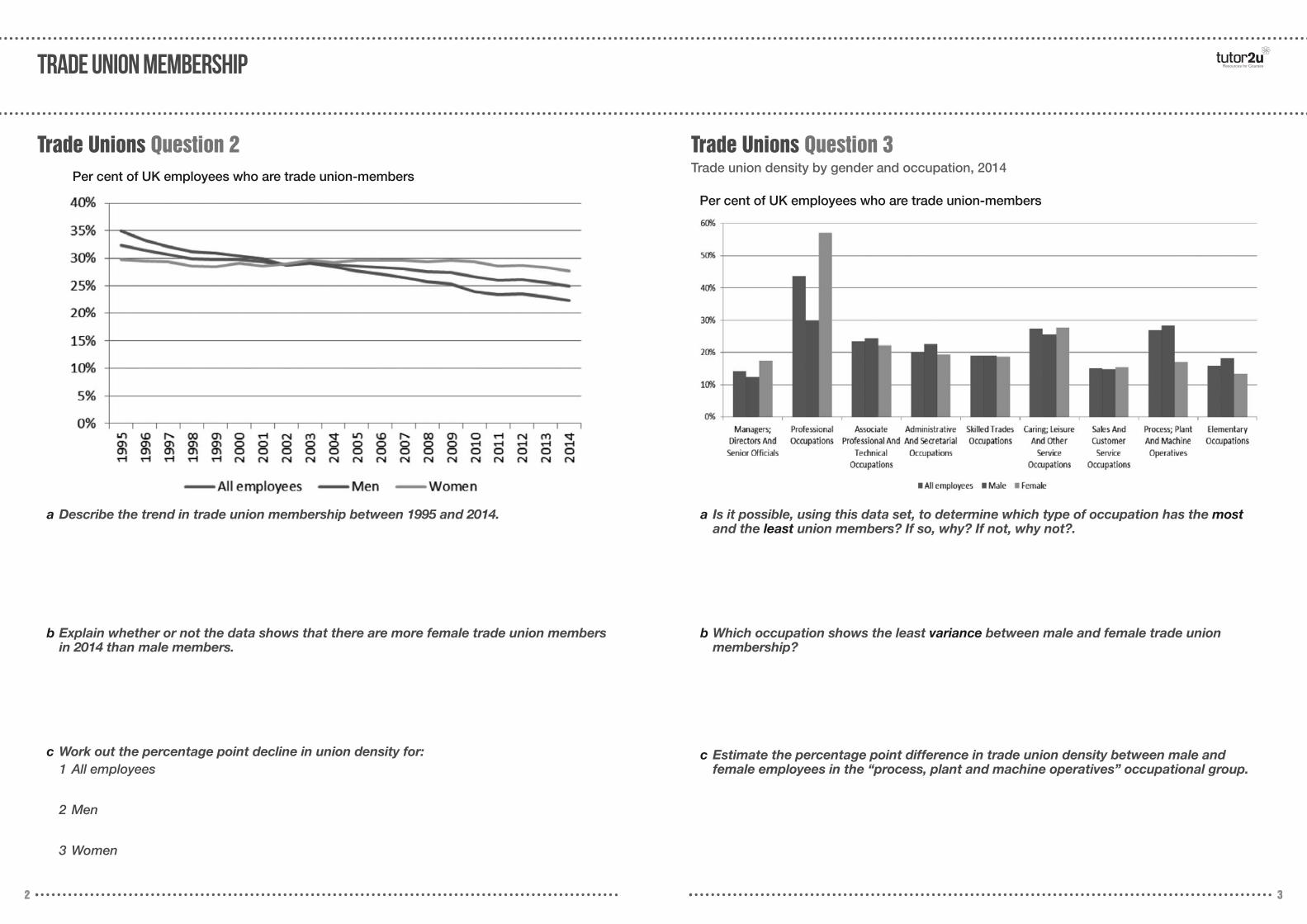
Trade Unions Question 2
a Describe the trend in trade union membership between 1995 and 2014.
b Explain whether or not the data shows that there are more female trade union membersin 2014 than male members.
c Work out the percentage point decline in union density for:1 All employees
2 Men
3 Women
Per cent of UK employees who are trade union-members
Trade Unions Question 3Trade union density by gender and occupation, 2014
a Is it possible, using this data set, to determine which type of occupation has the mostand the least union members? If so, why? If not, why not?.
b Which occupation shows the least variance between male and female trade union membership?
c Estimate the percentage point difference in trade union density between male and female employees in the “process, plant and machine operatives” occupational group.
Per cent of UK employees who are trade union-members
TRADE UNION MEMBERSHIP
Nation / region
Resources for Courses
4 5
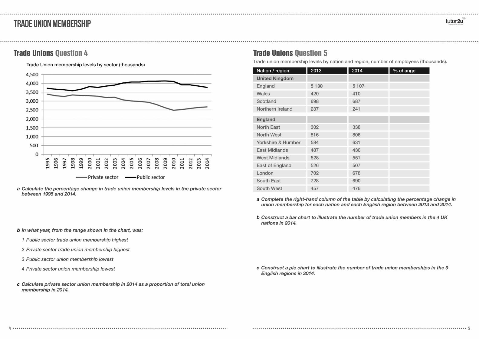
Trade Unions Question 4 Trade Unions Question 5Trade union membership levels by nation and region, number of employees (thousands).
a Calculate the percentage change in trade union membership levels in the private sectorbetween 1995 and 2014.
b In what year, from the range shown in the chart, was:
1 Public sector trade union membership highest
2 Private sector trade union membership highest
3 Public sector union membership lowest
4 Private sector union membership lowest
c Calculate private sector union membership in 2014 as a proportion of total union membership in 2014.
a Complete the right-hand column of the table by calculating the percentage change inunion membership for each nation and each English region between 2013 and 2014.
b Construct a bar chart to illustrate the number of trade union members in the 4 UK nations in 2014.
c Construct a pie chart to illustrate the number of trade union memberships in the 9 English regions in 2014.
Trade Union membership levels by sector (thousands)2013 2014 % change
United Kingdom
England 5 130 5 107
Wales 420 410
Scotland 698 687
Northern Ireland 237 241
England
North East 302 338
North West 816 806
Yorkshire & Humber 584 631
East Midlands 487 430
West Midlands 528 551
East of England 526 507
London 702 678
South East 728 690
South West 457 476

Sources: Annual Survey of Hours and Employment 2014, ONS, and www.economist.com/blogs/graphicdetail/2014/07/daily-chart-19
Question Set 2 – gender and the labour marketTRADE UNION MEMBERSHIP
Year
6 7
Trade Unions Question 6UK Trade Union membership (thousands), and index of union membership, 1892 – 2012 (1942 = 100).
Membership
Index Number
1 576 2 013 3 416 5 625 4 444 7 867
100.00
9 588 10 014 11 350
1892 1902 1912 1922 1932 1942 1952 1962 1972
Year
Membership
Index Number
11 744 8 929 7 751 7 197
1982 1992 2002 2012
a Complete the table by calculating the index numbers for each year shown. Rememberthat the base year is 1942. Work to 2 decimal places.
Gender Question 1
a Explain what is meant by “median full-time gross weekly earnings”.
b Describe 3 features of the data shown in the chart.1
2
3
Median full-time gross weekly earnings by sex, UK, 1997 - 2014
GENDER AND THE LABOUR MARKET Resources for Courses
8 9
Gender Question 2
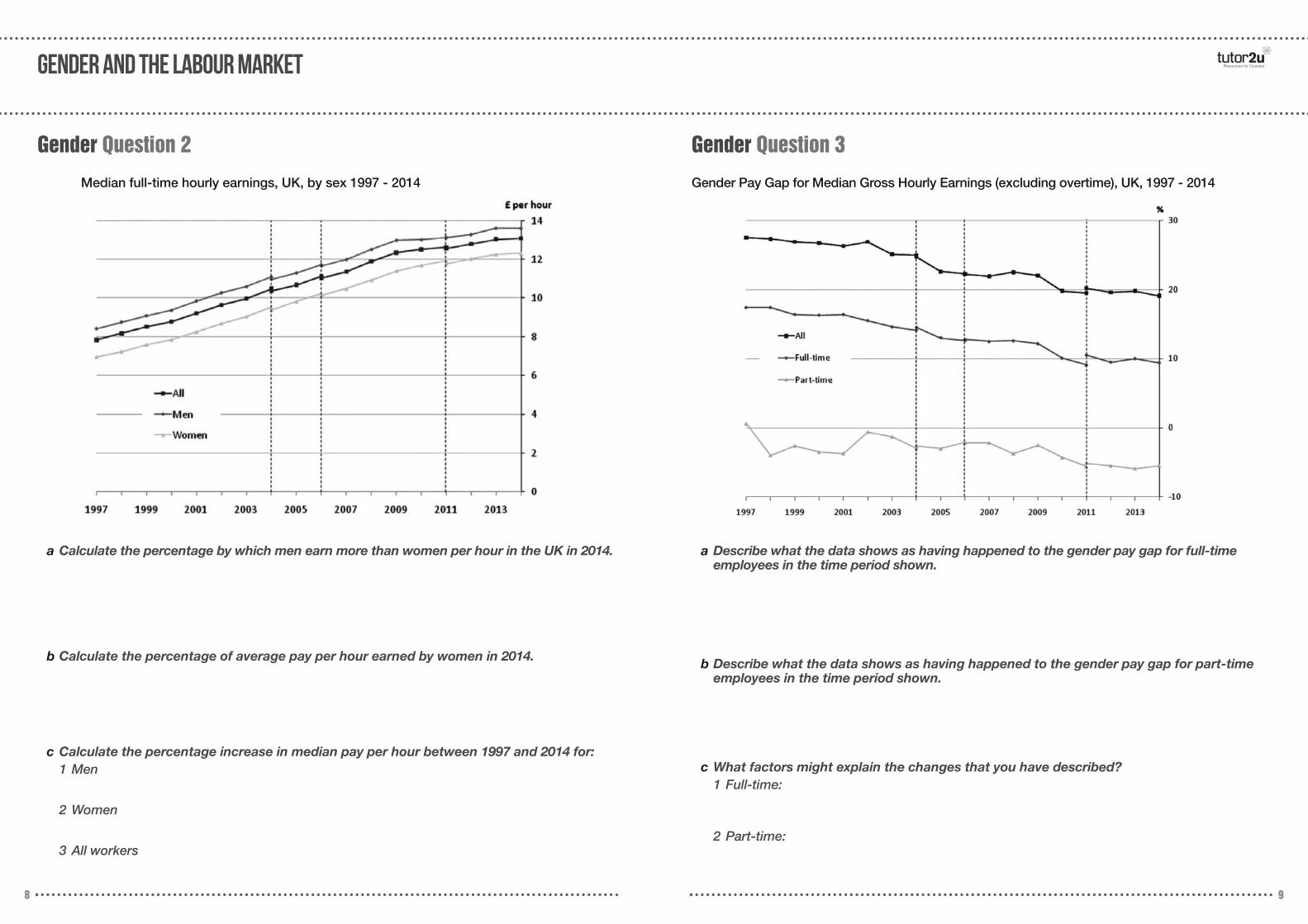
a Calculate the percentage by which men earn more than women per hour in the UK in 2014.
b Calculate the percentage of average pay per hour earned by women in 2014.
c Calculate the percentage increase in median pay per hour between 1997 and 2014 for:1 Men
2 Women
3 All workers
Median full-time hourly earnings, UK, by sex 1997 - 2014
Gender Question 3
a Describe what the data shows as having happened to the gender pay gap for full-time employees in the time period shown.
b Describe what the data shows as having happened to the gender pay gap for part-timeemployees in the time period shown.
c What factors might explain the changes that you have described?1 Full-time:
2 Part-time:
Gender Pay Gap for Median Gross Hourly Earnings (excluding overtime), UK, 1997 - 2014
GENDER AND THE LABOUR MARKET Resources for Courses
10 11
Gender Question 4
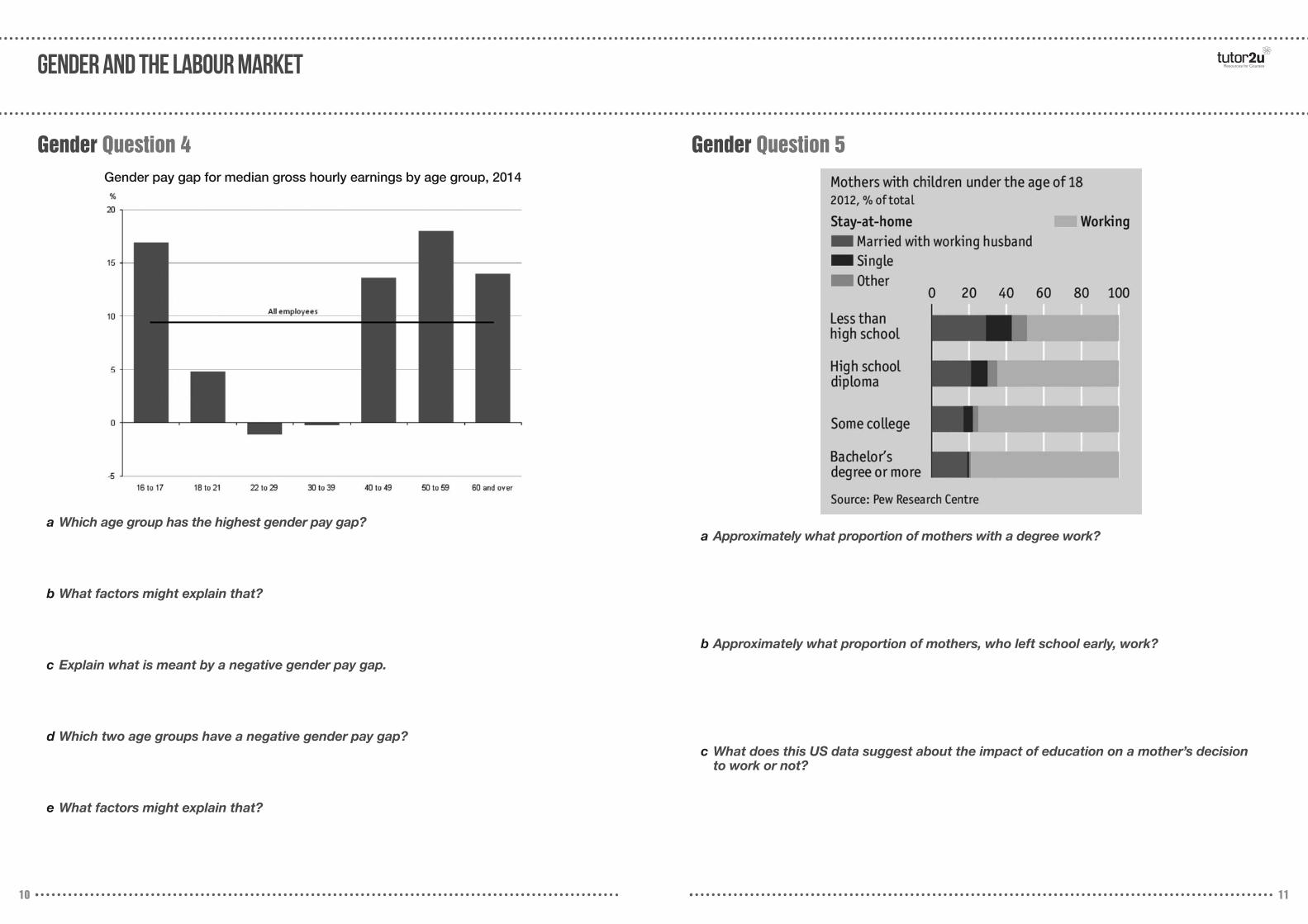
a Which age group has the highest gender pay gap?
b What factors might explain that?
c Explain what is meant by a negative gender pay gap.
d Which two age groups have a negative gender pay gap?
e What factors might explain that?
Gender pay gap for median gross hourly earnings by age group, 2014
Gender Question 5
a Approximately what proportion of mothers with a degree work?
b Approximately what proportion of mothers, who left school early, work?
c What does this US data suggest about the impact of education on a mother’s decision to work or not?
GENDER AND THE LABOUR MARKET
12 13
Gender Question 6
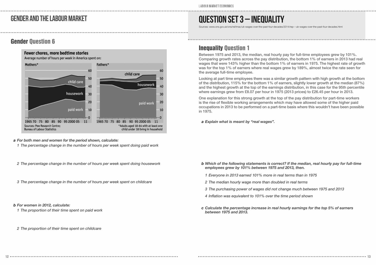
a For both men and women for the period shown, calculate:1 The percentage change in the number of hours per week spent doing paid work
2 The percentage change in the number of hours per week spent doing housework
3 The percentage change in the number of hours per week spent on childcare
b For women in 2012, calculate:1 The proportion of their time spent on paid work
2 The proportion of their time spent on childcare
Sources: www.ons.gov.uk/ons/rel/lmac/uk-wages-over-the-past-four-decades/2014/rep---uk-wages-over-the-past-four-decades.html
Question Set 3 – Inequality
Inequality Question 1Between 1975 and 2013, the median, real hourly pay for full-time employees grew by 101%.Comparing growth rates across the pay distribution, the bottom 1% of earners in 2013 had realwages that were 143% higher than the bottom 1% of earners in 1975. The highest rate of growthwas for the top 1% of earners where real wages grew by 189%, almost twice the rate seen forthe average full-time employee.
Looking at part time employees there was a similar growth pattern with high growth at the bottomof the distribution, 115% for the bottom 1% of earners, slightly lower growth at the median (87%)and the highest growth at the top of the earnings distribution, in this case for the 95th percentilewhere earnings grew from £8.07 per hour in 1975 (2013 prices) to £26.45 per hour in 2013.
One explanation for this strong growth at the top of the pay distribution for part-time workers is the rise of flexible working arrangements which may have allowed some of the higher paid occupations in 2013 to be performed on a part-time basis where this wouldn’t have been possiblein 1975.
a Explain what is meant by “real wages”.
b Which of the following statements is correct? If the median, real hourly pay for full-timeemployees grew by 101% between 1975 and 2013, then.
1 Everyone in 2013 earned 101% more in real terms than in 1975
2 The median hourly wage more than doubled in real terms
3 The purchasing power of wages did not change much between 1975 and 2013
4 Inflation was equivalent to 101% over the time period shown
c Calculate the percentage increase in real hourly earnings for the top 5% of earners between 1975 and 2013.
14 15
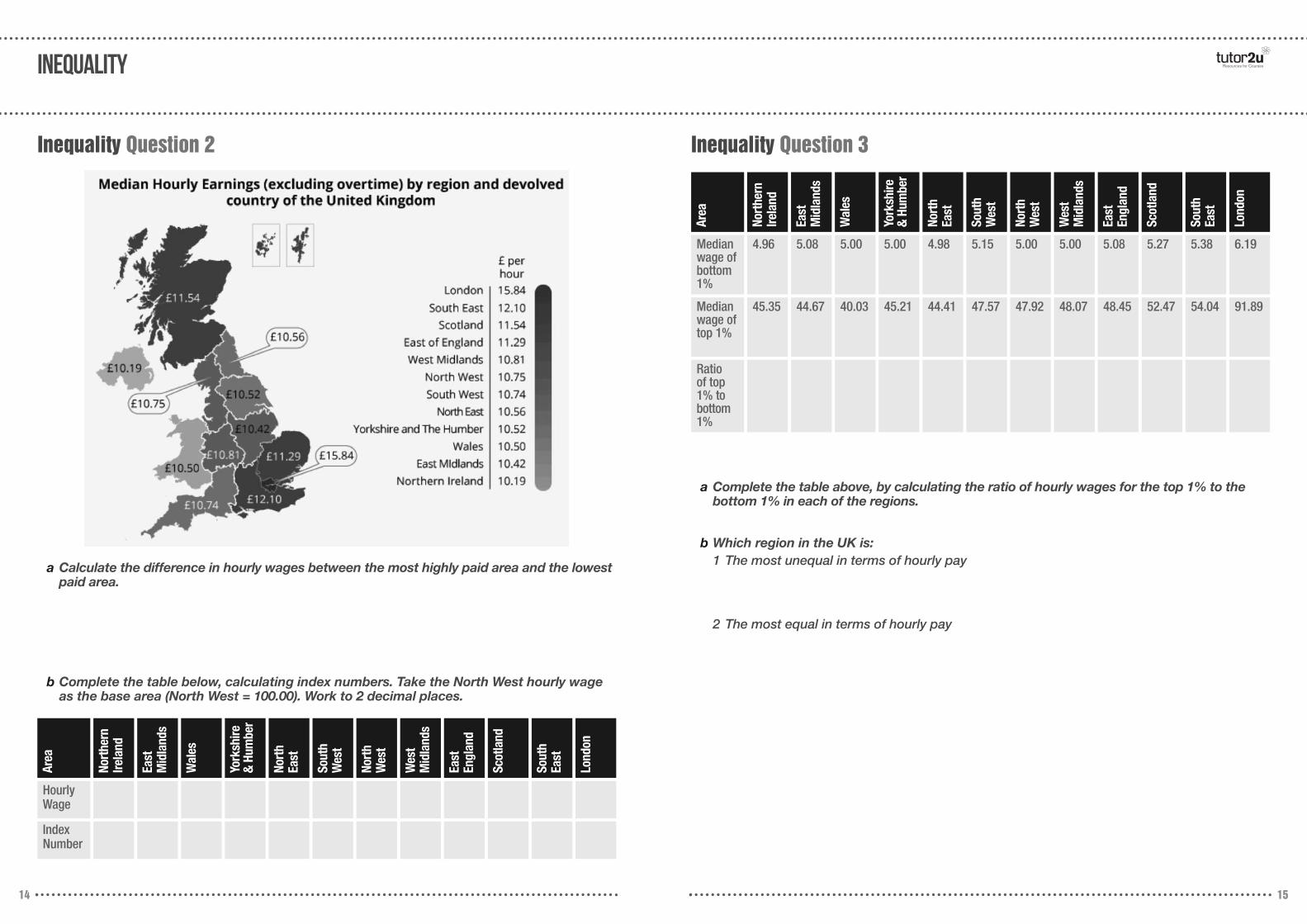
Inequality Question 2 Inequality Question 3
a Calculate the difference in hourly wages between the most highly paid area and the lowestpaid area.
b Complete the table below, calculating index numbers. Take the North West hourly wageas the base area (North West = 100.00). Work to 2 decimal places.
a Complete the table above, by calculating the ratio of hourly wages for the top 1% to thebottom 1% in each of the regions.
b Which region in the UK is:1 The most unequal in terms of hourly pay
2 The most equal in terms of hourly pay
Area
Nort
hern
Irela
nd
East
M
idla
nds
Wal
es
York
shire
&
Hum
ber
Nort
h Ea
st
Sout
hW
est
Nort
hW
est
Wes
t M
idla
nds
East
En
glan
d
Scot
land
Sout
h Ea
st
Lond
on
HourlyWage
Index Number
Area
Nort
hern
Irela
nd
East
M
idla
nds
Wal
es
York
shire
&
Hum
ber
Nort
h Ea
st
Sout
hW
est
Nort
hW
est
Wes
t M
idla
nds
East
En
glan
d
Scot
land
Sout
h Ea
st
Lond
on
Medianwage ofbottom1%
4.96 5.08 5.00 5.00 4.98 5.15 5.00 5.00 5.08 5.27 5.38 6.19
Medianwage oftop 1%
45.35 44.67 40.03 45.21 44.41 47.57 47.92 48.07 48.45 52.47 54.04 91.89
Ratio of top1% tobottom 1%
Inequality Resources for Courses

Sources: www.economist.com/news/britain/21663276-britains-workforce-ageing-make-most-it-companies-will-need-adapt-march;www.economist.com/news/britain/21661654-britains-economic-and-jobs-performance-better-much-rest-europes; 2014 Labour Force Survey;www.ons.gov.uk/ons/rel/productivity/labour-productivity/q2-2015/stbq215.html; www.tradingeconomics.com;
Question Set 4 – Labour Market Trends Resources for Courses
16 17
Trends (ageing workforce) Question 1
a Using the information from the chart above, calculate.
1 The number of workers aged over 50 in Jan 2008
2 The number of workers aged over 50 as a proportion of the total number of workers in employment in 2015
3 The number of workers aged between 16 and 24 in Jan 2008
4 The number of workers aged between 16 and 24, as a proportion of the total number ofworkers in employment in 2015
Trends (NEETs) Question 2
a What proportion of the UK population aged 15 – 29 are not in education, employment ortraining, and only have the equivalent of a primary / lower secondary education?
b By approximately how many percentage points is the figure you calculated in question (a) greater than the equivalent figure for the OECD as a whole?
C Which country in the chart has the highest “NEET” rate for those with a tertiary (i.e. college / university) education?
labour market trends Resources for Courses
18 19
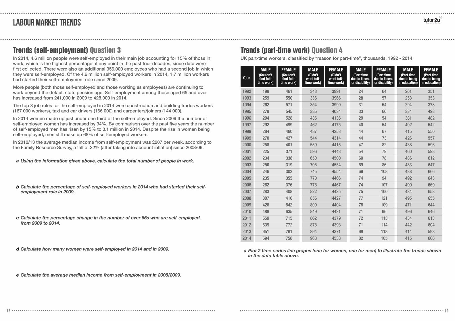
Trends (self-employment) Question 3In 2014, 4.6 million people were self-employed in their main job accounting for 15% of those inwork, which is the highest percentage at any point in the past four decades, since data werefirst collected. There were also an additional 356,000 employees who had a second job in whichthey were self-employed. Of the 4.6 million self-employed workers in 2014, 1.7 million workershad started their self-employment role since 2009.
More people (both those self-employed and those working as employees) are continuing towork beyond the default state pension age. Self-employment among those aged 65 and overhas increased from 241,000 in 2009 to 428,000 in 2014.
The top 3 job roles for the self-employed in 2014 were construction and building trades workers(167 000 workers), taxi and car drivers (166 000) and carpenters/joiners (144 000).
In 2014 women made up just under one third of the self-employed. Since 2009 the number ofself-employed women has increased by 34%. By comparison over the past five years the numberof self-employed men has risen by 15% to 3.1 million in 2014. Despite the rise in women beingself-employed, men still make up 68% of self-employed workers.
In 2012/13 the average median income from self-employment was £207 per week, according tothe Family Resource Survey, a fall of 22% (after taking into account inflation) since 2008/09.
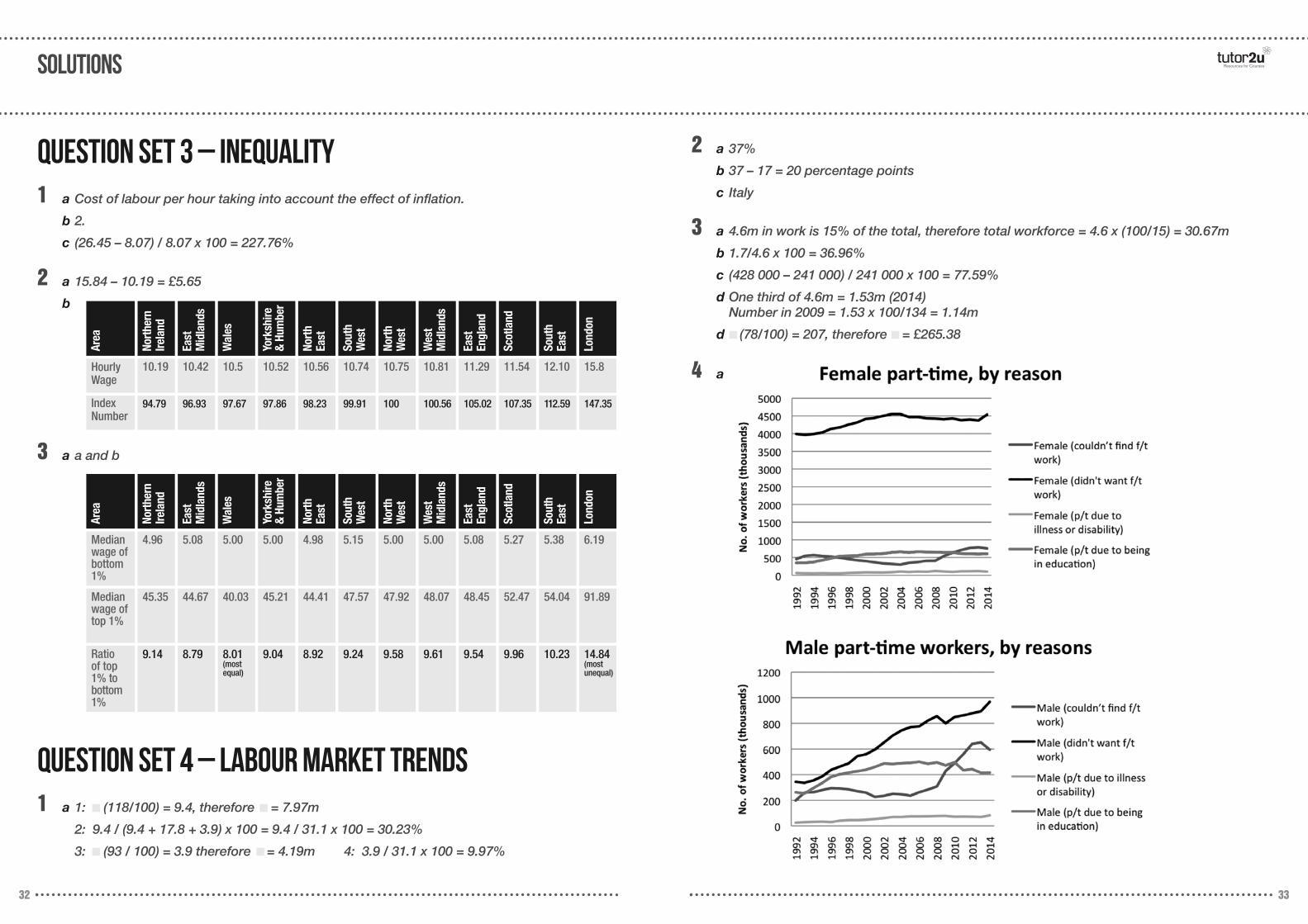
Trends (part-time work) Question 4UK part-time workers, classified by “reason for part-time”, thousands, 1992 - 2014
a Using the information given above, calculate the total number of people in work.
b Calculate the percentage of self-employed workers in 2014 who had started their self-employment role in 2009.
c Calculate the percentage change in the number of over 65s who are self-employed, from 2009 to 2014.
d Calculate how many women were self-employed in 2014 and in 2009.
e Calculate the average median income from self-employment in 2008/2009.
a Plot 2 time-series line graphs (one for women, one for men) to illustrate the trends shownin the data table above.
Year
1992 198 461 343 3991 24 64 261 3511993 259 550 336 3966 28 57 253 3531994 262 571 354 3990 31 54 294 3781995 279 545 385 4034 33 60 334 4281996 294 528 436 4136 29 54 381 4821997 292 499 462 4175 40 54 402 5421998 284 460 487 4253 44 67 415 5501999 270 427 544 4314 44 73 426 5572000 258 401 559 4415 47 82 438 5962001 225 371 596 4443 54 79 460 5982002 234 338 650 4500 60 78 486 6122003 250 319 705 4554 69 86 483 6472004 246 303 745 4554 69 108 488 6662005 235 355 770 4466 74 94 492 6432006 262 376 776 4467 74 107 499 6692007 283 408 822 4435 75 100 484 6582008 307 410 856 4427 77 121 495 6552009 428 542 800 4404 78 109 471 6442010 488 635 849 4431 71 96 496 6462011 559 715 862 4379 72 113 434 6132012 639 772 878 4398 71 114 442 6042013 651 791 894 4371 69 118 414 5982014 594 758 968 4538 82 105 415 606
MALE(Couldn’t find full-
time work)
FEMALE(Couldn’t find full-
time work)
MALE(Didn’t
want full-time work)
FEMALE(Didn’t
want full-time work)
MALE(Part time
due to illnessor disability)
FEMALE(Part time
due to illnessor disability)
MALE(Part time
due to beingin education)
FEMALE(Part time
due to beingin education)
labour market trends Resources for Courses
20 21
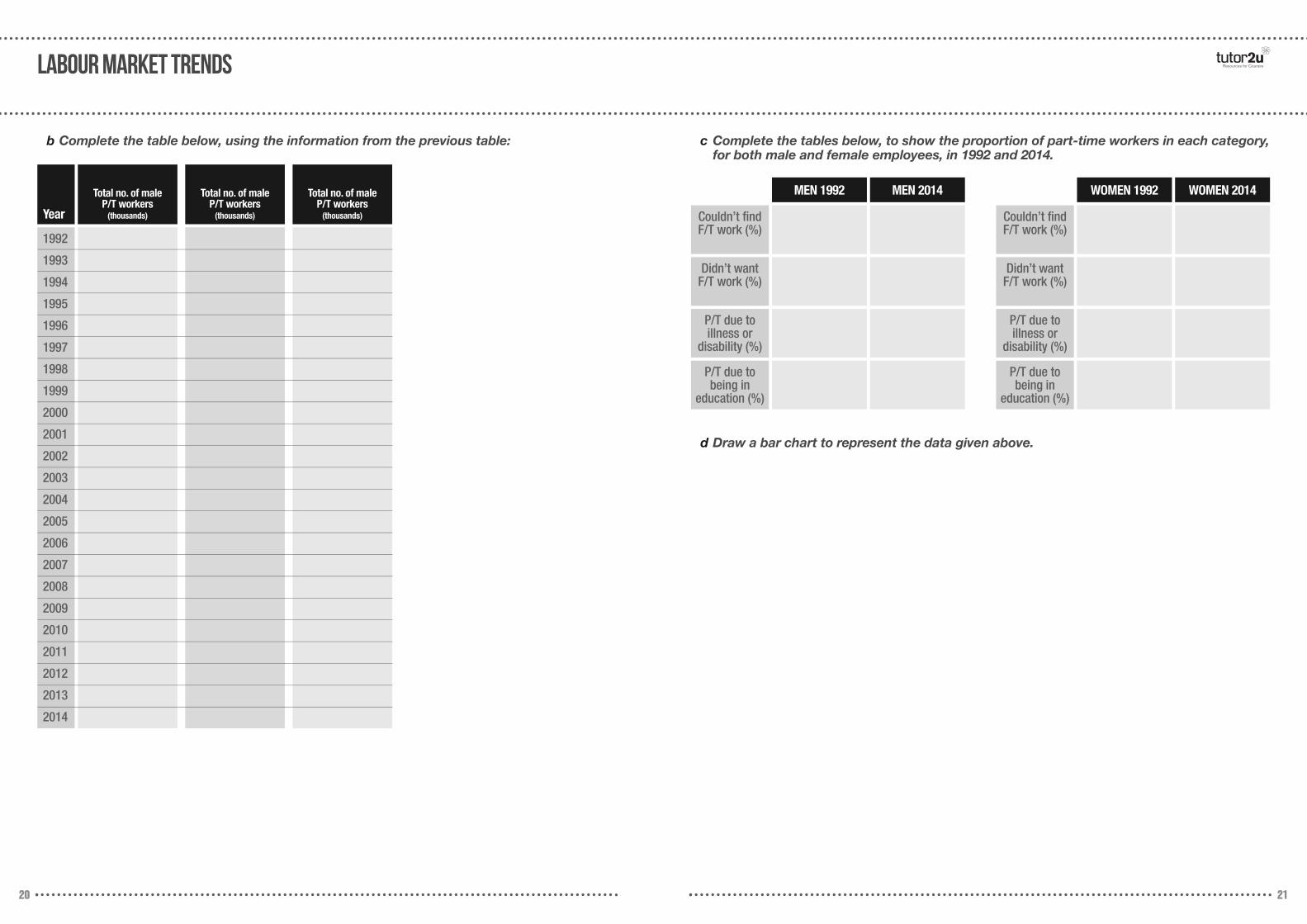
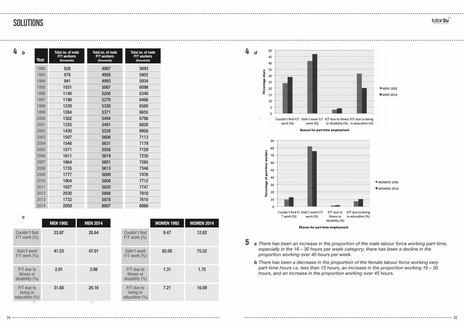
b Complete the table below, using the information from the previous table: c Complete the tables below, to show the proportion of part-time workers in each category,for both male and female employees, in 1992 and 2014.
d Draw a bar chart to represent the data given above.
Year
Total no. of male P/T workers
(thousands)
Total no. of male P/T workers
(thousands)
Total no. of male P/T workers
(thousands)
1992
1993
1994
1995
1996
1997
1998
1999
2000
2001
2002
2003
2004
2005
2006
2007
2008
2009
2010
2011
2012
2013
2014
MEN 1992 MEN 2014
Couldn’t findF/T work (%)
Didn’t want F/T work (%)
P/T due to illness or
disability (%)
P/T due tobeing in
education (%)
WOMEN 1992 WOMEN 2014
Couldn’t findF/T work (%)
Didn’t want F/T work (%)
P/T due to illness or
disability (%)
P/T due tobeing in
education (%)
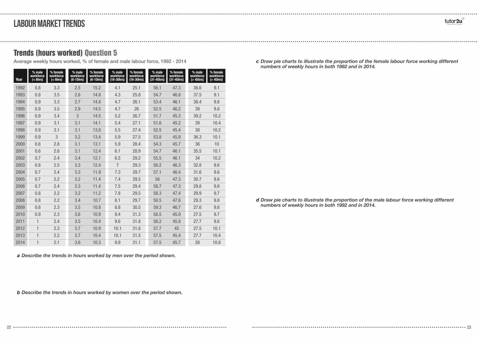
% male workforce (6-15hrs)
% female workforce (6-15hrs)
% male workforce (16-30hrs)
% female workforce (16-30hrs)
% male workforce (31-45hrs)
% female workforce (31-45hrs)
% male workforce (> 45hrs)
% female workforce (> 45hrs)
22 23
labour market trends Resources for Courses
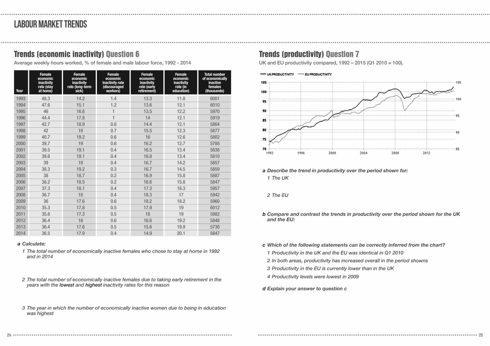
Trends (hours worked) Question 5Average weekly hours worked, % of female and male labour force, 1992 - 2014
a Describe the trends in hours worked by men over the period shown.
b Describe the trends in hours worked by women over the period shown.
c Draw pie charts to illustrate the proportion of the female labour force working differentnumbers of weekly hours in both 1992 and in 2014.
d Draw pie charts to illustrate the proportion of the male labour force working differentnumbers of weekly hours in both 1992 and in 2014.
Year
1992 0.8 3.3 2.5 15.2 4.1 25.1 56.1 47.3 36.6 9.11993 0.8 3.5 2.6 14.8 4.3 25.8 54.7 46.8 37.5 9.11994 0.9 3.3 2.7 14.8 4.7 26.1 53.4 46.1 38.4 9.81995 0.9 3.5 2.9 14.5 4.7 26 52.5 46.2 39 9.81996 0.9 3.4 3 14.5 5.2 26.7 51.7 45.3 39.2 10.21997 0.9 3.1 3.1 14.1 5.4 27.1 51.6 45.2 39 10.41998 0.9 3.1 3.1 13.8 5.5 27.4 52.5 45.4 38 10.21999 0.9 3 3.2 13.4 5.9 27.5 53.8 45.9 36.3 10.12000 0.8 2.8 3.1 13.1 5.9 28.4 54.3 45.7 36 102001 0.6 2.6 3.1 12.4 6.1 28.9 54.7 46.1 35.5 10.12002 0.7 2.4 3.4 12.1 6.5 29.2 55.5 46.1 34 10.22003 0.8 2.5 3.3 12.4 7 29.3 56.2 46.3 32.8 9.62004 0.7 2.4 3.3 11.9 7.3 29.7 57.1 46.4 31.6 9.62005 0.7 2.2 3.2 11.4 7.4 29.5 58 47.3 30.7 9.62006 0.7 2.4 3.3 11.4 7.5 29.4 58.7 47.3 29.8 9.62007 0.8 2.2 3.2 11.2 7.8 29.5 58.3 47.4 29.9 9.72008 0.8 2.2 3.4 10.7 8.1 29.7 58.5 47.6 29.3 9.82009 0.8 2.3 3.5 10.8 8.8 30.5 59.3 46.7 27.6 9.62010 0.9 2.3 3.6 10.9 9.4 31.3 58.5 45.9 27.5 9.72011 1 2.4 3.5 10.4 9.6 31.8 58.2 45.8 27.7 9.62012 1 2.3 3.7 10.9 10.1 31.8 57.7 45 27.5 10.12013 1 2.2 3.7 10.4 10.1 31.5 57.5 45.4 27.7 10.42014 1 2.1 3.6 10.3 9.9 31.1 57.5 45.7 28 10.8
% male workforce (< 6hrs)
% female workforce (< 6hrs)
Female economic inactivity
rate (long-term sick)
Female economic
inactivity rate (discouraged
workers)
Femaleeconomic inactivity rate (early retirement)
Female economic inactivity rate (in
education)
Total number of economically
inactive females
(thousands)
24 25
labour market trends
Trends (economic inactivity) Question 6Average weekly hours worked, % of female and male labour force, 1992 - 2014
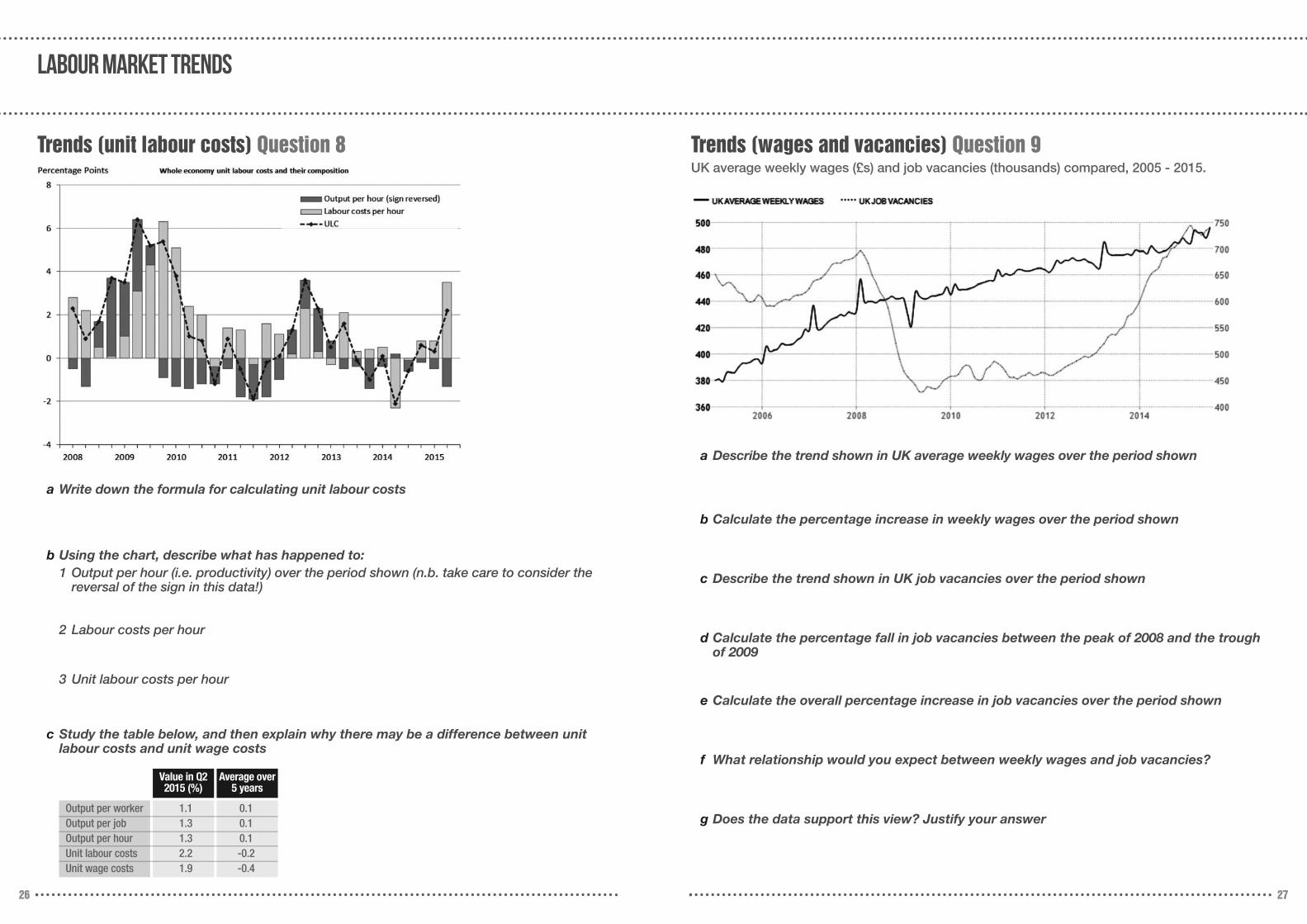
Trends (productivity) Question 7UK and EU productivity compared, 1992 – 2015 (Q1 2010 = 100).
a Calculate:
1 The total number of economically inactive females who chose to stay at home in 1992 and in 2014
2 The total number of economically inactive females due to taking early retirement in theyears with the lowest and highest inactivity rates for this reason
3 The year in which the number of economically inactive women due to being in educationwas highest
a Describe the trend in productivity over the period shown for:
1 The UK
2 The EU
b Compare and contrast the trends in productivity over the period shown for the UK and the EU:
c Which of the following statements can be correctly inferred from the chart?
1 Productivity in the UK and the EU was identical in Q1 2010
2 In both areas, productivity has increased overall in the period showns
3 Productivity in the EU is currently lower than in the UK
4 Productivity levels were lowest in 2009
d Explain your answer to question c
Year
1993 48.3 14.2 1.4 13.3 11.8 60011994 47.6 15.1 1.2 13.6 12.1 60101995 46 16.6 1 13.5 12.2 59701996 44.4 17.8 1 14 12.1 59191997 42.7 18.9 0.8 14.4 12.1 58641998 42 19 0.7 15.5 12.3 58771999 40.7 19.2 0.6 16 12.6 58022000 39.7 19 0.6 16.2 12.7 57882001 39.5 19.1 0.4 16.5 13.4 58382002 39.6 19.1 0.4 16.8 13.4 58102003 39 19 0.4 16.7 14.2 58572004 38.3 19.2 0.3 16.7 14.5 58592005 38 18.7 0.2 16.9 15.8 58872006 38.2 18.5 0.2 16.6 15.8 58472007 37.3 18.1 0.4 17.3 16.3 59572008 36.7 18 0.4 18.3 17 59422009 36 17.6 0.6 18.2 18.2 59602010 35.3 17.8 0.5 17.9 19 60122011 35.8 17.3 0.5 18 19 59822012 36.4 18 0.6 16.6 19.2 58482013 36.4 17.6 0.5 15.6 19.9 57302014 36.5 17.9 0.4 14.9 20.1 5647
Female economic inactivity rate (stay at home)
26 27
labour market trends
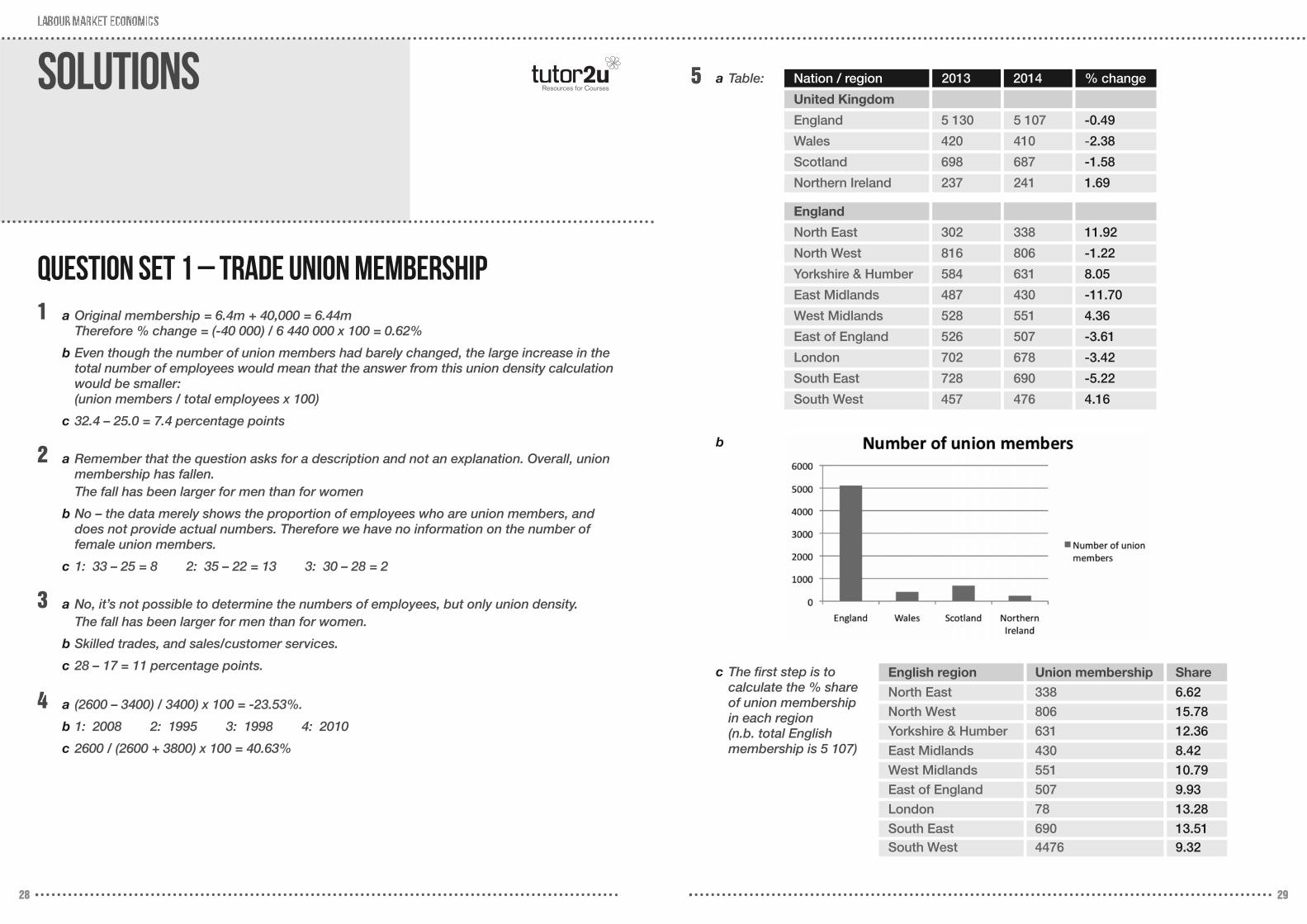
Trends (unit labour costs) Question 8 Trends (wages and vacancies) Question 9UK average weekly wages (£s) and job vacancies (thousands) compared, 2005 - 2015.
a Describe the trend shown in UK average weekly wages over the period shown
b Calculate the percentage increase in weekly wages over the period shown
c Describe the trend shown in UK job vacancies over the period shown
d Calculate the percentage fall in job vacancies between the peak of 2008 and the troughof 2009
e Calculate the overall percentage increase in job vacancies over the period shown
f What relationship would you expect between weekly wages and job vacancies?
g Does the data support this view? Justify your answer
a Write down the formula for calculating unit labour costs
b Using the chart, describe what has happened to:1 Output per hour (i.e. productivity) over the period shown (n.b. take care to consider the
reversal of the sign in this data!)
2 Labour costs per hour
3 Unit labour costs per hour
c Study the table below, and then explain why there may be a difference between unitlabour costs and unit wage costs
Value in Q22015 (%)
Average over5 years
Output per worker 1.1 0.1Output per job 1.3 0.1Output per hour 1.3 0.1Unit labour costs 2.2 -0.2Unit wage costs 1.9 -0.4
28 29
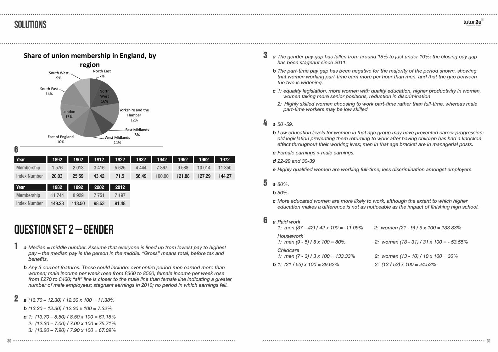
Solutions Resources for Courses5
1
a Table:
b
c The first step is to calculate the % shareof union membershipin each region (n.b. total Englishmembership is 5 107)
a Original membership = 6.4m + 40,000 = 6.44mTherefore % change = (-40 000) / 6 440 000 x 100 = 0.62%
b Even though the number of union members had barely changed, the large increase in thetotal number of employees would mean that the answer from this union density calculationwould be smaller: (union members / total employees x 100)
c 32.4 – 25.0 = 7.4 percentage points
2 a Remember that the question asks for a description and not an explanation. Overall, unionmembership has fallen.The fall has been larger for men than for women
b No – the data merely shows the proportion of employees who are union members, anddoes not provide actual numbers. Therefore we have no information on the number of female union members.
c 1: 33 – 25 = 8 2: 35 – 22 = 13 3: 30 – 28 = 2
3 a No, it’s not possible to determine the numbers of employees, but only union density.The fall has been larger for men than for women.
b Skilled trades, and sales/customer services.
c 28 – 17 = 11 percentage points.
Question Set 1 – Trade Union Membership
4 a (2600 – 3400) / 3400) x 100 = -23.53%.
b 1: 2008 2: 1995 3: 1998 4: 2010
c 2600 / (2600 + 3800) x 100 = 40.63%
Nation / region 2013
England
North East 302 338 11.92
North West 816 806 -1.22
Yorkshire & Humber 584 631 8.05
East Midlands 487 430 -11.70
West Midlands 528 551 4.36
East of England 526 507 -3.61
London 702 678 -3.42
South East 728 690 -5.22
South West 457 476 4.16
United Kingdom
England 5 130 5 107 -0.49
Wales 420 410 -2.38
Scotland 698 687 -1.58
Northern Ireland 237 241 1.69
2014 % change
English region Union membership Share
North East 338 6.62
North West 806 15.78
Yorkshire & Humber 631 12.36
East Midlands 430 8.42
West Midlands 551 10.79
East of England 507 9.93
London 78 13.28
South East 690 13.51South West 4476 9.32
solutions Resources for Courses
30 31
6Year
Membership
Index Number
1 576 2 013 3 416 5 625 4 444 7 867
100.00 121.88 127.29 144.2756.4971.543.4225.5920.03
9 588 10 014 11 350
1892 1902 1912 1922 1932 1942 1952 1962 1972
Year
Membership
Index Number
11 744 8 929 7 751 7 197
149.28 113.50 98.53 91.48
1982 1992 2002 2012
1 a Median = middle number. Assume that everyone is lined up from lowest pay to highestpay – the median pay is the person in the middle. “Gross” means total, before tax and benefits.
b Any 3 correct features. These could include: over entire period men earned more thanwomen; male income per week rose from £360 to £560; female income per week rosefrom £270 to £460; “all” line is closer to the male line than female line indicating a greaternumber of male employees; stagnant earnings in 2010; no period in which earnings fell.
3 a The gender pay gap has fallen from around 18% to just under 10%; the closing pay gaphas been stagnant since 2011.
b The part-time pay gap has been negative for the majority of the period shown, showingthat women working part-time earn more per hour than men, and that the gap betweenthe two is widening.
c 1: equality legislation, more women with quality education, higher productivity in women,women taking more senior positions, reduction in discrimination
2: Highly skilled women choosing to work part-time rather than full-time, whereas malepart-time workers may be low skilled
4 a 50 -59.
b Low education levels for women in that age group may have prevented career progression;old legislation preventing them returning to work after having children has had a knockoneffect throughout their working lives; men in that age bracket are in managerial posts.
c Female earnings > male earnings.
d 22-29 and 30-39
e Highly qualified women are working full-time; less discrimination amongst employers.
2 a (13.70 – 12.30) / 12.30 x 100 = 11.38%
b (13.20 – 12.30) / 12.30 x 100 = 7.32%
c 1: (13.70 – 8.50) / 8.50 x 100 = 61.18%2: (12.30 – 7.00) / 7.00 x 100 = 75.71%3: (13.20 – 7.90) / 7.90 x 100 = 67.09%
Question Set 2 – Gender
5 a 80%.
b 50%.
c More educated women are more likely to work, although the extent to which higher education makes a difference is not as noticeable as the impact of finishing high school.
6 a Paid work1: men (37 – 42) / 42 x 100 = -11.09% 2: women (21 - 9) / 9 x 100 = 133.33%
Housework1: men (9 - 5) / 5 x 100 = 80% 2: women (18 - 31) / 31 x 100 = - 53.55%
Childcare1: men (7 - 3) / 3 x 100 = 133.33% 2: women (13 - 10) / 10 x 100 = 30%
b 1: (21 / 53) x 100 = 39.62% 2: (13 / 53) x 100 = 24.53%
solutions Resources for Courses
32 33
1 a Cost of labour per hour taking into account the effect of inflation.
b 2.
c (26.45 – 8.07) / 8.07 x 100 = 227.76%
2 a 37%
b 37 – 17 = 20 percentage points
c Italy
3 a 4.6m in work is 15% of the total, therefore total workforce = 4.6 x (100/15) = 30.67m
b 1.7/4.6 x 100 = 36.96%
c (428 000 – 241 000) / 241 000 x 100 = 77.59%
d One third of 4.6m = 1.53m (2014)Number in 2009 = 1.53 x 100/134 = 1.14m
d (78/100) = 207, therefore = £265.38
2 a 15.84 – 10.19 = £5.65
b
Question Set 3 – Inequality
1 a 1: (118/100) = 9.4, therefore = 7.97m
2: 9.4 / (9.4 + 17.8 + 3.9) x 100 = 9.4 / 31.1 x 100 = 30.23%
3: (93 / 100) = 3.9 therefore = 4.19m 4: 3.9 / 31.1 x 100 = 9.97%
Question Set 4 – labour market trends
4
3 a a and b
Area
Nort
hern
Irela
nd
East
M
idla
nds
Wal
es
York
shire
&
Hum
ber
Nort
h Ea
st
Sout
hW
est
Nort
hW
est
Wes
t M
idla
nds
East
En
glan
d
Scot
land
Sout
h Ea
st
Lond
on
HourlyWage
Index Number
Area
Nort
hern
Irela
nd
East
M
idla
nds
Wal
es
York
shire
&
Hum
ber
Nort
h Ea
st
Sout
hW
est
Nort
hW
est
Wes
t M
idla
nds
East
En
glan
d
Scot
land
Sout
h Ea
st
Lond
on
Medianwage ofbottom1%
4.96 5.08 5.00 5.00 4.98 5.15 5.00 5.00 5.08 5.27 5.38 6.19
10.19 10.42 10.5 10.52 10.56 10.74 10.75 10.81 11.29 11.54 12.10 15.8
94.79 96.93 97.67 97.86 98.23 99.91 100 100.56 105.02 107.35 112.59 147.35
Medianwage oftop 1%
45.35 44.67 40.03 45.21 44.41 47.57 47.92 48.07 48.45 52.47 54.04 91.89
Ratio of top1% tobottom 1%
9.14 8.79 8.01(mostequal)
9.04 8.92 9.24 9.58 9.61 9.54 9.96 10.23 14.84(mostunequal)
a
solutions Resources for Courses
34 35
4 4Year
Total no. of male P/T workers
(thousands)
Total no. of male P/T workers
(thousands)
Total no. of male P/T workers
(thousands)
1992 826 4867 56931993 876 4926 58021994 941 4993 59341995 1031 5067 60981996 1140 5200 63401997 1196 5270 64661998 1230 5330 65601999 1284 5371 66552000 1302 5494 67962001 1335 5491 68262002 1430 5528 69582003 1507 5606 71132004 1548 5631 71792005 1571 5558 71292006 1611 5619 72302007 1664 5601 72652008 1735 5613 73482009 1777 5699 74762010 1904 5808 77122011 1927 5820 77472012 2030 5888 79182013 1732 5878 76102014 2059 6007 8066
b
cMEN 1992 MEN 2014
Couldn’t findF/T work (%)
23.97 28.84
Didn’t want F/T work (%)
P/T due to illness or
disability (%)
P/T due tobeing in
education (%)
WOMEN 1992 WOMEN 2014
Couldn’t findF/T work (%)
Didn’t want F/T work (%)
P/T due to illness or
disability (%)
P/T due tobeing in
education (%)
41.53 47.01
2.91 3.98
31.60 20.16
9.47 12.62
82.00 75.52
1.31 1.75
7.21 10.09
d
5 a There has been an increase in the proportion of the male labour force working part-time,especially in the 16 – 30 hours per week category; there has been a decline in the proportion working over 45 hours per week.
b There has been a decrease in the proportion of the female labour force working very part-time hours i.e. less than 15 hours, an increase in the proportion working 16 – 30hours, and an increase in the proportion working over 45 hours.
solutions Resources for Courses
36 37
5 c 8 a Total labour costs / total output
b 1: fell sharply from Q3 2008 for 5 successive quarters; also fell for 4 quarters from Q2 2013
2: labour costs per hour have mostly increased; in Q4 2009 they rose by over 6 percentagepoints. There were minor decreases in labour costs per hour in Q3 2010, Q3 2011, Q42012, and a relatively large decline in Q2 2014
3: ULCs increased over the period – the periods of increase were more prolonged andhigher than the relatively short periods of decline.
c Labour costs include more than just wages e.g. National Insurance payments, paymentsfor training, sick pay, maternity pay etc
9 a Average weekly wages have increased, with some volatility around the trend, but overallincrease.
b (490 – 380) / 380 x 100 = 28.95%
c Vacancies have overall increased with a peak in 2008, then a sharp decline to a low in 2009– risen since then
d (430 – 690) / 690 x 100 = -37.68%
e (740 – 650) / 650 x 100 = 13.85%
f We would expect wages to rise as unemployment falls (i.e. more vacancies) and vice versa,as when vacancies are high workers have more bargaining power over wages
g There are some occasions on which the data supports this relationship – the sharp declinein vacancies in 2009 indicates slower growth and is accompanied by a fall in weekly wages.
6 a 1: 1992 (48.3/100) x 6001 = 2898 women 2: 2014 (36.5/100) x 5647 = 2061 women
b Lowest rate was 1993 (13.3/100 x 2898 = 385), highest rate was 2008 (18.3/100 x 5942) = 1087
b Highest number was 2010
7 a 1: UK productivity has increased over the period shown; some volatility; fastest growthrates in 1992-1994 and 2003; in 2009 productivity fell back to the same levels as in2005; by 2014, productivity was back to its 2008 peak.
2: EU productivity has increased over the period shown; very sharp decline in 2000, buteven more of a sharp prolonged decline in 2008.
b In the second half of the 1990s, the EU’s productivity showed a stronger growth ratethan the UK; the recession caused a sharper decline in productivity in the EU than in theUK; the EU productivity returned to its peak value sooner than the UK’s.
c 2
d

Notes Resources for Courses
38 39
Related Documents