CONCEPT DEVELOPMENT Mathematics Assessment Project CLASSROOM CHALLENGES A Formative Assessment Lesson Representing Data with Grouped Frequency Graphs and Box Plots Mathematics Assessment Resource Service University of Nottingham & UC Berkeley For more details, visit: http://map.mathshell.org © 2015 MARS, Shell Center, University of Nottingham May be reproduced, unmodified, for non-commercial purposes under the Creative Commons license detailed at http://creativecommons.org/licenses/by-nc-nd/3.0/ - all other rights reserved

Welcome message from author
This document is posted to help you gain knowledge. Please leave a comment to let me know what you think about it! Share it to your friends and learn new things together.
Transcript
CONCEPT DEVELOPMENT
Mathematics Assessment Project
CLASSROOM CHALLENGES A Formative Assessment Lesson
Representing Data
with Grouped
Frequency Graphs and
Box Plots
Mathematics Assessment Resource Service
University of Nottingham & UC Berkeley
For more details, visit: http://map.mathshell.org © 2015 MARS, Shell Center, University of Nottingham May be reproduced, unmodified, for non-commercial purposes under the Creative Commons license detailed at http://creativecommons.org/licenses/by-nc-nd/3.0/ - all other rights reserved

Teacher guide Representing Data with Grouped Frequency Graphs and Box Plots T-1
Representing Data With Grouped Frequency Graphs and Box Plots
MATHEMATICAL GOALS This lesson unit is intended to help you assess how well students are able to interpret frequency graphs that use grouped data and their associated box plots. In particular this unit aims to identify and help students who have difficulty interpreting information from frequency graphs and box plots; such as minimum and maximum values, medians and quartiles.
COMMON CORE STATE STANDARDS This lesson relates to the following Standards for Mathematical Content in the Common Core State Standards for Mathematics:
6.SP: Develop understanding of statistical variability. Summarize and describe distributions.
This lesson also relates to the following Standards for Mathematical Practice in the Common Core State Standards for Mathematics, with a particular emphasis on Practices 1, 2, 6, and 7:
1. Make sense of problems and persevere in solving them. 2. Reason abstractly and quantitatively. 3. Construct viable arguments and critique the reasoning of others. 4. Model with mathematics. 6. Attend to precision. 7. Look for and make use of structure. 8. Look for and express regularity in repeated reasoning.
INTRODUCTION The unit is structured in the following way: • Before the lesson, students individually complete an assessment task that is designed to reveal
their current understanding and difficulties. • A whole-class introduction gives guidance to students on how to work during the collaborative
activity. Students then work in pairs or threes on a collaborative discussion task, matching grouped frequency graphs to box plots.
• Towards the end of the lesson there is a whole-class discussion. • In a follow-up lesson students work alone on a similar task to the introductory assessment task.
MATERIALS REQUIRED • Each student will need a copy of the tasks: Girls’ Heights and Boys’ Arm Spans, a mini-
whiteboard, pen, and eraser. • Each small group of students will need Card Set: Frequency Graphs, Card Set: Box Plots, (both
sets cut-up before the lesson), a large sheet of paper for making a poster, and a glue stick. • There is a projector resource to help with whole-class discussions. If your projector capabilities
are limited, the handout, Grouped Data: Frequency Graph and Box Plots, is available for the introductory whole-class discussion.
TIME NEEDED Approximately 15 minutes before the lesson, a 105-minute lesson (or two shorter lessons), and 15 minutes in a follow-up lesson. Exact timings will depend on the needs of the class.

Teacher guide Representing Data with Grouped Frequency Graphs and Box Plots T-2
BEFORE THE LESSON
Assessment task: Girls’ Heights (15 minutes) Give this task, in class or for homework, a few days before the formative assessment lesson. This will give you an opportunity to assess the work and to find out the kinds of difficulties students have with it. You should then be able to target your help more effectively in the next lesson.
Give each student a copy of the assessment task Girls’ Heights.
Read through the questions and try to answer them as carefully as you can.
It is important that, as far as possible, students are allowed to answer the questions without your assistance.
Students should not worry too much if they cannot understand nor do everything because in the next lesson they will engage in a similar task, which should help them. Explain to students that by the end of the next lesson, they should expect to answer questions such as these confidently. This is their goal.
Assessing students’ responses Collect students’ responses to the task and note what their work reveals about their current levels of understanding and their different approaches.
We suggest that you do not score students’ work. The research shows that this will be counterproductive, as it will encourage students to compare their scores and distract their attention from what they can do to improve their mathematics.
Instead, help students to make further progress by summarizing their difficulties as a list of questions. Some suggestions for these are given in the Common issues table on page T-4. These have been drawn from common difficulties observed in trials of this unit.
We suggest that you make a list of your own questions, based on your students’ work. We recommend you either:
• write one or two questions on each student’s work, or
Student Materials Representing Data Using Grouped Frequency Graphs and Box Plots S-1 © 2014 MARS, Shell Center, University of Nottingham
Girls’ Heights 1. The frequency graph shows the height of a group of Grade 6 girls. All heights were rounded to the
nearest centimeter. In the questions, the numbers all refer to rounded heights, not exact ones.
a. What does the frequency graph tell you about the girls’ heights?
b. How many girls have rounded heights between 141 and 145 cm?
c. How many girls are taller than 160 cm?
d. How many girls’ heights are represented by the frequency graph?
e. Can you say exactly what the median height is? Yes / No (please circle)
Explain your answer:

Teacher guide Representing Data with Grouped Frequency Graphs and Box Plots T-3
• give each student a printed version of your list of questions and highlight those questions relevant to each student’s work.
If you do not have time to do this, you could select a few questions that will be of help to the majority of students and write these questions on the board when you return the work to the students in the follow-up lesson.

Teacher guide Representing Data with Grouped Frequency Graphs and Box Plots T-4
Common issues Suggested questions and prompts
Unable to get started • What does each bar represent? • How many girls are represented in the first bar?
Fails to interpret what the bars represent For example: Student provides incorrect answers for Q1b, c & d.
• If a bar is taller than the next one, what does this mean?
• What does the title on the vertical axis tell you?
Attempts to find a value for the median For example: Student attempts to calculate the median based on the position of the 25th value e.g. 154 cm (Q1e).
Or: States the median as 150.5 cm by finding the midpoint between 131 & 170 cm (Q1e).
• For a data set, which data value gives the median? • In which bar of the graph is the median value? • Can you tell the actual heights of students
represented within each interval? • Are there an equal number of girls’ heights in
each interval?
Assumes median lies in the interval represented by middle bar/two middle bars For example: Student explains that the median lies in the interval 151 – 155 cm because this is the ‘middle’ bar (Q1e).
Or: States can’t find an exact median as there is no ‘middle’ bar so only know it’s in the interval 146 – 155 cm (Q1e).
• Will the median value always lie in the middle bar? How could you check?
• How many data values are represented in the frequency graph? What position would the median data value have?
• Can you tell in which interval the median data value lies?
Ignores grouping of data For example: Student explains that the exact median cannot be found because there are 50 pieces of data, which is an even number so no middle number (Q1e).
• What do we want to find the median of? • Are we looking for the median of the heights or
how many girls had that height?
Unable to extract any information from the box plot (Q2)
• What does each interval on the box plot’s scale represent?
• Why does the line end at 132 and 168 cm?
Gives median and quartile values read from a box plot as ranges, not exact values For example: Student states that the median is between 150 and 160 cm (Q2c).
• What does each interval on the box plot’s scale represent?
• Can we read off the median’s exact value from the box plot?
Does not understand that a grouped frequency graph can be represented by more than one box plot For example: Student states that Box Plots 1 & 2 can’t both be correct because they have different minimum/maximum/median values (Q3b).
• What can you tell me about the heights of the 2 shortest girls? What information cannot be got from the frequency graph?
• What’s the minimum height the tallest girl could be? What’s the maximum height the shortest girl could be?
• What is the minimum/maximum the median could be? What value is given for the median on Box Plot 1/Box Plot 2?
Teacher guide Representing Data with Grouped Frequency Graphs and Box Plots T-5
SUGGESTED LESSON OUTLINE
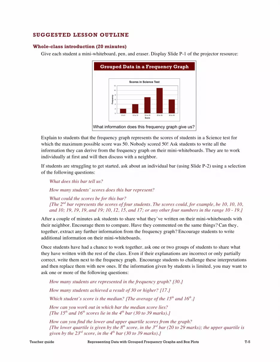
Whole-class introduction (20 minutes) Give each student a mini-whiteboard, pen, and eraser. Display Slide P-1 of the projector resource:
Explain to students that the frequency graph represents the scores of students in a Science test for which the maximum possible score was 50. Nobody scored 50! Ask students to write all the information they can derive from the frequency graph on their mini-whiteboards. They are to work individually at first and will then discuss with a neighbor.
If students are struggling to get started, ask about an individual bar (using Slide P-2) using a selection of the following questions:
What does this bar tell us?
How many students’ scores does this bar represent?
What could the scores be for this bar? [The 2nd bar represents the scores of four students. The scores could, for example, be 10, 10, 10, and 10; 19, 19, 19, and 19; 10, 12, 15, and 17; or any other four numbers in the range 10 - 19.]
After a couple of minutes ask students to share what they’ve written on their mini-whiteboards with their neighbor. Encourage them to compare. Have they commented on the same things? Can they, together, extract any further information from the frequency graph? Encourage students to write additional information on their mini-whiteboards.
Once students have had a chance to work together, ask one or two groups of students to share what they have written with the rest of the class. Even if their explanations are incorrect or only partially correct, write them next to the frequency graph. Encourage students to challenge these interpretations and then replace them with new ones. If the information given by students is limited, you may want to ask one or more of the following questions:
How many students are represented in the frequency graph? [30.]
How many students achieved a result of 30 or higher? [17.]
Which student’s score is the median? [The average of the 15th and 16th.]
How can you work out in which bar the median score lies? [The 15th and 16th scores lie in the 4th bar (30 to 39 marks).]
How can you find the lower and upper quartile scores from the graph? [The lower quartile is given by the 8th score, in the 3rd bar (20 to 29 marks); the upper quartile is given by the 23rd score, in the 4th bar (30 to 39 marks).]
Representing Data Using Grouped Frequency Graphs and Box Plots Projector Resources
Grouped Data in a Frequency Graph
P-1
What information does this frequency graph give us?
0
2
4
6
8
10
12
0 to 9 10 to 19 20 to 29 30 to 39 40 to 49
Freq
uenc
y
Score
Scores in Science Test

Teacher guide Representing Data with Grouped Frequency Graphs and Box Plots T-6
What is the maximum possible range of scores? What is the minimum possible range of scores? [Maximum is 49 (0 to 49) and the minimum is 31 (9 to 40).]
If students are not familiar with the terms median and upper and lower quartiles, explain that the lower quartile refers to the 1st quartile, the median refers to the 2nd quartile and the upper quartile refers to the 3rd quartile. These values divide the data set into four groups of equal frequencies. Students may assume that the range of the data will always be from the lowest value in the first interval to the highest value in the last interval so asking them to think about the minimum and maximum possible range of scores may be helpful in getting students to think about the properties of a grouped frequency graph.
Display Slide P-3 of the projector resource:
Ask students to write on their mini-whiteboards, which, if either of these box plots could represent the Science test scores. Maximize participation by asking all students to show you their mini-whiteboards. Select a few students with interesting or contrasting responses to justify them to the class. Encourage the rest of the class to challenge these explanations.
Students should identify that Box Plot 1 could represent the data but Box Plot 2 can’t, as the upper quartile lies in the wrong interval (40 – 49 as opposed to 30 – 39). All of the other features, however, (minimum value, lower quartile, median and maximum values) could represent the Science test scores. Encourage students to identify clearly, which features of the Box Plot 2 result in it not being a possible match for the data represented in the frequency graph:
Do the minimum/maximum values represented by Box Plot 1 and Box Plot 2 help you decide which box plot represents the frequency graph? [No, although the values are different, they still lie in the correct intervals 0 – 9 and 40 – 49.]
Do the start and end positions of the boxes in Box Plot 1 and Box Plot 2 help you decide which box plot represents the frequency graph? [The start positions of the boxes do not help as they both lie in the correct interval, 20 – 29, however only the end position of the box for Box Plot 1 lies in the correct interval 30 – 39.]
Can different box plots be constructed to represent the Science test scores? Why? [Yes, because exact values, such as the median score or the maximum score, cannot be determined from the frequency graph.]
Teacher guide Representing Data with Grouped Frequency Graphs and Box Plots T-7
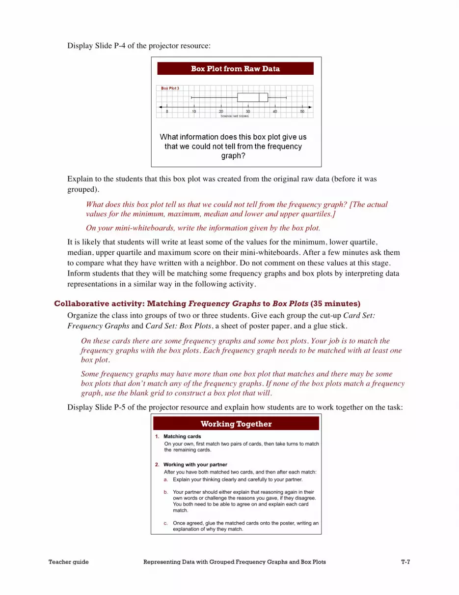
Display Slide P-4 of the projector resource:
Explain to the students that this box plot was created from the original raw data (before it was grouped).
What does this box plot tell us that we could not tell from the frequency graph? [The actual values for the minimum, maximum, median and lower and upper quartiles.]
On your mini-whiteboards, write the information given by the box plot.
It is likely that students will write at least some of the values for the minimum, lower quartile, median, upper quartile and maximum score on their mini-whiteboards. After a few minutes ask them to compare what they have written with a neighbor. Do not comment on these values at this stage. Inform students that they will be matching some frequency graphs and box plots by interpreting data representations in a similar way in the following activity.
Collaborative activity: Matching Frequency Graphs to Box Plots (35 minutes) Organize the class into groups of two or three students. Give each group the cut-up Card Set: Frequency Graphs and Card Set: Box Plots, a sheet of poster paper, and a glue stick.
On these cards there are some frequency graphs and some box plots. Your job is to match the frequency graphs with the box plots. Each frequency graph needs to be matched with at least one box plot.
Some frequency graphs may have more than one box plot that matches and there may be some box plots that don’t match any of the frequency graphs. If none of the box plots match a frequency graph, use the blank grid to construct a box plot that will.
Display Slide P-5 of the projector resource and explain how students are to work together on the task:
Representing Data Using Grouped Frequency Graphs and Box Plots Projector Resources
Working Together 1. Matching cards
On your own, first match two pairs of cards, then take turns to match the remaining cards.
2. Working with your partner After you have both matched two cards, and then after each match: a. Explain your thinking clearly and carefully to your partner.
b. Your partner should either explain that reasoning again in their own words or challenge the reasons you gave, if they disagree. You both need to be able to agree on and explain each card match.
c. Once agreed, glue the matched cards onto the poster, writing an explanation of why they match.
P-5

Teacher guide Representing Data with Grouped Frequency Graphs and Box Plots T-8
While students work in small groups you have two tasks: to note different student approaches to the task and support student reasoning.
Note different student approaches to the task In particular, notice any difficulties students encounter and the ways they justify and explain to each other. Do students check to see if their match is correct? Do they just focus on the maximum and minimum values? Do students assume the value of the median represented in a box plot always implies a student achieved that score? When figuring out a value from a graph, do students count accurately? Do they talk about the spread of the data? What do they do if they get stuck?
Support student reasoning Try not to make suggestions that move students towards particular matches, however do encourage students to use the correct mathematical language. Ask questions to help students to reason together.
How do you know that this box plot could represent the same data as this frequency graph?
If you find one student has matched two cards, challenge another student in the group to provide an explanation.
Alfie matched these cards. Tyrone, why does Alfie think these cards go together?
If students are struggling to get started, encourage them to ask a specific question about the task. Articulating the problem in this way can sometimes offer a direction to pursue that was previously overlooked. You may want to ask another member of the group to respond to a fellow student’s question. If the whole class is struggling on the same issue, you could write a couple of questions on the board and hold a brief whole-class discussion. You may want to use some of the questions and prompts from the Common issues table.
Extending the lesson over two days If you are taking two days to complete the unit then you may want to end the first lesson here, ensuring that students have glued their matched cards onto their poster. Then, at the start of the second day, give students time to familiarize themselves with their own work before comparing posters with another group.
Sharing posters (20 minutes) As students finish matching the cards, give them the opportunity to compare their work with another group. It may be helpful for students to jot down on their mini-whiteboards their agreed matches before they visit another group.
Show Slide P-6 and explain how students are to share their work:
Representing Data Using Grouped Frequency Graphs and Box Plots Projector Resources
Sharing Work
1. One person from each group get up and visit a different group.
2. If you are staying with your poster, explain your card matches to the visitor, justifying each match.
3. If you are the visitor, look carefully at the poster and challenge any cards you think have been matched incorrectly.
4. If you agree on the matches, compare your methods used when matching cards.
P-6

Teacher guide Representing Data with Grouped Frequency Graphs and Box Plots T-9
Poster review (10 minutes) Once students have had a chance to share their work, give them the opportunity to reconsider their card matches.
Now that you have had a chance to discuss and compare your work, you might like to have another look at your poster and decide in your groups, whether you are still happy with your card matches. If you think a card is in the wrong place, draw an arrow on your poster to where you think it should go, writing an explanation for the change.
Whole-class discussion (20 minutes) It is likely that some groups will not have matched all the cards. The intention of this discussion focuses on the justification of a few examples, rather than checking that students have the correct solutions.
You could first select a pair of cards that most groups matched correctly, as this should encourage good explanations. Then select one or two matches that most groups found difficult.
Explain how you matched these cards?
Can someone else put that into his or her own words?
Does anyone have a different explanation?
Did anyone match one of these cards to a different card?
Could this card be matched with another one?
You may want to use Slides P-7 and P-8 of the projector resource to support this discussion.
Finish up by asking the students to look at the global shapes of the frequency graphs and box plots.
Although this lesson is primarily concerned with developing a critical appreciation of the potentials and limitations of different ways of summarizing and representing data, a short amount of time on the shapes of representations might be well invested.
It might be helpful to look at the shape of the data for the matches that have already been discussed.
You might like to ask:
How would you describe the data represented in this frequency graph? [E.g. bars all similar height, students more likely to score high/low etc.]
Can you see this in the box plot as well? How can you tell? [E.g. box and whiskers the same length etc.]
How is this data different? [E.g. clustered, evenly distributed, skewed etc.]
How are these box plots different? [E.g. comparison of length of box/whiskers, position of box etc.]
What percentage of the data is in the box? [50%.]
What would the frequency graph look like if the box was further to the right/left?
What has to happen to the scores for the box to shift up?
For example, the data for Group D is clustered around the median value, giving a small interquartile range and relatively short whiskers.

Teacher guide Representing Data with Grouped Frequency Graphs and Box Plots T-10
The related box plot shows this (Slide P-9 of the projector resource):
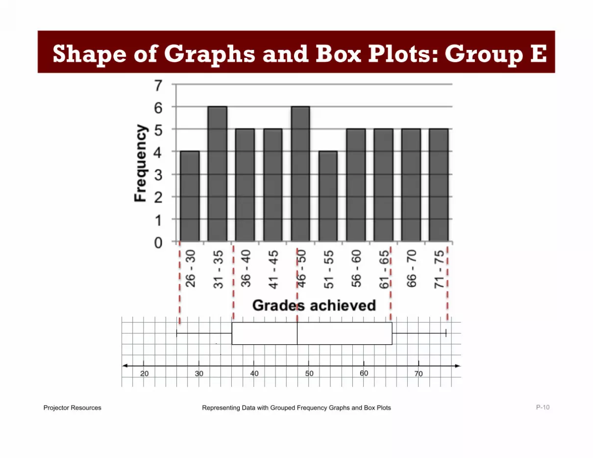
On the other hand, the data from Group E is more evenly spread, giving a box plot with a larger interquartile range (Slide P-10 of the projector resource):
Follow-up lesson: reviewing the assessment task (15 minutes) Return the original assessment Girls’ Heights to the students, together with a copy of Boys’ Arm Spans. If you have not added questions to individual pieces of work, write your list of questions on the board. Students should select from this list only those questions they think are appropriate to their own work.
Look at your original responses and the questions (on the board/written on your paper.) Answer these questions and revise your responses.
Now look at the new task sheet, Boys’ Arm Spans. Use what you have learned to answer these questions.
If students struggled with the original assessment task, you may feel it more appropriate for them to revisit Girls’ Heights rather than attempting Boys’ Arm Spans. If this is the case give them another copy of the original assessment task instead.
Some teachers give this as a homework task.
Representing Data Using Grouped Frequency Graphs and Box Plots Projector Resources
Shape of Graphs and Box Plots: Group D
P-9
!" #" $" %" &" '"
!" #" $" %" &" '"
!" #" $" %" &" '"
!" #" $" %" &" '"
!" #" $" %" &" '"
!" #" $" %" &" '"
!" #" $" %" &" '"
Representing Data Using Grouped Frequency Graphs and Box Plots Projector Resources
Shape of Graphs and Box Plots: Group E
P-10
!" #" $" %" &" '"
!" #" $" %" &" '"
!" #" $" %" &" '"
!" #" $" %" &" '"

Teacher guide Representing Data with Grouped Frequency Graphs and Box Plots T-11
SOLUTIONS
Assessment task: Girls’ Heights 1a. The frequency graph summarizes the data for 50 girls.
In the following answers, all height measurements are rounded. When describing what the frequency graph tells us about the girls’ heights, students may refer to the fact that the data has been rounded. For example, they may state the range of the girls’ heights as 130.5 cm ≤ height < 171.5 cm.
36 girls have (rounded) heights that lie in the interval 146 to 160 cm (or exact heights in the interval 145.5 to 160.5) with 14 in the interval 151 to 156 cm. The median height is in the interval 151 to 155 cm. There are two girls in each of the extreme intervals 131 to 135 cm and 166 to 170 cm. The biggest spread in heights is in the shorter heights, as this is where the data is more spread out.
1b. 3 girls have heights between 141 and 145 cm.
1c. 9 girls are taller than 160 cm (7 between 161 and 165 cm, and 2 between 166 and 170 cm).
1d. 50 girls’ heights are represented by the frequency graph.
1e. It is not possible to say exactly what the median height is. All we know is that it is the average of the 25th and 26th data values, which fall in the interval 151 to 155 cm.
2a. The shortest girl’s height is 132 cm [because the left-hand whisker reaches to 132].
2b. The tallest girl’s height is 168 cm [because the right-hand whisker reaches to 168].
2c. The box plot also shows that:
• the median height is 153 cm
• 50% of the girls’ heights are between 150 cm and 158 cm
• the heights range between 132 cm and 168 cm.
3a. The minimum height is 135 cm. The maximum height is 166 cm. The median height is 154 cm.
3b. Both box plots could be correct because the frequency graph only tells us the interval in which the minimum, maximum and median heights fall.

Teacher guide Representing Data with Grouped Frequency Graphs and Box Plots T-12
Lesson task: The matches are given below:
Group A: Grades in Memory Test
B6
Box Plot B6 has a minimum of 29 (in the interval 26 to 30) and a maximum of 71 (in the interval 71 to 75). The median is 47, which lies in the interval 46 to 50. The lower and upper quartiles are 40 and 58 and lie in the intervals 36 to 40 and 56 to 60 respectively.
Group B: Grades in Memory Test
B1
B5
Box Plots B1 and B5 are both matches for Group B. They both have a minimum in the interval 31 to 35 (32 for B1 and 35 for B5) and a maximum of 76. Their medians of 61 and 64 both lie in the interval 61 to 65. Their lower quartiles of 51 and 54 both lie in the interval 51 to 55 and their upper quartiles of 66 and 70 both lie in the interval 66 to 70.
Group C: Grades in Memory Test
B7
Box Plot B7 has a minimum of 32 (in the interval 31 to 35) and a maximum of 76 (in the interval 76 to 80). The median is 58, which lies in the interval 56 to 60. The lower and upper quartiles are 54 and 66 and lie in the intervals 51 to 55 and 66 to 70 respectively.
0
2
4
6
8
10
12 26
- 30
31 -
35
36 -
40
41 -
45
46 -
50
51 -
55
56 -
60
61 -
65
66 -
70
71 -
75
Freq
uenc
y
Grades achieved
20 30 40 50 60 70
20 30 40 50 60 70
20 30 40 50 60 70
20 30 40 50 60 70
20 30 40 50 60 70
20 30 40 50 60 70
20 30 40 50 60 70
0
2
4
6
8
10
31- 3
5
36 -
40
41 -
45
46 -
50
51 -
55
56 -
60
61 -
65
66 -
70
71 -
75
76 -
80
Freq
uenc
y
Grades achieved
20 30 40 50 60 70
20 30 40 50 60 70
20 30 40 50 60 70
20 30 40 50 60 70
20 30 40 50 60 70
20 30 40 50 60 70
20 30 40 50 60 70
20 30 40 50 60 70
20 30 40 50 60 70
20 30 40 50 60 70
20 30 40 50 60 70
20 30 40 50 60 70
20 30 40 50 60 70
20 30 40 50 60 70
0 2 4 6 8
10 12 14
31 -
35
36 -
40
41 -
45
46 -
50
51 -
55
56 -
60
61 -
65
66 -
70
71 -
75
76 -
80
Freq
uenc
y
Grades achieved
Group C: Grades in memory test
20 30 40 50 60 70
20 30 40 50 60 70
20 30 40 50 60 70
20 30 40 50 60 70
20 30 40 50 60 70
20 30 40 50 60 70
20 30 40 50 60 70

Teacher guide Representing Data with Grouped Frequency Graphs and Box Plots T-13
Group D: Grades in Memory Test
B3
Box Plot B3 has a minimum of 26 (in the interval 26 to 30) and a maximum of 64 (in the interval 61 to 65). The median is 44, which lies in the interval 41 to 45. The lower and upper quartiles are 36 and 51 and lie in the intervals 36 to 40 and 51 to 55 respectively.
Group E: Grades in Memory Test
B8 Blank Card
Group F: Grades in Memory Test
B2
Box Plot B2 has a minimum of 26 (in the interval 26 to 30) and a maximum of 64 (in the interval 61 to 65). The median is 44, which lies in the interval 41 to 45. The lower and upper quartiles are 35 and 50 and lie in the intervals 31 to 35 and 46 to 50 respectively.
0 2 4 6 8
10 12 14
26 -
30
31 -
35
36 -
40
41 -
45
46 -
50
51 -
55
56 -
60
61 -
65
Freq
uenc
y
Grades achieved
20 30 40 50 60 70
20 30 40 50 60 70
20 30 40 50 60 70
20 30 40 50 60 70
20 30 40 50 60 70
20 30 40 50 60 70
20 30 40 50 60 70
0 1 2 3 4 5 6 7
26 -
30
31 -
35
36 -
40
41 -
45
46 -
50
51 -
55
56 -
60
61 -
65
66 -
70
71 -
75
Freq
uenc
y
Grades achieved
20 30 40 50 60 70
20 30 40 50 60 70
20 30 40 50 60 70
20 30 40 50 60 70
20 30 40 50 60 70
20 30 40 50 60 70
20 30 40 50 60 70
0
2
4
6
8
10
26 -
30
31 -
35
36 -
40
41 -
45
46 -
50
51 -
55
56 -
60
61 -
65
Freq
uenc
y
Grades achieved
20 30 40 50 60 70
20 30 40 50 60 70
20 30 40 50 60 70
20 30 40 50 60 70
20 30 40 50 60 70
20 30 40 50 60 70
20 30 40 50 60 70
Minimum in the interval 26 to 30
Median in the interval 46 to 50 Maximum in the
interval 71 to 75
Lower quartile in the interval 36 to 40 Upper quartile in the
interval 61 to 65
Teacher guide Representing Data with Grouped Frequency Graphs and Box Plots T-14
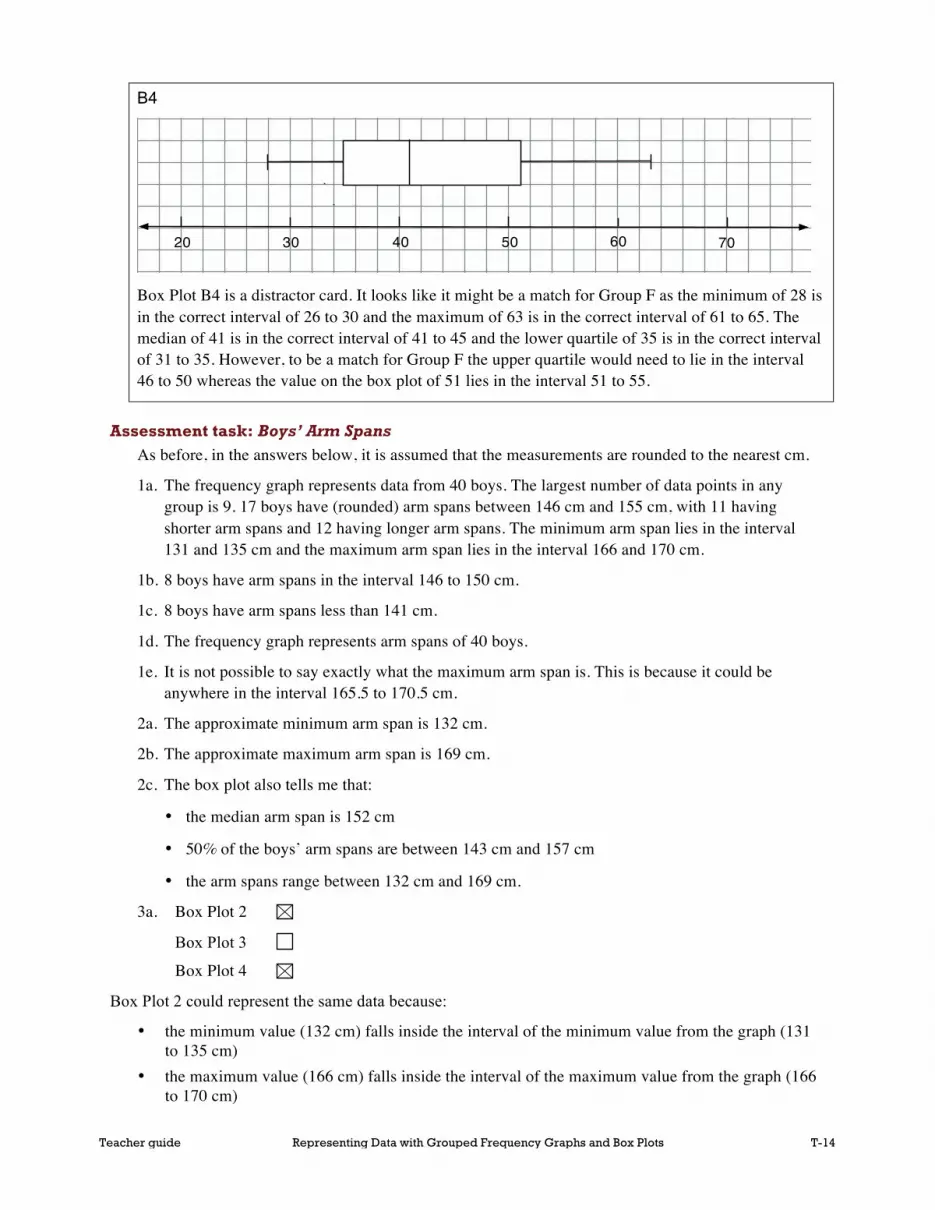
B4
Box Plot B4 is a distractor card. It looks like it might be a match for Group F as the minimum of 28 is in the correct interval of 26 to 30 and the maximum of 63 is in the correct interval of 61 to 65. The median of 41 is in the correct interval of 41 to 45 and the lower quartile of 35 is in the correct interval of 31 to 35. However, to be a match for Group F the upper quartile would need to lie in the interval 46 to 50 whereas the value on the box plot of 51 lies in the interval 51 to 55.
Assessment task: Boys’ Arm Spans As before, in the answers below, it is assumed that the measurements are rounded to the nearest cm.
1a. The frequency graph represents data from 40 boys. The largest number of data points in any group is 9. 17 boys have (rounded) arm spans between 146 cm and 155 cm, with 11 having shorter arm spans and 12 having longer arm spans. The minimum arm span lies in the interval 131 and 135 cm and the maximum arm span lies in the interval 166 and 170 cm.
1b. 8 boys have arm spans in the interval 146 to 150 cm.
1c. 8 boys have arm spans less than 141 cm.
1d. The frequency graph represents arm spans of 40 boys.
1e. It is not possible to say exactly what the maximum arm span is. This is because it could be anywhere in the interval 165.5 to 170.5 cm.
2a. The approximate minimum arm span is 132 cm.
2b. The approximate maximum arm span is 169 cm.
2c. The box plot also tells me that:
• the median arm span is 152 cm
• 50% of the boys’ arm spans are between 143 cm and 157 cm
• the arm spans range between 132 cm and 169 cm.
3a. Box Plot 2
Box Plot 3
Box Plot 4
Box Plot 2 could represent the same data because:
• the minimum value (132 cm) falls inside the interval of the minimum value from the graph (131 to 135 cm)
• the maximum value (166 cm) falls inside the interval of the maximum value from the graph (166 to 170 cm)
20 30 40 50 60 70
20 30 40 50 60 70
20 30 40 50 60 70
20 30 40 50 60 70
20 30 40 50 60 70
20 30 40 50 60 70
20 30 40 50 60 70

Teacher guide Representing Data with Grouped Frequency Graphs and Box Plots T-15
• the median value (152 cm) falls inside the interval of the median value from the graph which occurs half way between the 20th data point and the 21st data point (151 to 155 cm)
• the lower quartile value (144 cm) falls inside the interval of the lower quartile value from the graph which occurs half way between the 10th data point and the 11th data point (141 to 145 cm)
• the upper quartile value (160 cm) falls inside the interval of the upper quartile value from the graph which occurs half way between the 30th data point and the 31st data point (156 to 160 cm)
Box plot 3 could NOT represent the same data because
• the lower quartile value (139 cm) falls outside the interval of the lower quartile value from the graph which occurs half way between the 10th data point and the 11th data point (141 to 145 cm)
However, on the other four values the box plot does not fail:
• the minimum value (132 cm) falls inside the interval of the minimum value from the graph (131 to 135 cm)
• the maximum value (166 cm) falls inside the interval of the maximum value from the graph (166 to 170 cm)
• the median value (152 cm) falls inside the interval of the median value from the graph which occurs half way between the 20th data point and the 21st data point (151 to 155 cm)
• the upper quartile value (160 cm) falls inside the interval of the upper quartile value from the graph which occurs half way between the 30th data point and the 31st data point (156 to 160 cm).
Box Plot 4 could represent the same data because:
• the minimum value (142 cm) falls within the interval of the minimum value from the graph (131 to 135 cm).
• the maximum value (166 cm) falls inside the interval of the maximum value from the graph (166 to 170 cm)
• the median value (155 cm) falls inside the interval of the median value from the graph which occurs half way between the 20th data point and the 21st data point (151 to 155 cm)
• the lower quartile value (142 cm) falls inside the interval of the lower quartile value from the graph which occurs half way between the 10th data point and the 11th data point (141 to 145 cm)
• the upper quartile value (157 cm) falls inside the interval of the upper quartile value from the graph which occurs half way between the 30th data point and the 31st data point (156 to 160 cm).

Student materials Representing Data with Grouped Frequency Graphs and Box Plots S-1 © 2015 MARS, Shell Center, University of Nottingham
Girls’ Heights
1. The frequency graph shows the height of a group of Grade 6 girls. All heights were rounded to the nearest centimeter. In the questions, the numbers all refer to rounded heights, not exact ones.
a. What does the frequency graph tell you about the girls’ heights?
b. How many girls have rounded heights between 141 and 145 cm?
c. How many girls are taller than 160 cm?
d. How many girls’ heights are represented by the frequency graph?
e. Can you say exactly what the median height is? Yes / No (please circle)
Explain your answer:

Student materials Representing Data with Grouped Frequency Graphs and Box Plots S-2 © 2015 MARS, Shell Center, University of Nottingham
2. Here is a possible box plot of the same height data: Box Plot 1:
a. What is the height of the shortest girl in the data set? cm
b. What is the height of the tallest girl? cm
c. What else does this box plot tell you?
3. Here is another box plot of the same data. Box Plot 2: a. How is Box Plot 2 different from Box Plot 1? (State 3 differences)
b. Explain why either box plots could be correct.

Student materials Representing Data with Grouped Frequency Graphs and Box Plots S-3 © 2015 MARS, Shell Center, University of Nottingham
Grouped Data: Frequency Graph and Box Plots
0
2
4
6
8
10
12
0 to 9 10 to 19 20 to 29 30 to 39 40 to 49
Fre
qu
en
cy
Score
Scores in Science Test

Student materials Representing Data with Grouped Frequency Graphs and Box Plots S-4 © 2015 MARS, Shell Center, University of Nottingham
Card Set: Frequency Graphs
Group A: Grades in Memory Test
Group B: Grades in Memory Test
0
2
4
6
8
10
12
26 -
30
31
- 3
5
36 -
40
41
- 4
5
46 -
50
51
- 5
5
56 -
60
61
- 6
5
66 -
70
71
- 7
5
Fre
qu
en
cy
Grades achieved
0
2
4
6
8
10
31-
35
36
- 4
0
41
- 4
5
46
- 5
0
51
- 5
5
56
- 6
0
61
- 6
5
66
- 7
0
71
- 7
5
76
- 8
0
Fre
qu
en
cy
Grades achieved

Student materials Representing Data with Grouped Frequency Graphs and Box Plots S-5 © 2015 MARS, Shell Center, University of Nottingham
Card Set: Frequency Graphs (continued)
Group C: Grades in Memory Test
Group D: Grades in Memory Test
0 2 4 6 8
10 12 14
31 -
35
36 -
40
41 -
45
46 -
50
51 -
55
56 -
60
61 -
65
66 -
70
71 -
75
76 -
80
Fre
qu
en
cy
Grades achieved
Group C: Grades in memory test
0
2
4
6
8
10
12
14
26
- 3
0
31 -
35
36
- 4
0
41 -
45
46
- 5
0
51 -
55
56
- 6
0
61 -
65
Fre
qu
en
cy
Grades achieved

Student materials Representing Data with Grouped Frequency Graphs and Box Plots S-6 © 2015 MARS, Shell Center, University of Nottingham
Card Set: Frequency Graphs (continued)
Group E: Grades in Memory Test
Group F: Grades in Memory Test
0
1
2
3
4
5
6
7
26
- 3
0
31 -
35
36
- 4
0
41 -
45
46
- 5
0
51 -
55
56
- 6
0
61 -
65
66
- 7
0
71 -
75
Fre
qu
en
cy
Grades achieved
0
2
4
6
8
10
26 -
30
31
- 3
5
36 -
40
41
- 4
5
46 -
50
51
- 5
5
56 -
60
61
- 6
5
Fre
qu
en
cy
Grades achieved

Student materials Representing Data with Grouped Frequency Graphs and Box Plots S-7 © 2015 MARS, Shell Center, University of Nottingham
Card Set: Box Plots
B1
B2
B3
B4

Student materials Representing Data with Grouped Frequency Graphs and Box Plots S-8 © 2015 MARS, Shell Center, University of Nottingham
Card Set: Box Plots (continued)
B5
B6
B7
B8

Student materials Representing Data with Grouped Frequency Graphs and Box Plots S-9 © 2015 MARS, Shell Center, University of Nottingham
Boys’ Arm Spans
1. The frequency graph shows the arm spans of a group of Grade 6 boys. All measurements have been rounded to the nearest centimeter. In the questions, the numbers refer to rounded arm spans, not exact ones.
a. What does the frequency graph tell you about the boys’ arm spans?
b. How many boys have rounded arm spans between 146 and 150 cm?
c. How many boys have arm spans of less than 141 cm?
d. How many boys’ arm spans are represented by the frequency graph?
e. Can you say exactly what the maximum arm span is? Yes / No (please circle)
Explain your answer:

Student materials Representing Data with Grouped Frequency Graphs and Box Plots S-10 © 2015 MARS, Shell Center, University of Nottingham
2. Here is a possible box plot of the same arm span data:
Box Plot 1:
a. What is the minimum arm span for the boys in the data set? cm
b. What is the maximum arm span for the boys in the data set? cm
c. What else does this box plot tell you?
3. Which of the following box plots could represent the frequency graph?
Box Plot 2:
Box Plot 3:

Student materials Representing Data with Grouped Frequency Graphs and Box Plots S-11 © 2015 MARS, Shell Center, University of Nottingham
Box Plot 4:
a. Check (√) the box plots that could represent the same data.
Box Plot 2
Box Plot 3
Box Plot 4
b. Explain your reasons for these choices:

Representing Data with Grouped Frequency Graphs and Box Plots Projector Resources
Grouped Data in a Frequency Graph
P-1
What information does this frequency graph give us?
0
2
4
6
8
10
12
0 to 9 10 to 19 20 to 29 30 to 39 40 to 49
Freq
uenc
y
Score
Scores in Science Test

Representing Data with Grouped Frequency Graphs and Box Plots Projector Resources
0
2
4
6
8
10
12
0 to 9 10 to 19 20 to 29 30 to 39 40 to 49
Freq
uenc
y
Score
Scores in Science Test
Grouped Data in a Frequency Graph
P-2
What does this bar tell us?

Representing Data with Grouped Frequency Graphs and Box Plots Projector Resources
Possible Box Plots?
P-3
0
2
4
6
8
10
12
0 to 9 10 to 19 20 to 29 30 to 39 40 to 49
Freq
uenc
y
Score
Which, if either, of these box plots could represent the Science test scores?
0 10 30 40 5020Science Test Scores
0 10 30 40 5020Science Test Scores
Box Plot 1
Box Plot 2

Representing Data with Grouped Frequency Graphs and Box Plots Projector Resources
Box Plot from Raw Data
P-4
0 10 30 40 5020Science Test Scores
Box Plot 3
What information does this box plot give us that we could not tell from the frequency
graph?

Representing Data with Grouped Frequency Graphs and Box Plots Projector Resources
Working Together 1. Matching cards
On your own, first match two pairs of cards, then take turns to match the remaining cards.
2. Working with your partner After you have both matched two cards, and then after each match: a. Explain your thinking clearly and carefully to your partner.
b. Your partner should either explain that reasoning again in their own words or challenge the reasons you gave, if they disagree. You both need to be able to agree on and explain each card match.
c. Once agreed, glue the matched cards onto the poster, writing an explanation of why they match.
P-5

Representing Data with Grouped Frequency Graphs and Box Plots Projector Resources
Sharing Work
1. One person from each group get up and visit a different group.
2. If you are staying with your poster, explain your card matches to the visitor, justifying each match.
3. If you are the visitor, look carefully at the poster and challenge any cards you think have been matched incorrectly.
4. If you agree on the matches, compare your methods used when matching cards.
P-6

Representing Data with Grouped Frequency Graphs and Box Plots Projector Resources
Frequency Graphs
P-7
Student Materials Representing Data Using Grouped Frequency Graphs and Box Plots S-5 © 2014 MARS, Shell Center, University of Nottingham
Card Set: Frequency Graphs (Continued)
Group C: Grades in Memory Test
Group D: Grades in Memory Test
0 2 4 6 8
10 12 14
31 -
35
36 -
40
41 -
45
46 -
50
51 -
55
56 -
60
61 -
65
66 -
70
71 -
75
76 -
80
Freq
uenc
y
Grades achieved
Group C: Grades in memory test
0 2 4 6 8
10 12 14
26 -
30
31 -
35
36 -
40
41 -
45
46 -
50
51 -
55
56 -
60
61 -
65
Freq
uenc
y
Grades achieved
Student Materials Representing Data Using Grouped Frequency Graphs and Box Plots S-4 © 2014 MARS, Shell Center, University of Nottingham
Card Set: Frequency Graphs
Group A: Grades in Memory Test
Group B: Grades in Memory Test
0
2
4
6
8
10
12
26 -
30
31 -
35
36 -
40
41 -
45
46 -
50
51 -
55
56 -
60
61 -
65
66 -
70
71 -
75
Freq
uenc
y
Grades achieved
0
2
4
6
8
10
31- 3
5
36 -
40
41 -
45
46 -
50
51 -
55
56 -
60
61 -
65
66 -
70
71 -
75
76 -
80
Freq
uenc
y
Grades achieved
Student Materials Representing Data Using Grouped Frequency Graphs and Box Plots S-6 © 2014 MARS, Shell Center, University of Nottingham
Card Set: Frequency Graphs (Continued)
Group E: Grades in Memory Test
Group F: Grades in Memory Test
0 1 2 3 4 5 6 7
26 -
30
31 -
35
36 -
40
41 -
45
46 -
50
51 -
55
56 -
60
61 -
65
66 -
70
71 -
75
Freq
uenc
y
Grades achieved
0
2
4
6
8
10
26 -
30
31 -
35
36 -
40
41 -
45
46 -
50
51 -
55
56 -
60
61 -
65
Freq
uenc
y
Grades achieved

Representing Data with Grouped Frequency Graphs and Box Plots Projector Resources
Box Plots
P-8
Student Materials Representing Data Using Grouped Frequency Graphs and Box Plots S-6 © 2013 MARS, Shell Center, University of Nottingham
Card Set: Box Plots
B1 B2
B3
B4
!" #" $" %" &" '"
!" #" $" %" &" '"
!" #" $" %" &" '"
!" #" $" %" &" '"
!" #" $" %" &" '"
!" #" $" %" &" '"
!" #" $" %" &" '"
!" #" $" %" &" '"
!" #" $" %" &" '"
!" #" $" %" &" '"
!" #" $" %" &" '"
!" #" $" %" &" '"
!" #" $" %" &" '"
!" #" $" %" &" '"
!" #" $" %" &" '"
!" #" $" %" &" '"
!" #" $" %" &" '"
!" #" $" %" &" '"
!" #" $" %" &" '"
!" #" $" %" &" '"
!" #" $" %" &" '"
!" #" $" %" &" '"
!" #" $" %" &" '"
!" #" $" %" &" '"
!" #" $" %" &" '"
!" #" $" %" &" '"
!" #" $" %" &" '"
!" #" $" %" &" '"
Student Materials Representing Data Using Grouped Frequency Graphs and Box Plots S-8 © 2013 MARS, Shell Center, University of Nottingham
B5
B6
B7
B8
20 30 40 50 60 70
20 30 40 50 60 70
20 30 40 50 60 70
20 30 40 50 60 70
20 30 40 50 60 70
20 30 40 50 60 70
20 30 40 50 60 70
20 30 40 50 60 70
20 30 40 50 60 70
20 30 40 50 60 70
20 30 40 50 60 70
20 30 40 50 60 70
20 30 40 50 60 70
20 30 40 50 60 70
20 30 40 50 60 70
20 30 40 50 60 70
20 30 40 50 60 70
20 30 40 50 60 70
20 30 40 50 60 70
20 30 40 50 60 70
20 30 40 50 60 70
20 30 40 50 60 70
20 30 40 50 60 70
20 30 40 50 60 70
20 30 40 50 60 70
20 30 40 50 60 70
20 30 40 50 60 70
20 30 40 50 60 70

Representing Data with Grouped Frequency Graphs and Box Plots Projector Resources
Shape of Graphs and Box Plots: Group D
P-9
20 30 40 50 60 70
20 30 40 50 60 70
20 30 40 50 60 70
20 30 40 50 60 70
20 30 40 50 60 70
20 30 40 50 60 70
20 30 40 50 60 70
Representing Data with Grouped Frequency Graphs and Box Plots Projector Resources
Shape of Graphs and Box Plots: Group E
P-10
20 30 40 50 60 70
20 30 40 50 60 70
20 30 40 50 60 70
20 30 40 50 60 70

© 2015 MARS, Shell Center, University of Nottingham This material may be reproduced and distributed, without modification, for non-commercial purposes, under the Creative Commons License detailed at http://creativecommons.org/licenses/by-nc-nd/3.0/
All other rights reserved. Please contact [email protected] if this license does not meet your needs.
Mathematics Assessment Project
Classroom Challenges
These materials were designed and developed by the Shell Center Team at the Center for Research in Mathematical Education
University of Nottingham, England:
Malcolm Swan, Nichola Clarke, Clare Dawson, Sheila Evans, Colin Foster, and Marie Joubert
with Hugh Burkhardt, Rita Crust, Andy Noyes, and Daniel Pead
We are grateful to the many teachers and students, in the UK and the US, who took part in the classroom trials that played a critical role in developing these materials
The classroom observation teams in the US were led by David Foster, Mary Bouck, and Diane Schaefer
This project was conceived and directed for The Mathematics Assessment Resource Service (MARS) by
Alan Schoenfeld at the University of California, Berkeley, and Hugh Burkhardt, Daniel Pead, and Malcolm Swan at the University of Nottingham
Thanks also to Mat Crosier, Anne Floyde, Michael Galan, Judith Mills, Nick Orchard, and Alvaro Villanueva who contributed to the design and production of these materials
This development would not have been possible without the support of Bill & Melinda Gates Foundation
We are particularly grateful to Carina Wong, Melissa Chabran, and Jamie McKee
The full collection of Mathematics Assessment Project materials is available from
http://map.mathshell.org
Related Documents