In what ways does your media product use, develop or challenge forms and conventions of real media products? EVALUATION : QUESTION 1

Welcome message from author
This document is posted to help you gain knowledge. Please leave a comment to let me know what you think about it! Share it to your friends and learn new things together.
Transcript

In what ways does your media product use, develop or challenge forms and conventions of real media products?
EVALUATION : QUESTION 1

Front Cover Contents
Double Page Spread

BRIEF SUMMARYThroughout creating my product I have aimed to try and create continuity throughout my magazine. To ensure this I have made sure I have used:
• The same font throughout my magazine
• The same colour scheme (whilst making sure I stick to using the colours black, white, red and yellow)
• Making sure the numbers on my contents page fit the number on my double page spread
• How my layout matches Conventions I have studied
• How I have used conventions in my magazine to make it look real and proffesional.

Using the same font
I also used the same font as my feature stories as my contents page features. This also helps connect
the two different stories and helps the reader directly know where to look for the specific story.

Using the same font
For my double page spread I used the same font in my stand first as the one usd as my feauture stories in both my front cover and contents page, this again
adds continuity
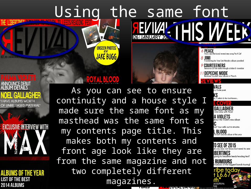
Using the same font
As you can see to ensure continuity and a house style I made sure the same font as my masthead was the same font as my contents page title. This
makes both my contents and front age look like they are from the same magazine and not two
completely different magazines.

THE SAME COLOUR SCHEME
For my front cover I chose four different colours which doesn’t actually stick to conventions of a magazine. However I think these four colours suit the genre of my magazine and don’t look too bold and take over my magazine. I chose to do the headlines in either red or yellow and not just one colour as this is something I researched and was conventional for a magazine. The main feature story is in white as this stands out the most in front of the black photo furthermore it actually fits the feature story ‘the story in black and white’.

THE SAME COLOUR SCHEME
For my contents page I once again stuck to the same four colours as my front cover however didn’t use the colour yellow as much. This time I made sure the font colour for my subheadings was always red this made the reader know which parts are subheadings and which parts are feature stories. This is conventional as I made sure all numbers and subheading were red and all feature stories were black. In conclusion for my contents page to add a house style and continuity I made sure the colour scheme was the same as my front cover.

THE SAME COLOUR SCHEME
For my double page spread I actually only stuck to 3 of the colours out of the four I chose to use in my front cover and double page spread. However this made it simple and easier to look at. I made most the page black and white so it used continuity to my feature story ‘the story in black and white’ . I only made the stand first and pull quote red so it stood out as these are parts of a double page spread people read first.

MATCHING THE NUMBERS
As you can see to add continuity and to make my magazine look professional I made sure the page number from my contents page matched the page number for my double page spread. This makes my magazine look real as the matching numbers mean that if my magazine was real the reader would be able to go directly to the correct page of my double page spread.

LAYOUT OF FRONT COVERI made sure my skyline was at the correct place at the top of the page
In he corner I added my plug to encourage people to buy my magazine.
My masthead is in the top left corner and is a larger font than the rest of my magazine. It is also in a different font style so it stands out.
Feature stories that are on the left and right side of my magazine, including artists that feature inside.
Main image framed as a medium close up with a simple background. In black and white so text stands out around it.
Main feature story in a different font style and colour. It is bigger than the other texts so it stands out to the reader.
Barcode and price together in the bottom corner so it doesn’t take up too much space.

LAYOUT OF CONTENTS PAGEMasthead to add continuity and issue date and number, all in top left corner.
Title in top right corner same font as masthead.
Main image of the double page spread and near to the front of magazine. Same image as front cover and dps.
Subheadings of different conventional sections within a music magazine
Articles listed consecutively in a column with page numbers for readers reference.
Extra original images that are suited to the genre and advertise other feature stories
Deal with a subscription to the magazine using images of past front cover drafts.

LAYOUT OF DOUBLE PAGE SPREADLarge title at the top in an interesting font to capture readers attention.
Stand first in a different colour and font style with important words in white.
Pull quote in the centre of the text in a different colour and font to article.
Advertisement of the artists album and its availability on iTunes.
Page number, masthead and date to add continuity and lets the reader be reminded of the magazine and issue.
Article on one side of the page in columns so the text does not overlap the crease and can be easily read.
Main image taking up one whole side of the page and is not overlapping the crease
Caption of who the photo is of and credit to the photographer.
Related Documents


![Presentation20 05 14 - Aristotle University of Thessalonikiusers.auth.gr/.../Spring2014/Presentation20_05_14.pdf · Microsoft PowerPoint - Presentation20_05_14 [Compatibility Mode]](https://static.cupdf.com/doc/110x72/5f046d5d7e708231d40dea30/presentation20-05-14-aristotle-university-of-microsoft-powerpoint-presentation200514.jpg)