CHAPTER 3 Presentation and Analysis of Data Quantitative information is fundamental to scientific and engineering analysis. Information about biopro- cesses, such as the amount of substrate fed into the system, the operating conditions, and properties of the product stream, is obtained by measuring pertinent physical and chemical variables. In industry, data are collected for equipment design, process control, troubleshooting and economic evaluations. In research, experimental data are used to test hypotheses and develop new theories. In either case, quantitative inter- pretation of data is essential for making rational decisions about the system under investigation. The ability to extract useful and accurate information from data is an important skill for any scientist. Professional pre- sentation and communication of results are also required. Techniques for data analysis must take into account the existence of error in measure- ments. Because there is always an element of uncertainty associated with measured data, interpretation calls for a great deal of judgement. This is especially the case when critical decisions in design or operation of processes depend on data evaluation. Although com- puters and calculators make data processing less tedious, the data analyst must possess enough perception to use these tools effectively. This chapter discusses sources of error in data and methods of handling errors in calcu- lations. Presentation and analysis of data using graphs and equations and communication of process information using flow sheets are described. 3.1 ERRORS IN DATAAND CALCULATIONS Measurements are never perfect. Experimentally determined quantities are always some- what inaccurate due to measurement error; absolutely ‘correct’ values of physical quantities (time, length, concentration, temperature, etc.) cannot be found. The significance or reliabil- ity of conclusions drawn from data must take measurement error into consideration. Estimation of error and principles of error propagation in calculations are important ele- ments of engineering analysis that help prevent misleading representation of data. General principles for estimating and expressing errors are discussed in the following sections. 45 Bioprocess Engineering Principles, Second Edition © 2013 Elsevier Ltd. All rights reserved.

Welcome message from author
This document is posted to help you gain knowledge. Please leave a comment to let me know what you think about it! Share it to your friends and learn new things together.
Transcript

C H A P T E R
3
Presentation and Analysis of Data
Quantitative information is fundamental to scientific and engineering analysis. Information about biopro-cesses, such as the amount of substrate fed into the system, the operating conditions, and properties of theproduct stream, is obtained by measuring pertinent physical and chemical variables. In industry, data arecollected for equipment design, process control, troubleshooting and economic evaluations. In research,experimental data are used to test hypotheses and develop new theories. In either case, quantitative inter-pretation of data is essential for making rational decisions about the system under investigation. The abilityto extract useful and accurate information from data is an important skill for any scientist. Professional pre-sentation and communication of results are also required.
Techniques for data analysis must take into account the existence of error in measure-ments. Because there is always an element of uncertainty associated with measured data,interpretation calls for a great deal of judgement. This is especially the case when criticaldecisions in design or operation of processes depend on data evaluation. Although com-puters and calculators make data processing less tedious, the data analyst must possessenough perception to use these tools effectively.
This chapter discusses sources of error in data and methods of handling errors in calcu-lations. Presentation and analysis of data using graphs and equations and communicationof process information using flow sheets are described.
3.1 ERRORS IN DATA AND CALCULATIONS
Measurements are never perfect. Experimentally determined quantities are always some-what inaccurate due to measurement error; absolutely ‘correct’ values of physical quantities(time, length, concentration, temperature, etc.) cannot be found. The significance or reliabil-ity of conclusions drawn from data must take measurement error into consideration.Estimation of error and principles of error propagation in calculations are important ele-ments of engineering analysis that help prevent misleading representation of data. Generalprinciples for estimating and expressing errors are discussed in the following sections.
45Bioprocess Engineering Principles, Second Edition © 2013 Elsevier Ltd. All rights reserved.

3.1.1 Significant Figures
Data used in engineering calculations vary considerably in accuracy. Economic projec-tions may estimate market demand for a new biotechnology product to within 6100%; onthe other hand, some properties of materials are known to within 60.0001% or less. Theuncertainty associated with quantities should be reflected in the way they are written. Thenumber of figures used to report a measured or calculated variable is an indirect indica-tion of the precision to which that variable is known. It would be absurd, for example,to quote the estimated income from sales of a new product using ten decimal places.Nevertheless, the mistake of quoting too many figures is not uncommon; display of super-fluous figures on calculators is very easy but should not be transferred to scientificreports.
A significant figure is any digit (i.e., 1�9) used to specify a number. Zero may also be asignificant figure when it is not used merely to locate the position of the decimal point.For example, the numbers 6304, 0.004321, 43.55, and 8.0633 1010 each contain four signifi-cant figures. For the number 1200, however, there is no way of knowing whether or notthe two zeros are significant figures; a direct statement or an alternative way of expressingthe number is needed. For example, 1.23 103 has two significant figures, while 1.2003 103
has four.A number is rounded to n significant figures using the following rules:
1. If the number in the (n1 1)th position is less than 5, discard all figures to the right ofthe nth place.
2. If the number in the (n1 1)th position is greater than 5, discard all figures to the rightof the nth place, and increase the nth digit by 1.
3. If the number in the (n1 1)th position is exactly 5, discard all figures to the right of thenth place, and increase the nth digit by 1.
For example, when rounding off to four significant figures:
• 1.426348 becomes 1.426• 1.426748 becomes 1.427• 1.4265 becomes 1.427
The last rule is not universal but is engineering convention; most electronic calculatorsand computers round up halves. Generally, rounding off means that the value may bewrong by up to 5 units in the next number-column not reported. Thus, 10.77 kg meansthat the mass lies somewhere between 10.765 kg and 10.775 kg, whereas 10.7754 kg repre-sents a mass between 10.77535 kg and 10.77545 kg. These rules apply only to quantitiesbased on measured values; some numbers used in calculations refer to precisely known orcounted quantities. For example, there is no error associated with the number 1/2 in theequation for kinetic energy:
kinetic energy5Ek 51
2Mv 2
where M is mass and v is velocity.
46 3. PRESENTATION AND ANALYSIS OF DATA
1. INTRODUCTION

It is good practice during calculations to carry along one or two extra significantfigures for combination during arithmetic operations; final rounding off should be doneonly at the end. How many figures should we quote in the final answer? There are severalrules of thumb for rounding off after calculations, so rigid adherence to all rules is notalways possible. However as a guide, after multiplication or division, the number of sig-nificant figures in the result should equal the smallest number of significant figures of anyof the quantities involved in the calculation. For example:
ð6:6813 1022Þ ð5:43 109Þ5 3:6083 108 - 3:63 108
and
6:16
0:0546775 112:6616310- 113
For addition and subtraction, look at the position of the last significant figure in each num-ber relative to the decimal point. The position of the last significant figure in the resultshould be the same as that most to the left. For example:
24:3351 3:901 0:009875 28:24487- 28:24
and
121:8082 112:876345 8:93166- 8:932
3.1.2 Absolute and Relative Uncertainty
The uncertainty associated with measurements can be stated more explicitly than ispossible using the rules of significant figures. For a particular measurement, we should beable to give our best estimate of the parameter value and the interval representing itsrange of uncertainty. For example, we might be able to say with confidence that the pre-vailing temperature lies between 23.6�C and 24.4�C. Another way of expressing this resultis 246 0.4�C. The value 60.4�C is known as the uncertainty, error, probable error, or marginof error for the measurement, and allows us to judge the quality of the measuring process.Since 60.4�C represents the actual temperature range by which the reading is uncertain, itis known as the absolute error. An alternative expression for 246 0.4�C is 24�C6 1.7%; inthis case the relative error is 61.7%.
Because most values of uncertainty must be estimated rather than measured, there is arule of thumb that magnitudes of errors should be given with only one or sometimes twosignificant figures. A flow rate may be expressed as 1466 10 gmol h21, even though thismeans that two, the 4 and the 6, in the result are uncertain. The number of digits used toexpress the result should be compatible with the magnitude of its estimated error. Forexample, in the statement 2.14376 0.12 grams, the estimated uncertainty of 0.12 gramsshows that the last two digits in the result are superfluous. Use of more than three signifi-cant figures for the result in this case gives a false impression of accuracy.
473.1 ERRORS IN DATA AND CALCULATIONS
1. INTRODUCTION

3.1.3 Propagation of Errors
There are rules for combining errors during mathematical operations. The uncertaintyassociated with calculated results is determined from the errors associated with the rawdata. The simplest type of error to evaluate after combination of measured values is themaximum possible error. For addition and subtraction the rule is: add absolute errors. The totalof the absolute errors becomes the absolute error associated with the final answer. Forexample, the sum of 1.256 0.13 and 0.9736 0.051 is:
ð1:251 0:973Þ6 ð0:131 0:051Þ5 2:226 0:25 2:226 8%
Considerable loss of accuracy can occur after subtraction, especially when two largenumbers are subtracted to give an answer of small numerical value. Because the absoluteerror after subtraction of two numbers always increases, the relative error associated witha small-number answer can be very great. For example, consider the difference betweentwo numbers, each with small relative error: 12736 0.5% and 12686 0.5%. For subtraction,the absolute errors are added:
ð12736 6:4Þ2 ð12686 6:3Þ5 ð12732 1268Þ6 ð6:41 6:3Þ5 56 135 56 250%
The maximum possible error in the answer is extremely large compared with the relativeerrors in the original numbers. For measured values, any small number obtained by sub-traction of two large numbers must be examined carefully and with justifiable suspicion.Unless explicit errors are reported, the large uncertainty associated with such results cango unnoticed.
For multiplication and division the rule is: add relative errors. The total of the relativeerrors becomes the relative error associated with the answer. For example, 7906 20divided by 1646 1 is the same as 7906 2.5% divided by 1646 0.61%:
790
164
� �6 ð2:51 0:61Þ%5 4:86 3%5 4:86 0:1
Rules for propagating errors in other types of mathematical expression, such as multiplica-tion by a constant and elevation to a power, can be found in other references (e.g., [1�3]).
Although the concept of maximum possible error is relatively straightforward and canbe useful in defining the upper limits of uncertainty, when the values being combined inmathematical operations are independent and their errors randomly distributed, other lessextreme estimates of error can be found. Modified rules for propagation of errors arebased on the observation that, if two values, A and B, have uncertainties of 6a and 6b,respectively, it is possible that the error in A is 1a while the error in B is 2b, so the com-bined error in A1B will be smaller than a1 b. If the errors are random in nature, there isa 50% chance that an underestimate in A will be accompanied by an overestimate in B.Accordingly, in the example given previously for subtraction of two numbers, it couldbe argued that the two errors might almost cancel each other if one were 16.4 and theother were 26.3. Although we can never be certain this would occur, uncertaintiesmay still be represented using probable errors rather than maximum possible errors. Rules
48 3. PRESENTATION AND ANALYSIS OF DATA
1. INTRODUCTION

for estimating probable errors after addition, subtraction, multiplication, division, andother mathematical operations are described in other books dealing with error analysis(e.g., [1, 3]).
So far we have considered the error occurring in single observations. However, as dis-cussed in the following sections, better estimates of errors are obtained by taking repeatedmeasurements. Because this approach is useful only for certain types of measurementerror, let us consider the various sources of error in experimental data.
3.1.4 Types of Error
There are two broad classes of measurement error: systematic and random. A systematicerror is one that affects all measurements of the same variable in the same way. If the causeof systematic error is identified, it can be accounted for using a correction factor. For exam-ple, errors caused by an imperfectly calibrated analytical balance may be identified usingstandard weights; measurements with the balance can then be corrected to compensate forthe error. Systematic errors easily go undetected; performing the same measurement usingdifferent instruments, methods, and observers is required to detect systematic error.
Random or accidental errors are due to unknown causes. Random errors are present inalmost all data; they are revealed when repeated measurements of an unchanging quantitygive a ‘scatter’ of different results. As outlined in the next section, scatter from repeatedmeasurements is used in statistical analysis to quantify random error. The term precisionrefers to the reliability or reproducibility of data, and indicates the extent to which a mea-surement is free from random error. Accuracy, on the other hand, requires both randomand systematic errors to be small. Repeated weighings using a poorly calibrated balancecan give results that are very precise (because each reading is similar); however, the resultwould be inaccurate because of the incorrect calibration and systematic error.
During experiments, large, isolated, one-of-a-kind errors can also occur. This type oferror is different from the systematic and random errors just mentioned and can bedescribed as a ‘blunder’. Accounting for blunders in experimental data requires knowledgeof the experimental process and judgement about the likely accuracy of the measurement.
3.1.5 Statistical Analysis
Measurements that contain random errors but are free of systematic errors and blunderscan be analysed using statistical procedures. Details are available in standard texts (e.g.,[1, 426]); only the most basic techniques for statistical treatment will be described here.From readings containing random error, we aim to find the best estimate of the variablemeasured and to quantify the extent to which random error affects the data.
In the following analysis, errors are assumed to follow a normal or Gaussian distribu-tion. Normally distributed random errors in a single measurement are just as likely to bepositive as negative; thus, if an infinite number of repeated measurements were made ofthe same variable, random error would completely cancel out from the arithmetic mean ofthese values to give the population mean or true mean, X. For less than an infinite numberof observations, the arithmetic mean of repeated measurements is still regarded as the best
493.1 ERRORS IN DATA AND CALCULATIONS
1. INTRODUCTION

estimate of X, provided each measurement is made with equal care and under identicalconditions. Taking replicate measurements is therefore standard practice in science; when-ever possible, several readings of each datum point should be obtained. For variable xmeasured n times, the arithmetic or sample mean is calculated as follows:
x5mean value of x5
Xnx
n5
x1 1 x2 1 x3 1 . . . xnn
ð3:1Þ
As indicated, the symbolXn
represents the sum of n values;Xn
x means the sum of nvalues of parameter x.
In addition to the sample mean, we are also likely to be interested in how scattered theindividual points are about the mean. For example, consider the two sets of data inFigure 3.1, each representing replicate measurements of the same parameter. Although themean of both sets is the same, the values in Figure 3.1(b) are scattered over a much broad-er range. The extent of the data scatter or deviation of individual points from the meanreflects the reliability of the measurement technique (or person) used to obtain the data. Inthis case, we would have more confidence in the data shown in Figure 3.1(a) than in thoseof Figure 3.1(b).
The deviation of an individual measurement from the mean is known as the residual; anexample of a residual is ðx12 xÞ where x1 is one of the measurements in a set of replicates.A simple way of indicating the scatter in data is to report the maximum error or maximumresidual; this is obtained by finding the datum point furthest from the mean and calculat-ing the difference. For example, the maximum error in the data shown in Figure 3.1(a) is0.5; the maximum error in Figure 3.1(b) is 2.2. Another indicator of scatter is the range ofthe data, which is the difference between the highest and lowest values in a data set. Forthe measurements in Figure 3.1(a), the range is 1.0 (from 4.5 to 5.5); in Figure 3.1(b), therange is much larger at 4.4 (from 2.8 to 7.2). Yet, although the maximum error and range
9
(a) (b)
x x
8
7
6–x = 5
4
3
2
1
0
9
8
7
6–x = 5
4
3
2
1
01 2 3 4
Measurement5 6 10 2 3 4
Measurement5 6
FIGURE 3.1 Two data sets with the same mean but different degrees of scatter.
50 3. PRESENTATION AND ANALYSIS OF DATA
1. INTRODUCTION

tell us about the extreme limits of the measured values, these parameters have the disad-vantage of giving no indication about whether only a few or most points are so widelyscattered.
The most useful indicator of the amount of scatter in data is the standard deviation. For aset of experimental data, the standard deviation σ is calculated from the residuals of allthe datum points as follows:
σ5
ffiffiffiffiffiffiffiffiffiffiffiffiffiffiffiffiffiffiffiffiffiffiXnðx2 xÞ2n2 1
vuut5
ffiffiffiffiffiffiffiffiffiffiffiffiffiffiffiffiffiffiffiffiffiffiffiffiffiffiffiffiffiffiffiffiffiffiffiffiffiffiffiffiffiffiffiffiffiffiffiffiffiffiffiffiffiffiffiffiffiffiffiffiffiffiffiffiffiffiffiffiffiffiffiffiffiffiffiffiffiffiffiffiffiffiffiffiffiffiffiffiffiffiffiffiffiffiffiðx1 2 xÞ2 1 ðx2 2 xÞ2 1 ðx3 2 xÞ2 1 . . . ðxn 2 xÞ2
n2 1
sð3:2Þ
Equation (3.2) is the definition used by most modern statisticians and manufacturers ofelectronic calculators; σ as defined in Eq. (3.2) is sometimes called the sample standarddeviation.
Replicate measurements giving a low value of σ are considered more reliable and gener-ally of better quality than those giving a high value of σ. For data containing randomerrors, approximately 68% of the measurements can be expected to take values betweenx2σ and x1σ. This is illustrated in Figure 3.2, where 13 of 40 datum points lie outside thex6σ range. Also shown in Figure 3.2 is the bell-shaped, normal distribution curve for x.The area enclosed by the curve between x2σ and x1σ is 68% of the total area under thecurve. As around 95% of the data fall within two standard deviations from the mean, thearea enclosed by the normal distribution curve between x22σ and x1 2σ accounts forabout 95% of the total area.
For less than an infinite number of repeated measurements, if more than one set of rep-licate measurements is made, it is likely that different sample means will be obtained. Forexample, if a culture broth is sampled five times for measurement of cell concentrationand the mean value from the five measurements is determined, if we take a further fivemeasurements and calculate the mean of the second set of data, a slightly different meanwould probably be found. The uncertainty associated with a particular estimate of the
9
10
x
8
7
6–x = 5 –x ± σ –x ± 2σ
4
3
2
1
0
FIGURE 3.2 This image showsthe scatter of data within one andtwo standard deviations from themean. Each dot represents an indi-vidual measurement of x.
513.1 ERRORS IN DATA AND CALCULATIONS
1. INTRODUCTION

mean is expressed using the standard error or standard error of the mean, σm, which can becalculated as:
σm 5σffiffiffin
p ð3:3Þ
where n is the number of measurements in the data set and σ is the standard deviationdefined in Eq. (3.2). There is a 68% chance that the true population mean X falls withinthe interval x6σm, and about a 95% chance that it falls within the interval x6 2σm. Therange62σm is therefore sometimes called the 95% confidence limit for the mean. Clearly,the smaller the value of σm, the more confidence we can have that the calculated mean x isclose to the true mean X.
Therefore, to report the results of repeated measurements, we usually quote the calcu-lated sample mean as the best estimate of the variable, and the standard error as a mea-sure of the confidence we place in the result. In the case of cell concentration, for example,this information could be expressed in the form 1.56 0.3 g l21, where 1.5 g l21 is the meancell concentration and 0.3 g l21 is the standard error. However, because error can be repre-sented in a variety of ways, such as as maximum error, standard deviation, standard error,95% error (i.e., 2σm), and so on, the type of error being reported after the 6 sign shouldalways be stated explicitly. The units and dimensions of the mean and standard error arethe same as those of x, the variable being measured.
From Eq. (3.3), the magnitude of the standard error σm decreases as the number of rep-licate measurements n increases, thus making the mean more reliable. Information aboutthe sample size should always be provided when reporting the outcome of statistical anal-ysis. In practice, a compromise is usually struck between the conflicting demands of preci-sion and the time and expense of experimentation; sometimes it is impossible to make alarge number of replicate measurements. When substantial improvement in the accuracyof the mean and standard error is required, this is generally achieved more effectively byimproving the intrinsic accuracy of the measurement rather than by just taking a multi-tude of repeated readings.
The accuracy of standard deviations and standard errors determined using Eq. (3.2) orEq. (3.3) is relatively poor. In other words, if many sets of replicate measurements wereobtained experimentally, there would be a wide variation in the values of σ and σm deter-mined for each set. For typical experiments in biotechnology and bioprocessing whereonly three or four replicate measurements are made, the error in σ is about 50% [3].Therefore, when reporting standard deviations and standard errors, only one or perhapstwo significant figures are sufficient.
Some data sets contain one or more points that deviate substantially from the others,more than is expected from ‘normal’ random experimental error. These points known asoutliers have large residuals and, therefore, strongly influence the results of statistical anal-ysis. It is tempting to explain outliers by thinking of unusual mistakes that could havehappened during their measurement, and then eliminating them from the data set. This isa dangerous temptation, however; once the possibility of eliminating data is admitted, it isdifficult to know where to stop. It is often inappropriate to eliminate outliers, as they maybe legitimate experimental results reflecting the true behaviour of the system. Situations
52 3. PRESENTATION AND ANALYSIS OF DATA
1. INTRODUCTION

like this call for judgement on the part of the experimenter, based on knowledge of themeasurement technique. Guidance can also be obtained from theoretical considerations.As noted before, for a normal distribution of errors in data, the probability of individualreadings falling outside the range x6 2σ is about 5%. Further, the probability of pointslying outside the range x6 3σ is 0.3%. We could say, therefore, that outliers outside the63σ limit are very likely to be genuine mistakes and candidates for elimination.Confidence in applying this criterion will depend on the accuracy with which we know σ,which depends in turn on the total number of measurements taken. Handling outliers istricky business; it is worth remembering that some of the greatest discoveries in sciencehave followed from the consideration of outliers and the real reasons for their occurrence.
EXAMPLE 3.1 MEAN, STANDARD DEVIATION,AND STANDARD ERROR
The final concentration of L-lysine produced by a regulatory mutant of Brevibacterium lactofer-
mentum is measured 10 times. The results in g l21 are 47.3, 51.9, 52.2, 51.8, 49.2, 51.1, 52.4, 47.1,
49.1, and 46.3. How should the lysine concentration be reported?
SolutionFor this sample, n5 10. From Eq. (3.1):
x547:31 51:91 52:21 51:81 49:21 51:11 52:41 47:11 49:11 46:3
105 49:84 g121
Substituting this result into Eq. (3.2) gives:
σ5
ffiffiffiffiffiffiffiffiffiffiffiffiffiffiffiffiffiffiffiffiffiffiffiffiffiffiffiffiffiffiffiffiffiffiffiffiffiffiffiffiffiffiffiffiffiffiffiffiffiffiffiffiffiffiffiffiffiffiffiffiffiffiffiffiffiffiffiffiffiffiffiffiffiffiffiffiffiffiffiffiffiffiffiffiffiffiffiffiffiffiffiffiffiffiffiffiffiffiffiffiffiffiffiffiffiffiffiffiffiffiffiffiffiffiffiffiffiffiffiffiffiffiffiffiffiffiffiffiffiffiffiffiffiffiffiffiffiffiffiffiffiffiffiffið47:32 49:84Þ2 1 ð51:92 49:84Þ2 1 ð52:22 49:84Þ2 1 ð51:82 49:84Þ21 ð49:22 49:84Þ2 1 ð51:12 49:84Þ2 1 ð52:42 49:84Þ2 1 ð47:12 49:84Þ2
1 ð49:12 49:84Þ2 1 ð46:32 49:84Þ29
vuuuuut
σ5
ffiffiffiffiffiffiffiffiffiffiffi49:24
9
r5 2:34 g 121
Applying Eq. (3.3) for standard error gives:
σm 52:34 g121ffiffiffiffiffi
10p 5 0:74 g 121
Therefore, from 10 repeated measurements, the lysine concentration is 49.86 0.7 g l21, where 6
indicates standard error.
Methods for combining standard deviations and standard errors in calculations are dis-cussed elsewhere [2, 4, 7, 8]. Remember that standard statistical analysis does not accountfor systematic error; parameters such as the mean, standard deviation, and standard errorare useful only if the measurement error is random. The effect of systematic error cannot beminimised using standard statistical analysis or by collecting repeated measurements.
533.1 ERRORS IN DATA AND CALCULATIONS
1. INTRODUCTION

3.2 PRESENTATION OF EXPERIMENTAL DATA
Experimental data are often collected to examine relationships between variables. Therole of these variables in the experimental process is clearly defined. Dependent variables orresponse variables are uncontrolled during the experiment; dependent variables are mea-sured as they respond to changes in one or more independent variables that are controlledor fixed. For example, if we wanted to determine how UV radiation affects the frequencyof mutation in a bacterial culture, radiation dose would be the independent variable andnumber of mutant cells the dependent variable.
There are three general methods for presenting data representing relationships betweendependent and independent variables:
• Tables• Graphs• Equations
Each has its own strengths and weaknesses. Tables listing data have the highest accuracy,but can easily become too long and the overall result or trend of the data may not bereadily discernable. Graphs or plots of data create immediate visual impact because therelationships between the variables are represented directly. Graphs also allow easy inter-polation of data, which can be difficult using tables. By convention, independent variablesare plotted along the abscissa (the x-axis) in graphs, while one or more dependent variablesare plotted along the ordinate (y-axis). Plots show at a glance the general pattern of thedata, and can help identify whether there are anomalous points. It is good practice, there-fore, to plot raw experimental data as they are being measured. In addition, graphs can beused directly for quantitative data analysis.
As well as tables and graphs, equations or mathematical models can be used to representphenomena. For example, balanced growth of microorganisms is described using themodel:
x5 x0 eμt ð3:4Þ
where x is the cell concentration at time t, x0 is the initial cell concentration, and μ is the spe-cific growth rate. Mathematical models can be either mechanistic or empirical. Mechanisticmodels are founded on theoretical assessment of the phenomenon being measured. Anexample is the Michaelis�Menten equation for enzyme reaction:
v5vmaxs
Km 1 sð3:5Þ
where v is the rate of reaction, vmax is the maximum rate of reaction, Km is the Michaelisconstant, and s is the substrate concentration. The Michaelis�Menten equation is based ona loose analysis of the reactions supposed to occur during simple enzyme catalysis. On theother hand, empirical models are used when no theoretical hypothesis can be postulated.Empirical models may be the only feasible option for correlating data representing
54 3. PRESENTATION AND ANALYSIS OF DATA
1. INTRODUCTION

complex or poorly understood processes. As an example, the following correlation relatesthe power required to stir aerated liquids to that required in nonaerated systems:
Pg
P05 0:10
FgNiV
� �20:25 N2i D
4i
gWiV2=3
� �20:20
ð3:6Þ
In Eq. (3.6) Pg is the power consumption with sparging, P0 is the power consumptionwithout sparging, Fg is volumetric gas flow rate, Ni is stirrer speed, V is liquid volume, Di
is impeller diameter, g is gravitational acceleration, and Wi is impeller blade width. Thereis no easy theoretical explanation for this relationship; instead, the equation is based onmany observations using different impellers, gas flow rates, and rates of stirring. Equationssuch as Eq. (3.6) are short, concise means for communicating the results of a large numberof experiments. However, they are one step removed from the raw data and can be only anapproximate representation of all the information collected.
3.3 DATA ANALYSIS
Once experimental data are collected, what we do with them depends on the informa-tion being sought. Data are generally collected for one or more of the following reasons:
• To visualise the general trend of influence of one variable on another• To test the applicability of a particular model to a process• To estimate the value of coefficients in mathematical models of the process• To develop new empirical models
Analysis of data would be simplified enormously if each datum point did not containerror. For example, after an experiment in which the apparent viscosity of a mycelial brothis measured as a function of temperature, if all points on a plot of viscosity versus tempera-ture lay perfectly along a line and there were no scatter, it would be very easy to determineunequivocally the relationship between the variables. In reality, however, procedures fordata analysis must be linked closely with statistical mathematics to account for randomerrors in measurement.
Despite its importance, a detailed treatment of statistical analysis is beyond the scope ofthis book; there are entire texts devoted to the subject. Rather than presenting methods fordata analysis as such, the following sections discuss some of the ideas behind the interpre-tation of experimental results. Once the general approach is understood, the actual proce-dures involved can be obtained from the references listed at the end of this chapter.
As we shall see, interpreting experimental data requires a great deal of judgement andsometimes involves difficult decisions. Nowadays, scientists and engineers use computersor calculators equipped with software for data processing. These facilities are very conve-nient and have removed much of the tedium associated with statistical analysis. There is adanger, however, that software packages can be applied without appreciation of theassumptions inherent to the analysis or its mathematical limitations. Without this knowl-edge, the user cannot know how valuable or otherwise are the generated results.
553.3 DATA ANALYSIS
1. INTRODUCTION

As already mentioned in Section 3.1.5, standard statistical methods consider only ran-dom error, not systematic error. In practical terms, this means that most procedures fordata processing are unsuitable when errors are due to poor instrument calibration, repeti-tion of the same mistakes in measurement, or preconceived ideas about the expected resultthat may influence the measurement technique. All effort must be made to eliminate thesetypes of error before treating the data. As also noted in Section 3.1.5, the reliability ofresults from statistical analysis improves as the number of replicate measurements isincreased. No amount of sophisticated mathematical or other type of manipulation canmake up for sparse, inaccurate data.
3.3.1 Trends
Consider the data plotted in Figure 3.3 representing the consumption of glucose duringbatch culture of plant cells. If there were serious doubt about the trend of the data, wecould present the plot as a scatter of individual points without any lines drawn throughthem. Sometimes data are simply connected using line segments as shown in Figure 3.3(a);the problem with this representation is that it suggests that the ups and downs of glucoseconcentration are real. If, as with these data, we are assured that there is a progressivedownward trend in sugar concentration despite the occasional apparent increase, wecould smooth the data by drawing a curve through the points as shown in Figure 3.3(b).
Smoothing moderates the effects of experimental error. By drawing a particular curvewe are indicating that, although the scatter of points is considerable, we believe the actualbehaviour of the system is smooth and continuous, and that all of the data without experi-mental error lie on that line. Usually there is great flexibility as to where the smoothingcurve is placed, and several questions arise. To which points should the curve pass clos-est? Should all the datum points be included, or are some points clearly in error or
00
5
10
15
Glu
cose
con
cent
ratio
n (g
l–1)
20
25
30
35
(a) (b)
5 10 15 20
Time (days)
25 30 35 40 00
5
10
15
Glu
cose
con
cent
ratio
n (g
l–1)
20
25
30
35
5 10 15 20
Time (days)
25 30 35 40
FIGURE 3.3 Glucose concentration during batch culture of plant cells: (a) data connected directly by line seg-ments; (b) data represented by a smooth curve.
56 3. PRESENTATION AND ANALYSIS OF DATA
1. INTRODUCTION
expected to lie outside of the general trend? It soon becomes apparent that many equallyacceptable curves can be drawn through the data.
Various techniques are available for smoothing. A smooth line can be drawn freehandor with French or flexible curves and other drafting equipment; this is called hand smooth-ing. Procedures for minimising bias during hand smoothing can be applied; some examplesare discussed further in Chapter 12. The danger involved in smoothing manually—that wetend to smooth the expected response into the data—is well recognised. Another method isto use a computer software package; this is called machine smoothing. Computer routines,by smoothing data according to preprogrammed mathematical or statistical principles,eliminate the subjective element but are still capable of introducing bias into the results.For example, abrupt changes in the trend of data are generally not recognised using thesetechniques. The advantage of hand smoothing is that judgements about the significance ofindividual datum points can be taken into account.
Choice of curve is critical if smoothed data are to be applied in subsequent analysis. Forexample, the data of Figure 3.3 may be used to calculate the rate of glucose consumptionas a function of time; procedures for this type of analysis are described further inChapter 12. In rate analysis, different smoothing curves can lead to significantly differentresults. Because final interpretation of the data depends on decisions made duringsmoothing, it is important to minimise any errors introduced. One obvious way of doingthis is to take as many readings as possible. When smooth curves are drawn through toofew points, it is very difficult to justify the smoothing process.
3.3.2 Testing Mathematical Models
Most applications of data analysis involve correlating measured data with existingmathematical models. The model proposes some functional relationship between two ormore variables; our primary objective is to compare the properties of the experimental sys-tem with those of the model.
As an example, consider Figure 3.4(a), which shows the results from experiments inwhich rates of heat production and oxygen consumption were measured for two differentmicrobial cultures. Although there is considerable scatter in these data, we could be led tobelieve that the relationship between rate of heat production and rate of oxygen consump-tion is linear, as indicated by the straight line in Figure 3.4(a). However, there are an infinitenumber of ways to represent any set of data; how do we know that this linear relationshipis the best? For instance, we might consider whether the data could be fitted by the curveshown in Figure 3.4(b). This nonlinear model seems to follow the data reasonably well;should we conclude that there is a more complex, nonlinear relationship between heat pro-duction and oxygen consumption?
Ultimately, we cannot know if a particular relationship holds between variables. This isbecause we can only test a selection of possible relationships and determine which of themfits closest to the data. We can determine which model, linear or nonlinear, is the betterrepresentation of the data in Figure 3.4, but we can never conclude that the relationshipbetween the variables is actually linear or nonlinear. This fundamental limitation of dataanalysis has important consequences and must be accommodated in our approach. We
573.3 DATA ANALYSIS
1. INTRODUCTION

start off with a hypothesis about how the parameters are related and use data to determinewhether this hypothesis is supported. A basic tenet in the philosophy of science is that itis only possible to disprove hypotheses by showing that experimental data do not conformto the model. The idea that the primary business of science is to falsify theories, not verifythem, was developed last century by the Austrian philosopher, Karl Popper. Popper’sphilosophical excursions into the meaning of scientific truth make extremely interestingreading (e.g., [9, 10]); his theories have direct application in analysis of measured data.Using experiments, we can never deduce with absolute certainty the physical relationshipsbetween variables. The language we use to report the results of data analysis must reflectthese limitations; particular models used to correlate data cannot be described as ‘correct’or ‘true’ descriptions of the system but only as ‘satisfactory’ or ‘adequate’ for our pur-poses, keeping in mind the measurement precision.
3.3.3 Goodness of Fit: Least-Squares Analysis
Determining how well data conform to a particular model requires numerical proce-dures. Generally, these techniques rely on measurement of the deviations or residuals ofeach datum point from the curve or line representing the model being tested. For example,residuals after correlating cell plasmid content with growth rate using a linear model areshown by the dashed lines in Figure 3.5. A curve or line producing small residuals isrequired for a good fit of the data.
A popular technique for locating the line or curve that minimises the residuals is least-squares analysis. This statistical procedure is based on minimising the sum of squares of theresiduals. There are several variations of the procedure: Legendre’s method minimises the
50
(a) (b)
40
30
20
10
00 20 40 60 80 100
Rate of oxygen consumption (mmol l–1 h–1)
Rat
e of
oxy
gen
prod
uctio
n (k
J l–1
h–1
) 50
40
30
20
10
00 20 40 60 80 100
Rate of oxygen consumption (mmol l–1 h–1)
Rat
e of
hea
t pro
duct
ion
(kJ
l–1 h
–1)
FIGURE 3.4 Experimental data for the rates of heat production and oxygen consumption in two differentmicrobial cultures: (x) Escherichia coli, and (•) Schizosaccharomyces pombe. (a) The data are fitted with a straight lineindicating a linear relationship between the two variables. (b) The same data as in (a) fitted with a nonlinearcurve indicating a more complex relationship between the variables.
58 3. PRESENTATION AND ANALYSIS OF DATA
1. INTRODUCTION

sum of squares of residuals of the dependent variable; Gauss’s and Laplace’s methodsminimise the sum of squares of weighted residuals where the weighting factors dependon the scatter of replicate datum points. Each method gives different results; it should beremembered that the curve of ‘best’ fit is ultimately a matter of opinion. For example, byminimising the sum of squares of the residuals, least-squares analysis could produce acurve that does not pass close to particular datum points known beforehand to be moreaccurate than the rest. Alternatively, we could choose to define the best fit as that whichminimises the absolute values of the residuals, or the sum of the residuals raised to thefourth power. The decision to use the sum of squares is an arbitrary one; many alternativeapproaches are equally valid mathematically.
As well as minimising the residuals, other factors must be taken into account when cor-relating data. First, the curve used to fit the data should create approximately equal num-bers of positive and negative residuals. As shown in Figure 3.5(a), when there are more
0.00
50
100
150
(a)
Plas
mid
s pe
r ce
ll
0.5 1.0 1.5
Specific growth rate (h–1)
0.0 0.5 1.0 1.5
Specific growth rate (h–1)
0.0 0.5 1.0 1.5
Specific growth rate (h–1)
(b)
0
50
100
150
Plas
mid
s pe
r ce
ll
(c)
0
50
100
150
Plas
mid
s pe
r ce
ll
FIGURE 3.5 Residuals in plasmid content after fitting a straight line to experimental data. The residuals areshown as dashed lines.
593.3 DATA ANALYSIS
1. INTRODUCTION

positive than negative deviations, even though the sum of the residuals is relatively small,the line representing the data cannot be considered a good fit. The fit is also poor when, asshown in Figure 3.5(b), the positive residuals occur mainly at low values of the indepen-dent variable while the negative residuals occur at high values. There should be no signifi-cant correlation of the residuals with either the dependent or independent variable. Thebest straight-line fit is shown in Figure 3.5(c); the residuals are relatively small and welldistributed in both positive and negative directions, and there is no relationship betweenthe residuals and either variable.
In some data sets, there may be one or more outlier points that deviate substantiallyfrom the values predicted by the model. The large residuals associated with these pointsexert a strong influence on the outcome of regression methods using the sum-of-squaresapproach. It is usually inappropriate to discard outlier points; they may represent legiti-mate results and could possibly be explained and fitted using an alternative model not yetconsidered. The best way to handle outliers is to analyse the data with and without theaberrant values to make sure their elimination does not influence discrimination betweenmodels. It must be emphasised that only one point at a time and only very rare datumpoints, if any, should be eliminated from data sets.
Measuring individual residuals and applying least-squares analysis could be very use-ful for determining which of the two curves in Figures 3.4(a) and 3.4(b) fits the data moreclosely. However, as well as mathematical considerations, other factors can influencethe choice of model for experimental data. Consider again the data of Figures 3.4(a) and3.4(b). Unless the fit obtained with the nonlinear model were very much improved com-pared with the linear model in terms of the magnitude and distribution of the residuals,we might prefer the straight-line correlation because it is simple, and because it conformswith what we know about microbial metabolism and the thermodynamics of respiration.It is difficult to find a credible theoretical justification for representing the relationshipwith an oscillating curve, so we could be persuaded to reject the nonlinear model eventhough it fits the data reasonably well. Choosing between models on the basis of supposedmechanism requires a great deal of judgement. Since we cannot know for sure what therelationship is between the two parameters, choosing between models on the basis of sup-posed mechanism brings in an element of bias. This type of presumptive judgement is thereason that it is so difficult to overturn established scientific theories; even if data areavailable to support a new hypothesis, there is a tendency to reject it because it does notagree with accepted theory. Nevertheless, if we wanted to fly in the face of conventionand argue that an oscillatory relationship between rates of heat evolution and oxygen con-sumption is more reasonable than a straight-line relationship, we would undoubtedlyhave to support our claim with more evidence than the data shown in Figure 3.4(b).
3.3.4 Linear and Nonlinear Models
A straight line can be represented by the equation:
y5Ax1B ð3:7Þ
60 3. PRESENTATION AND ANALYSIS OF DATA
1. INTRODUCTION

where A is the slope and B is the intercept of the straight line on the ordinate. A and B arealso called the coefficients, parameters, or adjustable parameters of Eq. (3.7). Once a straightline is drawn, A is found by taking any two points (x1, y1) and (x2, y2) on the line andcalculating:
A5y2 2 y1x2 2 x1
ð3:8Þ
As indicated in Figure 3.6, (x1, y1) and (x2, y2) are points on the line through the data; theyare not measured datum points. Once A is known, B is calculated as:
B5 y1 2Ax1 or B5 y2 2Ax2 ð3:9ÞSuppose we measure n pairs of values of two variables, x and y, and a plot of the
dependent variable y versus the independent variable x suggests a straight-line relation-ship. In testing correlation of the data with Eq. (3.7), changing the values of A and B willaffect how well the model fits the data. Values of A and B giving the best straight line aredetermined by linear regression or linear least-squares analysis. This procedure is one of themost frequently used in data analysis; linear regression routines are part of many com-puter packages and are available on hand-held calculators. Linear regression methods fitdata by finding the straight line that minimises the sum of squares of the residuals. Detailsof the method can be found in statistics texts (e.g., [1, 4, 6, 8, 11]).
Because linear regression is so accessible, it can be applied readily without properregard for its appropriateness or the assumptions incorporated in its method. Unless thefollowing points are considered before using regression analysis, biased estimates ofparameter values will be obtained.
1. Least-squares analysis applies only to data containing random errors.2. The variables x and y must be independent.3. Simple linear regression methods are restricted to the special case of all uncertainty
being associated with one variable. If the analysis uses a regression of y on x, then yshould be the variable involving the largest errors. More complicated techniques arerequired to deal with errors in x and y simultaneously.
00
5
10
15
1 2
(x1, y1)
(x2, y2)
3 4x
y
5
FIGURE 3.6 Straight-line correlation for calculation ofmodel parameters.
613.3 DATA ANALYSIS
1. INTRODUCTION

4. Simple linear regression methods assume that each datum point has equal significance.Modified procedures must be used if some points are considered more or lessimportant than others, or if the line must pass through some specified point (e.g.,the origin).
5. Each point is assumed to be equally precise, that is, the standard deviation or randomerror associated with individual readings should be the same for all points. Inexperiments, the degree of fluctuation in the response variable often changes withinthe range of interest; for example, measurements may be more or less affected byinstrument noise at the high or low end of the scale, or data collected at the beginningof an experiment may have smaller or larger errors compared with those measured atthe end. Under these conditions, simple least-squares analysis is flawed.
6. As already mentioned with respect to Figures 3.5(a) and 3.5(b), positive and negativeresiduals should be approximately evenly distributed, and the residuals should beindependent of both x and y variables.
Correlating data with straight lines is a relatively easy form of data analysis. Whenexperimental data deviate markedly from a straight line, correlation using nonlinear mod-els is required. It is usually more difficult to decide which model to test and to obtainparameter values when data do not follow linear relationships. As an example, considerthe growth of Saccharomyces cerevisiae yeast, which is expected to follow the nonlinearmodel of Eq. (3.4). We could attempt to check whether measured cell concentration dataare consistent with Eq. (3.4) by plotting the values on linear graph paper as shown inFigure 3.7(a). The data appear to exhibit an exponential response typical of simple growthkinetics, but it is not certain that an exponential model is appropriate. It is also difficult toascertain some of the finer points of the culture behaviour using linear coordinates—forinstance, whether the initial points represent a lag phase or whether exponential growthcommenced immediately. Furthermore, the value of μ for this culture is not readily dis-cernible from Figure 3.7(a).
00
2
4
6
Yea
st c
once
ntra
tion
(g l–1
)
Nat
ural
loga
rith
m o
f ye
ast c
once
ntra
tion
8
10
12
14
16
(a) (b)
2 4 6
Time (h)
8 10 12 14 0–1.0
–0.5
0.0
0.5
1.0
1.5
2.0
2.5
3.0
2 4 6
Time (h)
8 10 12 14
FIGURE 3.7 Growth curve for Saccharomyces cerevisiae: (a) data plotted directly on linear graph paper; (b) lin-earisation of growth data by plotting the logarithms of cell concentration versus time.
62 3. PRESENTATION AND ANALYSIS OF DATA
1. INTRODUCTION

A convenient approach to this problem is to convert the model equation into a linearform. Following the rules for logarithms outlined in Appendix E, taking the natural loga-rithm of both sides of Eq. (3.4) gives:
ln x5 ln x0 1μt ð3:10Þ
Equation (3.10) indicates a linear relationship between ln x and t, with intercept ln x0 andslope μ. Accordingly, if Eq. (3.4) is a good model for yeast growth, a plot of the naturallogarithm of cell concentration versus time should, during the growth phase, yield astraight line. The results of this linear transformation are shown in Figure 3.7(b). All pointsbefore stationary phase appear to lie on a straight line, suggesting the absence of a lagphase. The value of μ is also readily calculated from the slope of the line. Graphical linear-isation has the advantage that gross deviations from the model are immediately evidentupon visual inspection. Other nonlinear relationships and suggested methods for yieldingstraight-line plots are given in Table 3.1.
Once data have been transformed to produce straight lines, it is tempting to apply lin-ear least-squares analysis to determine the model parameters. For the data in Figure 3.7(b),we could enter the values of time and the logarithm of cell concentration into a computeror calculator programmed for linear regression. This analysis would give us the straightline through the data that minimises the sum of squares of the residuals. Most users of lin-ear regression choose this technique because they believe it will automatically give theman objective and unbiased analysis of their data. However, application of linear least-squaresanalysis to linearised data can result in biased estimates of model parameters. The reason is
TABLE 3.1 Methods for Plotting Data as Straight Lines
y5Axn Plot y vs. x on logarithmic coordinates
y5A1Bx2 Plot y vs. x2 on linear coordinates
y5A1Bxn First obtain A as the intercept on a plot of y vs. x on linear coordinates, then plot(y2A) vs. x on logarithmic coordinates
y5Bx Plot y vs. x on semi-logarithmic coordinates
y5A1 ðB=xÞ Plot y vs. 1/x on linear coordinates
y51
Ax1BPlot 1/y vs. x on linear coordinates
y5x
A1BxPlot x/y vs. x, or 1/y vs. 1/x, on linear coordinates
y5 11 ðAx2 1BÞ1=2 Plot (y21)2 vs. x2 on linear coordinates
y5A1Bx1Cx2 Ploty2 ynx2 xn
vs. x on linear coordinates, where (xn, yn) are the coordinates of any point
on a smooth curve through the experimental points
y5x
A1Bx1C Plot
x2 xny2 yn
vs. x on linear coordinates, where (xn, yn) are the coordinates of any point
on a smooth curve through the experimental points
633.3 DATA ANALYSIS
1. INTRODUCTION

related to the assumption in least-squares analysis that each datum point has equal ran-dom error associated with it.
When data are linearised, the error structure is changed so that the distribution of errorsbecomes distorted. Although the error associated with each raw datum point may beapproximately constant, when logarithms are calculated, the transformed errors becomedependent on the magnitude of the variable. This effect is illustrated in Figure 3.8(a)where the error bars represent a constant error in y, in this case equal to B/2. When loga-rithms are taken, the resulting error in ln y is neither constant nor independent of ln y; asshown, the errors in ln y become larger as ln y decreases. Similar effects also occur whendata are inverted, as in some of the transformations suggested in Table 3.1. As shown inFigure 3.8(b) where the error bars represent a constant error in y of 60.05B, small errors iny lead to enormous errors in 1/y when y is small; for large values of y the same errors arebarely noticeable in 1/y. When the magnitude of the errors after transformation is depen-dent on the value of the variable, simple least-squares analysis is compromised.
In such cases, modifications can be made to the analysis. One alternative is to applyweighted least-squares techniques. The usual way of doing this is to take replicate measure-ments of the variable, transform the data, calculate the standard deviations for the trans-formed variable, and then weight the values by 1/σ2. Correctly weighted linear regressionoften gives satisfactory parameter values for nonlinear models; details of the procedurescan be found elsewhere [11, 12].
Techniques for nonlinear regression usually give better results than weighted linear regres-sion. In nonlinear regression, nonlinear equations such as those in Table 3.1 are fitted directlyto the data. However, determining an optimal set of parameters by nonlinear regression canbe difficult, and the reliability of the results is harder to interpret. The most common nonlinearmethods, such as the Gauss�Newton procedure, available as computer software, are based ongradient, search, or linearisation algorithms and use iterative solution techniques. More infor-mation about nonlinear approaches to data analysis is available in other books (e.g., [11]).
In everyday practice, simple linear least-squares methods are applied commonly to lin-earised data to estimate the parameters of nonlinear models. Linear regression analysis is
ln y
(a) (b)
ln y = ln B
x
y1
x1
y1
B1=
FIGURE 3.8 Transformation of constant errors in y after (a) taking logarithms or (b) inverting the data. Errorsin ln y and 1/y vary in magnitude as the value of y changes even though the error in y is constant.
64 3. PRESENTATION AND ANALYSIS OF DATA
1. INTRODUCTION

more readily available on hand-held calculators and in graphics software packages thannonlinear routines, which are generally less easy to use and require more informationabout the distribution of errors in the data. Nevertheless, you should keep in mind theassumptions associated with linear regression techniques and when they are likely to beviolated. A good way to see if linear least-squares analysis has resulted in biased estimatesof model parameters is to replot the data and the regression curve on linear coordinates.The residuals revealed on the graph should be relatively small, randomly distributed, andindependent of the variables.
3.4 GRAPH PAPERWITH LOGARITHMIC COORDINATES
Two frequently occurring nonlinear functions are the power law, y5BxA, and the expo-nential function, y5BeAx. These relationships are often presented using graph paper withlogarithmic coordinates. Before proceeding, it may be necessary for you to review themathematical rules for logarithms outlined in Appendix E.
3.4.1 Log�Log Plots
When plotted on a linear scale, some data take the form of curves 1, 2, or 3 in Figure 3.9(a),none of which are straight lines. Note that none of these curves intersects either axis exceptat the origin. If straight-line representation is required, we must transform the databy calculating logarithms; plots of log10 or ln y versus log10 or ln x yield straight lines, asshown in Figure 3.9(b). The best straight line through the data can be estimated using asuitable regression analysis, as discussed in Section 3.3.4.
When there are many datum points, calculating the logarithms of x and y can be time-consuming. An alternative is to use a log�log plot. The raw data, not their logarithms, areplotted directly on log�log graph paper; the resulting graph is as if logarithms were calcu-lated to base e. Graph paper with both axes scaled logarithmically is shown in Figure 3.10;each axis in this example covers two logarithmic cycles. On log�log plots, the origin (0,0)can never be represented; this is because ln 0 (or log10 0) is not defined.
y
(a) (b)x
3
2
1 3
1
2
ln y
ln x
FIGURE 3.9 Equivalent curveson linear and log�log graph paper.
653.4 GRAPH PAPER WITH LOGARITHMIC COORDINATES
1. INTRODUCTION

If you are not already familiar with log plots, some practice may be required to getused to the logarithmic scales. Notice that the grid lines on the log-scale axes inFigure 3.10 are not evenly spaced. Within a single log cycle, the grid lines start off wideapart and then become closer and closer. The number at the end of each cycle takesa value 10 times larger than the number at the beginning. For example, on the x-axisof Figure 3.10, 101 is 10 times 1 and 102 is 10 times 101; similarly, on the y-axis, 102 is 10times 101 and 103 is 10 times 102. On the x-axis, 101 is midway between 1 and 102. This isbecause log1010
1 (5 1) is midway between log101 (5 0) and log10102 (5 2) or, in terms of
natural logs, because ln101 (5 2.3026) is midway between ln1 (5 0) and ln102 (5 4.6052).Similar relationships can be found between 101, 102, and 103 on the y-axis. The first gridline after 1 is 2, the first grid line after 10 is 20, not 11, the first grid line after 100 is 200,and so on. The distance between 1 and 2 is much greater than the distance between 9 and10; similarly, the distance between 10 and 20 is much greater than the distance between 90and 100, and so on. On logarithmic scales, the midpoint between 1 and 10 is about 3.16.
A straight line on log�log graph paper corresponds to the equation:
y5BxA ð3:11Þ
or
ln y5 ln B1A ln x ð3:12Þ
Inspection of Eq. (3.11) shows that, if A is positive, y5 0 when x5 0. Therefore, a positivevalue of A corresponds to either curve 1 or curve 2 passing through the origin ofFigure 3.9(a). If A is negative, when x5 0, y is infinite; therefore, negative A correspondsto curve 3 in Figure 3.9(a), which is asymptotic to both linear axes.
1 2 5 101101
2 × 101
5 × 101
2 × 10²
5 × 10²
103
102
x
y
10220 50
FIGURE 3.10 Log�log plot.
66 3. PRESENTATION AND ANALYSIS OF DATA
1. INTRODUCTION

The values of the parameters A and B can be obtained from a straight line on log�logpaper as follows. A may be calculated in two ways:
1. A is obtained by reading from the axes the coordinates of two points on the line, (x1, y1)and (x2, y2), and making the calculation:
A5ln y2 2 ln y1ln x2 2 ln x1
5ln ðy2=y1Þln ðx2=x1Þ
ð3:13Þ
2. Alternatively, if the log�log graph paper is drawn so that the ordinate and abscissascales are the same—that is, the distance measured with a ruler for a tenfold change inthe y variable is the same as for a tenfold change in the x variable—A is the actual slopeof the line. A is obtained by taking two points (x1, y1) and (x2, y2) on the line andmeasuring the distances between y2 and y1 and between x2 and x1 with a ruler:
A5distance between y2 and y1distance between x2 and x1
ð3:14Þ
Note that all points x1, y1, x2, and y2 used in these calculations are points on the linethrough the data; they are not measured datum points.
Once A is known, B is calculated from Eq. (3.12) as follows:
ln B5 ln y1 2A ln x1 or ln B5 ln y2 2A ln x2 ð3:15Þwhere B5 e(lnB). B can also be determined as the value of y when x5 1.
3.4.2 Semi-Log Plots
When plotted on linear-scale graph paper, some data show exponential rise or decay asillustrated in Figure 3.11(a). Curves 1 and 2 can be transformed into straight lines if log10 yor ln y is plotted against x, as shown in Figure 3.11(b).
An alternative to calculating logarithms is using a semi-log plot, also known as a linear�logplot. As shown in Figure 3.12, the raw data, not their logarithms, are plotted directly on semi-log
1
1
2
2
ln yy
(a) (b)x x
FIGURE 3.11 Graphic repre-sentation of equivalent curves onlinear and semi-log graph paper.
673.4 GRAPH PAPER WITH LOGARITHMIC COORDINATES
1. INTRODUCTION

paper; the resulting graph is as if logarithms of y only were calculated to base e. Zero cannot berepresented on the log-scale axis of semi-log plots. In Figure 3.12, values of the dependent vari-able y were fitted within one logarithmic cycle from 10 to 100; semi-log paper with multiplelogarithmic cycles is also available. The features and properties of the log scale used for they-axis in Figure 3.12 are the same as those described in Section 3.4.1 for log�log plots.
A straight line on semi-log paper corresponds to the equation:
y5BeAx ð3:16Þ
or
ln y5 ln B1Ax ð3:17Þ
Values of A and B are obtained from the straight line as follows. If two points (x1, y1) and(x2, y2) are located on the line, A is given by:
A5ln y2 2 ln y1
x2 2 x15
ln ðy2=y1Þx2 2 x1
ð3:18Þ
B is the value of y at x5 0 (i.e., B is the intercept of the line at the ordinate). Alternatively,once A is known, B can be determined as follows:
ln B5 ln y1 2Ax1 or ln B5 ln y2 2Ax2 ð3:19Þ
B is calculated as e(lnB).
EXAMPLE 3.2 CELL GROWTH DATA
Data for cell concentration x versus time t are plotted on semi-log graph paper. Points (t15 0.5 h,
x15 3.5 g l21) and (t25 15 h, x25 10.6 g l21) fall on a straight line passing through the data.
(a) Determine an equation relating x and t.
(b) What is the value of the specific growth rate for this culture?
010
20
30
40
5060
80100
10 20 30
y
x40 50
FIGURE 3.12 Semi-log plot.
68 3. PRESENTATION AND ANALYSIS OF DATA
1. INTRODUCTION

Solution(a) A straight line on semi-log graph paper means that x and t can be correlated with the
equation x5BeAt. A and B are calculated using Eqs. (3.18) and (3.19):
A5ln 10:62 ln 3:5
152 0:55 0:076
and
ln B5 ln 10:62 ð0:076Þ ð15Þ5 1:215
or
B5 3:37
Therefore, the equation for cell concentration as a function of time is:
x5 3:37 e 0:076t
This result should be checked by, for example, substituting t15 0.5:
BeAt1 5 3:37 eð0:076Þð0:5Þ 5 3:55 x1
(b) After comparing the empirical equation obtained for x with Eq. (3.4), the specific growth rate
μ is 0.076 h21.
3.5 GENERAL PROCEDURES FOR PLOTTING DATA
Axes on plots must be labelled for the graph to carry any meaning. The units associatedwith all physical variables should be stated explicitly. If more than one curve is plotted ona single graph, each curve must be identified with a label.
It is good practice to indicate the precision of data on graphs using error bars. As anexample, consider the data listed in Table 3.2 for monoclonal antibody concentration as afunction of medium flow rate during continuous culture of hybridoma cells in a stirredfermenter. The flow rate was measured to within 60.02 litres per day. Measurement of
TABLE 3.2 Antibody Concentration during ContinuousCulture of Hybridoma Cells
Flow rate (l d21) Antibody concentration (µg ml21)
0.33 75.9
0.40 58.4
0.52 40.5
0.62 28.9
0.78 22.0
1.05 11.5
693.5 GENERAL PROCEDURES FOR PLOTTING DATA
1. INTRODUCTION

antibody concentration was more difficult and somewhat imprecise; these values are esti-mated to involve errors of 610 µg ml21. The errors associated with the data are indicatedin Figure 3.13(a) using error bars to show the possible range of each variable. When repli-cate experiments and measurements are performed, error bars can also be used to indicatestandard error about the mean. As shown in the bar graph of Figure 3.13(b), data for thetotal collagen content of tissue-engineered human cartilage produced using four differentculture media are plotted with error bars representing the magnitude of the standarderrors for each mean value (Section 3.1.5).
3.6 PROCESS FLOW DIAGRAMS
This chapter is concerned with ways of presenting and analysing data. Because of thecomplexity of large-scale manufacturing processes, communicating information aboutthese systems requires special methods. Flow diagrams or flow sheets are simplified pictorialrepresentations of processes used to present relevant process information and data. Flowsheets vary in complexity from simple block diagrams to highly complex schematic draw-ings showing main and auxiliary process equipment such as pipes, valves, pumps, andbypass loops.
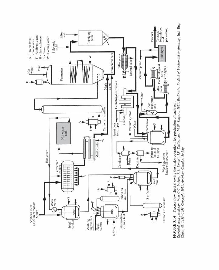
Figure 3.14 is a simplified process flow diagram showing the major operations for pro-duction of the antibiotic, bacitracin. This qualitative flow sheet indicates the flow of mate-rials, the sequence of process operations, and the principal equipment in use. When flowdiagrams are applied in calculations, the operating conditions, masses, and concentrationsof material handled by the process are also specified. An example is Figure 3.15, which
0.20
20
40
60
Ant
ibod
y co
ncen
trat
ion
(µg
ml–1
)
80
100
120
(a) (b)
0.4 0.6
Flow rate (l day–1)
0.8 1.0 1.2 10
10
20
Tota
l col
lage
n co
nten
t (µg
per
105 c
ells
)
30
40
50
2 3 4
Culture medium
FIGURE 3.13 (a) Error bars indicating the range of values for antibody concentration and medium flow ratemeasured during continuous culture of hybridoma cells. (b) Error bars indicating the standard error of the meancalculated from triplicate measurements of total collagen content in human tissue-engineered cartilage producedusing four different culture media. For each culture medium, the number of replicate measurements n5 3.
70 3. PRESENTATION AND ANALYSIS OF DATA
1. INTRODUCTION
Soyb
ean
mea
lC
alci
um c
arbo
nate
Star
ch
Seed
cook
er
Wat
erm
eter
Hot
wat
er
Hot
wat
erta
nk
Ferm
ente
rco
oker
Mas
h co
oler
Con
dens
er
Bri
ne
Con
cent
rato
r
Dec
ante
rW
ater
But
anol
Spen
t bee
rto
str
ippe
rC
entr
ifug
al e
xtra
ctor
sFi
lter
pres
s
Bul
k dr
yer
Filte
rpr
ess
Dis
card
cak
e
Vac
uum
pum
p
Prod
uct
Cha
r
Cha
rad
sorp
tion
tank
To a
ssay
form
ulat
ion
and
pack
agin
g
Bac
teri
olog
ical
filte
r(S
eitz
-typ
e)
Vac
uum
eje
ctor
Mas
hing
ingr
edie
nts
Flas
kcu
lture
Inte
rmed
iate
cultu
re ta
nk
S or
W
S or
W
F
A
A
H
H
S
SS
S
S
Mas
hSe
edFe
rmen
ted
beer
Ferm
ente
r
W
W
F
Ven
t
Hot
wat
er
Rec
eivi
ngta
nk
Sulp
huri
cac
id
Filte
rai
d
A
H
S
F
Car
bon
air
ster
ilise
r
Car
bon
air
ster
ilise
r
Car
bon
air
ster
ilise
r
Seed
tank
Wet
but
anol
toke
ttle-
still
rec
over
y
Wat
er to
buta
nol
stri
pper
H -
Hea
t exc
hang
er
W -
Coo
ling
wat
er
F -
Ant
ifoa
m a
gent
A -
Raw
air
fro
m
co
mpr
esso
rs
S -
Ste
am
FIG
URE3.14
Process
flow
sheetsh
owingthemajoroperationsforproductionofbacitracin.
Reprintedwithperm
ission
from
G.C.Inskeep,
R.E.Bennett,
J.F.Dudley,andM.W
.Shepard,19
51,Bacitracin:Produ
ctof
biochemical
engineering,
Ind.Eng.
Chem
.43
,14
88�1
498.
Copyright
1951,American
Chemical
Society.

Bee
r w
ell
Eth
anol
reco
very
675
gal
95%
eth
anol
Scre
enin
g
Wat
er
Pre
ssin
g
Hig
hw
ine
stor
age
Eth
anol
puri
fica
tion
Stea
m50
,000
lb
Stea
m60
,000
lb
Ferm
ente
d m
ash
Dio
l8,
910
2.32
1.55
6.47
5,94
024
,800
383,
500
Eth
anol
Solid
sTo
tal
375,
050
Tota
l
8,45
0To
tal
Wei
ght,
lb%
Slop
Dio
l8,
9025,
900 8
70.0
00.
10
2.38
0.86
5.75
6.61
3,22
021
,580
24,8
00
Inso
l. so
lids
Solu
ble
solid
sTo
tal s
olid
s
Wei
ght,
lb%
Hig
h w
ine
Wei
ght,
lb%
Filtr
ate
Wei
ght,
lb%
Wet
bra
nW
eigh
t, lb
%
Rec
tify
ing
sect
ion
Stea
m35
4,00
0 lb
170,
280
lb
214,
000
lbSt
eam
11,4
00 lb
Stri
ppin
gse
ctio
nSt
eam
347,
000
lbSt
eam
2,00
0 lb
Pur
ific
atio
nse
ctio
n
Stea
m5,
300
lb
49,0
00 lb
Stea
m11
8,00
0 lb
Dio
lE
than
ol
Dio
l8,
857
1.86
4.50
21,4
70So
lids
Tota
l
Tota
l
Dio
l
10,7
70
475,
280
450.
4229
.91.
0230
.9
3,22
011
03,
330
Inso
l. so
lids
Solu
ble
solid
sTo
tal s
olid
s
8,45
0To
tal
8,46
098
.0D
iol
Wei
ght,
lb%
Dio
l
Solid
s re
cycl
eW
eigh
t, lb
%D
iol
550
83.3 5
33So
lids
Tota
l66
0Pr
oduc
tW
eigh
t, lb
%D
iol
8,52
06.
64To
tal
128,
200
Dri
ed s
olub
les
Wei
ght,
lb%
Dio
l70
0.28
Wat
er3,
760
Tota
l25
,300
14.8
5
Syru
pW
eigh
t, lb
%D
iol
8,70
09.
56So
lids
21,4
70To
tal
91,0
0023
.6
Scre
enin
gsW
eigh
t, lb
%D
iol
868
2.19
8.15
5.41
3,22
0In
sol.s
olid
sSo
lubl
e so
lids
2,14
013
.56
Tota
l sol
ids
5,36
0To
tal
39,5
50
Scre
enin
gsW
eigh
t, lb
%D
iol
213
0.54
8.15
1.33
3,22
0In
sol.s
olid
sSo
lubl
e so
lids
525
9.48
Tota
l sol
ids
3,74
5To
tal
39,5
50D
ried
bra
nD
iol
350.
8985
.014
.16
3,33
055
53,
920
Solid
sW
ater
Tota
l
Wei
ght,
lb%
70,5
70 lb
111,
000
lb
Stea
m85
,600
lbWat
er97
,850
lbSt
eam
23,6
50 lb
FIG
URE3.15
Quan
titativeflow
sheetforthedownstream
processingof2,3-butaned
iolbased
onferm
entationof1000
bush
elsofwheatper
day
byAerobacilluspolymyxa.
From
J.A.Wheat,J.D.Leslie,R.V.Tom
kins,H.E.Mitton,D.S.Scott,andG.A.Ledingh
am,19
48,Produ
ctionandproperties
of2,3-bu
tanediol,XXVIII:Pilot
plant
recovery
oflevo-2,3-butanediolfrom
wholewheat
mashesferm
entedby
Aerobacilluspolymyxa,
Can
.J.Res.26
F,46
9�49
6.

represents the operations used to recover 2,3-butanediol produced by fermentation ofwhole wheat mash. The quantities and compositions of streams undergoing processessuch as distillation, evaporation, screening, and drying are shown to allow calculation ofproduct yields and energy costs.
Detailed engineering flow sheets such as Figure 3.16 are useful for plant constructionwork and troubleshooting because they show all piping, valves, drains, pumps, andsafety equipment. Standard symbols are adopted to convey the information as conciselyas possible. Figure 3.16 represents a pilot-scale fermenter with separate vessels forantifoam, acid, and alkali. All air, medium inlet, and harvest lines are shown, as arethe steam and condensate drainage lines for in situ steam sterilisation of the entireapparatus.
In addition to those illustrated here, other specialised types of flow diagram are usedto specify instrumentation for process control networks in large-scale processing plants,and for utilities such as steam, water, fuel, and air supplies. We will not be applyingcomplicated or detailed diagrams such as Figure 3.16 in our analysis of bioprocessing;their use is beyond the scope of this book. However, as simplified versions of flow dia-grams are extremely valuable, especially for material and energy balance calculations,we will be applying block-diagram flow sheets in Chapters 4 through 6 for this purpose.You should become familiar with flow diagrams for showing data and other processinformation.
SUMMARY OF CHAPTER 3
This chapter covers a range of topics related to data presentation and analysis. Afterstudying Chapter 3 you should:
• Understand use of significant figures• Know the types of error that affect the accuracy of experimental data, and which errors
can be accounted for using statistical techniques• Be able to report the results of replicate measurements in terms of the mean and standard
error• Understand the fundamental limitations associated with use of experimental data for
testing mathematical models• Be familiar with least-squares analysis and its assumptions• Be able to analyse linear plots and determine model parameters• Understand how simple nonlinear models can be linearised to obtain straight-line
plots;• Be able to use log and semi-log graph paper with ease• Be familiar with simple process flow diagrams
73SUMMARY OF CHAPTER 3
1. INTRODUCTION

Air
to a
dditi
onve
ssel
s
Stea
m f
rom
serv
ice
mod
ule
Con
dens
er c
oolin
gw
ater
sup
ply
Air
spa
rge
from
serv
ice
mod
ule
Jack
et w
ater
ret
urn
Stea
m to
jack
et
Air
to p
robe
hous
ing
Stea
m to
hea
tex
chan
ger
Jack
et w
ater
flo
w
Seal
res
ervo
irai
r su
pply
Dra
in
Dra
in
Med
iaad
ditio
n
Val
ve
Pres
sure
rel
ief
valu
e
Pres
sure
reg
ulat
or
Air
ope
rate
d va
lve
Pum
p
Air
elim
inat
or
Lig
ht/s
ight
gla
ss
Not
e: a
ll st
eam
trap
sgr
oupe
d at
man
ifol
d
Bal
l val
ve
Thr
ee w
ay v
alve
Reg
ulat
ing
valv
e
Non
-ret
urn
valv
e
Filte
r
Stea
m tr
ap
Dra
in
KE
Y
Con
dens
er
PI
PI
Cra
sh c
oolin
gad
ditio
n ve
ssel
s
Har
vest
out
Hea
tex
chan
ger
Seal
rese
rvoi
r
Sam
ple
Ferm
ente
rA
nti-
foam
Add
ition
vess
els
Alk
ali
Aci
d
TC
PIPI
PI
TI
Man
ual
flow
cont
rol
optio
n
Air
out
FIG
URE3.16
Detailedeq
uipmen
tdiagram
forpilot-plantferm
entationsystem
.Reprodu
cedwithperm
ission
from
LH
EngineeringLtd.,amem
berof
theInceltechGroupof
companies.Copyright
1983.

PROBLEMS
3.1 Combination of errors
The oxygen mass transfer coefficient in fermentation vessels is determined from
experimental measurements using the formula:
kLa5OTR
CAL� 2CAL
where kLa is the mass transfer coefficient, OTR is the oxygen transfer rate, C�AL is the
solubility of oxygen in the fermentation broth, and CAL is the dissolved oxygen
concentration. C�AL is estimated to be 0.25 mol m23 with an uncertainty of 64%; CAL is
measured as 0.183 mol m23 also with an uncertainty of 64%. If the OTR is 0.011 mol m23 s21
with an uncertainty of 65%, what is the maximum possible error associated with kLa?
3.2 Accuracy requirement
For cells growing in liquid medium, the overall biomass yield coefficient YXS can be
estimated as follows:
YXS 5xf 2 x0s0 2 sf
where xf is the final cell concentration, x0 is the initial cell concentration, s0 is the initial
substrate concentration, and sf is the final substrate concentration. For a particular cell
culture, s05 30 g l21, sf5 0.85 g l21, xf5 12.7 g l21, and x05 0.66 g l21. If the uncertainty
associated with the substrate concentration assay is 60.1 g l21, how accurate must the
measurements for cell concentration be if the maximum possible error in YXS must be less
than 5%?
3.3 Mean and standard error
The pH for maximum activity of β-amylase enzyme is measured six times. The results are
5.15, 5.25, 5.45, 5.20, 5.50, and 5.35.
(a) What is the best estimate of the optimal pH?
(b) How reliable is this value?
(c) If the experiment were stopped after only the first three measurements were taken,
what would be the result and its precision?
(d) If an additional six measurements were made with the same results as the previous
ones, how would this change the outcome of the experiment?
3.4 Confidence limits for the sample mean
Two years ago, you installed a foam control system on a fermenter used to culture
Hansenula polymorpha yeast. The control system is based on automatic addition of antifoam
agent in response to rising foam levels. Your boss tells you that, since installation, the
average consumption of antifoam agent per batch fermentation has been excessive at 2.9
litres. You decide to check her assertion by measuring the volume of antifoam used in each
of the next 10 fermentations over a period of three months. The results in litres are 1.4, 1.2,
4.1, 3.3, 2.6, 1.6, 1.4, 3.0, 2.0, and 1.1. Is 2.9 litres a reasonable representation of the volume
of antifoam consumed in this fermentation? Explain your answer.
75PROBLEMS
1. INTRODUCTION

3.5 Measurement accuracy
The accuracy of two steam-sterilisable dissolved oxygen probes is tested. The probes are
calibrated, autoclaved, and then used to measure the oxygen level in a solution sparged with
gas and known to have a dissolved oxygen tension of 50% air saturation. This procedure is
carried out five times for each probe. The results are shown in the following table.
% air saturation
Probe 1 51.7 52.6 52.9 49.5 50.2
Probe 2 49.0 48.9 50.1 53.3 53.6
(a) Calculate the sample mean, standard deviation, and standard error for each probe.
(b) Which probe exhibits the greater degree of measurement scatter? Explain your answer.
(c) Which probe is more accurate? Explain your answer.
3.6 Linear and nonlinear models
Determine the equation for y as a function of x using the following information. Reference
to coordinate point (x, y) means that x is the abscissa value and y is the ordinate value.
(a) A plot of y versus x on linear graph paper gives a straight line passing through the
points (1, 10) and (8, 0.5).
(b) A plot of y versus x1/2 on linear graph paper gives a straight line passing through the
points (3.2, 14.5) and (8.9, 38.5).
(c) A plot of 1/y versus x2 on linear graph paper gives a straight line passing through the
points (5, 6) and (1, 3).
(d) A plot of y versus x on log�log paper gives a straight line passing through (0.5, 25) and
(550, 2600).
(e) A plot of y versus x on semi-log paper gives a straight line passing through (1.5, 2.5)
and (10, 0.036).
3.7 Calibration curve
Sucrose concentration in a fermentation broth is measured using high-performance liquid
chromatography (HPLC). Chromatogram peak areas are measured for five standard
sucrose solutions to calibrate the instrument. Measurements are performed in triplicate
with results as shown in the following table.
Sucrose concentration (g l21) Peak area
6.0 55.55, 57.01, 57.95
12.0 110.66, 114.76, 113.05
18.0 168.90, 169.44, 173.55
24.0 233.66, 233.89, 230.67
30.0 300.45, 304.56, 301.11
(a) Determine the mean peak areas for each sucrose concentration, and the standard errors.
(b) Plot the calibration curve relating peak area to sucrose concentration. Plot the standard
errors as error bars.
76 3. PRESENTATION AND ANALYSIS OF DATA
1. INTRODUCTION

(c) Find an equation for sucrose concentration as a function of peak area.
(d) A sample containing sucrose gives a peak area of 209.86. What is the sucrose concentration?
3.8 Linear-range calibration
An enzyme-linked immunosorbent assay (ELISA) is being developed for measurement
of virus concentration in samples of homogenised biomass. Absorbance is measured using
a spectrophotometer for a dilution series across a range of virus concentrations. The results
are as follows.
Virus concentration (ng ml21) Absorbance
6.0 2.88
3.0 2.52
1.5 2.22
0.75 2.07
0.38 1.65
0.29 1.35
(a) Within what range of virus concentration is there a linear relationship between virus
concentration and absorbance?
(b) Develop an equation for virus concentration as a function of absorbance within the
linear range.
(c) Three culture samples give absorbance readings of 2.02, 2.66, and 2.75. What
concentrations of virus are present?
(d) In which results from (c) do you have the most confidence? Why?
3.9 Data correlation
The density of a liquid is sometimes expressed as a function of temperature in the
following way:
ρ5 ρ0 1A ðT2T0Þwhere ρ is the density at temperature T, ρ0 is the density at temperature T0, and A is a
constant. The following density data are obtained as a function of temperature.
Temperature (�C) Liquid density (g cm23)
0.0 0.665
5.0 0.668
10.0 0.672
15.0 0.673
25.0 0.677
30.0 0.684
Estimate A.
3.10 Linear regression: distribution of residuals
Medium conductivity is sometimes used to monitor cell growth during batch culture.
Experiments are carried out to relate the decrease in medium conductivity to the increase in
77PROBLEMS
1. INTRODUCTION

plant cell biomass during culture of Catharanthus roseus in an airlift fermenter. The results
are tabulated in the following table.
Decrease in medium
conductivity (mS cm21)
Increase in biomass
concentration (g l21)
0 0
0.12 2.4
0.31 2.0
0.41 2.8
0.82 4.5
1.03 5.1
1.40 5.8
1.91 6.0
2.11 6.2
2.42 6.2
2.44 6.2
2.74 6.6
2.91 6.0
3.53 7.0
4.39 9.8
5.21 14.0
5.24 12.6
5.55 14.6
(a) Plot the points using linear coordinates and obtain an equation for the ‘best’ straight
line through the data using linear least-squares analysis.
(b) Plot the residuals in biomass increase versus decrease in conductivity after comparing
the model equation with the actual data. What do you conclude about the goodness of
fit for the straight line?
3.11 Nonlinear model: calculation of parameters
The mutation rate of E. coli increases with temperature. The following data were obtained
by measuring the frequency of mutation of his2 cells to produce his1 colonies.
Temperature (�C) Relative mutation frequency, α
15 4.43 10215
20 2.03 10214
25 8.63 10214
30 3.53 10213
35 1.43 10212
78 3. PRESENTATION AND ANALYSIS OF DATA
1. INTRODUCTION

Mutation frequency is expected to obey an Arrhenius-type equation:
α5α0 e2E=RT
where α0 is the mutation rate parameter, E is activation energy, R is the ideal gas constant,
and T is absolute temperature.
(a) Test the model using an appropriate plot with logarithmic coordinates.
(b) What is the activation energy for the mutation reaction?
(c) What is the value of α0?
3.12 Nonlinear kinetics
A new enzyme has been discovered in bacteria isolated from the Great Southern Ocean
near Antarctica. Your research group has been given the task of characterising the enzyme
reaction, which converts krilliol to krilloene. Experiments are conducted using a krilliol
solution at the optimal reaction temperature of 4�C. Data for krilliol concentration as a
function of time are as follows.
Time (min) Krilliol concentration (g l21)
0 1.50
0.2 1.35
0.5 0.90
1.0 0.75
2.0 0.27
You suspect that the reaction follows first-order kinetics according to the relationship:
s5 s0e2kt
where s is the reactant concentration, s0 is the initial reactant concentration, k is the rate
constant, and t is time.
(a) Test the model using an appropriate plot.
(b) Determine the rate constant, k.
(c) How long will it take for the krilliol concentration to reach 0.05 g l21? How confident
are you about this result?
3.13 Nonlinear data correlation
Saccharomyces cerevisiae cells are homogenised to release recombinant hepatitis B surface
antigen for vaccine production. During homogenisation, fractional protein release is
predicted to follow the equation:
12Sp 5 e2kt
where Sp is the fractional protein release, k is a constant dependent on the operating
pressure of the homogeniser, and t is time. At a fixed pressure, the following data are
obtained.
79PROBLEMS
1. INTRODUCTION

Time (s) Fractional protein release (2)
20 0.25
30 0.31
60 0.62
90 0.75
120 0.79
150 0.88
(a) Is the predicted model a reasonable one for this system?
(b) What is the value of k?
(c) What time is required to release 50% of the protein?
(d) What time is required to release 95% of the protein? How good is your answer?
3.14 Discriminating between rival models
In bioreactors where the liquid contents are mixed by sparging air into the vessel, the liquid
velocity is directly dependent on the gas velocity. The following results were obtained from
experiments with 0.15 M NaCl solution.
Gas superficial
velocity, uG (m s21)
Liquid superficial
velocity, uL (m s21)
0.02 0.060
0.03 0.066
0.04 0.071
0.05 0.084
0.06 0.085
0.07 0.086
0.08 0.091
0.09 0.095
0.095 0.095
(a) How well are these data fitted with a linear model? Determine the equation for the
‘best’ straight line relating gas and liquid velocities.
(b) It has been reported in the literature that fluid velocities in air-driven reactors can be
related using the power equation:
uL 5αuvG
where α and v are constants. Is this model an appropriate description of the
experimental data?
(c) Which equation, linear or nonlinear, is the better model for the reactor system? Explain
your answer.
80 3. PRESENTATION AND ANALYSIS OF DATA
1. INTRODUCTION

3.15 Nonlinear model: calculation of parameters
When nutrient medium is autoclaved, the number of viable microorganisms decreases
with time spent in the autoclave. An experiment is conducted to measure the number of
viable cells N in a bottle of glucose solution after various sterilisation times t. Triplicate
measurements are taken of the cell number; the mean and standard error of each
measurement are listed in the following table.
t (min) Mean N Standard error
5 3.63 103 0.203 103
10 6.33 102 13 102
15 1.073 102 0.43 102
20 1.83 101 0.53 101
30 ,1 2
From what is known about thermal death kinetics for microorganisms, it is expected that
the relationship between N and t is of the form:
N5N0 e2kdt
where kd is the specific death constant and N0 is the number of viable cells present before
autoclaving begins.
(a) Plot the results in a suitable form to obtain a straight line through the data.
(b) Plot the standard errors on the graph as error bars.
(c) What are the values of kd and N0?
(d) What are the units and dimensions of kd and N0?
3.16 Nonlinear model
Adsorption of cadmium by brown marine macroalgae is being measured for
bioremediation of industrial effluent. Experiments are carried out to measure the
concentration of Cd adsorbed by the biomass as a function of the residual Cd concentration
in the effluent solution. The equilibrium values of these concentrations are as follows.
Residual liquid-phase Cd
concentration (ppm)
Biomass Cd concentration
(µg g21 dry weight)
20 614
50 1360
100 3590
200 8890
500 10,500
1000 15,600
2000 19,700
3500 22,800
81PROBLEMS
1. INTRODUCTION

The adsorption data are expected to obey a Langmuir model:
C�AS 5
CASm KA C�A
11KAC�A
where C�AS is the biomass Cd concentration, CASm is the maximum biomass Cd
concentration corresponding to complete monolayer coverage of all available adsorption
sites, C�A is the residual Cd concentration in the liquid, and KA is a constant.
(a) Plot the results in a suitable linearised form using linear coordinates.
(b) What are the values of KA and CASm?
(c) What are the units and dimensions of KA and CASm?
(d) Five thousand litres of waste water containing 120 ppm Cd are treated using algal
biomass in an adsorption column. If the Cd concentration must be reduced to at least
25 ppm by the end of the process, what quantity of algae is required?
References
[1] J.R. Taylor, Introduction to Error Analysis, second ed., University Science Books, 1997.[2] B.S. Massey, Measures in Science and Engineering, Ellis Horwood, 1986.[3] W. Lichten, Data and Error Analysis in the Introductory Physics Laboratory, Allyn and Bacon, 1988.[4] M.L. Samuels, J.A. Witmer, A. Schaffner, Statistics for the Life Sciences, fourth ed., Addison-Wesley, 2011.[5] A. Graham, Statistics: An Introduction, Hodder and Stoughton, 1995.[6] T.W. Anderson, J.D. Finn, The New Statistical Analysis of Data, Springer, 1995.[7] N.C. Barford, Experimental Measurements: Precision, Error and Truth, second ed., Wiley, 1985.[8] R.E. Walpole, R.H. Myers, S.L. Myers, K.E. Ye, Probability and Statistics for Engineers and Scientists, ninth
ed., Prentice Hall, 2011.[9] K.R. Popper, The Logic of Scientific Discovery, Routledge, 2002.[10] K.R. Popper, Conjectures and Refutations: The Growth of Scientific Knowledge, fifth ed., Routledge, 2002.[11] N.R. Draper, H. Smith, Applied Regression Analysis, third ed., Wiley, 1998.[12] D.C. Baird, Experimentation: An Introduction to Measurement Theory and Experiment Design, third ed.,
Benjamin Cummings, 1994.
Suggestions for Further Reading
Errors in Measured DataSee references [1] through [3], [7], and [12].
Statistical Analysis of Data
See also references [4], [6] through [8], and [11].Armitage, P., Berry, G., & Matthews, J. N. S. (2002). Statistical Methods in Medical Research (4th ed.). Blackwell
Science.Dowd, J. E., & Riggs, D. S. (1965). A comparison of estimates of Michaelis�Menten kinetic constants from various
linear transformations. J. Biol. Chem., 240, 863�869.Garfinkel, D., & Fegley, K. A. (1984). Fitting physiological models to data. Am. J. Physiol., 246, R641�R650.
82 3. PRESENTATION AND ANALYSIS OF DATA
1. INTRODUCTION
Mannervik, B. (1982). Regression analysis, experimental error, and statistical criteria in the design and analysis ofexperiments for discrimination between rival kinetic models. Methods Enzymology, 87, 370�390.
Sagnella, G. A. (1985). Model fitting, parameter estimation, linear and nonlinear regression. Trends Biochem. Sci.,10, 100�103.
Wardlaw, A. C. (2000). Practical Statistics for Experimental Biologists (2nd ed.). Wiley.Zar, J. H. (2010). Biostatistical Analysis (5th ed.). Prentice Hall.
Process Flow DiagramsSinnott, R. K. (2005). Coulson and Richardson’s Chemical Engineering, vol. 6: Chemical Engineering Design (4th ed.,
Chapters 4 and 5). Elsevier.
83REFERENCES
1. INTRODUCTION
Related Documents