Preparations for My Music Magazine The masthead Is the start in creating a magazine it’s the magazines identity, it’s what makes the magazine has it’s own identity but a matter of fact they all have a very similar idea, most have the same colorations such as blacks, reds and white to make it stand out. The name The name of the magazine is very important the examples above are some examples of names they all short, simple but very affective. As I am going to make a rock magazine it needs the same strong, effective but short masthead. It needs a name like; flame/ rock chick/ rock it/ silent hell/ slasha/ amplified/ buttons and switches/ revolt/ lightning/ black widow/ rock biter/ Now I have to decide what one to pick as it must not be to long, irrelevant to my genre and must be catchy. I have decided to choose, rock chick Ideas of Fonts With the name of the magazine I can start to think about the font of the magazine with the examples above it shows destruction and rebellion with ‘kerrang’ which is for a younger audience rather then with ‘Q’ which is for an alder audience. My audience is for a younger audience so I have to consider the design as well as the font. I found ideas from www.dafont.com a useful website to gather fonts from. I found many examples which are below. In my research I have come to a decision that the title has to be bold and in my research all the mastheads are in colours reds, blacks and whites and as my magazine is going to be a rock magazine it is going to be black using the theme of classic rock. Examples followed show

My Music Magazine Introduction
Mar 09, 2016
An introduction to me starting my music magazine
Welcome message from author
This document is posted to help you gain knowledge. Please leave a comment to let me know what you think about it! Share it to your friends and learn new things together.
Transcript
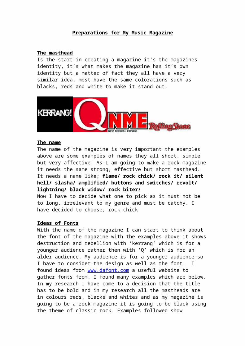
Preparations for My Music Magazine
The masthead Is the start in creating a magazine it’s the magazines identity, it’s what makes the magazine has it’s own identity but a matter of fact they all have a very similar idea, most have the same colorations such as blacks, reds and white to make it stand out.
The nameThe name of the magazine is very important the examples above are some examples of names they all short, simple but very affective. As I am going to make a rock magazine it needs the same strong, effective but short masthead. It needs a name like; flame/ rock chick/ rock it/ silent hell/ slasha/ amplified/ buttons and switches/ revolt/ lightning/ black widow/ rock biter/ Now I have to decide what one to pick as it must not be to long, irrelevant to my genre and must be catchy. I have decided to choose, rock chick
Ideas of FontsWith the name of the magazine I can start to think about the font of the magazine with the examples above it shows destruction and rebellion with ‘kerrang’ which is for a younger audience rather then with ‘Q’ which is for an alder audience. My audience is for a younger audience so I have to consider the design as well as the font. I found ideas from www.dafont.com a useful website to gather fonts from. I found many examples which are below. In my research I have come to a decision that the title has to be bold and in my research all the mastheads are in colours reds, blacks and whites and as my magazine is going to be a rock magazine it is going to be black using the theme of classic rock. Examples followed show possible ideas what to include them are all very different and similar at the same time, using my research I have found that the association with rebellion and disruption is a good idea, my own idea is an artistic way but that shows rebellion at the same time, the examples below show possible candidates for my magazine:
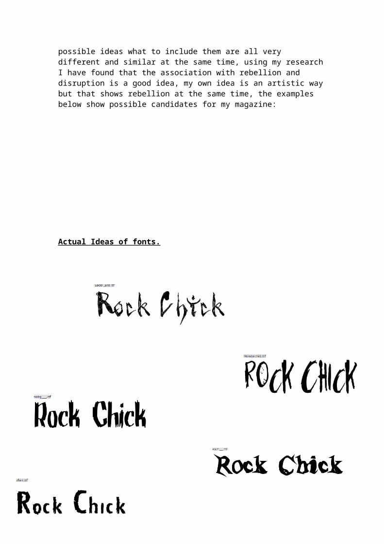
Actual Ideas of fonts.
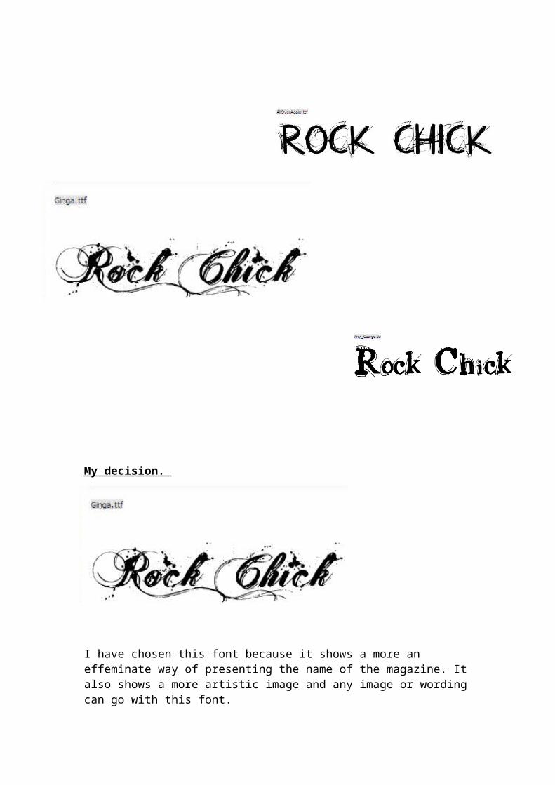
My decision.
I have chosen this font because it shows a more an effeminate way of presenting the name of the magazine. It also shows a more artistic image and any image or wording can go with this font.
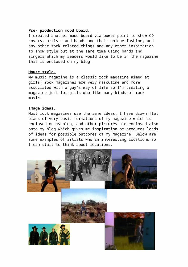
Pre- production mood board.I created another mood board via power point to show CD covers, artists and bands and their unique fashion, and any other rock related things and any other inspiration to show style but at the same time using bands and singers which my readers would like to be in the magazine this is enclosed on my blog.
House style.My music magazine is a classic rock magazine aimed at girls; rock magazines are very masculine and more associated with a guy’s way of life so I’m creating a magazine just for girls who like many kinds of rock music.
Image ideas.Most rock magazines use the same ideas, I have drawn flat plans of very basic formations of my magazine which is enclosed on my blog, and other pictures are enclosed also onto my blog which gives me inspiration or produces loads of ideas for possible outcomes of my magazine. Below are some examples of artists who in interesting locations so I can start to think about locations.
Related Documents