Contents Page Research By Paida Mapfeka 12O A Level Media

Music Magazine Contents Page Research
Jul 29, 2015
Welcome message from author
This document is posted to help you gain knowledge. Please leave a comment to let me know what you think about it! Share it to your friends and learn new things together.
Transcript
Contents Page
Research
By Paida Mapfeka 12O
A Level Media
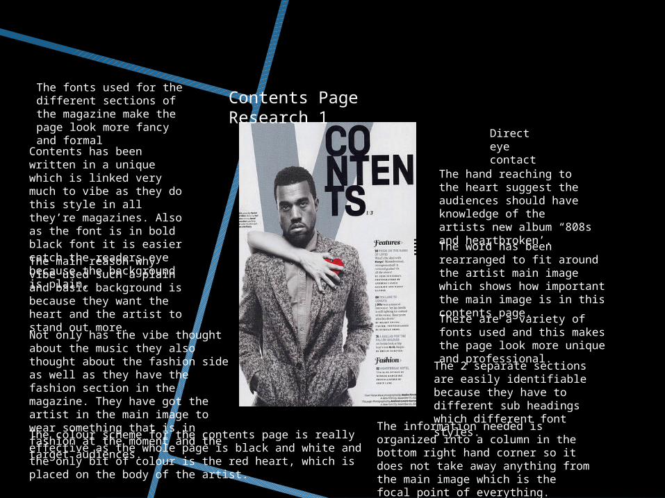
The colour scheme for the contents page is really effective as the whole page is black and white and the only bit of colour is the red heart, which is placed on the body of the artist.
Contents has been written in a unique which is linked very much to vibe as they do this style in all they’re magazines. Also as the font is in bold black font it is easier catch the readers eye because the background is plain,The main reason why vibe used such a plain and basic background is because they want the heart and the artist to stand out more.Not only has the vibe thought about the music they also thought about the fashion side as well as they have the fashion section in the magazine. They have got the artist in the main image to wear something that is in fashion at the moment and the target audiences.
The fonts used for the different sections of the magazine make the page look more fancy and formal
There are a variety of fonts used and this makes the page look more unique and professional.
Direct eye contact
The word has been rearranged to fit around the artist main image which shows how important the main image is in this contents page.
The 2 separate sections are easily identifiable because they have to different sub headings which different font styles.
The information needed is organized into a column in the bottom right hand corner so it does not take away anything from the main image which is the focal point of everything.
The hand reaching to the heart suggest the audiences should have knowledge of the artists new album “808s and heartbroken’.
Contents Page Research 1

The masthead for the contents page is in white, which makes it stand out and catch the attention of the reader.
There is page numbers and small features with short cover lines, explain what the feature is about.
The contents page is split into 2 sections features and fashion. This is done because the magazine is split into 2 sections and makes the magazine easier to navigate for the reader. This is done because the reader is probably only interested in aspect of the magazine and not the other.Direct eye contact
The white outline of a ‘V’ in the background connects to the shape of the models legs, which are shaped in a ‘V’
The background sticks to plain and basic colours so that the model and the text stand out as the main part of the contents page.
The model in the main image of this contents page is wearing very sexy clothing and is hold a sexy pose with both body language and facial expressions, Also the fact she is wearing silver and gold reflect on both the model and the magazine as being for the upper class.
The fact that the model is wearing heels in the magazine could connect to the fashion side of the magazine.
Contents Page Research 2
The lighting on the ,aim image makes the model look like she is glowing .this could imply a sort of innocents about Ciara but on the other hand she is posing in a very flirty way which could make her look like a tease or like she is playing hard to get with the camera.
The letters are rearranged to suit the main image of the model which could show the importance of the main image.

Contents Page Research 3
In the top left hand corner of the magazine, this are the features of the magazine and the bit underneath is the contents of the magazine which is split up clearly by the difference in font and font size.
Vibe masthead is in the corner and shows the date of issue underneath it. this keeps the cover look professional and tidy.
The background is red and it contrasts the writing and main image, and makes it stand it and it looks more attractive.
The unusual layout of the word ‘contents’ shows individuality and this is shown in most of the vibe magazine and this is kind of the a signature of vibe magazines.
The model is pictured topless, showing his tattoos he is wearing a variety of ‘bling’ pieces of jewelry, and a baseball cap worn the wrong way. All these aspects represent and promote youth culture and and wealth. The head at the end of the chain, represent anger it is not taken to be a appealing picture rather one of breaking usual social constraints.
The deep red and burgundy color could be representing passion and it also compliments the skin color of the artist really well, This creates a modern contemporary feel.
The column inch on the left has a simple lay out separate into two categories headings are different font style which makes it clearly identifiable.
The overall layout is fairly balanced, heavily focused in the main image with everything else being placed around it , showing the important of the main image of this main image.
They incorporated the magazine logo into the background works in promoting the the identity of the brand helping to put together everything the page and making it flow better.
The logo in the top right corner links to the magazine and also has the date and issue number.
SU
MM
ARY
While researching the
contents page I figured out that you had to keep it plain simple at to the point,
possible linked to the
front cover if possible.
Making it clear and separate every piece
of information.
Related Documents