MUSIC MAGAZINE CONTENTS PAGE ANALYSIS ALIYAH RAOOF

Music Magazine Contents Page Analysis
Jul 24, 2015
Welcome message from author
This document is posted to help you gain knowledge. Please leave a comment to let me know what you think about it! Share it to your friends and learn new things together.
Transcript
MUSIC MAGAZINECONTENTS PAGE
ANALYSISALIYAH RAOOF
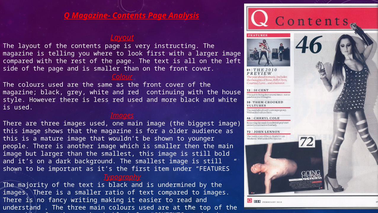
Q Magazine- Contents Page Analysis
LayoutThe layout of the contents page is very instructing. The magazine is telling you where to look first with a larger image compared with the rest of the page. The text is all on the left side of the page and is smaller than on the front cover.
ColourThe colours used are the same as the front cover of the magazine; black, grey, white and red continuing with the house style. However there is less red used and more black and white is used.
ImagesThere are three images used, one main image (the biggest image) this image shows that the magazine is for a older audience as this is a mature image that wouldn’t be shown to younger people. There is another image which is smaller then the main image but larger than the smallest, this image is still bold and it’s on a dark background. The smallest image is still shown to be important as it’s the first item under “FEATURES”
TypographyThe majority of the text is black and is undermined by the images. There is a smaller ratio of text compared to images. There is no fancy writing making it easier to read and understand . The three main colours used are at the top of the page white for the masthead, black for “CONTENTS” and red as the back ground.
Top of the Pops Magazine- Contents Page Analysis
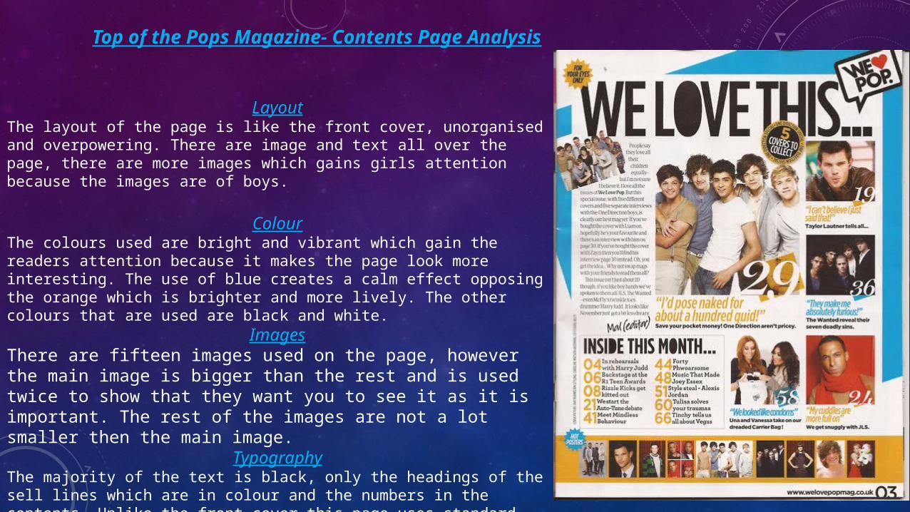
LayoutThe layout of the page is like the front cover, unorganised and overpowering. There are image and text all over the page, there are more images which gains girls attention because the images are of boys.
ColourThe colours used are bright and vibrant which gain the readers attention because it makes the page look more interesting. The use of blue creates a calm effect opposing the orange which is brighter and more lively. The other colours that are used are black and white.
ImagesThere are fifteen images used on the page, however the main image is bigger than the rest and is used twice to show that they want you to see it as it is important. The rest of the images are not a lot smaller then the main image.
TypographyThe majority of the text is black, only the headings of the sell lines which are in colour and the numbers in the contents. Unlike the front cover this page uses standard font which is easier to read and there is no use of complex language to suit a younger audience.
NME Magazine-Contents Page Analysis
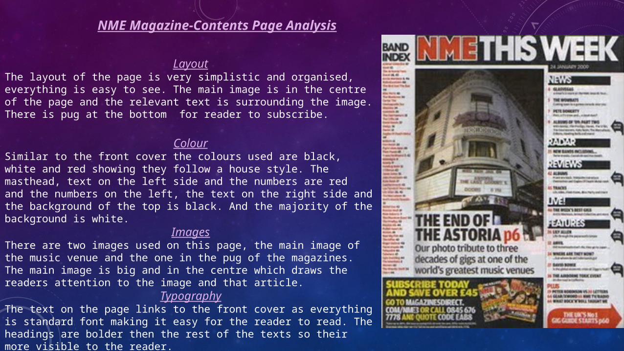
LayoutThe layout of the page is very simplistic and organised, everything is easy to see. The main image is in the centre of the page and the relevant text is surrounding the image. There is pug at the bottom for reader to subscribe.
ColourSimilar to the front cover the colours used are black, white and red showing they follow a house style. The masthead, text on the left side and the numbers are red and the numbers on the left, the text on the right side and the background of the top is black. And the majority of the background is white.
ImagesThere are two images used on this page, the main image of the music venue and the one in the pug of the magazines. The main image is big and in the centre which draws the readers attention to the image and that article.
TypographyThe text on the page links to the front cover as everything is standard font making it easy for the reader to read. The headings are bolder then the rest of the texts so their more visible to the reader.
Vibe Magazine-Contents Page Analysis
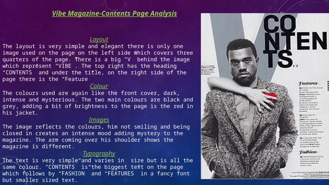
LayoutThe layout is very simple and elegant there is only one image used on the page on the left side which covers three quarters of the page. There is a big “V” behind the image which represent “VIBE”. The top right has the heading “CONTENTS” and under the title, on the right side of the page there is the “Feature”
ColourThe colours used are again like the front cover, dark, intense and mysterious. The two main colours are black and grey, adding a bit of brightness to the page is the red in his jacket.
ImagesThe image reflects the colours, him not smiling and being closed in creates an intense mood adding mystery to the magazine. The arm coming over his shoulder shows the magazine is different.
TypographyThe text is very simple and varies in size but is all the same colour. “CONTENTS” is the biggest text on the page which follows by “FASHION” and “FEATURES” in a fancy font but smaller sized text.
Flavour Magazine-Contents Page Analysis
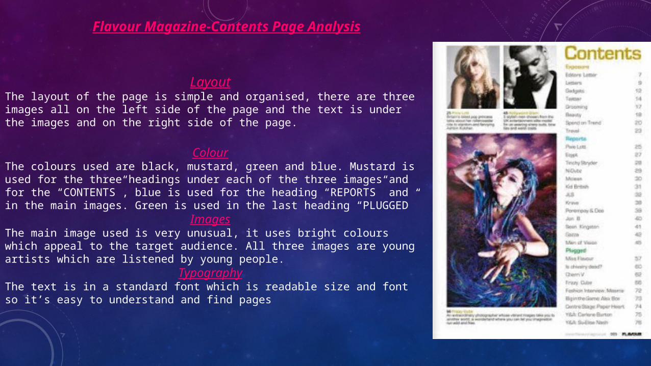
LayoutThe layout of the page is simple and organised, there are three images all on the left side of the page and the text is under the images and on the right side of the page.
ColourThe colours used are black, mustard, green and blue. Mustard is used for the three headings under each of the three images and for the “CONTENTS”, blue is used for the heading “REPORTS” and in the main images. Green is used in the last heading “PLUGGED”
ImagesThe main image used is very unusual, it uses bright colours which appeal to the target audience. All three images are young artists which are listened by young people.
TypographyThe text is in a standard font which is readable size and font so it’s easy to understand and find pages
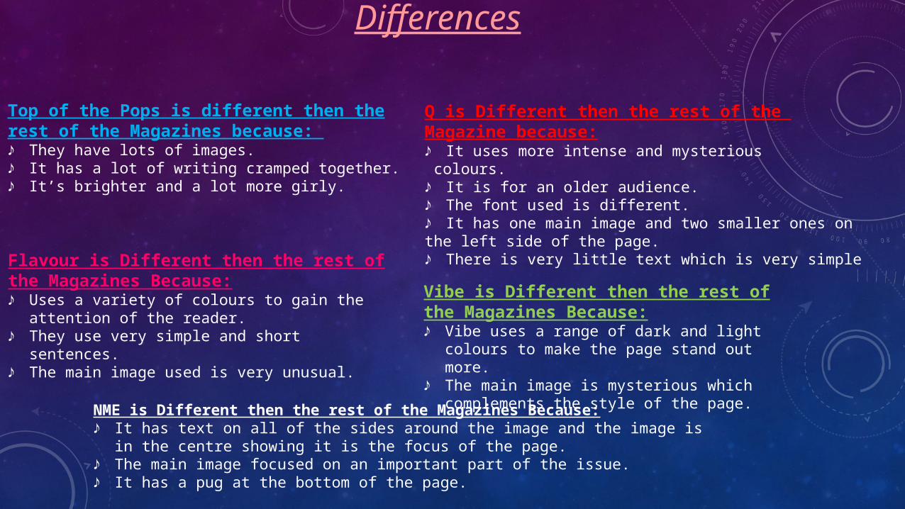
Differences
Top of the Pops is different then the rest of the Magazines because: ♪ They have lots of images.♪ It has a lot of writing cramped together.♪ It’s brighter and a lot more girly.
Q is Different then the rest of the Magazine because:♪ It uses more intense and mysterious colours.♪ It is for an older audience.♪ The font used is different. ♪ It has one main image and two smaller ones on the left side of the page.♪ There is very little text which is very simple
NME is Different then the rest of the Magazines Because:♪ It has text on all of the sides around the image and the image is in the centre
showing it is the focus of the page.♪ The main image focused on an important part of the issue.♪ It has a pug at the bottom of the page.
Vibe is Different then the rest of the Magazines Because:♪ Vibe uses a range of dark and light colours to
make the page stand out more.♪ The main image is mysterious which
complements the style of the page.
Flavour is Different then the rest of the Magazines Because:♪ Uses a variety of colours to gain the attention
of the reader.♪ They use very simple and short sentences.♪ The main image used is very unusual.
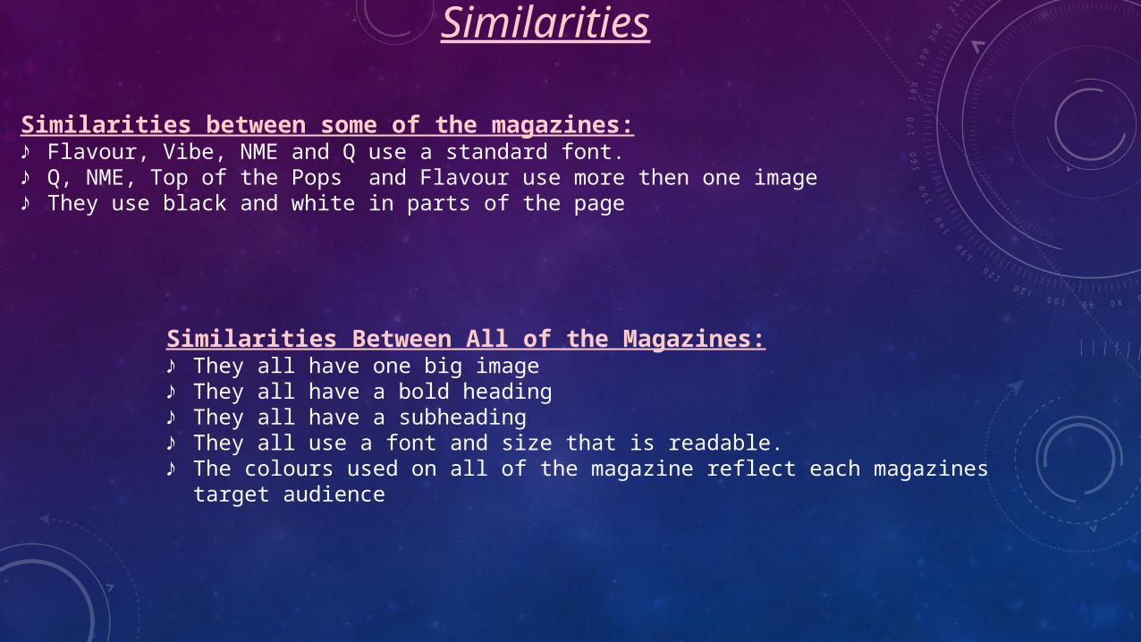
Similarities Between All of the Magazines:♪ They all have one big image♪ They all have a bold heading♪ They all have a subheading♪ They all use a font and size that is readable.♪ The colours used on all of the magazine reflect each magazines target
audience
Similarities between some of the magazines:♪ Flavour, Vibe, NME and Q use a standard font. ♪ Q, NME, Top of the Pops and Flavour use more then one image♪ They use black and white in parts of the page
Similarities
Related Documents