Multimedia object types I: TEXT ISMT Multimedia Dr Vojislav B Mišić

Welcome message from author
This document is posted to help you gain knowledge. Please leave a comment to let me know what you think about it! Share it to your friends and learn new things together.
Transcript
Multimedia object types I:TEXT
ISMT MultimediaDr Vojislav B Mišić
ISMT multimedia Lecture 02 / slide 2 © 2002 Dr Vojislav B Mišić
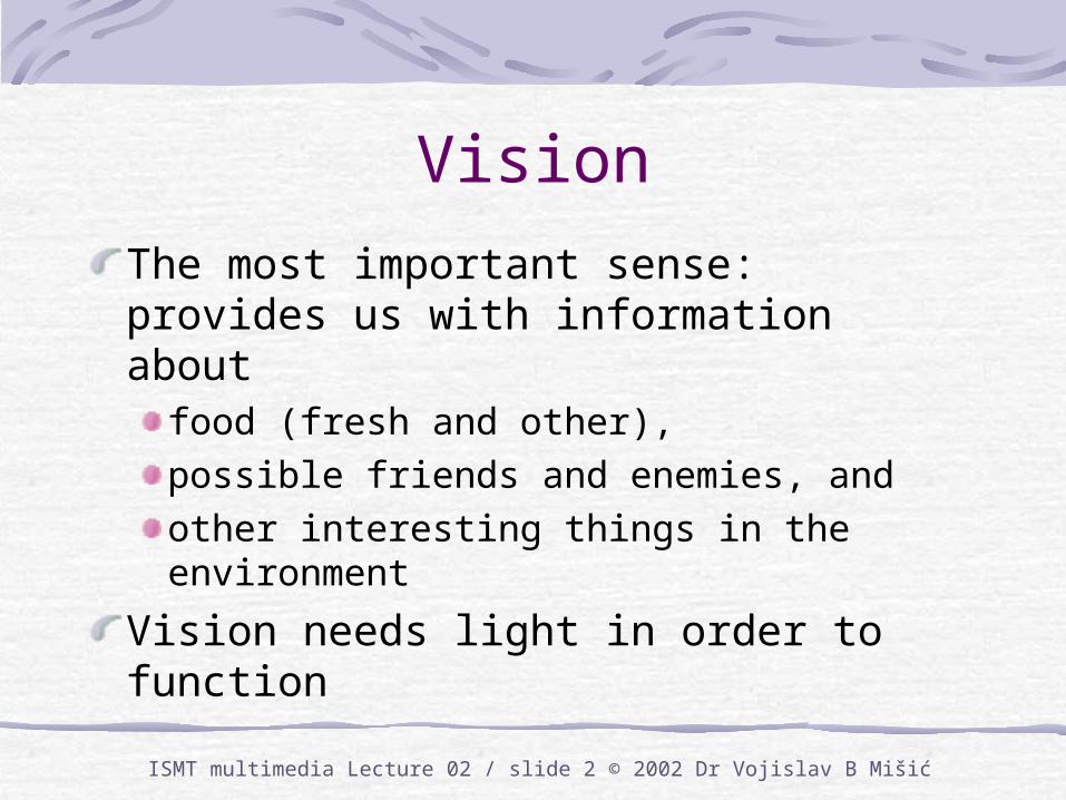
Vision
The most important sense: provides us with information about
food (fresh and other), possible friends and enemies, and other interesting things in the environment
Vision needs light in order to function
ISMT multimedia Lecture 02 / slide 3 © 2002 Dr Vojislav B Mišić
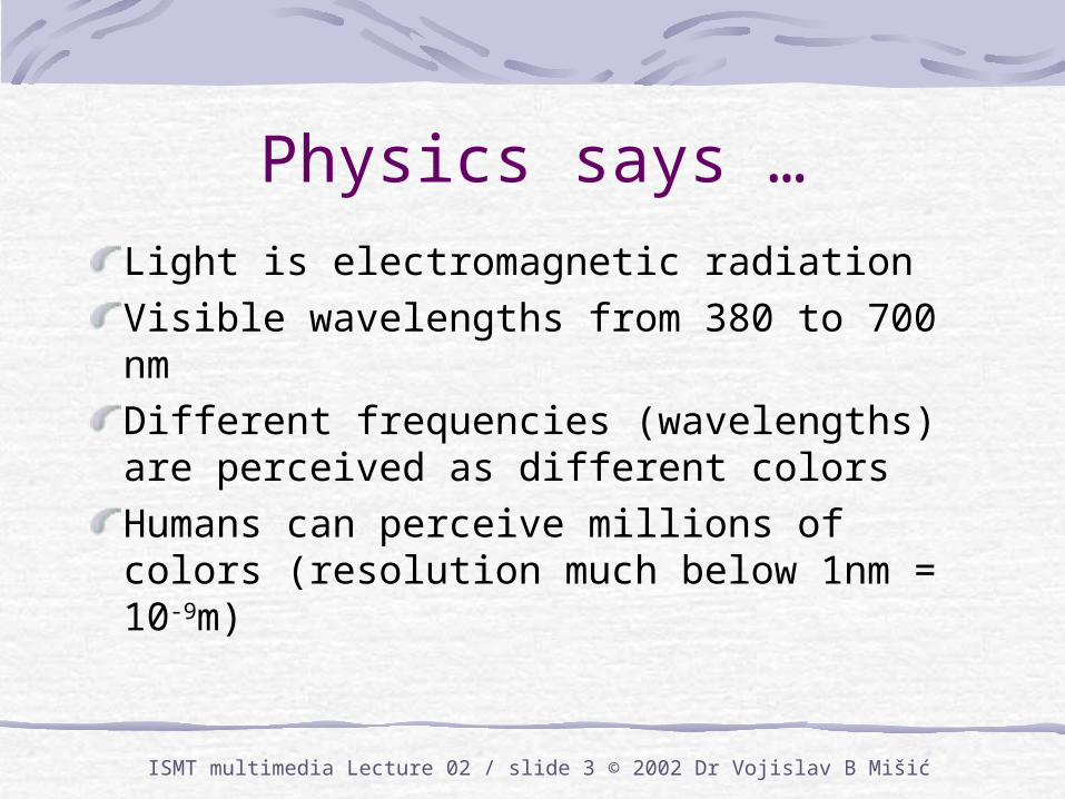
Physics says …
Light is electromagnetic radiationVisible wavelengths from 380 to 700 nmDifferent frequencies (wavelengths) are perceived as different colorsHumans can perceive millions of colors (resolution much below 1nm = 10-9m)
ISMT multimedia Lecture 02 / slide 4 © 2002 Dr Vojislav B Mišić
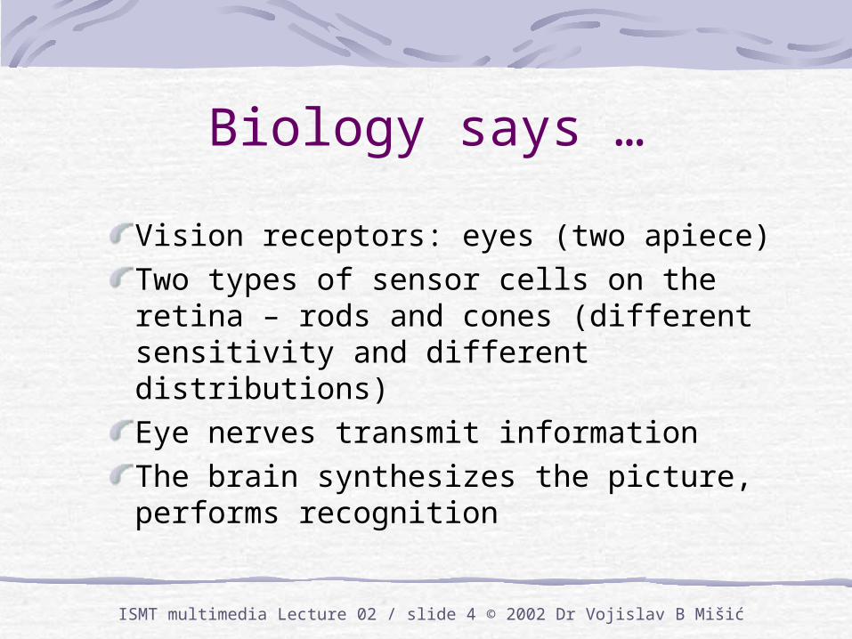
Biology says …
Vision receptors: eyes (two apiece)Two types of sensor cells on the retina – rods and cones (different sensitivity and different distributions)Eye nerves transmit informationThe brain synthesizes the picture, performs recognition
ISMT multimedia Lecture 02 / slide 5 © 2002 Dr Vojislav B Mišić
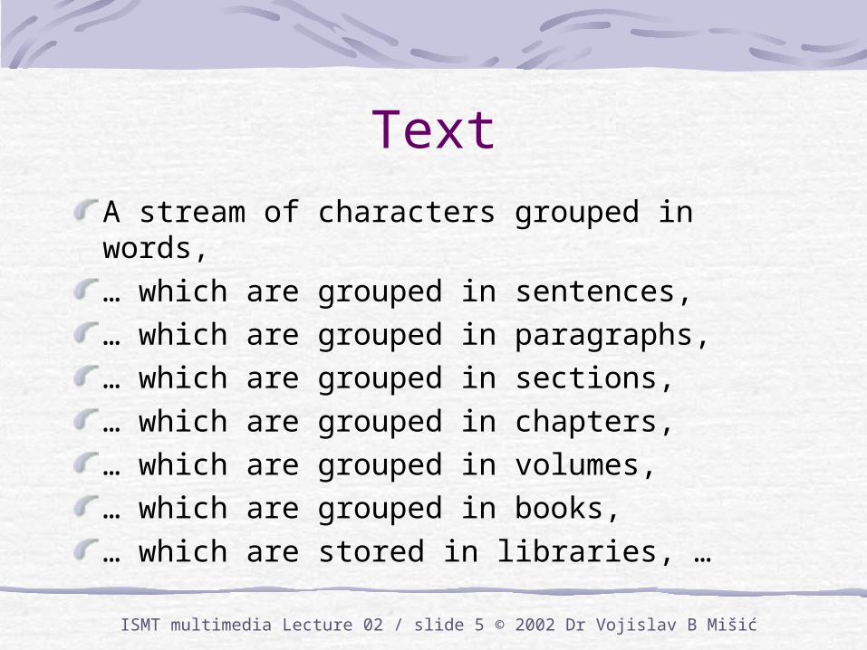
Text
A stream of characters grouped in words,… which are grouped in sentences, … which are grouped in paragraphs, … which are grouped in sections, … which are grouped in chapters, … which are grouped in volumes, … which are grouped in books, … which are stored in libraries, …
ISMT multimedia Lecture 02 / slide 6 © 2002 Dr Vojislav B Mišić
Text is linear and deferredText is an inherently linear mediumIdeas are communicated word by word, sentence by sentence, …The (literal) meaning of a block of text is revealed at the end, or somewhere near itText perception is again of a multilevel type: other interpretations (=meanings) can be present, to become obvious later (or never)
ISMT multimedia Lecture 02 / slide 7 © 2002 Dr Vojislav B Mišić
Text characteristicsIdeal for describing abstract phenomena, such as feelingsRelatively independent of the rendering qualityAble to support other media objects
by providing explanations or cluesby reinforcing their meaning and messages
Usually redundant; can tolerate some loss
ISMT multimedia Lecture 02 / slide 8 © 2002 Dr Vojislav B Mišić
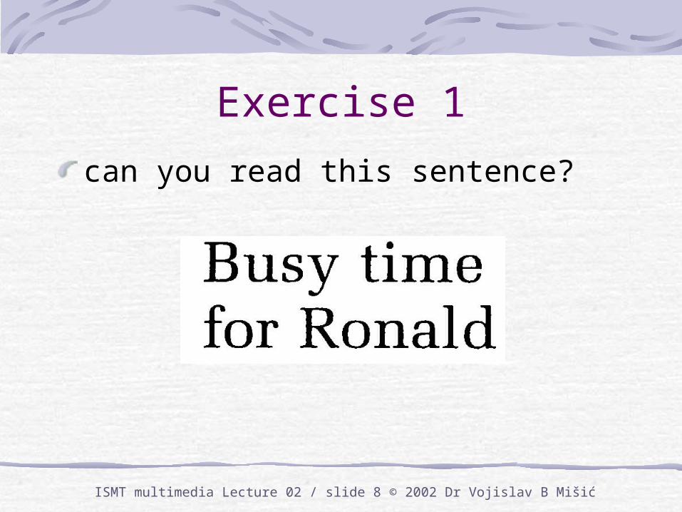
Exercise 1
can you read this sentence?

ISMT multimedia Lecture 02 / slide 9 © 2002 Dr Vojislav B Mišić
Exercise 2
how about this sentence?
ISMT multimedia Lecture 02 / slide 10 © 2002 Dr Vojislav B Mišić
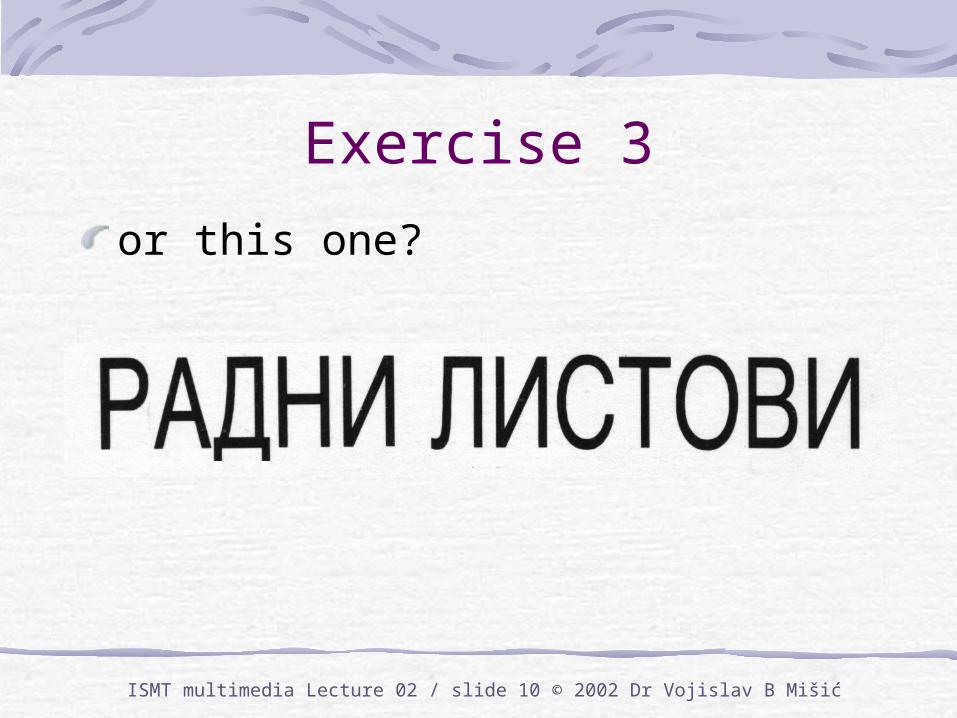
Exercise 3
or this one?
ISMT multimedia Lecture 02 / slide 11 © 2002 Dr Vojislav B Mišić
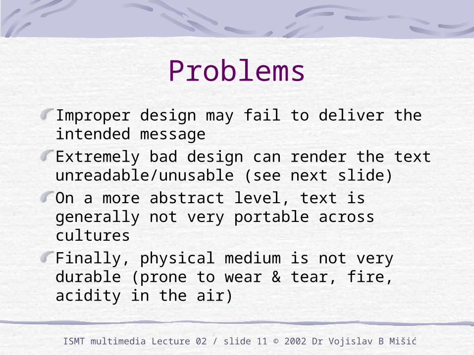
ProblemsImproper design may fail to deliver the intended messageExtremely bad design can render the text unreadable/unusable (see next slide)On a more abstract level, text is generally not very portable across culturesFinally, physical medium is not very durable (prone to wear & tear, fire, acidity in the air)
ISMT multimedia Lecture 02 / slide 12 © 2002 Dr Vojislav B Mišić
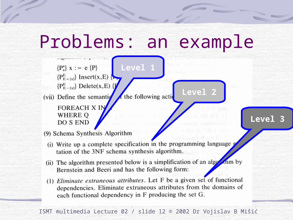
Problems: an exampleLevel 1
Level 2
Level 3
ISMT multimedia Lecture 02 / slide 13 © 2002 Dr Vojislav B Mišić
Typography
Typography concerns the aspects of text that make it legible and expressive
typefacesizeweightpage layout
They all affect the manner in which text conveys information (and the efficiency of the process)
ISMT multimedia Lecture 02 / slide 14 © 2002 Dr Vojislav B Mišić
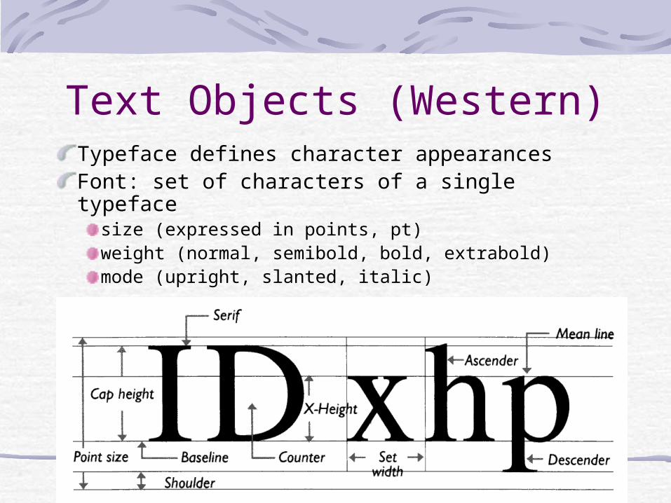
Text Objects (Western)Typeface defines character appearancesFont: set of characters of a single typeface
size (expressed in points, pt)weight (normal, semibold, bold, extrabold)mode (upright, slanted, italic)
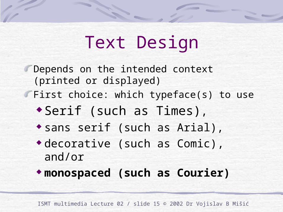
ISMT multimedia Lecture 02 / slide 15 © 2002 Dr Vojislav B Mišić
Text DesignDepends on the intended context (printed or displayed)First choice: which typeface(s) to use
Serif (such as Times), sans serif (such as Arial), decorative (such as Comic),
and/or monospaced (such as Courier)
ISMT multimedia Lecture 02 / slide 16 © 2002 Dr Vojislav B Mišić
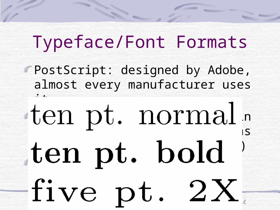
Typeface/Font Formats
PostScript: designed by Adobe, almost every manufacturer uses itTrueType: used by Microsoft in Windows 95/98 (but Win2000 has PostScript font rasterizer )Font quality: strokes, hints (esp. at small font sizes)
ISMT multimedia Lecture 02 / slide 17 © 2002 Dr Vojislav B Mišić
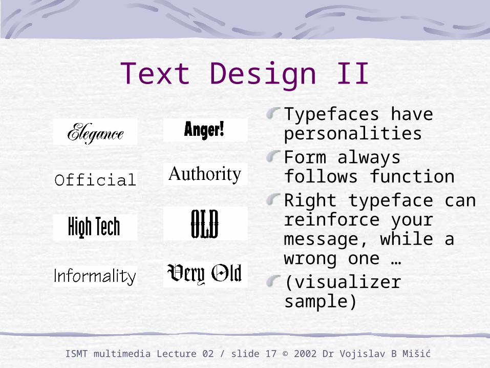
Text Design IITypefaces have personalitiesForm always follows functionRight typeface can reinforce your message, while a wrong one …(visualizer sample)
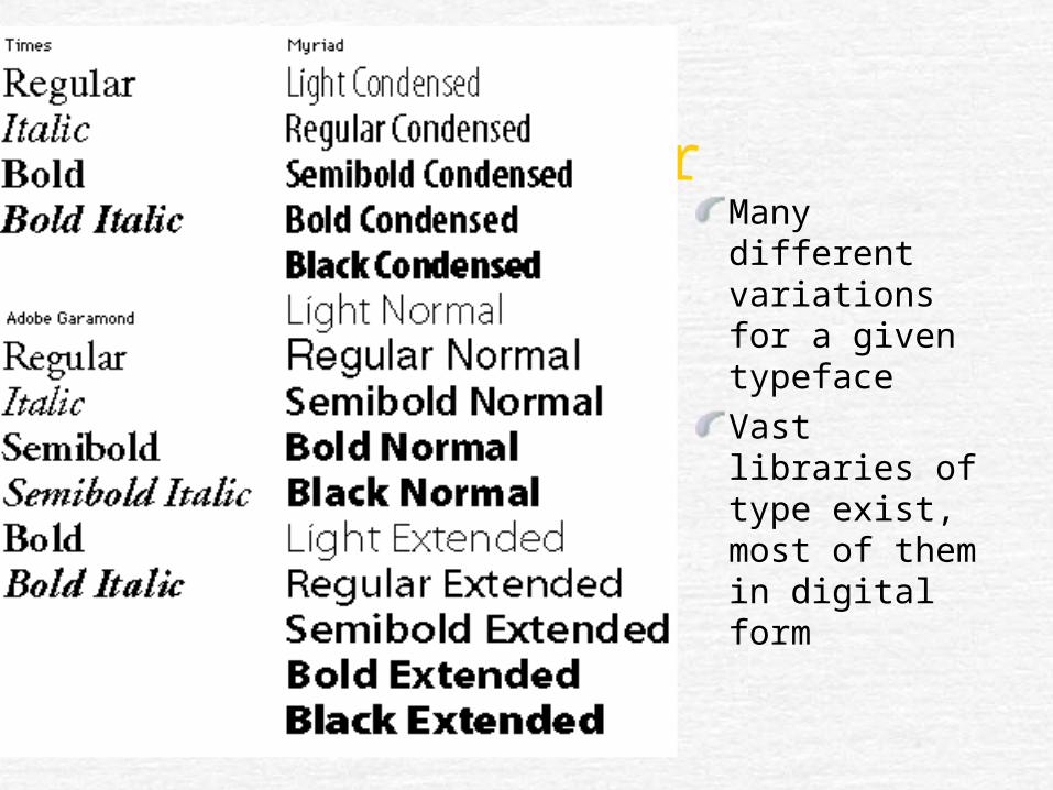
A SamplerMany different variations for a given typefaceVast libraries of type exist, most of them in digital form
ISMT multimedia Lecture 02 / slide 19 © 2002 Dr Vojislav B Mišić
Text legibilityChoose a clear typeface and size that users can easily readSerif typefaces tend to lose screen legibility
if they are too small or the screen resolution is low
Sans-serif typefaces are more legible,even on lower resolution screens
Decorative typefaces, such as Comic Sans or Impact, are normally used for printed text at large point sizes only, otherwise they tend to be hard to read or even illegible
ISMT multimedia Lecture 02 / slide 20 © 2002 Dr Vojislav B Mišić
Text Legibility IITo emphasize a word, phrase or sentence, experiment with different sizes, fonts, weights, or modesChanging weight or mode in the text is like shouting – you don’t shout all the time, and if you do, people will get used to it and not notice it any moreUse capitals sparingly: lowercase letters help readers distinguish words MORE EASILY THAN ALL UPPERCASE LETTERS
ISMT multimedia Lecture 02 / slide 21 © 2002 Dr Vojislav B Mišić
Typefaces
The moral of the story isuse typefaces that correspond to the intended messageuse different typeface/size/weight combinations for proper emphasisbut: don’t overdo it
If in doubt, seek professional helpA fool with a tool is still …
ISMT multimedia Lecture 02 / slide 22 © 2002 Dr Vojislav B Mišić
Page/screen layout
Layout: concerns the position of objects on the page/screenWhat information is the most important?What catches the eye first?Emphasis on content, headlines, navigation elements, or controls
ISMT multimedia Lecture 02 / slide 23 © 2002 Dr Vojislav B Mišić
Common layout elements
Column widths, lengths, leading, letter spacing, rivers, widows and orphansGrid: helps designers quickly (and consistently) lay out elementsGrid also helps in aligning the elements
ISMT multimedia Lecture 02 / slide 24 © 2002 Dr Vojislav B Mišić
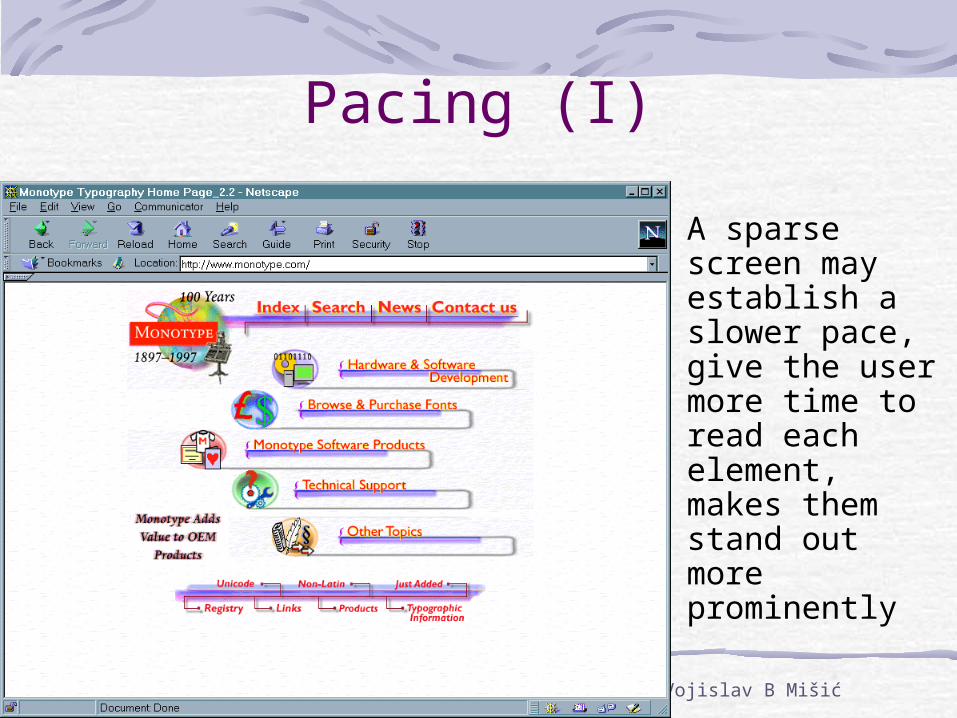
Pacing (I)
A sparse screen may establish a slower pace, give the user more time to read each element, makes them stand out more prominently
ISMT multimedia Lecture 02 / slide 25 © 2002 Dr Vojislav B Mišić
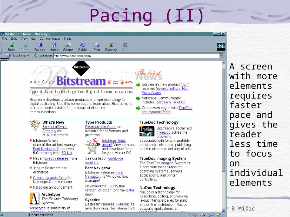
Pacing (II)
A screen with more elements requires faster pace and gives the reader less time to focus on individual elements
ISMT multimedia Lecture 02 / slide 26 © 2002 Dr Vojislav B Mišić
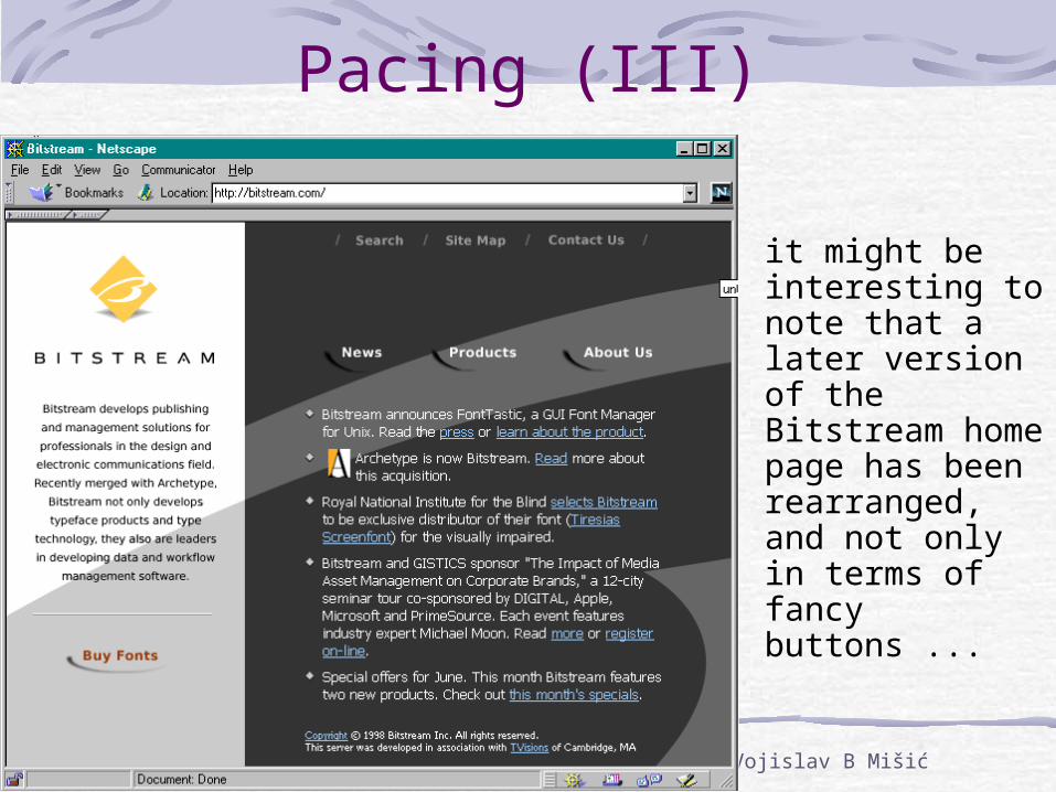
Pacing (III)
it might be interesting to note that a later version of the Bitstream home page has been rearranged, and not only in terms of fancy buttons ...
ISMT multimedia Lecture 02 / slide 27 © 2002 Dr Vojislav B Mišić
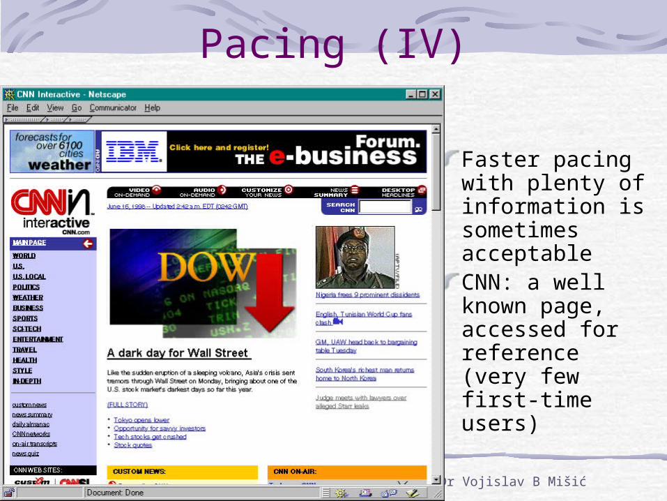
Pacing (IV)
Faster pacing with plenty of information is sometimes acceptableCNN: a well known page, accessed for reference (very few first-time users)
ISMT multimedia Lecture 02 / slide 28 © 2002 Dr Vojislav B Mišić
Style
Style is expressed by the design: the elements and their interrelationshipsDesign can expressdifferent stylesStyle should relate to the audience and the purpose and/or message(s) of the project
traditionalformalcasualactivefuturistichistoricmodernloudquietutilitarian
ISMT multimedia Lecture 02 / slide 29 © 2002 Dr Vojislav B Mišić
Hypertext
Intended to overcome the inherent linearity of text objectsAllows users to navigate in order to find relevant informationBut: links must be defined in advanceHypermedia extends the same concepts to all media including sound and video
ISMT multimedia Lecture 02 / slide 30 © 2002 Dr Vojislav B Mišić
Text retrievalLarge texts require searching support:
table of contentsword/name indexesconcept indexesglossaries
Concordances, Keyword-in-context (KWIC) indexes
Electronic versions add
sophisticated searching capabilitiesfuzzy searchinghypertext functions
Text search still leaves something to be desired (even Google or MSN )
ISMT multimedia Lecture 02 / slide 31 © 2002 Dr Vojislav B Mišić
What Do You Think …
Is text still important in the multimedia age?Or should we use other media instead?Does the answer depend on the physical medium (i.e., computer screen vs. mobile phone vs. some futuristic wearable computer)?
ISMT multimedia Lecture 02 / slide 32 © 2002 Dr Vojislav B Mišić
Summary of Lecture 02
vision - perhaps the most important sensory input channeltext - preferred medium in many casesoverall sense of balance and style is very important
Related Documents