Welcome message from author
This document is posted to help you gain knowledge. Please leave a comment to let me know what you think about it! Share it to your friends and learn new things together.
Transcript

January/February ��
�
�
Eight Dollarswww.commarts.com

⁄ 44
Mires>design for brands By Julie Prendiville Roux
Client Kurt Listug, CEO of Taylor Guitars, proclaimsto have a thing or two in common with design firm
Mires: “We’re both real anal and very detail-oriented aboutwhat we do.” In the case of Taylor, the ‘what we do’ is crafthigh-end guitars for those ranging from weekend enthusi-asts to seriously-famous musicians.
In the case of Mires, it’s supplying strategic thinking anddesign solutions for clients ranging from roof tiles and videogames to coffee beans and theater. Also travel, dining out,surfing, telephones, trading cards, golf and toys. And that’sjust a partial list. José Serrano, principal/creative director,says, “We’ve had a wide reach of different types of accounts—we haven’t been in one certain category, like medical. Wecan learn what the clients’ needs are and tell a story that fitsthat particular need. That’s where the storytelling comes intoplay. It gives us the freedom to attract any type of client.”
So that’s the thread that ties these disparate areas together:story. At Mires, they believe there’s a story behind everybrand that has its own unique voice. That belief has cata-pulted the San Diego, California, firm into a realm of suc-cess they never dreamed of. And one they don’t take forgranted. Serrano says, “We never want to get comfortable.We’re always looking for new things we can be doing.”
Located in a picturesque, charming enclave of antique shops,printers, car repair shops and palm trees, the firm’s beach-townlocale belies a bustling enterprise with an impressive clientlist. As the business grew, they offered more and more services.And over time, the former moniker of Mires Design—andthe sole act of design itself—didn’t fit.
Imagine their surprise when it turned out they were in needof a story of their own. Principal/creative director Scott Mires,founder, says, “We’d been wrestling with it for a few years.We were offering a lot more than just design—design waslimiting for us. We had become a strategic partner to ourclients. We helped to build their brands. There’s this stigmato design as just being esthetic; we wanted to position our-selves as being more strategic. A lot of times it’s your old-time clients who are pigeonholing you and sometimes you’renot good at promoting yourself to existing clients and talk-ing about your new capabilities. We never really had a tag-line—a descriptor for what we do.”
As they grappled for a new identity, their tagline ‘design forbrands’ transformed into Mires>design for brands. It’s a
Right: Bay 2 Bay poster. “Every year, the Point Loma YMCA organizesa fund-raising regatta that extends from Mission Bay to San DiegoBay,” said creative director José Serrano. “This poster is an expres-sion of Americana, with a roughness and rawness that reminds youof a weathered old boathouse.” Gerald Bustamante, illustrator.
“Posters have played an important role in our overall revitalization ofthe Arena Stage brand and identity, which coincided with the arrivalof a new artistic director in 1998. In addition to helping to restorelost luster, and to reposition a venerable institution in a changingcultural landscape, the brand identity program gave the theater astrong, overarching personality that made it less dependent on thesuccess or failure of individual productions. These posters wereselected for the permanent collection of the Library of Congress,”said creative director Scott Mires. Miguel Perez, designer; MarkUlriksen (The Women)/Jody Hewgill, illustrators.
subtle name that came with much discernment. Principal/creative director John Ball says, “It was a great transitionthing where it kept design up there pretty high, but it alsointroduced the strategic part of what we do: design ‘forbrands’.” Mires adds, “We didn’t want to totally walk awayfrom the esthetic, because that’s how we’ve gotten where weare—doing really incredible work—along with this othergreat component. At times, it’s been intuitively strategic butnow it’s become more process-oriented strategy.”
“So in a way,” Ball says, “it was like taking a dose of our ownmedicine, stepping back and saying, OK we’re differentnow, how are we going to be positioned in our world, withour clients and potential clients? We looked at the name andthe identity, redid the portfolio and the Web site.” Serranocontinues, “The one thing that we did differently frommost people is that we had actually done the work we weretalking about. It wasn’t: Oh, we’re going to change our nameand we’re going to refocus ourselves to say we’re doing strat-egy now, or, now we do brand work. We actually have abody of work that shows that we do those things. So nowthat we do have a new name, we already have work to backit up.” Mires adds, “It’s like doing a package for a productthat doesn’t exist yet. It just makes people race to it and say,hey that’s really not any good.”
One key client, Neill Archer Roan, CEO of The Roan Group,a strategic business development company, has watched thefirm grow. Mires has worked on Roan’s Arena Stage andCalifornia Center for the Arts client projects for years. Hesays, “It’s one thing to get a really great project the first timearound, and another to get it for ten years. Their differentiat-

45

ing point is the quality of thinking andexecution. Miguel [Perez, design director] is basically the Leonardo di Vinci of execu-tion, creating an incredibly juicy executionof the idea and making it absolutely perfect. Things fail in execution. Mires is bulletproof in terms of executingstrong concepts.”
Bob Schonfisch, director of creative ser-vices, Sega America, remembers his firstencounter with Mires. “I was doing researchfor a corporate identity project. By thetime I met John Ball, I was pretty well downthe road of assigning another agency.” But itturns out, that was just for one assignment.Mires kept in front of Schonfisch by sendinghim spiral-bound books of recent work—books he’s kept to this day. Schonfisch, whose in-housemarketing group does extensive work on the front end of assigning projects, brings a lot to the table in terms ofmarket research and strategic thinking.
He references his company’s mission words, displayed in hisoffice: Defiant, Passionate, Fearless, Unexpected, Irreverentand Independent. “Every piece of work we put out therehas to have at least several of these properties,” he says. Oncehe began working with Mires, he found like minds, especiallybecause they were able to grasp and appreciate his up-frontstrategic planning, not just deliver creative. “By the time Idid give them their first assignment,” he remembers, “itwas a huge project—redesigning hardware packaging andall the peripherals.”
He continues, “The good thing is that they listen. They’reable to take direction and elaborate on it. It’s seamless interms of communication. During the process, it doesn’tmatter who I’m talking to; we’re all on the same page. Youdon’t get mistakes out of them.”
That’s where that attention-to-detail claim comes in. Serranosays, “When we get a project, I tell clients, you’re welcometo go to the back and go through our archives. See some ofthe work we’re really proud of. Whether it’s 1-color, 2-color,4-color, or whatever, the detail that goes into it is going tobe amazing. We’re not going to give you ‘choice A’ or ‘choiceB’ design. When we commit to a project, whether it’s onedollar or ten dollars, you’re going to get that level of detail.”
Each principal/creative director, Mires, Ball and Serrano,handles his own accounts, working with teams of designers
⁄ 46
and outside writers, illustrators and photographers. In 2001,Tom Carroll joined the firm as marketing director. “It was amissing piece that fit perfectly,” Mires says. “We also addedproject managers that added a whole level of getting thingsdone. Before, the three of us would run around doing allthat and now we have people who actually keep track ofevery last detail.”
Scott Mires has steered the Taylor Guitars account since themid-1990s. Listug says, “My concept of branding is not tocome up with something clever or advertising-y. Sometimeswhen you talk to [design] people, they want to do some-thing pretty but haven’t thought much about strategy. Scottis long on strategy and he can create a beautiful, impactfulpiece. He’s enthusiastic about it.”
Scott is one of those designers who still does tiny pencilthumbnails. Serrano and Ball encourage their teams to domarker layouts before turning on the computer. At first-round internal creative meetings, they’ll have a plentiful,rough bounty of work, much of which is shown to theclient. This way, they tend to over-deliver in the number ofconcepts they come up with—one more component to theirown corporate strategy. This idea of over-delivering seemsto have propelled them to the next level.
Roan offers, “The biggest challenge with branding as itrelates to design is continuing to have the butterfly evolve.If you look at Mires work over a period of time, what yousee is an arc that is very subtle. There’s a process of reveal-ing and unfolding that is really organic. There has to be anunfolding of the story.” ■
Mires staff (from left): (first photo) José Serrano/Gale Spitzley/Joy Price/Tavo Galindo/Jen Cadam/Miguel Perez/Andrew Goddard; (second photo) Scott Mires/John Ball/Kathy Carpentier-Moore/Toni MacCabe/Wendy Bowman/Dara Cadam/Holly Houk/Andrew Goddard/Mark Ruzich; (third photo) John Ball/Mary Pritchard/Dave Roberts/Holly Houk/Paula Monterrubio/Cory Dunn/Gordy Adsit/Dara Cadam/Howard Weliver.
Mires>design for brands
© 2
002
Mar
shal
l Har
ring
ton

47
This page: “The newspaper had just purchased a newfleet of trucks. We asked, ‘What can we do to promotethe newspaper in a nontraditional way? Who needswords or logos or large-scale corporate graphics?’” saidcreative director José Serrano. “We turned to the experi-ence of reading the newspaper itself. In this case, usinga classic cartoon from the Sunday funnies.” The SanDiego Union Tribune, client.
Qualcomm 5TGP packaging. “This solution represented asort of coming-of-age for the mobile phone industry,communicating unequivocally that this type of productcould be friendly and fun. In the early days of mobilephone marketing, packaging focused primarily on brandgraphics,” said creative director José Serrano. “On thewhole, it felt pretty flat and cold. We brought humanemotion into the equation. With Qualcomm, we saw agreat opportunity to rewrite the rules with color andimages of people consumers could relate to.” DavidAdey, designer; Carl Vanderschuit, photographer.
Dreamcast shopping bag and binder. “Sega gave us theassignment to redo their Dreamcast packaging. This ideawas one of the finalists. While focus groups ultimatelyfavored another solution, at Sega’s request we gave itnew life as the hero visual at the E3 tradeshow. Execu-tions included binders, bags and banners, including one70’ tall hanging outside the L.A. Convention Center,” saidcreative director John Ball. “The image, which refreshesthe ‘Sega scream’ campaign of years past, grew out ofthe concept of head-to-head online gaming and express-es the full-throttle intensity of the Sega brand.” PamMeierding/Jeff Samaripa, designers; Carl Vanderschuit,photographer; Sega of America, client.
“VerdeStyle was an online gardening community, a veryearly e-commerce play. So early, in fact, that investorsdidn’t really get it,” said creative director John Ball.“VerdeStyle’s vision included much of what the worldcame to expect an online brand experience to be: shop-ping, commerce, chat and so on. We designed every-thing: identity, Web site, packaging, sales collateral. Itwas an ambitious program that gave us early insight into the dot.com boom that was to come.” Miguel Perez, designer.

⁄ 48

49
Mires
Left: GoCard media kit. “This media kit for an early leaderin postcard advertising was encyclopedic in scope, reflectingthe passion of our client, an entrepreneur who lived andbreathed the subject,” said creative director John Ball.“We captured his excitement and propelled him forward,legitimizing the medium and speaking to the advertisingcommunity in a way it could not ignore.” Eric Freedman/Gale Spitzley, designers; John Kuraoka/Alan Wolan, writers;Miguel Perez, illustrator.
This page: Wildlife exhibition catalog. “Our client was abrand-new, $70 million art center in the small-town ofEscondido, California. The inaugural museum exhibitionfeatured artists’ interpretations of animals in various media.Our job was to give the show a marketable identity, with-out overpowering the art,” said creative director JohnBall. “The catalog was entered into the American Associa-tion of Museums, where it ended up on a Top 10 list alongwith the Smithsonian, the Museum of Modern Art andother nationally-recognized institutions. Our little museumgot instant credibility.” Gale Spitzley, designer; CaliforniaCenter for The Arts Museum, client.
California: In Three Dimensions exhibition catalog. “Forthe catalog accompanying this show on contemporaryCalifornia sculpture, every artist contributed an essay,” saidcreative director John Ball. “We used each layout to createa different typographic response to the work. The type onthe cover was embossed and debossed—tactile in bothdimensions. A typographic sculpture!” Deborah Hom,designer; California Center for The Arts Museum, client.
Positioning, name and identity for a golf e-commerce site,Gball.com. “While a lot of golf e-commerce sites alreadyexisted at the time Gball arrived, everyone was going forthe traditional equities,” said creative director Scott Mires.“We went the other direction, speaking to first-timers justgetting into the game. We positioned Gball for a hipper,more fun, less serious crowd.” Cherie Peltier/MiguelPerez, designers.

⁄ 50
51
Mires
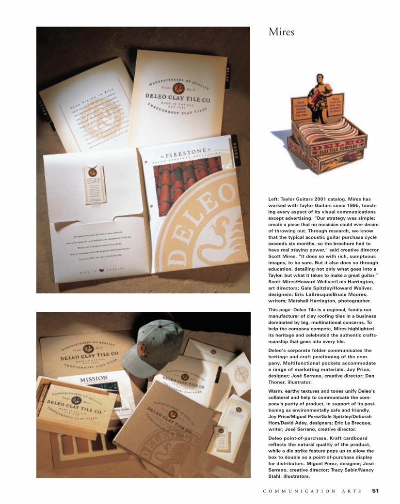
Left: Taylor Guitars 2001 catalog. Mires hasworked with Taylor Guitars since 1995, touch-ing every aspect of its visual communicationsexcept advertising. “Our strategy was simple:create a piece that no musician could ever dreamof throwing out. Through research, we knowthat the typical acoustic guitar purchase cycleexceeds six months, so the brochure had tohave real staying power,” said creative directorScott Mires. “It does so with rich, sumptuousimages, to be sure. But it also does so througheducation, detailing not only what goes into aTaylor, but what it takes to make a great guitar.”Scott Mires/Howard Weliver/Lois Harrington,art directors; Gale Spitzley/Howard Weliver,designers; Eric LaBrecque/Bruce Moores,writers; Marshall Harrington, photographer.
This page: Deleo Tile is a regional, family-runmanufacturer of clay roofing tiles in a businessdominated by big, multinational concerns. Tohelp the company compete, Mires highlightedits heritage and celebrated the authentic crafts-manship that goes into every tile.
Deleo’s corporate folder communicates theheritage and craft positioning of the com-pany. Multifunctional pockets accommodatea range of marketing materials. Joy Price,designer; José Serrano, creative director; DanThoner, illustrator.
Warm, earthy textures and tones unify Deleo’scollateral and help to communicate the com-pany’s purity of product, in support of its posi-tioning as environmentally safe and friendly.Joy Price/Miguel Perez/Gale Spitzley/DeborahHom/David Adey, designers; Eric La Brecque,writer; José Serrano, creative director.
Deleo point-of-purchase. Kraft cardboardreflects the natural quality of the product,while a die strike feature pops up to allow thebox to double as a point-of-purchase displayfor distributors. Miguel Perez, designer; JoséSerrano, creative director; Tracy Sabin/NancyStahl, illustrators.

⁄ 52

53
Mires
Left: Terra Sketch packaging. “A recycled paper handmadefrom organically-grown cotton left over as waste from themanufacture of backpacks: How much more roots-respon-sible does it get? I really wanted to push the ’good for theearth, good for you, good for your pen’ envelope in this pieceexplaining the process to the consumer,” said creative directorJosé Serrano. Miguel Perez, designer; Tracy Sabin, illustrator;Green Field Paper Company, client.
Body Glove packaging. “Grains of sand, beads of water. Anexperiment to capture the look and feel of the ocean,” saidcreative director José Serrano. “Printed in silver and black onraw craft to give it a shimmering look, and at the same timeto express a non-slick, industrial feel that would appeal to thetype of person who would buy these fins.” Miguel Perez,designer; Carl Vanderschuit, photographer; Voit Sports, client.
“First World was an early broadband player back when broad-band was new and people weren’t sure what to do with it,”said creative director John Ball. “The brochure, addressed toa business audience, was designed to depict the real-worldbenefits without getting too technical. Basic messages, brightcolors, full bleed.” Miguel Perez/Kathy Carpentier-Moore,designers; Miguel Perez/Sam Grogan, illustrators; MarshallHarrington, photographer; First World Communications, client.
This page: Anacomp Corporate Style Guide. “Anacomp is aninformation management company that had just come out ofa reorganization and that was making a transition to Internet-based technology,” said creative director John Ball. “Theydidn’t have much of an identity, and they had never reallybranded themselves. At the same time, they were doing busi-ness worldwide and had made several acquisitions thatrequired a unifying umbrella. This was their stake in theground.” Deborah Hom, designer; Miguel Perez, illustrator.
Anacomp newsletter. “Our first project after creatingAnacomp’s new identity, this newsletter became an illustra-tion of what you could do with it,” said creative director JohnBall. “We really put the manual to work, making use of thefull palette. Archiving data onto microfilm, CDs and Web sitesis a pretty dry subject, though you wouldn’t know by thelooks of it.” Deborah Hom, designer; Tracy Sabin, illustrator.
Icon for the Las Vegas Convention and Visitors Bureau’s far-reaching tourism effort. “The city’s previous logo was hard toreproduce in certain applications,” said creative director JoséSerrano. “Revisiting and updating it, Las Vegas wanted toposition itself firmly around its gaming heritage, but in a waythat was instantly readable and appealing to the full spec-trum of visitors. This simple, legible solution lends itself toprint, television and large-scale applications for live events.We’re seeing it everywhere.” Miguel Perez, designer.
Related Documents