+ G321- Foundation By Gemma O’Donovan

Welcome message from author
This document is posted to help you gain knowledge. Please leave a comment to let me know what you think about it! Share it to your friends and learn new things together.
Transcript
+
G321- Foundation
By Gemma O’Donovan
+
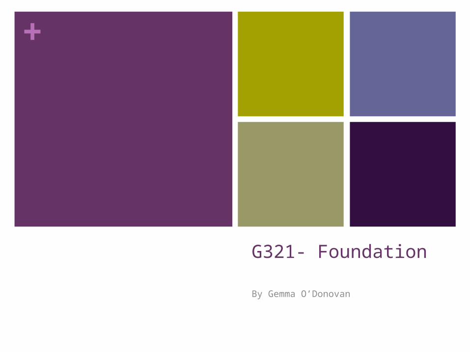
Main Central Image(Star appeal)
Star Appeal
Masthead
Puff/Promotion
Exclusive, engages the audience
Barcode
Title
Date/ price
+Analysis
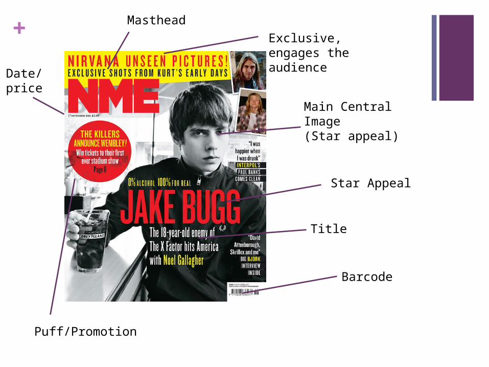
The NME magazine has many conventions to help the audience engage and be attracted to the front cover etc. The conventions are very appropriate to the genre of magazine. For example, this NME magazine has a main central image with ‘Star Appeal’ (Richard Dyer). This is effective because the audience are automatically engaged into the magazine if they see their favorite singer/celebrity on the front cover because we know there will be a big story about them in the magazine. The ‘Star Appeal’ in this is The Arctic Monkeys, and therefore the target audience will be boys and girls aged 14-20.
They haven’t replicated any magazine, its very original and they have made it their own. For example its masthead isn't placed in the middle of the page/centrally.
+NME Genre Research
NME magazine is an ‘Indie Rock’ magazine that focuses on stars such as ‘Jake Bugg’, ‘Artic Monkeys’, ‘Bastille’ and also ‘The 1975’. It’s a weekly magazine which has a circulation of 19,491 and its founder was Theodore Ingham. It’s current editor is Mike Williams and he has been the editor since June 2012. The first ever issue was on 7 March 1952.

+Target Audience – Katz, Maslow, Hartley and/or socio-economic needs The target audience for NME magazine can be denoted as having a ‘personal relationship’ (Katz) this is because the audience can build up a personal relationship with the stars that are spoken about in the magazine. We learn so much about them and enjoy the characteristics that we see. We could also be seen as ‘Social Climbers’ ( Maslow ). This is because we climb the social ladder to attempt to make ourselves be like the stars and celebrities we see in the magazines. For example if we read about how favorite singer playing a certain instrument, then it might make us, the social climbers, want to start playing this instrument. Another example is if we see our favorite singer wearing something really nice, we might want to go out and buy it, this is a good example of being a social climber.
What is the USP of this magazine? YOU MUST refer to specific conventions/stories from you research From the research completed into this media product, I think the USP is the ‘Main central image’. My reasoning for this is because when I see magazines in the shops, the first thing I see and the first thing I want to look at is the main central image because its likely going to be the main story in the magazine. If it’s a singer or band I really like then I'm more likely to buy the magazine. I also think that a USP is the masthead, the masthead must be big and bold. A masthead is also another big thing that we notice first when we look at a magazine. The masthead must be big and bold so the name of the magazine sticks in our head so we can then remember to pick up next weeks issue or even recommend to friends and family. This is important because the more and more people that get told about the magazine, the more sales meaning the circulation will rise rapidly.
+Established
There are different codes and conventions which are missed out on the magazine front cover and contents page. On the front cover on NME (my example on first slide), there is no convergent. Convergent means the links to twitter, facebook and many more social networking sites. This is a bad quality because it shows that it has no linking networks, if it did, they could get more subcribers etc, it shows that its less established than some other magazines.
Another convention that is missing is an editorial, an editorial is an introduction on the contents page that most magazines should have. It’s a brief introduction from the editor which makes the audience feel welcome and create a friendly environment for them to read in. It also introduces the stories and exclusives that will be included in that certain issue.
Related Documents