Graphic and Visual Aids

Welcome message from author
This document is posted to help you gain knowledge. Please leave a comment to let me know what you think about it! Share it to your friends and learn new things together.
Transcript
Graphic and Visual Aids
0123456789
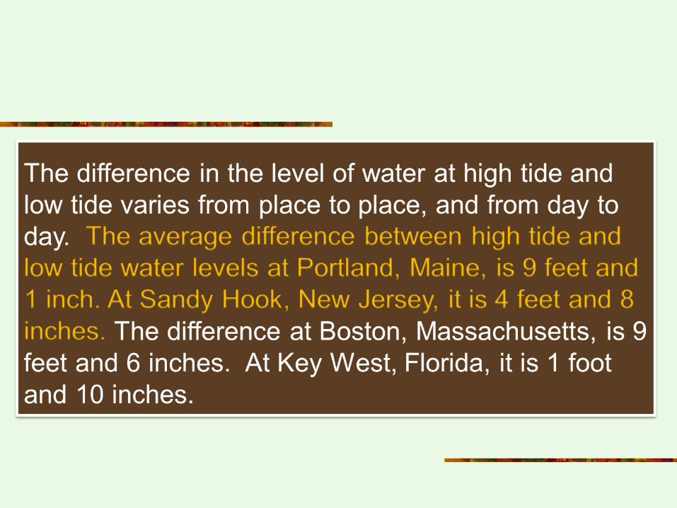
10
Portland Sandy Hook Boston Key West
Average Differences in Water Levels: High and Low Tides
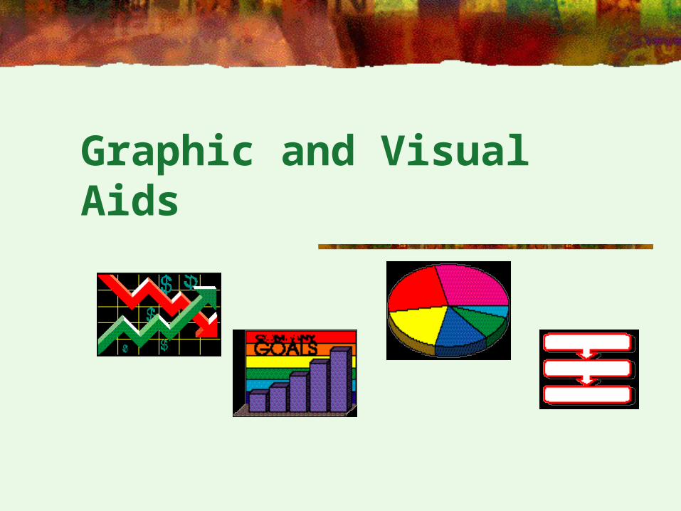
4
Definition
Graphic aids present information in pictorial form or in other specific formats in order to consolidate, clarify, or prove the written material they go with.
Too often graphs, diagrams, charts and tables are casually glanced over or bypassed completely by readers.
5
Purpose
Visual aids are designed to summarize information.
Sometimes the amount of data is so large that an aid is the only practical way of making the information accessible.
Visual aids allow the writer to explain complex ideas more concretely, and the reader to visualize abstract concepts.
Visuals aids can even present new or additional information to the written text.
6
The General Strategy for Interpreting Graphs
n 1. Read the title. It usually tells the topic.n 2. Look at the source of the information.n 3. Read any accompanying explanation.n 4. Read the legend (small explanatory table or list of symbols)n if there is one.n 5. Read the labels on the parts of the graph.n 6. Determine what is being measured or compared and then units of measurement.n 7. Look for trends or patterns.n 8. Think about how the graph illustrates, clarifies, or provesn the material it accompanies.n 9. Draw the important conclusions.
7
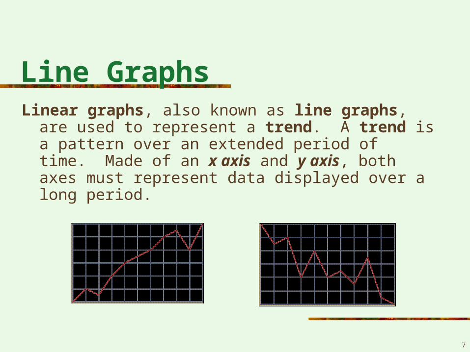
Line GraphsLinear graphs, also known as line graphs, are used to
represent a trend. A trend is a pattern over an extended period of time. Made of an x axis and y axis, both axes must represent data displayed over a long period.
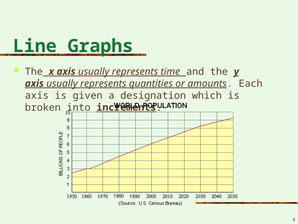
Line Graphs The x axis usually represents time and the y
axis usually represents quantities or amounts. Each axis is given a designation which is broken into increments.
8
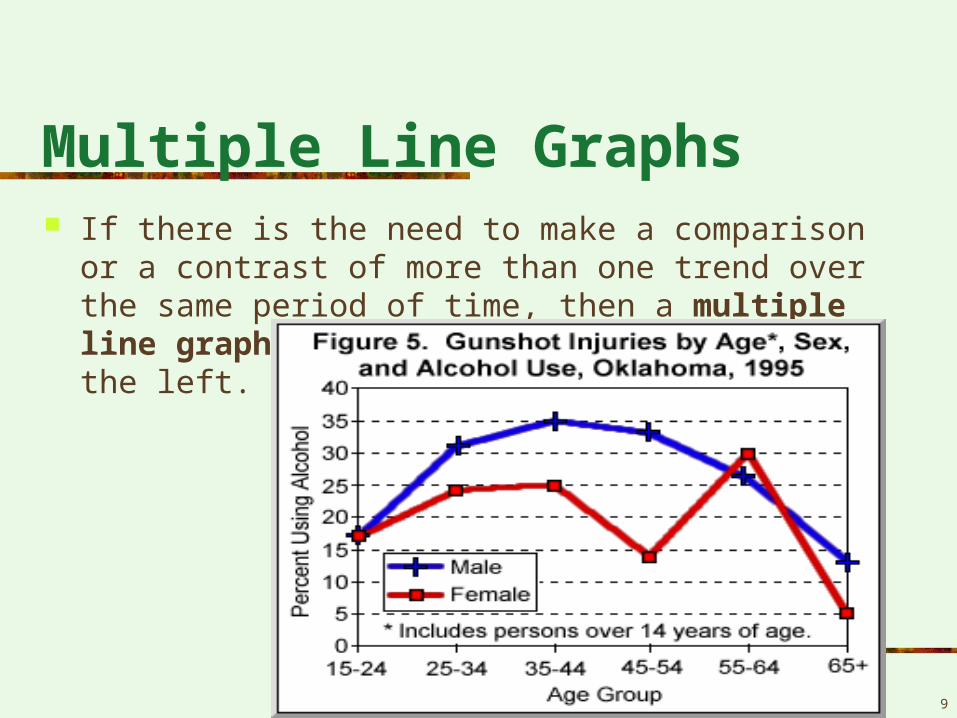
Multiple Line Graphs If there is the need to make a comparison or a contrast
of more than one trend over the same period of time, then a multiple line graph is used such as the example on the left.
9
10
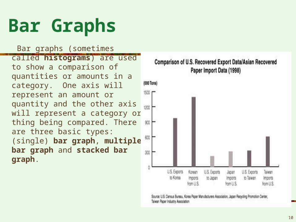
Bar Graphs Bar graphs (sometimes
called histograms) are used to show a comparison of quantities or amounts in a category. One axis will represent an amount or quantity and the other axis will represent a category or thing being compared. There are three basic types: (single) bar graph, multiple bar graph and stacked bar graph.
Bar Graphs
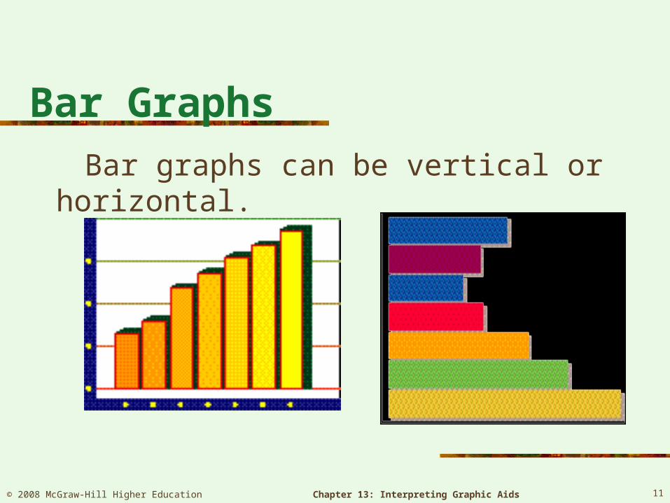
Bar graphs can be vertical or horizontal.
© 2008 McGraw-Hill Higher Education Chapter 13: Interpreting Graphic Aids 11
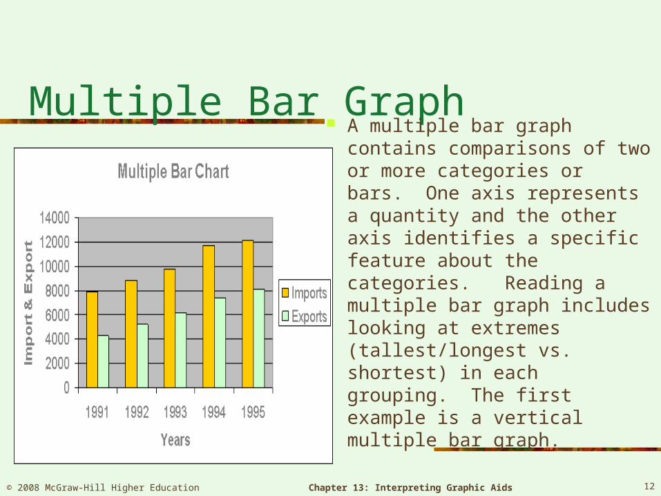
Multiple Bar Graph A multiple bar graph contains
comparisons of two or more categories or bars. One axis represents a quantity and the other axis identifies a specific feature about the categories. Reading a multiple bar graph includes looking at extremes (tallest/longest vs. shortest) in each grouping. The first example is a vertical multiple bar graph.
© 2008 McGraw-Hill Higher Education Chapter 13: Interpreting Graphic Aids 12
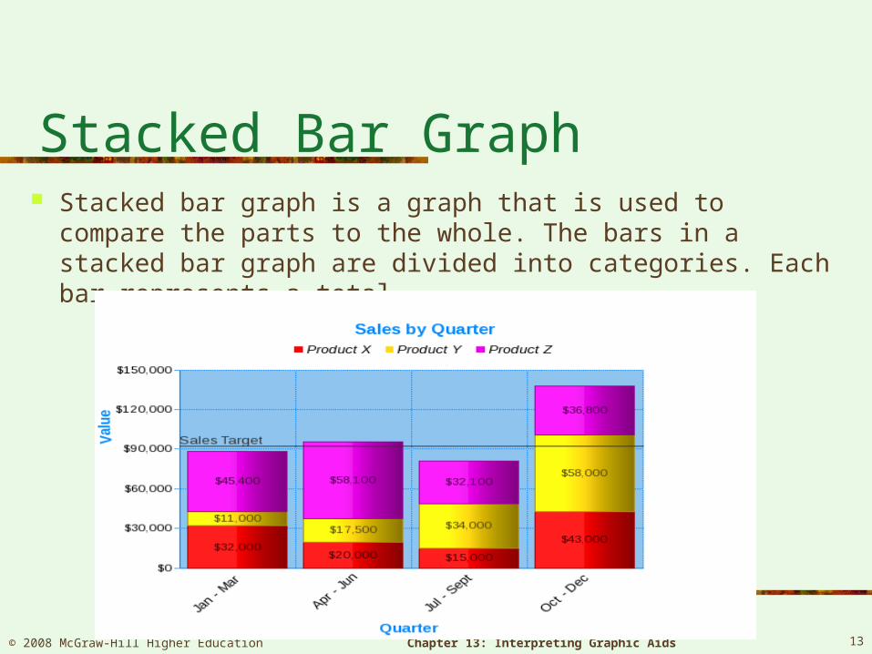
Stacked Bar Graph Stacked bar graph is a graph that is used to compare the
parts to the whole. The bars in a stacked bar graph are divided into categories. Each bar represents a total.
© 2008 McGraw-Hill Higher Education Chapter 13: Interpreting Graphic Aids 13
14
Pie Charts
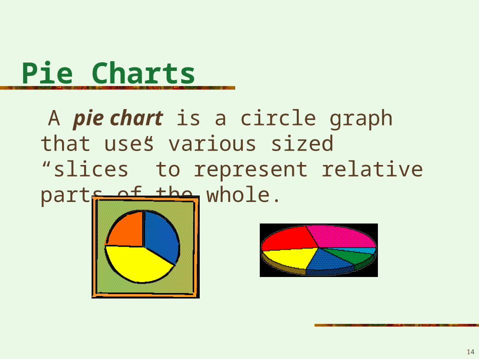
A pie chart is a circle graph that uses various sized “slices” to represent relative parts of the whole.
15
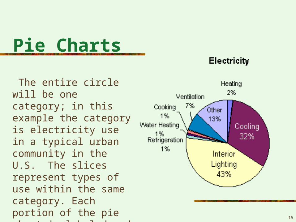
Pie Charts
The entire circle will be one category; in this example the category is electricity use in a typical urban community in the U.S. The slices represent types of use within the same category. Each portion of the pie chart is labeled and the proportion indicated.
16
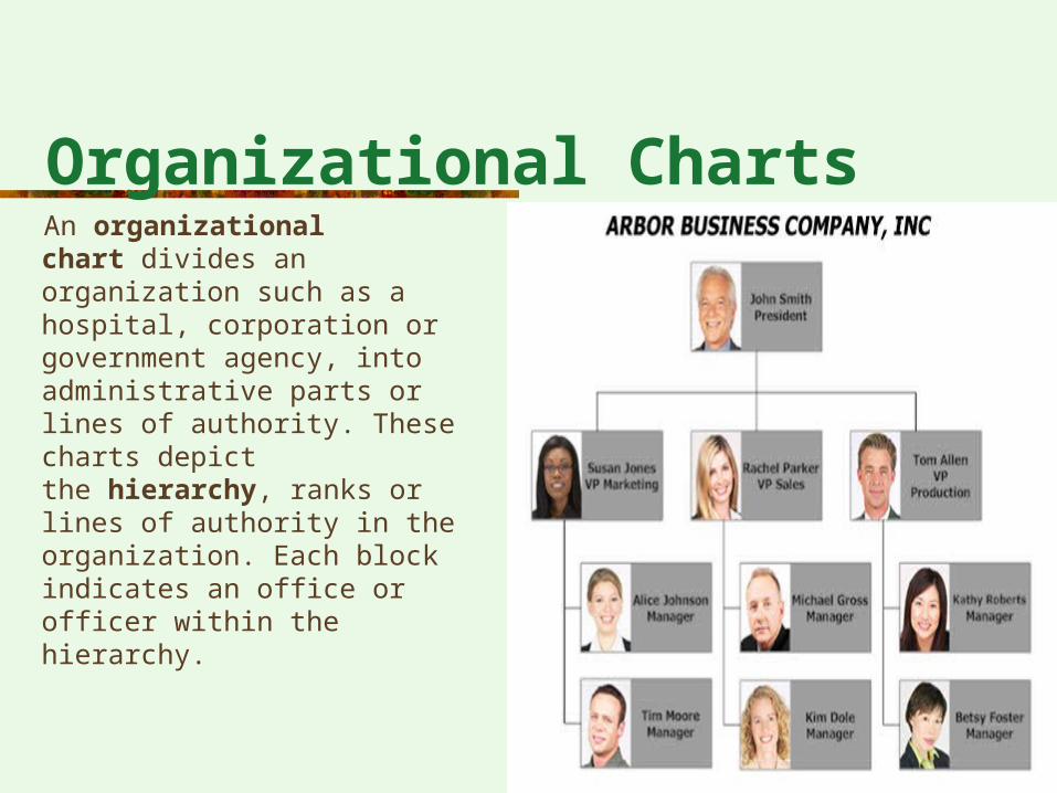
Organizational Charts An organizational
chart divides an organization such as a hospital, corporation or government agency, into administrative parts or lines of authority. These charts depict the hierarchy, ranks or lines of authority in the organization. Each block indicates an office or officer within the hierarchy.
17
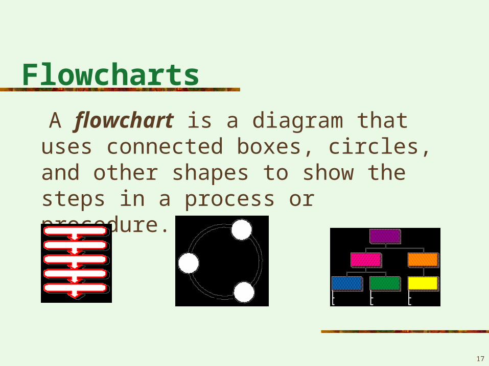
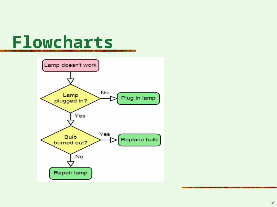
Flowcharts
A flowchart is a diagram that uses connected boxes, circles, and other shapes to show the steps in a process or procedure.
18
Flowcharts
Diagrams
19
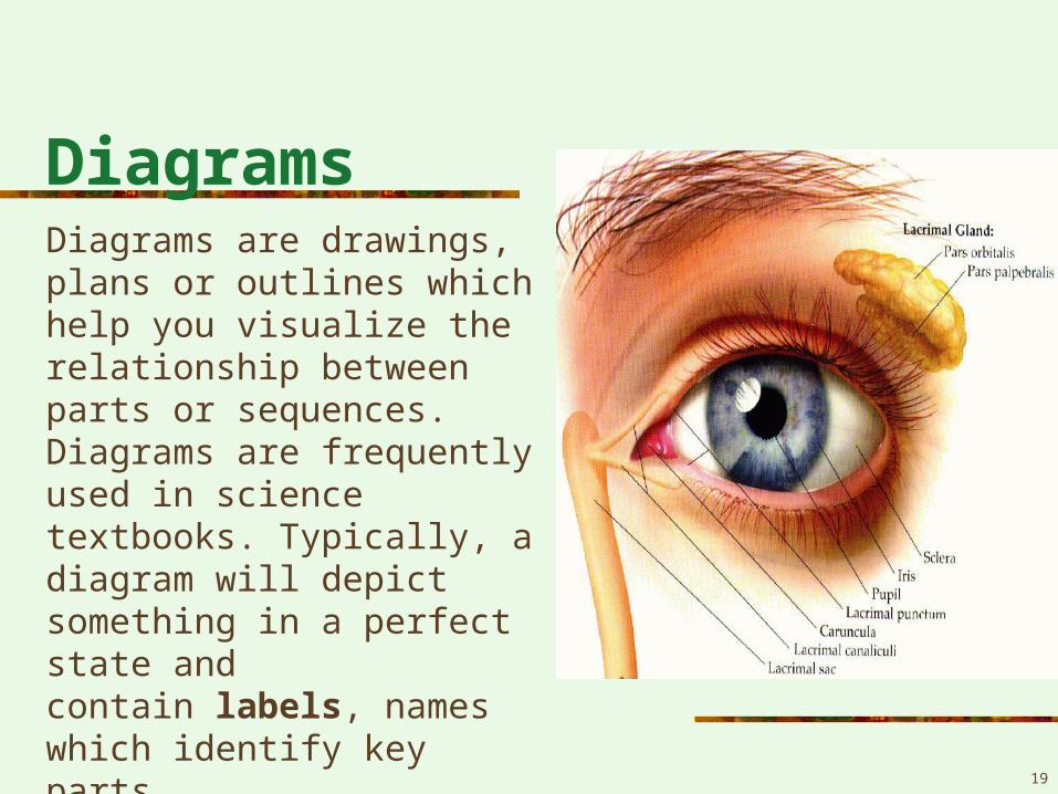
Diagrams are drawings, plans or outlines which help you visualize the relationship between parts or sequences. Diagrams are frequently used in science textbooks. Typically, a diagram will depict something in a perfect state and contain labels, names which identify key parts.
20
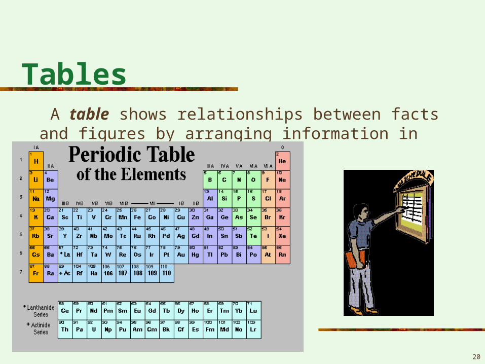
Tables A table shows relationships between facts and figures by
arranging information in rows and columns.
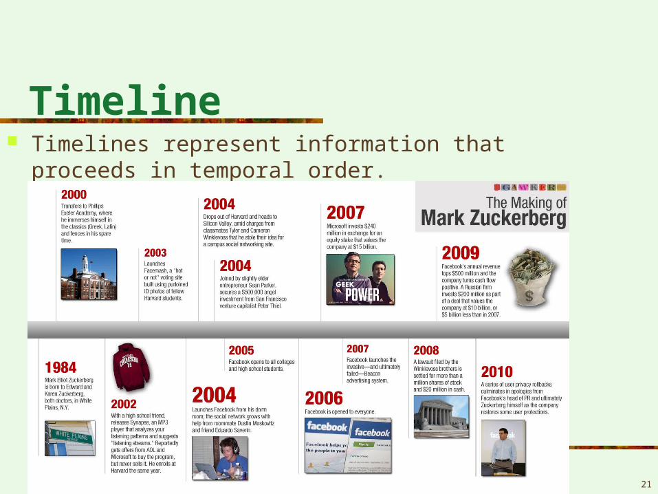
Timeline Timelines represent information that proceeds in
temporal order.
21
Related Documents