Deciding on a font was difficult for my group and I to chose as we wanted one that related to the horror genre but wasn’t too over the top. I decided to brose through Dafont.com to pick some fonts that were suitable Looking through the various categorise I stuck to these 4 as I though they related most to the horror genre.

Font Decisions
Aug 17, 2015
Welcome message from author
This document is posted to help you gain knowledge. Please leave a comment to let me know what you think about it! Share it to your friends and learn new things together.
Transcript

Deciding on a font was difficult for my group and I to chose as we wanted one that related to the horror genre but wasn’t too over the top.I decided to brose through Dafont.com to pick some fonts that were suitable
Looking through the various categorise I stuck to these 4 as I though they related most to the horror genre.
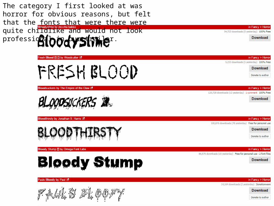
The category I first looked at was horror for obvious reasons, but felt that the fonts that were there were quite childlike and would not look professional in our trailer.
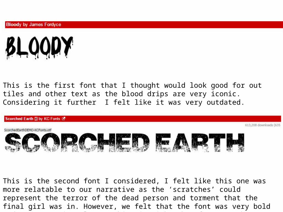
This is the first font that I thought would look good for out tiles and other text as the blood drips are very iconic. Considering it further I felt like it was very outdated.
This is the second font I considered, I felt like this one was more relatable to our narrative as the ‘scratches’ could represent the terror of the dead person and torment that the final girl was in. However, we felt that the font was very bold and over powering also matching it with other fonts may be difficult.
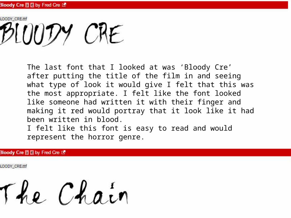
The last font that I looked at was ‘Bloody Cre’ after putting the title of the film in and seeing what type of look it would give I felt that this was the most appropriate. I felt like the font looked like someone had written it with their finger and making it red would portray that it look like it had been written in blood.I felt like this font is easy to read and would represent the horror genre.

Related Documents