PROJECT REPORT: A Visual Analytics Study on Educational Assessments Ilknur Icke CUNY, The Graduate Center, 365 Fifth Avenue, New York, NY November 2008 “The real voyage of discovery consists not in seeking new landscapes but in having new eyes” –Marcel Proust 1 Introduction Terabytes of enrollment, assessment and biographical data on millions of students are waiting to be analyzed in order to help educators increase the quality of teaching and learning in schools [3]. As a part of this effort, we worked on student testing dataset 1 to understand more about elementary school students’ performance on the on-line, adaptive and multi-dimensional testing tool. Besides providing standard test scores, the application gathers extensive data on the student performance highlighting specific strength and weaknesses of students. This dataset can be used to achieve multiple goals. Beyond standard analysis of individual student performance from test to test, a number of more advanced applications can be developed. For example: Simulated students (agents) can be developed as learning partners for real students in educational games or customized tutorials can be designed for different groups of students based on their performance on the tests. The testing application contains various topics ie. Writing(WR), Reading(RE),Phonemic Awareness(PA), 1 This work was partially supported by Prof. Elizabeth Sklar’s grants NSF #ITR-05-52294, NSF #PFI-03-32596 and by US Dept of Education SBIR #ED-06-PO-0895 1

Welcome message from author
This document is posted to help you gain knowledge. Please leave a comment to let me know what you think about it! Share it to your friends and learn new things together.
Transcript
PROJECT REPORT:
A Visual Analytics Study on Educational Assessments
Ilknur IckeCUNY, The Graduate Center,
365 Fifth Avenue, New York, NY
November 2008
“The real voyage of discovery consists not in
seeking new landscapes but in having new eyes”
–Marcel Proust
1 Introduction
Terabytes of enrollment, assessment and biographical data on millions of students are waiting to be analyzed
in order to help educators increase the quality of teaching and learning in schools [3]. As a part of this effort,
we worked on student testing dataset 1 to understand more about elementary school students’ performance
on the on-line, adaptive and multi-dimensional testing tool. Besides providing standard test scores, the
application gathers extensive data on the student performance highlighting specific strength and weaknesses
of students. This dataset can be used to achieve multiple goals. Beyond standard analysis of individual
student performance from test to test, a number of more advanced applications can be developed. For
example: Simulated students (agents) can be developed as learning partners for real students in educational
games or customized tutorials can be designed for different groups of students based on their performance
on the tests.
The testing application contains various topics ie. Writing(WR), Reading(RE),Phonemic Awareness(PA),
1This work was partially supported by Prof. Elizabeth Sklar’s grants NSF #ITR-05-52294, NSF #PFI-03-32596 and by USDept of Education SBIR #ED-06-PO-0895
1
Operations(OP), Measurement(ME), Pattern Forming(PF) and Numeracy (NU). Students receive one of the
four State standard grades for each topic.
• 1 Below expectation
• 2 Approaching expectation
• 3 At expectation
• 4 Beyond expectation
The tests are repeated multiple times a year(fall, spring and winter) and across various grades.
2 Coarse-Grained Analysis
2.1 Data and Visual Representations
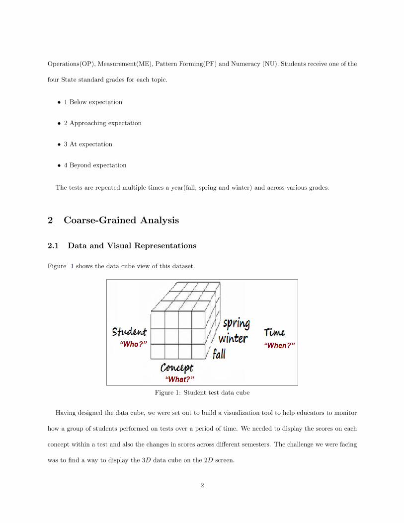
Figure 1 shows the data cube view of this dataset.
Figure 1: Student test data cube
Having designed the data cube, we were set out to build a visualization tool to help educators to monitor
how a group of students performed on tests over a period of time. We needed to display the scores on each
concept within a test and also the changes in scores across different semesters. The challenge we were facing
was to find a way to display the 3D data cube on the 2D screen.
2
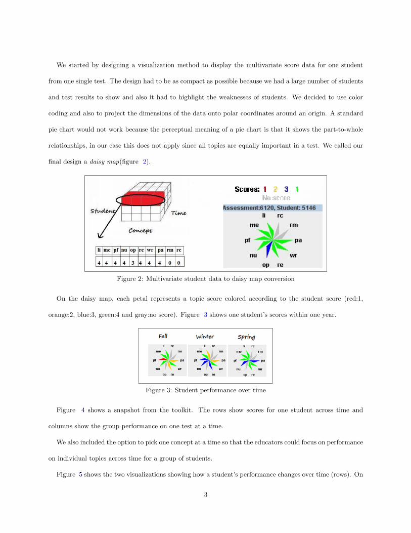
We started by designing a visualization method to display the multivariate score data for one student
from one single test. The design had to be as compact as possible because we had a large number of students
and test results to show and also it had to highlight the weaknesses of students. We decided to use color
coding and also to project the dimensions of the data onto polar coordinates around an origin. A standard
pie chart would not work because the perceptual meaning of a pie chart is that it shows the part-to-whole
relationships, in our case this does not apply since all topics are equally important in a test. We called our
final design a daisy map(figure 2).
Figure 2: Multivariate student data to daisy map conversion
On the daisy map, each petal represents a topic score colored according to the student score (red:1,
orange:2, blue:3, green:4 and gray:no score). Figure 3 shows one student’s scores within one year.
Figure 3: Student performance over time
Figure 4 shows a snapshot from the toolkit. The rows show scores for one student across time and
columns show the group performance on one test at a time.
We also included the option to pick one concept at a time so that the educators could focus on performance
on individual topics across time for a group of students.
Figure 5 shows the two visualizations showing how a student’s performance changes over time (rows). On
3
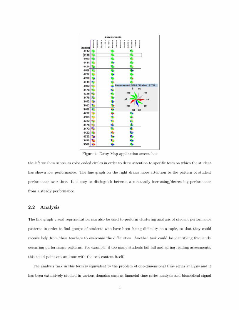
Figure 4: Daisy Map application screenshot
the left we show scores as color coded circles in order to draw attention to specific tests on which the student
has shown low performance. The line graph on the right draws more attention to the pattern of student
performance over time. It is easy to distinguish between a constantly increasing/decreasing performance
from a steady performance.
2.2 Analysis
The line graph visual representation can also be used to perform clustering analysis of student performance
patterns in order to find groups of students who have been facing difficulty on a topic, so that they could
receive help from their teachers to overcome the difficulties. Another task could be identifying frequently
occurring performance patterns. For example, if too many students fail fall and spring reading assessments,
this could point out an issue with the test content itself.
The analysis task in this form is equivalent to the problem of one-dimensional time series analysis and it
has been extensively studied in various domains such as financial time series analysis and biomedical signal
4
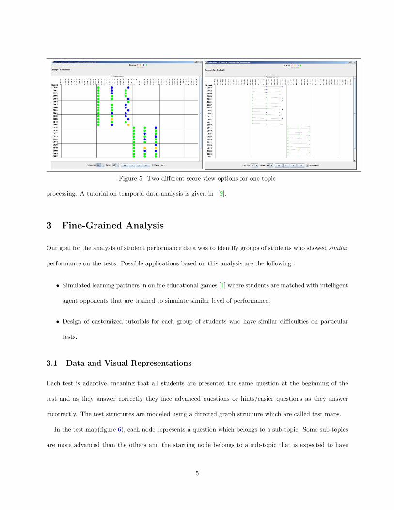
Figure 5: Two different score view options for one topic
processing. A tutorial on temporal data analysis is given in [2].
3 Fine-Grained Analysis
Our goal for the analysis of student performance data was to identify groups of students who showed similar
performance on the tests. Possible applications based on this analysis are the following :
• Simulated learning partners in online educational games [1] where students are matched with intelligent
agent opponents that are trained to simulate similar level of performance,
• Design of customized tutorials for each group of students who have similar difficulties on particular
tests.
3.1 Data and Visual Representations
Each test is adaptive, meaning that all students are presented the same question at the beginning of the
test and as they answer correctly they face advanced questions or hints/easier questions as they answer
incorrectly. The test structures are modeled using a directed graph structure which are called test maps.
In the test map(figure 6), each node represents a question which belongs to a sub-topic. Some sub-topics
are more advanced than the others and the starting node belongs to a sub-topic that is expected to have
5
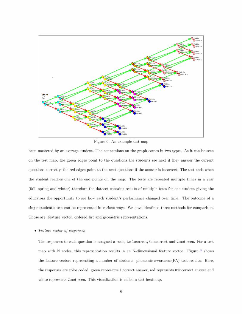
Figure 6: An example test map
been mastered by an average student. The connections on the graph comes in two types. As it can be seen
on the test map, the green edges point to the questions the students see next if they answer the current
questions correctly, the red edges point to the next questions if the answer is incorrect. The test ends when
the student reaches one of the end points on the map. The tests are repeated multiple times in a year
(fall, spring and winter) therefore the dataset contains results of multiple tests for one student giving the
educators the opportunity to see how each student’s performance changed over time. The outcome of a
single student’s test can be represented in various ways. We have identified three methods for comparison.
Those are: feature vector, ordered list and geometric representations.
• Feature vector of responses
The responses to each question is assigned a code, i.e 1:correct, 0:incorrect and 2:not seen. For a test
map with N nodes, this representation results in an N-dimensional feature vector. Figure 7 shows
the feature vectors representing a number of students’ phonemic awareness(PA) test results. Here,
the responses are color coded, green represents 1:correct answer, red represents 0:incorrect answer and
white represents 2:not seen. This visualization is called a test heatmap.
6
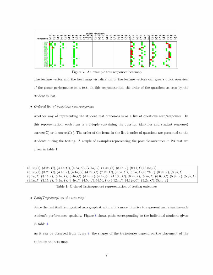
Figure 7: An example test responses heatmap
The feature vector and the heat map visualization of the feature vectors can give a quick overview
of the group performance on a test. In this representation, the order of the questions as seen by the
student is lost.
• Ordered list of questions seen/responses
Another way of representing the student test outcomes is as a list of questions seen/responses. In
this representation, each item is a 2-tuple containing the question identifier and student response(
correct(C) or incorrect(I) ). The order of the items in the list is order of questions are presented to the
students during the testing. A couple of examples representing the possible outcomes in PA test are
given in table 1.
(3.1a,C), (3.2a,C), (4.1a,C), (4.6a,C), (7.1a,C), (7.4a,C), (8.1a, I), (8.1b, I), (8.8a,C)(3.1a,C), (3.2a,C), (4.1a, I), (4.1b, C), (4.7a,C), (7.2a,C), (7.5a,C), (8.2a, I), (8.2b, I), (8.9a, I), (8.9b, I)(3.1a, I), (3.1b, I), (3.4a, I), (3.4b, C), (4.4a, I), (4.4b, C), (4.10a,C), (6.2a, I), (6.2b, I), (6.6a,C), (5.8a, I), (5.8b, I)(3.1a, I), (3.1b, I), (3.4a, I), (3.4b, I), (4.5a, I), (4.5b, I), (4.12a, I), (4.12b, C), (5.2a,C), (5.4a, I)
Table 1: Ordered list(sequence) representation of testing outcomes
• Path(Trajectory) on the test map
Since the test itself is organized as a graph structure, it’s more intuitive to represent and visualize each
student’s performance spatially. Figure 8 shows paths corresponding to the individual students given
in table 1.
As it can be observed from figure 8, the shapes of the trajectories depend on the placement of the
nodes on the test map.
7
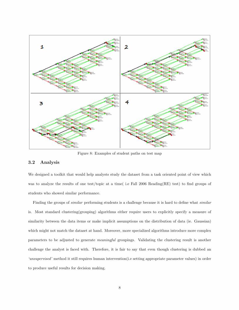
Figure 8: Examples of student paths on test map
3.2 Analysis
We designed a toolkit that would help analysts study the dataset from a task oriented point of view which
was to analyze the results of one test/topic at a time( i.e Fall 2006 Reading(RE) test) to find groups of
students who showed similar performance.
Finding the groups of similar performing students is a challenge because it is hard to define what similar
is. Most standard clustering(grouping) algorithms either require users to explicitly specify a measure of
similarity between the data items or make implicit assumptions on the distribution of data (ie. Gaussian)
which might not match the dataset at hand. Moreover, more specialized algorithms introduce more complex
parameters to be adjusted to generate meaningful groupings. Validating the clustering result is another
challenge the analyst is faced with. Therefore, it is fair to say that even though clustering is dubbed an
‘unsupervised’ method it still requires human intervention(i.e setting appropriate parameter values) in order
to produce useful results for decision making.
8
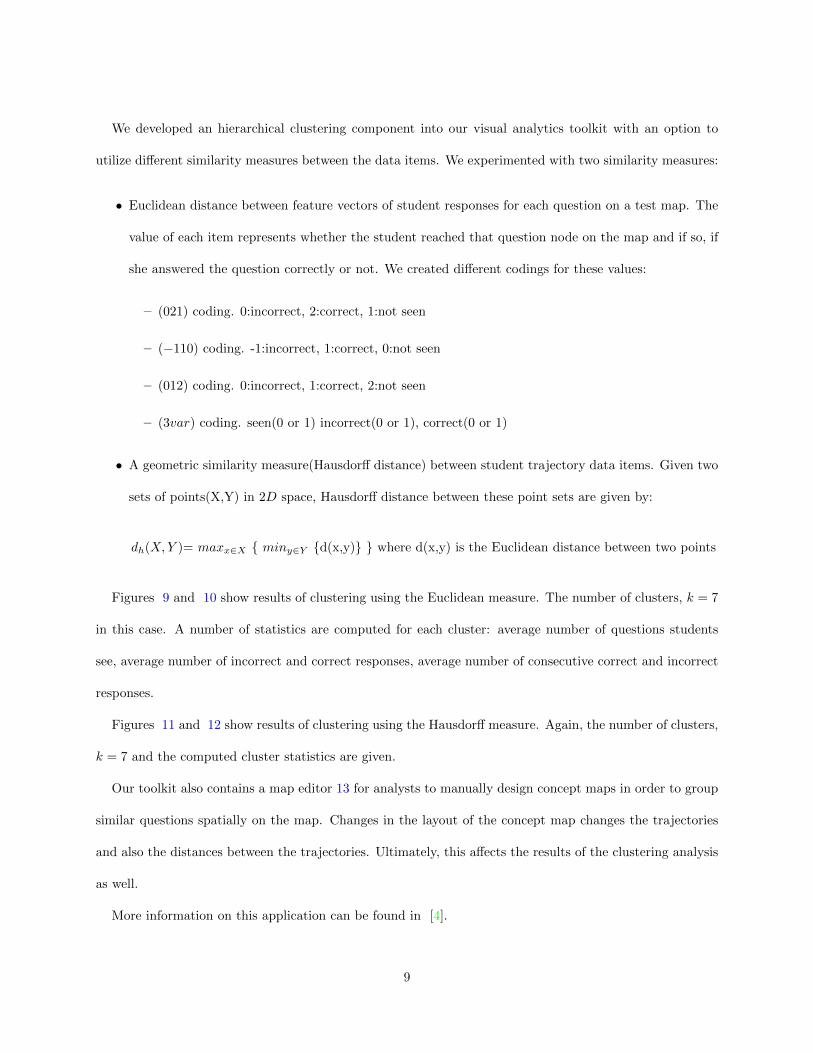
We developed an hierarchical clustering component into our visual analytics toolkit with an option to
utilize different similarity measures between the data items. We experimented with two similarity measures:
• Euclidean distance between feature vectors of student responses for each question on a test map. The
value of each item represents whether the student reached that question node on the map and if so, if
she answered the question correctly or not. We created different codings for these values:
– (021) coding. 0:incorrect, 2:correct, 1:not seen
– (−110) coding. -1:incorrect, 1:correct, 0:not seen
– (012) coding. 0:incorrect, 1:correct, 2:not seen
– (3var) coding. seen(0 or 1) incorrect(0 or 1), correct(0 or 1)
• A geometric similarity measure(Hausdorff distance) between student trajectory data items. Given two
sets of points(X,Y) in 2D space, Hausdorff distance between these point sets are given by:
dh(X,Y )= maxx∈X { miny∈Y {d(x,y)} } where d(x,y) is the Euclidean distance between two points
Figures 9 and 10 show results of clustering using the Euclidean measure. The number of clusters, k = 7
in this case. A number of statistics are computed for each cluster: average number of questions students
see, average number of incorrect and correct responses, average number of consecutive correct and incorrect
responses.
Figures 11 and 12 show results of clustering using the Hausdorff measure. Again, the number of clusters,
k = 7 and the computed cluster statistics are given.
Our toolkit also contains a map editor 13 for analysts to manually design concept maps in order to group
similar questions spatially on the map. Changes in the layout of the concept map changes the trajectories
and also the distances between the trajectories. Ultimately, this affects the results of the clustering analysis
as well.
More information on this application can be found in [4].
9
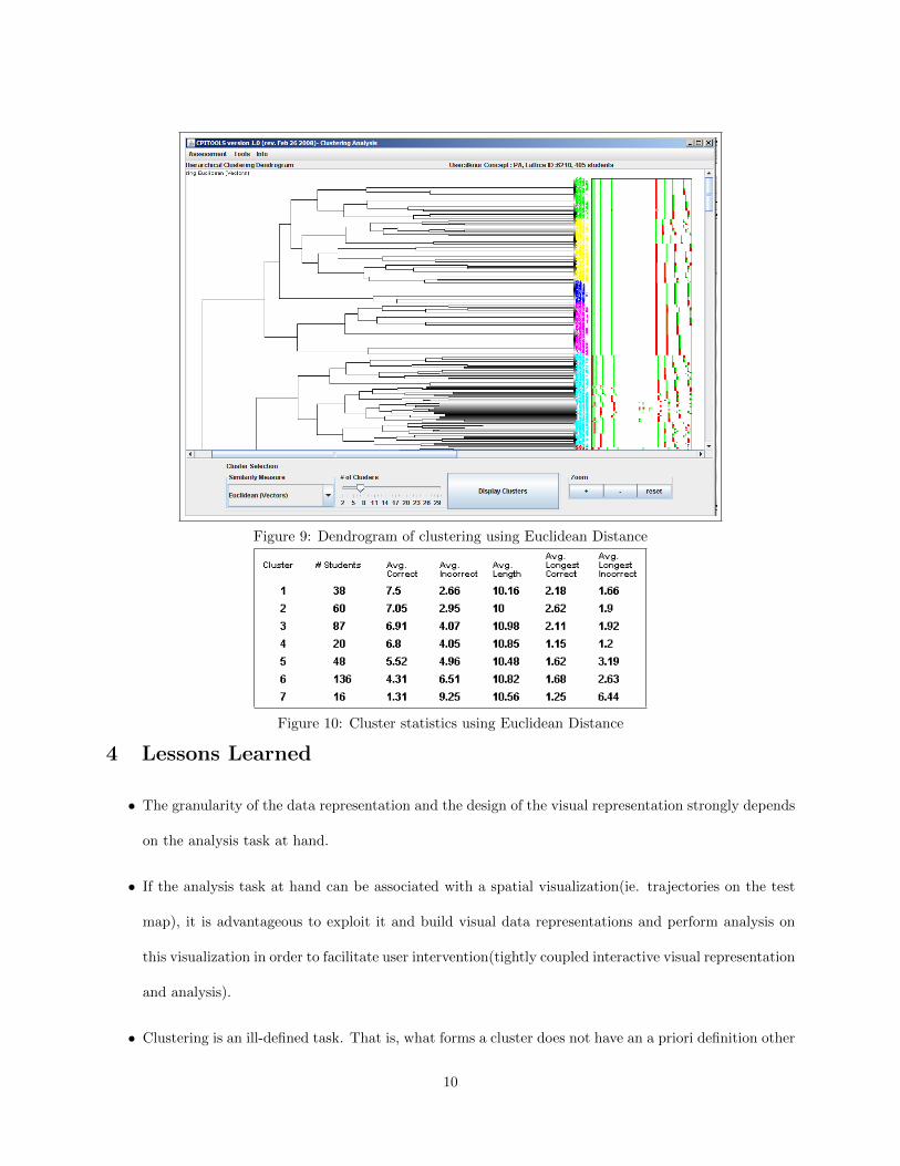
Figure 9: Dendrogram of clustering using Euclidean Distance
Figure 10: Cluster statistics using Euclidean Distance
4 Lessons Learned
• The granularity of the data representation and the design of the visual representation strongly depends
on the analysis task at hand.
• If the analysis task at hand can be associated with a spatial visualization(ie. trajectories on the test
map), it is advantageous to exploit it and build visual data representations and perform analysis on
this visualization in order to facilitate user intervention(tightly coupled interactive visual representation
and analysis).
• Clustering is an ill-defined task. That is, what forms a cluster does not have an a priori definition other
10
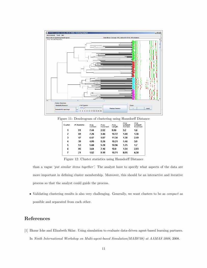
Figure 11: Dendrogram of clustering using Hausdorff Distance
Figure 12: Cluster statistics using Hausdorff Distance
than a vague ‘put similar items together’. The analyst have to specify what aspects of the data are
more important in defining cluster membership. Moreover, this should be an interactive and iterative
process so that the analyst could guide the process.
• Validating clustering results is also very challenging. Generally, we want clusters to be as compact as
possible and separated from each other.
References
[1] Ilknur Icke and Elizabeth Sklar. Using simulation to evaluate data-driven agent-based learning partners.
In Ninth International Workshop on Multi-agent-based Simulation(MABS’08) at AAMAS 2008, 2008.
11
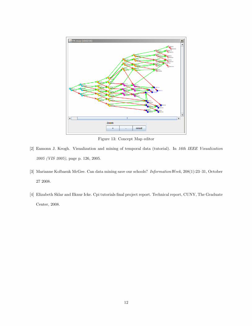
Figure 13: Concept Map editor
[2] Eamonn J. Keogh. Visualization and mining of temporal data (tutorial). In 16th IEEE Visualization
2005 (VIS 2005), page p. 126, 2005.
[3] Marianne Kolbasuk McGee. Can data mining save our schools? InformationWeek, 208(1):23–31, October
27 2008.
[4] Elizabeth Sklar and Ilknur Icke. Cpi tutorials final project report. Technical report, CUNY, The Graduate
Center, 2008.
12
Related Documents