Final series of double page experimenst
Aug 02, 2015
Welcome message from author
This document is posted to help you gain knowledge. Please leave a comment to let me know what you think about it! Share it to your friends and learn new things together.
Transcript
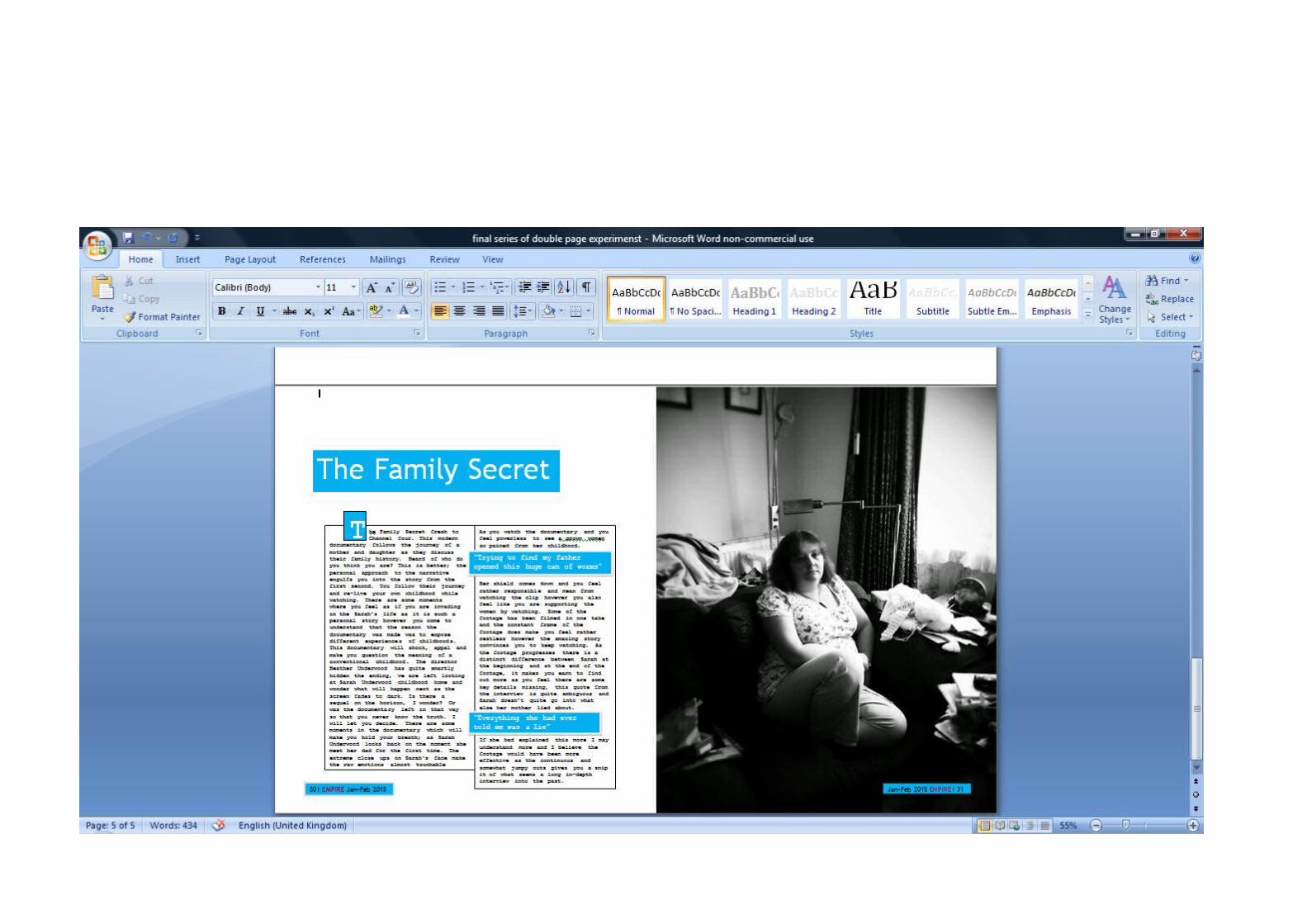
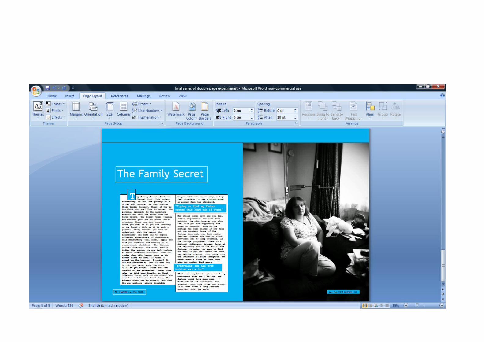
I have experimented further since the first slide share of double page spread examples. I believe the most effective style/ double page spread was this style the first one on this slide share therefore I decided to experiment further with how black and white can be used to enhance the text and the image of my mum. I believe the black and white studies are the most effective I tried out experiments using white and blue however I do not believe empire cinema would generally publish a magazine article with such a vibrant background. The use of blue is mainly to support channel fours colour pallet however like I have discussed in my previous posts I believe that by using black and white it is more effective. However I felt it was necessary to explore the use of blue to demonstrate I have experimented in a variety of different styles.
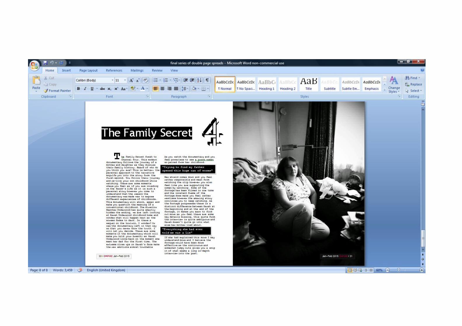
The two most successful styles are the first two styles in this slide share. I like the first slide share example the use of white and black enhances the shadowy and moody image of my mum reflecting on the past. However I also like the second screen shot style as it enhances the text, the dark background also enhances the lighter tones in my mum’s images. Therefore to combine these two styles to create my final double page spread I am going to experiment with boarders around the text and see whether that enhances the text and makes the documentary stand out more.
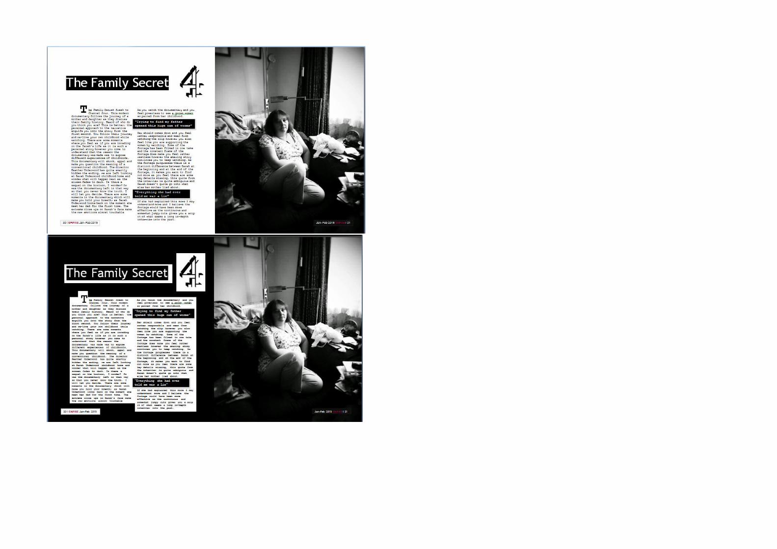
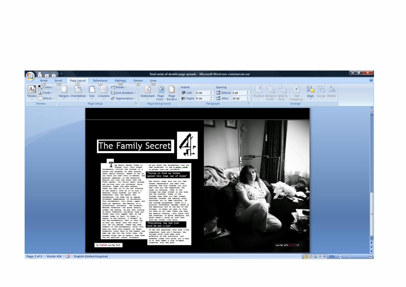
I have drawn lines around the text to create a boarder and by doing so the quote boxes stand out more. I have kept the background of the page white as I feel that it still looks sophisticated and conventional to have a white background. I am unsure as to whether the boxes help the double page spread or enhances all of the white negative space therefore I am still not completely sure of the style I want to make as the final double page spread
I have also made the box on the bottom left and right of the page stand out more by making the left box have a highlighted black boarder like the one which is around the text and I have also used a white boarder around the right box to enhance the page number and information.
Related Documents