In what ways does your media product use, develop or challenge forms and conventions of real media products? Here is my first design of my magazine that I developed using Microsoft Publisher, as you can see it did not conform to the stereotypical design, professional magazine publishers have the mast- head in the up in the left corner. This design was more like a newspaper. Later on you can see that I changed the mast-head of the magazine several times, I feel that the final design of my front page did conform to the layout of professional publishers. As you can see the second design of the front page was more linear to the design of professional magazines, I decided to keep the same colour scheme to the original design but I was still not satisfied. The differences between the original design to the final product was substantial. I do believe that the final product challenges forms of real media product because it was the target audience in mind at all times and understands that professional appearance is of extreme importance. Original Design 2 nd Design Final Product

Evalutation of music mag d&b
Jul 22, 2015
Welcome message from author
This document is posted to help you gain knowledge. Please leave a comment to let me know what you think about it! Share it to your friends and learn new things together.
Transcript

In what ways does your media product use, develop or challenge forms and conventions of real media products?
Here is my first design of my magazine that I developed using Microsoft Publisher, as you can see it did not conform to the stereotypical design, professional magazine publishers have the mast-head in the up in the left corner. This design was more like a newspaper. Later on you can see that I changed the mast-head of the magazine several times, I feel that the final design of my front page did conform to the layout of professional publishers.
As you can see the second design of the front page was more linear to the design of professional magazines, I decided to keep the same colour scheme to the original design but I was still not satisfied.
The differences between the original design to the final product was substantial. I do believe that the final product challenges forms of real media product because it was the target audience in mind at all times and understands that professional appearance is of extreme importance.
Original Design 2nd Design Final Product
In what ways does your media product use, develop or challenge forms and conventions of real media products? Continued…
Similarities Differences
Location of Mast-Head NME: Larger text
Colour Scheme of Mast-Head NME: Close-up Shot
Location of Image D&B: Mid-Shot
Skyline NME: Background (Snow Flakes)
Free Accessories NME: Posters D&B: Limited Edition CD
D&B: White Background
Location of Barcodes
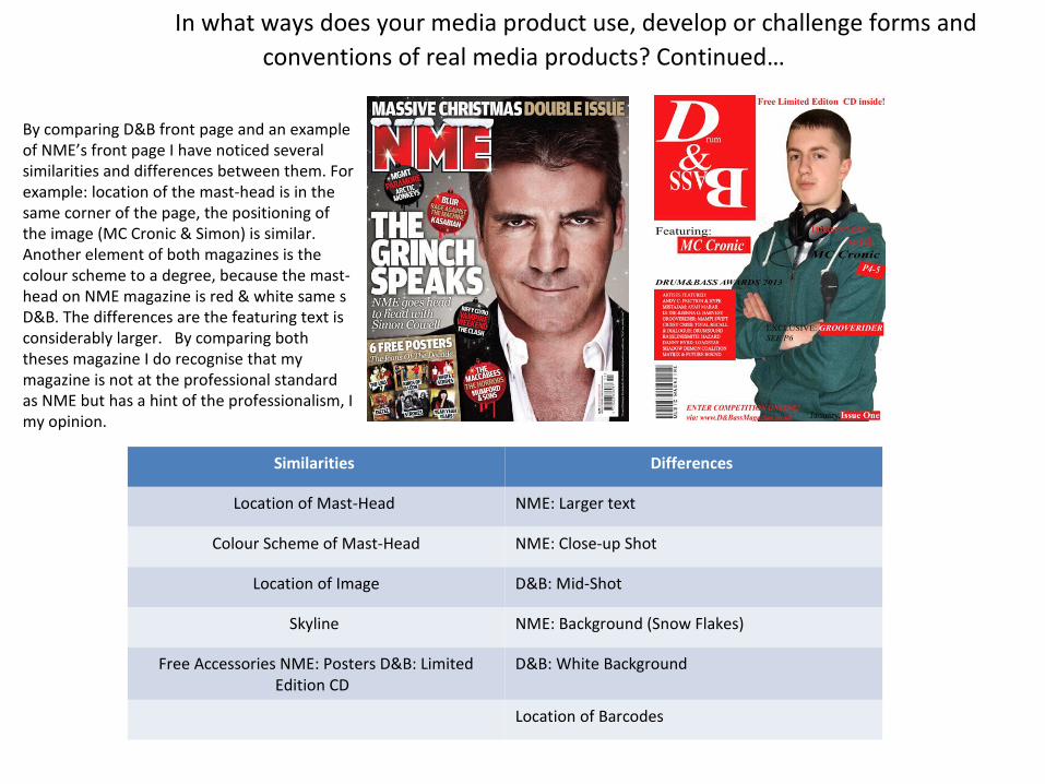
By comparing D&B front page and an example of NME’s front page I have noticed several similarities and differences between them. For example: location of the mast-head is in the same corner of the page, the positioning of the image (MC Cronic & Simon) is similar. Another element of both magazines is the colour scheme to a degree, because the mast-head on NME magazine is red & white same s D&B. The differences are the featuring text is considerably larger. By comparing both theses magazine I do recognise that my magazine is not at the professional standard as NME but has a hint of the professionalism, I my opinion.
In what ways does your media product use, develop or challenge forms and conventions of real media products? Continued…
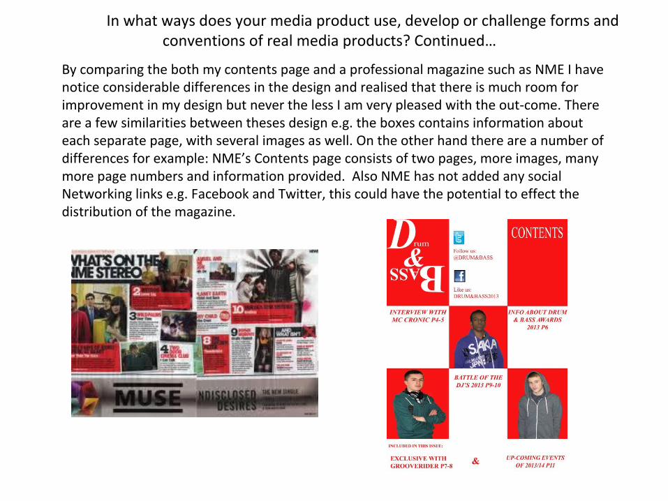
By comparing the both my contents page and a professional magazine such as NME I have notice considerable differences in the design and realised that there is much room for improvement in my design but never the less I am very pleased with the out-come. There are a few similarities between theses design e.g. the boxes contains information about each separate page, with several images as well. On the other hand there are a number of differences for example: NME’s Contents page consists of two pages, more images, many more page numbers and information provided. Also NME has not added any social Networking links e.g. Facebook and Twitter, this could have the potential to effect the distribution of the magazine.

In what ways does your media product use, develop or challenge forms and conventions of real media products? Continued…
By comparing both double-page spreads I have noticed many similarities and differences in theses design e.g. NME has used a wider range of images consisting of Close-up’s Mid-shot and group images. Their title texts are larger, but the colour scheme is the same which shows that even professionals believe that red and white compliment each other. This shows that I chosen I got colour scheme. NME have had the first letter in their article larger taking up three lines. Even though there are many differences between the professional design and my own I still remain confident that my design could be a possible new angle of designs magazines, which gives my design a unique edge. Which potentially could become popular by publisher in the future.

How does your media product represent particular social groups?
The Double-Page spread was based on interviewing Drum & Bass MC Cronic, who is 18 years old. So Audiences of a similar age group would this attracted to this article. Also the other two people in the contents are both from the 16-18 age group as well so mainly 16-18 would have the most appeal to this magazine. Other social group who would have the most appeal to this magazine would be Drum & Bass enthusiasts because they also attend gig’s together so they would share an interest in this magazine.
The Colours and Font has the potential to attract younger audiences due to the brightness which gives the magazine a loud in your face effect.
On the Contents page there are links to “follow” the magazine on Twitter and “Like” the Facebook page. Using social networking sites it helps the magazine to get recognised in the world of music and advertising. Also by asking readers to follow or like, it increases the popularity of the magazine both from “word of mouth” and via the internet. With internet popularity it potential give the magazine a window of opportunity to explode into the online magazine industry.

What kind of media institution might distribute
your media product and why?
I would get the print and media industry to assist in the printing and distribution of Drum & Bass by contacting institutions such as: Bauer Media who are very professional distribution company whop with a wide range of well-known magazine of all kind of genres e.g. Heat, Empire, KERRANG!, Zoo, Planet Rock and 4 Music. This company would be essential for the survival of my music magazine in this kind of competitive market.
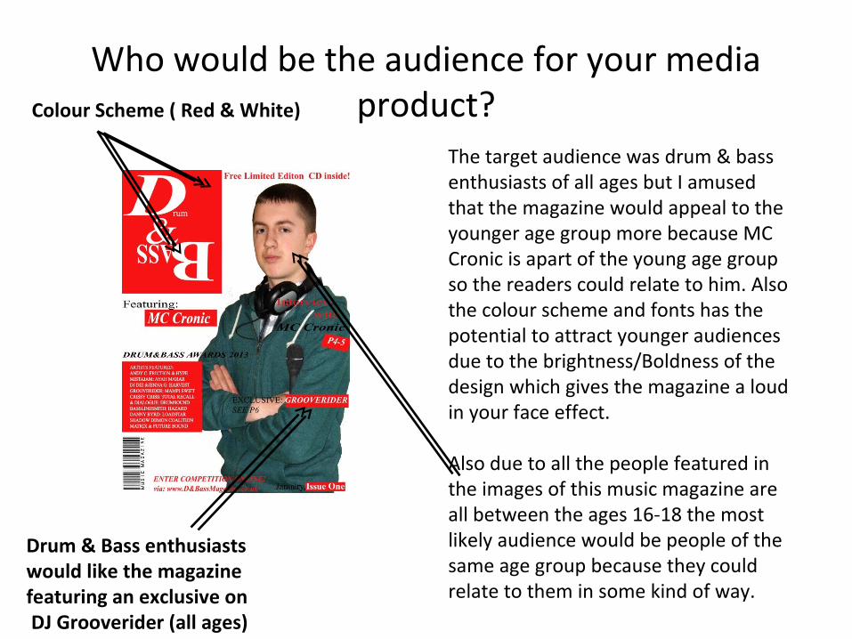
Who would be the audience for your media product?
The target audience was drum & bass enthusiasts of all ages but I amused that the magazine would appeal to the younger age group more because MC Cronic is apart of the young age group so the readers could relate to him. Also the colour scheme and fonts has the potential to attract younger audiences due to the brightness/Boldness of the design which gives the magazine a loud in your face effect.
Also due to all the people featured in the images of this music magazine are all between the ages 16-18 the most likely audience would be people of the same age group because they could relate to them in some kind of way.
Colour Scheme ( Red & White)
Drum & Bass enthusiasts would like the magazine featuring an exclusive on DJ Grooverider (all ages)
How did you attract/address your audience?
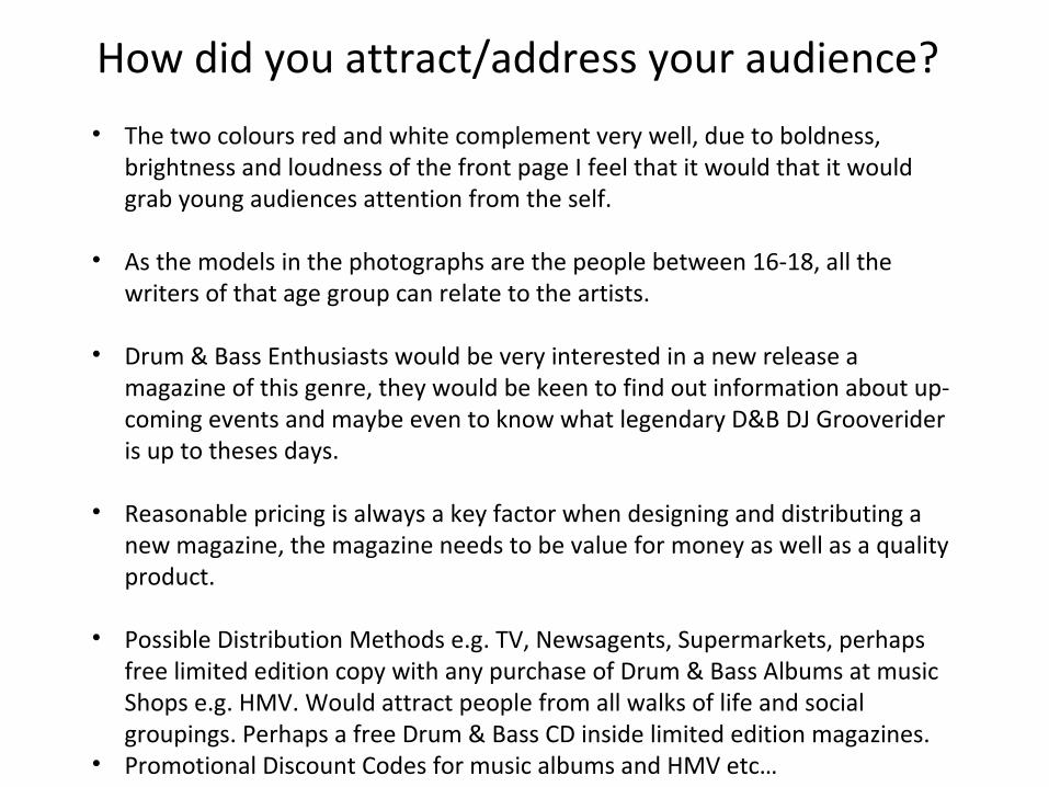
• The two colours red and white complement very well, due to boldness, brightness and loudness of the front page I feel that it would that it would grab young audiences attention from the self.
• As the models in the photographs are the people between 16-18, all the
writers of that age group can relate to the artists. • Drum & Bass Enthusiasts would be very interested in a new release a
magazine of this genre, they would be keen to find out information about up-coming events and maybe even to know what legendary D&B DJ Grooverider is up to theses days.
• Reasonable pricing is always a key factor when designing and distributing a new magazine, the magazine needs to be value for money as well as a quality product.
• Possible Distribution Methods e.g. TV, Newsagents, Supermarkets, perhaps free limited edition copy with any purchase of Drum & Bass Albums at music Shops e.g. HMV. Would attract people from all walks of life and social groupings. Perhaps a free Drum & Bass CD inside limited edition magazines.
• Promotional Discount Codes for music albums and HMV etc…

What have you learnt about technologies from the process of constructing this product?
I already knew the process of editing images using image manipulation software such as: Photoshop CS6 due to GCSE. Never the less over the course of the development of this project I have gained considerable amount of new skills, confidence in development and design. By developing this product it has increased my understanding on how to operate this software. There are many things that I recapped on e.g. Clone Stamp Tool, Magic Eraser Tool, brightness/contracts and levels. I now have the ability to create an account of progression of development and how to analysis other people work, to provide them with constructive feedback by critiquing their work.
By using the Magic Eraser Tool I deleted the background before layering image on another.

Second part of photo editingAs you can see the microphone is damaged so by using photo manipulation software “photoshop”.
Stages of editing:
•“Clone Stamp Tool” make the microphone just black with no damage. I fixed the damage of the microphone used the clone stamp tool, on photoshop CS6.• I also used the “Flip Canvas Horizontal” to reverse the image.

Looking back at your preliminary task, what do you feel you have learnt in the progression from
it to the full product? Since I began the development of my music magazine, I feel extremely confident that I have developed my existing skills of using Photo Manipulation Software from a high GCSE standard to a more A-Level relevant standard. I also believe that I have picked up many new skills during the progression of this project e.g. using blogging websites i.e. www.wordpress.com and Google's “blogger”, as well as creating survey’s on www.polldaddy.com which I've used to reinforce my evaluation of this project by using the feedback from peers. Their feedback via online survey was vey helpful with this evaluation of the project and aided me to critique my own work to find out where there was room for improvement.
Link to Survey: http://matthewmediablog.polldaddy.com/s/matthew-s-as-media-music-magazine
I have also increased my understanding and ability to create a step by step account of progression of this project as you can see via http://matasmedia.blogspot.co.uk/ and hopefully I will be able to transfer this vital skill to my other studies.
Due to GCSE photography I have a wide knowledge of the elements needed to create quality photographs e.g. lighting, angles and perhaps formal elements of photography i.e. tone, contrast or texture . This help me in the creation of the images need to compete the magazine. By using my own photograph I have increased my knowledge and recapped on the importance of perfection in the studio. Therefore I am confident that I have met the criteria for the project.
Related Documents

![Crave [music] Mag](https://static.cupdf.com/doc/110x72/568c36fa1a28ab02359a0b71/crave-music-mag.jpg)


![Music mag..[1]](https://static.cupdf.com/doc/110x72/547a7408b4af9ff5508b456b/music-mag1.jpg)