YOUNG MISTAKES ALRIGHT EVALUATION

Evaluation presentation
Jul 16, 2015
Welcome message from author
This document is posted to help you gain knowledge. Please leave a comment to let me know what you think about it! Share it to your friends and learn new things together.
Transcript

YOUNG MISTAKES
ALRIGHT
EVALUATION
CODES AND
CONVENTIONSIn what ways does your media product use, develop or challenge forms and conventions of real media products?
The codes and conventions for alternative rock has been portrayed in my music video significantly through the use of a band performance (focus of instruments), close ups and fast cuts. We used a range of different locations and costumes to enable the video a true indie/rock inspired look and ambiance. In videos such as ‘The Killers – When You Were Young’ and ‘Muse – Starlight’, they both focus on the mise en scene and dress the singers in a smart/professional way and this was just one thing that we was able to reference. The performances throughout vary from remaining calm, collective and almost a little too serious, to being fun, energetic and incredibly immature. This change of expression was used to connote how the band are serious about their music and being successful, but their also young and want to have fun (by doing this they can relate to each other and their audience). A unique convention that I also included in the video was to use the cinematic technique of a handheld camera. One of the band members in fact holds the camera himself whilst filming the other members (this made the video more fun and documentary like involving the audience in parts of the bands life). Although most alternative rock videos hold some kind of narrative, I challenged this convention by making the video incredibly random by transitioning from a brick wall to a woods, bowling alley and studio. It doesn’t have a beginning, middle and end but just presents what the boys love to do.

ANDREW GOODWIN Andrew Goodwin (A media theorist) says that there are six codes and conventions that almost every music video includes, these are the following; The record company's demand for exposure of the artist will mean a lot of close-up shots of the singer/band; A relationship between the music and the video; A relationship between the lyrics and vision; Genre characteristics; There will be references to the notion of looking and use of inter-textual referencing. Within my video I decided to feature all of these conventions but only use them briefly. For example, with the lyrics ‘keep your teeth nice and clean’ a close up shot of the lead singer is used as he mimes the words and brushes his teeth. Through this shot a notion of looking is used as the lead singer breaks the fourth wall and looks directly into the camera, involving the audience within the video and creating a more personal relationship. There is a connection between the music and video as the song is fast paced which joins together with the fast cuts and joyful atmosphere. The song is a representation of being young and free and through our video the young lads manage to portray this by fooling around.
Inter-textual referencing was not something we was too keen about including as we wanted it to be fully natural without showing signs of commodification. We decided to challenge the genre boundaries and what you would expect to see and decided to involve a pop reference from ‘One Direction – Live While Were Young’ by using the clicking dance routine shot. This is similar to what ‘Blink 182’ done when they referenced ‘The Backstreet Boys’ in a humiliating way and mocked them in their ‘All The Small Things video’.

How effective is the combination of your main product and ancillary texts?
My main product and ancillary texts combine in a magnificent way, mainly through the location and colour theme. Within the Music video one of my locations is a brick wall that the band stand in front of (this shows how even somewhere not interesting at all, the band are still able to entertain the audience). I have decided to use the brick wall as the background on some of the sides on my digipak. The colour scheme is blue, white and black. These colours represent a British theme but also communicate the mise end scene and costuming as the lead singer wears blue throughout. The same typography is used on the digipak and poster and this is part of the bands logo along with a silhouette of a head. The silhouette is also featured on the poster and digipak and is a representation of pure music and how the audience don’t need to know what the band looks like to be able to like them, they already should because our demographic share the same interest.
The lighting within the music video is bright and cheerful and is the same on the poster and digipak. The blue and white contrasts against the brick wall and black and therefore looks more appealing but also portrays the bands personality and ideologies.
MAIN PRODUCT
AND ANCILLIARY TEXTS

DIGIPAK
After researching into other album covers and digipaks, I created a brief for a designer to create something unique, iconic and which holds many representations of the band. I made sure to include all of the codes and conventions of a digipak such as the record label, barcode, song list, band name and legal text. I stuck to the same colour theme throughout such as blue, white and black which represents the mise en scene and costuming throughout the video. The logo of the head is symbolic to the band as it is a silhouette and therefore means the audience should like the band through their looks and commodification, but through their passion and music.
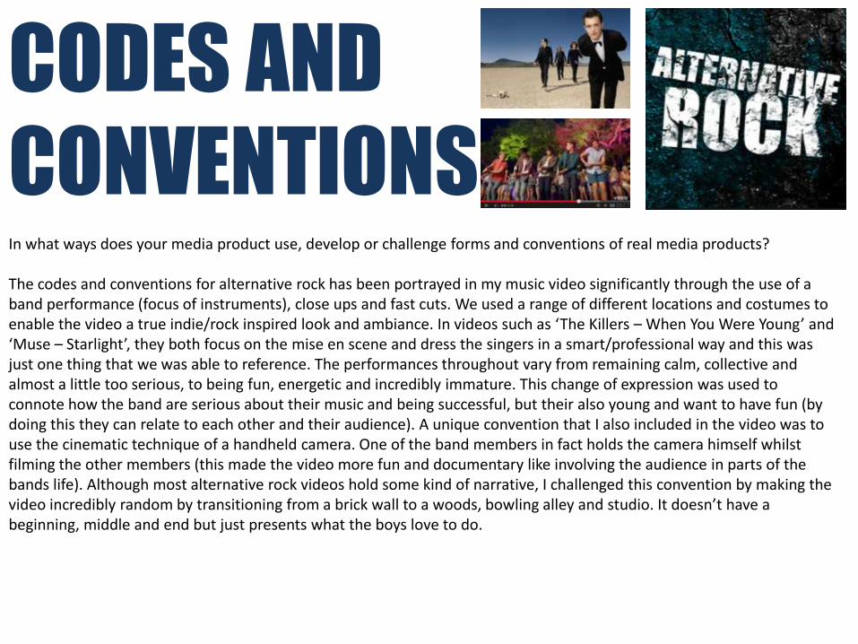
POSTERAfter also researching into other music video posters I realised how it is essential for it to relate to the music video. It a form of advertisement to give the audience a taste of what to expect and therefore create a buzz and get everyone talking about it. Including the bands social networking sites on the poster makes it more modern and opens the video and music up to a wider audience. I included the digipaks front cover on the poster to show how appealing it is and to link all 3 of my products together. I have once again stuck to the same colour theme and linked it back to the videos setting by including the brick wall.

What have you learned from your audience feedback?
The audience feedback has been extremely essential to the videos success and final outcome as we received it from who would be our target audience (18-25 male and female). When pitching our idea Maddie and me were very keen on what we wanted to create and was sure it was going to work. We received three 2 stars and 1 three star rating as we shared our song, record company choice and ideas with the class. The comments were very helpful as people said that that is a ‘Clear understanding of where the band fits in the industry’ ‘ a good connection between the band style, the video style and the song’ and that it is ‘in need of intertextual referencing’. On the first screening we received comment such as ‘the video is fun and makes you laugh’ as well as ‘The dog has more charisma than Adam’. The feedback was split between positive and negative but was all constructive. Our main points were that it needed to include another location, less of the brick wall shot sand more of Adam. We were praised on the matching of our visuals and lyrics and how energetic the other band members were and really suited the role. This lead us to the idea of filming in the arcades as it represents the band more and really brings out the colour, fun and humour within the video as the lyrics ’bought some wheels… lost control, hit a wall’ is heard whilst Adam is on a arcade motorbike flashing ‘insert coins’ on the screen; this represents the credit crunch in Britain and how its hard for teens to get money.
After showing our final music video to 4 random people within the school I recorded what they thought of it and there were no negative comments at all. The closest we received to being negative was ‘you could have included another split screen grid because of how well it works’. We were told how the video was fun and constantly kept you amused. This taught me how including the other location of the arcades really gave the video a boost in terms of being more entertaining. It also taught me how including a intertextual reference could actually determine the success of a media product as it will make another audience familiar with the video, is shown to a wider audience, creates a buzz and this therefore means more money.
AUDIENCE FEEDBACK

How did you use media technologies in the construction and research, planning and evaluation stages?
MEDIA TECHNOLGIES USED

RESEARCH AND PLANNINGThe research and planning of my final piece was constructed through the use of the blogging website www.Blogger.com. Blogger is a lot more beneficial for my planning, as I was able to easily find things that I needed through the use of labels. It is well organized and taught me to write down everything I do, every decision made and how essential it is to note mine and Maddies conversations and the music videos progression. Through this website I was able to add links to other music videos on ‘Youtube’ that I have analyzed and key information found about music video codes and conventions, theorists and costume ideas through ‘Wikipedia’.

Constructing the video in which editing was my main focus was extremely difficult due to the many cuts, but as I used a ‘Apple Mac’ and The ‘Final Cut Pro’ software I was eager to make it as professional looking as possible to reach my highest potential. Maddie shot the video using a Flip HD camcorder, which gave it a massive impact on how it looked (good and bad), but we should have suggested using the broadcasting camera for a wider screen and better quality. When uploading the footage we converted it from mp4 to DV using MPEG Streamclip and this made the shots looks a lot clearer and less fuzzy which was a huge relief and benefit. When creating my Digipak and Poster I used ‘Adobe Photoshop CS6’ as this was the software with most variety available and what I had already been trained on. Before actually starting to film we decided to make a Animatic through our story board shots to give us an idea of the timings, pace and combination of lyrics and visuals.
CONSTRUCTION

For my evaluation, I used ‘Youtube’ and social networking sites as my media technology to receive feedback from an audience. Using these sites created a buzz (which could have been bad or good) but determined to get comments I posted it anyway. The video was shared on ‘Facebook’ and by using the ‘Retweet’ button on ‘Twitter’. It was favourited by many users on ‘Twitter’ but I unfortunately didn’t receive any comments. However, on ‘Facebook’ the comments were very vague and similar but unbelievably positive.
EVALUATION STAGES
Related Documents