What do you feel you have learnt from the progression from your preliminary task to your foundation portfolio (music magazine)

Evaluation Part 6
Aug 06, 2015
Welcome message from author
This document is posted to help you gain knowledge. Please leave a comment to let me know what you think about it! Share it to your friends and learn new things together.
Transcript
What do you feel you have learnt from the progression from your preliminary task to your
foundation portfolio (music magazine)

Preliminary Task
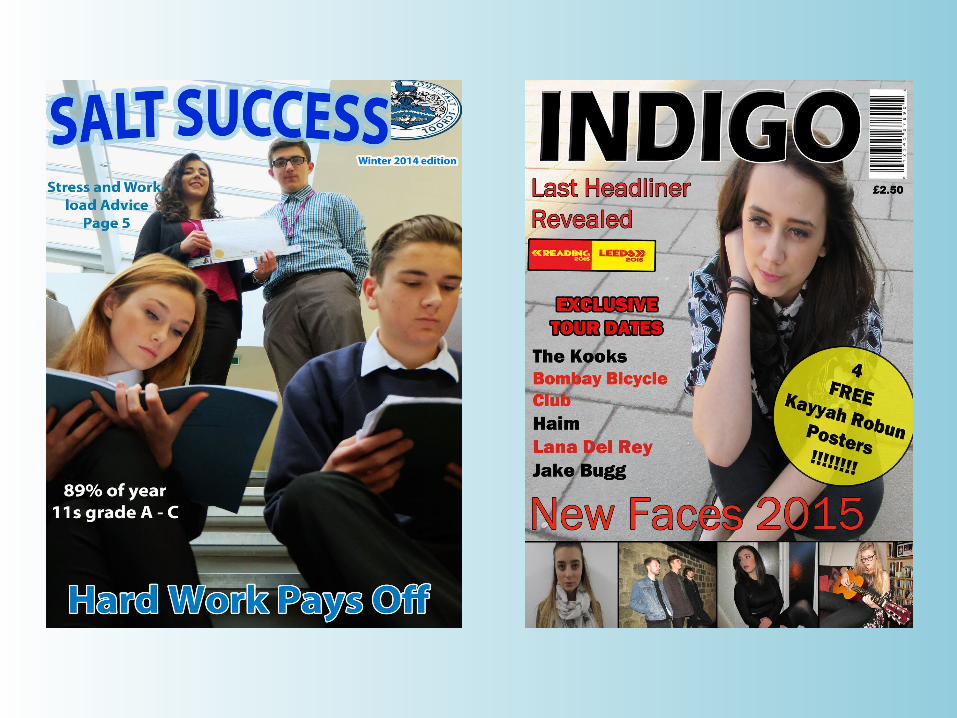
When I did my preliminary task I was still in the process of figuring out how exactly to use photoshop, therefore I only used the basic skills I knew how to use.
I only used one original image on my front cover but I had thought through how I wanted it to be and it came out how I had hoped.
I also used the same colour for all the text on my front cover which was blue and white. This meant that the masthead didn’t stand out except for the fact it was bigger than most other fonts and because I had used a tool to bend the writing to create a bridge shape. After doing research on magazines, I found out that magazines don’t tend to use those shape tools to bend there text, therefore this is something I have corrected now.
The lighting for my preliminary task wasn’t correct, I used lighting but it wasn’t used properly and instead as you can see, the image came out more yellow.
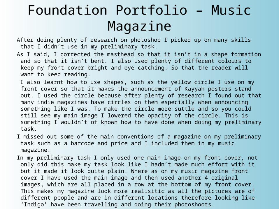
Foundation Portfolio – Music MagazineAfter doing plenty of research on photoshop I picked up on many skills that I didn’t use
in my preliminary task.As I said, I corrected the masthead so that it isn’t in a shape formation and so that it
isn’t bent. I also used plenty of different colours to keep my front cover bright and eye catching. So that the reader will want to keep reading.
I also learnt how to use shapes, such as the yellow circle I use on my front cover so that it makes the announcement of Kayyah posters stand out. I used the circle because after plenty of research I found out that many indie magazines have circles on them especially when announcing something like I was. To make the circle more suttle and so you could still see my main image I lowered the opacity of the circle. This is something I wouldn’t of known how to have done when doing my preliminary task.
I missed out some of the main conventions of a magazine on my preliminary task such as a barcode and price and I included them in my music magazine.
In my preliminary task I only used one main image on my front cover, not only did this make my task look like I hadn’t made much effort with it but it made it look quite plain. Where as on my music magazine front cover I have used the main image and then used another 4 original images, which are all placed in a row at the bottom of my front cover. This makes my magazine look more realisitic as all the pictures are of different people and are in different locations therefore looking like ‘Indigo’ have been travelling and doing their photoshoots.
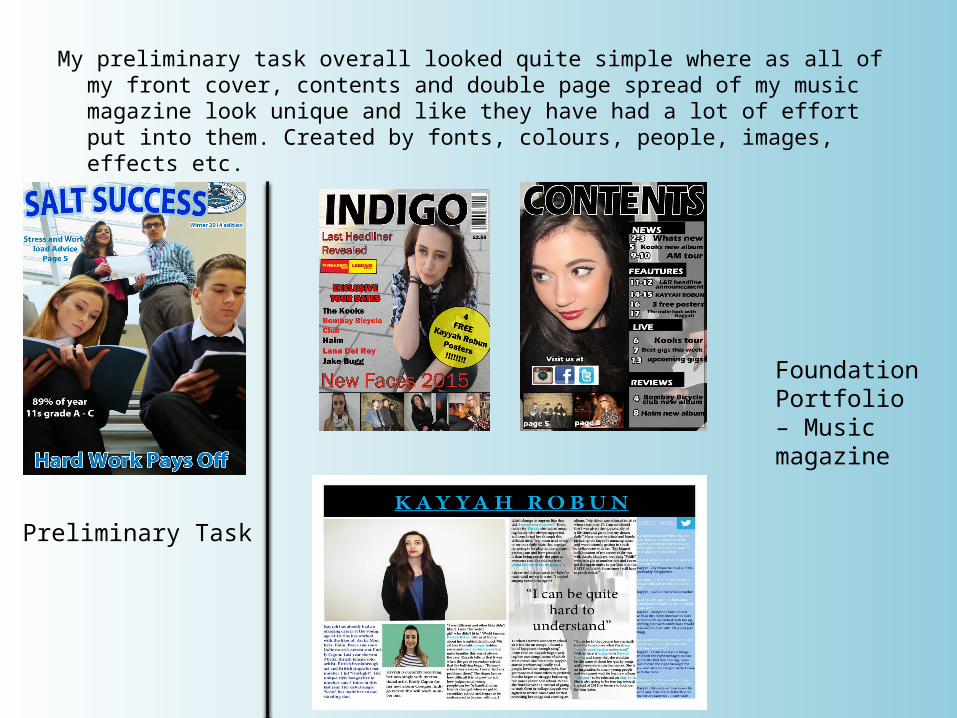
My preliminary task overall looked quite simple where as all of my front cover, contents and double page spread of my music magazine look unique and like they have had a lot of effort put into them. Created by fonts, colours, people, images, effects etc.
Preliminary Task
Foundation Portfolio – Music magazine
Related Documents