Name: Aaron Thomas Candidate Number: 6508 Center Name: St. Paul’s Catholic College Center Number: 64770 OCR Media Studies – A2 Media Studies Unit G324: Advanced Production Portfolio Evaluation

Welcome message from author
This document is posted to help you gain knowledge. Please leave a comment to let me know what you think about it! Share it to your friends and learn new things together.
Transcript
Name: Aaron ThomasCandidate Number: 6508Center Name: St. Paul’s Catholic CollegeCenter Number: 64770
OCR Media Studies – A2 Media Studies
Unit G324: Advanced Production Portfolio
Evaluation

Question 1
In what ways does your media product use, develop or challenge forms and conventions of real media products?
For me to take part in constructing the perfect media product. I had to gain an understanding of the codes and conventions from watching other trailers and describe its effect on the audience. For example, the Emmerdale trailer was a big source inspiration for our soap opera trailer because of flash-back transition effect which reflects the utopian and dystopian disequilibrium. Similarly following from this, our trailer ‘Meadows End’, denotes a sense of ‘binary opposite’ (Levi Strauss) to try and draw the attention of the target audience, For example, our trailer focuses on a nightmare vs. reality theme, which could challenge some soap opera conventions. In our trailer the music (Taylor Swift – Wildest dreams) influences the audiences mood when watching the trailer. The achy, love-struck lyrics are paramount and beautiful. The chorus pulls the whole message of the song together. The blurinessin the background give the song a dreamy feeling which is what I wanted my audience to take from the song. The lyrics from the non-diegetic soundtrack: ‘wildest dreams’ convey our theme of the trailer and the illusion of powerful misogyny the protagonist has to face. Also the lyric of “nothing lasts forever, this is going to take me down’’ pragmatically suggests that the female protagonist’s life (Lilly) will come crashing down, taking away her happiness and the happiness of those around her (Hayden). We are also given a description of the male protagonist through the non-diegetic soundtrack, “so tall, and handsome as hell”, we wanted to construct the trailer in a way that the lyrics synchronize with his representation to reinforce “female gaze” (Laura Muvley)We wanted to use a hood for the male antagonist (Ace) because it symbolizes a hint of fallacious behavior and the stereotypical representation suggests that the male is masculine and tough. However, for the female protagonist we wanted her to use more casual clothing to convey the representation of her innocence and “male gaze” (Laura Mulvey). The genre of our trailer is “different” (Steve Neal) because we haven’t gone with the instance of working class communities, as a group we focused more on the settings that hint the female protagonist’s story. For example, Ace watches Lilly and Hayden's while they drink and flirt, which connotes Ace is jealous and furious of the relationship between Hayden and Lilly and also suggests that he will do something disastrous later on to show his dominance towards them. Additionally, we used non-diegetic dialogue of the swings creaking at the beginning of the trailer. The volume is high pitch to convey the sound as intensifying and creepy. We also used swings in our trailer to emphasize its significance within the trailer because it is the point where the female protagonist is always being followed by the male antagonist (Ace). Our trailer lacked a multi-stranded narrative because we wanted to just put all the focus on Lilly and her nightmare. However, as the female protagonist is presented at her wedding, walking through the park & alley way, the pub and etc. they denote the differentdisequilibrium's that correlate together to build climax to the point where the antagonist is beside the protagonist and opens his eyes.
Meadows End – Trailer:
The close up of the antagonist brushing the knife, wearing clothes and a dark coat inside of the car as soon Lilly walks past the windows of the car portrays a sense of mysteriousness, control and dominance. Also, the imagery of the knife and the color black connotes the upcoming death of the female protagonist. The female protagonist wears jeans and a jumper in all the scenes where she is walking along which could suggest that the protagonist is just an ordinary teenager with no relevance to anything tragic. However, the dramatic irony is that the audience know there is more to her than meets the eye as the antagonist stalks her. We decided to name the protagonist ‘Lilly’ because it semantically refers to the way she’s presented as innocent, good-hearted and beautiful. This develops the codes and conventions of an authentic soap opera trailer because despite a specific character being represented as ‘kind and loving’, they normally face problems that lead to a death, an affair, imprisonment and etc. She shows her innocence when she looks at Liam, smiling to convey her happiness (we used an over the shoulder shot to show this) because she’s getting married. This narrative conveys the “normality” (Todorov - Equillibrium) of a wedding up until we get a fast cut of Ace coming out of focus while staring at them at the back of the chapel which then shows the normality of the wedding being “disrupted” (Todorov – Disequillibrium). Considering that our trailer is presented as a dream the protagonist is not in control and so does not link to Rebecca Feasy’s ideology of a Soap Opera trailer in which women being presented as the alpha-female.
In what ways does your media product use, develop or challenge forms and conventions of real media products?
Meadows End – Trailer:
Question 1
Magazine – Soap Spoilers:
I feel that my magazine used innovative techniques to challenge codes and conventions through the use of E-media logos such as ‘Facebook’ and ‘Twitter’ which is not used by other soap opera magazines. This clearly creates a symbiotic relationship with the reader because it informs the reader on where to access extra information that promotes the magazine, trailer and the editors. This indicates that a relationship can be evidently created between the producer and target readership which creates the magazine and trailers promotion that allows an increase in sales and profits. I have also challenged codes and conventions of an authentic soap opera magazine through the black and red saturation in the background of my trailer. The colors connote a sense of ‘evil’ which was used to support the promotion of the antagonist. Although I did take some similar codes and conventions within my soap magazine trailer because my main image is at the center of the page, looking directly at the audience. This was in order for me to create a sense of “female gaze” (Laura Mulvey) and to establish the main antagonist in the trailer to grab the audiences attention. To go against codes and conventions I put the barcode on the right side of the page because I wanted to construct my cover-lines at the left bottom corner of the page and center as they were the most appealing and eye-catching. Since the barcode was of least importance I decided to place it somewhere that separates itself from the main conventions and images. The “binary opposite” (Levi Strauss) between my male cover-line and female cover-line indicate that both genders have their individual problems that my target audience can relate to. I used the puff “series shockers of the week” as a similar convention to an ordinary magazine because it cross-promotes the different soap operas that have an enticing “equilibrium” (Todorov). The language used can grab the audiences attention to read magazine because “series shockers of the week” indicates that there are some interesting and exciting narratives which is used to “build a personal relationship with the reader.” - caregivers (Maslow’s Hierarchy of needs).
In what ways does your media product use, develop or challenge forms and conventions of real media products?
Question 1
Promotional Poster – Meadows End:
I feel that my promotional poster has challenged conventions of an authentic soap opera poster. The most obvious is the “repeated” (Steve Neal) E-media logos and links of ‘Twitter’ and ‘Facebook’ which can also be found on my magazine ‘soap-spoilers’. I decided to use these conventions of synergy because it was a way for me to “inform” (Katz) my target readership of ways in which they can subscribe to the soap opera to access extra information. These E-Media products were also used to ‘reflect the context’ (Zeitgeist – Wendy Helsby –”window into the world”) of the trailer (Meadows End) as a 21st century drama which again challenges most conventions in real magazines. The research I put into finding about soap opera posters contributed to the success of my final ancillary product. From looking at different images into existing promotional posters I found that they all have one thing in common, they all characters look angry or fearful either straight at the camera or at each other. As a reader this made me very appealed into finding out more about the soaps and because I wanted create a poster that has that same effect, I used a close-up and eye-line match to promote each character and their emotions. Within my promotional poster I wanted to convey gender rivalry, revenge, dominant male and distant relationship leading to violence. I used a naturalistic setting which was taken from my research because I thought that it would be an easier way for the readership to empathize with the the main characters and their situation. Therefore, I have used similar codes and conventions from authentic soap opera posters to bring out the suspense and inquisitiveness of ‘Meadows end’. Although, I have challenged more codes and conventions because of the clear fact I have used two males as my main images because in a real magazine you will normally see a group of people (mixed genders) as a main image. This contributed to the most success of my promotional poster because it directs a clear narrative filled with disaster and control. Both characters in my trailer are violent towards each other which gives the audience “enigma” (Roland bathe) on what the soap is about and how it begins e.g. with a love triangle or a murder which gives my poster a sense of mystery and climax. The wall used in my poster was used as a representation of how there is no escape from danger. I developed my promotional poster further by using high key-lighting which connotes the amplification of the characters negative social issues in their daily lives. This according to Katz Gratification theory, means that the audience who may watch the soap could get a sense of escapism from their real lives but it also suggests connection with the characters’ attitudes. I used consistent fonts within my soap opera trailer to represent the web-links and time of initial start of the program, this was used to make he language more formal and professional which helps connotes that the trailer is not for young audiences below 16-24.
Question 1
In what ways does your media product use, develop or challenge forms and conventions of real media products?
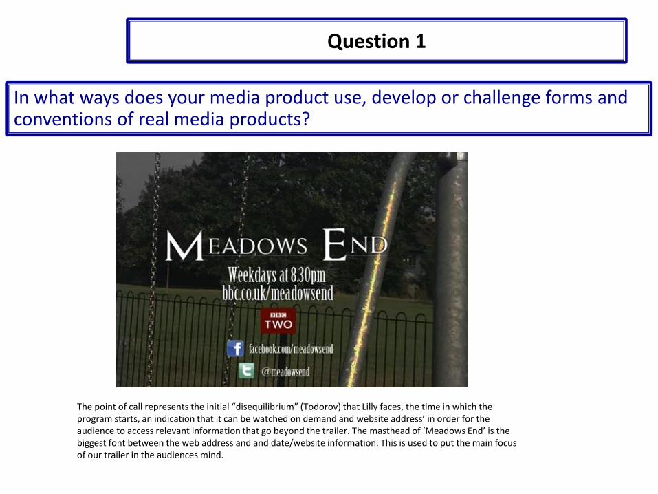
The point of call represents the initial “disequilibrium” (Todorov) that Lilly faces, the time in which the program starts, an indication that it can be watched on demand and website address’ in order for the audience to access relevant information that go beyond the trailer. The masthead of ‘Meadows End’ is the biggest font between the web address and and date/website information. This is used to put the main focus of our trailer in the audiences mind.
Question 1
In what ways does your media product use, develop or challenge forms and conventions of real media products?

The magazine –
For my ancillary production I had to analyze a Soap Opera magazine of inspiration in order to “replicate” (Steve Neal) and challenge codes and conventions from an ordinary soap opera magazine to my very own. There are many factors that possessed me to use this magazine front cover to support my own creation. The blue, red and yellow color scheme gives off a calm effectmean while the bold writing is attention grabbing which is what I like to see in a magazine. The green glow in the cover storiescome right at you, “fired”, “out” and “fired”, which then drew me to actually analyze each cover story and it made me want to find out more about what each “multi strand narrative” (Todorov).
Similar cover-line Structure and similar masthead position
In what ways does your media product use, develop or challenge forms and conventions of real media products?
Question 1
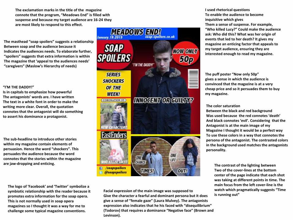
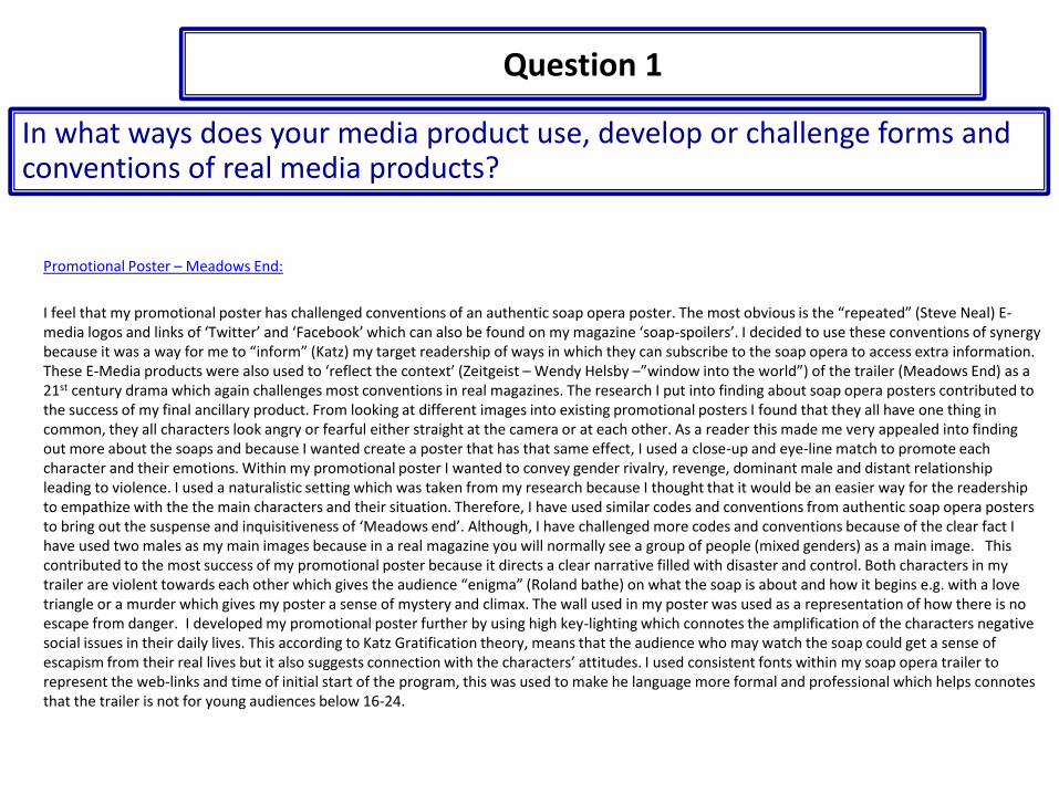
The logo of ‘Facebook’ and ‘Twitter’ symbolize a symbiotic relationship with the reader because it promotes extra information for the soap opera. This is not normally used in soap opera magazines so I thought it was a way for me to challenge some typical magazine conventions.
“I’M THE DADDY!”Is in capitals to emphasize how powerfulThe antagonists’ words are. I have writtenThe text in a white font in order to make the writing more clear. Overall, the quotation connotes that the antagonist will do something to assert his dominance a protagonist.
The puff poster “Now only 50p” gives a sense in which the audience is convinced that the magazine is at a very cheap price and so it persuades them to buy my magazine.
The sub-headline to introduce other stories within my magazine contain elements of persuasion. Hence the word “shockers”. This persuades the audience because the word connotes that the stories within the magazine are jaw-dropping and enticing.
The masthead “soap spoilers” suggests a relationshipBetween soap and the audience because itIndicates the audiences needs. To elaborate further,“spoilers” suggests that extra information is withinThe magazine that ‘appeal to the audiences needs’ “caregivers” (Maslow’s Hierarchy of needs)
Facial expression of the main image was supposed toGive the character a fearful and dominant persona but it does give a sense of “female gaze” (Laura Mulvey). The antagonists expression also indicates that he his faced with “disequilibrium” (Todorov) that requires a dominance “Negative face” (Brown and Levinson).
The color saturationBetween the black and red background Was used because the red connotes ‘death’And black connotes ‘evil’. Considering that the Antagonist is at the main image of myMagazine I thought it would be a perfect wayTo use these colors in a way that connotes the persona of the antagonist. The contrasted colors in the background used matches the antagonists personality.
I used rhetorical questionsTo enable the audience to become inquisitive which givesThem a sense of suspense. For example,“Who killed Lucy?” Could make the audience ask: Who did this? What was her origin of events that led to her death? It gives my magazine an enticing factor that appeals to my target audience, ensuring they are interested enough to read my magazine.
The contrast of the lighting betweenTwo of the cover-lines at the bottom center of the page indicate that each shot was taking at different points in time. The main focus from the left cover-line is the watch which pragmatically suggests “Time is running out”
The exclamation marks in the title of the magazine connote that the program, “Meadows End” is filled with suspense and because my target audience are 16-24 they are most likely to respond to this effect.
The combination of the main and ancillary texts are very effective and have contributed to the creation of ‘Soap-Savers’. I have used synergy within my production through the use of social media logos and using the same costume between the main antagonist in the trailer and my ancillary texts. I decided to use these forms of synergy to promote my trailer to a wider audience in order to increase awareness. In addition I used the same costume the antagonist was wearing in the trailer for my ancillary products to create a sense of “female gaze” (Laura McVey). In relation to Katz gratification theory, ‘Soap-Savers’ has created social-interaction because my target audience can debate for instance: What is the origin of the antagonists bad morals? My magazine and poster have a prime focus on synergy because my poster not only promotes the main characters but it also promotes their aggression and dominance - Earp and Katz’s (1999) masculinity and violence theory. The poster additionally uses synergy across the main product because the same font is used (Assassins Creed) to create the connation of mystery and horror that grabs my intended audiences’ attention. Clearly, convergence and synergy are powerful techniques that wok to increase the awareness and popularity of the main product as well as the creator. Additionally within my poster I feel that I have used media logos ‘Facebook’ and ‘Twitter’, to ‘educate’ Katz Gratification Theory, so the audience can retrieve more information about the product and trailer. Furthermore I have combined my main product and ancillary products together by expressing the thematic issue of ‘revenge’. For example on my magazine I have written in quotes “I’m the Daddy” which is a threat to act violent towards the potential protagonist. The threat itself triggers “social-interaction” (Katz) that something bad must have happened to the antagonist that would make him say that. Also, in my poster I have two of the main characters fighting, including the same antagonist which also sparks ‘revenge’ and the connotation that a female is involved to stimulate their hatred. Similarly, the same theme is promoted from my trailer because the antagonist is seen stalking ‘Lilly’ (PROTAGONIST) with a knife which connotes that he will murder her for being with another man. Overall this emphasizes the “disequilibrium” (Todorov) in the narrative of all three products. To conclude this question, I feel that all the three media products effectively captivate my primary audiences interests along with generating climax as they all successfully play a great part in hinting a cliff-hanger which is the key purpose of creating a powerful and jaw-dropping Soap Opera trailer.
The Trailer:
For my audience feedback I filmed myself giving a presentation of my soap opera trailer to a class aged ranged between 16-18 and managed to gather 10 of these participants to watch my trailer and give feedback. It was necessary for my audience to give me there feedback because since the trailer is primarily aimed at them there opinions are essential into making my Soap Opera trailer appealing. I decided to film my audience feedback as it was a for me to get reliable and effective answers rather than a questionnaire where some individuals could lie on the sheet or write minimal data that would be tricky to analyze. It was essential for me to cover the editing of my soap opera trailer so I have an indication of how my production towards the trailer benefited towards the target audience.
Specifically, my target audience would be appealed to watch my soap opera trailer because some participants say that my trailer creates “tension” through the close-up of the female protagonist as she walks down the alley. The built up climax indicates persuades the audience to want to watch actually watch ‘Meadows End’ because it makes them wonder what “disequilibrium” (Todorov) is she facing, how it began? Etc. Another comment was made about the “blurriness” in the background from the wedding which clearly connotes a happy atmosphere that in which the audience can then “sympathize with the characters’” mood. (Maslow’s Hierarchy of Needs) The effects used appealed more towards the male audience and the tension and climax used within the trailer grabs the attention of the female audience.
Another participant said how he liked “how the music fit in with all the scenes” as an example of synchronous sound and the “flash-back” feature because it helped generate an appealing story. Essentially the music was key to make the soap-opera trailer a success because the soothing sound of the female artists tone and repeated verse of “wildest dreams”, made it clear that the theme of the trailer is about the representation of dreams. Additionally the flash-back feature was one of the biggest positive aspects of the trailer. It’s not only something that is not normally seen in usual soap opera trailers but it gives a clear sense of mystery.
Question 3
What have you learned from your audience feedback?
Magazine‘Soap-Spoilers’ was the name of my chosen magazine name as a final magazine product. To construct this I had to use a magazine of inspiration that I found online. Between a male and female target audience I interviewed about what they like or dislike about my magazine, the most common response I had was that the structure of the magazine was very “professional” and clearly organised and this “stands out” from other existing magazine products. This means that the structure f my magazine was my greatest strength in the production because it “informs” (Katz gratification theory) the reader of information that is presented in the magazine which is easy to follow and read. Another strength that was picked up from my audience feedback on the magazine was the square and circle cover-lines around the front cover page which again was said to look “professional” and “organised”. I feel that “repeating” (Steve Neal) this specific formal structure from my magazine of inspiration is key for a Soap Opera magazine because it makes it easier for the audience to develop a relationship with the characters and their individual “disequilibrium's” (Todorov) within the front cover and throughout the magazine.
However, the common disadvantages people made towards my magazine was the fact that my barcode was located at a position which is not common in regular soap opera magazines which makes it look as if it was randomly placed. To improve, a suggestion was made to move it to the top left/right corner of the page. I think that this error should be made attention to because event though I did challenge the main conventions of a soap opera magazine, the barcode needs to be located at a place where its easy for my target readership to scan, which is why it is always on the corner of the page. Another mistake pointed out was that there was “too man blank spaces” which makes the front cover look limited in conventions and attention grabbing factors that appeal to my target readership and so the obvious improvement is to clear up these spaces to make my front cover of ‘Soap-Spoilers’ look full of information.

The Poster
From my audience feedback I have learnt not only how to improve my poster according to my target audiences needs but I have also learnt what aspects of the poster my female and male audience actually enjoy to notice. The most common response into why my audience like my promotional poster was because of the “quality of pictures and expressions that each characters are giving”. This use of “self-image” (Hartley’s seven subjectivities) was pointed out by a female candidate who gave me feedback this indicates that the “male gaze” (Laura Mcluvey) that I tried to create in my poster worked successfully. A male candidate gave me feedback and said that similarly the main images I used denote an “enticing story full drama which is clear through their actions”. Additionally what attracted my audience using my poster was the fact I used ‘Facebook’ and ‘Twitter’ E-Media links that “inform” (Katz Gratification Theory) the reader where to go for extra information on the soap. Social Networking links and website address’ were used so “the audience can relate” (Maslow’s Seven Subjectives) more to the extra information of the story when accessed through these links.
However, The most pointed out disadvantage to my poster was the fact that I used a small font for my slogan so it was very difficult to read from a distance in comparison to my main headline, ‘Meadows End’. Therefore, to improve my poster I actually took the time ensuring I expanded the slogan font as much as I could in order to make it more clear and noticeable. Another error pointed out was the way I used underlined markers below my headline, it felt “out of place” and so I decided to get rid of it. Another key error mentioned was the fact that I written “weekdays at 8.30pm”, which is not specific enough for my target audience to understand. So to improve my poster I changed the text in a way that indicated a specific time interval.

The construction and development:In terms of the main production we used Adobe Premier Cs6 in order to maintain a wide range of editing tools to make the trailer look more professional and complete. In order to develop my understanding of Adobe premier, I had to watch YouTube tutorials on how to use the software. In using Adobe Premier Cs6 we trimmed and ordered the footage to make it less than 1 minute and 30 seconds. However, I felt that at the point of call it needed to be extended so I increased the playtime of that footage. Additionally I placed the non-diegetic sound effect of the heartbeats and trimmed and copied the sound effect until it created harmony with the rest of the trailer. Having a wide range of editing tools made the software appear very sophisticated. As we finished the ordering of clips we imported our soundtrack chosen by myself and another candidate in my group (Taylor Swift – Wildest Dreams). Adobe Premier was effective because it allowed us to move the soundtrack at the perfect position while the trailer is played. I decided to choose this specific song to our trailer because the lyricism of the symphony creates a symbiotic relationship with the theme of the trailer. Key frames were used to help fade into the soundtrack and out of the soundtrack. For example, near the end of the trailer there is a key frame to import a fade out effect so as the volume slowly decreases, all that is left is the heartbeats. There is beats within the soundtrack so we manoeuvred and trimmed the track to balance out those beats with the heartbeats. Slowly decreasing from a fade out key frame and then rising up again to build tension. However, we were having issues with the trailer because the footage was complete, yet the brightness was too dark and so we used the video effects tool to manipulate the brightness of the trailer to make it look more naturalistic and authentic. We also used the transition tool in order to build climax and suspense during the last few shots of the trailer which would appeal to our target audience. To save our progress we ‘rendered’ our work.
The Research:
As part of the pre-production process (textual analysis) I had to critically evaluate two chosen soap opera trailers on YouTube(convergence) in terms of non-verbal codes (mise-en-scene and setting), verbal codes (dialogue and soundtrack) and technical codes (camera angles and shot types). The completion of my own trailer was aided by this analysis because I learnt the fundamental techniques that must be used to make my soap opera trailer heart-pounding and eye grabbing. For example, facial expressions are an important element in a soap opera trailer because it indicates whether a character is innocent or guilty thatmakes the audience sympathize or loath with the characters. Therefore, I “repeated” (Steve Neal) this technique and used it for my trailer and ancillary products to create dramatic effect.
In accordance with my soap opera poster, the inspiration was taken from a created poster named ‘spinningfield’. The location, the mise-en-scene and the facial expression of antagonists gave me the idea to convey my poster in a similar way. I only didn’t want a female protagonist in my poster because I wanted my audience to figure out themselves that there is a love triangle involved,destroying the relationship between the two characters.
Additionally we looked into different theorists such as Maslow, Katz, Todorov, Rebecca Feasey, Steale Neale and Hartley to evaluate existing Soap trailers and comply their theories into our own work.
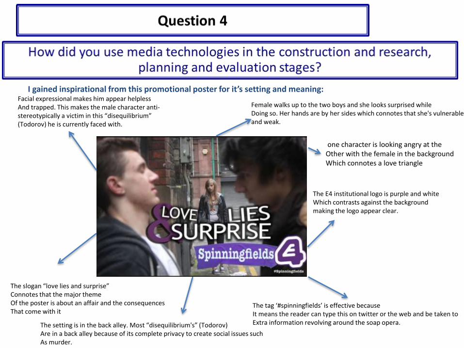
I gained inspirational from this promotional poster for it’s setting and meaning:
The E4 institutional logo is purple and whiteWhich contrasts against the background making the logo appear clear.
one character is looking angry at theOther with the female in the backgroundWhich connotes a love triangle
Facial expressional makes him appear helplessAnd trapped. This makes the male character anti-stereotypically a victim in this “disequilibrium” (Todorov) he is currently faced with.
The tag ‘#spinningfields’ is effective becauseIt means the reader can type this on twitter or the web and be taken toExtra information revolving around the soap opera.The setting is in the back alley. Most “disequilibrium's” (Todorov)
Are in a back alley because of its complete privacy to create social issues suchAs murder.
The slogan “love lies and surprise”Connotes that the major themeOf the poster is about an affair and the consequencesThat come with it
Female walks up to the two boys and she looks surprised while Doing so. Her hands are by her sides which connotes that she's vulnerable and weak.
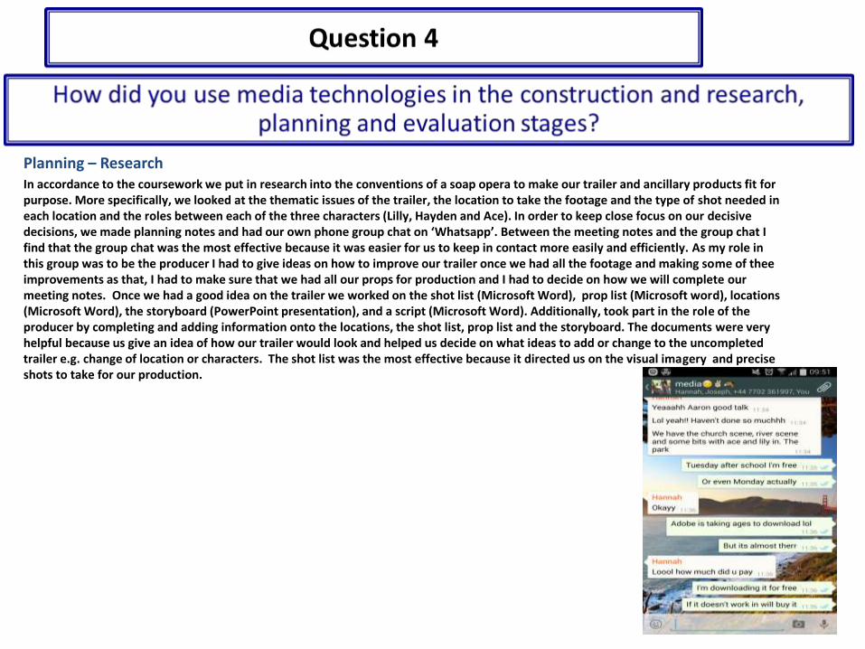
Planning – ResearchIn accordance to the coursework we put in research into the conventions of a soap opera to make our trailer and ancillary products fit for purpose. More specifically, we looked at the thematic issues of the trailer, the location to take the footage and the type of shot needed in each location and the roles between each of the three characters (Lilly, Hayden and Ace). In order to keep close focus on our decisive decisions, we made planning notes and had our own phone group chat on ‘Whatsapp’. Between the meeting notes and the group chat I find that the group chat was the most effective because it was easier for us to keep in contact more easily and efficiently. As my role in this group was to be the producer I had to give ideas on how to improve our trailer once we had all the footage and making some of thee improvements as that, I had to make sure that we had all our props for production and I had to decide on how we will complete our meeting notes. Once we had a good idea on the trailer we worked on the shot list (Microsoft Word), prop list (Microsoft word), locations (Microsoft Word), the storyboard (PowerPoint presentation), and a script (Microsoft Word). Additionally, took part in the role of the producer by completing and adding information onto the locations, the shot list, prop list and the storyboard. The documents were very helpful because us give an idea of how our trailer would look and helped us decide on what ideas to add or change to the uncompleted trailer e.g. change of location or characters. The shot list was the most effective because it directed us on the visual imagery and precise shots to take for our production.
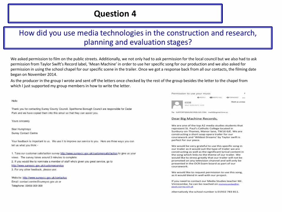
We asked permission to film on the public streets. Additionally, we not only had to ask permission for the local council but we also had to ask permission from Taylor Swift’s Record label, ‘Mean Machine’ in order to use her specific song for our production and we also asked for permission in using the school chapel for our specific scene in the trailer. Once we got a response back from all our contacts, the filming date began on November 2014.
As the producer in the group I wrote and sent off the letters once checked by the rest of the group besides the letter to the chapel from which I just supported my group members in how to write the letter.

Ancillary TasksTo formulate our magazine and promotional poster we had to design hand drawn drafts, two of each poster and magazine. This was important because it gave me an idea of what I want my products to actually look like and because we had to design to of each it vividly portrays a sense of variation and clear selectiveness in choosing the right hand drawn draft to use as a final product. I used the internet (Google images) to find my magazine of inspiration and poster of inspiration. I had to annotate each draft to show my understanding of the codes and conventions within the magazine and poster. This task was effective because it allowed me to become creative with the layout and colour scheme which directed me in producing the final products. Additionally, this task was beneficial because it allowed to show off my knowledge of theorists such as ‘Steve Neal’ and ‘Rebecca Feasy’ to add deeper analysis into the codes and conventions of my ancillary products.
The Poster (First Draft)
• I have two antagonists staring at each other from a distance to connote a sense of a clash between each character• The slogan of the poster ‘Nightmares become a reality’, is very eye-grabbing and ‘informs’ (Katz) the reader of the ‘Disequilibrium’ (Todorov) that connotes something horrifying will always happen in Meadows End.
Why I didn’t choose this draft
• The layout of the presentation is not professional• The E-Media logo (Twitter) is squashed at that position• The Masthead should be bigger• The antagonists should be dong something to connote a sense of rivalry

The Poster (Second Draft)• I have one of the characters strangling the other against the wall
• I have a E-media logo to convey that symbiotic relationship with the reader but there are less on this draft due to reduction of time, the idea is to put them along the bottom of the page.
• BBC TWO indent just below the title so I’ve made that more clear than my last draft
• I underlined the title besides the drop capitals
Why I chose this draft
• It is more clear that there is a rivalry between each characterWhich shows a ‘repeat’ (Steve Neal) from what we normally see in someSoap opera posters e.g. my magazine of inspiration• The layout is more structured in a professional manner• It is closely similar to my magazine of inspiration• The slogan which was used on my first draft too gives varied messages to the reader – sense of ‘disequilibrium’ (Todorov)
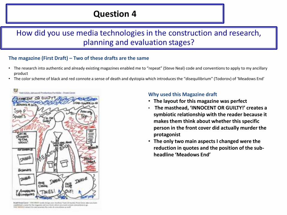
The magazine (First Draft) – Two of these drafts are the same
• The research into authentic and already existing magazines enabled me to “repeat” (Steve Neal) code and conventions to apply to my ancillary product
• The color scheme of black and red connote a sense of death and dystopia which introduces the “disequilibrium” (Todorov) of ‘Meadows End’
Why used this Magazine draft• The layout for this magazine was perfect• The masthead, ‘INNOCENT OR GUILTY!’ creates a
symbiotic relationship with the reader because it makes them think about whether this specific person in the front cover did actually murder the protagonist
• The only two main aspects I changed were the reduction in quotes and the position of the sub-headline ‘Meadows End’
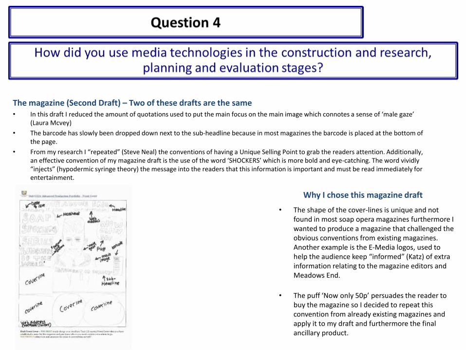
The magazine (Second Draft) – Two of these drafts are the same• In this draft I reduced the amount of quotations used to put the main focus on the main image which connotes a sense of ‘male gaze’
(Laura Mcvey)
• The barcode has slowly been dropped down next to the sub-headline because in most magazines the barcode is placed at the bottom of the page.
• From my research I “repeated” (Steve Neal) the conventions of having a Unique Selling Point to grab the readers attention. Additionally, an effective convention of my magazine draft is the use of the word ‘SHOCKERS’ which is more bold and eye-catching. The word vividly “injects” (hypodermic syringe theory) the message into the readers that this information is important and must be read immediately for entertainment.
Why I chose this magazine draft
• The shape of the cover-lines is unique and not found in most soap opera magazines furthermore I wanted to produce a magazine that challenged the obvious conventions from existing magazines. Another example is the E-Media logos, used to help the audience keep “informed” (Katz) of extra information relating to the magazine editors and Meadows End.
• The puff ‘Now only 50p’ persuades the reader to buy the magazine so I decided to repeat this convention from already existing magazines and apply it to my draft and furthermore the final ancillary product.
Related Documents