Evaluation JOE JACKSON

Welcome message from author
This document is posted to help you gain knowledge. Please leave a comment to let me know what you think about it! Share it to your friends and learn new things together.
Transcript
EvaluationJOE JACKSON

1. Who would be the audience for your music magazine?

For this piece of work I believe it is evident my target audience will be mainly aimed at people around the ages of late teens and in their 20's; I attempted to template my magazine to fit these criteria for the ideal reader. The way in which the models within the magazine and the headlines I am advertising indicates the type of audience I am intending to target. On the magazine front cover both models I used are both younger in generation and are dressed as if they are integrated within the younger generation; which will ultimately lead to a relation with the older teenage and younger adult audience I am intending to target. Both models are also dressed like someone who I believe would be the ideal audience for my magazine; both are wearing hooded jackets with their hood up looking at the camera in a particularly serious pose; this will ultimately sub-consciously lead to relation with my target audience who are viewing my magazine looking to purchase it. I decided to choose this particular audience because the music that is intended to be advertised on my music magazine is the music that I, being the creator, listens to so it will be easy for me to relate to which make it better as a magazine in the long run.

I aimed my audience at….
British
Teenagers
Festival Lovers

Notice how the models used on the front cover of my magazine are wearing cloths that you would depict as someone who would be the prime consumers of my magazine. The models used are wearing hooded jackets with their hoods up and are trendy cloths and jewellery such as a ring on one of the fingers.
I ensured that the models I used for my music magazine would be the similar age range to my target audience so the consumer would be made aware of the age range intended for this type of magazine.
It is important that the consumer (preferably my target audience) are related to the front cover. I ensured that my models are giving off a cool and serious look, providing a pose that I believe someone of my target audience would appreciate and relate to as most people in their late teens and early twenties are all trying to give off a cool look themselves; making this magazine relatable to them.
Thousands of older teenagers and people in their twenties attend Reading festival and many other festivals. Using Reading Festival in one of my main headings entices the reader and would persuade them to purchase the magazine as they would want to know all the information about the Reading Festival.
Studies suggest that teenagers tend to have a strong association with the colour red and black (most particularly with clothing) so having my masthead this colour would subconsciously attract the consumer.
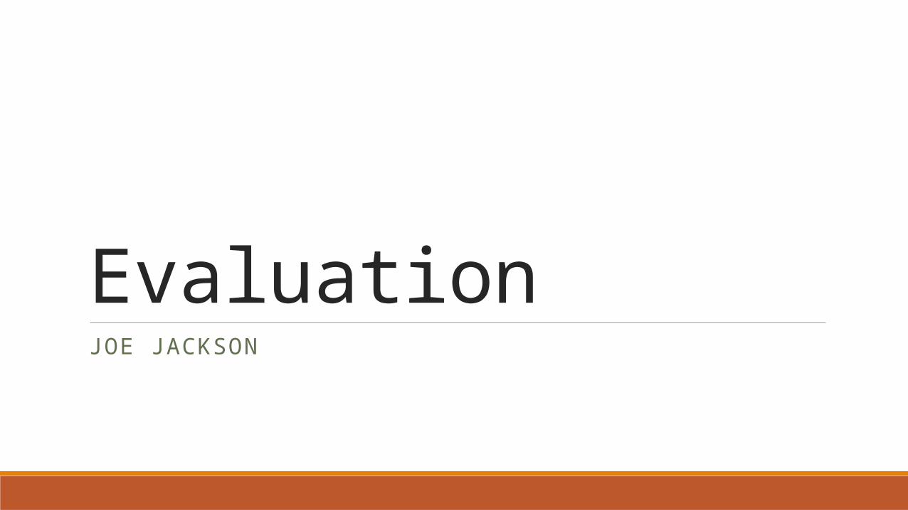
Notice the picture on the left has two teenagers with a particularly serious look amongst them. Teenagers in their late teens are my target audience; notice how my models used are wearing almost identical clothing with the hooded jackets, jewellery and serious pose all have a strong relation and link amongst them.
Notice how my models are both wearing their hoods and so is the teenager seen in the picture on the left.
All teenagers used in all three pictures are all wearing hooded jackets.
Hood is up on contents picture.

2. How did you attract/address your audience?

Teenagers and younger adults don’t tend to have much money. To overcome this and ensure they still have appeal towards my magazine I ensured I made the price low to reassure them that they can still purchase the magazine.
Studies suggest that teenagers tend to have a strong association with the colour red and black (most particularly with clothing) so having my masthead this colour would subconsciously attract the consumer. Even teenagers tend to favour phones and school supplies in the colours of red and black.
Notice how the models I used are portraying a very serious pose which is how teenagers are stereotyped and you would expect a teenager to look. The body language used may depict a troublesome nature with the serious look and the figures pointed to the sky.
Notice how both models are making complete eye contact with the camera which means giving complete eye contact with the consumer. Giving eye contact makes the buyer subconsciously trust the magazine and helps engage the reader; which ultimately leads to persuading the consumer to consume the product.
The main headline ‘FLOCK NORTH’ is one of the most notable parts of the front cover. It automatically catches the eye of the consumer due to its bold writing and easy-to-read text and font. It is also important that I maintained consistency by ensuring the other headlines used are the same font as the main headline; once the reader notices the main headline with it’s bold font in block capitals the will automatically begin to read the rest of the headlines.
Notice how with my models I used a darker colour within their clothing and ensured that their hoods were both up. Also there is sense of informality with their body language, facial expression and the fact that one of my models have their sleeves rolled up.
Notice how every word portrayed on the front cover are all in block capitals, this makes it easier for the consumer to read and so they notice it easily.
‘Think Big, Think Sound’ is a unique selling point. It portrays to the reader that if you think of the music magazine Sound then your are thinking ‘big’ as shown in the logo.

Assuming that I have enticed the audience to point where they purchase my item I have had many specific ways on how I have addressed the audiences to suite their needs. For example for the front cover and the double-page spread I used my forms of colloquial language in order to make the reader understand what they are reading and so they can relate to it. For example if the reader is interested in the article then they would understand that the band ‘Flock North’ have had an absence from the music world, therefore terms such as ‘They’re back’ and ‘They’re bigger, better and back for good’ would relate to the reader and make them want to continue reading about this particularly topic. During the article I also often addressed colloquially other bands and different type of albums; for example I often name albums that Flock North have done such as ‘Parliaments and Presidents’ and ‘Static Station’ in the assumption that the reader would know them and relate to them; this would address them.

As shown here, I emphasised that this page was the contents page with larger, bold writing in order to encourage the reader to read the contents which would ultimately encourage them to read the whole magazine.
For the contents page it was important that I ensured that the consumer would want to read on so the headlines for the contents page must relate and address the audience so they are tempted by the magazine. For example I split up the different types of headlines within the magazine; ‘Regulars’ would ensure people that these headlines are usually in the magazine just with differences within them. ‘Exclusives’ is what would entice the irregular customers of my magazine to read on; I used the headlines in the assumption that the consumer would know the headlines. And finally in ‘Entertainment’ would advertise the different type of gigs and festivals that would entice the audience; this section would be ideal for the people that want to attend some music festivals.
I decided that it would be best for my contents page that I used one picture as opposed to many; I believe it is better to use one picture portraying complete dominance with persuasive eye contact and straight posture. The models I used for this Is part of one of the main aspects of the magazine as he is in the band Flock North; this is the main band portrayed on the front cover. This encourages people to read on for the rest of the magazine.
Notice how on my contents page I used a very similar colour for the background as I did for my front cover; I did this because I believe that it is important to maintain a consistent style. After turning the page from the front cover, the next page would be the contents page, so having similar colours for both backgrounds is very beneficial.
3. How does your media product represent particular social groups?

ClassAs it is blatantly shown in the images on the left, the class of my audience would be lower/working class. Notice the similarities between my models used at the front of my magazine to the hooded teenagers located at the top of the slide. All are covering their heads with hoods and giving a serious facial expression to portray a sort of dangerous quality. The similarities between all people used in these pictures are almost uncanny; they all represent the same type of class that would be stereotyped amongst people wearing hooded clothing and giving troublesome facial expressions.

AgeNotice how my models used in my magazine are all a relatively same age to my target audience; teenagers and younger adults. I ensured that the model I used is the same age as my audience as it would relate to them and entice the them to purchase my product. I ensured that I used a teenager at the front of my music magazine so the audience knows the type of magazine I am intending to portray and so they can relate to it and preferably persuade them to buy the magazine.

Gender My music magazine is almost specifically aimed at the male gender. Both my models are portraying a dominant male position within the front cover with their serious facial expressions and serious poses giving complete eye contact to the reader. Very little content in my magazine is of a matriarchal dominance. It is very patriarchal. However despite the obvious patriarchal dominance all content within my magazine can be accessed and enjoyed my females. The only thing patriarchal about my magazine is artists within them; they are mostly all male. However all of the bands are for females as well and aren’t intended just for males. I have a section within my magazine that specifies on music festivals which is primarily enjoyed my both male and female as both genders substantially enjoy attending music festivals.
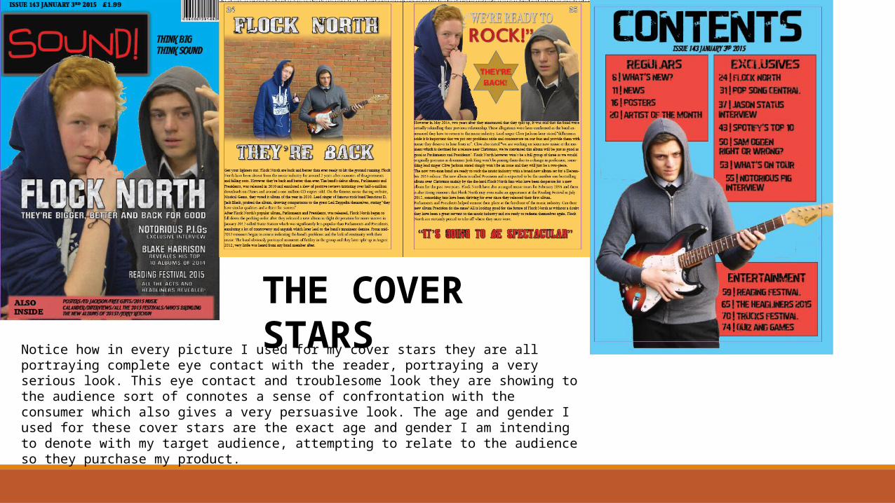
THE COVER STARSNotice how in every picture I used for my cover stars they are all portraying complete eye contact with the reader, portraying a very serious look. This eye contact and troublesome look they are showing to the audience sort of connotes a sense of confrontation with the consumer which also gives a very persuasive look. The age and gender I used for these cover stars are the exact age and gender I am intending to denote with my target audience, attempting to relate to the audience so they purchase my product.

4. In what ways does your media product use, develop or challenge forms and conventions of real media products?

Existing Conventions – No Alterations
Both magazines portray a strong, bold, white masthead which advertises the main band/artist that this specific issue of the magazine is based on. On the magazine ‘Vibe’ they used ‘Soul Brothers’, whereas in my magazine, ‘Sound’ I used ‘Flock North’. Both are the main focus for the magazines.
Both magazines also advertise other artists/bands which other aspect of the magazine are focused on, just not the main focus, hence why they are smaller than the main headline.
Notice how both magazine bare a bold masthead portraying the main brand of the magazine, both of which are located at the top of the cover. Also I gathered the idea that it would be good that one of my models cover the masthead slightly with their head. Something the reciprocated magazine had done also.
Notice how both magazines are portraying the same similar style of music. The models used on the front cover of Vibe are giving very similar facial expressions, body language, poses and looks as the models I used for my magazine. Both have their hands up, close to their face giving complete eye contact to the consumer.
Existing Conventions – Some Alterations
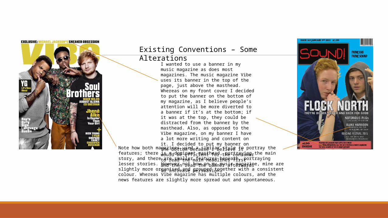
I wanted to use a banner in my music magazine as does most magazines. The music magazine Vibe uses its banner in the top of the page, just above the masthead. Whereas on my front cover I decided to put the banner on the bottom of my magazine, as I believe people’s attention will be more diverted to a banner if it’s at the bottom; if it was at the top, they could be distracted from the banner by the masthead. Also, as opposed to the Vibe magazine, on my banner I have a lot more writing and content on it. I decided to put my banner on the bottom because I believe it would be efficient for the consumer to read the main headlines first and then read the banner afterwards to increase persuasion.
Note how both magazines used a similar style to portray the features; there is a dominant masthead, portraying the main story, and there are smaller features beneath, portraying lesser stories. However not how on my music magazine, mine are slightly more organised and grouped together with a consistent colour. Whereas Vibe magazine has multiple colours, and the news features are slightly more spread out and spontaneous.

Goes Against Conventions
• For my magazine I used a blue coloured background as opposed to used a white one. I did this because I believe it is a more dominant colour and would catch the eye of the consumer.
• Notice how on the magazine Vibe they used almost full body shots to portray the models, whereas on my magazine I used more close up shots with less models. I did this so it would be easier to denote the facial expressions used for my models. I wanted my audience to have strong link with the models used at the front of the magazine; I did this by using the close-up camera angle to make the reader feel a relation with the stars on the cover.
• Also, the magazine Vibe portrays their masthead in bold, very big writing with a gold colour and no border around it. However on my magazine I used a red and black colouring and gave my masthead a border.
• Also, note that on my magazine I have a slogan for my magazine ‘Think Big, Think Sound’ which I believe is a good form of advertisement to persuade my consumer. Whereas the magazine Vibe does not have a notable slogan.

5. What kind of media institution might distribute your media product and why?
How I AdvertiseSound
!Sound!
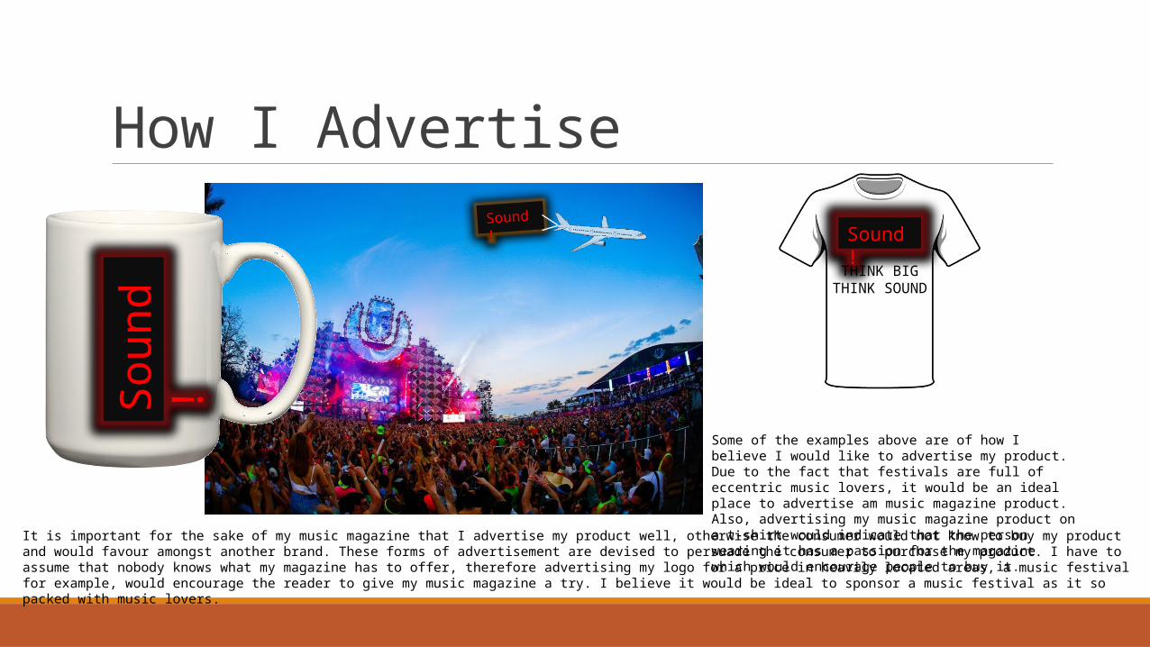
Some of the examples above are of how I believe I would like to advertise my product. Due to the fact that festivals are full of eccentric music lovers, it would be an ideal place to advertise am music magazine product. Also, advertising my music magazine product on a t-shirt would indicate that the person wearing it has a passion for the magazine which would encourage people to buy it.
Sound!THINK BIG
THINK SOUND
It is important for the sake of my music magazine that I advertise my product well, otherwise the consumer would not know to buy my product and would favour amongst another brand. These forms of advertisement are devised to persuade the consumer to purchase my product. I have to assume that nobody knows what my magazine has to offer, therefore advertising my logo for a price in heavily located areas, a music festival for example, would encourage the reader to give my music magazine a try. I believe it would be ideal to sponsor a music festival as it so packed with music lovers.

Distribution There are many way I believe it would be effective to distribute my product. Firstly I believe that it would be a given to distribute my products to all most convenience stores as this is trademark place to purchase a music magazine such as mine. I would also like to exploit larger retail supermarkets to sell my product such as Tesco, Asda, Sainsbury’s etc…
There are also a publisher that I believe distribution would be good with them. This publisher is IPC media. The reason for this is that they are one of the leading media institutions in the UK. Over 25 million consumers in the UK read a magazine published by IPC Media, therefor it is guarantee that them distributing my music magazine would give me good insurance they are doing an adequate job. Also, due to the fact they are so popular, so many people would use it therefor increase the popularity of my magazine.

Vibe is the music magazine that I believe my magazine is most associated with (I thrived similarities towards Vibe). I believe it has the most links to mine. I had my price range similar to the Vibe magazine as this magazine is really competitive in the market. If a consumer subscribes to Vibe magazine it would cost just under £10 for 6 issues, this accumulates to around £1.60 an issue; this is a very similar price range to my magazine (my magazine is £1.99 an issue). I feel that this is a very cheap price for a magazine and would be an efficient price range for my target audience. My magazine would be sold fortnightly for my consumers. I believe, baring in mind the price of my magazine, that selling it fortnightly would be a good selling point.
6. What have you learnt about technologies from the process of constructing this product?
Front Cover
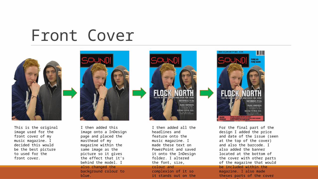
This is the original image used for the front cover of my music magazine. I decided this would be the best picture to used for the front cover.
I then added this image onto a InDesign page and placed the masthead of my magazine within the same image as the picture so it gives the effect that it’s behind the model. I also changed the background colour to blue.
I then added all the headlines and feature onto the music magazine. I made these text on PowerPoint and saved it onto the InDesign folder. I altered the font, size, colour and complexion of it so it stands out on the cover.
For the final part of the design I added the price and date of the issue (seen at the top of the cover) and also the barcode. I also added the banner located at the bottom of the cover with other parts of the magazine that would be included within the magazine. I also made theses parts of the cover on PowerPoint
Contents Page
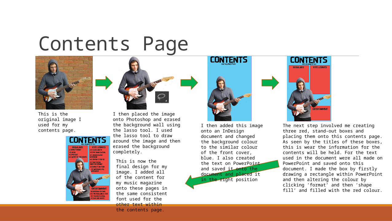
This is the original image I used for my contents page.
I then placed the image onto Photoshop and erased the background wall using the lasso tool. I used the lasso tool to draw around the image and then erased the background completely.
I then added this image onto an InDesign document and changed the background colour to the similar colour of the front cover, blue. I also created the text on PowerPoint and saved it onto the document and placed it in the right position
The next step involved me creating three red, stand-out boxes and placing them onto this contents page. As seen by the titles of these boxes, this is wear the information for the contents will be held. For the text used in the document were all made on PowerPoint and saved onto this document. I made the box by firstly drawing a rectangle within PowerPoint and then altering the colour by clicking ‘format’ and then ‘shape fill’ and filled with the red colour.
This is now the final design for my image. I added all of the content for my music magazine onto these pages in the same consistent font used for the other text within the contents page.
Double-Page Spread
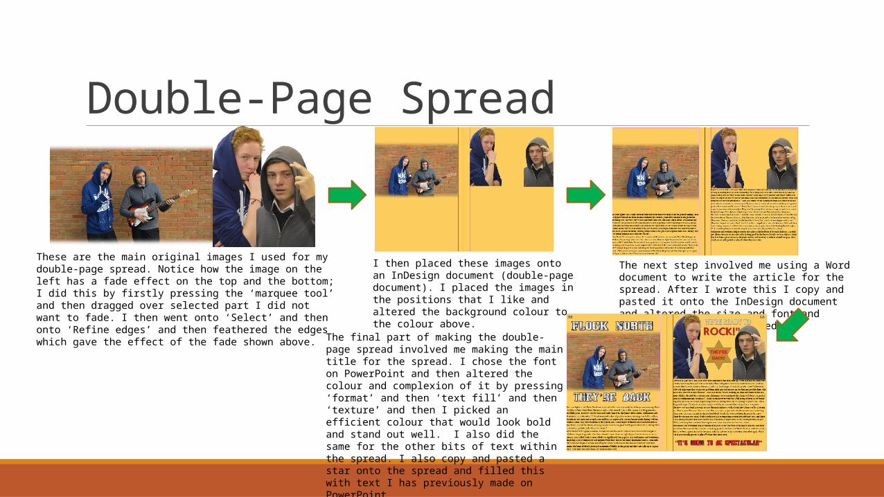
These are the main original images I used for my double-page spread. Notice how the image on the left has a fade effect on the top and the bottom; I did this by firstly pressing the ‘marquee tool’ and then dragged over selected part I did not want to fade. I then went onto ‘Select’ and then onto ‘Refine edges’ and then feathered the edges which gave the effect of the fade shown above.
I then placed these images onto an InDesign document (double-page document). I placed the images in the positions that I like and altered the background colour to the colour above.
The next step involved me using a Word document to write the article for the spread. After I wrote this I copy and pasted it onto the InDesign document and altered the size and font and positioned it how I wanted.
The final part of making the double-page spread involved me making the main title for the spread. I chose the font on PowerPoint and then altered the colour and complexion of it by pressing ‘format’ and then ‘text fill’ and then ‘texture’ and then I picked an efficient colour that would look bold and stand out well. I also did the same for the other bits of text within the spread. I also copy and pasted a star onto the spread and filled this with text I has previously made on PowerPoint.

7. Looking back at your preliminary task, what do you feel you have learnt in the progression from it to the full product?

My School Magazine My Music Magazine
I believe it is evident that my music magazine is a lot better design that my school magazine. I believe my understanding of the software has allowed me to develop the front cover further so it is a better design. I believe that the fonts and designs of the text are poorly done on my school magazine and don’t stand out from the background as well as I should have hoped. Whereas on my music magazine I believe that the fonts used are a lot better and stand out a lot more. I ensure that I spent more time and effort on creating the right font, size, colour and complexion so that it stands out from anything else, so the consumer knows about the headlines. The skills I used for the music magazine were a lot more developed and complex as opposed to my school magazine. Notice how the masthead is significantly clearer to read on my music magazine and that on my school magazine the masthead isn’t that clear, it looks to blended into the background image. Also on my masthead, notice how the model’s head is slightly in front of the masthead, this is a technique that many other music magazine use. I did use the idea for both my music magazine and school one to have a main feature in large bold writing and then have smaller writing just below it to slightly explain the main title, I believe this idea is a good format for any type of magazine. The planning and shoots of my music magazine was significantly developed compared to my school magazine. I took around 30 to 50 pictures for my music magazine and picked the best one which would fit my front cover, double-page spread and contents page best. Whereas on my school magazine I only took around 5 photos for my front cover and didn’t even use a notable photo for my contents page. The photos that I did take were much more carefully taken with a better camera and an actual photo shoot background, the locations I chose were very carefully picked.

Important Images
Related Documents