Social Action Evaluation

Welcome message from author
This document is posted to help you gain knowledge. Please leave a comment to let me know what you think about it! Share it to your friends and learn new things together.
Transcript

Social Action Evaluation
Logo
For this piece of work, I wanted to redesign the logo into a child’s version of the existing surfers against sewage logo. To do this I went through the process of designing new characters that also resembled the original surfers against sewage eye symbol, because I felt that this was important to keep the two different versions of the organization were still connected in a subtle way. Surfers against sewage already have an existing logo, but when comparing them I feel mine is more appropriate for the target audience and more successful with its intentions. The Seas for life logo did contain some cartoon elements, but the whale that was in it didn’t feel like the children could relate to it, that it wasn’t a real character that children could connect to, where as that was the whole point of mine, for the children to have a named character they could be connected with, which would give more meaning to the project of seas for life, and make its beach cleaning projects more successful, because the children would want to make my character happy. I feel that my logo is fit for its intended purpose, it is a fun character that is original and clear, which children would understand, yet has more detailed parts and tells the audience what the logo stands for, so the parents can appreciate it.
Here the whale isn't very cartoony and children can’t really relate to this graphic product, where as my character is more child friendly

Logo
The logo overall intends to promote and get people to identify with a different level of this organization, which I think it does. I think that my logo communicates a message clearly, that children can be involved with the rebuilding and maintaining of the beach and especially concentrating on animals homes, I made this clear by using an animal as the main logo, so that it could get the most attention. On the actual seas for life logo, they have also put animals on it, but I feel because the character doesn’t actually look like a cartoon character but more like a piece of graphic art, that actually it isn’t as child friendly and doesn’t communicate a message as well as mine does. Because of the blatant cartoon element I think that this is very suitable for my target audience, my audience was children, but also adults, in a way that they would know that the logo is well made and like some thought has gone into it. The cartoon crab is the main focus and this is so that it appeals to children, but then the background is detailed and the whole logo has a really gentle colour scheme, which adults will find attractive and trust more, meaning they are more likely to let their children become a part of this organization. When comparing my logo to the original SAS logo, you can see the major differences and how they are influenced by their target audience. The similarities is they are both logos, so they have to have an eye-catching and memorable shape to them, which they both do, with my seas for life logo the crab is a original and memorable silhouette, and the SAS is too, it is in the shape of an eye, which looks similar to a wave. These logos look effective in block colours, or with added detail, and this is the kind of flexibility you need with a logo as it will be put on everything the organization do.
Here in the crabs shell you can see I have subtlety incorporated the original SAS logo, to show that they are part of the original surfers against sewage charity.

LogoOriginally I wanted my logo to be an animal, that would appeal to children. I
created a logo design to start with, and this was successful, but I feel that it looked too much like the actual SAS seas for life logo, they were both in circles and both had similar colours and background details. When comparing the two I think they look overly similar, and that there isn’t much of a break away from the SAS’s logo to my one, so I decided to continue with the development of my logo, I pushed it so it didn’t look similar, I broke away from the solid outlined circle shape and went for a more broken and relaxed shape, it is still a circle but made up from lots of different sized ones, so that it isn’t one solid line. The background also gives me the chance to make the logo more flexible in when I put it and how it looks on different colours and textures. This was the best kind of outcome I could have ended up with, meaning I could put this logo on other work I would be creating without having to chose parts of it to suit the logo. The techniques I have used to create my logo are quite simple and they were all done by hand drawing and photoshop. I first created the initial logo designs by drawing them out by hand on a piece of paper, then I scanned them into the computer, to the trace over on photoshop, filling in details and making sure edges were rounded. I did this by rotoscoping the initial shapes, then adding the details in with shape tools or paint-brushes. I then chose the appropriate colours that suited the tones of my colour palette which was sea-side pastels. I then went on to creating the bubble background, I did this with drawing circles with the ellipse tool, I then made them the same colour of blue, but made all of them a certain percentage of transparency, some more transparent than others to made it look more realistic and effective than having just a plain background. Overall I that these techniques I used have been very effective and that they really stand out compared to the original SAS design.
Here you can see where I have taken inspiration from, with my logo and the original Seas For Life logo. You can see the colour, shape and design similarities, so you can see why I needed to work away from this and concentrate on making this my own.
Here you can see my logo design’s flexibility.
Logo
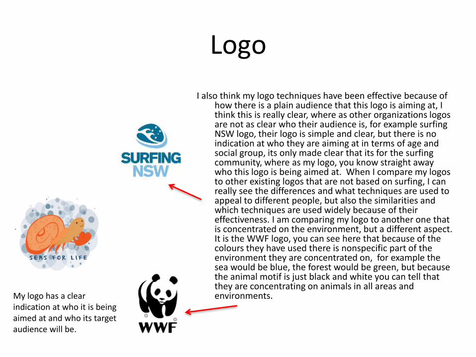
I also think my logo techniques have been effective because of how there is a plain audience that this logo is aiming at, I think this is really clear, where as other organizations logos are not as clear who their audience is, for example surfing NSW logo, their logo is simple and clear, but there is no indication at who they are aiming at in terms of age and social group, its only made clear that its for the surfing community, where as my logo, you know straight away who this logo is being aimed at. When I compare my logos to other existing logos that are not based on surfing, I can really see the differences and what techniques are used to appeal to different people, but also the similarities and which techniques are used widely because of their effectiveness. I am comparing my logo to another one that is concentrated on the environment, but a different aspect. It is the WWF logo, you can see here that because of the colours they have used there is nonspecific part of the environment they are concentrated on, for example the sea would be blue, the forest would be green, but because the animal motif is just black and white you can tell that they are concentrating on animals in all areas and environments.My logo has a clear
indication at who it is being aimed at and who its target audience will be.

Logo
I think that the technical and aesthetic qualities of my work are what has been able to make my logo as successful as it is. Technically I have created original characters and designs from nothing, just ideas that I had in my head, with inspiration from existing logos, like the SAS and the Surfing NSW I was able to create a logo that was simple enough to be put in a silhouette design and then have enough detail to also have a design that included lots of detail. Technically this took a bit of time to make it accurate and neat so that it looked professional. Choosing the right typography that fitted the style of my design and making sure that the colours went together and matched, so that is was aesthetically pleasing, that people want to look at and are attracted to it. The aesthetics are soft and gentle which will appeal to parents, making them want to get their child to join this program/charity because it looks like they can trust them and that they will be friendly.

PosterI created 3 different finished posters for my final pieces. They all had the intention
to get children to read them and learn something about the animals and how to save their beach homes. I think they are fit for their intended purpose because they are educational, aesthetically pleasing to look at and have information on how their homes can be saved. I went through the process of designing 3 different types of posters so I could include 3 different techniques on how to get the target audience to read and be positively effected by the posters. One was a fun, cartoon beach setting that told the reader facts about how many animals are effected, the second one was more interactive with cartoon and the third was informative. I think that these posters each in their own way communicate to the audience simple and clearly, it was even more important to be clear on what message the posters got across because of my target audience being children. The posters tell children how litter on the beach affects animals and it stresses the importance of how keeping their homes clean is vital for their survival, but to get this message across it was important to use the correct wording, to keep it easy to read and simple, with careful wording that gets a point across but doesn’t scare children, so when I was first writing the piece of information on the first poster I didn’t use my language carefully enough and had the word ‘die’ included, I then went back and changed it to ‘affected’ because of how shocking that word would seem to a child, and would only be appropriate for an adult audience poster. After going back to the posters and carefully rewording the pieces of text I feel that they are now appropriate for my target audience, and also different parts of my target audience, so the practical posters would be for a younger child of 6-9, whilst the more informative posters would be targeted at an older child of 9-12. The practical posters are encouraging children to go out and pick up litter, where a 7 year old might find that fun, a 10 year old may not be so convinced.
My 3 different types of posters aimed at different age groups in my target audience.

Poster
My original intentions were to create a poster that could have a second use that children would not just put on their wall but interact with it, for example I would make it into a star chart, getting a star for how much litter they had collected. But I figured out that this would not work because the poster would not be a poster anymore and it would become something else, so my brief wouldn’t be fulfilled. I also realised by creating this kind of poster that I would leave out a chunk of my target audience, that star charts are too young for older children like 10 year olds. In the posters I have created I have had a different take on how they could be interactive but still be a poster and include a lot more of my audience. I created 3 different finished posters with 3 different intentions that I wanted to create. The first poster was set in a beach theme and it was there to serve the purpose of being educational and interactive. At the top of the poster it had the title which was clear and underneath it was the words ‘TIDY UP YOUR LITTER’ I used small and easy words for children to understand. Then underneath that there is a bit of information about the animal’s situation when there is litter and what happens to them if the children don’t tidy up their litter, I also made sure I added ‘Conrad the crab’s’ name in to give the statement and more meaning, so that it would be more effective to the children reading it as they would have an attachment to the character.

Poster
The next poster is a more interactive one, the title being ‘know your litter’ and then the subheading at the bottom saying ‘keep the beach clean’. Then in the middle there are different genres of litter, fishing equipment, food packaging and plastics, these have been rotoscoped/cartooned to fit the children's style and make it appeal to them. Conrad the crab also appears here again, this time with a ‘litter patrol’ hat, this will make the children more enthusiastic about finding litter, setting them a challenge. This poster is suitable for most ages of my target audience and can apply from young to older children because all can participate in this..

Poster
The last poster is a more grown up kind of poster, not because it also gives information but because of the overall style, it is painted rather than rotoscoped, so its less cartoony, but it still has that digital and colorful element. In this poster I’m telling the audience, mainly older children, about how many animals are effected by litter, then I’m also telling them what they can do to help these animals. I painted a puffin on here to give the words more meaning, so this is an animal that could be affected and because the children have seen this animal, they will then want to protect its habitat. Comparing my posters to the ones I’ve seen, some are very different and some have similar aspects. The surfers against sewage poster takes on a different message and have a different audience in mind, they want these posters to be effective on adults and the way they’ve chosen to do this is through the shock factor of the surfboard in a grave, which would be much too upsetting for children. A poster by another charity that is similar to my style of posters are the green peace ones. This poster is similar in style, in the way they have rotoscoped it and used pastel tones, the backgrounds and shapes are simple and the message they are sending out is simple, although because of how their text is worded on their poster, I think that the audience is not aimed at children despite the cartoony style of graphics, ‘Inter-connected’ is used and this is a complicated word that children would not understand

Poster
I feel that the techniques I have used have been very successful digitally and through the thought I have put into my ideas. With my posters I have created them all on photoshop from scratch, making them from ideas I have initiated and developing and improving them to create a final product. I started off with a simple outline of the background, creating them through a paint brush or the ellipses tool on photoshop, I then went on to creating the separate pieces for the foregrounds for each poster, so for the beach I rotoscoped the beach hut, the rocks, the rubbish and the sea. For the second poster I rotoscoped the different types of litter in detail, added bubbles and typography and then in the third poster I painted and mixed the colours of the sea, sky, rocks and puffin, then added typography on to the poster, including my logo and the social networking site and email address. A poster that’s digital techniques that stand out to me are the WWF in danger of disappearing where there is a tiger this edges are dissolving. I think that the idea of the tiger looking like a photo that has been painted could have used similar techniques to me, especially with the edges of it, where these could have been rubbed out in a similar way to how I coloured in my puffin. The Green Peace poster is also similar to my other two more rotoscoped posters, using more simple shapes and colours, even the shape of the circle of the Green Peace poster is similar, like my poster with the bubbles in the background. Aesthetically I feel my work looks like it is of a professional standard and quality, that all the typography matches up, everything is line and has a invisible border, all the colours are matching and all 3 posters carry the same theme and feeling

PosterOverall my content I feel would be effective in a children's environment, I feel that the messages are
clear and simple, the colours are soft and gentle but still eye-catching, the interactive parts of the poster are fun and the character of Conrad the crab is likeable and children will become attached to it. I feel because of this character this really enforces the message to children, that when a crab talks to them they are more likely to listen rather than it just being words on a poster. This is a completely different technique to what the SAS have used for their adult posters, as it is words on a poster, but the picture is speaking to the audience in a shocking way, the shock factor will make the adults listen in their case and a cartoon crab will make my audience listen. Through these posters I am hoping to encourage a change in the way children think about animal’s homes and habitats, and to tell them that the beach is not a littering ground and if they see some litter they should pick it up, so that these animals stay healthy and happy. I think by making litter picking into a positive and rewarding thing, that animals will have a better life and teaching children not everything they do has to benefit them directly, but they will still feel good about themselves. So they can grow up and have this idea in their head that it isn't okay to leave litter around, and this is not just for the beach, but for any environment they are in. For other posters like the SAS one, I feel as if it doesn’t teach people, but scares them and will only work for a short term, for as long as they are scared, then when the poster is out of sight, it is out of mind. Educating people especially children really is the only way for them to have the information engraved into them, that it is morally wrong to litter, and they feel bad about the consequences when doing so, the SAS poster is only telling the audience the consequences and not teaching people why they shouldn’t litter and how to improve the situation the beaches and seas are in now.
Shocking Vs Educational

Merchandise
For my merchandise I created 5 different designs for 3 different types of products. The designs I created the products for was a cap, three t-shirts and a body board. I created designs for these things because I thought they would be most suitable and give me the most room for my designs, the t-shirts because they advertise the charity and also anyone can wear them, the cap because a lot of children have fine hair and need to protect their scalps, especially on the beach and the body board because some children may want to learn to surf and a body board can help them do this, and all these products are relevant to the beach. The current merchandise the SAS offer is varied in its designs but not so much in what kind of products it has on offer, it only offers t-shirts and mugs etc, nothing that could be in a interest for children. The SAS’s children’s designs also are lacking and there is nothing especially designed for them, just a t-shirt in a smaller size with the same design, and these designs may not appeal to them, or be relevant to things they are doing in the seas for life club. I think my finished products fit to their intended purpose as I wanted to make products that had the focus on their design, with the product being relevant to the Seas for Life group, I have done this by making the shirt designs like a uniform, that this is what they would wear when the children would attend the Seas for Life group, but the shirts are fun and well designed enough for them to also wear it outside a sea focused environment.
My t-shirt designs I feel are a lot more detailed and interesting than the plain SAS t-shirt designs

Merchandise
The cap and the body board were encompassed in the same idea, that they would be ‘uniform’, but also I designed it so it didn’t feel like the Seas for life idea wasn’t too overbearing, an example of this in my work is the body board, where I have taken the design a step further and expanded on the idea of the ‘litter patrol’, where the body board is designed like a police car. This is to give the children in the Seas for Life group a sense of importance and authority when doing a job of cleaning up litter. Because of the thought I have put into the product designs and what they will be displayed on and making the design especially for the product. They are child friendly and relate to the previous designs and characters I have created, for example 2 of the shirt designs include Conrad the crab, and children will want these shirts because of how much they like that character. When looking at my designs and comparing them to the SAS designs, I feel the SAS haven’t done a very good job at understanding their audiences needs, their section of merchandise on their website just includes 3 t-shirt designs, one of which is just some text that children probably understand. The other 3 designs are simple shaped animals and a surf board, the shapes look rotoscoped, and are in block colours. These designs are very simple which I think is good for a child's design, but they have no relation to their own SAS group, the Seas for Life, and I think children will feel like they are missing out because of this absence of a seas for life ‘uniform’. But with the WWF the merchandise is a lot different in the way they have thought about their target market, although they don’t have a specific ‘club’ for children, the WWF have still tailored lots of different designed t-shirts and products for children, they have t-shirts with brightly coloured animals on them, but they also have mittens and beanie hats in an animal shape, this is exciting for children, and it will be a novelty they will enjoy. The only down-side to these designs are that it isn’t obvious what company these are from, there isn’t any particular style they have gone for which would suggest that these designs were created by the WWF, there is also a lack of logos on there as well to be able to recognise which charity these product are from.
Exciting police design to make children feel like they have authority and feel like they are important.
WWF children's t-shirt

Merchandise
Originally my intentions were to create a lot more products with a more simple approach to designing, similar to a design like the SAS beaker for example, just using the plain, block coloured logo as the design on the product, but then I felt that this wouldn’t be 100% appropriate to my target audience, that children would be a lot more focused on a interesting design than a logo. So I got rid of that idea and started to work on a more complex design that would also match my posters in style and in theme. I felt it was important to include Conrad the crab on at least one t-shirt, as he is the main character and mascot of the whole of my Seas for life campaign, so I would need designs to revolve around him. I created a simple shirt design which included Conrad the crab as the main focal point, where he was sitting on a rock under the sea. This simple design is effective and it matches up in style with the rest of my previous posters in terms of how I have shaped things, what type of typography I’ve used and what colour palette I have stuck to. I think that the SAS’s merchandise for children doesn’t replicate this, and the style that their Seas for Life posters are in are not the same style as their t-shirt animal designs, as the posters are a lot more rounded and cartoony, where as the t-shirts are a lot more sharp and graphical. The designs don’t match up, so it looks like they haven't thought about the Seas for life program and this means that parents will be less likely to buy the shirts, as they are not matching and do not have a theme.
Here you can see the contrast in the detail I have put into my merchandise comparing to the simple SAS merchandise.
Non-relevant and simple designs by the SAS compared to my thoughtful and more detailed design. My designs catering to different age groups of my audience.

Merchandise
With the techniques I have used I feel they are very successful and have worked well. Because I had created the poster already, I had already developed my skills enough to create a successful scene and design using rotoscoping and colour blocking on photoshop. I had already made the Conrad the crab design previously, so I could re-use this multiple times on my designs, thus the design of the mascot still staying accurate and exact. My techniques were also used on repetitive patterns, for the body board I creating a police car pattern by repeating blue and green squares on a particular area. Although this technique isn’t difficult to create, it is difficult to get exact and making sure all the squares line up precisely, so that the design looks professional. Comparing this to previous work I have created, in particular designing t-shirt graphics, I feel my skills have improved tremendously, I am now able to create my own characters and environments using the rotoscoping tools on photoshop, rather than tracing over them like I have done in previous designs. I also feel I am more exact in my shapes and really aim to zoom right into the design on photoshop to make sure there isn’t a pixel out of place, where as previously I wouldn’t have done this, so it wouldn’t have looked as professional. I also feel I have expanded my skills with the use of typography, in a previous project where I also had to design t-shirts I feel my skills were not as strong and I didn’t experiment as much as I could have done, as the typography wasn’t exactly how I wanted it, but it was still similar. In this situation I think I should have searched more typography styles or even rotoscoped my own, so in this project I found the perfect 2 typography styles that go together really well. The first and main one is appropriate for my target audience, as it looks like it has been drawn, as it has that pen style to it, but it is still easy and simple to read, this was always presented in a dark, cool blue. The second typography was a more bold and sharper style, it was less stylized and fancy and more informative and square. All the letters were in capitals, but the fine shape of the bold letters mean that it didn’t look violent, but just informative. The colour of this was a pale, pastel red, which helped the typography not look too violent and assertive.
When comparing my typography choices I have made now to in the past, I can see that I have improved my skills in finding the right style of typography.
In this section of the design of my merchandise, you can see the techniques I have had to use, and how accurate I have had to be to make sure that the squares all line up correctly so that this design looks professional.

Membership formFor this part of the project, I completed this as the last task because I wanted to have
all the designs and colours saved from my posters and logos, so then I could replicate those on to the membership form. I wanted my form to be special and have extra details that encouraged children’s parents to join them to the Seas for Life program. The most important part of my form was the details page, it was important to have everything covered, including: If they wanted to renew a membership or become a member, what membership package they want, the member’s information, the parent’s information, the bank account details and terms and conditions and direct debit agreement box. It was so important to set this out in an accurate and clear way because of being able to read the information and also how much trust the person will have in the form, for example if the form is messy and not set out to a professional standard, people will think twice about putting down their details, as a messy form will not look legitimate and they don’t want money stolen. The parent audience will also think that the company is unreliable, if they cant get a form set out right then how will they be at organizing events etc, I think that this is presenting how professional and serious you are as a company, the form is like the first formal introduction to the company. The second most important part for me was to tell the audience what they should expect from being a member and what perks there are, on the front page I added a simple and clear paragraph explaining what is in the membership packs, what you should expect from being a member of seas for life (events and children’s workshops) and why it is so good that the audience is joining up, encouraging their decision at all times. Then the last but still important part of the membership form is the design of the graphic part of the form, so the front cover, the fun ‘find the litter’ page for the children and the setout of the information page. The front cover is fun and bright, it features Conrad again, this time with another friend, both under the sea. The fun page is a reproduced version of one of my earlier posters but reworked into a puzzle page for children to circle how many pieces of litter they can find on the beach. These two pages are both very detailed and have a lot of aesthetically pleasing elements about them, like the style of the simple background, the bubbles, the drawn clam, the colour palette of the pastel colours and the reoccurring typography. These all help to set the theme and connect all the separate pieces of media I have created into a project.

Membership form
Because of the thought I have put into the set out of the pages, I think that my message comes across clearly and easy to read and understand. My accuracy in the set out in the details page also makes it easy for the parent to communicate clearly with the company, I made sure this happened by adding a number of boxes for specific payment details, like sort-codes and bank account numbers. I have also let the audience communicate freely when putting down details for the child they want to become a member, like leaving large boxes for names and not having a tick box telling them what their gender is, I have a box where they write their gender down, so they get to decide and are not confined to just male or female. Also on the front page I have explained everything the potential members need to know, telling them what is going to happen, what they will receive and where they can find information and updates about the Seas for life. In the real SAS membership forms I feel there is something lacking, they don’t have a membership package that is specially designed for the Seas for Life group, so there is no special packs for children, which I think excludes a large part of their audience. The membership packages they do offer though are well set out and thoroughly explained, they have an online form and a physical one. The online ones are more explanatory and expand on what you will receive in your package. They also have a membership renew option which is good for members coming back. Online I feel that the membership packs don’t have any graphic details to them, they are quite plain and simple, comparing to mine, which is detailed and colorful, they are both obviously intended for different audiences. Greenpeace as an organization do their membership a little more simplistically, they don’t include membership packs, they don’t give any information about what the perks are of being a member, they just thank you for joining and expect you to pay a monthly donation. I think the design is very simple and quite boring, as it is just text on a white background, nothing that catches your eye and attracts you to want to become a member. I don’t think this is the most exciting and enticing form to encourage people to sign up, not is there no graphics, but no information about what this membership includes.
Here you can see the similarities in mine and the SAS’s membership form in the way on content, both of ours explains what being a member is about and what you will receive when signing up, both also give the option of renewing as well, but I feel that in terms of graphics the SAS on is quite boring and plain and doesn’t cater to a specific target audience.

Membership formTo begin with I wanted my membership forms to start out simple and effective, I wanted them to be
minimalist, with a more grown up theme of what the front page graphics would look like, I did create some more grown up art and graphics that would appeal to adults, making it more simple and traditional. But I came to the realization that actually even though the parents are going to be signing the forms, that doesn’t mean that it can’t have a second use for children to enjoy and use. So I created a fun puzzle for children to enjoy, I also took the artistic style and graphics back to the original style, like the logo I changed it to more block colours and pastels, leaving out details and making it more simple and cartoon like. I did this not only for the children to relate to but also to make sure my products matched and kept a theme running through, so that everyone would know they were all part of the same thing, even without knowing or being familiar with the organization. I feel like in the end the techniques I have used have been a great success and the 3 pages of my membership form are all relevant and work well together. Techniques I used was mainly in the graphics area and the typography and setout of the details page. The techniques used in the front and puzzle page were all the same as the ones I had used previously on other parts of my project, like the posters and the logo, I used rotoscoping and building of shapes in simple colours to create designs and environments, but on the front page of my membership form there is a purple clam, with this I didn’t use rotoscoping, but drew it with a rounded paintbrush, I traced a basic shape of a clam, then coloured it in adding highlighting and shading to make it look more 3D, I then added eyes to make it alive and into a character. I had gained these coloring skills with a photoshop paintbrush from previous posters I had created, by painting their graphics and colour mixing the subject matters. The second skills I used were all to do with accuracy and precision in my details form, I had to make sure everything was the same size, same width apart and all the relevant information was include whilst still keeping a border around the page. I did this on photoshop, so I made sure there were guidelines on the page, making it easier for me to line everything up. I started by typing one question out, I then typed the second one out and dragged it underneath the first, holding the ‘cntrl’ keys all the time so the text didn’t move sideways. I continued this technique with all the text and then repeated this process with answer boxes, being sure to copy and paste boxes so they were exactly the same sizes. I think that the setout of my details page was simple but thorough and that I included all the information that would be needed in a real life form, I also think it looks professional because of how everything is in line, matching and the same colours. I have created text setting out before in a previous college project, the one of copywriting, in particular setting out my writing in a magazine style. With this I think how I set out the text was similar to my membership form, spacing things out, underlining heading to make it clear where a piece of text stopped and started. I also think the style of typography was similar to one of mine in my details page, using them both as heading text in both setouts.

Membership form
Technically I feel as if my work shows a great amount of skill, effort and time. I feel as if the small and fine details that have all been attended to pay off and make this product look professional and aesthetically pleasing. Choosing the typography is one job that is important, because the styles have to contrast, but they also have to match, and technically this is hard to get right, but I feel I was successful at choosing the right styles of text, one being very cartoony, child friendly, as if it has been hand drawn and the other being more formal, informative and bold. Both pieces of typography are clear and easy to read, both are different, but work together really well as a pair. The colours of the graphics on my membership form were all chosen from the colour pallet I had picked at the start, all of them are soft and pastel blues, greens, purples and oranges, these were reoccurring from previous posters and logos so that the theme and feeling ran through my project. The color of my details sheet on my membership form, I have kept it to a minimal, using only a dark blue, which is matching to the headings and text of fonts in previous pieces. The background is white so that the text is contrasting well and easy to read. The also made the logos of the original SAS logo this block colour blue to make it look more professional. The only bit of colour I have put on this part of the sheet is my Seas for Life logo, which is a light orange, and stands out really well even though it is only small.
Here you can see the similar styles in my choice of typography for large written parts, and also how I use lines to break up my text. On the left is an older project and on the right is my present project, I think that I have improved a lot to make my work look more professional and accurate.
Related Documents