The main image is relative to the article about T.I. and links the two pages of the double page spread together, the way in which he is positioned makes him very clear to the audience as he takes up a whole page, his left hand is to the back of him, however, as it is towards the centre of the double page, which has been done as it will not be seen as clearly when reading the magazine. The name of the part of the magazine called “The Summer Preview” is placed at the top of the page so that it is seen but also blends into the rest of the article as the shape around the name of the article is in the same colours. These bright colours create a sense of summer, which is what the article is about. The shape around the name of the article draws attention to it and shows that this is what the article is about. The actual name itself has incorporated T.I.’s name into the word ‘TIME’ to create a link between the two as he is featured in the magazine. No important images or words are placed directly in the centre of the double page as this would make them fairly cut off and would not look very well planned out, spatially. However, the shape around the article’s name slightly overlaps The text of the article is in a smaller font in relation to the other copy on the page, however it takes up a significant quarter of the double page, as this is what is going to be Page numbers and issue information The layout of the double page shows a suitable use of space as everything has its own place without overlapping or being too congested and each part of the page fits in place and align with each other, squarely. The only colours on the page come from T.I.’s clothing the colourful shape around the title, the phrase ‘The Summer Preview’, the two dots next to T.I.’s name in the title, the name of the interviewer, and the circle next to the title; this has been done so that they stand

Double page spread analysis
Aug 02, 2015
Welcome message from author
This document is posted to help you gain knowledge. Please leave a comment to let me know what you think about it! Share it to your friends and learn new things together.
Transcript

The main image is relative to the article about T.I. and links the two pages of the double page spread together, the way in which he is positioned makes him very clear to the audience as he takes up a whole page, his left hand is to the back of him, however, as it is towards the centre of the double page, which has been done as it will not be seen as clearly when reading the magazine.
The name of the part of the magazine called “The Summer Preview” is placed at the top of the page so that it is seen but also blends into the rest of the article as the shape around the name of the article is in the same colours. These bright colours create a sense of summer, which is what the article is about.
The shape around the name of the article draws attention to it and shows that this is what the article is about. The actual name itself has incorporated T.I.’s name into the word ‘TIME’ to create a link between the two as he is featured in the magazine.
No important images or words are placed directly in the centre of the double page as this would make them fairly cut off and would not look very well planned out, spatially. However, the shape around the article’s name slightly overlaps this centre line to give an obvious link between the two pages.
The text of the article is in a smaller font in relation to the other copy on the page, however it takes up a significant quarter of the double page, as this is what is going to be read for more information about what was shown on the front cover.
Page numbers and issue information
The layout of the double page shows a suitable use of space as everything has its own place without overlapping or being too congested and each part of the page fits in place and align with each other, squarely.
The only colours on the page come from T.I.’s clothing the colourful shape around the title, the phrase ‘The Summer Preview’, the two dots next to T.I.’s name in the title, the name of the interviewer, and the circle next to the title; this has been done so that they stand out on the page to the audience and due to the white background, they stand out evenly within the two pages.

The close-up of Jay-Z’s face on the left-side page creates an obvious link between the double page from the start, his face takes up the whole of the left page and this is a common feature of double page spreads of this genre. His sunglasses conform to the hip-hop culture and are similar to what the readers will want to wear; appealing to them.
The red shadow and glow in the main image and in the background follows the colour scheme of this article as it matches the red writing of the floating quote, the big letter ‘J’ on the right-hand side, and the logo of the magazine that it is from.
Caption of the image involves the word ‘Exclusively’ to let readers know that they can’t find this information or these images anywhere else, encouraging them to buy the magazine.
Floating quote to give the audience a taste of what the article is going to be about before they read it, this is used to further encourage them to purchase the magazine as it gives them a peak of how good the text and information is.
The title of the article is not particularly large in size, but is directly in the middle at the top of the page, highlighting that this is the main feature of the magazine, revealing that the article is formal, done properly and legitimate with appropriate layout, whilst connoting dominance and order as it is at the highest point on the page.
The text is laid out in appropriately-sized sections in relation to the size of the page and takes up the whole of the right page, similar to the left page, however, instead of an image, the article has been used. This creates another link between the two pages as they mirror each other in terms of how much space they take up.
The large, red letter ‘J’ over the top of the text is a unique feature that ‘Q Magazine’ use for their articles involving music artists, the letter is the first letter of the artists name. It stands out without obscuring the text behind it and sticks to the colour scheme. Only a single letter is needed as it relies on the fame of the artist to bring the whole word into the reader’s mind.
Page Numbers and issue information
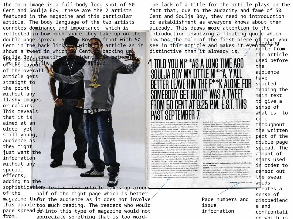
The main image is a full-body long shot of 50 Cent and Soulja Boy, these are the 2 artists featured in the magazine and this particular article. The body language of the two artists connotes dominance and importance, which is reflected in how much space they take up on the double page spread. Soulja Boy in front with 50 Cent in the back links in with the article as it shows a tweet in which 50 Cent is backing up Soulja Boy, creating an evident link between the two pages of the double page spread.
The lack of a title for the article plays on the fact that, due to the audacity and fame of 50 Cent and Soulja Boy, they need no introduction or establishment as everyone knows about them already. This draws more attention to the introduction involving a floating quote which now has the role of the first piece of text you see in this article and makes it even more distinctive than it already is.
Floating quote from the article used before the audience have started reading the main text to give a sense of what is to come throughout the written part of the double page spread. The amount of stars used in order to censor out the swear words creates a sense of disobedience and confrontation which is similar to how the audience of these types of magazines are.
The simplicity of the layout of the overall article gets straight to the point without any flashy images or colours. This reveals that it is aimed at an older, yet still young, audience as they might just want the information without any special effects; adding to the sophistication of the magazine that this double page spread is from.
The text of the article takes up around half of the right page which is better for the audience as it does not involve too much reading. The readers who would be into this type of magazine would not appreciate something that is too word-heavy.
Page numbers and issue information

The main image is a close-up of Wiz Khalifa’s face while he is smoking. He takes up the whole of the left page so that the reader knows the importance of him in relation to the article they are about to read, he is the featured artist in the magazine. Lighting has been used correctly to make him and the smoke stand out amongst the black background and the use of the different coloured backgrounds of each page follows a similar colour scheme to the logo of the article on the next page: black on the left side with a lighter colour on the right.
Wiz’s facial expression connotes not caring and untroubled carelessness with a sense of passive confrontation, similar to the attitudes of whoever reads this type of magazine.
Page number and issue information
The logo of the initials of Wiz Khalifa’s name follows the same colour scheme as the hat he is wearing in the image on the left page and uses similar typography, this creates a subtle link between the two pages and helps with the overall flow of the article in terms of colouring. Title of the article ‘How
high?’ is a play on words with a double meaning; high in terms of what you get through smoking cannabis, or high in terms of the ‘ladder of fame.’ This also links in with the main image as he is smoking in it.
The introduction follows the colour scheme of the whole article – black and orange – and also involves a link to do with cannabis; the use of ‘[puff puff]’ as an action to draw attention to the fact that Wiz Khalifa is a cannabis user and this would appeal to his audience.
The text is the last thing to be seen on the page as everything else is intended to be seen first, which is why they are larger and more colourful than the written text of the article. The colour scheme is still apparent here as the first few words and the large starting letter are in the same orange as is used elsewhere on the page.
The overall layout of the double page spread is simple and spacious, this is to stop the article from getting too congested and hard to read, this layout is laid-back and easy on the eyes, like Wiz Khalifa; again , linking with the article.
Website

The main image is a medium shot of Lupe Fiasco, which is the artist featured in the magazine and he is what the article on the double page spread is about. He is not looking at the camera and, therefore, not looking out to the audience; this gives us an idea of Lupe’s character as he seems to be a little bit more modest and not as confrontational as mainstream hip-hop artists.
Name of this part of the magazine at the top of the page.
Secondary image merges in with the rest of the page as the blue lighting fades out and does not obstruct anywhere else on the page. This image is of Lupe Fiasco performing and links in with the article as it mentions him performing within the text.
Colour scheme of text follows similar colour scheme of Lupe’s hoody and watch, the black background with the gold detail creates a distinctive and noticeable, yet subtle, link between the text and the image, contributing to the effectiveness of the overall article.
Title and information about the article are on the left page, this is different to other double page spreads I have analysed. This gives the introduction and establishment straight away before the reader has even looked at the next page, preparing them for what they will read next.
Floating quote of a clever part of the interview to give the audience a taste of what they will go on to read. This sets them up and creates an idea about what they will talk about in the article, inspiring the audience to read on.
The written part of the article is separated into two columns to make it easier for the audience to read. The colour of the font also changes to make the gold parts stand out more to the reader, continuously sticking to the colour scheme.
Name of magazine on each page
Related Documents