i In Elegant Fashion Didone Typefaces and Richard Avedon

Welcome message from author
This document is posted to help you gain knowledge. Please leave a comment to let me know what you think about it! Share it to your friends and learn new things together.
Transcript

i
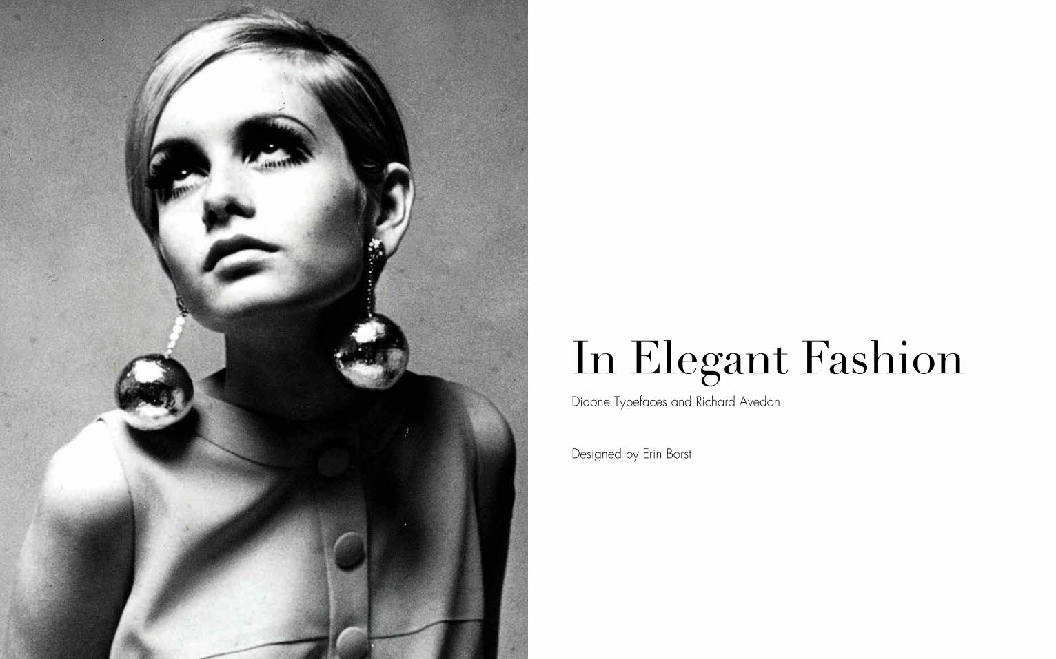
In Elegant Fashion
Didone Typefaces and Richard Avedon

In Elegant FashionDidone Typefaces and Richard Avedon
ii
In Elegant FashionDidone Typefaces and Richard Avedon
Designed by Erin Borst

iv vCopyright © 2015 by Erin BorstAll rights reserved. No part of this book may be reproduced or used in any manner whatsoever without the prior permission of the publisher except for the use of brief passages in connection with a book review.
Printed in the United States of America
Big Apple Publishing, 2015
ISBN 503-0-0489-0067-0
2243 7th AvenueNew York, NY 10027USA
Acknowledgments
The information found in this book has all been taken from various online sources. These sources are compiled from a combination of blogs, news sites and data sites. The images used have also been taken from various sources on the Internet.

In Elegant FashionDidone Typefaces and Richard Avedon
2 3
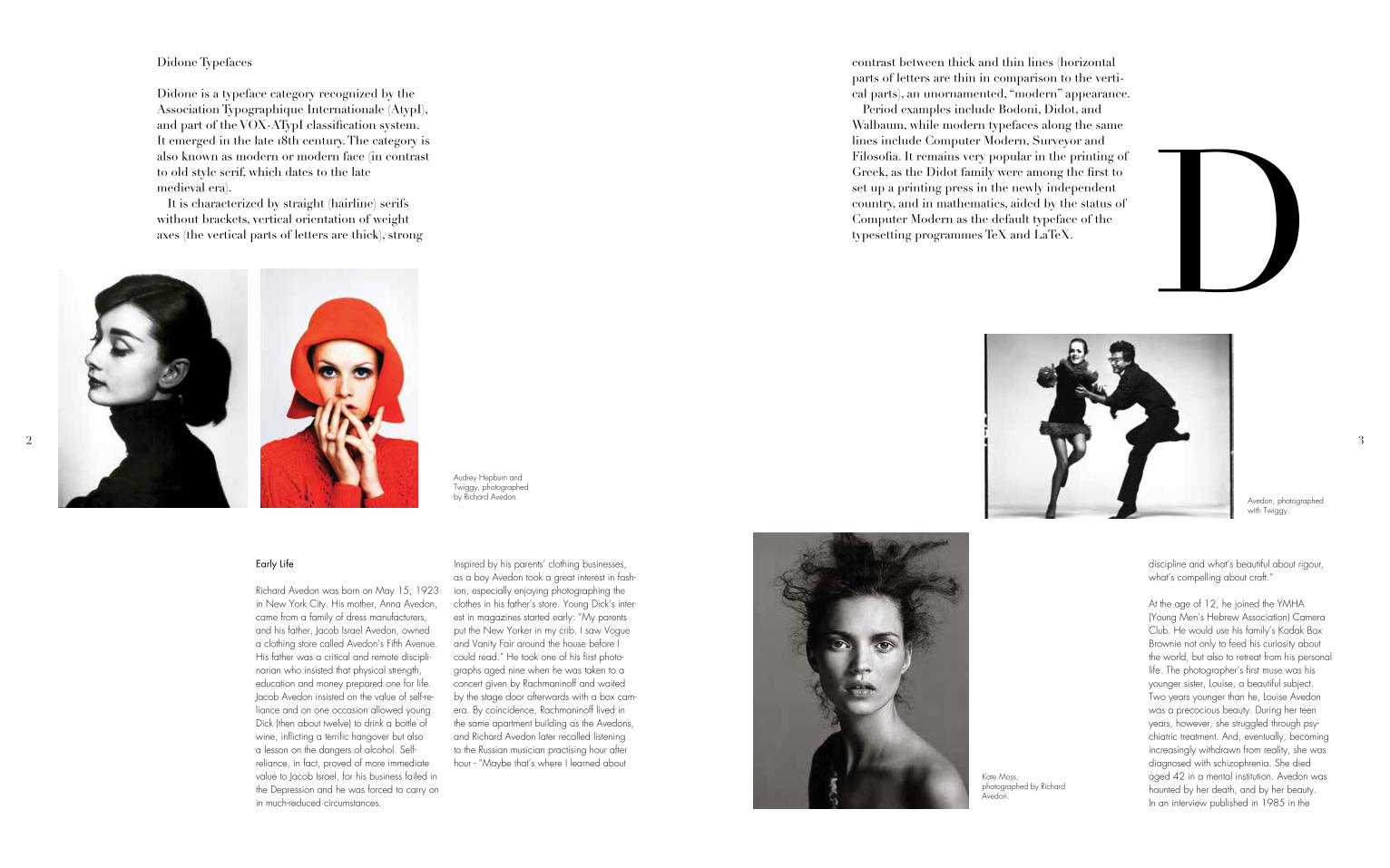
Didone Typefaces
Didone is a typeface category recognized by the Association Typographique Internationale (AtypI), and part of the VOX-ATypI classification system. It emerged in the late 18th century. The category is also known as modern or modern face (in contrast to old style serif, which dates to the late medieval era).MIt is characterized by straight (hairline) serifs without brackets, vertical orientation of weight axes (the vertical parts of letters are thick), strong
Early Life
Richard Avedon was born on May 15, 1923 in New York City. His mother, Anna Avedon, came from a family of dress manufacturers, and his father, Jacob Israel Avedon, owned a clothing store called Avedon’s Fifth Avenue. His father was a critical and remote discipli-narian who insisted that physical strength, education and money prepared one for life. Jacob Avedon insisted on the value of self-re-liance and on one occasion allowed young Dick (then about twelve) to drink a bottle of wine, inflicting a terrific hangover but also a lesson on the dangers of alcohol. Self-reliance, in fact, proved of more immediate value to Jacob Israel, for his business failed in the Depression and he was forced to carry on in much-reduced circumstances.
Inspired by his parents’ clothing businesses, as a boy Avedon took a great interest in fash-ion, especially enjoying photographing the clothes in his father’s store. Young Dick’s inter-est in magazines started early: “My parents put the New Yorker in my crib. I saw Vogue and Vanity Fair around the house before I could read.” He took one of his first photo-graphs aged nine when he was taken to a concert given by Rachmaninoff and waited by the stage door afterwards with a box cam-era. By coincidence, Rachmaninoff lived in the same apartment building as the Avedons, and Richard Avedon later recalled listening to the Russian musician practising hour after hour - “Maybe that’s where I learned about
Audrey Hepburn and Twiggy, photographed by Richard Avedon.
contrast between thick and thin lines (horizontal parts of letters are thin in comparison to the verti-cal parts), an unornamented, “modern” appearance.MPeriod examples include Bodoni, Didot, and Walbaum, while modern typefaces along the same lines include Computer Modern, Surveyor and Filosofia. It remains very popular in the printing of Greek, as the Didot family were among the first to set up a printing press in the newly independent country, and in mathematics, aided by the status of Computer Modern as the default typeface of the typesetting programmes TeX and LaTeX.
discipline and what’s beautiful about rigour, what’s compelling about craft.”
At the age of 12, he joined the YMHA (Young Men’s Hebrew Association) Camera Club. He would use his family’s Kodak Box Brownie not only to feed his curiosity about the world, but also to retreat from his personal life. The photographer’s first muse was his younger sister, Louise, a beautiful subject. Two years younger than he, Louise Avedon was a precocious beauty. During her teen years, however, she struggled through psy-chiatric treatment. And, eventually, becoming increasingly withdrawn from reality, she was diagnosed with schizophrenia. She died aged 42 in a mental institution. Avedon was haunted by her death, and by her beauty. In an interview published in 1985 in the
Kate Moss, photographed by Richard Avedon.
Avedon, photographed with Twiggy.
D

4 5
magazine Egoiste, he said: “Louise’s beauty was the event of our family and the destruc-tion of her life. She was very, very beautiful. She was treated as if there was no one inside her perfect skin, as if she was simply her long throat, her deep brown eyes. All my first models - Dorian Leigh, Elise Daniels, Carmen, Marella Agnelli, Audrey Hepburn - were brunettes and had fine noses, long throats, oval faces. They were all memories of my sister.” These early influences of fashion and family would shape his life and career, often expressed in his desire to capture tragic beauty in photos.
Avedon later described one childhood moment in particular as helping to kindle
his interest in fashion photography: “One evening my father and I were walking down Fifth Avenue looking at the store windows,” he remembered. “In front of the Plaza Hotel, I saw a bald man with a camera posing a very beautiful woman against a tree. He lifted his head, adjusted her dress a little bit and took some photographs. Later, I saw the pic-ture in Harper’s Bazaar. I didn’t understand why he’d taken her against that tree until I got to Paris a few years later: the tree in front of the Plaza had that same peeling bark you see all over the Champs-Elysees.”
Avedon attended DeWitt Clinton High School in New York City, where one of his class-mates and closest friends was the great writer James Baldwin. In addition to his continued interest in fashion and photography, in high
MBaskerville’s types, compared with their Old Style (or Garalde) predecessors, are marked by high contrast between thick and thin strokes, so much so that one commentator declared Baskerville was “blinding the nation.” The Moderns or Didones take this contrast to further extremes (just about as far as one can take them).MThe first Modern typeface is attributed to Frenchman Firmin Didot (son of François-Ambroise Didot), and first graced the printed page in 1784. His types were soon followed by the archetypal Didone from Bodoni. The Italian type designer, punchcutter and printer Giambattista Bodoni (1740-1813) drew his influence from the Romains du Roi (with its flat, unbracketed serifs)
Harper’s Bazaar cover, photographed by Richard Avedon.
Didot, used in the Harper’s Bazaar logo.

6 7
and the types of John Baskerville (high contrast), for whom he showed great admiration.MIn fact, if you grab a Baskerville, take away the brackets that join serifs to stems, thicken up the vertical strokes, you’ll be left with something that resembles a Didone (though don’t expect it to be pretty).MThe romans of the Modern types owe very little, if anything to the earlier calligraphic forms; they are too precise, too sharp, too clean. Whereas the Old Style types are Neoclassical, the Didones are Romantic. Though both forms share a common
One of Avedon’s most well-known works, Dovima with Elephants.
vertical (rationalist) axis, the Moderns have even greater contrast.MWhat are they good for? There’s something rather clinical about the Moderns, especially in the roman capitals. Their vertical axis coupled with strong hor-izontal stress furnishes them with the stiffness of toy soldiers on parade. They are elegant, and like all things elegant, look unhurried, calm, and in control. They’re generally not suited to setting extended text, as the verticality of the letter forms interferes with the text’s horizontal rhythm. The letters don’t lead our eyes across the page, but rather up and

8 9
down. Unsurprisingly, Bringhurst brings some clar-ity to the subject when he writes, “Romantic letters can be extraordinarily beautiful, but they lack the flowing and steady rhythm of the Renaissance forms. It is that rhythm which invites the reader to enter the text and read. The statuesque forms of Romantic letters invite the reader to stand outside and look at the letters instead.”MThe Moderns need lots of space (white space and inter-line space), so give them extra leading and generous margins; and if you pair a Modern with another face, then make sure it’s not a fussy one, or your page will look like a circus poster designed by
Elizabeth Taylor, photographed by Richard Avedon.
school Avedon also developed an affinity for poetry. He and Baldwin served as co-editors of the school’s prestigious literary magazine, The Magpie, and during his senior year, in 1941, Avedon was named “Poet Laureate of New York City High Schools.”
After high school, Avedon enrolled at Columbia University to study philosophy and poetry. However, he dropped out after only one year to serve in the United States Merchant Marine during World War II. As a Photographer’s Mate Second Class, his main duty was taking identification portraits of sailors with the Rolleiflex camera his father had given him as a gift. As he described it, “My job was to do identity photographs. I must have taken pictures of one hundred thousand faces before it occurred to me I was
a visually impaired dog. If you know the beautiful, yet austere architecture of Tadao Ando, then mixing a Didot with, say a Blackletter is akin to draping one of Ando’s monoliths in a giant lace doily.
Didot
Certainly one of the more renowned font groups, this well established font family group was named for one of the most famous Parisian printing and type foundry families, the Didot family. They ran a series of highly successful print shops and found-ries from the mid 1700s for over two hundred years.
Didot, used in the Gior-gio Armani logo.
becoming a photographer.” He spent most of his service at Sheepshead Bay in Brooklyn taking thousands upon thousands of photo-graphs of servicemen for their ID cards. It was a dully repetitive task, but the format of a full-face portrait in front of a bare background left its mark on him. Avedon served in the Merchant Marine for two years, from 1942 to 1944.
Photography Career
Upon leaving the Merchant Marine in 1944, Avedon attended the New School for Social Research in New York City to study photography under Alexey Brodovitch, the
acclaimed art director of Harper’s Bazaar. Avedon and Brodovitch formed a close bond, and within one year Avedon was hired as a staff photographer for the magazine. Initially denied the use of a studio by the magazine, he photographed models and fashions on the streets, in nightclubs, at the circus, on the beach and at other uncommon locations, employing the endless resourcefulness and inventiveness that became a hallmark of his art. After several years photographing daily life in New York City, Avedon was assigned to cover the spring and fall fashion collections in Paris. While legendary editor Carmel Snow covered the runway shows, Avedon’s task was to stage photographs of models wearing the new fashions out in the city itself. Throughout the late 1940s and early 1950s he created elegant black-and-white

10 11
One of the first fonts to be classified as Didone or modern, the font has appeared in everything from a publication of Voltaire to the logo of a highly suc-cessful American broadcasting company. There have been several revivals of The Linotype Didot Font Family, particularly with the development of hot metal type and Linotype’s more recent redesign to adapt the font for digital use.MThe Didot Font Family began in Paris when Firmin Didot began work on a collection of related type fonts. At the time the Didot family owned the most influential and successful print shop and font foundry in France. In fact, they were the King’s printers with seven members of the family working in some capacity in the varied branches of the book
Kennedy. On one occasion, in a 1951 shoot with the model Dovima, even the pyramids of Egypt became props in an Avedon fashion feature.
In 1946, Avedon had set up his own studio and began providing images for magazines including Vogue and Life. Under Brodovitch’s tutelage, he quickly became the lead pho-tographer for Harper’s Bazaar. From 1950 he also contributed photographs to Life, Look and Graphis and in 1952 became Staff Editor and photographer for Theatre Arts Magazine. Avedon did not conform to the standard technique of taking studio fashion photographs, where models stood
Dolores Guiness, photographed by Richard Avedon.
Marilyn Monroe (oppo-site), photographed by Richard Avedon.
photographs showcasing the latest fashions in real-life settings such as Paris’s picturesque cafes, cabarets and streetcars. Brodovitch saw the potential of Avedon’s private work, but rejected his first shoots for Harper’s on the grounds that they were too derivative and predictable. Avedon took the hint and drove off to a beach with his own models and photographed them playing leapfrog and walking about the sand on stilts. Other fash-ion editors were scandalised by the idea of models appearing in Harper’s barefoot - and without gloves - but Brodovitch was delighted.FROM then on Avedon was given an unpar-alleled degree of creative freedom. While his studio shoots eschewed anything but the bare white background, his fashion pho-tography used diverse locations, from zoos and circuses to the launching pads at Cape

12 13
emotionless and seemingly indifferent to the camera. Instead, Avedon showed models full of emotion, smiling, laughing, and, many times, in action in outdoor settings which was revolutionary at the time. However, towards the end of the 1950s he became dissatisfied with daylight photography and open air loca-tions and so turned to studio photography, using strobe lighting.
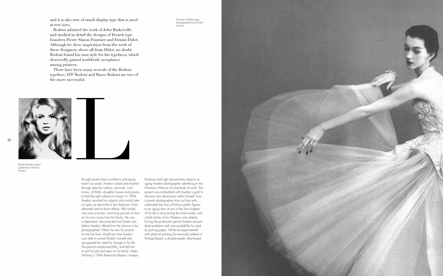
Already established as one of the most tal-ented young fashion photographers in the business, in 1955 Avedon made fashion and photography history when he staged a photo shoot at a circus. The iconic photograph of that shoot, “Dovima with Elephants,” features the most famous model of the time in a black Dior evening gown with a long white silk sash. She is posed between two elephants,
trade. Firmin Didot completed the development and began to cut the letters and cast them between 1784 and 1811. His brother Pierre used the type for his printing business including the now famous edition of Voltaire’s La Henriade which has been long considered his masterpiece. The typeface was known for its increasing stroke contrast and more condensed armature, much like John Baskerville’s fonts of the time.MThe font is considered a neoclassical font with a similar style because of its increased stress high contrast typeface to a contemporary family of fonts of the time, by the Italian Giambattista Bodoni, cre-ator of the well-known Bodoni font family.
Audrey Hepburn, photographed by Richard Avedon.
Twiggy, photographed by Richard Avedon.
Audrey Hepburn (left) and Cher (right), photographed by Richard Avedon.
her back serenely arched as she holds on to the trunk of one elephant while reaching out fondly toward the other. The image remains one of the most strikingly original and iconic fashion photographs of all time. “He asked me to do extraordinary things,” Dovima said of Avedon. “But I always knew I was going to be part of a great picture.”
Avedon served as a staff photographer for Harper’s Bazaar for 20 years, from 1945 to 1965. Avedon left Harper’s Bazaar in 1965 after facing a storm of criticism over his collaboration with models of color, and from 1966 to 1990 he worked as a pho-tographer for Vogue, its chief rival among American fashion magazines. He proceeded to become the lead photographer of Vogue and photographed most of the covers from
1973 until Anna Wintour became editor in chief in late 1988. Notable among his fashion advertisement photograph series are the recurring assignments for Gianni Versace, starting from the spring/summer campaign 1980. He also photographed the Calvin Klein Jeans campaign featuring a fifteen-year-old Brooke Shields, as well as directing her in the television commercials. Avedon first worked with Shields in 1974 for a Colgate toothpaste ad. He shot her for Versace, 12 American Vogue covers and Revlon’s Most Unforgettable Women campaign. In the February 9, 1981, issue of Newsweek,
Avedon said that “Brooke is a lightning rod. She focuses the inarticulate rage people feel about the decline in contemporary morality and destruction of innocence in the world.” On working with Avedon, Shields told Interview magazine in May 1992 “When Dick walks into the room, a lot of people are intimidated. But when he works, he’s so acutely creative, so sensitive. And he doesn’t like it if anyone else is around or speaking. There is a mutual vulnerability, and a moment of fusion when he clicks the shutter. You either get it or you don’t”.
Avedon also produced a playfully inventive series of advertisements for fashion label Christian Dior, based on the idea of film

14 15
stills. Featuring a stock cast of models and actors, the color photographs purported to show scenes from the life of a fictional “Dior family,” whose members managed to wear elegant fashions even when wrestling on a couch.
Avedon continued to push the boundaries of fashion photography with surreal, provocative and often controversial pictures in which nudity, violence and death featured promi-nently. Avedon was fascinated by photogra-phy’s capacity for suggesting the personality and evoking the life of his subjects. He registered poses, attitudes, hairstyles, clothing and accessories as vital, revelatory elements of an image. He had complete confidence in the two-dimensional nature of photography, the rules of which he bent to his stylistic and
Charles Deberney, head of the French type foundry, Deberney + Peignot.
narrative purposes. As he wryly said, “My photographs don’t go below the surface. I have great faith in surfaces. A good one is full of clues.”
In addition to his fashion photography, he was also well known for his portraiture. His black-and-white portraits were remarkable for capturing the essential humanity and vulnerability lurking in larger-than-life figures. Avedon was always interested in how por-traiture captures the personality and soul of its subject. As his reputation as a photographer became widely known, he brought in many famous faces to his studio and photographed
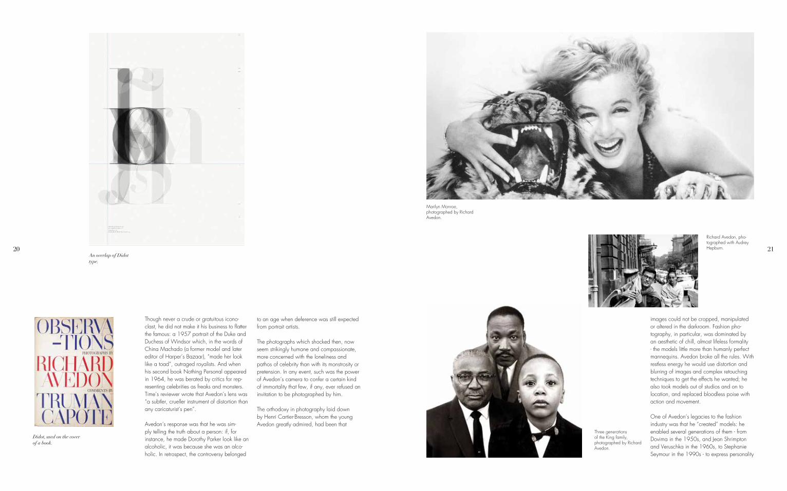
them with a large-format 8x10 view camera. His subjects include Buster Keaton, Marian Anderson, Marilyn Monroe, Ezra Pound, Isak Dinesen, Dwight D. Eisenhower, Andy Warhol, and the Chicago Seven. His por-traits are easily distinguished by their minimal-ist style, where the person is looking squarely in the camera, posed in front of a sheer white background. By eliminating the use of soft lights and props, Avedon was able to focus on the inner worlds of his subjects evoking emotions and reactions. He would at times evoke reactions from his portrait subjects by guiding them into uncomfortable areas of discussion or asking them psychologically probing questions. Through these means he would produce images revealing aspects of his subject’s character and personality that were not typically captured by others.
Marilyn Monroe, photographed by Richard Avedon.
16 17
tragedy. It faded, for one thing, or it came at a terrible loss of self. Growing up, Avedon heard his mother say to his sister Louise, who would eventually die, at 42, in a mental insti-tution, “You’re so beautiful you don’t have to open your mouth.” This notion that beauty can be intoxicating but, equally, impoverishing to the soul, Ms. Squiers said, tinged Avedon’s early pictures with a feeling of compassion.And it may never have completely left him.
A photograph he made in 1998 of a robotic-looking model wearing a mouth plug seemed to circle back to his sister. Such pictures, made when he was a staff
During this period, Avedon also created two famous sets of portraits of The Beatles. The first, taken in mid to late 1967, became one of the first major rock poster series, and consisted of five striking psychedelic portraits of the group — four heavily solarized indi-vidual color portraits and a black-and-white group portrait taken with a Rolleiflex camera and a normal Planar lens. The next year he photographed the much more restrained portraits that were included with The Beatles in 1968. Among the many other rock bands photographed by Avedon, in 1973 he shot Electric Light Orchestra with all the members exposing their bellybuttons for recording, On the Third Day.
What made Avedon different? He was keenly aware that beauty had an element of
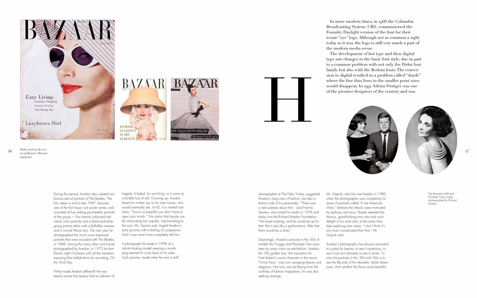
Didot, used on the cov-ers of Harper’s Bazaar magazine.
MIn more modern times, in 1966 the Columbia Broadcasting System (CBS) commissioned the Foundry Daylight version of the font for their iconic “eye” logo. Although not as common a sight today as it was, the logo is still very much a part of the modern media scene.MThe development of hot type and then digital type saw changes to the basic font style, due in part to a common problem with not only the Didot font family but also with the Bodoni fonts. The conver-sion to digital resulted in a problem called “dazzle” where the fine thin lines in the smaller point sizes would disappear. In 1991 Adrian Frutiger was one of the premier designers of the century and was
photographer at The New Yorker, suggested Avedon’s long view of fashion, but also a distinct side of his personality. “There was a real sadness about him,” said Norma Stevens, who joined his studio in 1976 and today runs the Richard Avedon Foundation. “He loved working, and he would be up for that. But it was like a performance. After that there would be a drop.”
Surprisingly, Avedon’s pictures in the ’60s of models like Twiggy and Penelope Tree were seen by some critics as anti-fashion. Avedon, the ’50s golden boy, the inspiration for Fred Astaire’s suave character in the movie “Funny Face,” was now savaging beauty and elegance. Not only was he fleeing from the confines of fashion magazines, he was also seeking revenge.
Mr. Gopnik, who first met Avedon in 1985 when the photographer was completing his series of portraits called “In the American West,” believes the attacks were motivated by jealousy and envy. People resented the famous, good-looking man who took such delight in his work and, at the same time, kept exploring new areas. “I don’t think it’s any more complicated than that,” Mr. Gopnik said.
Avedon’s photography has always amounted to a plea for beauty; to see it mysterious, to see it raw but ultimately to see it whole. To view his portraits in the ’50s and ’60s is to see the flip side of the decades’ stylish obses-sions. And whether the faces were beautiful
The Kennedys (left) and Elizabeth Taylor (right), photographed by Richard Avedon.

18 19
or ravaged, famous or not, the portraits relent-lessly informed the fashion images, and vice versa. Certainly by the ’90s, with notions like Prada’s ugly beauty, the categories of beauty had dissolved. For Avedon, though, the lines had faded long before, if they were ever that clear. Perhaps the famous “Avedon blur” expressed the futility, even the tragedy, of permanent beliefs. “I certainly think — I know — that the apparent line between his fashion photography and his portraits was false, that he saw it as continuous work,” Mr. Gopnik said, adding that Avedon was amused at how people could look at the empty face of a model and find it more beautiful than the worn face of a coal miner. “It was not an affectation on his part,” he said.
working at Linotype. He was inspired by the study of the early Didot fonts in the Voltaire publication. He came up with a solution for Dazzle by adapting the fonts with the creation of a heavier weighted stroke in the smaller sizes. A similar solution was created by Jonathan Hoefler in his adaptation that he named HTF Didot ’ when he was at H&FJ. The Linotype Didot and HTF Didot are still widely used to this day particularly in books and magazines where an elegant old-fashion look is desired.
Jean Shrimpton, photographed by Richard Avedon.
Marilyn Monroe, photographed by Richard Avedon.
20 21
Though never a crude or gratuitous icono-clast, he did not make it his business to flatter the famous: a 1957 portrait of the Duke and Duchess of Windsor which, in the words of China Machado (a former model and later editor of Harper’s Bazaar), “made her look like a toad”, outraged royalists. And when his second book Nothing Personal appeared in 1964, he was berated by critics for rep-resenting celebrities as freaks and monsters. Time’s reviewer wrote that Avedon’s lens was “a subtler, crueller instrument of distortion than any caricaturist’s pen”.
Avedon’s response was that he was sim-ply telling the truth about a person: if, for instance, he made Dorothy Parker look like an alcoholic, it was because she was an alco-holic. In retrospect, the controversy belonged
to an age when deference was still expected from portrait artists.
The photographs which shocked then, now seem strikingly humane and compassionate, more concerned with the loneliness and pathos of celebrity than with its monstrosity or pretension. In any event, such was the power of Avedon’s camera to confer a certain kind of immortality that few, if any, ever refused an invitation to be photographed by him.
The orthodoxy in photography laid down by Henri Cartier-Bresson, whom the young Avedon greatly admired, had been that
An overlap of Didot type.
Didot, used on the cover of a book.
images could not be cropped, manipulated or altered in the darkroom. Fashion pho-tography, in particular, was dominated by an aesthetic of chill, almost lifeless formality - the models little more than humanly perfect mannequins. Avedon broke all the rules. With restless energy he would use distortion and blurring of images and complex retouching techniques to get the effects he wanted; he also took models out of studios and on to location, and replaced bloodless poise with action and movement.
One of Avedon’s legacies to the fashion industry was that he “created” models: he enabled several generations of them - from Dovima in the 1950s, and Jean Shrimpton and Veruschka in the 1960s, to Stephanie Seymour in the 1990s - to express personality
Marilyn Monroe, photographed by Richard Avedon.
Richard Avedon, pho-tographed with Audrey Hepburn.
Three generations of the King family, photographed by Richard Avedon.

22 23
and presence in his images. In reality, he believed passionately that portraits were pointless unless they had a story to tell, at least a truth to communicate. “Faces,” he once said, “are the ledgers of our experi-ence”. While Avedon’s portraits often clashed with a naive American optimism and preoccu-pation with celebrity, his genius was to make his subjects - whether Henry Kissinger or a hobo from New Mexico - perform themselves, to show something essential about them-selves. For Avedon, who always worked not behind, but to one side of, the camera, the relationship between photographer and pho-tographed was of exchange and dialogue. “If each photograph steals a bit of the soul,” he asked, “isn’t it possible that I give up pieces of mine every time I take a picture?”
Twiggy, photographed by Richard Avedon.
Stephanie Seymour, photographed by Richard Avedon.
In addition to his continuing fashion work, by the 1960s Avedon had turned his energies toward making studio portraits of civil rights workers, politicians and cultural dissidents of various stripes in an America fissured by discord and violence. He began to branch out and photographed patients of mental hospitals, the Civil Rights Movement in 1963, protesters of the Vietnam War, and later the fall of the Berlin Wall. He did portraits of civil rights leaders such as Dr. Martin Luther King Jr., Malcolm X and Julian Bond, as well as segregationists such as Alabama Governor George Wallace, and ordinary people involved in demonstrations. In 1969, he shot a series of Vietnam War portraits that included the Chicago Seven, American soldiers and Vietnamese napalm victims. In 1971 Avedon went to Vietnam for a second
Bodoni
Bodoni will forever be associated with the hordes of digital interpretations from just about every type foundry on earth—the FontBook devotes some 14 pages to flavors of Bodoni; some are faithful digi-tal renderings, others well-crafted interpretations; while others still are nothing but parodies, suitable only for poster headlines or the typographic scrap-heap. However, Bodoni was a prolific type designer, completing hundreds of typefaces; the Museo Bodoniano in Parma, houses more than 25,000 of his punches! Bodoni’s Manuale Tipografico (1818) contains 142 roman typefaces and their correspond-ing italics—and that’s just volume one. The second volume includes numerous ornaments, Arabic, G
Didot, used in a poster design.

24 25
Marlon Brando (left) and Frank Sinatra (right), photographed by Richard Avedon.
Greek, Russian, and Tibetan types, to name but a few.MBodoni is a series of serif typefaces first designed by Giambattista Bodoni (1740–1813) in 1798. The typeface is classified as Didone modern. Bodoni followed the ideas of John Baskerville, as found in the printing type Baskerville: increased stroke contrast[2] and a more vertical, slightly condensed, upper case; but took them to a more extreme con-clusion. Bodoni had a long career and his designs evolved and varied, ending with a typeface of nar-rower underlying structure with flat, unbracketed serifs, extreme contrast between thick and thin strokes, and an overall geometric construction. Massimo Vignelli stated that “Bodoni is one of the most elegant typefaces ever designed.”
Didot, used on the cover of a Harper’s Bazaar issue.
MWhen first released, Bodoni, and other Didone fonts, were called classical designs. However, upon closer inspection it became evident that these fonts were not updated versions of classical type styles, but were in fact new designs. This meant that they were renamed modern fonts and then from to mid 20th century they were known as Didone fonts. Though these later designs are rightfully called “modern”, the earlier designs are “transitional”.MSome digital versions of Bodoni are said to be hard to read due to “dazzle” caused by the alternat-ing thick and thin strokes, particularly as the thin strokes are very thin at small point sizes. This only occurs when display versions are used at text sizes,
time, three years before the end of the war. He was not a natural war photographer, but using his signature technique of staging people in front of a plain background, he produced a harrowing series of portraits of napalm burns victims. In 1972 Avedon took part in an anti-war demonstration at the Capitol Building, Washington DC; he was arrested and jailed for civil disobedience.
Serious heart inflammations hindered Avedon’s health in 1974. The troubling time inspired Avedon to create a compelling collection from a new perspective. In 1979, Avedon was commissioned by Mitchell A. Wilder (1913–1979), the director of
the Amon Carter Museum to complete the “Western Project.” Wilder envisioned the project to portray Avedon’s take on the American West. It became a turning point in Avedon’s career when he focused on every-day working class subjects such as miners soiled in their work clothes, housewives, farmers and drifters on larger-than-life prints instead of a more traditional options with famous public figures or with the openness and grandeur of the West. The project itself lasted five years concluding with an exhi-bition and a catalogue. It allowed Avedon and his crew to photograph 762 people and expose approximately 17,000 sheets of 8 x 10 Tri-X Pan film. The collection identified a story within his subjects of their innermost self, a connection Avedon admits would not have happened if his new sense of mortality
Didot, modified for the use in the company, CBS.
26 27
and it is also true of much display type that is used at text sizes. MBodoni admired the work of John Baskerville and studied in detail the designs of French type founders Pierre Simon Fournier and Firmin Didot. Although he drew inspiration from the work of these designers, above all from Didot, no doubt Bodoni found his own style for his typefaces, which deservedly gained worldwide acceptance among printers.MThere have been many revivals of the Bodoni typeface; ATF Bodoni and Bauer Bodoni are two of the more successful.
through severe heart conditions and aging hadn’t occurred. Avedon visited and traveled through state fair rodeos, carnivals, coal mines, oil fields, slaughter houses and prisons to find the right subjects to reveal. In 1994, Avedon revisited his subjects who would later on open up about the In the American West aftermath and its direct effects. Billy Mudd, who was a trucker, went long periods of time on his own away from his family. He was a depressed, disconnected and lonely man before Avedon offered him the chance to be photographed. When he saw his portrait for the first time, Mudd saw that Avedon was able to reveal Mudd’s true-self and recognized the need for change in his life. The portrait transformed Billy, and led him to quit his job and return to his family. Helen Whitney’s 1996 American Master’s Avedon:
Darkness and Light documentary depicts an aging Avedon photographer identifying In the American West as his best body of work. The project was embedded with Avedon’s goal to discover new dimensions within himself, from a Jewish photographer from out East who celebrated the lives of famous public figures to an aging man at one of the last chapters of his life to discovering the inner-worlds, and untold stories of his Western rural subjects. During the production period Avedon encoun-tered problems with size availability for qual-ity printing paper. While he experimented with platinum printing he eventually settled on Portriga Rapid, a double-weight, fiber-based
Brigitte Bardot, photo-graphed by Richard Avedon.
Dovima in Balenciaga, photographed by Richard Avedon.

28 29
MBodoni has been used for a wide variety of material, ranging from 18th century Italian books to 1960s periodicals. In the 21st century, the late manner versions continue to be used in advertis-ing, while the early manner versions are occasion-ally used for fine book printing. Poster Bodoni is used in Mamma Mia! posters. Bodoni is one of the two typesets that is used by Hilton Hotels for restaurant or bar menu content. Sony’s Columbia Records (owned by CBS from 1938 to 1989) also utilizes Bodini for their wordmark. Nirvana’s logo is written with Bodoni (specifically Bodoni Poster-Compressed). Bauer Bodoni Black is used for Carnegie Mellon University’s wordmark. Bauer
gelatin silver paper manufactured by Agfa-Gevaert. Each print required meticulous work, with an average of thirty to forty manipula-tions. Two exhibition sets of In the American West were printed as artist proofs, one set to remain at the Carter after the exhibition there, and the other, property of the artist, to travel to the subsequent six venues. Overall, the printing took nine months: about 68, 000 square feet of paper were consumed in the process.
While In the American West is one of the Avedon’s most notable works, it has often been criticized for falsifying the West through voyeuristic themes and for exploiting his subjects. Critics question why a photographer from the East who traditionally focuses on models or public figures would go out West
Cher, photographed by Richard Avedon.
Bodoni Roman is used for Brandeis University’s wordmark. Tom Clancy used Bodoni font for the artwork of all his affiliated works until his novel Dead or Alive.
Fashion
Open just about any fashion magazine, and you’ll spot a Didone. Didot and Bodoni dominated printing until the late nineteenth century, when the Arts and Crafts movement returned to the solidity of humanist letterforms and the texture of Renaissance printing (William Morris called Bodoni’s letterforms ‘shatteringly hideous’). After
to capture the working class members who represent hardship and suffering. They argue that Avedon’s intentions are to influence and evoke condescending emotions from the audi-ence such as pity while studying the portraits.
Avedon became the first staff photographer for The New Yorker in 1992, where his portraiture redefined the aesthetic of the magazine and where his post-apocalyptic, wild fashion fable “In Memory of the Late Mr. and Mrs. Comfort,” featuring model Nadja Auermann and a skeleton, was published in 1995. Other pictures for the magazine, ranging from the first publication, in 1994, of previously unpublished photos
of Marilyn Monroe to a resonant rendering of Christopher Reeve in his wheelchair and nude photographs of Charlize Theron in 2004, were topics of wide discussion. Some of his less controversial New Yorker portraits include those of Saul Bellow, Hillary Rodham Clinton, Toni Morrison, Derek Walcott, and Stephen Sondheim. “I’ve photographed just about everyone in the world,” he said at the time. “But what I hope to do is photograph people of accomplishment, not celebrity, and help define the difference once again.” His last project for The New Yorker, which remained unfinished, was a portfolio enti-tled “Democracy” that included portraits of political leaders such as Karl Rove and John Kerry as well as ordinary citizens engaged in political and social activism.
Didot, used in the CBS logo.
30 31
Publications, Exhibitions, and Recognition
Avedon was prolific during his time at Harper’s, and the collaboration with Brodovitch bore fruit when he agreed to design Avedon’s first book, Observations (1959), a masterpiece of typography and layout which included text by Truman Capote. He continued to publish books of his works throughout his life, including Nothing Personal in 1964 (with an essay by old friend James Baldwin), Portraits 1947–1977 (1978, with an essay by Harold Rosenberg), An Autobiography (1993), Evidence 1944–1994 (1994, with essays by Jane Livingston and Adam Gopnik), and The Sixties (1999, with interviews by Doon Arbus).
fading from view, Bodoni and Didot made a come-back in the early twentieth century, partly because their geometric clarity seemed modern again. MIn 1912, Deberny + Peignot, bought the original punches of Didot, making the font newly accessible to designers. In a classic portrait, Charles Peignot, the head of the French foundry, was photographed with a beautiful poster-scaled Didot ‘a’ hovering in the background. It is from this fashionable context of European Modernism in the 1920s and 30s that America borrowed two of its most influential art directors, Dr Mehemed Fehmy Agha, who would art direct Vogue from 1929 to 1942, and Alexey
Yves Saint Laurent contemplating the use of Didot in his logo.
Brodovitch, who served as art director at Harper’s Bazaar from 1934 to 1958. Both are credited with having imported a Modern approach to layout and photography, as well as a ‘Modernist’ sensibility about type.MBrodovitch had used Didot while working in Paris on Cahiers d’Art in the 1920s. In his reign as art director of Harper’s Bazaar, Didot was the black blade that cut the white space of his layouts. The font became the signature of Harper’s Bazaar as well as Brodovitch’s own signature: he used the font
Avedon’s first exhibition opened at the Smithsonian Institution in 1962, and his work is still displayed there as part of the permanent collection. Even the design of the Smithsonian show was innovatory: the por-traits were mounted in a haphazard collage style, in prints of widely varying sizes.
This was followed in 1970 by a major retro-spective at the Minneapolis Institute of Arts, thought to be the largest show ever devoted to the work of a single photographer. One of its highlights was a series of photographs of Tom Hayden, Abbie Hoffman and the other defendants in the “Chicago Seven” conspir-acy trial of the previous year. The exhibit provoked a spontaneous anti-war demonstra-tion on the opening night of the show.
The Metropolitan Museum of Art, New York, presented two solo exhibitions during his lifetime, in 1978 and 2002. In 1980 another retrospective was organized by the University Art Museum in Berkeley. Major retrospectives were mounted at the Whitney Museum of American Art, New York (1994), and at the Louisiana Museum of Modern Art, Humblebaek, Denmark (2007; traveled to Milan, Paris, Berlin, Amsterdam and San Francisco, through 2009). Showing Avedon’s work from his earliest, sun-splashed pictures in 1944 to portraits in 2000 that convey his fashion fatigue, the International Center of Photography in 2009 mounted the largest survey of the photographer’s fashion work.
Marilyn Monroe (left) and Twiggy (right), photographed by Richard Avedon.
32 33
Jean Shrimpton, pho-tographed by Richard Avedon.
Also in 2009, the Corcoran Gallery of Art showed “Richard Avedon: Portraits of Power”, bringing together the photographer’s political portraits for the first time.
Avedon’s work is included in the collec-tions of the Museum of Modern Art and Metropolitan Museum of Art, New York; Smithsonian’s National Museum of American History, Washington, D.C.; Amon Carter Museum, Ft. Worth, Texas; and Centre Georges Pompidou, Paris, among many other museums and institutions worldwide. Supported by Leonard A. Lauder and Larry Gagosian, the Avedon Foundation gave 74 Avedon images to the Israel Museum in 2013. Included in the gift is a 20-by-8-foot mural of Allen Ginsberg’s family, along with a complete set of the artist’s four smaller-format
murals — they range in size from 8 by 10 inches to 22 by 40 inches — that he created between 1969 and 1971.
In 1974 Avedon’s photographs of his termi-nally ill father were featured at the Museum of Modern Art. The series, which has been pub-lished widely since, forms a profoundly mov-ing tribute. The next year a selection of his portraits was displayed at the Marlborough Gallery. In 1977, a retrospective collec-tion of his photographs, “Richard Avedon: Photographs 1947-1977,” was exhibited at the Metropolitan Museum of Art before beginning an international tour of many of the world’s most famous museums. As one
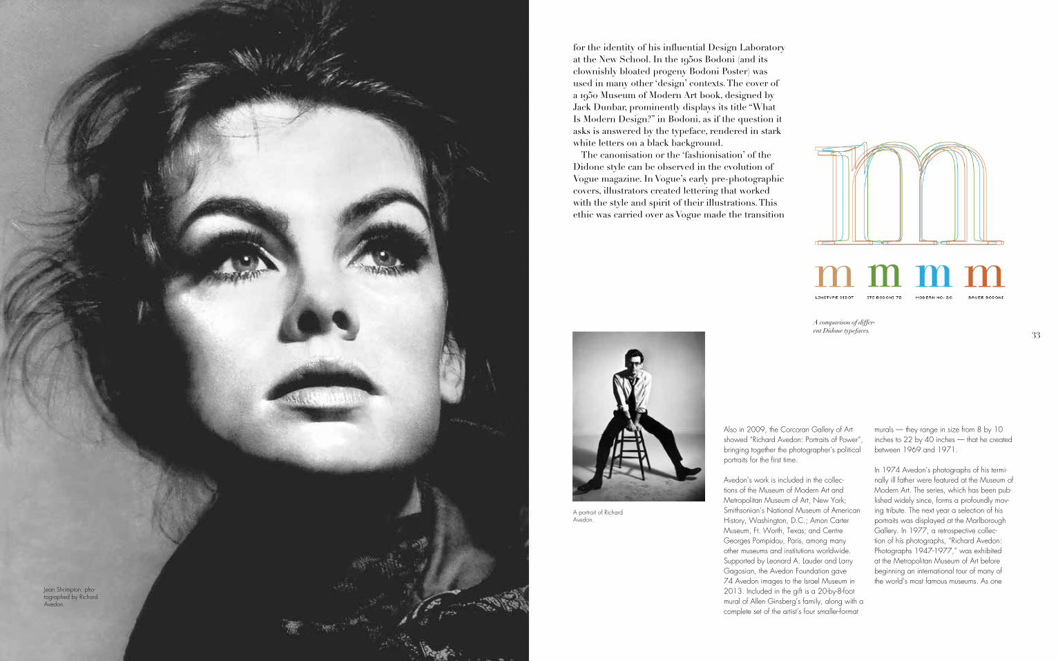
for the identity of his influential Design Laboratory at the New School. In the 1950s Bodoni (and its clownishly bloated progeny Bodoni Poster) was used in many other ‘design’ contexts. The cover of a 1950 Museum of Modern Art book, designed by Jack Dunbar, prominently displays its title “What Is Modern Design?” in Bodoni, as if the question it asks is answered by the typeface, rendered in stark white letters on a black background.MThe canonisation or the ‘fashionisation’ of the Didone style can be observed in the evolution of Vogue magazine. In Vogue’s early pre-photographic covers, illustrators created lettering that worked with the style and spirit of their illustrations. This ethic was carried over as Vogue made the transition
A portrait of Richard Avedon.
A comparison of differ-ent Didone typefaces.

34 35
into the photographic era: photographers and designers created ambitiously varied and inventive approaches that integrated letterforms as part of a total approach to design. But even in those covers that did not integrate the lettering as part of the overall concept, type choices were extremely varied.MAs late as 1955, Vogue covers vacillated between serif and sans serif typefaces, as well as script faces and illustrative, photographic letters. It was after 1955 that the magazine appears to have legislated a consistent use of the all-capitals banner headline set in Didone lettering. Apart from minor details, it has remained absolutely fixed since then, the trade-dress of a powerful international franchise.MFlash ahead to 1992 and the Didone aesthetic is powerfully resuscitated in Fabien Baron’s re-design
Didot, used in the Calvin Klein logo.
Dovima (left) and Twiggy (right), photographed by Richard Avedon.
of the first self-consciously artistic commercial photographers, Avedon played a large role in defining the artistic purpose and possibili-ties of the genre. “The moment an emotion or fact is transformed into a photograph it is no longer a fact but an opinion,” he once said. “There is no such thing as inaccuracy in a photograph. All photographs are accurate. None of them is the truth.”
He received numerous honours and prizes in his long career: as far back as 1958 he was cited as one of the world’s 10 best photog-raphers by Popular Photography. In 1980 he received the National Magazine award for Visual Excellence, and in 1985 he was named the American Society of Magazine Photographers’ Photographer of the Year. Other awards included a Lifetime
Achievement Award from the Council of Fashion Designers of America in 1989, the International Center of Photography Master of Photography Award in 1993, the Prix Nadar in 1994 for his photobook Evidence, the Royal Photographic Society 150th Anniversary Medal as well as the National Arts Award for Lifetime Achievement in 2003. He received honorary graduate degrees from the Royal College of Art (1989), Kenyon College (1993) and Parsons School of Design (1994), and was elected a Fellow of the American Academy of Arts and Sciences in 2001. He was awarded The Royal Photographic Society’s Special 150th Anniversary Medal and Honorary Fellowship in recognition of a sustained, significant
contribution to the art of photography in 2003.
Personal Life
Avedon was a small, wiry man, with a distinctive, centre-parted shock of hair which gradually turned from black to white as he grew older. He was somewhat near-sighted and worn horn-rimmed glasses all his life, although characteristically these would be pushed up to rest on his forehead whenever he was examining prints. He spoke in a gravelly voice with an East Coast accent. He had an impish energy and boundless curios-ity. Over the years he employed and trained many young and aspiring photographers at his office-cum-studio-cum-home on the Upper East Side of Manhattan, and as he got older
Jean Shrimpton, pho-tographed by Richard Avedon for Harper’s Bazaar.
36 37
he seemed only to thrive the more in the company of younger people. Avedon was a demanding tutor, impatient with anything less than perfection from those around him, but he was also an immensely courteous, charming and kind man. He was without pretension and would behave in the same direct, engaging manner toward all his sitters. But his instincts were always those of a New York Jewish liberal, and if he took against someone he could be waspish.
Blessed with longevity and enormous zest (his mother Anna was still sculpting in her nine-ties), Avedon continued working all his life.“I can see myself as a very old man in a ter-rific wheelchair,” he once told an interviewer. “Only, I won’t be photographing the tree
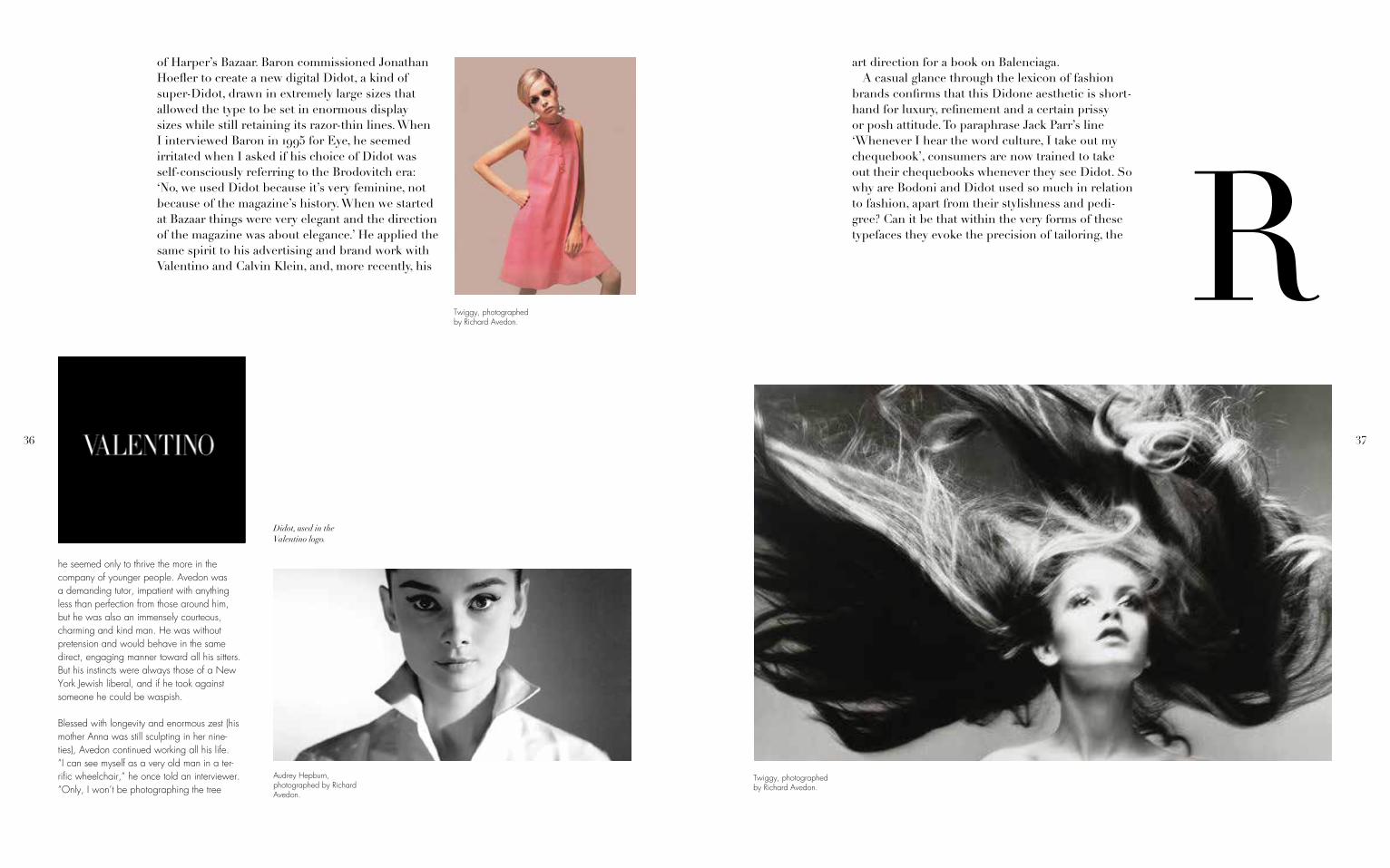
Didot, used in the Valentino logo.
Audrey Hepburn, photographed by Richard Avedon.
of Harper’s Bazaar. Baron commissioned Jonathan Hoefler to create a new digital Didot, a kind of super-Didot, drawn in extremely large sizes that allowed the type to be set in enormous display sizes while still retaining its razor-thin lines. When I interviewed Baron in 1995 for Eye, he seemed irritated when I asked if his choice of Didot was self-consciously referring to the Brodovitch era: ‘No, we used Didot because it’s very feminine, not because of the magazine’s history. When we started at Bazaar things were very elegant and the direction of the magazine was about elegance.’ He applied the same spirit to his advertising and brand work with Valentino and Calvin Klein, and, more recently, his
Twiggy, photographed by Richard Avedon.
Twiggy, photographed by Richard Avedon.
art direction for a book on Balenciaga.MA casual glance through the lexicon of fashion brands confirms that this Didone aesthetic is short-hand for luxury, refinement and a certain prissy or posh attitude. To paraphrase Jack Parr’s line ‘Whenever I hear the word culture, I take out my chequebook’, consumers are now trained to take out their chequebooks whenever they see Didot. So why are Bodoni and Didot used so much in relation to fashion, apart from their stylishness and pedi-gree? Can it be that within the very forms of these typefaces they evoke the precision of tailoring, the

38 39
outside my window, the way Steichen did. I’ll be photographing other old people.”
In 1944, Avedon married 19-year-old bank teller Dorcas Marie Nowell who later became the model and actress Doe Avedon. They remained married for six years, did not have children and divorced in 1949. In 1951, he married Evelyn Franklin, whom he eventually divorced and who passed away on March 13, 2004. Their marriage produced one son, John Avedon, who has written extensively about Tibet.
On October 1, 2004, Avedon died in a San Antonio, Texas hospital of complications from a cerebral hemorrhage. He was in San Antonio shooting an assignment for The
New Yorker. He was 81 years old. At the time of his death, he was also working on a new project titled Democracy to focus on the run-up to the 2004 U.S. presidential election.
Legacy
During his lifetime, Avedon structured the Richard Avedon Foundation, a private oper-ating foundation. It began its work shortly after his death in 2004. Based in New York, the foundation is the repository for Avedon’s photographs, negatives, publications, papers, and archival materials.
One of the greatest photographers of the 20th century, Richard Avedon expanded the genre of photography with his surreal and provocative fashion photography as well as
flatness of fabric, the dynamics of gathering, drap-ing and folding? In “Dreaming by the Book,” Elaine Scarry discusses how writers create and manipulate imagery, showing how mental images are subject to bending, folding and stretching. Typefaces perform similar manipulations, conjuring visual associations, rather than purely mental ones. The attenuated forms of Didone letters are not unlike the flattened geometries of dress patterns: accelerated curves and tapered rectangles meeting at precise junctures. One can imagine the fine lines of the Didone ser-ifs as the seams and stitches that connect into an ensemble of parts.
Marilyn Monroe, photographed by Richard Avedon.
Pierre Didot, a member of the famous Didot family.
Audrey Hepburn, photographed by Richard Avedon.
40 41
My concern is… the human predicament; only what I consider the human predicament may simply be my own.”
In both appearance and personality, Avedon cut the ideal figure of a fashion photogra-pher, and after his death, at age 81, he remains that. His photographic style has been widely imitated. Generations of models have sprung across mid-tone seamless backdrops, or sat pensively in cafes, or pretended to be in love or quite alone — all because of Avedon. And yet if his images retain their special power, if the experiences and emo-tions they present seem lived and not merely imitated, it may be because he is the more complete photographer.
Didot, used on a build-ing for CBS.
Audrey Hepburn, photographed by Richard Avedon.
Didot, used in a CBS advertisement.
Didot, used in the Porter magazine logo.
Twiggy, photographed by Richard Avedon.
MWhile we can speak of this ‘imaginary’ and asso-ciative dimension to Didone fonts, we can also point to one of its most salient, pragmatic aspects: it has an almost see-through quality. Because of its radical thick-thin structure, the mass of the let-terforms are greatly diminished: words typeset in Didone fonts act as a typographic veil over photog-raphy, making them particularly useful for magazine covers. Like Tom Wolfe’s ‘social x-ray’, Didone fonts create an x-ray of the word. Their anorexic, skeletal forms create an ideal overlay for photography. The connection between Didot, Bodoni and the topic of fashion is so embedded that not only do Vogue and Harper’s Bazaar continue to dress themselves in its sparkling linearity, but so do countless other maga-zines and brands.
eyes, her eyebrows, and her mouth – are visible. Funny Face gently satirises the fashion world, thanks in part to a splendid performance by Kay Thompson (“Think pink!”), loosely modelled on Harper’s Bazaar’s fashion editor, Diana Vreeland, but it is also a measure of the stature Avedon had achieved by the mid-1950s.
While much has been and continues to be written about Avedon, he always believed that the story of his life was best told through his photographs. Avedon said, “Sometimes I think all my pictures are just pictures of me.
portraits that bared the souls of some of the most important and opaque figures in the world. Avedon was such a predominant cul-tural force that he inspired the classic 1957 film Funny Face, starring Audrey Hepburn as a naive, but feisty, bluestocking who is “discovered” working in a Manhattan book-shop by the photographer Dick Avery, played by Fred Astaire. The character of Avery, of course, was based on Avedon, though Astaire was twice the real photographer’s age. Avedon acted as a visual consultant to the film. “I had to teach Fred Astaire to be me,” he recalled. “After wanting to be him all my life.” Avedon supplied some of the still photographs used in the production, including its most famous single image: an intentionally overexposed close-up of Audrey Hepburn’s face in which only her famous features – her

42 43Bibliography Colophon
This book was designed by Erin Borst at Northeastern University. It utilizes two typefaces: Didot, designed by Firmin Didot, and Futura Light, designed by Paul Renner.

44
Related Documents