Democracy, targeted redistribution and ethnic inequality * John D. Huber † Thomas K. Ogorzalek ‡ Radhika Gore § March 29, 2012 Abstract There are two principal ways that redistribution occurs in democracies. One is across income groups – class-based politics. The other is across groups not defined by class, such as those based on language, race or ethnicity. Using a new data set comprising 81 countries, we calculate measures of class-based inequality (“within-group inequality”) and group-based inequality (“between-group inequality”). We then examine empirically the relationship between democracy and these two forms of inequality. We find a strong and robust relationship between democracy and between-group inequality but no such relationship between democracy and within-group inequality or overall inequality. Two- stage least squares with a new instrument for democracy suggests this relationship be- tween democracy and lower between-group inequality may be causal. The results are consistent with group-based politics in democracies that disproportionately benefit the richest members of the poorest groups. We also find that the negative relationship between democracy and between-group inequality is strongest in the most ethnically diverse societies, and that that there is a negative relationship between democracy and class-based inequality in the most ethnically homogeneous countries. Theoretical work on democracy and inequality should therefore focus on the interaction between class and group, with the political incentives to target “class” within groups mediated by the level of ethnic diversity in society. * John Huber is grateful for research support from the National Science Foundation. We benefited from helpful comments on an earlier version from Thad Dunning and Dawn Brancati. This is a substantially revised draft of a paper that was presented at the 2011 Annual Meetings of the American Political Science Association in Seattle, WA. † Professor, Department of Political Science, Columbia University, [email protected]. Corresponding author. ‡ Ph.D. candidate, Department of Political Science, Columbia University, [email protected]. § PhD student, Department of Sociomedical Science, Columbia University, [email protected]. 1

Welcome message from author
This document is posted to help you gain knowledge. Please leave a comment to let me know what you think about it! Share it to your friends and learn new things together.
Transcript
Democracy, targeted redistribution and ethnic inequality∗
John D. Huber†
Thomas K. Ogorzalek‡
Radhika Gore§
March 29, 2012
Abstract
There are two principal ways that redistribution occurs in democracies. One is acrossincome groups – class-based politics. The other is across groups not defined by class,such as those based on language, race or ethnicity. Using a new data set comprising 81countries, we calculate measures of class-based inequality (“within-group inequality”)and group-based inequality (“between-group inequality”). We then examine empiricallythe relationship between democracy and these two forms of inequality. We find a strongand robust relationship between democracy and between-group inequality but no suchrelationship between democracy and within-group inequality or overall inequality. Two-stage least squares with a new instrument for democracy suggests this relationship be-tween democracy and lower between-group inequality may be causal. The results areconsistent with group-based politics in democracies that disproportionately benefit therichest members of the poorest groups. We also find that the negative relationshipbetween democracy and between-group inequality is strongest in the most ethnicallydiverse societies, and that that there is a negative relationship between democracy andclass-based inequality in the most ethnically homogeneous countries. Theoretical workon democracy and inequality should therefore focus on the interaction between classand group, with the political incentives to target “class” within groups mediated by thelevel of ethnic diversity in society.
∗John Huber is grateful for research support from the National Science Foundation. We benefited from helpfulcomments on an earlier version from Thad Dunning and Dawn Brancati. This is a substantially revised draft of a paperthat was presented at the 2011 Annual Meetings of the American Political Science Association in Seattle, WA.
†Professor, Department of Political Science, Columbia University, [email protected]. Corresponding author.
‡Ph.D. candidate, Department of Political Science, Columbia University, [email protected].
§PhD student, Department of Sociomedical Science, Columbia University, [email protected].
1

1 Introduction
By empowering the poor to vote for redistributive policies, democracy should reduce inequality.
This simple and powerful intuition, which is made explicit in a wide range of “tax and transfer”
models, is among the most influential and widely used in studies of democracy. Empirical research,
however, has not provided convincing support for the central claim that democracy leads to lower
levels of overall inequality, more redistribution, or higher levels of assistance for the poor.1 Why
could the redistributive logic be so compelling while empirical support for the implied relationship
between democracy and inequality be so weak? If there is little or no relationship between democ-
racy and inequality, does this mean that democracy does not encourage redistributive politics?
Redistribution can occur in different ways. One is obviously from rich to poor – classic
class-based politics that so much research considers. In authoritarian governments, the elites in
power can typically repress the poor. Under democracy, this repression is replaced by a struggle for
votes, with parties competing against each other to build winning coalitions. Existing research like
Acemoglu and Robinson (2006) and Boix (2003) use tax and transfer models to argue that in this
struggle for votes, a majority of the poor can form an electoral coalition that demands redistribution
from the rich. The transition from dictatorship to democracy will therefore be costly to the rich and
beneficial to the poor.
But a second important form of redistribution is group- rather than class-based. Democratic
competition often unfolds less as a battle between rich and poor than as a battle between groups,
particularly those based on race, ethnicity or religion. If parties have incentives to target ethnic
groups, then the logic of the tax and transfer models might be applied differently. We might expect
the poorest groups to make demands for redistribution from the richest ones. Democracy’s impact
on inequality would therefore work through groups by driving down inequality between them.
The central goal of this paper is to explore empirically the relationship between democracy and
class-based inequality, on one hand, and between democracy and group-based inequality on the
other.
Using a new data set covering 81 countries, we decompose the Gini coefficient of inequal-
1See Houle 2009, Mulligan, Gil and Sala-i-Martin 2004, Ross 2006 and Timmons 2010. Not all research, however,fails to support the democracy-redistribution hypotheses. Tavares and Wacziarg (2001) find democracy is associated withless inequality across countries, and Martınez-Bravo, Padro i Miquel, Qian and Yao (2012) find that the introduction of(quasi) democratic elections leads to lower land inequality in rural China.
2

ity into its ”group-based” (between-group inequality) and “class-based” (within-group inequality)
components, as well as its third component, “Overlap,” a residual that has been related to income
stratification (Yitzhaki and Lerman 1991). We then estimate statistical models of the relationship
between democracy and these different components. Using OLS regressions, we show that democ-
racy is not associated with lower levels of general inequality (measured by the Gini), lower levels
of within-group inequality (the class-based component), or lower levels of Overlap. But there is
a very strong and robust empirical relationship between democracy and group-based inequality:
democracy is associated with lower levels of between-group economic differences. Using a new
instrument for democracy, we provide evidence that this relationship could be causal.
Why might democracy be associated with lower inequality between ethnic groups but not
lower general or class-based inequality? Although it is beyond the scope of this paper to provide an
explicit theory, in our discussion of the empirical findings, we make a several observations. First,
we point out that class politics based on “rich to poor” redistribution is likely an inefficient tool for
parties seeking to build support for a majority in a democracy. Targeting groups often allows lower
cost strategies for building majorities, and ethnic groups are an obvious basis for such targeting
because such groups are often easily identifiable, and because individuals cannot easily select in
and out of ethnic groups.
Second, in order for democracy to reduce between-group economic differences without
affecting other types of inequality, democracy must (a) boost the well-being of the rich in the poorer
groups more than it does the well-being of the poor in poorer groups, (b) decrease the well-being of
the poorest in the rich groups more than it decreases the well-being of the rich in the richest groups,
or (c) do both. If this were not true, the accounting could not work – that is, it would be impossible
for between-group inequality to decrease without also decreasing overall inequality. Yet we believe
this “within-group targeting” is consistent with what we often observe, particular with respect to
the poorer groups. In countries as diverse as the US, Brazil and India, for example, wide ranging
affirmative action and other policies targeting groups typically benefit the most-well off in the poor
groups. The empirical analysis therefore suggests that the best pathway forward in theorizing about
democracy and inequality should involve neither a focus on strictly class-based politics nor a focus
on strictly group-based politics. Instead, there is likely an important interaction between class and
group, and incentives by politicians to target “class” within groups. Understanding such targeting
3

incentives in democratic competition should help paint a more accurate picture of the effect of
democracy on inequality.
Third, targeting ethic groups will obviously not be a viable electoral strategy in highly
homogenous societies. Does this imply that we see “class-based politics” in homogenous societies
and group-based politics in heterogeneous one? Our evidence suggests the answer is yes. When we
examine the interaction of democracy and ethnic diversity, we find that in homogeneous societies,
democracy is associated with lower within-group inequality, suggesting that class-based politics are
likely the norm in such countries. By contrast, in heterogeneous societies, democracy is associated
only with lower group-based inequality, suggesting that targeting ethnic groups is the dominant
strategy in such countries.
The paper is organized as follows. The next section describes the decomposition of the
familiar Gini coefficient into three components – between-group inequality, within-group inequality
and “overlap.” Section 3 presents the data set used to measure these three three components and
describes biases associated with some of the 175 surveys used in the analysis, an exercise that
informs the types of empirical models we estimate. Section 4 then presents data on the three
components, showing that most inequality is within- rather than between groups. Our empirical
tests are in sections 5 and 6, followed by our interpretation of the main empirical findings in section
7.
2 Decomposing the Gini coefficient
The Gini coefficient, which ranges from 0 (perfect equality) to 1 (maximal inequality, where one
person controls all the income), is perhaps the most well-known and widely used measure of overall
inequality in society. The Gini coefficient can be decomposed into three components, Between-
group inequality (BGI), which is a measure of economic differences between groups, Within-group
inequality (WGI), which is a measure of economic differences within groups, and thus is a measure
of class-based differences, and Overlap (O), a residual term.
To understand the nature of the three components and their relation to the Gini, it is useful
to recall that the Gini is based on the Lorenz curve, which describes the income distribution by
ordering individuals on the x axis from poorest to richest. Let p be a percentile rank on the x axis.
4

Thus, for example, a point p = 30 on the x-axis signifies the person at the 30th percentile in the
income distribution: people to the left (just less than 30% of the population) are poorer, while
people to the right (70% of the population) are richer. For any p one can plot on the y axis the
proportion of income held by all individuals who are at least a poor as p, defined as L(p). So if
the poorest 30 percent of the population had 15 percent of total income, there would be a point
on the Lorenz curve at x=30, y=15. In a case of perfect equality, L(p) = p for all p. So the
“poorest” 30 percent of the population earns 30 percent of total income, the “poorest” 50 percent
earns 50 percent of income, the “poorest” 90 percent earns 90 percent of the income, and so on for
each possible percentile. Of course, implicit in such a perfect-equality case is that any ranking of
individuals by income would be arbitrary. In both panels of Figure 1, the cases of perfect equality
are represented by the 45-degree lines. If any inequality exists, then at all p, the income share L(p),
will fall below the 45-degree line. This curve, denoted by L(p) in the figure, is the Lorenz curve.
The area between the curve and the 45 degree line describes the Gini coefficient, which is the ratio
of this area over the total area below the 45-degree line. The Gini is thus written as
G = 2∫ 1
0[p− L(p)]dp. (1)
Naturally, larger Gini coefficients mean a greater area between the Lorenz curve and the 45 degree
line, and thus greater inequality.
The Gini coefficient is neutral with respect to how inequality is distributed across and within
different groups in society, but class- and group-based inequality are often distinct and of central
substantive concern. First consider inequality between groups. Lambert and Aronson (1993) pro-
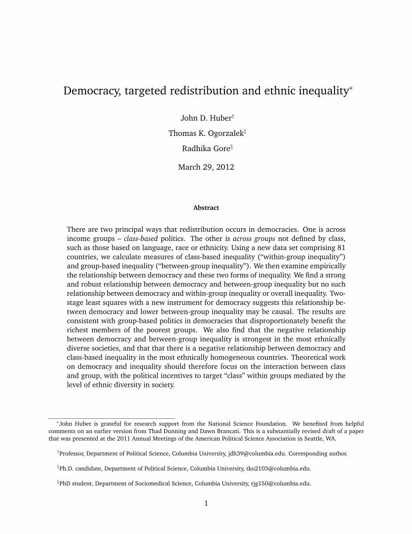
vide a graphical interpretation of the Gini decomposition using the Lorenz curve, and the top panel
in Figure 1 is adapted from their figure 1. Suppose that society is composed of three groups and
that we assign each person in a group the mean income of that group. We can array each person
on the x-axis from poorest to richest and graph the Lorenz curve as before. In the top panel, the
poorest group is 40 percent of the population and has 20 percent of total income, so the segment
of the group-based Lorenz curve for this group is the straight dashed line connecting the point 0,0
with the point 40,20. The next poorest group is 35 percent of the population and has 30 percent
of the income, so its segment of the group-based Lorenz curve is the straight line from the point
5

Proportion of population,p
Pro
port
ion
of in
com
e he
ld b
y p
0.4 0.75
0.2
0.5
BGIWGIO
LB(p)C(p)L(p)
Proportion of population,p
Pro
port
ion
of in
com
e he
ld b
y p
0.4 0.75
0.3
0.6
Figure 1: Two examples of the Gini’s decomposition
6
at 40,20 to the point 75, 50. This leaves the third group with 25 percent of the population and 50
percent of the income. This rich group’s segment in the group-based Lorenz curve goes from the
point 75, 50 to the point 1,1. The group-based Gini, or BGI, is represented by the area between the
dashed line LB(p) and the 45-degree line, depicted by the diagonal shading. The formula for this
area is given by
BGI = 2∫ 1
0[p− LB(p)]dp. (2)
BGI obviously does not capture all inequality in society, as it ignores income differences
within groups. Within-group inequality (“WGI”) is a second component of the Gini. It considers
economic differences within rather than across groups, and is a weighted average of the Gini coeffi-
cients for each group. Returning to Figure 1, we can preserve the income rankings defined by group
average incomes, so for example every member of group 1 is poorer than every member of group 2,
and so on. But within each group, individuals can be ranked on the x axis from poorest to richest.
This within-group ranking, along with information about the proportion of group income held at
each percentile rank for each group, provides the information needed to calculate the Lorenz curve
for the group. For each group, the dashed line, LB(p), delineates the within-group equivalent of
the 45-degree line in the total-population case, and the dotted line delineates the Lorenz curve for
each group. Consider group 1. If there was perfect equality within the group, so that the poorest 10
percent of the group had 10 percent of the group’s income, the poorest 20 percent had 20 percent
of income and so forth, within-group inequality for group 1 would be zero, and its depiction would
simply follow the dashed line. But as inequality increases within the group, the Lorenz (or concen-
tration) curve for the group would drop below the group’s dashed line segment for the group. The
figure delineates the Gini coefficient for each group, denoted by the dotted line marked C(p). The
cross-hatched areas between C(p) and LB(p) represent the Gini coefficients for each group. Note
in the top panel of the figure there is very little inequality within the poor group and considerable
inequality within the rich group. WGI is essentially the sum of these areas and is given by
WGI = 2∫ 1
0[LB(p)− C(p)]dp. (3)
Note that within-group inequality is a function not simply of the group-based Ginis but also of
7

group size (which affect the length of the dashed line segments) and group mean incomes (which
affect the slopes of these lines, and thus the total income under the curve at any group-specific p).
In arraying individuals on the x axis to calculate WGI, we implicitly assume that the rich-
est person in each group is poorer than the poorest person in the next richest group (because in
calculating WGI, we are preserving the income rankings for the BGI calculation and then ranking
individuals by income within groups). Together, BGI and WGI would capture all inequality in a
society if there was no overlap in the incomes of group members (so that all group 1 members
in the example are poorer than group 2 members, and all group 2 members were poorer than all
group 3 members). But this, of course, is unlikely to ever be the case. To capture the true level of
inequality, we must order all individuals by their income, ignoring group all together. The amount
of income inequality that is not accounted for by BGI and WGI is therefore the area between L(p)
and C(p), which is represented by the area shaded using horizontal lines. This residual area is
often called Overlap (“O”), and it is given by
O = 2∫ 1
0[C(p)− L(p)]dp. (4)
The Gini, then, is decomposable into three components:
G = BGI +WGI +O (5)
As the proportion of income held by each group becomes more proportional to group size,
BGI will obviously decrease. In the bottom panel of Figure 1, for example, the groups are the same
size as in the top panel, but group 1 has 30 percent of the income (instead of 20 in the top panel)
and group 3 has 40 percent of income (instead of 50 percent). Thus, BGI shrinks. This shrinkage
could occur with or without a change in WGI or O. Compared with the top panel, the bottom panel
depicts a situation not only where BGI is smaller, but also where WGI is larger (the cross-hatched
shaded group Ginis are relatively large) and O is smaller.
Though a number of efforts have been made to interpret the Overlap term as substantively
important in its own right (e.g., Yitzhaki and Lerman 1991), this has proven quite difficult because
it has not been possible to characterize analytically the Overlap term – which is typically written
as a residual – in a substantively meaningful fashion that is tied tightly to the Gini decomposition.
8

Moreover, while BGI and and WGI are conceptually distinct and either can change with no effect
on the other, the same is not true for O, which is a function of both BGI and WGI: given any overlap
in group income distributions, O will increase as BGI decreases or as WGI increases. Given that the
Gini does not decompose neatly into within-group and between-group components, scholars inter-
ested in between- and within-group differences have often turned to generally entropy measures
(such as the Theil index), which decompose neatly into within- and between-group components.
However, the general entropy measures are sensitive to the number of groups and thus are ap-
propriate measures only when the number of groups across comparison units is constant (such as
when comparing inequality between urban and rural areas across states).
This problem associated with interpreting the Overlap term need not undermine the utility
of BGI and WGI, however, because each of these two components of the Gini has a straightforward
substantive interpretation in its own right. BGI is a measure of group-based economic differences,
and has been used, for example, in the study of conflict (e.g., Stewart 2008) and public goods
provision (e.g, Baldwin and Huber 2010). BGI measures the differences between the average
income of groups, and using discrete data, can be written as
BGI =12y
(k∑
m=1
k∑n=1
pmpn | ym − yn |), (6)
where m and n index groups, pm is the proportion of the population in group m, ym is the average
income of group m, and there are k groups in society.
WGI is a measure of class conflict, as it measures the total inequality that exists solely
within groups. This variable has not received much attention in previous studies in political science,
though recent theoretical work by Esteban and Ray (2008, 2011) and Houle (2011) argues that
civil conflict is affected by WGI. Using discrete data, WGI can be written as
WGI =k∑
i=1
Gipiπi, (7)
where Gi is the Gini coefficient for group i and πi is the proportion of total income going to group
i.
In principle, democracy could be associated with different levels of all three components
9
of inequality. If democracy is associated with lower BGI, we know that it is associated with lower
economic differences between ethnic groups. If democracy is associated with lower WGI, we know
that is associated with lower levels of class-based economic differences. In principle, democracy
could be associated with higher levels of one component and lower levels of another, providing
insight into precisely how democracy affects the politics of redistribution.
3 Measuring the three elements of the Gini decomposition
Testing the relationship between democracy and the various components of inequality requires data
on the “income” and group identity of individuals. To this end, we use individual-level surveys. A
central goal is to create a data set that includes as wide a range of countries as possible, and we
often use more than one survey from particular countries. The surveys are from 1992-2008,2 and
there are five different types of surveys that we use:
• The World Values Survey (WVS) (from 1995-2002).
• The Comparative Study of Electoral Systems (CSES) (from 1996-2004).
• The Afrobarometer (2002-2006).
• The Demographic and Health Surveys (DHS) (1992-2008).
• Various fine-grained surveys which we call “Household expenditure surveys” (HES), includ-
ing the LSMS (Living Standards Monitoring Surveys), miscellaneous country-specific studies,
country census files from IPUMS, and the Luxembourg Income Study (LIS) (from 1988-2006).
3.1 What is a “group”?
Since different surveys can use different definitions of groups, it is useful to have a definition of
“group” that can be employed consistently across a range of surveys. To this end, we follow the
definition of groups found in Fearon (2003), which emphasizes groups be understood as “descent
groups” that are locally viewed as socially or politically consequential. Depending on the country,
Fearon’s identification of groups may be based on race (e.g., the US), language (e.g., Belgium),
2There is one exception to this time frame – we have only one survey from Cote d’Ivoire, which is from 1988.
10
religion (e.g. France), tribe (e.g., many African countries), or even some combination of these
factors. The strong advantage of this approach is that it attempts to apply a consistent definition of
groups across a wide range of countries. While the question of how to define a group is important
and contentious, the most important issue for present purposes is that the definition plausibly
identifies groups that could be targeted. That is clearly the case with the Fearon definition. Of
course, the same issues explored in this study could be explored using alternative definitions of
groups.
To determine whether the Fearon groups are sufficiently well-identified by a survey to merit
the inclusion of the survey in our data set, we employ a 10 percent rule, which works as follows. For
each survey, we calculate the percentage of the population (per Fearon’s data) that we cannot assign
to any of Fearon’s groups, and we retain the survey if this number is less than 10. For example,
if there are three groups in Fearon’s data, and group 1 represents 12 percent of the population
according to Fearon, then we do not use the survey if it does not include group 1 (because 12
percent violates the 10 percent rule). We sum the percentages of all the Fearon groups that we
cannot identify and omit the survey if this sum is greater than 10 percent. This ensures that we are
using a consistent definition of groups across the surveys.
3.2 Measuring “income”
The other key variable in constructing our measures is “income,” which the surveys measure either
directly or indirectly. First consider the direct measures. By far the best measures of “income” that
are available in any existing surveys come from those we place in the HES category. The 28 HES
surveys cover 23 countries. These include the data taken directly from a national census (“IPUMS”),
which have fine-grained income categories and very large representative samples. These also in-
clude detailed household income and consumption surveys. Some of the HES surveys included
ready-made income and/or consumption variables that follow protocols that have been developed
by economists (e.g. Deaton 1980, Deaton and Zaidi 2002). For those that do not, we constructed
measures of net income and consumption that follow these same protocols. Measures of net in-
come included wages, net earnings from self-employment, net value of home production; value
of government subsidized services, pensions, child assistance, alimony, child support, disability in-
11

surance, and social benefits; and value of investment, insurance, and rental income.3 Measures
of consumption/expenditures include the value of all food consumption, educational expenditures,
other market consumer purchases, goods produced and consumed in the home, in-kind payments,
rental expenditures, and rental-equivalent use value of durable goods and housing if owned. These
two measures are expressed in local currency and measured at the monthly household level. Each
total figure, for household expenditure/consumption and household income, is then divided by the
size of the household to create the household income and consumption figures we use in the cre-
ation of the nation-level measures of group-based economic differences.4 As is standard in the use
of these surveys to study inequality, we focus on consumption rather than income when both types
of measure are available (although the two are very highly correlated), given that consumption-
based measures do a better job of differentiating individuals at the low end of the income scale.
Indeed, for many individuals in many countries in this study, cash incomes often are non-existent.
The other direct measures of “income” are found in the CSES and WVS, which each have a
single question that asks respondents to state the income category of the respondent’s household
income after taxes and transfers. The CSES reports the income as quintiles, whereas the WVS has
a different income scale for each country. Since these data are less fined-grained than those in the
HES category, they may understate the true levels of group-based inequality (an issue we explore
empirically below).
Next consider indirect measures of “income.” In developing parts of the world, cash incomes
often do little to distinguish the relative economic well-being of individuals. Consequently, scholars
have developed a strategy for assessing economic well-being that involves asking survey respon-
dents about their living conditions and access to material goods. The Demographic Health Surveys
(DHS) have been leaders in this regard, and their surveys ask respondents about their possession
of assets, services, and amenities that are assumed to be directly related to the economic status of
the household. They have a rather large number of questions that include information about the
type of flooring, roof, water supply, sanitation facilities, and vehicle; possession of goods such as
a refrigerator, radio, television, and telephone; and the number of persons per sleeping room. To
3Taxes paid and business expenses (including expenses for home-based agriculture or production) are subtracted outof this to make the income a valid “net” measure of income.
4To account for household size, we divide the total household income and consumption by a measure of adult equiv-alency whenever possible or when it has not been done already in the survey: 1 unit for household head, .7 for otheradults and adolescents, .5 for children under 14 years of age.
12

construct its wealth index, DHS typically uses all available asset and utility services variables in
order to improve the distribution of households across index scores. For categorical variables such
as “type of flooring,” DHS first constructs sets of dichotomous variables from the indicator vari-
ables. Ordering the categories is at times a subjective exercise affected by the conditions in each
country. For example, types of flooring include carpet, ceramic tiling, and parquet; it is not obvious
which type of floor wealthier households are more likely to have. Finally, weights are attached to
the indicator variables using principal components analysis. The household’s wealth index value,
a standardized score with mean zero and standard deviation of one, is calculated by summing the
weighted indicator values. Filmer and Pritchett (2001) and McKenzie (2005) discuss the use of as-
set indicators to create these variables. The variable HV271 in DHS provides the household wealth
index. However, this variable is not available for all DHS surveys. Using a procedure similar to that
of DHS, we constructed our own household wealth index when the DHS variable does not exist in
a given survey.5
The Afrobarometer surveys also include no measures of income, but like DHS, include sev-
eral “well-being” variables. Each survey asks respondents how often they (or family members) have
gone without food, water, medical care, cooking fuel, and cash income. Each variable is coded on
a five-point scale (from 0 to 4) according to how often the respondent has gone without the item.
The third wave also includes questions about whether or not the respondent owns a radio, televi-
sion, motorbike, or “motor vehicle,” and these are included where available. As with the DHS, we
estimate the household affluence by including all of the available asset and needs variables in a
principal components factor analysis, and estimate “income” based on the first factor.
These indirect measures of income are attractive in that they allow us to differentiate eco-
nomic well-being of respondents who often have no cash income. But there is an obvious cost –
because it includes no measure of actual cash income, wages, or high-end wealth, this index is most
useful in distinguishing differences among the least well-off, masking differences that exist among
the more well-to-do. Thus, estimates of various inequality variables risk understating the true level
of inequality using the indirect measures. This should be particularly true of the Afrobarometer
surveys, which have a more limited range of variables with which to construct the measures of
5Since the principle components analysis returns a variable with mean zero, it cannot be used as an input to derivethe Gini decomposition. We therefore convert each DHS income score into a percentile (ranging from 1-100) score.
13

Table 1: Average democracy and national wealth of different survey types
Survey Avg. Polity2 score Avg. GDP/capita # Surveys # countriesAfrobarometer 5.13 $2,311 22 13
CSES 8.3 $18,751 27 19
DHS 2.1 $2,223 69 35
WVS 6.0 $14,607 29 29
HES 6.3 $15,106 28 23
economic well-being.6 We analyze this issue below.
3.3 Biases in the surveys
We have a total of 175 surveys from 81 countries available for analysis.7 Before employing the
group-based inequality measures for substantive research, it is important to explore biases that
may exist in the various surveys. One bias is that the surveys are correlated with region and/or
with national wealth or democracy. The Afrobarometer, for instance, exists only in Africa, the DHS
contains no advanced industrial countries, and the CSES focuses mostly on rich countries. Table
1, which displays the mean Polity2 democracy score, as well as the mean GDP/capita for each of
the five survey types, describes these biases. We can see that the DHS countries are on average
the least democratic whereas the CSES countries are the most democratic on average. Similarly,
the CSES countries are richer on average than other surveys, whereas the DHS and Afrobarometer
surveys are quite poor on average. Thus, it is important to bear in mind that the various individual
survey types are not random samples of all countries.
Do the surveys accurately reflect the size of groups? A simple way to address this is to
6See Baldwin and Huber 2010 for a discussion of how Afrobarometer surveys lead to underestimates of BGI.7See Table 10 in the appendix for a complete list of countries and surveys. We use a slightly smaller number of surveys
in some of the analyses below because for some countries we lack measures of right-hand side variables. We also excludeSouth Africa, which obviously has a very unique history of group-based economic differences. There is extreme variationin our South African measures. We calculate all components of the Gini using the “ginidesc” command in Stata (Aliagaand Montoya 1999).
14

0.2
.4.6
.81
ELF(
Fear
on)
0 .2 .4 .6 .8 1ELF(surveys)
Afrobarometer CSES DHS HES WVS 45-degree
Figure 2: Fearon’s diversity measures vs. the survey-based diversity measures
compare the measures of ELF from each of the surveys with the ELF from Fearon’s data. Figure 2
plots Fearon’s measure of ELF against the ELF measure based on surveys, with different symbols
for different survey types. There are three points worth noting. First, the correlation is very strong,
with a Pearson’s r of .94. Second, all of the surveys are systematically underestimating Fearon ELF,
particularly in the countries that have low ELF. Third, none of the surveys seem to overestimate or
underestimate ELF more than the others.
Next consider the measurement of income in the surveys. Figure 3 plots the Gini coeffi-
cient from the World Development Indicators against the Gini calculated from the surveys for each
survey type. Not surprisingly, the correlations are quite weak for three survey types: the top three
panels show essentially no relationship between the WDI and survey Ginis. For the DHS and Afro-
barometer, this lack of correlation is almost certainly due to the fact that the indirect measures of
income lump all individuals who are relatively well-to-do into the same “income” category, when
in fact there are certainly large income differences across such individuals. The greater the “high
income” inequality, the more these surveys will underestimate total inequality. For the CSES, the
use of quintiles to measure income essentially ensures no correlation with the WDI Gini. In the
bottom panel, the correlations are stronger, particularly for the HES. But even the correlation be-
tween the HES Gini and the WDI Gini is quite noisy in countries with a Gini greater than about .30.
15

.2.4
.6.8
.2.4
.6.8
20 40 60
20 40 60 20 40 60
Afrobarometer CSES DHS
HES WVSWDI
Gin
i
Survey GiniGraphs by survey type
Figure 3: WDI Gini v. Survey-based Gini
Given these HES surveys represent the best data we are able to uncover for household income, it
raises the question how well the WDI Gini measures inequality, a question that is beyond the scope
of what we can explore here.
Our goal, of course, is to measure the three components of the Gini, not the Gini itself. If
the various measures of income are accurately correlated with group identity across the surveys,
then even surveys like CSES and DHS will provide useful information about the relative importance
of BGI and WGI across countries. But it is important to understand and account for possible biases
caused by the way that income is measured in particular surveys. To this end, we can use the HES
as a benchmark. The surveys we call HES provide the best possible information available to social
scientists about the income distributions in particular societies, given the care that they take in
obtaining representative samples, as well as in the measurement of household income or expendi-
16

ture. They can therefore be used to evaluate biases in measures from the non-HES surveys. First
consider biases in the measurement of BGI. Model 1 in Table 2 presents the results from a regres-
sion where BGI is the dependent variable. The independent variables include indicator variables
for each country, indicator variables for regions (with Africa as the omitted category), and indica-
tor variables for the five types of surveys (with HES as the omitted category). The coefficients on
the survey indicators are therefore estimated from within-country variation, controlling for region
(given that the survey categories are correlated with region). They measure the average difference
between each survey type and the benchmark HES surveys.
All of the non-HES surveys underestimate BGI (relative to the HES estimates), with a partic-
ularly large underestimate found in the Afrobarometer surveys. This result for the Afrobarometer
is unsurprising given that the indirect measure of “income” is based on a relatively small number of
variables in those surveys. Note that the mean and standard deviation of BGI are .051 and .046 re-
spectively, implying that the “underestimate” in the Afrobarometer is non-trivial in size. The other
surveys have underestimates that are relatively similar to each other, though it is interesting to note
that the CSES produces the estimates closest to those of the HES. Thus, even though CSES income
is measured in quintiles (making estimates of Gini meaningless), the between-group incomes dif-
ferences from these surveys reflect relatively well the between-group differences found in the best
surveys available.
Model 2 is the same as Model 1 except that WGI is the dependent variable. Again, each
of the surveys underestimates polarization relative to the estimates using the HES surveys. But
there is not too much difference across the surveys, each of which have a coefficient between −.070
and −.106. The mean/SD of WGI is .163/.085. Finally, model (3) presents the results for Overlap.
Again, the non-HES surveys tend to underestimate Overlap, with the greatest underestimates found
in the Afrobarometer surveys.
4 An empirical description of the three components of the Gini
We now describe the three components of the Gini. The analysis in Table 2 suggests taking the
means of the raw data would give an inaccurate picture because the various surveys underestimate
to different degrees the actual components of inequality relative to our most accurate surveys, the
17
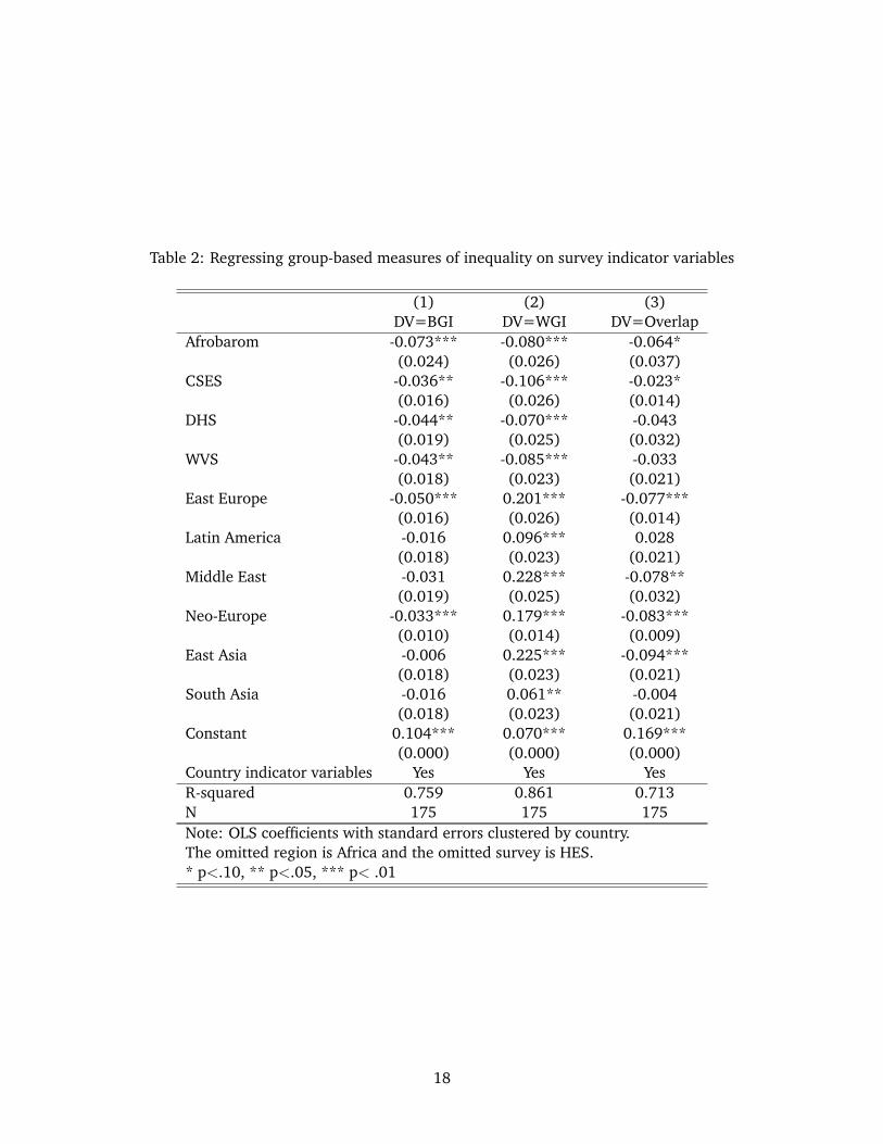
Table 2: Regressing group-based measures of inequality on survey indicator variables
(1) (2) (3)DV=BGI DV=WGI DV=Overlap
Afrobarom -0.073*** -0.080*** -0.064*(0.024) (0.026) (0.037)
CSES -0.036** -0.106*** -0.023*(0.016) (0.026) (0.014)
DHS -0.044** -0.070*** -0.043(0.019) (0.025) (0.032)
WVS -0.043** -0.085*** -0.033(0.018) (0.023) (0.021)
East Europe -0.050*** 0.201*** -0.077***(0.016) (0.026) (0.014)
Latin America -0.016 0.096*** 0.028(0.018) (0.023) (0.021)
Middle East -0.031 0.228*** -0.078**(0.019) (0.025) (0.032)
Neo-Europe -0.033*** 0.179*** -0.083***(0.010) (0.014) (0.009)
East Asia -0.006 0.225*** -0.094***(0.018) (0.023) (0.021)
South Asia -0.016 0.061** -0.004(0.018) (0.023) (0.021)
Constant 0.104*** 0.070*** 0.169***(0.000) (0.000) (0.000)
Country indicator variables Yes Yes YesR-squared 0.759 0.861 0.713N 175 175 175Note: OLS coefficients with standard errors clustered by country.The omitted region is Africa and the omitted survey is HES.* p<.10, ** p<.05, *** p< .01
18
HES. In the statistical models that we estimate below, where we regress inequality on democracy,
we can address this problem by including survey and region indicator variables on the right-hand
side. But here, where we wish to examine the means of the variables themselves, we can use the
estimates in Table 2 to adjust the scores for the components. Our best estimate of how much the
Afrobarometer surveys underestimate BGI, for example, is the Afrobarometer coefficient in Model 1
of table 2, which is -.073 and which represents the mean difference (using within-country variation)
between Afrobarometer surveys and the best surveys available, HES. Thus, if we add .073 to each
Afrobarometer measure of BGI, we should be closer to the true BGI. For each non-HES survey, we
can adjust the measures of BGI, WGI and O in the same fashion, adding the absolute value of the
relevant coefficients to the original measures. Table 3 shows for each survey type, the average of
each of the three components of the Gini, as well as the average proportion of total inequality for
each component, using the adjusted data. Looking at the far right right column, which gives the
total for all surveys, the average BGI is .090, a bit smaller than Overlap’s average of .123 and much
smaller that the average WGI, .232. On average across all surveys, 19.3 percent of the Gini is due
to between-group economic differences, compared with 27.3 percent for Overlap and 53.4 percent
for WGI. The table also shows that these proportions vary somewhat across the different survey
types. BGI is highest in the Afrobarometer, which is not surprising as the African countries have
tremendous ethnic diversity coupled with high levels of inequality. In the highest-quality surveys,
HES, 14.7 percent of inequality is due to between group differences, while 65 percent of inequality
due to within-group differences.
Table 4 shows the correlation matrix for the three components, along with Gini and ELF.
Several points are worth highlighting:
• ELF is positively correlated with Gini. More ethnically fragmented societies are also more
unequal.
• ELF is very strongly correlated with each component of the Gini. This correlation is positive
for Overlap and BGI, and is negative for WGI.
• Overlap and BGI are positively correlated with each other and are negatively correlated with
WGI.
19
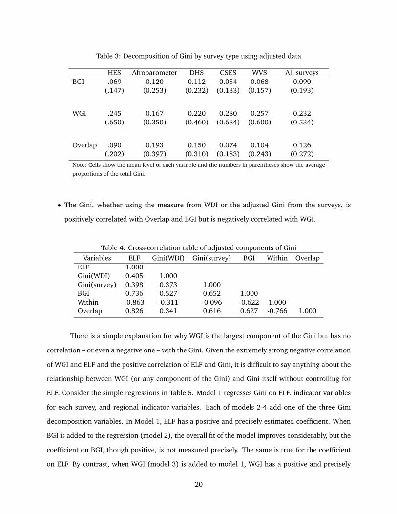
Table 3: Decomposition of Gini by survey type using adjusted data
HES Afrobarometer DHS CSES WVS All surveysBGI .069 0.120 0.112 0.054 0.068 0.090
(.147) (0.253) (0.232) (0.133) (0.157) (0.193)
WGI .245 0.167 0.220 0.280 0.257 0.232(.650) (0.350) (0.460) (0.684) (0.600) (0.534)
Overlap .090 0.193 0.150 0.074 0.104 0.126(.202) (0.397) (0.310) (0.183) (0.243) (0.272)
Note: Cells show the mean level of each variable and the numbers in parentheses show the average
proportions of the total Gini.
• The Gini, whether using the measure from WDI or the adjusted Gini from the surveys, is
positively correlated with Overlap and BGI but is negatively correlated with WGI.
Table 4: Cross-correlation table of adjusted components of GiniVariables ELF Gini(WDI) Gini(survey) BGI Within Overlap
ELF 1.000Gini(WDI) 0.405 1.000Gini(survey) 0.398 0.373 1.000BGI 0.736 0.527 0.652 1.000Within -0.863 -0.311 -0.096 -0.622 1.000Overlap 0.826 0.341 0.616 0.627 -0.766 1.000
There is a simple explanation for why WGI is the largest component of the Gini but has no
correlation – or even a negative one – with the Gini. Given the extremely strong negative correlation
of WGI and ELF and the positive correlation of ELF and Gini, it is difficult to say anything about the
relationship between WGI (or any component of the Gini) and Gini itself without controlling for
ELF. Consider the simple regressions in Table 5. Model 1 regresses Gini on ELF, indicator variables
for each survey, and regional indicator variables. Each of models 2-4 add one of the three Gini
decomposition variables. In Model 1, ELF has a positive and precisely estimated coefficient. When
BGI is added to the regression (model 2), the overall fit of the model improves considerably, but the
coefficient on BGI, though positive, is not measured precisely. The same is true for the coefficient
on ELF. By contrast, when WGI (model 3) is added to model 1, WGI has a positive and precisely
20

estimated coefficient, as does ELF, suggesting the negative bivariate correlation is simply an artifact
of not controlling for ELF. When Overlap is added to the model, the coefficient has has the wrong
sign, though it is small and very imprecisely measured – O indeed seems like a noisy residual. Thus,
WGI is the component with the strongest correlation with Gini, though we have to control for ELF
to see this correlation.
5 OLS models regressing group-based inequality measures on democ-
racy.
We now turn to the principal task of this paper, which is to estimate the empirical relationship
between the various components of inequality and democracy. This section presents OLS models,
treating each survey as the unit of analysis and estimating the coefficients on democracy when
democracy is measured in the same year as the survey. All of the models include two core controls:
(1) ELF (measured by Fearon) and (2) the Gini (measured by the World Development Indicators).
Given the differences across the surveys demonstrated above, as well as the correlation of the
surveys with geography, all models also include regional indicators and survey indicators. In each
model, the excluded region is Africa and the excluded survey is HES. To facilitate comparisons of
the size of the coefficients, all of the continuous variables are standardized to have a mean of 0 and
and standard deviation of 1. The models are estimated using OLS with standard errors clustered
by country.
Table 6 presents models where BGI is the dependent variable and the measure of democ-
racy is Polity2. Polity2 is measured on a 21 point scale, and we might expect that the relationship
between democracy and any form of inequality to be non-linear, with diminishing effects of democ-
racy as the scale approaches its highest values, where the most robust democracies are clustered.
We therefore consider both linear and logarithmic specifications of Polity2. In model 1, all avail-
able surveys are used, only the core control variables are included, and the linear specification of
Polity2 is included. Polity2 has a negative and precisely estimated coefficient, ELF has a positive
and precisely estimated coefficient, and Gini has a positive coefficient that is not particularly pre-
cisely estimated. Model 2 is identical to model 1 except that it uses the natural log of Polity as the
measure of democracy. The results are virtually identical to those in model 1. In the other models
21

Table 5: Regressing Gini on ELF and the adjusted measures of BGI, WGI and O
(1) (2) (3) (4)ELF 0.152*** 0.001 0.082** 0.053
(0.034) (0.044) (0.038) (0.041)BGI 0.255
(0.276)WGI 0.219**
(0.089)Overlap -0.131
(0.147)Afrobarom 0.069* 0.069** 0.048**
(0.039) (0.027) (0.024)CSES -0.002 0.009 -0.014
(0.014) (0.014) (0.011)DHS 0.009 0.013 -0.001
(0.014) (0.012) (0.012)WVS 0.014 0.020 0.001
(0.015) (0.013) (0.010)East Europe -0.069*** -0.085*** -0.080***
(0.019) (0.019) (0.022)Latin America 0.105*** 0.101*** 0.104***
(0.023) (0.023) (0.025)Middle East -0.071** -0.081** -0.077**
(0.035) (0.036) (0.037)Neo-Europe -0.065*** -0.077*** -0.078***
(0.024) (0.024) (0.027)East Asia 0.002 -0.002 0.000
(0.036) (0.033) (0.035)South Asia -0.096*** -0.110*** -0.105***
(0.021) (0.022) (0.022)Constant 0.330*** 0.398*** 0.335*** 0.412***
(0.019) (0.030) (0.042) (0.032)Adj. R-squared 0.159 0.594 0.595 0.590N 175 175 175 175Note: OLS coefficients with standard errors clustered by country.* p<.10, ** p<.05, *** p< .01
22

we estimate, very similar results are obtained using both the linear and logged versions of Polity2.
In what follows, we report the results for the linear specifications.
Democracy, of course, is correlated with a wide range of other variables, and it is important
to include further controls to improve confidence that the relationships in models 1 and 2 are not
spurious. Model 3 therefore includes the following controls:
• National wealth (measured as the log of GDP/capita using data from the World Development
Indicators). Previous research (e.g., Barro 2000) shows an inverse-U relationship between
economic growth and inequality (the Kuznets curve), though for most of the countries in the
data here, the relationship is likely in the positive range (see Barro 2008). Barro’s results are
not about inequality between groups, but to the extent that such inequality is correlated with
BGI, it is important to control for national wealth.
• Cultural Fractionalization (“CF”) (taken from Fearon 2003). This is a measure of the cultural
difference between groups based on the degree of linguistic differences between groups.8
Scholars have argued that group-based discrimination and conflict should be largest when
cultural differences between groups are largest (e.g., Fearon 2003 and Desmet et al 2009).
• Geographic Isolation (of groups). Since at least the 1930s, sociologists have studied and
debated whether inter-group contact increases or decreases prejudice and discrimination.9
Geographic Isolation is based on the “Isolation” variable used by scholars of residential segre-
gation (see Massey and Denton 1988, 288). The measure uses the region variable available
in most surveys to construct this variable, which increases as groups become more isolated
in their own region. If intergroup contact decreases discrimination, then the variable should
have positive coefficient (i.e., as groups are more regionally isolated from each other, contact
declines, and discrimination should increase).10
• Natural resource wealth. There is considerable evidence of a positive correlation between
resource wealth and civil conflict, and one reason for such a relationship is that resource
8Details are in Fearon (2003) and are discussed in Baldwin and Huber (2010).9See Pettigrew and Tropp (2006) for a recent meta-analysis of research on the “contact hypothesis,” which maintains
that inter-group conflict and discrimination diminishes as individuals interact more with individuals from outside theirgroup. Their study lends support to this view.
10Details on variable construction are found in Baldwin and Huber 2010.
23
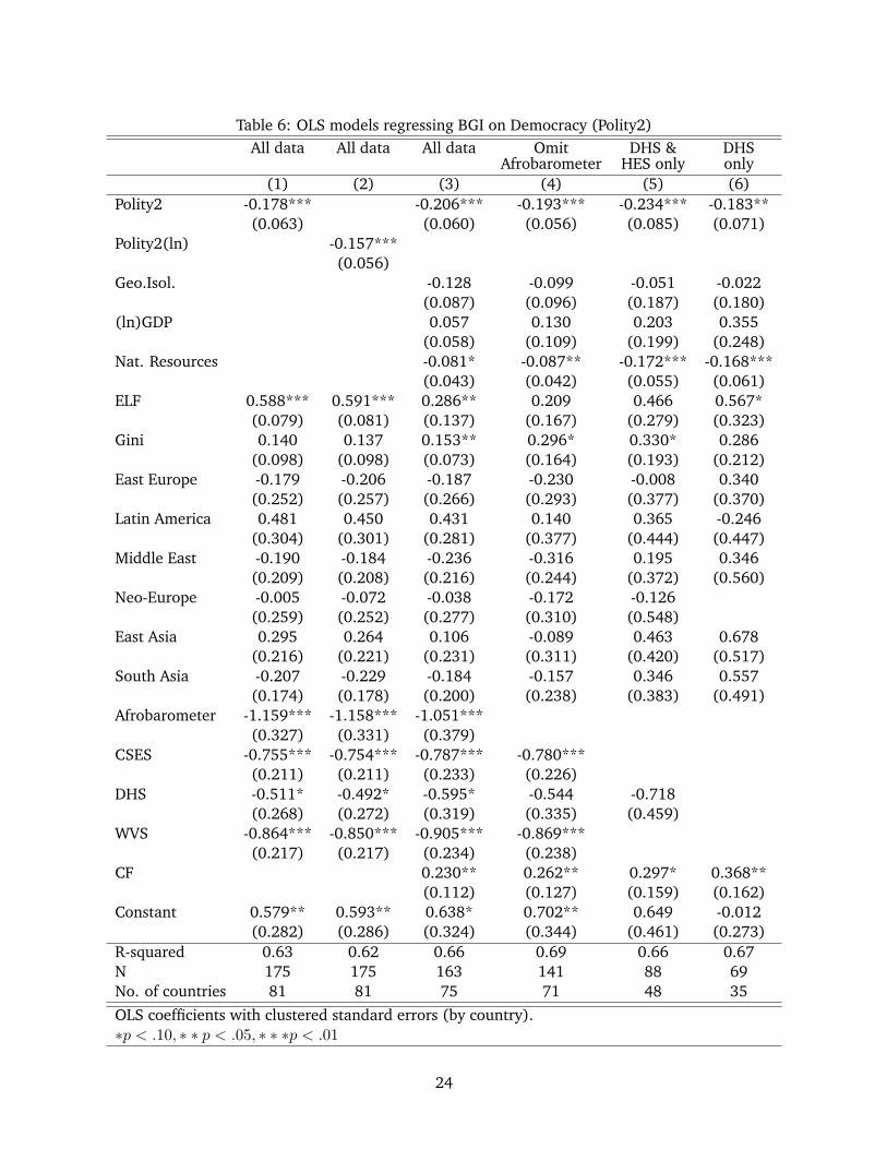
Table 6: OLS models regressing BGI on Democracy (Polity2)All data All data All data Omit DHS & DHS
Afrobarometer HES only only(1) (2) (3) (4) (5) (6)
Polity2 -0.178*** -0.206*** -0.193*** -0.234*** -0.183**(0.063) (0.060) (0.056) (0.085) (0.071)
Polity2(ln) -0.157***(0.056)
Geo.Isol. -0.128 -0.099 -0.051 -0.022(0.087) (0.096) (0.187) (0.180)
(ln)GDP 0.057 0.130 0.203 0.355(0.058) (0.109) (0.199) (0.248)
Nat. Resources -0.081* -0.087** -0.172*** -0.168***(0.043) (0.042) (0.055) (0.061)
ELF 0.588*** 0.591*** 0.286** 0.209 0.466 0.567*(0.079) (0.081) (0.137) (0.167) (0.279) (0.323)
Gini 0.140 0.137 0.153** 0.296* 0.330* 0.286(0.098) (0.098) (0.073) (0.164) (0.193) (0.212)
East Europe -0.179 -0.206 -0.187 -0.230 -0.008 0.340(0.252) (0.257) (0.266) (0.293) (0.377) (0.370)
Latin America 0.481 0.450 0.431 0.140 0.365 -0.246(0.304) (0.301) (0.281) (0.377) (0.444) (0.447)
Middle East -0.190 -0.184 -0.236 -0.316 0.195 0.346(0.209) (0.208) (0.216) (0.244) (0.372) (0.560)
Neo-Europe -0.005 -0.072 -0.038 -0.172 -0.126(0.259) (0.252) (0.277) (0.310) (0.548)
East Asia 0.295 0.264 0.106 -0.089 0.463 0.678(0.216) (0.221) (0.231) (0.311) (0.420) (0.517)
South Asia -0.207 -0.229 -0.184 -0.157 0.346 0.557(0.174) (0.178) (0.200) (0.238) (0.383) (0.491)
Afrobarometer -1.159*** -1.158*** -1.051***(0.327) (0.331) (0.379)
CSES -0.755*** -0.754*** -0.787*** -0.780***(0.211) (0.211) (0.233) (0.226)
DHS -0.511* -0.492* -0.595* -0.544 -0.718(0.268) (0.272) (0.319) (0.335) (0.459)
WVS -0.864*** -0.850*** -0.905*** -0.869***(0.217) (0.217) (0.234) (0.238)
CF 0.230** 0.262** 0.297* 0.368**(0.112) (0.127) (0.159) (0.162)
Constant 0.579** 0.593** 0.638* 0.702** 0.649 -0.012(0.282) (0.286) (0.324) (0.344) (0.461) (0.273)
R-squared 0.63 0.62 0.66 0.69 0.66 0.67N 175 175 163 141 88 69No. of countries 81 81 75 71 48 35OLS coefficients with clustered standard errors (by country).∗p < .10, ∗ ∗ p < .05, ∗ ∗ ∗p < .01
24
wealth leads to inter-group grievances and to conflict to control wealth (see discussion in
Ross 2004). We might therefore expect that resource wealth will lead higher inter-group
inequality as groups strive to control the resource wealth. Natural resource wealth is total
value of coal, oil, natural gas and mineral per capita and is taken from Haber and Menaldo
(2011).
Model 3 adds each of these four control variables to Model 1. The coefficient on Polity2
remains negative and precisely estimated, and increases slightly in size relative to model 1. The
coefficient for ELF remains positive and precisely estimated, but is much smaller than in model
1. Considering the other controls, we find that larger cultural differences between groups are
associated with greater between-group inequality, and that greater geographic isolation of groups
is associated with lower BGI. National wealth is associated with more between-group inequality,
though this effect is not precisely estimated.11 And greater natural resources are associated with
less between-group inequality, the opposite that one might expect if one believes that such resources
spark grievances and stronger efforts by groups to control wealth.
Before discussing these results further, it is important to assess their robustness, which we
do here by estimating model 3 using different subsets of the data. In model 4, we remove the
Afrobarometer surveys, which have the largest underestimates of BGI. Model 5 removes the three
surveys for which the income variables are most coarse – Afrobarometer, CSES and WVS (and thus
estimates the model using only DHS and HES). And Model 6 uses only the DHS surveys, which
provide the greatest number of surveys using the same “income” metric.
The results show that across all models, Polity2 has a stable, negative and precisely esti-
mated coefficient. The other two control variables (besides ELF), that are consistently estimated
with precision are Cultural Fractionalization and natural resource wealth. The Geographic Isolation
of groups has a consistently negative sign, but the coefficient is usually estimated with considerable
error. And GDP’s coefficient is consistently positive but is also not measured precisely. To further
assess the robustness of the results, we re-estimated the models in Table 6, but using two differ-
ent measures of democracy, Freedom House’s “Political Rights” score and Freedom House’s “Civil
Liberties” score. The substantive results for these models are extremely similar to those in Table 6.
11We also estimated the model with a linear and quadratic term for GDP, and the coefficients for both variables weestimated with considerable error while the results for Polity2 were unaffected.
25
Next consider the association between democracy and the other two elements of the Gini
decomposition, WGI and O. Table 7 presents the results from estimating the same models as those
in Table 6, but using within-group inequality as the dependent variable. Across all the models,
the coefficient is positive, suggesting that if anything, democracy is associated with greater within-
group inequality. But this effect is measured very imprecisely. Table 8 presents the models when
the dependent variable is the overlap component of the Gini. There is a positive coefficient in four
of the six models, although all coefficients are very imprecisely measured. We have also regressed
the Gini coefficient itself on Polity2 and in these models the coefficient on Polity2 always has a very
large standard error and the sign of the coefficient is positive in 5 of the 6 models.
6 A causal effect of democracy on between-group inequality?
The robust negative association between democracy and BGI, along with the null relationship be-
tween democracy and within-group inequality and overlap, suggest that if democracy affects the
politics of inequality, it is through the effect of democracy on inequality between groups. But given
the possibility of omitted variables that may be correlated with democracy, it is not possible to
have confidence that democracy causes a reduction in between-group economic differences. More-
over, there are good reasons to suspect that inequality may in fact affect the level of democracy.
Houle (2009), for example, finds that while general inequality does not affect the probability of
democratization, it does affect the ability of democracies to consolidate. This section therefore ex-
plores whether there could be a causal effect of democracy on between-group inequality using two
strategies. First we regress the BGI on lagged democracy scores. Second we estimate models using
two-stage least squares with a new instrument for democracy.
Consider the regressions with lagged democracy scores. Since current BGI cannot cause past
democracy, if the coefficients on democracy are precisely estimated, we can have greater confidence
that the direction of causation works from democracy to between-group inequality. We estimate
model 3 from Table 6 using the lagged value of democracy instead of the democracy score in the
year of the survey. Since it is not clear what the duration of the lag should be, we estimated 7
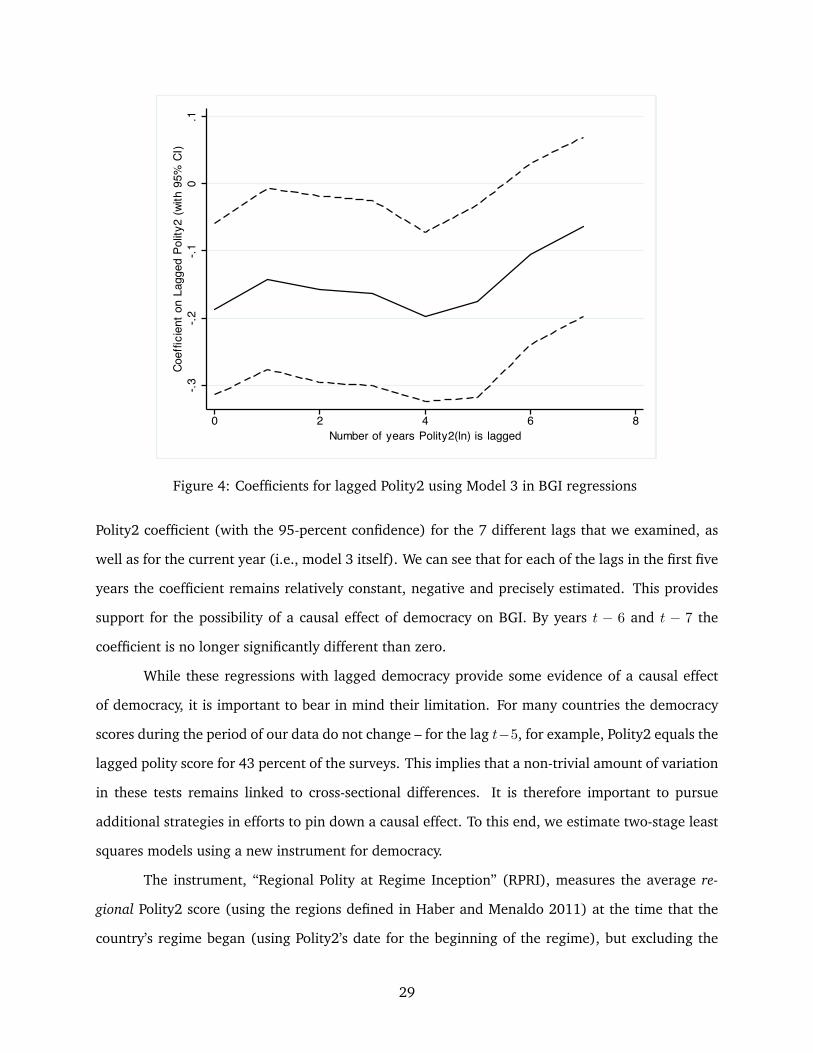
different models, each with a different Polity2 lag, with these lags ranging from year t− 1 through
year t − 7. Figure 4 plots the results for the Polity2 coefficients. The graph shows the value of the
26

Table 7: OLS models regressing Within-group Inequality on Democracy (Polity2)All data All data All data Omit DHS & DHS
Afrobarometer HES only only(1) (2) (3) (4) (5) (6)
Polity2 0.015 0.037 0.018 0.025 0.035(0.039) (0.035) (0.036) (0.049) (0.040)
Polity2(ln) 0.017(0.039)
ELF -0.691*** -0.691*** -0.603*** -0.643*** -0.402** -0.403*(0.058) (0.058) (0.087) (0.102) (0.185) (0.211)
Gini 0.096 0.096 0.050 0.116 0.092 -0.075(0.064) (0.064) (0.051) (0.072) (0.093) (0.074)
CF 0.014 0.016 -0.014 -0.081(0.048) (0.056) (0.089) (0.081)
Geo.Isol. 0.163*** 0.175*** 0.254*** 0.422***(0.051) (0.054) (0.078) (0.125)
(ln)GDP -0.001 -0.072 -0.108 0.079(0.050) (0.071) (0.150) (0.106)
Resources 0.036 0.040 0.058 -0.009(0.032) (0.028) (0.052) (0.027)
East Europe 0.743*** 0.745*** 0.735*** 0.771*** 0.961*** 0.734***(0.169) (0.168) (0.165) (0.164) (0.258) (0.227)
Latin America 0.422** 0.421** 0.520*** 0.490** 0.520* 0.233(0.192) (0.191) (0.179) (0.215) (0.277) (0.207)
Middle East 0.522*** 0.525*** 0.504*** 0.516*** 1.012*** 0.298(0.195) (0.196) (0.184) (0.194) (0.328) (0.266)
Neo-Europe 0.473** 0.474** 0.370 0.497** 0.225(0.207) (0.202) (0.223) (0.234) (0.540)
East Asia 0.446** 0.450** 0.410** 0.346* 0.793** 0.297(0.170) (0.171) (0.171) (0.192) (0.310) (0.308)
South Asia 0.595** 0.596** 0.470 0.470 1.217*** 0.558*(0.284) (0.282) (0.307) (0.298) (0.306) (0.288)
Afrobarom -0.770*** -0.773*** -0.619***(0.200) (0.199) (0.234)
CSES -1.090*** -1.091*** -1.013*** -0.997***(0.164) (0.164) (0.183) (0.183)
DHS -0.535*** -0.537*** -0.298 -0.326 -0.644**(0.183) (0.183) (0.225) (0.220) (0.258)
WVS -0.915*** -0.916*** -0.796*** -0.808***(0.167) (0.168) (0.199) (0.198)
Constant 0.301 0.302 0.146 0.143 0.288 0.055(0.191) (0.190) (0.234) (0.232) (0.312) (0.160)
R-squared 0.809 0.809 0.818 0.817 0.867 0.933N 175 175 163 141 88 69No. of countries 81 81 75 72 48 35OLS coefficients with clustered standard errors (by country).∗p < .10, ∗ ∗ p < .05, ∗ ∗ ∗p < .01
27

Table 8: OLS models regressing Overlap on Democracy (Polity2)All data All data All data Omit DHS & DHS
Afrobarometer HES only only(1) (2) (3) (4) (5) (6)
Polity2 -0.007 0.070 0.048 0.029 -0.015(0.051) (0.044) (0.046) (0.060) (0.068)
Polity2(ln) 0.000(0.043)
ELF 0.635*** 0.635*** 0.481*** 0.539*** 0.280 0.076(0.065) (0.065) (0.109) (0.133) (0.216) (0.242)
Gini -0.069 -0.070 -0.042 -0.061 0.002 0.011(0.061) (0.061) (0.051) (0.075) (0.108) (0.134)
CF -0.017 -0.080 -0.063 -0.009(0.072) (0.088) (0.131) (0.134)
Geo.Isol. -0.236** -0.237** -0.417*** -0.574***(0.092) (0.093) (0.135) (0.159)
(ln)GDP -0.104 -0.254** -0.389* -0.403**(0.066) (0.107) (0.218) (0.191)
Resources 0.050 0.054 0.079 -0.005(0.051) (0.049) (0.088) (0.058)
East Europe -0.899*** -0.901*** -0.612*** -0.482** -0.645** -0.725*(0.223) (0.224) (0.170) (0.203) (0.313) (0.359)
Latin America -0.657** -0.663** -0.553** -0.367 -0.451 -0.541(0.291) (0.291) (0.269) (0.271) (0.312) (0.342)
Middle East -0.553*** -0.548*** -0.338* -0.224 -0.373 -0.528(0.196) (0.195) (0.187) (0.221) (0.393) (0.531)
Neo-Europe -1.019*** -1.028*** -0.626** -0.319 -0.050(0.284) (0.282) (0.247) (0.294) (0.535)
East Asia -0.737*** -0.736*** -0.619*** -0.514** -0.779** -0.976**(0.201) (0.199) (0.191) (0.223) (0.347) (0.477)
South Asia -0.541** -0.542** -0.269* -0.258 -0.301 -0.411(0.241) (0.240) (0.160) (0.184) (0.331) (0.495)
Afrobarom -0.816*** -0.819*** -0.469*(0.307) (0.308) (0.268)
CSES -0.352** -0.354** -0.192 -0.186(0.140) (0.141) (0.127) (0.128)
DHS -0.532** -0.532** -0.351 -0.416* -0.506**(0.258) (0.256) (0.212) (0.211) (0.233)
WVS -0.298* -0.299* -0.159 -0.214(0.174) (0.174) (0.141) (0.143)
Constant 0.926*** 0.929*** 0.577*** 0.506** 0.551** 0.013(0.281) (0.283) (0.218) (0.216) (0.252) (0.300)
R-squared 0.705 0.705 0.730 0.790 0.778 0.787N 175 175 163 141 88 69No. of countries 81 81 75 72 48 35OLS coefficients with clustered standard errors (by country).∗p < 10, ∗ ∗ p < .05, ∗ ∗ ∗p < .01
28
-.3-.2
-.10
.1Co
effic
ient
on
Lagg
ed P
olity
2 (w
ith 9
5% C
I)
0 2 4 6 8Number of years Polity2(ln) is lagged
Figure 4: Coefficients for lagged Polity2 using Model 3 in BGI regressions
Polity2 coefficient (with the 95-percent confidence) for the 7 different lags that we examined, as
well as for the current year (i.e., model 3 itself). We can see that for each of the lags in the first five
years the coefficient remains relatively constant, negative and precisely estimated. This provides
support for the possibility of a causal effect of democracy on BGI. By years t − 6 and t − 7 the
coefficient is no longer significantly different than zero.
While these regressions with lagged democracy provide some evidence of a causal effect
of democracy, it is important to bear in mind their limitation. For many countries the democracy
scores during the period of our data do not change – for the lag t−5, for example, Polity2 equals the
lagged polity score for 43 percent of the surveys. This implies that a non-trivial amount of variation
in these tests remains linked to cross-sectional differences. It is therefore important to pursue
additional strategies in efforts to pin down a causal effect. To this end, we estimate two-stage least
squares models using a new instrument for democracy.
The instrument, “Regional Polity at Regime Inception” (RPRI), measures the average re-
gional Polity2 score (using the regions defined in Haber and Menaldo 2011) at the time that the
country’s regime began (using Polity2’s date for the beginning of the regime), but excluding the
29

country for which the measure is being calculated. For example, one of the surveys in the data
set is from Finland in 2003. According to Polity2, the regime in place in Finland in 2003 began in
1944. The average Polity2 score for all countries (not just those countries in our sample) except
Finland in Finland’s (neo-Europe) region in 1944 is 4.25, which is the score assigned to Finland’s
2003 survey for RPRI.12
The instrument is inspired by Knusten (2011), who draws on Huntington (1991) to argue
that we can exploit the fact that democratization often occurs in waves to develop an instrument for
democracy. For each democratization wave, there are geopolitical events that lead to regime change
in groups of countries. These events include the revolutions in the US and France (wave 1) and
the allied victory in WWII (wave 2). The third wave, Huntington argues, started in the mid-1970s
in Spain and Portugal, and continued through the 1990s with the fall of the Soviet Union. Such
geopolitical factors can directly lead to democratization, such as in Germany and Japan following
the war or in many central European countries following the Soviet Union’s demise in 1989. But
contagion effects are also very important, and they need not be linked to Huntington’s purported
waves. At least since Starr’s (1991) study, scholars have argued the democratization often works
via diffusion in the international system, where regional neighbors copy each other, as may be
going on currently in several countries in the Middle East region.13
Reverse causation is obviously impossible with this instrument, as a country’s democracy
score today obviously cannot affect regional democracy scores in the past. The larger concern is
that RPRI might be affecting BGI through some channel other than democracy. To the extent that
the democracy score for a country at the time that its regime begins is affected by geopolitical
factors unrelated to regional concerns about between group inequality – and we have found no
arguments about between group inequality in regime choice – it seems highly plausible that an
instrument based on regional democracy at the time of regime choice satisfies the exclusion restric-
tion. But even if the geopolitical events and regional contagions were driven by concerns unrelated
to between-group inequality, one might still be concerned that the exclusion restriction will be vi-
olated if regions share other unmeasured traits that affect their levels of between-group inequality
at the time of regime choice. But this should not be particularly worrisome for two reasons. First,
12It is not possible to operationalize this instrument with any of the Freedom House scores because the Freedom Housetime series is too short.
13See, for example, Kopstein and Reilly (2000), Gleditsch, Skrede and Ward (2006), and Leeson and Dean (2009).
30

we have uncovered no argument or evidence that regional episodes of regime choice are driven
by any factors other than democracy that would affect between-group economic inequality. For
example, we have yet to identify regional concerns after the war in Europe that simultaneously
would affect regime choice and between-group inequality in that region. Of course, as with any
instrument, such factors could exist yet remain unidentified. But second, and more importantly, if
there exist unmeasured regional traits that affect between-group inequality through channels other
than democracy, the effects of such unmeasured traits should be captured by the regional indicator
variables, which are included in both stages of the 2SLS estimations. We feel that there is a plausi-
ble case to be made, then, that the instrument based on the level of regional democracy at the time
of regime inception affects between-group economic differences only through democracy.
Although RPRI is motivated by arguments in Knutsen (2011), his actual instrument is quite
different than RPRI. Knutsen uses an indicator variable called ”Wave” which is based on whether
the country’s regime began during one of Huntington’s three waves of democratization. Here,
since RPRI uses regional Polity2 averages at the time of regime inception, the instrument captures
regional contagion.14 And by using the Polity2 regional averages, we not only have a more fine
grained measure then a 0-1 indicator variable, we also avoid the need to arbitrarily define the
year-based cut-points for the three waves.15
The top of Table 9 gives the results for RPRI from the first-stage regression models in the
two-stage least-squares models. In these models we obtain stronger instruments when using the
logged version of the instrument, and we report the results with this specification, using the stan-
dardize value of the log of Polity2 (and the standardize value of the log of RPRI). Although to
conserve space the table presents the first-stage results for only RPRI, the first stage regressions of
course include all other regressors as well, including the regional indicators. We estimate the 2SLS
models using the same specifications as in Table 6 and using standard errors clustered by country.
The instrument is weakest in the model with no controls (p=.11). In all other models RPRI(ln) is
a strong estimate, with positive first-stage coefficients that are quite precisely estimated.
14A variable constructed to take the average value of world polity at the time of regime inception has a very weakcorrelation with Polity2 in our data.
15To measure his “Wave” instrument, Knutsen defines the “inter-wave” periods as 1922-42, 1958-75, or after 1999,with all other years following a wave. When Wave is used as an instrument here, the first stage estimates have largestandard errors and have the wrong sign (with regimes beginning between Huntington’s three waves having higherestimated Polity2 scores than those of regimes beginning during one of Huntington’s waves).
31

The second stage results indicate a negative effect of democracy on between-group inequal-
ity across all five models. The coefficient on the Polity2 instrument is the least precisely estimated
in model 1 (where the instrument is weakest). In all models including the extended set of controls,
the negative effect is relatively precisely measured, with p-values ranging from .04 to .07. And
the coefficients for democracy across the 5 models are all large (in absolute value) – larger by far
than in the OLS models. (Recall that all variables are standardized to facilitate comparisons of co-
efficients.) Using model 2, for example, a one-standard deviation change in ln(RPRI) is associated
with a roughly one-half standard deviation decrease in BGI. This is far larger than any other control
variable.
We also ran each of the five 2SLS regressions in Table 9 using the other measures of inequal-
ity – Gini, Within-group inequality, and Overlap – as the dependent variable. As in the OLS models
above, in each model, Polity2 is never remotely significant. When WGI is the dependent variable,
the coefficient on the Polity2 instrument is always positive, and when O is the dependent variable,
it has a positive sign in 2 of the 6 models. Thus, the evidence here strongly suggests that any
causal effect of democracy on inequality works through the effect of democracy on between-group
inequality.
7 Discussion
We find a robust relationship between democracy and between-group inequality. There is not, how-
ever, a robust relationship between democracy and within-group inequality or between democracy
and overall inequality. How could democracy be associated with lower between-group inequality
but not with lower overall inequality?
If democracy created an equal benefit to all members of one or more poorer groups or an
equal cost to all members of one or more richer groups, then democracy would be associated with
lower BGI, but also with lower overall inequality. Since there seems to be little relationship between
democracy and overall inequality, the empirical results in the previous section seem to suggest that
any benefits or costs of democracy to particular groups are not born equally by members of these
group. Rather, the benefits and costs must operate so as to make specific members of particular
groups better or worse off. To be consistent with our findings, this could work in two ways. One
32

Table 9: 2SLS models regressing BGI on instrument (RPRI) for Democracy (Polity2)(1) (2) (3) (4) (5)
All data All data Omit DHS & DHSAfrobarometer HES only only
First stage results for instrument onlyRPRI (ln) 0.305 0.412** 0.458** 0.630** 0.583**
(0.188) (0.181) (0.186) (0.257) (0.270)Second stage regression results
Polity2(ln) -0.770 -0.477* -0.599** -0.488* -0.638*(0.490) (0.266) (0.287) (0.256) (0.334)
ELF 0.572*** 0.321** 0.223 0.505** 0.451(0.104) (0.136) (0.171) (0.252) (0.302)
Gini 0.179 0.166** 0.358** 0.359* 0.405*(0.118) (0.072) (0.175) (0.192) (0.227)
CF 0.205* 0.222* 0.238* 0.272*(0.105) (0.117) (0.141) (0.161)
Geo.Isol. -0.098 -0.047 -0.000 -0.148(0.096) (0.115) (0.194) (0.178)
(ln)GDP 0.122 0.147 0.241 0.322(0.089) (0.126) (0.210) (0.302)
Resources -0.118** -0.131** -0.220*** -0.282**(0.057) (0.061) (0.074) (0.114)
East Europe -0.155 -0.245 -0.285 -0.137 -0.098(0.330) (0.279) (0.337) (0.422) (0.547)
Latin America 0.945** 0.538* 0.293 0.481 -0.085(0.479) (0.295) (0.395) (0.433) (0.435)
Middle East -0.650 -0.539 -0.755* -0.067 -0.111(0.556) (0.368) (0.410) (0.418) (0.659)
Neo-Europe 0.602 0.058 0.094 -0.010(0.576) (0.332) (0.422) (0.568)
East Asia 0.011 -0.103 -0.426 0.186 0.146(0.563) (0.368) (0.487) (0.491) (0.715)
South Asia -0.146 -0.228 -0.239 0.277 0.461(0.319) (0.215) (0.277) (0.355) (0.541)
Afrobarom -0.758* -0.947**(0.432) (0.428)
CSES -0.520* -0.734*** -0.698***(0.304) (0.236) (0.234)
DHS -0.435 -0.587 -0.577 -0.693(0.335) (0.397) (0.460) (0.546)
WVS -0.750*** -0.869*** -0.841***(0.257) (0.251) (0.268)
Constant 0.275 0.613 0.670 0.633 -0.120(0.414) (0.394) (0.454) (0.530) (0.370)
R-squared 0.339 0.581 0.531 0.554 0.421N 175 163 141 88 69No. of countries 81 75 72 48 352SLS coefficients with clustered standard errors (by country).∗p < 10, ∗ ∗ p < .05, ∗ ∗ ∗p < .01
33

possibility is that democracy could make the poorest individuals within a rich group worse off.
This would lower BGI (by lowering the average income of a rich group) and would raise WGI
(by increasing the Gini of the rich group). Alternatively, and in our view much more plausibly,
democracy could improve the well-being of the richest members of poorer group. This would
create greater inequality within the poor group, but would also raise this group’s average income,
decreasing between-group inequality.
Studies of group-oriented policies confirm that policies aimed at helping poor minority
groups seem to disproportionately benefit the rich within these groups (e.g. Sowell 2004). India,
for example, has numerous programs that aim to help the least advantaged groups. Affirmative
action in education is one example, and research suggests that the lower-caste individuals who ben-
efit from these programs are richer than the average lower-caste family, so that the policy does not
benefit the most disadvantaged in the group (Bertrand, Hanna, and Mullainathan, 2007). In part
this reflects the role that household income and family circumstances play in determining whether
lower-caste candidates complete schooling and qualify to take college entrance exams (Desai and
Kulkarni, 2008). Findings from Brazils quota-based affirmative action program in universities are
similar: places in universities are contingent on students completing high school and taking a com-
mon entrance exam, which favors more advantaged blacks and ethnic minorities (Smith, 2010).
The United States also has affirmative action policies that aim to alleviate between-group
inequality by ensuring that sectors of society and the economy are open to groups that would be
otherwise excluded by discriminatory practices. But as in India, these policies tend to mostly help
the most well-off in the disadvantaged groups. Sociologists, for example, have noted a growing
gap between middle-class and poorer African Americans, arguing that considering class as a life-
defining trait is becoming increasingly important for black Americans as the determinative power
of race ebbs for some (Landry and Marsh 2011). Indeed, the Gini coefficient among blacks has
increased since the 1960 census (though this is true for all groups in the U.S. and for the coun-
try as a whole), even as the ratio to mean white income to mean black income has decreased.
More generally, any anti-discriminatory program based on group identity is more likely to dispro-
portionately benefit those above the median income of the targeted group. Most individuals who
compete for admissions in education, for government contracts, or for favorable government reg-
ulations, trade decisions, or tax benefits are likely to come from the most well-off strata of their
34
group (whatever that group might be). So to the extent that democracy encourages some form of
redistribution across groups, it likely reduces between-group income differences largely by boosting
the well-being of the elite within poorer groups.
Should we expect strategic politicians in democracies to compete for votes by advocating
group- rather than class-based policies? One problem with class-based strategies might be that
general “rich to poor” redistribution is in fact an inefficient tool for parties seeking to build support
for a majority in a democracy (Huber and Ting 2011). The benefits to each poor person from any
general income-based program will be relatively low if these benefits are spread thinly across all
poor people, and redistributive programs with wide eligibility also diminish the ability of politicians
to claim credit for assisting their voters. Targeted redistribution programs can therefore be a much
more efficient vote-seeking tool for politicians in democratic settings. Models have examined a
number of ways that groups can be targeted, including geographic districts (Huber and Ting 2011),
race (Austen-Smith and Wallerstein 2006), religion (Huber and Stanig 2010), or policy-specific
interests like education (Levy 2005). And the policy tools for such targeting are wide ranging,
and need not involve cash transfers. Politicians, for example, can require affirmative action in
education and employment practices, can build government offices and industries in particular
areas, can adopt agricultural price supports for specific crops, can adopt trade policies for specific
goods, and can target groups for public goods through funding for schools, roads, medical care,
clean water, public sanitation or other infrastructure needs.
Targeting groups obviously will not work if group members are difficult to identify (making
it difficult for politicians to know to whom the benefits should be directed), or if individuals can
easily select into groups (making it difficult for politicians to exclude individuals from group-based
benefits). These conditions make ethnicity a particularly attractive basis for group based politics.
Ethnic groups are typically easy to identify and target – they are often concentrated in particular
geographic locations, but even if they are not, they usually have observable traits that are tar-
getable. And it is normally impossible for an individual to “choose” an ethnic group, since group
membership is usually based on attributes that one acquires only at birth. Of course, there is ample
evidence that politicians often pursue policies that target specific ethnic groups. Ethnicity there-
fore provides an obvious mechanism for democratic politicians to create majorities using targeted
transfers that benefit sub-groups of the poor. Democratic politicians who seek to create low-cost
35

majorities should therefore be expected to pursue policies that benefit one or more relatively poor
ethnic groups, improving the well-being of those groups, and thus diminishing between-group in-
equality relative to dictatorship. And the empirical results in this paper suggest they should do so
by aiding disproportionately the most well-off in the poorest groups.
The possibility of group-based politics obviously depends on the presence of sufficient ethnic
heterogeneity to allow groups to be played off against each other. In the absence of such hetero-
geneity, group politics cannot occur, and we might expect class-based politics to prevail. Since
the data used in this analysis contains a wide range of countries vis-a-vis ethnic heterogeneity, we
can explore empirically whether the level of ethnic diversity mediates the democracy-inequality
relationship in this way. In particular, if democracy leads to group-based politics in heterogeneous
societies and class-based politics in homogeneous ones, then in societies above a threshold of eth-
nic diversity, there should be a negative association between democracy and BGI. And if democracy
encourages class-based politics below such a diversity threshold, there should be a negative associ-
ation between democracy and WGI in such countries
We regressed Gini, BGI, WGI and Overlap on Polity2, ELF and the interaction of Polity2 and
ELF (along with the full set of controls used above).16 Figure 5 presents graphs of the marginal
effect of democracy on each of the four types of inequality at different levels of ethnic diversity.
When Gini (top left) or Overlap (top right) is the dependent variable, there is no discernible associ-
ation with the level of democracy at any ELF. When Gini is the dependent variable, at low ELF, the
estimated effect of democracy is negative – higher levels of democracy are associated with lower
Gini. At high ELF, higher levels of democracy are associated with higher levels of inequality. But
across the range of ELF, the marginal effect of democracy is never precisely measured, and is never
significantly different than zero. Similarly, when Overlap is the dependent variable we find that the
marginal effect of democracy is always measured very imprecisely.
But the results for BGI and WGI are consistent with the idea that democracy encourages
group-based politics in diverse societies and class-based politics in homogenous ones. In the graph
for BGI (bottom left), we see that at any level of ELF, the estimated marginal effect of democracy
is negative. But at low ELF, this effect is very small and is not statistically significant. As ELF
increases, the marginal effect becomes larger (in absolute value) and this effect is quite precisely
16We have scaled ELF from 0-100 to make the coefficients easier to read.
36
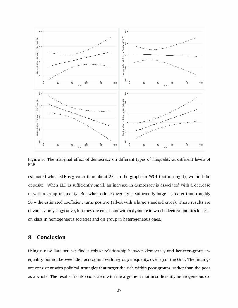
-.50
.51
Mar
gina
l effe
ct o
f Pol
ity o
n G
ini (
95%
CI)
0 20 40 60 80 100ELF
-.004
-.002
0.0
02.0
04M
argi
nal e
ffect
of P
olity
on
Ove
rlap
(95%
CI)
0 20 40 60 80 100ELF
-.006
-.004
-.002
0.0
02M
argi
nal e
ffect
of P
olity
on
BGI (
95%
CI)
0 20 40 60 80 100ELF
-.004
-.002
0.0
02.0
04.0
06M
argi
nal e
ffect
of P
olity
on
WG
I (95
% C
I)
0 20 40 60 80 100ELF
Figure 5: The marginal effect of democracy on different types of inequality at different levels ofELF
estimated when ELF is greater than about 25. In the graph for WGI (bottom right), we find the
opposite. When ELF is sufficiently small, an increase in democracy is associated with a decrease
in within-group inequality. But when ethnic diversity is sufficiently large – greater than roughly
30 – the estimated coefficient turns positive (albeit with a large standard error). These results are
obviously only suggestive, but they are consistent with a dynamic in which electoral politics focuses
on class in homogeneous societies and on group in heterogeneous ones.
8 Conclusion
Using a new data set, we find a robust relationship between democracy and between-group in-
equality, but not between democracy and within-group inequality, overlap or the Gini. The findings
are consistent with political strategies that target the rich within poor groups, rather than the poor
as a whole. The results are also consistent with the argument that in sufficiently heterogeneous so-
37
cieties, democracy encourages targeted group-based politics, with politicians seeking support from
specific low-cost groups in an effort to build majorities that are not overly inclusive, as opposed to
engaging in general “rich to poor” redistribution, which dilutes the value of redistribution for its re-
cipients and which makes it more difficult for politicians to claim credit. Consistent with this idea,
we find that the relationship between democracy and group-based inequality (measured by BGI) is
strong in ethnically heterogeneous societies, but less so in homogeneous ones. By contrast, we find
that the relationship between democracy and class-base inequality (measured by WGI) is stronger
in homogeneous societies than in heterogeneous ones. That the relationship between democracy
and inequality is mediated by ethnic diversity suggests that the strategies of politicians for building
majorities will vary with the ethnic diversity of society.
One implication of these findings concerns the possibility of a particular pathway by which
democracy may affect public goods provision. Considerable research finds that democracies pro-
duce more public goods than non-democracies (e.g., Baum and Lake 2003 and Stasavage 2005)
and a recent study finds that high levels of between-group inequality are associated with lower
levels of public goods provision (Baldwin and Huber 2010). If democracy leads to lower levels of
between-group inequality which in turn leads to higher levels of public goods, then democracy may
influence public goods provision in part by encouraging targeted group-based politics. If true, then
the benefits of democracy may be distributed quite unevenly among lower income individuals from
different groups.
The analysis suggests pathways for further theoretical and empirical research. Theoretical
models should be able to provide insights into the circumstances under which group-based as op-
posed to class-based electoral strategies are optimal. Such models could focus not only on the size
and number of groups, but also on the distribution of income within groups themselves. Empirical
research should improve our understanding of the mechanisms by which targeting occurs. Politi-
cians, for example, may skew the provision of public schools or roads or health care to particular
groups, raising the standards of the poor within these groups while slightly increasing within-group
inequality in other groups if middle income and poor voters bear a disproportionate burden in pay-
ing for such groups. Or politicians may target some groups with cultural policies while targeting
others with economic benefits, with the effect of BGI reductions being offset by increases in general
inequality, something that the middle class and poor who receive little economic benefits accept
38
in return for the cultural policies. There are no doubt other pathways as well, and it is likely that
such pathways differ across countries with different institutional arrangements or different num-
ber of groups. Thus, our understanding of both democratic politics and ethnic politics will benefit
from further study of how group-based targeting operates across authoritarian governments and
different forms of democratic ones.
39

9 References
Acemoglu, Daron, and James A. Robinson. 2006. Economic Origins of Dictatorship and Democracy.
New York: Cambridge University Press.
Aliaga, Roger and Silvia Montoya. 1999. “GINIDESC: Stata module to compute Gini index with
within- and between-group inequality decomposition.” Statistical Software Components,
Boston College Department of Economics.
Austen-Smith, David, and Michael Wallerstein. 2006. “Redistribution and Affirmative Action.”
Journal of Public Economics 90: 1789-1823.
Baldwin, Kate and John D. Huber. 2010. “Economic versus Cultural Differences: Forms of Ethnic
Diversity and Public Goods Provision.” American Political Science Review 104(4):644662.
Barro, R.J. 2000. “Inequality and Growth in a Panel of Countries.” Journal of Economic Growth
5(March) 532.
Barro, Robert J. 2008. “Inequality and growth revisited.” Asian Development Bank. Working
Paper Series on Regional Economic Integration No. 11.
Bates, Robert H. 1983. “Modernization, Ethnic Competition and the Rationality of Politics.” In
State versus Ethnic Claims: African Policy Dilemmas, edited by D. Rothchild and V. A. Olun-
sorola. Boulder, CO: Westview Press.
Bates, Robert H. 1990. “Macropolitical economy in the field of development.” In Perspectives
on positive political economy, James E. Alt, Kenneth A. Shepsle (Eds.) Cambridge University
Press.
Baum, Matthew A. and David A. Lake. 2003. “The Political Economy of Growth: Democracy and
Human Capital.” American Journal of Political Science 47(2):333347.
Bertrand, M., Hanna, R. and Mullainathan, S. 2010. “Affirmative action in education: Evidence
from engineering college admissions in India.” Journal of Public Economics 94(12): 1629.
Boix, Carles. 2003. Democracy and Redistribution. New York: Cambridge University Press.
40

Cedarman, Lars-Erik, Nils B. Weidmann and Kristian Skrede Gleditsch. ND. “Horizontal Inequali-
ties and Ethno-Nationalist Civil War: A Global Comparison,” Forthcoming in American Political
Science Review.
Deaton, Angus S., 1980, “The measurement of welfare: theory and practical guidelines,” LSMS
Working Paper No. 7, Washington, DC. The World Bank.
Deaton, Angus and Salman Zaidi. 2002. “ Guidelines for Constructing Consumption Aggregates
for Welfare Analysis.” Washington, DC: World Bank.
Desai, S. and V. Kulkarni, 2008. “Changing educational inequalities in India in the context of
affirmative action.” Demography 45(2): 245270
Desmet, Klaus, Ignacio Ortuno and Shlomo Weber. 2009. “Linguistic Diversity and Redistribution.”
Journal of the European Economic Association 7(6): 1291-1318.
Esteban, Joan and Debraj Ray. 1994. “On the Measurement of Polarization.” Econometrica 62:
819-852.
Esteban, Joan and Debraj Ray. 2008. “On the Salience of Ethnic Conflict.” American Economic
Review 98(5): 21852202.
Esteban, Joan and Debraj Ray. 2011. “A Model of Ethnic Conflict.” Forthcoming, Journal of
European Economic Association.
Fearon, James. 2003. “Ethnic and Cultural Diversity by Country.” Journal of Economic Growth 8
(2): 195− 222.
Filmer D, and LH Pritchett. 2001. “Estimating Wealth E!ects Without Expenditure Data-Or Tears:
An Application to Educational Enrollments in States of India.” Demography 38(1):115132.
Gellner, Ernest. 1964. Nationalism. In Thought and Change. Chicago, IL: University of Chicago
Press.
Gleditsch, Kristian Skrede and Michael D. Ward. 2006. “Diffusion and the International Context
of Democratization.” International Organization 60 (4):911-933.
41

Haber, Stephen and Victor Menaldo. 2011. “Do Natural Resources Fuel Authoritarianism? A
Reappraisal of the Resource Curse.” American Political Science Review 105(1,): 1-26.
Houle, Christian. 2009. “Inequality and Democracy: Why Inequality Harms Consolidation but
Does Not Affect Democratization.” World Politics 61 (October): 589622.
Houle, Christian. 2011. “Consolidating Democracy in Plural Societies: Ethnic Inequality in Sub-
Saharan Africa.” Working paper, Trinity College, Dublin.
Huber, John D. and Michael Ting. 2010. “Redistribution, Pork and Election.” Typescript, Columbia
University and forthcoming, Journal of the European Economic Association.
Huber, John D. and Piero Stanig. 2011a. “Church-state separation and redistribution.” Journal of
Public Economics 95(7-8): 828-836.
Knutsen, Carl Henrik. 2011. “Democracy, Dictatorship and Protection of Property Rights.” Journal
of Development Studies 47(1):164182.
Kopstein, Jeffrey and David A. Reilly. 2000. “Geographic Diffusion and the Transformation of the
Postcommunist World.” World Politics 53(1): 1-37.
Laitin, David. 1998. Identity in Formation: The Russian-Speaking Populations in the Near Abroad.
Ithaca, NY: Cornell University Press.
Lambert, Peter J.; and J. Richard Aronson. 1993. “Inequality Decomposition Analysis and the Gini
Coefficient Revisited.” The Economic Journal 103(420): 1221-1227.
Landry, Bart and Marsh, Kris. 2011. “The Evolution of the New Black Middle Class.” Annual
Review of Sociology 37:373-94.
Leeson, Peter T. and Andrea M. Dean. 2009. “The Democratic Domino Theory: An Empirical
Investigation.” American Journal of Political Science 53 (9): 533-55.
Levy, Gilat. 2005. “The Politics of Public Provision of Education.” Quarterly Journal of Economics.
120(4): 1507-1534.
42

Mancini, Luca. 2008. “Horizontal Inequality and Communal Violence: Evidence from Indonesian
Districts.” In Horizontal Inequalities and Conflict. Understanding Group Violence in Multiethnic
Societies ed. Frances Stewart. London: Palgrave.
Martınez-Bravo, Monica , Gerard Padro i Miquel, Nancy Qian and Yang Yao. 2012. “The Effects of
Democratization on Economic Policy: Evidence from China.” Typescript: Yale University.
Marx, Anthony. 1998. Making Race and Nation. A Comparison of the United States, South Africa
and Brazil. New York: Cambridge University Press.
Massey, Douglas S. and Nancy R. Denton. 1988. “The Dimensions of Residential Segregation.”
Social Forces 67(2): 281-315.
McKenzie, David J. 2005. “Measuring inequality with asset indicators.” Journal of Population
Economics 18:229260.
Montalvo, J. and M. Reynal-Querol. 2005. “Ethnic Polarization, Potential Conflict, and Civil Wars.”
American Economic Review 95 (3): 796− 816.
Mulligan. Casey B.,Ricard Gil and Xavier Sala-i-Martin. 2004. “Do Democracies Have Different
Public Policies than Nondemocracies?” The Journal of Economic Perspectives 18(1): 51-74.
Ostby, G. 2008. “Polarization, Horizontal Inequalities and Violent Civil Conflict.” Journal of Peace
Research 45(2): 143-162.
Pettigrew , Thomas F. and Linda R. Tropp. 2006. “A Meta-Analytic Test of Intergroup Contact
Theory.” Journal of Personality and Social Psychology 90(5): 751783.
Posner, Daniel N. 2005. Institutions and Ethnic Politics in Africa. Cambridge: Cambridge University
Press.
Reynal-Querol, M. 2002. ”Ethnicity, Political Systems, and Civil Wars.” Journal of Conflict Resolu-
tion 46 (1): 307− 334.
Ross, Michael. 2004. “How Do Natural Resources Influence Civil War? Evidence from Thirteen
Cases.” International Organization 58: 35-67
43

Ross, Michael 2006. “Is Democracy Good for the Poor?” American Journal of Political Science 50,
No. 4: 860874.
Smith, A. 2010. “Who supports affirmative action in Brazil?” Americas Barometer Insights, nol. 49.
Sowell, Thomas. 2004. Affirmative Action around the World: An Empirical Study. New Haven: Yale
University Press.
Starr, Harvey. 1991. “Democratic Dominoes: Diffusion Approaches to the Spread of Democracy in
the International System.” Journal of Conflict Resolution 35(2):35681.
Stasavage, David. 2005. “Democracy and Educational Spending in Africa.” American Journal of
Political Science 49(2):343358.
Stewart, F. 2008. ed. Horizontal Inequalities and Conflict: Understanding Group Violence in Multi-
ethnic Societies. New York: Palgrave Macmillian.
Tavares, Jose and Romain Wacziarg. 2001. How democracy affects growth, European Economic
Review 45 (8): 13411378.
Timmons, Jeffrey F. 2010. “Does Democracy Reduce Economic Inequality?” British Journal of
Political Science 40(4):741757.
Yitzhaki, S. and R. Lerman. 1991. ”Income Stratification and Income Inequality.” Review of Income
and Wealth 37 (3): 313− 329.
44
Table 10: Countries and surveys used in data set
Country Year Survey type | Country Year Survey typeAlbania HES–LSMS 2005 | Kenya DHS 2008Armenia WVS 1996 | Kyrgyz Republic DHS 1997Armenia DHS 2000 | Latvia WVS 1999Australia CSES 1996 | Lithuania CSES 1997Australia WVS 1996 | Macedonia WVS 1999Australia CSES 2004 | Madagascar Afrobarometer 2005Austria HES–LIS 2000 | Malawi DHS 2000Azerbaijan HES–ASLC 1995 | Malawi Afrobarometer 2003Azerbaijan DHS 2006 | Malawi DHS 2004Bangladesh DHS 1997 | Malawi Afrobarometer 2005Bangladesh WVS 1999 | Mali DHS 1995Bangladesh DHS 2000 | Mali DHS 2001Bangladesh DHS 2004 | Mali Afrobarometer 2002Bangladesh DHS 2007 | Mali Afrobarometer 2005Belarus CSES 2001 | Mali DHS 2006Belgium CSES 1999 | Mexico CSES 1997Belgium WVS 1999 | Mexico WVS 1999Benin DHS 1996 | Mexico CSES 2000Benin DHS 2001 | Mexico CSES 2003Benin Afrobarometer 2005 | Moldova WVS 1999Benin DHS 2006 | Moldova DHS 2005Bolivia HES–MECOVI 2002 | Mozambique Afrobarometer 2002Bolivia DHS 2003 | Mozambique Afrobarometer 2005Botswana Afrobarometer 2003 | Namibia DHS 2000Botswana Afrobarometer 2005 | Namibia Afrobarometer 2003Brazil DHS 1996 | Namibia Afrobarometer 2006Brazil WVS 1996 | Netherlands WVS 1999Brazil CSES 2002 | New Zealand CSES 1996Brazil HES–PNAD 2002 | New Zealand WVS 1996Brazil HES–LIS 2006 | New Zealand CSES 2002Bulgaria HES–IHS 1995 | Nicaragua HES–EMNV 2001Bulgaria CSES 2001 | Niger DHS 1992Burkina Faso DHS 1998 | Niger DHS 1998Burkina Faso HES–EP2 1998 | Niger DHS 2006Burkina Faso DHS 2003 | Nigeria WVS 1999Cameroon DHS 1998 | Nigeria Afrobarometer 2005Cameroon DHS 2004 | Pakistan WVS 1999Canada CSES 1997 | Peru DHS 2000Canada HES–LIS 1997 | Peru DHS 2004Canada WVS 1999 | Peru HES–LIS 2004Canada HES–IPUMS 2001 | Philippines DHS 1993Central African Republic DHS 1994 | Philippines DHS 1998Chad DHS 1997 | Philippines DHS 2003Chad DHS 2004 | Philippines DHS 2008Colombia WVS 1996 | Romania CSES 1996Cote d’Ivoire HES–LSMS 1988 | Romania HES–LIS 1997Czech Republic CSES 1996 | Russia CSES 1999DRC DHS 2007 | Russia CSES 2000Dominican Republic WVS 1996 | Russia HES–LIS 2000Egypt DHS 1995 | Senegal DHS 1992Egypt WVS 1999 | Senegal Afrobarometer 2002Egypt DHS 2005 | Senegal Afrobarometer 2005Egypt DHS 2008 | Senegal DHS 2005Estonia WVS 1999 | Singapore WVS 1999Estonia HES–LIS 2000 | Slovenia CSES 1996Ethiopia DHS 2000 | Spain CSES 1996Ethiopia DHS 2005 | Spain WVS 1999Finland CSES 2003 | Spain CSES 2000Finland HES–LIS 2004 | Spain CSES 2004France WVS 1999 | Sweden HES–LIS 2005France CSES 2002 | Tajikistan HES–LSS 1996Gabon DHS 2000 | Tanzania HES–HRDS 1993Georgia WVS 1996 | Togo DHS 1998Germany WVS 1999 | Turkey DHS 1993Germany HES–LIS 2004 | UK HES–LIS 2004Ghana DHS 1993 | Uganda DHS 1995Ghana DHS 1998 | Uganda Afrobarometer 2005Ghana DHS 2003 | Ukraine CSES 1998Ghana DHS 2008 | United States CSES 1996Guatemala DHS 1995 | United States HES–LIS 1997Guatemala DHS 1998 | United States WVS 1999Guatemala HES–ENCOVI 2000 | United States CSES 2004Guatemala HES–LIS 2006 | United States HES–IPUMS 2005Guinea DHS 1999 | Uruguay WVS 1996Guinea DHS 2005 | Uzbekistan DHS 1996Guyana DHS 2005 | Venezuela WVS 1999Hungary CSES 2002 | Vietnam DHS 1997India WVS 1999 | Vietnam DHS 2002Ireland WVS 1999 | Vietnam DHS 2005Israel HES–IPUMS 1995 | Zambia DHS 1996Israel HES–LIS 2005 | Zambia DHS 2001Kazakhstan DHS 1995 | Zambia Afrobarometer 2003Kazakhstan DHS 1999 | Zambia Afrobarometer 2005Kenya DHS 1993 | Zambia DHS 2007Kenya DHS 1998 | Zimbabwe WVS 1999Kenya Afrobarometer 2003 | Zimbabwe Afrobarometer 2004Kenya DHS 2003 | Zimbabwe Afrobarometer 2005Kenya Afrobarometer 2005
45
Related Documents