Data Presentation Techniques

Data Presentation Techniques. Data Presentation Techniques Data Presentation Techniques.
Dec 31, 2015
Welcome message from author
This document is posted to help you gain knowledge. Please leave a comment to let me know what you think about it! Share it to your friends and learn new things together.
Transcript

Data Presentation Techniques


Satellite imaginery
Aerial, oblique and ground-level photography
1. High angle oblique; and 2. Low angle oblique.
In a high angle oblique, the apparent horizon is shown; while in a low angle oblique the apparent horizon is not shown. Often because of atmosphere haze or other types of obscuration the true horizon of a photo cannot really be seen. However we often can see a horizon in an oblique air photo. This is the apparent horizon.
We can define vertical aerial photographs as a photo taken from an aerial platform (either moving or stationary) wherein the camera axis at the moment of exposure is truly vertical.
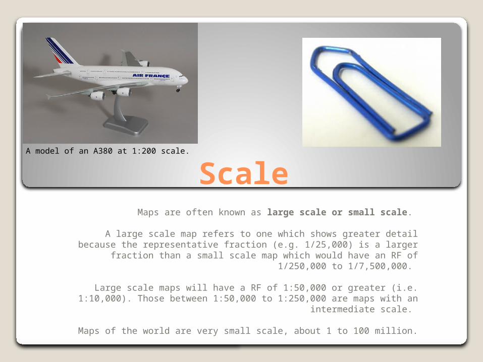
ScaleMaps are often known as large scale or small scale.
A large scale map refers to one which shows greater detail because the representative fraction (e.g. 1/25,000) is a larger fraction than a
small scale map which would have an RF of 1/250,000 to 1/7,500,000.
Large scale maps will have a RF of 1:50,000 or greater (i.e. 1:10,000). Those between 1:50,000 to 1:250,000 are maps with an intermediate
scale.
Maps of the world are very small scale, about 1 to 100 million.
A model of an A380 at 1:200 scale.
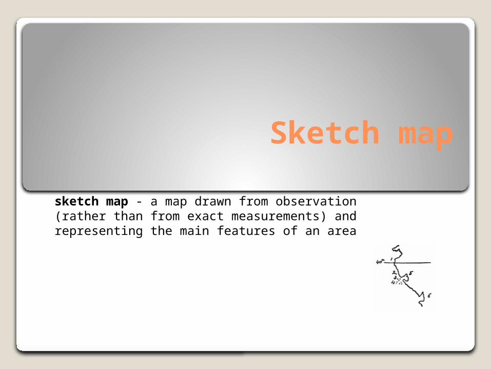
Sketch map
sketch map - a map drawn from observation (rather than from exact measurements) and representing the main features of an area
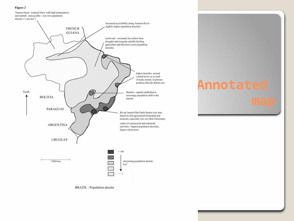
Annotated map
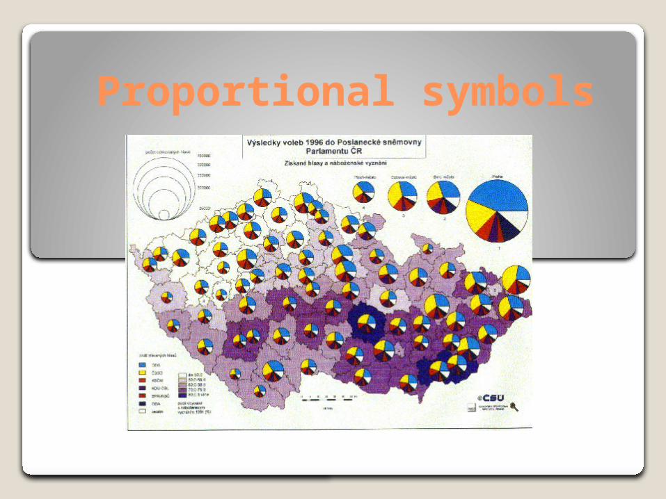
Proportional symbols
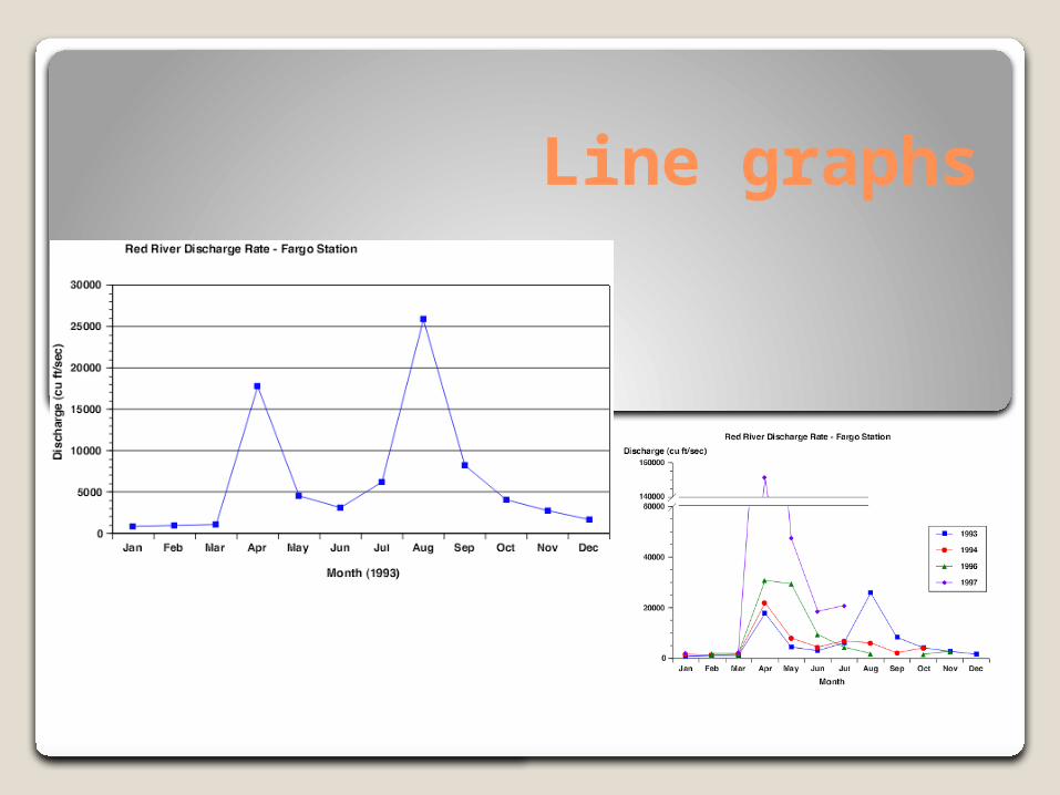
Line graphs
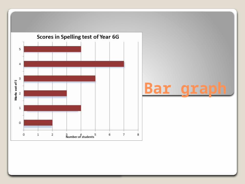
Bar graph
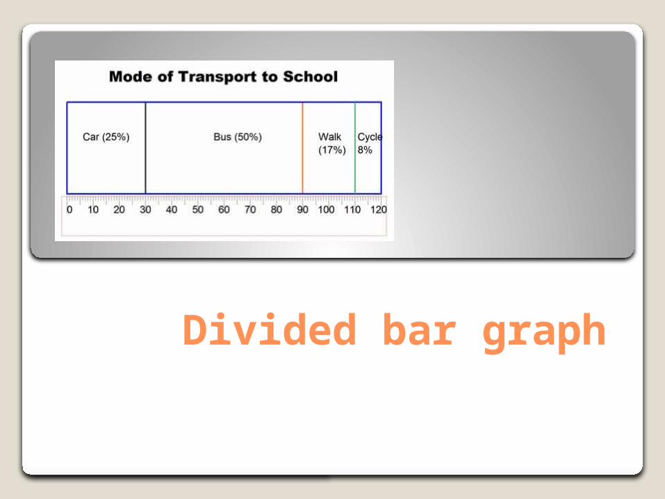
Divided bar graph
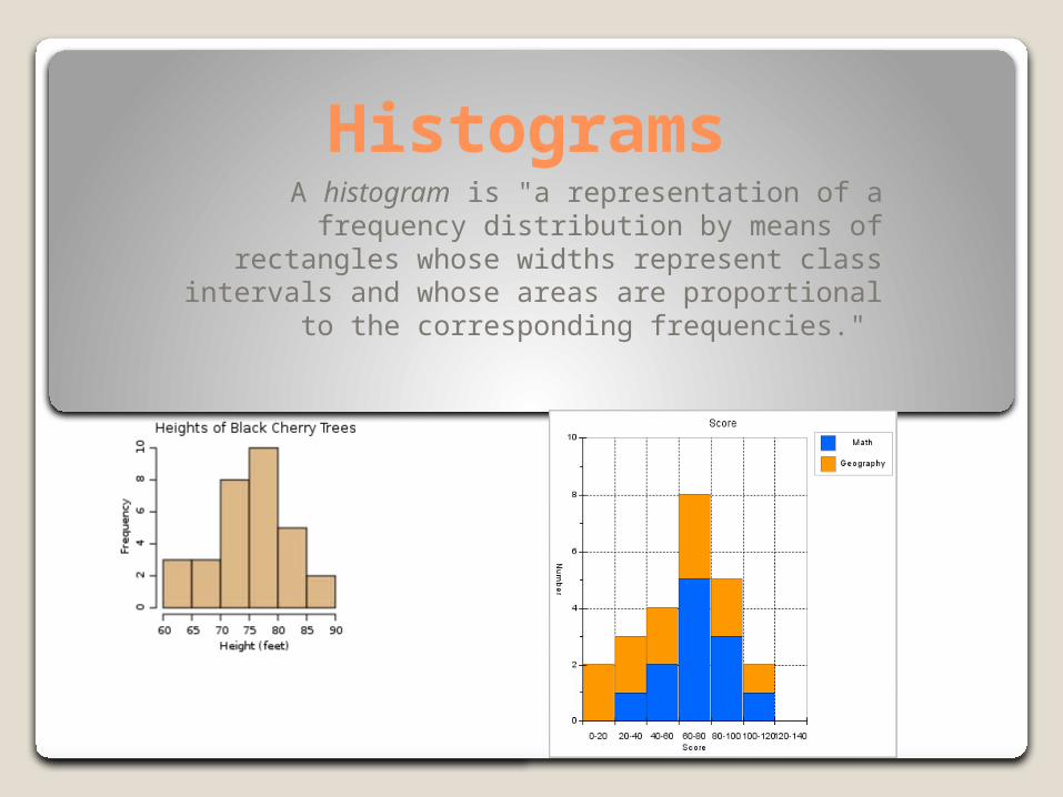
HistogramsA histogram is "a representation of a frequency
distribution by means of rectangles whose widths represent class intervals and whose areas are proportional to the corresponding
frequencies."
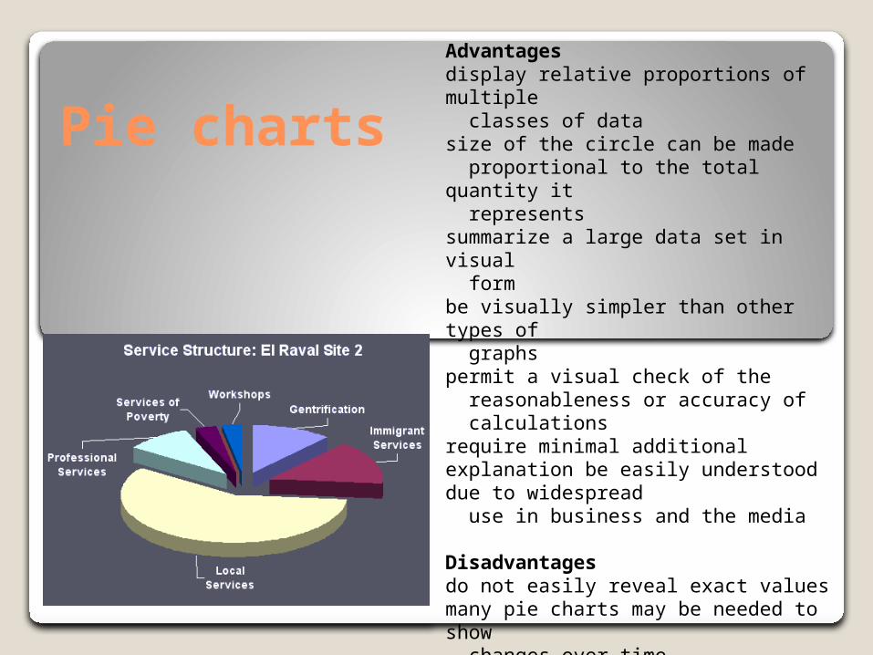
Pie charts
Advantagesdisplay relative proportions of multiple classes of data size of the circle can be made proportional to the total quantity it represents summarize a large data set in visual form be visually simpler than other types of graphs permit a visual check of the reasonableness or accuracy of calculations require minimal additional explanation be easily understood due to widespread use in business and the media
Disadvantagesdo not easily reveal exact values many pie charts may be needed to show changes over time fail to reveal key assumptions, causes, effects, or patterns be easily manipulated to yield false impressions
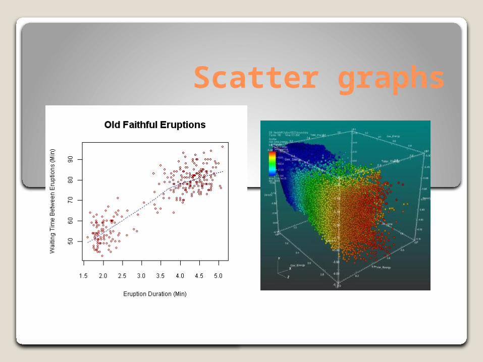
Scatter graphs
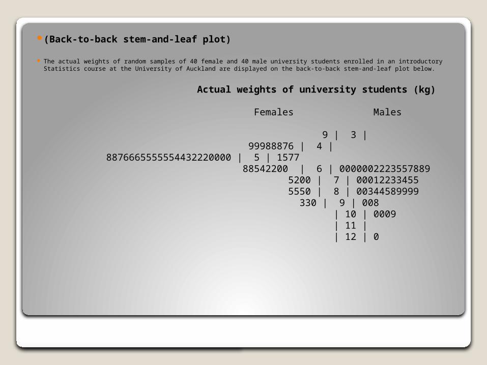
(Back-to-back stem-and-leaf plot)
The actual weights of random samples of 40 female and 40 male university students enrolled in an introductory Statistics course at the University of Auckland are displayed on the back-to-back stem-and-leaf plot below.
Actual weights of university students (kg)
Females Males
9 | 3 | 99988876 | 4 | 8876665555554432220000 | 5 | 1577 88542200 | 6 | 0000002223557889 5200 | 7 | 00012233455 5550 | 8 | 00344589999 330 | 9 | 008 | 10 | 0009 | 11 | | 12 | 0
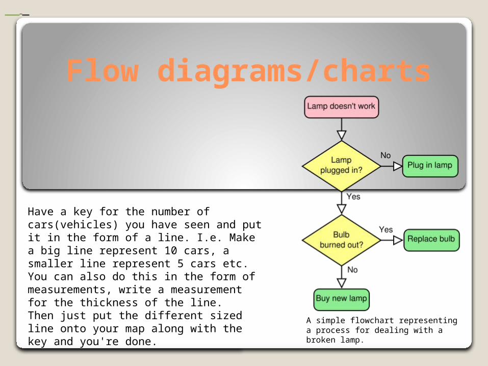
Flow diagrams/charts
A simple flowchart representing a process for dealing with a broken lamp.
Have a key for the number of cars(vehicles) you have seen and put it in the form of a line. I.e. Make a big line represent 10 cars, a smaller line represent 5 cars etc. You can also do this in the form of measurements, write a measurement for the thickness of the line.Then just put the different sized line onto your map along with the key and you're done.
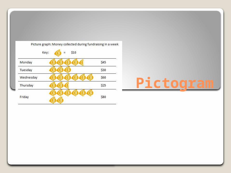
Pictogram
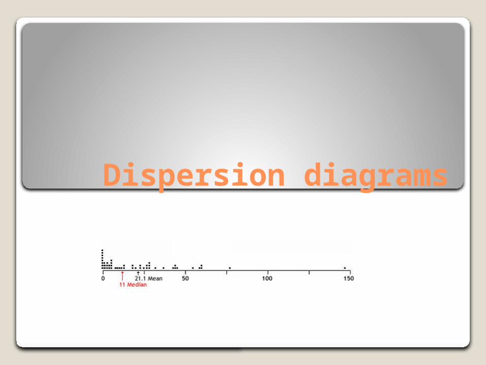
Dispersion diagrams
Ranges of data(differences between maximum and minimum)
TotalsAn amount obtained by addition.
Averages
mean: the sum of all the members of the list divided by the number of items in the list.
median is described as the number separating the higher half of a sample from the lower half.
mode: means the most frequent value
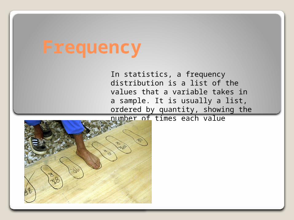
Frequency In statistics, a frequency distribution is a list of the values that a variable takes in a sample. It is usually a list, ordered by quantity, showing the number of times each value appears.
RatiosA ratio is an expression which compares quantities relative to each other.
For example, the ratio 60 metres to 1 second, or 60:1 is written as 60 m/s, or 60 ms−1, "60 metres per second" and is thought of as a measurement of velocity.
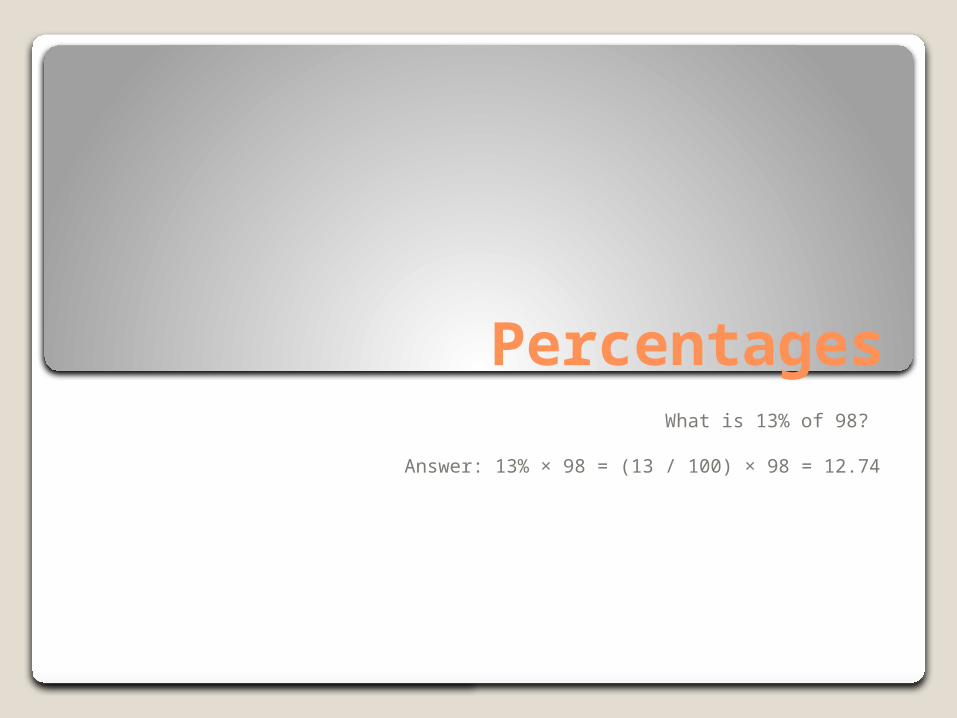
PercentagesWhat is 13% of 98?
Answer: 13% × 98 = (13 / 100) × 98 = 12.74
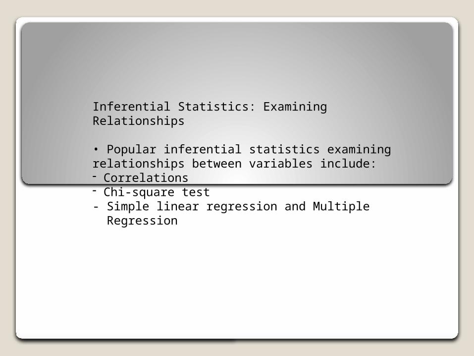
Inferential Statistics: ExaminingRelationships
• Popular inferential statistics examining relationships between variables include:- Correlations- Chi-square test- Simple linear regression and Multiple Regression
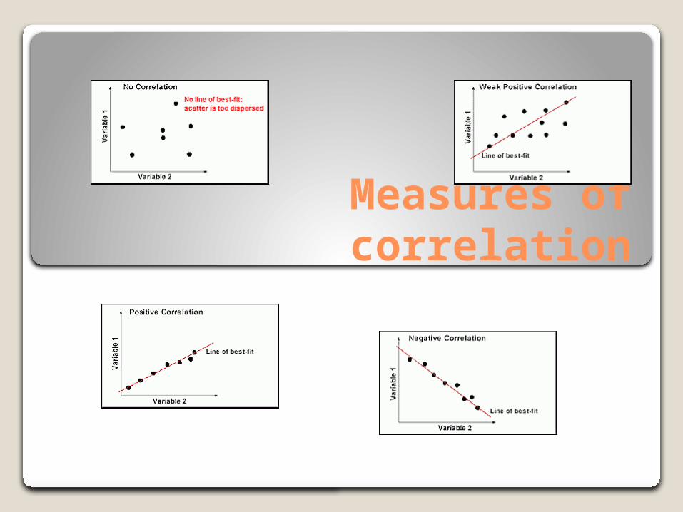
Measures of correlation
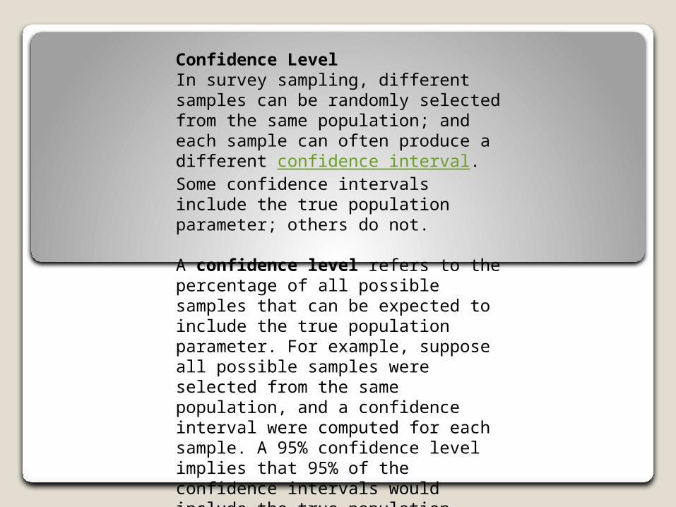
Confidence LevelIn survey sampling, different samples can be randomly selected from the same population; and each sample can often produce a different confidence interval. Some confidence intervals include the true population parameter; others do not.
A confidence level refers to the percentage of all possible samples that can be expected to include the true population parameter. For example, suppose all possible samples were selected from the same population, and a confidence interval were computed for each sample. A 95% confidence level implies that 95% of the confidence intervals would include the true population parameter.
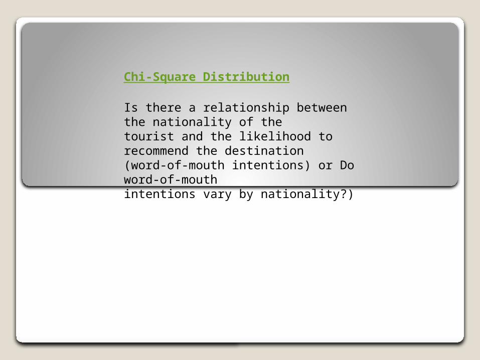
Chi-Square Distribution
Is there a relationship between the nationality of the tourist and the likelihood torecommend the destination (word-of-mouth intentions) or Do word-of-mouth intentions vary by nationality?)
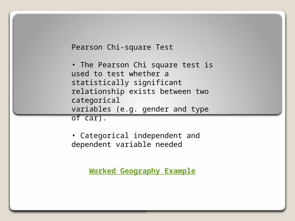
Pearson Chi-square Test
• The Pearson Chi square test is used to test whether a statistically significant relationship exists between two categoricalvariables (e.g. gender and type of car).
• Categorical independent and dependent variable needed
Worked Geography Example
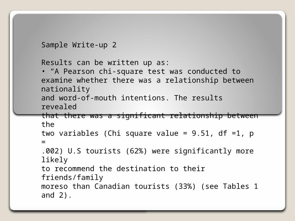
Sample Write-up 2
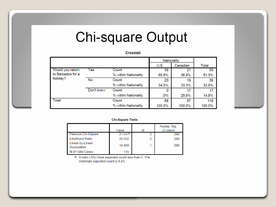
Results can be written up as:• “A Pearson chi-square test was conducted to examine whether there was a relationship between nationalityand word-of-mouth intentions. The results revealedthat there was a significant relationship between thetwo variables (Chi square value = 9.51, df =1, p =.002) U.S tourists (62%) were significantly more likelyto recommend the destination to their friends/familymoreso than Canadian tourists (33%) (see Tables 1and 2).
Spearman's Rank Correlation Coefficient (page 41 of Planet
Geography) is a further technique for analysing this data set.
Spearman's Rank Correlation
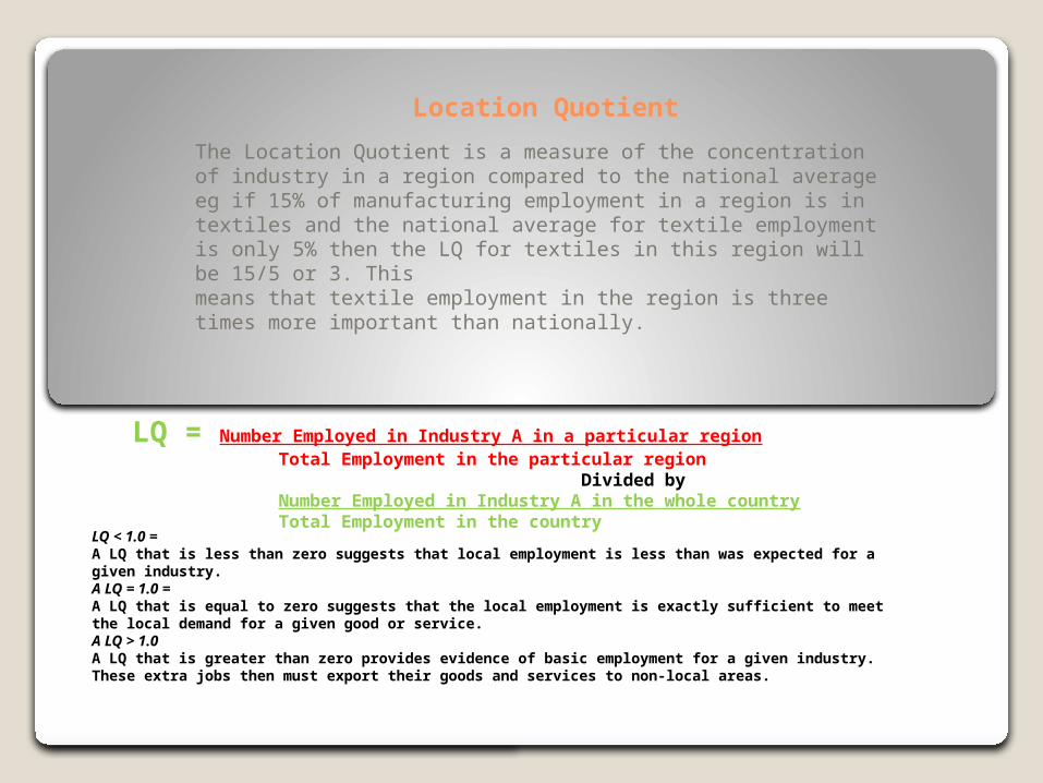
Location Quotient
The Location Quotient is a measure of the concentration of industry in a region compared to the national average eg if 15% of manufacturing employment in a region is in textiles and the national average for textile employment is only 5% then the LQ for textiles in this region will be 15/5 or 3. Thismeans that textile employment in the region is three times more important than nationally.
LQ = Number Employed in Industry A in a particular region Total Employment in the particular region Divided by Number Employed in Industry A in the whole country Total Employment in the country
LQ < 1.0 = A LQ that is less than zero suggests that local employment is less than was expected for a given industry. A LQ = 1.0 = A LQ that is equal to zero suggests that the local employment is exactly sufficient to meet the local demand for a given good or service. A LQ > 1.0 A LQ that is greater than zero provides evidence of basic employment for a given industry. These extra jobs then must export their goods and services to non-local areas.
Related Documents