Creating Charts with Microsoft Excel 0 20 40 60 80 100 120 1stQ tr 2nd Q tr 3rd Q tr 4th Q tr 8th G rade 7th G rade 6th G rade 0 10 20 30 40 50 60 70 80 90 1stQ tr 2nd Q tr 3rd Q tr 4th Q tr 6th G rade 7th G rade 8th G rade 1stQ tr 2nd Q tr 3rd Q tr 4th Q tr

Creating Charts with Microsoft Excel Microsoft Excel TERMS Cells Columns A Rows 1.
Dec 15, 2015
Welcome message from author
This document is posted to help you gain knowledge. Please leave a comment to let me know what you think about it! Share it to your friends and learn new things together.
Transcript

Creating Charts with
Microsoft Excel
0
20
40
60
80
100
120
1st Qtr 2nd Qtr 3rd Qtr 4th Qtr
8th Grade
7th Grade
6th Grade
0
10
20
30
40
50
60
70
80
90
1st Qtr 2nd Qtr 3rd Qtr 4th Qtr
6th Grade
7th Grade
8th Grade
1st Qtr
2nd Qtr
3rd Qtr
4th Qtr
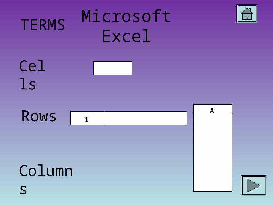
Microsoft ExcelTERMS
Cells
Columns
ARows 1

All three elements come together to make….
Together, they are called a SPREADSHEET.
Together the spreadsheets are called a workbook.
Three spreadsheets automatically are available when you open Microsoft Excel.
SURPRISE QUIZ!!!!Rows, columns and all
those cells are called????
Let’s get those gears moving!

Data is the keyClick on a cell to begin entering information.
When preparing to create a chart, it is important to have category headings across the top row. For example:

Then enter categories on the left side.
Now add the data under the appropriate headings and rows.

Now it is time for a Quiz!
What elements create a spreadsheet?
A. rows and cells
B. cells and columns
C. rows, cells and columns
A
B
C

CLOSE, BUT NOT THE
RIGHT ANSWER!
Try Again!

GREAT!Now You are ready
to turn your data into a chart!
Hurray!
Way to Go!

Once all the data has been entered…
Highlight all the cells like in the example.
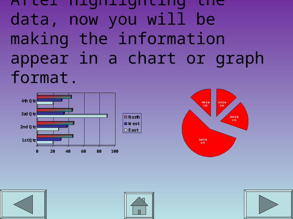
After highlighting the data, now you will be making the information appear in a chart or graph format.
0 20 40 60 80 100
1st Qtr
2nd Qtr
3rd Qtr
4th Qtr
North
West
East
1st Qtr13%
2nd Qtr17%
3rd Qtr57%
4th Qtr13%

The information on the leftCan be turned into this Pie Chart
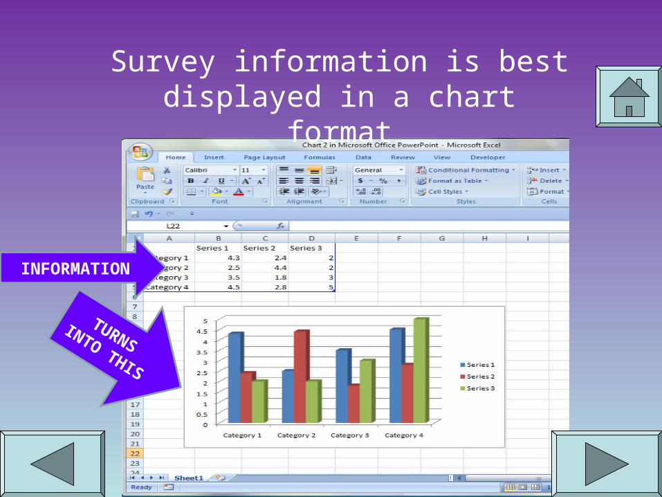
Survey information is best displayed in a chart format
INFORMATION
TURNS
INTO THIS

Let’s take a look at the Button Bar
This is the CHART button
Please follow along to see how this is done!
There are many options to choose so it is good to have an idea of what
you are wanting to create.

Clicking the Chart Button opens a dialog box that looks
like this…
Click on the Chart that best suits the information you want to
display
Once you have selected the chart, you can click this
button to see what it will look like
Then click the
NEXT butto
n

The options that are offered after this are self-
explanatory.
Try out the options offered and you can always
change things back. The best advice is to move slowly so that you can
undo choices you do not want.
The last part of formatting
your chart has to do
with where you want the
chart to appear
If you want the chart on
the same spreadsheet,
select “As object in:”
On the same note, if you
would like the chart to be on its own sheet,
select, “As new sheet”.

When displaying parts of a whole, the pie chart works
best.
True or False
QUICK QUIZ

Sorry! This statement is
true.
See how all the parts make one
object.
1st Qtr13%
2nd Qtr17%
3rd Qtr57%
4th Qtr13%
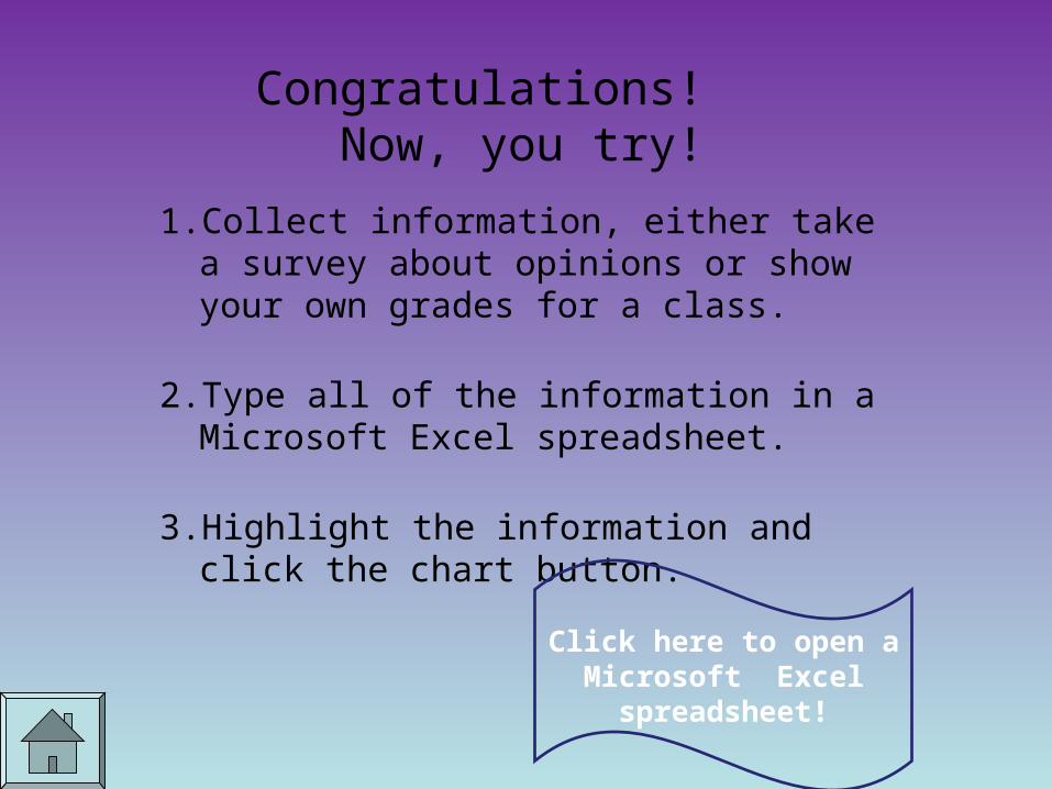
Congratulations! Now, you try!
1. Collect information, either take a survey about opinions or show your own grades for a class.
2. Type all of the information in a Microsoft Excel spreadsheet.
3. Highlight the information and click the chart button.
Click here to open a Microsoft Excel
spreadsheet!
Related Documents